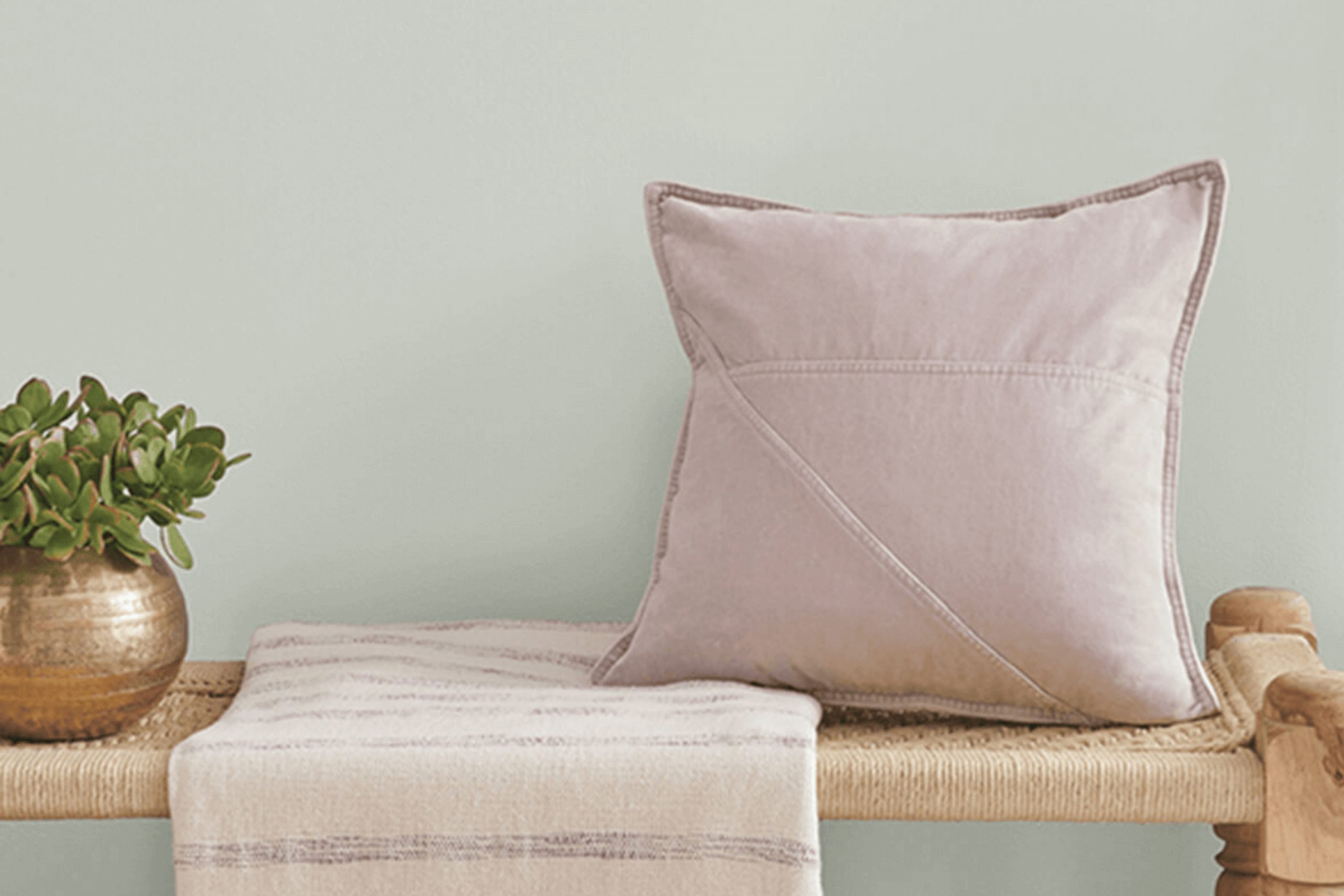
Painting has always been one of my favorite ways to change the mood of a room. Recently, I came across a shade that caught my eye: SW 0052 Pearl Gray by Sherwin Williams. At first glance, it might seem like a typical gray, but once applied, its subtle nuances reveal themselves. Pearl Gray sits at the intersection of warmth and neutrality, creating a cozy yet refined atmosphere.
What struck me most about Pearl Gray was its versatility. It adapts beautifully to various lighting conditions, bringing out different undertones depending on the time of day or the room it’s in. In natural light, it exudes a gentle softness that makes areas feel open and inviting, while under artificial light, it shifts to a more intimate and calming backdrop.
This color proves itself to be a perfect choice for those seeking a foundation for other design elements. Whether your style leans toward modern, traditional, or anywhere in between, Pearl Gray provides an enduring canvas that allows your decor to shine. It’s a color that doesn’t demand attention, yet quietly enhances whatever surrounds it.
For anyone considering a refresh or looking to add a touch of elegance, Pearl Gray is certainly worth experiencing. Its subtle beauty has a way of making any room feel like home.
What Color Is Pearl Gray SW 0052 by Sherwin Williams?
Pearl Gray by Sherwin Williams is a subtle, soft gray with a slight hint of warmth. It has a gentle, soothing quality that makes it adaptable for various interior styles. This shade is perfect for creating a calm and inviting atmosphere in your home.
In terms of interior styles, Pearl Gray fits well with modern, minimalist, and contemporary designs. Its neutral tone allows it to serve as a perfect backdrop without overpowering other elements in a room. It is equally suitable for traditional areas, providing a clean look that complements classic furniture and decor.
Pearl Gray pairs beautifully with a variety of materials and textures. It works well with natural wood, whether lighter shades like oak or darker tones like walnut, giving a balanced feel. Additionally, it complements metals such as brushed nickel or brass, enhancing the overall aesthetic. For textiles, consider pairing this color with soft fabrics like cotton or linen to maintain a cozy feel. You can also add interest with textured elements like woven baskets or chunky knit throws.
Overall, Pearl Gray is a flexible, muted color that can easily blend with and enhance different elements, providing a peaceful and cohesive environment.
Is Pearl Gray SW 0052 by Sherwin Williams Warm or Cool color?
Pearl Gray SW 0052 by Sherwin Williams is a soft, neutral color that adds a touch of elegance and calmness to any room. This shade of gray is adaptable, making it suitable for both modern and traditional homes. It has a subtle warmth that prevents it from feeling too cold or harsh, which is a common concern with some gray tones.
When used in living rooms or bedrooms, Pearl Gray creates a cozy and welcoming atmosphere. It’s an excellent backdrop for any color scheme, allowing furniture and decorative items to stand out. The light tone of Pearl Gray also helps smaller rooms feel brighter and more spacious.
It’s a great choice for hallways, ensuring they feel open and airy. Additionally, this color pairs well with both dark and light accents, giving homeowners flexibility in design choices. Overall, Pearl Gray is a reliable choice for anyone looking to introduce a neutral yet inviting color to their home.
Undertones of Pearl Gray SW 0052 by Sherwin Williams
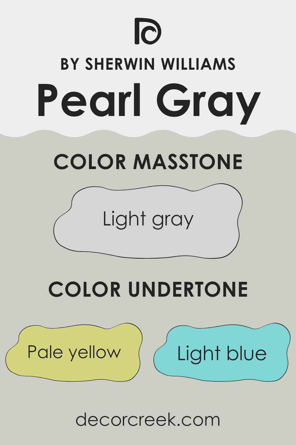
Pearl Gray by Sherwin Williams is a gentle and adaptable paint color that shifts beautifully depending on light and surroundings. Its subtle undertones of pale yellow, light blue, light purple, mint, pale pink, lilac, and gray blend seamlessly to create a soft, balanced look. These delicate hints give the shade depth and character, allowing it to feel warmer in bright daylight and cooler in shadow. This adaptability makes Pearl Gray an enduring choice for creating calm, inviting areas while still offering quiet refinement.
Undertones are the subtle hues that can be seen underneath the main color. They can affect how a paint color looks in different environments. For example, in natural light, a gray with blue undertones may appear cooler, while in artificial light, it might look warmer. These color shifts can influence the mood and atmosphere of a room.
In the case of Pearl Gray, its pale yellow and mint undertones can add a hint of warmth and freshness to a room, while the light blue and lilac can bring a sense of calm. The presence of gray keeps it grounded and neutral. This makes it an excellent choice for various interior rooms, as it can adapt to different styles and decors. Depending on the existing colors in a room, Pearl Gray can either stand out as a gentle pop of color or blend seamlessly with other neutral tones.
What is the Masstone of the Pearl Gray SW 0052 by Sherwin Williams?
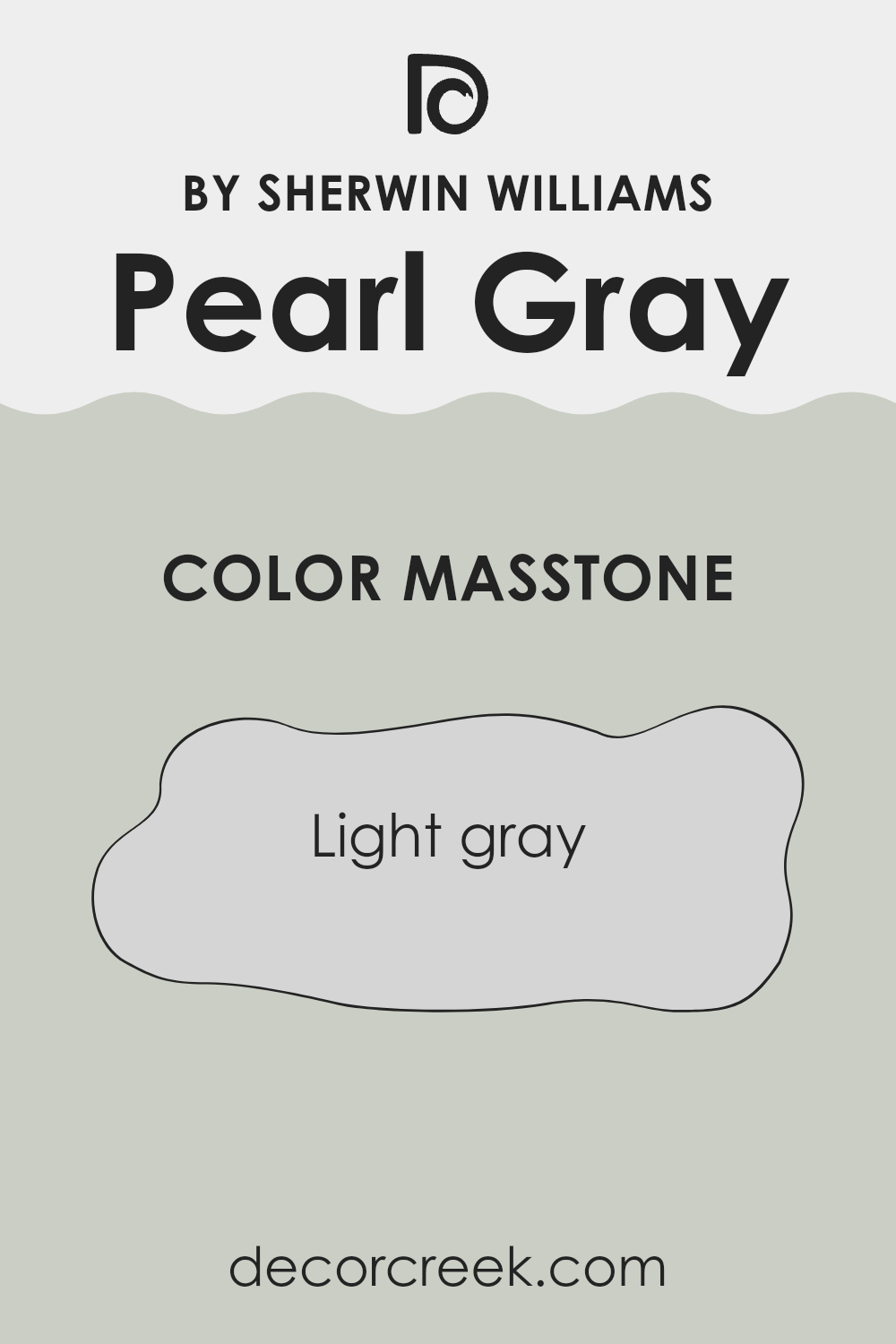
Pearl Gray by Sherwin Williams is a soft, light gray color that brings a calming and neutral feel to any room. Its masstone, which is close to a soft gray (#D5D5D5), makes it adaptable and easy to match with other colors and decor in a home.
Because it is a light gray, it reflects natural light well, making rooms feel bigger and brighter. This color is perfect for living rooms, bedrooms, or even kitchens where you want to maintain a clean and open look.
Pearl Gray works well with both modern and traditional styles. It pairs beautifully with white trim for a fresh, crisp look, or with darker colors if you prefer a bolder contrast. Additionally, it provides a nice backdrop for colorful art or furniture, allowing those pieces to stand out. Overall, its gentle hue makes it a flexible and pleasing choice for any room in your home.
How Does Lighting Affect Pearl Gray SW 0052 by Sherwin Williams?
Lighting plays a crucial role in how we perceive colors in a room. Different types of lighting can change the appearance of paint colors, sometimes making them look more vibrant, dull, warm, or cool. One color, Pearl Gray SW 0052 by Sherwin Williams, provides an excellent example of how lighting variations can affect our perception of color.
In natural sunlight, Pearl Gray can appear as a true, soft gray with subtle undertones. Sunlight can highlight the color’s nuances, making it look more dynamic. However, the effect of sunlight on this color can change depending on which direction a room faces.
In north-facing rooms, which typically have cooler natural light, Pearl Gray might take on a slightly cooler tone, appearing more blue-gray. This is because northern light is often indirect and has a bluish tint. In such cases, Pearl Gray might seem slightly darker than expected due to the lack of direct sunlight.
In contrast, south-facing rooms receive warm, direct sunlight for most of the day. In this setting, Pearl Gray can appear warmer and more inviting, sometimes revealing subtle warm undertones that aren’t as visible in other lighting conditions.
East-facing rooms get bright, warm light in the morning and cooler light in the afternoon. In these rooms, Pearl Gray may show warmer tones in the morning and cooler ones later in the day. The shifting light can create an interesting dynamic as the color subtly changes throughout the day.
West-facing rooms experience the opposite pattern, with cooler light in the morning and warmer light in the evening. In the evening, when the light becomes more golden and intense, Pearl Gray might feel particularly cozy and warm.
Under artificial lighting, Pearl Gray’s appearance will largely depend on the type of bulbs used. Incandescent bulbs can bring out warmth in the color, while LED or fluorescent lights might make it appear cooler. By using different types of lighting, you can significantly change how Pearl Gray looks in your room.
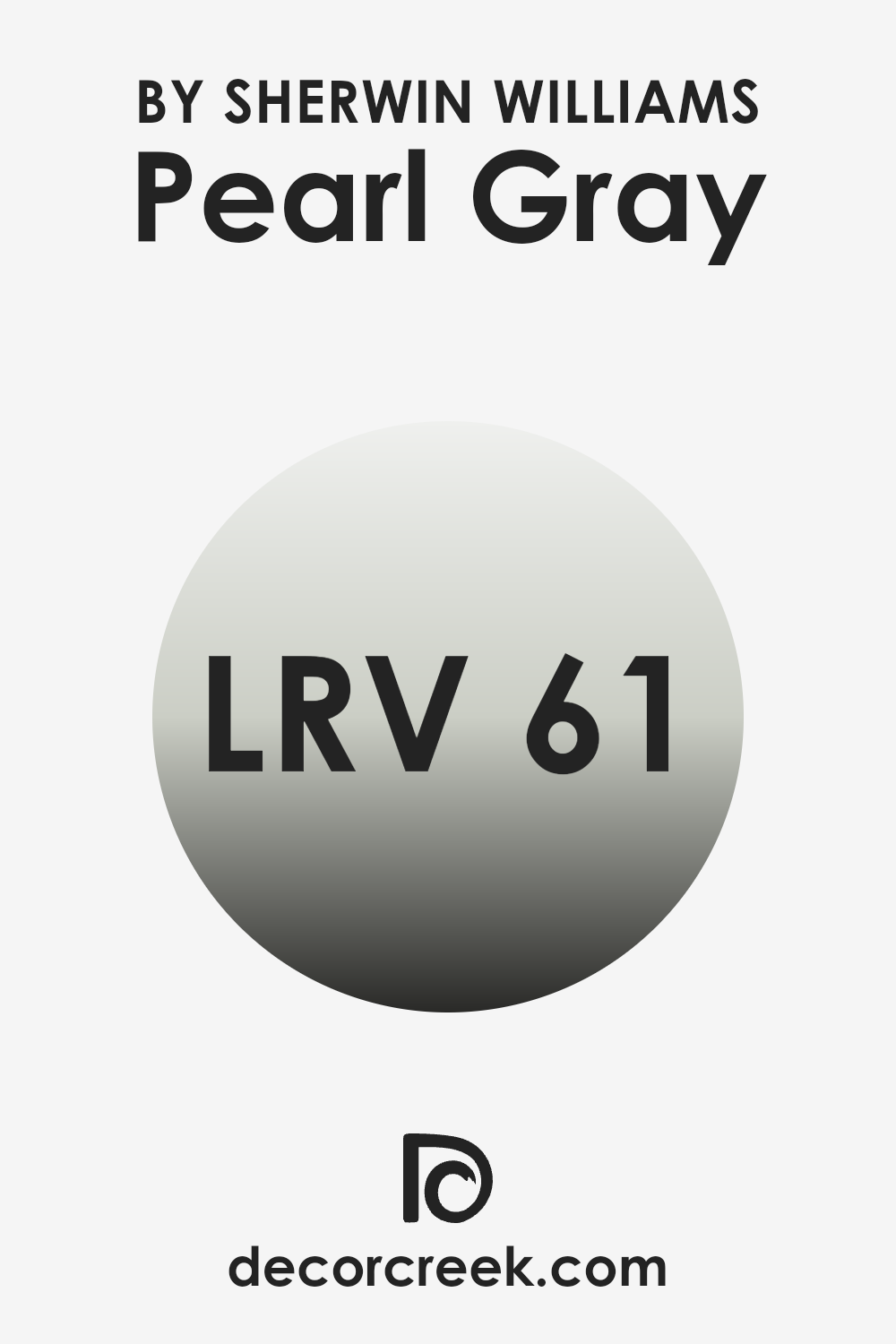
What is the LRV of Pearl Gray SW 0052 by Sherwin Williams?
Light Reflectance Value (LRV) is a measurement that tells you how much light a color reflects. It uses a scale from 0 to 100, where 0 means no light is reflected (pure black) and 100 means all light is reflected (pure white). The LRV helps you understand how bright or dark a color will appear when painted on a wall. It has a big impact on how a room feels.
A higher LRV means the color will reflect more light and can make a room feel brighter and more open. Conversely, a lower LRV means the color absorbs more light, which can make a room seem cozier but darker.
Pearl Gray by Sherwin Williams has an LRV of 60.974. This means it reflects a good amount of light, making it a relatively bright color. It’s not too dark or too light, sitting comfortably in the mid-range. When used on walls, it will make a room feel airy and light without being overpoweringly bright. It can add warmth to a room while still maintaining an easy-going and neutral appearance. This makes it a flexible choice for various rooms, as it can fit well with different lighting conditions and decor styles.
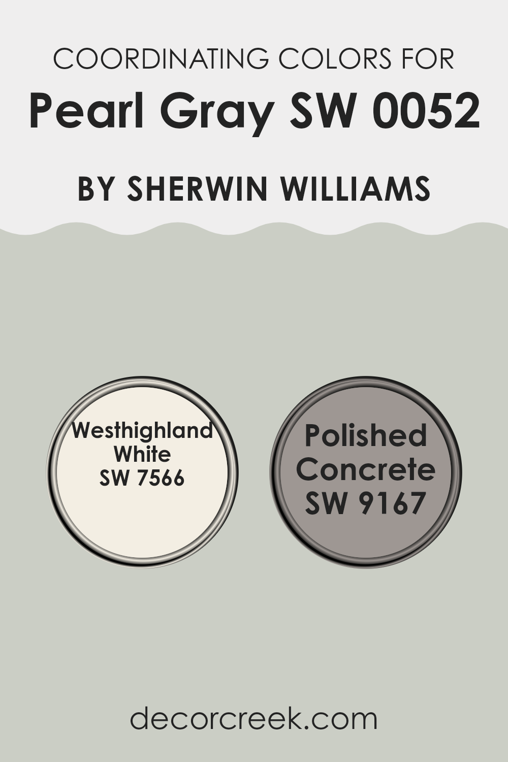
Coordinating Colors of Pearl Gray SW 0052 by Sherwin Williams
Coordinating colors are different shades that work well together to create a harmonious look in a room. They are chosen to complement a main color, enhancing its aesthetic and mood in a . For Pearl Gray by Sherwin Williams, coordinating colors like Westhighland White and Polished Concrete are perfect choices.
Westhighland White is a soft, warm white that offers a subtle contrast while keeping things light and airy. Its gentle warmth makes it flexible, bringing a touch of comfort and openness to any room.
Polished Concrete, on the other hand, is a sleek and modern gray with a hint of warmth. It bridges the gap between the lightness of Westhighland White and the understated elegance of Pearl Gray. When used together, these colors create a balanced and inviting atmosphere perfect for any room in your home. By mixing and matching these shades, you can achieve a cohesive look that feels both fresh and enduring.
You can see recommended paint colors below:
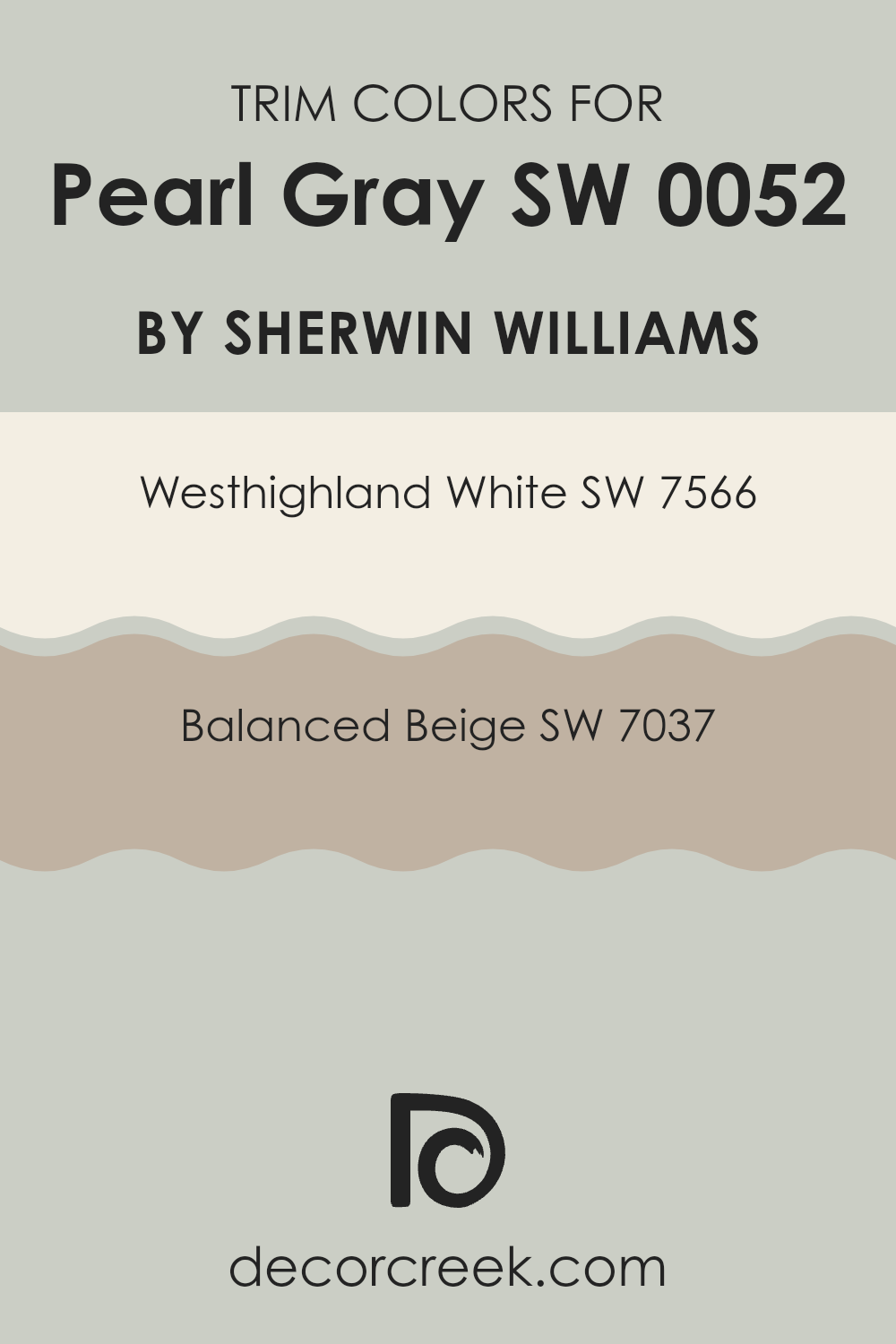
What are the Trim colors of Pearl Gray SW 0052 by Sherwin Williams?
Trim colors are crucial when painting a room with Pearl Gray by Sherwin Williams because they help define the room and add contrast. Pearl Gray is a soft, neutral shade, and pairing it with the right trim colors can enhance its beauty and make the room feel complete. Westhighland White, for instance, is a warm white that offers a clean and crisp frame around the edges of the room.
Its warmth complements the cool undertones of Pearl Gray, creating a balanced and inviting environment. Balanced Beige, on the other hand, is a gentle shade that brings a hint of warmth and depth to the room, which can make walls seem more connected and the room feel cozy and intimate.
Westhighland White is a classic and flexible color that can be used in many different design settings. This white is not stark; instead, it provides a welcoming brightness that works well with the subtler shades like Pearl Gray.
Balanced Beige introduces a soft, earthy tone that ties in beautifully with the neutral palette. It adds a touch of warmth without overpowering the primary wall color, making it an excellent choice for those who want a slightly richer, more grounded feel in their room. Together, these two trim choices cansignificantly enhance the overall look and feel of your room.
You can see recommended paint colors below:
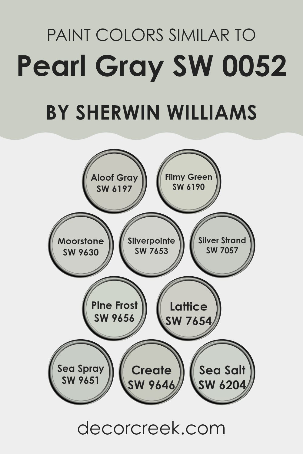
Colors Similar to Pearl Gray SW 0052 by Sherwin Williams
Similar colors play a crucial role in design and decoration because they can harmonize a room, creating a comforting and unified feel. The colors related to Pearl Gray by Sherwin-Williams, such as Aloof Gray and Filmy Green, are all variations that offer slight changes in tone, allowing for diversity without clashing.
Having similar tones like Moorstone and Silverpointe adds depth and interest within the same palette. Each color brings a unique quality: Aloof Gray has an understated elegance, while Filmy Green introduces a hint of nature. Moorstone’s subtle warmth and Silverpointe’s coolness provide touches that can make a room inviting or refreshing, depending on the desired mood.
Silver Strand beautifully bridges gray and green undertones, merging cool and warm vibes. Pine Frost’s delicate hue whispers calmness, akin to a distant, frosty landscape. Lattice is soft with a more muted presence, making it flexible for various settings.
Sea Spray gently hints at ocean adventures, perfect for adding a splash of nature without being heavy, while Create is a balanced tone of gray. Sea Salt, with its soft touch of green, is fresh and airy, reminiscent of a gentle ocean breeze. Together, these shades echo the balance found in nature, subtly shifting areas into harmonious places to be.
You can see recommended paint colors below:
- SW 6197 Aloof Gray
- SW 6190 Filmy Green
- SW 9630 Moorstone
- SW 7653 Silverpointe
- SW 7057 Silver Strand
- SW 9656 Pine Frost
- SW 7654 Lattice
- SW 9651 Sea Spray
- SW 9646 Create
- SW 6204 Sea Salt
How to Use Pearl Gray SW 0052 by Sherwin Williams In Your Home?
Pearl Gray SW 0052 by Sherwin Williams is a soft, neutral gray that can add a touch of elegance to any room in your home. This gentle shade works well in living rooms, bedrooms, or bathrooms, providing a calm and soothing backdrop.
Its versatility allows it to pair beautifully with both warm and cool colors, making it an excellent choice for those looking to create a balanced and inviting room. In a living room, you can use Pearl Gray on the walls to complement wooden furniture and colorful accents like cushions or rugs.
In a bedroom, this color creates a restful environment when paired with white or light-colored bedding. It also works well in a modern kitchen, providing a clean and fresh look when combined with stainless steel appliances and white cabinets. The understated nature of Pearl Gray makes it a popular choice for creating a peaceful and comfortable home atmosphere.
Pearl Gray SW 0052 by Sherwin Williams vs Aloof Gray SW 6197 by Sherwin Williams
Pearl Gray SW 0052 and Aloof Gray SW 6197, both by Sherwin Williams, are two popular shades of gray that offer different aesthetics for your room. Pearl Gray is a lighter and softer shade, exuding a delicate and airy feel.
It’s a great choice if you want to keep a room feeling bright and open. On the other hand, Aloof Gray has a greener undertone, which gives it a slightly more complex appearance. It can create a calming environment, making it suitable for areas where you want to relax.
While Pearl Gray works well in rooms with plenty of natural light, enhancing its lightness, Aloof Gray can introduce a subtle depth, especially in rooms with moderate lighting. Both colors are flexible and can work in various settings, but their undertones and depth vary, offering you options depending on whether you prefer a purer gray or one with a hint of color.
You can see recommended paint color below:
Pearl Gray SW 0052 by Sherwin Williams vs Sea Spray SW 9651 by Sherwin Williams
Pearl Gray SW 0052 by Sherwin Williams is a subtle, classic gray with a soft warmth. It offers a neutral backdrop that pairs well with a range of other colors and design styles, making it flexible for various rooms in your home. Pearl Gray can make a room feel calm and inviting, without overpowering the senses.
On the other hand, Sea Spray SW 9651 by Sherwin Williams introduces a different vibe. This color is a light blue-green with a refreshing and airy quality. Sea Spray can bring a touch of the ocean indoors, creating a feeling of freshness and openness. It’s an excellent choice for bathrooms or bedrooms where a relaxed, coastal feel is desired.
While Pearl Gray provides a neutral, adaptable atmosphere, Sea Spray adds a gentle splash of color and an invigorating look. These colors, although distinct, can complement each other if used strategically in a design scheme.
You can see recommended paint color below:
Pearl Gray SW 0052 by Sherwin Williams vs Pine Frost SW 9656 by Sherwin Williams
Pearl Gray SW 0052 by Sherwin Williams is a flexible, soft gray with subtle undertones that give it a classic look, making it suitable for any room. It’s a neutral shade that blends well with both warm and cool color palettes, providing a calm and balanced atmosphere.
On the other hand, Pine Frost SW 9656 is a more vibrant and refreshing color. It has a slight green tint, reminiscent of nature and the outdoors. This color can bring a hint of liveliness and freshness into a room, making it ideal for creating an environment that feels revitalizing and invigorating.
While Pearl Gray offers a more traditional and neutral backdrop, Pine Frost introduces a touch of color that can brighten and energize a room. Both colors have their charm, with Pearl Gray being more understated and flexible, while Pine Frost adds a natural touch and freshness to any area.
You can see recommended paint color below:
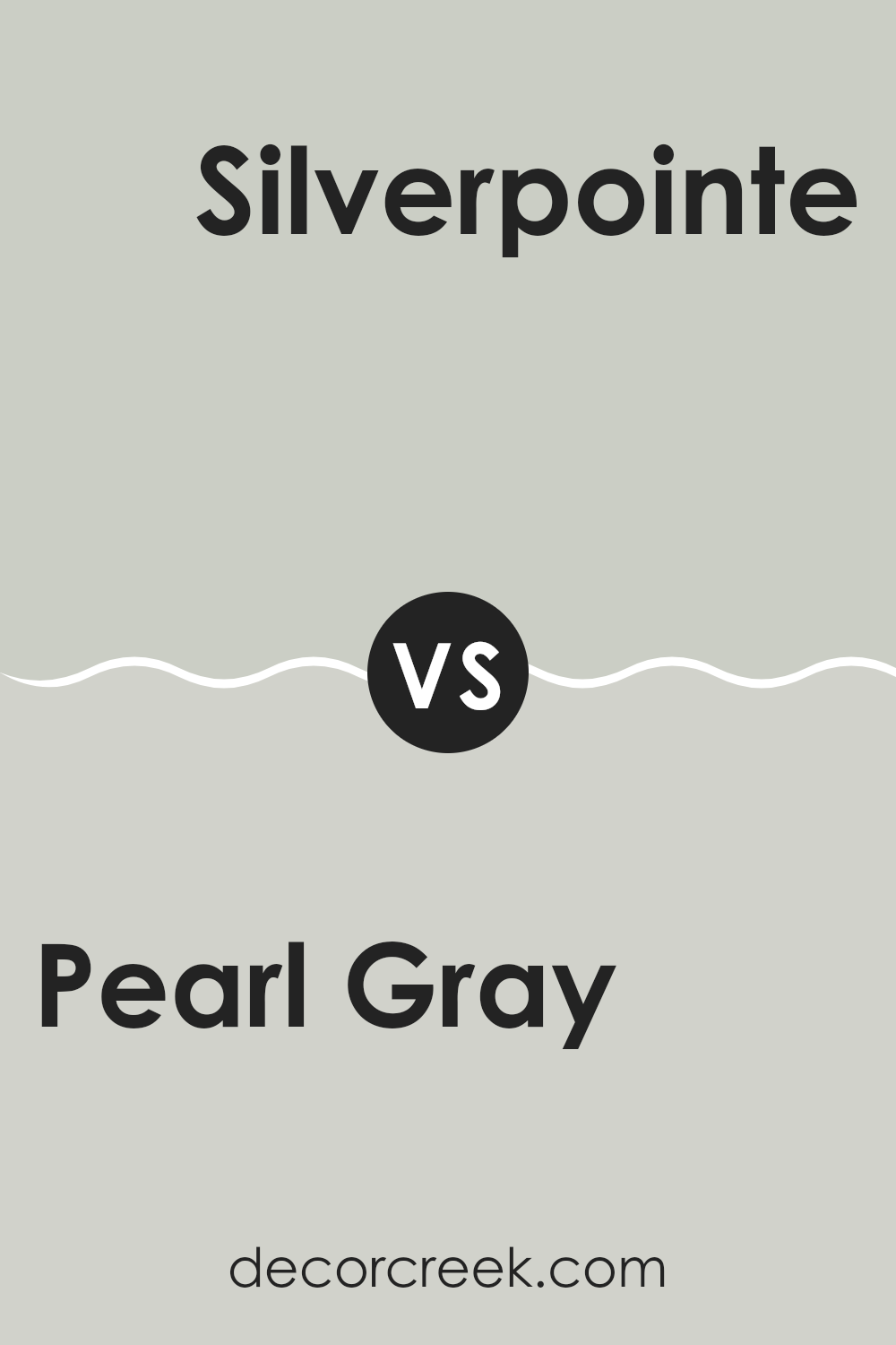
Pearl Gray SW 0052 by Sherwin Williams vs Silverpointe SW 7653 by Sherwin Williams
Pearl Gray (SW 0052) by Sherwin Williams is a soft, muted shade of gray with warm undertones, offering a cozy feel. It works well in traditional or vintage settings, adding a touch of warmth without overpowering a room.
On the other hand, Silverpointe (SW 7653) is a cooler, light gray with slight blue undertones. It has a modern and airy feel, making it a great choice for contemporary areas. Silverpointe can create a crisp, clean look, ideal for rooms that get ample natural light, as it can really highlight the cool tones.
Both colors can serve as neutral backdrops, but Pearl Gray might be better for a room where you want an inviting, warm atmosphere, while Silverpointe is suited for areas where you desire a fresh, modern vibe. Your choice depends on whether you’re aiming for warmth or a more crisp feel in your room.
You can see recommended paint color below:
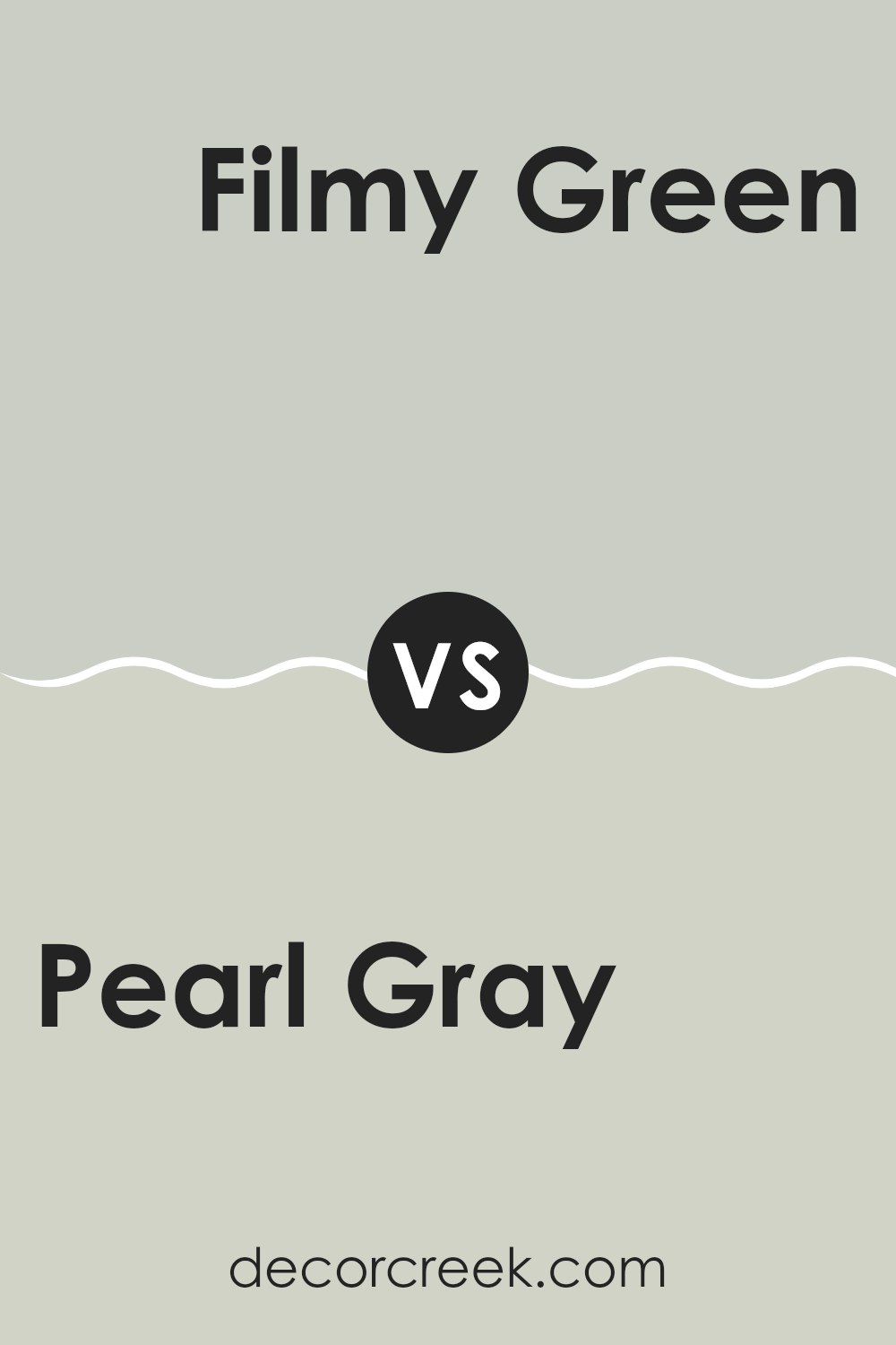
Pearl Gray SW 0052 by Sherwin Williams vs Filmy Green SW 6190 by Sherwin Williams
Pearl Gray SW 0052 by Sherwin Williams is a gentle, soft shade of gray that brings a sense of calmness and neutrality to a room. It’s a flexible color that works well as a backdrop, highlighting other colors or features in the room without overpowering them. This color is perfect for creating a clean and simple look.
Filmy Green SW 6190, on the other hand, introduces a hint of subtle green, adding a bit of natural freshness to any room. It’s a light and airy color that can brighten up areas and give them a slight touch of nature. This makes Filmy Green good for areas where you want a connection to the outdoors or a feeling of renewal.
When comparing the two colors, Pearl Gray offers more of a classic gray feel, while Filmy Green infuses a bit more color and personality into the room. Both can create relaxing environments, but Filmy Green brings a touch of vibrancy with its green hue.
You can see recommended paint color below:
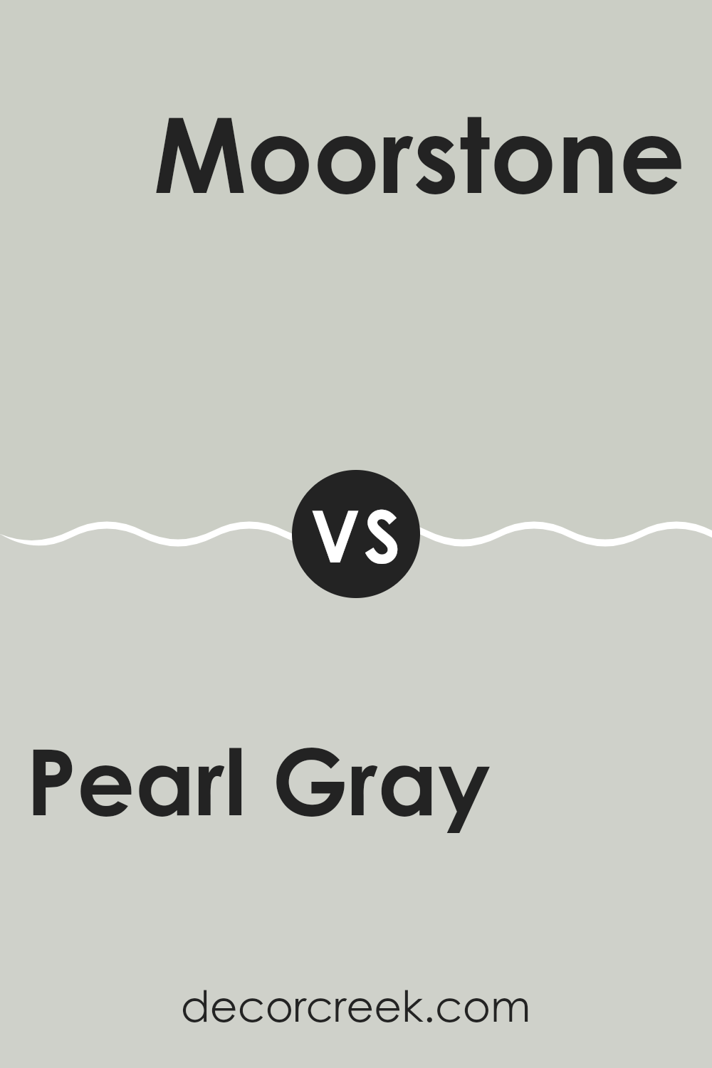
Pearl Gray SW 0052 by Sherwin Williams vs Moorstone SW 9630 by Sherwin Williams
Pearl Gray SW 0052 by Sherwin Williams is a soft and neutral shade with a gentle warmth. It’s a light gray with subtle undertones that can create a calm and inviting atmosphere in any room. This color is flexible, working well in both traditional and modern rooms.
It harmonizes easily with a variety of other colors and materials, making it a popular choice for many homeowners. On the other hand, Moorstone SW 9630 is a deeper, more saturated hue. It has a stronger presence and can add a touch of drama or coziness to a room.
Moorstone leans slightly more towards the cool side compared to Pearl Gray, making it suitable for those who prefer a bolder yet still neutral look. Both colors have their own unique appeal: Pearl Gray offers a gentle backdrop, while Moorstone provides a richer, more pronounced statement.
You can see recommended paint color below:
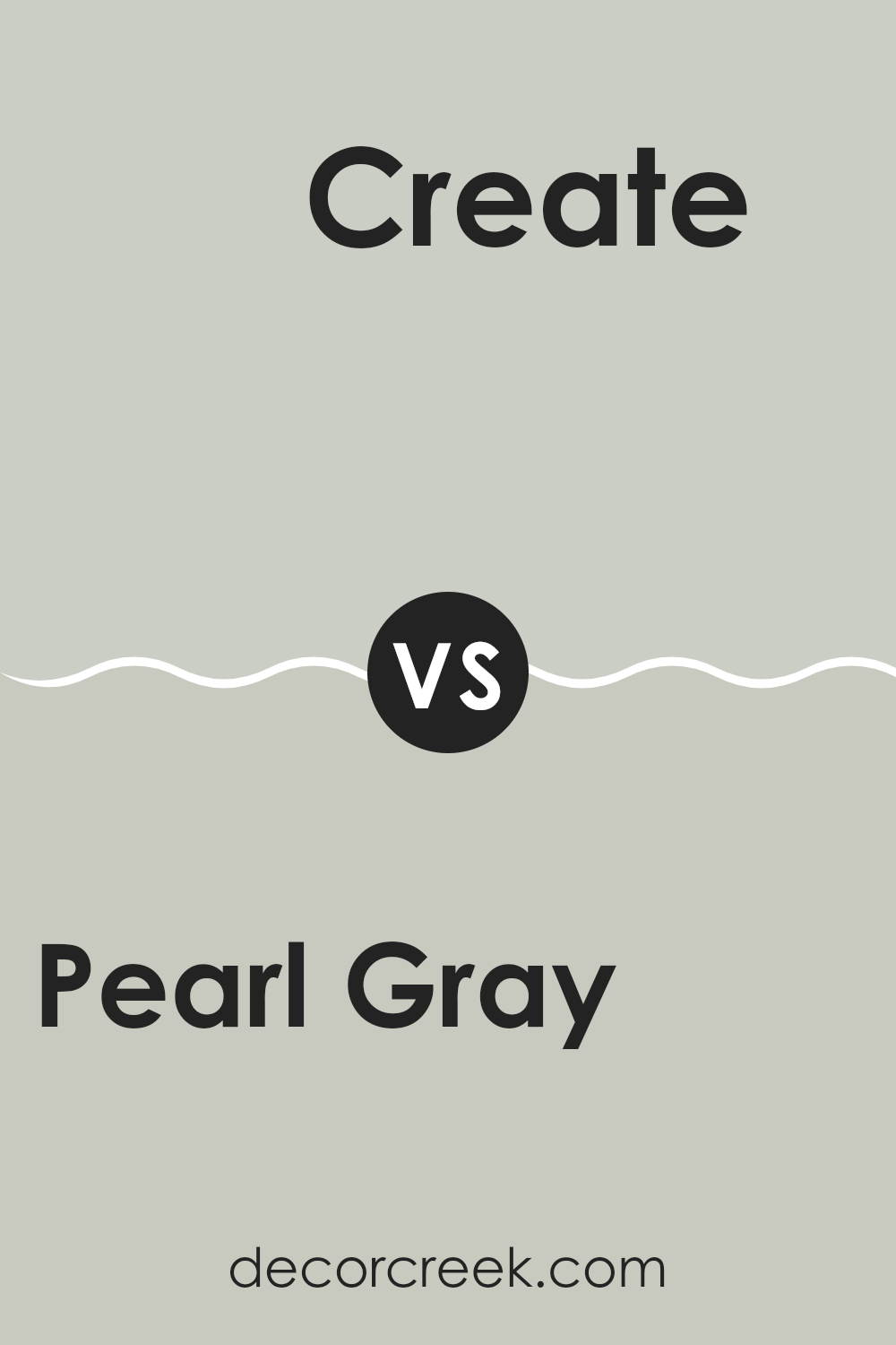
Pearl Gray SW 0052 by Sherwin Williams vs Create SW 9646 by Sherwin Williams
Pearl Gray SW 0052 by Sherwin Williams is a soft, muted gray with a hint of warmth, making it flexible for many rooms. It provides a calm and neutral backdrop, suitable for both modern and classic designs.
In comparison, Create SW 9646 is a more vibrant shade, with a lively undertone. It offers a bit more energy and can make a room feel more dynamic. While Pearl Gray is understated and blends seamlessly, Create stands out more and can be used to highlight certain areas or features.
Pearl Gray is often chosen for areas where subtlety and calmness are desired, such as living rooms or bedrooms, whereas Create might be used in creative areas or accent walls where a bit more liveliness is wanted. Both colors have their unique charm and can be great choices depending on the desired mood of a room.
You can see recommended paint color below:
Pearl Gray SW 0052 by Sherwin Williams vs Lattice SW 7654 by Sherwin Williams
Pearl Gray SW 0052 and Lattice SW 7654, both by Sherwin Williams, are similar colors but with distinct vibes. Pearl Gray is a soft, slightly warm gray that feels inviting and cozy. It works well in living areas and bedrooms, offering a comforting backdrop. This color has a subtle warmth that makes areas feel welcoming.
On the other hand, Lattice SW 7654 is a cooler gray with blue undertones. It’s crisp and fresh, making it great for bathrooms and kitchens, where a clean look is often desired. Lattice brings out a modern and airy feel in areas, contrasting with the warmth of Pearl Gray.
While both are neutral and flexible, Pearl Gray leans toward being more traditional and comfortable, whereas Lattice offers a more contemporary and refreshing touch. These colors can be used to achieve different moods depending on the room’s purpose and desired ambiance.
You can see recommended paint color below:
Pearl Gray SW 0052 by Sherwin Williams vs Silver Strand SW 7057 by Sherwin Williams
Pearl Gray SW 0052 and Silver Strand SW 7057 are both popular paint colors by Sherwin Williams, offering a neutral and calming feel, though they each bring their own unique charm to a room. Pearl Gray is a gentle, soft gray with a hint of warmth, ideal for creating a comfortable and inviting atmosphere. Its subtle tone makes it flexible, working well in both traditional and modern settings.
Silver Strand, on the other hand, is a cool gray with a touch of blue-green undertone. This color adds a refreshing and light touch to any room. It can work especially well in areas where you want to add a sense of openness like bathrooms or kitchens.
While Pearl Gray is more understated and warm, Silver Strand offers a slightly more vibrant and cool finish. Both choices can harmonize well with various colors, yet their subtle differences cater to specific aesthetics and moods.
You can see recommended paint color below:
Pearl Gray SW 0052 by Sherwin Williams vs Sea Salt SW 6204 by Sherwin Williams
Pearl Gray SW 0052 and Sea Salt SW 6204 are both popular colors from Sherwin Williams, but they have different vibes. Pearl Gray is a soft, neutral gray with a subtle hint of blue, making it feel cool and calm. It’s flexible and works well in many rooms, offering a clean and fresh look without being overpowering.
On the other hand, Sea Salt is a light, muted green with a bit of gray. It gives off a peaceful and airy feel, mimicking the natural colors of the ocean. Sea Salt is a great choice for rooms where you want a bit of color without it being too bold or intense.
Both colors are soothing, but Pearl Gray leans more on the gray side, while Sea Salt brings a touch of nature with its green tones. They can complement each other well, especially if you want to mix neutrals with subtle colors.
You can see recommended paint color below:
SW 0052 Pearl Gray by Sherwin Williams is a paint color that’s like a comforting hug. Imagine a soft gray cloud on a cozy day, and you’ll have a good idea of what Pearl Gray feels like. It’s the kind of color that doesn’t shout for attention but quietly makes everything around it feel calm and cozy.
When I look at Pearl Gray, I think of a rainy day spent inside reading books or watching movies. It’s calm and relaxing, and it makes me feel at ease. This color works well in any room, whether it’s the living room where you hang out with family or your bedroom where you go to rest.
One great thing about Pearl Gray is that it goes well with many other colors. You can pair it with bright colors to make them stand out or with other soft colors for a gentle look. It’s like a good friend who gets along with everyone.
In the end, if you want your home to feel warm and inviting, Pearl Gray is a fantastic choice. It helps create a peaceful feeling all around, making your home a place you love spending time in. Try it out, and see how your rooms can feel cozy and welcoming with just a simple change of color.
Ever wished paint sampling was as easy as sticking a sticker? Guess what? Now it is! Discover Samplize's unique Peel & Stick samples.
Get paint samples

