Paint is not just a substance that imparts color but a tool that creates atmosphere, mood, and visual interest. Sherwin-Williams’ SW 6219 Rain, a soft, muted gray with a touch of a blue undertone, is a prime example of this transformative power.
This article dives into the characteristics of SW 6219 Rain, its undertones, coordinating colors, the impact of lighting, and how to incorporate this serene color into your home.
What Color Is SW 6219 Rain?
SW 6219 Rain is a calming and balanced color that straddles the line between gray and blue. Its name perfectly captures its essence – a soft, muted color reminiscent of a rainy day. Neither too gray nor too blue, it’s a versatile hue that sets a tranquil tone for any room.
Ever wished paint sampling was as easy as sticking a sticker? Guess what? Now it is! Discover Samplize's unique Peel & Stick samples.
Get paint samples

Is It a Warm Or Cool Color?
SW 6219 Rain falls into the category of cool colors. Despite its gray neutrality, the subtle hint of blue lends it a cool undertone, making it ideal for creating serene and peaceful environments.
Undertones of SW 6219 Rain Paint Color
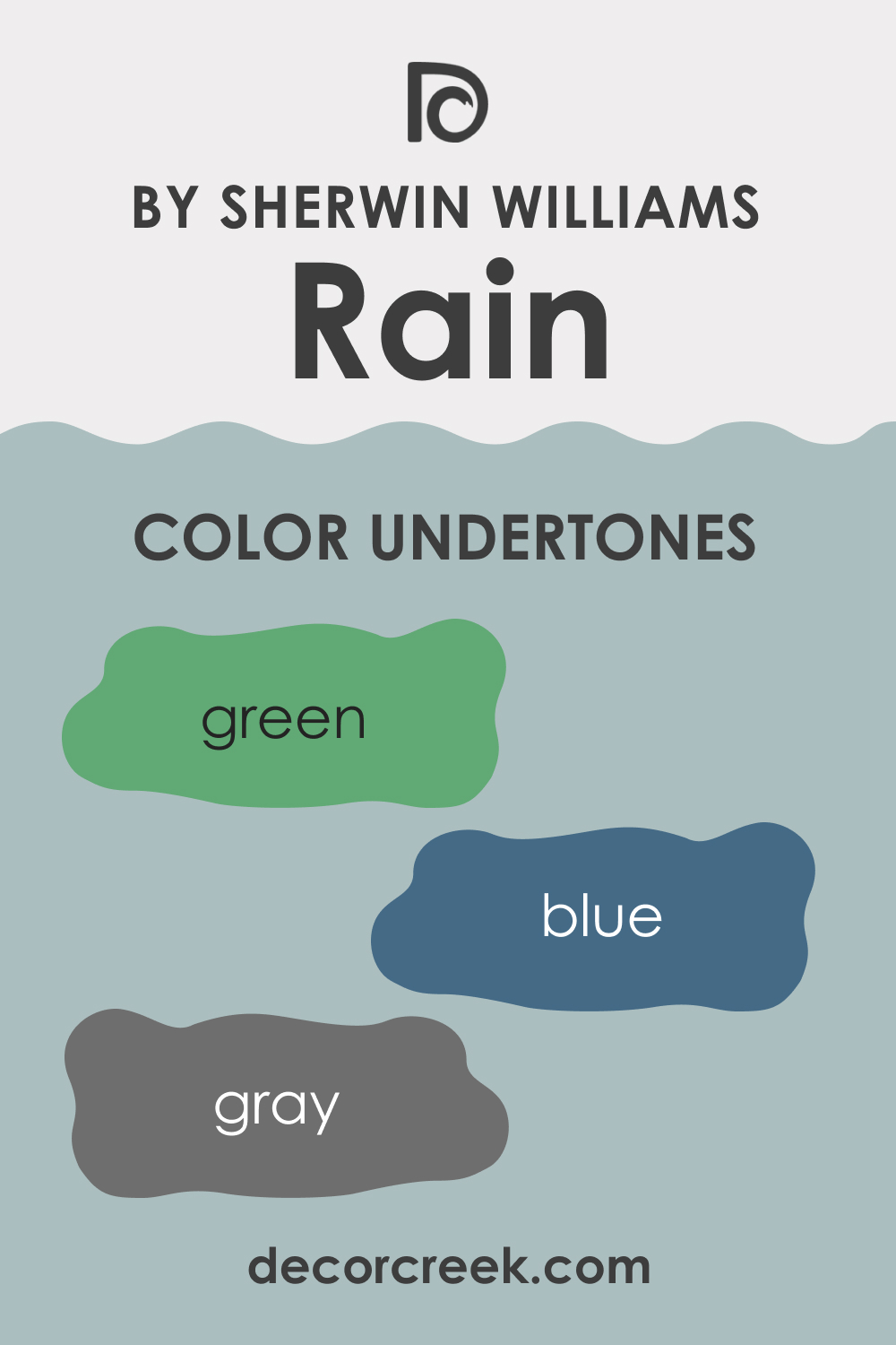
Undertones are the subtle color nuances that are revealed when a color is seen in different lighting or juxtaposed against other colors. The undertones of color can influence how it appears in relation to other colors and can affect the overall ambiance of a space. Let’s delve into the undertones of SW 6219 Rain:
- Gray: SW Rain’s dominant undertone is gray, which gives it a neutral and versatile base.
- Blue: The slight blue undertone adds a cool, calming dimension to SW Rain, providing a tranquil aesthetic.
- Green: Some might notice a very subtle hint of green in specific lighting conditions, adding an extra layer of complexity to this color.
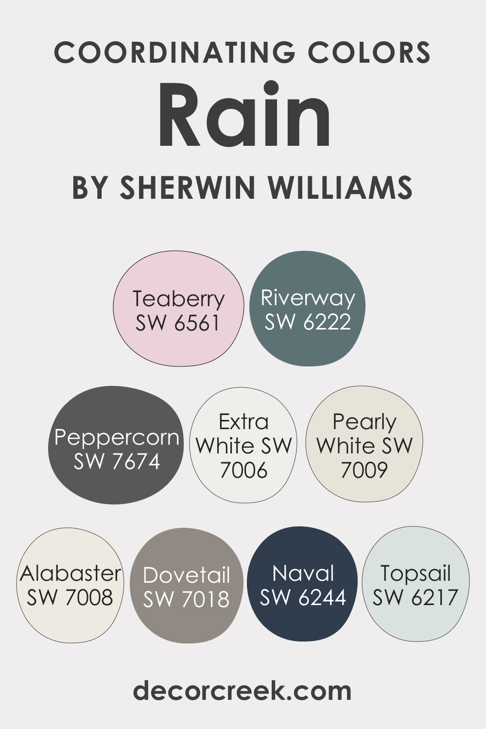
Coordinating Colors of SW 6219 Rain
When selecting coordinating colors for SW 6219 Rain, you’ll want to choose hues that complement its soft, muted character. Here are three Sherwin-Williams colors that pair well with SW Rain, followed by three additional options:
- SW 6217 Topsail: A light, airy blue that adds freshness and brightness when paired with Rain.
- SW 7006 Extra White: This pure white provides a crisp, high contrast that brings out the depth of Rain.
- SW 7018 Dovetail: A warm, mid-tone gray that complements the cool tones of Rain, grounding the space and adding warmth.
Three additional colors you might want to consider as coordinating ones include:
- SW 7008 Alabaster: A warm, off-white hue that provides a soft, less stark contrast with SW Rain.
- SW 7674 Peppercorn: A darker, intense gray with slightly warm undertones. It can add drama and depth when used with SW Rain.
- SW 6244 Naval: This deep, rich navy blue creates a dynamic contrast, emphasizing the soothing quality of SW Rain.
Also, check out these paint colors that can also work as coordinating ones:
- SW 6561 Teaberry
- SW 7009 Pearly White
- SW 6222 Riverway
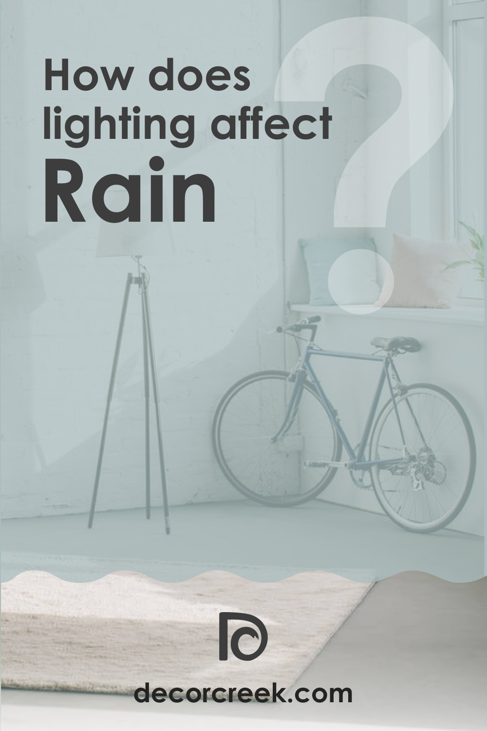
How Does Lighting Affect SW 6219 Rain Paint Color?
Lighting has a significant impact on how we perceive Rain. In a room with lots of natural light, SW Rain can appear lighter and softer, and its blue undertone may become more noticeable.
Conversely, in a space with low or artificial light, SW Rain may lean more heavily towards gray and can even reveal its subtle hint of green. Therefore, it’s crucial to observe this color under various lighting conditions in your space before committing.
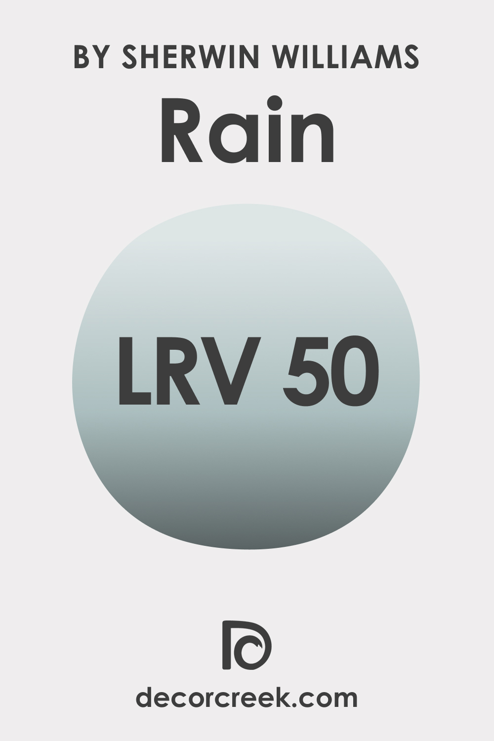
LRV of SW 6219 Rain Paint Color
The Light Reflectance Value (LRV) of a paint color measures the amount of light it reflects. The closer the LRV value is to 100, the lighter the color. The closer the LRV value is to zero, the darker and less reflective the color is.
SW 6219 Rain has an LRV of 50, placing it in the middle of the scale. This means SW Rain is a balanced color that maintains a harmonious middle ground between absorbing and reflecting light.
Rooms painted in SW Rain won’t feel overly bright or too dark. This makes SW Rain a versatile choice, capable of adding depth without overwhelming space and brightening rooms without feeling stark.
LRV – what does it mean? Read This Before Finding Your Perfect Paint Color
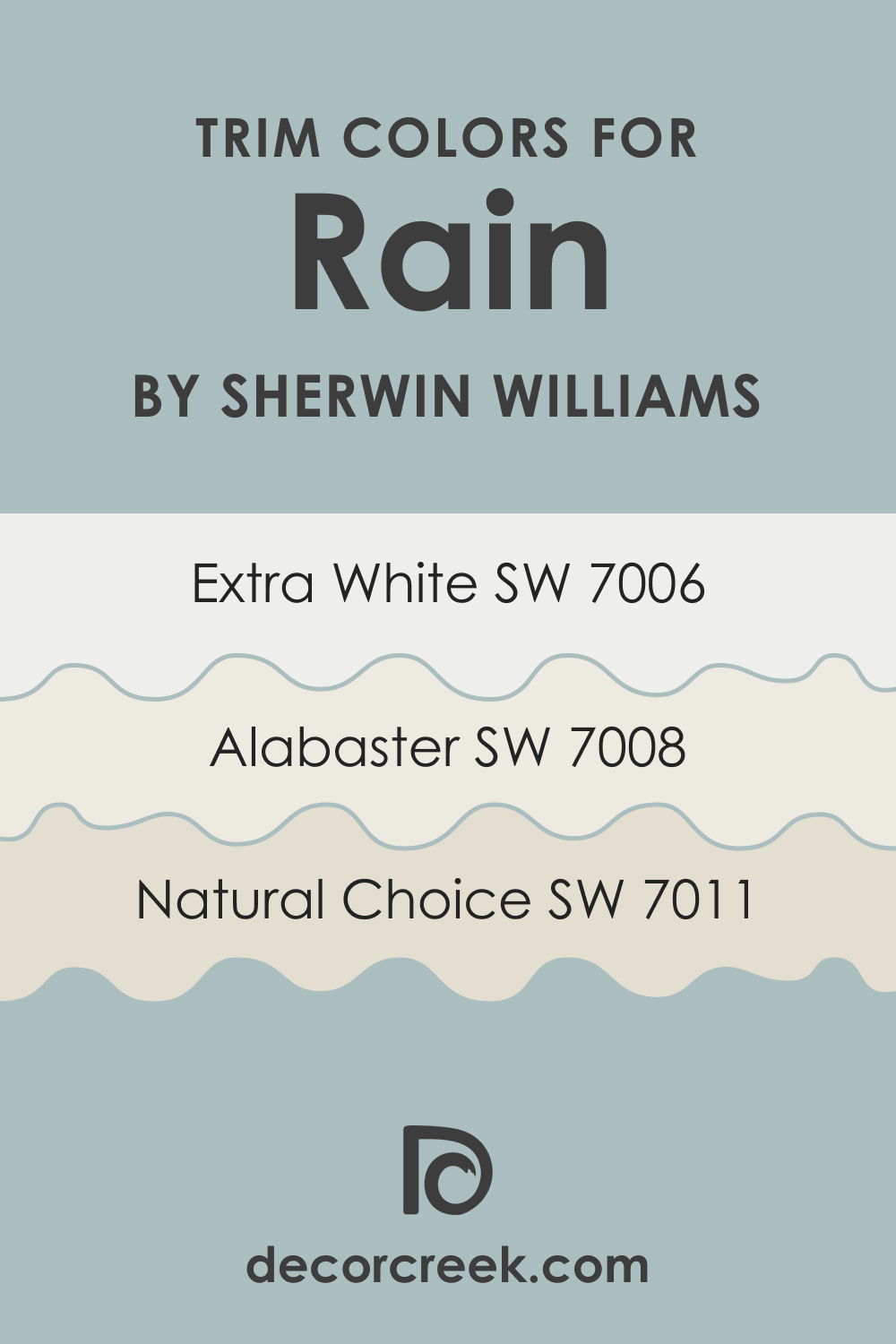
Trim Colors of SW 6219 Rain
Trim colors, the hues used on molding, doors, window frames, and baseboards, play a key role in defining the aesthetics of a room. They create contrast, define lines, and highlight architectural details. For SW 6219 Rain, consider the following shades of white:
- SW 7006 Extra White: The sharp contrast of Extra White against Rain can highlight architectural features and bring a modern, crisp look to the space.
- SW 7008 Alabaster: A warm, creamy white, Alabaster provides a softer contrast to Rain, enhancing its calming effect.
- SW 7011 Natural Choice: A muted, almost beige white. This trim color can add a touch of warmth to a room dominated by the cool undertones of Rain.
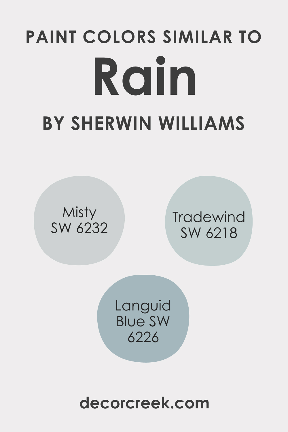
Colors Similar to SW 6219 Rain
There are several colors in the Sherwin-Williams range that, while not identical, carry a similar vibe to Rain:
- SW 6218 Tradewind: Slightly bluer than SW Rain, it has a similar softness and calming effect.
- SW 6226 Languid Blue: A true soft blue that feels calming and serene.
- SW 6232 Misty: This color leans towards a lavender-gray, providing a gentle, soothing effect similar to SW Rain.
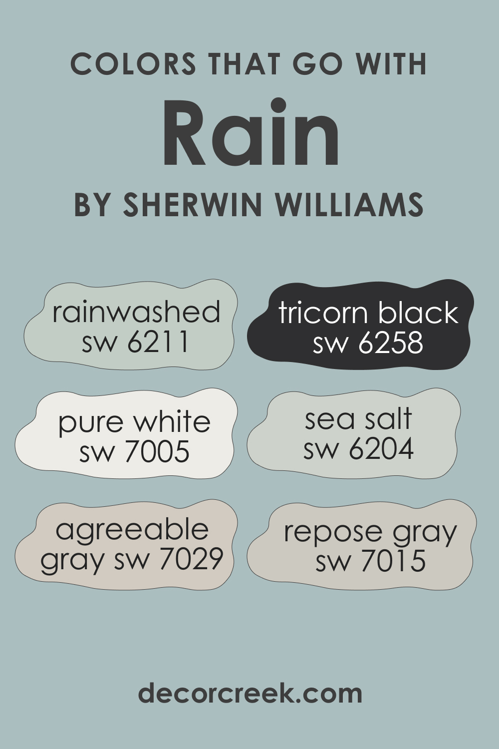
Colors That Go With SW 6219 Rain
Given SW Rain’s neutral and versatile nature, many colors go well with it. Here are six recommendations:
- SW 6211 Rainwashed: A soft blue-green that complements SW Rain’s tranquil vibe.
- SW 7029 Agreeable Gray: A warm, neutral gray that adds a comforting balance.
- SW 6258 Tricorn Black: For a dramatic contrast, Tricorn Black enhances the softness of SW Rain.
- SW 6204 Sea Salt: This green-gray hue brings out the cool undertones of SW Rain.
- SW 7005 Pure White: For a crisp, clean look, Pure White is a classic choice.
- SW 7015 Repose Gray: A light gray with warm undertones, it pairs beautifully with the coolness of SW Rain.
These colors will help you create a welcoming and good-looking palette in any room of your home.
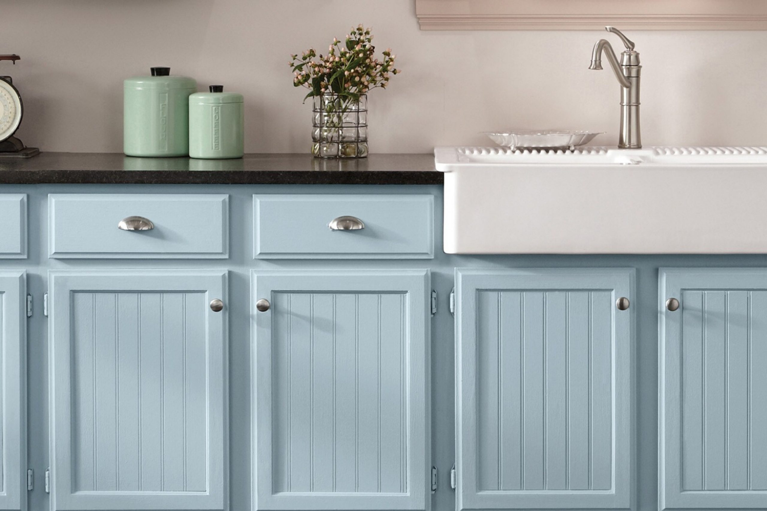
How to Use SW 6219 Rain In Your Home?
SW Rain is an incredibly versatile color, capable of transforming any room in your home. Its soothing gray-blue tones make it suitable for spaces where calm and tranquility are desired, such as bedrooms and bathrooms.
In living and dining rooms, it creates a neutral backdrop that allows furnishings and artworks to stand out. This color fits well with contemporary, coastal, Scandinavian, and transitional interior design styles, among others. Below, you can read how it works in different rooms.
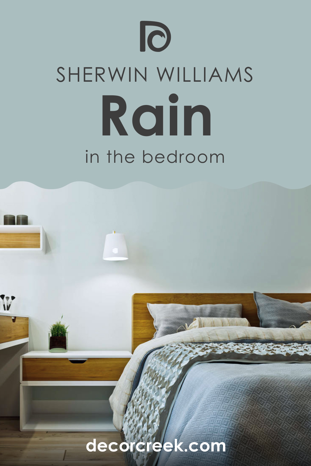
How to Use SW 6219 Rain in the Bedroom?
The serene ambiance of SW Rain makes it a prime choice for bedrooms. Its cool undertones promote rest and relaxation, making it perfect for a calming retreat at the end of the day. Complement it with soft whites for a clean, airy feel, or add a dash of drama with dark woods and rich fabrics.
How to Use SW 6219 Rain in the Bathroom?
In a bathroom, SW Rain contributes to a spa-like ambiance. Pair it with crisp whites for a classic look or with warmer hues for a cozier feel. Metallic accents in chrome or gold can add a touch of luxury.

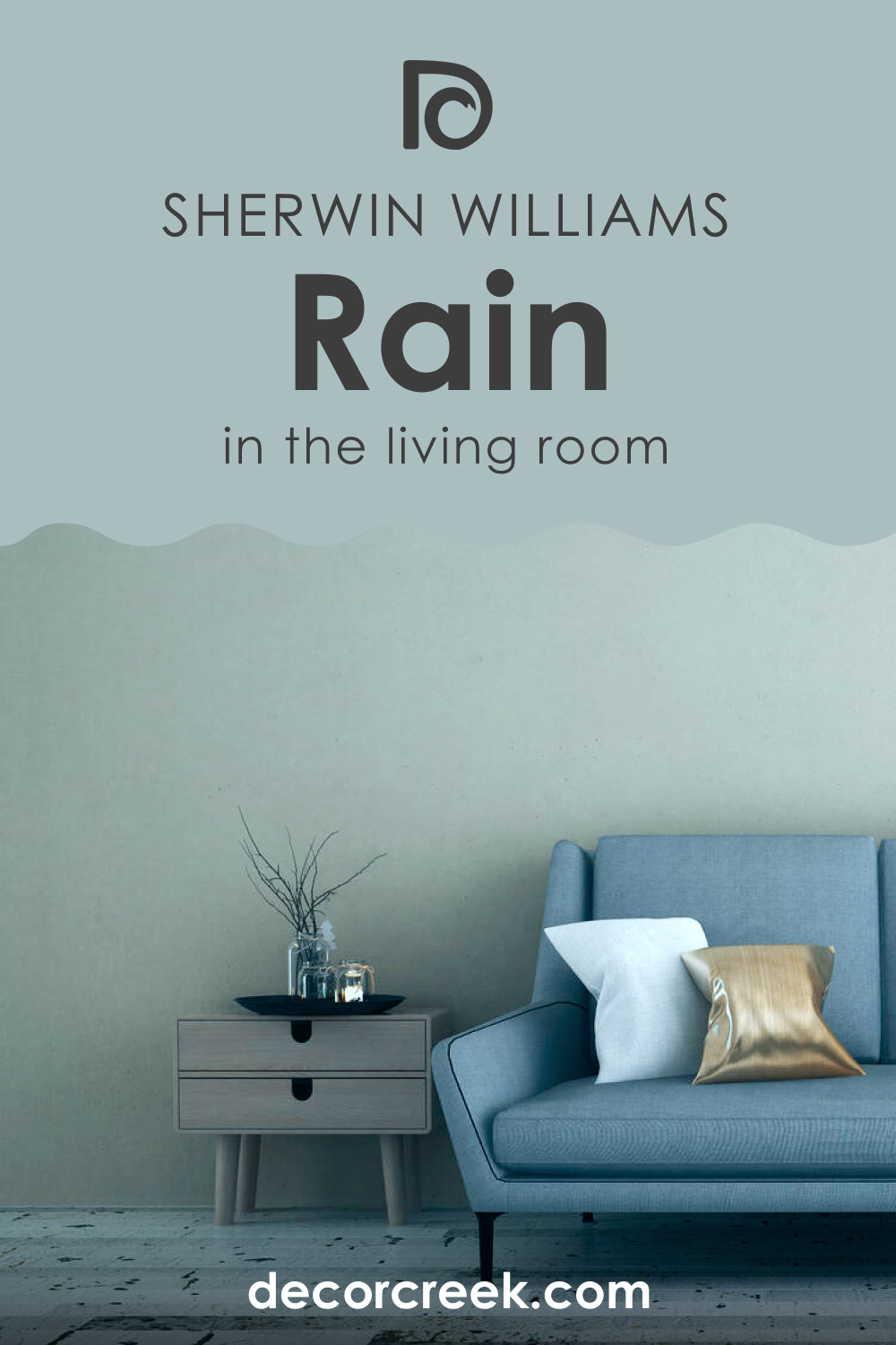
How to Use SW 6219 Rain in the Living Room?
In living rooms, SW Rain creates a soothing yet sophisticated backdrop. Complement with warmer neutrals to create a welcoming space, or use bold colors for a pop of contrast. The color can adapt beautifully to various lighting conditions, playing a versatile role in your home’s central gathering space.
How to Use SW 6219 Rain for an Exterior?
SW Rain also makes for an excellent exterior color. It blends well with natural surroundings and looks striking against white trims, lending your home a timeless, elegant curb appeal. Stone accents, wooden details, and metal finishes all look stunning when paired with this color.

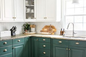
How to Use SW 6219 Rain in the Kitchen?
The kitchen, the heart of the home, can greatly benefit from the calm aura of Rain. Whether on walls or cabinets, this hue provides a tranquil yet refreshing vibe. It pairs beautifully with white or wooden cabinets and stainless steel appliances, creating a balanced and inviting space.

Comparing SW 6219 Rain With Other Colors
Sherwin-Williams’ SW 6219 Rain is a soft, muted gray with a touch of blue undertone. Its subtle hue is versatile, making it a fantastic choice for numerous interior spaces. Now, let’s compare SW Rain with six other colors:
SW 6219 Rain vs. SW 6218 Tradewind
Tradewind is a soft, muted blue with a hint of gray. While SW Rain leans more towards gray, Tradewind presents a slightly stronger blue undertone, bringing a hint of the sky indoors.

SW 6219 Rain vs. SW 6217 Topsail
SW Topsail is a pale, almost pastel-like blue. It is lighter and less gray than SW Rain, providing a fresher, airy feel to the space.

SW 6219 Rain vs. SW 6224 Mountain Air
SW Mountain Air is a blue-green color that feels more vibrant and natural compared to SW Rain. The subtle green undertone sets it apart, making it a unique choice for a tranquil room.

SW 6219 Rain vs. SW 6230 Rainstorm
SW Rainstorm is a much darker shade compared to SW Rain, with strong blue undertones. Where SW Rain provides a subtle, soothing ambiance, SW Rainstorm offers a more dramatic, intense look.
SW 6219 Rain vs. SW 6226 Languid Blue
SW Languid Blue leans much more towards blue than Rain. It’s a true soft blue that feels calming and serene, less muted and more vivid compared to Rain.
SW 6219 Rain vs. SW 6258 Tricorn Black
SW Tricorn Black is at the opposite end of the spectrum from SW Rain, being a deep, true black. SW Rain’s soft, muted quality offers a more gentle, calming vibe, whereas SW Tricorn Black provides a bold, dramatic contrast.
Each of these colors has its own unique characteristics, and while Rain is a muted, versatile color that can be used in various settings, these comparisons show how subtly changing the color’s intensity and undertones can affect the overall mood and aesthetic of a space.
Conclusion
SW 6219 Rain is a versatile, calming color that provides a perfect blend of gray and blue. Its cool undertones make it a go-to color for creating serene spaces, and its balanced light reflectance value ensures that it won’t overwhelm a room.
Whether used in a bedroom, bathroom, living room, or kitchen, SW Rain adds tranquility and sophistication. With its ability to blend with various color schemes and adapt to different lighting conditions, SW Rain is indeed a remarkable choice for any home.
Ever wished paint sampling was as easy as sticking a sticker? Guess what? Now it is! Discover Samplize's unique Peel & Stick samples.
Get paint samples
Frequently Asked Questions
⭐What kind of rooms work best with SW 6219 Rain?
SW 6219 Rain is incredibly versatile and works well in any room. Its tranquil and serene quality makes it particularly suitable for bedrooms, bathrooms, or any space where a calming ambiance is desired. In common areas like living rooms, it serves as a sophisticated, neutral backdrop that enhances other design elements.
⭐What are the undertones of SW 6219 Rain?
The primary undertones of SW 6219 Rain are gray and blue. In certain lighting conditions, you may also notice a very subtle hint of green.
⭐What trim color should I use with SW 6219 Rain?
Various shades of white work well as trim colors for SW 6219 Rain. SW 7006 Extra White provides a crisp, modern contrast, while SW 7008 Alabaster offers a softer look. SW 7011 Natural Choice can also be used for a more subtle, warm contrast.
⭐Can I use SW 6219 Rain for my home's exterior?
Yes, SW 6219 Rain is an excellent choice for exteriors. Its serene color can blend beautifully with natural surroundings and provides a striking contrast against white trims, contributing to an elegant curb appeal.