Black
Black Blue
Blue Brown
Brown Gray
Gray Green
Green Neutral
 Orange
 White
White Yellow
As you ponder refreshing your room with a new color, consider SW 6214 Underseas by Sherwin Williams. This unique shade of green has a subtle depth that complements a variety of decor styles, making it an adaptable choice for any room.
Whether you’re looking to update your living room, bedroom, or even your kitchen, Underseas offers a soothing presence that enhances the environment without dominating it.
It pairs well with natural elements like wood and stone, and can also stand up to bolder colors if you’re aiming for a more dynamic look.
As you plan your next painting project, think about the calm and inviting atmosphere Underseas could bring into your home, potentially turning an ordinary room into your new favorite room.
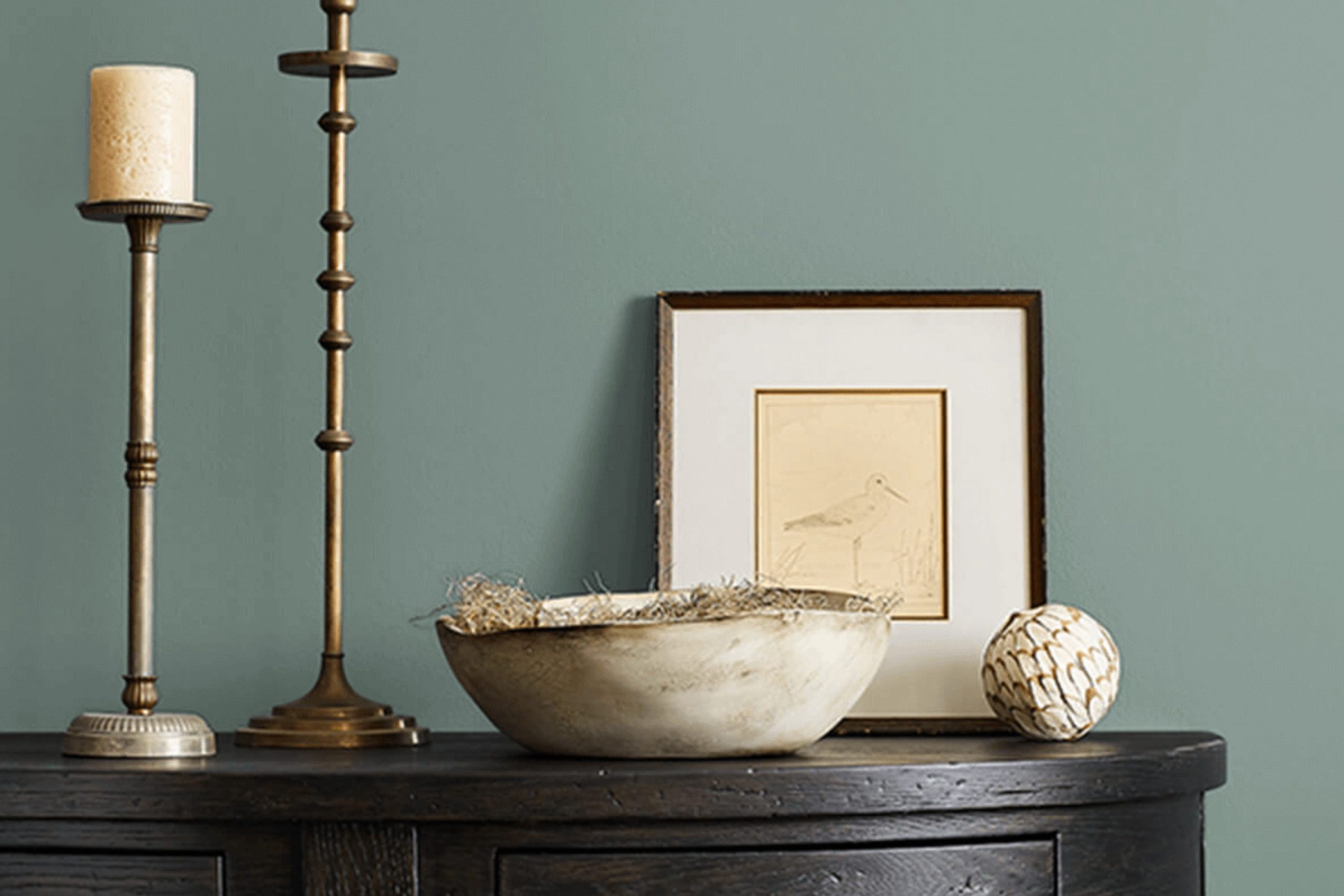
What Color Is Underseas SW 6214 by Sherwin Williams?
Underseas by Sherwin Williams is a rich, deep green shade that draws inspiration from the mysterious charm of the ocean’s depths. This color is not just a reflection of nature but also brings a grounded, soothing feel to any room it adorns. Its depth and intensity allow it to stand strong as a primary color within a room but also gives flexibility to act as an accent against more neutral backgrounds.
This particular green works exceptionally well in interior styles that seek a connection to nature, like rustic or coastal designs. It can also add a vintage flair to traditional rooms or bring a touch of drama to modern and contemporary areas. Underseas pairs beautifully with natural wood finishes—from light, sandy oak to darker, richer walnut. These combinations can evoke the feeling of a forest floor or driftwood washed ashore, enhancing the naturalistic feel of the room.
For textures, Underseas harmonizes well with soft, plush fabrics like velvet or wool in décor items such as throw pillows or blankets. This pairing can create an inviting and comfortable atmosphere. To balance the richness of Underseas, incorporating elements like wicker, linen, or even smooth leather can add variety and contrast, enriching the tactile experience of the room.
Overall, Underseas offers an adaptable palette option that brings warmth and earthiness to interiors, perfect for creating a welcoming and grounded environment.

decorcreek.com
Is Underseas SW 6214 by Sherwin Williams Warm or Cool color?
Underseas by Sherwin Williams is a unique greenish-blue shade that can have a calming effect when used in the home. This paint color leans more towards green, offering a natural and cozy feel which is excellent for creating a relaxed environment.
Whether you choose to paint an entire room with it or just one accent wall, Underseas brings a touch of nature indoors. It works well in rooms where you want to promote relaxation, such as bedrooms, bathrooms, and living rooms.
In rooms with lots of natural light, Underseas appears more vibrant and can add a refreshing burst of color without being too bold. When combined with soft neutrals like beige, white, or light gray, it helps to balance out its boldness, making the room feel grounded and comfortable. Accessories in earth tones or simple wood furniture complement it nicely, enhancing its down-to-earth vibe. Underseas is adaptable enough to suit various decorating styles, from casual to more traditional looks.
Undertones of Underseas SW 6214 by Sherwin Williams
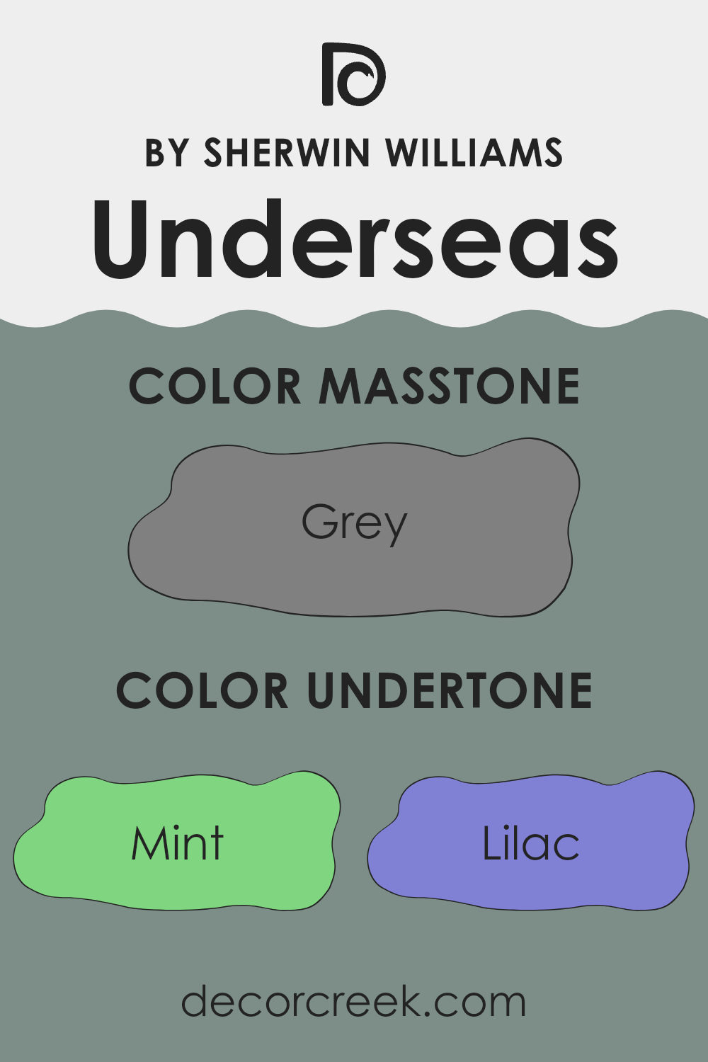
UnderseasSW 6214 is a unique paint color that can strongly influence the ambiance of any room due to its diverse undertones. Undertones are subtle hues that, although not immediately noticeable, can significantly impact how we perceive the primary color. In the case of Underseas, the undertones include a wide spectrum from mint and lilac to navy and dark gray.
This variety of undertones means that this color can look slightly different depending on the lighting and surrounding colors. For instance, in a room with lots of natural light, the lighter undertones like mint or pale pink might make the walls appear softer and more inviting. On the other hand, in a dimly lit room, darker undertones like navy or dark green could give the walls a more grounded, solid feel.
When used on interior walls, the undertones in Underseas can create a dynamic effect. Lighter furniture or decor might pull out the lighter, vibrant undertones like light turquoise or pale yellow, making the room feel lively. Conversely, darker furniture might highlight darker undertones like violet or dark turquoise, lending a more enclosed, cozy feel.
Ultimately, the diverse undertones of this paint make it adaptable but also complex. The choice of complementary colors and room lighting can either highlight or soften these undertones, significantly affecting the mood and style of the room. This makes Underseas a great option for someone who wants flexibility and subtle variety in their color choices for interior walls.
decorcreek.com
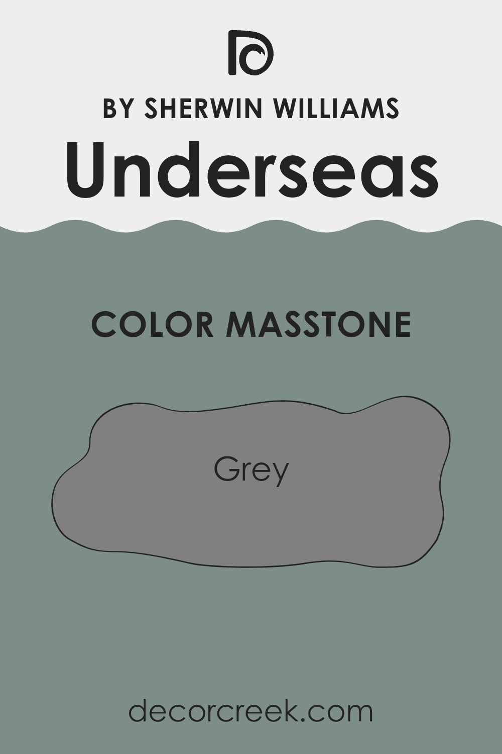
What is the Masstone of the Underseas SW 6214 by Sherwin Williams?
Underseas 6214 by Sherwin Williams has a masstone, or basic, undiluted color, of gray that lends it an adaptable and neutral quality. This characteristic makes it extremely useful in home decor, where it can easily fit into a variety of decorating styles and rooms.
Gray as a foundational color doesn’t overpower other hues. Instead, it allows for bold accents, like bright yellows or deep blues, to stand out. In a room, gray can help balance brighter furnishings or artworks, creating a cohesive look that feels well-planned and calming.
In rooms that need a subtle touch of color without being too bold, this shade of gray can provide a background that unites different decor elements. For instance, in bedrooms, it can help to create a restful atmosphere while still leaving room for personal expression through accessories and bedding. Overall, its neutral gray base makes it a practical choice for any area in the home.
decorcreek.com
How Does Lighting Affect Underseas SW 6214 by Sherwin Williams?
Lighting plays a critical role in how we perceive colors. The same color can appear differently depending on the type of light it’s under. For natural light, colors change throughout the day due to the shifting position of the sun. In artificial lighting, the color temperature of the bulbs greatly influences the appearance of color in a room.
Consider the color Underseas SW 6214 by Sherwin Williams. This is a deep, vibrant green-blue hue that carries a sense of depth and richness. Under artificial light, particularly warmer tones like incandescent bulbs, this color might look more muted and slightly greener, giving a cozier feel to the room. Fluorescent lighting, which is cooler, can bring out the bluer part of the paint, making the room feel fresher and more lively.
Natural light, however, has a broader spectrum and can show this color in its truest form. In rooms that face north, which receive less direct sunlight and have more shadow, Underseas might appear darker and more profound. This can either enhance a room’s cozy atmosphere or make it seem smaller.
In south-facing rooms, where light is abundant throughout the day, this color will be vibrant and true to its hue, showing all the subtleties of its green and blue tones. This could make the room feel lively and energetic, ideal for living areas.
East-facing rooms get bright light in the morning when the color can look particularly bright and fresh. As the day progresses and the light fades, the color can take on a softer and warmer appearance. This makes it ideal for rooms used predominantly in the morning, like kitchens and breakfast nooks.
West-facing rooms, on the other hand, have the opposite effect. They receive the most intense light in the afternoon to evening, which means the color can shift from a softer tone in the morning to a bright, vivid shade in the evening.
Understanding how light affects this specific shade can help in deciding where to paint it to enhance the overall mood and function of a room.

decorcreek.com
What is the LRV of Underseas SW 6214 by Sherwin Williams?
LRV stands for Light Reflectance Value, a measure used to indicate how much light a paint color reflects or absorbs. The scale for LRV runs from zero, which absorbs all light and appears black, to the highest value where all light is reflected, appearing white.
This number is crucial when choosing paint colors because it affects how light or dark a color looks on your walls. Higher LRV values mean the color will appear lighter and can make a room feel more open and airy. Conversely, lower LRV values mean the color is darker and can make rooms feel more enclosed or cozy.
With an LRV of 25.411, Underseas is on the darker side, meaning it absorbs more light than it reflects. This can influence the atmosphere of a room significantly, making it feel more enclosed and cozy, ideal for creating an intimate room. In rooms with less natural light, this color might seem even darker and can enhance a moody vibe. However, in well-lit rooms, or when combined with good artificial lighting and contrasting décor, this deep hue can add richness and depth to the setting without making it feel too cramped.

decorcreek.com
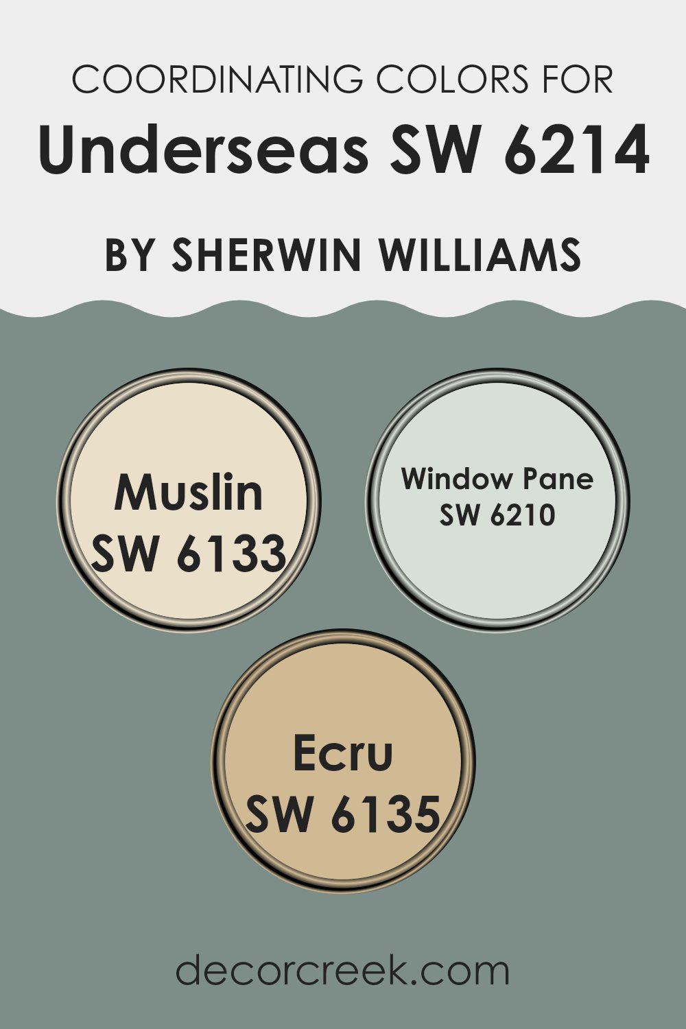
Coordinating Colors of Underseas SW 6214 by Sherwin Williams
Coordinating colors are selected shades that harmonize well with a primary color, enhancing the overall aesthetic of a room without clashing. When used skillfully, these coordinating shades can bring balance and cohesion to an interior design. For instance, taking a primary shade like a rich teal, one can choose coordinating colors that either contrast nicely or complement the base tone subtly, achieving a pleasing ensemble in decor.
SW 6133 – Muslin is a soft, neutral tan that provides a calm and gentle contrast to more vibrant colors, making it an excellent choice for creating a balanced look. SW 6210 – Window Pane is a pale, airy blue with just enough depth to add a refreshing splash of color without being too bold.
Lastly, SW 6135 – Ecru offers a warmer, creamy hue that pairs beautifully with stronger colors, lending a cozy feel to any room. These shades are particularly effective in bringing out the best features of the primary color, enhancing its depth and richness without competing for attention. By integrating these coordinating colors, one can achieve a harmonious and appealing room.
You can see recommended paint colors below:
- SW 6133 Muslin
- SW 6210 Window Pane
- SW 6135 Ecru
What are the Trim colors of Underseas SW 6214 by Sherwin Williams?
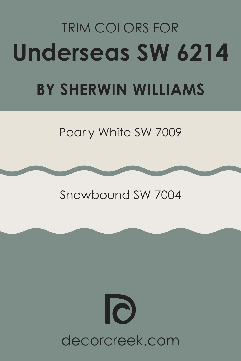
Trim colors are the accents used to highlight or define the edges of walls, door frames, window frames, and other architectural features in a room. When applying a striking shade like Underseas SW 6214 by Sherwin-Williams, which is a deep and vibrant teal, selecting the right trim colors can significantly enhance the overall appearance.
Trim colors help in creating a clear visual separation that makes the main wall color stand out more distinctly. For Underseas, using lighter trim colors like SW 7009 – Pearly White or SW 7004 – Snowbound can create a clean and pleasant contrast. This contrast not only breaks the monotony but also frames the bold wall color, making the room feel more organized and neatly arranged.
Pearly White SW 7009 is a soft and gentle white with a subtle warmth that makes it adaptable and welcoming, ideal for softening the intensity of darker hues without dominating the room. Snowbound SW 7004, on the other hand, is a cooler white with slight gray undertones that offers a modern and fresh look, providing a crisp border that can help to visually brighten areas that receive less natural light. Both colors, by reflecting more light, can make a room feel larger and more open, acting as a perfect complement to the rich depths of Underseas, ensuring the room feels balanced and aesthetically pleasing.
You can see recommended paint colors below:
Colors Similar to Underseas SW 6214 by Sherwin Williams
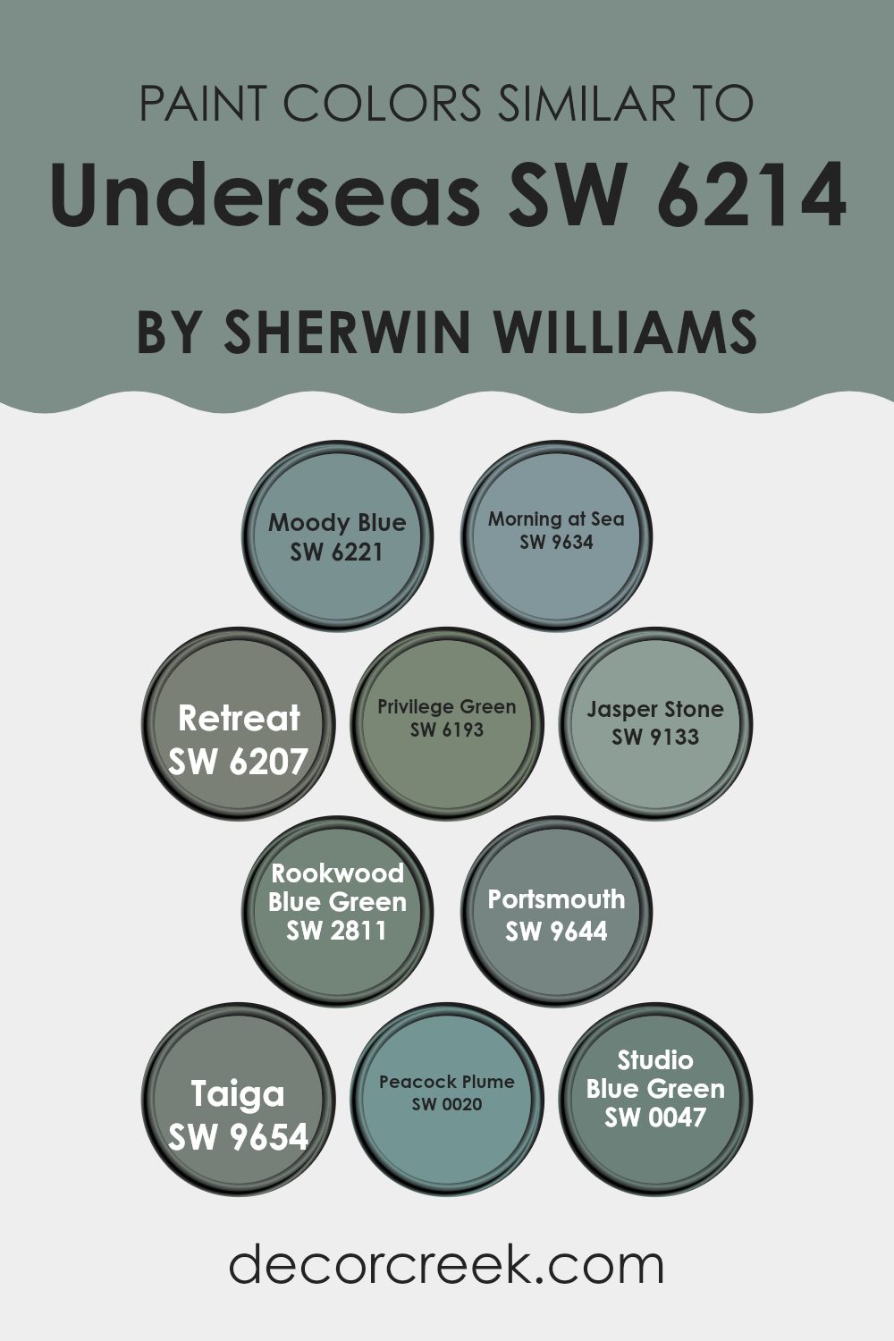
Similar colors are vital in design because they create a harmonious and cohesive look. By using shades that are closely related, such as those similar to Underseas by Sherwin Williams, one can achieve a subtle yet impactful visual experience. These colors are derived from a similar palette, offering a soothing blend without stark contrasts, which makes them perfect for creating a relaxing and inviting atmosphere in any room.
Starting with Moody Blue, this color brings a moody yet comforting tone that resembles a cloudy sky. Morning at Sea appears as a fresh dawn blue, adding a hint of early morning sky to interiors. Retreat is a deep, muted green, providing a backdrop that suggests seclusion and restfulness. Privilege Green has a more pronounced green hue, reflecting a lush and verdant feel.
Jasper Stone offers a deeper, stonier hue that can ground a room’s aesthetic. Rookwood Blue Green is reminiscent of a dense forest under a rainy sky, enriching rooms with its earthy depth. Portsmouth aligns closely with the maritime feel, reflective of historic harbor waters. Taiga mimics the dense coniferous forests, bringing nature indoors with its deep green-blue tone.
Peacock Plume stands out with its vibrant, peacock-inspired blue-green, adding a dramatic flair to any room. Lastly, Studio Blue Green, with its artist’s studio vibe, offers an imaginative and fresh perspective to interiors. Each of these colors can work beautifully on walls, creating rooms that are cohesive yet distinct, reflecting a calm and collected ambiance.
You can see recommended paint colors below:
- SW 6221 Moody Blue
- SW 9634 Morning at Sea
- SW 6207 Retreat
- SW 6193 Privilege Green
- SW 9133 Jasper Stone
- SW 2811 Rookwood Blue Green
- SW 9644 Portsmouth
- SW 9654 Taiga
- SW 0020 Peacock Plume
- SW 0047 Studio Blue Green
Colors that Go With Underseas SW 6214 by Sherwin Williams
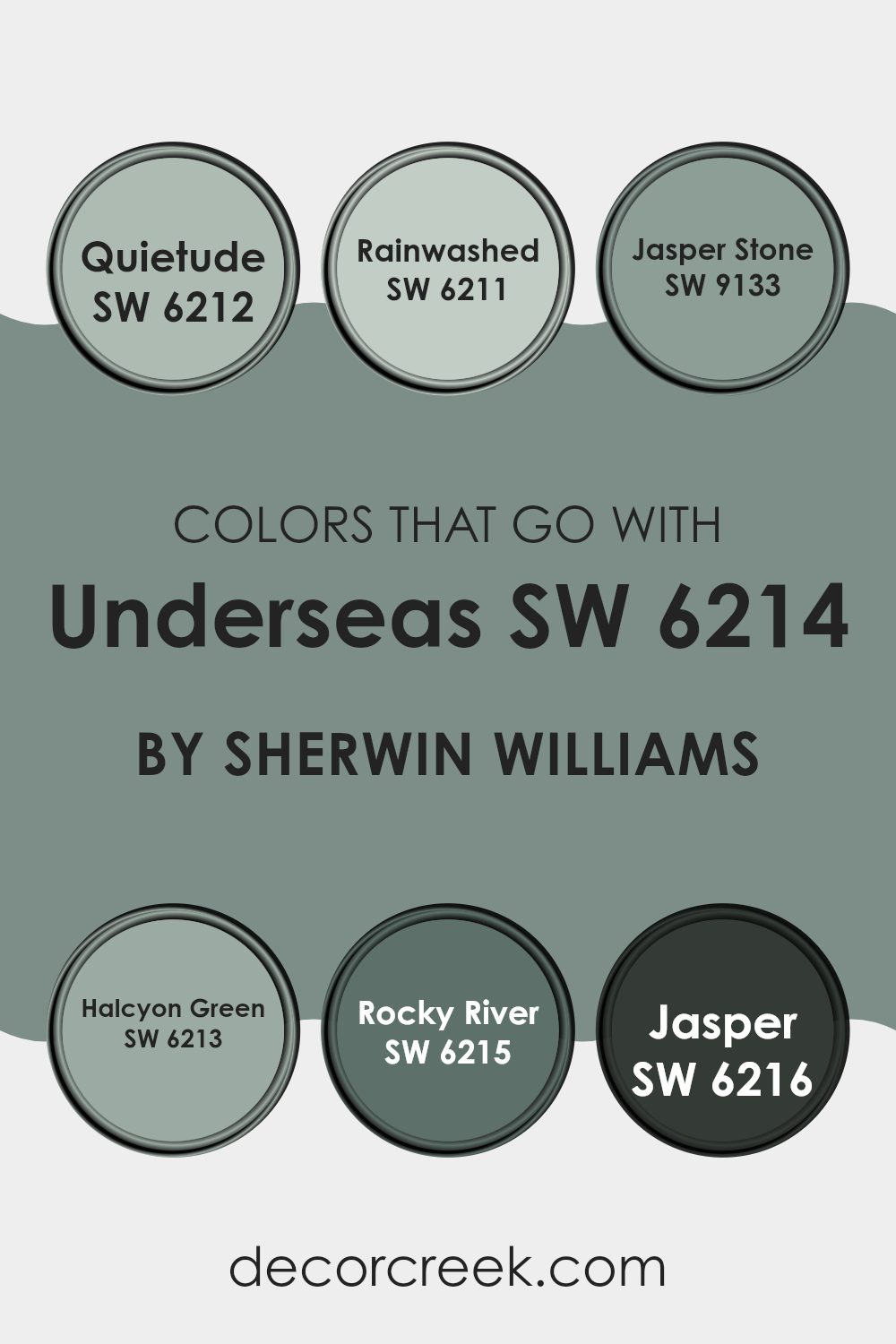
Choosing the right colors to complement Underseas SW 6214 by Sherwin Williams is crucial because it helps create a cohesive and appealing look in any room. Underseas SW 6214 is a deep, vibrant teal that can act as a stunning accent or bold base color. Pairing it with harmonious shades can enhance the overall atmosphere of a room, balancing out the intensity of the teal with lighter or darker tones to suit various design styles and personal tastes.
For example, Quietude SW 6212 is a soft, muted gray-green that brings a fresh and calming feel when paired with the deeper Underseas. This makes it an excellent choice for creating a relaxed environment. Rainwashed SW 6211 has a breezy, light blue-green hue that injects a sense of airiness and light, contrasting beautifully against the richer Underseas.
Jasper Stone SW 9133 offers a unique blend of green with gray undertones, grounding the vibrant teal with its earthier, subdued quality. Halcyon Green SW 6213 leans towards a more medium green, providing a natural, refreshing touch that pairs well with the aquatic vibe of Underseas.
Rocky River SW 6215, a darker green-blue, reinforces a robust, coordinated look that complements the depth of Underseas without competing for attention. Lastly, Jasper SW 6216, a rich, darker earth tone, adds a strong foundational element that works well in balancing the brightness of Underseas, perfect for creating a more grounded feel in the design.
You can see recommended paint colors below:
- SW 6212 Quietude
- SW 6211 Rainwashed
- SW 9133 Jasper Stone
- SW 6213 Halcyon Green
- SW 6215 Rocky River
- SW 6216 Jasper
How to Use Underseas SW 6214 by Sherwin Williams In Your Home?
Underseas by Sherwin Williams is a rich teal paint color that brings a sense of calmness and coziness to any room. This color can be used in various ways around your home. It works well in a living room or bedroom, providing a soothing backdrop that makes the room feel more inviting. You can paint all the walls in this shade for a bold look, or just one accent wall to add a splash of color.
In a bathroom, using Underseas can create a spa-like atmosphere, making your daily routines more enjoyable. It’s also great for a kitchen, where it can add a lively touch to the room, especially when paired with white cabinets or metallic fixtures.
For those who like DIY projects, painting old furniture with this shade can give it a fresh, new look. Overall, Underseas is adaptable and can easily be matched with different styles and home decor elements.
Underseas SW 6214 by Sherwin Williams vs Retreat SW 6207 by Sherwin Williams
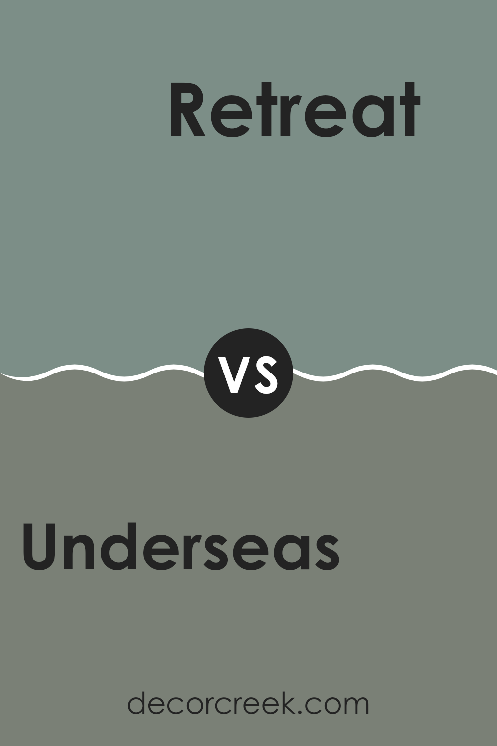
“Underseas” and “Retreat” by Sherwin Williams are two shades of green with unique qualities. “Underseas” is a darker, rich teal with a vivid and lively feel. It brings to mind the deep parts of the ocean and has an energizing effect.
On the other hand, “Retreat” is a softer and more muted shade, leaning more toward gray-green. This color is more relaxing and subtle, making it a great choice for a calm room. Both colors provide a touch of nature, but while “Underseas” is bold and dramatic, “Retreat” is more reserved and understated.
These differences make “Underseas” suitable for accent walls or statement areas, whereas “Retreat” works well for larger rooms to create a peaceful atmosphere.
You can see recommended paint color below:
Underseas SW 6214 by Sherwin Williams vs Studio Blue Green SW 0047 by Sherwin Williams
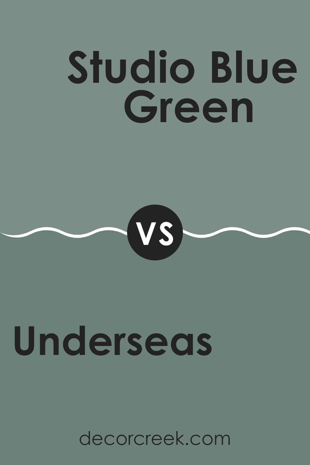
Underseas and Studio Blue Green are two distinct colors offered by Sherwin Williams, each creating a unique ambiance in interior rooms. Underseas is a darker, deeper shade that resembles the depths of the ocean. It gives off a strong sense of depth and richness, making it ideal for creating a cozy and inviting atmosphere in rooms that are meant for relaxation, like living rooms or bedrooms.
On the other hand, Studio Blue Green is relatively lighter and leans more towards a fresher, crisp vibe. This color can be described as a blend of blue and green with a touch of softness, perfect for rooms that aim for a refreshing but grounded feel. It works well in kitchens, bathrooms, or any area that benefits from a clean and airy appearance.
Both colors offer their own unique aesthetic but cater to different tastes and uses within home décor. Whether one prefers the comforting feel of Underseas or the refreshing tone of Studio Blue Green depends on personal style and the room’s function.
You can see recommended paint color below:
Underseas SW 6214 by Sherwin Williams vs Jasper Stone SW 9133 by Sherwin Williams
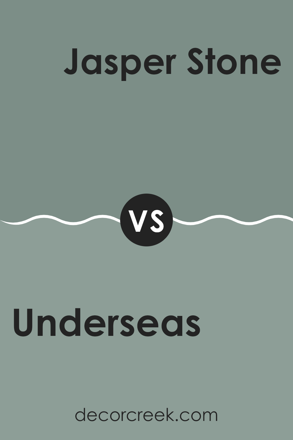
Underseas and Jasper Stone are two distinct colors from Sherwin Williams, each with its unique charm. Underseas is a deep, greenish-blue shade that resembles the dark parts of the ocean. This color is great for creating a cozy, more intimate feeling in a room because of its dark and rich tone.
On the other hand, Jasper Stone is a softer, muted green with hints of gray. It offers a more relaxed and gentle vibe, making it suitable for bringing a calm and airy feel to rooms.
When comparing these two, Underseas is the darker and more intense color, potentially making rooms feel smaller but more snug, whereas Jasper Stone is lighter and can make rooms appear larger and more open. Depending on your room’s needs and the atmosphere you want to create, you could choose the boldness of Underseas for a dramatic touch or the softness of Jasper Stone for a soothing environment.
You can see recommended paint color below:
- SW 9133 Jasper Stone
Underseas SW 6214 by Sherwin Williams vs Taiga SW 9654 by Sherwin Williams
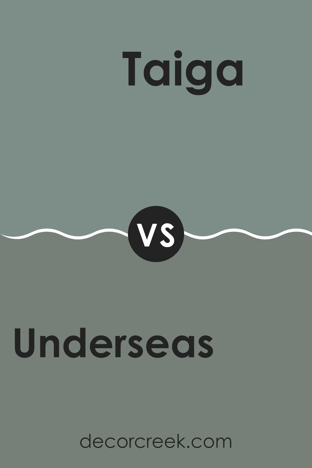
Underseas and Taiga, both by Sherwin Williams, offer unique shades for different decorative moods. Underseas is a deep, vibrant green that brings to mind lush forests and ocean depths. It has a strong presence and can make any room feel full of life and energy.
Taiga, on the other hand, is a much softer, muted green with subtle gray undertones. This color is perfect for creating a calm and gentle atmosphere in a room, making it ideal for rooms where you want to relax and unwind.
While Underseas has an energizing effect, Taiga provides a backdrop that’s easy on the eyes, offering a more understated and gentle vibe. These colors could complement each other well in a single room or be used separately to achieve different looks. Underseas works well in areas that benefit from a pop of color, such as accent walls or statement furniture pieces, whereas Taiga is great for larger rooms where a soothing and gentle color is preferred.
You can see recommended paint color below:
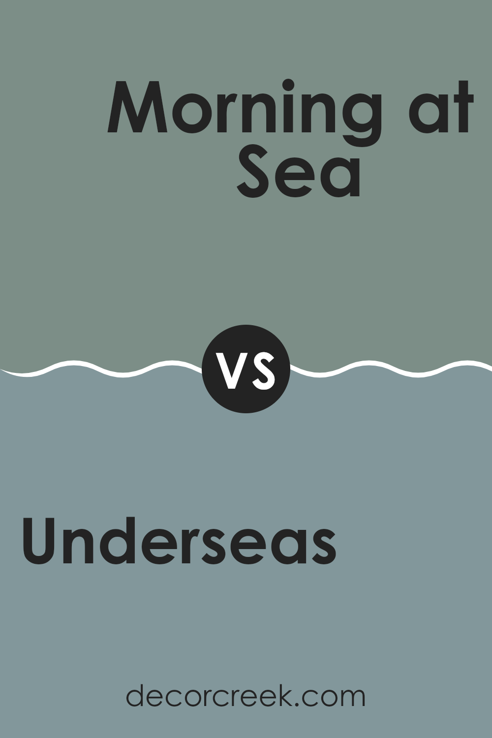
Underseas SW 6214 by Sherwin Williams vs Morning at Sea SW 9634 by Sherwin Williams
Underseas and Morning at Sea are both paint colors by Sherwin Williams that capture unique shades of teal and aqua, respectively. Underseas is a deeper, darker shade, reminiscent of the deep ocean. It adds a strong and quiet emphasis to rooms, perfect for creating a cozy, secure atmosphere in a room.
In contrast, Morning at Sea is lighter and brighter, much like the aqua hues seen at the break of dawn over the ocean. It brings a fresh and airy feel, making a room look more open and light-filled.
While Underseas might be favored for accent walls or smaller areas to make them feel more intimate, Morning at Sea works wonderfully in larger rooms or areas that aim to feel more spacious and welcoming. Both colors reflect the beauty of the sea but offer different vibes, with Underseas feeling more enclosed and Morning at Sea offering a sense of openness.
You can see recommended paint color below:
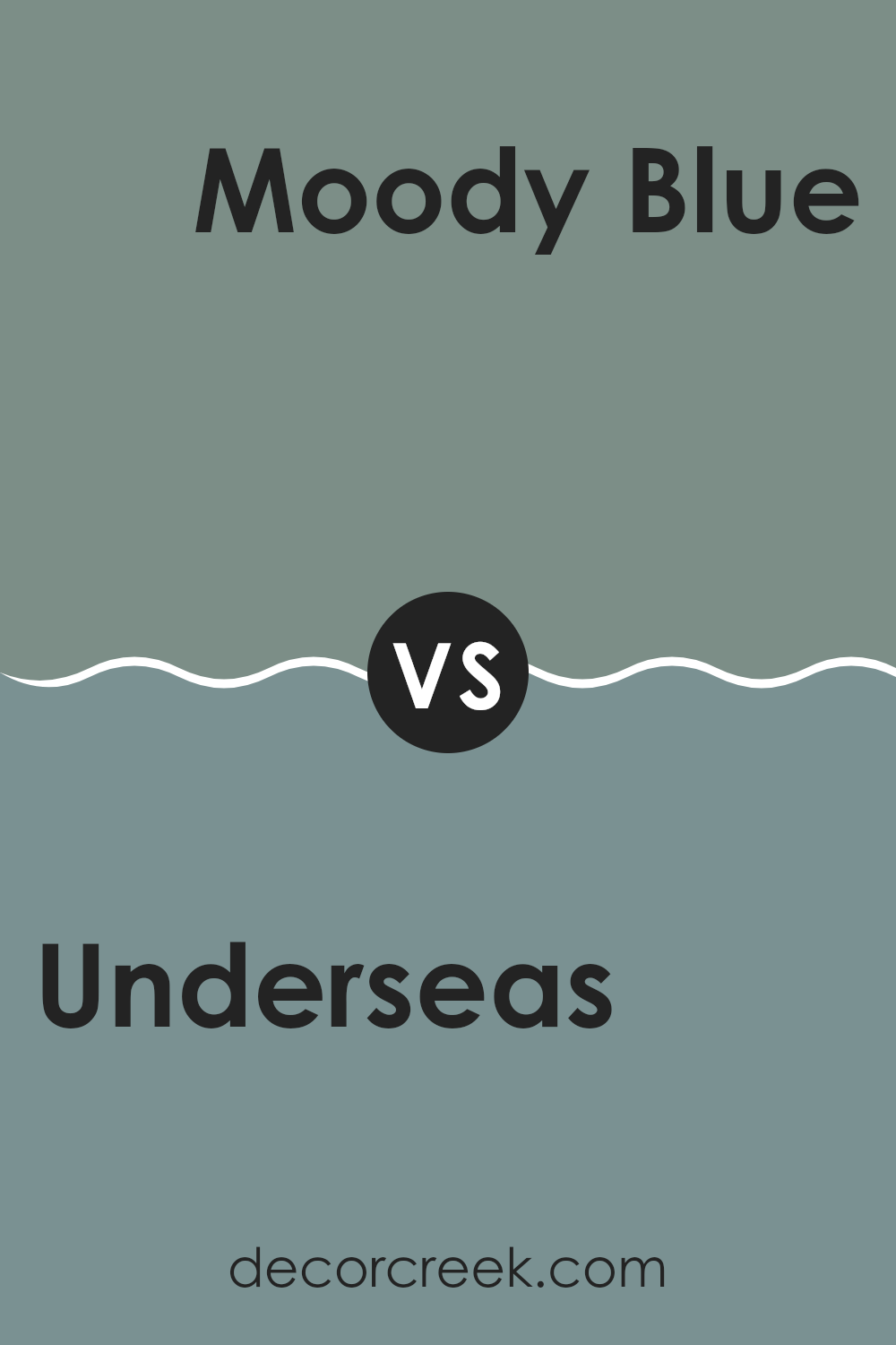
Underseas SW 6214 by Sherwin Williams vs Moody Blue SW 6221 by Sherwin Williams
Underseas and Moody Blue are both paint colors from Sherwin Williams, each offering a unique vibe to any room. Underseas is a deeper, greenish-blue hue that resembles the murky depths of the ocean. It’s a strong color, often giving a room a cozy and grounded feeling. It works well in rooms where you want to add a touch of nature-inspired calm without being too dark.
On the other hand, Moody Blue is slightly lighter compared to Underseas and leans more towards a true blue with a soft gray undertone. This color feels fresher and can brighten rooms while still keeping a touch of moodiness. It’s a great choice if you want to add a bit of color to a room without being too bold.
Both colors pair well with neutral tones, but their different undertones could inspire various decor styles and preferences. Underseas fits well in earthy, natural settings, while Moody Blue matches rooms with a cleaner, more airy design.
You can see recommended paint color below:
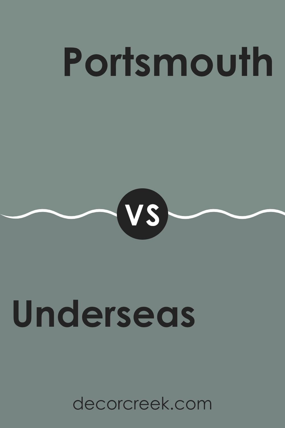
Underseas SW 6214 by Sherwin Williams vs Portsmouth SW 9644 by Sherwin Williams
Underseas and Portsmouth are both beautiful colors by Sherwin Williams that bring distinct vibes to any room. Underseas is a darker shade, resembling the deep, mysterious parts of the ocean. It’s a rich, greenish-blue color that adds a sense of depth and coziness to a room.
On the other hand, Portsmouth is a lighter, more muted green. It has a subtle, soft appearance that gives a room a fresh and calm feeling, without being too bright or dominating the room.
While Underseas creates a bold and cozy atmosphere, perfect for making large rooms feel more intimate, Portsmouth offers a softer approach that can make small rooms seem larger and more open. Each color has its unique appeal and can be used effectively depending on the mood you want to create and the size of the room. Whether you want the deep, immersive feel of Underseas or the gentle, airy touch of Portsmouth, both bring a unique style to the home.
You can see recommended paint color below:
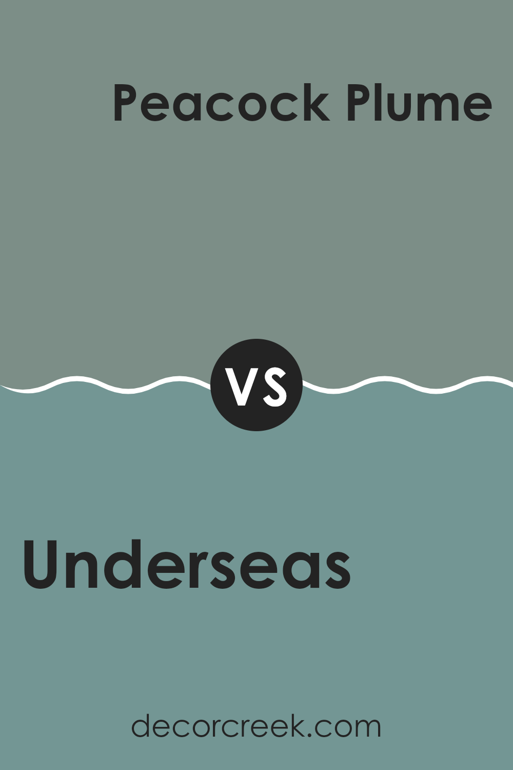
Underseas SW 6214 by Sherwin Williams vs Peacock Plume SW 0020 by Sherwin Williams
Underseas SW 6214 and Peacock Plume SW 0020 by Sherwin Williams are two distinct shades of green, offering unique vibes for different rooms. Underseas is a deeper, muted green with a grayish tone, making it an excellent choice for creating a cozy and calm atmosphere. This color works well in rooms where you want to relax, like bedrooms or living rooms.
On the other hand, Peacock Plume is a brighter and more vibrant green with a subtle hint of blue. This color is livelier and can add a fresh splash of energy to a room. It’s great for areas where you want a cheerful and inviting feel, such as kitchens and bathrooms.
In summary, Underseas offers a mellow and soothing feel with its darker hue, perfect for quiet, peaceful areas, while Peacock Plume is more suitable for rooms that benefit from a bright and energetic ambiance. Choose according to the mood you wish to create in your room.
You can see recommended paint color below:
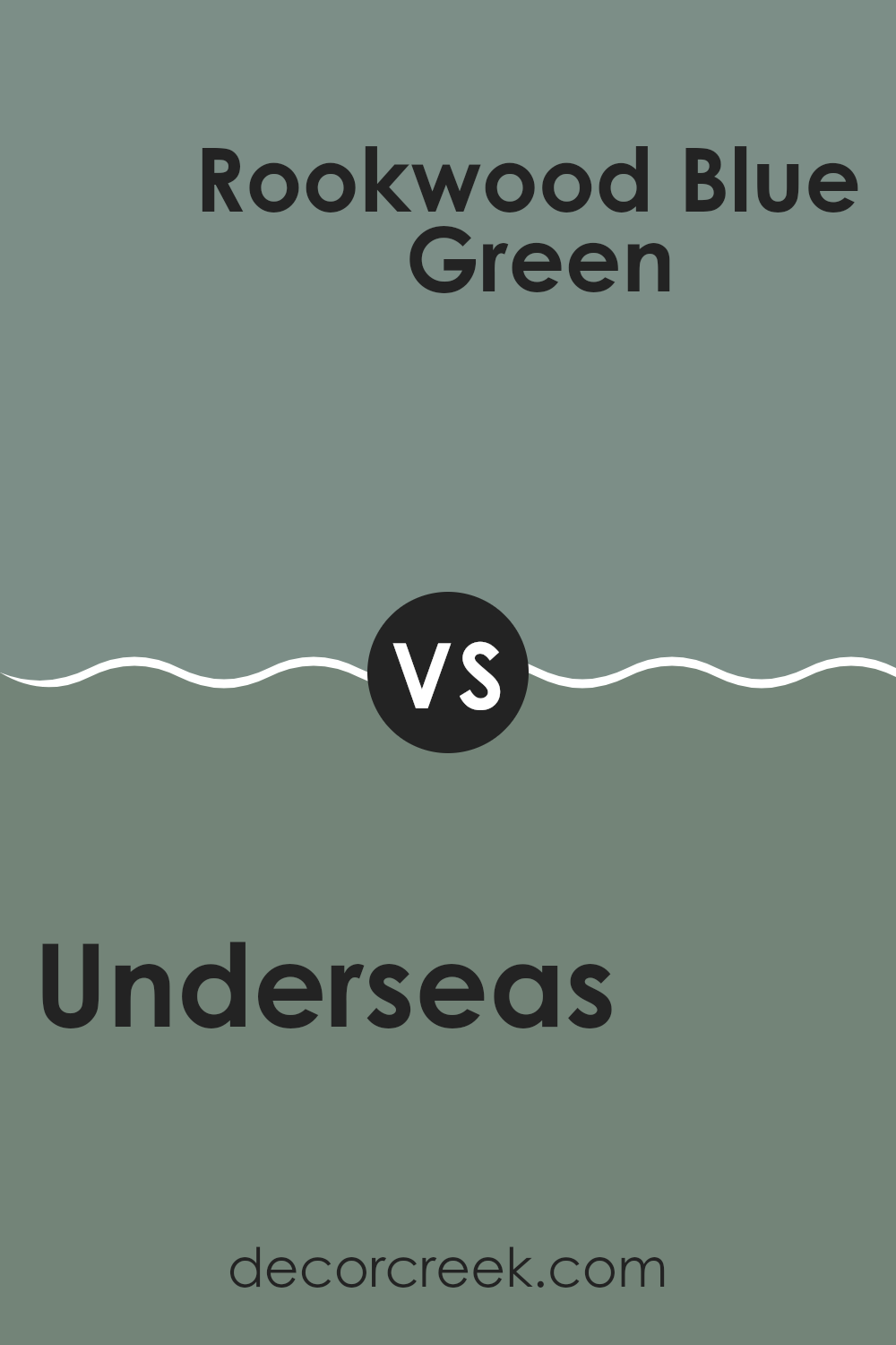
Underseas SW 6214 by Sherwin Williams vs Rookwood Blue Green SW 2811 by Sherwin Williams
Underseas and Rookwood Blue Green are two colors by Sherwin Williams that both draw inspiration from nature. Underseas is a darker, deep green that mimics the dark and mysterious depths of the ocean. It lends a robust and grounding feel to rooms, perfect for creating a cozy and secure atmosphere in rooms.
On the other hand, Rookwood Blue Green is lighter and leans more towards a blue-green hue, reminiscent of a calm lakeside or the surface of a calm sea. This color is refreshing and has a calming effect, making it ideal for rooms where you want to relax and refresh.
Both colors work well in various settings but produce different moods: Underseas is richer and more enveloping, while Rookwood Blue Green is airier and more soothing. They could even complement each other in a room, using Rookwood Blue Green as a base and Underseas for accents.
You can see recommended paint color below:
- SW 2811 Rookwood Blue Green
Underseas SW 6214 by Sherwin Williams vs Privilege Green SW 6193 by Sherwin Williams
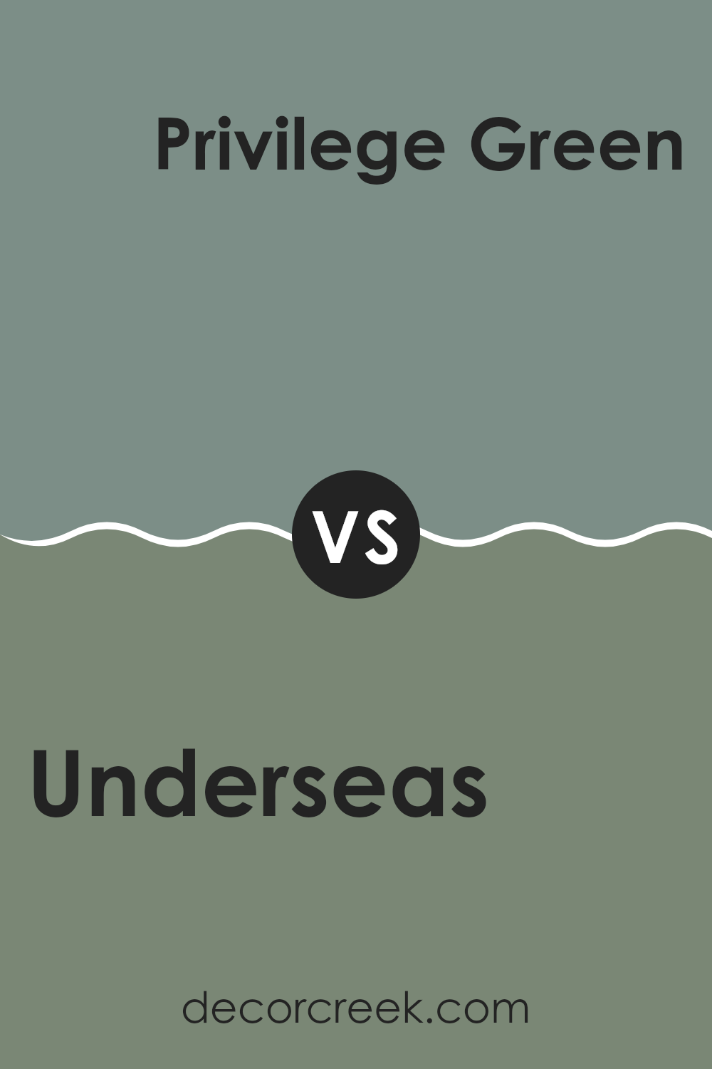
Underseas is a rich, dark teal that brings a strong sense of depth to any room. It leans more toward blue but has enough green to keep it lively and engaging. This color is perfect for creating a cozy, relaxing area, particularly good in living rooms or bedrooms where a calming atmosphere is desired.
Privilege Green, on the other hand, is a lighter, more subdued shade. It’s a soft green with a touch of gray, which gives it a muted feel. This color is excellent for rooms that aim to be calming without being too bold. It works well in rooms that get a lot of natural light, where the subtlety of the gray can be appreciated.
Overall, Underseas is the darker and more dynamic color of the two, great for making a statement. Privilege Green offers more understatement and softness, suitable for a more gentle and relaxing vibe. Both colors represent different moods and can dramatically affect the overall feel of a room.
You can see recommended paint color below:
As I wrap up my thoughts on SW 6214 Underseas by Sherwin Williams, I’ve really enjoyed sharing how this unique color can change the feel of a room! Underseas is a deep, greenish-blue that reminds me of the calm parts of the ocean. It’s a color that brings a peaceful yet interesting vibe, not too bold but definitely something that makes a room special.
Using Underseas in a home is pretty exciting because it works well in lots of different rooms. Whether it’s in a cozy corner for reading, a bedroom for chilling out, or even a bathroom for a splash of color, Underseas makes rooms more lively while still making them feel comfy. It’s also pretty cool how this color matches well with many other colors. Light woods and white trims really pop against it, making everything look clean and neat.
If you’re thinking about refreshing your room with new paint, Underseas might just be the perfect choice. It’s not just another blue; it’s a shade that has a bit of magic, like the hidden depths of the sea. After looking at this color and seeing how it behaves in different lights and settings, I’m excited about the idea of using it somewhere in my own home.
It’s a color that brings a bit of the outdoor feel inside, without being too loud or flashy. I think it could make any room even more inviting!

decorcreek.com
Ever wished paint sampling was as easy as sticking a sticker? Guess what? Now it is! Discover Samplize's unique Peel & Stick samples.
Get paint samples