Choosing the right paint color can feel overwhelming with all the options out there, but sometimes you stumble upon a shade that just feels right. SW 9597 Western Reserve by Sherwin Williams is one of those colors that caught my eye. It carries a sense of calm that’s not too bold, nor too muted, striking that perfect balance that makes it versatile for any space.
If you’re on the lookout for a color that seamlessly integrates into various rooms, offering a backdrop that can complement both modern and traditional decors, Western Reserve might just be your pick. It has a unique ability to adapt its tone depending on the lighting, looking slightly more intense under natural light while presenting a softer hue under artificial lighting.
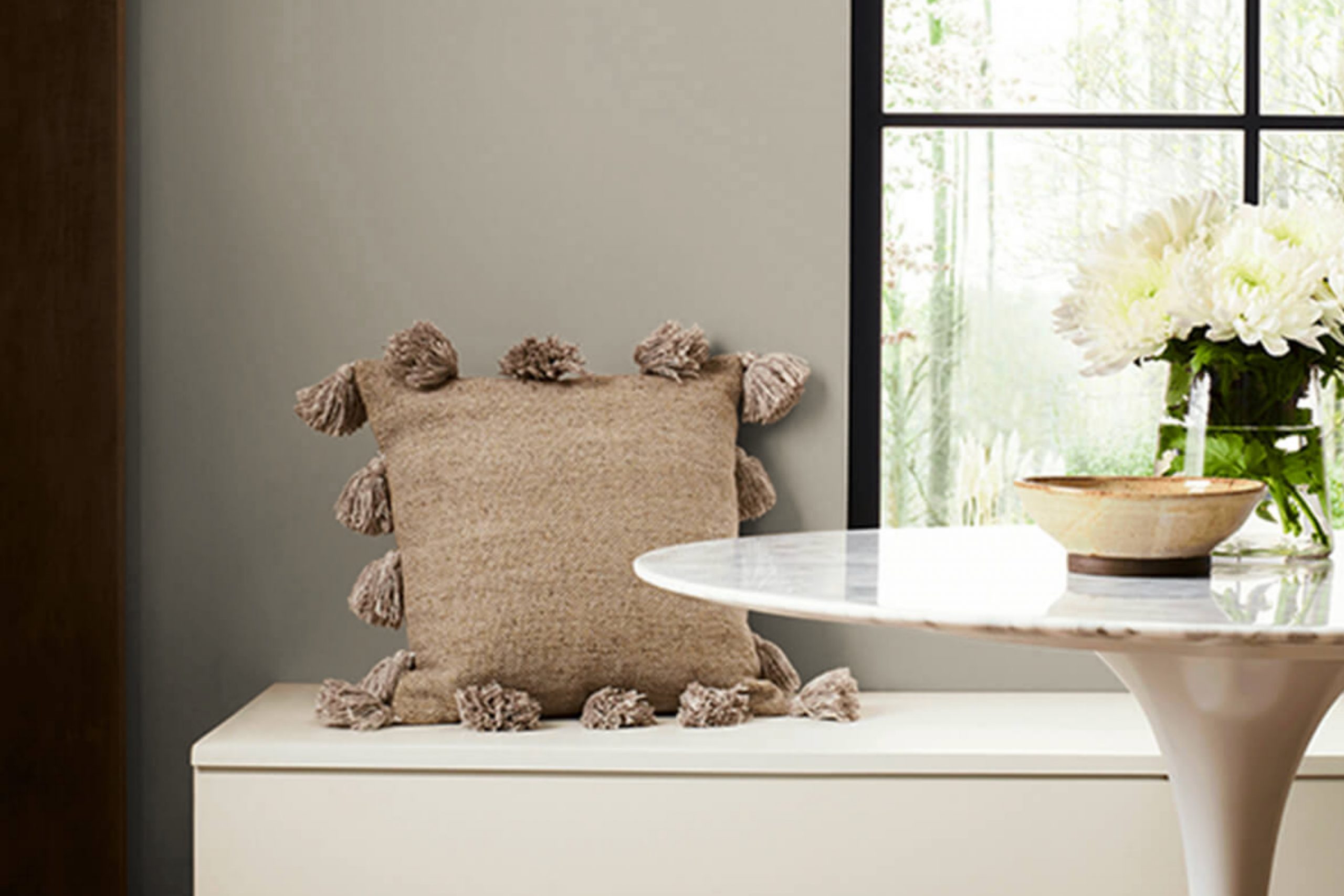
Painting a room can be a quick way to refresh your space, and choosing a color like Western Reserve ensures that you don’t just change the look of your walls, you enhance the entire feel of the room. Whether you’re repainting your living room, bedroom, or even the kitchen, this color provides a fresh canvas that invites your favorite decor elements to stand out.
Join me as I share why SW 9597 Western Reserve has become a top choice for my decorating plans.
What Color Is Western Reserve SW 9597 by Sherwin Williams?
Western Reserve by Sherwin Williams is a rich, welcoming shade that lies beautifully between sage and olive green. This color has a natural, earthy feel, making it perfectly suited for spaces where comfort and relaxation are key. Its muted undertones provide a warm ambiance without overwhelming the senses. This characteristic makes it a great choice for both lively family rooms and peaceful bedroom retreats.
In terms of compatibility, Western Reserve pairs impeccably with materials that emphasize its organic roots. Natural wood, whether it’s a light pine or a darker walnut, enhances its earthy essence. Textiles like linen or cotton in neutral tones also complement this color well, promoting a relaxed yet refined atmosphere. For a touch of elegance, touches of brushed gold or copper in accessories or fixtures can add a gentle contrast to this soft green hue.
Suitable for a variety of interior styles, it shines particularly well in rustic, farmhouse, and modern country home aesthetics. This shade brings a breath of fresh air into spaces, working harmoniously with natural elements and subdued palettes. For those looking to create a cozy, grounded environment, Western Reserve is a versatile and delightful choice.
Is Western Reserve SW 9597 by Sherwin Williams Warm or Cool color?
Western ReserveSW 9597 by Sherwin Williams is a unique shade of green that brings a fresh and lively feel to any room in a house. When you paint a wall with this color, it adds a natural touch, similar to having plants or greenery indoors. This particular green can make small spaces appear bigger and more open, because light colors generally make rooms feel more spacious.
This green works well in many areas of a home. In a living room or family room, it can create a welcoming and comfortable atmosphere. In a bedroom, it helps set a calm and restful mood, which is great for relaxing and getting a good night’s sleep. For a kitchen or dining area, this green adds a splash of color that is not too overwhelming.
Matched with different decors, Western ReserveSW 9597 adapts easily. It looks good with both modern and rustic styles, and can be paired with natural wood, whites, and even bright accents like yellow or blue for a more dynamic look.
Undertones of Western Reserve SW 9597 by Sherwin Williams
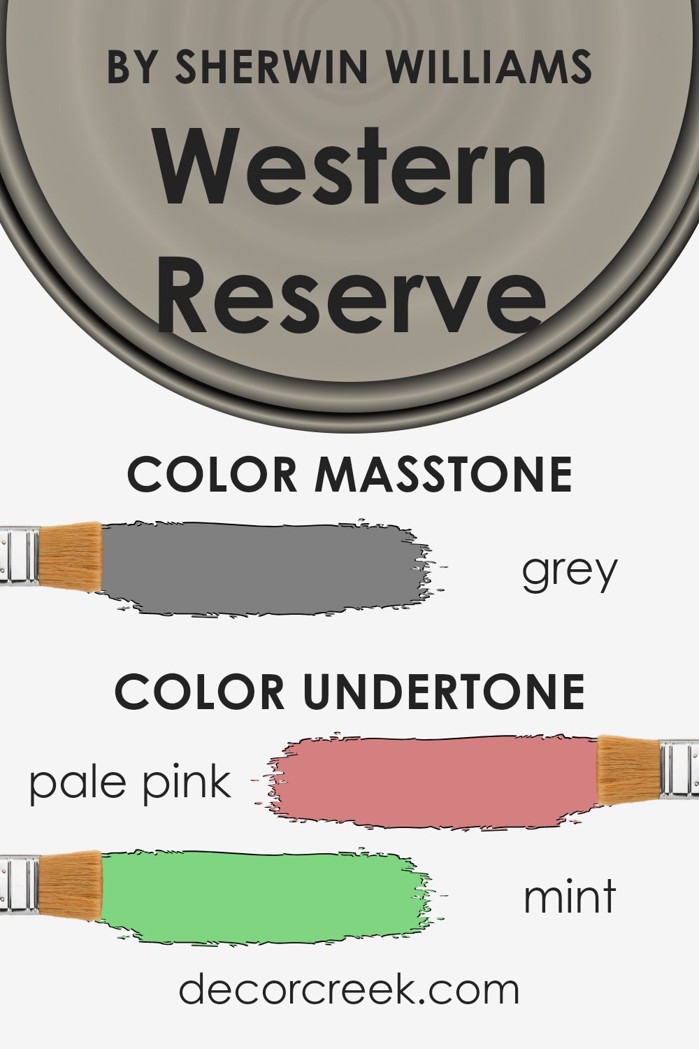
Western Reserve is a unique paint color with a complex mix of undertones that can significantly influence its appearance in different settings. This color has hints of colors ranging from pale pink and light blue to deeper shades like navy and dark green. These undertones can subtly change the color’s expression depending on lighting and surrounding elements.
In interior spaces, the impact of these undertones becomes particularly important. For example, in a room with a lot of natural light, the lighter undertones like pale yellow or light blue might become more noticeable, giving the walls a softer, more gentle look. In contrast, in a room with less natural light or at night under artificial lighting, darker undertones like navy or dark gray might stand out, giving the walls a more grounded and richer feel.
When choosing decor or furniture, considering these undertones helps in creating a coherent look. For instance, pairing Western Reserve with accessories or fabrics that highlight its mint or pale pink undertones could create a harmonious and inviting space. Similarly, using elements that draw out its darker blue or gray tones can set a more formal tone.
Thus, the complex undertones of Western Reserve make it a versatile choice, capable of adapting and complementing various styles and moods in interior design. When used thoughtfully, it can enhance the aesthetic appeal and the feel of a space.
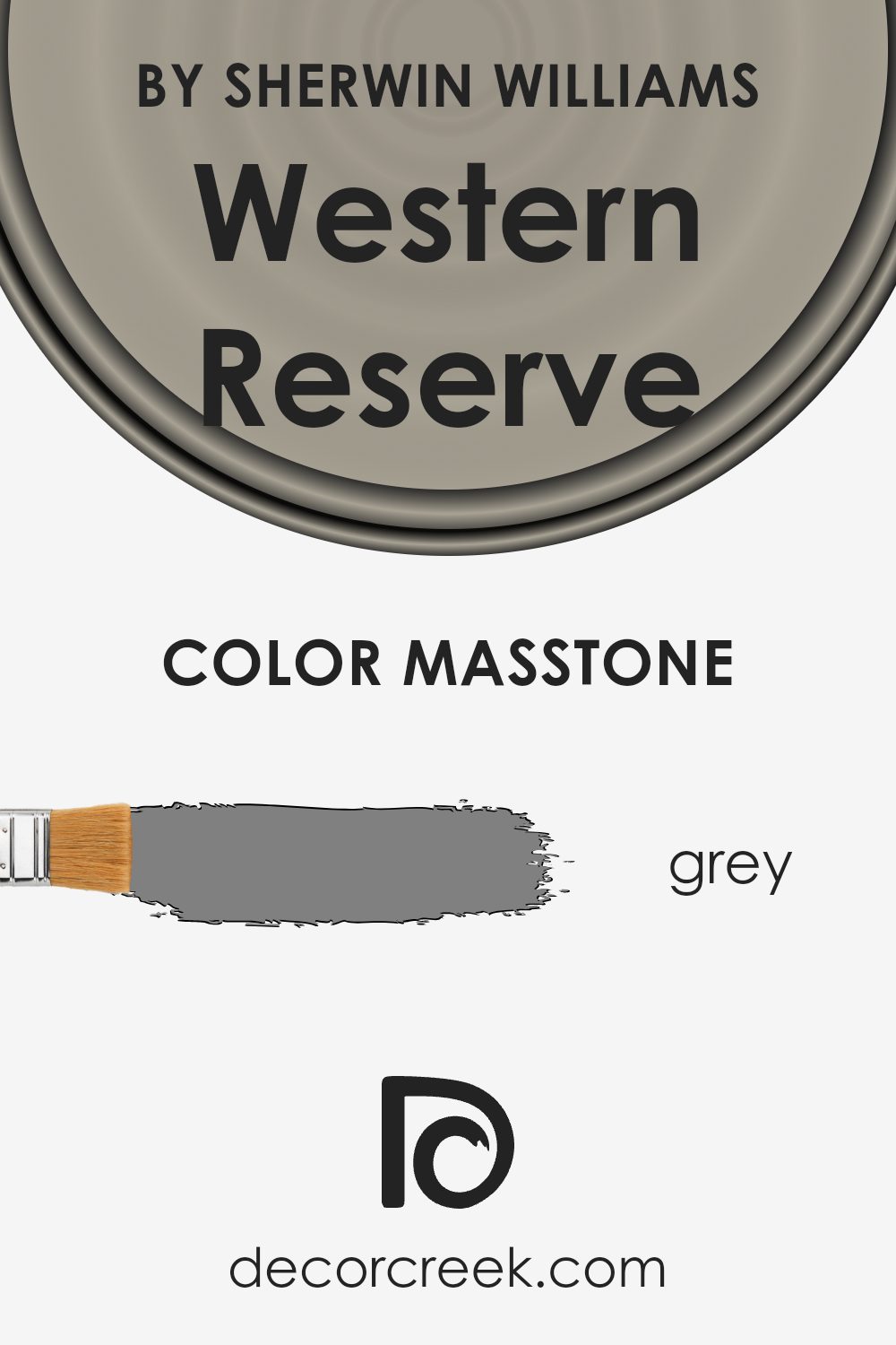
What is the Masstone of the Western Reserve SW 9597 by Sherwin Williams?
Western Reserve SW 9597 by Sherwin Williams has a masstone of Grey (#808080), presenting a balanced and neutral hue. This kind of grey is straightforward and works well in a variety of home settings because it doesn’t lean too heavily towards either a dark or light shade.
Its neutrality makes it easy to pair with various colors, whether you want to add bright accents like blues and yellows or stick to a more toned-down palette with whites and browns. In homes, this grey can help tie together different styles and furnishings without overpowering the space. It’s particularly effective in areas where you want to keep the background subtle, such as living rooms, bedrooms, or offices.
This color also has the added benefit of hiding marks and smudges better than lighter shades, making it practical for busy areas. Overall, Western Reserve provides a calm, cohesive backdrop that allows other elements in the room to stand out.
How Does Lighting Affect Western Reserve SW 9597 by Sherwin Williams?
Lighting plays a crucial role in how we perceive colors in different environments. The color of paint on your walls can look drastically different depending on the type of light it’s exposed to, whether artificial or natural. This difference is primarily due to color temperature and light intensity.
Starting with color Western ReserveSW 9597, a nuanced green hue, its appearance can shift significantly under various lighting conditions. In artificial light, such as that from LED or incandescent bulbs, this green might appear more subdued or intense depending on the color temperature of the bulb.
Warm lighting can make it look softer and cozier, which is pleasant in living spaces or bedrooms. Conversely, cool white light often makes it look sharper and more vivid, which could be effective in kitchens or bathrooms where clarity and freshness are desired.
In natural light, the perception of this green changes throughout the day. Natural light generally provides the truest representation of color, but even this varies.
In north-facing rooms, light is cooler and more consistent, giving Western ReserveSW 9597 a more muted tone. Such rooms might not highlight the vibrancy of the color, but they will emphasize its calming nature.
In south-facing rooms, however, the abundant, warmer sunlight can make this color appear brighter and more alive, enhancing both its warmth and depth. This makes it ideal for living areas where a warm and inviting atmosphere is often appreciated.
For east-facing rooms, morning light can make Western ReserveSW 9597 look very vivid and refreshing. As the day progresses and the direct sunlight moves away, the color can lose some of its intensity. Meanwhile, in west-facing rooms, the situation reverses—the color might start off more neutral during the day and become particularly dynamic in the evening with the warm, setting sun.
Understanding how different kinds of light affect the perception of this color can help in making informed decisions about paint choices and room usage based on light exposure.
What is the LRV of Western Reserve SW 9597 by Sherwin Williams?
LRV stands for Light Reflectance Value, which is a measure of the amount of visible and usable light that gets reflected by a surface when light shines on it. The scale for LRV ranges from zero to one hundred, where zero means no light is reflected (a true black) and one hundred reflects all light (a true white).
This measurement is crucial when choosing paint colors because it helps determine how light or dark a color will look on your walls depending on how much light the room receives. A higher LRV means the color will appear lighter and can make a room feel airier and more open, while a lower LRV means the color will look darker, which can make a space feel smaller or cozier.
With an LRV of 36.204, Western Reserve is considered a medium-range color, meaning it neither reflects a lot of light nor absorbs it heavily. In rooms with less natural light, this color might appear darker and more pronounced, adding a sense of warmth and fullness. In well-lit spaces, however, the same color could look slightly lighter and more subdued.
The LRV value here indicates that Western Reserve is versatile and can be used in various lighting conditions, but its appearance will significantly depend on the amount and type of light in the room. Selecting this particular LRV can offer a good balance, neither too bright nor too dark, making it a practical choice for many interior spaces.

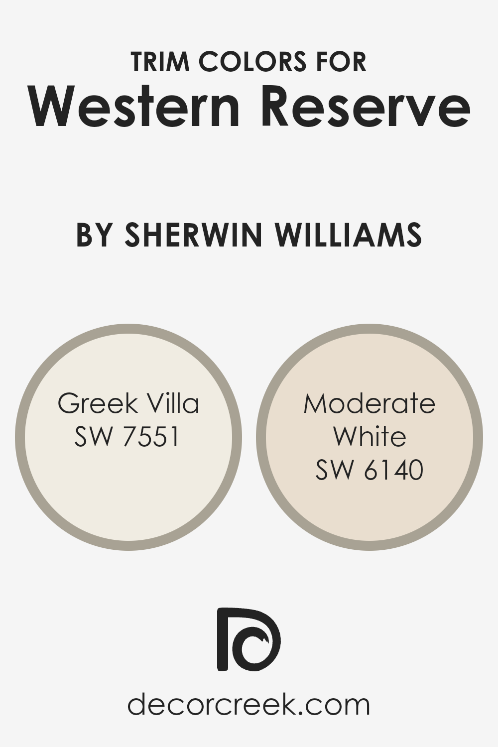
What are the Trim colors of Western Reserve SW 9597 by Sherwin Williams?
Trim colors play a key role in enhancing the aesthetics of a house by providing a contrasting or complementary frame to the walls, highlighting architectural details and shapes. Using trim colors effectively can make features like windows, doors, and molding stand out, giving the space a finished look.
For a color like Western Reserve by Sherwin Williams, trim colors such as Greek Villa and Moderate White are excellent choices as they can create a subtle yet noticeable contrast that enhances the overall appeal of the room.
Greek Villa, SW 7551, is a warm, creamy white that emits a soft and inviting glow, making it ideal for trims to add a gentle yet bright border around the bolder hues of a space. Moderate White, SW 6140, offers a slightly dulled, soothing off-white tone that works wonderfully to bring out a smoother transition at the borders, helping other colors in the palette to stand out just enough without overwhelming the senses. Both colors provide a great way to define and highlight the beauty of Western Reserve, ensuring the space feels cohesive and thoughtfully designed.
You can see recommended paint colors below:
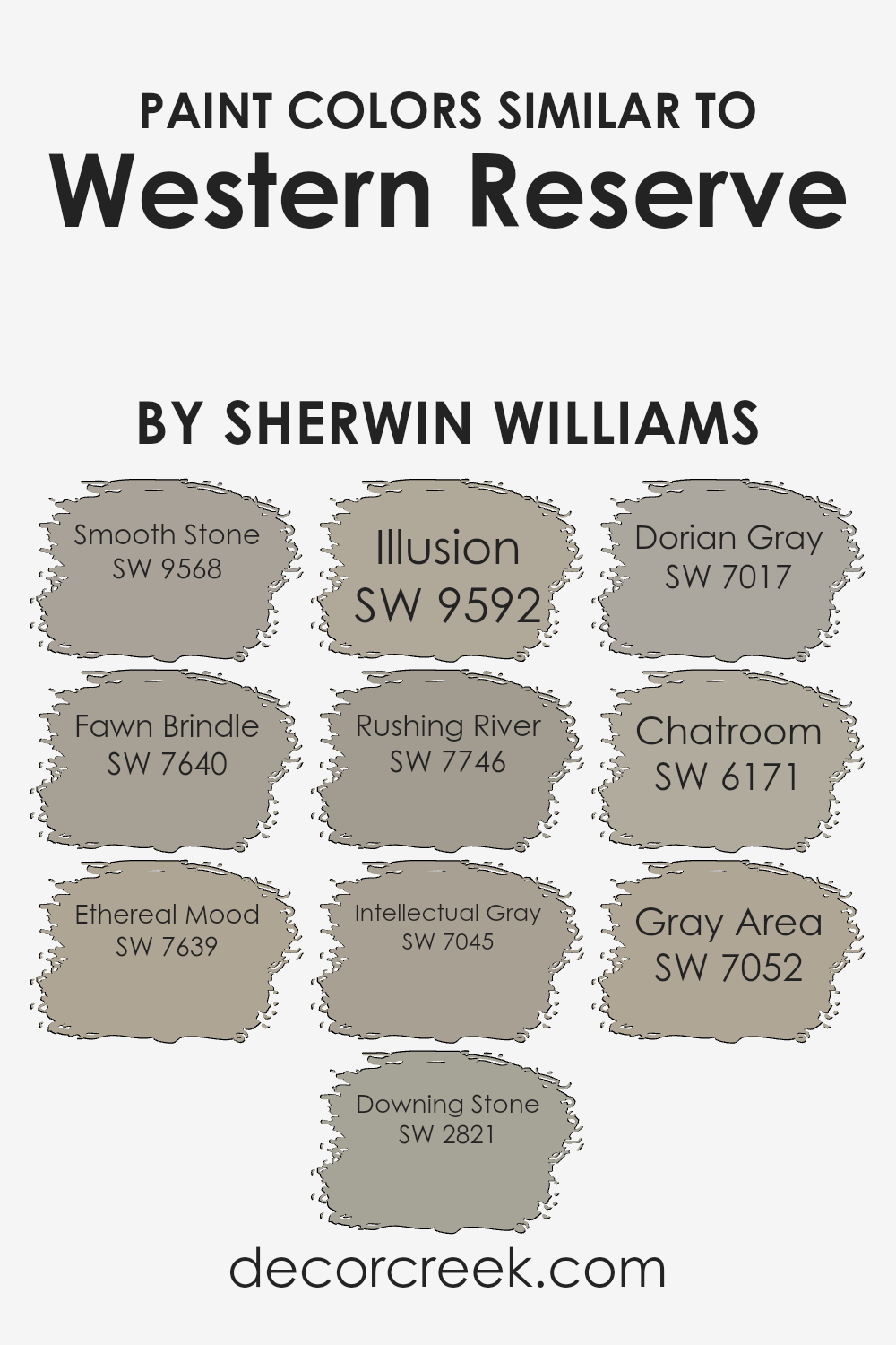
Colors Similar to Western Reserve SW 9597 by Sherwin Williams
Using similar colors in a design can create a subtle and harmonious look, effectively allowing spaces to feel more cohesive and visually appealing. These shades offer a palette with enough variety to keep spaces interesting while maintaining a unified feel.
For example, close color relatives like those similar to Western Reserve by Sherwin Williams complement each other due to their underlying tones and intensities which ensure that no single color overwhelms the space. Employing shades like Smooth Stone and Fawn Brindle can subtly differentiate between areas without sharp contrasts, promoting a smooth transition across a room’s design.
Smooth Stone is a gentle gray that lends a calm and collected ambiance, perfect for creating a relaxed environment. Fawn Brindle brings a slightly warmer gray, enriching spaces with its welcoming hue. Ethereal Mood, in contrast, introduces a deeper, moodier gray that works well in more intimate settings.
Downing Stone, on the other hand, offers a touch of earthiness, reminiscent of natural stone and ideal for grounding a space. Colors like Illusion and Rushing River provide a soft, yet deeper blue-toned gray, adding depth and interest. Intellectual Gray is slightly bolder, making it great for accentuating focal points, while Dorian Gray’s balanced shade works well in almost any setting.
Chatroom has a dusky hue that is versatile for both modern and traditional designs. Finally, Gray Area serves as a bridge between lighter and darker grays, expertly softening transitions between more distinct colors. These carefully selected shades work in concert to enhance the aesthetics of an environment without overwhelming it with excessive color variation.
You can see recommended paint colors below:
- SW 9568 Smooth Stone
- SW 7640 Fawn Brindle
- SW 7639 Ethereal Mood
- SW 2821 Downing Stone
- SW 9592 Illusion
- SW 7746 Rushing River
- SW 7045 Intellectual Gray
- SW 7017 Dorian Gray
- SW 6171 Chatroom
- SW 7052 Gray Area
How to Use Western Reserve SW 9597 by Sherwin Williams In Your Home?
The paint color Western Reserve SW 9597 by Sherwin Williams is a versatile choice for any home. It has a calm and soothing feel, perfect for creating a welcoming atmosphere. This color, which is a lovely shade of gray, works great in various rooms such as living rooms, bedrooms, and kitchens.
You could use it as a main color on all walls for a cohesive look or just on one wall to create an accent feature. It pairs beautifully with white trim for a clean, crisp edge. Additionally, it works nicely with darker furniture or colorful decor because it doesn’t overpower other elements in the room.
It’s also a good option for painting cabinets or shelves as it provides a subtle background that allows other items to stand out. Overall, using Western Reserve in your home can help make your space feel comfortable and stylish.
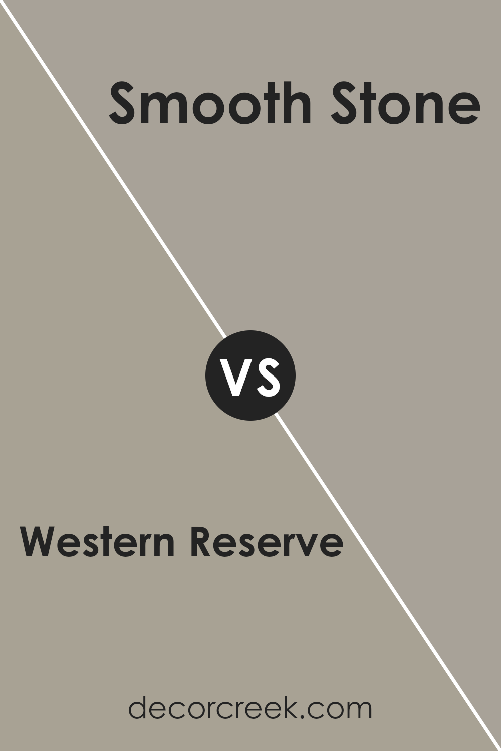
Western Reserve SW 9597 by Sherwin Williams vs Smooth Stone SW 9568 by Sherwin Williams
Western Reserve and Smooth Stone are two distinct paints from Sherwin Williams, offering different vibes to your space. Western Reserve is a deep, dark green that can make a room feel cozy and grounded. It’s perfect for creating a calm, focused atmosphere in spaces like offices or reading nooks.
On the other hand, Smooth Stone has a soft, light gray tone that brings a bright and airy feel to any room. It’s especially great for making small spaces appear bigger and more open. If you’re looking to set a strong, comforting mood, Western Reserve is your go-to, whereas Smooth Stone is ideal if you’re after a fresher, more open feel.
Both colors work well in modern decor and can complement various styles depending on your taste and the furnishings you pair them with.
You can see recommended paint color below:
Western Reserve SW 9597 by Sherwin Williams vs Chatroom SW 6171 by Sherwin Williams
Western Reserve and Chatroom, both by Sherwin Williams, offer distinct vibes for any space. Western Reserve is a deep, rich green that brings a sense of calm and grounding to a room. It’s perfect for creating a cozy, inviting atmosphere. On the other hand, Chatroom is a muted gray with subtle green undertones.
This color is lighter and offers a more neutral backdrop, making it versatile for various decorating styles. While Western Reserve adds drama and depth, Chatroom provides a softer, more understated look. Both colors work well in different contexts: Western Reserve could be ideal for a striking accent wall, whereas Chatroom might be better suited for larger areas, giving a room an open, airy feel.
Choosing between them depends on the mood you want to set and the other elements in your space.
You can see recommended paint color below:
Western Reserve SW 9597 by Sherwin Williams vs Gray Area SW 7052 by Sherwin Williams
**Western Reserve and Gray Area are two distinct colors from Sherwin Williams that each bring a unique vibe to a space. Western Reserve is a deep, almost colonial blue with a hint of gray. It’s a strong color that stands out and can give a room a bold yet welcoming feel.
In contrast, Gray Area is a true gray that leans towards the lighter side, offering a clean and modern look. It’s a versatile color that works well in various settings, providing a subtle backdrop that enhances other colors. While Western Reserve can create a focal point in a room, Gray Area acts more as a neutral foundation, supporting other hues and decor elements.
Both colors can significantly influence the mood and style of a space, with Western Reserve adding drama and character, and Gray Area ensuring a calm and understated elegance.**
You can see recommended paint color below:
- SW 7052 Gray Area
Western Reserve SW 9597 by Sherwin Williams vs Ethereal Mood SW 7639 by Sherwin Williams
Western Reserve is a rich, atmospheric color that leans towards a deep teal with hints of gray. It’s a bold choice that adds depth and character to any space, making it ideal for accent walls or furniture pieces. It pairs nicely with neutral tones, bringing a sense of warmth and coziness to rooms.
On the other hand, Ethereal Mood is a softer shade, more of a muted gray with subtle blue undertones. This color is versatile and gentle, perfect for creating a calm and welcoming atmosphere in spaces like living rooms or bedrooms. It works well with both bright whites and darker hues, offering a balanced backdrop that is easy to complement with various decor styles.
Both colors offer distinct moods and can significantly impact the feel of a room, whether you’re looking for something bold and dramatic or soft and soothing.
You can see recommended paint color below:
Western Reserve SW 9597 by Sherwin Williams vs Illusion SW 9592 by Sherwin Williams
Western Reserve and Illusion, both from Sherwin Williams, offer distinct yet subtly different hues for your space. Western Reserve is a deeper, soothing green with a touch of gray, creating a calm and cozy atmosphere, perfect for spaces where relaxation is key. It tends to absorb light, giving it a more muted appearance which can make small rooms feel smaller but richer.
On the other hand, Illusion is a lighter, softer green that leans closer to a sage. This color reflects more light, making it an excellent choice for making a small room appear larger and more open. It carries a fresh and airy quality, which can brighten a room effortlessly.
Both colors offer a touch of nature’s peacefulness, yet the choice between them depends on the desired effect in your space. Western Reserve works well in intimate, dimly lit areas, while Illusion is ideal for spaces you want to feel spacious and light-filled.
You can see recommended paint color below:
Western Reserve SW 9597 by Sherwin Williams vs Fawn Brindle SW 7640 by Sherwin Williams
Western Reserve and Fawn Brindle, both by Sherwin Williams, present unique shades for various decorating styles. Western Reserve is a deep, rich green with subtle gray undertones, offering a bold and grounding effect. This color is perfect for creating a cozy, inviting atmosphere in spaces like living rooms or studies.
In contrast, Fawn Brindle is a soft gray with warm brown undertones, providing a more neutral and flexible backdrop. This shade works beautifully in almost any room, helping to create a calm, collected look because it pairs well with many other colors.
While Western Reserve makes a statement, Fawn Brindle offers a subtle elegance, making both colors versatile in their own ways. Whether looking to add depth or soften a space, these colors offer lovely options.
You can see recommended paint color below:
Western Reserve SW 9597 by Sherwin Williams vs Downing Stone SW 2821 by Sherwin Williams
Western Reserve and Downing Stone are two distinct colors from Sherwin Williams. Western Reserve has a deep, rich green hue with a hint of gray, creating a cozy and grounding atmosphere in any room. It’s perfect for spaces where you want to add a bit of nature’s calm without going too dark.
On the other hand, Downing Stone offers a lighter, warm gray tone that feels very inviting. This color works well in spaces that aim for a softer and more neutral palette, providing a clean and open feel.
While both shades can complement a range of decor styles, Western Reserve tends to make more of a statement because of its depth and slight intensity. Downing Stone, being more understated, serves as an excellent backdrop for various design elements, allowing other colors or features in the room to stand out. Both colors offer unique possibilities depending on the mood and style you want to achieve.
You can see recommended paint color below:
Western Reserve SW 9597 by Sherwin Williams vs Dorian Gray SW 7017 by Sherwin Williams
The main color, Western Reserve, is noticeably darker and leans towards a deep, earthy green with subtle hints of gray. It offers a rich and grounding feel to spaces, making it a great choice for areas where a cozy or more enclosed atmosphere is desired. On the other hand, Dorian Gray is a gentle gray hue with warm undertones.
This color is versatile and tends to open up spaces, lending a lighter, airier feel compared to Western Reserve. While Western Reserve provides a bold backdrop, ideal for accent walls or cabinetry, Dorian Gray works well as a neutral base across entire rooms, aiding in a smooth integration with various decor styles.
The contrast between the two colors could be used to great effect in coordinating design elements within a home, offering both depth and balance.
You can see recommended paint color below:

Western Reserve SW 9597 by Sherwin Williams vs Rushing River SW 7746 by Sherwin Williams
Western Reserve and Rushing River, both by Sherwin Williams, offer distinct shades that can dramatically affect the mood of a room. Western Reserve is a deep, rich green with subtle blue undertones, creating a cozy and inviting atmosphere. This color is perfect for spaces where you want a feeling of warmth and comfort, such as living rooms or bedrooms.
On the other hand, Rushing River is a lighter shade, leaning more towards a soft grey with a hint of green. This color provides a fresh and clean look, ideal for bathrooms and kitchens where a brighter space is often preferred. It reflects light well, making smaller spaces appear larger.
Both colors have their unique appeal and can be used effectively depending on the room and the ambiance you wish to create. Rushing River could be a better option for a modern and airy feel, whereas Western Reserve suits a more traditional or cozy setting.
You can see recommended paint color below:
Western Reserve SW 9597 by Sherwin Williams vs Intellectual Gray SW 7045 by Sherwin Williams
Western Reserve is a unique shade that combines green and gray tones to create a soft, muted look that suits both modern and traditional spaces. Meanwhile, Intellectual Gray is a warm gray with a subtle hint of green. This color tends to be more neutral and versatile, making it an excellent choice for any room, providing a cozy yet stylish backdrop.
When comparing the two, Western Reserve offers a distinct greenish tone that can bring a calm and gentle mood to interior spaces. It pairs well with natural materials like wood and stone. On the other hand, Intellectual Gray is a stronger gray with just a hint of warmth, which makes it well-suited for areas where you want a more grounded, stable feel.
Overall, both colors are great for those looking to create a peaceful and welcoming environment in their home, with Western Reserve leaning a bit more towards a green influence and Intellectual Gray serving as a classic gray that works well in numerous settings. Whether you choose one over the other depends on the particular vibe and color balance you aim to achieve in your space.
You can see recommended paint color below:
Concluding my thoughts on SW 9597 Western Reserve by Sherwin Williams, I’m really impressed with its unique charm. This color has a natural depth that can make any room feel more inviting and cozy. It reminds me of a calm forest or a peaceful night, setting a relaxing mood in a home. It pairs well with many other colors, which means you can use it in different rooms or with different styles in your home, making everything look really put together.
As a paint, I found Western Reserve to be of high quality, very similar to other paints by Sherwin Williams, which are known for being good to work with. Whether you’re painting a big wall or just adding some color to a small part, this paint works smoothly and covers well.
Overall, I highly recommend SW 9597 Western Reserve if you’re thinking about re-doing a room or just want to add a splash of beautiful color to your home. It’s a great choice that will probably make your space feel new and comforting.
Ever wished paint sampling was as easy as sticking a sticker? Guess what? Now it is! Discover Samplize's unique Peel & Stick samples.
Get paint samples

