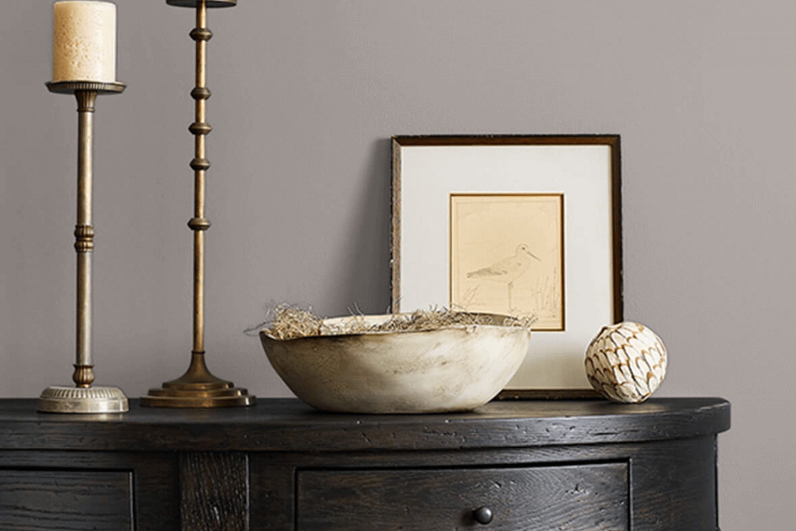
Choosing the perfect color for your spaces can often feel overwhelming, but I found a certain shade that you might find intriguing if you appreciate subtlety with a contemporary twist. Today, I’d like to share my thoughts on SW 9167 Polished Concrete by Sherwin Williams. This color captures the sleek look of actual polished concrete and translates it into paint, making it an excellent choice for those who want to bring a touch of industrial chic into their homes or offices.
I used Polished Concrete in a recent project where I wanted to achieve a modern yet timeless ambiance. The color has a unique way of complementing different textures and materials, enhancing natural light while adding to the room’s overall aesthetic without overpowering the space.
It’s a versatile shade that works wonderfully in a variety of settings, be it a cozy bedroom or a busy office environment. If you’re thinking about refreshing your space with a new coat of paint and you lean towards muted, sophisticated tones, Polished Concrete might be the perfect fit for you.
Its subtle elegance allows for endless creativity, whether you decide to keep things minimal or use it as a backdrop for bold decor elements.
What Color Is Polished Concrete SW 9167 by Sherwin Williams?
Polished Concrete by Sherwin Williams is a unique gray shade that mimics the look of smooth, finished concrete, offering a subtle, modern touch to any room. This color has a cool, neutral base that makes it incredibly versatile and easy to pair with various decor styles and color schemes. Its understated elegance works particularly well in minimalist and industrial interiors, where the focus is on simplicity and raw materials.
The color is a great match for materials like exposed brick, stainless steel, and natural wood, which help to warm up the cooler tones. Textures like soft wool throws or shaggy rugs can also add a cozy element to the balance, making your space feel inviting.
In terms of interior styles, aside from minimalist and industrial, this gray can beautifully complement contemporary designs or serve as a fresh backdrop in a more rustic setting. Pair it with bold colors like navy or burnt orange for a striking contrast, or keep the palette muted with shades of white and black for a clean, cohesive look.
The color’s adaptability makes it ideal for living rooms, kitchens, or bedrooms where a calm, collected atmosphere is desired. Its matte likeness to real concrete provides a chic, understated canvas that’s easy to build upon with various decorative elements.
Is Polished Concrete SW 9167 by Sherwin Williams Warm or Cool color?
Polished Concrete by Sherwin Williams is a versatile gray shade that brings a modern and clean look to any home. This color is particularly effective in creating a neutral backdrop that allows both bold and subtle decor elements to stand out. Its muted tone works well in various spaces, from kitchens to bedrooms, and complements a wide range of furniture styles and materials.
What makes Polished Concrete an excellent choice for many homeowners is its ability to balance other colors. It can soften brighter hues or give depth to a monochromatic scheme, providing a cohesive look throughout the home.
This shade is also practical, as it hides minor imperfections and is easy to maintain, making it ideal for high-traffic areas. Whether looking for a contemporary feel or a base for personal expression, this color is adaptable and timeless, fitting seamlessly into any decorating style.
Undertones of Polished Concrete SW 9167 by Sherwin Williams
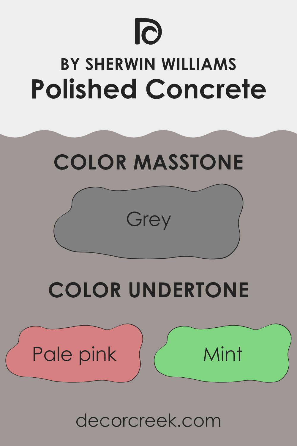
Sherwin Williams’ Polished Concrete is a unique gray shade with a complex mix of undertones that greatly influence its appearance in various settings. Undertones are subtle colors hidden within the main color, which can change how it looks depending on lighting and surroundings. For Polished Concrete, the presence of a range of undertones from pale pink to dark grey makes this color highly versatile.
In an interior setting, the undertones of pale pink, light purple, and lilac can add a gentle warmth to the room, making spaces feel more welcoming. In contrast, cooler undertones like mint and light blue can give a fresher, crisper look, which might make a room feel more spacious and airy.
The mix of undertones in Polished Concrete means it behaves differently in diverse lighting conditions. For instance, in a room with a lot of natural light, the cooler undertones might become more pronounced, whereas in a room with warmer artificial light, the pink and yellow undertones could make the walls seem cozier.
Using Polished Concrete on interior walls can thus provide a neutral backdrop that adapts subtly to its environment, complementing various decor styles and color schemes. This adaptability makes it an excellent choice for those wanting a color that can hold various elements of a room together while still adding a touch of depth and interest through its hidden undertones.
What is the Masstone of the Polished Concrete SW 9167 by Sherwin Williams?
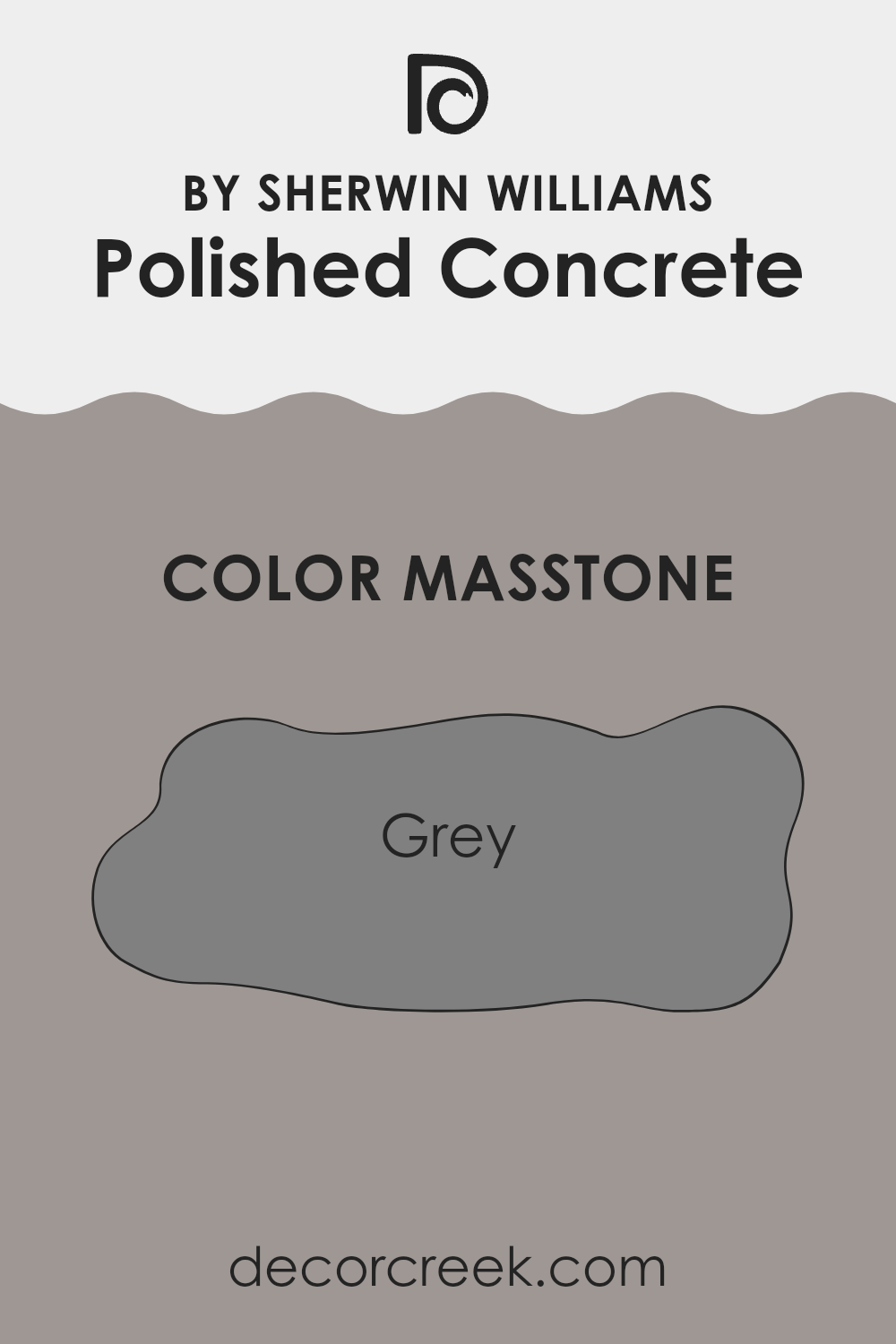
Polished Concrete SW 9167 by Sherwin Williams, with its masstone of grey (#808080), offers a versatile and pared-down look that works well in many home spaces. This neutral shade of grey provides a strong foundation for any room, allowing homeowners to easily complement it with various colors and decor styles.
Whether it’s the living room, bedroom, or kitchen, this gray acts as a subtle backdrop that can make other colors pop or blend seamlessly with a minimalist theme. The grey tone of this paint is practical as it hides imperfections and daily wear and tear better than lighter colors. This makes it ideal for high-traffic areas or homes with young children and pets.
Its neutrality helps in small spaces too, giving an illusion of a bigger area. It is straightforward to match with furniture, and accessories, whether one prefers vivid splashes of color or more toned-down earthy textures. This adaptability and ease of use make Polished Concrete an asset in home decoration.
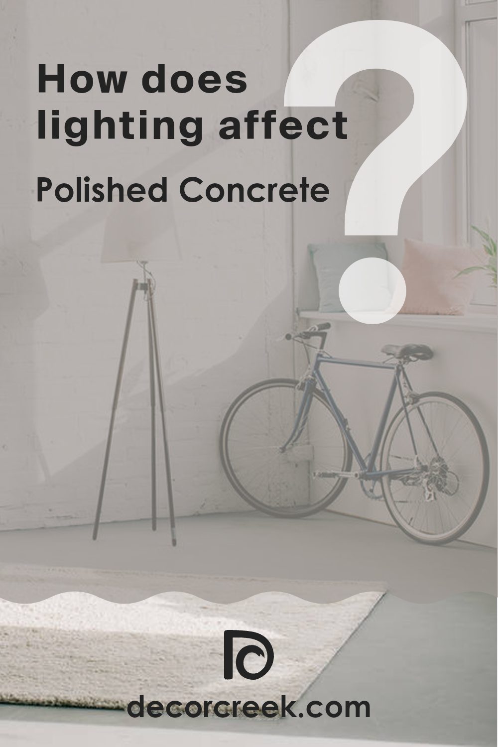
How Does Lighting Affect Polished Concrete SW 9167 by Sherwin Williams?
Lighting has a significant impact on how we perceive colors because it can alter their appearance. The way a room is lit, whether by natural sunlight or artificial light, can make a color look different at various times of the day.
Taking the example of Polished Concrete, a color by Sherwin Williams, we can see these variations clearly. This shade is a subtle and neutral gray that adapts to different lighting conditions.
In natural light, Polished Concrete appears more true to its color swatch, showcasing its pure gray tone. However, the quality of natural light varies depending on the direction a room faces:
– North-faced rooms: These rooms get less direct sunlight, which can make colors appear slightly cooler. Polished Concrete might look a bit more shadowed and toned down, enhancing its cooler undertones.
– South-faced rooms: These rooms are bathed in abundant sunlight for most of the day, making colors warmer and brighter. Polished Concrete will look lighter and slightly warmer here than in any other direction.
– East-faced rooms: Morning light is warm and bright, making Polished Concrete light up warmly in the mornings but return to its true cooler gray as the light dims.
– West-faced rooms: Evening light, which tends to be warmer, will cast a warm glow on the color, making it appear cozier towards the end of the day.
Artificial lighting also affects how Polished Concrete is perceived:
– Warm artificial light, such as that from standard incandescent bulbs, will make Polished Concrete appear softer and slightly warmer.
– Cool artificial light, from fluorescent or LED sources, can enhance the gray’s cooler tones, making it appear more stern and formal.
Understanding these interactions between light and color can help in making more informed decisions about paint colors depending on the room’s exposure and the kind of light it generally receives.
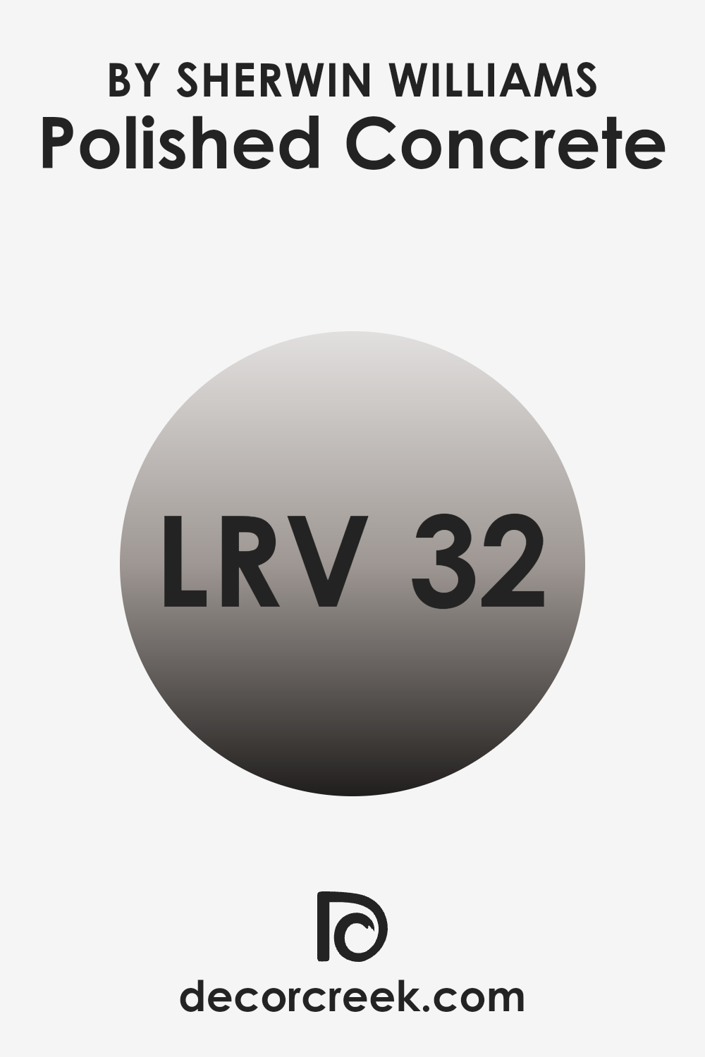
What is the LRV of Polished Concrete SW 9167 by Sherwin Williams?
LRV stands for Light Reflectance Value. It measures the percentage of light a paint color can reflect back into the room compared to pure white, which reflects the most light. A higher LRV means the color is lighter and reflects more light, making a room feel brighter and more open. On the other side, a lower LRV indicates the color is darker and absorbs more light, which can make a room feel cozier but smaller and darker.
This value is crucial when deciding on a paint color because it helps you understand how light or dark a color will appear once it’s on your walls. It can greatly affect the mood and visual size of a space.
Speaking specifically about the LRV of Polished Concrete, which is 31.622, it falls into the category of darker shades. This means it will absorb more light than it reflects, lending the color a denser and more grounded appearance when applied to walls. In rooms with limited natural or artificial light, using this shade might make the space appear smaller and more enclosed.
However, in a well-lit area or a larger space, this color could add a substantial and warm presence to the room, complementing furnishings and artwork that contrast in lighter hues. The specific LRV of Polished Concrete allows us to predict how it will affect the atmosphere and the perceived space of a room.
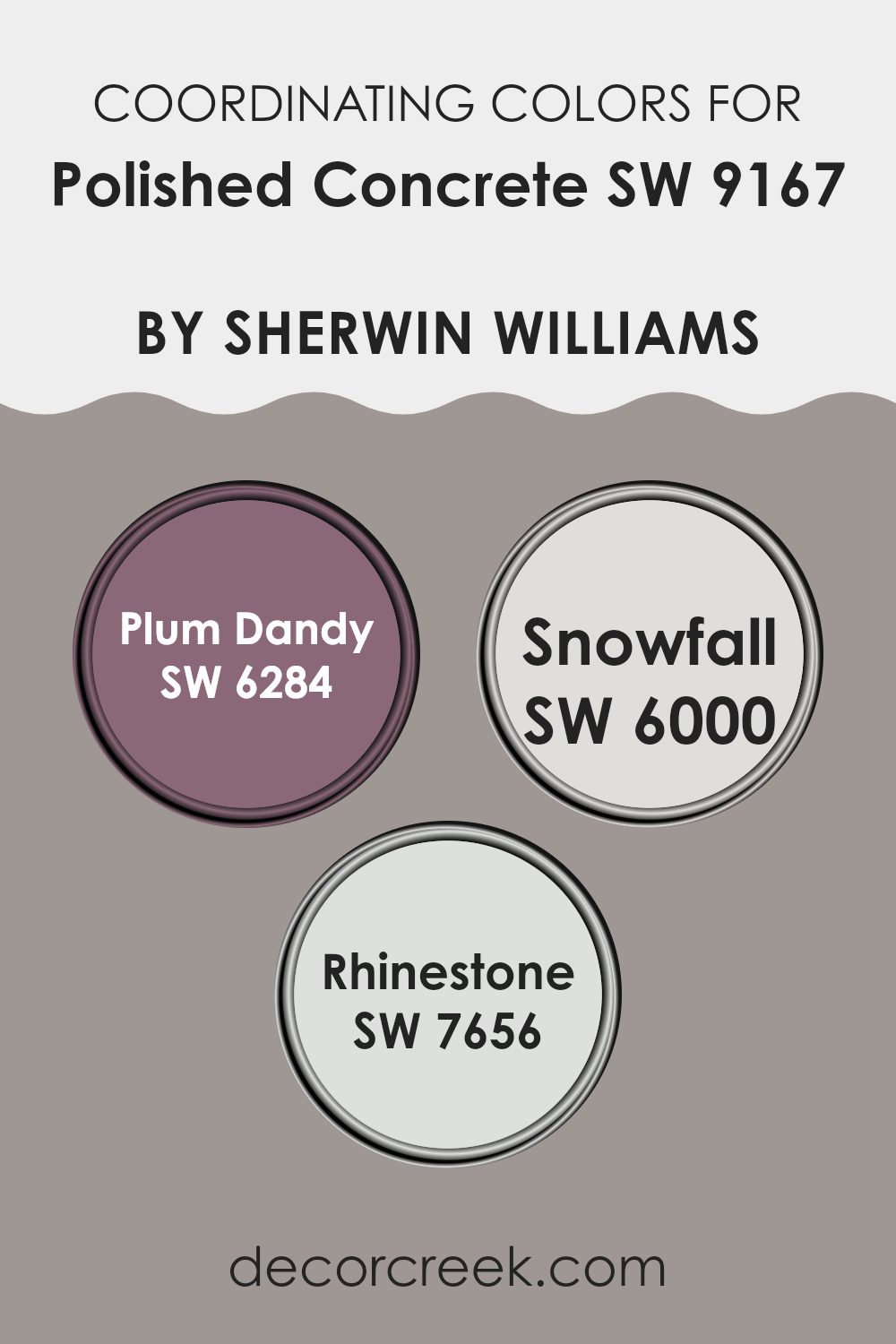
Coordinating Colors of Polished Concrete SW 9167 by Sherwin Williams
Coordinating colors are a way to bring harmony and balance to your space by choosing hues that complement or enhance each other. When it comes to Polished Concrete by Sherwin Williams, this neutral shade serves as an ideal backdrop for a variety of other colors, creating a cohesive look. By selecting the right coordinating colors, you can achieve a design that flows smoothly and feels connected throughout the space.
Plum Dandy is a rich, vibrant color that adds a touch of drama and depth to spaces that feature Polished Concrete. Its bold personality makes it a perfect accent color, whether it’s used for a feature wall or for decorative elements like cushions or curtains. On the other hand, Snowfall offers a clean and fresh look, bringing lightness and airiness to rooms.
It works well to lighten up the solid feel of Polished Concrete, making the environment feel more open and inviting. Lastly, Rhinestone is a subtle gray that seamlessly blends with Polished Concrete. It’s excellent for those who prefer a more understated decor, as it enhances the space without overwhelming it. Together, these colors create a varied palette that can suit multiple decorating styles, making any area visually interesting and harmonious.
You can see recommended paint colors below:
- SW 6284 Plum Dandy
- SW 6000 Snowfall
- SW 7656 Rhinestone
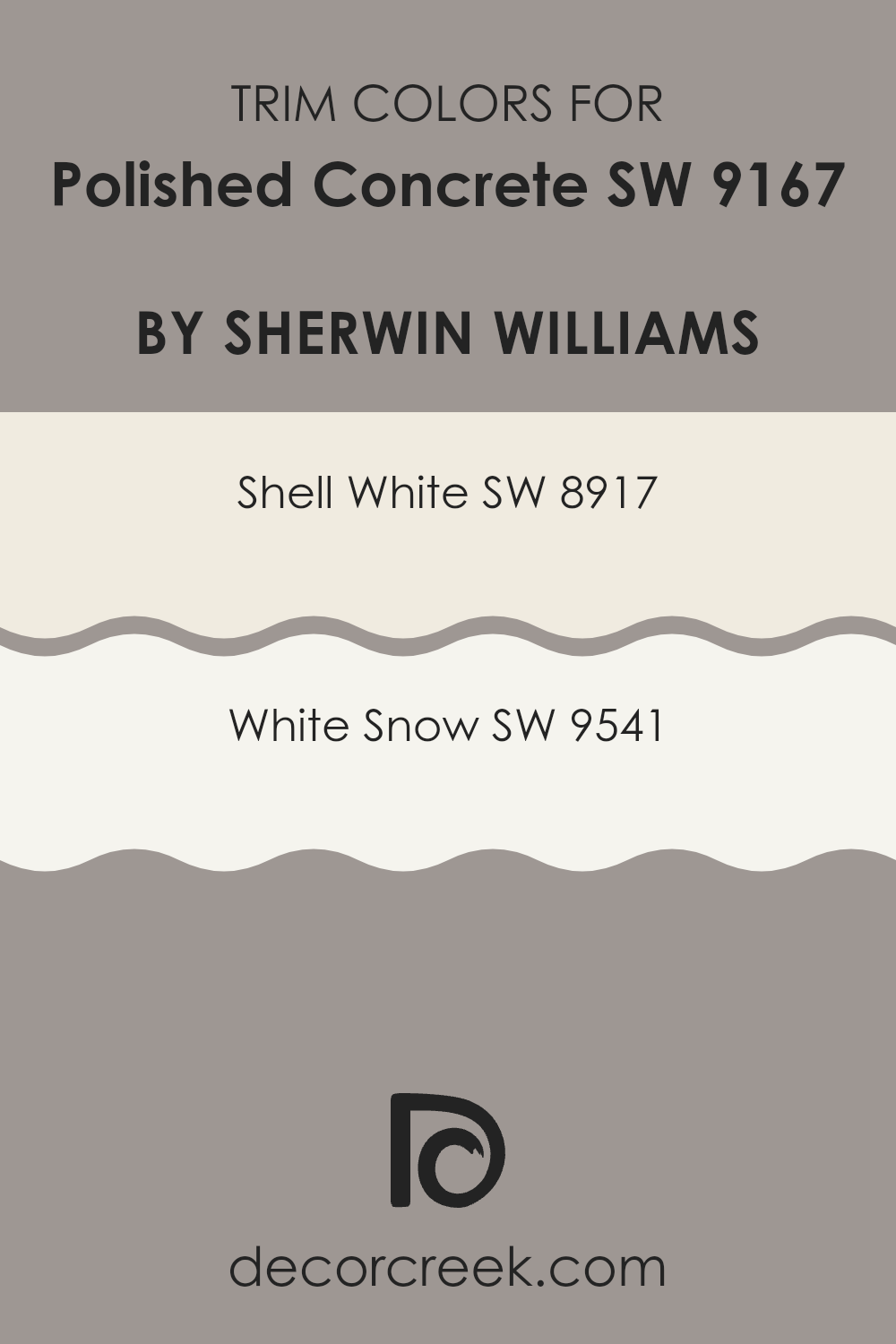
What are the Trim colors of Polished Concrete SW 9167 by Sherwin Williams?
Trim colors are specifically chosen paint shades used to highlight or define the borders, edges, and details of a room, like door frames, skirting boards, window frames, and moldings. When using a main shade like a neutral gray, selecting the right trim colors can significantly impact the overall look by creating a subtle yet impactful contrast that can make the architectural details stand out.
For instance, when paired with a neutral tone like Polished Concrete by Sherwin Williams, lighter trim colors can add a fresh and clean look to the room, enhancing the modern feel while still keeping a warm and welcoming atmosphere.
Shell White (SW 8917) is a soft, warm white that offers a gentle contrast to cooler tones, giving a room a cozy and inviting feel without overpowering the primary color. Its understated hue works wonderfully with more subdued colors, providing a seamless look that ties together space.
On the other hand, White Snow (SW 9541) presents a brighter, crisper white which can make darker colors pop more dramatically. This color is perfect for use in spaces that benefit from a stark, clear definition to features, adding a fresh vibrance that compliments a minimalist or modern aesthetic effectively.
You can see recommended paint colors below:
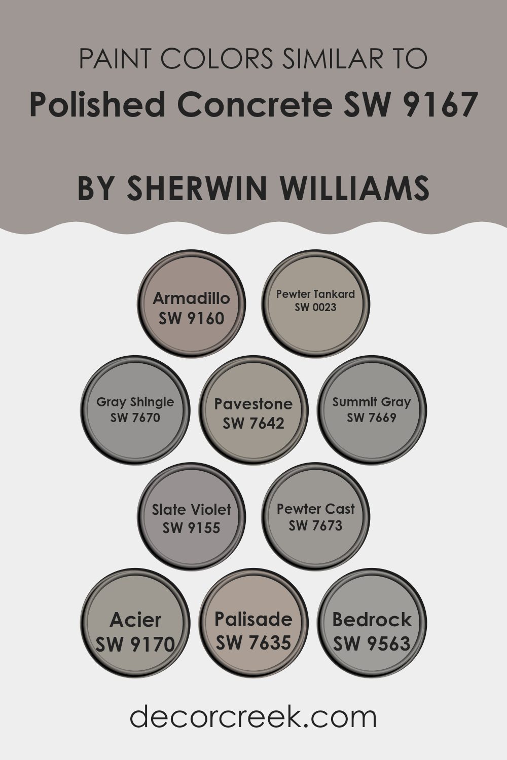
Colors Similar to Polished Concrete SW 9167 by Sherwin Williams
Similar colors play a crucial role in design by creating a cohesive and harmonious look. Choosing colors like Sherwin Williams’ Polished Concrete and its similar shades allows for a subtle and unified ambiance in any space. These similar colors often share a common hue but differ in brightness and saturation, enabling designers and homeowners to craft spaces that feel well-coordinated and thoughtfully curated.
When similar colors are used together, they help in achieving a more graceful and seamless transition between spaces, providing a soothing visual flow that is pleasing to the eye. For instance, Armadillo is a robust gray that offers a strong foundation, similar to the sturdiness of a concrete base but with a warmer tone.
Pewter Tankard, another gray, has a slightly silvery tint that can brighten spaces while maintaining an elegant neutrality. Gray Shingle intertwines soft gray undertones with the subtlest hint of blue, offering a gentle contrast. Pavestone presents a deeper gray that adds a touch of depth to interiors. Summit Gray strikes a balance, neither too dark nor too light, perfect for achieving a modern, understated look.
Slate Violet introduces a unique blend, with gray tones infused with a soft violet, giving spaces a subtle hint of color. Pewter Cast, similar to Pewter Tankard but darker, adds a bolder statement. Acier is a cooler gray that leans toward a steel-like appearance, offering a crisp, clean aesthetic. Palisade, unlike the other grays, leans towards taupe, bringing a warm nuance to the palette.
Lastly, Bedrock is a deep, earthy gray that grounds the surroundings, providing a solid, reassuring presence in a space. Together, these colors can be used to fashion an environment that feels continuous and integrated.
You can see recommended paint colors below:
- SW 9160 Armadillo
- SW 0023 Pewter Tankard
- SW 7670 Gray Shingle
- SW 7642 Pavestone
- SW 7669 Summit Gray
- SW 9155 Slate Violet
- SW 7673 Pewter Cast
- SW 9170 Acier
- SW 7635 Palisade
- SW 9563 Bedrock
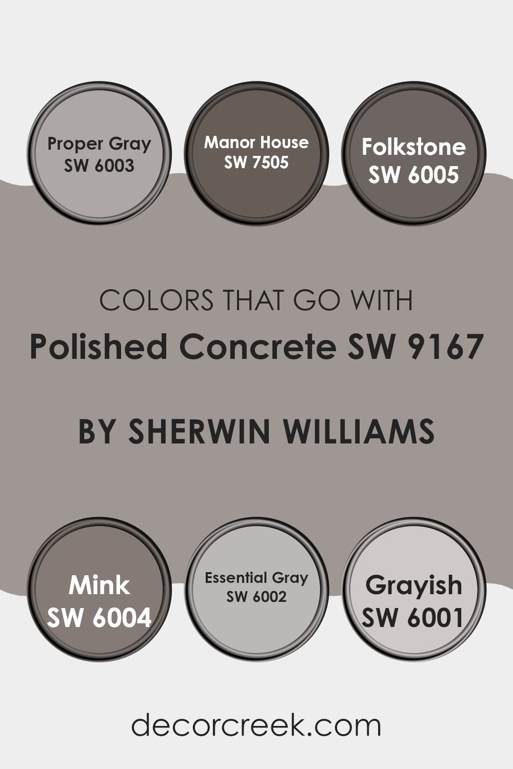
Colors that Go With Polished Concrete SW 9167 by Sherwin Williams
When pairing colors with Polished Concrete SW 9167 by Sherwin Williams, the importance lies in creating a cohesive and appealing space. Colors that coordinate well with this shade, such as SW 6003 – Proper Gray, SW 7505 – Manor House, SW 6005 – Folkstone, SW 6004 – Mink, SW 6002 – Essential Gray, and SW 6001 – Grayish, help in achieving balance and visual harmony in any room.
These colors have been carefully chosen to complement the unique tone of Polished Concrete, ensuring that each pairing enhances the overall aesthetic while providing options for both subtle enhancements and more striking contrasts, depending on personal taste and design objectives.
Proper Gray is a gentle, understated gray that offers a clean backdrop, making it ideal for minimalist or modern interiors. Manor House, on the other hand, has a richer, deeper tone that adds a touch of elegance and depth to spaces. For those who prefer a bit more complexity, Folkstone provides a nuanced gray that works beautifully in varied lighting conditions. Mink lends a slightly warmer, softer touch, providing a cozy and welcoming feel. Essential Gray is just what its name suggests – essential; it’s a versatile color that can tie different elements together smoothly.
Lastly, Grayish offers a lighter, almost airy feel, perfect for adding spaciousness and light to smaller or darker rooms. Each of these colors not only complements Polished Concrete but also enhances the style and mood of any space they inhabit.
You can see recommended paint colors below:
- SW 6003 Proper Gray
- SW 7505 Manor House
- SW 6005 Folkstone
- SW 6004 Mink
- SW 6002 Essential Gray
- SW 6001 Grayish
How to Use Polished Concrete SW 9167 by Sherwin Williams In Your Home?
Polished Concrete SW 9167 by Sherwin Williams is a versatile paint shade that homeowners can use in various ways to freshen up their living spaces. This gray color has a subtle, modern feel that blends beautifully with different home styles, making it a great choice for anyone looking to update their decor.
It works really well in living rooms and bedrooms where a calm, neutral backdrop is desired. You can pair Polished Concrete with brighter colors for a pop of vibrancy or keep things muted with whites and other grays for a more cohesive look. This shade is also durable and easy to apply, making it a practical option for busy areas like kitchens and hallways.
Additionally, using this color in a bathroom can create a clean and open feel, complementing white fixtures and natural wood accents. Overall, Polished Concrete SW 9167 offers a fresh way to beautify your home without being too intense.
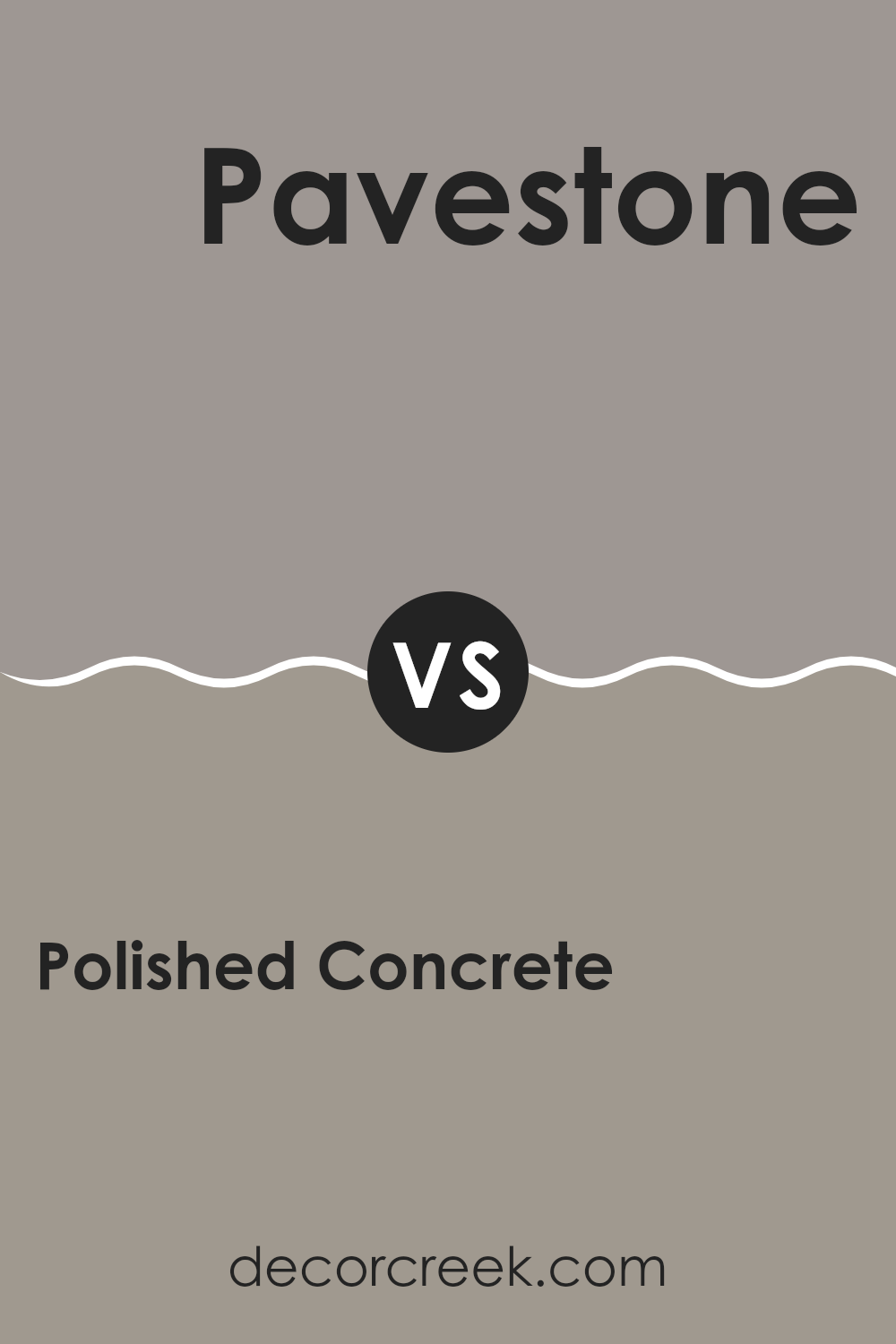
Polished Concrete SW 9167 by Sherwin Williams vs Pavestone SW 7642 by Sherwin Williams
Polished Concrete and Pavestone are two distinct colors from Sherwin Williams, each offering a unique feel to spaces. Polished Concrete is a gentle gray with a balanced, soft undertone that works well in areas where a calm, neutral background is desired. Its lightness can make a room feel more open and airy.
On the other hand, Pavestone is a deeper, warm gray that tends to add a bit more character and warmth to a space. This color is perfect for adding a touch of coziness without overpowering the room with too dark a shade.
While both colors are versatile and can beautifully complement various decor styles, Polished Concrete is better for achieving a lighter, more subtle ambiance, whereas Pavestone is ideal for creating a stronger, more grounded aesthetic.
You can see recommended paint color below:
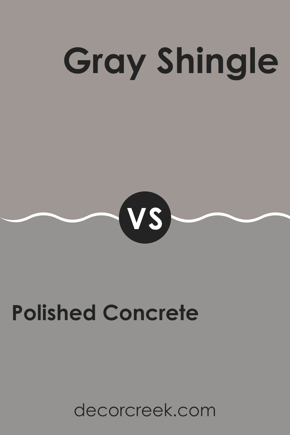
Polished Concrete SW 9167 by Sherwin Williams vs Gray Shingle SW 7670 by Sherwin Williams
Polished Concrete and Gray Shingle by Sherwin Williams are two distinctive shades of gray, each offering its own unique vibe to a space. Polished Concrete has a cool, almost steely tone, making it a great choice for modern and industrial-style spaces. Its lighter, clean look provides a fresh and airy feel, allowing it to work well in various areas, including living rooms and studios.
On the other hand, Gray Shingle carries a warmer undertone, which adds a cozy and inviting touch to environments. It’s darker than Polished Concrete, which helps in creating a more enclosed, snug ambiance. This color is perfect in settings where you want to foster a sense of comfort, like bedrooms or family rooms.
Both colors offer versatility and can adapt to different lighting situations and decor styles. Whether you prefer the cooler touch of Polished Concrete or the warmer embrace of Gray Shingle, both shades are solid choices for adding a chic, neutral backdrop to your walls.
You can see recommended paint color below:
Polished Concrete SW 9167 by Sherwin Williams vs Palisade SW 7635 by Sherwin Williams
Polished Concrete and Palisade by Sherwin Williams are two distinct gray shades, each offering a unique vibe for interior spaces. Polished Concrete is a deep, cool gray that brings a strong, modern feel to a room. It resembles the color of actual concrete, hence the name, making it a great choice for those looking for a minimalist or industrial ambiance.
On the other hand, Palisade is a softer, warmer gray. It has a welcoming, gentle quality that works well in spaces where a cozy, more inviting atmosphere is desired. Compared to Polished Concrete, Palisade is lighter and can help make a small room feel more spacious and open.
Both colors are versatile and can work beautifully in various settings, from living rooms to bedrooms, depending on the mood you’re aiming to achieve and how much natural light the room receives.
You can see recommended paint color below:
- SW 7635 Palisade
Polished Concrete SW 9167 by Sherwin Williams vs Acier SW 9170 by Sherwin Williams
Polished Concrete and Acier, both by Sherwin Williams, are subtle yet distinct shades of gray that each offer a unique vibe to any space. Polished Concrete is lighter, mimicking the cool, even tone of actual concrete. This makes it a great choice for spaces that require a modern, clean look. It reflects light well, which can make smaller rooms appear more spacious.
On the other hand, Acier has a deeper, steel-like quality that adds a touch of drama without overwhelming a room. It’s perfect for creating a cozy atmosphere in larger spaces or for accent walls where you want a bit more impact.
While both colors share a gray base, the lighter hue of Polished Concrete brings an airy feel, while Acier offers a warmer, more grounded sensation. This makes Polished Concrete ideal for minimalist, open designs, whereas Acier suits areas where a stronger, more defined color is needed. Selecting between the two depends on the mood and functional needs of your room.
You can see recommended paint color below:
Polished Concrete SW 9167 by Sherwin Williams vs Pewter Cast SW 7673 by Sherwin Williams
Polished Concrete and Pewter Cast are both gray shades from Sherwin Williams but they have different undercurrents and depth. Polished Concrete is a lighter gray that gives a soft look to rooms. It’s excellent for spaces where you want a clean and open atmosphere, making it ideal for modern and minimalistic designs.
On the other hand, Pewter Cast is a darker gray with a slightly warmer tone. This color is perfect for adding a bit more body and richness to a space. It works well in areas where you want to create a cozy feeling, such as living rooms or bedrooms.
When comparing the two, Polished Concrete reflects more light, lending an airy feel, while Pewter Cast, being darker, offers a grounding effect, which can help in making large spaces feel more contained and inviting. Both colors are versatile, but their impact depends on the room’s lighting and how they’re used alongside other decor elements.
You can see recommended paint color below:
Polished Concrete SW 9167 by Sherwin Williams vs Bedrock SW 9563 by Sherwin Williams
Polished Concrete and Bedrock by Sherwin Williams are two distinct shades that cater to different aesthetic preferences. Polished Concrete has a lighter, cooler tone resembling the color of natural concrete, which makes it a great choice for a modern and minimalistic look. Its subtle gray hues can help create a clean and open feel in a space.
On the other hand, Bedrock is darker and warmer, suggesting the rich, solid colors found in natural earth. This color can add warmth and depth to a room, making it feel cozy and inviting. Bedrock works well in spaces where a strong, grounded feeling is desired.
Both colors are versatile and can be used in various settings, from living rooms to bedrooms. Polished Concrete pairs well with brighter colors and can serve as a quiet background for more vibrant decor. Bedrock, because of its deeper tone, is excellent for accent walls or for pairing with lighter colors to create a striking contrast. Each color offers a unique mood and can be chosen based on the desired effect in the decorating space.
You can see recommended paint color below:
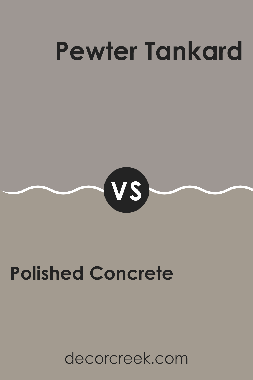
Polished Concrete SW 9167 by Sherwin Williams vs Pewter Tankard SW 0023 by Sherwin Williams
Polished Concrete and Pewter Tankard, both by Sherwin Williams, offer unique takes on gray. Polished Concrete is a lighter, subtle gray with a hint of warmth, making it feel cozy and inviting in different lighting conditions.
This color works well in spaces where you want a modern but soft ambiance. On the other hand, Pewter Tankard is a deeper gray with more intensity. It carries a stronger presence due to its darker shade, making it ideal for creating striking contrasts in a room, especially when used on accent walls or in larger areas.
While both colors share a gray base, Polished Concrete provides a gentler, more muted background, whereas Pewter Tankard stands out more prominently. Choosing between them depends on the effect you want in your space—light and airy or bold and strong.
You can see recommended paint color below:
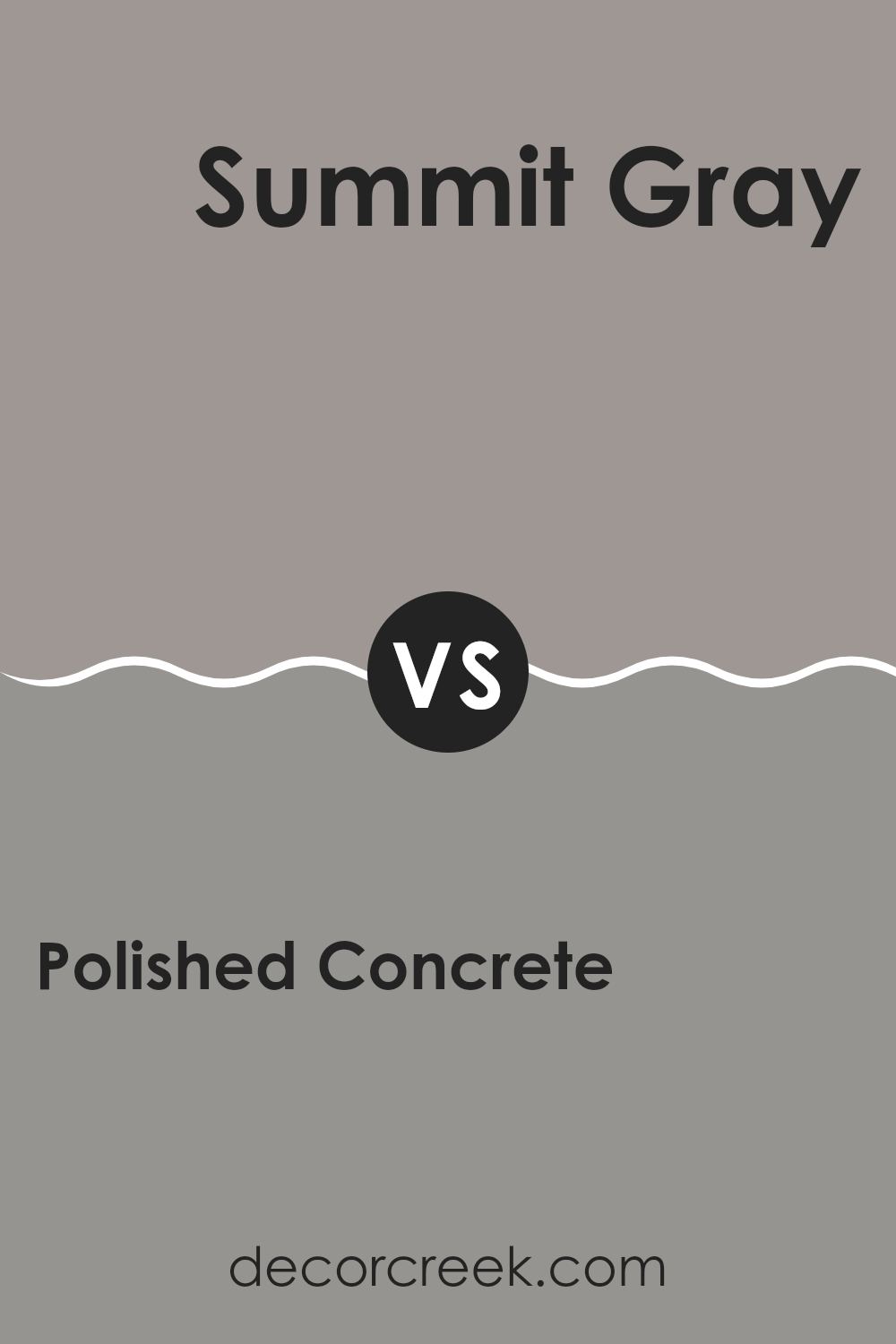
Polished Concrete SW 9167 by Sherwin Williams vs Summit Gray SW 7669 by Sherwin Williams
Polished Concrete and Summit Gray are two shades from Sherwin Williams. Polished Concrete is a deep, robust gray with a hint of warmth that makes it cozy and welcoming in any space. It’s a versatile color that goes well with various decor styles, making it a great base for any room.
On the other hand, Summit Gray is lighter and has a cooler tone compared to Polished Concrete. This color reflects more light, making it excellent for smaller rooms or spaces where you want to create a more open, airy feel.
While both colors share a gray base, Polished Concrete gives a stronger, warmer feel, and Summit Gray offers a lighter, fresher appearance. They can complement each other beautifully in different parts of a home or be used alone to set distinct moods in separate spaces.
You can see recommended paint color below:
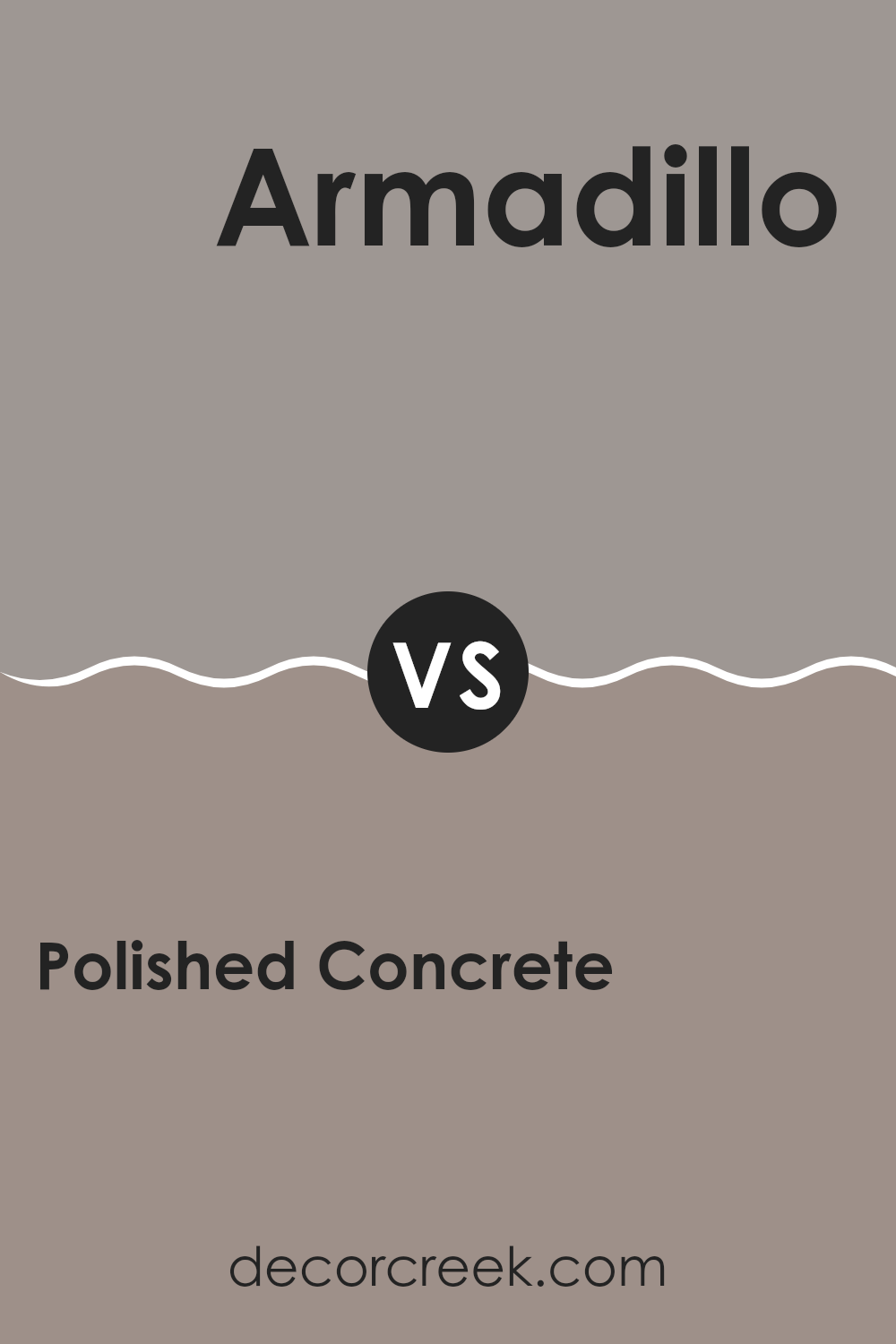
Polished Concrete SW 9167 by Sherwin Williams vs Armadillo SW 9160 by Sherwin Williams
Polished Concrete and Armadillo, both by Sherwin Williams, present subtle variations in hue that can affect the mood and style of a space. Polished Concrete is a lighter gray that gives a clean and open feel to rooms. It reflects more light, making it ideal for smaller or darker spaces to appear more spacious and airy.
In contrast, Armadillo is a deeper, warmer gray that offers a cozy and grounding effect. This color can help larger spaces feel more intimate and is great for creating a comforting ambiance. Both shades work well with a variety of decor styles and are versatile enough for any room.
However, while Polished Concrete provides a fresh, modern look, Armadillo leans towards a more traditional, homely vibe. Choosing between them would depend on the desired atmosphere and the room’s natural lighting.
You can see recommended paint color below:
- SW 9160 Armadillo
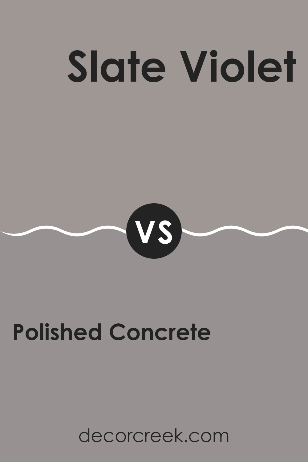
Polished Concrete SW 9167 by Sherwin Williams vs Slate Violet SW 9155 by Sherwin Williams
Polished Concrete and Slate Violet are two distinct paint colors from Sherwin Williams. Polished Concrete is a cool, neutral gray with hints of blue, which provides a calm, understated look. Slate Violet, on the other hand, is a muted purple with gray undertones, delivering subtle elegance to any space.
When comparing these colors, Polished Concrete serves as a versatile backdrop that can pair well with various decor styles and hues due to its neutral nature. Slate Violet, because of its purple-based tone, introduces a bit more personality and warmth, making it ideal for areas where a touch of softness is desired.
While both colors lend themselves well to modern aesthetics, the choice between them would depend on the mood and character you want to infuse into a room. Polished Concrete is safer for those seeking a broadly appealing look, while Slate Violet is perfect for creating a gentle yet distinct ambiance.
You can see recommended paint color below:
- SW 9155 Slate Violet
Concluding my thoughts on SW 9167 Polished Concrete by Sherwin Williams, I’m quite impressed with this color. It’s a shade that looks like the smooth, cool floor in a big, fancy building. It’s not just a simple gray; it’s got hints of something deeper, somewhat like the sky just before a big storm. I think this makes it unique because it can fit well in many different rooms and with lots of other colors.
Sherwin Williams did a good job making a paint that can make any room look modern and fresh without making too much noise. It’s calm and quiet in its way but still brings a strong feeling to a room. Whether you want to paint a living room, a bedroom, or even a kitchen, Polished Concrete gives you a solid base to start with. Plus, it pairs really well with both brighter colors and softer tones.
Overall, I believe it’s a great choice for anyone looking to give their home a modern touch with a cozy feel. It’s easy to see why it could be a favorite for both homes and places like offices or cafes. After seeing this color, I think it could inspire anyone to refresh their own space and make it feel new again.

Ever wished paint sampling was as easy as sticking a sticker? Guess what? Now it is! Discover Samplize's unique Peel & Stick samples.
Get paint samples

