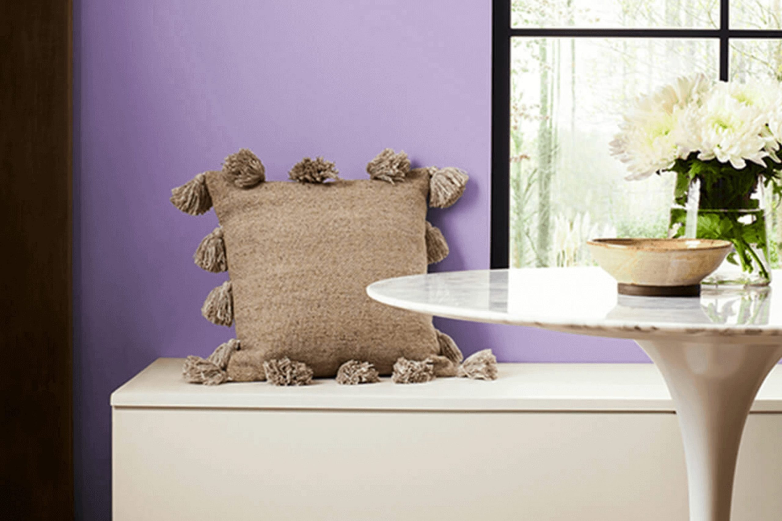
As you walk through the doors of your home, the color on the walls is one of the first things you notice. It sets the mood, and the hue called SW 9068 Berry Frappe by Sherwin Williams does just that with a subtle, soothing influence. In the hustle of everyday life, finding those moments of calm can be refreshing, and the right wall color can strongly contribute to this feeling.
Berry Frappe isn’t just another pink; it’s a refined blend that falls somewhere between a soft blush and a muted berry. This shade is strikingly flexible, complementing a wide range of decor styles and color schemes.
You’ll find that Berry Frappe works wonderfully in rooms meant for relaxation and even in areas that need a bit of energetic inspiration. Whether in the bedroom, where softness and calm are key, or in a busy kitchen, where warmth and welcome matter, this color meets the mark.
For anyone looking to refresh their room with a hue that’s both inviting and tasteful, Berry Frappe could be the perfect change you’re looking for. As we look at how this color behaves in different lighting and with various furnishings, it becomes clear that its flexibility is just as appealing as its aesthetic.
What Color Is Berry Frappe SW 9068 by Sherwin Williams?
Berry Frappe by Sherwin Williams is a vibrant color that brings to mind the juicy, refreshing taste of a berry smoothie. This lively shade is a blend of pink and purple hues, offering a cheerful and youthful vibe to any room. Its medium depth prevents it from feeling too much for a room, making it an excellent choice for adding a pop of color without dominating the overall design.
This color works especially well in interior styles that aim to be fun, inviting, and energetic, such as contemporary, eclectic, or even a modern farmhouse look with a twist. It’s particularly effective in living rooms, kids’ rooms, or kitchens where the goal is to create an upbeat and welcoming atmosphere.
When thinking about what materials and textures pair best with Berry Frappe, consider natural wood tones which can soften its impact and add warmth to the room. It also pairs beautifully with light fabrics and subtle floral patterns to keep a light and airy feel. Metallic finishes like brushed nickel or polished chrome can add a hint of sleekness and a modern feel, balancing out its playful look.
Overall, using Berry Frappe is a lovely way to add personality and vibrancy into a room, making it feel fresh and lively without becoming too much.
Is Berry Frappe SW 9068 by Sherwin Williams Warm or Cool color?
Berry Frappe is a unique paint color from Sherwin Williams that brightens any room with its lively hue. This delightful shade is a soft berry tone that combines elements of pink and purple, bringing a cheerful energy into rooms. Perfect for adding a splash of color, it suits different areas of a home, especially bedrooms, bathrooms, or even an accent wall in the living room.
The subtlety of Berry Frappe makes it highly flexible. It pairs beautifully with neutral colors like whites and grays, allowing for a balanced look. You can also match it with darker hues like navy or charcoal for a more dramatic effect. Furniture in natural wood tones complements the berry shade, improving its warmth and making the room feel cozy and welcoming.
In terms of lighting, Berry Frappe looks different depending on the light source. In natural sunlight, the color feels vibrant and airy, while under artificial lighting, it can show a more intimate and softer vibe. This flexibility makes it an excellent choice for many homes, adapting smoothly to different styles and tastes.
Undertones of Berry Frappe SW 9068 by Sherwin Williams
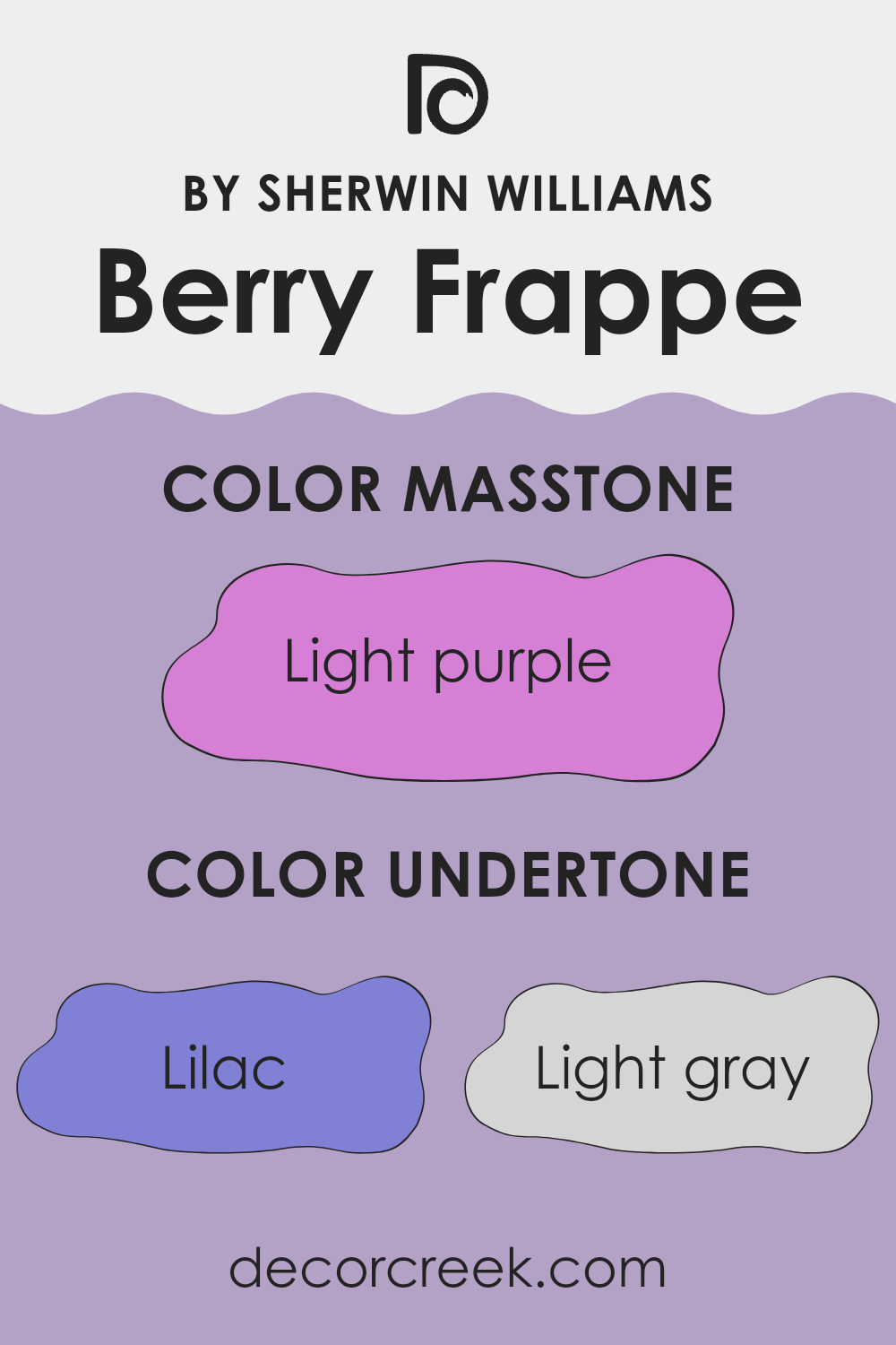
Berry Frappe is a unique paint color that can subtly change mood and style depending on its surrounding light and decor, largely due to its diverse undertones. Undertones are the colors that sit beneath the main surface color and they play a major role in how we perceive the main hue. For Berry Frappe, these undertones include shades like lilac, light gray, light blue, pale pink, gray, pale yellow, mint, fuchsia, violet, pink, and purple.
Each of these undertones adds a layer to Berry Frappe, influencing how it appears in different lighting conditions. In bright sunlight, for example, pale yellow and light blue might make the color appear cooler or warmer, while in dimmer, indoor light, lilac and pale pink might become more noticeable, giving the walls a softer look.
On interior walls, these undertones can improve the feeling of the room. Lilac and pink can create a calm, cozy atmosphere, whereas hints of mint or light blue might refresh a small room, making it feel more open. The complexity of Berry Frappe means it can complement a wide range of decor styles and color schemes. The presence of gray and light gray helps to balance brighter colors, ensuring that the paint doesn’t feel too much for the room but instead gently supports other design elements.
Choosing Berry Frappe for a room can be a great decision as it brings a beautiful and flexible backdrop that works well with many different types of furniture and accessories. Its ability to react to changing light with its mix of hidden colors can keep a room feeling fresh and inviting all day long.
What is the Masstone of the Berry Frappe SW 9068 by Sherwin Williams?
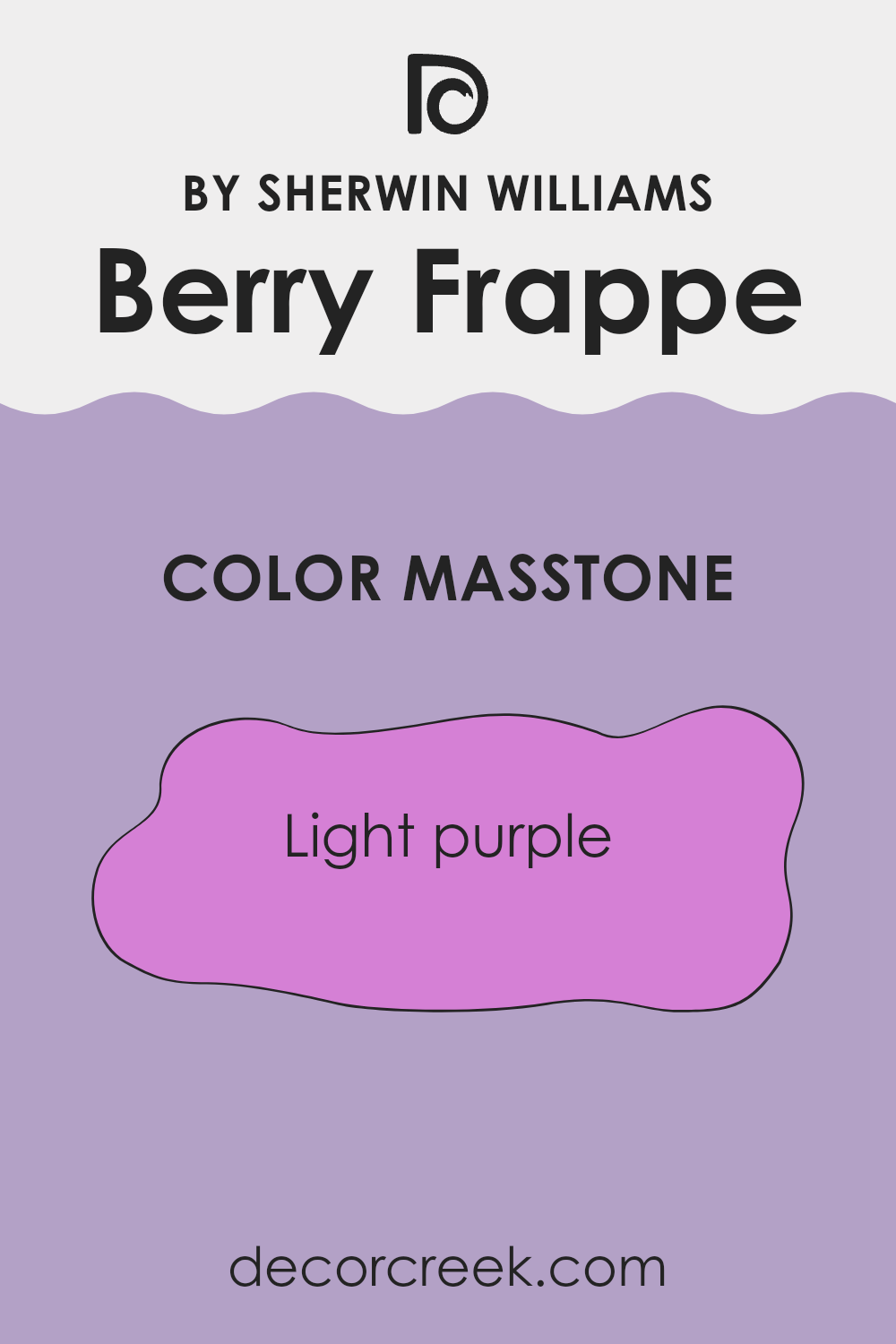
Berry Frappe, with its masstone of light purple (#D580D5), offers a vibrant yet relaxed feel to any room in which it is used. This shade is playful and can make small rooms seem larger because of its brightness and softness.
Ideal for rooms needing a cheerful uplift, this hue works wonderfully in a bedroom or bathroom where providing a sense of calm is essential without making the area too dull. It’s also an excellent choice for nurseries or kids’ rooms, where it adds a fun pop of color but is gentle enough to create a comforting environment.
Furthermore, light purple pairs easily with other colors, like grays and whites, for a modern and cohesive look. Whether you’re painting an entire room or an accent wall, Berry Frappe provides a fresh, appealing touch that’s perfect for creating a welcoming home atmosphere.
How Does Lighting Affect Berry Frappe SW 9068 by Sherwin Williams?
Lighting plays a crucial role in how we perceive colors. The type of light and the direction it comes from can strongly change the appearance of a color. Let’s look at how this affects Berry Frappe SW 9068, a specific paint color by Sherwin Williams.
Berry Frappe SW 9068 is a subtle and warm hue that can change based on the lighting conditions. In artificial light, such as from LED or incandescent bulbs, the color may appear slightly warmer, improving its pinkish tones. This makes rooms feel cozy and welcoming, especially in the evening.
In natural light, Berry Frappe SW 9068 looks different as the day progresses. Natural light shows the true character of the color, which can range from a soft, warm light in the morning to a more vibrant and bright appearance at noon, softening again towards the evening.
The direction a room faces also affects how Berry Frappe SW 9068 looks:
- North-Faced Rooms: These rooms receive less direct sunlight, which means colors can appear cooler and more muted. Here, Berry Frappe might look more muted, with its pink tones less noticeable.
- South-Faced Rooms: These rooms get plenty of sunlight, making colors look brighter and more vivid. In such rooms, Berry Frappe will be lively and vibrant throughout the day, showing off its warm undertones.
- East-Faced Rooms: Sunlight in these rooms is more intense during the morning. Here, Berry Frappe will have a very bright and cheerful appearance in the morning, turning cooler and more gentle as the day progresses.
- West-Faced Rooms: These rooms have the most sunlight during the afternoons and evenings. Berry Frappe will appear softer in the morning but gains intensity and warmth in the afternoon and evening, making it feel more dynamic.
Understanding how light affects this color can help in deciding which room and wall would suit it best, ensuring that you always get the desired mood and effect from your color choice.
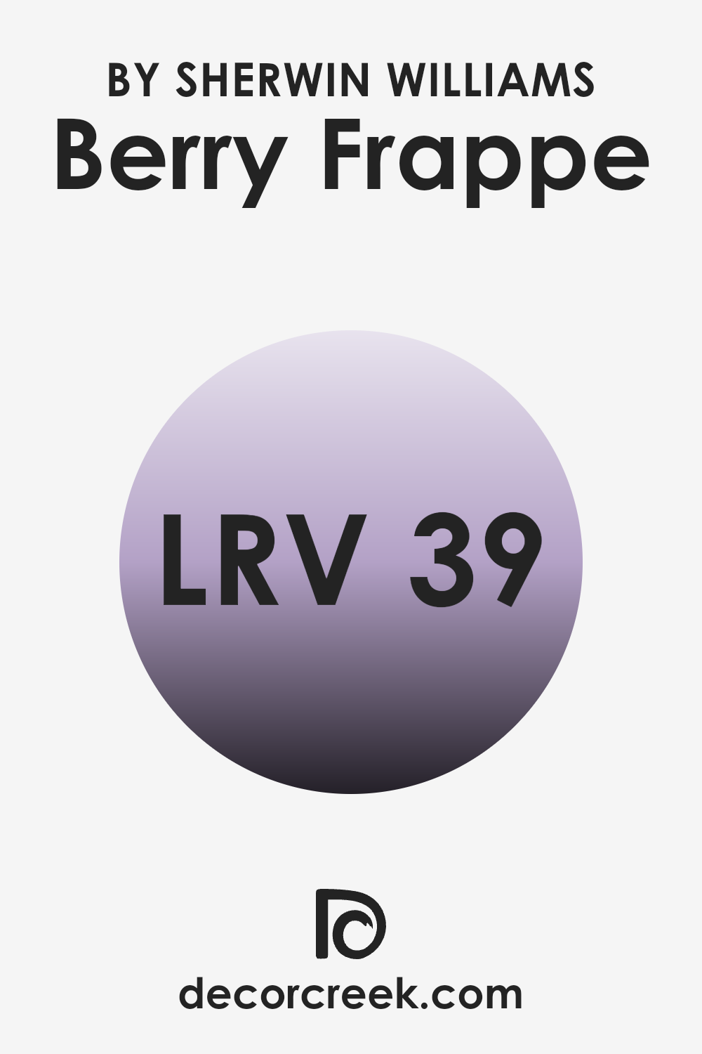
What is the LRV of Berry Frappe SW 9068 by Sherwin Williams?
LRV, or Light Reflectance Value, is a measurement that tells us how much light a color will reflect. It is usually on a scale from 0 to 100, where a lower value means the color is darker and absorbs more light, and a higher value means it is lighter and reflects more light. This metric is very useful when choosing paint colors for a room because it helps to determine how light or dark the room will appear once the color is applied to the walls.
When it comes to the specific color of LRV 39.159, it sits in the middle range. This means it’s not very dark but it’s not very light either. In practical terms, this mid-level LRV will reflect some light, but it will also absorb a fair amount too.
As a result, in a well-lit room, this color will appear somewhat light, but in a room with less natural or artificial light, it will seem darker. The way this color affects the room will strongly depend on the lighting conditions, making it a flexible choice for rooms that may be used differently throughout the day.
decorcreek.com
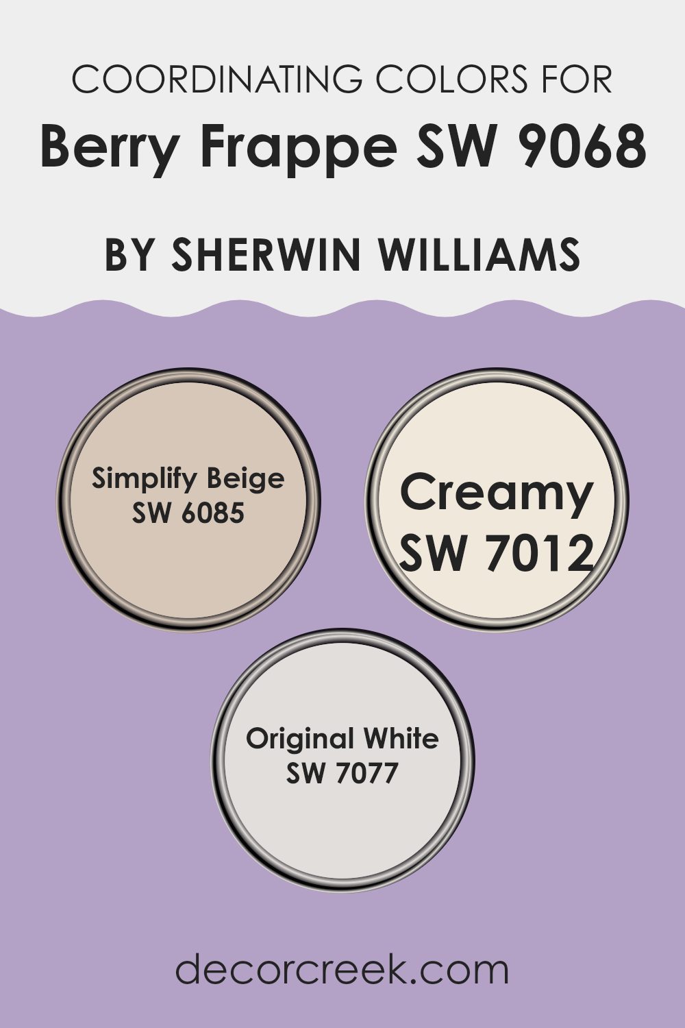
Coordinating Colors of Berry Frappe SW 9068 by Sherwin Williams
Coordinating colors work by complementing a main color to create a visually harmonious palette. In the case of Berry Frappe, a selection of coordinating shades can improve its aesthetic appeal and provide balance in a room’s decor. By using colors such as Simplify Beige, Creamy, and Original White by Sherwin Williams, one can achieve a well-rounded design. These shades are flexible, allowing them to blend smoothly with Berry Frappe and offer opportunities for creating warm, inviting rooms.
For instance, Simplify Beige is a warm, subtle beige that adds a refined, neutral backdrop that pairs well with the richer tones of Berry Frappe. This color can help soften the overall look while creating a calming effect. Creamy, as the name suggests, is a soft off-white with a delicate yellow undertone that can brighten rooms without feeling too much.
This color complements Berry Frappe by highlighting its depth and adding a light, airy quality to the palette. Original White is a clean, crisp white that offers a contrast that can make the features of Berry Frappe stand out more clearly. Using Original White can add clarity and freshness to any room, making it appear more open.
You can see recommended paint colors below:
What are the Trim colors of Berry Frappe SW 9068 by Sherwin Williams?
Trim colors play a crucial role in improving the aesthetic appeal of a main color by providing a contrasting or complementary frame that highlights and defines the room. In the case of a vibrant and lively color like Berry Frappe by Sherwin Williams, choosing the right trim color can strongly impact the visual coherence and balance of a room. Trim colors like Mindful Gray and Repose Gray are excellent choices as they provide a subtle contrast that allows the main color to stand out, while also keeping a harmonious color scheme that is pleasing to the eye.
Mindful Gray (SW 7016) is a warm, gentle gray that offers a soft contrast, making it a flexible choice for trims, especially when used with brighter tones like Berry Frappe. It has the ability to anchor the lighter, lively pink without feeling too much, creating a grounded yet lively atmosphere.
Repose Gray (SW 7015), on the other hand, is a lighter gray that leans towards a neutral palette. This color is particularly effective in balancing the vibrancy of Berry Frappe, as it gently blends with the trim to provide a cohesive backdrop that complements the bolder hue without clashing with it. Together, these grays ensure that the walls are beautifully framed, improving both the overall look and the individual character of the main color.
You can see recommended paint colors below:

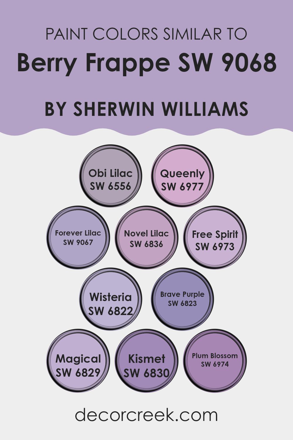
Colors Similar to Berry Frappe SW 9068 by Sherwin Williams
Similar colors are important in design as they allow for a harmonious look, providing a subtle variety without feeling too much for the senses. By using shades that share a common hue but differ slightly in tone or saturation, you create depth and interest while keeping a cohesive feel. For instance, when decorating a room, selecting a palette of similar colors ensures that the elements blend smoothly, creating a pleasant look that is easy on the eye. This approach is also forgiving for beginners, as it’s easier to achieve balance without the risk of clashing.
Looking at a range of similar colors, such as Obi Lilac, offers a soft lavender that brings a gentle, light-hearted touch to rooms. Forever Lilac is slightly richer, providing depth while keeping that light, airy feel. Novel Lilac and Queenly, on the other hand, introduce darker lavender shades, adding a touch of elegance without moving away from the calming nature of lighter lilacs.
Free Spirit steps into a breezier, more playful feel with its lively lilac hue. For those who love floral inspiration, Wisteria and Brave Purple reflect the charming colors of the wisteria flower, with Brave Purple leaning toward a slightly stronger visual impact.
Magical and Kismet follow this theme as well, but with a bit more brightness, setting a lively mood in any room. Plum Blossom rounds out the selection with a rich, ripe tone that suggests depth, perfect for an accent wall or bold decor items. Each of these colors works well with Berry Frappe, adding layers of subtlety to the overall design scheme while staying close enough to blend beautifully.
You can see recommended paint colors below:
- SW 6556 Obi Lilac
- SW 6977 Queenly
- SW 9067 Forever Lilac
- SW 6836 Novel Lilac
- SW 6973 Free Spirit
- SW 6822 Wisteria
- SW 6823 Brave Purple
- SW 6829 Magical
- SW 6830 Kismet
- SW 6974 Plum Blossom
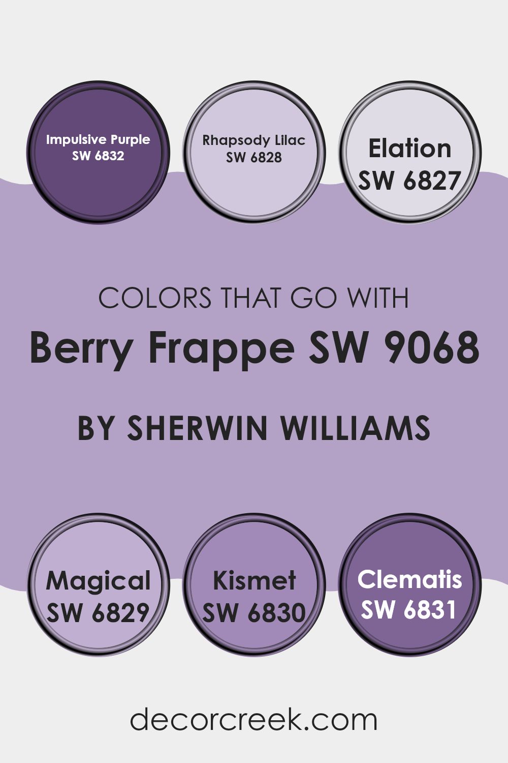
Colors that Go With Berry Frappe SW 9068 by Sherwin Williams
Choosing the right colors to complement Berry Frappe SW 9068 by Sherwin Williams is important for creating a cohesive and visually appealing room. When paired thoughtfully, these colors improve the overall look and bring balance to a room.
For instance, using SW 6832 – Impulsive Purple introduces a bold and vibrant touch that beautifully offsets the softer tones of Berry Frappe. This deep, dynamic purple adds a layer of richness and depth which can make furniture or decor items stand out. Similarly, SW 6828 – Rhapsody Lilac offers a lighter, gentle hue that softens rooms and is ideal for areas meant to have a calming feel without losing a touch of personality.
Moreover, SW 6827 – Elation is a fresh and airy color that can brighten up any room, especially when used alongside the cooler Berry Frappe. It’s perfect for creating a refreshing vibe in common areas like kitchens or bathrooms. On the other hand, SW 6829 – Magical brings a touch of elegance with its muted purplish-grey undertone, which can make it easy to blend traditional and modern elements in a living room.
For those looking to add a sense of energy into their surroundings, SW 6830 – Kismet presents a vivid magenta that pairs strongly with Berry Frappe, adding an unexpected pop of color. Finally, SW 6831 – Clematis, with its soft, floral inspiration, offers a delicate contrast that complements the strong base of Berry Frappe, ideal for achieving a balanced, harmonious look. Choosing the right colors for your room involves considering how each color works together and the mood it creates, making a well-rounded, visually interesting environment.
You can see recommended paint colors below:
- SW 6832 Impulsive Purple
- SW 6828 Rhapsody Lilac
- SW 6827 Elation
- SW 6829 Magical
- SW 6830 Kismet
- SW 6831 Clematis
How to Use Berry Frappe SW 9068 by Sherwin Williams In Your Home?
Berry Frappe SW 9068 by Sherwin Williams is a vibrant paint color that can brighten any home room. If you’re looking to freshen up a room, this shade is an excellent choice.
With its lively pink hue, it can add a fun and cheerful touch to areas like the bathroom, a child’s bedroom, or even a home office. You can also use it to paint one wall as an accent in a more neutral-colored room, adding a pop of color without feeling too much for the room.
This color works well when paired with light shades like soft whites or creams, which help to balance its brightness. This pairing creates a fresh and inviting atmosphere. Additionally, combining it with darker or earthy tones can ground the room and provide a more balanced visual appeal. Berry Frappe is especially fitting for anyone looking to add a playful and upbeat vibe into their home décor.
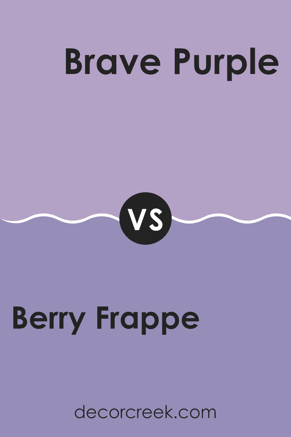
Berry Frappe SW 9068 by Sherwin Williams vs Brave Purple SW 6823 by Sherwin Williams
Berry Frappe is a soft, gentle shade in comparison to the bold Brave Purple. Berry Frappe has a muted tone that complements subtle, understated decor styles.
It’s a flexible color, blending well with neutrals or serving as a quiet backdrop to bolder colors. In contrast, Brave Purple is vibrant and stands out. It commands attention in any room it’s used and is ideal for creating a focal point or adding a burst of energy to a room.
While Berry Frappe is more about creating a calm, relaxed vibe, Brave Purple, being vivid, tends to energize the environment. These two colors suit different moods and design needs, making them useful in a range of settings depending on the desired impact.
You can see recommended paint color below:
- SW 6823 Brave Purple
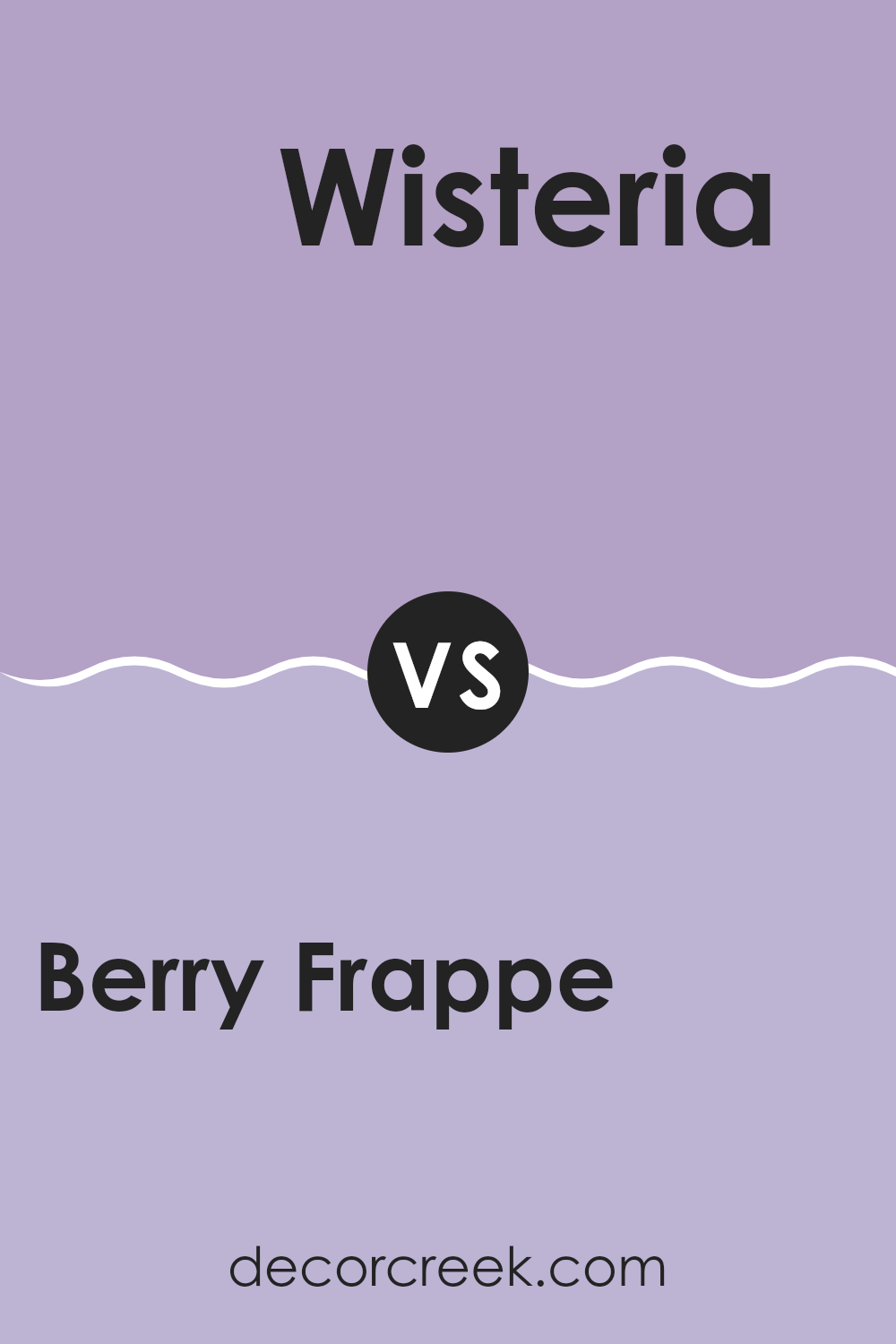
Berry Frappe SW 9068 by Sherwin Williams vs Wisteria SW 6822 by Sherwin Williams
The color Berry Frappe is a soft, muted plum that offers a cozy and inviting feel. It’s a flexible shade that can make a room feel warm and welcoming, ideal for living rooms or bedrooms where a calm atmosphere is valued.
On the other hand, Wisteria is a vibrant and lively lilac color. This shade is lighter and more striking compared to Berry Frappe. Wisteria stands out more in a room and could be a great choice for areas that could use a dash of brightness, like bathrooms or kids’ play areas.
It brings a cheerful energy and can add a playful touch to any interior. Overall, while Berry Frappe sets a soothing tone with its understated elegance, Wisteria adds a pop of youthful freshness and energy into decor.
You can see recommended paint color below:
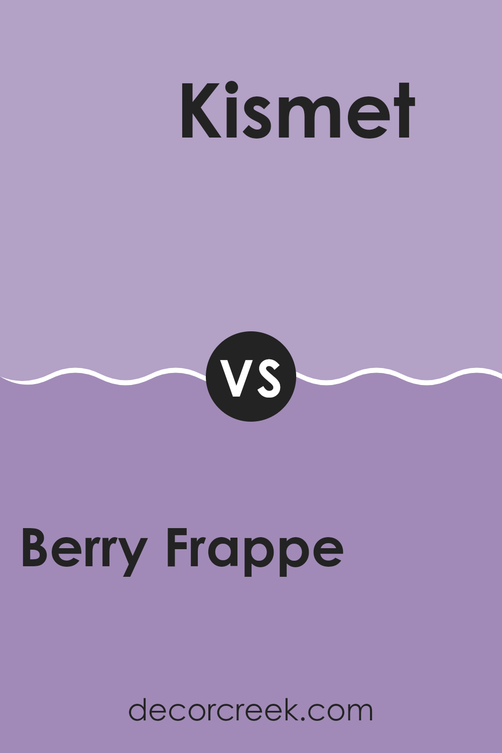
Berry Frappe SW 9068 by Sherwin Williams vs Kismet SW 6830 by Sherwin Williams
Berry Frappe is a soft, muted pink with a hint of purplish tones, creating a gentle and soothing ambiance. It’s light enough to make small rooms feel bigger while adding a cozy, warm feel.
On the other hand, Kismet stands out as a vivid, bold magenta. This color is more striking and energetic, and it can definitely make a statement in a room.
It’s great for accent walls or decor items if you want to add a pop of color without feeling too much for the room. While Berry Frappe brings a subtle charm, Kismet is more about impact and excitement. Together, they can balance each other nicely in a room that aims to be both lively and relaxing.
You can see recommended paint color below:
- SW 6830 Kismet
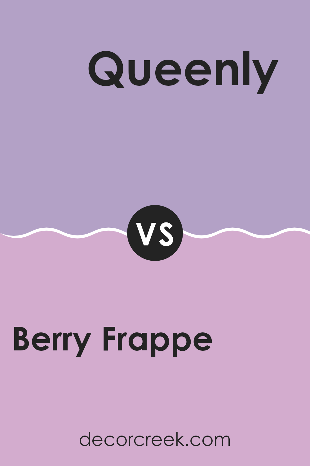
Berry Frappe SW 9068 by Sherwin Williams vs Queenly SW 6977 by Sherwin Williams
Berry Frappe is a soft, muted pink that has a cozy and inviting feel, perfect for creating a warm atmosphere in rooms meant for relaxation, like living rooms or bedrooms. It’s gentle enough to be soothing but has just enough saturation to add a noticeable touch of color to a room without feeling too much.
In contrast, Queenly is a strong, vibrant purple that commands attention and adds a bold splash of color wherever it’s used. This shade is ideal for making a statement, whether as an accent wall or in decorative accessories throughout a room. Its boldness works well in creative or lively areas, like a home office or entertainment room.
These two colors offer distinctly different vibes: Berry Frappe brings warmth and softness, while Queenly adds energy and a dynamic punch. Depending on what kind of mood or style you’re aiming for, each has its unique appeal, either to calm or energize a room.
You can see recommended paint color below:
- SW 6977 Queenly
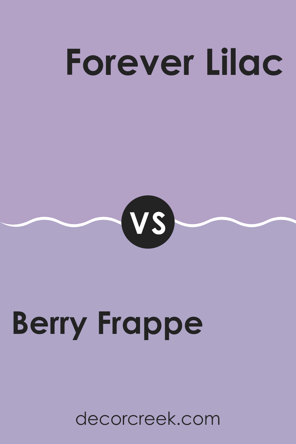
Berry Frappe SW 9068 by Sherwin Williams vs Forever Lilac SW 9067 by Sherwin Williams
Berry Frappe and Forever Lilac, both from Sherwin Williams, present beautiful shades that complement each other well. Berry Frappe is a rich, vibrant color reminiscent of a berry blend with its deep, warm pink hues. It energizes a room while keeping a cozy vibe.
In contrast, Forever Lilac is a softer, more gentle color. It has a subtle purple tone that looks fresh and soothing, perfect for creating a calm and inviting room. When used together, these colors can balance each other’s intensity.
Berry Frappe provides a pop of warmth, making it a great accent, while Forever Lilac offers a lighter backdrop, suitable for larger wall areas. Both shades work wonderfully in a variety of living areas, particularly bedrooms and living rooms where you might want a mix of vibrancy and calm.
You can see recommended paint color below:
- SW 9067 Forever Lilac
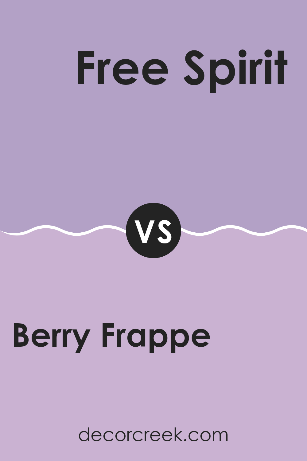
Berry Frappe SW 9068 by Sherwin Williams vs Free Spirit SW 6973 by Sherwin Williams
Berry Frappe is a subtle, soft pink with a dusty hue that gives off a calming, gentle vibe. It’s a color that feels light and airy, making it a good choice for rooms where you want a touch of warmth without feeling too much brightness.
On the other hand, Free Spirit is a bold and bright teal that brings a lot of energy into a room. This color is vibrant and stands out, making it perfect for areas where you want to add a splash of lively color.
When comparing Berry Frappe and Free Spirit, the main difference is in their impact on a room’s mood. Berry Frappe creates a soft, calming environment, while Free Spirit is all about making a lively, dynamic statement. Berry Frappe works well in bedrooms or cozy living areas, and Free Spirit is great for accent walls or places where you want to add fun and excitement.
You can see recommended paint color below:
- SW 6973 Free Spirit
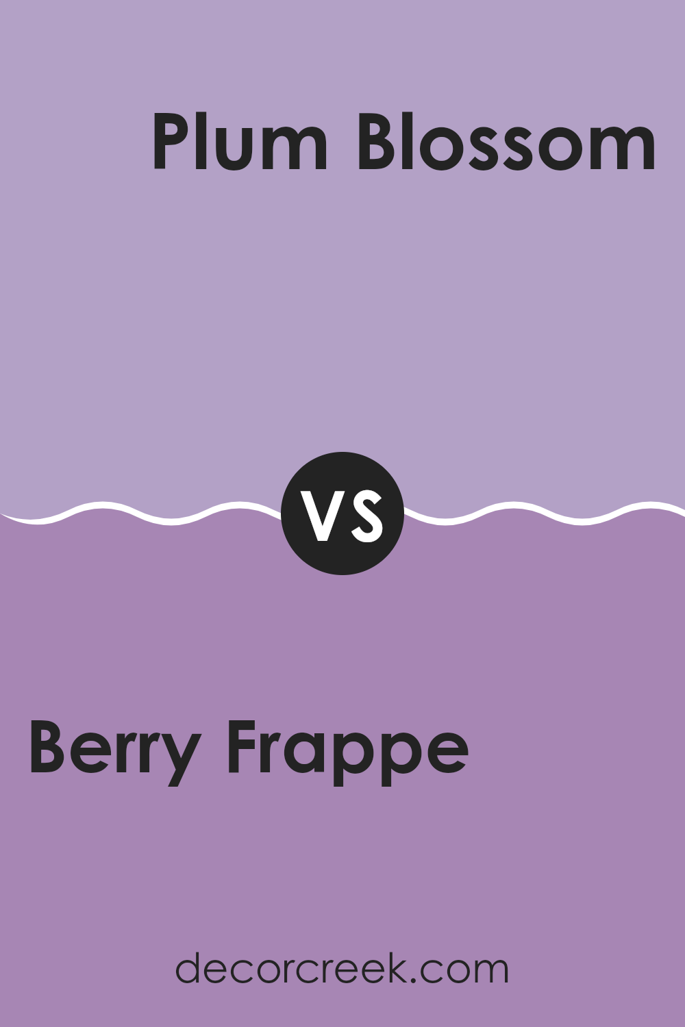
Berry Frappe SW 9068 by Sherwin Williams vs Plum Blossom SW 6974 by Sherwin Williams
Berry Frappe and Plum Blossom are two distinct colors by Sherwin Williams. Berry Frappe is a soft, muted pink with warm undertones, creating a cozy and welcoming vibe in any room. It’s gentle and subtle, making it perfect for areas where you want a touch of color without feeling too much for the senses.
On the other hand, Plum Blossom is a rich, deep purple that adds a bold and vivid touch to rooms. This color is more striking and can make a strong statement in an area, whether used on an accent wall or throughout a room.
While Berry Frappe offers a hint of color, Plum Blossom provides a more dramatic impact, ideal for those looking to add some vibrancy to their decor. Both colors have their unique appeal depending on the mood and style you wish to achieve in your room.
You can see recommended paint color below:
- SW 6974 Plum Blossom
Berry Frappe SW 9068 by Sherwin Williams vs Magical SW 6829 by Sherwin Williams
The main color, Berry Frappe, is a soft, muted pink with a touch of warmth that makes it cozy and inviting. It’s a calm color that brings a gentle, soothing atmosphere to any room, ideal for areas meant for relaxation or intimate gatherings.
On the other hand, Magical is a bright, vibrant turquoise that adds a splash of energy and cheerfulness to its surroundings. This color is perfect for those looking to add a dynamic and joyful touch to their room, making it lively and exciting.
When comparing both colors, Berry Frappe offers a subtle and warm hue that creates a relaxed vibe, whereas Magical brings a lively and stimulating energy with its eye-catching brightness. Both colors can strongly change the feel of a room, but they serve different moods and settings. Berry Frappe is better for softer, more understated rooms, while Magical is great for areas that benefit from a bright, cheerful pop of color.
You can see recommended paint color below:
- SW 6829 Magical
Berry Frappe SW 9068 by Sherwin Williams vs Obi Lilac SW 6556 by Sherwin Williams
Berry Frappe and Obi Lilac by Sherwin Williams are both beautiful, unique shades but they give off distinctly different vibes and can set varied moods in a room. Berry Frappe is a rich, muted pink with a hint of raspberry, which provides a cozy, welcoming feel. This color can make a room feel warm and intimate, ideal for living rooms or bedrooms where you want comfort and a touch of color.
On the other hand, Obi Lilac has a distinctly lighter, airy feel, with a soft purple tone that leans towards a pastel. It’s a gentle color that can make a room feel open and relaxed, perfect for bathrooms or small rooms that you want to appear larger.
While both colors can be used creatively in all types of interiors, Berry Frappe works well in rooms that benefit from darker, warmer tones, and Obi Lilac fits beautifully in areas where light colors are used to create a sense of calm and openness. How you use these colors can really affect the mood and feel of your rooms.
You can see recommended paint color below:
Berry Frappe SW 9068 by Sherwin Williams vs Novel Lilac SW 6836 by Sherwin Williams
Berry Frappe is a soft, warm pink shade with a cozy and inviting feel, almost reminiscent of a gentle blush. It has a subtle quality that makes it quite flexible for any room, creating a soothing atmosphere. This color is particularly great for rooms where you want a touch of warmth without feeling too much boldness.
On the other hand, Novel Lilac is a brighter, more energetic color. It’s a vibrant lilac shade that adds a pop of playful energy to any room. The color is more intense than Berry Frappe, with a cheerful vibe that can liven up a room. This makes it a good choice for areas that benefit from a splash of color, like a child’s room or a creative room.
In summary, while Berry Frappe brings warmth and softness, Novel Lilac offers vibrancy and a more outgoing personality. Each color serves its own unique purpose depending on the mood and energy you want to create in your room.
You can see recommended paint color below:
In wrapping up my thoughts about SW 9068 Berry Frappe by Sherwin Williams, I have to say, it’s a delightful paint color! This shade is like a soft, friendly hug for any room looking to feel cozy and cheerful. It’s a sort of pink that isn’t too bold or too quiet, which makes it perfect for places where you want to feel relaxed and happy.
Using Berry Frappe could make a bedroom feel like a sunny morning or a living room like a fun play area. It blends well with lots of other colors, so you can add your favorite blues, greens, or even yellows for a fun and pretty look. It’s easy to apply too, and once it’s on the wall, it makes the room feel warm and welcoming.
For anyone wanting to give their home a pretty and gentle touch, I’d definitely recommend considering Berry Frappe. It’s got a charm that makes your home not just a place to live but a loving place to enjoy every day. Whether updating a single room or the whole house, this color brings a smile and a splash of joy with ease.
So, if you’re thinking about a new look, Berry Frappe is a great choice to make your home shine!

Ever wished paint sampling was as easy as sticking a sticker? Guess what? Now it is! Discover Samplize's unique Peel & Stick samples.
Get paint samples

