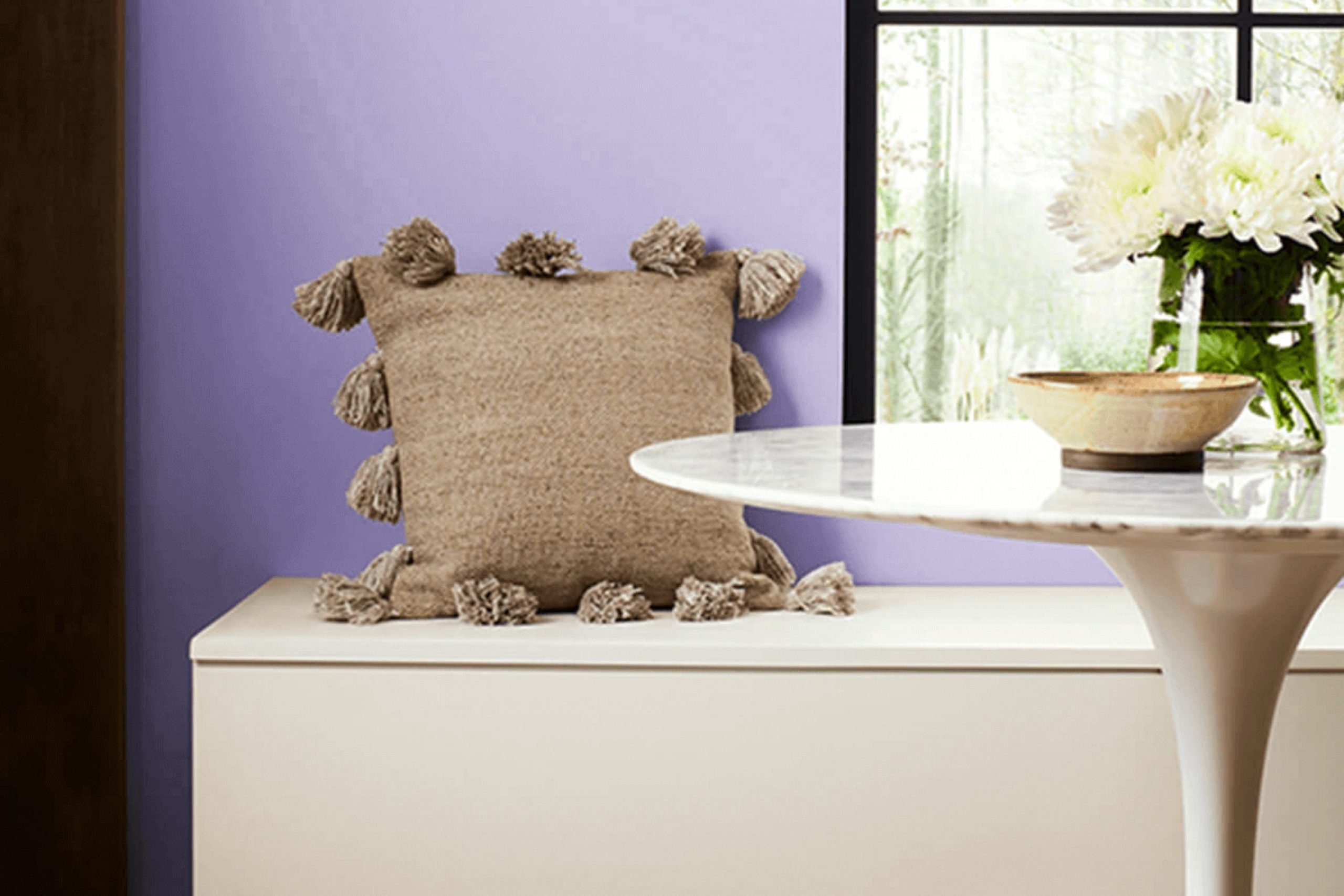
If you’re thinking about giving your room a fresh look, you might want to consider the paint color SW 6822 Wisteria by Sherwin Williams. This shade isn’t just a regular purple; it has a unique charm that mixes playfulness with refinement. You’ll find that it has the ability to brighten up a room while still bringing a depth that adds character.
Whether you’re looking to repaint your living room, bedroom, or even a kitchen, Wisteria provides a flexible backdrop that complements various decor styles and color palettes. Its soft and subtle hue works wonderfully in rooms that need a touch of color without overpowering the senses. Also, matching Wisteria with different textures and furniture finishes can create a dynamic yet harmonious look.
From personal experience, using Wisteria has added a delightful dimension to my home. It pairs well with white trims for a crisp, clean appearance or can be coordinated with darker shades for a more dramatic effect. This color can really help you refresh your favorite room or liven up a dull area.
Choosing the right paint color can be a crucial decision, and with Wisteria, you might just find that perfect balance of warmth and style you were hoping to achieve.
What Color Is Wisteria SW 6822 by Sherwin Williams?
The color Wisteria is a vibrant and playful purple shade with a lively touch that can brighten up any room. It has a joyful yet calm personality, making it a fantastic choice for adding a pop of color without overpowering the senses. Its vivid hue can inject energy into a room while creating a comfortable and inviting atmosphere.
Wisteria works especially well in contemporary and eclectic interior styles. Its dynamic nature allows it to blend beautifully with modern furnishings and decorative elements. It’s particularly striking in living rooms, kid’s play areas, or even as an accent wall in a neutral-toned bedroom.
When it comes to pairing materials and textures with Wisteria, consider natural wood to ground its exuberance. Light oak or warm walnut creates a delightful contrast and keeps the room feeling grounded. For fabrics, think about pairing it with velvets or soft linens to add a layer of luxury and comfort. Metallic finishes like brass or copper can also complement this color’s playful and lively nature, adding a touch of glamour to the room.
Incorporating Wisteria into your home is a sure way to add a fun and fresh element that improves the overall feel of your decor. Whether it’s a feature wall, a piece of furniture, or even home accents, this color promises to liven up any interior it inhabits.
Is Wisteria SW 6822 by Sherwin Williams Warm or Cool color?
Wisteria 6822 by Sherwin Williams is a gentle purple color that gives a fresh and light feel to any room. This color works well in homes because it adds a touch of softness without being too bold or overpowering. It’s especially great for bedrooms where you want a calming atmosphere for relaxing and sleeping. In living rooms, it pairs nicely with creams or white trims to create a cozy, inviting room.
Since it’s not a very dark shade, this color can help make small rooms look a bit more spacious and brighter. It also matches well with various decor styles, whether you’re going for a modern look or something more rustic.
Furniture in neutral colors or light woods complements it really well. Overall, Wisteria 6822 is a flexible paint color that works beautifully in many areas of the home, bringing a light, calming touch to the rooms it fits into.
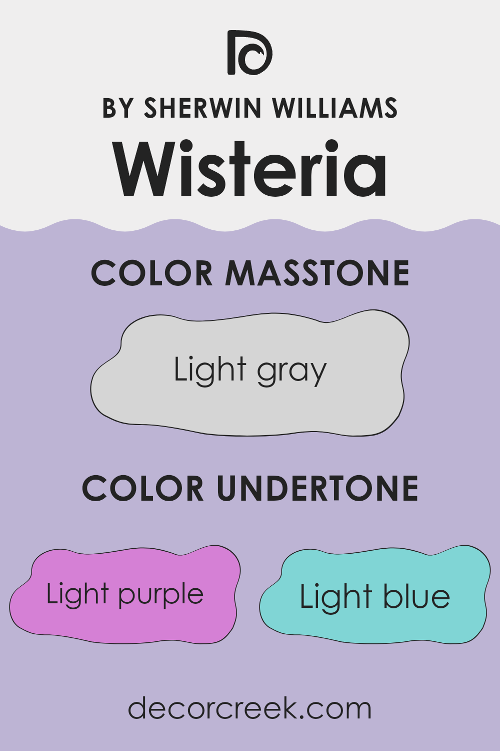
Undertones of Wisteria SW 6822 by Sherwin Williams
Wisteria by Sherwin Williams is a unique color that carries a blend of subtle undertones, making it flexible for different interior rooms. The undertones of a paint color are slight hues mixed into the primary color, influencing how it appears under various lighting conditions and when paired with different decor elements.
For Wisteria, the undertones include light purple, light blue, lilac, pale yellow, pale pink, mint, and grey. These undertones contribute to the complexity of the color, giving it a multifaceted appearance that can shift based on the room’s lighting and surrounding colors.
For example, in a room with abundant natural light, the light blue and lilac undertones might make the walls feel slightly cooler, while in a room with warmer, dim lighting, the pale yellow and pale pink undertones might make the room feel softer and subtly warmer.
When used on interior walls, Wisteria provides a neutral base with a twist. The grey undertone maintains a sense of calm and neutrality, making it easy to match with various furnishings and accents. Meanwhile, the hints of mint and light purple can bring a gentle vibrancy to the room, adding depth and interest without overpowering the senses.
Overall, the color’s ability to adapt slightly in different environments makes it a good choice for those looking to add a hint of color to their walls while maintaining flexibility in their decor choices.
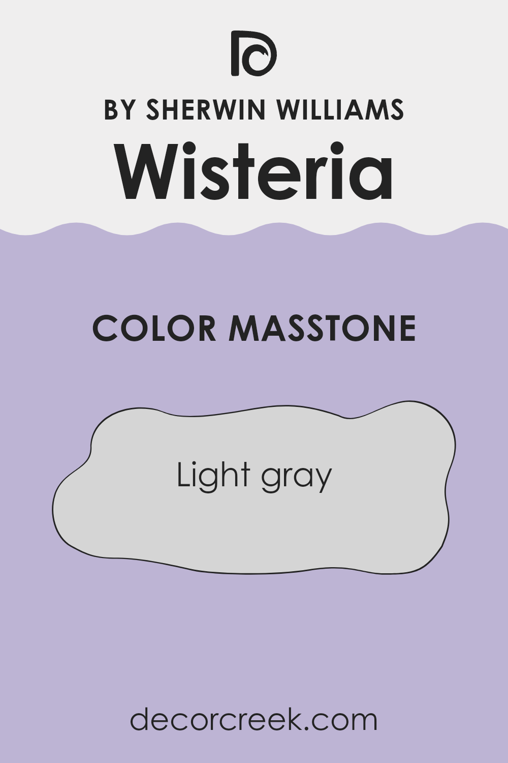
What is the Masstone of the Wisteria SW 6822 by Sherwin Williams?
Wisteria SW 6822 by Sherwin Williams has a masstone of Light Gray, identified by the shade #D5D5D5. This soft and neutral gray color is flexible, making it a popular choice for use in many areas of a home.
Its lightness gives the impression of more room in smaller rooms, such as bathrooms or hallways, making them feel airier and less cramped. In larger rooms like living rooms or bedrooms, this gray works beautifully as a calm backdrop, allowing furniture and artwork to stand out.
Its gentle tone pairs well with a wide range of other colors, from bright hues to darker shades, giving homeowners the flexibility to add personal touches through décor and accessories. The neutrality of Light Gray means it doesn’t clash with existing elements, making it a practical choice for those updating their home without wanting to do a full redesign.
How Does Lighting Affect Wisteria SW 6822 by Sherwin Williams?
Lighting has a significant impact on how we perceive colors in our surroundings. Different types of light can change the way colors look, and this effect is particularly noticeable with unique shades like Wisteria SW 6822 by Sherwin Williams. This particular color can appear differently under artificial light compared to natural light, making it a flexible choice for various rooms.
In artificial light, Wisteria SW 6822 tends to appear more vibrant and slightly deeper. This richness makes it a great choice for evening settings or rooms that rely on lamps and overhead lighting. It can give a cozy and inviting atmosphere, improving the room’s appeal during nighttime usage.
In contrast, under natural light, Wisteria SW 6822 displays a softer and more subtle hue. Daylight brings out the true character of the color, which can be ideal for creating a gentle and refreshing environment. Its responsiveness to natural light makes it suitable for living areas where daylight is abundant.
The orientation of a room also changes how Wisteria SW 6822 will look. North-facing rooms often get less direct sunlight, which can make colors appear slightly cooler. In such scenarios, Wisteria can seem more subdued and less saturated, which could be excellent for creating a calm area in the home. South-facing rooms enjoy ample sunlight making Wisteria look brighter and more vivid, improving the warmth of the room.
East-facing rooms benefit from morning light, which can make Wisteria SW 6822 look very welcoming and lively in the mornings, fading to a softer tone as the day progresses. On the other hand, in west-facing rooms, this color will feel cooler in the morning and become warmer and more dynamic by the afternoon due to the intense afternoon sun, offering a dynamic visual experience throughout the day.
Overall, Wisteria SW 6822’s flexibility under different lighting conditions and room orientations makes it a popular choice for those wanting a color that adapts to its surroundings, offering different moods and atmospheres throughout the day.
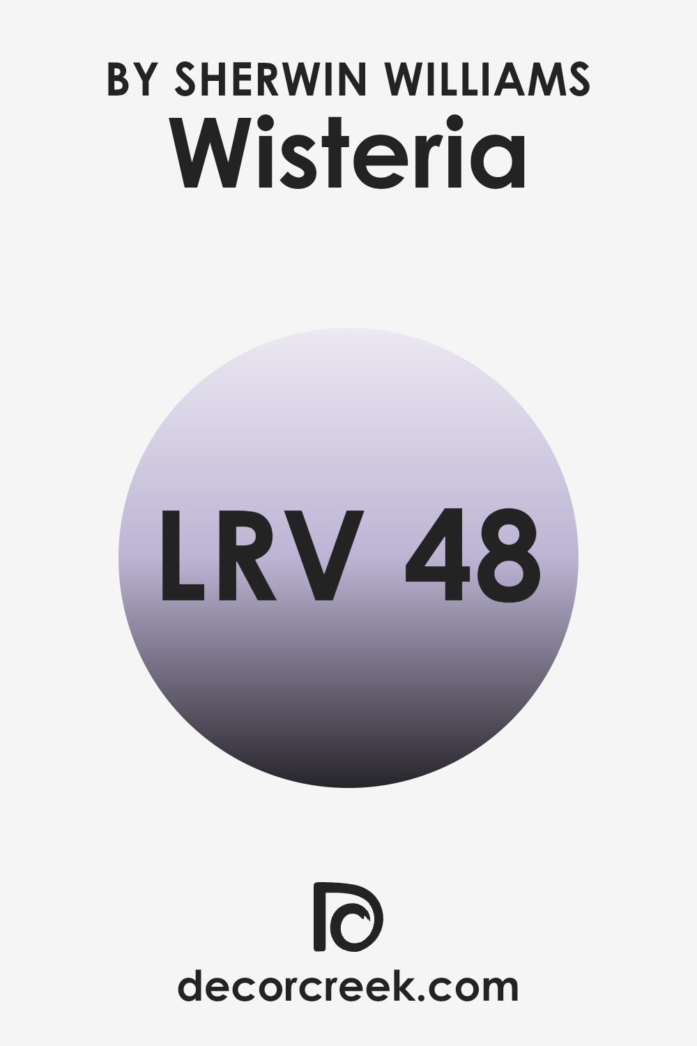
What is the LRV of Wisteria SW 6822 by Sherwin Williams?
LRV stands for Light Reflectance Value, which is a measure that tells you how much light a paint color reflects back into a room compared to the amount it absorbs. The scale used for LRV goes from 0, which is pure black and absorbs all light, to 100, which is pure white and reflects all light back into the room.
This value is crucial when choosing paint colors because it impacts how light or dark a color looks on your walls and thus affects the overall mood and feel of a room. For example, a color with a high LRV makes a room feel brighter and more open, while a lower LRV can make a room feel cozier but smaller.
The specified color, Wisteria, has an LRV of approximately 48. This is almost at the midpoint of the LRV scale, meaning it neither reflects nor absorbs light excessively. As a result, Wisteria offers a balance that can work well in various lighting conditions. In a room with lots of natural light, this color will appear vibrant and lively without being overpoweringly bright. In lower light, it maintains a presence without turning too dark, making it a flexible choice for different rooms and settings. Thus, it’s a practical color if you’re unsure about the natural light conditions of your room or if you want a color that carries a balanced, moderate energy.
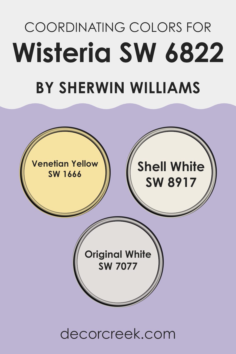
Coordinating Colors of Wisteria SW 6822 by Sherwin Williams
Coordinating colors are shades that complement each other well and bring harmony to a design palette. When used thoughtfully, these colors can greatly enhance the visual appeal of a room by balancing tones and creating a cohesive look. For example, the soft purple of Wisteria by Sherwin Williams pairs beautifully with specific coordinating colors that balance its hue and help to establish a mood that is both balanced and appealing.
One of the coordinating colors is Venetian Yellow, a warm and vibrant shade that provides a striking contrast to Wisteria. This lively yellow adds a splash of brightness, energizing rooms and making them feel more inviting.
Another coordinating color is Shell White, a gentle and subdued white with a slightly warm undertone that offers a calm and soothing break from more intense colors, making it perfect for trim or larger areas to balance the stronger tones. Finally, Original White is a crisp, clear white that provides a pure and unadulterated background, allowing Wisteria to stand out beautifully. This true white helps in highlighting architecture details or improving the spatial perception of a room. Together, these colors work to create environments that are pleasant and beautifully balanced.
You can see recommended paint colors below:
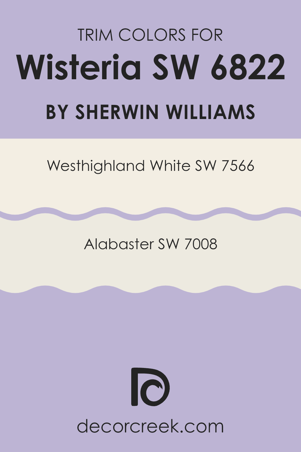
What are the Trim colors of Wisteria SW 6822 by Sherwin Williams?
Trim colors are essential accents in painting that highlight architectural details and frame the main color of a room or exterior, helping to define the room distinctly. For a vibrant shade like Wisteria by Sherwin Williams, choosing the right trim colors can improve its visual appeal and overall cohesion within a design scheme. White and off-white colors are particularly effective as they provide a clean, crisp border that can make the primary color stand out while maintaining a harmonious look.
Westhighland White by Sherwin Williams is a warm and creamy white that softens the boldness of Wisteria, giving a gentle and inviting contrast. It is ideal for creating a cozy and welcoming atmosphere in rooms where relaxation is key.
On the other hand, Alabaster by Sherwin Williams is a slightly lighter shade that offers a subtle contrast, brightening up rooms without overpowering the main color. It provides a fresh and clean look, making it suitable for more minimalistic or modern designs where simplicity and clarity are desired. Both colors, by providing a refined framework, help Wisteria stand out in a balanced and appealing way.
You can see recommended paint colors below:
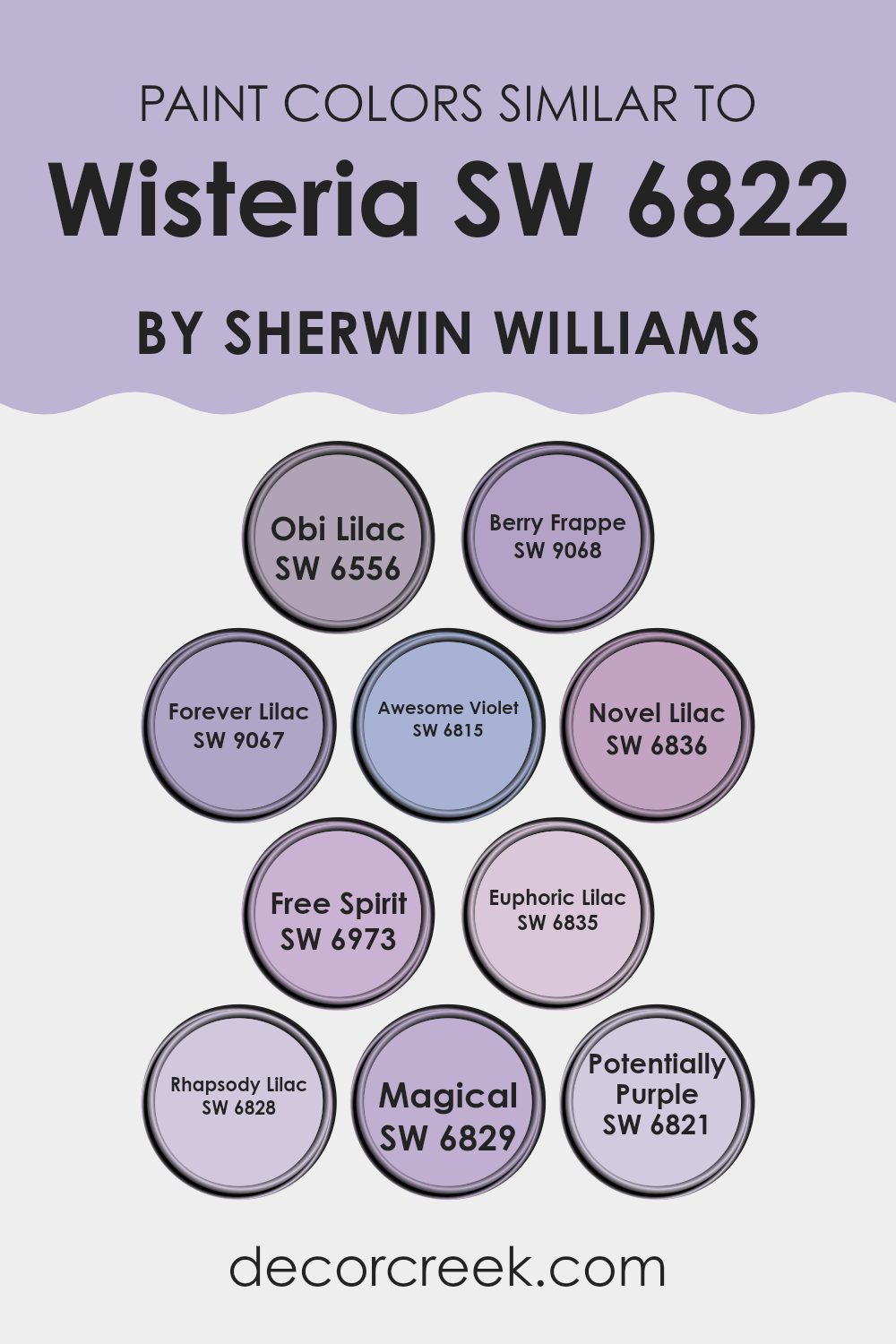
Colors Similar to Wisteria SW 6822 by Sherwin Williams
Choosing similar colors is essential when aiming to create a cohesive and harmonious color scheme in any room. Colors like SW 6556 – Obi Lilac, which offers a muted lavender hue, are perfect for soft transitions in design.
Nearby, SW 9068 – Berry Frappe adds a touch of richness with its deeper, berry-inspired tone, while SW 9067 – Forever Lilac presents a slightly dustier version of the lavender shades, giving depth and variety. SW 6815 – Awesome Violet shows a more pronounced violet shade that provides a vibrant contrast that is still in harmony due to its similar undertones.
Further enriching this palette, SW 6836 – Novel Lilac introduces a fresh, modern take on lilac with a clear, crisp vibe. Similarly, SW 6973 – Free Spirit reflects a deep, expressive purple that suggests creativity and imagination without overpowering. SW 6835 – Euphoric Lilac lends a lighter, airy quality to the mix, perfect for creating a calming atmosphere.
SW 6828 – Rhapsody Lilac then deepens the scenario slightly, adding an element of mystery and depth, while SW 6829 – Magical reaches into a nearly fantastical shade of light purple. Lastly, SW 6821 – Potentially Purple rounds out this group by offering a flexible purple that can tie together various elements within a room, ensuring each color complements the others beautifully while maintaining its unique appeal.
You can see recommended paint colors below:
- SW 6556 Obi Lilac
- SW 9068 Berry Frappe
- SW 9067 Forever Lilac
- SW 6815 Awesome Violet
- SW 6836 Novel Lilac
- SW 6973 Free Spirit
- SW 6835 Euphoric Lilac
- SW 6828 Rhapsody Lilac
- SW 6829 Magical
- SW 6821 Potentially Purple
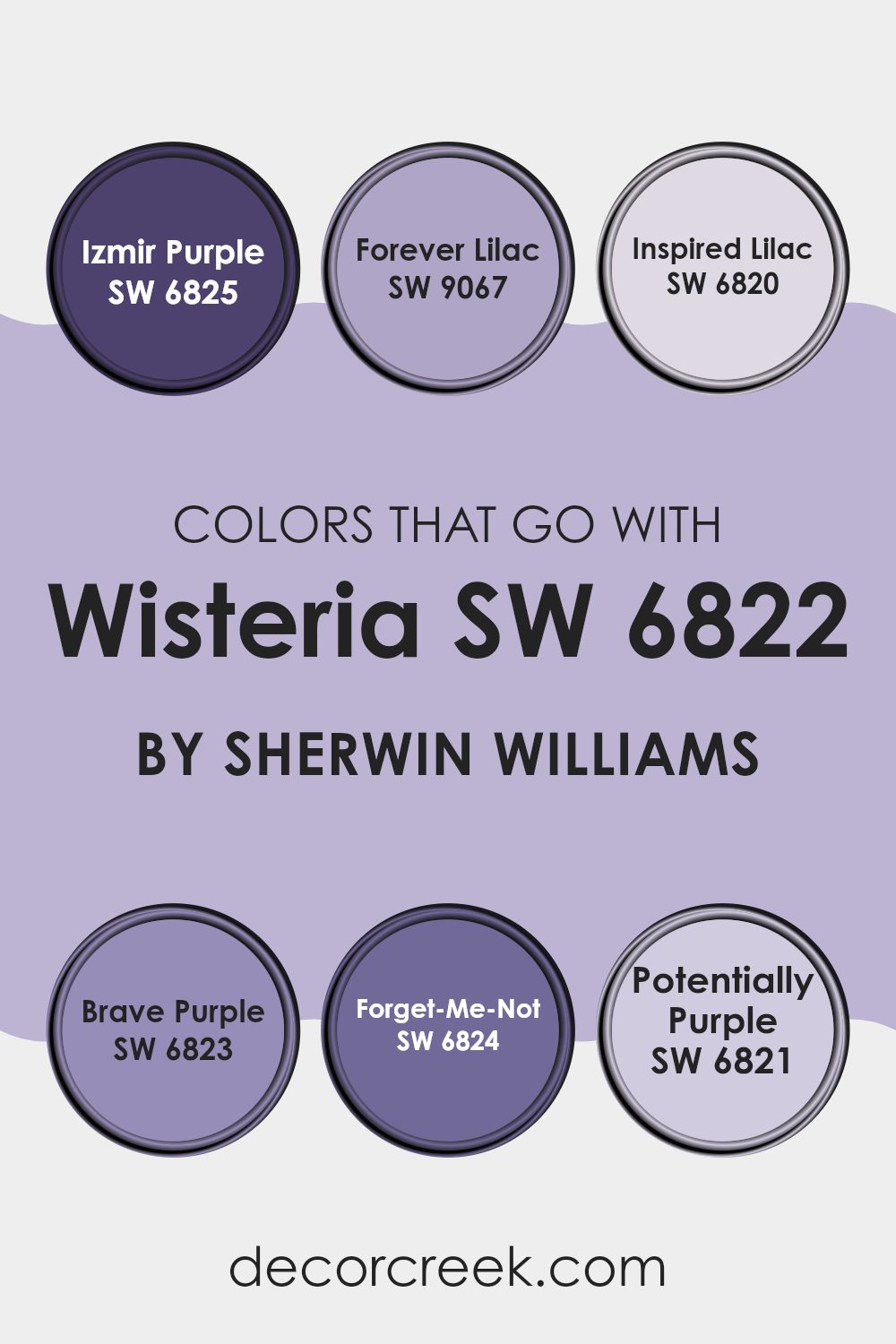
Colors that Go With Wisteria SW 6822 by Sherwin Williams
When decorating a room with a standout color like Wisteria SW 6822 by Sherwin Williams, coordinating colors play a crucial role in creating a cohesive and appealing look. These complementary colors can improve the main hue’s beauty, make the room feel balanced, and express a sense of style.
For example, Izmir Purple SW 6825 works well with Wisteria as it’s a deeper, muted purple that can provide a lovely contrast, enriching the vibrancy of Wisteria without overpowering it. The lighter tone of Forever Lilac SW 9067 introduces a soft, subtle option that brings lightness and freshness to a room, offering a gentle contrast that is easy on the eyes.
Colors like Inspired Lilac SW 6820 provide a near match to Wisteria, making the pairing smooth and calming, which is especially good in setting a relaxed mood in bedrooms or living areas. Brave Purple SW 6823, on the other hand, brings a bold, energetic feel to the mix, perfect for accentuating features or creating focal points within a room.
Forget-Me-Not SW 6824 offers a bluer touch, giving a creative twist to rooms that aim for uniqueness without straying too far from the purple palette. Meanwhile, Potentially Purple SW 6821 stands out as a lighter, almost whimsical purple that can brighten darker corners or smaller details, adding layers and depth to the overall design. Together, these colors complement Wisteria by providing various options that suit different tastes and design goals.
You can see recommended paint colors below:
- SW 6825 Izmir Purple
- SW 9067 Forever Lilac
- SW 6820 Inspired Lilac
- SW 6823 Brave Purple
- SW 6824 Forget-Me-Not
- SW 6821 Potentially Purple
How to Use Wisteria SW 6822 by Sherwin Williams In Your Home?
Wisteria by Sherwin Williams is a lovely shade of purple that brings a fresh and lively feel to any room. It’s perfect for someone looking to add a touch of color without overpowering the room. When using Wisteria in your home, consider painting it on one wall as an accent.
This technique helps create a focal point without making the room feel too closed in. You can also paint smaller areas like the backs of bookshelves or a hallway nook for an unexpected pop of color.
If you enjoy crafting a cohesive look, pair Wisteria walls with neutral-toned furniture and accessories in white, beige, or light gray. These colors keep the room feeling open and airy, while letting the purple stand out. To add a bit more interest, mix in soft green or yellow accents through pillows or decor, complementing the cheerful vibe of the Wisteria. This shade is flexible enough for living rooms, bedrooms, or even a bathroom, giving a fresh and stylish look to your living areas.
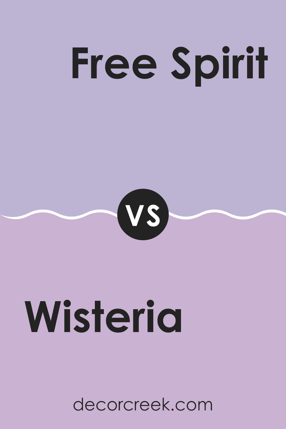
Wisteria SW 6822 by Sherwin Williams vs Free Spirit SW 6973 by Sherwin Williams
Wisteria and Free Spirit are two distinct and vibrant colors offered by Sherwin Williams. Wisteria is a soft, muted purple with a gentle, comforting vibe. It provides a subtle hint of color to a room without overpowering the senses, ideal for creating a relaxing and cozy atmosphere.
On the other hand, Free Spirit stands out as a bright and bold turquoise. This lively color can energize any room and is perfect for adding a splash of cheer and modernity. It pairs well with both neutral and bold palettes, offering flexibility in design choices.
While Wisteria is more understated and works well in bedrooms or living areas for a peaceful feel, Free Spirit is suitable for areas where vibrancy and interaction are desired, like kitchens or playrooms. Together, these colors offer two very different approaches to styling a room, whether you’re looking for calmness or liveliness.
You can see recommended paint color below:
- SW 6973 Free Spirit
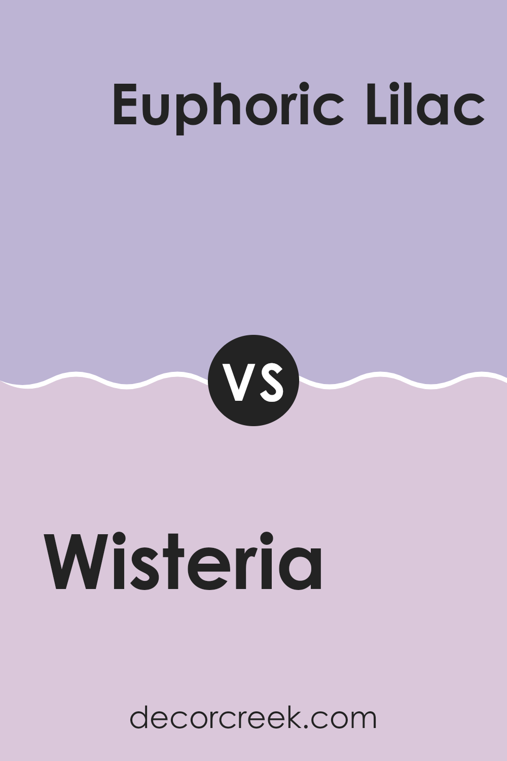
Wisteria SW 6822 by Sherwin Williams vs Euphoric Lilac SW 6835 by Sherwin Williams
Main color, Wisteria, and the second color, Euphoric Lilac, are both from Sherwin Williams but they bring unique tones to the table. Wisteria is a deeper, more saturated purple, giving a feeling of richness and depth.
It’s a vibrant color that can make a strong statement in a room. On the other hand, Euphoric Lilac has a lighter, softer touch. It’s more understated and gently infuses a room with a calm, light purple hue. While Wisteria might be better suited for a focal wall or an area where you want some drama.
Euphoric Lilac is great for creating a calming background in a more relaxed setting like a bedroom or bathroom. Both colors reflect different moods and can affect the feeling in a room depending on how they are used.
You can see recommended paint color below:
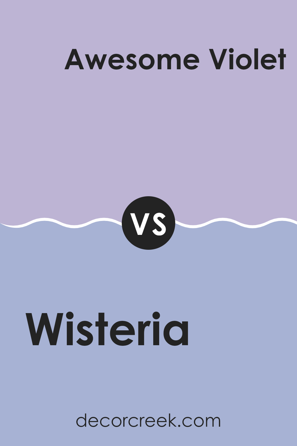
Wisteria SW 6822 by Sherwin Williams vs Awesome Violet SW 6815 by Sherwin Williams
The color Wisteria SW 6822 is a soft, pastel purple with muted tones, making it subtle and calming for any room. It’s perfect for creating a gentle atmosphere in rooms where you want to relax, like bedrooms or living areas.
On the other hand, Awesome Violet SW 6815 is a bolder, more vivid purple. This shade has a richer, more intense quality, bringing a lively burst of energy to a room. It would work well in areas that benefit from a splash of color, such as a dining room or entryway.
Both colors share a purple base, but their intensity and vibrancy differ greatly. Wisteria is more laid-back and understated, while Awesome Violet is outgoing and dynamic, making them suited for different moods and settings.
You can see recommended paint color below:
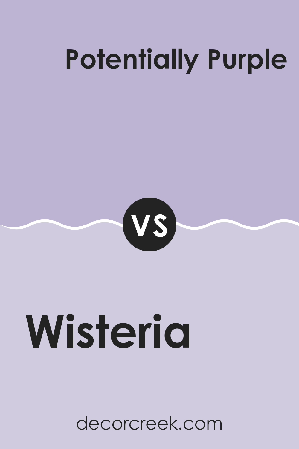
Wisteria SW 6822 by Sherwin Williams vs Potentially Purple SW 6821 by Sherwin Williams
Wisteria SW 6822 and Potentially Purple SW 6821 by Sherwin Williams are both shades of purple, but they offer distinct tones that can set different moods in a room. Wisteria SW 6822 is a light and gentle purple, resembling the soft color of the wisteria flower.
It’s perfect for creating a calm and inviting atmosphere without being too bright or overpowering. On the other hand, Potentially Purple SW 6821 is a deeper shade with more intensity. It’s still soft but has a richness that makes it ideal for adding a sense of depth and warmth to an area.
Both colors are flexible and can work well in various settings like bedrooms or living areas, depending on the vibe you want to achieve. If you prefer subtlety, go with Wisteria; for a bolder look, Potentially Purple might be your choice.
You can see recommended paint color below:
- SW 6821 Potentially Purple
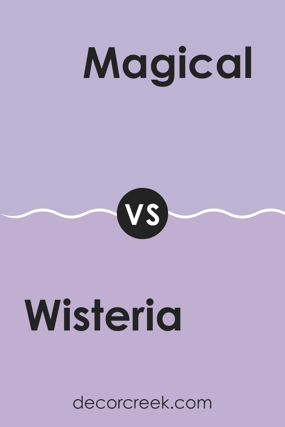
Wisteria SW 6822 by Sherwin Williams vs Magical SW 6829 by Sherwin Williams
The color Wisteria is a soft yet vibrant purple that has a playful and lively vibe. This shade adds a touch of freshness and is perfect for rooms that aim to have a cheerful and inviting atmosphere. It’s a color that can brighten up a room while still adding a dash of elegance.
On the other hand, Magical is a deeper, more intense purple. It offers a richer and slightly more dramatic look compared to Wisteria. Magical is excellent for creating a striking feature wall or when used in a room that benefits from a more deep and bold color impact.
Both colors, being variations of purple, carry a certain amount of warmth and creativity. Wisteria might be more suited for a light and breezy room, perhaps a child’s room or a casual living area. Magical, with its deeper tone, is ideal for a more formal area or an accent that needs to stand out.
You can see recommended paint color below:
- SW 6829 Magical
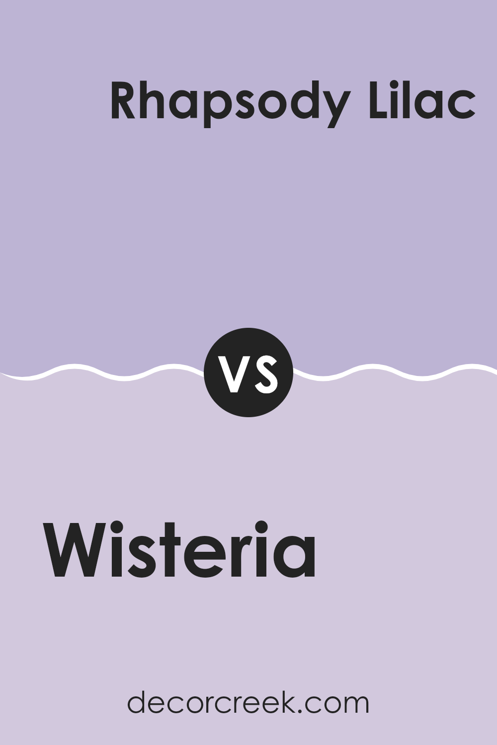
Wisteria SW 6822 by Sherwin Williams vs Rhapsody Lilac SW 6828 by Sherwin Williams
Wisteria and Rhapsody Lilac, both by Sherwin Williams, offer unique shades of purple that differ subtly in hue and mood. Wisteria presents a lighter, softer lavender tone that carries a gentle, airy feel, making it excellent for creating a calm and welcoming atmosphere in rooms like bedrooms or bathrooms. Its understated quality allows it to blend well with various decors, adding a touch of lightness without overpowering the room.
On the other hand, Rhapsody Lilac displays a deeper, more pronounced purple. This color has a richer intensity which can add a striking effect to a room. Despite its bolder nature, it still maintains an inherent softness typical of lilac shades.
Rhapsody Lilac is particularly well-suited for areas where a more vibrant, yet still calming, impact is desired. It works beautifully as a feature wall or in a room that benefits from a bit more color to add personality and warmth. Both colors offer their own unique charms, making them flexible options for different tastes and styles.
You can see recommended paint color below:
Wisteria SW 6822 by Sherwin Williams vs Berry Frappe SW 9068 by Sherwin Williams
Wisteria SW 6822 and Berry Frappe SW 9068 are two distinct colors offered by Sherwin Williams, presenting very different vibes for any room. Wisteria is a soft, light purple with a slightly blue undertone, offering a gentle and calm feel. It’s a great choice if you’re looking to add a touch of light and airiness to a room without overpowering it.
On the other hand, Berry Frappe is a deeper, muted pink with a touch of warmth to it, giving off a cozy and inviting atmosphere. This color works well in rooms where you want to add a bit of coziness and warmth, making it ideal for living rooms or bedrooms.
Both colors are quite flexible, but their impact is markedly different based on their depth and tone. Wisteria leans towards a refreshing, open feel, while Berry Frappe tends towards a snug, comforting ambiance. Depending on what mood or style you’re aiming for, choosing between these two could significantly alter the room’s overall feel.
You can see recommended paint color below:
- SW 9068 Berry Frappe
Wisteria SW 6822 by Sherwin Williams vs Novel Lilac SW 6836 by Sherwin Williams
Wisteria and Novel Lilac are two distinct shades offered by Sherwin Williams. Wisteria is a vibrant, deep purple with a bold presence that adds a punch of color to any room. Its intensity works well in areas where you want to make a statement, such as an accent wall or a decorative piece of furniture.
On the other hand, Novel Lilac is a softer, more subdued purple. It has a gentle appeal, making it perfect for creating a relaxed atmosphere in places like bedrooms or bathrooms. Its lighter tone brings a fresh and airy feel, perfect for rooms intended for rest or light activity.
In comparing the two, Wisteria stands out with its depth and vividness, while Novel Lilac offers a calmer, more laid-back vibe. Depending on the mood you want to set in a room, either color can be a great choice — Wisteria for energy and vibrance, and Novel Lilac for softness and ease.
You can see recommended paint color below:
Wisteria SW 6822 by Sherwin Williams vs Forever Lilac SW 9067 by Sherwin Williams
The main color, Wisteria, is a lively and somewhat bold shade of purple with strong blue undertones, giving it a vibrant, energetic feel that stands out brightly in a room. It can add a playful and dynamic splash of color to rooms, making it ideal for areas where a bit of cheer is needed.
On the other hand, Forever Lilac is a much softer and more subdued purple. It leans towards a more gentle and muted tone, featuring hints of grey that calm down its purple base. This color is perfect for creating a relaxed atmosphere in rooms meant for unwinding, such as bedrooms or bathrooms.
When comparing the two, Wisteria is more attention-grabbing and could be the focal point in decor, while Forever Lilac serves well as a background color, complementing other hues without overpowering them. Each color would be best suited to different types of rooms depending on the mood one aims to set.
You can see recommended paint color below:
- SW 9067 Forever Lilac
Wisteria SW 6822 by Sherwin Williams vs Obi Lilac SW 6556 by Sherwin Williams
Wisteria SW 6822 and Obi Lilac SW 6556 are both colors by Sherwin Williams that belong to the purple family, but they bring different vibes to a room. Wisteria is a deeper, more saturated purple that adds a bold and lively feel to rooms.
It’s ideal for those looking to make a statement or add a focal point to their interiors. On the other hand, Obi Lilac is a lighter, softer purple with a calming effect. It’s much more subtle than Wisteria, making it great for creating a gentle and relaxing atmosphere in rooms like bedrooms or bathrooms.
While both colors share a purple base, Wisteria leans towards a richer hue, whereas Obi Lilac offers a pastel tone that’s often preferred for creating a light and airy feel. This difference makes each color suitable for different design needs and personal preferences.
You can see recommended paint color below:
After reading about SW 6822 Wisteria by Sherwin Williams, I’ve learned a lot about this unique paint color. Wisteria is not just any ordinary purple; it has a special charm that can make any room feel happy and welcoming.
It reminds me of a light purple flower, and it seems perfect for anyone who loves colors that are soft and not too bright. This color can be a wonderful choice for bedrooms because it creates a cozy and calm atmosphere. It might also look beautiful in a bathroom or as a fun color in a playroom.
Whether you’re thinking about painting a whole room or just one wall for a fun accent, Wisteria could be a great pick. Parents and kids will probably like it because it’s playful but still pretty. My conclusion? SW 6822 Wisteria by Sherwin Williams seems like a fantastic pick for families wanting to add a splash of gentle color to their homes. It makes rooms cheerful without being too loud, and it’s a color that can grow with your style over time.

Ever wished paint sampling was as easy as sticking a sticker? Guess what? Now it is! Discover Samplize's unique Peel & Stick samples.
Get paint samples

