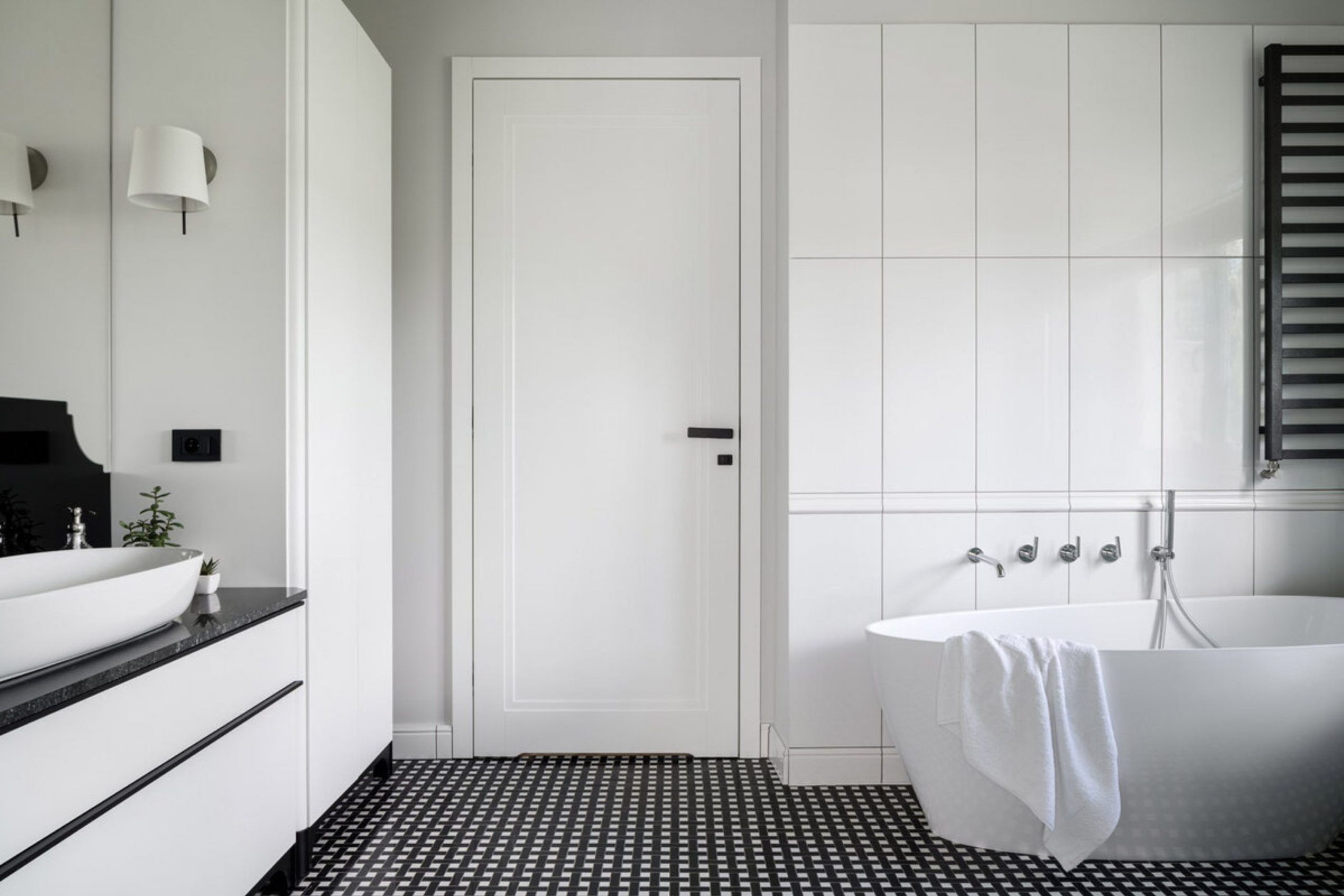
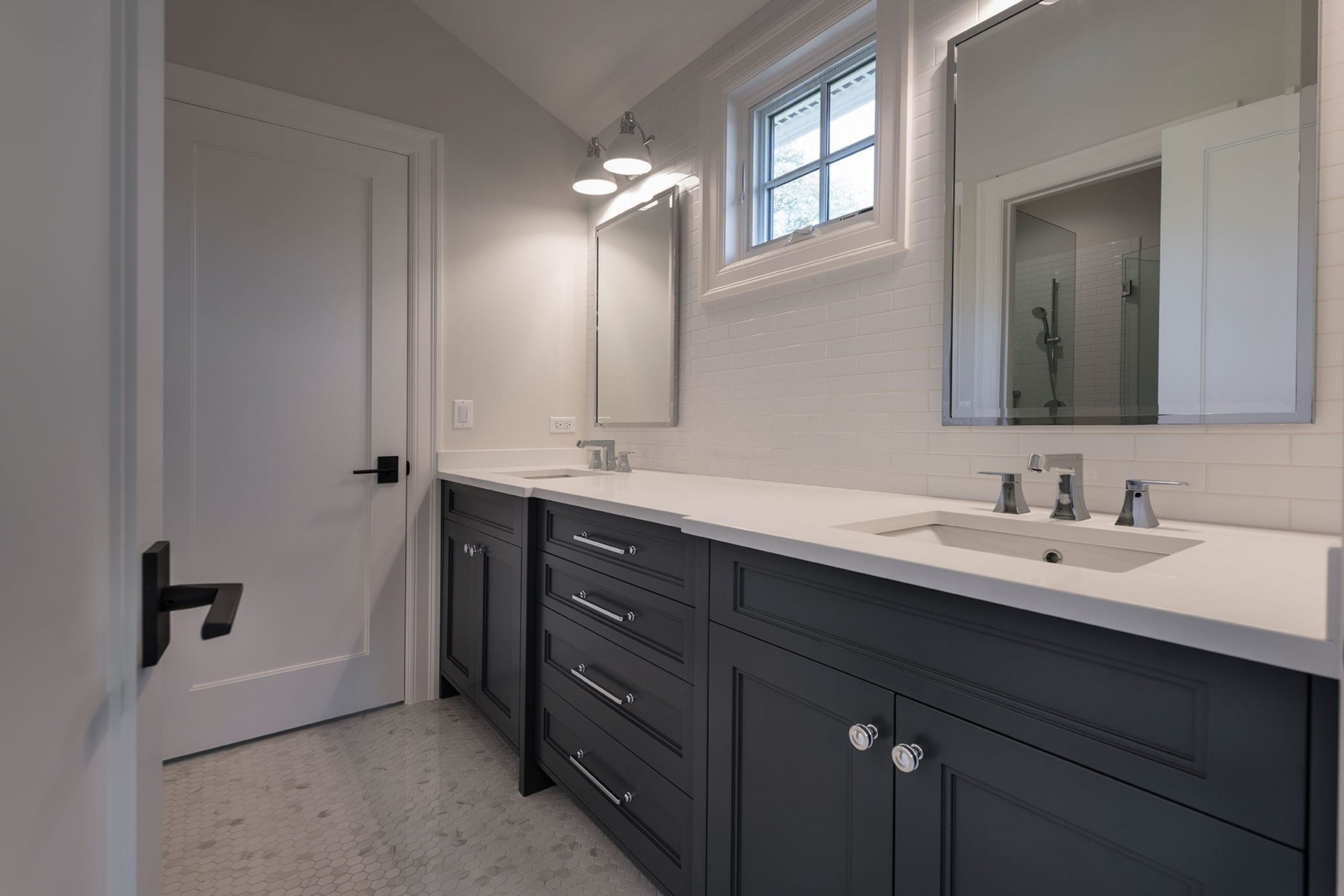
Welcome everyone! I have hand-picked the perfect colors for your bathroom doors to help you create a private sanctuary that feels both functional and incredibly stylish. Choosing a color for your bathroom doors might seem like a small detail, but because the bathroom is where you begin and end your day, it changes how your entire home feels. Most people forget that doors are like pieces of furniture that move and get a lot of use in humid environments.
When you pick a color that matches your walls and trim, the bathroom starts to look like a professional designer put it together. I see many homeowners stick with plain white because they are afraid of making a mistake in a small space. However, adding the right shade can make your room feel much friendlier and more finished.
You should think about how many times you touch your bathroom doors every single day. A fresh coat of paint on these surfaces can fix a bathroom that feels boring or clinical. It is a simple project that does not take much time but gives you a very big reward.
Your family will notice the difference as soon as they see the new look.
Why I Trust Thoughtfully Chosen Door Colors to Tie the Bathroom Together
I have spent years staging houses to make people fall in love with them the moment they walk inside. I trust specific door colors because they act as an anchor for your eyes. When the door color flows with the rest of the bathroom, it makes the house feel organized and expensive. A good color choice hides fingerprints and wear while making the ceiling look higher or the small room look wider.
It is the easiest way to make a house feel like a real home without spending a lot of money on a full renovation. I have seen how the right door color can make a standard bathroom look like a million dollars.
It helps pull all the different elements, like your tiles and vanity, together into one story. When the doors look good, the whole house feels like it was built with a lot of care. It gives you a sense of pride every time you close the door for a relaxing bath.
How I Choose the Right Door Paint Color for a Bathroom
Picking the right paint starts with looking at your tiles and your natural light. I always check how a color looks in the morning and again at night when the vanity lights are on. You want a color that stays pretty in all types of light. I also think about how the door looks when it is standing open toward the bedroom or hallway.
I usually pick three colors that work as a team: one for the door, one for the walls, and one for the trim. I carry paint samples around the bathroom to see how they look next to the porcelain and the fixtures. You have to make sure the colors do not clash with the stone or wood tones of your vanity.
If you have a large master bath, you can go a bit deeper with your choices. In a smaller guest bath, I stick to lighter shades to keep things feeling bright and airy.
Warm Neutrals For a Bathroom That Feels Like a Soothing Home Spa
In my experience, these combinations are the best choice for families who want to feel relaxed and comfortable the moment they step into their personal spa. I have used these warm mixes in many houses where the bathroom felt a bit too cold, clinical, or empty. By painting the doors a slightly darker tan or beige, I create a soft, layered look that stays beautiful and inviting all day long, regardless of how the light shifts.
I notice that these specific colors make the bathroom walls look softer and the surrounding fixtures look more inviting to guests. My clients always tell me that these warm tones make their bathrooms feel like a big, soft blanket or a high-end spa where they want to linger. I trust these sets implicitly because they never look yellow or dirty, even when the sun goes down and the warm vanity lamps are turned on.
They work so well because they use colors found in nature, like sand, weathered stone, and natural linen. When I use these on bathroom doors, the whole room feels much more grounded, solid, and high-quality. You will find that these neutrals go with almost any tile floor or stone counter you already have in place. It is my favorite way to make a bathroom feel friendly and upscale without using bright or loud colors that might become tiring over time.
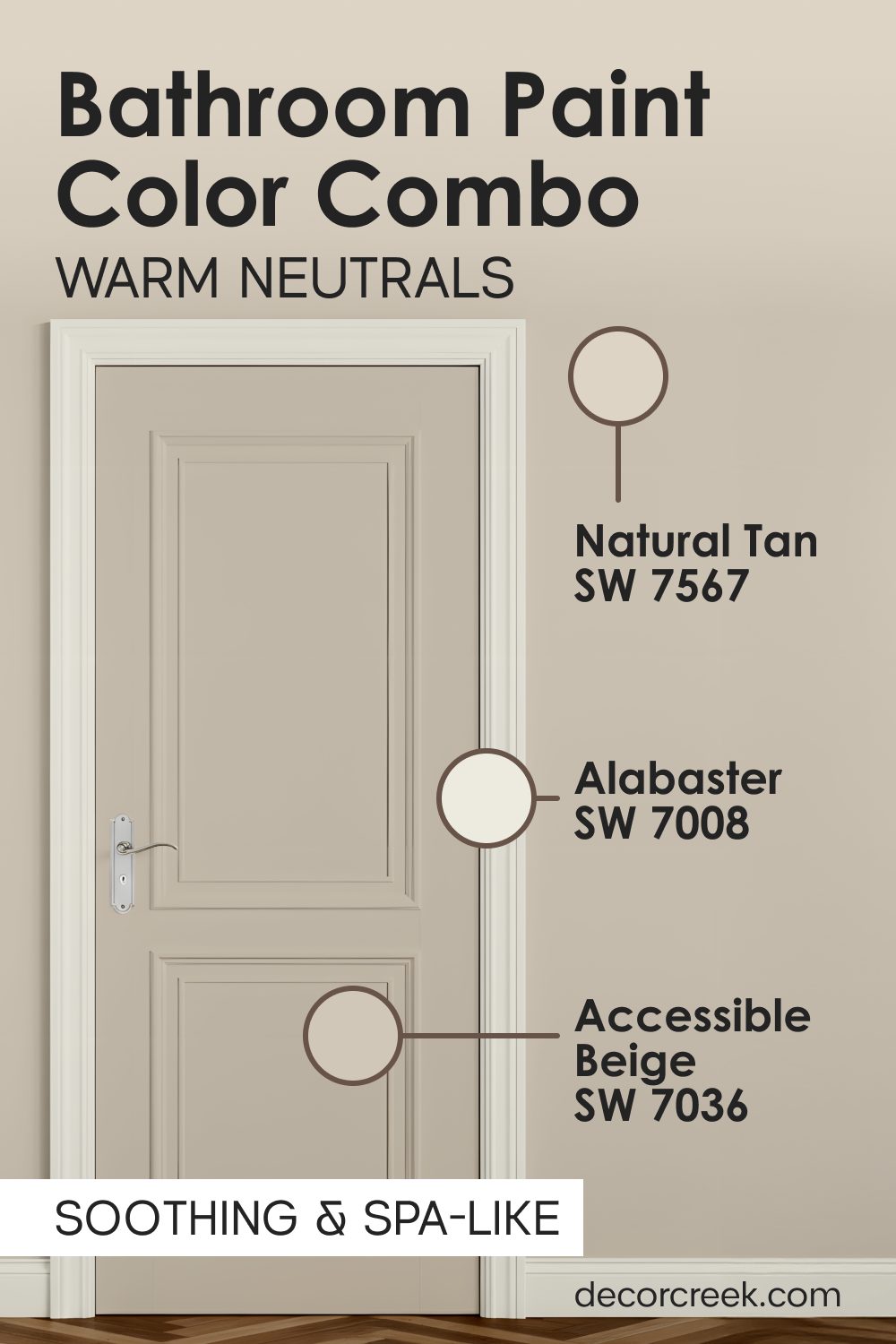
Natural Tan SW 7567 + Accessible Beige SW 7036 + Alabaster SW 7008
Natural Tan SW 7567 has a distinct wood-like warmth that makes any bathroom feel very natural and organic. I often suggest this for homes that want to bring a bit of the outdoors inside.
Accessible Beige SW 7036 sits beautifully on the walls to provide a soft, creamy background that highlights your mirrors or shelving.
Alabaster SW 7008 is a rich, celebrated white that looks like vanilla cream on the trim and the ceiling. I especially like this mix for bathrooms that have a lot of natural textures or wooden vanities.

The tan and beige colors make the space feel healthy and vibrant. This set of colors is incredibly soothing for people who want a quiet, peaceful place to unwind after a long day at work.

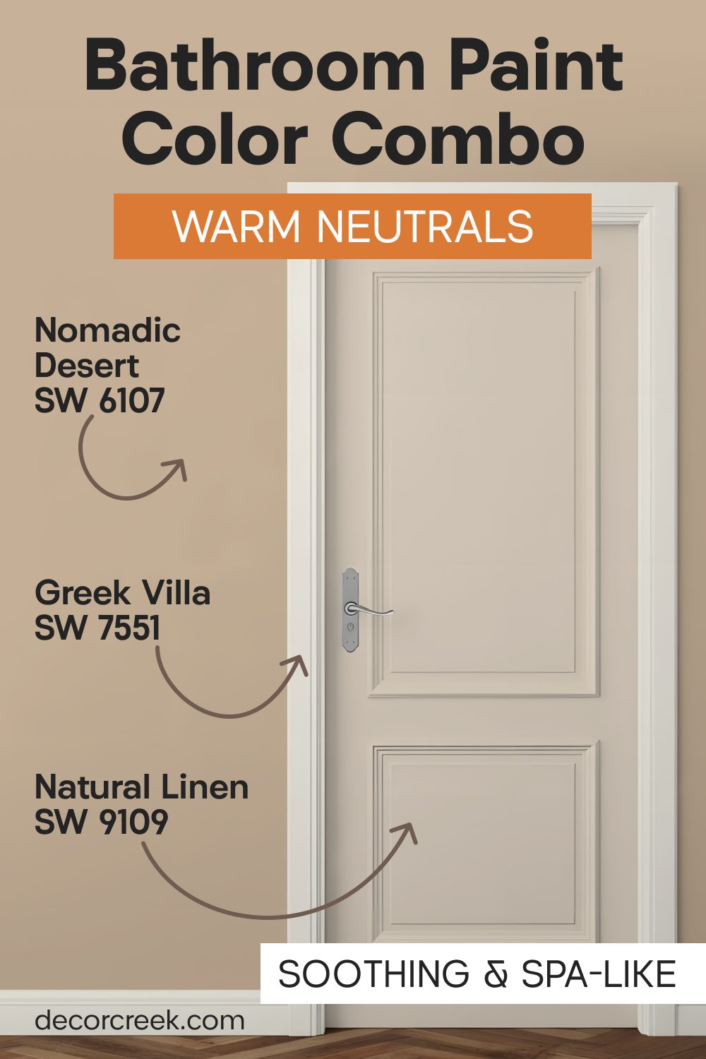
Nomadic Desert SW 6107 + Natural Linen SW 9109 + Greek Villa SW 7551
Nomadic Desert SW 6107 provides a tan base for the doors that feels like warm sand under your feet on a summer day. It is a sturdy color that gives the door a sense of importance and weight.

Natural Linen SW 9109 works on the walls to keep the sunshine feeling bright and airy throughout the room.
Greek Villa SW 7551 stays on the trim to make the transition between the tan door and the linen walls look very crisp and intentional.

This combination reminds me of a beautiful luxury resort where everything feels relaxed and simple for the family to enjoy. You will notice that this specific tan shade hides water spots and dust much better than a stark white door ever could. Sand colors like these help the bathroom feel grounded and permanent instead of light and temporary.

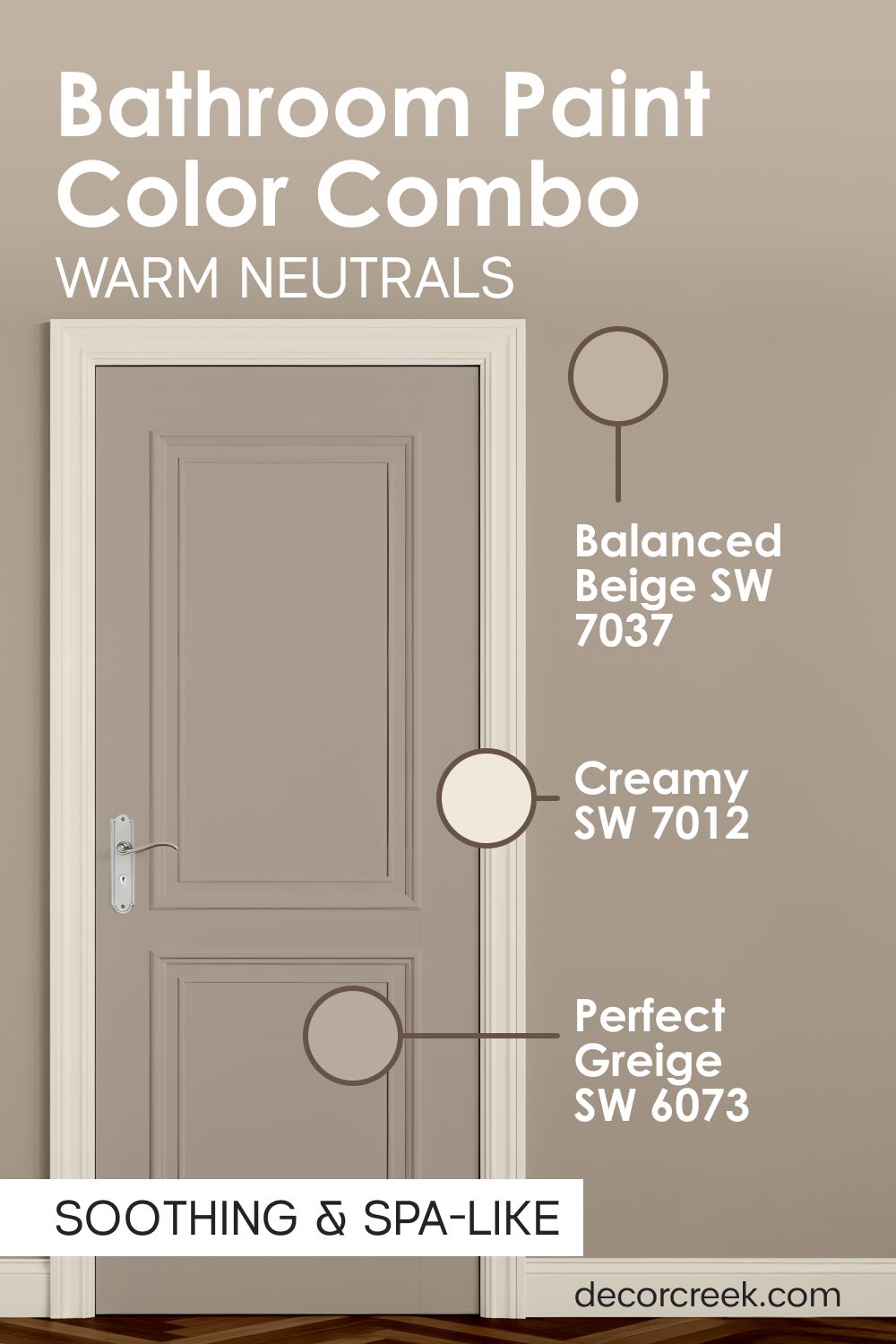
Balanced Beige SW 7037 + Perfect Greige SW 6073 + Creamy SW 7012
Balanced Beige SW 7037 is a deeper, more sophisticated tan that looks wonderful on bathroom doors that need to stand out. Perfect Greige SW 6073 mixes gray and beige on the walls to give the room a modern, updated feeling while keeping it warm.

Creamy SW 7012 keeps the baseboards and door frames looking fresh and bright against the slightly darker door paint. This trio is the perfect solution if you have light-colored tile floors or light gray stone counters in your home.

I think this look is very professional and makes a house feel like it was designed by an expert staging team. The darker door color creates a nice frame for the entrance to your private area, making it feel expensive and well-planned.

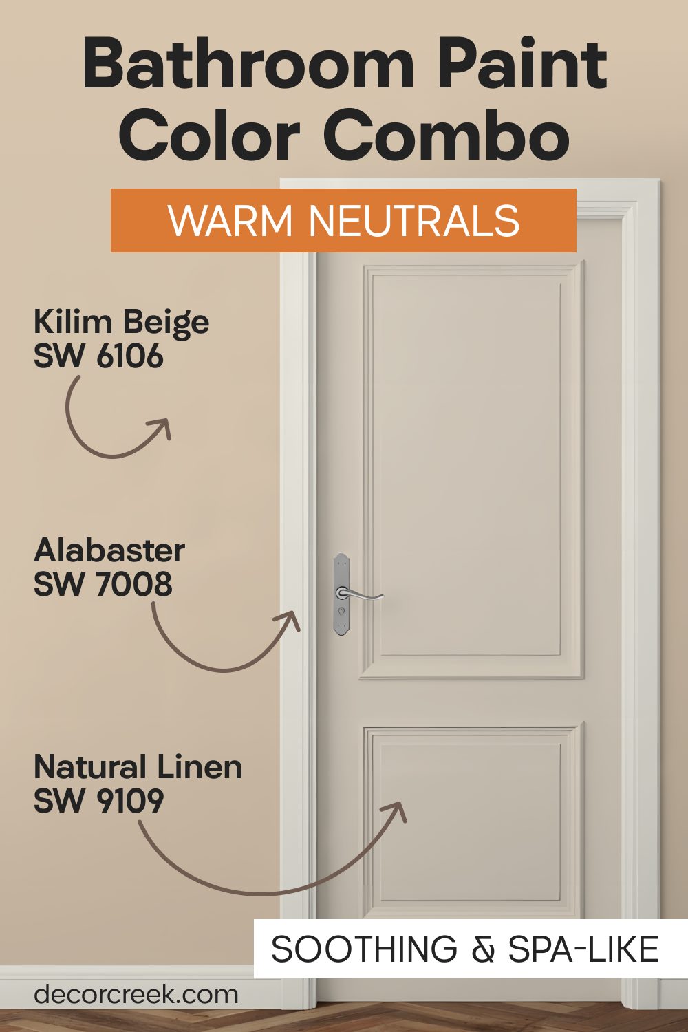
Kilim Beige SW 6106 + Natural Linen SW 9109 + Alabaster SW 7008
Kilim Beige SW 6106 is a classic, timeless color that adds a sense of history and warmth to any bathroom it touches. It is a very reliable shade that doesn’t change drastically in different lighting conditions.

Natural Linen SW 9109 on the walls keeps the atmosphere feeling light and approachable, ensuring the room never feels too dark or enclosed. Alabaster SW 7008 on the trim provides a clean, white edge that helps define the architecture of the room.
I find that this palette works exceptionally well in traditional homes with classic porcelain fixtures. It creates a very steady, calm feeling that makes the house feel solid and well-built for a growing family. Most people find this combination very pleasing because it is balanced and does not demand constant attention.
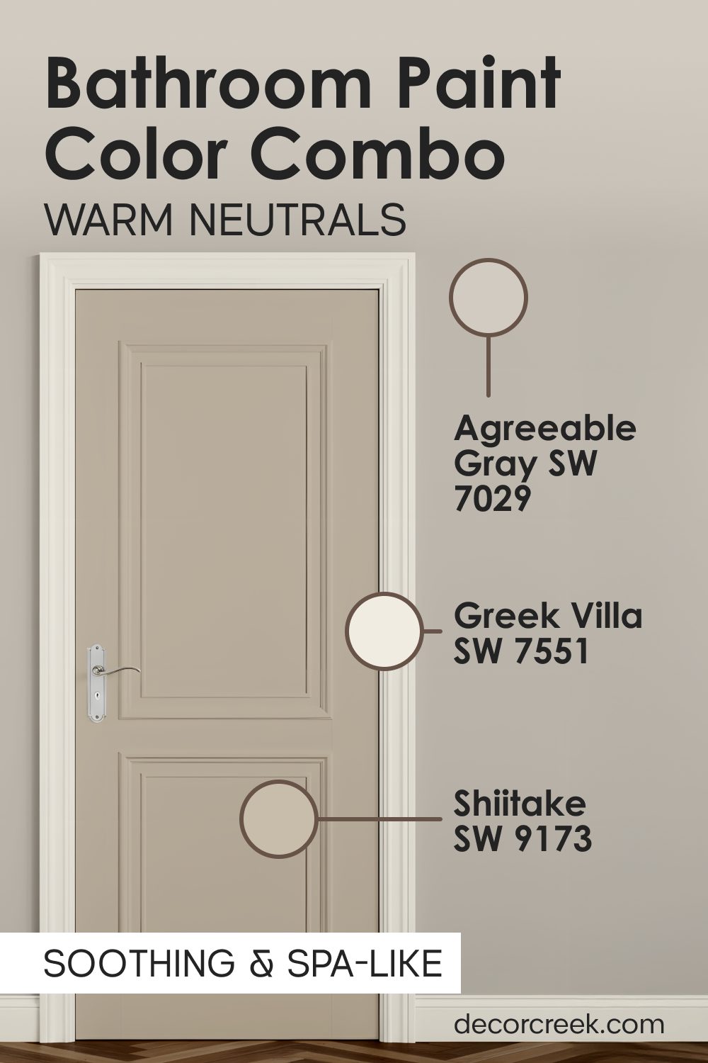
Agreeable Gray SW 7029 + Shiitake SW 9173 + Greek Villa SW 7551
Agreeable Gray SW 7029 is one of the most popular colors in the world because it adapts so well to its surroundings. On a bathroom door, it looks clean and modern without being cold.

Shiitake SW 9173 adds a slightly darker stone color to the walls, providing a beautiful depth that makes the Greek Villa SW 7551 trim stand out. This combination is great for bathrooms that have a lot of chrome or nickel fixtures.

The gray tones on the door act as a neutral bridge between the warm wall tones and the cool metal of the shower and faucets. I find that this palette makes a room feel very balanced and easy on the eyes during the bright midday sun. It is a sophisticated way to use gray tones while ensuring the bathroom remains a warm and homey place for everyone.
Timeless Shades For a Look That Is Always Clean And Lasting
When I work with homeowners who want a bathroom that never goes out of style, I reach for these classic combinations. These mixes are designed to feel fresh for decades, providing a look that is both hygienic and high-end. I have used these palettes to create a sense of continuity throughout a home, making the transition to the bathroom feel elegant and planned.
These colors work perfectly because they emphasize cleanliness without feeling like a sterile hospital room. I find that using different shades of white and light neutrals on the doors and walls makes the bathroom look very layered, expensive, and smart. It is a classic look that stays in style regardless of changing trends, so you never have to worry about your bathroom looking “dated” in a few years.
My experience shows that these light colors make your bathroom appear much larger, which is essential for smaller layouts. They create a very steady, calm feeling that helps people feel more organized. You will love how these colors catch the light and reflect a sense of purity and order. It is the perfect choice for a home that needs to feel very light, very clean, and very peaceful every single day of the year.
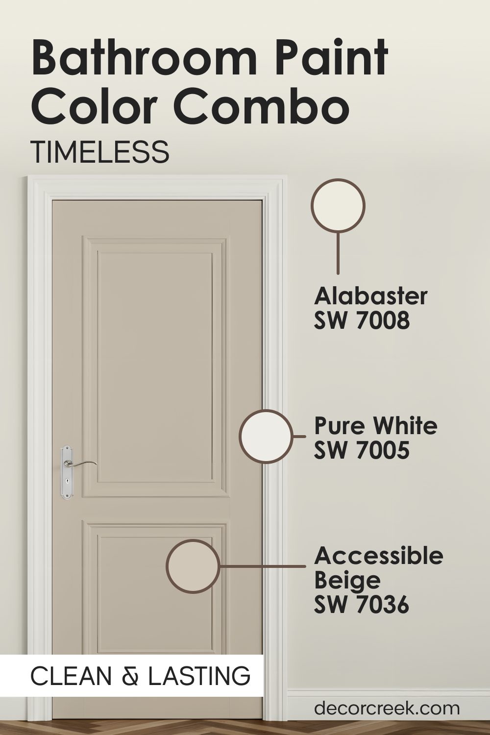
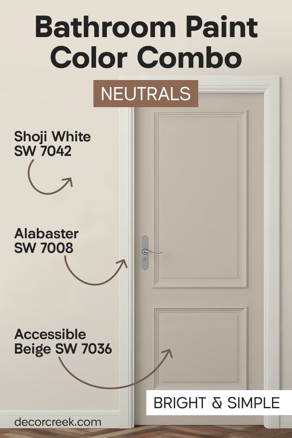
Alabaster SW 7008 + Accessible Beige SW 7036 + Pure White SW 7005
Alabaster SW 7008 on the doors provides a soft, warm white that feels incredibly substantial and high-quality without being harsh on the eyes. It is the perfect choice for creating a gentle transition as you move into the room, making the door feel like a custom piece of architectural furniture rather than just a functional exit.
Accessible Beige SW 7036 on the walls adds a touch of earthy, sophisticated color that provides enough contrast to make the Alabaster door truly pop and stand out. This specific beige has a way of warming up the bathroom porcelain, making your sinks and tubs look even brighter and cleaner than before.
Pure White SW 7005 on the trim keeps the edges of the room looking sharp, modern, and very well-defined against the slightly warmer wall color. This palette is widely considered the gold standard for a clean, professional look that works in almost any size of bathroom.
It is a very safe but highly rewarding choice for homeowners who want their space to look fresh, organized, and expensive for many years to come.

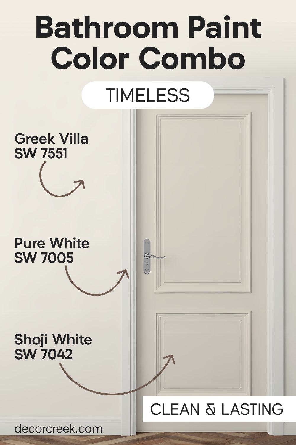
Greek Villa SW 7551 + Shoji White SW 7042 + Pure White SW 7005
Greek Villa SW 7551 on the doors offers a soft, sun-drenched glow that is very flattering to all skin tones when you are looking in the vanity mirror. It has a tiny hint of warmth that prevents the bathroom from ever feeling cold or uninviting, even on a cloudy day.
Shoji White SW 7042 on the walls provides a pale, stone-like backdrop that feels grounded, serene, and deeply calming for your morning routine. This wall color is excellent at hiding the small imperfections that often appear in bathroom drywall over time.

Pure White SW 7005 on the trim adds that final, necessary layer of brightness that makes the entire room feel crisp and intentional. This set is heavily inspired by high-end minimalist design and works exceptionally well with natural stone tiles like marble or travertine.
I find that this combination makes a master bath feel like a luxury boutique hotel, giving you a sense of quiet elegance every time you step inside to relax.
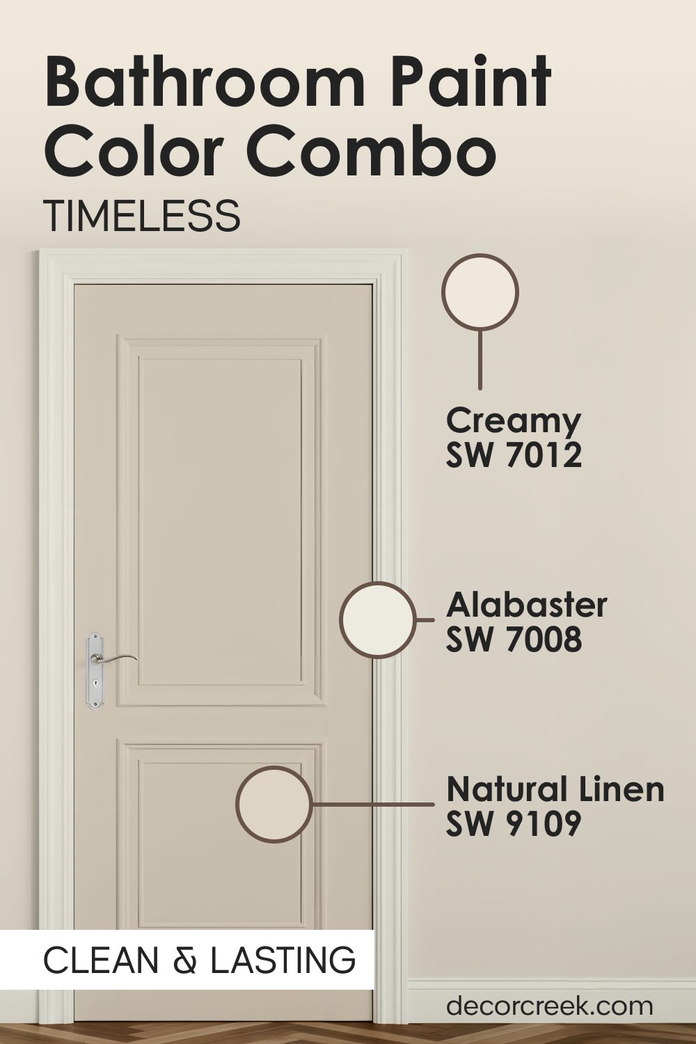
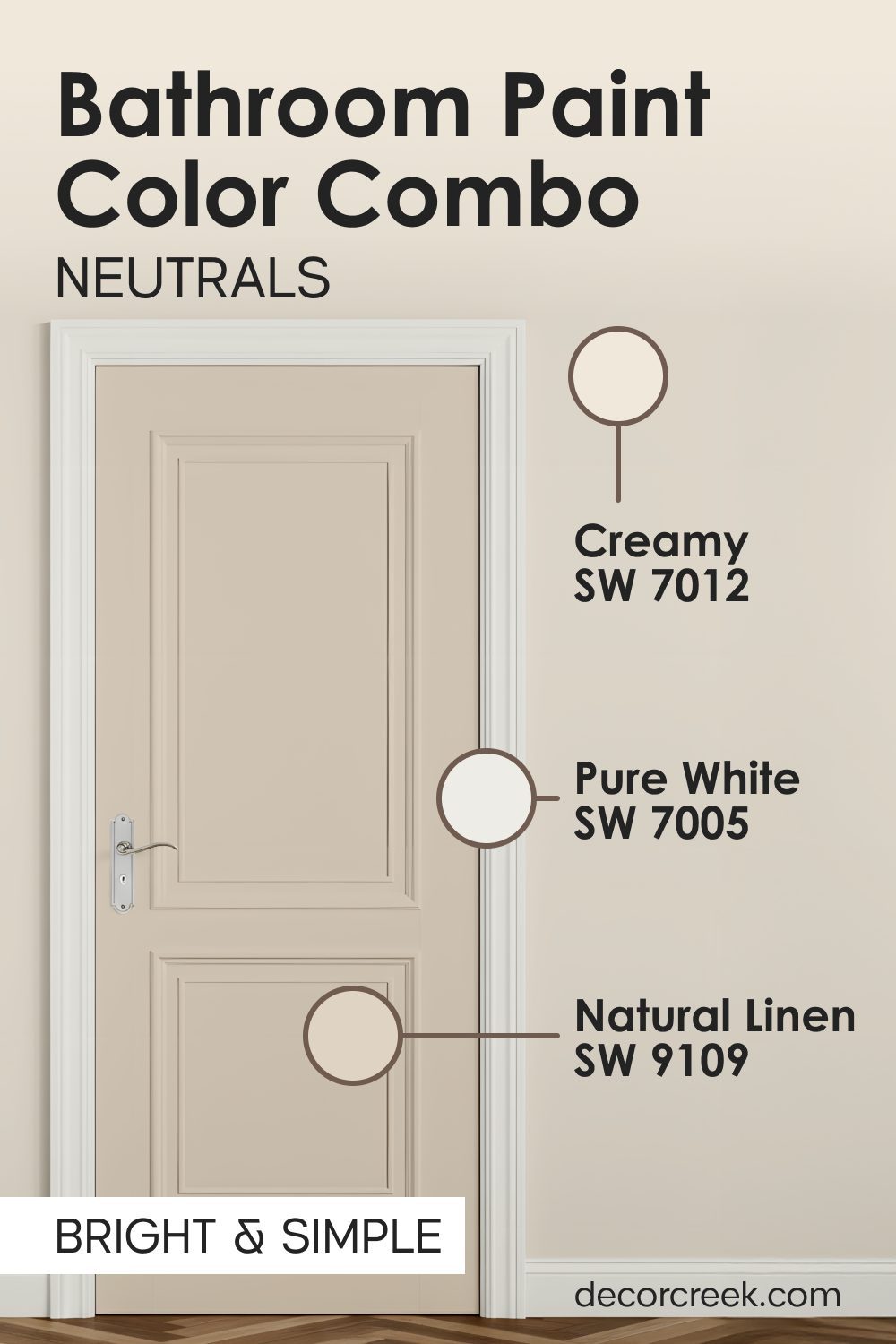
Creamy SW 7012 + Natural Linen SW 9109 + Alabaster SW 7008
Creamy SW 7012 makes the bathroom doors look incredibly soft and inviting, almost like the feeling of a warm, plush towel fresh out of the dryer. It is a rich, buttery white that adds a layer of comfort to the room that most standard whites simply cannot achieve.
Natural Linen SW 9109 on the walls provides a textured, cozy feel that transforms the bathroom into the most comfortable and private retreat in your entire house. This combination is particularly effective if you have wooden vanities or woven storage baskets, as it enhances those natural, organic materials.
Alabaster SW 7008 on the trim creates a rich, subtle contrast that makes the linen colors on the walls look very expensive and thoughtfully chosen. I suggest this palette for bathrooms where the primary goal is relaxation and warmth, as it creates an atmosphere that encourages you to take your time and decompress.
It is a timeless look that feels established, solid, and very welcoming to both family and guests.
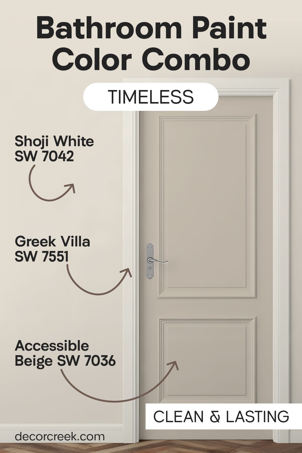
Shoji White SW 7042 + Accessible Beige SW 7036 + Greek Villa SW 7551
Shoji White SW 7042 is a glowing, warm white for the walls that provides a cozy and open atmosphere, even in bathrooms that do not have large windows. It has a unique ability to capture and bounce light around the room without creating any uncomfortable glare or harsh reflections.
Accessible Beige SW 7036 on the doors gives the bathroom significant visual strength and keeps the entrance from looking boring or “washed out” against the lighter walls. This deeper tone on the door acts as a sophisticated anchor for the room’s design, making the space feel more mature and well-balanced.
Greek Villa SW 7551 on the trim adds a crucial layer of brightness that helps define the shapes of your cabinets, door frames, and mirrors. This palette is inspired by the soft colors of natural paper and sand, making it a very smart choice for a modern home that wants to feel connected to nature.
It is a durable style that looks just as good with modern matte black hardware as it does with traditional polished chrome.
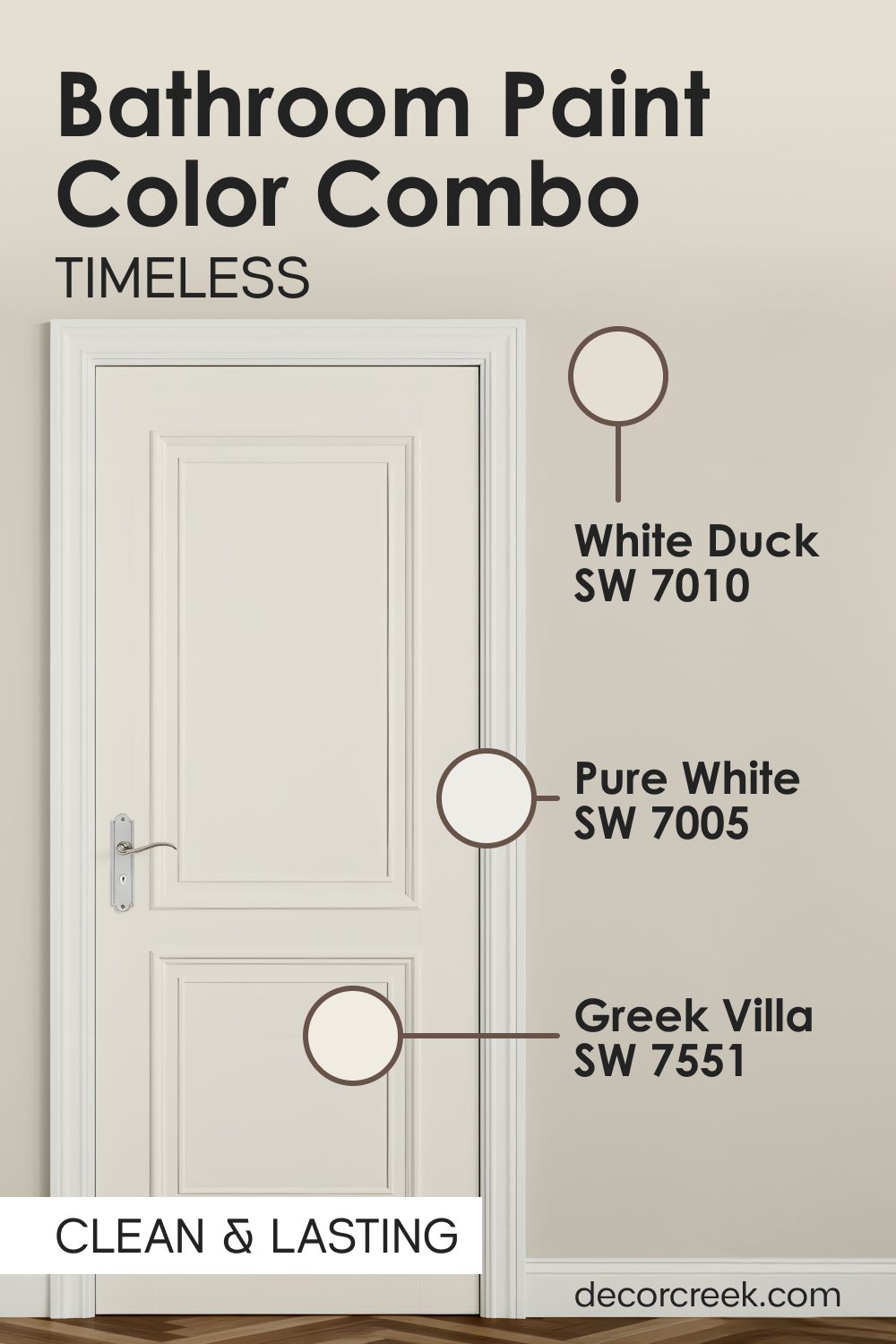
White Duck SW 7010 + Greek Villa SW 7551 + Pure White SW 7005
White Duck SW 7010 is a beautiful, creamy off-white with a tiny bit of gray hidden inside that makes it look incredibly sophisticated on the bathroom walls. This slight gray undertone is the secret to making the room feel modern and updated without sacrificing the warmth of a traditional neutral.

Greek Villa SW 7551 on the doors makes the entrance to your private space look very soft, creamy, and inviting for everyone in the family. It is a color that feels very “friendly” and helps to set a positive tone for your morning and evening routines.
Pure White SW 7005 on the trim keeps the edges of the room looking very straight, very sharp, and entirely professional. This is a classic, high-end look that will never go out of fashion, making it a very safe investment for your home’s value.
I love how this combination makes the metal fixtures in your bathroom look like jewelry, highlighting the quality of your faucets and shower heads.
Bright Neutrals That Keep Your Bathroom Simple And Airy
When I work with homeowners who love a very neat, tidy, and organized look, I always reach for these light and airy combinations. These mixes of white and very light gray are the best way to make a bathroom feel fresh, hygienic, and full of natural light. I have used these palettes in many small guest bathrooms to make them feel much larger and more open than they actually are. These colors work perfectly because they do not fight with each other for your attention; instead, they work together to create a harmonious background.
I find that using different shades of white on the doors and walls makes the room look very professional and smart. It is a look that stays in style for a long time, so you do not have to worry about painting again next year. My experience shows that these light colors make any colorful towels or bathroom accessories look much more vibrant and beautiful.
They create a very steady, calm feeling that helps people feel more organized in their busy daily lives. You will love how these colors catch the light in the morning. It is the perfect choice for a home that needs to feel very light and very peaceful every single day.
Drift of Mist SW 9166 + Agreeable Gray SW 7029 + Alabaster SW 7008
Drift of Mist SW 9166 is a very light gray that looks like a soft morning fog on your bathroom walls, providing a sense of quiet and calm. It is an incredibly modern color that makes the room feel updated without feeling industrial or cold.

Agreeable Gray SW 7029 on the doors adds a little bit of earthy warmth to the cool gray walls, providing a beautiful balance that feels very “lived-in” and comfortable.
Alabaster SW 7008 on the trim provides a clean white line that makes the gray and beige look crisp, intentional, and well-designed.
This combination is particularly successful in bathrooms with silver or brushed nickel hardware, as the gray tones complement the metal perfectly.

Shoji White SW 7042 + Accessible Beige SW 7036 + Alabaster SW 7008
Shoji White SW 7042 on the walls creates a warm, glowing atmosphere that feels very soft and welcoming for your guests. It has a unique character that changes slightly throughout the day, looking creamy in the morning and more like soft stone in the evening.
Accessible Beige SW 7036 on the doors gives the bathroom visual strength and keeps the large door surface from looking washed out or flat. This deeper color on the door helps to hide the scuffs and marks that often happen in high-traffic bathrooms.
Alabaster SW 7008 on the trim adds a final layer of brightness that helps define the space and makes the wall and door colors look much more rich.
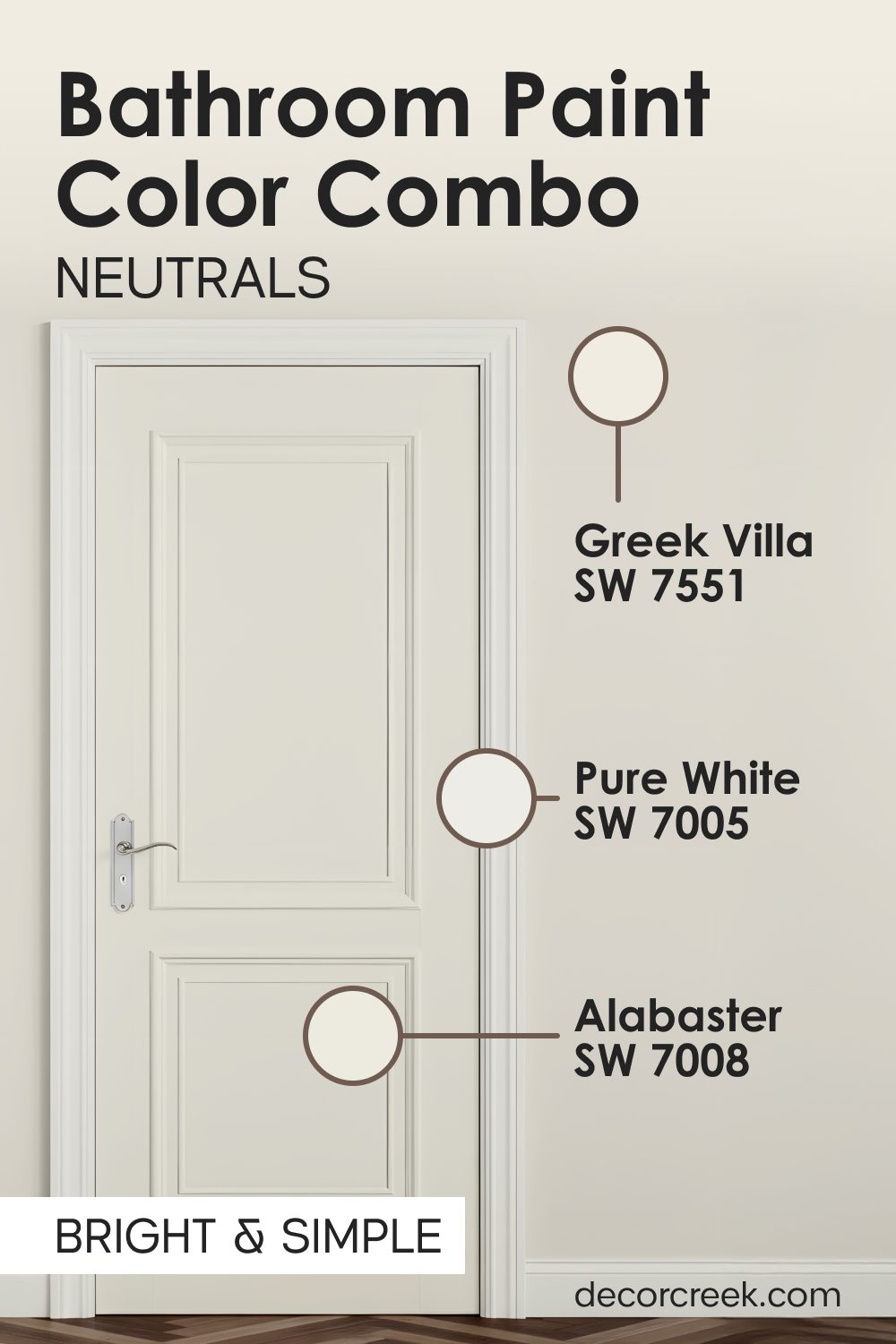
Greek Villa SW 7551 + Alabaster SW 7008 + Pure White SW 7005
Greek Villa SW 7551 is a soft white for the doors that makes them feel clean and bright without being overly stark. It provides a very “pure” feeling that is perfect for a space dedicated to hygiene and self-care.
Alabaster SW 7008 goes on the walls to provide just a tiny bit of depth and warmth so the room has some shape and dimension.
Pure White SW 7005 is used on the trim to make the whole bathroom look very sharp, organized, and high-contrast.
This is the ultimate “clean” palette that makes your bathroom look like it was just scrubbed and polished, even on a busy Tuesday morning.
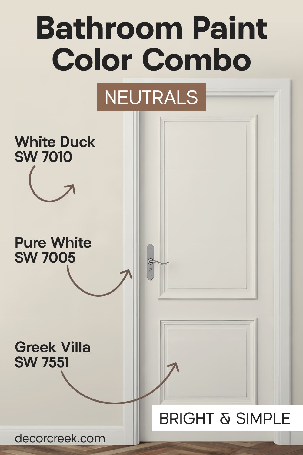
White Duck SW 7010 + Greek Villa SW 7551 + Pure White SW 7005
White Duck SW 7010 on the walls provides a sophisticated, creamy backdrop that feels very high-end and designer-inspired. It is a color that looks great next to white tile, as the slight contrast makes the tile look even whiter and brighter.
Greek Villa SW 7551 on the doors makes the entrance look soft and inviting, setting a calm mood before you even enter the room.
Pure White SW 7005 on the trim keeps the room looking professional and bright, providing a clean edge for the walls to sit against. I often use this in homes where the owners want a “classic” look that still feels fresh and updated.
Creamy SW 7012 + Natural Linen SW 9109 + Pure White SW 7005
Creamy SW 7012 makes the doors look very soft and inviting, providing a warm welcome every time you reach for the handle. It is a very forgiving color that looks great in both natural sunlight and artificial light.
Natural Linen SW 9109 on the walls provides a textured look that feels like a cozy fabric, making the bathroom feel like a comfortable room rather than just a utility space.
Pure White SW 7005 on the trim creates a sharp contrast that makes these light, warm colors look very rich, intentional, and well-planned. This is an excellent choice for a family bathroom where you want a space that is both practical and very beautiful.
Final Thoughts
Choosing a color for your bathroom doors is the final, essential step in making your home look absolutely perfect, intentional, and fully cohesive. When the door color carefully matches the walls and the surrounding trim, it creates a seamless visual flow that makes every single minute spent preparing for your day in the bathroom a true joy for the whole family.
You definitely do not have to settle for standard, boring white doors if you want to create something much more interesting, unique, and personalized for your household to enjoy every day. Whether you prefer the deep, soothing mystery of warm neutrals or the airy, refreshing brightness of light and clean ones, there is a perfect, hand-picked set waiting for you in this guide.
A little bit of fresh paint on a door surface can completely change the whole personality, mood, and energy of your bathroom in just one single day of focused work. You will be genuinely surprised at how much more professional, expensive, and high-end your home feels once you see all the right colors working together in perfect harmony. I truly hope this guide helps you find a signature look that you will love and appreciate for many years to come as you relax and create memories in your house. It is wonderful how such a simple project can provide a lasting sense of pride every time you walk into the room or host a guest.
Taking the time to coordinate these small details shows that your home was built with genuine care and a focus on lasting, beautiful style.
