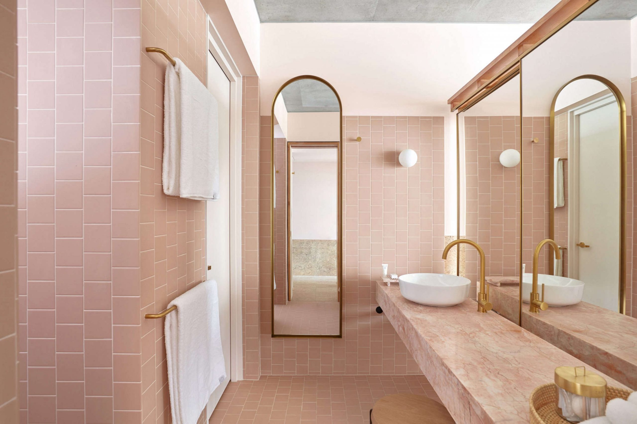
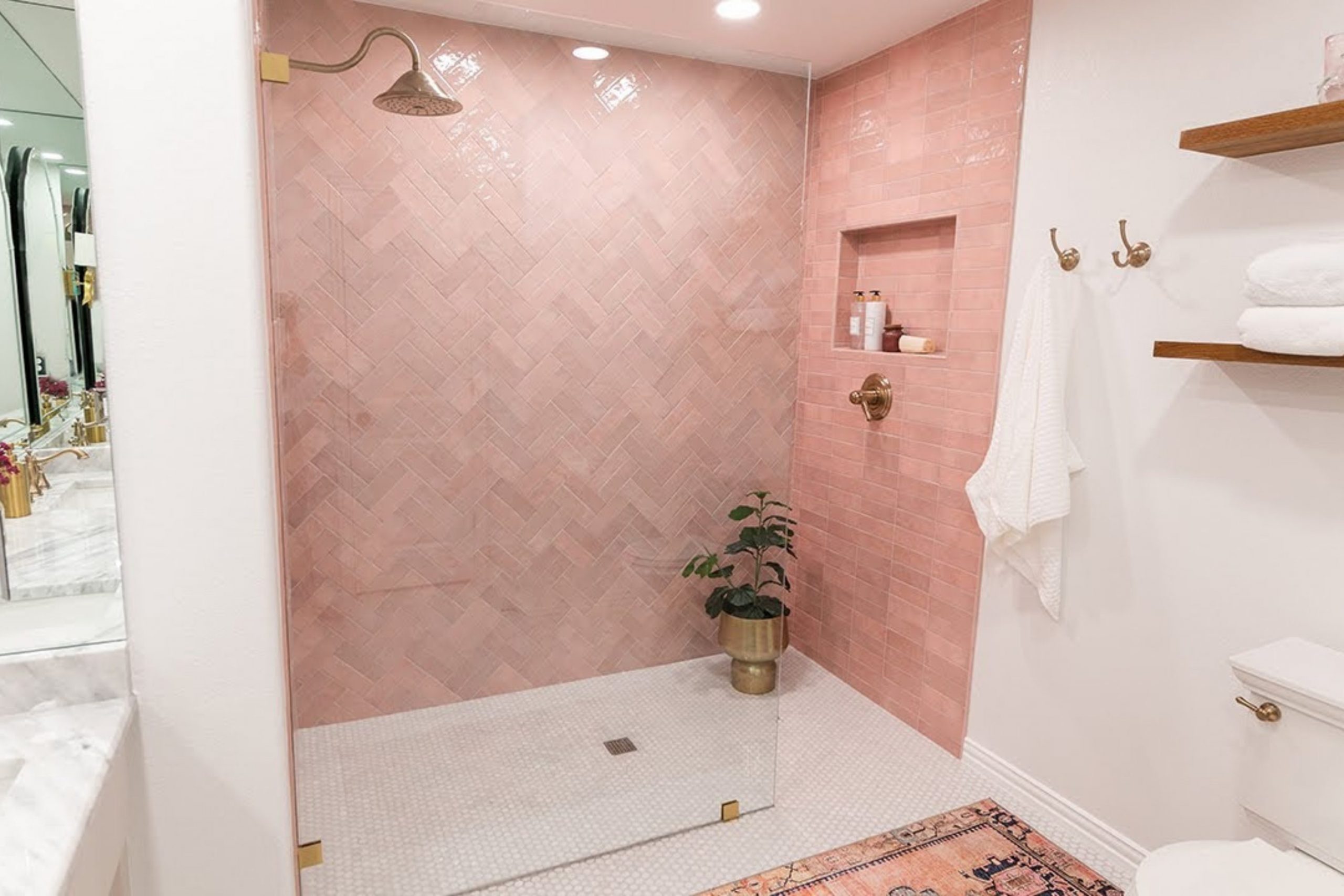
Pink bathrooms are making a massive, undeniable comeback in the world of modern home design today, reclaiming their spot as a top choice for stylish interiors. Throughout my years of design work, I have personally helped countless homeowners realize that this versatile color can be both incredibly fun and remarkably classy for your daily routine.
It is no longer just a vintage relic; instead, it has become a sophisticated way to add character and warmth to your home. By choosing the right tone, you can transform a standard, cold washroom into a sanctuary that feels both high-end and deeply personal. Choosing the perfect shade makes a monumental difference in the overall atmosphere of the space and how you feel each and every morning.
A well-chosen pink wall has a secret benefit: it acts like a natural filter, making your skin look exceptionally healthy and glowing every time you glance in the mirror. This subtle reflection of warm light provides an instant confidence boost as you start your day.It is a cheerful, life-affirming choice that works beautifully for a whimsical guest powder room or a luxurious, calming main master suite.
My ultimate goal is to guide you through the selection process to find a pink that fits your house and your unique personality without any unnecessary stress or confusion.
Why I Always Trust Sherwin-Williams and Benjamin Moore for the Best Pink Bathroom Paint Colors
When it comes to selecting professional-grade finishes, I always turn to Sherwin-Williams and Benjamin Moore because their paint quality is truly top-notch and industry-leading. These brands are world-renowned for offering colors that look exactly the same on your actual wall as they do on the small sample chip, which prevents any expensive surprises.
This level of color consistency is critically important when you are dealing with tricky colors like light pink, which can easily shift in tone if the pigment quality is low. You want a pink that stays pink, not one that unexpectedly turns into a muddy beige or a neon coral once the second coat dries.Beyond just the beauty of the color, their premium paint formulas are specifically engineered to hold up incredibly well against the constant steam, humidity, and moisture found in a bathroom environment.
I have seen firsthand that if I pick a shade from these professional collections, the finish will stay looking fresh, vibrant, and clean for many years to come without peeling or fading. You can fully rely on these professional-grade choices to give your home a high-quality, durable finish that stands the test of time.
Investing in these brands means you won’t have to worry about repainting your bathroom every couple of years due to wear and tear.
How I Choose the Perfect Pink Shade for Any Bathroom
My professional process always starts by carefully evaluating the specific lighting in the room to see exactly how it hits the different wall surfaces. It is vital to remember that some pinks can look surprisingly orange or even slightly purple depending on whether you have a large window with natural sunlight or just a standard LED light bulb.
Lighting is the most important variable in paint design, as it can completely change the “mood” of a color from morning to night.Because of this, I always suggest painting a large sample piece or using a peel-and-stick swatch to watch how the color evolves and changes throughout the day.
In addition to the lighting, I also take a very close look at the fixed items in the room that you don’t plan on changing, such as your existing tile, flooring, and stone countertops. A cool-toned pink with blue undertones might clash harshly with a warm tan floor or golden oak cabinets, so I make it a priority to match the undertones with extreme care. I look at the room as a complete puzzle where every piece needs to fit together perfectly.
My ultimate goal is to create a finished look that feels balanced, harmonious, and pleasant for every family member and guest who visits your home.
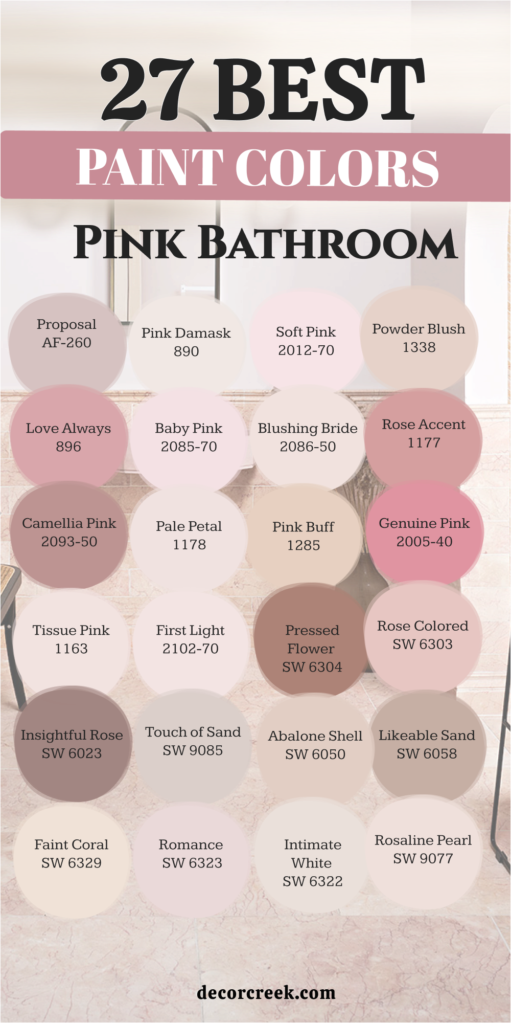
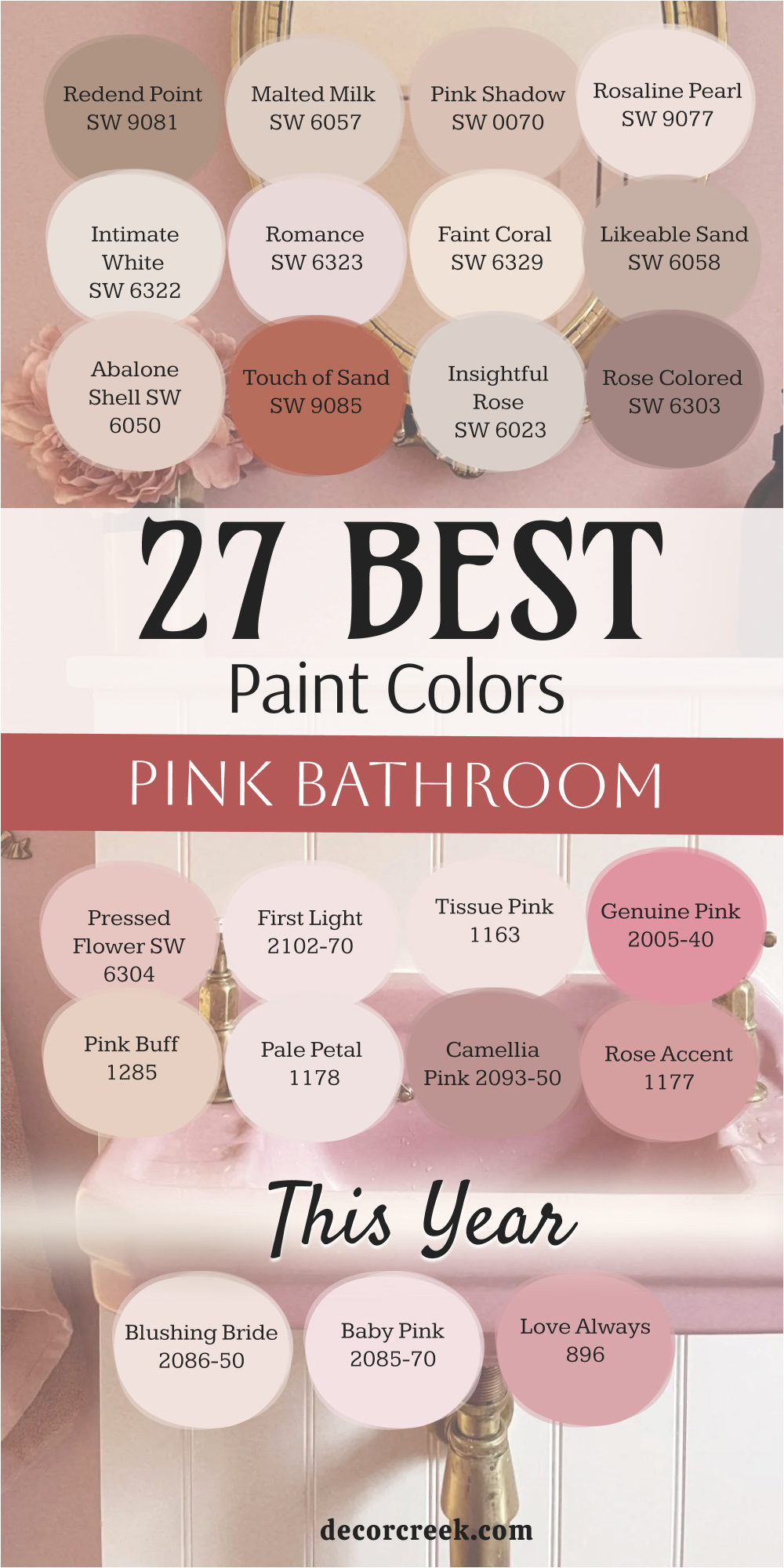
27 Best Paint Colors For The Pink Bathroom This Year
Redend Point SW 9081
Redend Point SW 9081 acts as a grounded choice that feels like natural clay or earthy sand. This color brings a sense of the outdoors inside your home with its warm and stony personality. I find that it works perfectly for people who want a pink that does not feel too bright. The hue changes slightly as the sun moves, showing off different tan and rose notes throughout the day.
It provides a sturdy backdrop for wooden cabinets or white marble surfaces in a modern setting. Many homeowners choose this shade because it feels very mature and steady compared to a bubblegum pink. You can use it on all four walls without making the room feel closed in or heavy. It creates a soft glow that makes your morning routine feel very peaceful and quiet as you wake up.
This paint is a favorite for those who like a desert-inspired look in their private quarters. I think it is the best way to add color while staying very close to a neutral look.
Best used in: bathrooms, bedrooms, entryways, and cozy dens
Pairs well with: Kestrel White SW 7516, Foothills SW 7514, Hushed Auburn SW 9080, and light oak textures The key rule of this color for farmhouse style is to use it where you want natural light to feel kind, soft, and inviting throughout the day.
🎨 Check out the complete guide to this color right HERE 👈

Malted Milk SW 6057
Malted Milk SW 6057 offers a creamy and tan-heavy pink that looks like a warm drink. This color is very light and helps a small room feel much bigger than it actually is. I love how it sits between a beige and a rose to give you the best of both worlds. It looks very clean next to bright white trim or a white bathtub in a guest bath.
The shade is very forgiving and hides small imperfections on your walls quite well. You will notice that it creates a very welcoming environment for guests who stay over at your house. It does not demand too much attention but provides a lovely glow to the entire area. I often recommend this for hallways that lead into a bathroom to keep the flow consistent.
It is a very safe choice if you are worried about a pink being too intense for your family. The warmth in this paint makes the air in the room feel very cozy and comfortable.
Best used in: guest bathrooms, laundry rooms, nurseries, and small hallways
Pairs well with: Unfussy Beige SW 6043, Breathless SW 6022, Snowbound SW 7004, and dark bronze fixtures The key rule of this color for farmhouse style is to use it where you want natural light to feel kind, soft, and inviting throughout the day.
🎨 Check out the complete guide to this color right HERE 👈
Pink Shadow SW 0070
Pink Shadow SW 0070 has a very old-fashioned feel that reminds me of historic homes and classic style. This color is deep enough to show its true character even in a room with very bright lights. I see it as a very sophisticated choice for a vanity area where you want to feel fancy. It has a dusty quality that keeps it from looking like a child’s bedroom or a toy store.
The paint covers well and gives the walls a rich look that feels very expensive and custom. You can pair it with gold hardware to make the whole room shine with a bit of glamour. It stands out beautifully against dark wood floors or a patterned tile layout. This shade tells a story of elegance and grace without being too flashy or bright for the eyes.
I think it is one of the most reliable pinks for creating a classic look in an old house. It works wonders in a bathroom that has plenty of white porcelain to break up the color.
Best used in: master bathrooms, dining rooms, home offices, and accent walls
Pairs well with: Westhighland White SW 7566, Roycroft Bronze Green SW 2846, Creamy SW 7012, and brass accents The key rule of this color for farmhouse style is to use it where you want natural light to feel kind, soft, and inviting throughout the day.
🎨 Check out the complete guide to this color right HERE 👈
Rosaline Pearl SW 9077
Rosaline Pearl SW 9077 is a very pale and delicate pink that almost looks like a soft white. This color is perfect for tiny bathrooms where you want to keep things bright and airy. I like how it adds just a hint of warmth without making a bold statement. It reflects light very well, which helps when you are doing your hair or makeup in the morning.
The shade feels very fresh and clean, like a new bar of soap or a fresh towel. It works well with silver or chrome faucets to create a very crisp and modern look. You will find that it matches almost any tile color because it is so light and neutral. It is a great starting point for someone who is just beginning to use pink in their home.
This paint makes the walls feel light and breezy every single day. I find that it is very hard to grow tired of such a gentle and light-hearted shade.
Best used in: small bathrooms, powder rooms, ceilings, and trim details
Pairs well with: Extra White SW 7006, Sea Salt SW 6204, Rainwashed SW 6210, and gray stone The key rule of this color for farmhouse style is to use it where you want natural light to feel kind, soft, and inviting throughout the day.
Intimate White SW 6322
Intimate White SW 6322 is a very soft pink that has a lot of white mixed into the base. This color gives your bathroom a very clean and professional look while still feeling very friendly. I find that it works very well in rooms that do not have a lot of natural sunlight. The pink tones come out more when you turn on your warm indoor light bulbs at night.
It is a very popular choice for staging homes because it feels very fresh and updated. You can use it as a neutral background for colorful towels or bright art pieces on the wall. It never feels heavy or dark, even if the room is very small and crowded. I think of it as a very polite color that makes everyone feel welcome in your home.
It provides a tiny pop of color that keeps the room from looking boring or plain. Using this shade is a great way to add a feminine touch without it being too obvious.
Best used in: bathrooms, kitchens, sunrooms, and bedroom ceilings
Pairs well with: Alabaster SW 7008, Naval SW 6244, Peppercorn SW 7674, and light pine wood The key rule of this color for farmhouse style is to use it where you want natural light to feel kind, soft, and inviting throughout the day.
🎨 Check out the complete guide to this color right HERE 👈
Romance SW 6323
Romance SW 6323 is a medium pink that feels very sweet and traditional in a bathroom setting. This color reminds me of spring flowers and bright mornings spent getting ready for the day. I love to use it in bathrooms that have a lot of white tile or white beadboard on the bottom. It provides a nice contrast that makes the architecture of the room stand out more clearly.
The shade is bright enough to be noticed but soft enough to stay very pleasant for a long time. It brings a happy energy to the room that can help you start your day with a smile. You can pair it with floral accents or simple stripes for a very classic and pretty look. It is a great choice for a daughter’s bathroom or a fun guest powder room.
This paint makes a statement of cheerfulness and light in any part of the house. I think this shade captures a very youthful and spirited feeling for any bathroom wall.
Best used in: kid’s bathrooms, craft rooms, laundry rooms, and accent furniture
Pairs well with: Pure White SW 7005, Tricorn Black SW 6258, Gray Owl BM OC-52, and wicker baskets The key rule of this color for farmhouse style is to use it where you want natural light to feel kind, soft, and inviting throughout the day.
🎨 Check out the complete guide to this color right HERE 👈
Faint Coral SW 6329
Faint Coral SW 6329 has a tiny bit of orange in it that makes it feel very warm and sunny. This color is excellent for adding a tropical or beachy vibe to your bathroom decor. I find that it looks amazing when paired with teal or light blue accents in the room. It gives a healthy glow to your skin tone when you look at yourself in the mirror.
The shade is very energetic and keeps the room from feeling dull or sleepy in the morning. You can use it to make a large bathroom feel a bit more cozy and filled with light. It works well with gold or copper fixtures to lean into that warm and sunny feeling.
Many people like this color because it feels unique and different from a standard baby pink. It is a very lively choice that brings a bit of vacation spirit to your daily life. I love how it makes a bathroom feel like it is filled with golden sunlight all the time.
Best used in: pool baths, guest suites, kitchens, and bright sun porches
Pairs well with: Toasted Pine Nut SW 7696, Salty Earring SW 9642, High Reflective White SW 7757, and bamboo The key rule of this color for farmhouse style is to use it where you want natural light to feel kind, soft, and inviting throughout the day.
🎨 Check out the complete guide to this color right HERE 👈
Likeable Sand SW 6058
Likeable Sand SW 6058 is a very earthy pink that leans heavily into tan and brown undertones. This color is perfect for people who want a pink bathroom that feels very natural and quiet. I often use this when I want to create a spa-like feeling that is grounded and steady.
It looks very beautiful with natural stone tiles and dark wood vanity cabinets in the room. The pink is very muted, so it does not feel like a typical pink room at first glance. It is a very sophisticated shade that works well in modern or traditional styles of homes.
You will find that it creates a very comfortable atmosphere for taking a long bath or relaxing. It hides dust and wear very well, making it a practical choice for a busy family house. I see it as a smart middle ground between a neutral tan and a soft rose.
Best used in: master baths, living rooms, hallways, and exterior accents
Pairs well with: Shoji White SW 7042, Urbane Bronze SW 7048, Requisite Gray SW 7023, and slate tile The key rule of this color for farmhouse style is to use it where you want natural light to feel kind, soft, and inviting throughout the day.
Abalone Shell SW 6050
Abalone Shell SW 6050 is a soft peach-pink that feels very light and refreshing on the walls. This color reminds me of the inside of a seashell or a very soft sunset over the water.
I like how it brings a glow to the bathroom that feels very natural and not at all forced. It is a light shade that works well in rooms with or without big windows.
The color has a bit of a vintage feel that works perfectly with older homes and classic tubs. You can pair it with light gray or soft white to keep the room looking very clean.
Best used in: small bathrooms, bedrooms, nurseries, and walk-in closets
Pairs well with: Repose Gray SW 7015, Eider White SW 7014, Sea Serpent SW 7615, and silver mirrors The key rule of this color for farmhouse style is to use it where you want natural light to feel kind, soft, and inviting throughout the day.
🎨 Check out the complete guide to this color right HERE 👈
27 Best Paint Colors For The Pink Bathroom This Year
Touch of Sand SW 9085
Touch of Sand SW 9085 is a very neutral pink that looks like warm beige with a rosy heart. This color is great for making a bathroom feel very cozy and tucked away from the world.
I find that it provides a very steady background for all of your bathroom accessories and towels.
It does not compete with other colors in the room but supports them very quietly and nicely.
Best used in: master suites, open bathrooms, mudrooms, and neutral kitchens
Pairs well with: Iron Ore SW 7069, Greek Villa SW 7551, Accessible Beige SW 7036, and walnut wood The key rule of this color for farmhouse style is to use it where you want natural light to feel kind, soft, and inviting throughout the day.
🎨 Check out the complete guide to this color right HERE 👈

Insightful Rose SW 6023
Insightful Rose SW 6023 is a deep and dusty pink that brings a lot of personality to a bathroom wall.
This color feels very grounded because it has a bit of a purple undertone hidden inside.
I love using this shade in rooms where you want a moody and sophisticated feeling. It is dark enough to feel cozy but light enough to stay cheerful in the morning.
Best used in: guest bathrooms, powder rooms, master suites, and cozy home offices
Pairs well with: Shoji White SW 7042, Urbane Bronze SW 7048, Silver Strand SW 7057, and antique gold hardware The key rule of this color for farmhouse style is to use it where you want natural light to feel kind, soft, and inviting throughout the day.
🎨 Check out the complete guide to this color right HERE 👈
Rose Colored SW 6303
Rose Colored SW 6303 is a true, classic pink that reminds me of a blooming garden in the spring. This color is very friendly and brings a happy energy to your daily routine.
I find that it works best in bathrooms that get plenty of natural sunlight through a window.
It has a clear and bright quality that never feels muddy or gray on the walls.
Best used in: kids’ bathrooms, laundry rooms, craft rooms, and sun-filled bedrooms
Pairs well with: Pure White SW 7005, Tricorn Black SW 6258, Dorian Gray SW 7017, and light oak wood The key rule of this color for farmhouse style is to use it where you want natural light to feel kind, soft, and inviting throughout the day.
🎨 Check out the complete guide to this color right HERE 👈
Pressed Flower SW 6304
Pressed Flower SW 6304 is a rich and saturated pink that leans into a terracotta or clay look.
This color is very warm and makes a bathroom feel like a high-end spa in the desert.
I enjoy how it adds a layer of depth to a room without feeling heavy or overwhelming. It is a very earthy shade that feels connected to nature and organic materials.
Best used in: master bathrooms, entryways, dining areas, and accent walls
Pairs well with: Alabaster SW 7008, Naval SW 6244, Peppercorn SW 7674, and copper accents The key rule of this color for farmhouse style is to use it where you want natural light to feel kind, soft, and inviting throughout the day.
🎨 Check out the complete guide to this color right HERE 👈
First Light 2102-70
First Light 2102-70 is a very airy and light pink that was designed to be a modern neutral.
This color is extremely soft and acts like a fresh start for any dark or dated room.
I love how it reflects light to make a tiny bathroom feel much larger and more open. It has just enough pink to feel warm but stays very clean and bright like a white.
Best used in: small bathrooms, nurseries, master bedrooms, and kitchen cabinets
Pairs well with: White Heron BM OC-57, Gray Owl BM OC-52, Hale Navy BM HC-154, and glass decor The key rule of this color for farmhouse style is to use it where you want natural light to feel kind, soft, and inviting throughout the day.
🎨 Check out the complete guide to this color right HERE 👈

Tissue Pink 1163
Tissue Pink 1163 is a delicate and powdery shade that feels very soft and romantic on the wall.
This color reminds me of vintage makeup rooms and classic style from the past.
I find that it adds a very feminine and graceful touch to any bathroom it is painted in. It is light enough to use on both the walls and the ceiling for a total look.
Best used in: powder rooms, girls’ bedrooms, walk-in closets, and ceiling accents
Pairs well with: Chantilly Lace BM OC-65, Simply White BM OC-117, Revere Pewter BM HC-172, and linen fabrics The key rule of this color for farmhouse style is to use it where you want natural light to feel kind, soft, and inviting throughout the day.
Genuine Pink 2005-40
Genuine Pink 2005-40 is a vibrant and cheerful pink that makes a very bold statement in a room.
This color is full of life and is perfect for a bathroom that needs a big energy boost.
I love to use this in small spaces where you can take a big risk with your design. It has a very modern feel that works well with black and white patterns or bold art.
Best used in: small powder rooms, accent walls, kids’ play areas, and fun laundry rooms
Pairs well with: Super White BM PM-1, Black Beauty BM 2128-10, Stonington Gray BM HC-170, and chrome fixtures The key rule of this color for farmhouse style is to use it where you want natural light to feel kind, soft, and inviting throughout the day.
Pink Buff 1285
Pink Buff 1285 is a warm and sandy pink that feels very natural and easy to live with. This color is a great bridge between a traditional tan and a soft rose petal.
I find that it creates a very cozy and safe feeling in a bathroom that lacks natural light.
It has a bit of an orange undertone that makes the room feel warm and sunny.
Best used in: main bathrooms, kitchens, hallways, and living room accents
Pairs well with: Swiss Coffee BM OC-45, Wrought Iron BM 2124-10, Edgecomb Gray BM HC-173, and wicker textures The key rule of this color for farmhouse style is to use it where you want natural light to feel kind, soft, and inviting throughout the day.
Pale Petal 1178
Pale Petal 1178 is a very soft and whisper-light pink that feels like a warm hug for your walls. This color is nearly white but has a rosy heart that makes a room feel very friendly.
I love how it adds just a tiny bit of color to a bathroom without making it look too small.
It is a very clean shade that works perfectly for people who love a minimalist style.
Best used in: tiny bathrooms, master suites, ceilings, and bright hallways
Pairs well with: White Dove BM OC-17, Kendall Charcoal BM HC-166, Sea Haze BM 2137-50, and silver accents The key rule of this color for farmhouse style is to use it where you want natural light to feel kind, soft, and inviting throughout the day.
Camellia Pink 2093-50
Camellia Pink 2093-50 is a sophisticated and dusty rose that feels very high-end and stylish.
This color has a gray undertone that keeps it from looking too bright or like a toy.
I find that it works beautifully in a master bathroom where you want to feel a bit pampered. It provides a rich and elegant look that stands up well to large mirrors.
Best used in: master baths, dining rooms, formal entries, and library walls
Pairs well with: Classic Gray BM OC-23, Chelsea Gray BM HC-168, Black Forest Green BM HC-187, and marble surfaces The key rule of this color for farmhouse style is to use it where you want natural light to feel kind, soft, and inviting throughout the day.
Rose Accent 1177
Rose Accent 1177 is a medium-toned pink that is very warm and full of life for a bathroom.
This color is perfect for making a statement on one wall or throughout a small powder room.
I love how it brings a sense of energy and happiness to a space that often feels cold. It has a very rich quality that makes the walls look like they are glowing.
Best used in: powder rooms, accent walls, kids’ rooms, and creative work spaces
Pairs well with: Cloud White BM OC-13, Van Deusen Blue BM HC-156, Smoke BM 2122-40, and dark wood tones The key rule of this color for farmhouse style is to use it where you want natural light to feel kind, soft, and inviting throughout the day.
Blushing Bride 2086-50
Blushing Bride 2086-50 is a very soft and romantic pink that feels like a warm glow on a cloudy day.
This color is light enough to act as a neutral while still bringing a lot of heart.
I find that it works wonders in bathrooms that have very little natural light coming through. It has a tiny hint of peach that keeps it from ever feeling too cold or gray.
Best used in: small bathrooms, nurseries, master suites, and laundry rooms
Pairs well with: White Heron BM OC-57, Gray Owl BM OC-52, Hale Navy BM HC-154, and warm wood tones The key rule of this color for farmhouse style is to use it where you want natural light to feel kind, soft, and inviting throughout the day.
Baby Pink 2085-70
Baby Pink 2085-70 is the most delicate and light-hearted shade of pink you can find for a bathroom.
This color is very airy and brings a sense of pure joy to your daily life.
I like to use this when I want a room to feel very fresh and completely open. It is a very pale shade that looks wonderful next to bright white trim and silver faucets.
Best used in: kids’ bathrooms, small powder rooms, ceilings, and walk-in closets
Pairs well with: Chantilly Lace BM OC-65, Simply White BM OC-117, Revere Pewter BM HC-172, and glass accents The key rule of this color for farmhouse style is to use it where you want natural light to feel kind, soft, and inviting throughout the day.
Love Always 896
Love Always 896 is a medium pink that feels very balanced and very sweet on a large wall.
This color has a traditional personality that reminds me of vintage tiles and classic charm.
I find that it brings a lot of warmth to a bathroom that might otherwise feel cold or plain. It is a very steady shade that does not change much when you turn the lights on.
Best used in: guest bathrooms, accent walls, craft rooms, and vanity areas
Pairs well with: Cloud White BM OC-13, Van Deusen Blue BM HC-156, Smoke BM 2122-40, and brass fixtures The key rule of this color for farmhouse style is to use it where you want natural light to feel kind, soft, and inviting throughout the day.
Powder Blush 1338
Powder Blush 1338 is a very sophisticated pink that has a tiny bit of tan mixed into the base. This color feels very mature and works perfectly for a modern home.
I love how it creates a spa-like feeling that is very quiet and very relaxed for a bath.
It is a muted shade that looks very expensive when paired with dark metal hardware.
Best used in: master bathrooms, hallways, dining rooms, and home offices
Pairs well with: Swiss Coffee BM OC-45, Wrought Iron BM 2124-10, Edgecomb Gray BM HC-173, and marble surfaces The key rule of this color for farmhouse style is to use it where you want natural light to feel kind, soft, and inviting throughout the day.
Soft Pink 2012-70
Soft Pink 2012-70 is a very bright and clear pink that feels like a fresh flower petal.
This color is full of energy and makes any bathroom feel much more alive.
I find that it works best in rooms where you want to feel very awake and ready for the day. It has a very crisp quality that looks amazing next to white porcelain sinks.
Best used in: powder rooms, kids’ bathrooms, laundry rooms, and accent furniture
Pairs well with: Super White BM PM-1, Black Beauty BM 2128-10, Stonington Gray BM HC-170, and chrome fixtures The key rule of this color for farmhouse style is to use it where you want natural light to feel kind, soft, and inviting throughout the day.
Pink Damask 890
Pink Damask 890 is a very pale pink that has a lot of white in it to keep it very bright.
This color is so soft that it almost looks like a warm white until you see it next to trim.
I love how it adds a secret layer of warmth to a bathroom without being too obvious. It is a very elegant choice for a master suite where you want a very quiet feeling.
Best used in: master bathrooms, small entries, ceilings, and bedroom walls
Pairs well with: White Dove BM OC-17, Kendall Charcoal BM HC-166, Sea Haze BM 2137-50, and silver accents The key rule of this color for farmhouse style is to use it where you want natural light to feel kind, soft, and inviting throughout the day.
Proposal AF-260
Proposal AF-260 is a modern and dusty pink that feels very stylish and very current for today’s homes.
This color has a gray undertone that makes it look very expensive on the wall.
I find that it works beautifully in a bathroom that has a lot of black or dark gray tile. It provides a nice contrast that feels very sophisticated and well-planned for a designer look.
Best used in: master baths, formal powder rooms, dining areas, and library walls
Pairs well with: Classic Gray BM OC-23, Chelsea Gray BM HC-168, Black Forest Green BM HC-187, and dark metal accents The key rule of this color for farmhouse style is to use it where you want natural light to feel kind, soft, and inviting throughout the day.
🎨 Check out the complete guide to this color right HERE 👈
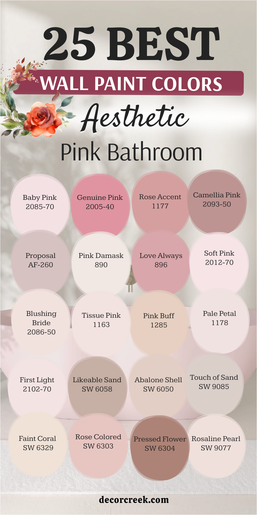
25 Wall Paint Colors For The Aesthetic Pink Bathroom
Redend Point SW 9081
Redend Point SW 9081 acts as a grounded choice that feels like natural clay or earthy sand. This color brings a sense of the outdoors inside your home with its warm and stony personality. I find that it works perfectly for people who want a pink that does not feel too bright.
The hue changes slightly as the sun moves, showing off different tan and rose notes throughout the day. It provides a sturdy backdrop for wooden cabinets or white marble surfaces in a modern setting. Many homeowners choose this shade because it feels very mature and steady compared to a bubblegum pink.
You can use it on all four walls without making the room feel closed in or heavy. It creates a soft glow that makes your morning routine feel very peaceful and quiet as you wake up. I think it is the best way to add color while staying very close to a neutral look.
Best used in: bathrooms, bedrooms, entryways, and cozy dens
Pairs well with: Kestrel White SW 7516, Foothills SW 7514, Hushed Auburn SW 9080, and light oak textures The key rule of this color for farmhouse style is to use it where you want natural light to feel kind, soft, and inviting throughout the day.
🎨 Check out the complete guide to this color right HERE 👈
Malted Milk SW 6057
Malted Milk SW 6057 offers a creamy and tan-heavy pink that looks like a warm drink. This color is very light and helps a small room feel much bigger than it actually is. I love how it sits between a beige and a rose to give you the best of both worlds.
It looks very clean next to bright white trim or a white bathtub in a guest bath. The shade is very forgiving and hides small imperfections on your walls quite well. You will notice that it creates a very welcoming environment for guests who stay over at your house.
It does not demand too much attention but provides a lovely glow to the entire area. I often recommend this for hallways that lead into a bathroom to keep the flow consistent. The warmth in this paint makes the air in the room feel very cozy and comfortable.
Best used in: guest bathrooms, laundry rooms, nurseries, and small hallways
Pairs well with: Unfussy Beige SW 6043, Breathless SW 6022, Snowbound SW 7004, and dark bronze fixtures The key rule of this color for farmhouse style is to use it where you want natural light to feel kind, soft, and inviting throughout the day.
🎨 Check out the complete guide to this color right HERE 👈
Romance SW 6323
Romance SW 6323 is a medium pink that feels very sweet and traditional in a bathroom setting. This color reminds me of spring flowers and bright mornings spent getting ready for the day. I love to use it in bathrooms that have a lot of white tile or white beadboard on the bottom.
It provides a nice contrast that makes the architecture of the room stand out more clearly. The shade is bright enough to be noticed but soft enough to stay very pleasant for a long time. It brings a happy energy to the room that can help you start your day with a smile.
You can pair it with floral accents or simple stripes for a very classic and pretty look. It is a great choice for a daughter’s bathroom or a fun guest powder room. I think this shade captures a very youthful and spirited feeling for any bathroom wall.
Best used in: kid’s bathrooms, craft rooms, laundry rooms, and accent furniture
Pairs well with: Pure White SW 7005, Tricorn Black SW 6258, Gray Owl BM OC-52, and wicker baskets The key rule of this color for farmhouse style is to use it where you want natural light to feel kind, soft, and inviting throughout the day.
🎨 Check out the complete guide to this color right HERE 👈
Intimate White SW 6322
Intimate White SW 6322 is a very soft pink that has a lot of white mixed into the base. This color gives your bathroom a very clean and professional look while still feeling very friendly. I find that it works very well in rooms that do not have a lot of natural sunlight.
The pink tones come out more when you turn on your warm indoor light bulbs at night. It is a very popular choice for staging homes because it feels very fresh and updated. You can use it as a neutral background for colorful towels or bright art pieces on the wall.
It never feels heavy or dark, even if the room is very small and crowded. I think of it as a very polite color that makes everyone feel welcome in your home. Using this shade is a great way to add a feminine touch without it being too obvious.
Best used in: bathrooms, kitchens, sunrooms, and bedroom ceilings
Pairs well with: Alabaster SW 7008, Naval SW 6244, Peppercorn SW 7674, and light pine wood The key rule of this color for farmhouse style is to use it where you want natural light to feel kind, soft, and inviting throughout the day.
🎨 Check out the complete guide to this color right HERE 👈
Pink Shadow SW 0070
Pink Shadow SW 0070 has a very old-fashioned feel that reminds me of historic homes and classic style. This color is deep enough to show its true character even in a room with very bright lights. I see it as a very sophisticated choice for a vanity area where you want to feel fancy.
It has a dusty quality that keeps it from looking like a child’s bedroom or a toy store. The paint covers well and gives the walls a rich look that feels very expensive and custom. You can pair it with gold hardware to make the whole room shine with a bit of glamour.
It stands out beautifully against dark wood floors or a patterned tile layout. This shade tells a story of elegance and grace without being too flashy or bright for the eyes. It works wonders in a bathroom that has plenty of white porcelain to break up the color.
Best used in: master bathrooms, dining rooms, home offices, and accent walls
Pairs well with: Westhighland White SW 7566, Roycroft Bronze Green SW 2846, Creamy SW 7012, and brass accents The key rule of this color for farmhouse style is to use it where you want natural light to feel kind, soft, and inviting throughout the day.
🎨 Check out the complete guide to this color right HERE 👈
Rosaline Pearl SW 9077
Rosaline Pearl SW 9077 is a very pale and delicate pink that almost looks like a soft white. This color is perfect for tiny bathrooms where you want to keep things bright and airy. I like how it adds just a hint of warmth without making a bold statement.
It reflects light very well, which helps when you are doing your hair or makeup in the morning. The shade feels very fresh and clean, like a new bar of soap or a fresh towel. It works well with silver or chrome faucets to create a very crisp and modern look.
You will find that it matches almost any tile color because it is so light and neutral. It is a great starting point for someone who is just beginning to use pink in their home. I find that it is very hard to grow tired of such a gentle and light-hearted shade.
Best used in: small bathrooms, powder rooms, ceilings, and trim details
Pairs well with: Extra White SW 7006, Sea Salt SW 6204, Rainwashed SW 6210, and gray stone The key rule of this color for farmhouse style is to use it where you want natural light to feel kind, soft, and inviting throughout the day.
Pressed Flower SW 6304
Pressed Flower SW 6304 is a rich and saturated pink that leans into a terracotta or clay look. This color is very warm and makes a bathroom feel like a high-end spa in the desert.
I enjoy how it adds a layer of depth to a room without feeling heavy or overwhelming. It is a very earthy shade that feels connected to nature and organic materials.
The paint works wonders with brass hardware and natural woven baskets for a textured look. It feels very cozy at night when the warm indoor lights are turned on.
This shade is a great way to use pink if you prefer warm and spicy colors in your home. It provides a sturdy and reliable backdrop for a very stylish and unique bathroom design.
Many people find that this color makes the room feel much more expensive than it actually is. It is a confident choice that shows off your creative side in a very polished way.
Best used in: master bathrooms, entryways, dining areas, and accent walls
Pairs well with: Alabaster SW 7008, Naval SW 6244, Peppercorn SW 7674, and copper accents The key rule of this color for farmhouse style is to use it where you want natural light to feel kind, soft, and inviting throughout the day.
🎨 Check out the complete guide to this color right HERE 👈
Rose Colored SW 6303
Rose Colored SW 6303 is a true, classic pink that reminds me of a blooming garden in the spring. This color is very friendly and brings a happy energy to your daily routine. I find that it works best in bathrooms that get plenty of natural sunlight through a window.
It has a clear and bright quality that never feels muddy or gray on the walls. The shade looks amazing with crisp white towels and light gray marble countertops. It is a very popular pick for family bathrooms because it feels so light-hearted and fun.
You can use it to create a focal point behind a vanity or a clawfoot tub. It gives the room a healthy and vibrant glow that makes everyone look their best. It is a bold choice that remains very pretty and easy to live with over time.
Best used in: kids’ bathrooms, laundry rooms, craft rooms, and sun-filled bedrooms
Pairs well with: Pure White SW 7005, Tricorn Black SW 6258, Dorian Gray SW 7017, and light oak wood The key rule of this color for farmhouse style is to use it where you want natural light to feel kind, soft, and inviting throughout the day.
🎨 Check out the complete guide to this color right HERE 👈
Faint Coral SW 6329
Faint Coral SW 6329 has a tiny bit of orange in it that makes it feel very warm and sunny. This color is excellent for adding a tropical or beachy vibe to your bathroom decor. I find that it looks amazing when paired with teal or light blue accents in the room.
It gives a healthy glow to your skin tone when you look at yourself in the mirror. The shade is very energetic and keeps the room from feeling dull or sleepy in the morning. You can use it to make a large bathroom feel a bit more cozy and filled with light.
It works well with gold or copper fixtures to lean into that warm and sunny feeling. Many people like this color because it feels unique and different from a standard baby pink. I love how it makes a bathroom feel like it is filled with golden sunlight all the time.
Best used in: pool baths, guest suites, kitchens, and bright sun porches
Pairs well with: Toasted Pine Nut SW 7696, Salty Earring SW 9642, High Reflective White SW 7757, and bamboo The key rule of this color for farmhouse style is to use it where you want natural light to feel kind, soft, and inviting throughout the day.
🎨 Check out the complete guide to this color right HERE 👈
Touch of Sand SW 9085
Touch of Sand SW 9085 is a very neutral pink that looks like warm beige with a rosy heart. This color is great for making a bathroom feel very cozy and tucked away from the world. I find that it provides a very steady background for all of your bathroom accessories and towels.
It does not compete with other colors in the room but supports them very quietly and nicely. The pink in this paint is very faint, so it feels very modern and current for today’s styles. You can use it in a large master bath to make the room feel less cold and more inviting.
It looks wonderful with black hardware or dark metal accents to add some sharp contrast. This shade is a smart choice for a house that uses a lot of natural materials like wood. I think it is the perfect solution for anyone who is afraid of using too much color.
Best used in: master suites, open bathrooms, mudrooms, and neutral kitchens
Pairs well with: Iron Ore SW 7069, Greek Villa SW 7551, Accessible Beige SW 7036, and walnut wood The key rule of this color for farmhouse style is to use it where you want natural light to feel kind, soft, and inviting throughout the day.
🎨 Check out the complete guide to this color right HERE 👈
Abalone Shell SW 6050
Abalone Shell SW 6050 is a soft peach-pink that feels very light and refreshing on the walls. This color reminds me of the inside of a seashell or a very soft sunset over the water. I like how it brings a glow to the bathroom that feels very natural and not at all forced.
It is a light shade that works well in rooms with or without big windows. The color has a bit of a vintage feel that works perfectly with older homes and classic tubs. You can pair it with light gray or soft white to keep the room looking very clean.
It is a very friendly color that makes guests feel comfortable as soon as they walk in. I recommend this for anyone who wants a pink that feels very light and easy to live with. I always think of this color as a breath of fresh air for a tired bathroom.
Best used in: small bathrooms, bedrooms, nurseries, and walk-in closets
Pairs well with: Repose Gray SW 7015, Eider White SW 7014, Sea Serpent SW 7615, and silver mirrors The key rule of this color for farmhouse style is to use it where you want natural light to feel kind, soft, and inviting throughout the day.
🎨 Check out the complete guide to this color right HERE 👈
Likeable Sand SW 6058
Likeable Sand SW 6058 is a very earthy pink that leans heavily into tan and brown undertones. This color is perfect for people who want a pink bathroom that feels very natural and quiet. I often use this when I want to create a spa-like feeling that is grounded and steady.
It looks very beautiful with natural stone tiles and dark wood vanity cabinets in the room. The pink is very muted, so it does not feel like a typical pink room at first glance. It is a very sophisticated shade that works well in modern or traditional styles of homes.
You will find that it creates a very comfortable atmosphere for taking a long bath or relaxing. It hides dust and wear very well, making it a practical choice for a busy family house. I see it as a smart middle ground between a neutral tan and a soft rose.
Best used in: master baths, living rooms, hallways, and exterior accents
Pairs well with: Shoji White SW 7042, Urbane Bronze SW 7048, Requisite Gray SW 7023, and slate tile The key rule of this color for farmhouse style is to use it where you want natural light to feel kind, soft, and inviting throughout the day.
First Light 2102-70
First Light 2102-70 is a very airy and light pink that was designed to be a modern neutral. This color is extremely soft and acts like a fresh start for any dark or dated room. I love how it reflects light to make a tiny bathroom feel much larger and more open.
It has just enough pink to feel warm but stays very clean and bright like a white. The shade is a favorite for staging homes because it appeals to so many different styles. It works perfectly with silver faucets and gray tile for a very cool and modern look.
You will notice that it creates a very peaceful environment for your morning and evening routines. It is a very polite color that stays in the background while making everything look better. It is a safe and beautiful way to bring a little bit of joy into your house.
Best used in: small bathrooms, nurseries, master bedrooms, and kitchen cabinets
Pairs well with: White Heron BM OC-57, Gray Owl BM OC-52, Hale Navy BM HC-154, and glass decor The key rule of this color for farmhouse style is to use it where you want natural light to feel kind, soft, and inviting throughout the day.
🎨 Check out the complete guide to this color right HERE 👈
Pale Petal 1178
Pale Petal 1178 is a very soft and whisper-light pink that feels like a warm hug for your walls. This color is nearly white but has a rosy heart that makes a room feel very friendly. I love how it adds just a tiny bit of color to a bathroom without making it look too small.
It is a very clean shade that works perfectly for people who love a minimalist style. The paint reflects light beautifully and makes the space feel very airy and open. It is a great choice for a ceiling color if you want to add a secret pop of warmth.
You will notice that it pairs well with almost any tile or countertop you already have. It is a very easy color to decorate around because it is so light and neutral. It brings a touch of softness to a hard room like a bathroom in a very nice way.
Best used in: tiny bathrooms, master suites, ceilings, and bright hallways
Pairs well with: White Dove BM OC-17, Kendall Charcoal BM HC-166, Sea Haze BM 2137-50, and silver accents The key rule of this color for farmhouse style is to use it where you want natural light to feel kind, soft, and inviting throughout the day.
Pink Buff 1285
Pink Buff 1285 is a warm and sandy pink that feels very natural and easy to live with. This color is a great bridge between a traditional tan and a soft rose petal.
I find that it creates a very cozy and safe feeling in a bathroom that lacks natural light. It has a bit of an orange undertone that makes the room feel warm and sunny even on rainy days.
Best used in: main bathrooms, kitchens, hallways, and living room accents
Pairs well with: Swiss Coffee BM OC-45, Wrought Iron BM 2124-10, Edgecomb Gray BM HC-173, and wicker textures The key rule of this color for farmhouse style is to use it where you want natural light to feel kind, soft, and inviting throughout the day.
Tissue Pink 1163
Tissue Pink 1163 is a delicate and powdery shade that feels very soft and romantic on the wall. This color reminds me of vintage makeup rooms and classic style from the past.
I find that it adds a very feminine and graceful touch to any bathroom it is painted in. It is light enough to use on both the walls and the ceiling for a total look.
Best used in: powder rooms, girls’ bedrooms, walk-in closets, and ceiling accents
Pairs well with: Chantilly Lace BM OC-65, Simply White BM OC-117, Revere Pewter BM HC-172, and linen fabrics The key rule of this color for farmhouse style is to use it where you want natural light to feel kind, soft, and inviting throughout the day.
Blushing Bride 2086-50
Blushing Bride 2086-50 is a very soft and romantic pink that feels like a warm glow on a cloudy day. This color is light enough to act as a neutral while still bringing a lot of heart to the room.
I find that it works wonders in bathrooms that have very little natural light coming through. It has a tiny hint of peach that keeps it from ever feeling too cold or gray on your walls.
Best used in: small bathrooms, nurseries, master suites, and laundry rooms
Pairs well with: White Heron BM OC-57, Gray Owl BM OC-52, Hale Navy BM HC-154, and warm wood tones The key rule of this color for farmhouse style is to use it where you want natural light to feel kind, soft, and inviting throughout the day.
Soft Pink 2012-70
Soft Pink 2012-70 is a very bright and clear pink that feels like a fresh flower petal. This color is full of energy and makes any bathroom feel much more alive and vibrant.
I find that it works best in rooms where you want to feel very awake and ready for the day. It has a very crisp quality that looks amazing next to white porcelain sinks and tubs.
Best used in: powder rooms, kids’ bathrooms, laundry rooms, and accent furniture
Pairs well with: Super White BM PM-1, Black Beauty BM 2128-10, Stonington Gray BM HC-170, and chrome fixtures The key rule of this color for farmhouse style is to use it where you want natural light to feel kind, soft, and inviting throughout the day.
Love Always 896
Love Always 896 is a medium pink that feels very balanced and very sweet on a large wall. This color has a traditional personality that reminds me of vintage tiles and classic charm.
I find that it brings a lot of warmth to a bathroom that might otherwise feel cold or plain. It is a very steady shade that does not change much when you turn the lights on.
Best used in: guest bathrooms, accent walls, craft rooms, and vanity areas
Pairs well with: Cloud White BM OC-13, Van Deusen Blue BM HC-156, Smoke BM 2122-40, and brass fixtures The key rule of this color for farmhouse style is to use it where you want natural light to feel kind, soft, and inviting throughout the day.
Pink Damask 890
Pink Damask 890 is a very pale pink that has a lot of white in it to keep it very bright. This color is so soft that it almost looks like a warm white until you see it next to trim.
I love how it adds a secret layer of warmth to a bathroom without being too obvious or loud. It is a very elegant choice for a master suite where you want a very quiet feeling.
Best used in: master bathrooms, small entries, ceilings, and bedroom walls
Pairs well with: White Dove BM OC-17, Kendall Charcoal BM HC-166, Sea Haze BM 2137-50, and silver accents The key rule of this color for farmhouse style is to use it where you want natural light to feel kind, soft, and inviting throughout the day.
Proposal AF-260
Proposal AF-260 is a modern and dusty pink that feels very stylish and very current for today’s homes. This color has a gray undertone that makes it look very expensive on the wall.
I find that it works beautifully in a bathroom that has a lot of black or dark gray tile. It provides a nice contrast that feels very sophisticated and very well-planned for a designer look.
Best used in: master baths, formal powder rooms, dining areas, and library walls
Pairs well with: Classic Gray BM OC-23, Chelsea Gray BM HC-168, Black Forest Green BM HC-187, and dark metal accents The key rule of this color for farmhouse style is to use it where you want natural light to feel kind, soft, and inviting throughout the day.
🎨 Check out the complete guide to this color right HERE 👈
Camellia Pink 2093-50
Camellia Pink 2093-50 is a sophisticated and dusty rose that feels very high-end and stylish. This color has a gray undertone that keeps it from looking too bright or like a toy store pink.
I find that it works beautifully in a master bathroom where you want to feel a bit pampered. It provides a rich and elegant look that stands up well to large mirrors and bright lights.
Best used in: master baths, dining rooms, formal entries, and library walls
Pairs well with: Classic Gray BM OC-23, Chelsea Gray BM HC-168, Black Forest Green BM HC-187, and marble surfaces The key rule of this color for farmhouse style is to use it where you want natural light to feel kind, soft, and inviting throughout the day.
Rose Accent 1177
Rose Accent 1177 is a medium-toned pink that is very warm and full of life for a bathroom. This color is perfect for making a statement on one wall or throughout a small powder room.
I love how it brings a sense of energy and happiness to a space that often feels cold. It has a very rich quality that makes the walls look like they are glowing from the inside.
Best used in: powder rooms, accent walls, kids’ rooms, and creative work spaces
Pairs well with: Cloud White BM OC-13, Van Deusen Blue BM HC-156, Smoke BM 2122-40, and dark wood tones The key rule of this color for farmhouse style is to use it where you want natural light to feel kind, soft, and inviting throughout the day.
Genuine Pink 2005-40
Genuine Pink 2005-40 is a vibrant and cheerful pink that makes a very bold statement in a room. This color is full of life and is perfect for a bathroom that needs a big energy boost.
I love to use this in small spaces where you can take a big risk with your design. It has a very modern feel that works well with black and white patterns or bold art.
Best used in: small powder rooms, accent walls, kids’ play areas, and fun laundry rooms
Pairs well with: Super White BM PM-1, Black Beauty BM 2128-10, Stonington Gray BM HC-170, and chrome fixtures The key rule of this color for farmhouse style is to use it where you want natural light to feel kind, soft, and inviting throughout the day.
Baby Pink 2085-70
Baby Pink 2085-70 is the most delicate and light-hearted shade of pink you can find for a bathroom. This color is very airy and brings a sense of pure joy to your daily life at home.
I like to use this when I want a room to feel very fresh and completely open. It is a very pale shade that looks wonderful next to bright white trim and silver faucets.
Best used in: kids’ bathrooms, small powder rooms, ceilings, and walk-in closets
Pairs well with: Chantilly Lace BM OC-65, Simply White BM OC-117, Revere Pewter BM HC-172, and glass accents The key rule of this color for farmhouse style is to use it where you want natural light to feel kind, soft, and inviting throughout the day.
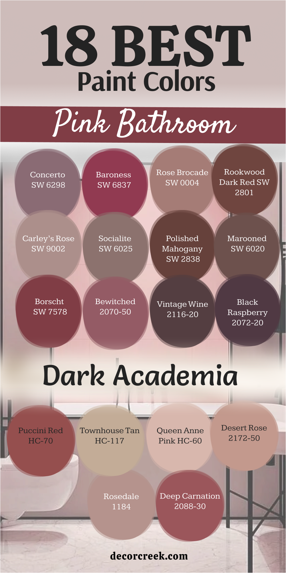
18 Dark Academia Pink Bathroom Paint Colors
Concerto SW 6298
Concerto SW 6298 is a deep, sophisticated plum-pink that feels like a quiet evening in an old library. This color adds a heavy sense of history and drama to any bathroom it touches.
I love how the purple undertones make silver fixtures look sharp and modern against the dark walls. It is a powerful choice for those who want their bathroom to feel like a hidden, luxurious sanctuary.
Best used in: powder rooms, master baths, and rooms with high ceilings
Pairs well with: On the Rocks SW 7671, Iron Ore SW 7069, and antique silver The key rule of this color for farmhouse style is to use it where you want natural light to feel kind, soft, and inviting throughout the day.
Baroness SW 6837
Baroness SW 6837 is a bold and regal pink that demands attention with its rich, jewel-toned depth. It brings a sense of grand elegance that works perfectly with dark wood and heavy mirrors.
I find that this shade creates a wonderful mood for a nighttime bath by candlelight. It is a confident color that transforms a simple bathroom into a room fit for royalty.
Best used in: accent walls, vanity areas, and formal guest bathrooms
Pairs well with: High Reflective White SW 7757, Tricorn Black SW 6258, and gold leaf The key rule of this color for farmhouse style is to use it where you want natural light to feel kind, soft, and inviting throughout the day.
🎨 Check out the complete guide to this color right HERE 👈
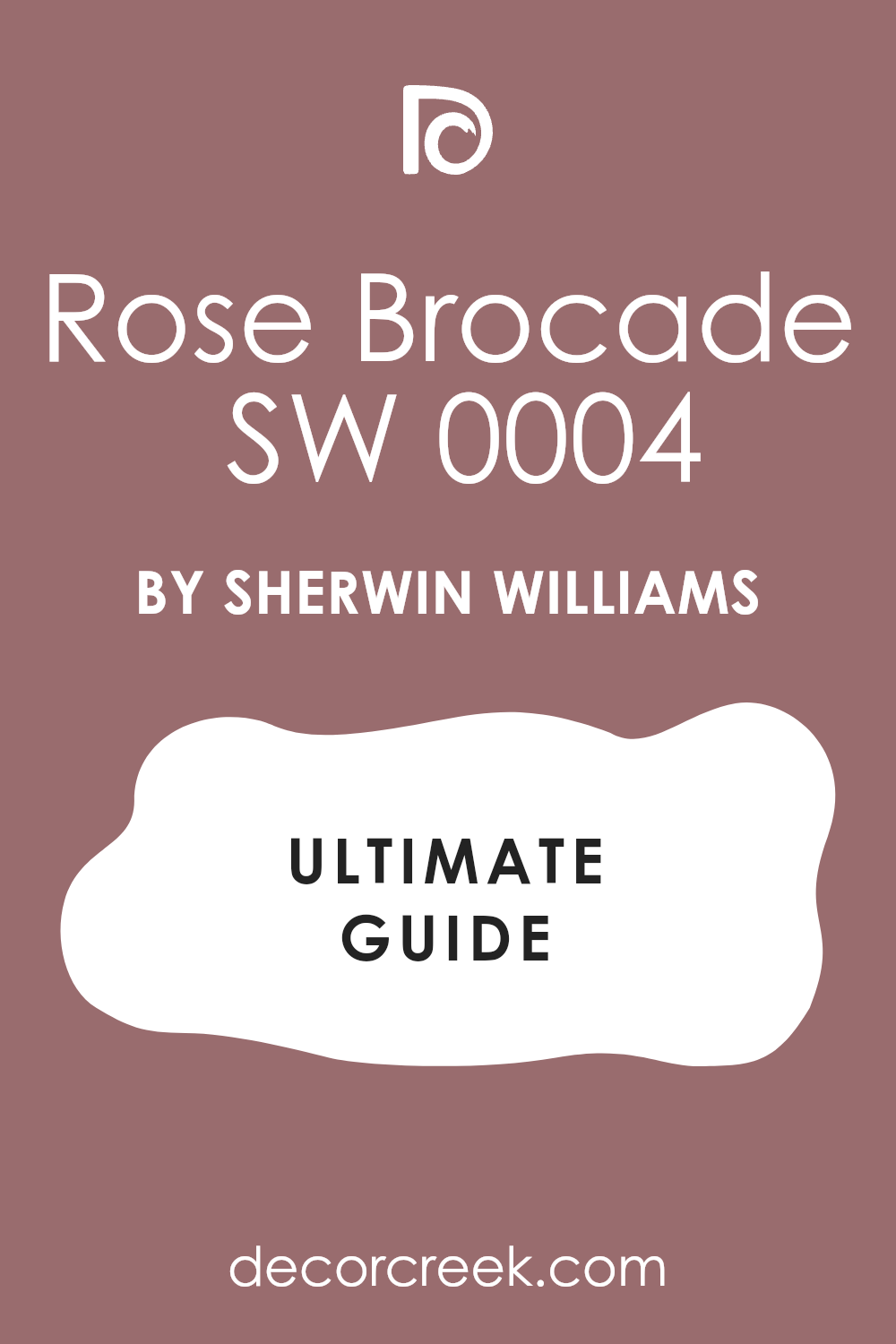
Rose Brocade SW 0004
Rose Brocade SW 0004 is a historic, dusty rose that feels like it was taken straight from a Victorian parlor. This color is muted and soft, yet it carries a very serious and academic weight.
I enjoy using this shade to bridge the gap between “pretty” pink and a more scholarly, grounded aesthetic. it looks stunning when paired with dark charcoal tiles and old brass hardware.
Best used in: historic renovations, master suites, and cozy bathrooms
Pairs well with: Dover White SW 6385, Rookwood Dark Green SW 2816, and mahogany The key rule of this color for farmhouse style is to use it where you want natural light to feel kind, soft, and inviting throughout the day.
🎨 Check out the complete guide to this color right HERE 👈
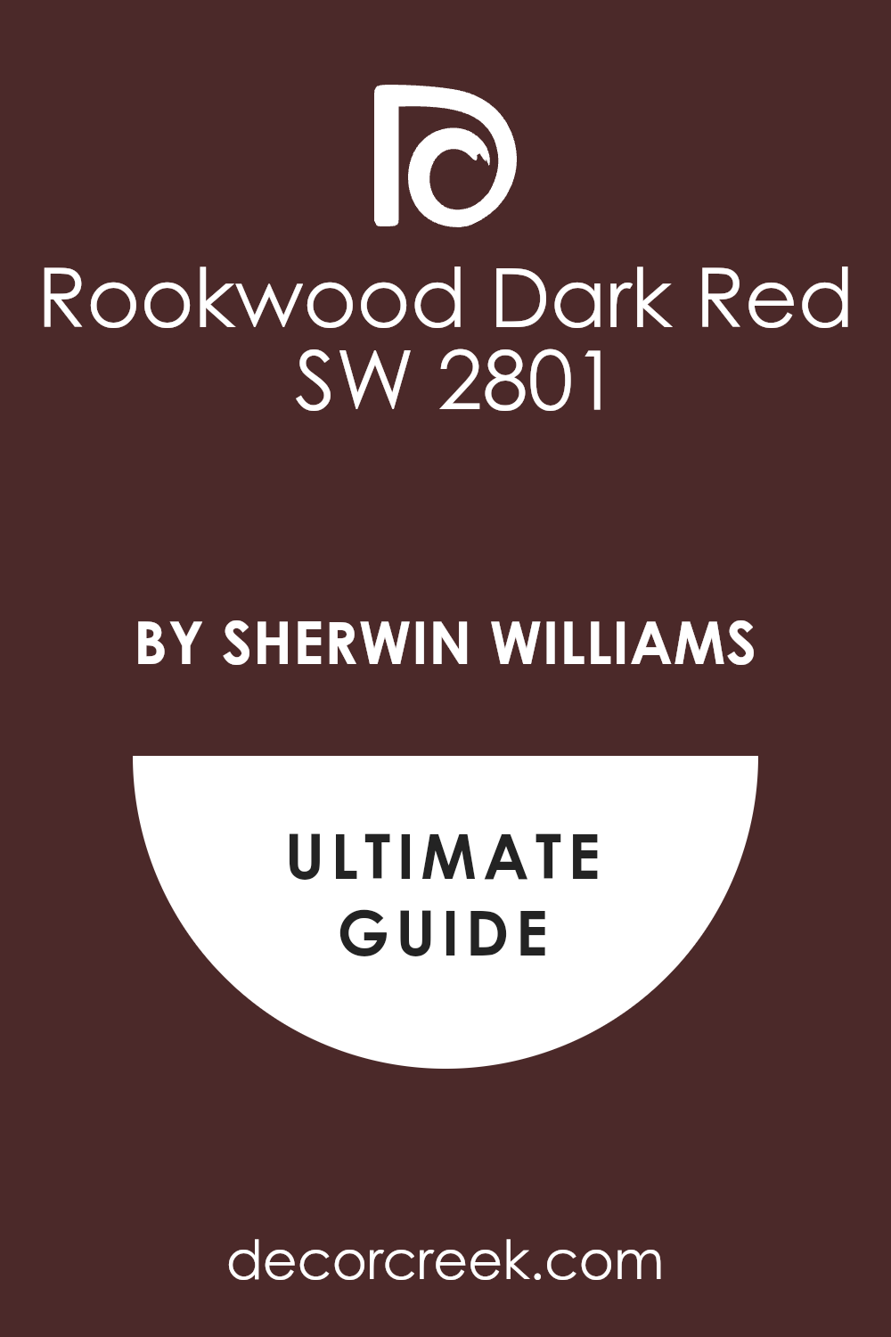
Rookwood Dark Red SW 2801
Rookwood Dark Red SW 2801 is a deep, brownish-pink that leans into the classic colors of the Arts and Crafts movement. It feels very sturdy and permanent, like the walls of an ancient university.
I find that this color provides a warm, protective feeling that makes a large bathroom feel much more intimate. It is a perfect backdrop for leather accents or dark framed artwork on the walls.
Best used in: large bathrooms, study-adjacent baths, and basement powder rooms
Pairs well with: Antique White SW 6119, Classical White SW 2829, and dark walnut The key rule of this color for farmhouse style is to use it where you want natural light to feel kind, soft, and inviting throughout the day.
🎨 Check out the complete guide to this color right HERE 👈
Carley’s Rose SW 9002
Carley’s Rose SW 9002 is a medium-toned, dusty mauve that offers a softer take on the Dark Academia look. It feels scholarly and thoughtful without being as heavy as the darker reds or purples.
I love how this color changes in the light, sometimes looking more gray and other times showing its rosy heart. It is an excellent choice for a bathroom where you want a moody atmosphere that stays calm.
Best used in: guest baths, laundry-bath combos, and small vanity spaces
Pairs well with: Snowbound SW 7004, Peppercorn SW 7674, and brushed nickel The key rule of this color for farmhouse style is to use it where you want natural light to feel kind, soft, and inviting throughout the day.
Socialite SW 6025
Socialite SW 6025 is a refined and shadowy pink that carries a mysterious, high-society vibe. This color is dark enough to feel moody but has a warmth that keeps the room from feeling cold.
I think this shade works best when you want to highlight white marble or light gray stone floors. It creates a high-contrast look that feels very deliberate and very upscale.
Best used in: modern bathrooms, walk-in showers, and formal powder rooms
Pairs well with: Alabaster SW 7008, Urbane Bronze SW 7048, and white marble The key rule of this color for farmhouse style is to use it where you want natural light to feel kind, soft, and inviting throughout the day.
Polished Mahogany SW 2838
Polished Mahogany SW 2838 is a rich, wine-colored pink that borders on a deep brown-red. It captures the essence of polished wood and old leather books perfectly.
I recommend this for a bathroom where you want to feel a sense of heritage and tradition. It provides a very dark, cozy envelope that is perfect for relaxing at the end of a long day.
Best used in: master bathrooms, library-style baths, and accent walls
Pairs well with: Creamy SW 7012, Roycroft Bronze Green SW 2846, and copper The key rule of this color for farmhouse style is to use it where you want natural light to feel kind, soft, and inviting throughout the day.
Marooned SW 6020
Marooned SW 6020 is a dark, saturated pink with heavy brown undertones that feels very grounded. It is a very serious color that brings a sense of stability and age to a new room.
I love how this shade absorbs light, creating deep shadows that fit the Dark Academia aesthetic perfectly. It is a bold choice that makes white sinks and toilets look extra bright and clean.
Best used in: windowless powder rooms, basement baths, and moody suites
Pairs well with: Repose Gray SW 7015, Black Magic SW 6991, and aged brass The key rule of this color for farmhouse style is to use it where you want natural light to feel kind, soft, and inviting throughout the day.
Borscht SW 7578
Borscht SW 7578 is a vibrant yet deep beet-root pink that adds a punch of organic color to the home. This shade feels very old-world, reminding me of traditional dyes and natural pigments.
I find that it works beautifully with eclectic decor and mixed metal finishes like gold and silver. It is a unique way to do “dark” without relying on grays or blacks.
Best used in: eclectic bathrooms, artistic spaces, and small powder rooms
Pairs well with: Pure White SW 7005, Naval SW 6244, and natural wood The key rule of this color for farmhouse style is to use it where you want natural light to feel kind, soft, and inviting throughout the day.
Enchanted 2070-50
Enchanted 2070-50 is a magical, mid-to-dark pink that has a smoky quality to it. This color feels like it belongs in a house full of old maps and vintage curiosities.
I love using this in a bathroom to create a space that feels a little bit mystical and very private. It is a soft-focus dark color that is very easy on the eyes in the morning.
Best used in: creative bathrooms, secondary suites, and vanity alcoves
Pairs well with: Simply White BM OC-117, Kendall Charcoal BM HC-166, and pewter The key rule of this color for farmhouse style is to use it where you want natural light to feel kind, soft, and inviting throughout the day.
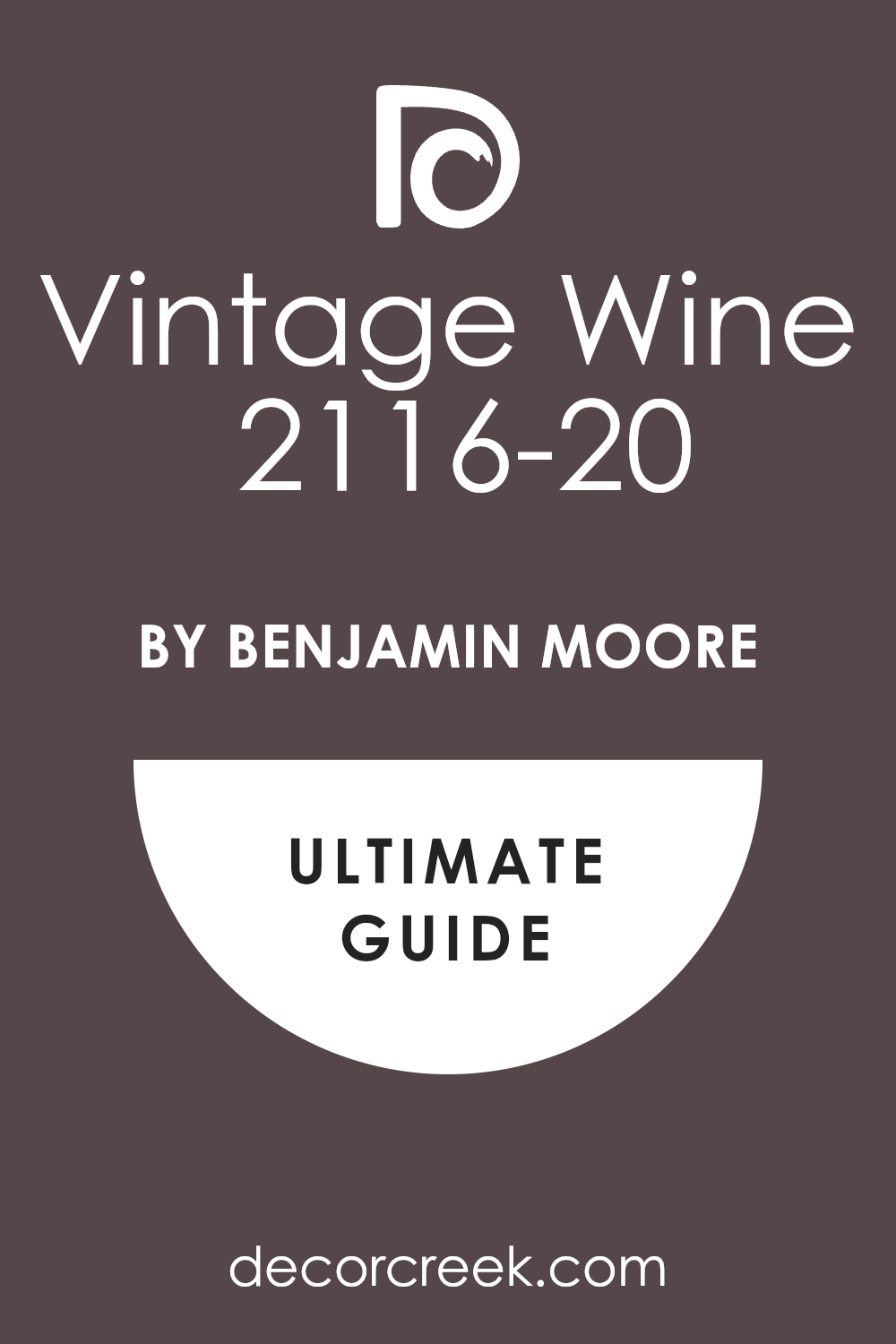
Vintage Wine 2116-20
Vintage Wine 2116-20 is a deep, blackened plum-pink that is the height of Dark Academia style. It is incredibly moody and sophisticated, perfect for a high-drama bathroom.
I find that this color makes gold frames and mirrors look like they are glowing against the dark surface. It is the ultimate choice for a room where you want to escape into another time.
Best used in: formal powder rooms, master baths, and rooms with mood lighting
Pairs well with: White Dove BM OC-17, Black Beauty BM 2128-10, and antique gold The key rule of this color for farmhouse style is to use it where you want natural light to feel kind, soft, and inviting throughout the day.
🎨 Check out the complete guide to this color right HERE 👈
Black Raspberry 2072-20
Black Raspberry 2072-20 is a juicy, dark pink that is almost black in certain lights. It feels very lush and expensive, like velvet curtains in a grand theater.
I love the depth of this color and how it provides a very cozy, enclosed feeling in a small bathroom. It is a bold move that always pays off with a very high-end look.
Best used in: small bathrooms, feature walls, and luxury guest baths
Pairs well with: Chantilly Lace BM OC-65, Revere Pewter BM HC-172, and crystal The key rule of this color for farmhouse style is to use it where you want natural light to feel kind, soft, and inviting throughout the day.
Queen Anne Pink HC-60
Queen Anne Pink HC-60 is a soft, dusty rose that carries a lot of dignity and old-world grace. It is a very sophisticated shade that avoids looking “childish” at all costs.
I love how this color feels like a piece of history on your walls, especially when paired with oil-rubbed bronze. It is a gentle way to do the Dark Academia style without going too dark.
Best used in: guest bathrooms, master suites, and vintage-style baths
Pairs well with: White Heron BM OC-57, Gray Owl BM OC-52, and bronze hardware The key rule of this color for farmhouse style is to use it where you want natural light to feel kind, soft, and inviting throughout the day.
Bouquet Rose 2172-50
Bouquet Rose 2172-50 is a warm, clay-like pink that feels very organic and academic in its simplicity. It reminds me of terracotta tiles and old southwestern architecture.
I find that this color brings a lot of life to a bathroom while keeping a very steady and calm energy. It is an excellent choice for a room that needs a touch of earthy warmth.
Best used in: master bathrooms, spa-like spaces, and warm modern baths
Pairs well with: Atrium White BM OC-145, Van Deusen Blue BM HC-156, and terra cotta The key rule of this color for farmhouse style is to use it where you want natural light to feel kind, soft, and inviting throughout the day.
Rosedale 1180
Rosedale 1180 is a mid-toned, smoky pink that feels very refined and tucked away. It has a beautiful balance of color and shadow that fits a scholarly home perfectly.
I love how this color looks next to dark wood shelving filled with glass jars or vintage bottles. It creates a very curated and personal feeling in even a small bathroom.
Best used in: cottage baths, master suites, and creative powder rooms
Pairs well with: Steam BM AF-15, Chelsea Gray BM HC-168, and walnut wood The key rule of this color for farmhouse style is to use it where you want natural light to feel kind, soft, and inviting throughout the day.
Deep Carnation 2086-40
Deep Carnation 2086-40 is a rich, full-bodied pink that is very confident and deep. It feels like a late summer garden just before the sun goes down.
I recommend this for someone who wants a pink that is undeniably bold but still very sophisticated. It provides a lush, dark background that makes white linens feel extra fresh and bright.
Best used in: large bathrooms, accent walls, and moody guest suites
Pairs well with: Super White BM PM-1, Black Beauty BM 2128-10, and chrome The key rule of this color for farmhouse style is to use it where you want natural light to feel kind, soft, and inviting throughout the day.
21 Vintage Pink Bathroom Paint Color Ideas
Romance SW 6323
Romance SW 6323 is a medium pink that feels very sweet and traditional in a bathroom setting. This color reminds me of spring flowers and bright mornings spent getting ready for the day.
I love to use it in bathrooms that have a lot of white tile or white beadboard on the bottom. It provides a nice contrast that makes the architecture of the room stand out more clearly.
Best used in: kid’s bathrooms, craft rooms, laundry rooms, and accent furniture
Pairs well with: Pure White SW 7005, Tricorn Black SW 6258, Gray Owl BM OC-52, and wicker baskets The key rule of this color for farmhouse style is to use it where you want natural light to feel kind, soft, and inviting throughout the day.
🎨 Check out the complete guide to this color right HERE 👈
Intimate White SW 6322
Intimate White SW 6322 is a very soft pink that has a lot of white mixed into the base. This color gives your bathroom a very clean and professional look while still feeling very friendly.
I find that it works very well in rooms that do not have a lot of natural sunlight. The pink tones come out more when you turn on your warm indoor light bulbs at night.
Best used in: bathrooms, kitchens, sunrooms, and bedroom ceilings
Pairs well with: Alabaster SW 7008, Naval SW 6244, Peppercorn SW 7674, and light pine wood The key rule of this color for farmhouse style is to use it where you want natural light to feel kind, soft, and inviting throughout the day.
🎨 Check out the complete guide to this color right HERE 👈
Pink Shadow SW 0070
Pink Shadow SW 0070 has a very old-fashioned feel that reminds me of historic homes and classic style. This color is deep enough to show its true character even in a room with very bright lights.
I see it as a very sophisticated choice for a vanity area where you want to feel fancy. It has a dusty quality that keeps it from looking like a child’s bedroom or a toy store.
Best used in: master bathrooms, dining rooms, home offices, and accent walls
Pairs well with: Westhighland White SW 7566, Roycroft Bronze Green SW 2846, Creamy SW 7012, and brass accents The key rule of this color for farmhouse style is to use it where you want natural light to feel kind, soft, and inviting throughout the day.
🎨 Check out the complete guide to this color right HERE 👈
Rosaline Pearl SW 9077
Rosaline Pearl SW 9077 is a very pale and delicate pink that almost looks like a soft white. This color is perfect for tiny bathrooms where you want to keep things bright and airy.
I like how it adds just a hint of warmth without making a bold statement. It reflects light very well, which helps when you are doing your hair or makeup in the morning.
Best used in: small bathrooms, powder rooms, ceilings, and trim details
Pairs well with: Extra White SW 7006, Sea Salt SW 6204, Rainwashed SW 6210, and gray stone The key rule of this color for farmhouse style is to use it where you want natural light to feel kind, soft, and inviting throughout the day.
Rose Colored SW 6303
Rose Colored SW 6303 is a true, classic pink that reminds me of a blooming garden in the spring. This color is very friendly and brings a happy energy to your daily routine.
I find that it works best in bathrooms that get plenty of natural sunlight through a window. It has a clear and bright quality that never feels muddy or gray on the walls.
Best used in: kids’ bathrooms, laundry rooms, craft rooms, and sun-filled bedrooms
Pairs well with: Pure White SW 7005, Tricorn Black SW 6258, Dorian Gray SW 7017, and light oak wood The key rule of this color for farmhouse style is to use it where you want natural light to feel kind, soft, and inviting throughout the day.
🎨 Check out the complete guide to this color right HERE 👈
Pressed Flower SW 6304
Pressed Flower SW 6304 is a rich and saturated pink that leans into a terracotta or clay look. This color is very warm and makes a bathroom feel like a high-end spa in the desert.
I enjoy how it adds a layer of depth to a room without feeling heavy or overwhelming. It is a very earthy shade that feels connected to nature and organic materials.
Best used in: master bathrooms, entryways, dining areas, and accent walls
Pairs well with: Alabaster SW 7008, Naval SW 6244, Peppercorn SW 7674, and copper accents The key rule of this color for farmhouse style is to use it where you want natural light to feel kind, soft, and inviting throughout the day.
🎨 Check out the complete guide to this color right HERE 👈
Faint Coral SW 6329
Faint Coral SW 6329 has a tiny bit of orange in it that makes it feel very warm and sunny. This color is excellent for adding a tropical or beachy vibe to your bathroom decor.
I find that it looks amazing when paired with teal or light blue accents in the room. It gives a healthy glow to your skin tone when you look at yourself in the mirror.
Best used in: pool baths, guest suites, kitchens, and bright sun porches
Pairs well with: Toasted Pine Nut SW 7696, Salty Earring SW 9642, High Reflective White SW 7757, and bamboo The key rule of this color for farmhouse style is to use it where you want natural light to feel kind, soft, and inviting throughout the day.
🎨 Check out the complete guide to this color right HERE 👈
Rose Brocade SW 0004
Rose Brocade SW 0004 is a historic, dusty rose that feels like it was taken straight from a Victorian parlor. This color is muted and soft, yet it carries a very serious and academic weight.
I enjoy using this shade to bridge the gap between “pretty” pink and a more scholarly, grounded aesthetic. It looks stunning when paired with dark charcoal tiles and old brass hardware.
Best used in: historic renovations, master suites, and cozy bathrooms
Pairs well with: Dover White SW 6385, Rookwood Dark Green SW 2816, and mahogany wood The key rule of this color for farmhouse style is to use it where you want natural light to feel kind, soft, and inviting throughout the day.
🎨 Check out the complete guide to this color right HERE 👈
Carley’s Rose SW 9002
Carley’s Rose SW 9002 is a medium-toned, dusty mauve that offers a softer take on the vintage look. It feels scholarly and thoughtful without being as heavy as the darker reds or purples.
I love how this color changes in the light, sometimes looking more gray and other times showing its rosy heart. It is an excellent choice for a bathroom where you want a moody atmosphere that stays calm.
Best used in: guest baths, laundry-bath combos, and small vanity spaces
Pairs well with: Snowbound SW 7004, Peppercorn SW 7674, and brushed nickel The key rule of this color for farmhouse style is to use it where you want natural light to feel kind, soft, and inviting throughout the day.
Baroness SW 6837
Baroness SW 6837 is a bold and regal pink that demands attention with its rich, jewel-toned depth. It brings a sense of grand elegance that works perfectly with dark wood and heavy mirrors.
I find that this shade creates a wonderful mood for a nighttime bath by candlelight. It is a confident color that transforms a simple bathroom into a room fit for royalty.
Best used in: accent walls, vanity areas, and formal guest bathrooms
Pairs well with: High Reflective White SW 7757, Tricorn Black SW 6258, and gold leaf The key rule of this color for farmhouse style is to use it where you want natural light to feel kind, soft, and inviting throughout the day.
🎨 Check out the complete guide to this color right HERE 👈
First Light 2102-70
First Light 2102-70 is a very airy and light pink that was designed to be a modern neutral with a vintage heart. This color is extremely soft and acts like a fresh start for any dark or dated room.
I love how it reflects light to make a tiny bathroom feel much larger and more open. It has just enough pink to feel warm but stays very clean and bright like a white.
Best used in: small bathrooms, nurseries, master bedrooms, and kitchen cabinets
Pairs well with: White Heron BM OC-57, Gray Owl BM OC-52, Hale Navy BM HC-154, and glass decor The key rule of this color for farmhouse style is to use it where you want natural light to feel kind, soft, and inviting throughout the day.
🎨 Check out the complete guide to this color right HERE 👈
Pink Damask 890
Pink Damask 890 is a very pale pink that has a lot of white in it to keep it very bright. This color is so soft that it almost looks like a warm white until you see it next to trim.
I love how it adds a secret layer of warmth to a bathroom without being too obvious or loud. It is a very elegant choice for a master suite where you want a very quiet feeling.
Best used in: master bathrooms, small entries, ceilings, and bedroom walls
Pairs well with: White Dove BM OC-17, Kendall Charcoal BM HC-166, Sea Haze BM 2137-50, and silver accents The key rule of this color for farmhouse style is to use it where you want natural light to feel kind, soft, and inviting throughout the day.
Pale Petal 1178
Pale Petal 1178 is a very soft and whisper-light pink that feels like a warm hug for your walls. This color is nearly white but has a rosy heart that makes a room feel very friendly.
I love how it adds just a tiny bit of color to a bathroom without making it look too small. It is a very clean shade that works perfectly for people who love a minimalist style.
Best used in: tiny bathrooms, master suites, ceilings, and bright hallways
Pairs well with: White Dove BM OC-17, Kendall Charcoal BM HC-166, Sea Haze BM 2137-50, and silver accents The key rule of this color for farmhouse style is to use it where you want natural light to feel kind, soft, and inviting throughout the day.
Pink Buff 1285
Pink Buff 1285 is a warm and sandy pink that feels very natural and easy to live with. This color is a great bridge between a traditional tan and a soft rose petal.
I find that it creates a very cozy and safe feeling in a bathroom that lacks natural light. It has a bit of an orange undertone that makes the room feel warm and sunny even on rainy days.
Best used in: main bathrooms, kitchens, hallways, and living room accents
Pairs well with: Swiss Coffee BM OC-45, Wrought Iron BM 2124-10, Edgecomb Gray BM HC-173, and wicker textures The key rule of this color for farmhouse style is to use it where you want natural light to feel kind, soft, and inviting throughout the day.
Tissue Pink 1163
Tissue Pink 1163 is a delicate and powdery shade that feels very soft and romantic on the wall. This color reminds me of vintage makeup rooms and classic style from the past.
I find that it adds a very feminine and graceful touch to any bathroom it is painted in. It is light enough to use on both the walls and the ceiling for a total look.
Best used in: powder rooms, girls’ bedrooms, walk-in closets, and ceiling accents
Pairs well with: Chantilly Lace BM OC-65, Simply White BM OC-117, Revere Pewter BM HC-172, and linen fabrics The key rule of this color for farmhouse style is to use it where you want natural light to feel kind, soft, and inviting throughout the day.
Blushing Bride 2086-50
Blushing Bride 2086-50 is a very soft and romantic pink that feels like a warm glow on a cloudy day. This color is light enough to act as a neutral while still bringing a lot of heart to the room.
I find that it works wonders in bathrooms that have very little natural light coming through. It has a tiny hint of peach that keeps it from ever feeling too cold or gray on your walls.
Best used in: small bathrooms, nurseries, master suites, and laundry rooms
Pairs well with: White Heron BM OC-57, Gray Owl BM OC-52, Hale Navy BM HC-154, and warm wood tones The key rule of this color for farmhouse style is to use it where you want natural light to feel kind, soft, and inviting throughout the day.
Love Always 896
Love Always 896 is a medium pink that feels very balanced and very sweet on a large wall. This color has a traditional personality that reminds me of vintage tiles and classic charm.
I find that it brings a lot of warmth to a bathroom that might otherwise feel cold or plain. It is a very steady shade that does not change much when you turn the lights on.
Best used in: guest bathrooms, accent walls, craft rooms, and vanity areas
Pairs well with: Cloud White BM OC-13, Van Deusen Blue BM HC-156, Smoke BM 2122-40, and brass fixtures The key rule of this color for farmhouse style is to use it where you want natural light to feel kind, soft, and inviting throughout the day.
Proposal AF-260
Proposal AF-260 is a modern and dusty pink that feels very stylish and very current for today’s homes. This color has a gray undertone that makes it look very expensive on the wall.
I find that it works beautifully in a bathroom that has a lot of black or dark gray tile. It provides a nice contrast that feels very sophisticated and very well-planned for a designer look.
Best used in: master baths, formal powder rooms, dining areas, and library walls
Pairs well with: Classic Gray BM OC-23, Chelsea Gray BM HC-168, Black Forest Green BM HC-187, and dark metal accents The key rule of this color for farmhouse style is to use it where you want natural light to feel kind, soft, and inviting throughout the day.
🎨 Check out the complete guide to this color right HERE 👈
Queen Anne Pink HC-60
Queen Anne Pink HC-60 is a soft, dusty rose that carries a lot of dignity and old-world grace. It is a very sophisticated shade that avoids looking “childish” at all costs.
I love how this color feels like a piece of history on your walls, especially when paired with oil-rubbed bronze. It is a gentle way to do the vintage style without going too dark.
Best used in: guest bathrooms, master suites, and vintage-style baths
Pairs well with: White Heron BM OC-57, Gray Owl BM OC-52, and bronze hardware The key rule of this color for farmhouse style is to use it where you want natural light to feel kind, soft, and inviting throughout the day.
Desert Rose 2094-50
Desert Rose 2094-50 is a warm, clay-like pink that feels very organic and classic in its simplicity. It reminds me of terracotta tiles and old southwestern architecture.
I find that this color brings a lot of life to a bathroom while keeping a very steady and calm energy. It is an excellent choice for a room that needs a touch of earthy warmth.
Best used in: master bathrooms, spa-like spaces, and warm modern baths
Pairs well with: Atrium White BM OC-145, Van Deusen Blue BM HC-156, and terra cotta The key rule of this color for farmhouse style is to use it where you want natural light to feel kind, soft, and inviting throughout the day.
Pensacola Pink 1184
Pensacola Pink 1184 is a mid-toned, smoky pink that feels very refined and tucked away. It has a beautiful balance of color and shadow that fits a curated home perfectly.
I love how this color looks next to dark wood shelving filled with glass jars or vintage bottles. It creates a very personal feeling in even a small bathroom.
Best used in: cottage baths, master suites, and creative powder rooms
Pairs well with: Steam BM AF-15, Chelsea Gray BM HC-168, and walnut wood The key rule of this color for farmhouse style is to use it where you want natural light to feel kind, soft, and inviting throughout the day.
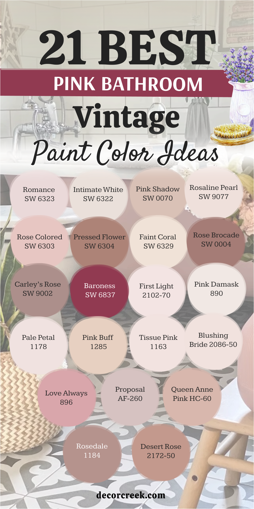
My Final Thoughts About 27 Best Paint Colors For The Pink Bathroom
Picking a pink paint for your bathroom is an incredibly fun and creative way to showcase your unique personal style while making your home feel truly special and distinctive. I firmly believe that any of these beautiful shades can work perfectly in your space, provided you take the time to carefully consider your specific lighting conditions and your existing furniture first.
By looking at how your vanity, mirrors, and decor interact with the walls, you can ensure that the final result feels like a professional, well-planned design rather than an afterthought.
Pink is a remarkably versatile color that brings an abundance of life, warmth, and genuine joy to a room that we rely on for our essential routines every single day. Because it has such a strong impact on the mood of a space, it is absolutely vital to remember to test your top favorites directly on the wall using large swatches before you commit to buying all the paint for the entire project.
Watching how a sample dries and shifts in tone will save you time and money, ensuring the shade you fell in love with on a small chip actually translates beautifully to the larger surface area of your bathroom.
You want to be completely certain that the specific color you choose makes you feel happy, refreshed, and energized the moment you see it in the soft morning light. The right pink should act as a backdrop to your life that feels both comforting and inspiring, turning a functional room into a private retreat.
I am so genuinely glad you are taking this exciting step to transform your bathroom into a more beautiful, vibrant, and personal place to be. It is a wonderful investment in your home’s atmosphere that you will appreciate every time you walk through the door.