If you’re looking for a paint color that adds a gentle touch of warmth to any room, you may have found a match in SW 6303 Rose Colored by Sherwin Williams. As someone who appreciates subtle yet impactful design changes, I find this shade particularly appealing. Rose Colored isn’t just pink; it has a refined blush tone that creates a cozy and inviting atmosphere. Whether you’re painting a bedroom to enhance relaxation or a living area to make it more welcoming, this color has the charm to shift the mood of your environment gently.
Using Rose Colored on your walls can help soften other elements in the room, making it easier to pair with furniture and decor of various styles. From modern minimalist pieces that rely on strong lines and neutral shades to more eclectic, vibrant selections, this color works surprisingly well as a backdrop.
It especially shines in areas that benefit from a lot of natural light, as the changing sunlight throughout the day can play beautifully off its warm undertones, offering a dynamic feel to the room.
Let me take you through how this color can reshape the aesthetics of your room effortlessly, enhancing the overall vibe without feeling too strong.

What Color Is Rose Colored SW 6303 by Sherwin Williams?
Rose Colored is a warm and inviting shade that brings a cozy feel to any room. It has a subtle pink hue that’s not too intense, making it a perfect choice for those looking to add a touch of softness and warmth to their interiors. This color is flexible enough to blend well with both modern and traditional designs.
In terms of interior styles, Rose Colored shines in romantic and shabby chic decor, where its gentle pink adds a whimsical touch without being too bold. It also works beautifully in contemporary settings, especially when used as an accent wall to add a pop of color against a more neutral palette.
When pairing with materials, Rose Colored goes particularly well with light woods, such as pine or birch, which help maintain the airy feel of the room. Textures like linen, cotton, and soft wool fabrics complement this color exceptionally well, supporting the cozy and comforting vibe it brings. Additionally, metallic accents in gold or brass can introduce a touch of luxury, making the environment feel warm and inviting.
Overall, Rose Colored is a charming choice that can help create a welcoming and stylish room that feels both comfortable and chic. It’s easy to incorporate into various design elements and pairs beautifully with a range of materials and textures for a cohesive look.
decorcreek.com
Is Rose Colored SW 6303 by Sherwin Williams Warm or Cool color?
Rose Colored by Sherwin Williams is a warm and inviting shade of pink that adds a gentle touch of color to any room. This hue has a slightly muted quality, making it adaptable and easy to pair with other colors.
It’s perfect for rooms where you want to create a cozy and welcoming ambiance, like living rooms or bedrooms. The soft pink tone also works well in bathrooms or as an accent wall, offering a hint of color without feeling too strong.
This color can make smaller rooms feel more open and airy, while in larger rooms, it can help create a sense of intimacy. It’s particularly effective in rooms with natural light, as the sunlight enhances the depth and warmth of the color. Rose Colored pairs beautifully with neutral shades like whites, grays, and tans, as well as with darker colors for a more dramatic look. It’s a great choice if you’re looking for something that adds personality to your home without being too bold or intense.
Undertones of Rose Colored SW 6303 by Sherwin Williams
Rose Colored is a vibrant paint that looks different depending on the lighting and surrounding colors. It has a complex mix of undertones including pale yellow, light purple, pale pink, light blue, mint, lilac, and grey. These undertones mix beneath the main color and influence how the paint looks in various conditions.
Undertones are subtle hints of other colors that are mixed into the main color. They can affect the warmth, coolness, and overall feel of the color. For example, a color with yellow undertones might feel warmer, whereas a color with blue undertones might feel cooler.
In the case of Rose Colored, these undertones contribute to its adaptability. Under bright light, the pale yellow or light blue might make the color appear brighter and more lively. In dimmer light, the grey or lilac undertones could make it seem softer and more subdued.
When used on interior walls, the varying undertones of Rose Colored make it a dynamic choice that interacts with both natural and artificial light. This interaction can make a room feel lively and fresh during the day when natural light is present, and cozy and welcoming in the evening under indoor lights. This quality makes it a suitable choice for living rooms, bedrooms, and any room where the mood can change with the time of day.
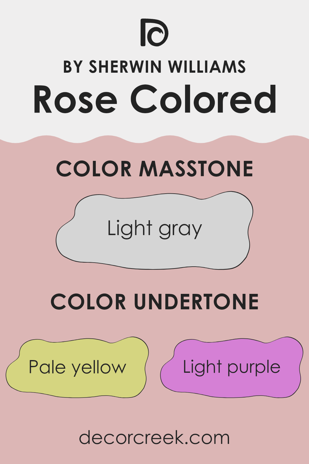
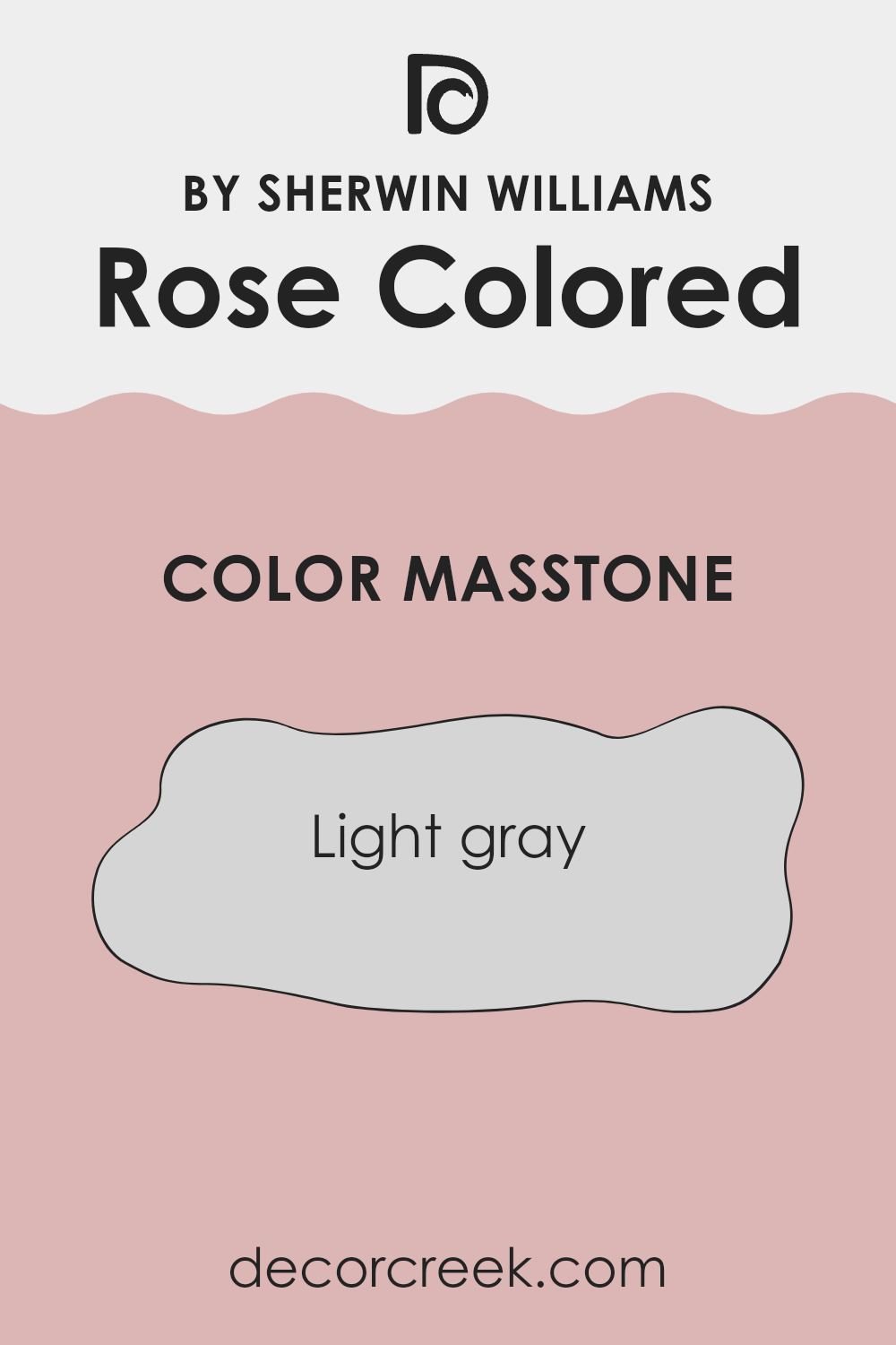
What is the Masstone of the Rose Colored SW 6303 by Sherwin Williams?
Rose Colored SW 6303 by Sherwin Williams has a masstone of light gray, coded as #D5D5D5. This specific shade of gray offers a soft and subtle backdrop that works well in various home settings. Its lightness provides a neutral base that does not overpower a room but instead supports a calm and relaxing atmosphere.
This color can easily blend with different decor styles and colors, offering adaptability in interior design. It is particularly effective in smaller rooms where a lighter color can make the area feel larger and more open. The neutral tone of this gray also works well in rooms with plenty of natural light, as it reflects light gently and boosts brightness.
Its adaptability makes it a popular choice for living rooms, bedrooms, and even kitchens, where it provides a clean, fresh look without feeling too stark. Overall, its ability to work nicely with other colors and elements in a room makes it a practical and appealing choice for many homes.
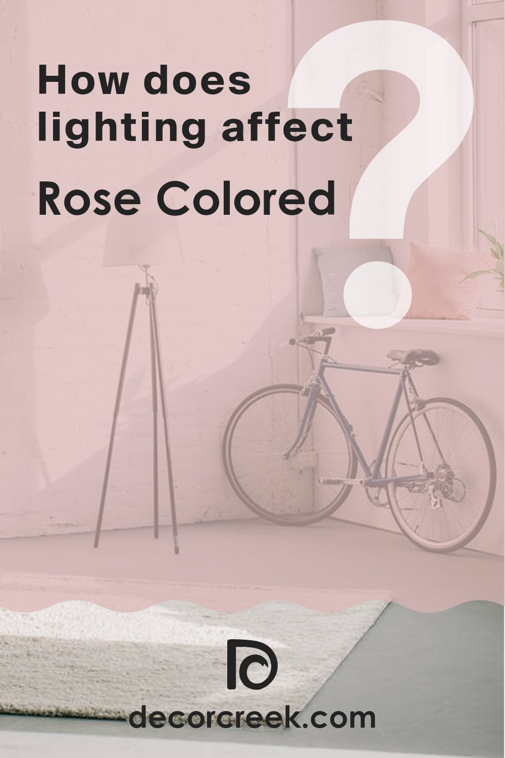
How Does Lighting Affect Rose Colored SW 6303 by Sherwin Williams?
Lighting plays a crucial role in how we perceive colors. The type of light and its intensity can change how a shade looks on walls, fabrics, and surfaces. It’s important to consider this when choosing paint colors for a room.
Taking the color Rose Colored as an example, its appearance can vary noticeably under different lighting conditions. Rose Colored is a warm, soft pink that can appear more vibrant or more subdued depending on the light.
In artificial light, such as LED or incandescent bulbs, Rose Colored tends to look warmer. Incandescent lighting brings out the cozy, inviting quality of the pink, making it feel richer and more vibrant. LED lights, depending on the color temperature, can either enhance this warmth or give a slightly cooler effect, making the color appear a bit softer.
In natural light, the appearance of Rose Colored changes throughout the day. Morning light, which is softer and cooler, might make the paint look more delicate and subtle. As the sun reaches its peak, the intensity of the natural light can make Rose Colored look brighter and more vivid.
Room orientation affects how natural light interacts with Rose Colored:
- North-facing rooms receive less direct sunlight, which can make Rose Colored appear slightly muted and cooler. This subtle quality can make the room feel calm and gentle.
- South-facing rooms get plenty of bright, direct light, which can make the pink lively and vibrant. This is great for rooms where you want a cheerful and energetic feel.
- East-facing rooms enjoy bright light in the morning, when the color will look its brightest and most cheerful. By afternoon, as the light fades, the color takes on a softer tone.
- West-facing rooms will see Rose Colored in softer light in the morning, which then turns warmer and richer toward the evening. This enhances the cozy feel of the room, especially at sunset.
Understanding how light affects colors like Rose Colored can help you decide the best use of the color in your home, creating the desired mood and atmosphere in each room.
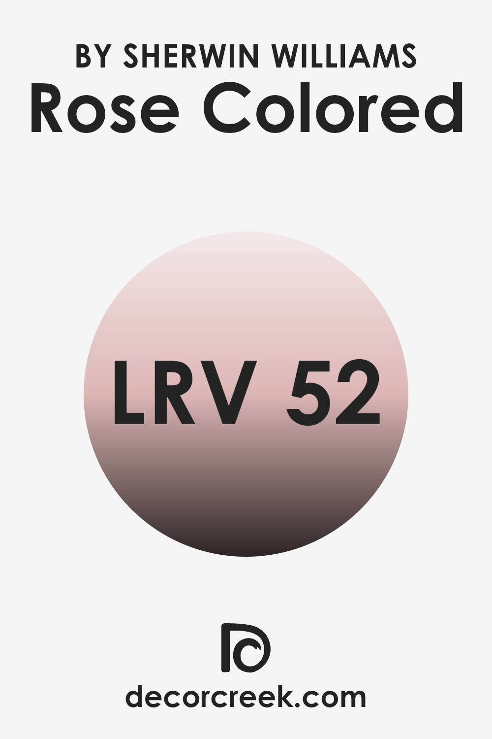
What is the LRV of Rose Colored SW 6303 by Sherwin Williams?
LRV stands for Light Reflectance Value, which is a measurement showing the percentage of light a paint color reflects back into a room compared to the amount of light that actually hits the wall. This value can range between only black and the color white.
A higher LRV means the color reflects more light, resulting in a brighter appearance, while a lower LRV indicates that the paint absorbs more light, making it appear darker. The LRV is an important factor to consider when choosing paint because it helps predict how bright or dark a room will feel once painted.
For the color Rose Colored, with an LRV of 52.151, it strikes a balance between reflecting and absorbing light. This makes it adaptable for use in various lighting conditions. In well-lit rooms, such as those receiving ample natural light, this color will appear more vibrant and lively due to its ability to reflect a substantial amount of light. In dimmer rooms, it might look slightly muted but will still provide warmth to the area. Understanding this LRV can help in choosing the right color for the intended effect and ambiance in different rooms.
decorcreek.com
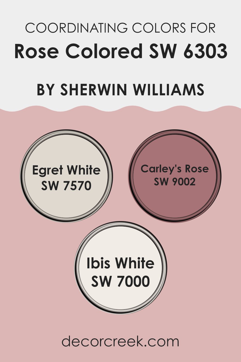
Coordinating Colors of Rose Colored SW 6303 by Sherwin Williams
Coordinating colors are selected hues that harmonize well when used together in a room, improving the ambiance without feeling too strong. These hues either complement, contrast, or stay tonally close to the main color, creating a balanced and visually pleasing palette. For example, when decorating with a color like Rose Colored, certain shades can enhance its warm, inviting nature without clashing.
Egret White is a soft, subtle off-white that provides a gentle contrast to richer, deeper tones such as Rose Colored. It serves as an excellent backdrop, allowing more vibrant colors to stand out while maintaining a clean and light atmosphere in the room. Carley’s Rose, on the other hand, is a slightly deeper pink that pairs beautifully with Rose Colored, strengthening the overall warmth of the color scheme.
This shade adds depth and interest, making it ideal for accent walls or fabric choices in a room primarily painted in Rose Colored. Lastly, Ibis White offers a bright, crisp appearance. It’s a fresh white that works well on trims and ceilings, creating a sharp, neat boundary that highlights the richer wall colors. Together, these coordinating colors create a cohesive and inviting feel, improving the visual appeal of any room.
You can see recommended paint colors below:
- SW 7570 Egret White
- SW 9002 Carley’s Rose
- SW 7000 Ibis White
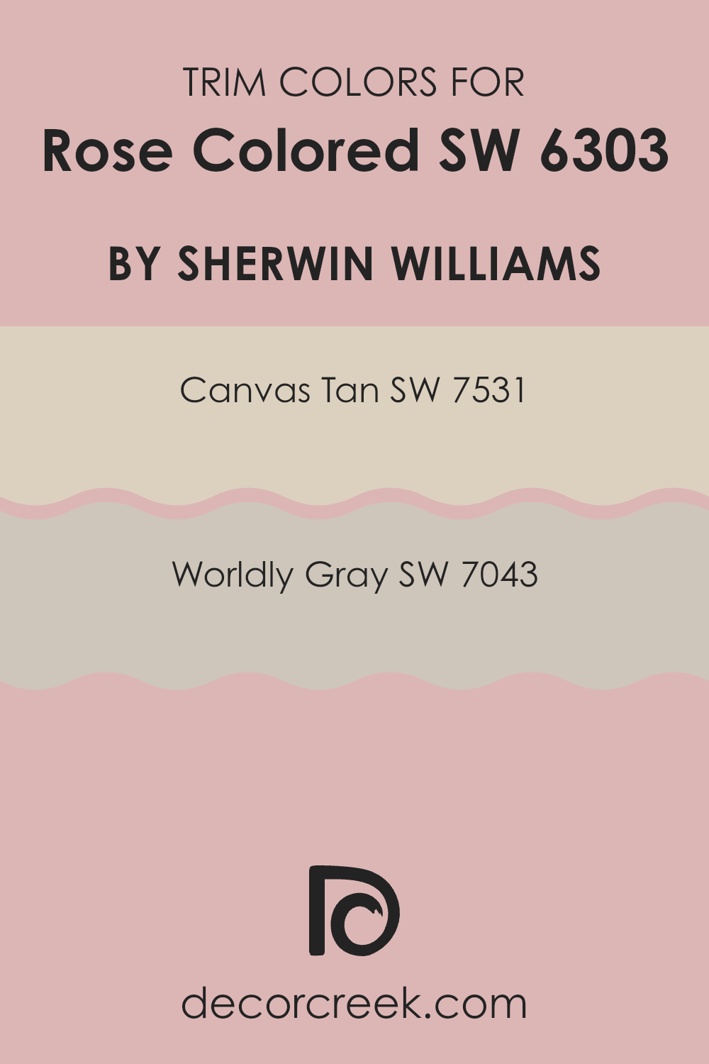
What are the Trim colors of Rose Colored SW 6303 by Sherwin Williams?
Trim colors are important because they add contrast and interest to the main color of a room or exterior by highlighting architectural details and borders such as door frames, window sills, and baseboards. For instance, when using a vibrant and unique hue like Rose Colored by Sherwin Williams, selecting the right trim colors can make a significant impact on the room’s atmosphere and overall look.
Using colors like SW 7531 – Canvas Tan or SW 7043 – Worldly Gray as trim can gently complement Rose Colored without taking over, allowing the primary color to stand out while ensuring the room feels well coordinated and thoughtfully designed.
SW 7531 – Canvas Tan is a neutral, sandy beige that provides a soft, natural-looking contrast to the deeper tones of Rose Colored, helping to anchor the room while adding a light, airy quality. On the other hand, SW 7043 – Worldly Gray offers a cooler, mid-tone gray that pairs beautifully with Rose Colored by adding a touch of modern polish. These colors are ideal as trims for creating a harmonious yet visually interesting environment that highlights the beauty and impact of the main wall color.
You can see recommended paint colors below:
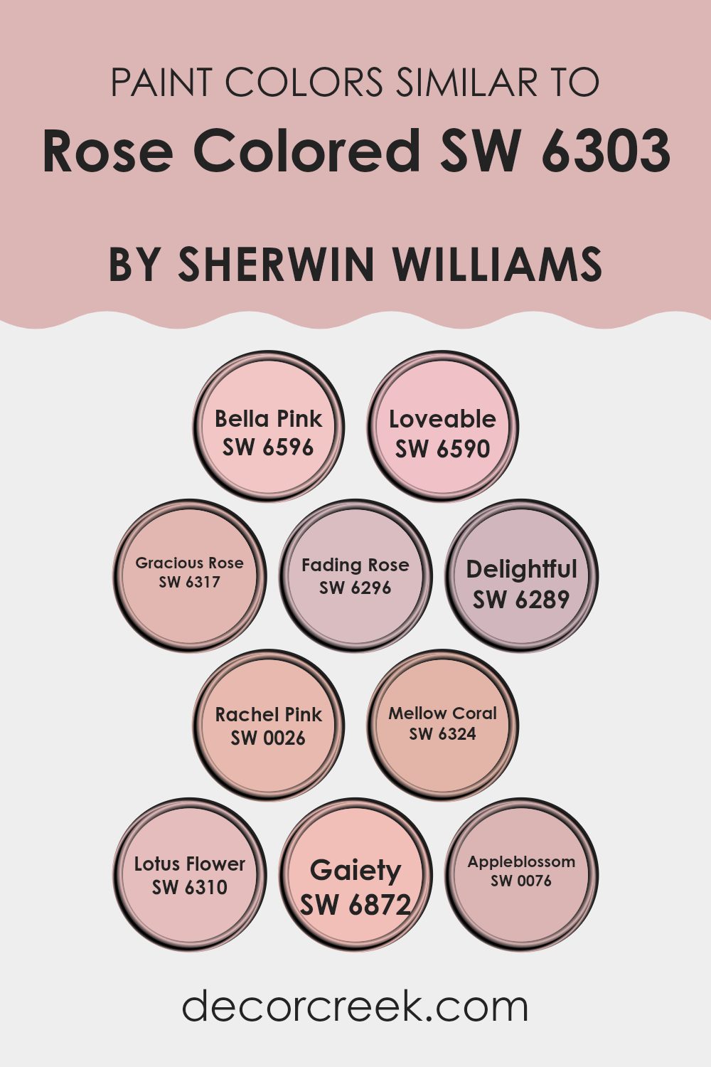
Colors Similar to Rose Colored SW 6303 by Sherwin Williams
Similar colors play a crucial role in design by creating a cohesive and harmonious look. When colors like Bella Pink, Loveable, and Gracious Rose are used together, they offer a gradient of tone that can add depth and interest to a room without feeling too strong. These shades are close to each other on the color spectrum, making it easier to create transitions and flow in decor, which is ideal for projects aiming for a subtle and unified appearance.
Bella Pink is a gentle hue that offers a whisper of sweetness to any room, blending well with darker shades. Loveable is a vibrant, cheerful pink that adds a pop of brightness, perfect for energizing a room. Gracious Rose has a dusky, more muted tone that brings a sense of warmth and comfort.
Fading Rose and Delightful both provide soft, understated elegance, with the former leaning toward a nostalgic touch and the latter feeling airy and pleasant. Rachel Pink and Mellow Coral introduce a slight, delightful zest that can lighten up any area. Lotus Flower carries a soft, floral charm, while Gaiety bursts with a playful, spirited pink that can refresh a child’s room. Lastly, Appleblossom offers a subtle peachy pink that evokes the freshness of spring, ideal for creating a welcoming environment.
You can see recommended paint colors below:
- SW 6596 Bella Pink
- SW 6590 Loveable
- SW 6317 Gracious Rose
- SW 6296 Fading Rose
- SW 6289 Delightful
- SW 0026 Rachel Pink
- SW 6324 Mellow Coral
- SW 6310 Lotus Flower
- SW 6872 Gaiety
- SW 0076 Appleblossom
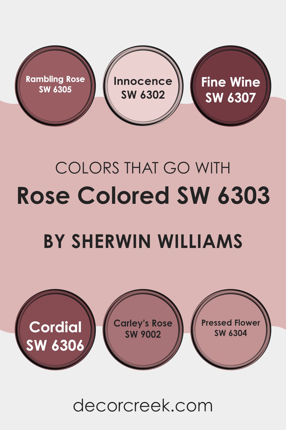
Colors that Go With Rose Colored SW 6303 by Sherwin Williams
Choosing the right complementary colors for Rose Colored SW 6303 by Sherwin Williams can greatly improve the ambiance of any room. When paired correctly, these colors create a harmonious look that makes rooms feel more inviting and cohesive.
For instance, SW 6305 – Rambling Rose is a richer, more intense shade that complements the lighter, softer Rose Colored by adding depth and warmth to the decor. On the other hand, SW 6302 – Innocence is much lighter and helps brighten rooms, giving an airy and fresh feeling when used alongside Rose Colored.
Other shades like SW 6307 – Fine Wine bring a robust and deep hue into the mix, offering a striking contrast that can act as a focal point or an accent. Similarly, SW 6306 – Cordial offers a slightly muted yet appealing alternative to darker reds, which can help create a balanced visual appeal. For something slightly different, SW 9002 – Carley’s Rose provides a youthful and vibrant pink that adds a pop of color without feeling too intense. Lastly, SW 6304 – Pressed Flower, which has an earthy pink tone, pairs nicely with Rose Colored, ensuring the room remains warm and welcoming without feeling too strong. All these shades work together to give any room a cohesive and enjoyable atmosphere.
You can see recommended paint colors below:
- SW 6305 Rambling Rose
- SW 6302 Innocence
- SW 6307 Fine Wine
- SW 6306 Cordial
- SW 9002 Carley’s Rose
- SW 6304 Pressed Flower
How to Use Rose Colored SW 6303 by Sherwin Williams In Your Home?
Rose Colored SW 6303 from Sherwin Williams is a warm, inviting shade that brings a cozy vibe to any room. This color is perfect for creating a welcoming atmosphere in living areas or adding a gentle touch to bedrooms. Its soft pink hue mixes beautifully with neutral tones like whites or grays and can also act as a calm backdrop when paired with bold furniture or decor pieces.
For those looking to refresh their kitchen or dining area, Rose Colored offers a charming base that complements wood finishes and enhances natural light. Bathroom walls bathed in this color can also create a soothing visual experience that makes routine more enjoyable. Additionally, it’s an excellent option for accent walls, adding just the right amount of color without feeling too intense.
Implementing Rose Colored is simple. It applies evenly and pairs well with various textures and materials, making it a flexible choice for many home styles. Whether updating a single room or reimagining an entire house, this paint is easy to work with, delivering pleasant aesthetics and a warm feel.
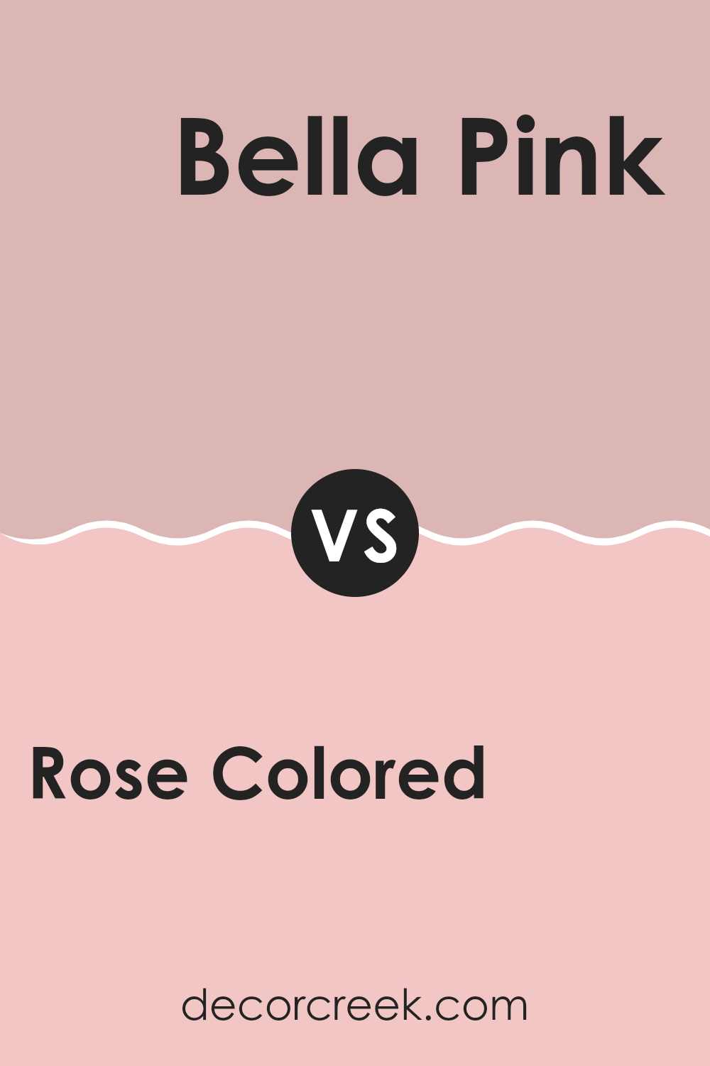
Rose Colored SW 6303 by Sherwin Williams vs Bella Pink SW 6596 by Sherwin Williams
The main color, Rose Colored, is a gentle and warm hue that gives a cozy and inviting feel to any room. It has a soft, subtle vibe that pairs well with a variety of decor styles, from classic to modern. On the other hand, Bella Pink is a brighter and more vivid shade.
This color stands out more and brings a cheerful and lively energy to a room. While Rose Colored has a muted tone that works well for creating a calm and comforting atmosphere, Bella Pink is punchier, ideal for adding a pop of color and making a statement.
Both colors are pink, but they serve different purposes depending on the mood you want to create. Rose Colored suits understated, refined rooms, whereas Bella Pink is perfect for more dynamic, playful areas.
You can see recommended paint color below:
- SW 6596 Bella Pink
Rose Colored SW 6303 by Sherwin Williams vs Delightful SW 6289 by Sherwin Williams
Rose Colored and Delightful are both paint colors by Sherwin Williams, but they offer distinct vibes due to their different hues. Rose Colored is a warm, soft pink that feels cozy and comforting. It’s perfect for creating a gentle and welcoming atmosphere in rooms like living areas or bedrooms.
On the other hand, Delightful is a calming light blue with a fresh and airy feel. It’s ideal for places where you want to relax, such as bathrooms or cozy nooks.
While Rose Colored adds a touch of subtle warmth to a room, Delightful gives off a cool, calming presence, making each suitable for specific tastes and rooms. Both colors can brighten up a room but in uniquely different ways—Rose Colored with a hint of cheer and Delightful with a breath of fresh air.
You can see recommended paint color below:

Rose Colored SW 6303 by Sherwin Williams vs Gaiety SW 6872 by Sherwin Williams
Rose Colored and Gaiety, both by Sherwin Williams, offer distinctive moods for any room. Rose Colored is a gentle pink with a soft, soothing presence. Its subtle hue works well in rooms meant for relaxation, like bedrooms or living rooms, where a calm atmosphere is appreciated. It pairs nicely with soft whites or greys, adding a touch of warmth without overpowering the room.
On the other hand, Gaiety stands out with its bright and energetic pink tone. This color is perfect for areas where you want to inject vibrancy and fun, such as playrooms or creative rooms. Its vividness can stimulate energy and creativity, making it a great choice for accents or feature walls where you want to make a strong statement.
Overall, where Rose Colored adds a whisper of warmth, Gaiety brings bold cheerfulness, each adding its own character to a room depending on the intended effect.
You can see recommended paint color below:
- SW 6872 Gaiety

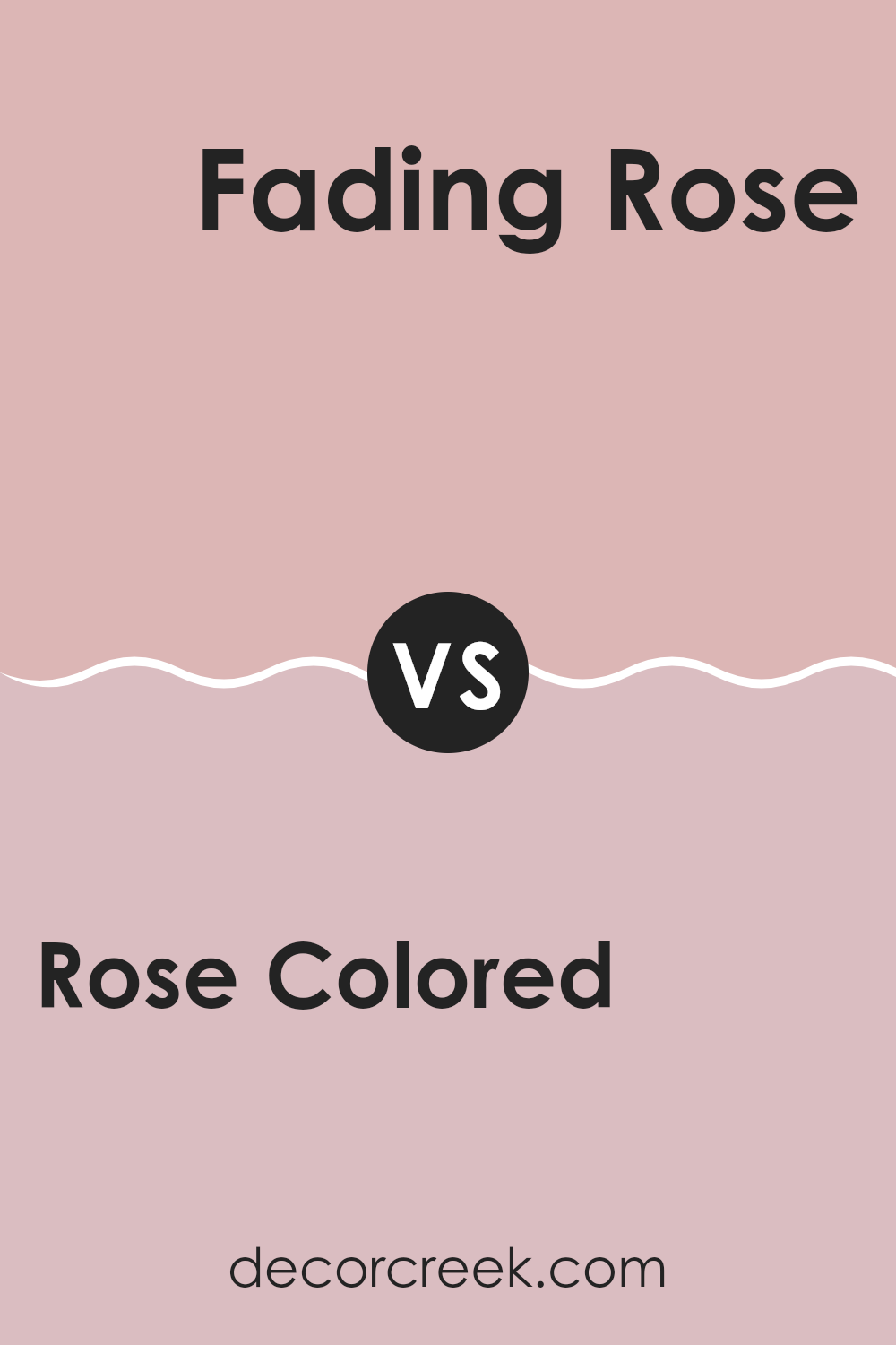
Rose Colored SW 6303 by Sherwin Williams vs Fading Rose SW 6296 by Sherwin Williams
The two colors from Sherwin Williams, Rose Colored and Fading Rose, offer subtle differences, perfect for different tastes or room needs. Rose Colored is a deeper, more vibrant shade. It leans toward a traditional rose hue, giving a cheerful and warm touch to rooms. This color is great for creating a welcoming atmosphere in living areas or dining rooms.
On the other hand, Fading Rose is softer and has more of a muted tone. This color is less intense and works well for creating a gentle, soothing backdrop in bedrooms or bathrooms. It can make small rooms appear bigger and more open because of its lightness.
Both colors reflect variations of pink but serve distinct purposes. Rose Colored adds a pop of brightness, while Fading Rose offers a subtle, calming effect. Selecting between them depends on the desired mood and the specific room you’re painting.
You can see recommended paint color below:
- SW 6296 Fading Rose
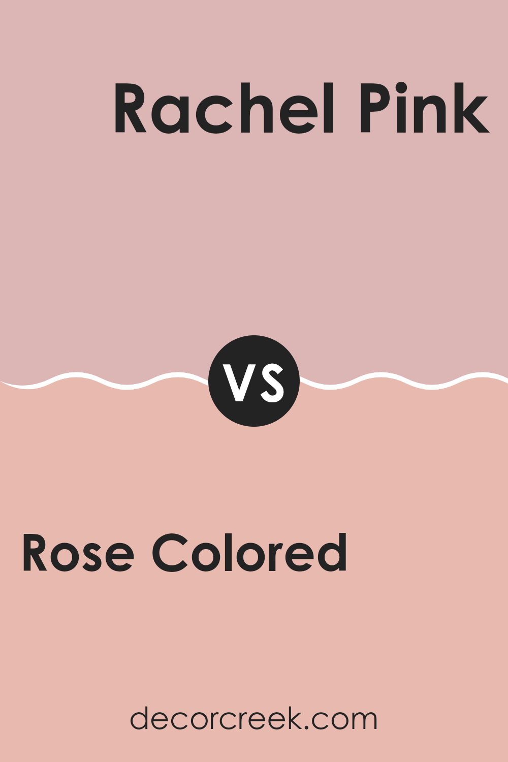
Rose Colored SW 6303 by Sherwin Williams vs Rachel Pink SW 0026 by Sherwin Williams
Rose Colored and Rachel Pink, both by Sherwin Williams, are lovely shades but each has its own charm. Rose Colored is a deeper, warmer pink that offers a cozy feeling to any room.
It can make interiors feel more inviting and homey. On the other hand, Rachel Pink is lighter and softer, perfect for creating a gentle and airy ambiance. This color could be ideal for smaller rooms or areas that you want to feel more open and bright.
While Rose Colored might be better suited for a living room or a dining area where a stronger, richer tone can really set the mood, Rachel Pink works wonders in bedrooms or bathrooms, where a more subtle and light touch is often preferred. Each color holds its own identity, influencing the mood and style of an interior differently. Whether you want a snug atmosphere or a refreshing area, choosing between these two would depend on the feel you’re aiming for in your room.
You can see recommended paint color below:
Rose Colored SW 6303 by Sherwin Williams vs Loveable SW 6590 by Sherwin Williams
The main color, Rose Colored, is a muted pink with soft, warm undertones. It gives a calm and cozy feel, making it perfect for a bedroom or a relaxing lounge area. On the other hand, Loveable is a vibrant, bright pink. This punchy, cheerful tone adds a splash of energy and fun to rooms, and is great for lively areas or children’s rooms.
Rose Colored is subtler and tends to blend easily with a variety of decor styles and colors. It works well with neutral shades and can act as a gentle backdrop. Loveable, with its boldness, is more of a statement color, ideal for accent walls or as a striking color contrast in decorations.
While both colors convey warmth and a sense of welcome, they serve different moods and settings. Rose Colored is more laid back and understated, and Loveable is outgoing and attention-grabbing. Depending on your room’s purpose and lighting, either could enhance your room beautifully.
You can see recommended paint color below:
- SW 6590 Loveable
Rose Colored SW 6303 by Sherwin Williams vs Gracious Rose SW 6317 by Sherwin Williams
Rose Colored and Gracious Rose from Sherwin Williams are both unique shades with subtle differences. Rose Colored is a strong, lively pink with a true rose hue that brings a cheerful touch to rooms.
It has the vibrant quality of a garden in full blossom, making it ideal for areas where you want a splash of brightness and warmth. On the other hand, Gracious Rose offers a slightly more muted pink. It leans toward a dusty rose shade, which gives it a calmer, softer appearance.
This color works well in places where you prefer a gentle and more understated look, while still keeping a touch of rosiness. Both colors can create a cozy and welcoming atmosphere in the home, with Rose Colored being the bolder choice and Gracious Rose offering a more subdued, relaxed vibe.
You can see recommended paint color below:
- SW 6317 Gracious Rose
Rose Colored SW 6303 by Sherwin Williams vs Lotus Flower SW 6310 by Sherwin Williams
Rose Colored and Lotus Flower, both by Sherwin Williams, are two distinct shades that bring unique vibes to rooms. Rose Colored is a deeper, more muted pink. It has a grounding effect yet retains an element of cheeriness, making it ideal for creating cozy, inviting interiors.
On the other hand, Lotus Flower is lighter and brighter. This color leans toward a soft, pale pink that can make a room feel open and airy. It is perfect for rooms where you want a touch of delicacy without feeling too strong.
These two colors could work well together for someone aiming to blend warmth and lightness, or they can stand alone, each setting a different mood. Rose Colored suits more intimate, warm settings, while Lotus Flower is great for areas that aim to feel fresh and calm.
You can see recommended paint color below:
- SW 6310 Lotus Flower
Rose Colored SW 6303 by Sherwin Williams vs Mellow Coral SW 6324 by Sherwin Williams
Rose Colored and Mellow Coral are both warm, welcoming hues from Sherwin Williams, yet they offer distinct vibes due to their different undertones and saturation levels.
Rose Colored is a soft, subtle pink with a slightly muted feel that makes it flexible for use in a variety of rooms, adding a gentle touch of warmth without feeling too strong. In contrast, Mellow Coral is bolder and more vibrant, with a peachy tone that brings a cheerful energy to any room.
It stands out more than Rose Colored and tends to draw the eye, making it a great choice for accent walls or areas where you want to add some personality. While both colors can warm up a room, Mellow Coral does so with a bit more punch, whereas Rose Colored offers a quieter, more understated charm.
You can see recommended paint color below:
Rose Colored SW 6303 by Sherwin Williams vs Appleblossom SW 0076 by Sherwin Williams
The main color, Rose Colored, is a soft, warm pink that brings a cozy and slightly cheerful feel to any room. It has a soothing quality but also carries a hint of brightness that can make smaller rooms feel more open and inviting.
On the other hand, Appleblossom is lighter and more subdued, leaning toward a neutral pink with a creamy feel. This color is perfect for creating a calm and relaxing atmosphere, ideal in rooms where you want to feel peaceful, like bedrooms or bathrooms.
When comparing both, Rose Colored offers a bit more warmth and vibrancy, making it a great choice for living areas or rooms that benefit from a pop of color. Appleblossom, with its gentler tone, works well where a more understated elegance is desired. Both colors pair beautifully together, where Appleblossom can soften the energetic pink of Rose Colored, resulting in a harmonious blend.
You can see recommended paint color below:
In wrapping up my thoughts on SW 6303 Rose Colored by Sherwin Williams, I’ve really grown to appreciate this unique paint color. It’s not just pink – it’s like a gentle hug for your room! It has a soft and gentle pink tone that makes any room feel warm and inviting. This color is pretty special because it doesn’t shout for attention; instead, it softly whispers, making it perfect for places where you want to relax and feel cozy.
I’ve learned that it’s a great choice for bedrooms or even living rooms where you spend a lot of time. It pairs really well with light grays, blues, and even some creamy whites, which helps in creating a peaceful but cheerful look. What’s surprising is how it changes with the light; in the morning, it’s bright and fresh, and by evening, it’s warm and comforting.
All in all, using SW 6303 Rose Colored could be a wonderful way to make a room feel happy and snug. If you’re thinking about giving your room a makeover, this color could definitely be a heartwarming addition. Just like a rose, it has a way of making everything look a bit brighter and better.
Ever wished paint sampling was as easy as sticking a sticker? Guess what? Now it is! Discover Samplize's unique Peel & Stick samples.
Get paint samples

