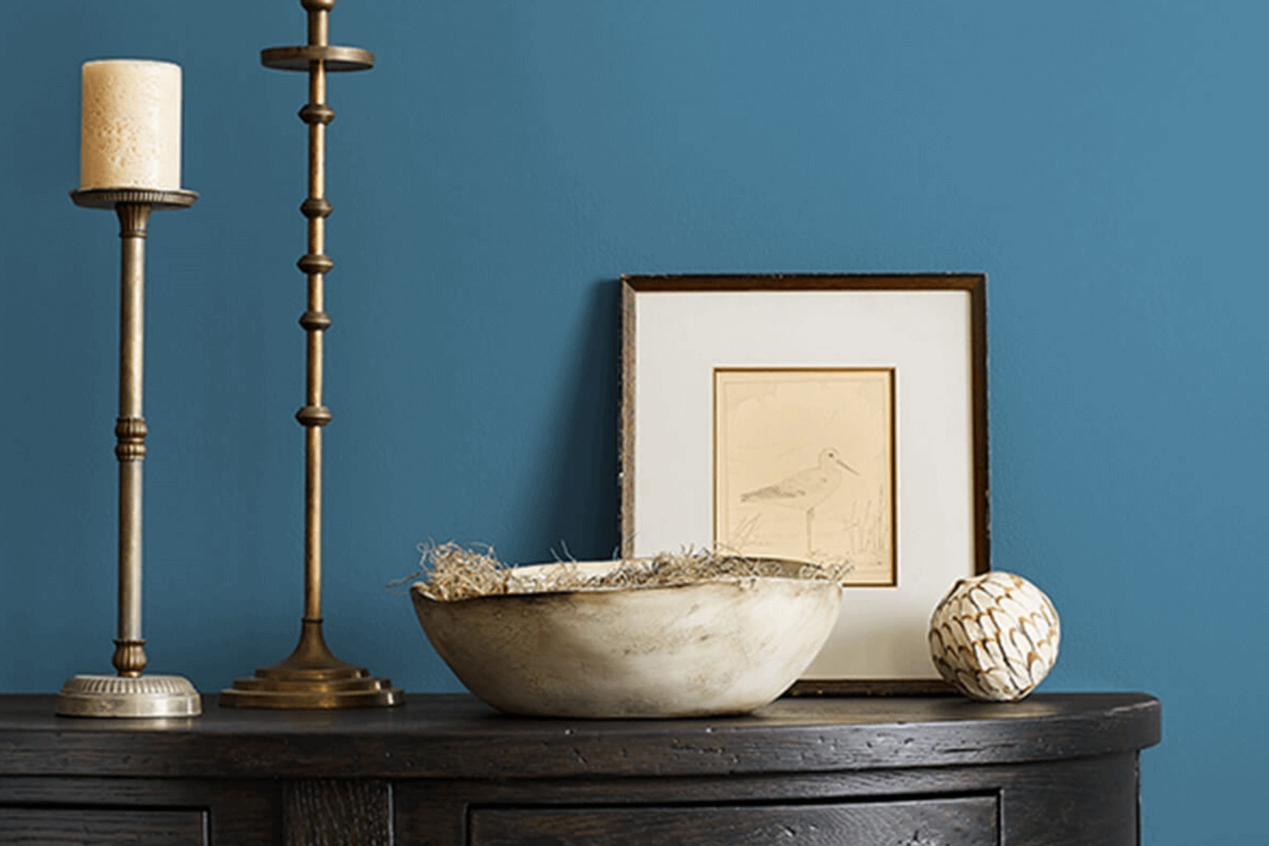
Finding the perfect paint color can completely change the feel of a room, and SW 7607 Santorini Blue by Sherwin Williams offers just that. This shade brings a touch of the Mediterranean right into your home. It reminds me of clear skies and peaceful beaches, creating a quiet but vibrant atmosphere. A warm, rich color, it blends the deep essence of the ocean with the soft hue of a cloudless day.
When I use Santorini Blue in a room, I notice how it manages to be both subtle and striking at the same time. It offers a sense of peace without being too quiet, perfect for areas where you want guests to feel welcome and relaxed. Whether it’s a living room, bedroom, or even a kitchen, this color opens the room up and brings in an airy yet cozy feeling.
Pairing it with whites or greys can make it feel even more expansive, while rich browns or golds can add warmth and depth. Its versatility is one of its strong points, making it suitable for various decor styles, from modern to coastal.
SW 7607 Santorini Blue allows you to bring a bit of the Greek islands into your home, offering a simple change that truly makes a world of difference.
What Color Is Santorini Blue SW 7607 by Sherwin Williams?
Santorini Blue by Sherwin Williams is a soft, inviting shade of blue reminiscent of the Mediterranean sky or clear ocean waters. This color brings a calm and refreshing feel to any area. It’s perfect for those who want to add a touch of coolness and comfort to their homes without it being too intense.
Santorini Blue works beautifully in coastal or nautical-themed interiors, where it complements white, sandy beige, and navy accents. It’s an excellent choice for cottage or farmhouse styles, where it can be paired with creamy whites and natural wood tones for a cozy, rustic look. Scandi-style interiors can also benefit from this shade, as it pairs nicely with light woods, light grays, and simple, clean lines.
This color goes well with natural materials like bamboo, rattan, wicker, and driftwood, enhancing the relaxed, ocean-inspired vibes. It pairs nicely with textured fabrics such as linen, cotton, and wool, adding depth and warmth to the room. For a modern twist, consider pairing Santorini Blue with metallics such as brushed nickel or brass, adding a touch of refinement without overpowering the gentle, soothing nature of the color.
Whether used in a bedroom, living room, or bathroom, Santorini Blue creates a welcoming atmosphere that feels both stylish and comforting.
Is Santorini Blue SW 7607 by Sherwin Williams Warm or Cool color?
Santorini Blue (SW 7607) by Sherwin Williams is a calming and inviting shade of light blue that resembles the beautiful hues of the Mediterranean Sea. This color works well in homes by creating a peaceful and soothing atmosphere.
It is perfect for rooms where relaxation is important, such as bedrooms and bathrooms. Santorini Blue adds a touch of freshness and openness to a room, making it feel more spacious. In living rooms, this color pairs nicely with neutral tones like whites, grays, and beiges, creating a balanced and harmonious look.
It can also serve as a lovely backdrop for natural wood furniture and accents, adding warmth and texture to the area. In kitchens, Santorini Blue can be used on cabinets or walls to bring a refreshing vibe, especially when combined with stainless steel or white appliances. Overall, Santorini Blue is a flexible choice that brings a light and airy feel to various home settings.
Undertones of Santorini Blue SW 7607 by Sherwin Williams
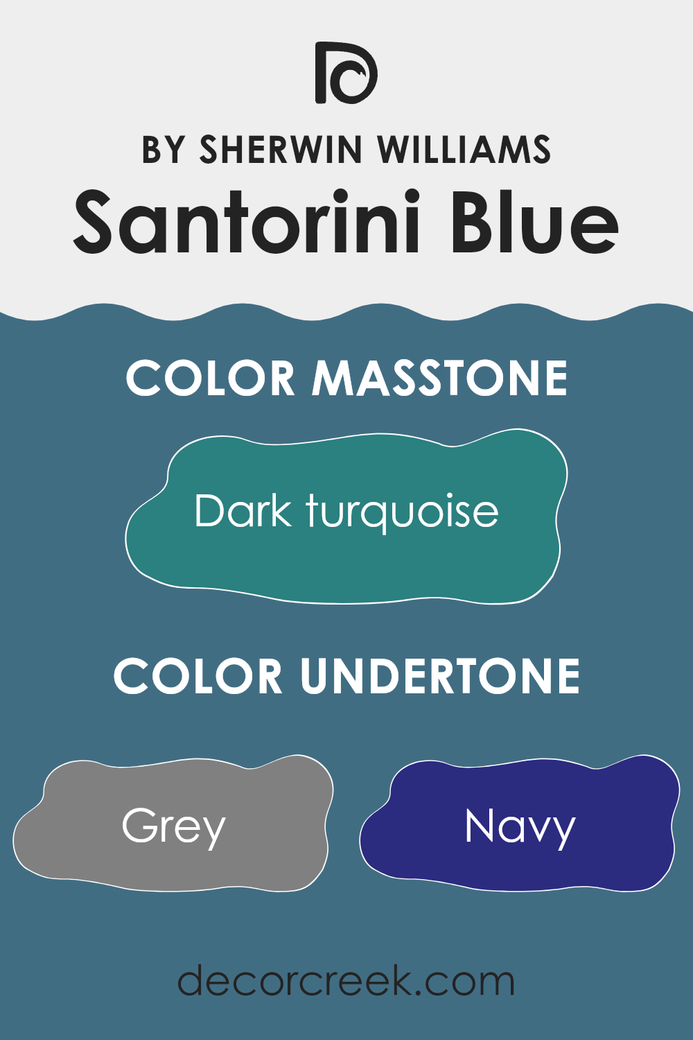
Santorini Blue by Sherwin Williams is a color that’s more complex than it appears at first glance because of its many undertones. These underlying hues can subtly shift how we perceive the color, making it flexible and dynamic. The grey and dark grey undertones add a sense of neutrality and balance, which can make the color feel calm and stable in a room. Navy and dark blue give the color depth, adding a rich, classic feel.
Blue and light blue undertones bring a sense of freshness and openness, which can make a room feel airier and more spacious. Shades of purple and violet can introduce a hint of elegance, while lilac adds a softer, more playful touch. The undertones of green and dark green add an earthy, natural feel, which can make the color feel more grounded.
Mint and light green add a hint of brightness and energy without being too intense, while turquoise and light turquoise can give off a lively, beachy vibe. In interior rooms, these diverse undertones mean that Santorini Blue can work in a variety of settings, adjusting to the surrounding light and colors. It might appear cooler or warmer depending on the other elements in the room, creating a balanced atmosphere.
What is the Masstone of the Santorini Blue SW 7607 by Sherwin Williams?
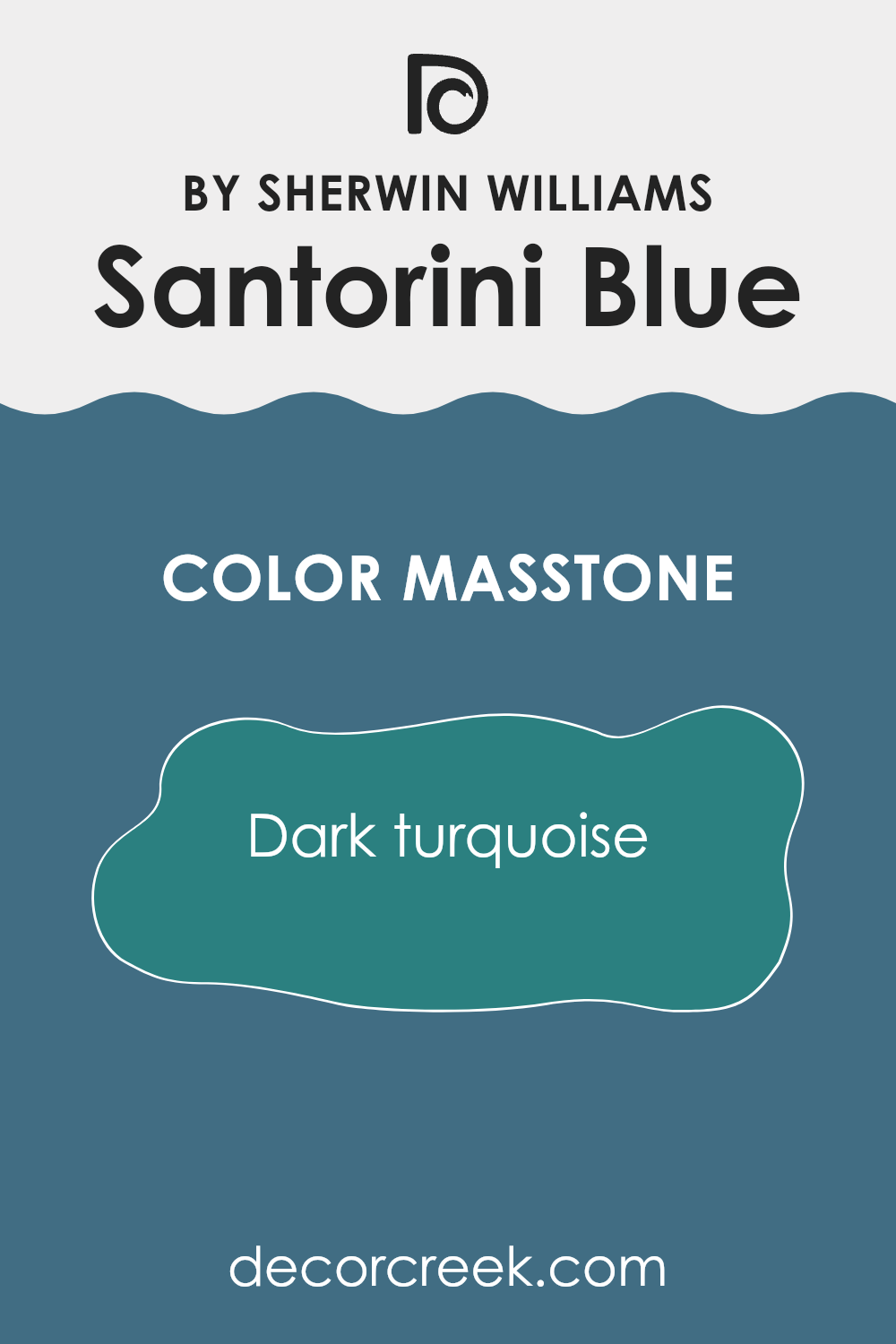
Santorini Blue 7607 by Sherwin Williams is a beautiful dark turquoise shade that can bring a fresh and vibrant feel to any area. The masstone, which is the main color you see, is a deep turquoise (#2B8080). This color is both quiet and engaging, making it flexible for various parts of a home.
In living rooms or common areas, this shade can create a cozy yet stylish environment. It’s a strong color that pairs well with neutral tones like white or beige, allowing the turquoise to stand out without being too intense. In bathrooms, using this color can remind people of the sea, offering a soothing and clean vibe.
When used in bedrooms, the color can make the area feel peaceful, making it easier to relax and unwind. The dark turquoise works in both modern and traditional settings, depending on how it’s paired with furniture and decor, providing a lively touch.
How Does Lighting Affect Santorini Blue SW 7607 by Sherwin Williams?
Lighting plays a crucial role in how we perceive colors. Natural and artificial lights can change the appearance of a color, such as Santorini Blue by Sherwin Williams. This color, which is a soft blue with gray undertones, can look different depending on the light source and the room’s orientation.
In natural light, colors tend to appear more true to their actual shade, but the direction from which this light comes can alter perception. In a north-facing room, for instance, natural light is cooler and often dimmer. Santorini Blue may take on a slightly cooler tone, possibly emphasizing its gray undertones. This can make the color look more subdued or even a bit shadowy.
In contrast, south-facing rooms receive warm and intense natural light throughout the day. Here, Santorini Blue might appear brighter and a little warmer, reflecting sunlight effectively and potentially looking more vibrant than in a north-facing room.
East-facing rooms get bright, warm light in the morning and cooler light as the day progresses. This changing light might make Santorini Blue appear warmer in the morning and cooler or more muted later in the day. It’s a dynamic color that can shift as the light changes, giving varied effects.
West-facing rooms have the opposite effect, with cooler light during the morning and warm, golden light in the late afternoon and evening. In these settings, Santorini Blue may seem softer in the morning, gaining warmth and vibrancy as the day ends.
Artificial light also impacts how we see colors. Under incandescent lights, which are warm, Santorini Blue could appear more yellow-toned or slightly greenish. Fluorescent lights, which are cooler and more bluish, might emphasize the cool aspects of the color. LED lights vary, so the color can appear differently depending on their temperature and brightness.
Understanding these effects helps in choosing and applying wall colors effectively in different rooms and lighting conditions.
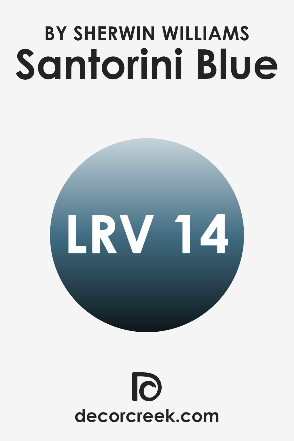
What is the LRV of Santorini Blue SW 7607 by Sherwin Williams?
Light Reflectance Value, or LRV, is a measure of the amount of visible and usable light that reflects from a painted surface. It’s an important number used in the paint industry. The scale goes from 0, which is absolute black and absorbs all light, to 100, which is pure white and reflects all light.
Essentially, LRV tells us how bright or dark a color will appear when painted on a surface. A lower LRV means the color will absorb more light and appear darker, while a higher LRV means the color will reflect more light and appear brighter.
Santorini Blue has an LRV of 13.762, which places it on the darker side of the spectrum. When used on walls, it creates a richer, bolder look, absorbing more light than it reflects—this results in a room that feels cozier and more intimate. In rooms with plenty of natural light, the color can help balance out the brightness, while in dimly lit areas, it may cause the room to feel smaller or shadowed.
Because lighting greatly affects how this color is perceived, it’s a good idea to test a sample on your wall before making a final decision.
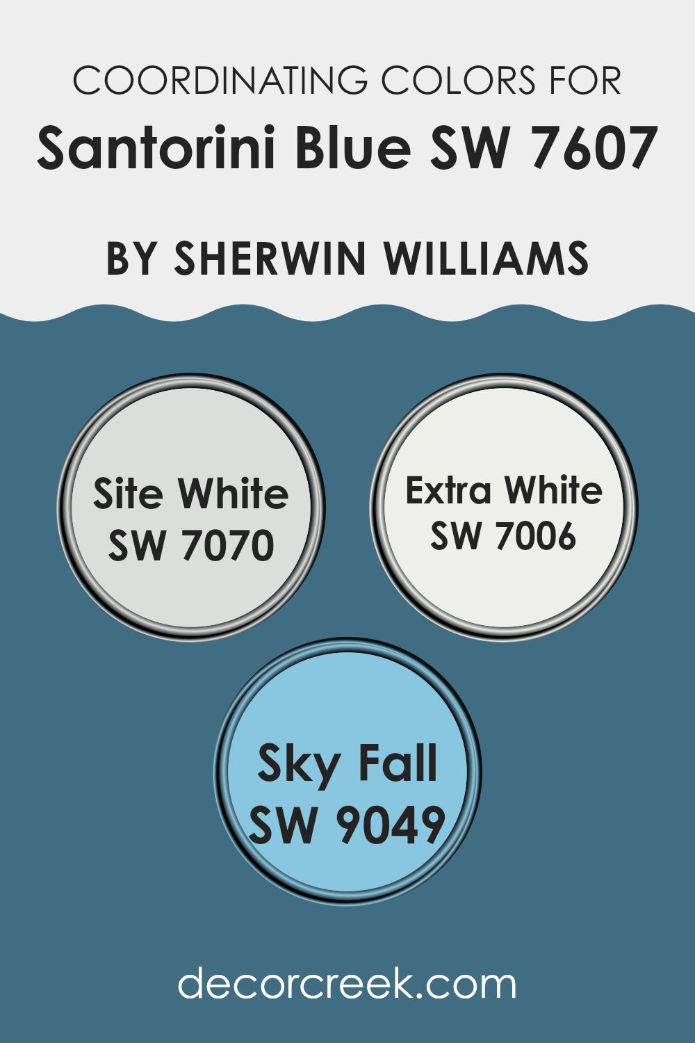
Coordinating Colors of Santorini Blue SW 7607 by Sherwin Williams
Coordinating colors are hues that complement each other, creating a balanced and pleasing look when used together in design. When you choose a color like Santorini Blue by Sherwin Williams, coordinating colors help enhance its beauty while maintaining a harmonious aesthetic throughout your room. Santorini Blue is a rich, vibrant shade that evokes the deep blue of Mediterranean waters. To get the most out of this color, you might pair it with several thoughtfully selected tones.
One coordinating color choice is SW 7070 – Site White. This is a delicate, soft shade that keeps areas feeling light and airy when paired with the stronger Santorini Blue, offering a gentle contrast without overpowering the room.
Another option is SW 7006 – Extra White, which is a clean and crisp white. It adds brightness and a refreshing touch, perfect for emphasizing the depth of the blue. Additionally, SW 9049 – Sky Fall provides a calming effect with its muted blue-gray tones, complementing Santorini Blue while adding depth and subtle complexity to the room. Together, these coordinating colors create a cohesive and inviting environment, each playing off the other to produce a beautiful, well-balanced room.
You can see recommended paint colors below:
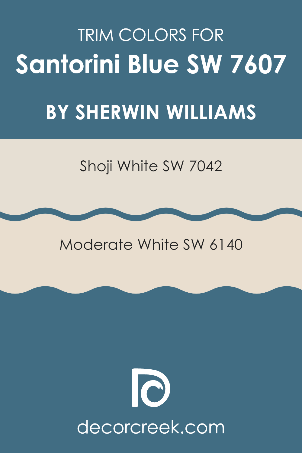
What are the Trim colors of Santorini Blue SW 7607 by Sherwin Williams?
Trim colors are the shades used on door frames, window casings, baseboards, and other architectural elements to provide contrast and definition to the main wall color. For Santorini Blue by Sherwin Williams, choosing the right trim color can enhance its vibrant, calming nature and create a visually pleasing balance. The color Santorini Blue is reminiscent of the brilliant blue seas and skies of its Greek Island namesake.
By selecting complementary trim colors, this main color can stand out even more while bringing harmony to the overall look of a room. Using either Shoji White or Moderate White as trim can accentuate the coolness of Santorini Blue, creating a refreshing and inviting atmosphere that exudes warmth and style.
Shoji White is a soft and neutral white with a hint of warmth, offering a subtle contrast that can soften the boldness of Santorini Blue. It doesn’t starkly clash with the blue, making it perfect for roms where a gentle touch is desired. On the other hand, Moderate White offers a slightly earthier tone, with deeper beige nuances that bring out the vibrant tones of Santorini Blue even more, adding depth to the room.
Both of these trim colors can subtly frame Santorini Blue, giving it a polished look and making the color scheme work cohesively throughout the room. By making careful choices about trim color, you ensure that Santorini Blue isn’t just a splash of color on the walls, but a feature that enhances the entire aesthetic of the room.
You can see recommended paint colors below:
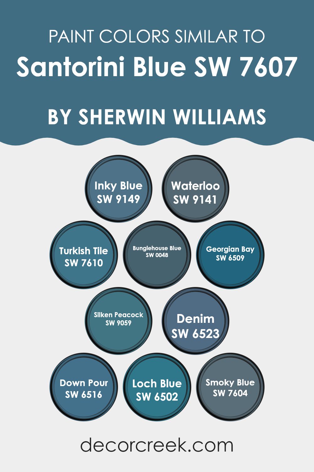
Colors Similar to Santorini Blue SW 7607 by Sherwin Williams
Similar colors play a key role in design by creating a sense of harmony and balance. Colors that are close to each other on the color wheel, like those similar to Santorini Blue by Sherwin Williams, can work together to produce a cohesive look. For instance, Inky Blue (SW 9149) offers a deep, rich tone that adds depth without overpowering a room, while Waterloo (SW 9141) provides a slightly muted take on blue, offering a quiet and relaxed vibe.
Turkish Tile (SW 7610) stands out with its vibrant, lively hue, creating an energetic feel wherever it is used. Bunglehouse Blue (SW 0048) features a touch of historical charm, perfect for adding character.
Georgian Bay (SW 6509) offers a crisp and clear shade of blue that evokes modern and sleek design, whereas Silken Peacock (SW 9059) is a slightly darker, more daring option that delivers a sense of mystery. Denim (SW 6523) presents a softer, more approachable shade, reminiscent of your favorite pair of jeans.
Down Pour (SW 6516) brings a fresh and invigorating splash, while Loch Blue (SW 6502) mirrors deep ocean waters with its rich tone. Lastly, Smoky Blue (SW 7604) provides a balanced, neutral option that fits well in any setting. These hues work in harmony, offering a range of blue tones that can complement each other beautifully.
You can see recommended paint colors below:
- SW 9149 Inky Blue
- SW 9141 Waterloo
- SW 7610 Turkish Tile
- SW 0048 Bunglehouse Blue
- SW 6509 Georgian Bay
- SW 9059 Silken Peacock
- SW 6523 Denim
- SW 6516 Down Pour
- SW 6502 Loch Blue
- SW 7604 Smoky Blue
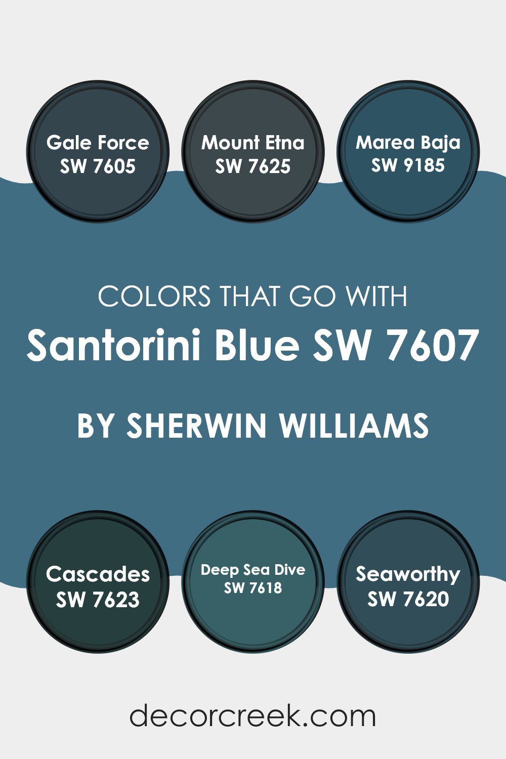
Colors that Go With Santorini Blue SW 7607 by Sherwin Williams
Colors that complement Santorini Blue (SW 7607) by Sherwin Williams are important because they enrich its vibrant and calming nature, making rooms feel harmonious. These colors work together to create a cohesive look where each hue balances and highlights the others. Using complementary colors helps in achieving a pleasing aesthetic, whether in home decor or design projects. Each color adds a distinct layer of depth to the overall palette.
SW 7605 – Gale Force is a rich, dark blue that adds depth and anchors the lighter Santorini Blue. SW 7625 – Mount Etna is a deep teal that echoes the cool notes of Santorini Blue while adding a touch of mystery. SW 9185 – Marea Baja brings in a warm, earthy tone that contrasts beautifully, offering balance to the cooler blues.
SW 7623 – Cascades offers a deep, lush green, providing an energetic vibe that also complements the relaxing feel of Santorini Blue. SW 7618 – Deep Sea Dive gives a powerful, oceanic blue that ties all the colors together with its striking presence. SW 7620 – Seaworthy, a dark, yet muted blue, blends seamlessly with Santorini Blue, enhancing its freshness without overpowering it. Together, these colors create a dynamic and visually interesting palette.
You can see recommended paint colors below:
- SW 7605 Gale Force
- SW 7625 Mount Etna
- SW 9185 Marea Baja
- SW 7623 Cascades
- SW 7618 Deep Sea Dive
- SW 7620 Seaworthy
How to Use Santorini Blue SW 7607 by Sherwin Williams In Your Home?
Santorini Blue SW 7607 by Sherwin Williams is a soft and calming blue paint color that can bring a peaceful feel to any home. This shade works well in various areas, making it a flexible choice for homeowners.
In a bedroom, Santorini Blue can create a restful atmosphere, helping you unwind at the end of the day. Pair it with crisp white linens and natural wood accents to enhance its soothing effect.
In the living room, you can use Santorini Blue on an accent wall to add a splash of color without overpowering the area. Combine it with neutral-toned furniture for a balanced look.
For bathrooms, this color can evoke a refreshing, spa-like environment when matched with white tiles and light fixtures.
Santorini Blue also works well in kitchens, especially when paired with white cabinets and stainless steel appliances. It’s a great way to bring a touch of calm throughout your home.
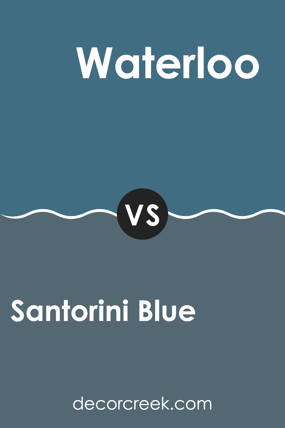
Santorini Blue SW 7607 by Sherwin Williams vs Waterloo SW 9141 by Sherwin Williams
Santorini Blue SW 7607 and Waterloo SW 9141 are both lovely shades by Sherwin Williams, but they offer different vibes. Santorini Blue is a lighter, softer blue with a hint of gray. It creates a quiet and airy feel, making areas feel open and fresh. It’s great for rooms where you want a peaceful atmosphere.
Waterloo, on the other hand, is a deeper blue with stronger gray undertones. This gives it a more grounded and cozy feel, making it suitable for creating warmth in a room. It’s a good choice for adding some depth and richness to a room.
In short, if you’re looking for a light and breezy feeling, Santorini Blue is the way to go. For a more intimate and snug environment, Waterloo is a solid pick. Both are flexible and can be used in different rooms depending on the mood you want to set.
You can see recommended paint color below:
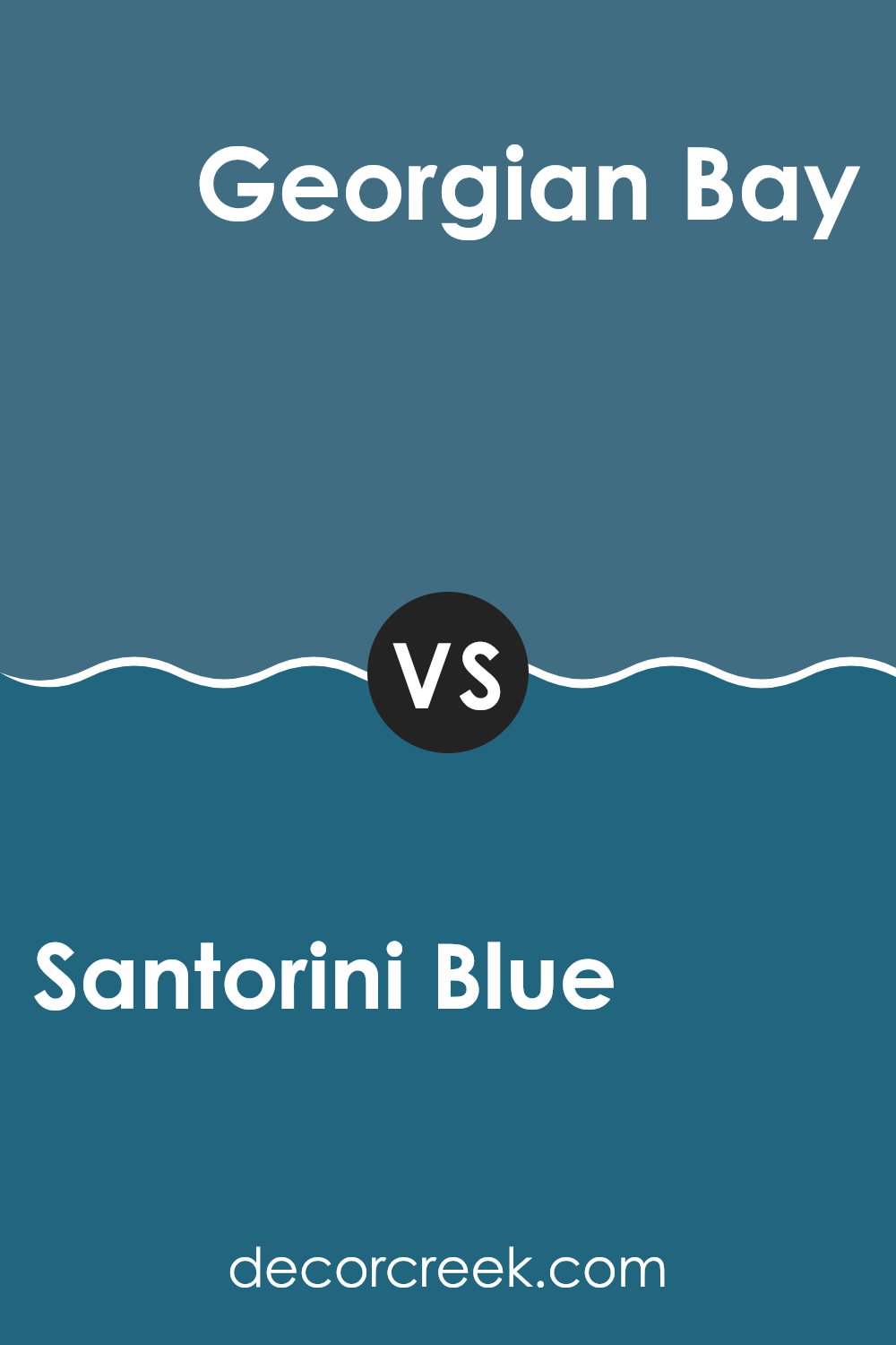
Santorini Blue SW 7607 by Sherwin Williams vs Georgian Bay SW 6509 by Sherwin Williams
Santorini Blue SW 7607 and Georgian Bay SW 6509 by Sherwin Williams are two shades of blue that offer distinct vibes. Santorini Blue is a lighter, softer blue. It’s quiet and airy, often reminding people of clear skies or shallow ocean waters. This color works well in areas where you want to create an open and relaxed feeling, like bedrooms or bathrooms.
On the other hand, Georgian Bay is a richer, deeper blue. It has a strong presence and can bring a sense of depth and coziness to a room. It’s perfect for living rooms where you want a bold look, while still maintaining a classic feel. Georgian Bay can also serve as an excellent accent color, adding contrast to lighter walls or furniture.
Both colors are beautiful choices, but the decision depends on whether you’re looking for something light and breezy or something with more intense color and character.
You can see recommended paint color below:
Santorini Blue SW 7607 by Sherwin Williams vs Down Pour SW 6516 by Sherwin Williams
Santorini Blue (SW 7607) by Sherwin Williams is a gentle and soothing shade of blue that has a calming undertone. It’s reminiscent of clear skies and brings a sense of openness to a room. This color is flexible enough to be used in both traditional and modern settings, creating a fresh, airy feeling.
On the other hand, Down Pour (SW 6516) is a richer, more intense blue. It brings a bold and vibrant energy to any room, making it feel dynamic. This color is ideal for creating a statement or highlighting specific areas.
While both are blues, Santorini Blue is mild and understated, providing a subtle backdrop, whereas Down Pour is more dominant, making it perfect for an accent or focal point. Together, they can balance a room, with Santorini Blue providing calmness and Down Pour adding depth and interest.
You can see recommended paint color below:
Santorini Blue SW 7607 by Sherwin Williams vs Loch Blue SW 6502 by Sherwin Williams
Santorini Blue SW 7607 and Loch Blue SW 6502 by Sherwin Williams are both beautiful shades of blue, but they have distinct characteristics. Santorini Blue has a lighter, breezy feel that reminds you of a sunny day on the Greek islands.
It’s a bright and uplifting shade, perfect for creating a fresh and airy atmosphere in any room. On the other hand, Loch Blue is deeper and more intense. It’s a rich, bold color that can add a sense of strength and coziness to a .
While Santorini Blue might be ideal for living rooms or kitchens where you want more light and openness, Loch Blue is great for bedrooms or study areas where you might prefer a more calming and focused environment. Both colors bring their own unique charm, making them flexible choices depending on the mood and setting you wish to create in your home.
You can see recommended paint color below:
Santorini Blue SW 7607 by Sherwin Williams vs Bunglehouse Blue SW 0048 by Sherwin Williams
Santorini Blue (SW 7607) and Bunglehouse Blue (SW 0048) are both beautiful shades of blue by Sherwin Williams, but they have distinct differences. Santorini Blue is a soft, muted blue with a slight hint of green, making it feel fresh and airy.
It’s perfect for rooms where you want a calm and inviting atmosphere without overpowering the senses. On the other hand, Bunglehouse Blue has a deeper and richer tone, with stronger gray undertones. This makes Bunglehouse Blue feel more cozy and classic, suitable for those who prefer a more traditional look.
While Santorini Blue can brighten up a room and give it a spacious feel, Bunglehouse Blue adds warmth and depth, creating an intimate setting. Both colors can be used in various settings, but your choice between them would depend on whether you want a light and breezy room or a warm and comfortable one.
You can see recommended paint color below:
Santorini Blue SW 7607 by Sherwin Williams vs Inky Blue SW 9149 by Sherwin Williams
Santorini Blue SW 7607 and Inky Blue SW 9149 are both striking shades of blue from Sherwin Williams, but they have different vibes and uses. Santorini Blue is a lighter, more vibrant shade that brings a bright and cheerful feel to a room. It evokes thoughts of sunny skies and beachside views, making it great for areas where you want an uplifting atmosphere, like kitchens or living rooms.
In contrast, Inky Blue is a deep, rich shade that has a more moody and intense presence. It creates an atmosphere of coziness and intimacy, making it suitable for bedrooms or study rooms where a sense of depth and calmness are desired. Inky Blue can also be used for creating a bold accent wall due to its strong, dramatic appearance.
While both colors bring blue into your home, Santorini Blue emphasizes brightness and energy, whereas Inky Blue enhances depth and warmth.
You can see recommended paint color below:
Santorini Blue SW 7607 by Sherwin Williams vs Silken Peacock SW 9059 by Sherwin Williams
Santorini Blue (SW 7607) by Sherwin Williams is a soft, muted blue that feels light and airy, reminiscent of sunny days and coastal settings. It brings a sense of stillness and openness to a room, making it suitable for areas where you might want a relaxed and spacious feel.
On the other hand, Silken Peacock (SW 9059) is a richer, more vibrant teal-blue. It has a lush quality that can add depth and drama to a room, and it might be chosen for rooms where you want to create a cozy and inviting environment.
While Santorini Blue leans more towards a gentle and subtle atmosphere, Silken Peacock is bold and can make a statement. Both colors can complement different styles, but the choice between them could depend on whether you’re aiming for something light and fresh or deep and intimate.
You can see recommended paint color below:
- SW 9059 Silken Peacock
Santorini Blue SW 7607 by Sherwin Williams vs Turkish Tile SW 7610 by Sherwin Williams
Santorini Blue and Turkish Tile are both refreshing shades of blue by Sherwin Williams. Santorini Blue is a softer, muted shade that brings to mind the skies and seas of the Mediterranean. It offers a sense of stillness and works well in areas where you want a relaxing atmosphere.
On the other hand, Turkish Tile is a deeper, more vibrant blue. It conveys a sense of richness and intensity, making it a great choice for accent walls or areas where you want a pop of color. This shade stands out more compared to the subtler Santorini Blue.
Both colors are flexible and can be paired with various neutrals and other colors, but Santorini Blue might be more suited for areas aiming for a gentle feel, while Turkish Tile can add drama and interest to a room. Each color brings its own unique personality to a room, making them both excellent choices depending on your design goals.
You can see recommended paint color below:
Santorini Blue SW 7607 by Sherwin Williams vs Smoky Blue SW 7604 by Sherwin Williams
Santorini Blue (SW 7607) by Sherwin Williams is a gentle and refreshing color with a mix of gray and blue. It’s like a soft, breezy day by the sea, giving off a quiet vibe. This color can make a room feel light and airy, perfect for areas where you want a relaxed atmosphere.
On the other hand, Smoky Blue (SW 7604) is a bit deeper and moodier. It has more gray in it, which gives it a slightly more serious and cozy feel. This color works well in rooms where you want a bit more depth and warmth. It can create a snug, comforting setting that’s great for dens or bedrooms.
Both colors bring the calmness of blue, but while Santorini Blue is more refreshing and light, Smoky Blue adds a layer of sophistication with its deeper tone. They each have their unique charm, making rooms feel inviting and comfortable.
You can see recommended paint color below:
Santorini Blue SW 7607 by Sherwin Williams vs Denim SW 6523 by Sherwin Williams
Santorini Blue SW 7607 and Denim SW 6523 are both shades of blue by Sherwin Williams, but they bring different vibes to a room. Santorini Blue is a softer and lighter blue with a mild gray undertone, offering a cool and quiet atmosphere. It works well in areas where you want a peaceful or airy feeling, like bedrooms or bathrooms.
On the other hand, Denim is a bit darker and richer, resembling the color of well-loved jeans. It’s bolder and can add warmth and coziness to a room. Denim can be an excellent choice for rooms where you want a bit more depth and character, like a study or a living room.
While both colors are flexible and appealing, the choice between them depends on the mood you want to set. Santorini Blue creates a light and gentle ambiance, while Denim provides a warm and inviting presence.
You can see recommended paint color below:
After thinking about Sherwin-Williams SW 7607 Santorini Blue, I feel like I’ve understood why this color is so special. It’s a calm and friendly shade of blue that reminds me of clear skies and peaceful waters. When I see this color, it makes me feel relaxed and happy, like when you’re outside on a sunny day.
I think Santorini Blue is great for lots of different rooms. In a bedroom, it can help make the room feel restful, which is perfect for sleeping. In the bathroom, it reminds me of a clean, fresh place where you start your day. It’s also a nice choice for living rooms, where it can make the area feel inviting, like you want to sit and talk for hours.
This color works well with other colors, too. If you mix it with white or grey, it feels crisp and clean. Paired with yellow or orange, it looks lively and fun. No matter what, Santorini Blue feels like a safe choice because it’s both gentle and cheerful.
I think choosing this color can really help make a home feel warm and welcoming. It’s nice that something as simple as a color can make such a big difference!
Ever wished paint sampling was as easy as sticking a sticker? Guess what? Now it is! Discover Samplize's unique Peel & Stick samples.
Get paint samples

