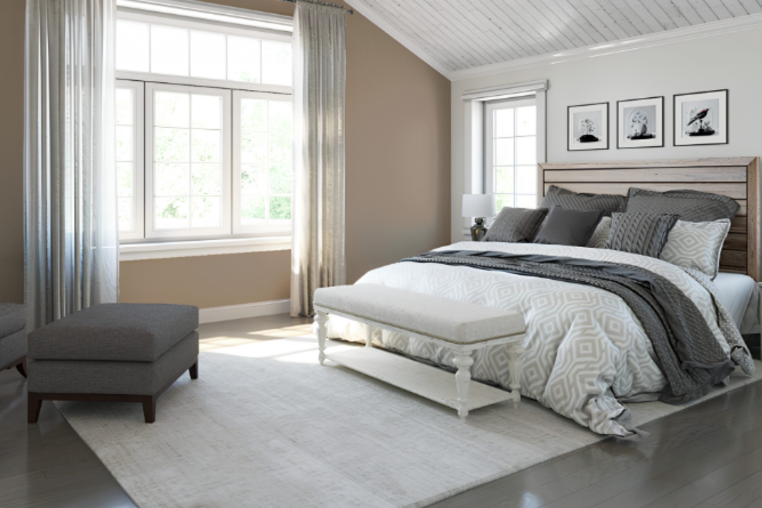
If you’re considering a serene and calming color for your next home makeover, you might want to check out SW 7513 Sanderling by Sherwin Williams. Being in my living room coated with this subtle, neutral shade opens up the space with a warm, inviting feel. This particular color is part of the Nature-Inspired collection, reflecting elements of soft, sandy beaches which can help create a peaceful environment.
For those of you looking to refresh a room without committing to a bold or overly dramatic change, Sanderling is a perfect choice. It pairs beautifully with natural elements like wooden furniture or woven textiles, enhancing the overall aesthetics without overpowering.
I also appreciate how this shade plays with light, offering different tones during day and night, thus adding a dynamic element to my steady decor. Moreover, its versatility in matching with various decor styles makes it a handy color whether you’re decorating a modern minimalist living space or a cozy, rustic kitchen.
Using Sanderling in my home has allowed me to achieve a fresh look while maintaining a soothing atmosphere, proving it to be both functional and stylish.
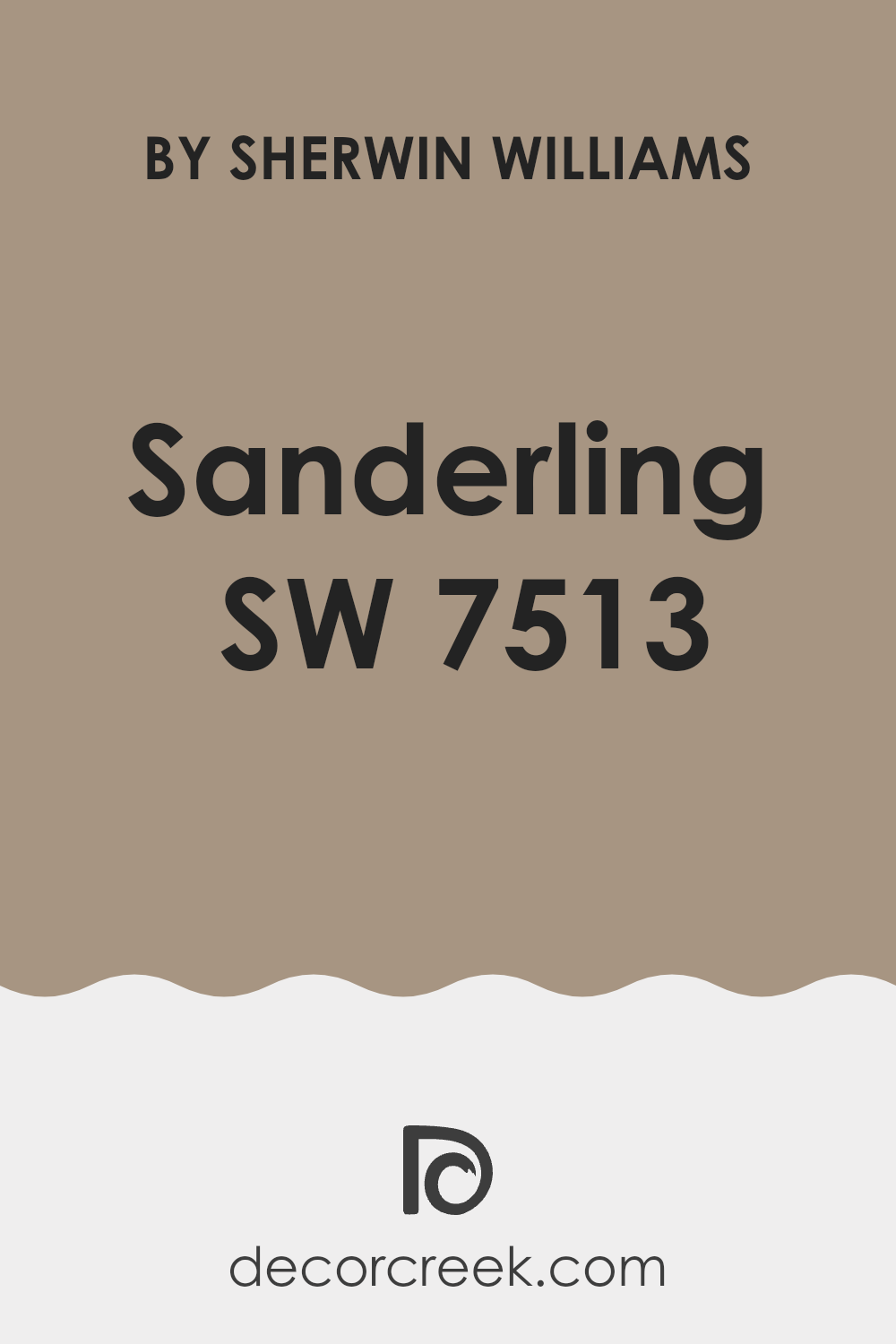
What Color Is Sanderling SW 7513 by Sherwin Williams?
The color Sanderling by Sherwin Williams is a warm, soft beige that brings a cozy and inviting feel to any room. This muted hue serves as a versatile backdrop that can easily pair with a variety of colors and materials, making it a popular choice for many interior styles. Sanderling works exceptionally well in traditional, rustic, and modern farmhouse designs due to its earthy undertones.
It creates a seamless flow in spaces that incorporate natural elements such as wood, stone, and linen. When matched with dark wood, Sanderling highlights the richness of the wood tones, making the space feel grounded and welcoming.
Paired with lighter materials like linen drapes or a creamy leather sofa, it offers a gentle contrast that brightens the room while maintaining a cozy atmosphere.
In terms of pairing with textures, Sanderling complements soft, textured fabrics like wool or chunky knit throws, adding layers of warmth to the interior.
It also looks elegant when combined with sleeker materials like glass or polished metals in more modern settings. The color’s natural adaptability allows for flexibility as decor trends change, providing a timeless backdrop that supports a wide range of decorative styles and preferences.
Is Sanderling SW 7513 by Sherwin Williams Warm or Cool color?
Sanderling SW 7513 by Sherwin Williams is a subtle and warm shade of beige that brings a soft, cozy feel to any room. This color works well in homes because it provides a neutral backdrop that can easily blend with various decor styles and furniture colors.
It’s perfect for spaces where you want a touch of warmth without overwhelming the senses with strong colors. Sanderling is great for living areas, bedrooms, and kitchens because it makes these spaces look brighter and more inviting. This shade is versatile enough to pair with both bold and muted accent colors, allowing for flexibility in decorating.
Whether you add dark woods for a more traditional look or bright blues and greens for a more lively environment, Sanderling holds its ground. It also helps in making small rooms appear larger and more open, thanks to its light-reflecting qualities. Overall, Sanderling is a fantastic choice for creating a cozy, welcoming home environment.
Undertones of Sanderling SW 7513 by Sherwin Williams
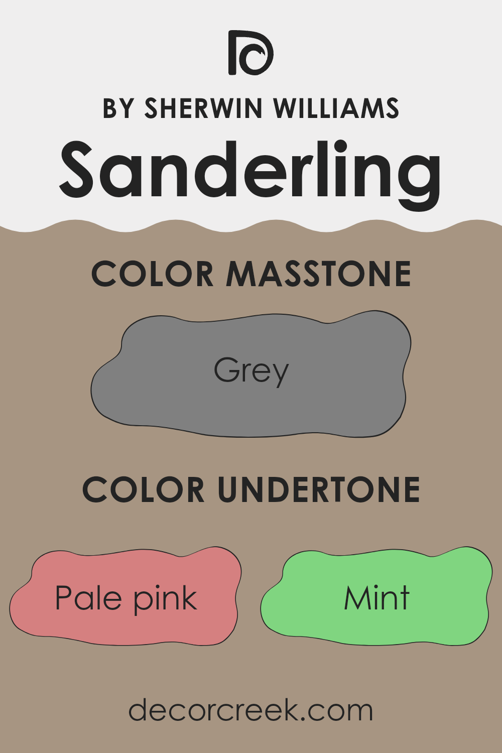
SanderlingSW 7513 is a versatile paint color by Sherwin Williams that has a unique blend of undertones, including shades like pale pink, mint, and pale yellow. Undertones are subtle colors that lie under the primary color and can influence the overall look and feel of the paint. They play a crucial role in how a color appears in different lighting conditions and environments.
For instance, on interior walls, the undertones in SanderlingSW 7513 can make the space feel warmer or cooler depending on the lighting and surrounding colors. If a room has a lot of natural light, the pale yellow and light blue undertones might become more prominent, giving the walls a fresher and more airy feel.
In artificial light, the lilac or pale pink undertones might be more noticeable, adding a gentle warmth to the room. These undertones also impact how well the paint color coordinates with other elements in a room. For example, furniture and decor in olive or brown tones would complement the subtle green or orange undertones in SanderlingSW 7513, creating a harmonious and pleasing atmosphere.
Overall, the variety of undertones in this paint color offers flexibility in design choices, allowing it to adapt to different styles and preferences, making it a good choice for anyone looking to refresh their space.
What is the Masstone of the Sanderling SW 7513 by Sherwin Williams?
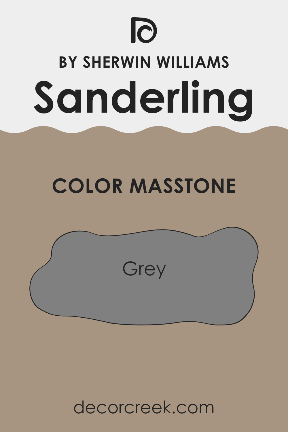
SanderlingSW 7513 by Sherwin Williams has a masstone that is a solid gray, similar to the gray (#808080) you see in classic color palettes. This neutral and balanced gray tone makes it a versatile choice for various spaces in homes.
Gray, being a middle ground between black and white, works well in both small and large rooms. In smaller areas, it can make spaces seem more open and airy, while in larger rooms, it helps create a cohesive look without overwhelming with color.
This shade of gray also pairs easily with other colors, whether you want to add pops of bright colors for a lively vibe or keep things calm with more subdued hues.
For those looking to refresh their homes without committing to bold or dark colors, this gray offers a steady base that can support various decor styles, from modern minimalism to cozy country.
How Does Lighting Affect Sanderling SW 7513 by Sherwin Williams?
Lighting can significantly impact how we perceive colors. The same paint color on a wall can look different depending on the type of light—be it natural sunlight or artificial lighting—shining on it. When selecting colors for a space, it’s crucial to consider the lighting conditions to ensure the color appears as intended.
When discussing the paint color Sanderling by Sherwin Williams, a subtle, warm tone, lighting conditions can influence its appearance greatly. In natural light, this color tends to look softer and more muted.
North-facing rooms often receive less direct sunlight and can make colors appear slightly cooler, so here, Sanderling might seem more subdued and slightly greyish. South-facing rooms, bathed in ample sunlight for most of the day, will bring out the warmth and vibrancy of the color, making it appear brighter and more cheerful.
In rooms facing east, where the light is bright in the morning but softer in the afternoon, Sanderling will change character throughout the day. It may appear gently luminous in the morning light, then more understated by afternoon. Conversely, in west-facing rooms, the color might feel cooler during the morning and gain depth and warmth in the late afternoon and evening as the sunlight intensifies.
Artificial lighting also affects the perception of this color. Warm artificial lights, like those from incandescent bulbs, can enhance the warmth of the color, making it appear cozier and inviting. Cooler lights, such as those from fluorescent bulbs, can strip away some of the warmth, making the color appear more neutral and less vibrant.
Overall, the appearance of the color Sanderling by Sherwin Williams will vary significantly depending on light exposure, with varying effects between ambient natural light and different types of artificial light. Taking these factors into account can help achieve the desired mood and aesthetic in any given room.
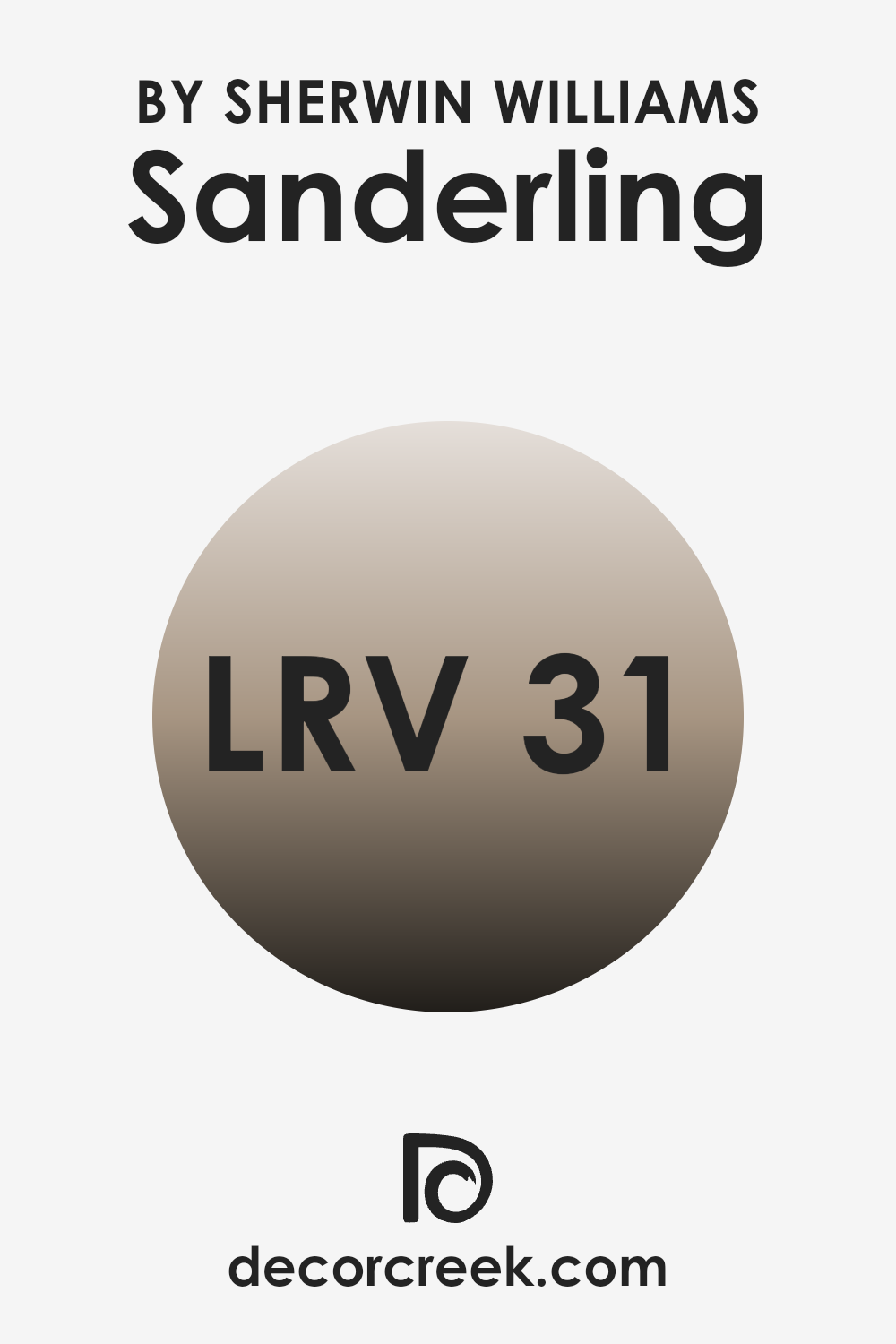
What is the LRV of Sanderling SW 7513 by Sherwin Williams?
LRV stands for Light Reflectance Value, which measures the percentage of light a paint color reflects back into a room. This scale ranges with lower values indicating darker colors that absorb more light, and higher values representing lighter colors that reflect more light. LRV is especially useful when choosing paint colors as it helps you understand how light or dark a shade will appear under different lighting conditions.
For example, a room with a lot of natural light might make a low-LRV color appear more lively, whereas the same color in a dimly lit room could look nearly black. Taking the LRV of 31.376 for the given paint reflects that it is on the darker side of the scale, meaning it won’t bounce a lot of light around the room.
This could make small rooms painted in this shade feel smaller or cozier because the walls will absorb more light rather than reflecting it. In well-lit or larger rooms, this color may appear more muted and subtle, contributing to a snug and warm atmosphere. Choosing this LRV means understanding the lighting in your space to ensure the color behaves as expected.
Also remember that colors adjacent to it on walls or in decor could appear different due to the low reflectivity of the paint.
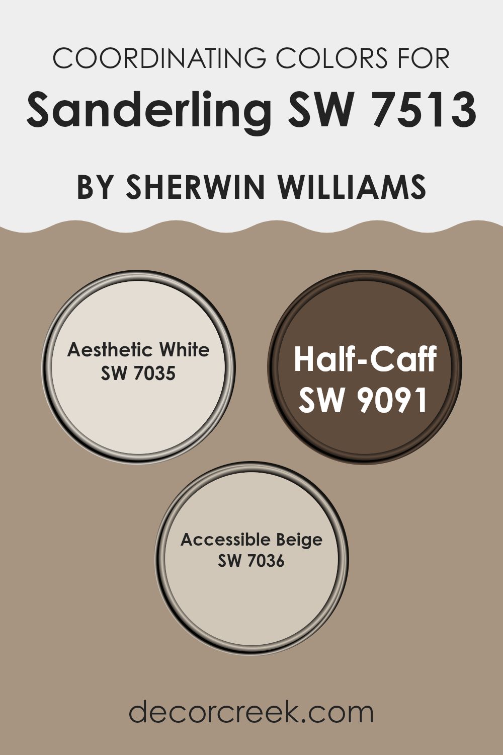
Coordinating Colors of Sanderling SW 7513 by Sherwin Williams
Coordinating colors are those that harmonize well with a primary color to enhance the overall aesthetic of a space. For instance, when considering a color like Sanderling by Sherwin Williams, selecting shades that complement it can bring balance and beauty to a room. Coordinating colors should either contrast or blend smoothly with the main color to achieve a desired mood or effect. They typically share similar undertones or are positioned opposite each other on the color wheel, creating an appealing visual cohesion.
Among the colors that pair well with Sanderling are Aesthetic White, Half-Caff, and Accessible Beige. Aesthetic White is a soft, muted shade that lends a gentle brightness to surroundings, making it ideal for trim and ceilings that need a subtle lift without overpowering the main hue.
Half-Caff offers a deeper, richer tone akin to a warm, soothing cup of coffee, perfect for creating cozy corners or accentuating woodwork in a space. Lastly, Accessible Beige is a versatile, warm beige that works beautifully to provide a neutral backdrop, allowing furniture and décor to stand out, making it great for larger wall areas or in connecting spaces. These colors collectively create a balanced palette that enhances the beauty and functionality of any room styled with Sanderling.
You can see recommended paint colors below:
- SW 7035 Aesthetic White
- SW 9091 Half-Caff
- SW 7036 Accessible Beige
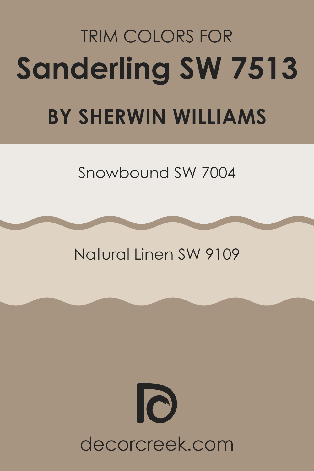
What are the Trim colors of Sanderling SW 7513 by Sherwin Williams?
Trim colors are specifically chosen paint colors used to accentuate or enhance the architectural elements of a room, such as door frames, moldings, and baseboards. When paired effectively with wall colors, trim colors can greatly influence the feeling and dynamics of a space.
For example, using trim colors like SW 7004 – Snowbound and SW 9109 – Natural Linen with a wall color such as Sanderling by Sherwin Williams can create a harmonious and appealing look. These trim colors can add contrast that defines the spaces more crisply or can blend smoothly to give a subtle, comforting transition between the wall and trim.
SW 7004 – Snowbound is a soft white with a slight gray undertone which makes it versatile for combining with various wall colors, helping to create a clean and fresh look. It complements many palettes without overwhelming other colors, making it a great choice for a unifying trim color.
SW 9109 – Natural Linen, on the other hand, is a warmer neutral that brings a cozy and welcoming feel to the room. Its natural, earthy tone works well with warmer wall colors and can add depth and warmth to a space when used as a trim color.
You can see recommended paint colors below:
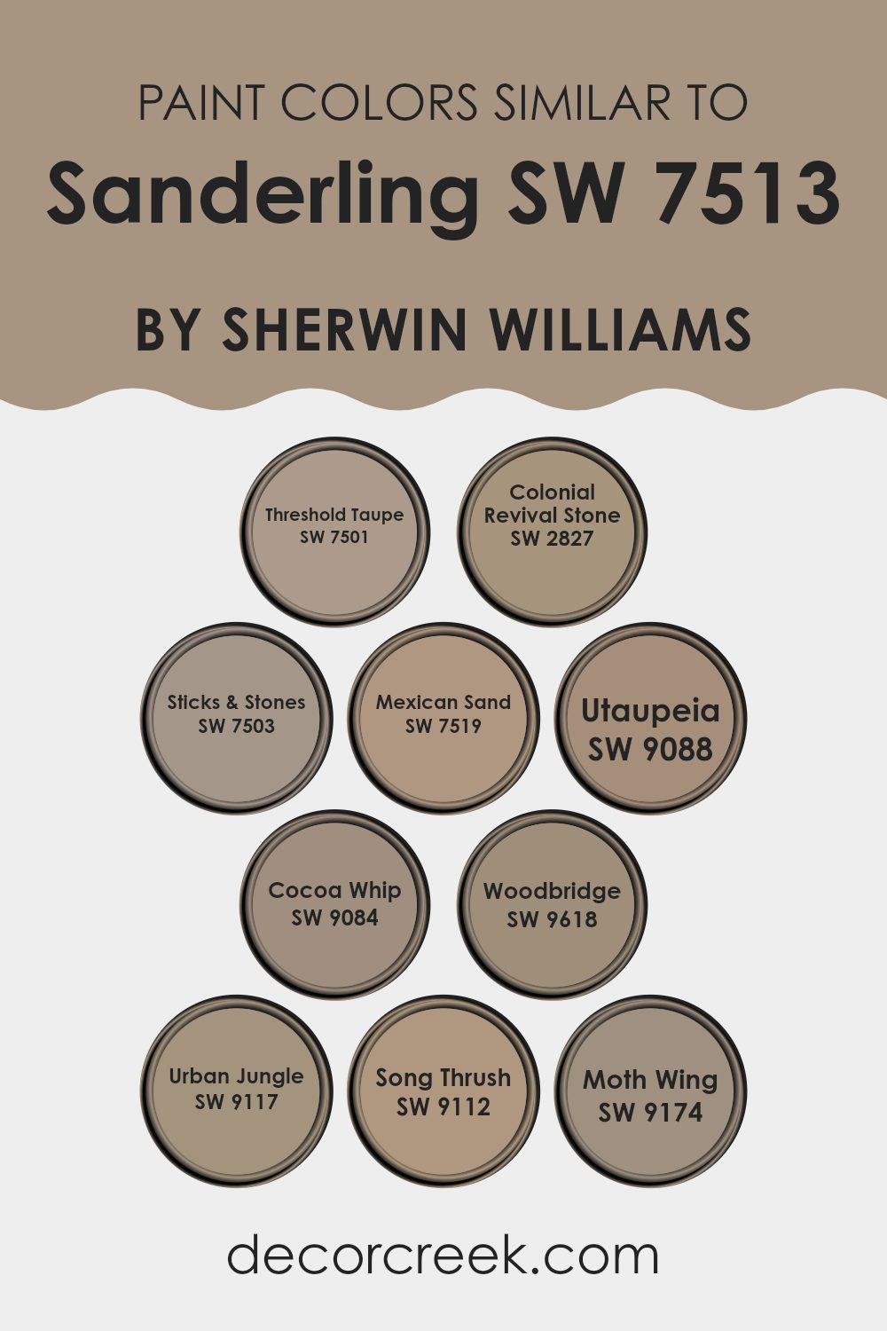
Colors Similar to Sanderling SW 7513 by Sherwin Williams
Using similar colors in a palette ensures a smooth and harmonious look in any space, making it feel more cohesive and aesthetically pleasing. Colors like SW 7501 – Threshold Taupe and SW 2827 – Colonial Revival Stone provide subtle shifts in tone that result in a relaxed and welcoming vibe.
These shades are like close relatives, blending comfortably with each other without creating stark contrasts. SW 7503 – Sticks & Stones, for instance, slightly deepens the hue, adding a touch of earthiness that anchors the room, while SW 7519 – Mexican Sand offers a slightly warmer touch, perfect for cozy settings.
Continue the theme with SW 9088 – Utaupeia and SW 9084 – Cocoa Whip; their creamy, soft presence contributes to a smooth visual flow. As the palette progresses, colors like SW 9618 – Woodbridge introduce a deeper, richer earth tone which pairs nicely with lighter options, creating depth.
Colors like SW 9117 – Urban Jungle and SW 9112 – Song Thrush add a nuanced, organic touch, seemingly connecting indoor aesthetics with outdoor elements. Lastly, SW 9174 – Moth Wing rounds out the collection with its muted neutrality, ensuring that the overall effect remains calm and collected, perfect for creating a space that feels put together and harmonious.
You can see recommended paint colors below:
- SW 7501 Threshold Taupe
- SW 2827 Colonial Revival Stone
- SW 7503 Sticks & Stones
- SW 7519 Mexican Sand
- SW 9088 Utaupeia
- SW 9084 Cocoa Whip
- SW 9618 Woodbridge
- SW 9117 Urban Jungle
- SW 9112 Song Thrush
- SW 9174 Moth Wing
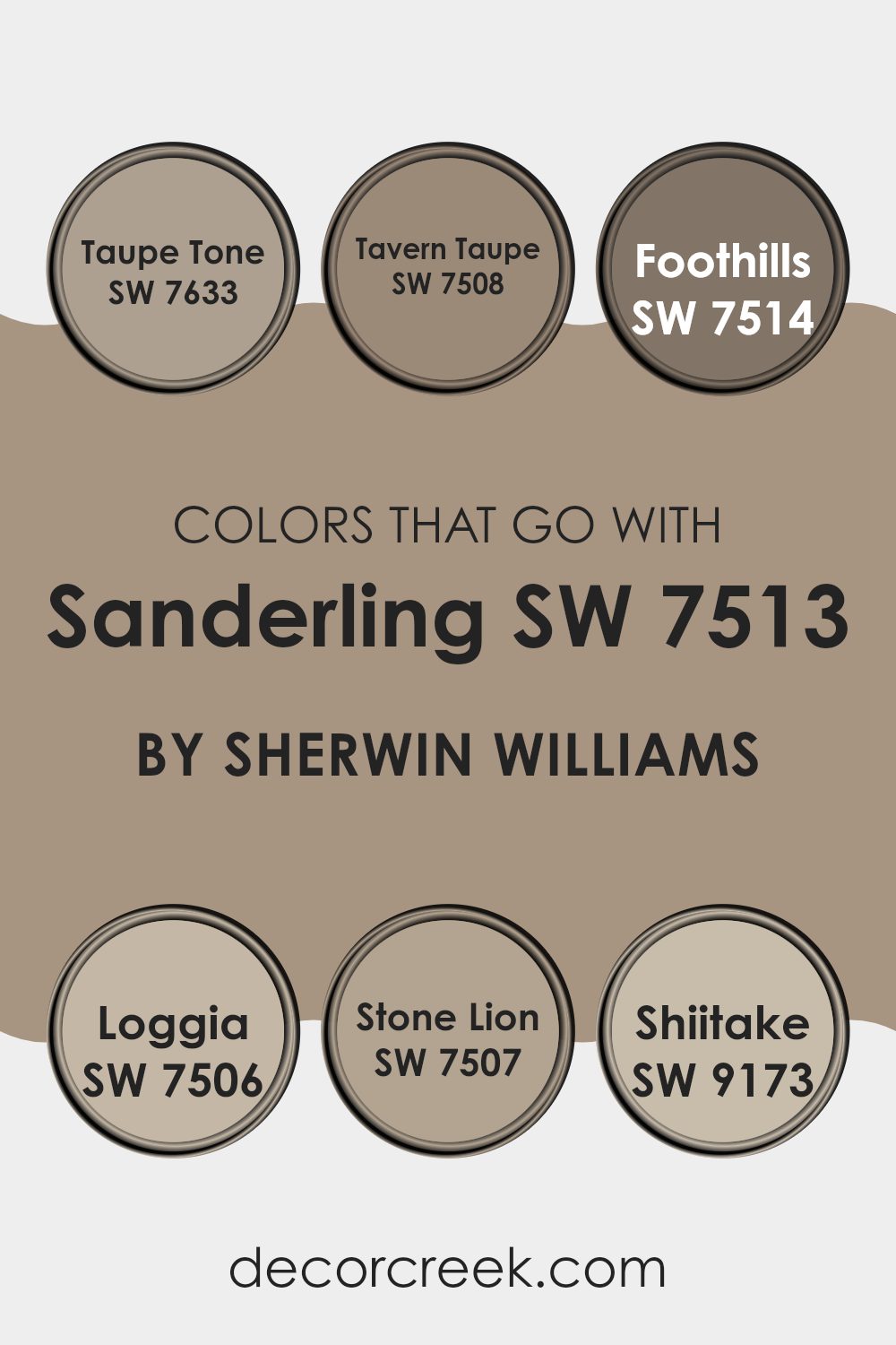
Colors that Go With Sanderling SW 7513 by Sherwin Williams
Choosing the right colors to pair with Sanderling SW 7513 by Sherwin Williams can significantly impact the overall look and feel of a room. When colors like Taupe Tone, Tavern Taupe, Foothills, Loggia, Stone Lion, and Shiitake complement Sanderling, they create a harmonious and appealing space.
These colors are carefully chosen to match, ensuring that the space feels balanced and aesthetically pleasing without overwhelming the senses. Combining these colors can pull a room together, giving it a coordinated look that can enhance the architecture and the furnishings.
Taupe Tone is a warm gray that adds depth and warmth when paired with the softer hues of Sanderling. Tavern Taupe brings in a deeper, earthy quality that contrasts nicely with Sanderling’s lighter tone. Foothills is a step darker, offering a cozy feel that works well in spaces seeking a bit of intimacy.
Loggia is a lighter, more subdued shade that gently complements the lightness of Sanderling, enhancing the natural light of an area.
Stone Lion has a hint of olive, providing a unique earthy presence that feels grounding.
Lastly, Shiitake offers a soft mushroom color that blends naturally with the other colors, ensuring none of them stands too bold against the others. Each color option provides a way to create a seamless flow from room to room, making the choices crucial to achieving a cohesive interior look.
You can see recommended paint colors below:
- SW 7633 Taupe Tone
- SW 7508 Tavern Taupe
- SW 7514 Foothills
- SW 7506 Loggia
- SW 7507 Stone Lion
- SW 9173 Shiitake
How to Use Sanderling SW 7513 by Sherwin Williams In Your Home?
Sanderling SW 7513 by Sherwin Williams is a versatile light beige paint color that can add warmth and a welcoming feel to any room in your home. This shade is perfect for those looking to create a cozy and inviting space without overwhelming it with darker tones.
You can use Sanderling in your living room to create a calm and comfortable setting, ideal for relaxing and spending time with family. In the bedroom, this color can help set the mood for a good night’s sleep by producing a gentle and soothing environment. It’s also great in kitchens and bathrooms, where it can keep the space bright and airy.
Because it’s a neutral color, it pairs well with a wide range of colors and decor styles, from modern to traditional. Sanderling can be used on walls, as well as for trimming or cabinets, offering flexibility in design and coordination with your existing furnishings.
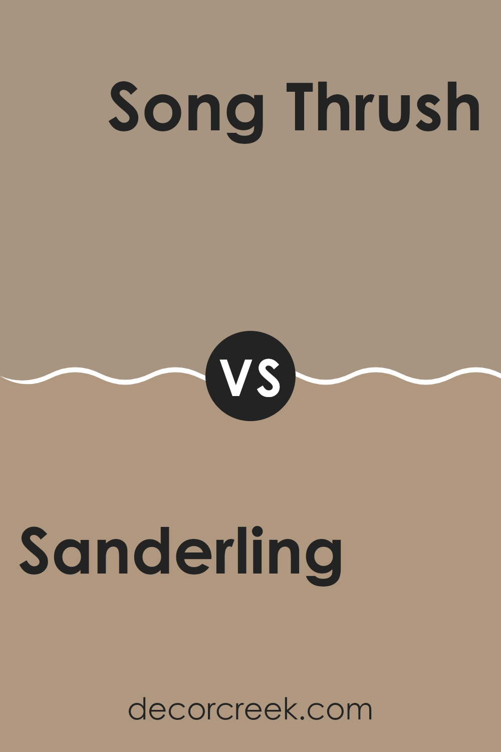
Sanderling SW 7513 by Sherwin Williams vs Song Thrush SW 9112 by Sherwin Williams
The two colors chosen, Sanderling and Song Thrush, by Sherwin Williams, showcase distinct tones that can be used effectively in various home decor settings. Sanderling is a warm beige, offering a light, airy feel that can make small spaces appear more open and brighter. It pairs well with many accent colors and wood finishes, making it a versatile choice for common areas like living rooms and kitchens.
On the other hand, Song Thrush is a deeper taupe, providing a stronger sense of warmth and coziness. Its richer hue makes it perfect for creating a more cozy and inviting atmosphere in spaces like bedrooms or dens. This color can complement both light and dark furnishings, adding depth and interest to the room.
When used together, these two shades can create a layered effect in a space, transitioning smoothly from the lighter Sanderling to the deeper, more intense Song Thrush, offering a natural, earthy palette that suits various styles and preferences.
You can see recommended paint color below:
- SW 9112 Song Thrush
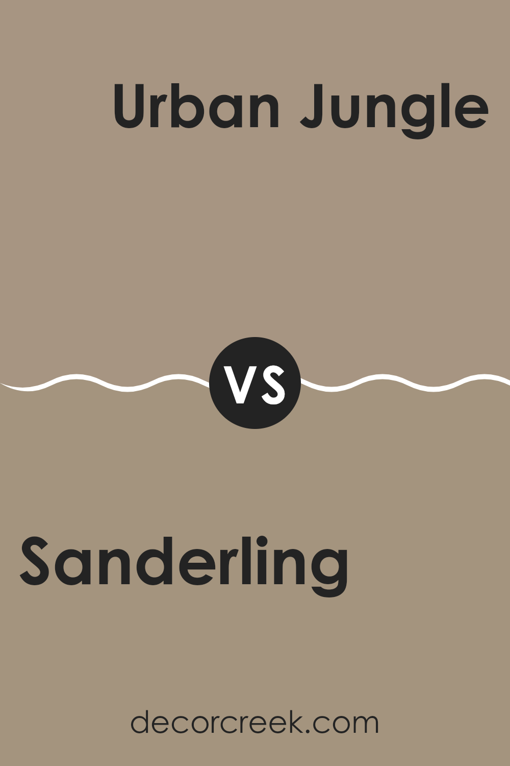
Sanderling SW 7513 by Sherwin Williams vs Urban Jungle SW 9117 by Sherwin Williams
Sanderling and Urban Jungle by Sherwin Williams are two contrasting yet harmonious colors. Sanderling is a light beige that evokes a sense of calm and warmth, perfect for creating a cozy and inviting space in homes.
It pairs well with brighter colors and acts as a neutral base in many decorative schemes. On the other hand, Urban Jungle is a darker, gray-green shade that brings a subtle touch of nature indoors. This color is ideal for those looking to add a bit of drama and depth to their rooms without overwhelming the senses.
While Sanderling reflects more light, making a room feel more open and airy, Urban Jungle tends to absorb light, which can make a space feel more enclosed but very cozy. Together, these colors can work beautifully in a home, offering a balanced environment with areas of restful calm and rich, grounding tones.
You can see recommended paint color below:
- SW 9117 Urban Jungle
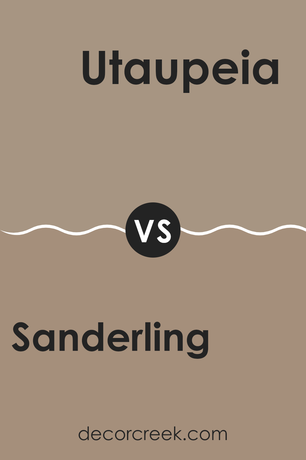
Sanderling SW 7513 by Sherwin Williams vs Utaupeia SW 9088 by Sherwin Williams
Sanderling and Utaupeia, both from Sherwin Williams, present subtle yet distinctly different tones. Sanderling is a soft, light beige that provides a gentle and airy feel to a space. It is particularly suited for creating a calm, inviting environment. It reflects natural light well, making it a great choice for small rooms or spaces without a lot of natural sunlight.
On the other hand, Utaupeia is a deeper taupe that leans towards a grayish-brown hue. This color offers a stronger presence and can give a room a more grounded, cozy feel. It works well in larger spaces or as an accent wall, where it can add depth and interest without overpowering.
Both colors are versatile and can blend well with various decor styles and color palettes. While Sanderling is ideal for those looking for a brighter, open setting, Utaupeia suits those wanting a bit more warmth and complexity in their color choice.
You can see recommended paint color below:
- SW 9088 Utaupeia
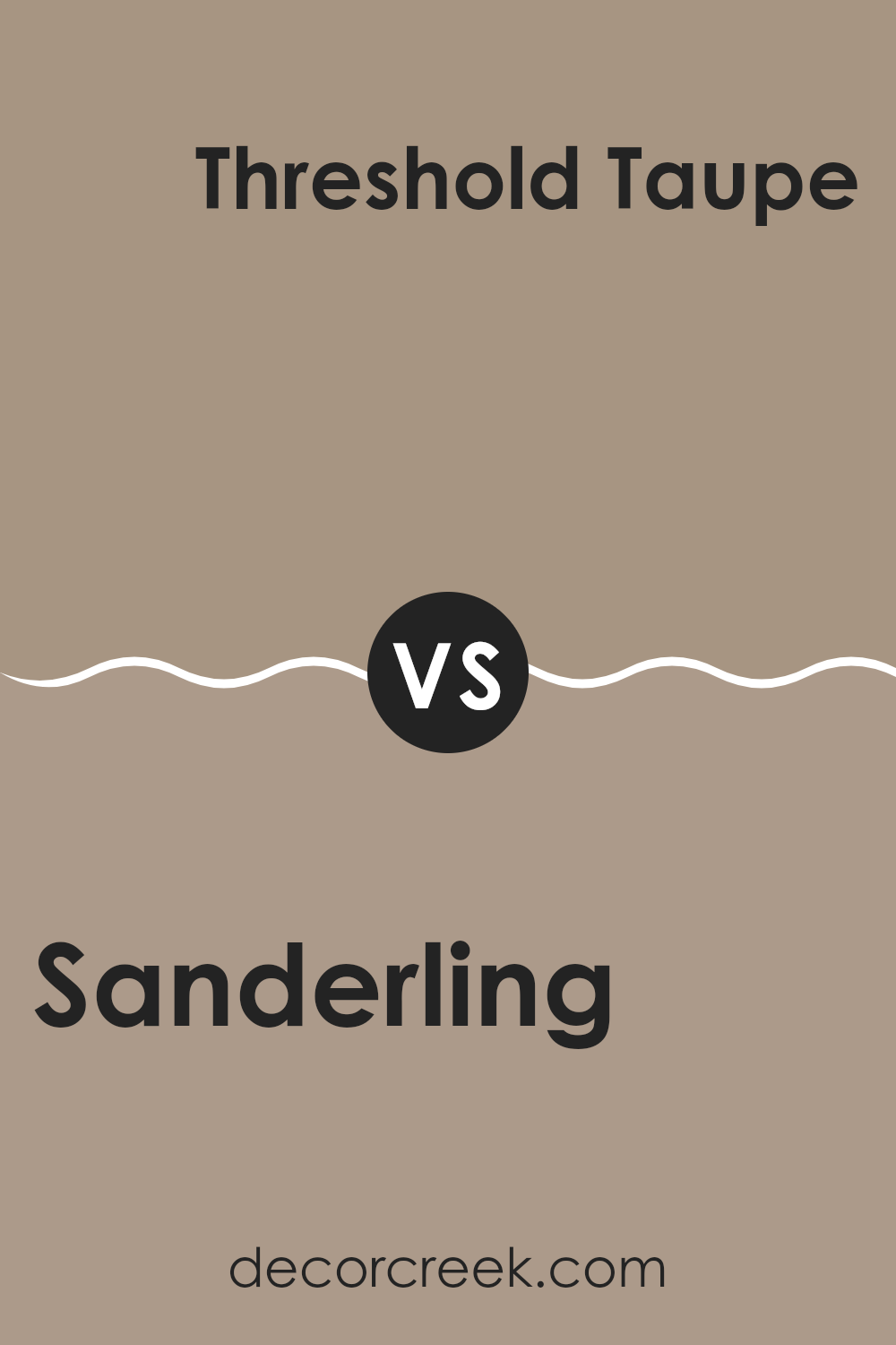
Sanderling SW 7513 by Sherwin Williams vs Threshold Taupe SW 7501 by Sherwin Williams
Sanderling and Threshold Taupe are two popular neutral paint colors that offer subtle yet distinct vibes for any room. Sanderling is a warm, sandy beige that gives off a cozy and inviting feel. It’s light and airy, making it perfect for smaller spaces or rooms that you want to appear more open and bright.
Threshold Taupe, on the other hand, is a bit deeper and richer. This color leans more towards a greyish taupe, offering a slightly more grounded and sturdy feel. It’s excellent for creating a calm, stable atmosphere in a space, making it ideal for areas where you want a bit more definition without overwhelming the senses.
Both colors are incredibly versatile and can work well in various settings, from living rooms and bedrooms to kitchens and bathrooms. Whether you choose the lighter Sanderling or the moodier Threshold Taupe, each color provides a solid foundation for various decor styles and color schemes.
You can see recommended paint color below:
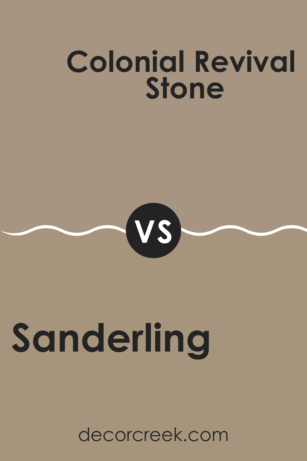
Sanderling SW 7513 by Sherwin Williams vs Colonial Revival Stone SW 2827 by Sherwin Williams
Sanderling SW 7513 is a light, warm beige color that provides a soft, neutral backdrop for any room. It has a gentle warmth to it that can make spaces feel inviting and cozy. This color works particularly well if you want to create a calm and comfortable atmosphere without making the space feel too confined or dark.
On the other hand, Colonial Revival Stone SW 2827 is a bit darker and richer than Sanderling. It combines elements of gray and beige, often referred to as “greige.” This makes it incredibly versatile, suitable for spaces that need a touch of elegance without being too bold.
Colonial Revival Stone can also help in adding a bit more depth and interest to the walls, compared to the lighter Sanderling. Both colors are great choices for those who prefer neutral tones, but the choice between them depends on the specific mood and depth you want to achieve in your space.
You can see recommended paint color below:
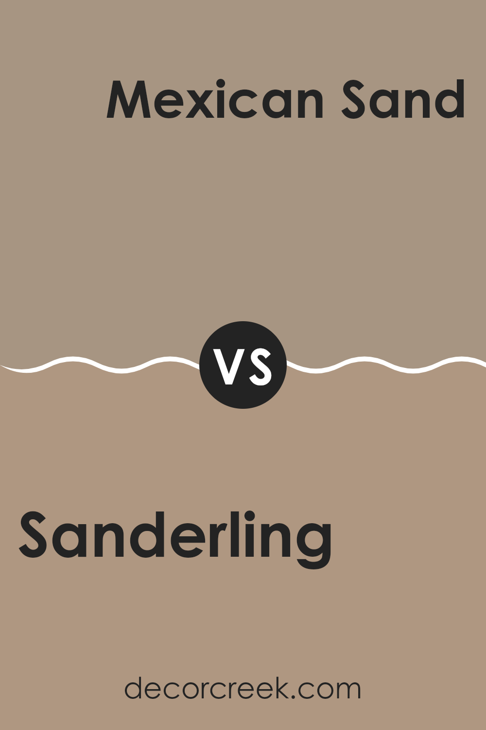
Sanderling SW 7513 by Sherwin Williams vs Mexican Sand SW 7519 by Sherwin Williams
The main color, Sanderling, is a soft, warm beige with a slightly creamy feel. It has a neutral tone that makes it very versatile for use in various spaces, whether you’re looking to paint a living room or a bedroom. It pairs well with both bright colors and darker hues, making it easy to incorporate into most design schemes.
On the other hand, Mexican Sand is a deeper, richer beige with a hint of earthiness. This color feels warmer and cozier compared to Sanderling due to its darker and more pronounced brown undertones. It’s particularly suitable for creating a warm, welcoming atmosphere in a space.
While still neutral, Mexican Sand makes a bolder statement than Sanderling and can serve as a great backdrop for both light and dark furnishings. In summary, while both are neutral beiges, Sanderling presents a lighter, more versatile option whereas Mexican Sand offers a cozier and slightly more distinct warm appearance.
You can see recommended paint color below:
- SW 7519 Mexican Sand
Sanderling SW 7513 by Sherwin Williams vs Woodbridge SW 9618 by Sherwin Williams
Sanderling SW 7513 by Sherwin Williams is a warm, soft beige with a hint of gray. It’s a light, neutral color that works well in various settings, adding a gentle touch of warmth to the room without being too strong or overpowering.
On the other hand, Woodbridge SW 9618 is a deeper, richer shade that leans more toward a traditional brown with a subtle undertone of gray. This color offers a stronger presence and can give a room a more grounded, stable feel.
Where Sanderling brings a light, airy feel, ideal for making smaller spaces seem larger, Woodbridge provides depth and can be great for adding character or as an accent in larger spaces. Both these colors are quite flexible, blending well with various decor styles and other colors, but the choice between them would depend on the mood and atmosphere you’re trying to achieve in your space.
You can see recommended paint color below:
Sanderling SW 7513 by Sherwin Williams vs Cocoa Whip SW 9084 by Sherwin Williams
Sanderling SW 7513 is a warm, light beige with subtle gray undertones, giving it a clean and versatile appearance. It’s ideal for creating a cozy and inviting space without being too dark or overwhelming. This color works well in a variety of rooms, offering a neutral backdrop that complements a wide range of decor styles and color schemes.
On the other hand, Cocoa Whip SW 9084 is a deeper, rich beige with a hint of gray. This color provides a stronger visual impact and can add a sense of warmth and depth to any room. It’s perfect for adding character in spaces where you want a bit more presence and warmth without moving into actual dark color territories.
Together, these two colors can work beautifully to balance out a space. Use Sanderling for larger areas or walls to keep the space light and open, while accenting with Cocoa Whip for trim, accent walls, or furniture to add depth and interest. This pairing can create a cozy, welcoming atmosphere without being too bold or stark.
You can see recommended paint color below:
- SW 9084 Cocoa Whip
Sanderling SW 7513 by Sherwin Williams vs Moth Wing SW 9174 by Sherwin Williams
Sanderling and Moth Wing, both by Sherwin Williams, offer unique hues that could complement various decorating styles. Sanderling is a light, sandy beige with warm undertones, making it ideal for creating a cozy and welcoming atmosphere. It pairs well with bright or dark colors, serving as a versatile backdrop in any room.
Moth Wing, on the other hand, is a darker shade, resembling a soft, grayish-brown. This color provides a stronger presence due to its deeper tone, contributing to a grounded, more defined look. It’s perfect for accent walls or for spaces that need a bit of drama without overwhelming the senses.
Both colors share a natural earthiness, but their impact in a space differs considerably. Sanderling lightens up a room, offering a subtle warmth, while Moth Wing brings depth and a sense of solidity. Choosing between them depends on the desired effect in your space—whether you want the light, airy feel of Sanderling or the robust, earthy vibe of Moth Wing.
You can see recommended paint color below:
Sanderling SW 7513 by Sherwin Williams vs Sticks & Stones SW 7503 by Sherwin Williams
Sanderling and Sticks & Stones by Sherwin Williams are two distinct shades that can greatly influence the mood and style of a room. Sanderling is a soft, neutral beige with warm undertones, which creates a cozy and inviting atmosphere. It’s a versatile color that pairs well with almost any decor, making it ideal for living spaces or bedrooms where a calm and welcoming feel is desired.
On the other hand, Sticks & Stones is a deeper taupe that leans towards a gray-brown. This color is excellent for adding a bit of depth and warmth to an area without overwhelming it with darkness. It works well in spaces that receive a lot of natural light, allowing the color to show its richness without making the room feel closed in.
When choosing between the two, consider Sanderling if you prefer lighter, airier spaces, and opt for Sticks & Stones if you want to create a more grounded, cozy feel. Both colors offer a beautiful backdrop for various styles and preferences.
You can see recommended paint color below:
Conclusion
As I wrap up my thoughts on SW 7513 Sanderling by Sherwin Williams, I realize it’s a really cozy and calming color. It reminds me of a sandy beach on a sunny day. When you paint a room with this color, it feels like bringing a piece of that peaceful beach inside your home. It’s gentle, so it doesn’t scream for attention, but it has enough warmth to make any room feel welcoming.
I found that Sanderling goes well with a lot of other colors. Whether you put it next to something dark or light, it seems to fit in just right. It’s kind of like the perfect teammate in a soccer game—always supporting and making sure everything looks good. It’s great for bedrooms where you sleep, or living rooms where you hang out and play games or watch TV with family.
In conclusion, if you’re thinking about giving your room a new look, Sanderling is a great choice. It’s not just a pretty color; it makes your room feel good, too. It’s simple to like, easy to use, and it works with pretty much everything. So, whether you’re redoing your whole house or just want to freshen up a single room, Sanderling is definitely worth considering.
Ever wished paint sampling was as easy as sticking a sticker? Guess what? Now it is! Discover Samplize's unique Peel & Stick samples.
Get paint samples

