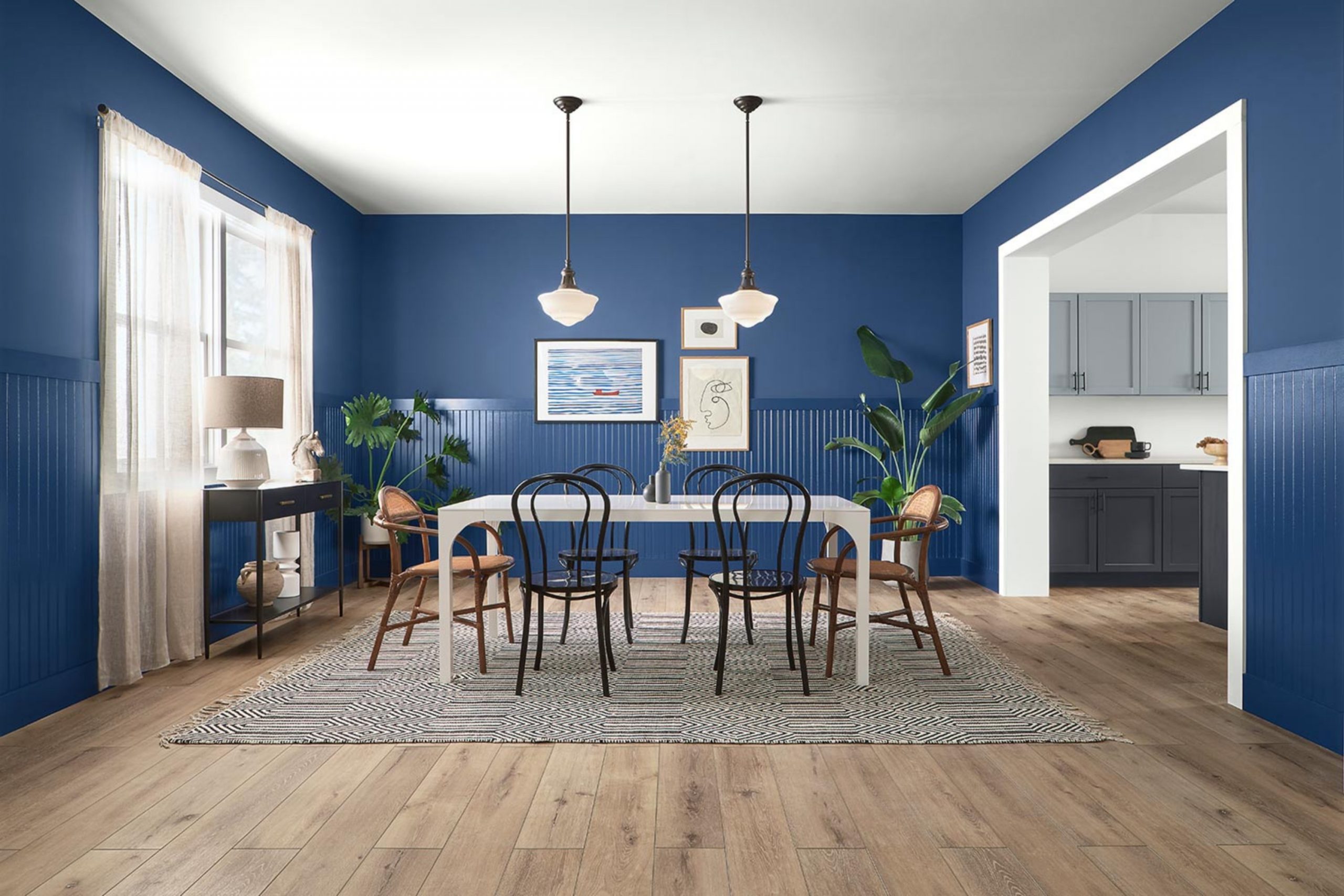
As someone who loves to play with colors in my decorating projects, I was thrilled to stumble upon SW 6524 Commodore by Sherwin Williams. This shade of blue, with its deep and rich tones, can add a serious splash of elegance and refinement to any area. Perfect for those looking to make a statement in a room, Commodore offers a sense of boldness without being too much, a balance that’s often hard to achieve with darker colors.
In planning my latest room renovation, I found that Commodore pairs beautifully with a variety of textures and finishes, from natural wood grains to metallic accents. It’s flexible enough for a chic office or a cozy reading nook, demonstrating its adaptability in different settings. The color brings out a fresh dynamic when used on accent walls or furniture, providing a focal point that instantly draws the eye.
If you’re pondering a color that combines drama with a hint of mystery, Commodore could be your go-to. It opens up numerous design possibilities, allowing you to create an area that feels both inviting and stylishly bold.
Whether it’s a full room repaint or a smaller project like painting a bookshelf, Commodore stands out as a uniquely memorable choice.
What Color Is Commodore SW 6524 by Sherwin Williams?
Commodore SW 6524 by Sherwin Williams is a striking shade of deep blue that makes a bold statement. This color can be described as a navy blue with a classic vibe, yet it holds a modern appeal due to its depth and intensity. This rich hue works wonderfully in a variety of interior styles, particularly in nautical, traditional, and contemporary settings.
In a nautical-themed area, Commodore complements whites and reds, providing a maritime feel that is both fresh and inviting. In traditional interiors, this color adds lasting elegance when paired with rich woods, gold accents, and luxurious textures like velvet or silk. For a more contemporary look, Commodore can be the star of the show against minimalist decor, helping to create a dynamic yet cozy atmosphere.
This color works especially well with natural materials like wood, leather, and linen, which help to soften its boldness while maintaining a warm environment. It also pairs nicely with metallic finishes such as brass or chrome, adding a sleek touch to the area. Textures play a key role when working with such a deep color; balancing it with soft furnishings or glossy finishes can prevent it from becoming too much.
Is Commodore SW 6524 by Sherwin Williams Warm or Cool color?
Commodore by Sherwin Williams is a deep navy blue that brings a strong and bold vibe to any room. This shade can add a dramatic touch, making it perfect for feature walls in a living room or dining area. Due to its dark tone, it pairs well with lighter colors such as white or gray, which helps to balance the visual weight of the area.
This color can make small areas appear smaller, so it’s often used sparingly in tight areas. However, in a well-lit, large room, it can make the area feel more cozy and inviting. Commodore is flexible for home décor, working well with both modern and traditional styles.
Adding metallic accents like gold or silver can enhance its luxurious feel, while pairing with wood textures creates a more grounded, natural environment. This rich navy hue is a popular choice for those looking to add a bold touch to their home without making the area feel too much with too bright or too much colors.
Undertones of Commodore SW 6524 by Sherwin Williams
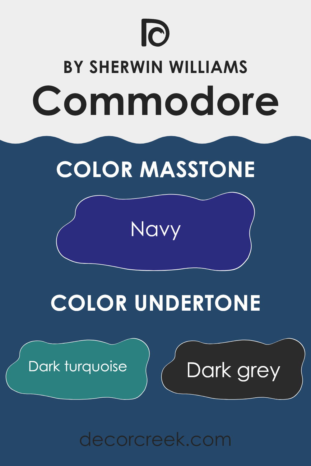
Commodore SW 6524 by Sherwin Williams is a unique color with a variety of undertones that influence its perception in different environments. Undertones are subtle hues mixed into the main color that can be seen under certain lighting conditions or when the color is placed next to other colors. The undertones in this paint color include dark turquoise, dark grey, dark green, purple, grey, dark blue, brown, blue, olive, violet, and lilac.
These undertones play a crucial role in how the color is perceived. For example, grey and dark grey undertones can give a cooling effect, while brown and olive can add a touch of warmth. Purple and lilac undertones can bring a slight playfulness or softness to the color. The combination of these undertones means the color can look slightly different depending on the light and surrounding decor.
When used on interior walls, the comprehensive spectrum of undertones in this paint ensures it remains flexible, adapting subtly to different furniture styles and accessories. Darker undertones like dark turquoise and dark green can provide depth, making the color stand out more in an area with natural light. In contrast, the inclusion of lighter undertones like blue and violet can help brighten an area without making it feel too much. This flexibility makes it a suitable choice for various rooms, adjusting subtly to changes in decor and lighting.
decorcreek.com
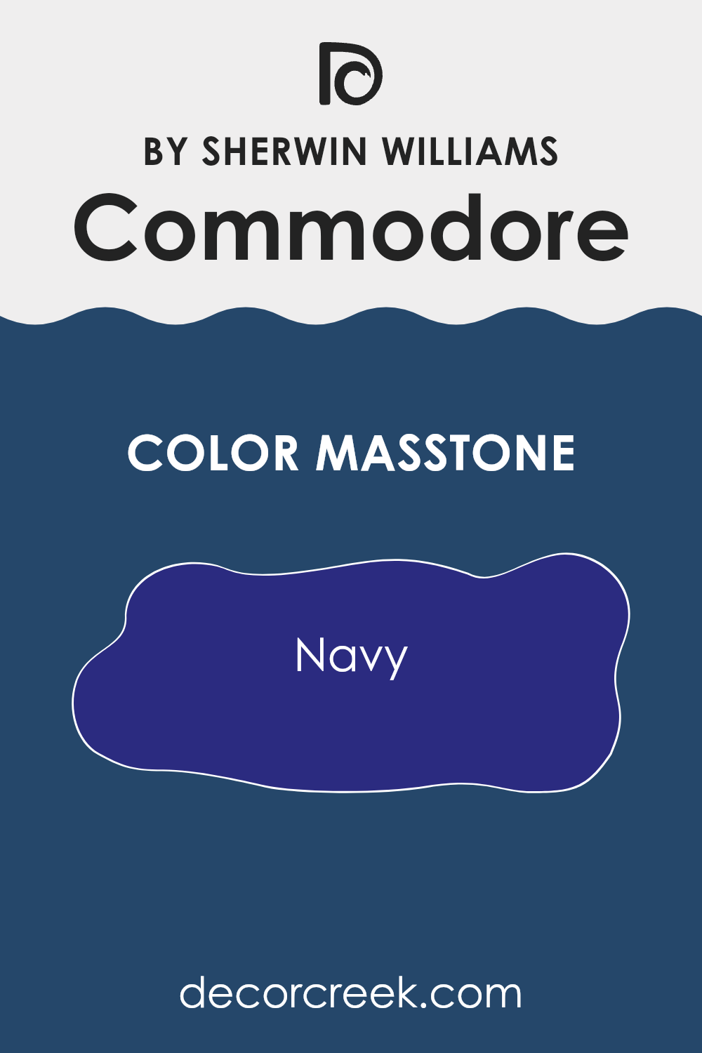
What is the Masstone of the Commodore SW 6524 by Sherwin Williams?
The masstone of the Commodore color by Sherwin Williams is a deep navy, akin to the color code #2B2B80. This shade has a strong presence due to its dark blue hue, which brings a sense of strength and stability to a room.
In home decor, this color works well as an accent wall or for cabinets in a kitchen or bathroom, providing a bold contrast to lighter colors such as white or gray. It’s also popular in bedrooms, where it adds depth and can make the area feel more cozy and enclosed—a great option for those who want a calm, restful feeling in their sleeping area.
However, because it’s so dark, using this color in a smaller room or an area without much natural light might make the area feel smaller or more cramped. Therefore, it’s best used in well-lit areas or larger areas to avoid a boxed-in feel.
How Does Lighting Affect Commodore SW 6524 by Sherwin Williams?
Lighting has a significant impact on how we perceive colors, as it can alter their appearance dramatically. Different types of light, such as natural daylight or artificial light, can change how colors look in any given area.
Let’s take the color blue, specifically a deep shade such as Commodore (SW 6524) by Sherwin Williams, as an example. Under artificial light, particularly warm bulbs, this blue can appear richer and slightly darker. The warm yellow tones of the light can soften the blue, making it feel cozier and more muted. In contrast, under cooler artificial light, like that from fluorescent bulbs, the blue might appear sharper and more vibrant, as the blue light enhances its cooler tones.
In natural light, the appearance of this rich blue also varies throughout the day and depending on the direction of the windows. Rooms that face north often receive less direct sunlight, which can make this deep blue look more somber and profound. It retains a consistent appearance throughout the day but may need good artificial lighting to prevent it from looking too dark in the evening.
In south-facing rooms, however, this blue will change as the amount of natural light changes. These rooms receive the most light throughout the day, making the blue lighter and more dynamic during peak sunlight hours, and returning to its deeper, true shade as the sun sets.
Rooms that face east bask in the warm glow of the morning sun, making this color feel brighter and more welcoming in the morning before shifting back to its darker shade as the day progresses. Conversely, in west-facing rooms, the color will stay true to its original shade for most of the day and become more vivid and bright with the setting sun’s golden tones in the late afternoon and evening.
Overall, lighting conditions play a crucial role in how this deep blue shade is perceived, affecting its character and the mood it sets in the area. Choosing the right lighting is key to ensuring that colors like this one can make the desired impact in an area.
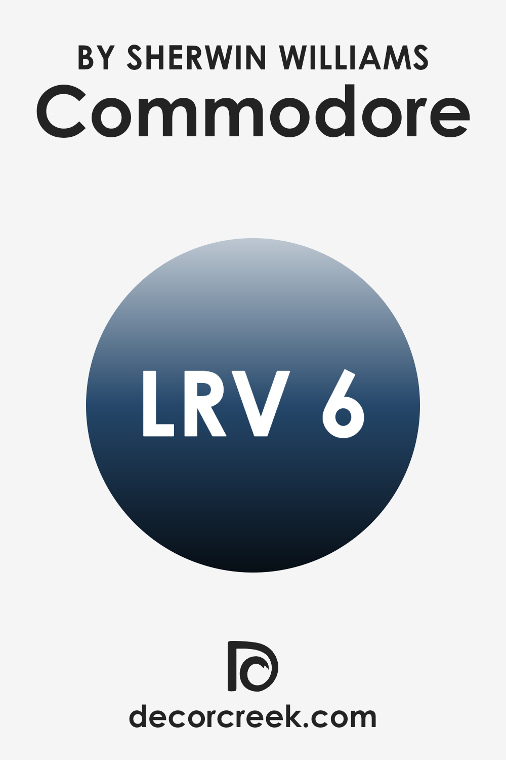
What is the LRV of Commodore SW 6524 by Sherwin Williams?
LRV stands for Light Reflectance Value, a measure indicating the percentage of light a paint color reflects from or absorbs into a painted surface. When it comes to painting, LRV ranges from absolute black, which reflects no light, to pure white, which reflects almost all light. This value helps determine how light or dark a color will look on your walls and can influence the room’s overall ambiance.
A higher LRV means a color will appear lighter and more reflective, helping to brighten a room and make it feel more airy. Conversely, a lower LRV absorbs more light, making an area feel cozier and potentially smaller.
With an LRV of 5.966, the color Commodore SW 6524 is a very dark shade, absorbing most of the light that hits it. In a practical setting, this means it can dramatically alter the feel of a room. Walls painted with this color will likely appear bold and intense, contributing to a more enclosed and intimate atmosphere.
This could be ideal for creating a striking effect or focal point in an interior design scheme.
However, it’s important to consider the room’s size and the availability of natural or artificial light, as such a dark color could make a small, poorly-lit area feel even smaller and darker.
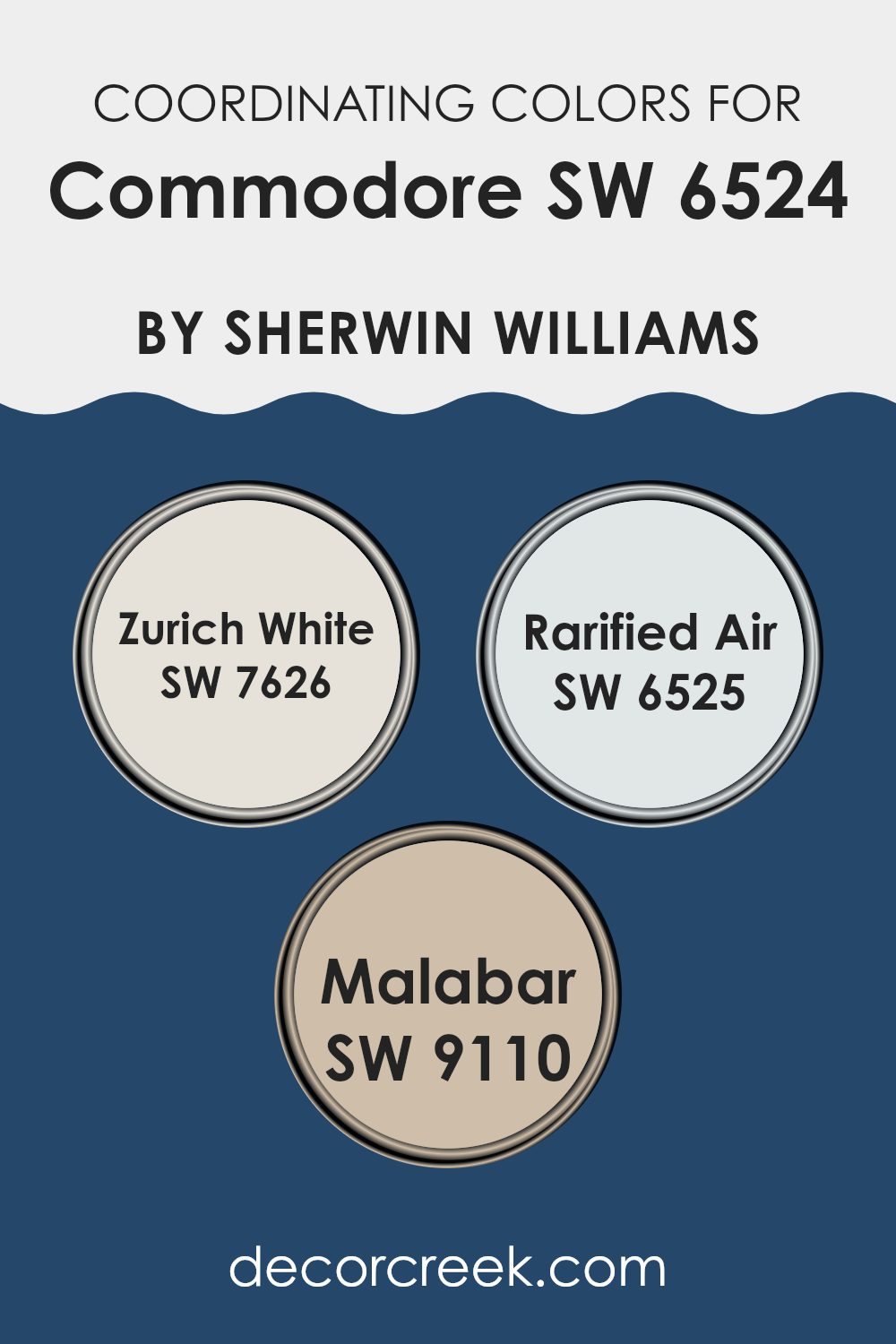
Coordinating Colors of Commodore SW 6524 by Sherwin Williams
Coordinating colors are selected hues that harmonize well with a primary color to create a pleasing aesthetic in any area. Essentially, these colors complement or enhance the main color, allowing for a unified and appealing color scheme. When it comes to choosing coordinating colors for Commodore SW 6524 by Sherwin Williams, colors like Zurich White SW 7626, Rarified Air SW 6525, and Malabar SW 9110 are excellent choices. These specific shades complement Commodore’s deep, navy-like tone by providing balance and contrast, enhancing the overall look of the room without making the senses feel too much.
Zurich White SW 7626 is a clean and crisp white that provides a refreshing contrast to the rich depth of Commodore. It lightens the atmosphere and brings a sense of freshness and clarity to areas, making it perfect for trim, ceilings, or as a main wall color in a room predominantly featuring Commodore.
Rarified Air SW 6525, on the other hand, is a light and airy blue that echoes the subtler tones within Commodore, presenting an opportunity to create a soft, cohesive look. Lastly, Malabar SW 9110 is a gentle, earthy taupe that adds warmth and a natural element when paired with the cooler tones of Commodore, ideal for creating a balanced and inviting area. Together, these colors create a harmonious palette that enhances the visual appeal and mood of any room.
You can see recommended paint colors below:
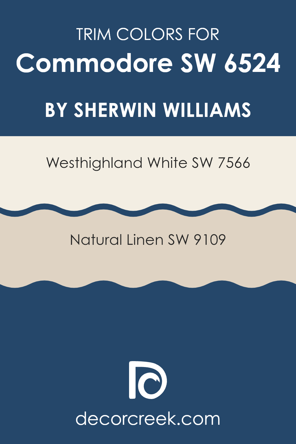
What are the Trim colors of Commodore SW 6524 by Sherwin Williams?
Trim colors play a crucial role in framing and accentuating the aesthetic appeal of a home’s main color. In the case of a bold color like Commodore SW 6524 by Sherwin-Williams, choosing the right trim colors can create a pleasing contrast that highlights the architecture of an area or home.
Westhighland White SW 7566 and Natural Linen SW 9109 are both excellent options for trims when paired with Commodore SW 6524. They help soften the strong hue of Commodore, providing a balanced visual flow that ensures the primary color stands out without making the senses feel too much.
Westhighland White SW 7566 is a clean, crisp white that brings a fresh and airy feel to the trim, offering a sharp contrast that defines the areas delicately when used with vivid or dark wall colors like Commodore. Natural Linen SW 9109, on the other hand, offers a warmer approach as a trim color. Its soft, beige tone brings a subtle warmth and a gentle transition that can soften the overall appearance of darker or more intense colors, making it a perfect companion that adds a touch of coziness to the boldness of Commodore SW 6524.
You can see recommended paint colors below:
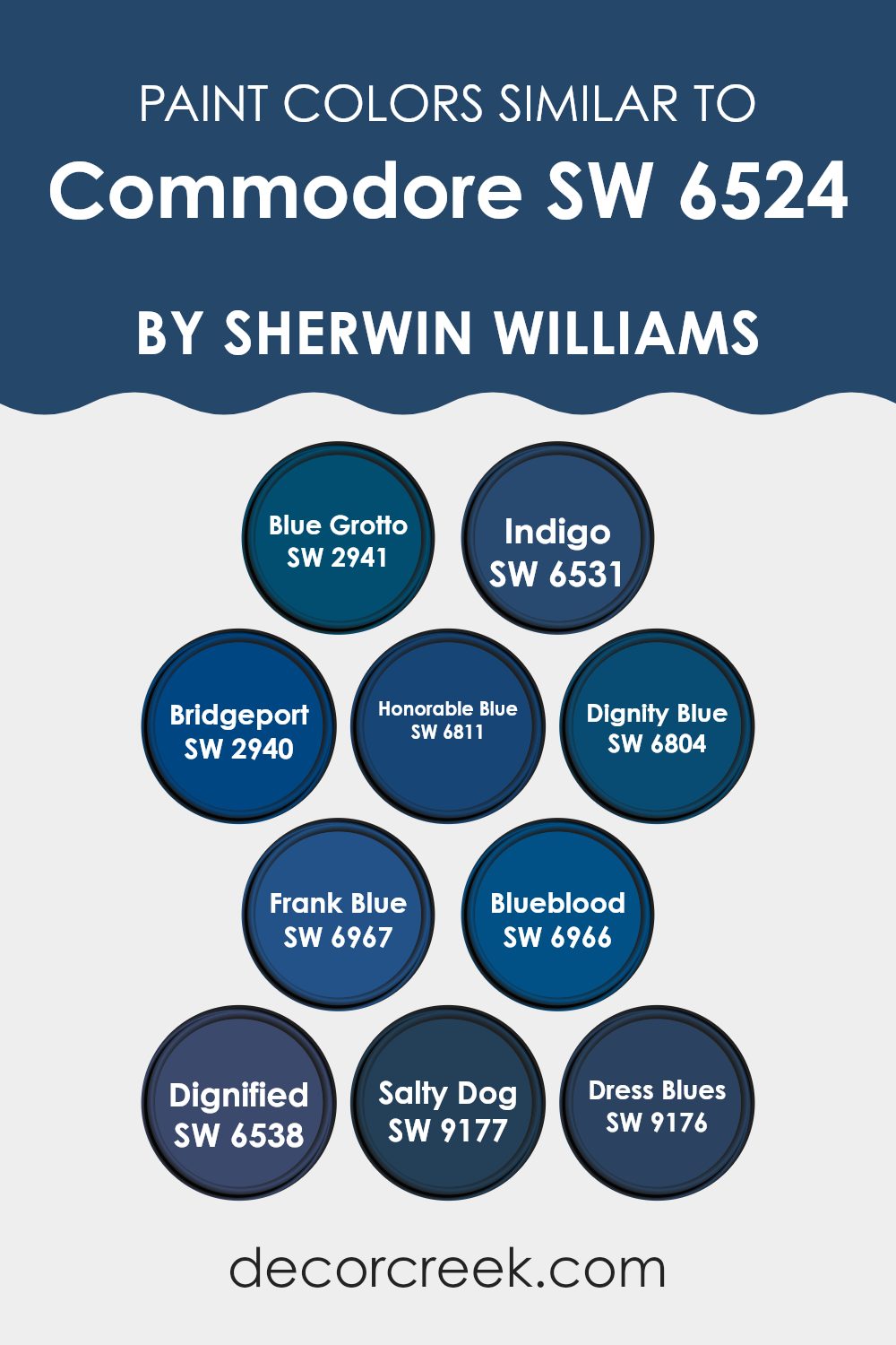
Colors Similar to Commodore SW 6524 by Sherwin Williams
Choosing similar colors, such as the various shades inspired by Commodore SW 6524 by Sherwin Williams, is significant because they enable you to create a harmonious and aesthetically pleasing environment. These colors work together to provide a sense of continuity and flow, which is essential for both interior and exterior design.
For example, when you use shades like Blue Grotto and Indigo, you create a subtle variation in your area that enhances visual interest without making the senses feel too much. This technique is particularly useful in achieving a cohesive look that ties different rooms or elements together seamlessly.
Colors like Bridgeport and Dignified add a touch of depth to your palette, allowing for a dynamic yet unified aesthetic. Honorable Blue and Dignity Blue offer cooler tones that can give a calm and inviting vibe to any area. More intense hues such as Frank Blue and Blueblood contribute richness and vibrancy, perfect for accent walls or decor highlights. Finally, for those looking to make a bold statement, Salty Dog and Dress Blues are excellent choices for their strong personality and ability to stand out, yet they still maintain the overall harmony when used with other similar shades from the Commodore range. By selecting these similar tones, you can ensure a polished and coordinated look that is pleasing to the eye.
You can see recommended paint colors below:
- SW 2941 Blue Grotto
- SW 6531 Indigo
- SW 2940 Bridgeport
- SW 6811 Honorable Blue
- SW 6804 Dignity Blue
- SW 6967 Frank Blue
- SW 6966 Blueblood
- SW 6538 Dignified
- SW 9177 Salty Dog
- SW 9176 Dress Blues
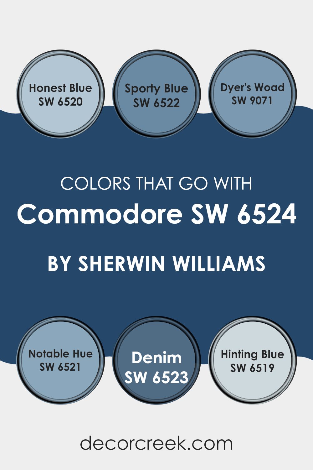
Colors that Go With Commodore SW 6524 by Sherwin Williams
Colors that pair well with Commodore SW 6524 by Sherwin Williams create a consistent and harmonious aesthetic, enhancing the overall look of a room. When selecting complementary colors, such as Honest Blue, Sporty Blue, Dyer’s Woad, Notable Hue, Denim, and Hinting Blue, it’s crucial to consider how they will work together to achieve a balanced visual impact. Each color has unique properties that contribute to a cohesive color scheme, which can improve the mood and style of an area.
Honest Blue SW 6520 is a gentle, muted blue that gives a calm and soft vibe to an area, perfect for creating a relaxed atmosphere. Sporty Blue SW 6522, with its slightly more vibrant tone, injects a touch of energy into areas, making it ideal for areas like playrooms or creative areas. Dyer’s Woad SW 9071 offers a deep, rich blue that adds a dash of drama and intensity, suitable for accent walls or furniture.
Notable Hue SW 6521 is a strong, bold blue that commands attention and works well in areas where you want to make a statement. Denim SW 6523, reminiscent of the classic blue fabric, provides a comforting and familiar feel, excellent for bedrooms or living rooms. Lastly, Hinting Blue SW 6519 is a very subtle blue with a whisper of softness, great for creating a light and airy feel in small areas or bathrooms. By choosing these colors to accompany Commodore SW 6524, you can create an area that feels cohesive and thoughtfully designed.
You can see recommended paint colors below:
- SW 6520 Honest Blue
- SW 6522 Sporty Blue
- SW 9071 Dyer’s Woad
- SW 6521 Notable Hue
- SW 6523 Denim
- SW 6519 Hinting Blue
How to Use Commodore SW 6524 by Sherwin Williams In Your Home?
Commodore SW 6524 by Sherwin Williams is a deep navy blue paint that brings a bold and calming vibe to any room. It’s perfect if you want to add a strong dash of color without making your area feel too much. You can use this shade in various ways at home.
For example, painting one accent wall with Commodore can create a lovely background for lighter furniture or artwork. It makes for a great choice in your living room or bedroom because it pairs well with whites, grays, and even brighter colors for a diverse look.
Additionally, if you’re into a nautical or coastal style, Commodore fits right in. Imagine your bathroom with this navy color, complementing crisp white towels and accessories. Even in small areas like a reading nook, covering the walls with this shade can make the area feel cozy and tucked away. It’s a flexible color that helps make any corner of your home look more stylish and well put together.
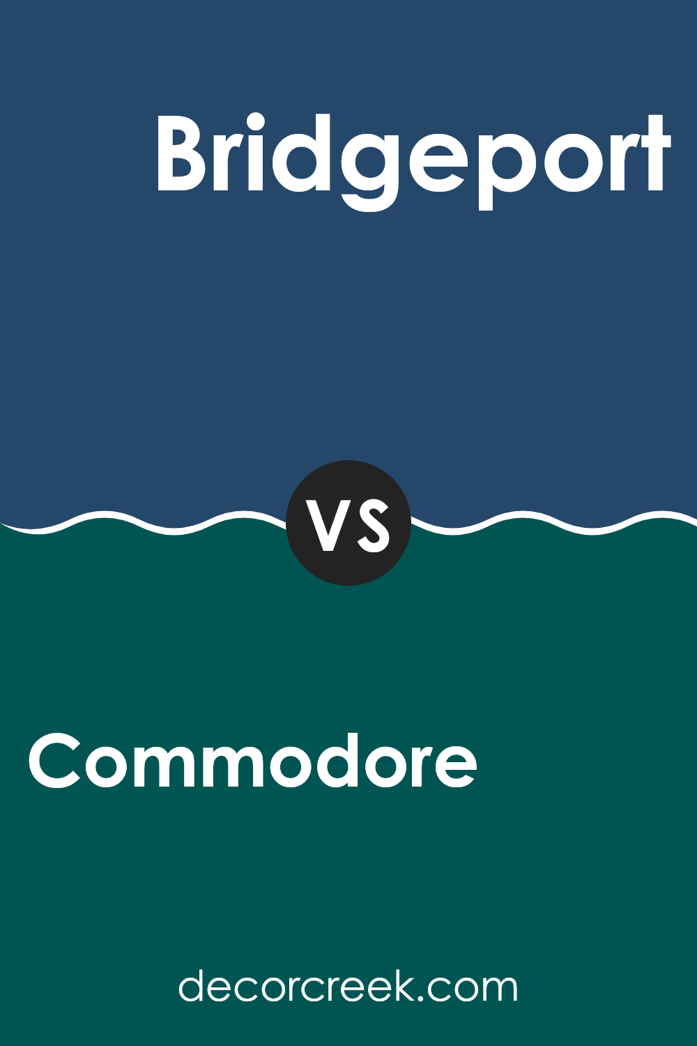
Commodore SW 6524 by Sherwin Williams vs Bridgeport SW 2940 by Sherwin Williams
Commodore is a deep blue color that gives a sense of stability and depth. It has a bold and striking vibe, making it perfect for areas where a strong, prominent color is needed to make a statement, like in a study or dining room.
On the other hand, Bridgeport is a gray shade that leans slightly towards blue. It’s subtle and more understated compared to Commodore, providing a cooler and more neutral backdrop.
This makes it easy to combine with other colors in various settings, like living rooms or bedrooms, where creating a calming environment is key. Both colors bring their own unique qualities to an area, with Commodore adding drama and intensity, while Bridgeport offers a softer, more adaptable aesthetic.
You can see recommended paint color below:
- SW 2940 Bridgeport
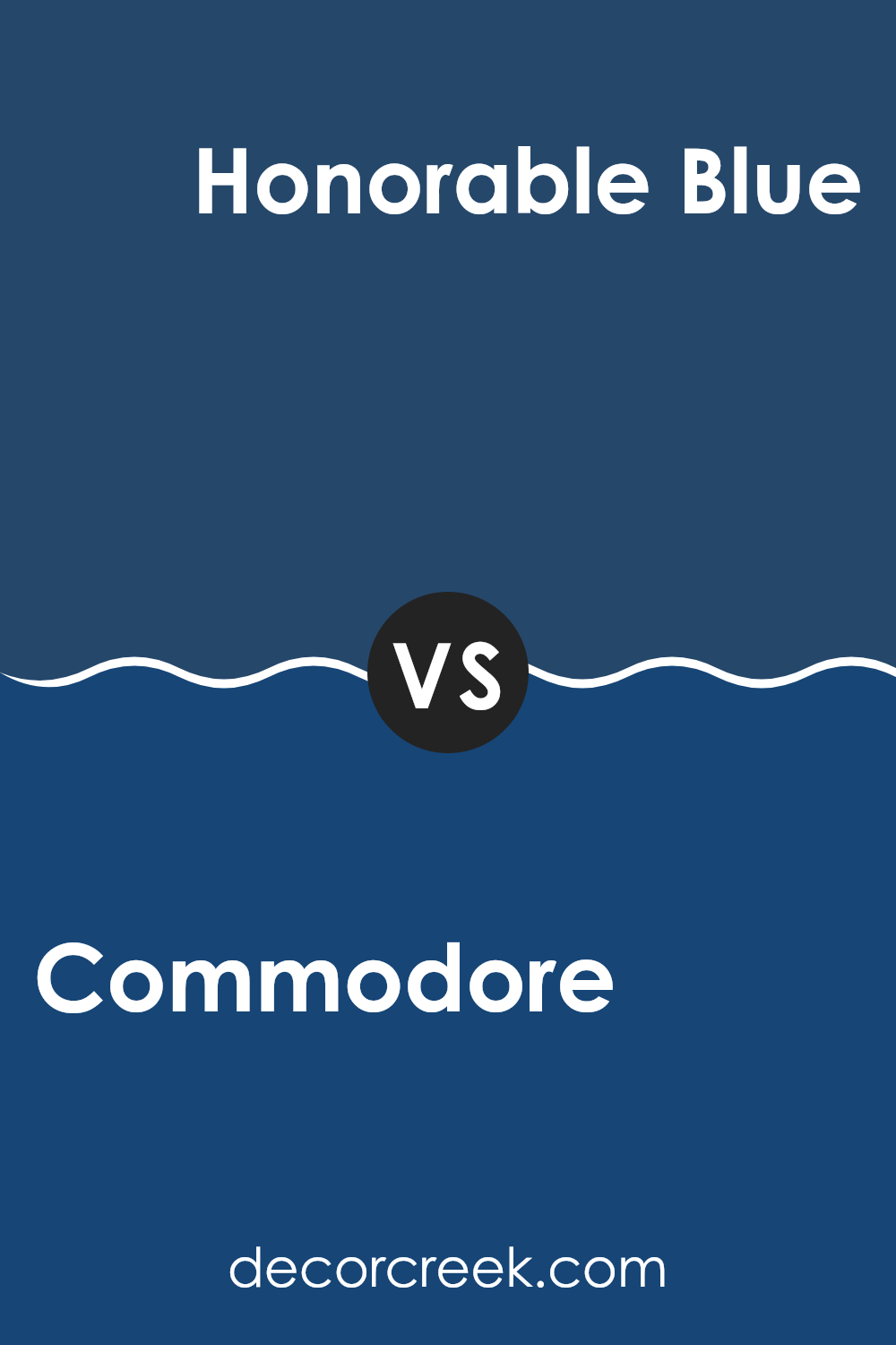
Commodore SW 6524 by Sherwin Williams vs Honorable Blue SW 6811 by Sherwin Williams
Commodore SW 6524 by Sherwin Williams is a deep navy blue that carries a strong presence due to its richness and depth. It has a subdued quality that makes it flexible for various areas, allowing it to create a cozy, inviting atmosphere.
In contrast, Honorable Blue SW 6811 is a vibrant, bold shade of blue that’s brighter and more energetic. This color stands out more and can energize a room, making it feel more lively and dynamic.
Both colors bring their own unique qualities to an area, with Commodore lending a more understated and calm feel, while Honorable Blue adds a pop of cheer and brightness. They’re excellent choices depending on whether you want a room that feels more grounded or one that feels lively and spirited.
You can see recommended paint color below:
- SW 6811 Honorable Blue
Commodore SW 6524 by Sherwin Williams vs Indigo SW 6531 by Sherwin Williams
The main color, Commodore, and the second color, Indigo, are both shades offered by Sherwin Williams and belong to the blue color family. Commodore is a deeper blue with a strong presence, giving off a rich and bold vibe that can make any area feel more defined and strong.
On the other hand, Indigo is a slightly lighter shade of blue. Though still within the darker spectrum, it offers a bit more brightness compared to Commodore, adding a subtle vibrancy to a room.
Both colors can be used to create a striking impact in an interior, whether used as a primary color on walls or as accents in decor. Commodore might be favored for a more dramatic and commanding look, while Indigo could be a choice for those looking for depth with a hint of lightness. Both provide a fresh, modern feel and are flexible enough to be paired with various decor styles and colors.
You can see recommended paint color below:
Commodore SW 6524 by Sherwin Williams vs Dignity Blue SW 6804 by Sherwin Williams
Commodore by Sherwin Williams is a deep, almost navy blue with hints of gray. It presents a subdued yet strong presence, ideal for areas designed to foster focus and stability. Its muted tone makes it flexible for both modern and traditional settings, equally fitting as a main wall color or as an accent.
Dignity Blue, on the other hand, is a brighter and more vibrant shade of blue. It leans slightly towards a teal, giving it a fresher, more energetic feel. This color works well in areas where you want to add a pop of color without making the area feel too much. It is also great for stimulating more dynamic, lively interactions in a room.
While both colors share a blue base, Commodore has a more reserved, grounded feel, whereas Dignity Blue offers a livelier and lighter atmosphere. This makes each suitable for different purposes within home or office decors, depending on the mood you want to set.
You can see recommended paint color below:
- SW 6804 Dignity Blue
Commodore SW 6524 by Sherwin Williams vs Dignified SW 6538 by Sherwin Williams
The main color, Commodore, is a deep shade of blue that seems to add a strong, vibrant touch to any area. Contrastingly, Dignified is a rich purple hue, offering a bold yet understated elegance to interiors.
While both shades are quite bold and can make a statement, Commodore tends to bring a cooler, maritime feel, perfect for a modern or nautical-themed room. On the other hand, Dignified provides a sense of regal warmth, making it ideal for areas intended to feel cozy yet dignified.
When placed in a room, Commodore might be more rejuvenating with its refreshing blue tones, whereas Dignified, with its purple undertones, offers a grounding, comforting environment. Both colors are potent and can define an area, but the choice between them would depend on the atmosphere you’re aiming to create—Commodore is crisper and livelier, while Dignified is warmer and more reserved.
You can see recommended paint color below:
- SW 6538 Dignified

Commodore SW 6524 by Sherwin Williams vs Blue Grotto SW 2941 by Sherwin Williams
Commodore SW 6524 by Sherwin Williams is a deep blue hue with a hint of gray that gives it a subtle, muted appearance. This color is great for areas that need a strong color presence without making the area feel too much. It works well in living rooms or bedrooms, providing a calm and stable atmosphere.
On the other hand, Blue Grotto SW 2941 by Sherwin Williams is a brighter and more vibrant blue. It has a fresh and energetic feel, making it ideal for areas where you want to add a pop of color or invigorate the room. Kitchens and bathrooms are perfect places for Blue Grotto, as it brings a lively and cheerful vibe to the area.
In comparison, Commodore is darker and more restrained, suitable for creating a more grounded feel. Blue Grotto is lighter and more vibrant, suitable for more lively and playful environments. Depending on the mood or tone you want to set, each color offers unique advantages.
You can see recommended paint color below:
- SW 2941 Blue Grotto
Commodore SW 6524 by Sherwin Williams vs Frank Blue SW 6967 by Sherwin Williams
Commodore and Frank Blue are both vibrant shades offered by Sherwin Williams, but they bring quite different vibes to an area. Commodore is a deep, intense blue with a hint of purple. This shade is perfect for adding a bold and rich feel to any room, making it a popular choice for accent walls or creative areas. It has a certain richness that can make a room feel cozy yet prominent.
On the other hand, Frank Blue is a brighter, more playful blue. It’s lighter than Commodore and has a more energetic feel. This color is excellent for areas that need a lively boost, such as kitchens, children’s rooms, or any place that benefits from a splash of cheerful color. Frank Blue radiates a more open and airy feel, which can help in making smaller areas appear bigger and more inviting.
Both colors are strong in their own right but cater to different aesthetic preferences and functional uses within interior areas.
You can see recommended paint color below:
- SW 6967 Frank Blue

Commodore SW 6524 by Sherwin Williams vs Dress Blues SW 9176 by Sherwin Williams
Commodore SW 6524 and Dress Blues SW 9176 by Sherwin Williams are both distinctive shades of blue but with noticeable differences in their depth and mood. Commodore is a deeper, more intense blue, creating a strong, prominent impression in any area. This color is darker and might be seen as more dramatic, making it a great choice for a feature wall or in rooms that benefit from a robust, bold ambiance.
On the other hand, Dress Blues is a slightly richer, navy blue that carries an air of classic tradition while maintaining a modern feel. It’s less intense than Commodore, which gives it a flexible quality, making it suitable for various settings, from cozy, casual areas to more formal environments.
These hues would work well together in a complementary scheme or on their own, depending on the aesthetic you’re trying to achieve. While Commodore asserts itself with vigor, Dress Blues offers a soothing, yet equally elegant option. Both bring their unique character to interiors, widely used by those looking to make a statement with their decor.
You can see recommended paint color below:
- SW 9176 Dress Blues
Commodore SW 6524 by Sherwin Williams vs Salty Dog SW 9177 by Sherwin Williams
Commodore SW 6524 is a unique bluish-gray color that delivers a muted, subtle vibe to any area. It’s a flexible shade that works well in either a lively family room or a peaceful personal area like a bedroom, setting a relaxed backdrop that doesn’t make the senses feel too much. This color pairs beautifully with lighter shades, providing a soothing contrast without being too stark.
On the other hand, Salty Dog SW 9177 is a much bolder, deep blue that makes a strong statement. It’s an ideal choice if you want to add personality and a hint of drama to an area. This vibrant blue can make white trims and decor pop, giving rooms a fresh, modern feel. Though it’s vibrant, it still maintains a warm, inviting tone which is perfect for lively areas like living rooms or dining areas.
Together, these two colors offer options for different moods and settings, with Commodore providing a softer, more understated look and Salty Dog delivering a striking, impactful presence.
You can see recommended paint color below:

Commodore SW 6524 by Sherwin Williams vs Blueblood SW 6966 by Sherwin Williams
Commodore SW 6524 and Blueblood SW 6966 by Sherwin Williams are two distinct shades that bring their unique flair to areas. Commodore is a muted, soft blue with a whisper of gray, making it flexible and subdued. This color works well in areas where you want a calm, subtle backdrop that easily pairs with various decor elements without making them feel too much.
On the other hand, Blueblood is a bold, deep blue that instantly makes a statement. This color has a regal quality to it, perfect for creating a strong focal point in a room. It’s great for accent walls or decor pieces where you want to add a splash of confidence and drama.
While both colors share a blue base, Commodore is lighter and more understated, offering a gentle hint of color. Blueblood is the more dramatic choice, with its rich saturation that can define an area’s character all on its own. Whether you prefer the understated elegance of Commodore or the striking presence of Blueblood, both shades offer unique possibilities for personalizing your area.
You can see recommended paint color below:
- SW 6966 Blueblood
In wrapping up my thoughts on SW 6524 Commodore by Sherwin Williams, I have to say, I’m pretty impressed. It’s a strong and bold blue color that makes any room feel cozy and important. This paint isn’t just any normal blue; it’s like the deep blue of the ocean that you see on a really clear day. It brings a sense of calmness to a room without making it feel too cold or too formal.
What’s great about Commodore is how it adds a nice pop of color without being too loud or flashy. It works really well in a bedroom or a study, where you want to focus or relax. After giving it a try in my own home, I found that it pairs really nicely with light colors like whites or grays, which help to balance out its depth.
Overall, if you’re thinking of adding a new character to your room with color, Commodore is definitely worth considering. It’s not just a paint; it’s a way to make your room stand out with style and comfort.
Whether you’re looking to make an area where you can think and relax, or just give your room a fresh new look, this color will do the trick. Trust me, it makes a difference!
Ever wished paint sampling was as easy as sticking a sticker? Guess what? Now it is! Discover Samplize's unique Peel & Stick samples.
Get paint samples

