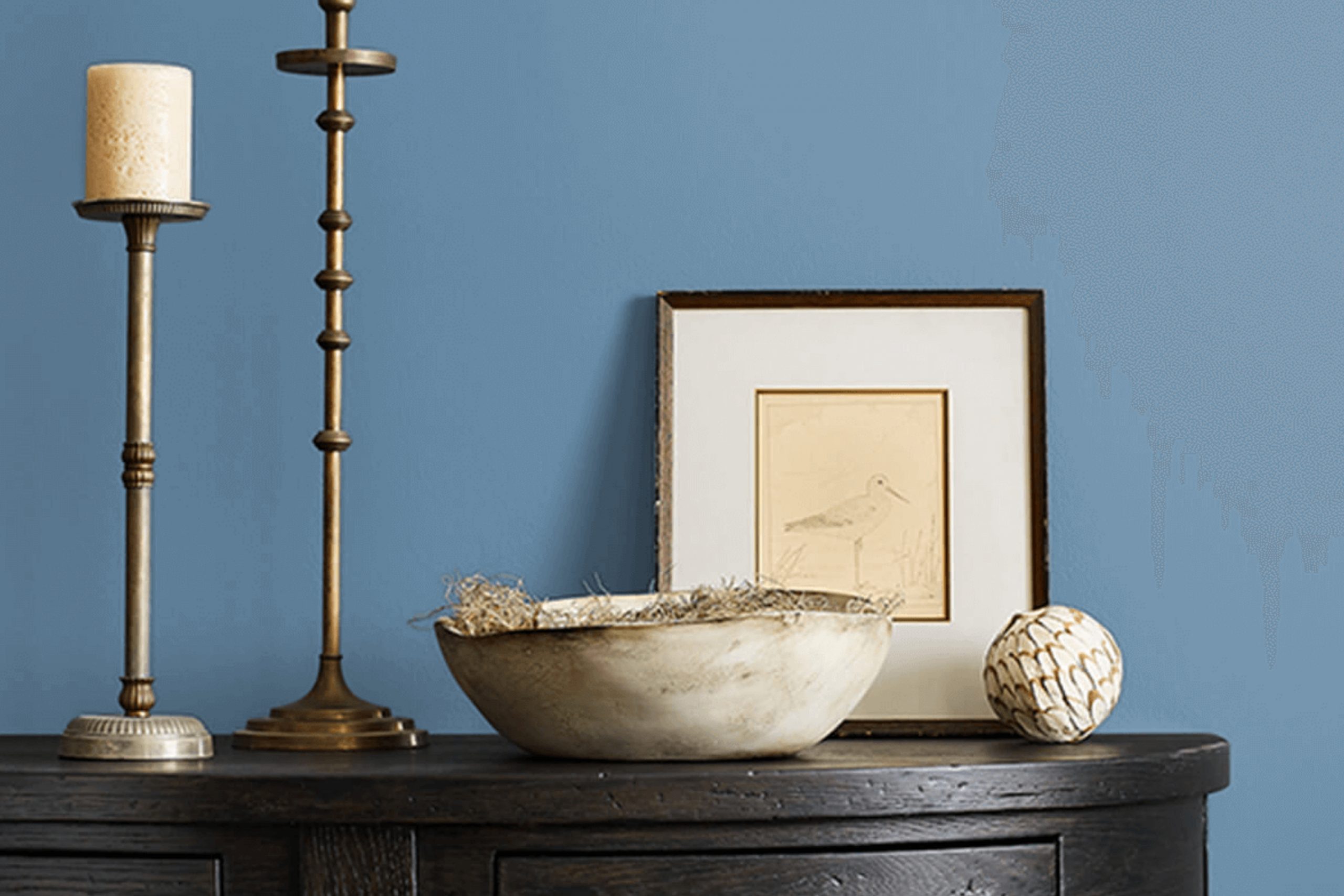
If you’re on the hunt for a vibrant yet calming shade of blue, let me tell you about SW 6522 Sporty Blue from Sherwin Williams. My journey with this paint color started when I decided to refresh my home office. I wanted a color that kept me energized yet didn’t overwhelm room, a delicate balance to achieve!
Sporty Blue struck that perfect chord between lively and soothing. The color itself has a dynamic charm—a bright, cheerful blue with undertones that subtly shift with the light, keeping the room feeling fresh all day. It pairs beautifully with white trims, bringing out a crisp, clean look that enhances focus and creativity.
Whether you’re looking to revamp a small corner or an entire room, Sporty Blue might be the hue that lifts your room and your spirits. It certainly did for mine. Now, my office is not just a place of work; it feels more like a retreat, where I’m calmer, more focused, and genuinely happier.
What Color Is Sporty Blue SW 6522 by Sherwin Williams?
Sporty Blue SW 6522 by Sherwin Williams is a vibrant and lively shade of blue that adds a fresh pop of color to any room. This particular blue has a playful yet grounded essence, making it suitable for various interior designs, particularly in settings that aim for a cheerful and inviting atmosphere. Its dynamic tone works wonderfully in children’s rooms, creative rooms, or coastal-inspired interiors.
When it comes to coordinating materials and textures, Sporty Blue pairs beautifully with natural wood finishes which help to balance its brightness with their warm tones. This combination promotes a relaxed, beachy vibe, especially when matched with light oak or pine.
Incorporating fabrics like cotton or linen in neutral shades such as white, beige, or light gray can also complement this blue, creating a soft, airy feel in the room. Moreover, metallic accents in silver or brushed nickel can enhance this color by adding a hint of sleekness and modernity to the décor.
These elements work exceptionally well in kitchen or bathroom areas where Sporty Blue can be used on cabinets or accent walls for a striking impact. Ultimately, this shade is flexible and can be adapted to various styles ranging from modern minimalist to rustic coastal, depending on the accompanying design elements chosen.
Is Sporty Blue SW 6522 by Sherwin Williams Warm or Cool color?
Sporty Blue by Sherwin Williams is a vibrant and lively shade that adds a fun splash of color to any room. Its bright and cheerful hue makes it perfect for areas where you want to inject some energy and personality. When used in a home, this particular blue can make walls or accent areas stand out, providing a cool contrast to neutral tones like whites or grays.
It’s especially suitable for children’s rooms or play areas, as its vividness stimulates creativity and playfulness. Also, it works well in bathrooms or kitchens where a clean, fresh look is desired. For those looking to add a modern twist to their home, combining this blue with metallic finishes or sleek furniture pieces creates a fresh and trendy vibe.
Ultimately, Sporty Blue brings a refreshing and dynamic atmosphere to any room, making it feel more vibrant and inviting. Whether used as an accent or a primary theme, it helps to enhance the overall aesthetic of a home.
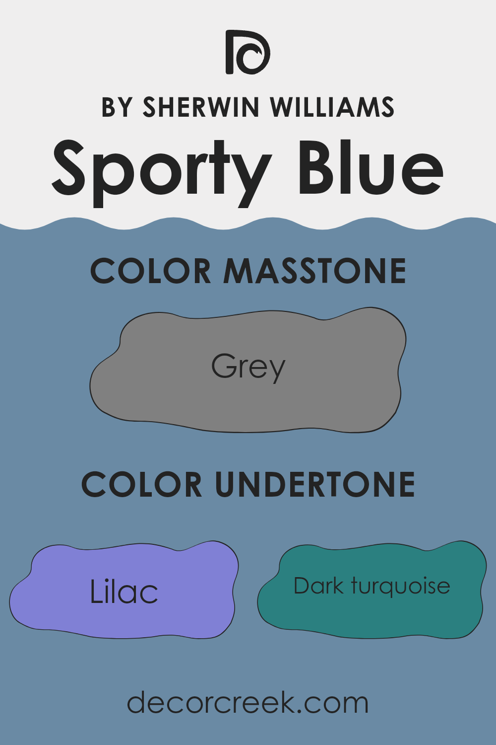
Undertones of Sporty Blue SW 6522 by Sherwin Williams
Sporty Blue has a dynamic mix of undertones that create a lively yet harmonious look on interior walls. These undertones include shades like lilac, dark turquoise, blue, and light turquoise, all of which contribute to the perception of the color as vibrant and fresh. For example, the lilac undertone brings a subtle hint of purple to the blue, making it feel warmer and more adaptable to different lighting conditions and furnishings.
When applied on walls, the combination of its undertones like mint, light blue, and light turquoise evoke a sense of refreshing calmness, but without making the room feel cold. Instead, these cooler undertones balance out with warmer shades like pale pink and light purple, ensuring the color stays balanced and flexible.
These various undertones contribute differently under various lighting conditions. For instance, in a room with abundant natural light, the light blue and mint undertones might become more dominant, giving the walls a brighter look. Conversely, in dimmer, artificial light, darker undertones like navy and dark blue might be more noticeable, offering a richer depth to the color.
In decorating, this mix of undertones in Sporty Blue allows it to work well with a wide range of color palettes, whether pairing with soft neutrals or contrasting with vibrant hues. It creates a lively backdrop that complements both modern and traditional interiors, making it a flexible choice for anyone looking to refresh their room.
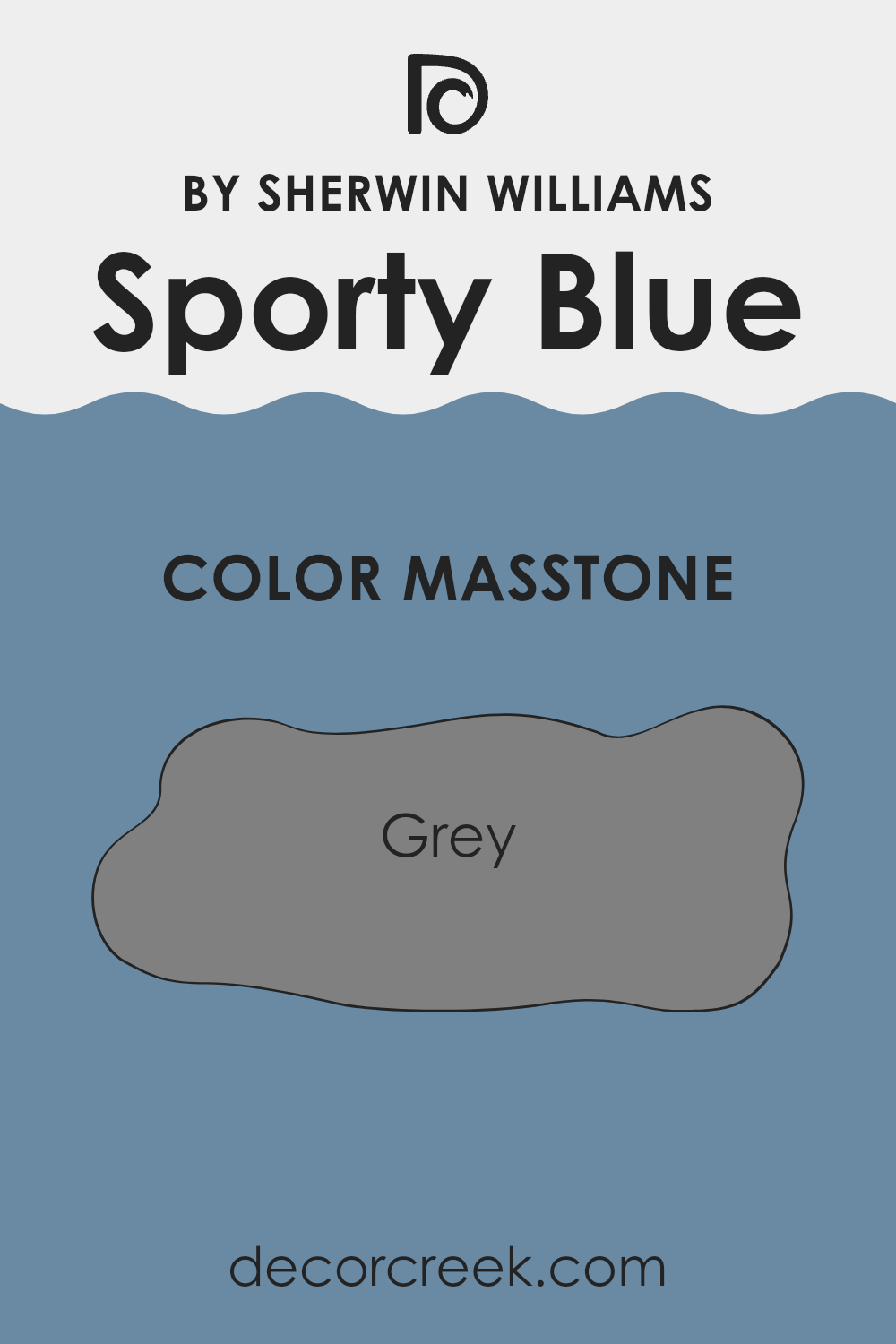
What is the Masstone of the Sporty Blue SW 6522 by Sherwin Williams?
Sporty Blue SW 6522 by Sherwin Williams, with a masstone of grey (#808080), creates a calming and balanced ambiance in any room. The grey underlying tone makes this blue flexible and practical for home decoration, fitting well in various settings like living rooms, bedrooms, or kitchens.
Being neither too bright nor too subdued, it provides a neat, neutral backdrop that complements a wide range of decor styles and color palettes. This particular shade is excellent for areas where you want a touch of color without overpowering the senses.
It pairs beautifully with white trim for a crisp look or warmer wooden tones for a cozy feel. Its grey foundation means it can adapt to both modern and traditional designs, making it a reliable choice for homeowners wanting to refresh their rooms without going too bold or drifting into too stark a scheme. Grey, as the base tone, ensures the color maintains a subtle, refined presence, perfect for creating a stylish, yet understated environment.
How Does Lighting Affect Sporty Blue SW 6522 by Sherwin Williams?
Lighting plays a crucial role in how colors appear in any room. The type of light, whether natural or artificial, can make a significant difference in the way colors are perceived. The color Sporty Blue by Sherwin Williams is a clear example of how light affects color perception.
In artificial light, Sporty Blue tends to appear slightly darker than it does in natural light. The truth behind this shift is that artificial lights, depending on their type (like LED, fluorescent, or incandescent), can enhance different tones in the paint. For instance, under warm incandescent lights, Sporty Blue might seem softer and less vibrant, while LED lights with a cooler tone can make it look more vibrant.
Under natural light, however, the appearance of Sporty Blue can vary greatly throughout the day. Morning light, which is generally softer and more golden, can make Sporty Blue look bright and fresh. As the day progresses and light becomes more intense, the color may appear more vivid and dynamic.
The orientation of the room also influences how Sporty Blue looks:
1. North-faced rooms: These rooms receive less direct sunlight, which can make Sporty Blue appear more muted and shadowy. The cool, indirect light can sometimes give the paint a more somber tone.
2. South-faced rooms: These rooms enjoy ample sunlight most of the day, which can make Sporty Blue look lively and true to its swatch. The brightness can really make the color pop, showing off its full vibrancy.
3. East-faced rooms: Morning light coming from the east can make Sporty Blue look very bright and welcoming in the morning, but it might turn into a cooler, more subdued shade as the day goes on when the direct sunlight moves away.
4. West-faced rooms: Conversely, in west-facing rooms, the color will have a more muted tone in the morning, but it can appear vivid and dramatic in the late afternoon and evening as it catches the warm evening light.
Overall, understanding the effects of lighting and room orientation is key to achieving the desired impact of colors like Sporty Blue in interior rooms.
What is the LRV of Sporty Blue SW 6522 by Sherwin Williams?
LRV stands for Light Reflectance Value, a measure that tells how much light a color reflects back into the room compared to how much it absorbs. The scale used for LRV goes from the darkest possible, which is 0, reflecting no light, to the brightest at 100, which reflects all light. This value is particularly useful when choosing paint colors because it helps predict how light or dark a color will appear once it’s on your walls.
Higher LRVs make a room feel more open and brighter because they reflect more light around the room. Conversely, lower LRV colors tend to absorb more light, making a room feel smaller or cozier. The LRV for the color Sporty Blue is 23.92, which means it is on the darker side of the scale. As a result, it doesn’t reflect much light, absorbing more instead.
This characteristic can drastically affect the mood and perceived size of a room. In rooms with plenty of natural light, this color might appear more vibrant, but in darker rooms, it can seem almost navy, potentially making the room feel smaller and more enclosed.
This LRV value suggests that if your goal is to create a vibrant or cozy effect in a well-lit area, this color could be a good fit, but care should be taken in small or poorly-lit areas as it can make the area seem more confined.

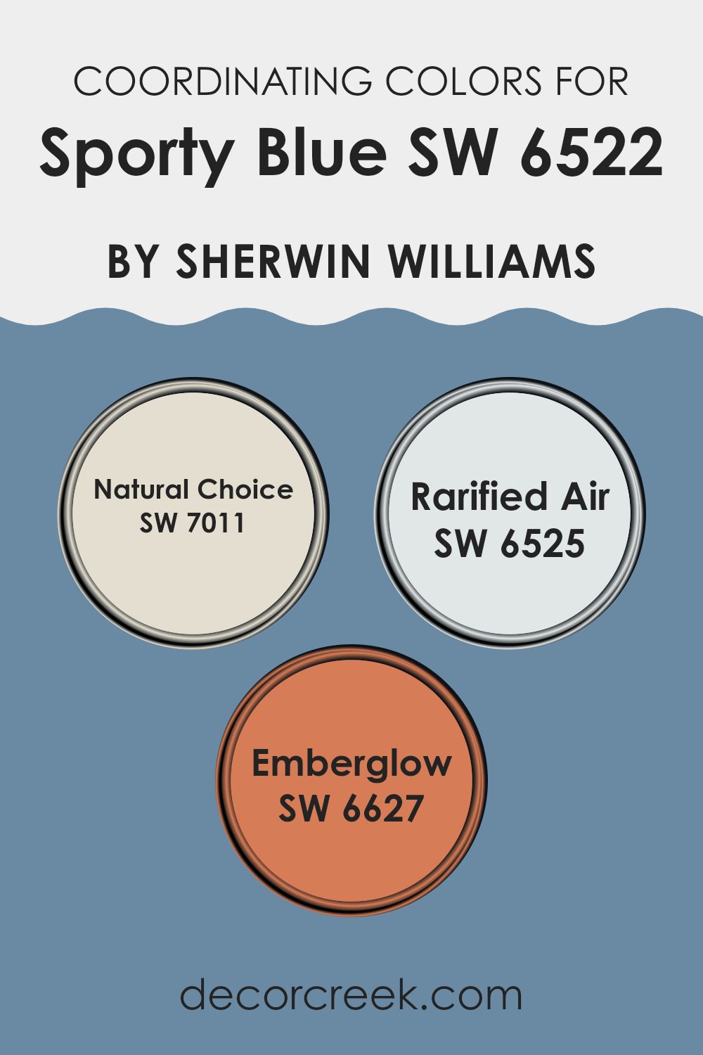
Coordinating Colors of Sporty Blue SW 6522 by Sherwin Williams
Coordinating colors are selected hues that work well together to enhance the overall aesthetic of a room, creating a visually pleasing color scheme. Often, these coordinating colors complement a primary color by providing balanced contrasts or harmonious shades that either soften or enrich the overall look. For example, when dealing with a vibrant primary color, like a bold blue, you might choose subtler shades or vibrant opposites from the color wheel to create a cohesive look.
Sporty Blue SW 6522 by Sherwin Williams can be paired effectively with colors like Natural Choice, Rarified Air, and Emberglow. Natural Choice is a soft and light grayish tone that brings a calm and neutral backdrop to the more vivid Sporty Blue, allowing it to stand out without overpowering the senses.
On the other hand, Rarified Air provides a lighter, airy feel, its faint bluish tint subtly reinforcing the cooler spectrum while maintaining a fresh look. Lastly, Emberglow, with its warm, welcoming orange hue, offers a striking contrast to Sporty Blue, injecting warmth and energy into areas that might otherwise lean too cool, creating a striking balance that enlivens any room. These coordinated colors work together to create flexible palettes that can adapt to different moods and settings, whether seeking calmness or vibrancy.
You can see recommended paint colors below:
- SW 7011 Natural Choice
- SW 6525 Rarified Air
- SW 6627 Emberglow
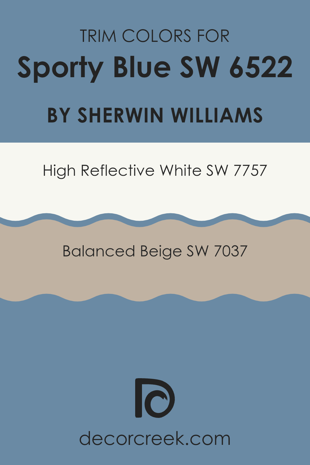
What are the Trim colors of Sporty Blue SW 6522 by Sherwin Williams?
Trim colors are essentially the accent colors used on the interior or exterior of structures to highlight the architectural features or frame different sections like doorways, windows, and baseboards. Using the right trim colors can greatly enhance the overall appearance of a room or building’s façade, by adding contrast or coherence to the main color palette.
For example, with a vibrant main color like Sporty Blue by Sherwin Williams, selecting appropriate trim colors is crucial to create a visually appealing design. High Reflective White (SW 7757) is a very bright, pure white that is excellent for making other colors stand out more distinctly.
It’s particularly useful as a trim color because it provides a crisp border that can make the strong hues of Sporty Blue pop, giving the walls a clean, defined look. Balanced Beige (SW 7037), on the other hand, is a subtle and warm beige tone that offers a softer contrast to Sporty Blue. This color works well to soften the intensity of brighter colors, providing a soothing and cohesive transition between the bolder sections of a room and its neutral elements.
You can see recommended paint colors below:
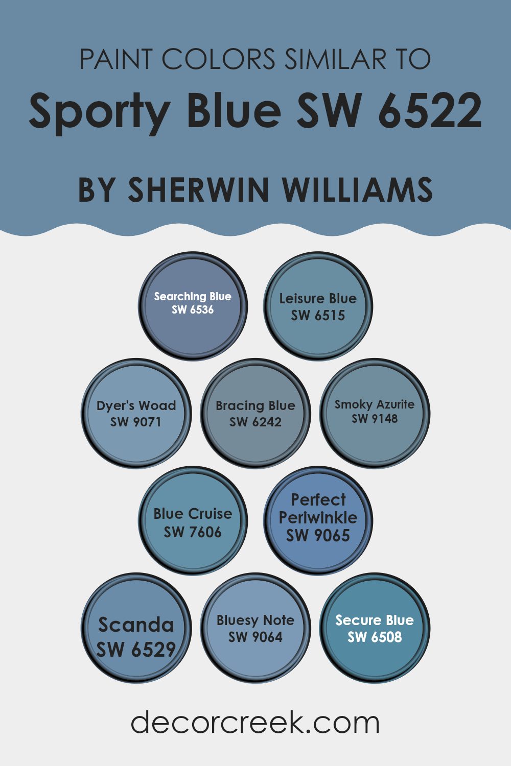
Colors Similar to Sporty Blue SW 6522 by Sherwin Williams
Similar colors, such as those related to Sporty Blue by Sherwin Williams, are crucial for creating a harmonious color scheme in any room. They work together by balancing the visual experience, making the environment more cohesive and pleasant to the eye. For instance, Searching Blue is a bold, vivid blue that brings a strong character to the walls, while Leisure Blue offers a more relaxed, softer hue that is perfect for a calming bedroom or bathroom setting.
Dyer’s Woad provides an earthy undertone, excellent for adding a grounded, mature feel to areas. Bracing Blue is slightly brighter, giving a fresh, lively kick to any area it adorns. Smoky Azurite has a hint of gray, making it ideal for those looking for a more muted but still poignant blue. Blue Cruise draws from the lighter end of the spectrum, providing a breezy, light-hearted ambiance.
Perfect Periwinkle combines the gentle qualities of blue and purple, creating a unique feel that’s both friendly and inspiring. Scanda touches on the Scandinavian style, light and airy with a soft charm. Bluesy Note dips slightly darker, lending a dramatic flair without overpowering, and Secure Blue, the deepest of the group, anchors the room in strength and depth. All these shades maintain aesthetic coherence while allowing for individual expression and style within the theme of blue.
You can see recommended paint colors below:
- SW 6536 Searching Blue
- SW 6515 Leisure Blue
- SW 9071 Dyer’s Woad
- SW 6242 Bracing Blue
- SW 9148 Smoky Azurite
- SW 7606 Blue Cruise
- SW 9065 Perfect Periwinkle
- SW 6529 Scanda
- SW 9064 Bluesy Note
- SW 6508 Secure Blue
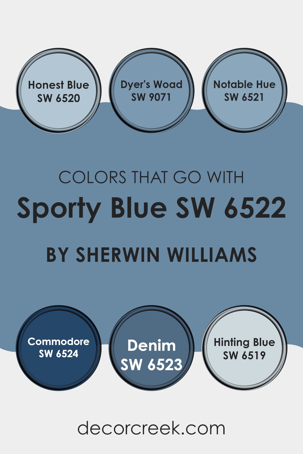
Colors that Go With Sporty Blue SW 6522 by Sherwin Williams
Choosing the right colors to pair with Sporty Blue SW 6522 by Sherwin Williams is essential for creating a harmonious and visually appealing room. The selected colors should complement or contrast Sporty Blue effectively, enhancing the overall aesthetic of the room.
For instance, Honest Blue SW 6520 offers a lighter, softer shade that can lighten the appearance of a room while maintaining a harmonious blue palette. Alternatively, Dyer’s Woad SW 9071 provides a deeper, slightly muted blue tone that adds depth and interest when used alongside Sporty Blue.
Similarly, Notable Hue SW 6521 adds a touch of uniqueness with its rich blue shade, offering an eye-catching element without overpowering the primary color. Commodore SW 6524, a darker and more intense blue, works well in creating a focal point or accentuating areas of a room. Denim SW 6523, reminiscent of the classic fabric, provides a comfortable, familiar feel that complements Sporty Blue beautifully.
Lastly, Hinting Blue SW 6519 is a very light blue with a hint of gray, perfect for softening the overall look and feel of the room, making it ideal for more relaxed settings. Together, these colors form a coherent palette that enhances the atmosphere of any room featuring Sporty Blue.
You can see recommended paint colors below:
- SW 6520 Honest Blue
- SW 9071 Dyer’s Woad
- SW 6521 Notable Hue
- SW 6524 Commodore
- SW 6523 Denim
- SW 6519 Hinting Blue
How to Use Sporty Blue SW 6522 by Sherwin Williams In Your Home?
Sporty Blue SW 6522 by Sherwin Williams is a vibrant and cheerful shade of blue that can really brighten up a room in your home. This shade is perfect if you’re looking to add a splash of color to any room without it being overpoweringly bold. It works great in a kid’s bedroom or play area because the lively color can stimulate energy and creativity.
You can also use it in a home office or study corner to create a refreshing backdrop that keeps you alert and focused. If you prefer a more balanced look, combine it with neutral colors like white or gray, which will let Sporty Blue stand out without dominating the room.
For those who enjoy DIY projects, consider using this color to paint a piece of furniture such as a bookshelf or a chair for a fun and personalized touch in any room. This flexible blue is easy to work with and can help refresh any area of your home.
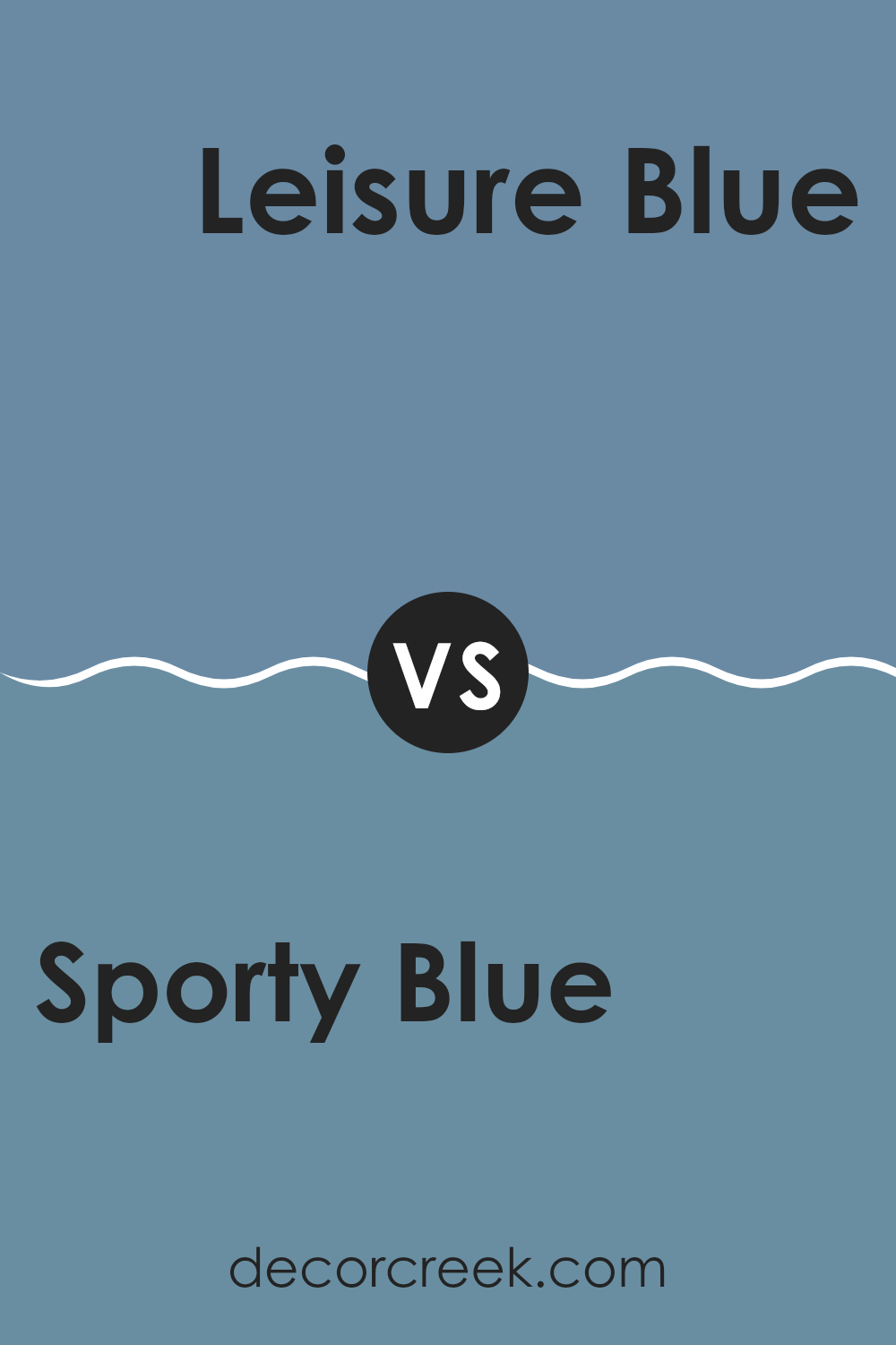
Sporty Blue SW 6522 by Sherwin Williams vs Leisure Blue SW 6515 by Sherwin Williams
Sporty Blue and Leisure Blue are two distinct colors produced by Sherwin Williams. Sporty Blue is a vibrant shade that brings a lively and energetic feel to areas. It’s a great option for anyone looking to add a bold and dynamic touch to their room.
On the other hand, Leisure Blue offers a softer, more subdued look. It has a calming effect, making it perfect for areas where you want to relax, like a bedroom or bathroom.
Both colors are flexible and can enhance different types of décor, but Sporty Blue tends to stand out more due to its brighter tone, whereas Leisure Blue lends a gentler, more laid-back vibe. Depending on the atmosphere you wish to create, either color could be an excellent choice for your next painting project.
You can see recommended paint color below:
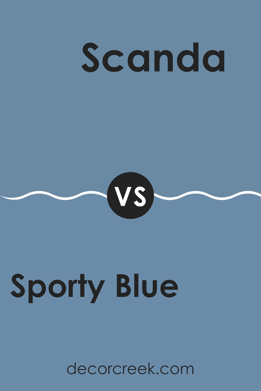
Sporty Blue SW 6522 by Sherwin Williams vs Scanda SW 6529 by Sherwin Williams
Sporty Blue and Scanda, both by Sherwin Williams, offer distinct tones that can significantly affect the mood and style of a room. Sporty Blue is a vibrant, lively shade that leans towards a classic blue with a playful yet bold nature.
It’s ideal for creating a cheerful and energetic atmosphere in rooms like playrooms or creative rooms. On the other hand, Scanda falls into a softer, subdued category, presenting a light aqua hue that is much more muted than Sporty Blue.
Scanda is excellent for areas where a calm and gentle vibe is desired, such as bathrooms or bedrooms, where the softer color helps in setting a relaxed mood. Both colors, while blue, bring their unique character to interiors, with Sporty Blue being more energetic and Scanda offering a gentler touch.
You can see recommended paint color below:
- SW 6529 Scanda
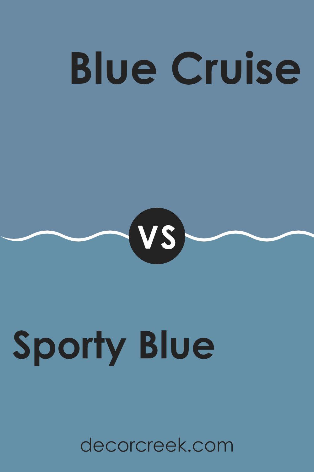
Sporty Blue SW 6522 by Sherwin Williams vs Blue Cruise SW 7606 by Sherwin Williams
Sporty Blue and Blue Cruise by Sherwin Williams are both shades of blue, but they have distinct tones and vibes. Sporty Blue is lighter and has a cheerful, energetic quality. It’s perfect for areas like a playroom or a casual kitchen where you want a burst of brightness.
On the other hand, Blue Cruise is darker and leans towards a more classic navy blue. This makes it a great choice for formal areas or rooms where you want to create a more grounded, traditional feel.
While Sporty Blue opens up a room with its vibrancy and can make areas feel more lively, Blue Cruise offers depth and a sense of calm which can help in making a room feel more secure and cozy. Overall, the choice between them depends on the atmosphere you want to set for the room.
You can see recommended paint color below:
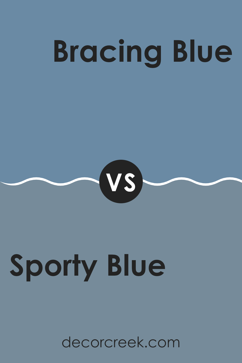
Sporty Blue SW 6522 by Sherwin Williams vs Bracing Blue SW 6242 by Sherwin Williams
The main color, Sporty Blue, is a vibrant, lively shade that brings a fresh and energetic feel to any room. It’s relatively lighter and has a youthful vibe that is perfect for creating a cheerful and inviting atmosphere.
On the other hand, Bracing Blue is a bit darker and offers a more subdued and calm appearance. This color is great for areas where you want to establish a sense of steadiness and mild relaxation without going too bold. Sporty Blue works well in areas like playrooms or casual living areas where energy and playfulness are desired.
Bracing Blue, being less intense, is better suited for areas like bedrooms or offices where a quieter and more focused environment is beneficial. Both shades reflect different moods and can beautifully complement each other when used in the same home, depending on the function and feel you want each room to convey.
You can see recommended paint color below:
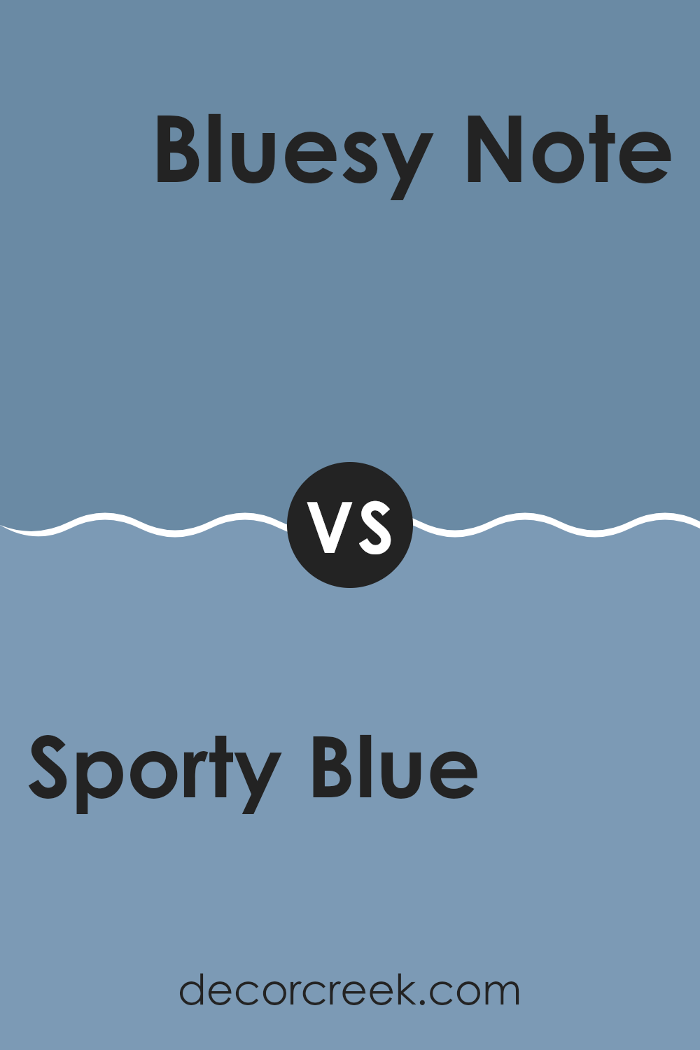
Sporty Blue SW 6522 by Sherwin Williams vs Bluesy Note SW 9064 by Sherwin Williams
Sporty Blue and Bluesy Note by Sherwin Williams both offer distinctive shades of blue, each creating a different mood. Sporty Blue is a vibrant and lively color that could brighten up any room and make it more cheerful.
It’s perfect for a room where a lot of energy and brightness is desired, like a playroom or a creative studio. On the other hand, Bluesy Note presents a darker, more subdued hue. This color might be ideal for creating a calm and focused atmosphere suitable for a bedroom or a study where softer, more muted tones can help in relaxation or concentration.
The lighter Sporty Blue brings a sense of light and room, while the deeper Bluesy Note adds depth and a hint of mystery to interiors. Each color offers its unique take on the flexible and classic blue, allowing for varied interior styling that can either energize or soothe the environments they are applied in.
You can see recommended paint color below:
- SW 9064 Bluesy Note
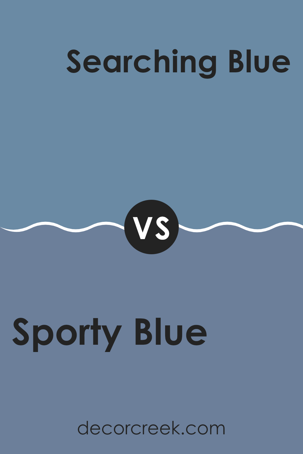
Sporty Blue SW 6522 by Sherwin Williams vs Searching Blue SW 6536 by Sherwin Williams
Sporty Blue and Searching Blue, both by Sherwin Williams, each have a unique vibe. Sporty Blue is a lively and bright shade that feels refreshing and energetic. This makes it a great pick for areas like a home gym or a kid’s playroom where you want a burst of energy.
On the other hand, Searching Blue is darker and more subdued. It has a calming effect, ideal for areas where you want to relax such as a bedroom or a cozy reading nook.
Additionally, while Sporty Blue has a more straightforward, vibrant feel to it, Searching Blue offers a bit of mystery due to its depth, which can add a layer of interest to a room. Both colors are flexible but serve different purposes based on the mood you want to set.
You can see recommended paint color below:
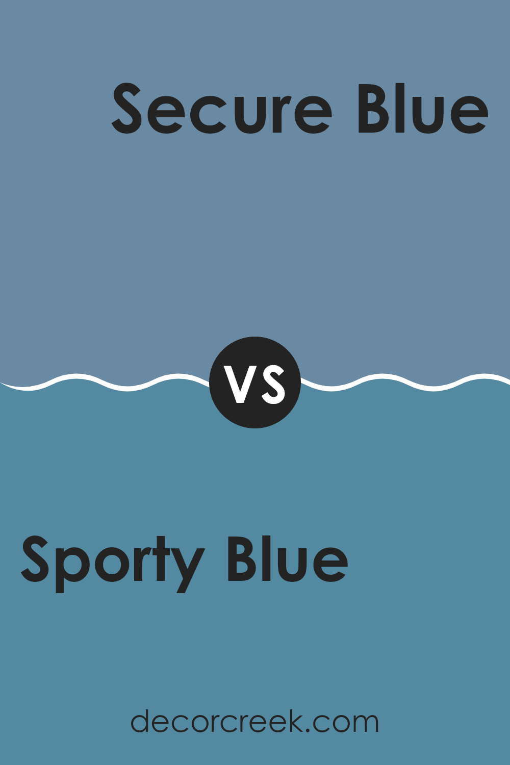
Sporty Blue SW 6522 by Sherwin Williams vs Secure Blue SW 6508 by Sherwin Williams
Sporty Blue and Secure Blue, both by Sherwin Williams, offer distinct tones that could change the mood of any room. Sporty Blue has a lively vibe with a lighter, more vibrant appearance. This color might remind you of a clear sky on a sunny day, making it great for areas where you want an energetic and cheerful atmosphere.
On the other hand, Secure Blue presents a deeper, more reserved shade. This darker blue has a calming effect, ideal for areas where you want to promote focus and peace, like a study room or bedroom. It resembles the deep ocean, providing a sense of stability and depth.
In terms of application, Sporty Blue is perfect for brightening up rooms and adding a splash of cheerfulness, while Secure Blue works well in creating a grounded, soothing environment. Both colors offer unique attributes, making them suitable for different preferences and room functions.
You can see recommended paint color below:
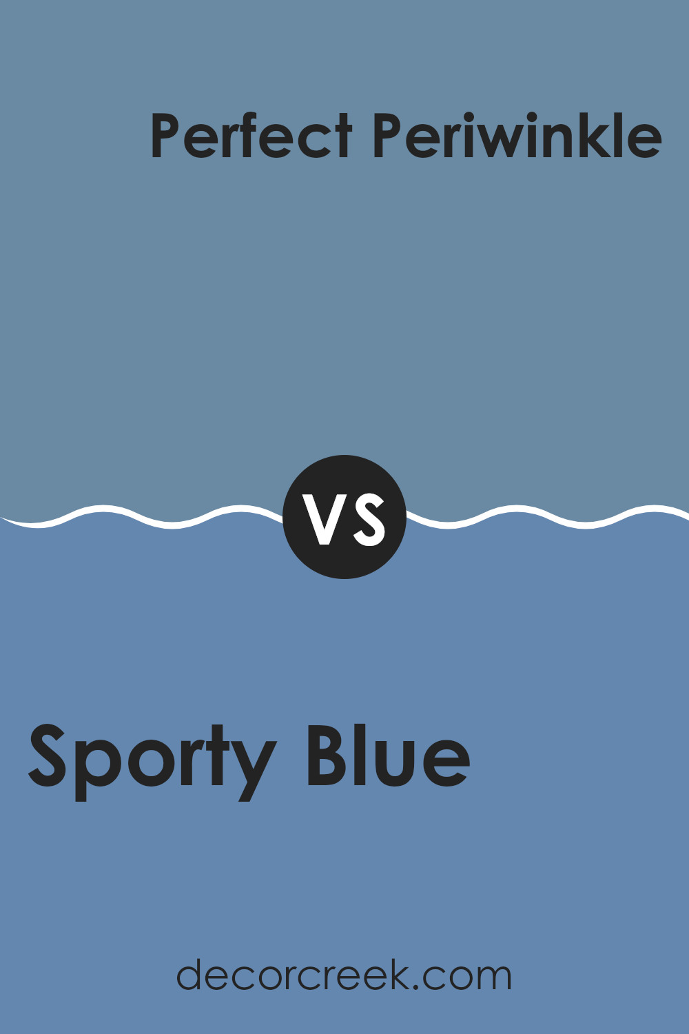
Sporty Blue SW 6522 by Sherwin Williams vs Perfect Periwinkle SW 9065 by Sherwin Williams
Sporty Blue and Perfect Periwinkle, both by Sherwin Williams, are distinct shades that can change the feel of a room. Sporty Blue is a vibrant color that leans towards a bright, refreshing ocean blue. It brings a lively, playful touch that can add some brightness to a room, making it great for energetic rooms or kids’ rooms.
On the other hand, Perfect Periwinkle has a softer, more muted quality, with a blend of blue and lavender that gives a gentle and calming feel. This color works well in places where you want to encourage relaxation and comfort, like bedrooms or bathrooms.
In essence, while Sporty Blue adds a dash of energy and freshness, Perfect Periwinkle offers a soothing and mild ambiance. Your choice between them would depend on whether you’re looking to energize a room or create a quiet retreat.
You can see recommended paint color below:
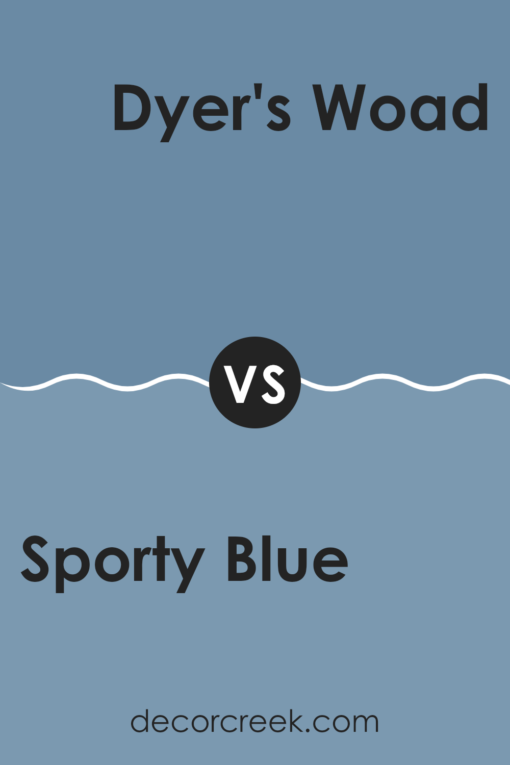
Sporty Blue SW 6522 by Sherwin Williams vs Dyer’s Woad SW 9071 by Sherwin Williams
Sporty Blue and Dyer’s Woad are both colors from Sherwin Williams that bring unique tones to any room. Sporty Blue is a vibrant and energetic shade. It’s vivid, with a striking brightness that can make a wall or room stand out in an eye-catching way. This color is perfect for livening up any area and tends to bring a youthful, lively vibe to the surroundings.
On the other hand, Dyer’s Woad is a much more subdued and muted blue. It leans toward a grayish tone, giving it a more reserved and calm appearance. This color is ideal for those looking for a subtler, more understated look. It works well in areas where you want to keep things low-key yet stylish without overpowering the senses.
Both colors offer distinct visual experiences: Sporty Blue adds a splash of boldness, while Dyer’s Woad provides a gentle background hue. Each has its charm, depending on the atmosphere you’re aiming to create.
You can see recommended paint color below:
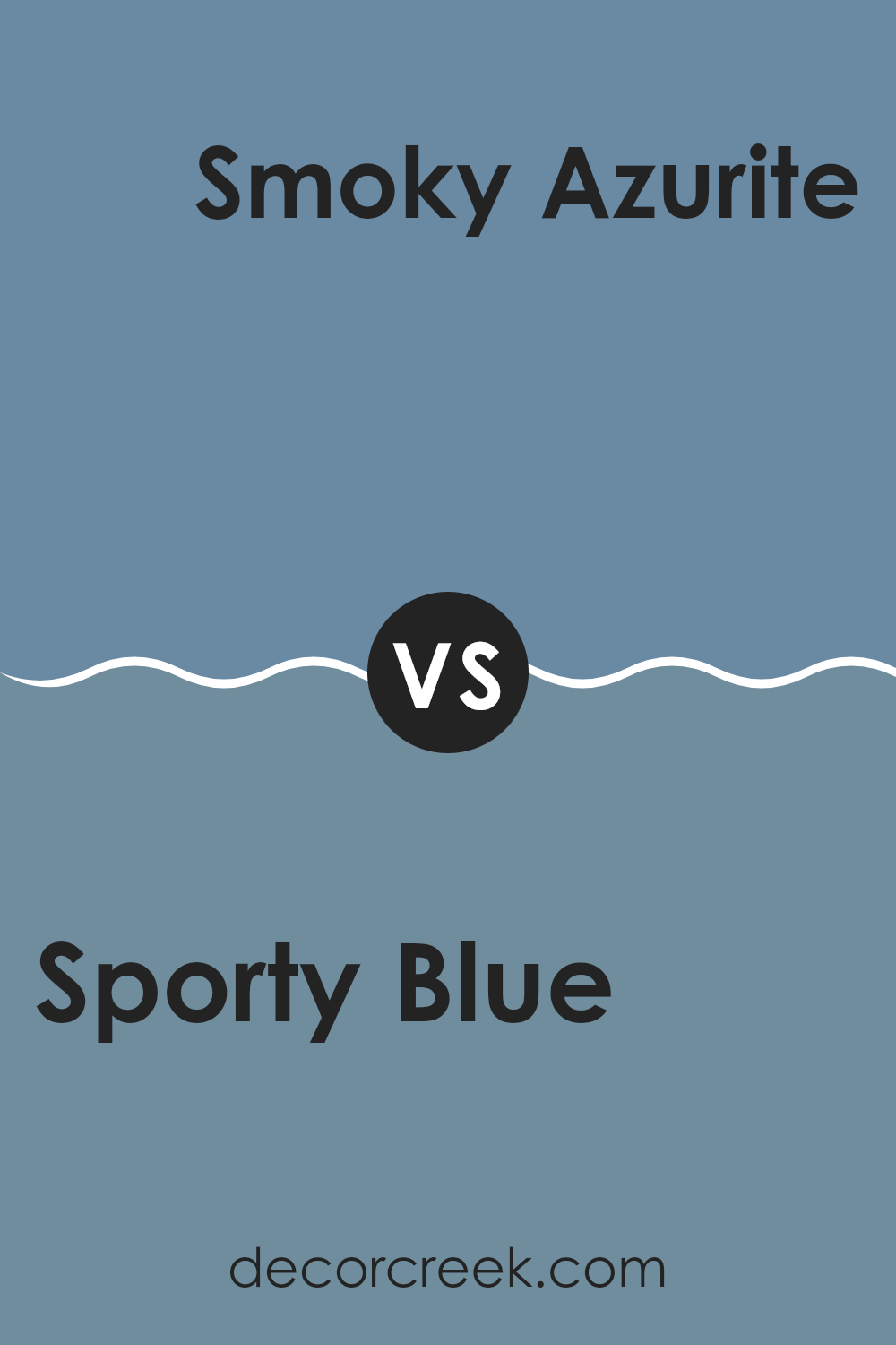
Sporty Blue SW 6522 by Sherwin Williams vs Smoky Azurite SW 9148 by Sherwin Williams
“Sporty Blue” and “Smoky Azurite,” both from Sherwin Williams, offer distinctive tones that can enhance any room differently. Sporty Blue is a vivid, energetic blue that adds a lively touch to rooms. It’s the kind of color that brightens up a room and brings a cheerful vibe.
On the other hand, Smoky Azurite presents a deeper, moodier blue. This color creates a more reserved and mature feel, perfect for areas where you want a touch of formality or depth. Both shades are flexible but serve unique purposes.
Sporty Blue works great in active, bright areas like playrooms or creative rooms, while Smoky Azurite is ideal for creating a dignified look in offices or dining rooms. Each color brings its charm and can set a completely different tone depending on what you’re going for.
You can see recommended paint color below:
After learning all about SW 6522 Sporty Blue by Sherwin Williams, I can tell you that it’s a really neat color that can make a room feel fun and full of energy. This shade of blue is like the sky on a clear day and can make you feel both happy and calm at the same time. It works great in places like bedrooms or even living rooms where you spend a lot of time. Also, because it’s a pretty rich and lively blue, it’s a color that can help small rooms feel bigger and brighter if you use it in the right way.
I also found out that using Sporty Blue in games rooms or places where kids play can be pretty amazing. It adds a pop of color that makes things more exciting. Matching it with other colors is easy too. You can use whites, greys, or even some yellows, and they all look good with Sporty Blue.
Overall, if you like blue or just want to add a fresh, fun vibe to your room, Sporty Blue by Sherwin Williams could be a perfect choice. It’s easy to use, and everyone tends to like how it makes their room look. So if you’re thinking about painting, Sporty Blue is definitely worth considering!
Ever wished paint sampling was as easy as sticking a sticker? Guess what? Now it is! Discover Samplize's unique Peel & Stick samples.
Get paint samples

