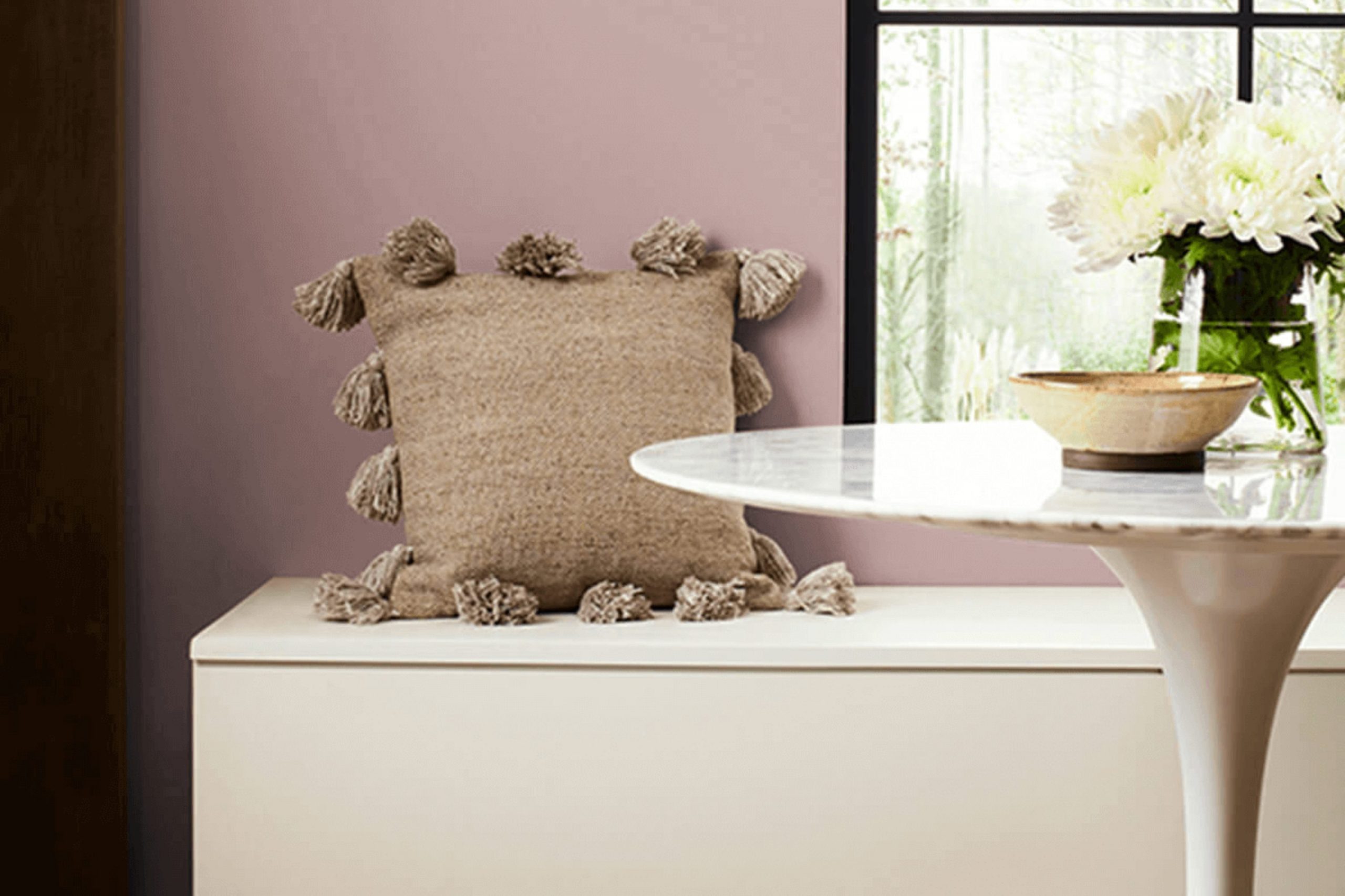
If you’re on the lookout for a paint color that adds both warmth and elegance to your interior, let me introduce you to SW 6024 Dressy Rose by Sherwin Williams. Initially, the name alone intrigued me, promising something both elegant and floral. As a fan of subtle yet distinct hues, I found Dressy Rose struck a beautiful balance by offering a muted tone that still holds rich depth.
This charming shade is not just another pink; it’s a mature, dusky rose that has the flexibility to bring a refined touch to living rooms and dining areas alike. It pairs wonderfully with soft whites or bold contrasts like dark grays. Whether you’re updating a single room or revamping your entire home, Dressy Rose could be the perfect addition.
I particularly appreciate how this color creates a cozy yet refined atmosphere. It’s ideal for those looking to add a touch of gentle elegance to their interior decor without overpowering the senses.
In my home, the color has proven to be a delightful backdrop for both modern and vintage decors, making it a dependable choice for my ongoing home projects.
What Color Is Dressy Rose SW 6024 by Sherwin Williams?
Dressy Rose is a rich, nuanced shade of pink that gives off a warm and inviting vibe. Reflecting a chalky softness, this color has a subtle depth that goes well beyond simple pink. It’s a flexible hue that can create a friendly and welcoming atmosphere in any room, making it ideal for areas meant to encourage relaxation and comfort.
The muted richness of Dressy Rose pairs beautifully with a variety of interior styles, particularly modern farmhouse, shabby chic, and even contemporary, if used carefully. It works exceptionally well as an accent wall color or for full-room coverage in smaller areas like bathrooms or reading nooks, where its cozy feel can truly shine.
In terms of materials, Dressy Rose coordinates well with natural wood tones, from lighter beech to darker walnut, which help to ground the color and add a touch of natural warmth. Fabrics like linen or soft cotton in white or light neutral tones provide a lovely textural contrast, enhancing the overall look. Additionally, incorporating elements like brushed brass fixtures or soft metallic accents can add a slight reflective quality to the interior without overpowering the gentle appeal of Dressy Rose.
Is Dressy Rose SW 6024 by Sherwin Williams Warm or Cool color?
Dressy Rose by Sherwin Williams is a warm, inviting shade perfect for adding a cozy and welcoming touch to any room. Its rich, rosy hue makes it an excellent choice for areas where you want to create a friendly and comfortable atmosphere.
Because of its warmth, it pairs well with soft neutrals like creams or soft grays, which help balance its intensity. This color can make rooms feel more intimate and cozy, which is great for living rooms or bedrooms where a calming effect is desired.
Using Dressy Rose in smaller areas, such as a powder room or an accent wall, can add a touch of elegance without overpowering the area. Furthermore, it works beautifully in rooms with plenty of natural light, where the color can show its full depth and richness. Overall, Dressy Rose adds a pleasant, cheerful vibe to your home, making areas more enjoyable and uplifting.
Undertones of Dressy Rose SW 6024 by Sherwin Williams
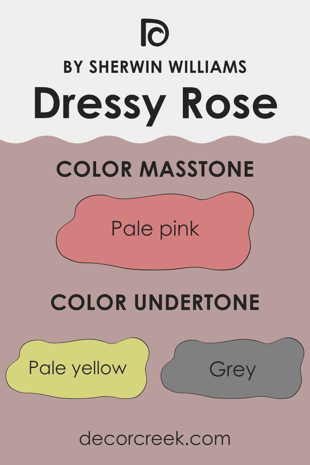
Dressy Rose is a complex paint color that contains a variety of undertones that can subtly influence the look and feel of a room. Undertones are the subtle colors that lie beneath the surface of what we initially perceive. They can enhance or alter the main color in different lighting conditions or when paired with various décor elements.
The undertones in Dressy Rose include a spectrum from pale yellow and light gray to more vibrant shades like fuchsia and red. These undertones mean the color can appear differently based on the room’s lighting and surrounding colors.
For instance, under bright, natural light, the pale yellow or light blue undertones might make the walls seem more vibrant and airy. However, in a dimmer, artificially lit room, the grey or brown undertones might make the room feel cozier and more enclosed.
When using Dressy Rose on interior walls, these undertones contribute to a dynamic shift in perception as daylight changes from dawn to dusk. This can make it an excellent choice for rooms that are used throughout the day, like living rooms or kitchens. Accessories and furniture in complementary colors can either amplify or balance these undertones.
For example, mint or pale yellow decor can highlight the freshness of the room, whereas brown or dark purple furniture can draw out a sense of warmth. Understanding the undertones helps in deciding how to style and use the room to its full potential, ensuring the color truly works in your interior.
What is the Masstone of the Dressy Rose SW 6024 by Sherwin Williams?
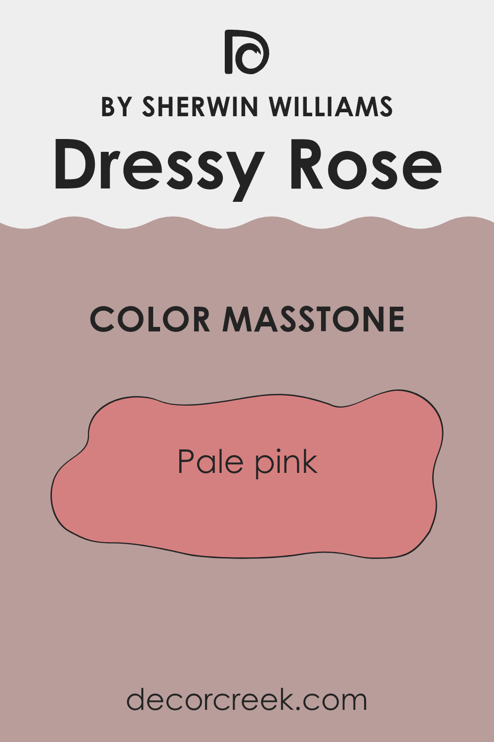
Dressy Rose SW 6024 by Sherwin Williams has a masstone of Pale pink (#D58080), a gentle and inviting hue that can strongly shape the atmosphere of a home. This particular shade of pink has a soft and warm nature, making it perfect for creating a cozy and welcoming interior. It is flexible enough to be used in various rooms— whether in a bedroom where it adds a touch of warmth or in a living area where it promotes a light, friendly feel.
The pale pink color is also great for smaller areas, as lighter shades can make rooms appear larger and more open. Furthermore, it pairs beautifully with neutral colors like whites and greys, as well as with rich, darker hues for a striking contrast.
This balance allows for flexibility in decorating styles, whether one prefers a more classic look or something more modern. In summary, the masstone of Pale Pink in Dressy Rose brings a soft, warm touch that can easily adapt to different home styles and tastes.
decorcreek.com
How Does Lighting Affect Dressy Rose SW 6024 by Sherwin Williams?
Lighting plays a crucial role in how colors appear in different environments. The color perception of any paint, like the shade “Dressy Rose,” can change dramatically under various lighting conditions. When selecting paint colors, understanding how lighting affects their appearance is essential for achieving the desired mood in a room.
Artificial Light: In artificial light, the shade “Dressy Rose” can appear warmer and more vibrant. Incandescent bulbs, which emit a yellowish light, can enhance the red tones within the paint, making the room feel cozy and welcoming. Fluorescent lighting, however, tends to cast a bluish tone, making “Dressy Rose” appear slightly muted and cooler.
Natural Light: In natural light, “Dressy Rose” shows its true color best during midday when sunlight is brightest. This allows the color to display its real depth and pigmentation without the color shifts that artificial lighting can cause.
Room Orientation:
North-Facing Rooms: Rooms that face north often receive less direct sunlight, which can make colors appear cooler and slightly darker. In a north-facing room, “Dressy Rose” might look more subdued and less vibrant unless well-lit with artificial lighting to balance the lack of natural light.
South-Facing Rooms: South-facing rooms benefit from ample sunlight throughout the day, which means “Dressy Rose” will appear brighter and closer to its color swatch. The strong light can bring out the warm undertones of the color, making the room feel lively and full of energy.
East-Facing Rooms: The morning light in east-facing rooms is warm and bright, making “Dressy Rose” appear lively and vibrant early in the day. As the day progresses and less direct light enters the room, the color may take on a softer and more muted quality.
West-Facing Rooms: In west-facing rooms, the color will shift throughout the day. It starts cooler in the morning, and as the sun sets, the warm, strong evening light can make “Dressy Rose” look more intense and rich.
In summary, the way “Dressy Rose” looks can vary depending on the lighting conditions, which should be considered when choosing where to use this color. Whether lit by the sun or light bulbs, each setting can noticeably change its appearance.
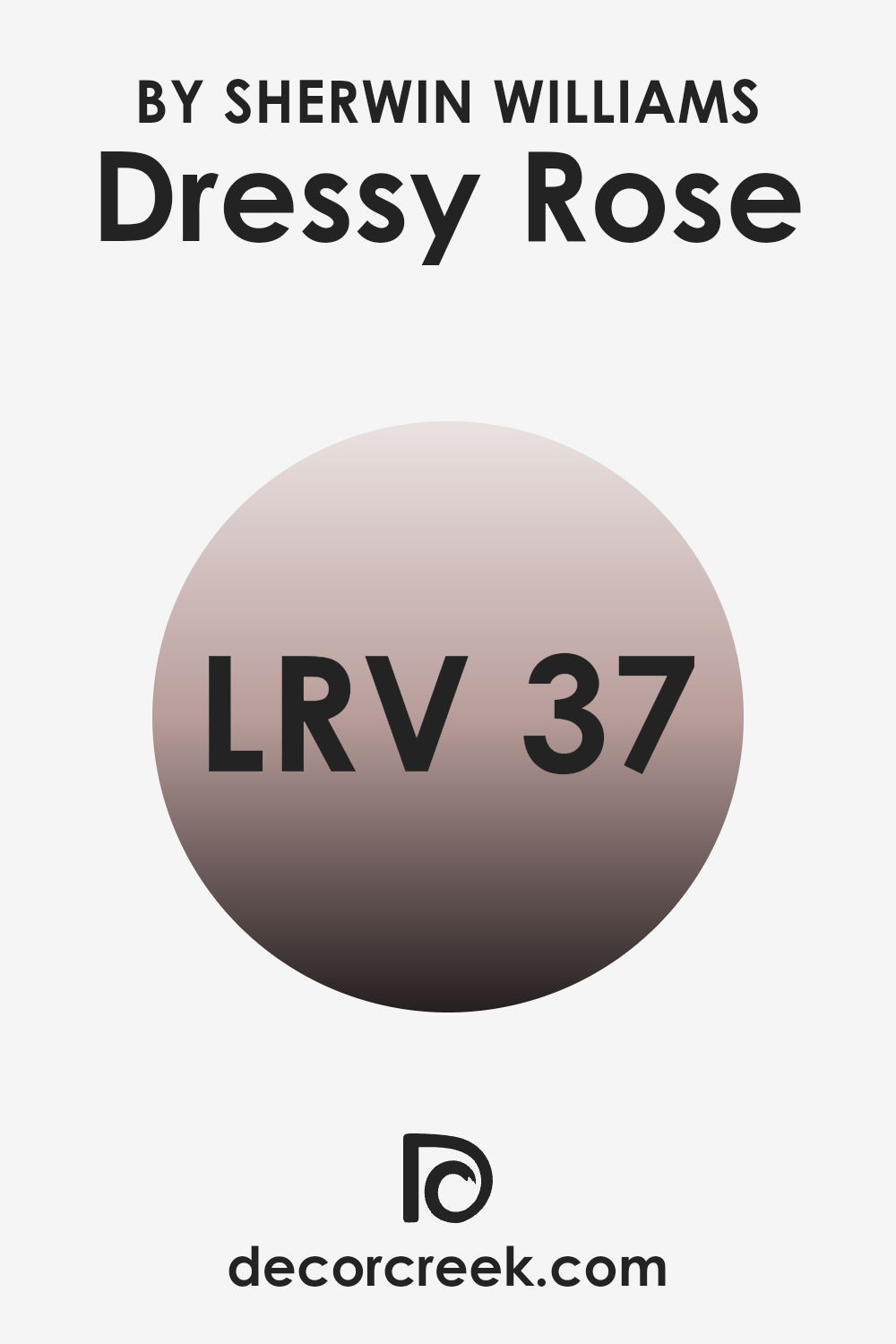
What is the LRV of Dressy Rose SW 6024 by Sherwin Williams?
Light Reflectance Value, or LRV, is a measure that indicates how much light a color reflects or absorbs. It’s calculated on a scale where lower values mean the color absorbs more light and appears darker, while higher values indicate that the color reflects more light and looks lighter.
This measure helps in deciding how a paint color will feel in a specific room. A color with a high LRV makes a room feel more open and airy, whereas a darker LRV can make an area feel cozier but smaller.
For the color Dressy Rose, which has an LRV of 36.513, the shade is on the darker side, meaning it tends to absorb more light than it reflects. This characteristic can make an interior feel warm and inviting. However, in rooms with little natural light, using a color with this LRV might make the area appear dim and smaller. Therefore, it’s ideal for larger rooms or areas with adequate lighting, where its rich tones can create a comfortable and attractive environment without making the room feel constrained.
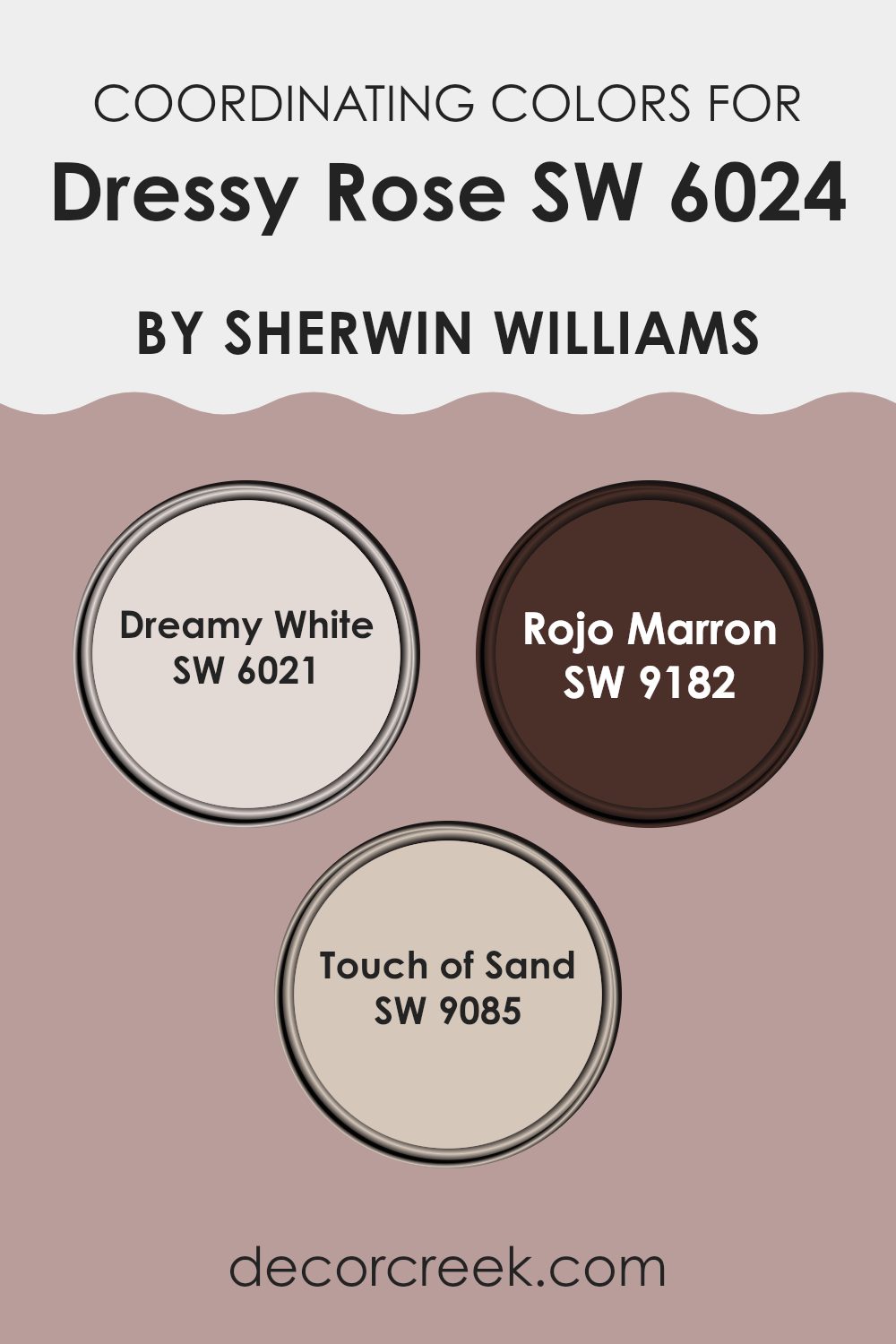
Coordinating Colors of Dressy Rose SW 6024 by Sherwin Williams
Coordinating colors are hues that complement each other well and can create a harmonious color scheme when used together. For example, if you decide to paint your room in Dressy Rose by Sherwin Williams, which is a subtle and muted shade of pink, you can enhance its overall look by choosing suitable coordinating colors. The choices such as Dreamy White, Rojo Marron, and Touch of Sand play supportive roles that either balance or highlight the main color.
Dreamy White, known as SW 6021, is a soft and clean color that brings out the brightness in the room, giving a fresh and airy feeling. This color works great as a base or for trims, providing a crisp contrast to richer or deeper tones.
Rojo Marron, or SW 9182, offers a bold contrast being a deep, warm brownish-red that can add a lot of warmth and depth to areas, making it an excellent choice for accents or furniture to create a cozy atmosphere. Lastly, Touch of Sand, coded as SW 9085, is a gentle beige that easily connects the bolder colors in the palette, offering a smooth transition and lending a calming and grounded feel to any interior. Together, these colors complement the elegance of Dressy Rose by Sherwin Williams by providing balanced and appealing visual support in the design interior.
You can see recommended paint colors below:
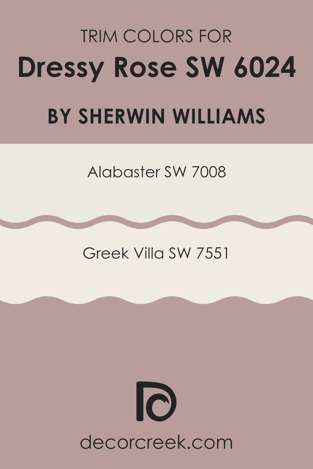
What are the Trim colors of Dressy Rose SW 6024 by Sherwin Williams?
Trim colors are essential in interior design as they help define and highlight the architectural details of a room, such as door frames, window frames, and skirting boards. By choosing the right trim color, you can enhance the main color on your walls and create a polished, cohesive look. For instance, when working with a rich hue like Dressy Rose from Sherwin Williams, selecting a trim color that complements without overpowering is key to achieving a balanced look.
Alabaster (SW 7008) is a warm, soft white with a subtle hint of cream, making it ideal for trims as it gently contrasts with deeper and vibrant wall colors like Dressy Rose, providing a light, airy feel to the room.
Greek Villa (SW 7551), another excellent choice for trim, is slightly warmer than Alabaster, offering a cozy yet fresh appearance that pairs harmoniously with warmer wall colors. These trim colors are not only functional, separating different materials and segments of the wall, but also add to the visual appeal, making your color choices in rooms stand out more attractively.
You can see recommended paint colors below:
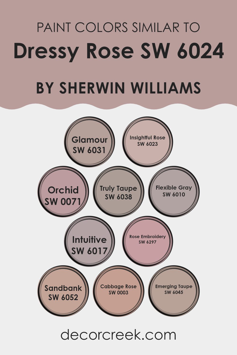
Colors Similar to Dressy Rose SW 6024 by Sherwin Williams
When incorporating similar colors into your design, it’s important for creating a cohesive and harmonious look. Colors that share a similar hue, saturation, or brightness can easily blend with each other, offering a subtle yet impactful visual experience.
For instance, colors like Glamour (SW 6031), a soft, muted pink, offer a gentle contrast to the deeper tones of Dressy Rose. Insightful Rose (SW 6023) is a dusty rose that complements the base tones in Dressy Rose, providing a smooth transition between colors in decor.
Orchid (SW 0071) presents a light, airy lavender that adds a playful touch without overpowering the rich depth of Dressy Rose. Truly Taupe (SW 6038) and Emerging Taupe (SW 6045) both bring a beige blend that acts as a neutral background, enhancing the vibrancy of rose shades. Flexible Gray (SW 6010) and Intuitive (SW 6017) offer a cooler contrast, bringing balance to the warmth of rose-colored themes.
Rose Embroidery (SW 6297) echoes the floral inspiration with its subtle pink, tying in beautifully with similar shades. Sandbank (SW 6052) provides a grounding, earthy taupe that supports the rosy colors. Cabbage Rose (SW 0003) is a deeper, more intense version of Dressy Rose, perfect for adding depth and interest to any interior using this color palette. These color relationships help create a cohesive interior that feels thoughtfully designed and visually connected.
You can see recommended paint colors below:
- SW 6031 Glamour
- SW 6023 Insightful Rose
- SW 0071 Orchid
- SW 6038 Truly Taupe
- SW 6010 Flexible Gray
- SW 6017 Intuitive
- SW 6297 Rose Embroidery
- SW 6052 Sandbank
- SW 0003 Cabbage Rose
- SW 6045 Emerging Taupe
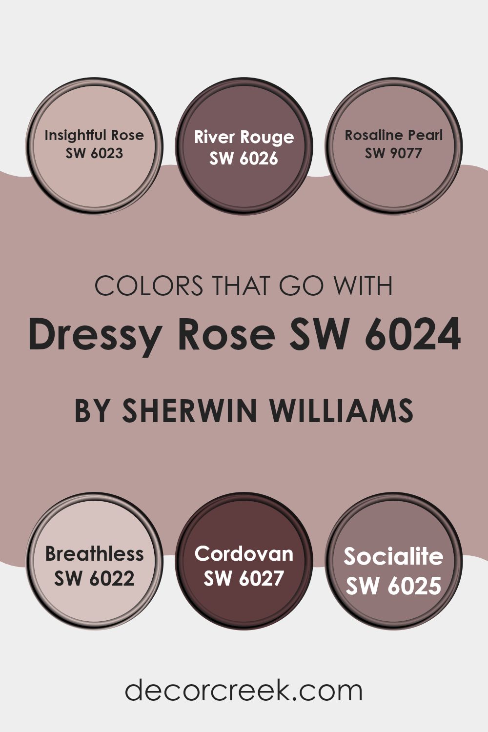
Colors that Go With Dressy Rose SW 6024 by Sherwin Williams
Choosing colors that complement Dressy Rose SW 6024 by Sherwin Williams is key for creating a harmonious and pleasant visual experience in any interior. These colors help to balance the soft, dusky quality of Dressy Rose, ensuring a cohesive look. For instance, Insightful Rose SW 6023 connects subtly with Dressy Rose, offering a slightly more intense hue that can bring depth and interest. River Rouge SW 6026, a bit darker and richer, can act as a strong counterpoint, anchoring lighter elements in the setting.
In addition, Rosaline Pearl SW 9077 with its gentle, pearl-like finish offers a lighter, airier feel that complements the dusty qualities of Dressy Rose without overpowering it. Breathless SW 6022, a pale shade, nearly acts as a neutral, allowing Dressy Rose to stand out while providing a calming backdrop.
Cordovan SW 6027 introduces a deep, leathery tone which works beautifully for adding a touch of drama and luxury. Lastly, Socialite SW 6025 has a more playful, slightly vibrant feel that can bring energy to interiors that use Dressy Rose as their base. Pairing Dressy Rose with these carefully selected shades allows for a range of moods and styles, from subtle elegance to dynamic contrast, important for personal or professional interiors.
.
You can see recommended paint colors below:
- SW 6023 Insightful Rose
- SW 6026 River Rouge
- SW 9077 Rosaline Pearl
- SW 6022 Breathless
- SW 6027 Cordovan
- SW 6025 Socialite
How to Use Dressy Rose SW 6024 by Sherwin Williams In Your Home?
Dressy Rose by Sherwin Williams is a vibrant shade of pink that brings a fun and lively feel to any room. It’s perfect for adding a dash of color and personality to your home. If you want to refresh your living area, consider painting a feature wall with Dressy Rose. It can create a cheerful focal point and make the room feel more inviting.
In a bedroom, using Dressy Rose on the walls can make the area feel cozy and warm. It’s great for creating a comforting mood where you can relax after a long day. For those who enjoy DIY projects, you might even paint old furniture with this color to give it a new life and a unique touch.
In areas like the kitchen or bathroom, Dressy Rose works well as an accent color, perhaps on cabinets or paired with neutral tones like whites and grays to keep the area feeling light and airy. This color is flexible and can be used in many different ways to add charm and vibrancy to your home.
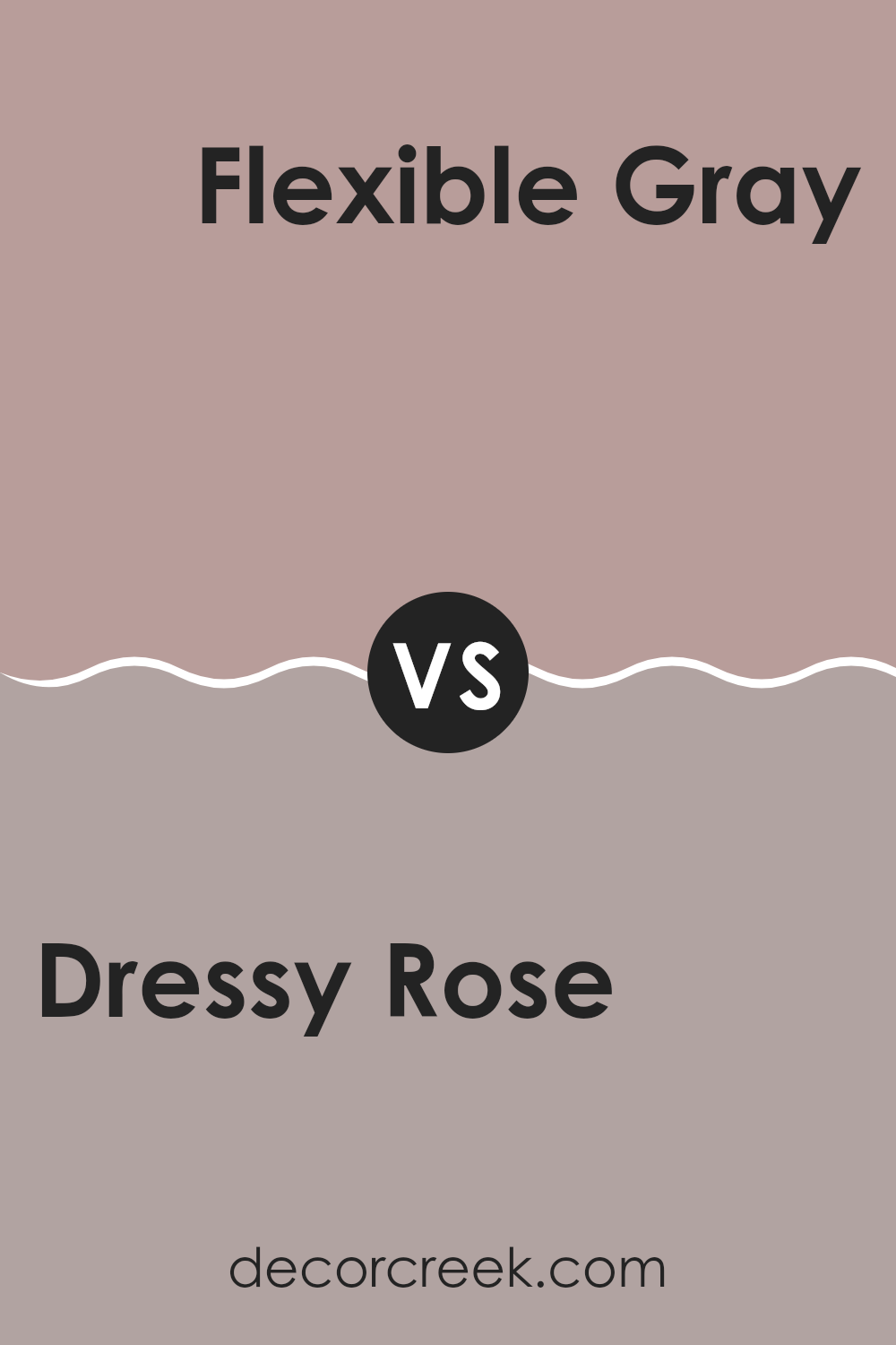
Dressy Rose SW 6024 by Sherwin Williams vs Flexible Gray SW 6010 by Sherwin Williams
The color Dressy Rose is a gentle, muted pink shade that brings warmth and a sense of welcoming. It creates a cozy atmosphere, perfect for living areas where relaxation is key.
On the other hand, Flexible Gray is a soft, adaptable gray that works well with different decorating styles. This shade offers a neutral backdrop that complements bolder colors and can easily fit into various rooms, balancing brighter tones with its understated elegance.
While Dressy Rose adds a touch of subtle cheerfulness to a room, Flexible Gray provides a calm and steady base, allowing other colors to stand out. Together, these two colors can work harmoniously to create a balanced and pleasant décor.
You can see recommended paint color below:
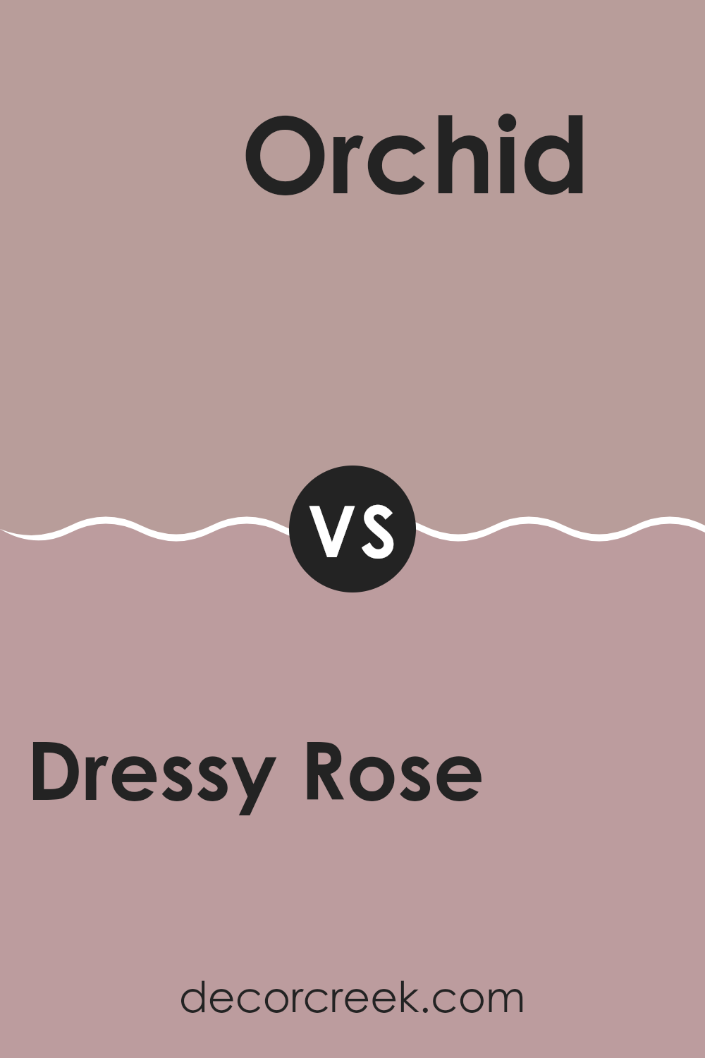
Dressy Rose SW 6024 by Sherwin Williams vs Orchid SW 0071 by Sherwin Williams
Dressy Rose and Orchid are two unique shades from Sherwin Williams that offer differing vibes for any interior. Dressy Rose has a muted, subtle pink tone that feels cozy and warm, making it perfect for creating a welcoming atmosphere in rooms.
It’s great for areas where you want a gentle pop of color without overpowering the senses. On the other hand, Orchid is a brighter, more vivid purple. It’s bolder and stands out more than Dressy Rose, providing a lively and cheerful touch to any area.
This makes Orchid ideal for areas where you want to bring energy and fun, or where a statement color is needed to liven up the decor. Both colors have their unique appeal, depending on the mood you’re aiming to achieve in your interior.
You can see recommended paint color below:
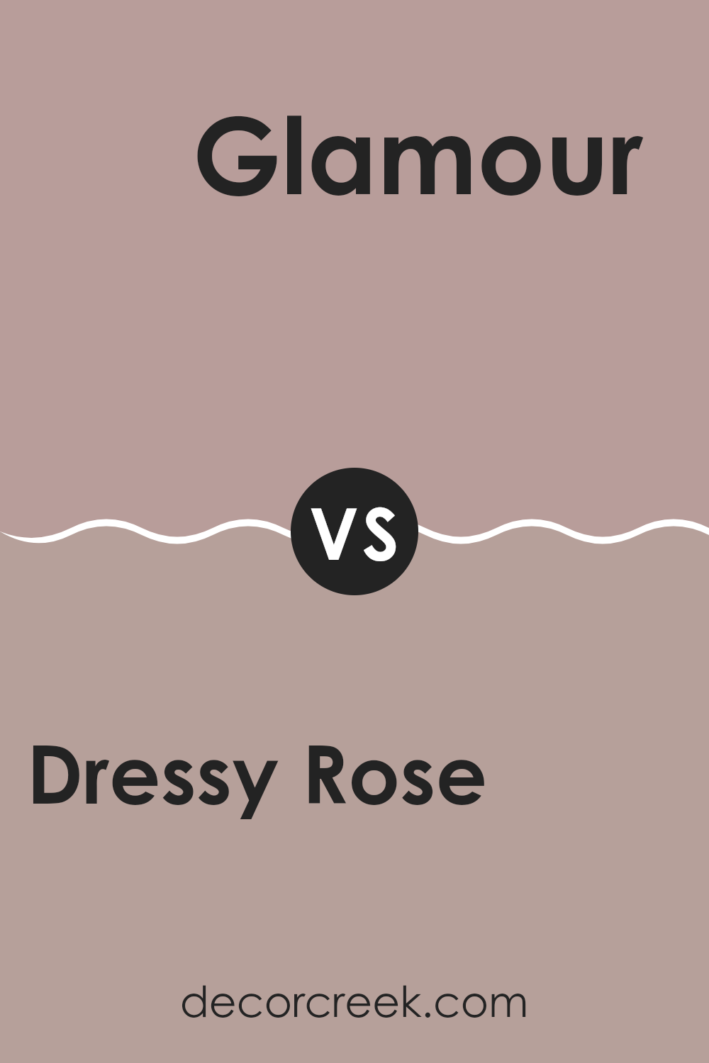
Dressy Rose SW 6024 by Sherwin Williams vs Glamour SW 6031 by Sherwin Williams
“Dressy Rose” and “Glamour” are both colors by Sherwin Williams. Dressy Rose is a muted pink hue. It’s gentle and soft, making areas feel welcoming and cozy.
Think of it as the subtle blush on a flower. On the other hand, Glamour is deeper and more intense. It’s a dusky violet with hints of gray, giving it a rich and moody quality. This color is great for creating a bold statement in a room, adding drama and depth.
Both colors can work beautifully in a home but serve different moods and styles. While Dressy Rose sets a lighter, airy feel, Glamour goes for something more powerful and striking. Whether you prefer the soft whisper of pink or the strong presence of violet will depend on the mood you want to create.
You can see recommended paint color below:
- SW 6031 Glamour
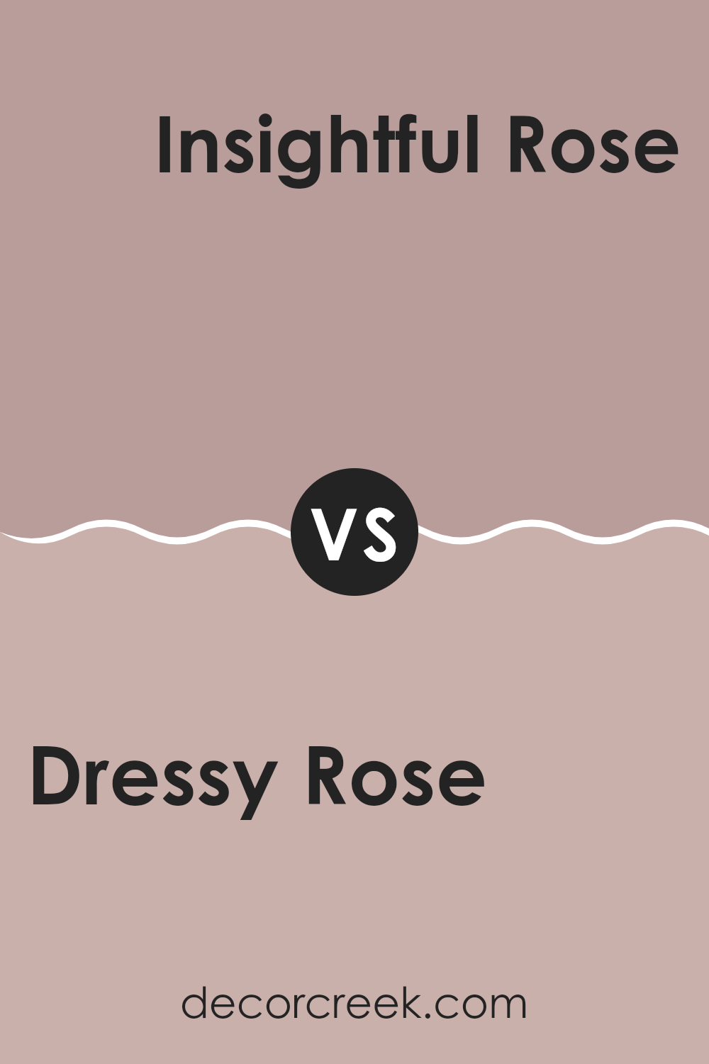
Dressy Rose SW 6024 by Sherwin Williams vs Insightful Rose SW 6023 by Sherwin Williams
The main color, Dressy Rose, and the second color, Insightful Rose, both by Sherwin Williams, are quite similar yet have subtle differences. Dressy Rose is a bit deeper and more pronounced, presenting a rich, muted pink with a warm undertone.
This makes it perfect for cozy, inviting areas. In contrast, Insightful Rose is slightly lighter and carries a softer tone. This gentle hue gives off a calm, welcoming vibe, ideal for creating a relaxed atmosphere in a room.
Both colors are flexible and can work beautifully in various settings such as bedrooms or living areas. While Dressy Rose might be better suited for those looking for a more striking, yet still understated backdrop, Insightful Rose works well where a lighter, more airy feel is desired. Pairing them together can also create a layered, thoughtful look that adds depth to interior décor.
You can see recommended paint color below:
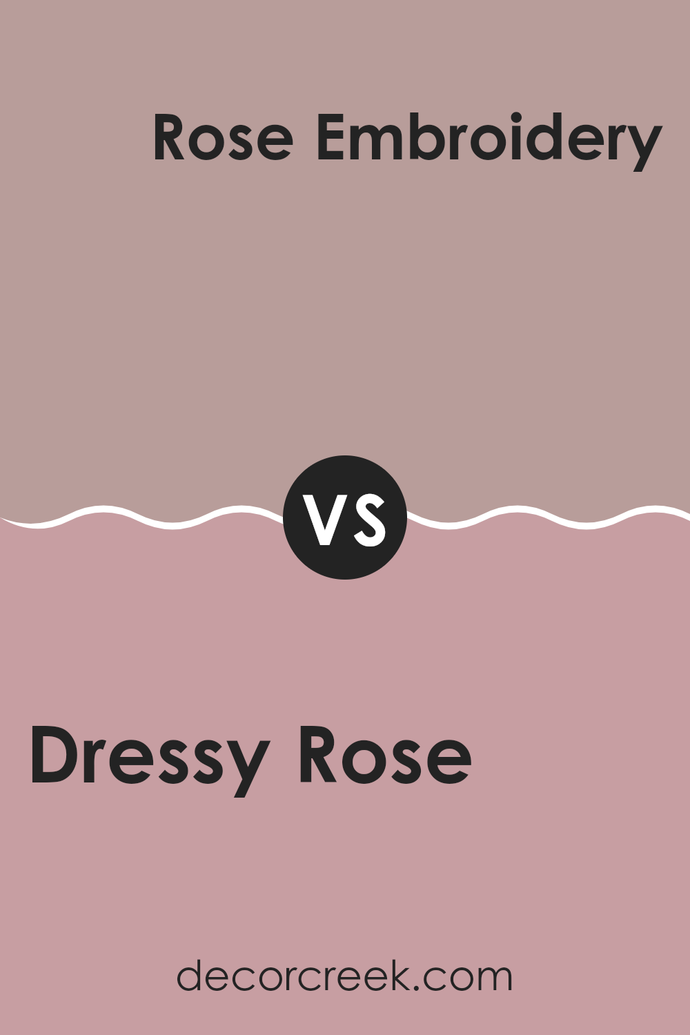
Dressy Rose SW 6024 by Sherwin Williams vs Rose Embroidery SW 6297 by Sherwin Williams
The two colors, Dressy Rose and Rose Embroidery, both by Sherwin Williams, have distinct yet harmonious tones. Dressy Rose is a subtle pink with a soft touch, giving a warm and welcoming feel to any room.
It’s quite muted, making it flexible for areas that aim for a gentle and pleasant mood. On the other hand, Rose Embroidery is deeper and richer, closely resembling the natural shade of rose petals. This color provides a more vibrant feel, perfect for adding a pop of color without overpowering an interior.
Comparing the two, Dressy Rose is lighter and more understated, ideal for a subdued look, while Rose Embroidery offers a bolder statement with its vividness. Both colors can work beautifully in different settings depending on the mood you want to create.
You can see recommended paint color below:
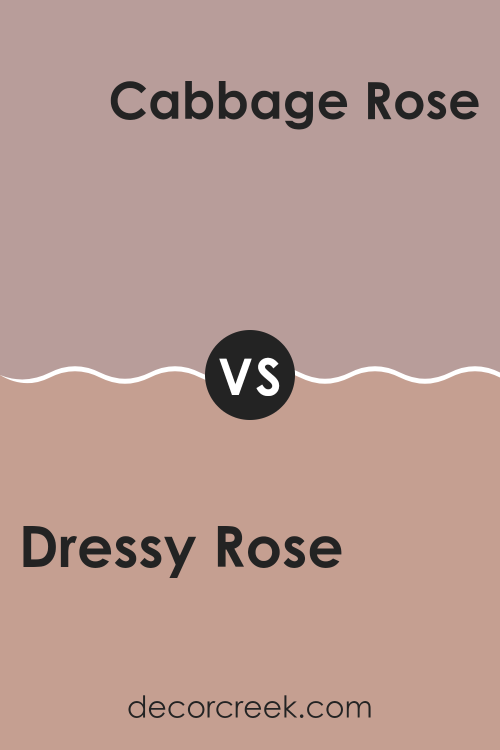
Dressy Rose SW 6024 by Sherwin Williams vs Cabbage Rose SW 0003 by Sherwin Williams
Dressy Rose and Cabbage Rose by Sherwin Williams are both shades of pink, but they have distinct tones that set them apart. Dressy Rose is a vibrant, deeper pink with a hint of raspberry. This color is bolder and can add a lively pop to a room, making it feel more dynamic and energetic. It works well in areas where you want to make a statement or add some cheerfulness.
On the other hand, Cabbage Rose is a much softer, subtler pink. It leans towards a pastel, giving it a gentle and calming effect in interior areas. This shade is ideal for creating a relaxed, soothing mood in places like bedrooms or bathrooms where comfort is key.
While both pinks, the choice between Dressy Rose and Cabbage Rose depends on the mood you’re aiming to achieve. Dressy Rose brings energy and vibrancy, while Cabbage Rose offers a soft and peaceful feel.
You can see recommended paint color below:
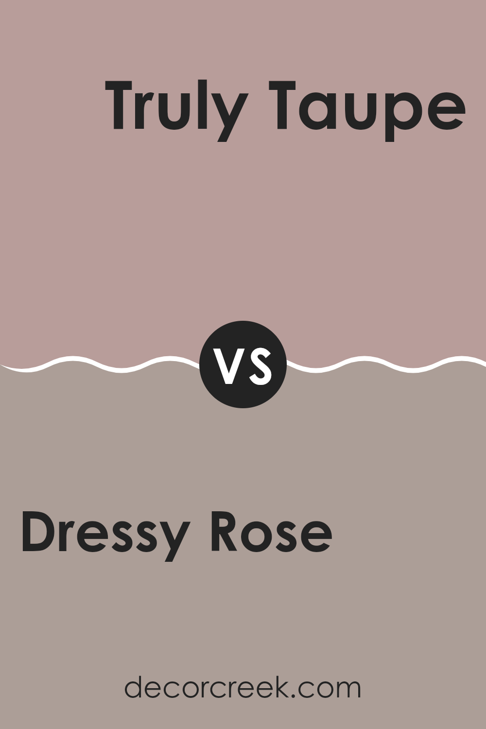
Dressy Rose SW 6024 by Sherwin Williams vs Truly Taupe SW 6038 by Sherwin Williams
“Dressy Rose” and “Truly Taupe” are two distinct paint colors by Sherwin Williams. “Dressy Rose” is a soft, muted pink that feels warm and inviting, making it perfect for creating a cozy atmosphere in living areas or bedrooms.
Its gentle rosy tint offers a welcoming vibe without being too bold or overpowering. On the other hand, “Truly Taupe” is a neutral shade that blends gray and brown, producing a flexible and earthy color. This hue works well in various settings, providing a stable backdrop that pairs nicely with many other colors.
While “Dressy Rose” adds a subtle touch of femininity, “Truly Taupe” serves as a strong foundational color. Together, they could complement each other well, especially in an interior where you want a balance between warmth and understated elegance.
You can see recommended paint color below:
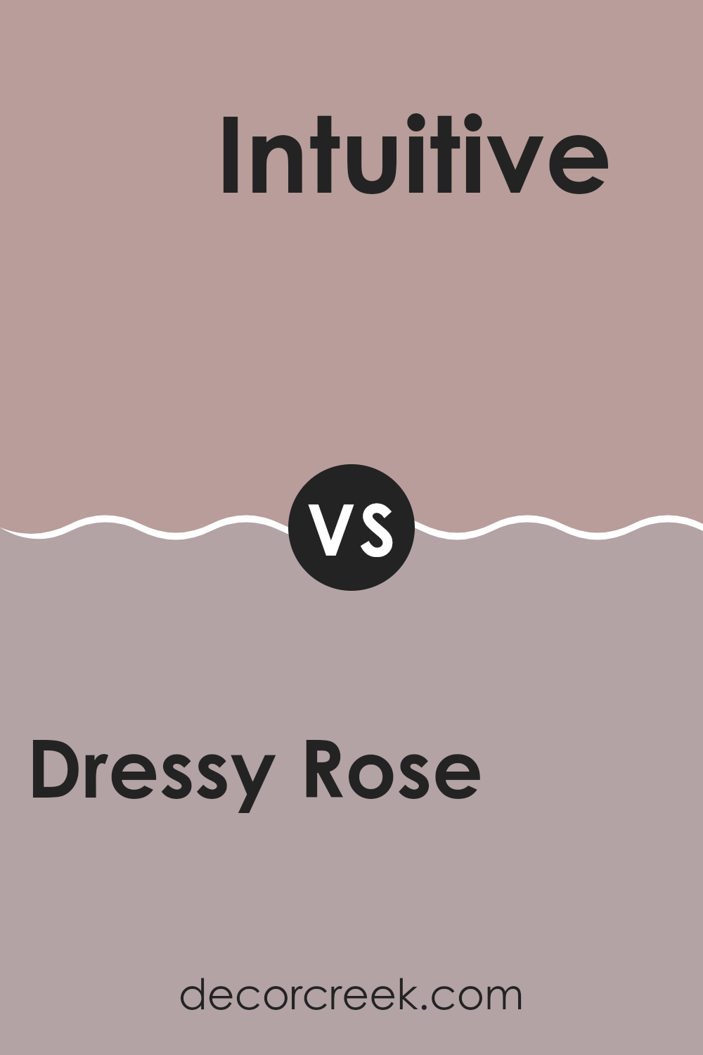
Dressy Rose SW 6024 by Sherwin Williams vs Intuitive SW 6017 by Sherwin Williams
Dressy Rose and Intuitive are two distinctive colors by Sherwin Williams. Dressy Rose presents itself as a soft, muted pink with a slight hint of gray, making it warm and inviting. It works well in areas that aim for a gentle, soothing atmosphere. This color can soften the feel of a room and pairs nicely with darker colors for contrast or can be used alone for a more understated elegance.
On the other hand, Intuitive is a unique shade that blends gray with green tones, resulting in a subtle, earthy color. It’s perfect for those looking to create a calming, natural vibe in their interior. Intuitive particularly stands out in areas that benefit from a connection to the outdoors, such as sunrooms or kitchens with lots of natural light.
Together, these colors offer varied options for interior areas, each bringing its own charm and personality to the setting. Whether aiming for the gentle warmth of Dressy Rose or the grounded feel of Intuitive, both colors provide beautiful possibilities for decorating.
You can see recommended paint color below:
- SW 6017 Intuitive
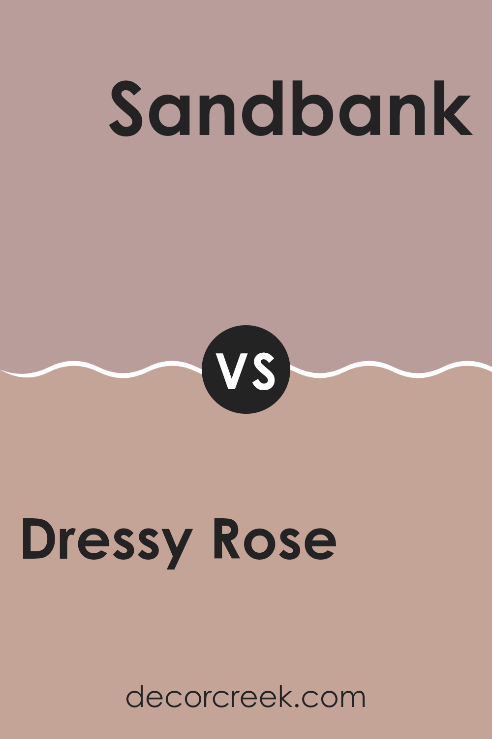
Dressy Rose SW 6024 by Sherwin Williams vs Sandbank SW 6052 by Sherwin Williams
Dressy Rose is a gentle, muted pink shade that gives a cozy and inviting mood. It brings a warm touch to any interior, perfect for creating a soft, nurturing atmosphere in rooms like living areas or bedrooms. This color pairs well with neutral tones and can also serve as a subtle backdrop for bolder decor choices.
On the other hand, Sandbank is a solid, earthy taupe that offers a grounded and calm feel. It’s a flexible color that works well in various settings, helping to achieve a natural and balanced look. This shade is ideal for those seeking a neutral palette without the starkness of pure gray or white, making it excellent for areas where relaxation is key, like dens and reading nooks.
Both Dressy Rose and Sandbank provide unique aesthetic values: Dressy Rose adds a touch of warmth with its soft pink, while Sandbank offers a strong and stable foundation with its richer taupe. They cater to different tastes and can be used to create distinct moods within a home.
You can see recommended paint color below:
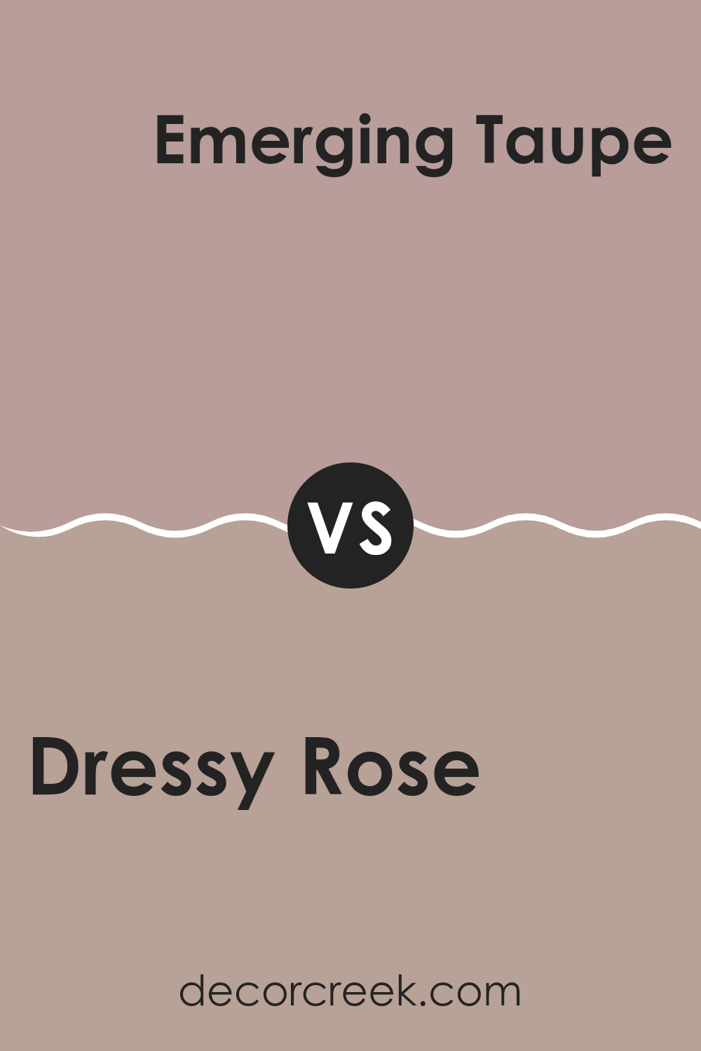
Dressy Rose SW 6024 by Sherwin Williams vs Emerging Taupe SW 6045 by Sherwin Williams
Dressy Rose and Emerging Taupe are two distinct paint colors by Sherwin Williams, each offering a unique vibe for room decoration. Dressy Rose is a soft, muted pink with a subtle warmth that makes areas feel welcoming and cozy. This color is flexible, perfect for creating a gentle backdrop in living rooms or bedrooms. It pairs nicely with creams and light grays for a harmonious look.
On the other hand, Emerging Taupe is a deeper, neutral shade that combines gray and brown tones. This color is excellent for adding depth and warmth to a room without overpowering it with darkness. Emerging Taupe works well in areas that benefit from a more grounded, calming effect, such as studies or dining rooms. It pairs well with richer colors like deep blues or greens.
Together, these colors could complement each other in a home, with Dressy Rose brightening areas and Emerging Taupe grounding them. Each color offers its own charm, whether aiming for a lighter, airy feel or a more anchored, cozy mood.
You can see recommended paint color below:
- SW 6045 Emerging Taupe
In wrapping up, SW 6024 Dressy Rose by Sherwin Williams is an amazing paint color that can make any room look pretty and calm. This shade of pink isn’t too bright or too soft, so it feels just right. Whether it’s on a bedroom wall or a cozy reading nook, Dressy Rose can make any place more comfortable and inviting. It’s a good choice if you’re tired of plain colors and want something that adds a bit of cheer and warmth to your room without being too loud.
This color can mix well with other colors, so you can pair it with gentle whites or even bold colors if you feel adventurous. It’s perfect for people looking to refresh their homes without making huge changes.
From what I learned, using this color in your decorating could make your interior feel like a lovely, sunny afternoon. Dressy Rose by Sherwin Williams certainly seems like a sweet option for anyone hoping to give their home a gentle touch of pink and warmth.
Paint can really make a difference in how a room feels, and this color does a great job at making an interior feel welcoming and cozy.
Ever wished paint sampling was as easy as sticking a sticker? Guess what? Now it is! Discover Samplize's unique Peel & Stick samples.
Get paint samples

