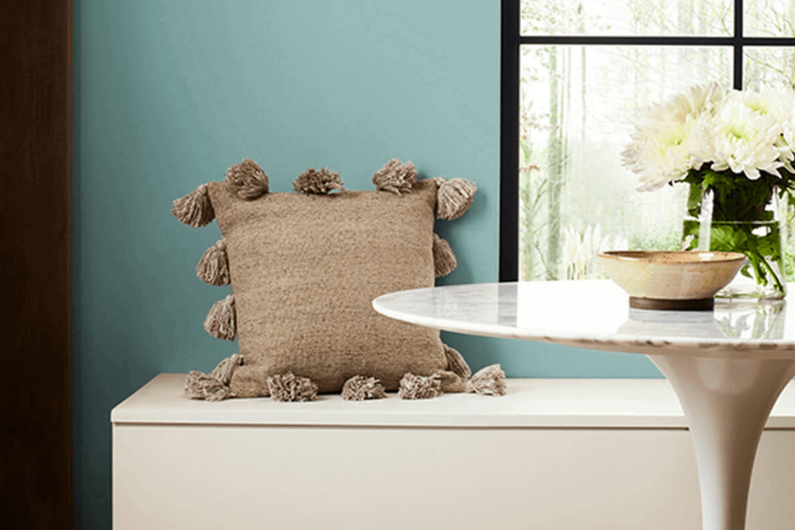
When I first saw Sherwin Williams’ SW 6479 Drizzle, it felt like I had stumbled upon a fresh breeze on a warm day. This color has a way of bringing a sense of freshness and lightness to any room. Imagine a shade that combines the calming qualities of blue with a hint of green. It’s reminiscent of a gentle rain shower clearing the air, leaving everything crisp and new.
Drizzle doesn’t overwhelm; instead, it subtly enhances a room. It can make a small area feel more open or bring a touch of serenity to a lively family room. Whether on a bedroom wall or in a cozy reading nook, the effect stays soothing and welcoming.
Choosing Drizzle creates a backdrop that’s both easy on the eyes and easy to work with when it comes to pairing with furniture and accessories. Soft neutrals or deeper hues both find harmony with this color, offering flexibility in decorating.
If you appreciate understated elegance that still makes a statement, Drizzle is a choice that gently uplifts. It’s a tone that speaks softly but leaves a lasting impression, perfect for anyone seeking peace and balance in their home.
What Color Is Drizzle SW 6479 by Sherwin Williams?
Drizzle by Sherwin Williams is a soft, muted shade of blue-green. It feels like a gentle mist rolling in on a quiet morning. This color has a soothing quality that can create a calming atmosphere in any room. Its cool tones are flexible and work well in different interior styles.
In coastal and beach-themed areas, Drizzle can mimic the color of the ocean, bringing a refreshing feel. It also complements Scandinavian design, where light colors and simplicity are key. The gentle nature of Drizzle fits perfectly in a minimalistic setting, bringing a hint of color without being overpowering.
For materials, Drizzle pairs nicely with natural ones like light wood and rattan, enhancing the relaxed vibe. Soft textures like linen and cotton fabrics work well with this color, adding to its comfort. You can also introduce white or light gray accents to keep things airy and bright.
In more eclectic styles, Drizzle can serve as a backdrop for bolder, brighter colors, allowing for creative and playful decor. Whether used on walls or in accents, this shade offers a peaceful touch to a room, making it feel welcoming and inviting.

Is Drizzle SW 6479 by Sherwin Williams Warm or Cool color?
Drizzle SW 6479 by Sherwin Williams is a soft, muted teal that can bring a cool and calming effect to any room. Its gentle appearance makes it a flexible color choice for various areas in the home, whether it’s the living room, bedroom, or bathroom. The color sits comfortably between blue and green, providing a peaceful ambiance without overpowering the room.
Drizzle pairs well with both neutral tones and vibrant accents, allowing for a range of decorating styles. When combined with white trim, it creates a crisp and clean look. Pairing it with natural wood finishes can add warmth, balancing the cooler tones of this shade.
The color works well with a variety of textures, from sleek, modern pieces to softer, more traditional furnishings. Drizzle SW 6479 is perfect for creating a soothing atmosphere, making areas feel open and inviting. It’s an excellent choice for those who want a touch of calmness in their home.
Undertones of Drizzle SW 6479 by Sherwin Williams
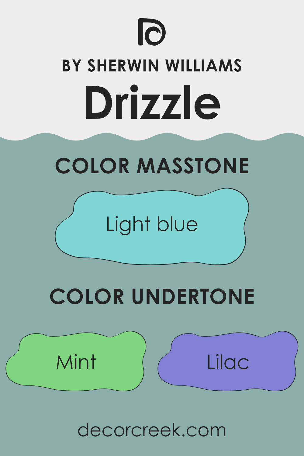
Drizzle SW 6479 by Sherwin-Williams is a unique color that carries a variety of undertones. This paint color has subtle hints of mint, lilac, gray, light gray, pale yellow, light purple, pale pink, turquoise, light turquoise, blue, and dark turquoise. These undertones influence how the main color looks to the human eye, even if we’re not consciously aware of them.
Undertones can make a color appear warmer or cooler. If a color has yellow or pink undertones, it might feel warm and inviting. On the other hand, blues and grays can give a cool and calming feel. The undertones present in the paint color, like mint and turquoise, suggest a cooler hue with a touch of freshness. This makes it especially appealing for rooms where you want a soothing atmosphere.
When Drizzle SW 6479 is applied to interior walls, these undertones can affect the room’s overall mood. The cooler tones from mint and blue can give a room a relaxed vibe, ideal for a bedroom or bathroom. Light gray and pale yellow undertones can balance and soften the look, preventing it from feeling too cold. The result is a flexible color that works well with natural light, providing a refreshing look to any room.
What is the Masstone of the Drizzle SW 6479 by Sherwin Williams?
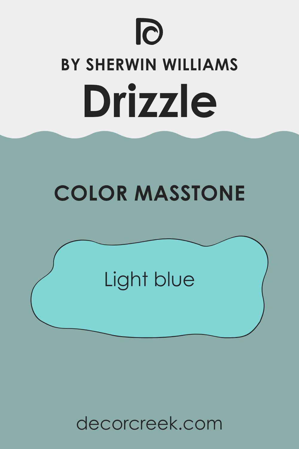
Drizzle SW 6479 by Sherwin Williams is a light blue color that brings a fresh and airy feel to any room. Because of its light and soothing tone, it can create a calm and relaxing atmosphere in a room. It’s a great choice for areas like bedrooms or bathrooms where you want to unwind.
The color light blue (#80D5D5) works well in homes because it can make small areas feel larger and more open. It reflects light beautifully, enhancing the brightness of a room. Additionally, this color pairs nicely with neutral shades like white or beige, adding a touch of color without being overpowering.
Using Drizzle on walls can also bring a sense of cleanliness and crispness, making rooms feel more organized. Overall, its gentle and pleasing hue ensures that interiors feel cozy yet spacious, offering a simple way to refresh the look of your home.
How Does Lighting Affect Drizzle SW 6479 by Sherwin Williams?
Lighting plays a crucial role in how we perceive colors. The type of light can change how a color appears in a room, making it look different in artificial light compared to natural light. This happens because different light sources emit light in different color temperatures. For example, sunlight can be more blue, while incandescent bulbs can emit warmer, yellow tones.
The color Drizzle (SW 6479) by Sherwin Williams is a soft blue-green shade that can change quite a bit depending on the lighting and the direction a room faces. In artificial light, especially if using warm bulbs, Drizzle might appear slightly warmer or more greenish. Under cooler, fluorescent lighting, it may seem more blue.
In natural light, how Drizzle looks will vary based on the room’s orientation. In north-facing rooms, natural light tends to be cooler and more consistent throughout the day. Drizzle might appear cooler or more muted in these conditions. In south-facing rooms, which receive warm, bright light, this color may seem lighter and more vibrant. The paint’s undertones may appear more pronounced, showing more of its greenish hues.
East-facing rooms get bright, warm light in the morning and cooler light later in the day. In these areas, Drizzle can look brighter and more lively during the morning hours, then become softer and cooler as the sun moves. In west-facing rooms, the opposite happens.
The light is softer and cooler earlier in the day and becomes warm and golden in the afternoon and evening. Here, Drizzle might appear more subdued earlier and exhibit a richer depth as the day progresses. Understanding how lighting influences the appearance of paint colors can help in choosing the right shade for each room, ensuring that it meets the desired look and feel at different times of the day.

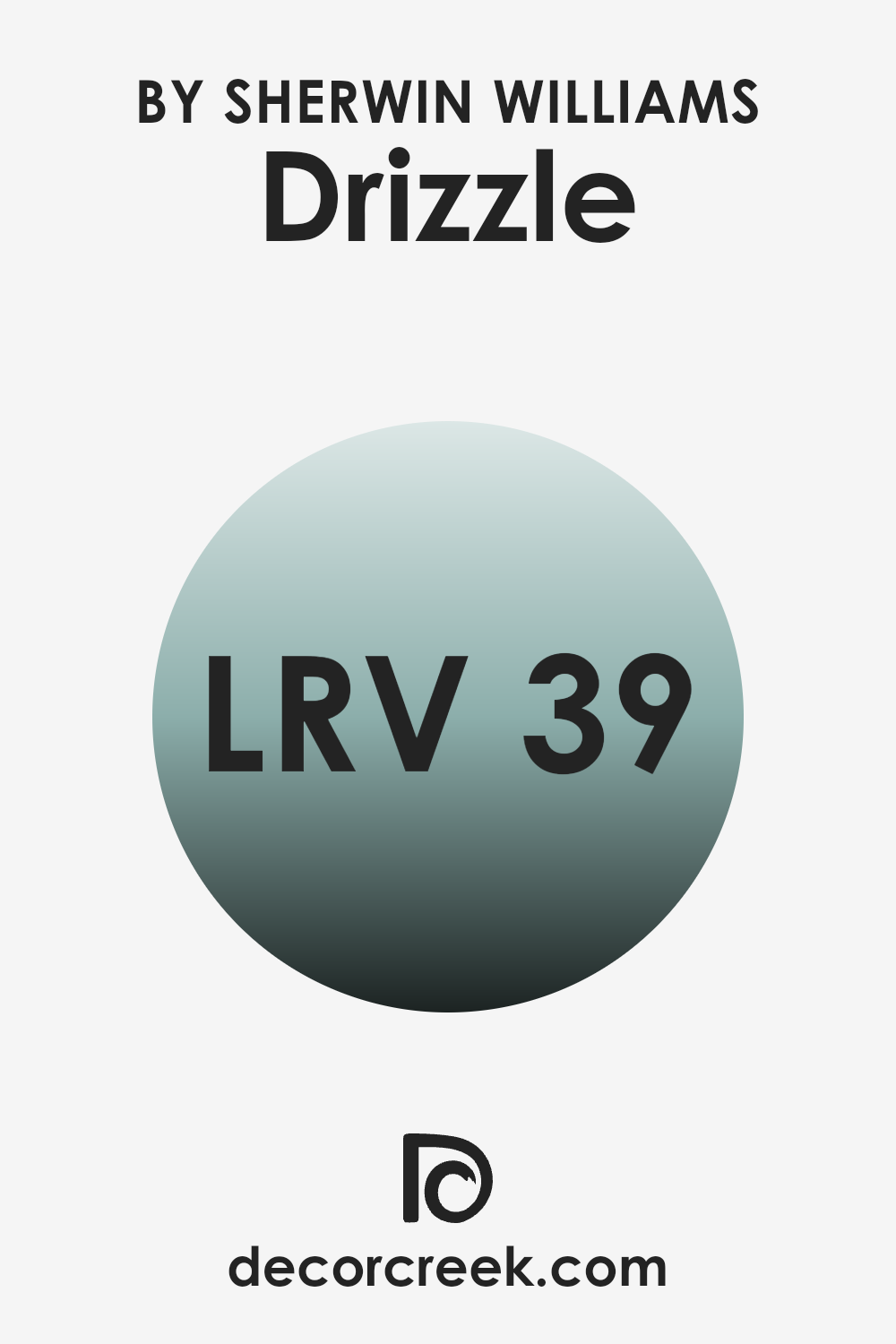
What is the LRV of Drizzle SW 6479 by Sherwin Williams?
The Light Reflectance Value, or LRV, is a measure that tells you how much light a color reflects. It’s a number between 0 and 100, where 0 means the color reflects no light (pure black) and 100 means it reflects all light (pure white).
LRV helps you understand how light or dark a color will look and feel in a room. A color with a low LRV absorbs more light, making a room feel cozier but potentially darker. Conversely, a color with a high LRV reflects more light, which can make a room feel brighter and more open.
For Drizzle, with an LRV of 38.911, this color falls into the mid-range of light reflection. This means it doesn’t reflect a lot of light like a very light color would, but it’s also not as dark as colors with lower VRVs. In a room, Drizzle can create a comfortable and balanced atmosphere—not too bright but also not too heavy. It will look different depending on the amount of natural light in the room.
In brighter areas, it might feel airy and fresh, while in rooms with less light, it may have a more muted and calming effect.
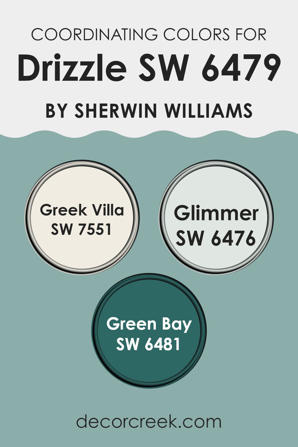
Coordinating Colors of Drizzle SW 6479 by Sherwin Williams
Coordinating colors are shades that work well together, creating a harmonious and pleasing look in a room. When you choose a main color, like Drizzle by Sherwin Williams, coordinating colors enhance the main shade by complementing or contrasting with it to create a balanced palette.
Drizzle is a soft and calming blue-green that can serve as a peaceful backdrop, and coordinating colors can manage moods and styles in different ways. These colors can tie together various elements in your room, be it furniture, decor, or architectural features, adding layers and depth to the overall design.
Greek Villa, a warm and creamy white, complements Drizzle well by bringing light and airiness to a room, creating a feeling of openness. The color Glimmer adds a hint of light blue, offering a gentle contrast that still aligns with the calming nature of Drizzle. Green Bay, a deeper, rich teal, provides a dramatic contrast that adds depth and interest to the color scheme.
These coordinating colors, when used together, can create a room that is both visually interesting and harmonious, showcasing how colors can work together to enhance the feel of a room.
You can see recommended paint colors below:
- SW 7551 Greek Villa
- SW 6476 Glimmer
- SW 6481 Green Bay
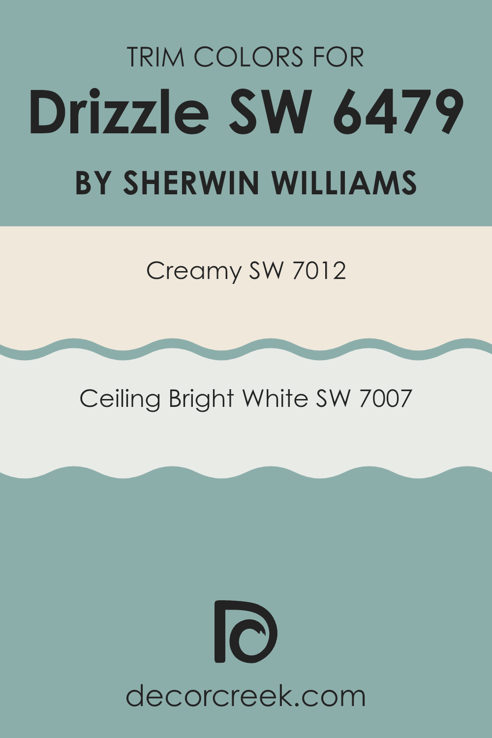
What are the Trim colors of Drizzle SW 6479 by Sherwin Williams?
Trim colors are the specific shades used on the edges or borders of a room, like baseboards, window casings, and door frames. These colors play an essential role in interior design because they create a visual frame for the walls, enhancing or complementing the main color used in the room.
With Drizzle by Sherwin Williams as the primary color, using the right trim colors can make the room feel balanced and visually appealing. Drizzle, being a light and refreshing hue, benefits from trim colors that either highlight its soft, calming effect or contrast it for boldness.
One excellent choice for trim is Sherwin Williams’ Creamy (SW 7012), a warm white with buttery undertones that adds a subtle elegance and coziness, perfectly complementing the coolness of Drizzle. Another suitable option is Ceiling Bright White (SW 7007), which is a clean, crisp white that offers a sharp, bright contrast, making the walls stand out. Together, these trim colors can either softly harmonize with or distinctly highlight the primary wall color, adding depth and interest to the room’s overall aesthetic.
You can see recommended paint colors below:
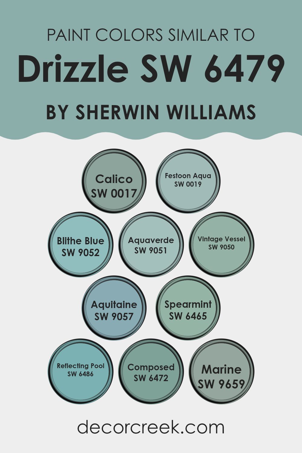
Colors Similar to Drizzle SW 6479 by Sherwin Williams
Choosing the right colors is key in creating a cohesive and soothing environment, and this is where similar colors come into play. These colors often share undertones, making them naturally harmonious when placed together in a room. Drizzle by Sherwin Williams, a gentle blend of aqua with a hint of gray, can be beautifully complemented by various shades that similarly evoke a calming atmosphere.
SW 0017 Calico offers a warm, earthy tone that can ground the room, while SW 0019 Festoon Aqua introduces a lively splash reminiscent of tropical waters. Meanwhile, SW 9052 Blithe Blue brings a peaceful sky-like quality to the mix.
Blending in more green hues, SW 9051 Aquaverde strikes a balance between blue and green, and SW 9050 Vintage Vessel presents a muted teal that adds depth. SW 9057 Aquitaine further enhances this palette with its subtle, green-leaning blue that is both flexible and calming. SW 6465 Spearmint refreshes the scene with its crisp, minty presence.
To enrich the watery theme, SW 6486 Reflecting Pool offers a sense of coolness, while SW 6472 Composed introduces a soft, subdued blue with a gray undertone. Lastly, SW 9659 Marine ties it all together with a deep, oceanic blue that echoes the calm depth of the sea. These colors together can create an inviting and unified room.
You can see recommended paint colors below:
- SW 0017 Calico
- SW 0019 Festoon Aqua
- SW 9052 Blithe Blue
- SW 9051 Aquaverde
- SW 9050 Vintage Vessel
- SW 9057 Aquitaine
- SW 6465 Spearmint
- SW 6486 Reflecting Pool
- SW 6472 Composed
- SW 9659 Marine
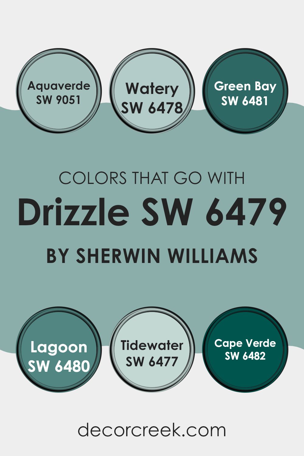
Colors that Go With Drizzle SW 6479 by Sherwin Williams
The colors that go with Drizzle SW 6479 by Sherwin Williams create a beautiful, harmonious atmosphere in any room. Drizzle is a soft blue-green shade that pairs wonderfully with several other colors to create a calm and cohesive look. When combined with SW 9051 – Aquaverde, you get a fresh and clean feel with its light and airy green tone that complements the subtle blue in Drizzle.
SW 6478 – Watery introduces a calming effect with its more pronounced light blue shade, working perfectly as an accent or main color to highlight Drizzle’s beauty. SW 6481 – Green Bay, with its rich teal hue, offers a bold contrast that still feels cohesive and balanced, adding depth and richness to the color scheme.
In addition, SW 6480 – Lagoon brings an energetic vibe with its vibrant blue-green tone, invigorating any room while staying harmonious with Drizzle. SW 6477 – Tidewater has a breezy light blue hue, perfect for creating a soft and relaxing environment that enhances Drizzle’s subtle charm. Finally, SW 6482 – Cape Verde is a deep and lush green that grounds the color palette, providing an elegant and natural touch that makes each of these colors feel connected and pleasing to the eye.
Together, these colors work beautifully to create inviting and visually interesting areas.
You can see recommended paint colors below:
- SW 9051 Aquaverde
- SW 6478 Watery
- SW 6481 Green Bay
- SW 6480 Lagoon
- SW 6477 Tidewater
- SW 6482 Cape Verde
How to Use Drizzle SW 6479 by Sherwin Williams In Your Home?
Drizzle SW 6479 is a refreshing paint color from Sherwin Williams. It’s a soft, bluish-green hue that can add a calm and airy feeling to any room. You can use this color in different parts of the home to create a relaxing atmosphere.
In a bedroom, Drizzle can make the room feel peaceful and inviting. Pair it with white or light gray bedding for a soothing look. In the bathroom, it can bring a spa-like quality, especially when combined with natural elements like wood and stone.
For living rooms, using Drizzle on an accent wall can add a pop of color without being too bold. It works well with neutral or earthy tones. The color is also great for kitchens when you want a fresh and clean vibe. Overall, Drizzle SW 6479 is flexible and can bring a sense of calmness to any room.
Drizzle SW 6479 by Sherwin Williams vs Aquaverde SW 9051 by Sherwin Williams
Drizzle (SW 6479) by Sherwin Williams is a soft, muted teal that brings a sense of calm and coastal vibes to any room. It’s like a gentle sea breeze, with its cool undertones making it a flexible choice for both modern and traditional interiors.
On the other hand, Aquaverde (SW 9051) offers a slightly bolder take on a greenish-blue palette. While Drizzle leans more towards a grayish undertone, Aquaverde is more vibrant and has a hint of green, giving it a fresh, lively feel.
Drizzle might remind you of a quiet, cloudy day by the beach, whereas Aquaverde feels like a sunny afternoon in a lush garden. Both colors work well with natural textures and can be complemented with whites and neutrals for a balanced look. In summary, Drizzle is calm and understated, while Aquaverde is cheery and invigorating.
You can see recommended paint color below:
Drizzle SW 6479 by Sherwin Williams vs Composed SW 6472 by Sherwin Williams
Drizzle (SW 6479) and Composed (SW 6472) are two lovely paint colors by Sherwin Williams. Drizzle is a soft, muted blue-green shade that feels calm and soothing. It has a light and airy quality, perfect for creating a relaxing atmosphere.
On the other hand, Composed is a darker, more intense shade of green. It feels strong and grounded, with an earthy depth that adds richness to a room. While Drizzle brings a bright, breezy vibe, Composed offers a more serious and formal mood.
Despite their differences, both colors share an underlying green tone that ties them together. They can complement each other well, with Drizzle working beautifully in areas where you want a gentle touch and Composed adding a more dramatic effect. Each color brings its own unique feel, allowing for a range of moods depending on the room and purpose.
You can see recommended paint color below:
Drizzle SW 6479 by Sherwin Williams vs Vintage Vessel SW 9050 by Sherwin Williams
Drizzle is a soft, muted turquoise that brings a touch of freshness and calm to a room. It’s flexible and can be used in various settings, from bathrooms to living rooms, offering a soothing backdrop. In contrast, Vintage Vessel is a warmer, deeper teal with earthy undertones.
This color provides a cozy, rich feel, making it a great choice for creating intimate rooms like bedrooms or reading nooks. While both colors belong to the blue-green family, Drizzle leans more towards a lighter and more airy vibe, perfect for areas where you want to add a hint of color without overpowering the senses.
Vintage Vessel, on the other hand, adds depth and warmth, making it suitable for areas where you want to foster a more inviting atmosphere. Together, they could complement each other well, with Drizzle offering lightness and Vintage Vessel adding a grounding presence.
You can see recommended paint color below:
- SW 9050 Vintage Vessel

Drizzle SW 6479 by Sherwin Williams vs Marine SW 9659 by Sherwin Williams
Drizzle SW 6479 and Marine SW 9659 by Sherwin Williams offer two distinct shades of blue-green. Drizzle is a soft, muted hue that leans more toward a grayish blue. It creates a calm and relaxed atmosphere, making it ideal for areas where you want a subtle touch of color without overpowering the room.
On the other hand, Marine SW 9659 is a deeper, more intense shade of blue-green. It has a rich, vibrant quality that can energize a room and make a bold statement. While Drizzle feels more understated and soothing, Marine demands attention with its strong color presence.
Both colors work well in different settings: Drizzle is perfect for creating a peaceful environment, while Marine adds a pop of color and drama. Whether you prefer a gentle or bold look, these colors provide flexible options for any room.
You can see recommended paint color below:
Drizzle SW 6479 by Sherwin Williams vs Festoon Aqua SW 0019 by Sherwin Williams
Drizzle SW 6479 by Sherwin Williams is a soft, muted shade of blue-green, reminiscent of a gentle foggy morning. It has a calming effect and works well as a neutral backdrop in both traditional and modern areas. It brings a subtle hint of color without overpowering the senses, making it flexible for living rooms, bedrooms, or bathrooms.
Festoon Aqua SW 0019, on the other hand, is a brighter, more vibrant aqua. This color is lively and cheerful, with a noticeable green tone that brings energy to a room. Festoon Aqua is ideal for areas where you want to inspire creativity and positivity, such as kitchens, playrooms, or home offices.
While both colors belong to the blue-green family, Drizzle provides a more subdued, calming atmosphere, perfect for relaxation, whereas Festoon Aqua offers a bolder and more invigorating splash of color, suitable for areas that thrive on energy and dynamism.
You can see recommended paint color below:
- SW 0019 Festoon Aqua
Drizzle SW 6479 by Sherwin Williams vs Reflecting Pool SW 6486 by Sherwin Williams
Drizzle and Reflecting Pool are both soft, calming colors by Sherwin Williams, but they each have their unique characteristics. Drizzle is a muted blue-green with a hint of gray, giving it a soothing and understated feel.
It works well in areas where you want a subtle hint of color without being overpowering. Reflecting Pool, on the other hand, is a slightly brighter and more vibrant teal. It adds a bit more energy to a room while still maintaining a calm atmosphere.
Drizzle is great for creating a cozy, gentle environment, whereas Reflecting Pool can bring a bit more liveliness and brightness to a room. Both colors are flexible and can be used in various settings, from living rooms to bedrooms, depending on the mood you want to create. They pair well with neutral tones and natural elements, enhancing their relaxing qualities.
You can see recommended paint color below:
Drizzle SW 6479 by Sherwin Williams vs Calico SW 0017 by Sherwin Williams
Drizzle SW 6479 and Calico SW 0017 by Sherwin Williams are quite different from each other. Drizzle is a soft, muted blue-green that brings a cool and refreshing feel, reminiscent of a gentle rain or misty day. It works well in areas where you want a calm and soothing environment.
On the other hand, Calico SW 0017 is a warm, rich brown. It has a cozy and earthy vibe, making a room feel inviting and grounded. While Drizzle adds a light, airy touch, Calico creates a sense of warmth and stability.
Together, these colors can complement each other by balancing cool and warm tones. Drizzle is ideal for accent walls or areas needing a refreshing touch, while Calico adds depth and warmth to rooms like living rooms or offices. Both colors have distinct personalities but can work well together depending on the mood you want to create.
You can see recommended paint color below:
Drizzle SW 6479 by Sherwin Williams vs Blithe Blue SW 9052 by Sherwin Williams
Drizzle SW 6479 by Sherwin Williams and Blithe Blue SW 9052 are both soft, calming colors, but they have distinct differences. Drizzle is a muted, light blue-green with a gray undertone. It gives a cool and peaceful vibe, resembling a gentle mist. This color works well in areas where you want a relaxed and soothing atmosphere.
Blithe Blue, on the other hand, is a more vibrant and lively shade of blue. It has a bit more energy than Drizzle, making rooms feel cheerful and welcoming. While Drizzle leans more towards green, Blithe Blue is a clear, light, and airy blue that brings a sense of freshness.
When choosing between these two, consider the mood you want to create. If you prefer a calm, subdued setting, Drizzle might be your choice. If you’re looking for something a bit brighter and lively, Blithe Blue could be the better option.
You can see recommended paint color below:
Drizzle SW 6479 by Sherwin Williams vs Aquitaine SW 9057 by Sherwin Williams
Drizzle SW 6479 and Aquitaine SW 9057 are two distinctive shades by Sherwin Williams. Drizzle is a soft, muted blue-green. It gives off a calm and relaxing vibe, making it a good choice for areas meant for unwinding. It combines the freshness of blue with the calming touch of green, creating a balanced look that doesn’t dominate a room.
On the other hand, Aquitaine is a deeper, more vivid blue-green compared to Drizzle. It has a richer tone and can add a stronger statement to a room. This color is great for adding an energetic and vibrant feel to a room without being too bold or dark.
When compared, Drizzle is softer and more subdued, perfect for areas where a gentle, calming touch is desired. Aquitaine, being more intense, works well for when a bit more color and energy is wanted. Both can complement each other or be used separately to achieve different moods.
You can see recommended paint color below:
- SW 9057 Aquitaine
Drizzle SW 6479 by Sherwin Williams vs Spearmint SW 6465 by Sherwin Williams
Drizzle SW 6479 by Sherwin Williams is a soft, muted shade of blue-green, like a gentle mist over the sea. It has a calming and understated feel, making it perfect for a relaxing atmosphere. It works well in areas where you want a touch of color without overpowering brightness.
In contrast, Spearmint SW 6465 is a brighter and more vibrant green. It has a refreshing pop, reminiscent of the cool, minty taste it’s named after. Spearmint stands out more and adds a lively touch to any room.
When comparing the two, Drizzle is more subdued, creating a peaceful vibe, while Spearmint introduces energy and freshness. Drizzle might be suited for bedrooms or living rooms where relaxation is key, whereas Spearmint could work well in a kitchen or a playroom, where its lively presence can energize the room. Both colors offer their unique charm and can be chosen depending on the mood you want to create.
You can see recommended paint color below:
- SW 6465 Spearmint
In conclusion, I find that SW 6479 Drizzle by Sherwin Williams is a wonderful color choice. It brings a fresh and calming look to any room. The color is light and has a soft blue-green shade that makes you think of the ocean or a clear sky after rain.
When I painted a room with Drizzle, it turned a dull room into one with a bright and happy feel. It’s like a breath of fresh air for the walls. The color is gentle on the eyes, and it doesn’t stand out too much but adds just enough color to make everything look nice.
It works well with white furniture or wood floors, and it looks great in any room, whether it’s a bedroom, living room, or even the kitchen. The color can brighten up a room and make it feel more open and airy.
In my experience, Drizzle is a color that can make a home feel welcoming and cheerful. It brings a sense of calm without being boring. So, if you’re thinking of changing your room’s color, Drizzle by Sherwin Williams might be a great choice to make your home look pleasant and inviting.

Ever wished paint sampling was as easy as sticking a sticker? Guess what? Now it is! Discover Samplize's unique Peel & Stick samples.
Get paint samples

