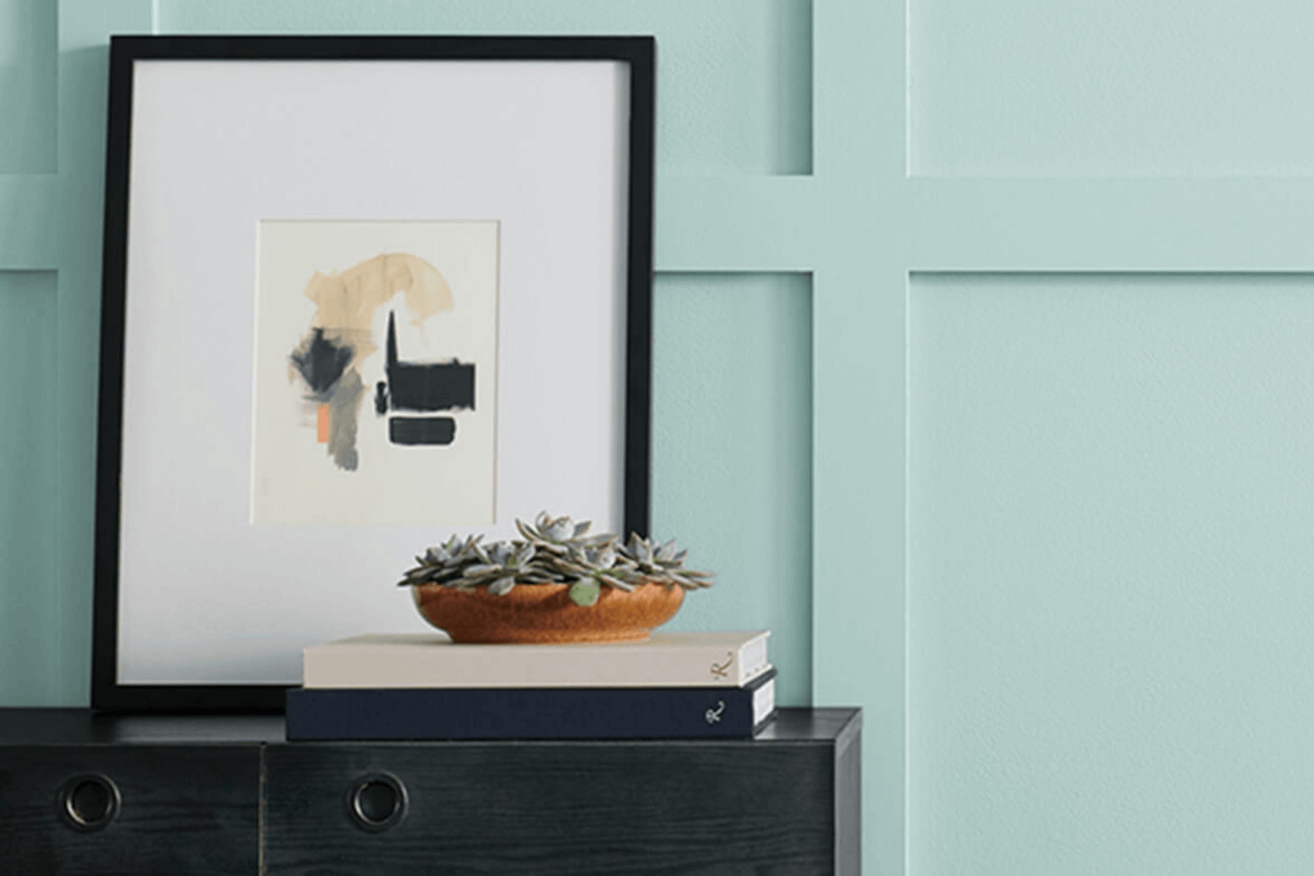
If you’re thinking about refreshing a room with new paint, SW 6478 Watery by Sherwin Williams might be just what you need. This shade is a delicate and airy blue that effortlessly brings a sense of calm and lightness into any room. When I recommended this color to my clients, it reminded me of the gentle tones of a clear sky on a sunny morning or the calm surface of a quiet lake.
This color is not just beautiful — it also works great in many rooms and with different decor. It works well in many parts of the home — whether you’re updating a cozy bedroom or adding a splash of color to a formal dining area. The softness of Watery lets it pair nicely with both bright accents and quieter tones, so you can style each room in a way that feels just right.
Moreover, using Watery can give your room an expanded feel, making it appear more open and inviting. I found it especially helpful in smaller rooms or those that don’t get much natural light — it reflects whatever light is there and helps the whole area feel brighter.
If you’re thinking about adding a fresh, uplifting tone to your home, Watery is a choice worth considering.
What Color Is Watery SW 6478 by Sherwin Williams?
The color Watery by Sherwin Williams is a fresh and light aqua hue, perfect for adding a touch of brightness to any room. With its soft blend of blue and green, this color has a subtle vibrancy that isn’t overpowering, making it ideal for creating a relaxing atmosphere.
It’s especially effective in bathrooms and kitchens, where it complements the natural light and adds a clean, airy feel. Additionally, watery works well in bedrooms and living areas, giving them a cheerful and inviting look without being too bold.
Watery pairs beautifully with white trim or fixtures, which help to enhance its light, breezy quality. In terms of materials, natural wood with a light to medium stain looks stunning against this color, as it underscores the warmth of the wood without clashing. Textures like linen, cotton, and other soft fabrics also work well with Watery, adding to the comfortable and laid-back feel of the room.
For interior styles, Watery works well with modern, coastal, or Scandinavian designs. In modern settings, its clean and bright quality helps to keep the look minimal yet inviting. In coastal-style rooms, it echoes the colors of the seaside and helps bring out that breezy, beachy feeling.
Scandinavian designs benefit from its lightness and subtlety, adding just enough color to warm the typically neutral palette without dominating it.

Is Watery SW 6478 by Sherwin Williams Warm or Cool color?
WaterySW 6478 is a paint color from Sherwin Williams that brings a fresh and lively vibe to any room. This light blue shade has a calm feel to it, making it perfect for areas like bedrooms and bathrooms where you want to promote a relaxed atmosphere. Its brightness can also make small rooms feel bigger and more open, which is a big plus for cozier homes.
Because it’s such a soft color, it pairs well with a wide range of decor styles and colors. For instance, it looks beautiful next to white trim or furniture, creating a clean and refreshing look. It can also work well alongside darker colors like navy or gray, giving a nice contrast without making the room feel too heavy.
Overall, Watery is simple to use and fits nicely in many parts of the home. Whether you’re looking to paint a whole room or just an accent wall, it’s a great choice that adds a touch of calmness without being too bold.
Undertones of Watery SW 6478 by Sherwin Williams
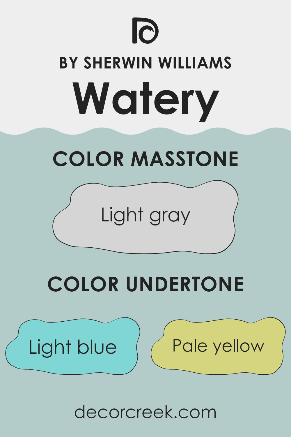
Watery SW 6478 is a flexible paint color that can shift in appearance depending on the room and what’s around it, thanks to its undertones. An undertone is a subtle color that is present underneath the primary color you see. In this case, the undertones include light blue, pale yellow, light purple, mint, lilac, pale pink, and grey.
These undertones can play a significant role in the look and feel of a room. For example, the light blue and mint undertones can give a fresh and airy vibe, making a room feel more open. In contrast, pale yellow and light purple undertones might add a gentle warmth, making the room feel cozier and more inviting without being too bold.
On interior walls, the undertones can significantly influence the mood and atmosphere. If a room gets a lot of natural sunlight, the pale yellow undertone might become more noticeable, making the room feel cheerful and full of life. In a room with less natural light, the grey and lilac undertones might stand out, giving the room a muted and calm appearance.
Choosing furniture and decorations that complement these undertones can also enhance the overall aesthetic. Light-colored wood and soft textures might harmonize well with the pale pink and lilac undertones, while metallic accents and modern furniture might highlight the grey undertones for a contemporary look. Understanding these undertones can help you make better choices when decorating and styling a room.
What is the Masstone of the Watery SW 6478 by Sherwin Williams?
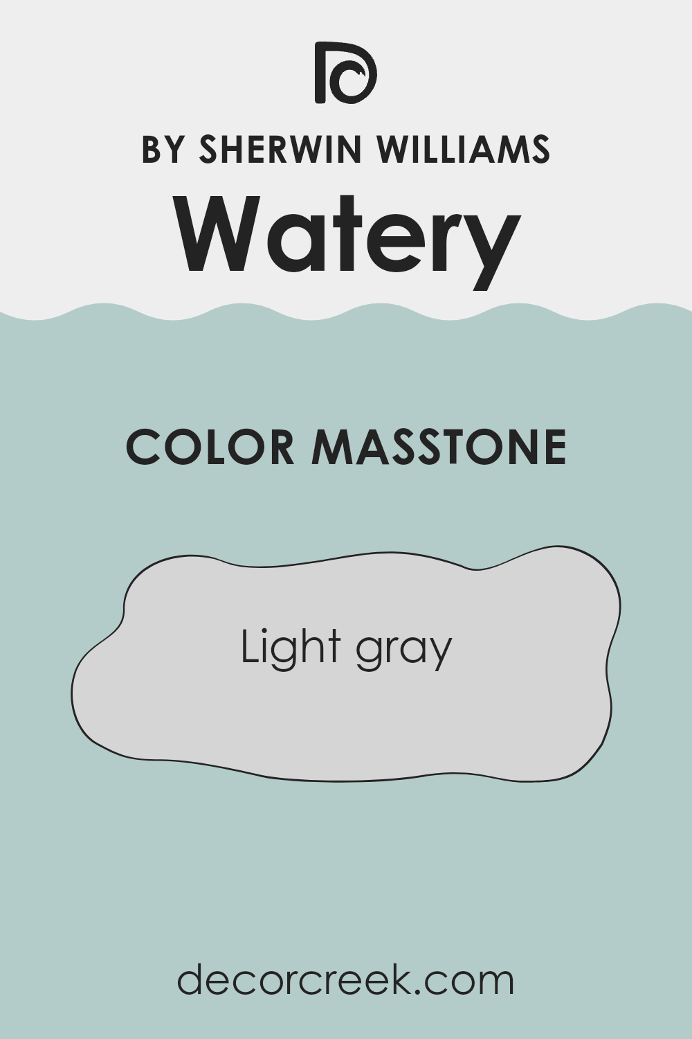
The core shade of Watery SW 6478 by Sherwin Williams is Light Gray, which has a base tone resembling the color #D5D5D5. This light gray base color provides a gentle, neutral backdrop for any room in the home. It’s a flexible color that matches well with many other hues, making it easy to use in various decorating styles. Whether your home features modern, minimalist furniture or more traditional décor, this shade of light gray blends in beautifully without making the room feel too busy.
This particular gray is neither too stark nor too bold, which helps to create a calm and welcoming environment. It’s excellent for rooms where you want to create a sense of calm and order, like bedrooms and living rooms.
The lightness of the gray allows it to reflect natural light effectively, making rooms appear larger and more open. This can be especially helpful in smaller rooms or spots with limited natural light. Overall, this shade is a practical choice that helps a house feel more like a home.
How Does Lighting Affect Watery SW 6478 by Sherwin Williams?
Lighting plays a crucial role in how we perceive colors, as it can significantly alter their appearance. Different light sources and their direction can change how a color looks in a room.
For example, Sherwin Williams’ color SW 6478, a refreshing shade of light blue, reacts uniquely under various lighting conditions. In artificial light, such as that from LED bulbs or fluorescent lamps, this shade tends to appear slightly brighter and more vibrant. Artificial lighting can enhance the blue, making it pop more than it might in natural light.
In natural light, the appearance of this color can vary throughout the day, depending on the direction of the windows and the quality of the light. In a north-facing room, where light is generally cooler and more muted, SW 6478 tends to look more subdued, maintaining its true blue tone but with a slightly grayish cast due to the lesser intensity of the light. This cool illumination does not distort the color much, keeping it calm and consistent.
In south-facing rooms, which receive the most intense light throughout the day, this color can appear much lighter and somewhat washed out during peak sunny hours. The vibrancy of the color is amplified by the abundant natural light, making the room feel airy.
East-facing rooms get bright light in the morning when the sun rises, so SW 6478 will look vivid and lively at this time. As the day progresses and the natural light diminishes, the color might appear cooler and more subdued.
Similarly, in west-facing rooms, the color displays its vibrancy in the late afternoon as the sun begins to set, radiating warmth that enhances the lushness of the blue. During morning hours, the color can seem cooler and more restrained.
This dynamic behavior of SW 6478 under different lighting shows why it’s so important to consider light when choosing colors for your room. It affects how the color acts, feels, and even sets the mood of the room.

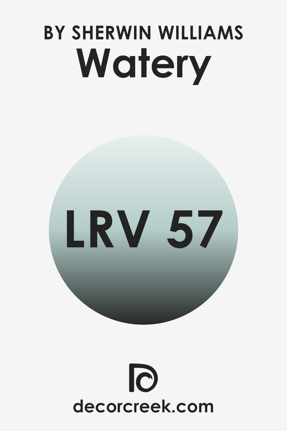
What is the LRV of Watery SW 6478 by Sherwin Williams?
LRV stands for Light Reflectance Value, a measurement that indicates how much light a paint color reflects or absorbs. Measured on a scale from 1 to 99, a higher number means the color reflects more light, making it look brighter in a room. Contrarily, a lower LRV means the color absorbs more light, which can make a room feel cozier but smaller.
LRV is crucial when choosing paint colors as it helps to understand how paint will look under different lighting conditions. For instance, a room with lots of natural light can handle a color with a lower LRV, whereas a room with less light might need a higher LRV to prevent it from feeling too dark.
With an LRV of 57.174, Watery SW 6478 falls in the mid-range of the scale, meaning it has a balanced capacity for reflecting light. This value means it works well in many kinds of rooms, whether they get lots of light or just a little. In bright rooms, this color will feel lighter and more airy, while in rooms with less natural light, it will still hold its true color without absorbing too much light and making the area feel darker. This balance makes it a practical choice for someone wanting to maintain a sense of brightness without the area feeling too stark.
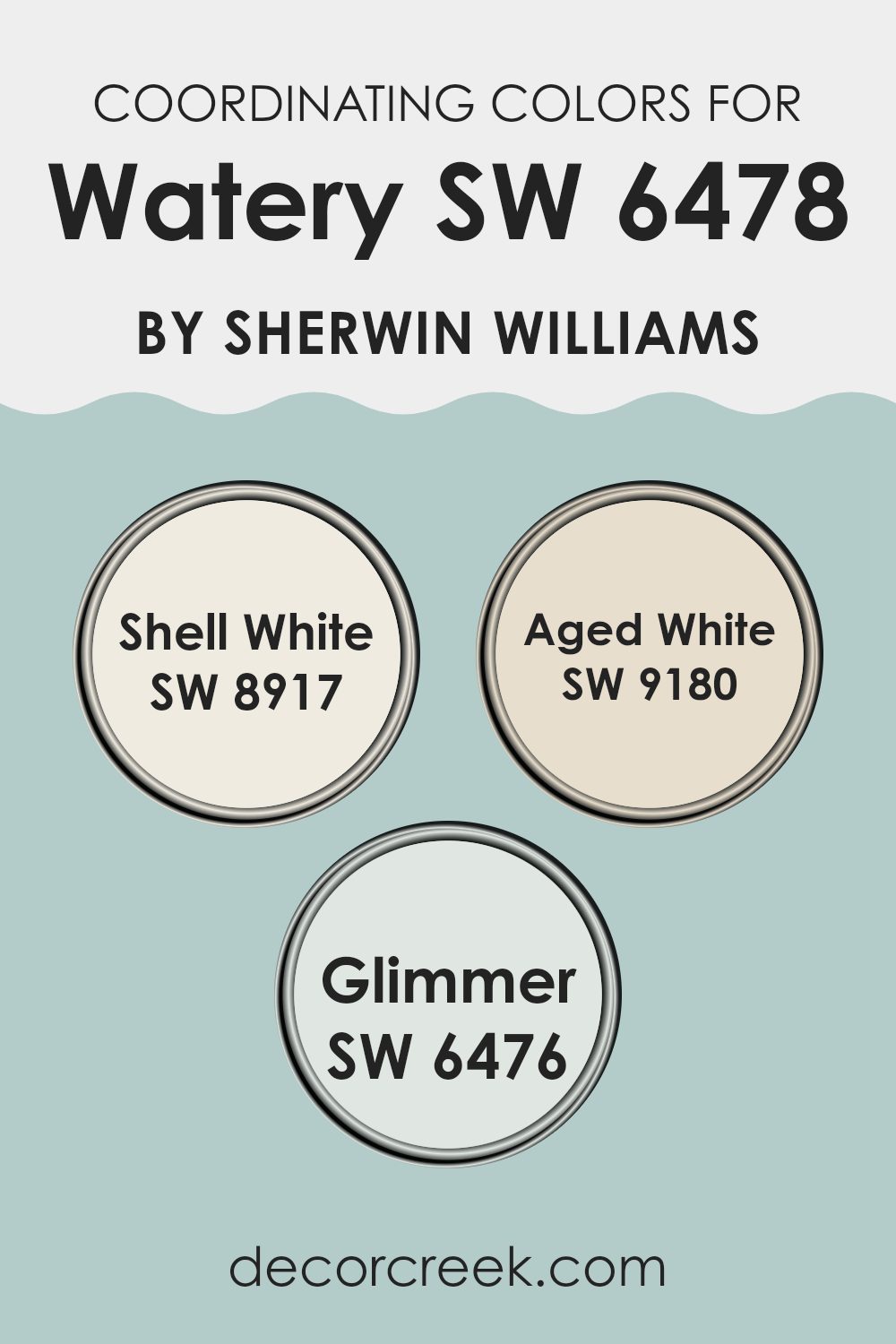
Coordinating Colors of Watery SW 6478 by Sherwin Williams
Coordinating colors are a group of shades that work well together in a room, enhancing the overall look without feeling too strong or distracting. These colors often share similar tones or contrasts that make them visually pleasing when combined. For instance, Shell White (SW 8917), Aged White (SW 9180), and Glimmer (SW 6476) are colors that coordinate well with the soothing blue shade of Watery (SW 6478) by Sherwin Williams.
Shell White is a gentle off-white shade that provides a clean and airy background, helping the room feel more open while adding a touch of calm. Aged White, slightly deeper, offers a warm, creamy backdrop that lends a cozy, welcoming feel to any room.
On the lighter side, Glimmer is a subtle, soft green that gives a hint of color, perfect for creating a light, refreshing environment. These hues together create a harmonious palette that can complement the calming effect of a blue like Watery, without overshadowing its presence.
You can see recommended paint colors below:
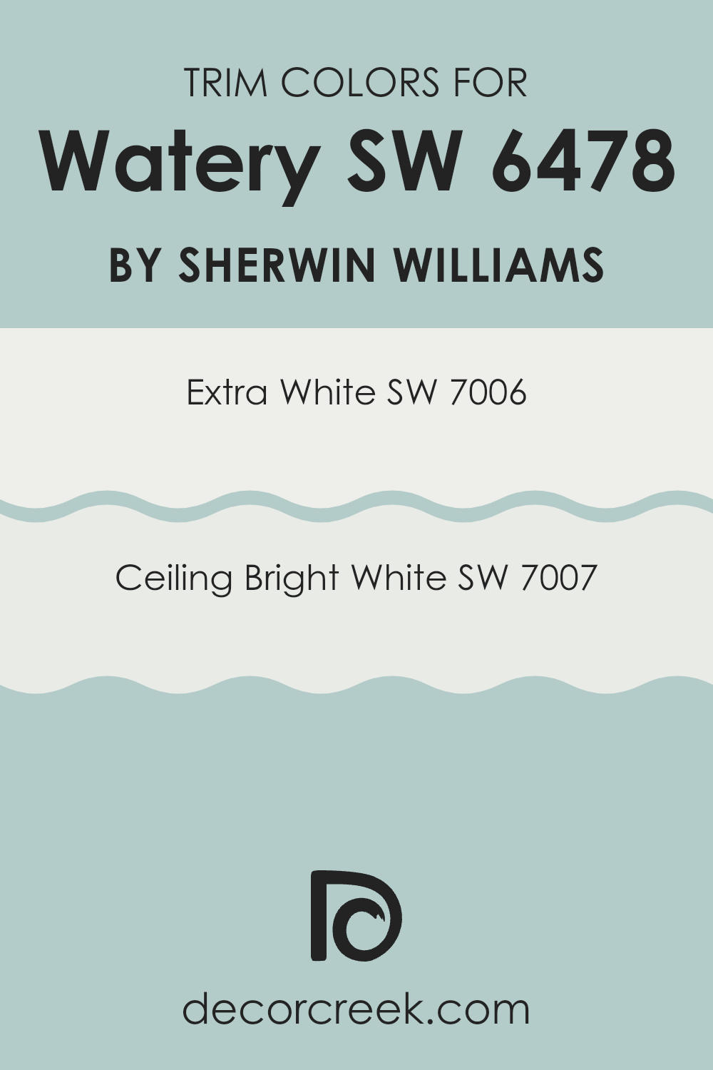
What are the Trim colors of Watery SW 6478 by Sherwin Williams?
Trim colors are critical accessories in the painting and decorating world, especially when it comes to complementing main color choices such as Watery by Sherwin Williams. They help define and highlight architectural features, create visual outlines, and enhance the overall appeal of a room.
For instance, using a trim color like SW 7006 – Extra White or SW 7007 – Ceiling Bright White can add a crisp, clean look to the edges, windows, and doors, providing a beautiful contrast that makes the primary color stand out more.
SW 7006 – Extra White is a pure, bright white that brings a fresh, clean feel to any room, and it’s a favorite for trim, especially when you want contrast with deeper wall colors. On the other hand, SW 7007 – Ceiling Bright White has a slightly softer tone compared to Extra White.
This color is great for ceilings and trims too, offering a gentle contrast that softens the shift between wall and ceiling, helping the whole room feel more put-together. Using these whites with Watery provides a beautiful, harmonious palette that can refresh and lighten any room.
You can see recommended paint colors below:
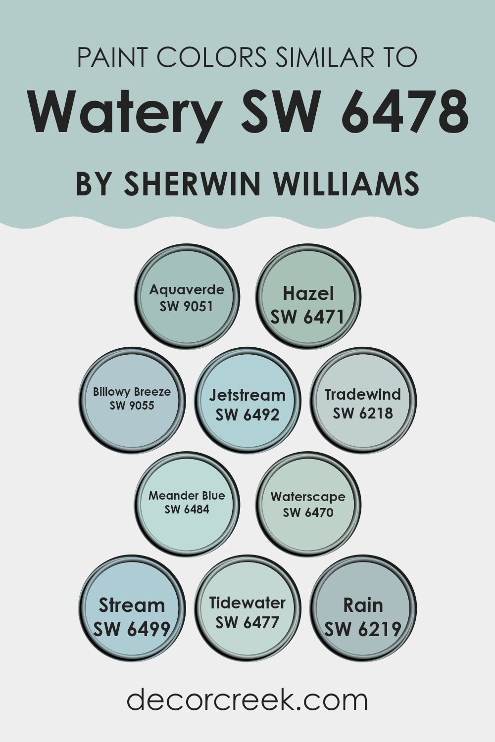
Colors Similar to Watery SW 6478 by Sherwin Williams
Using similar colors when decorating or designing a room can help create a calm and balanced look that feels nice to be in. These colors often share a common base tone but vary slightly in their shades and intensities, offering a cohesive yet subtly diverse visual experience.
Colors that are alike can seamlessly blend with each other, making a room feel more balanced and congruent. This kind of color scheme is particularly useful in achieving a cohesive look without the harsh contrasts that can come from combining opposite colors on the color wheel.
For instance, Sherwin Williams paints such as Aquaverde, Hazel, and Billowy Breeze are all variations of soft, muted greens and blues that suggest the calmness of seascapes and cloudless skies. Similarly, Jetstream and Tradewind are gentle blue hues that remind one of a clear, light blue sky.
Meander Blue, Waterscape, and Stream, with their soothing blue and green undertones, reflect the peaceful quality of meandering rivers and shallow waters. Tidewater and Rain provide slightly deeper shades of the blue-green spectrum, reminiscent of the ocean depths and rainy skies, respectively.
When these colors are used together in a design, they create a smooth visual story that ties all the elements with cool, calm tones. Choosing similar Sherwin Williams shades helps build a setting that feels neat and peaceful — great for rooms where you want to relax or focus.
You can see recommended paint colors below:
- SW 9051 Aquaverde
- SW 6471 Hazel
- SW 9055 Billowy Breeze
- SW 6492 Jetstream
- SW 6218 Tradewind
- SW 6484 Meander Blue
- SW 6470 Waterscape
- SW 6499 Stream
- SW 6477 Tidewater
- SW 6219 Rain
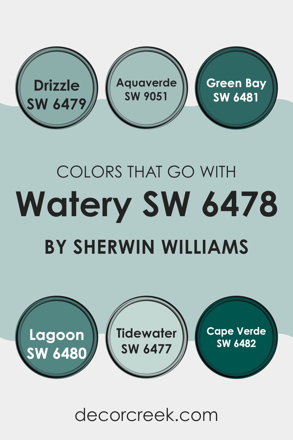
Colors that Go With Watery SW 6478 by Sherwin Williams
Selecting the right colors that complement Watery SW 6478 by Sherwin Williams is important because it helps create a balanced and harmonious look throughout the room. Watery SW 6478 is a refreshing color that works beautifully when matched with the right shades. Matching colors like SW 6479 – Drizzle, SW 9051 – Aquaverde, and others help enhance the overall aesthetic and create a cohesive environment.
Drizzle is a light grayish-blue that adds a soft contrast to Watery, giving rooms a bit more depth without taking away from the light feel. Aquaverde is a little bolder, with a green-blue tone that feels like shallow tropical water — it pairs nicely with Watery to create a fresh and cheerful look.
Green Bay is a deeper, richer green that injects energy and a sense of nature into the mix, great for adding a focal point. Lagoon, a dark teal, offers a bold statement yet remains soothing when placed alongside Watery. Tidewater is closely related to Watery but has a bit more green, helping to create a seamless flow from room to room.
Lastly, Cape Verde stands out with its bold, vibrant aqua tone that brings a splash of brightness and fun to any room. By carefully selecting these complementing colors, one not only achieves a visual appeal but also ensures that each room carries a pleasant and cohesive feel.
You can see recommended paint colors below:
- SW 6479 Drizzle
- SW 9051 Aquaverde
- SW 6481 Green Bay
- SW 6480 Lagoon
- SW 6477 Tidewater
- SW 6482 Cape Verde
How to Use Watery SW 6478 by Sherwin Williams In Your Home?
Watery SW 6478 by Sherwin Williams is a beautiful paint color that brings a fresh and lively vibe to any room. Reminiscent of the ocean, it has a soothing effect that makes it perfect for bedrooms and bathrooms where a calm atmosphere is ideal. You can also use it in your living room or kitchen to add a splash of brightness without making the room feel too bold.
For those looking to refresh their home, consider painting an accent wall with this shade; it pairs wonderfully with neutral colors such as whites, grays, and tans. Additionally, Watery can be used on furniture or cabinets for a unique touch.
It works well in different lighting conditions, especially in rooms with natural light, where it reflects a soft, airy glow. Whether you’re updating a small corner or redoing an entire room, this color provides a clean, refreshing look that’s easy on the eyes.
Watery SW 6478 by Sherwin Williams vs Stream SW 6499 by Sherwin Williams
“Watery” is a soft, gentle blue with a calming vibe that’s perfect for creating a peaceful setting in any room. It has a light feel that makes a room seem more open and airy. On the other hand, Stream is a deeper, more vibrant blue.
This color adds a bit of energy to a room without being too bold. It works well in areas where you want a bit more character but still keep a soothing atmosphere. Both colors reflect qualities of the natural world, but while Watery might remind you of a light sky on a sunny morning, Stream evokes the richer tones of deep water.
Each color has its charm, whether you’re looking for something subtle (Watery) or a bit more pronounced (Stream).
You can see recommended paint color below:

Watery SW 6478 by Sherwin Williams vs Tidewater SW 6477 by Sherwin Williams
Watery and Tidewater are two shades from Sherwin Williams that complement each other while offering subtle differences. Watery has a fresh, light blue tone that feels like a gentle splash of clear sky. It brings a bright and cheerful touch to the room, making it a great choice for creating a lively and inviting atmosphere.
In contrast, Tidewater leans slightly towards a greenish-blue, mimicking the beautiful hue of shallow coastal waters. This shade offers a slightly muted color, giving off a calm and cozy vibe perfect for creating a relaxed environment.
Both colors are great for anyone wanting to refresh their home with tones inspired by the sea. Whether used alone or together, they create a pleasant look that feels calm and friendly — perfect for bedrooms, bathrooms, or any part of the home that could use a bit of natural charm.
You can see recommended paint color below:
Watery SW 6478 by Sherwin Williams vs Hazel SW 6471 by Sherwin Williams
Watery by Sherwin Williams is a soft, light blue with a gentle touch that brings a fresh and airy feel to any room. It’s like looking up at a clear sky on a sunny day or watching gentle waves at the shore. This color is perfect for creating a relaxing and inviting atmosphere in rooms like bathrooms or bedrooms where you want a soothing vibe.
On the other hand, Hazel by Sherwin Williams leans towards a unique green shade with hints of blue, reminding you of a lush, leafy forest during a spring rain. It’s deeper and more nature-inspired compared to Watery, offering a feeling of renewal and freshness. Hazel works great in areas where you want to bring in a bit of nature and depth without making the room feel too heavy.
Both colors offer a refreshing palette but in distinctly different ways: Watery for its clear sky-like calmness and Hazel for its earthy, rich freshness.
You can see recommended paint color below:
Watery SW 6478 by Sherwin Williams vs Billowy Breeze SW 9055 by Sherwin Williams
Watery and Billowy Breeze are two colors by Sherwin Williams that share some similarities but also have distinct differences. Watery is a vibrant, energizing shade of blue that brings a lively pop of color to any room. It has the vividness of ocean waters on a sunny day, making it perfect for adding a cheerful touch to rooms.
On the other hand, Billowy Breeze is a softer, more muted blue with a gentle green undertone. This color is more subdued compared to Watery, providing a calm, soothing presence, which makes it ideal for creating a relaxed environment in places like bedrooms or bathrooms.
As for where to use them, Watery is great for areas where you want brightness and energy — like a kitchen or kids’ playroom. Billowy Breeze, with its softer and more peaceful look, works better in rooms where comfort and calm matter most. Both colors reflect light nicely, but each brings a different mood depending on how bold or gentle it feels.
You can see recommended paint color below:
- SW 9055 Billowy Breeze
Watery SW 6478 by Sherwin Williams vs Aquaverde SW 9051 by Sherwin Williams
Watery SW 6478 and Aquaverde SW 9051, both by Sherwin Williams, offer unique takes on aquatic-inspired colors, perfect for creating a fresh and inviting vibe in any room. Watery is a light, sea-inspired blue with a soft and soothing feel. It functions well in rooms that need a gentle, relaxing atmosphere, like bathrooms or bedrooms. The color mimics the clear, calm look of water on a sunny day, making the room feel more open and airy.
On the other hand, Aquaverde is a deeper, more pronounced teal that leans toward a greenish hue. This color stands out more than Watery and is great for bringing a bit of energy to a room without making it feel too strong. It works great in areas where you want a vibrant but calming feel, like living rooms or kitchens.
Both colors reflect light differently based on their depth and undertones, with Watery offering a lighter, breezier feel and Aquaverde bringing a bit more intensity and richness to the mix.
You can see recommended paint color below:
Watery SW 6478 by Sherwin Williams vs Jetstream SW 6492 by Sherwin Williams
The two colors from Sherwin Williams, Watery and Jetstream, are fresh and pleasant shades of blue, each bringing its unique feel to a room. Watery is a soft, light blue that has a gentle, calming effect, making it great for creating a relaxed atmosphere.
It’s soft enough to work well in big rooms without feeling too strong or distracting. In contrast, Jetstream is a more vibrant teal with a hint of green, giving it a bright and lively look. This color is perfect for adding a splash of energy, making it ideal for accent walls or decor items.
Both colors can fit nicely in many types of rooms, but their unique tones create very different moods. Watery is soothing and airy, while Jetstream is cheerful and dynamic.
You can see recommended paint color below:
- SW 6492 Jetstream

Watery SW 6478 by Sherwin Williams vs Rain SW 6219 by Sherwin Williams
Watery and Rain, both by Sherwin Williams, are distinct yet harmonious shades of blue. Watery is a light, bright blue with a refreshing vibe, much like a clear sky on a sunny day. It brings a lively and airy feel to a room, helping it feel more open and cheerful.
On the other hand, Rain is a deeper, more muted blue with gray undertones, resembling the sky on a stormy day. Despite its darker tone, Rain keeps a calm and gentle feel, making it ideal for creating a cozy and inviting room.
When used together, these colors can provide a delightful contrast—one uplifting and vibrant, the other grounded and soothing—offering a pleasing balance to any interior.
You can see recommended paint color below:
Watery SW 6478 by Sherwin Williams vs Meander Blue SW 6484 by Sherwin Williams
“Watery” and “Meander Blue” by Sherwin Williams are both beautiful shades of blue, but they have distinct differences. “Watery” is a lighter, more subdued color, resembling the clear sky on a sunny day. It’s fresh and calming, making it a great choice for creating a relaxed atmosphere in rooms like bathrooms or bedrooms.
On the other hand, “Meander Blue” is deeper and has more intensity. It’s closer to the color of the ocean, giving it a stronger presence in a room. This makes it a great choice for areas where a bolder statement is desired, such as an accent wall or a dining room.
Both colors go well with many types of decor, but the feeling they bring to a room will change depending on how light or deep they are. “Watery” is perfect for a soft, light feel, while “Meander Blue” can give a room a more grounded, striking look.
You can see recommended paint color below:
- SW 6484 Meander Blue
Watery SW 6478 by Sherwin Williams vs Waterscape SW 6470 by Sherwin Williams
Watery SW 6478 and Waterscape SW 6470 by Sherwin Williams are two unique shades of color, both drawing from aquatic inspirations. Watery is a light aqua that brings a fresh and airy feel to any room, like the look of clear, shallow water on a sunny day. This makes it perfect for brightening up rooms and creating a feeling of openness.
On the other hand, Waterscape is a deeper teal, resembling the richer colors found in deeper waters. It adds a touch of drama and depth, making it ideal for rooms where you want a more cozy and wrapped-in feeling.
Both colors work well in a variety of decorating themes, from coastal to modern minimalist. Watery may be better for those looking for a subtle lift in their design, while Waterscape can serve as a bold statement or an accent to add character and focus within a room. When deciding between the two, think about the mood and look you want to create in the room.
You can see recommended paint color below:
Watery SW 6478 by Sherwin Williams vs Tradewind SW 6218 by Sherwin Williams
Watery SW 6478 and Tradewind SW 6218 by Sherwin Williams are two colors that share a calm and refreshing vibe, yet they present subtle differences in tone and mood. Watery is a lighter and more muted shade, resembling the clear, soft blue of a gentle stream. This color tends to brighten up a room and can make it feel more open and airy.
On the other hand, Tradewind is a deeper blue with a touch of gray, mimicking the rich hues of a well-protected cove. This color provides a bit more depth and is great for adding a sense of stability and comfort to any room.
Both colors work well in a variety of decorating styles, especially those aiming for a coastal or relaxed feel. Tradewind, being the bolder of the two, might work better on focal walls or furniture pieces, while Watery is a great pick for larger areas or full walls where you want the room to feel more open. When used together, these colors complement each other nicely, providing a balanced and refreshing aesthetic.
You can see recommended paint color below:

After looking at the color SW 6478 Watery by Sherwin Williams, I’ve learned that this light blue shade really brings a fresh and calm feeling to any room. Whether you paint your whole bedroom or just one wall in your living room, this color makes places feel more cheerful and relaxing.
It’s not just good for homes, either. Schools, hospitals, or offices could look nicer with this color. It’s soft enough to make you feel relaxed, but also bright enough to keep you awake and focused. People who have used this color say it reminds them of a light blue sky on a sunny day or the surface of a calm sea.
What’s great about Watery is that it can mix well with lots of other colors. Putting it next to darker blues, grays, or even some greens can make it stand out more and give a cool look to the room. If you’re thinking about changing up a room or just want it to have a fresh and light feeling, SW 6478 Watery might be a perfect choice.
It’s easy to see why so many people like this color. It’s pretty, simple to use, and can make any room look nicer in no time.

Ever wished paint sampling was as easy as sticking a sticker? Guess what? Now it is! Discover Samplize's unique Peel & Stick samples.
Get paint samples

