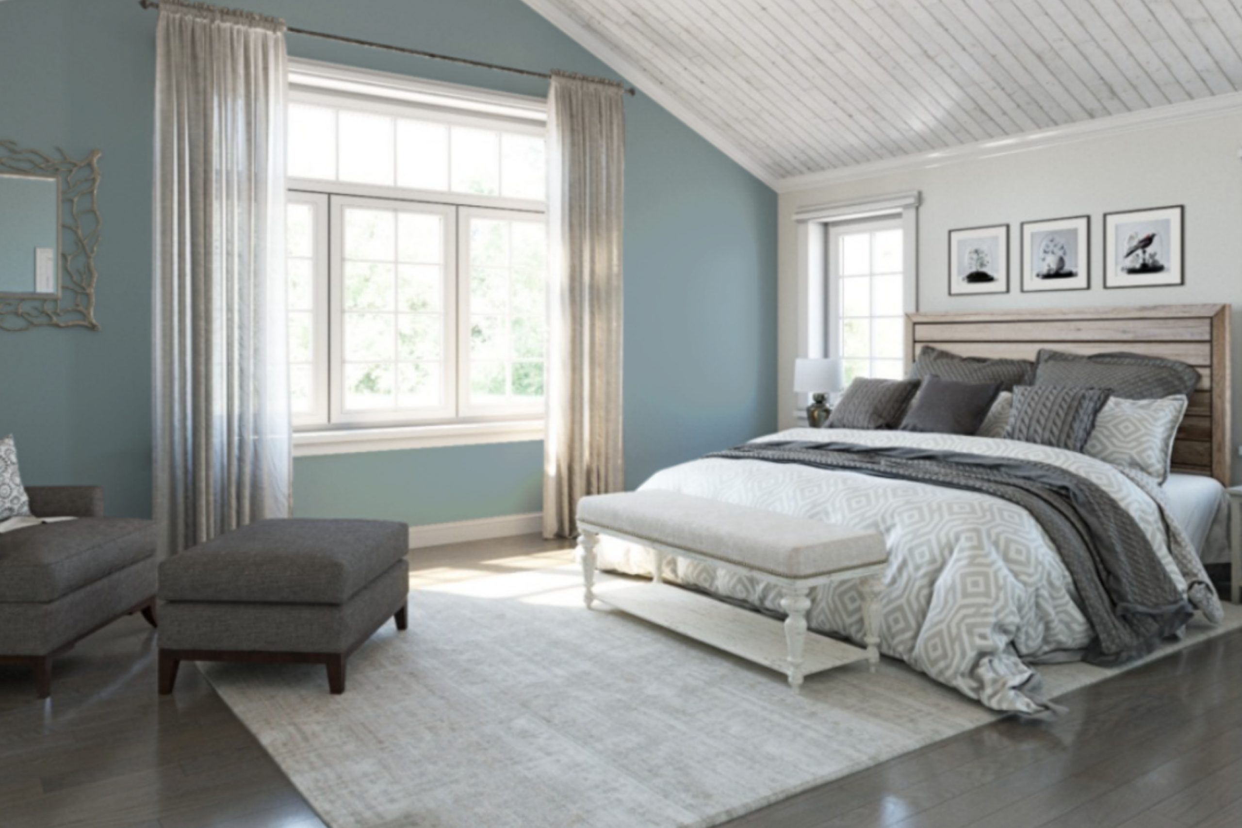
I recently decided to refresh my living room and stumbled upon SW 6227 Meditative by Sherwin Williams, a soothing shade of blue that instantly caught my attention. In my search for a serene and calming atmosphere, I found that Meditative wasn’t just a color; it was the perfect backdrop to create a restful space in my home.
As I applied the first few strokes, the transformation was evident. The color has a gentle, soft quality that brings a sense of peace and serenity to the room, making it ideal for places where you want to relax or unwind after a busy day.
While it’s subtle enough not to overpower, Meditative still adds a touch of personality and depth to your walls. Whether you’re looking to freshen up a single room or revamp your entire home, Meditative provides a versatile base that pairs beautifully with crisp whites or rich, dark hues for contrast.
The effect is a balanced and harmonious environment that you’ll appreciate in any light, whether it’s the natural sunlight of the morning or the soft glow of evening lamps.
If you’re considering a new look for your space, Meditative might just be the soothing palette you need.
What Color Is Meditative SW 6227 by Sherwin Williams?
Meditative by Sherwin Williams is a soothing blue hue that exudes a calm and gentle atmosphere in any room. Featuring a balanced mix of blue with a hint of gray, this color is versatile for various interior styles, particularly modern, coastal, and Scandinavian designs.
In a modern setting, Meditative creates a sleek and clean look, especially when paired with minimalist furniture and metallic accents like stainless steel or chrome. This color works well in living rooms or kitchens, providing a subtle backdrop that complements modern appliances and fixtures.
For a coastal vibe, combine Meditative with sandy beige or soft white textures, such as linen or cotton, to evoke the feel of a beach house. Accents like driftwood pieces or sea glass can enhance this effect, making spaces feel like a calm seaside retreat.
Scandinavian interiors benefit from the light and airy feel of Meditative. Paired with pale wood, plush throws, and woolen rugs, it helps to create a cozy yet uncluttered environment, which is a staple of Nordic design.
This shade also pairs beautifully with natural materials like raw wood or stone, adding depth and contrast while maintaining a soothing atmosphere. Lighter woods like birch or maple help to keep interiors feeling open and bright. Whether used for accent walls or throughout the room, Meditative is versatile and at home in many décor styles.
Is Meditative SW 6227 by Sherwin Williams Warm or Cool color?
Meditative is a soothing, calm shade of blue offered by Sherwin Williams. This color has a cool, soft tone that works wonderfully in homes to create a peaceful and gentle atmosphere. When used in a bedroom, it promotes relaxation and can help in winding down after a busy day. In a living room or study, Meditative adds a touch of quiet elegance without being too bold.
Because it’s not too dark or overwhelming, this color pairs well with both light and dark furniture, allowing for versatility in decorating. It’s also ideal for smaller spaces, as the lightness of the hue can help make a room feel more open and airy.
Furthermore, it coordinates easily with various textures and materials, from soft fabrics to rustic wood finishes, making it a practical choice for different home styles. Homeowners often choose Meditative for its ability to offer a fresh and calm environment, ideal for spaces where comfort and peace are a priority.
Undertones of Meditative SW 6227 by Sherwin Williams
MeditativeSW 6227 by Sherwin Williams is a unique color that incorporates a complex blend of undertones. These undertones include shades such as lilac, mint, grey, light gray, light purple, pale pink, pale yellow, blue, turquoise, dark turquoise, and light turquoise. Understanding these undertones is key to appreciating how this color appears in different settings.
Undertones are subtle colors that influence the primary hue. They can enhance or modify the paint’s base color depending on the lighting and surrounding elements. For instance, lilac and light purple undertones add a soft, gentle quality, making a space feel more welcoming. In contrast, shades like grey and light gray introduce a neutral aspect, which can balance bolder colors in furniture or decor.
When applied to interior walls, the multiple undertones of MeditativeSW 6227 contribute to its versatility. In rooms with ample natural light, the blue and turquoise undertones might become more pronounced, creating a refreshing vibe. Conversely, in spaces with less light, the grey and dark turquoise undertones might dominate, lending a more grounded feel.
This complexity of undertones allows MeditativeSW 6227 to adapt to various styles and furnishing colors. Whether paired with bright accents in a modern living room or soft textiles in a cozy reading nook, it maintains its appeal, subtly shifting in character depending on its environment. This adaptability makes it a practical choice for anyone looking to refresh their home while keeping options open for future decor changes.
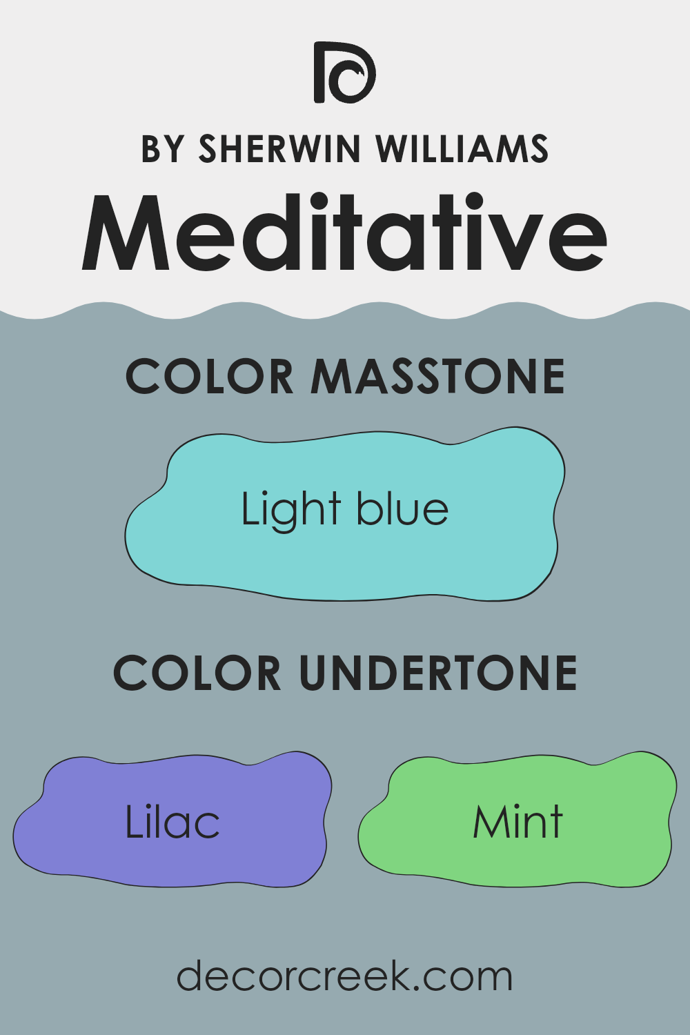
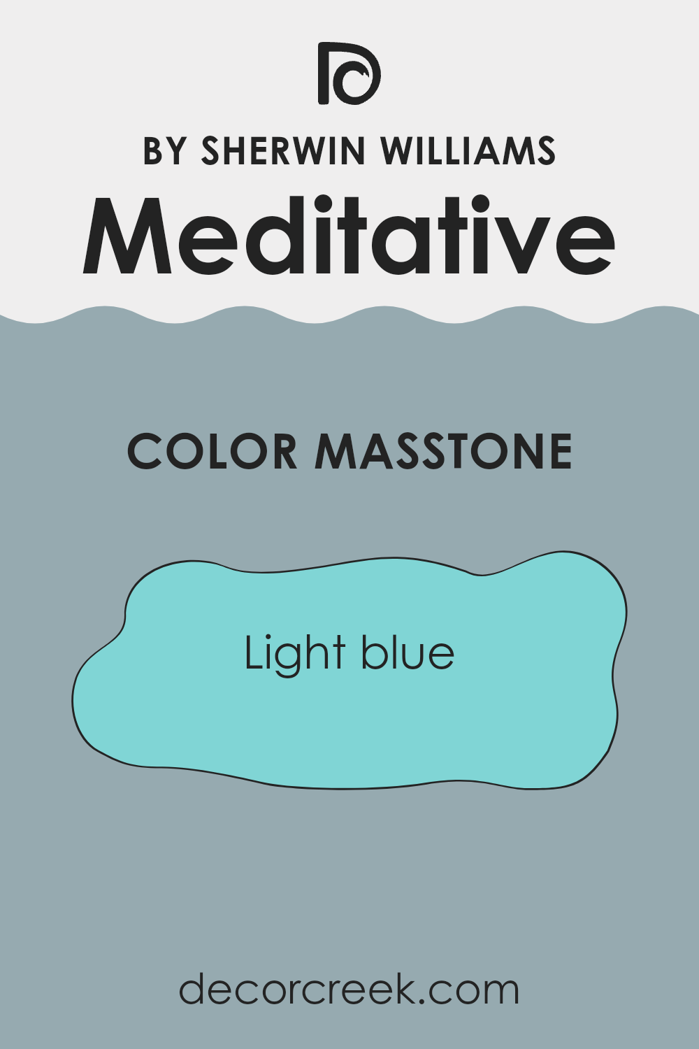
What is the Masstone of the Meditative SW 6227 by Sherwin Williams?
MeditativeSW 6227 by Sherwin Williams has a masstone of light blue, also coded as #80D5D5. This soft and airy shade brings to any space a sense of calm and openness. When used in homes, it creates a refreshing backdrop that is gentle on the eyes, making rooms appear larger and more inviting.
This color is versatile enough to work well in various areas of the house. In living rooms, it creates a relaxed atmosphere for family gatherings, while in bedrooms, it sets a calm mood conducive to a good night’s sleep. This light blue hue pairs beautifully with crisp whites or richer blues for a clean, coherent look.
It also complements wooden furniture and flooring, adding a modern yet cozy touch to the interior design. Overall, this color offers a simple way to refresh and brighten up a home without overwhelming the senses, making it a popular choice for those looking to add a touch of subtle color to their living space.
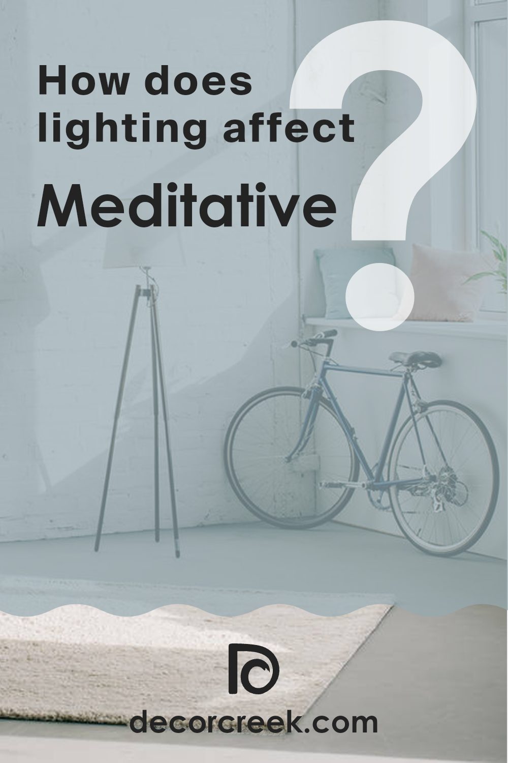
How Does Lighting Affect Meditative SW 6227 by Sherwin Williams?
Lighting plays a crucial role in how we perceive colors. A color might appear different under various light sources due to a phenomenon called metamerism. Natural daylight is generally considered the most balanced source of white light, allowing colors to be seen in their truest form. Artificial light, however, can vary dramatically, influencing the way colors look.
The color Meditative by Sherwin Williams is a calm, soft blue-gray shade that can change its appearance based on the lighting conditions. Under artificial light, such as LED or fluorescent light, this color might lean more towards gray, as these lights can emit a cooler tone.
This can potentially make the color appear more muted and less blue. Conversely, in a room with ample sunlight, the blue tones in Meditative might be enhanced, making the walls feel brighter and fresher.
Rooms with different exposures to sunlight will also alter the appearance of this color:
– North-facing rooms: These rooms often get less direct sunlight, which can make Meditative appear more subdued, and its gray undertones might be more prominent, giving a cooler feel to the room.
– South-facing rooms: These rooms receive more intense, direct sunlight, bringing out the blue in Meditative and making the room feel more vibrant and lively.
– East-facing rooms: Morning light is warm, so Meditative will look brighter and more cheerful in the morning but could turn cooler as the day progresses.
– West-facing rooms: Evening light is also warm, so the color will appear softer and warmer in the afternoon and evening.
Understanding how lighting affects colors helps in choosing the right paint for your space, ensuring you achieve the mood and style you desire. Meditative, with its versatile blue-gray tone, can work beautifully in many settings, adjusting its character with the light it receives.
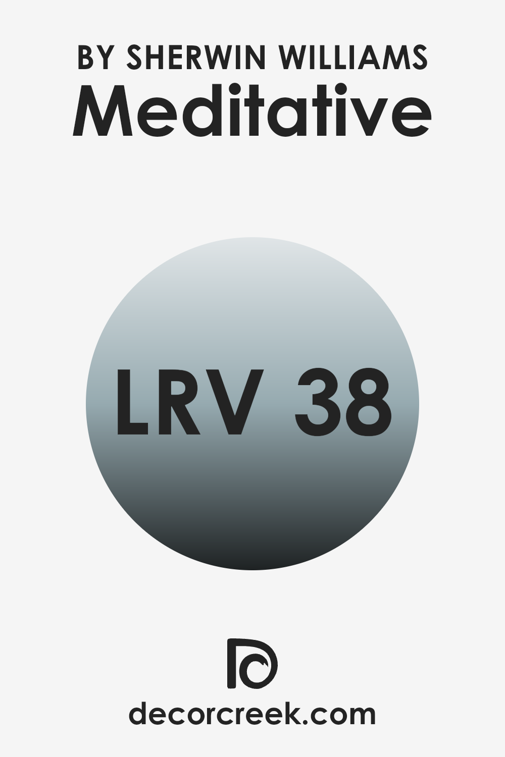
What is the LRV of Meditative SW 6227 by Sherwin Williams?
LRV stands for Light Reflectance Value, a measurement that shows how much light a paint color reflects back into a room as opposed to absorbing it. This value is calculated on a scale where 0 means the color absorbs all light (black), and the highest possible value means it reflects all light (white). The higher the LRV, the lighter the paint color appears, and vice versa.
This measurement is crucial because it helps people decide how a paint color will affect the overall brightness of their space. Lighter colors can help make a small room feel larger and more open, while darker colors can make a space feel cozier and more enclosed.
For Meditative SW 6227, which has an LRV of 38.265, the color is on the darker side of the mid-range spectrum. This means it won’t reflect light as strongly as lighter colors but isn’t as dark as hues with much lower LRVs. This level of reflectivity can add a certain depth and warmth to the space, making it ideal for areas where a moderately cozy and more intimate atmosphere is desired. In rooms with less natural light, this color might appear darker, but in well-lit areas, the color can show more vibrancy.
This specific LRV is appropriate for anyone looking to balance a sense of warmth without making a room feel too small or cramped.
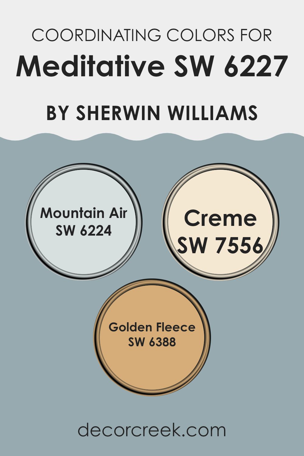
Coordinating Colors of Meditative SW 6227 by Sherwin Williams
Coordinating colors are shades that complement each other and work harmoniously together in a design. When it comes to pairing colors with Meditative by Sherwin Williams, there are specific shades that enhance its aesthetic without overwhelming it. For example, Mountain Air, Creme, and Golden Fleece each bring their own unique presence while maintaining a beautiful balance with the primary color.
Mountain Air is a refreshing and light blue that mirrors the softness of a clear sky, offering a breezy feel to any space. It pairs nicely with the deeper tones of Meditative, providing a contrast that is both pleasing and calming. Creme, on the other hand, is a warm and inviting off-white that adds a subtle richness to the environment.
It’s an excellent choice for trim or accent walls, working seamlessly with the soothing qualities of Meditative. Lastly, Golden Fleece is a gentle yellow that has a sunny disposition, perfect for bringing a touch of warmth to a room. This color works well in spaces that aim for a cheerful and cozy atmosphere, complementing the coolness of Meditative without clashing. Together, these coordinating colors create a cohesive look that enhances the overall appeal of your space.
You can see recommended paint colors below:
- SW 6224 Mountain Air
- SW 7556 Creme
- SW 6388 Golden Fleece
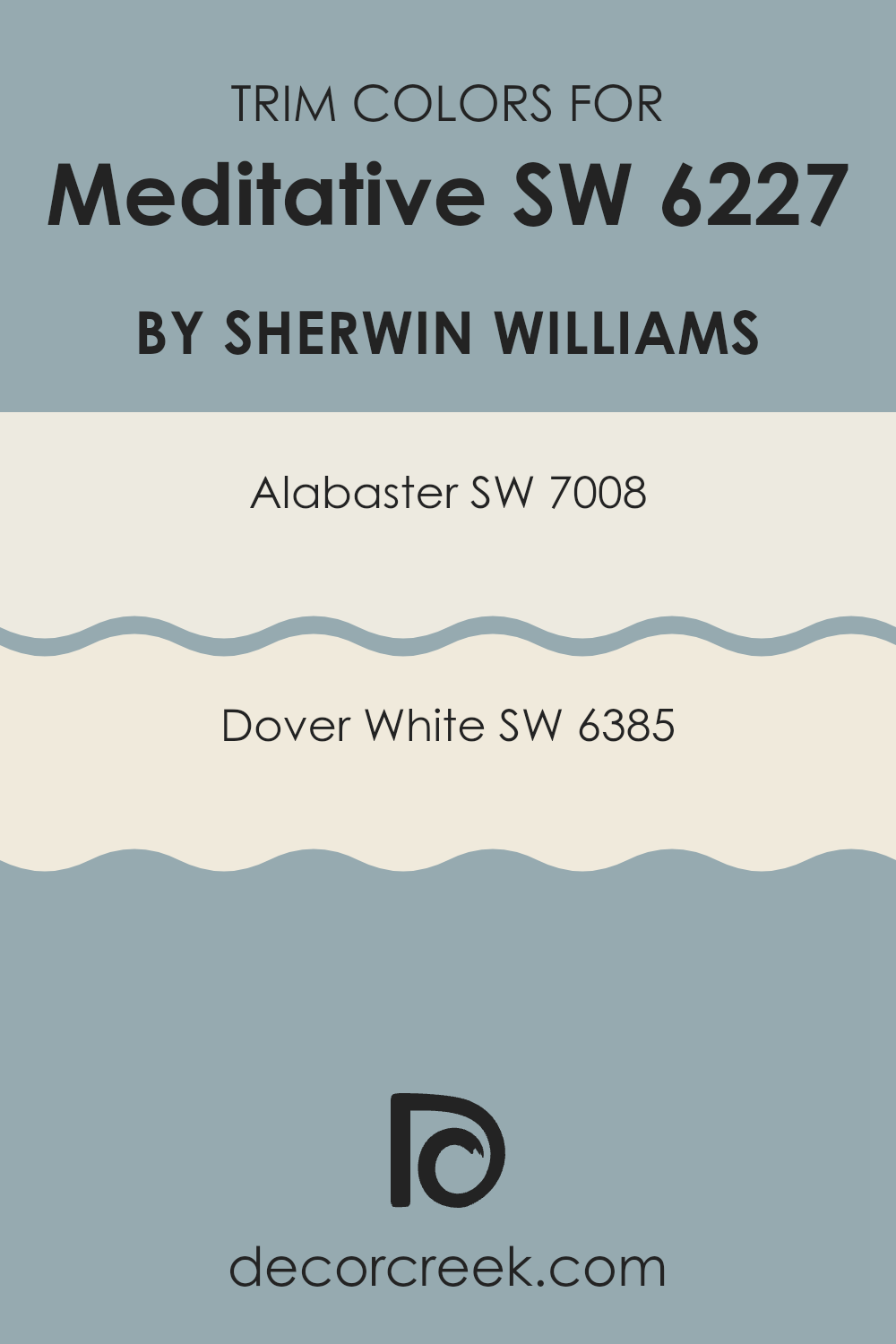
What are the Trim colors of Meditative SW 6227 by Sherwin Williams?
Trim colors play a crucial role in enhancing and defining the overall appearance of a painted space by creating contrast and defining the architectural details of rooms or exteriors. When paired with a soothing shade like Meditative by Sherwin Williams, trim colors such as Alabaster and Dover White help to highlight the clean lines and subtle design elements, making the wall color stand out more prominently. These trim colors can create a harmonious balance, drawing attention while complementing the primary color, thus enhancing the overall aesthetic appeal of the space.
Alabaster, or SW 7008, is a warm and creamy white that offers a soft and inviting look. It works particularly well to create a gentle contrast against deeper or cooler wall colors, making a room feel more welcoming and cozy.
Dover White, or SW 6385, on the other hand, has a slightly brighter and crisper tone, providing a clear but subtle differentiation from deeper hues. This makes it ideal for use in spaces where a vivid, yet non-overpowering contrast is desired, helping architectural details to pop against richly colored walls.
You can see recommended paint colors below:
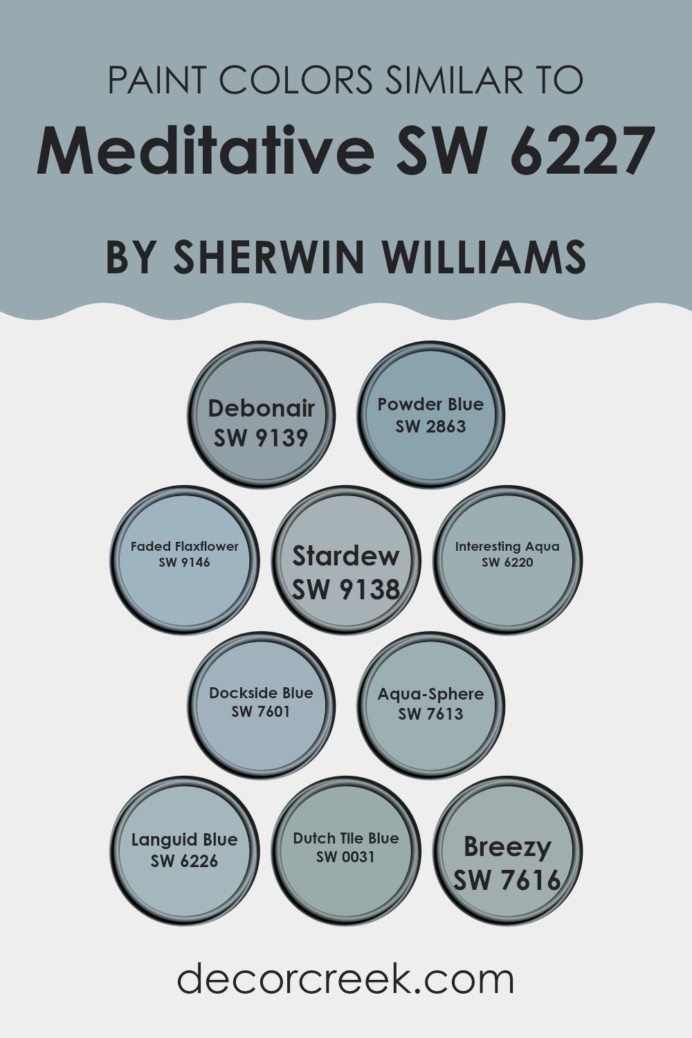
Colors Similar to Meditative SW 6227 by Sherwin Williams
Similar colors play a crucial role in creating a cohesive and harmonious visual experience. They help establish a mood in a space without the stark contrasts that come with complementary or contrasting colors. For instance, colors like Debonair and Powder Blue work beautifully alongside other subtle hues to generate a soothing and understated atmosphere.
These tones share a gentle, calming quality that can make rooms feel more inviting and peaceful. Adding shades like Faded Flaxflower or Stardew brings in a slight variation that maintains the overall fluidity of color themes without disrupting the visual continuity.
Diving into specifics, Debonair presents a refined gray-blue tone that adds a touch of elegance without overpowering. Powder Blue is a light, airy blue that feels like a fresh breath, ideal for spaces meant to relax. Faded Flaxflower has a muted lavender touch that offers uniqueness while keeping the color scheme soft.
Stardew, a beautiful blend of blue and gray, provides a subtle depth. Interesting Aqua infuses a touch of liveliness with its blue-green hue, perfect for adding a bit of zest. Dockside Blue takes a slightly bolder stance with a deeper shade that still aligns smoothly with more subtle blues. Aqua-Sphere and Languid Blue introduce nuanced variations of blue-green, enriching the palette without clashing with other elements.
Dutch Tile Blue offers a traditional charm with its deeper, yet muted blue tones, and Breezy rounds out the options with its light and airy presence that can lighten up any space. These colors work together to create a visually pleasing environment that feels cohesive and thoughtfully designed.
You can see recommended paint colors below:
- SW 9139 Debonair
- SW 2863 Powder Blue
- SW 9146 Faded Flaxflower
- SW 9138 Stardew
- SW 6220 Interesting Aqua
- SW 7601 Dockside Blue
- SW 7613 Aqua-Sphere
- SW 6226 Languid Blue
- SW 0031 Dutch Tile Blue
- SW 7616 Breezy
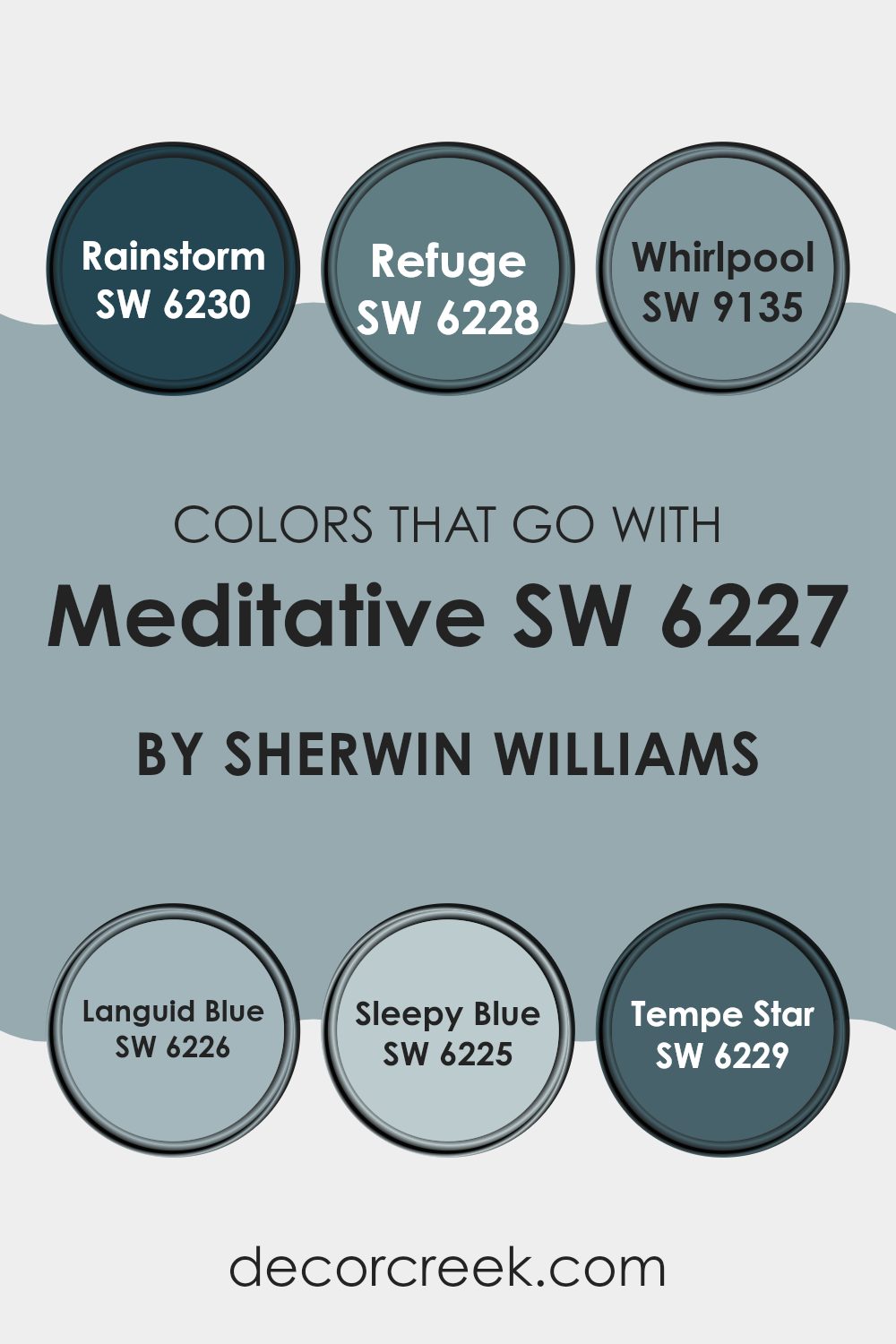
Colors that Go With Meditative SW 6227 by Sherwin Williams
Colors that pair well with Meditative SW 6227 by Sherwin Williams are essential as they contribute to creating harmonious and pleasing environments. These companion colors can enhance the primary shade by an interaction that could either subtly blend or provide a striking contrast, depending on the desired effect.
For instance, using colors like Languid Blue or Sleepy Blue alongside Meditative sets a calm, coherent mood through their similar cool tones, which naturally complement each other. On the other hand, contrasting colors such as Rainstorm and Refuge serve to add a dynamic, vibrant edge to the space, keeping the overall aesthetics balanced yet lively.
Rainstorm SW 6230 is a deep blue that adds a bold statement, while Refuge SW 6228 offers a slightly lighter shade of blue providing a refreshing feel. Whirlpool SW 9135 is another interesting choice with its lighter, almost greyish-blue hue that subtly softens spaces for a smooth flow of design elements. Languid Blue SW 6226, a soft blue with a touch of grey, works like a quiet whisper in a room, enhancing spaces without overwhelming them.
Sleepy Blue SW 6225, suggestive of a subdued sky, contributes to a light, airy feel and pairs very well with more intense shades. Lastly, Tempe Star SW 6229, a dark grayish-blue, serves as an excellent anchor color, grounding lighter hues and adding depth and interest to the color palette. Each of these colors supports or contrasts with Meditative SW 6227 in ways that can meet diverse design needs, making them all valuable for crafting aesthetically cohesive and inviting spaces.
You can see recommended paint colors below:
- SW 6230 Rainstorm
- SW 6228 Refuge
- SW 9135 Whirlpool
- SW 6226 Languid Blue
- SW 6225 Sleepy Blue
- SW 6229 Tempe Star
How to Use Meditative SW 6227 by Sherwin Williams In Your Home?
Meditative SW 6227 by Sherwin Williams is a soft blue paint color known for its calming effect. It is perfect for setting a peaceful mood in any room in your house. You can use it in your bedroom to help you relax and get a good night’s sleep. Because it’s gentle and not too bright, it’s also great for bathrooms, where it can help create a spa-like atmosphere for unwinding after a long day.
In living areas like the living room or dining room, Meditative SW 6227 adds a cozy, comforting vibe without being overpowering. It works well with a variety of decor styles and can pair nicely with whites, grays, and even some pastel colors to keep the space feeling airy and light.
If you have a small office at home, painting it this color might help in reducing stress. The calming blue can aid in keeping your mind clear and focused while working. In all, using this color can help make your home a more relaxing place to be.
Meditative SW 6227 by Sherwin Williams vs Interesting Aqua SW 6220 by Sherwin Williams
Meditative and Interesting Aqua are two distinct colors from Sherwin Williams. Meditative is a deeper, soothing blue that leans toward a subtle oceanic feel, giving spaces a calm, cozy vibe. It’s a perfect choice for bedrooms or any area where restfulness is essential.
On the other hand, Interesting Aqua is a lighter, more vibrant shade that brings energy to a room. This color has a touch of green, making it more lively and ideal for spaces that need a splash of brightness, like bathrooms or kitchens.
Both colors can refresh a room, but they serve different moods and settings. Meditative works best in places for winding down, while Interesting Aqua is great for areas that benefit from a more active, cheerful atmosphere.
You can see recommended paint color below:
Meditative SW 6227 by Sherwin Williams vs Dockside Blue SW 7601 by Sherwin Williams
Meditative and Dockside Blue are two distinct colors by Sherwin Williams. Meditative is a deep, calming blue that gives off a gentle, soothing vibe. It’s perfect for creating a quiet, peaceful space in your home, like a bedroom or study area.
On the other hand, Dockside Blue is lighter and leans slightly towards a grayish tone. This color is great for brightening up a room while keeping a cool and relaxed feel. It works well in living rooms or bathrooms where you want to maintain a fresh, clean look with a hint of color.
Both colors add a chilled-out atmosphere to any room, but Meditative is darker and more intense, while Dockside Blue is softer and more subtle. Choosing between them depends on how bold or gentle you want your room’s vibe to be. Both offer a stylish look without being too overpowering.
You can see recommended paint color below:

Meditative SW 6227 by Sherwin Williams vs Breezy SW 7616 by Sherwin Williams
Meditative by Sherwin Williams is a deep, rich blue color that gives off a peaceful and calm feeling. It’s quite soothing and tends to bring a sense of comfort and relaxation to a space. This color is great for places where you want to settle down and focus or wind down after a busy day.
On the other hand, Breezy by Sherwin Williams is lighter and softer compared to Meditative. It brings a fresh and airy feel to a room, making it feel open and light. This color works well in areas where you want to create a cheerful and welcoming atmosphere.
Both colors are from the same brand but serve different moods and purposes. Meditative is more about depth and introspection, perfect for personal or quiet spaces. Breezy, with its lighter touch, is ideal for lively spaces and social areas of a home.
You can see recommended paint color below:
- SW 7616 Breezy
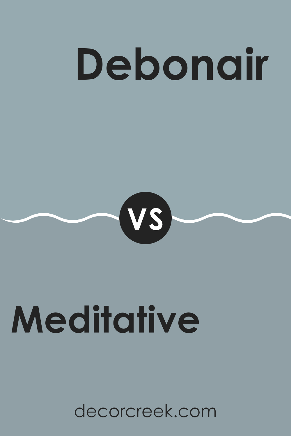
Meditative SW 6227 by Sherwin Williams vs Debonair SW 9139 by Sherwin Williams
Meditative SW 6227 by Sherwin Williams is a cool blue shade that brings a calming feel to any space. It’s like looking at a peaceful sky on a clear day. This color is soft and gentle, making it perfect for areas where you want to relax, such as bedrooms or bathrooms.
On the other hand, Debonair SW 9139 from Sherwin Williams is a deeper, more intense blue. It has a hint of gray which gives it a more grounded, mature look. This color is great for creating a strong, confident vibe in spaces like home offices or dining rooms.
In comparison, Meditative is lighter and feels more airy, while Debonair is bolder and commands more attention. Each color has its own charm and works well depending on what mood you’re aiming to achieve in a room.
You can see recommended paint color below:
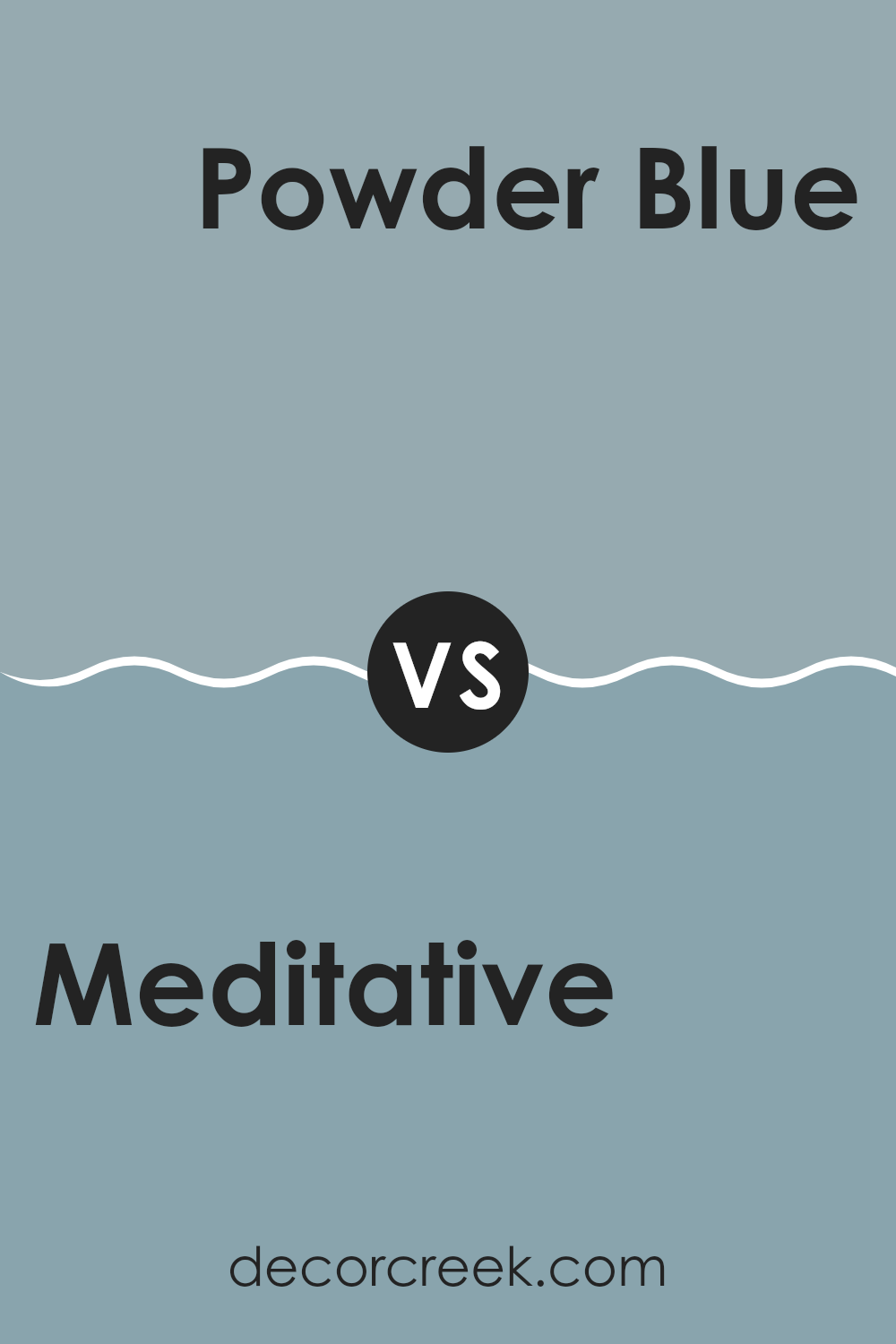
Meditative SW 6227 by Sherwin Williams vs Powder Blue SW 2863 by Sherwin Williams
“Meditative” by Sherwin Williams is a deep and calm blue that brings a cozy feel to spaces. It’s perfect for rooms where you want to relax and unwind, such as bedrooms or quiet reading corners. The color has a subtle richness that keeps it interesting without being too bright or overpowering.
On the other hand, “Powder Blue” is lighter and airier. It has a freshness that can make any room feel more open and inviting. Because of its lighter tone, it works well in smaller spaces to give an illusion of more space, or in rooms that get a lot of natural light.
While both colors play in the blue family, “Meditative” gives a feel of depth and coziness, making it a great choice for a more intimate atmosphere. In contrast, “Powder Blue” offers a cheerful and light essence, perfect for lively spaces and a breezy, refreshing vibe.
You can see recommended paint color below:
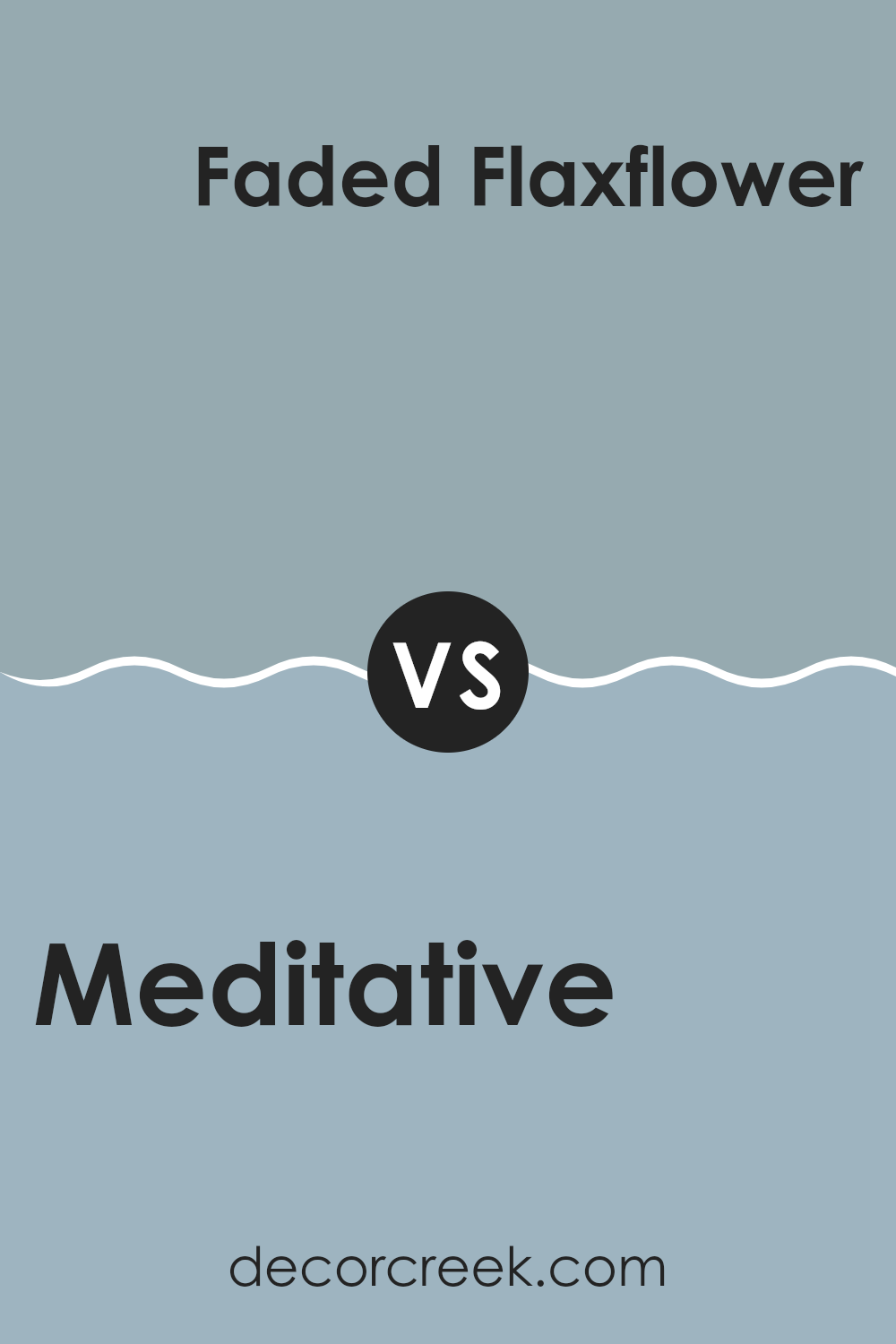
Meditative SW 6227 by Sherwin Williams vs Faded Flaxflower SW 9146 by Sherwin Williams
Meditative and Faded Flaxflower are two distinct colors from Sherwin Williams. Meditative is a deep blue that feels calm and grounding, perfect for creating a relaxing space. It’s a color that pairs well with bright whites or soft grays to give a clean and inviting look to any room.
On the other hand, Faded Flaxflower is a much lighter color, leaning towards a soft grey with hints of blue and lavender. It’s subtle and doesn’t overpower, making it a great choice for a peaceful and low-key vibe in a room. It works well when combined with darker shades to provide balance or with similar pastel tones for a soft, cohesive appearance.
Together, these colors could work beautifully in a space aimed at restfulness and quiet appeal. Meditative could serve as a striking feature wall color, while Faded Flaxflower could be used on other walls to maintain lightness and space. Each brings its own unique feel, creating an environment that is both inviting and stylish.
You can see recommended paint color below:
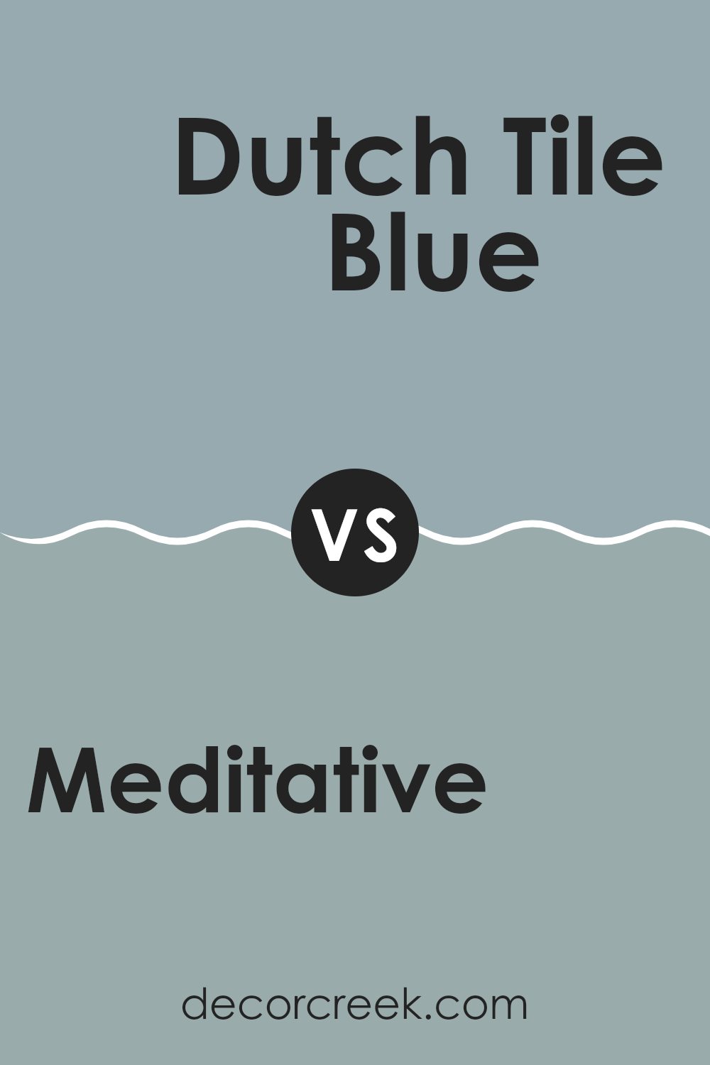
Meditative SW 6227 by Sherwin Williams vs Dutch Tile Blue SW 0031 by Sherwin Williams
Meditative SW 6227 by Sherwin Williams is a deep, soothing blue that gives a sense of calm and stability to any space. It’s a mature shade that works well in bedrooms or offices where a calming influence is desired. Its richness makes it a great choice for creating a focal point in a room, especially when used on accent walls or furniture.
On the other hand, Dutch Tile Blue SW 0031, also by Sherwin Williams, is a lighter, airier blue. It carries a fresh vibrancy that can brighten up spaces and make them feel more open and inviting. This color is ideal for bathrooms or kitchens where a clean, fresh look is often preferred. It pairs nicely with lighter hues and natural materials like wood or stone.
Both colors offer distinct moods and atmospheres: Meditative SW 6227 brings depth and focus, while Dutch Tile Blue SW 0031 introduces lightness and a refreshing vibe. Each has its unique appeal, depending on the room’s purpose and the desired effect.
You can see recommended paint color below:
- SW 0031 Dutch Tile Blue
Meditative SW 6227 by Sherwin Williams vs Languid Blue SW 6226 by Sherwin Williams
“Meditative” and “Languid Blue” by Sherwin Williams are two closely related shades of blue, each offering its own unique vibe. Meditative is a deeper blue, giving a stronger feeling of calm and steadiness. It’s a color that might remind you of a deep, still ocean, offering a sense of stability and quiet to any space.
On the other hand, Languid Blue is slightly lighter, with a softer touch that can make a room feel gentle and relaxed. It’s akin to looking up at a lighter, clear sky, providing a breathable and airy atmosphere.
Both colors are versatile and can be used in various settings like bedrooms or offices where you want to foster a calm environment. However, Meditative might be better for creating a more focused and grounded feel, whereas Languid Blue could be preferable for a lighter, more refreshing touch. Depending on the mood you want to set and the natural light in your space, either could enhance your room beautifully.
You can see recommended paint color below:
- SW 6226 Languid Blue
Meditative SW 6227 by Sherwin Williams vs Stardew SW 9138 by Sherwin Williams
Meditative and Stardew, both by Sherwin Williams, offer subtle yet distinct tones that can influence the ambiance of a room significantly. Meditative is a deeper blue with a calm feel, likely to make spaces feel snug and secure. It’s an ideal choice if you’re after a color that’s soothing without being too dark.
In contrast, Stardew has a lighter, airier feel, leaning slightly towards a grayish-blue. This color is excellent for creating a fresh and open atmosphere, making rooms feel more spacious and relaxed. It pairs well with modern decor and can brighten up areas that don’t get a lot of natural light.
Both colors are versatile but serve different purposes based on the mood or effect you’re aiming to achieve in your space. Meditative works well in bedrooms or areas for rest, while Stardew is perfect for living spaces and bathrooms where a lighter touch is preferred.
You can see recommended paint color below:
Meditative SW 6227 by Sherwin Williams vs Aqua-Sphere SW 7613 by Sherwin Williams
Both Meditative and Aqua-Sphere are shades by Sherwin Williams but they bring different vibes to a space. Meditative is a deep, calming blue with a hint of gray, making it perfect for creating a relaxed and soothing atmosphere in rooms like bedrooms or quiet spaces. It has a gentle presence that pairs well with soft neutrals for a muted decor.
In contrast, Aqua-Sphere stands out as a more vibrant choice. This color leans towards a lively sea-green, giving it a fresh and energetic feel. It’s great for bathrooms or offices where you want an uplifting environment. Aqua-Sphere goes well with brighter whites and can be accented with other bold colors for a dynamic look.
Both colors offer distinct atmospheres: Meditative for a soft, low-key vibe and Aqua-Sphere for an energetic and refreshing feel. Depending on the ambience you want to achieve, each provides a unique option to liven up a room.
You can see recommended paint color below:
Conclusion
I like using this color because it’s gentle on the eyes and goes well with lots of other colors. If you have furniture or decorations in colors like white, gray, or even brown, they will look great against this soothing blue. It’s also a great choice if you want your bedroom or living room to feel like a peaceful spot where you can read books, play, or relax.
SW 6227 Meditative is not just another blue paint. It changes how a room feels. It can make small rooms look a bit bigger and gives a breath of fresh air to any area. So, if you’re thinking of giving your room a new look, this color might be the perfect choice. It has surely worked wonders for me, making my space more enjoyable to spend time in.

Ever wished paint sampling was as easy as sticking a sticker? Guess what? Now it is! Discover Samplize's unique Peel & Stick samples.
Get paint samples

