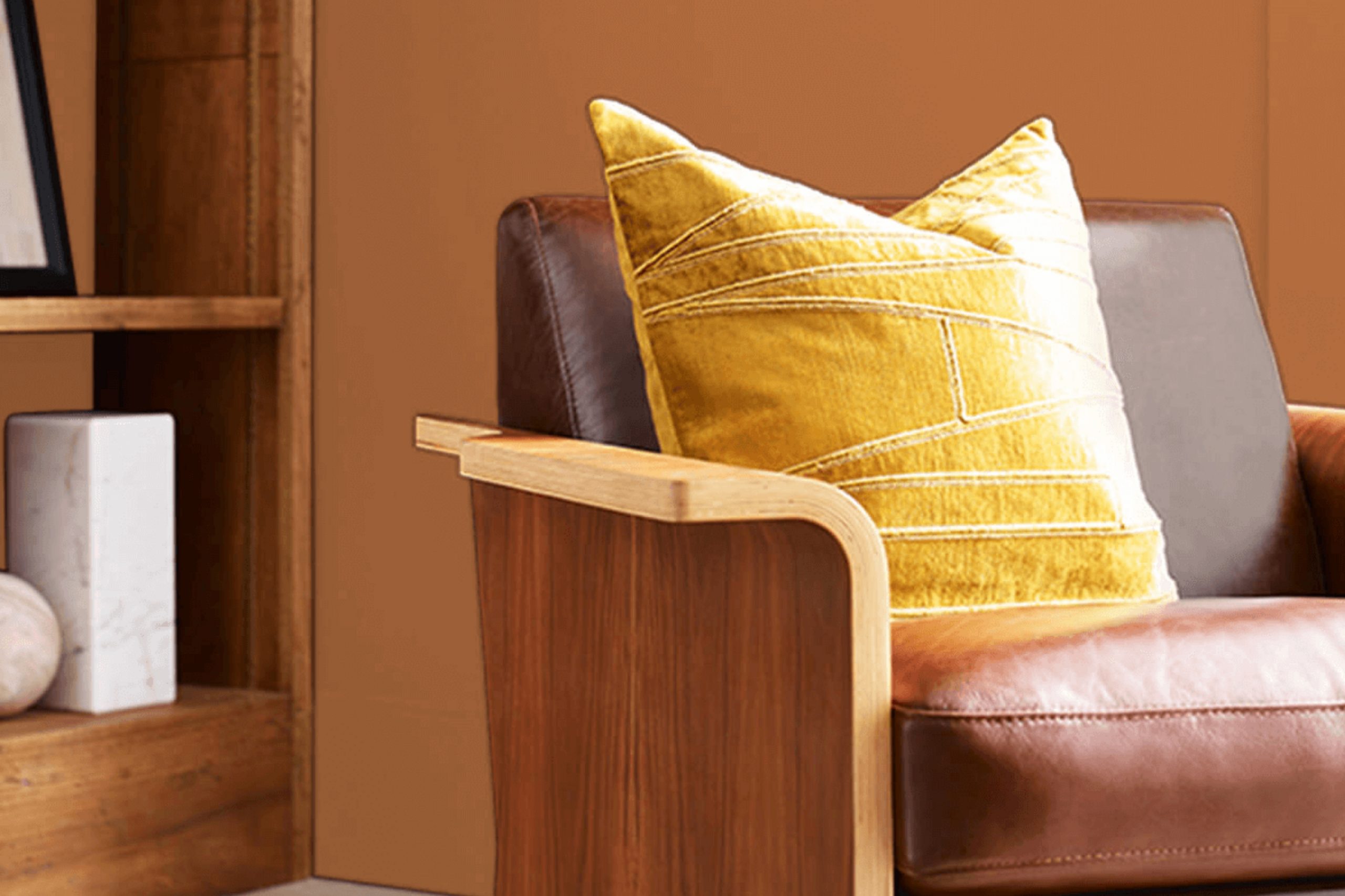
If you’re considering a warm and inviting paint color for your home, SW 6363 Gingery by Sherwin Williams might just be the perfect choice. This shade is a beautiful, rich mix of orange and brown, mimicking the natural hue of ginger. It offers a cozy feel, ideal for areas where comfort and warmth are key.
Imagine stepping into a room bathed in the soft glow of SW 6363 Gingery; it’s like being wrapped in a soft blanket on a chilly day. This color works exceptionally well in living rooms, dining areas, or any room where you want to promote a sense of togetherness. It pairs beautifully with neutral tones, adding depth and warmth to your decor.
Using Gingery can also add a touch of elegance to your furnishings, whether you have classic wood pieces or more contemporary items. It’s flexible enough to enhance various decorating styles, from rustic to modern. So, if you’re planning to give your room a refreshing yet warm touch, consider this inviting shade.
It’s not just a color; it’s a step towards creating a more welcoming home environment.
What Color Is Gingery SW 6363 by Sherwin Williams?
The color Gingery by Sherwin Williams is a warm, muted shade of orange, evoking the homely, comforting feel of ginger areas. Its understated yet vibrant hue brings a cozy and inviting ambiance to any room. Gingery is perfect for those who appreciate a subtle pop of color that isn’t overpowering but still adds a distinctive character to a room.
This color works exceptionally well in rustic and traditional interior styles. Its earthy tones complement natural elements like wood, enhancing grain patterns and adding depth to wooden flooring, furniture, or cabinetry. Gingery also pairs beautifully with exposed brick and stone, playing into the textures and natural color variations these materials offer.
Gingery fits seamlessly into living rooms and kitchens where warmth is key. In a living room, it can be used on walls or as an accent color in decor items like cushions, rugs, or drapes. In kitchens, it brings a sunny, cheerful warmth to the walls or backsplash areas, especially when combined with wooden counters or cabinets.
For fabrics, Gingery matches well with soft textures like cotton and linen, which help to soften its appearance while maintaining the cozy feel. Metallic accents in copper or bronze can also enhance its warmth, adding a touch of elegance without overpowering the overall aesthetic.
Is Gingery SW 6363 by Sherwin Williams Warm or Cool color?
Gingery SW 6363 by Sherwin Williams is a warm and inviting hue that can make any home feel cozy and welcoming. This particular shade of orange has a soft brown undertone, which helps it blend well with many decor styles, from traditional to modern.
Using Gingery in a living room or dining area can create a sense of warmth, making these rooms more inviting for gatherings and family meals. It works exceptionally well with natural light, as the sunlight enhances its rich tones and gives a cheerful glow to the room.
For bedrooms, adding accents in this color can provide a comforting and cozy atmosphere, aiding in relaxation and sleep. Additionally, pairing Gingery with neutral colors like white, cream, or gray can balance its vibrancy and prevent it from overpowering the room. Overall, this color is a flexible choice that adds a touch of warmth and coziness to any home interior.
Undertones of Gingery SW 6363 by Sherwin Williams
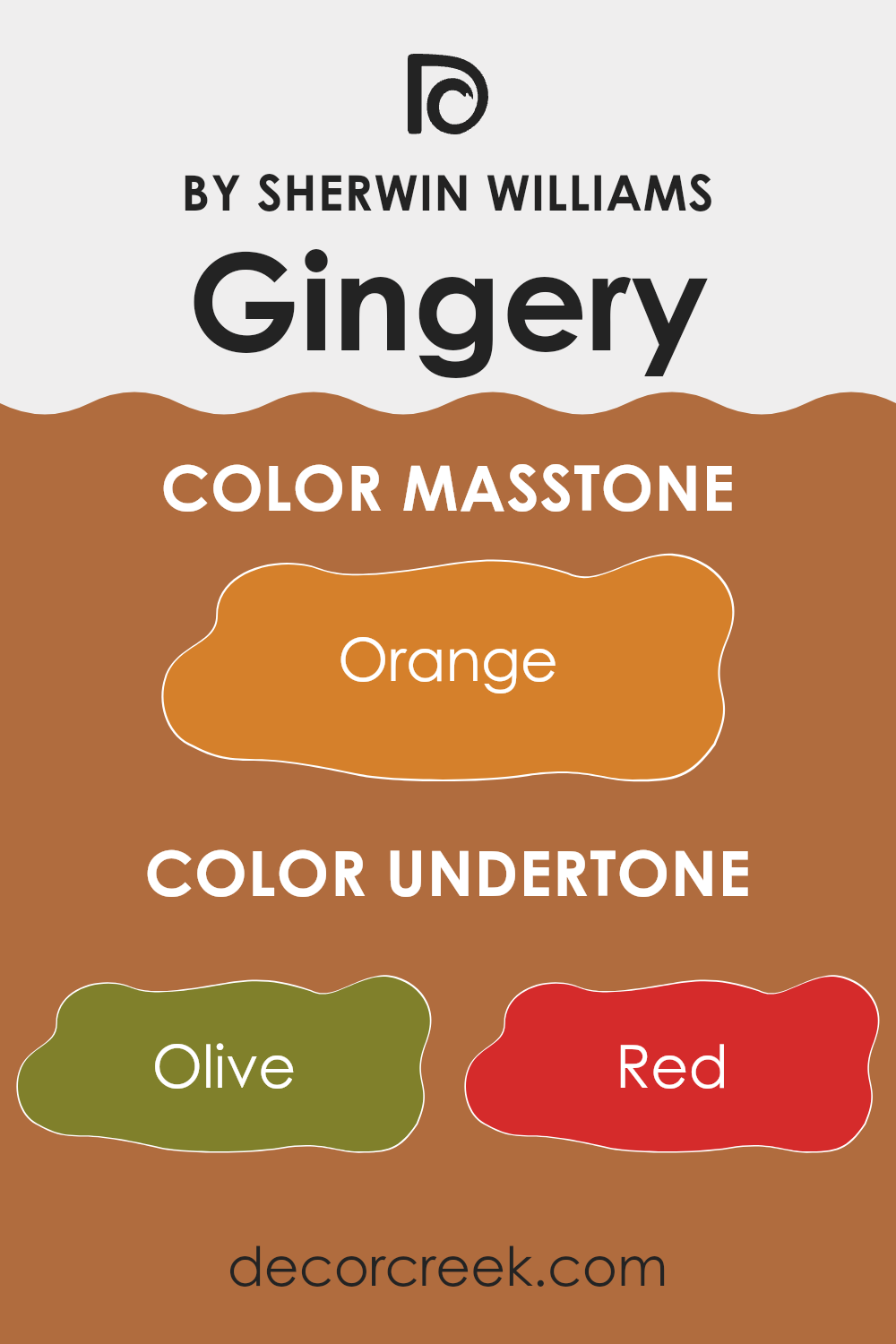
Gingery is a unique paint color that seems straightforward at first glance but actually has a complex array of undertones that can influence the ambiance of a room. Among these undertones are shades like olive, red, pale pink, brown, grey, pink, purple, yellow, light green, pale yellow, and mint. Each of these colors subtly affects the overall perception of Gingery, making it appear different under various lighting conditions.
For example, the olive and brown undertones give it an earthy base that makes the room feel warm and welcoming. Light green and mint add a fresh, vibrant touch, making the room seem more lively. Meanwhile, shades like pale yellow and pale pink lend a soft, gentle feel to the room. Colors like purple and pink add depth and a hint of playfulness.
On interior walls, these undertones play a crucial role in determining how the color interacts with furniture and decor. If the room has lots of natural light, the yellow and light green undertones might become more prominent, giving the paint a brighter, more cheerful look. In a room with less light, the brown and olive might dominate, creating a cozy, snug ambiance.
The versatility of Gingery due to its undertones makes it a fantastic choice for different rooms, whether you aim for a cheerful kitchen or a calm, inviting living room. It’s essential to consider how these undertones will pair with other colors in your décor to achieve the desired effect in your room.
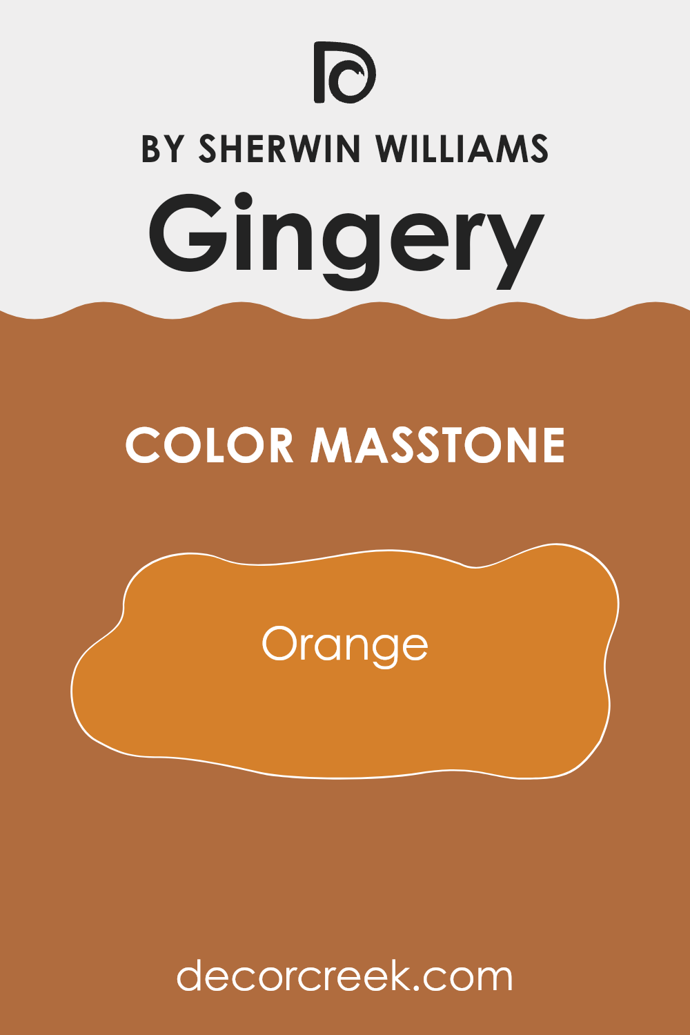
What is the Masstone of the Gingery SW 6363 by Sherwin Williams?
The color Orange (#D5802B), as seen in Gingery SW 6363 by Sherwin Williams, presents a warm and vibrant hue that is both cozy and welcoming. This masstone is known for its ability to inject energy and warmth into a living room, making it especially suitable for common areas like living rooms and kitchens where families gather and socialize.
The rich orange tone pairs well with neutral colors such as whites, grays, and creams, creating a balanced and inviting atmosphere. These combinations can help make smaller rooms feel more open and lively, while in larger areas, the color can help pull in the focus and add character.
Moreover, this shade of orange can also be used in accessories and accent walls to introduce a pop of color without overpowering the overall aesthetic of a room. By bringing in such bright and cheerful tones, you can create a friendly environment that feels both comfortable and stylish.
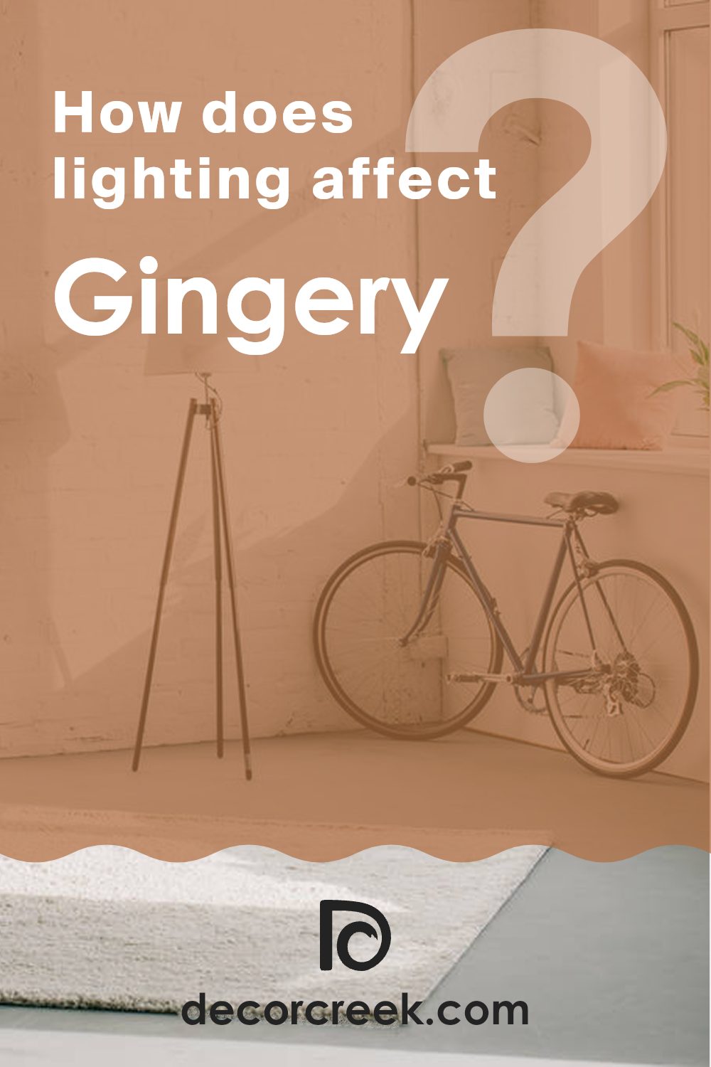
How Does Lighting Affect Gingery SW 6363 by Sherwin Williams?
Lighting plays a crucial role in how colors appear in a room. It not only influences the brightness and visibility of a color but also its tone and mood. Different types of light, whether artificial or natural, can have significant effects on the same color.
Taking a color like Gingery as an example, which is a warm, earthy orange shade, its appearance can change dramatically under different lighting conditions. In artificial light, such as LED or fluorescent lighting, this color can appear more intense and pronounced. The light tends to enhance the richness of the color, making it a cozy option for areas that use a lot of evening artificial lighting.
In natural light, the appearance of this color can vary throughout the day. Morning light, which is cooler, might make Gingery look slightly more muted, while during the afternoon, when the light is warmer and brighter, the color can appear vibrant and lively.
The orientation of the room also affects how this color is perceived:
1. North-facing rooms: These rooms receive less direct sunlight and the light is often cooler, which might make Gingery appear slightly more subdued and less vibrant. In these rooms, artificial lighting can help to warm up the color.
2. South-facing rooms: These rooms get plenty of sunlight which can make warm colors like Gingery look very bright and vivid. It’s a great fit for rooms facing this direction as the natural light will enhance its warmth.
3. East-facing rooms: In these rooms, the color will look brighter in the morning due to the gentle, warm morning light. It might lose some of its vibrancy in the afternoon as the light becomes cooler.
4. West-facing rooms: In contrast, west-facing rooms will start with a cooler tint during the morning and then get warmer and brighter towards the evening. This transition can make Gingery appear more dynamic as it changes subtly throughout the day.
Understanding how different types of light affect a color like Gingery can help in deciding its use effectively in various rooms and creating the desired atmosphere.
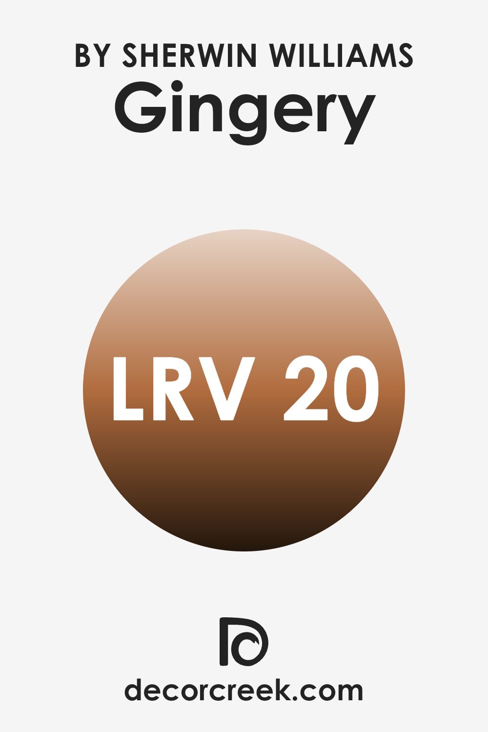
What is the LRV of Gingery SW 6363 by Sherwin Williams?
LRV stands for Light Reflectance Value, which measures the percentage of light a paint color reflects back into the room as opposed to absorbing it. Basically, the higher the LRV, the more light the color reflects. This is a crucial factor to consider when choosing paint because it can significantly influence the brightness of a room. Light colors tend to have higher LRVs and can make a room appear more open and airy, while darker colors have lower LRVs and might make a room feel cozier but smaller.
The LRV of Gingery by Sherwin Williams is 20.271, which means it’s on the darker side of the spectrum, reflecting a fairly low amount of light. This can affect the appearance and mood of a room quite dramatically.
In a room with less natural light, using a color like this could make the room appear even darker. However, in a well-lit area, or when used as an accent alongside lighter colors, it can add a warm and inviting quality without overpowering the room. Always consider the room’s lighting and the atmosphere you want to create when deciding if a lower LRV color is right for your room.
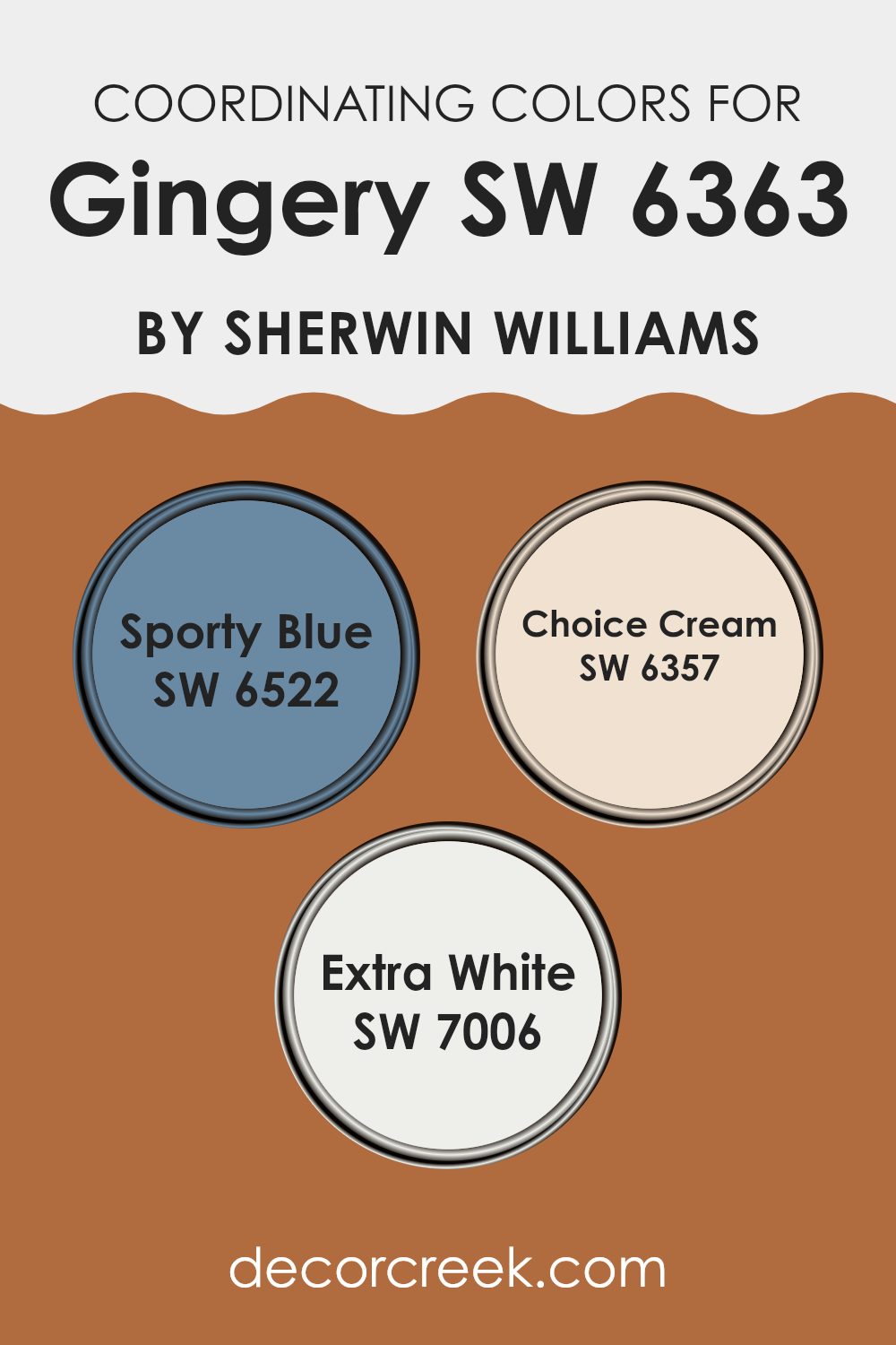
Coordinating Colors of Gingery SW 6363 by Sherwin Williams
Coordinating colors work together to create a harmonious and balanced look in a design room. They can either be contrasting or complementary shades that enhance the primary color they accompany. In the case of the warm, vibrant hue of Gingery by Sherwin Williams, three coordinating colors suggested are Sporty Blue, Choice Cream, and Extra White. These colors help in creating a visually appealing palette that brings out the best in the primary color, whether in home decor, painting, or fashion.
Sporty Blue is a lively and bright blue that adds a refreshing contrast to the earthy tone of Gingery. This color pairs well in areas that require a pop of vibrancy without overpowering the senses. Next, Choice Cream is a soft, muted cream color.
Its luscious and mild tone provides a perfect backdrop that complements the robust nature of Gingery, softening the overall aesthetics and bringing a warm, inviting ambiance to the room. Lastly, Extra White is a clean, crisp white that offers a stark, refreshing contrast. It works excellently for trim or accents, helping to define and highlight the rooms adorned with Gingery and its coordinating shades.
You can see recommended paint colors below:
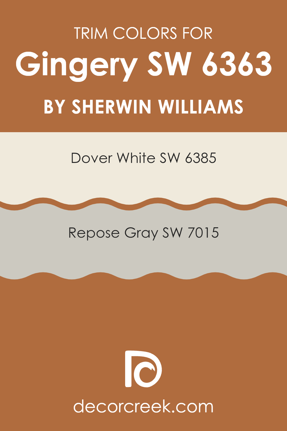
What are the Trim colors of Gingery SW 6363 by Sherwin Williams?
Trim colors play an essential role in adding definition and contrast to the walls painted with a primary color like Gingery by Sherwin Williams. Trim colors such as Dover White and Repose Gray are chosen for their neutral yet distinct tones which can effectively highlight the warmer hues of Gingery, creating a clean and harmonious look in the room.
These colors are not only practical in hiding imperfections along edges where walls meet floors and ceilings but also enhance the overall aesthetic by providing a subtle frame around the architectural features of a room.
Dover White SW 6385 is a warm white tone that adds a gentle softness to the edges of a room, making it feel more inviting and cohesive when paired with richer wall colors. On the other hand, Repose Gray SW 7015 offers a slightly deeper, gray shade that provides a modern contrast, yet still maintains a light and airy feel when used as a trim. Both colors are flexible choices that can easily complement various decor styles and personal tastes while adding dimension and finishing touches to the interiors.
You can see recommended paint colors below:
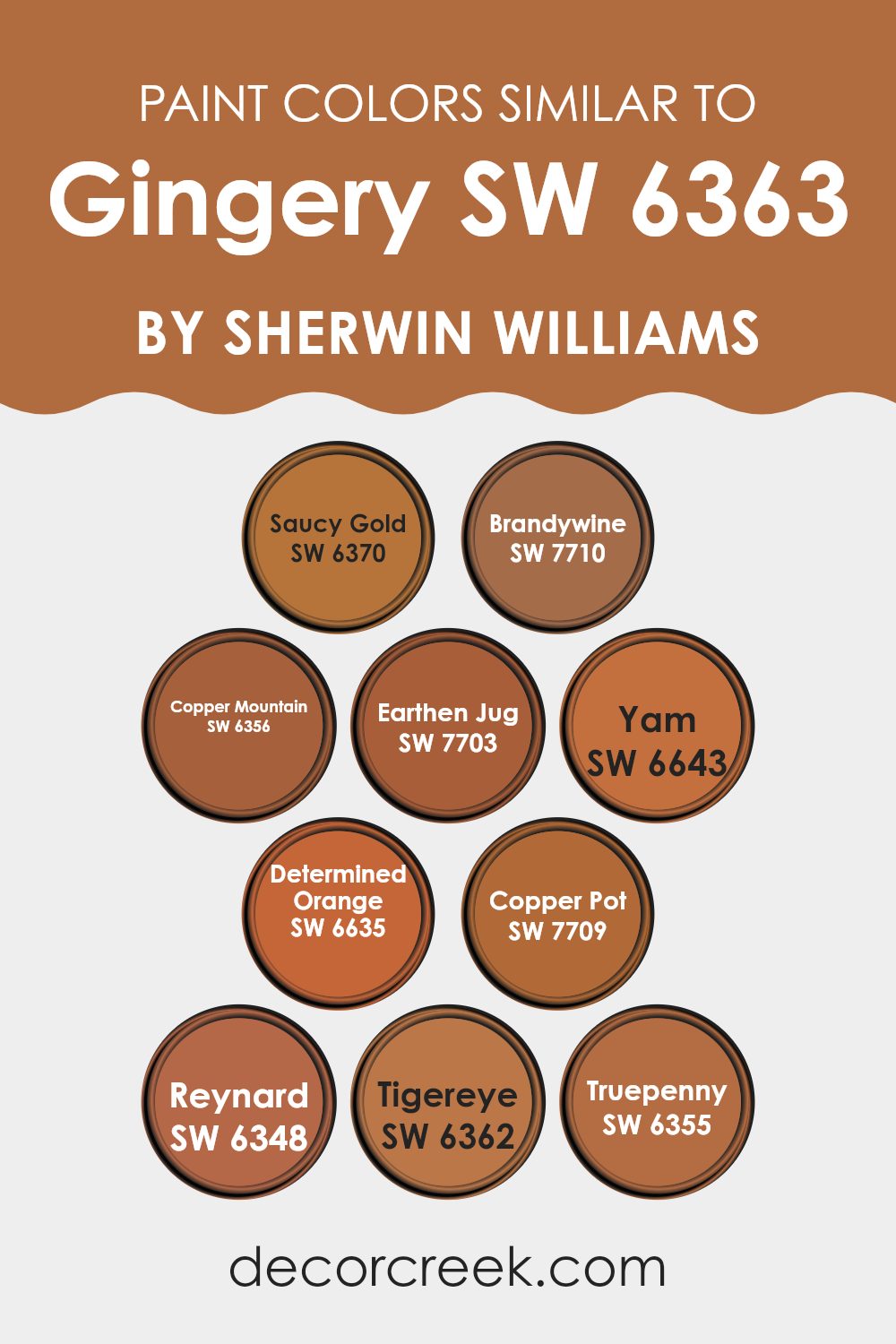
Colors Similar to Gingery SW 6363 by Sherwin Williams
Choosing similar colors, such as the diverse shades related to Gingery SW 6363 by Sherwin Williams, is crucial for creating a harmonious and visually appealing room. These colors, sharing a warm and earthy palette, ensure a seamless transition and balance within interiors, making them feel cohesive.
For example, SW 6370 Saucy Gold brings a rich, vibrant touch, reminiscent of sunlit golden hues that add brightness and warmth. In contrast, SW 7710 Brandywine offers a deeper, more intense warmth, akin to the rich undertones of aged wine, perfect for adding depth and interest.
Similarly, SW 6356 Copper Mountain has an inviting, coppery glow that can make a room feel welcoming and cozy. SW 7703 Earthen Jug carries a deep terra cotta color that resembles natural clay, providing a grounded, earthy feel to areas.
SW 6643 Yam and SW 6635 Determined Orange are lively and bold, with Yam leaning towards a cheerful pumpkin shade and Determined Orange offering a more muted, dusky sunset feel. For a more striking presence, SW 7709 Copper Pot flashes a rustic aura similar to aged copper.
On the other hand, SW 6348 Reynard displays a rich fox-like hue, enhancing areas with its intriguing charm. SW 6362 Tigereye and SW 6355 Truepenny provide lighter, softer alternatives, Tigereye bearing subtle amber tones and Truepenny a light, caramel touch. Utilizing these hues together enables anyone to create rooms that feel unified yet dynamic, with each color complementing the others beautifully.
You can see recommended paint colors below:
- SW 6370 Saucy Gold
- SW 7710 Brandywine
- SW 6356 Copper Mountain
- SW 7703 Earthen Jug
- SW 6643 Yam
- SW 6635 Determined Orange
- SW 7709 Copper Pot
- SW 6348 Reynard
- SW 6362 Tigereye
- SW 6355 Truepenny
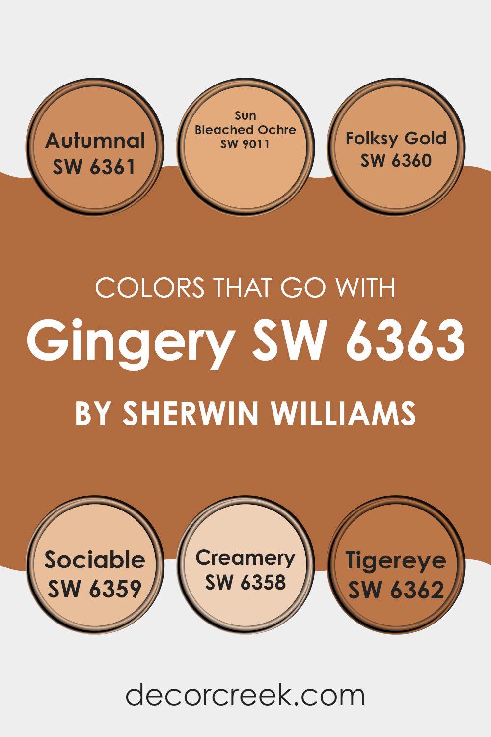
Colors that Go With Gingery SW 6363 by Sherwin Williams
Choosing the right complementing colors for Gingery SW 6363 by Sherwin Williams is crucial because it helps create a harmonious and visually appealing room. The colors that pair well with Gingery, such as Autumnal, Sun Bleached Ochre, Folksy Gold, Sociable, Creamery, and Tigereye, each bring their unique tones that can enhance the warmth and inviting nature of Gingery.
These colors work together to establish a cohesive look that can make a room feel more coordinated and pleasant. Autumnal is a deep, rich shade reminiscent of fall leaves, providing a strong contrast that highlights the vibrant tones of Gingery. Sun Bleached Ochre offers a soft, muted yellow, giving a subtle lift to the earthy Gingery without overpowering it.
Folksy Gold has a cheerful, bright presence that injects a burst of energy into areas, pairing nicely with the depth of Gingery. Sociable is a lively and vibrant hue that adds a touch of fun and excitement, working well in areas meant for interaction and enjoyment. Creamery is a subtle, creamy color that offers a gentle backdrop, allowing Gingery to stand out as the star.
Lastly, Tigereye brings a rich, golden-brown that complements Gingery’s undertones, adding a sense of warmth and coziness to the environment. Together, these colors support and enhance the beauty of Gingery, making it flexible for various decorating styles and rooms.
You can see recommended paint colors below:
- SW 6361 Autumnal
- SW 9011 Sun Bleached Ochre
- SW 6360 Folksy Gold
- SW 6359 Sociable
- SW 6358 Creamery
- SW 6362 Tigereye
How to Use Gingery SW 6363 by Sherwin Williams In Your Home?
Gingery SW 6363 by Sherwin Williams is a warm, earthy color that adds a cozy and inviting feel to any room. Its blend of rich brown and subtle red hues makes it flexible for use in various rooms in your home.
You can use Gingery in your living area or kitchen to create a welcoming atmosphere where family and friends can gather. It pairs well with natural elements like wooden furniture and green plants, enhancing the overall warmth of the room. In the bedroom, Gingery can be used on a feature wall to add depth and warmth, creating a cozy retreat.
This color also works well in dining rooms, giving them an inviting and comfortable feel. For a more modern look, combine Gingery with neutral colors like white or grey. This not only contrasts beautifully but also keeps the room feeling light and balanced. Overall, Gingery by Sherwin Williams is a great choice to add warmth and a sense of comfort to your home.
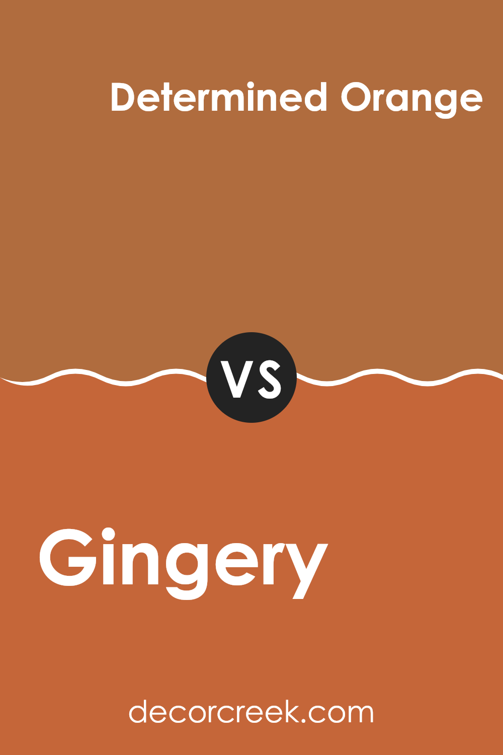
Gingery SW 6363 by Sherwin Williams vs Determined Orange SW 6635 by Sherwin Williams
Gingery and Determined Orange are two vibrant shades offered by Sherwin Williams. Gingery is a warm, earthy orange with a grounding feel, reminiscent of autumn leaves or a cozy, fireside glow. It’s a softer tone that blends well in areas where you want a touch of color without overpowering brightness.
On the other hand, Determined Orange is a bolder, more vivid shade. This color stands out more and is likely to catch the eye, making it a great choice for areas where you want to make a statement or add a pop of brightness.
While Gingery lends a subtle, soothing warmth to a room, Determined Orange brings an energetic pulse, suitable for lively areas and accent walls. These colors could work beautifully together for someone looking to balance zest with a comforting earthiness.
You can see recommended paint color below:
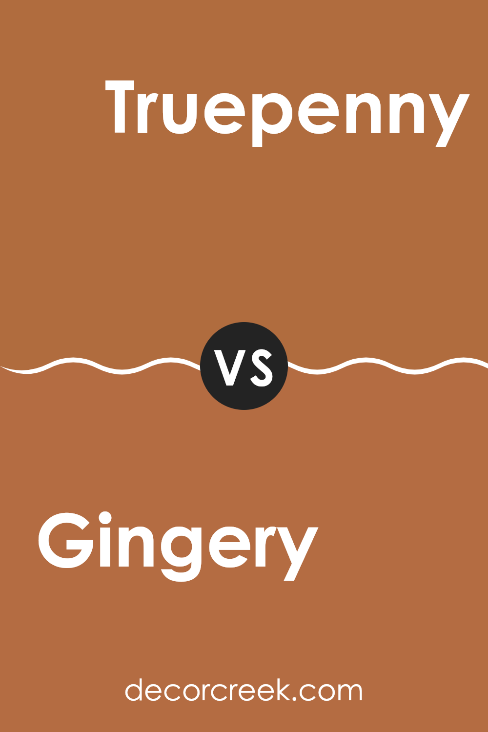
Gingery SW 6363 by Sherwin Williams vs Truepenny SW 6355 by Sherwin Williams
Gingery and Truepenny are two warm and inviting colors by Sherwin Williams that provide a cozy feel to any room. Gingery is a softer, more muted terracotta shade that brings a gentle earthy touch to areas.
It leans slightly towards a pinkish-brown, making it a perfect choice for those who prefer subtle yet warm hues. On the other hand, Truepenny has a bit more vibrancy as a rich copper color. It’s stronger and more pronounced, creating a welcoming energetic ambiance that is excellent for lively areas like living rooms or dining rooms.
While both colors share a natural warmth, Gingery offers a quieter backdrop, whereas Truepenny stands out more and could be a great focal point. Altogether, both colors add a delightful warmth but cater to different preferences depending on how bold or subtle you want your color impact to be.
You can see recommended paint color below:
- SW 6355 Truepenny
Gingery SW 6363 by Sherwin Williams vs Earthen Jug SW 7703 by Sherwin Williams
The main color, Gingery, and the second color, Earthen Jug, both from Sherwin Williams, offer warm and inviting hues that could complement each other nicely in home décor. Gingery is a lively ginger color with a vibrant, orangey undertone that brings a pop of brightness to a room. It’s perfect for creating a lively, cheerful atmosphere, and works well in areas of the home where energy and warmth are desired.
In contrast, Earthen Jug has a deeper, richer tone resembling terracotta. It leans towards a rusty red that suggests a classic, earthy feel. This color can add depth and warmth to a room, making it feel cozy and welcoming.
When used together, these colors can establish a balance between vibrancy and groundedness, suitable for anyone looking to create a room that feels both energetic and rooted. Whether for an accent wall, paired in decor items or fabrics, Gingery and Earthen Jug can create a harmonious look.
You can see recommended paint color below:
- SW 7703 Earthen Jug
Gingery SW 6363 by Sherwin Williams vs Reynard SW 6348 by Sherwin Williams
Gingery and Reynard are two warm, earthy hues from Sherwin Williams that bring a cozy and inviting feel to any room. Gingery is a vibrant, orange-leaning shade that simulates the lively color of ginger. It adds a cheerful and energetic touch to rooms, perfect for creating a welcoming environment.
On the other hand, Reynard is a deeper, red-brown color, reminiscent of the rich, autumn leaves. This color is slightly more subdued than Gingery and offers a feeling of warmth and comfort, ideal for areas that aim for a more grounded and homely atmosphere.
When paired together, these colors complement each other beautifully, with Gingery providing brightness and Reynard adding depth and warmth. These colors are particularly suitable for living rooms, kitchens, and areas where you want to add lively yet cozy vibes. Each color stands out on its own but also coordinates well with neutral tones for balance and harmony in design.
You can see recommended paint color below:
- SW 6348 Reynard
Gingery SW 6363 by Sherwin Williams vs Saucy Gold SW 6370 by Sherwin Williams
The main color, Gingery, is a warm, vibrant orange that has a natural, earthy feel. It’s quite bold and lively, making it a great choice for areas where you want to add a sense of energy or enthusiasm. This color pairs well with neutral shades and can really bring a room to life when used on an accent wall or in decorative accessories.
On the other hand, Saucy Gold is a rich, golden yellow that also carries a warm tone but is brighter and more eye-catching than Gingery. Saucy Gold offers a cheerfulness that can instantly brighten up a room and make it feel more inviting and cozy. It works particularly well in areas that receive a lot of natural light, enhancing the light’s natural warmth.
Both colors are warm and inviting but each has its own unique impact. Gingery leans towards a more subdued, earthy quality, while Saucy Gold brings a brighter, more radiant energy to interiors.
You can see recommended paint color below:
Gingery SW 6363 by Sherwin Williams vs Copper Mountain SW 6356 by Sherwin Williams
Gingery and Copper Mountain are both warm, inviting colors by Sherwin Williams, but they have distinct tones that set them apart. Gingery is a bold, vibrant shade that leans more towards a bright orange with hints of brown. It’s lively and can add a cheerful pop of color to a room.
On the other hand, Copper Mountain is deeper and richer, resembling the natural color of a polished copper. This makes it a bit more subdued compared to Gingery, offering a more grounded and earthy feel.
Copper Mountain could be considered more flexible for various home decor styles as it pairs well with both rustic and modern designs due to its depth and warmth. Gingery, with its brighter and lighter hue, is perfect for energizing a room or creating a focal point. Both colors work well to warm up areas but will deliver different vibes depending on their use.
You can see recommended paint color below:
Gingery SW 6363 by Sherwin Williams vs Tigereye SW 6362 by Sherwin Williams
Gingery and Tigereye, both by Sherwin Williams, are two warm, earthy tones that bring a cozy feel to any room but have distinct differences in hue and strength. Gingery has a muted, lighter shade that resembles the pale, dusty aspect of ground ginger. It’s subtle and lends itself well to being a background color, perfect for living areas where you want a gentle touch of warmth without overpowering the room.
On the other hand, Tigereye is a richer, deeper color, reminiscent of the gemstone it’s named after, featuring darker orange and brown undertones. This color makes a bolder statement and can work well as an accent wall or in a room where you want to add a bit of drama and warmth.
Both colors pair well with natural materials like wood or leather and could be used together to create a layered, inviting look. While Gingery provides a soft backdrop, Tigereye can draw attention to key furnishings or architectural features.
You can see recommended paint color below:
- SW 6362 Tigereye
Gingery SW 6363 by Sherwin Williams vs Copper Pot SW 7709 by Sherwin Williams
The main color, Gingery, is a warm, spicy orange that brings a cozy and inviting atmosphere to any room. It resembles the natural tone of ginger roots with its earthiness and subtle radiance. This color is perfect for adding a burst of warmth to living areas or kitchens.
On the other hand, Copper Pot, the second color, is a deeper, richer shade that leans more towards a burnt orange or rust. It offers a robust and hearty feel, making it excellent for areas where you want to create a strong, welcoming vibe without overpowering the senses.
Both Gingery and Copper Pot are great options for those looking to introduce warm colors into their decor, but Copper Pot provides a more intense and dramatic look because of its darker, more saturated quality. Gingery, being lighter, can make a room feel more open and airy. Both colors work well with natural light and can complement a variety of decor styles and materials.
You can see recommended paint color below:
- SW 7709 Copper Pot
Gingery SW 6363 by Sherwin Williams vs Yam SW 6643 by Sherwin Williams
The main color, Gingery, and the second color, Yam, are both warm, inviting shades from Sherwin Williams but have distinct tones that give each a unique appeal. Gingery offers a creamy, muted ginger hue that’s soft and subtle, making it a flexible choice for areas where you want a cozy, understated look without overpowering the room. It pairs well with neutral and earth tones, adding a gentle warmth.
On the other hand, Yam presents a more vibrant and rich shade, akin to the deep orange of a sweet potato. This color brings a lively pop of energy to any room, ideal for areas where you want to make a statement or add some zest. Because of its intensity, it works well as an accent wall or in decor elements that create focal points.
Both colors can warm up a room, but where Gingery blends softly into a design, Yam stands out with boldness. Their uses depend on the desired impact and mood of your interior rooms.
You can see recommended paint color below:
- SW 6643 Yam
Gingery SW 6363 by Sherwin Williams vs Brandywine SW 7710 by Sherwin Williams
Gingery and Brandywine are both warm, inviting colors by Sherwin Williams, each offering a unique vibe for interior rooms. Gingery is a vibrant, rich orange with a lively feel and a hint of spice, making it a great choice for adding a touch of energy to a room. This cheerful shade is a perfect pick for a kitchen or dining area where you want a cozy, welcoming atmosphere.
On the other hand, Brandywine is a deeper, more intense color. It has a robust red tone that can make any room feel more snug and homey. This color is great for areas like living rooms or reading nooks where you want a strong, grounded feeling.
Both colors are great for creating warm looks but serve different moods and settings. Gingery is brighter and injects a bit of fun, while Brandywine offers a rich depth that’s great for a more relaxed, settled feel in a room.
You can see recommended paint color below:
- SW 7710 Brandywine
After spending some time learning about and using SW 6363 Gingery by Sherwin Williams, I must say I’m quite impressed. This paint color is like a warm, inviting hug for any room! It makes my room look cozy and welcoming, which is great for rooms where my family likes to hang out and relax. The shade is a mix of orange and brown, so it feels very warm and comforting—kind of like pumpkin spice!
What’s also fantastic about Gingery is how it plays well with other colors. I tried pairing it with soft creams and even bold blues, and it looks amazing every time! It seems to work in any kind of room too, whether it’s my living room or the kitchen. It adds a lovely warm touch without making things look too busy or flashy.
I think that if someone is looking to give their room a cozy, warm feeling, SW 6363 Gingery is a great choice. It makes you feel like you’re wrapped up in your favorite blanket, and who wouldn’t want their home to feel like that? Plus, it’s not too dark or too light, so it sets just the right tone. So, from my own experience, Gingery by Sherwin Williams is a winner in making a home feel just right.
Ever wished paint sampling was as easy as sticking a sticker? Guess what? Now it is! Discover Samplize's unique Peel & Stick samples.
Get paint samples

