I recently had the opportunity to work with the paint color SW 9574 Hulett Ore by Sherwin Williams, and I must say, it surprised me. Initially, its rich and earthy tone caught my eye, suggesting a strong presence without being too overpowering. It’s a kind of color that offers warmth and depth, making it ideal for spaces where you want to add a sense of calmness and serenity.
As you apply it, you’ll notice how Hulett Ore adheres smoothly, providing excellent coverage that can totally transform the ambiance of a room. It also pairs wonderfully with various textures and materials like wood, metal, and glass, allowing for versatile design choices. Whether you’re painting a cozy study or refreshing an entire living area, it’s a reliable option that helps you set the right mood.
In my experience, what sets this color apart is how it changes with natural light, shifting subtly across the day from a muted shadow to a softer, inviting glow.
This dynamic quality keeps the space interesting and engaging.
If you’re considering a makeover for your home or just a particular room, you might want to consider Hulett Ore not just for its aesthetic appeal but also for the ease of application and durability.

What Color Is Hulett Ore SW 9574 by Sherwin Williams?
The color Hulett Ore by Sherwin Williams is a warm, muted terracotta shade that brings a cozy, earthy feel to any space. Its rich, clay-like tone makes it ideal for creating a welcoming atmosphere in your home. This color has an appealing, rustic charm that works wonderfully in casual, laid-back settings as well as more refined, subdued spaces.
Hulett Ore pairs beautifully with natural materials and textures. Think of combining it with unfinished wood, natural stone, or linen fabrics to enhance its organic roots. The warmth of the color goes hand-in-hand with materials like warm oak, rattan, and wool, making spaces feel grounded and balanced.
In terms of interior styles, Hulett Ore is particularly effective in bohemian and traditional décor styles. It complements the eclectic mix of elements in bohemian themes and enhances the classic lines and rich textures found in traditional spaces. Additionally, this color is also a great choice for modern farmhouse interiors, where its rustic vibe aligns perfectly with simpler, comforting elements of design.
Overall, Hulett Ore is a versatile color choice that adds a touch of warmth and natural elegance to any room, supporting a variety of styles and materials in creating a soothing, inviting environment.
Is Hulett Ore SW 9574 by Sherwin Williams Warm or Cool color?
The paint color Hulett Ore, coded SW 9574, by Sherwin Williams is a unique and versatile shade that suits various spaces in a home. This color, a deep, rich brown with warm undertones, adds a cozy and welcoming feel to rooms.
It is perfect for creating a comforting ambiance in living areas or bedrooms. Because of its depth, it pairs well with lighter colors like creams and beiges, which help to balance its intensity and prevent it from overpowering smaller spaces. Additionally, this color works well in homes with natural wood elements or rustic decor, as it complements these materials beautifully.
Using Hulett Ore in well-lit rooms or on accent walls can also enhance the warmth and depth of the space, making it feel more inviting. Overall, it’s a practical choice for those looking to add warmth and a touch of nature to their interior design.
Undertones of Hulett Ore SW 9574 by Sherwin Williams
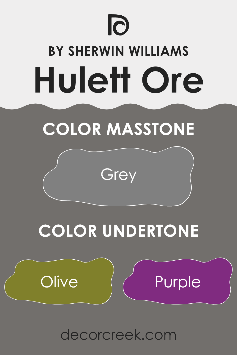
The color Hulett Ore has a complex mix of undertones that can significantly influence the ambiance of a room. Undertones are subtle colors underlying the main color, affecting how it appears under different lighting conditions. This specific paint color includes a variety of undertones such as olive, purple, and dark turquoise, among others.
These undertones can make the main color look warmer or cooler depending on the lighting and the colors around it. For example, in a room with lots of natural light, the olive and dark green undertones could make the walls appear more vibrant and lively. In artificial light, the purple or navy undertones might become more noticeable, giving the walls a slightly cooler feel.
In interior design, understanding these undertones can help you decide what furnishings and decorations will best complement the walls. A room painted with Hulett Ore, which also includes undertones like brown and dark grey, can pair well with natural wood furniture or metal accents to bring out the earthier tones. Alternatively, using fabrics or accessories in mint or pale pink might highlight the softer sides of the paint.
Ultimately, the impact of these undertones in interior settings is what adds depth and character to your space, making it more visually interesting and cohesive. Every undertone adds a layer of complexity, creating a unique atmosphere that enhances the aesthetics of any room.
What is the Masstone of the Hulett Ore SW 9574 by Sherwin Williams?
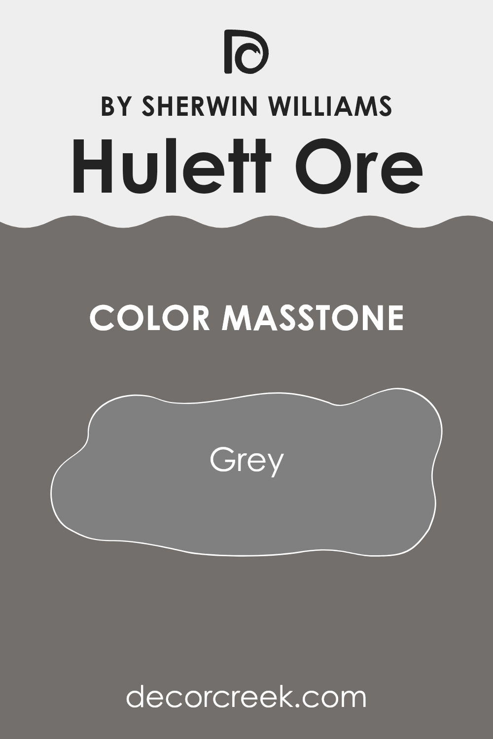
The masstone of Hulett Ore, which is a grey color, can bring a calm and neutral atmosphere to any room. This shade, resembling the classic grey (#808080), serves as a versatile backdrop in homes. It fits well in spaces that need a touch of simplicity without overwhelming the senses.
This sort of grey works great in living areas or bedrooms where the goal is to have a peaceful and uncluttered look. It pairs well with various decor styles, whether you’re going for something modern or more traditional.
The color can help other elements in the room, like furniture or artwork, stand out without causing a visual clash. Additionally, its neutrality allows homeowners to easily switch up accent colors or decorations with the seasons without needing a complete redesign.
This makes it a practical choice that can adapt to changing tastes and trends.
How Does Lighting Affect Hulett Ore SW 9574 by Sherwin Williams?
Lighting plays a key role in how colors appear in a room. Different types of light can change how a color looks. For instance, the Sherwin Williams paint color, Hulett Ore (SW 9574), can appear differently under various lighting conditions due to its unique shade.
Under artificial light, such as LED or fluorescent lights, Hulett Ore might look slightly different from how it appears in natural daylight. Artificial lighting can either dull the color or make it look more intense, depending on the type of bulb used. Warmer lights, like some LEDs, can bring out the richness and depth of the color, making it appear more vibrant.
In contrast, cooler lights might make the paint look a bit more subdued.
In natural light, the appearance of this color can change throughout the day. Natural sunlight tends to show the truest color, bringing out all the nuances in the hue of Hulett Ore. During the morning when the light is soft and warm, this color may look inviting and bold. As the day progresses to noon when sunlight is brightest and most neutral (less yellow), the color may appear slightly lighter.
In rooms facing different cardinal directions, the color also varies:
– North-facing rooms: These rooms get less direct sunlight, which can cause Hulett Ore to appear a little darker and with more gray tones.
– South-facing rooms: The ample sunlight in these rooms can make the color appear more vivid and dynamic throughout the day.
– East-facing rooms: Morning light makes this color look warm and welcoming, but it might appear softer and more muted as the day goes on.
– West-facing rooms: In these rooms, the color can look mellow and calm during the morning and turn warm and richer towards the evening.
Understanding how different lighting affects color like Hulett Ore from Sherwin Williams can help in deciding what paint to use and where to use it to achieve the desired atmosphere in a space.

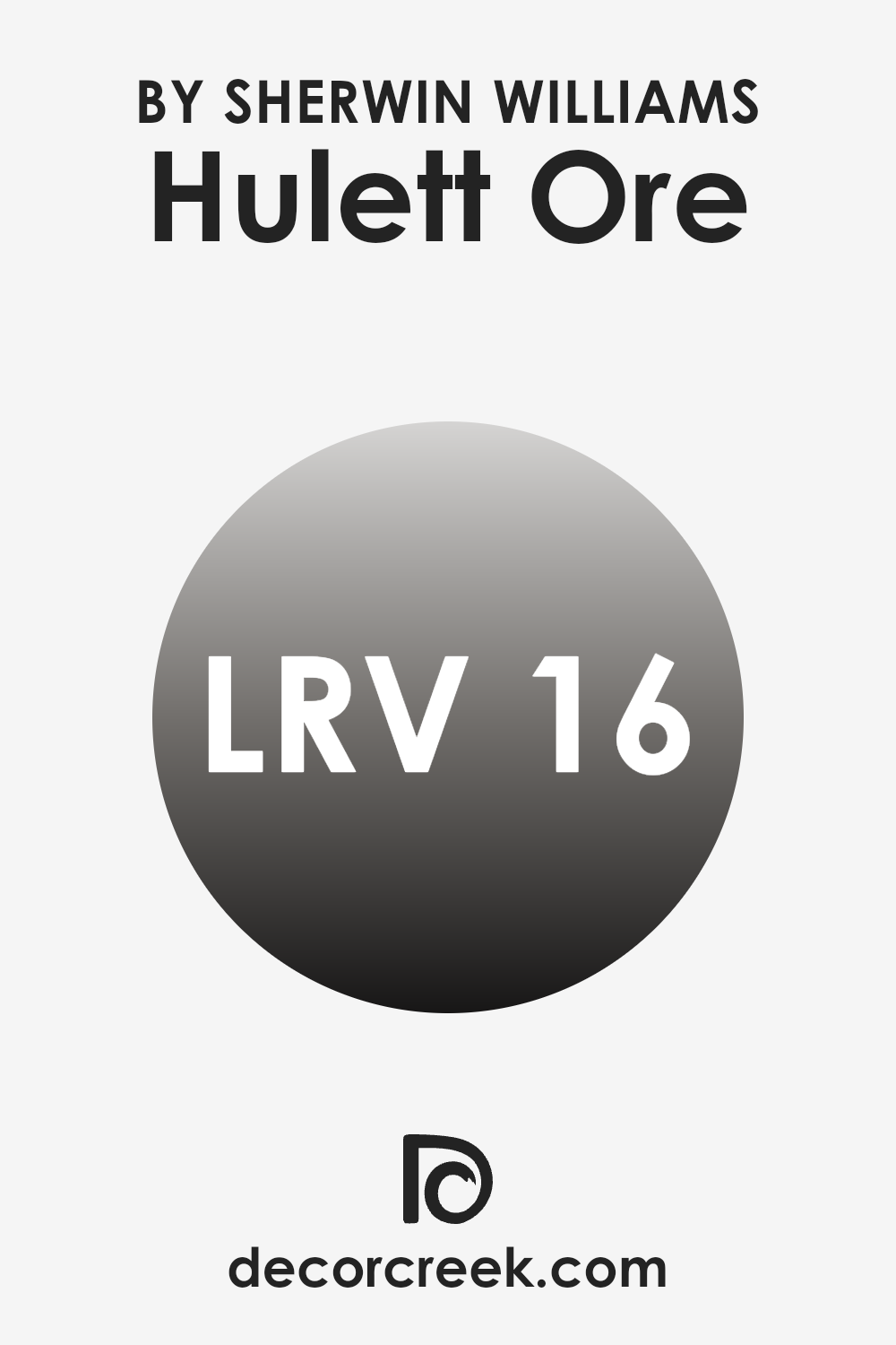
What is the LRV of Hulett Ore SW 9574 by Sherwin Williams?
LRV stands for Light Reflectance Value, which is a measure that tells how much light a paint color reflects back into a room as opposed to absorbing it. This value is represented on a scale where higher values mean the color reflects more light and appears lighter, while lower values mean it absorbs more light and looks darker.
LRV is especially useful when choosing paint colors for a room because it can help you understand how the color will look under different lighting conditions—whether it’ll brighten up a space or make it feel more enclosed.
The LRV of 16.068 for this specific paint color indicates that it is a darker shade that absorbs a lot of light rather than reflecting it. This means that when used on walls, this color can make rooms feel smaller or more intimate because of the way it absorbs light. Such a low LRV is often preferred in larger or well-lit spaces to avoid the color from overpowering the room.
In smaller or poorly lit rooms, using a color with such a low LRV can make the space feel even more cramped and dark.
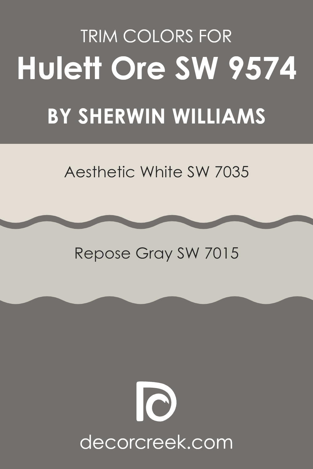
What are the Trim colors of Hulett Ore SW 9574 by Sherwin Williams?
Trim colors play a crucial role in enhancing the overall aesthetic of a room, providing a frame or border that enhances architectural features and contrasts with the main wall color. The trim color is important as it helps to either subtly complement or boldly define the spaces around doors, windows, and other parts of the room or exterior, depending on the desired effect.
For a color like Hulett Ore by Sherwin Williams, choosing the right trim color can greatly affect the mood and style of the space.
Aesthetic White SW 7035 is a soft, creamy white that offers a gentle contrast against richer or darker shades. It’s perfect for bringing a light and airy feel to the space, making it appear more open. On the other hand, Repose Gray SW 7015 is a light gray that provides a neutral but crisp edge to the surroundings. This color can easily blend with a variety of palettes, ensuring a sleek and modern finish that enhances the main color without overpowering it.
You can see recommended paint colors below:
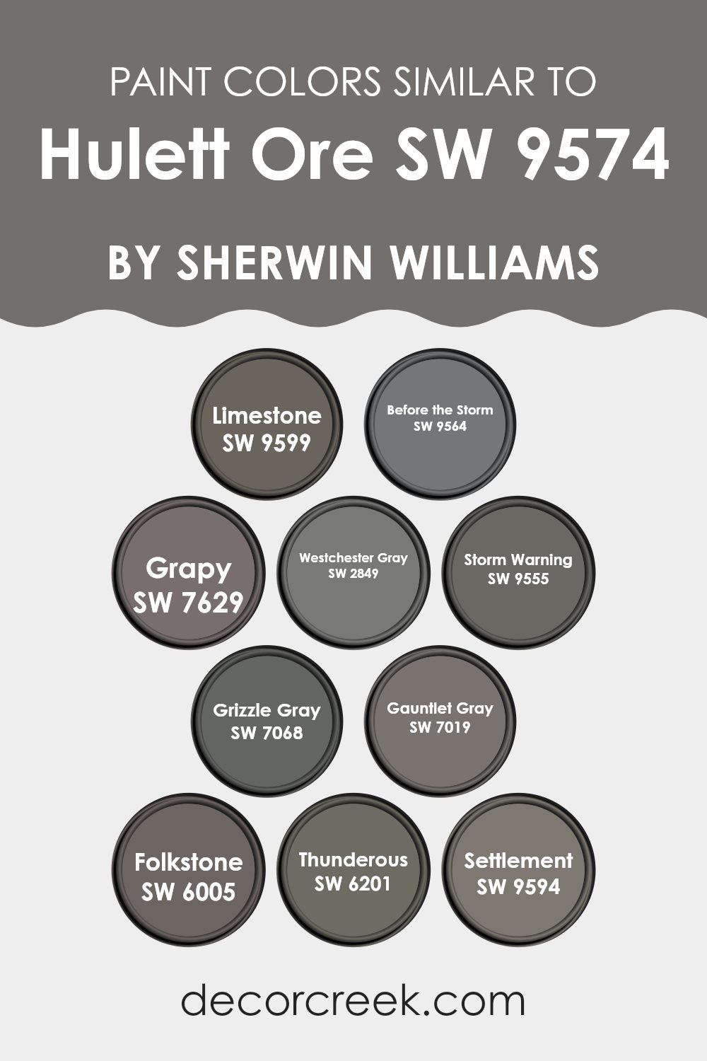
Colors Similar to Hulett Ore SW 9574 by Sherwin Williams
Similar colors play a pivotal role in creating harmonious color schemes that are pleasing to the eye. Using shades like SW 9599 – Limestone, a gentle gray with a whisper of warmth, along with SW 9564 – Before the Storm, which adds a slightly sterner, cooler gray tone, can create a subtle gradient effect that is cohesive and calming. SW 7629 – Grapy has a dusky, muted purple tone, giving depth and introducing a touch of color that’s not overwhelming.
Meanwhile, SW 2849 – Westchester Gray offers a balanced gray that radiates a classic, timeless feel in any space. This range of grays continues with SW 9555 – Storm Warning where a darker, more dramatic gray gives a strong presence.
Further deepening this palette, SW 7068 – Grizzle Gray and SW 7019 – Gauntlet Gray each present grayer, almost steely hues, fantastic for adding a bit of intensity and sophistication without going too dark.
SW 6005 – Folkstone and SW 6201 – Thunderous both offer versatility; Folkstone is a solid, earthy gray that resonates well in areas needing a solid, neutral backdrop, while Thunderous presents a shadowy charcoal gray perfect for accentuating areas for visual interest.
Lastly, SW 9594 – Settlement introduces a muted, stony gray with the ability to unify the varying grays and purples, rounding out this family of colors and creating a cohesive flow through different rooms or elements in a design.
You can see recommended paint colors below:
- SW 9599 Limestone
- SW 9564 Before the Storm
- SW 7629 Grapy
- SW 2849 Westchester Gray
- SW 9555 Storm Warning
- SW 7068 Grizzle Gray
- SW 7019 Gauntlet Gray
- SW 6005 Folkstone
- SW 6201 Thunderous
- SW 9594 Settlement
How to Use Hulett Ore SW 9574 by Sherwin Williams In Your Home?
Hulett Ore SW 9574 by Sherwin Williams is a rich, deep color resembling the tone of natural minerals. This versatile shade can add a sense of warmth and richness to any room in your home. For those looking to make a cozy impression, painting your living room walls with this color can create a welcoming atmosphere.
In the bedroom, it works beautifully as an accent wall behind the bed, paired with lighter furnishings to keep the room from feeling too dark. Perfect for a study or home office too, Hulett Ore provides a focused yet relaxed backdrop that can help improve concentration.
In dining areas, using this color can set a stylish stage for lively meals and conversations. Even in smaller touches, like painted bookshelves or cabinets, it adds a touch of warmth without overwhelming the space. Just remember, when using a strong color like Hulett Ore, balance it with lighter or neutral tones to keep your spaces feeling light and open.
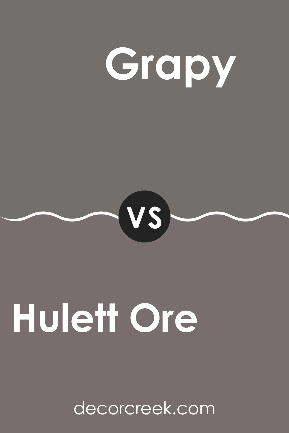
Hulett Ore SW 9574 by Sherwin Williams vs Grapy SW 7629 by Sherwin Williams
The two paints, Hulett Ore and Grapy, both from Sherwin Williams, present two distinctive shades that add unique character to any space. Hulett Ore is a rich, deep red, creating a warm and welcoming feeling, ideal for making a bold statement in a room.
It pairs well with neutral colors, allowing it to stand out as a focal point. On the other hand, Grapy is a muted purple with subtle gray undertones, offering a more subdued yet equally appealing color option.
This hue works well in spaces meant for relaxation and thought, as its softness adds a gentle, calming element without being too bright. Both colors are versatile but serve different purposes, with Hulett Ore being more vibrant and attention-grabbing, and Grapy providing a quieter, softer background.
You can see recommended paint color below:
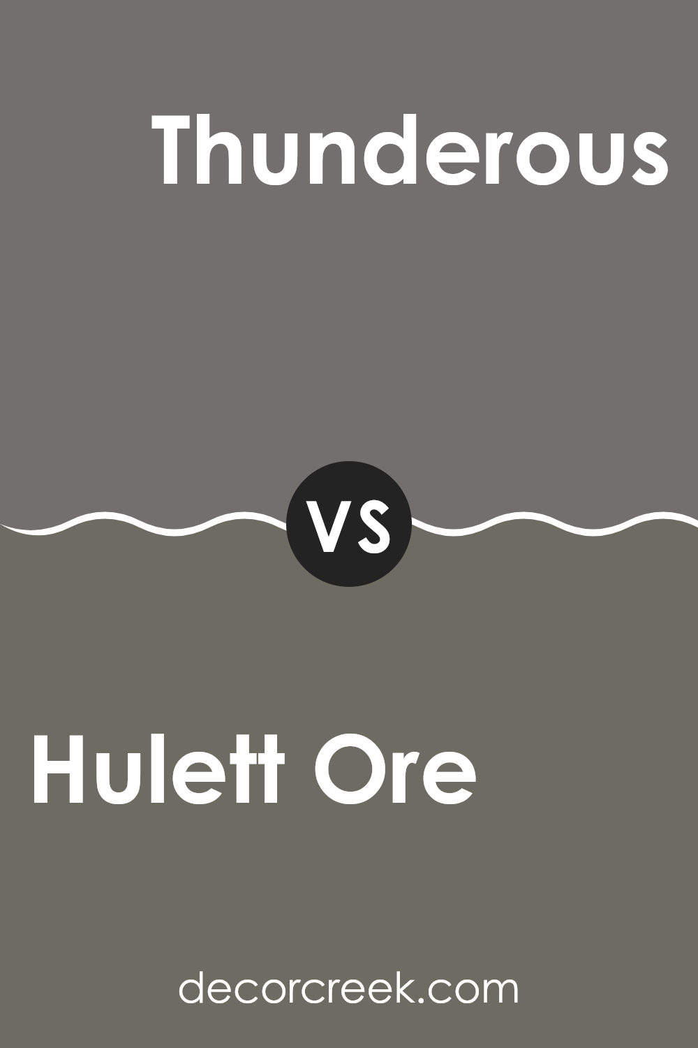
Hulett Ore SW 9574 by Sherwin Williams vs Thunderous SW 6201 by Sherwin Williams
The main color, Hulett Ore, is a rich and deep red with a rusty tint, giving it a warm and earthy feel. This shade can create a cozy and inviting atmosphere in any space, working well in living areas or dining rooms where a touch of warmth is desirable.
On the other hand, Thunderous is a cool, mid-tone gray that offers a more neutral and versatile backdrop. This color is perfect for those looking to establish a calm and understated look, suitable for bedrooms or offices where a relaxing environment is crucial.
When comparing the two, Hulett Ore brings more warmth and character due to its red tones, whereas Thunderous provides a cleaner, more subdued look with its gray palette. These characteristics make Hulett Ore better for adding vibrancy and warmth, while Thunderous is ideal for creating a soft, minimalist setting.
You can see recommended paint color below:
- SW 6201 Thunderous
Hulett Ore SW 9574 by Sherwin Williams vs Limestone SW 9599 by Sherwin Williams
The main color, Hulett Ore, is a bold and warm shade that leans heavily into the burgundy spectrum with hints of brown. This makes it stand out and adds a cozy feeling to any room. It pairs well with natural wood and other earthy tones, creating a welcoming environment.
In contrast, Limestone is a much lighter and subtler color. It resembles a soft gray with a touch of beige, making it incredibly versatile and ideal for spaces where you want to promote a light and airy atmosphere.
Limestone works well as a neutral backdrop, allowing other colors in the decor to stand out without overpowering them. Together, these colors could complement each other in a space where Hulett Ore could serve as an accent wall or feature, while Limestone could be used for the remaining areas, balancing the visual impact of the darker shade.
You can see recommended paint color below:
Hulett Ore SW 9574 by Sherwin Williams vs Before the Storm SW 9564 by Sherwin Williams
Hulett Ore and Before the Storm are two distinct colors by Sherwin Williams. Hulett Ore is a vibrant orange shade that brings a lot of warmth and energy to any space. It’s a great option for areas where you want to add some liveliness, such as a kitchen or a playroom.
On the other hand, Before the Storm is a dark gray color that offers a more grounded and calm feeling. It’s better suited for a modern look or spaces where you want a more neutral backdrop, like in an office or a living room.
The difference between the two colors is quite stark, with Hulett Ore being much brighter and Before the Storm providing a more subtle and muted presence, making them suitable for very different decorating needs.
You can see recommended paint color below:
Hulett Ore SW 9574 by Sherwin Williams vs Grizzle Gray SW 7068 by Sherwin Williams
Hulett Ore and Grizzle Gray are both paints by Sherwin Williams, but they bring different vibes to a space. Hulett Ore is a deep, warm red with hints of terracotta, feeling both welcoming and earthy. It’s a versatile choice that pairs well with natural materials like wood or stone, making rooms feel cozy and grounded.
On the flip side, Grizzle Gray is a solid, dark gray that leans slightly toward blue. It gives off a strong, grounded feel, perfect for creating a modern or industrial look. Grizzle Gray works well in spaces that benefit from a bold, but not overpowering background color, suiting offices or contemporary living areas.
The contrast between the earthiness of Hulett Ore and the steely coolness of Grizzle Gray offers a range of options for interior design, depending on whether you want a touch of warmth or a more formal, cool atmosphere.
You can see recommended paint color below:
Hulett Ore SW 9574 by Sherwin Williams vs Settlement SW 9594 by Sherwin Williams
“Hulett Ore” and “Settlement” are two paint colors from Sherwin Williams that have distinct tones and vibes. “Hulett Ore” is a dark gray with a muted, earthy feel. It can give a strong, grounding effect to a room, making it feel cozy and secure. This color works well in spaces where you want to create a sense of comfort and retreat, such as bedrooms or reading nooks.
On the other hand, “Settlement” is lighter and warmer, with beige undertones. This color is great for areas where you want to add light and warmth, making it perfect for living rooms or kitchens. It brings a welcoming and calming atmosphere, enhancing natural light in the space.
Both colors can complement each other nicely. Using “Hulett Ore” as an accent in a room predominantly painted with “Settlement” can add depth and interest to the décor, or vice versa.
You can see recommended paint color below:
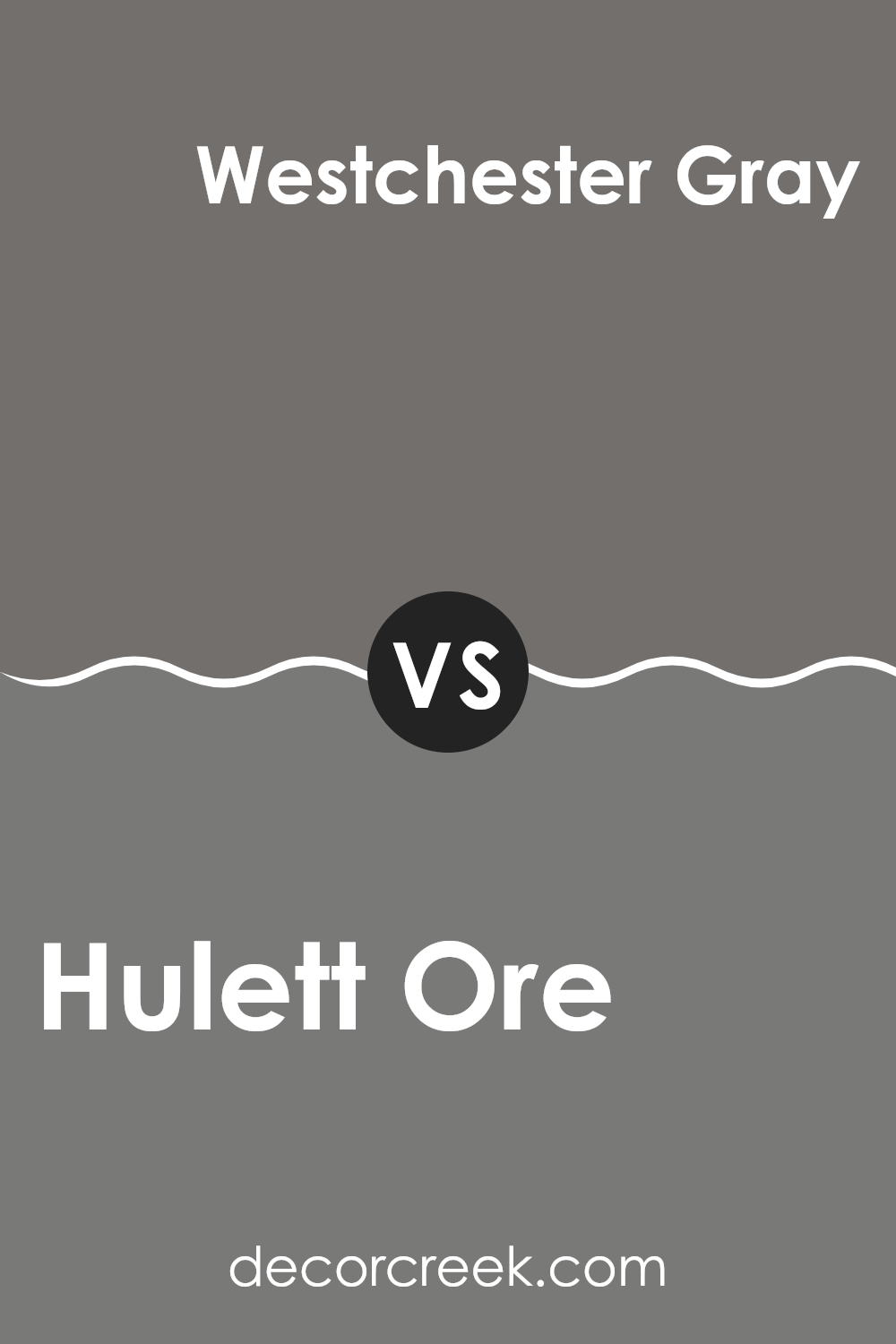
Hulett Ore SW 9574 by Sherwin Williams vs Westchester Gray SW 2849 by Sherwin Williams
Hulett Ore and Westchester Gray by Sherwin Williams are both unique shades but they set very different moods. Hulett Ore is a rich copper tone that brings a sense of warmth and earthiness to a space. It’s reminiscent of autumn leaves or a rustic copper penny. This color would work well in a room that needs a cozy or inviting atmosphere, perfect for spaces where you want to feel relaxed and at home.
On the other hand, Westchester Gray is a cooler, neutral gray that has a calm and balanced look. It’s a versatile choice that can fit into almost any design scheme without overpowering other elements. This shade is great for modern and minimalist spaces, providing a clean and understated backdrop that allows other colors or decor items to stand out.
Choosing between the two depends on the vibe you’re after: warm and earthy with Hulett Ore or cool and subtle with Westchester Gray.
You can see recommended paint color below:
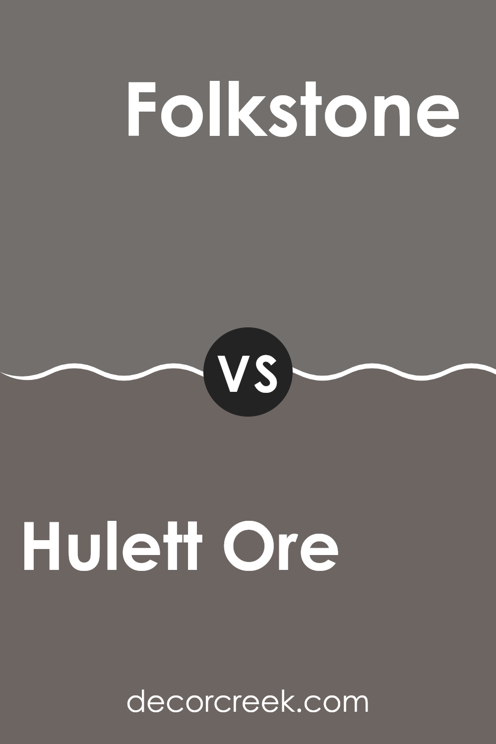
Hulett Ore SW 9574 by Sherwin Williams vs Folkstone SW 6005 by Sherwin Williams
Hulett Ore and Folkstone are both neutral colors from Sherwin Williams but they offer quite different shades and moods. Hulett Ore is a rich, deep green that has a soothing and natural feel, making it perfect for spaces where you want a touch of nature’s calmness.
It’s ideal for a cozy study room or bedroom. On the other hand, Folkstone is a solid grey that lends a sturdy and grounded look.
This color is great for modern spaces and works well in areas like the living room or kitchen as it pairs well with a wide range of décor styles. If you’re going for a more earthy and enveloping feel, Hulett Ore is the better choice, while Folkstone works well for creating a clean, straightforward backdrop.
You can see recommended paint color below:
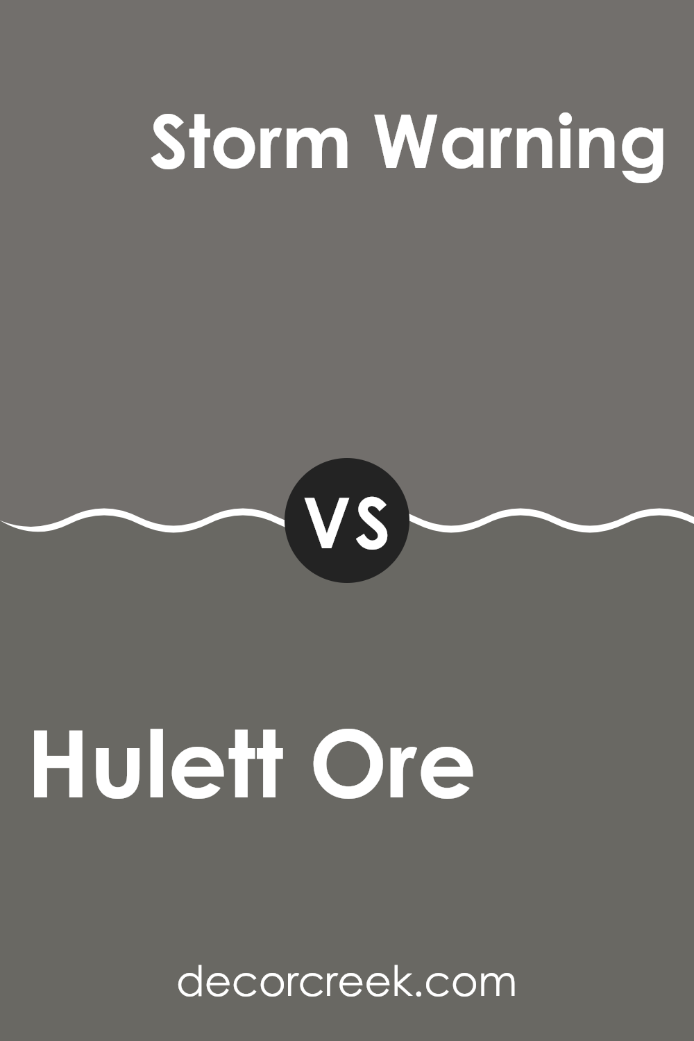
Hulett Ore SW 9574 by Sherwin Williams vs Storm Warning SW 9555 by Sherwin Williams
The color Hulett Ore is a deep, earthy red with hints of brown, giving it a warm and cozy feel. It’s the type of color that makes a space feel inviting and comfortable, ideal for living rooms or dining areas where you want a sense of warmth.
On the other hand, Storm Warning is a dark, moody blue with gray undertones. This color has a more reserved and subtle vibe, making it perfect for creating a calming and neutral backdrop in a home office or bedroom. It’s less about warmth and more about providing a solid, understated base.
Together, these colors offer contrasting atmospheres. Hulett Ore brings warmth and a touch of nature, while Storm Warning adds coolness and a calming effect. When used in the same space, they can balance each other out, offering a pleasing palette that includes both warm and cool tones. Each has its unique charm, suitable for different purposes and tastes.
You can see recommended paint color below:
Hulett Ore SW 9574 by Sherwin Williams vs Gauntlet Gray SW 7019 by Sherwin Williams
Hulett Ore and Gauntlet Gray are two unique paint colors from Sherwin Williams. Starting with Hulett Ore, it is a warm, rich brown with a distinct earthy tone that creates a welcoming and cozy atmosphere in any room. It pairs well with natural materials like wood and leather, imparting a rustic charm.
On the other hand, Gauntlet Gray is a much cooler shade. It’s a deep gray that borders on being a charcoal color. This makes it perfect for modern spaces that want to carry a sense of depth and boldness. Because of its neutrality, Gauntlet Gray works well with a broad range of decor styles and adds a strong, grounding effect to a space.
Comparatively, while both colors are dark, Hulett Ore offers warmth and coziness due to its brown base, while Gauntlet Gray provides a sleek, contemporary feel with its more austere gray tones. Choosing between them depends on the desired mood and style of the room.
You can see recommended paint color below:

Conclusion
As I finish talking about SW 9574 Hulett Ore by Sherwin Williams, I really want to share how much I appreciate this paint color. It’s not just any color; it’s soft, warm, and makes you feel at ease. It’s like the kind of brown you see in yummy chocolate, which makes you feel cozy and comfortable.
This color goes well almost anywhere – in your living room, bedroom, or even the kitchen! It’s great because it doesn’t scream for attention but still adds a lot of warmth to the room. When you paint your walls with Hulett Ore, it feels like giving your room a nice, big hug.
It works well with many other colors too. You can pair it with light colors for a soft look or with bright colors for some fun contrasts. So, it’s pretty easy to use when you want to change up your room without having a hard time choosing what matches.
In short, SW 9574 Hulett Ore by Sherwin Williams is a fantastic choice if you’re looking to give your room a touch of warmth and comfort without making it too bold. It’s easy to look at and even easier to live with day in and day out. I’m really happy with how it works with everything and makes my room feel just right.
Ever wished paint sampling was as easy as sticking a sticker? Guess what? Now it is! Discover Samplize's unique Peel & Stick samples.
Get paint samples

