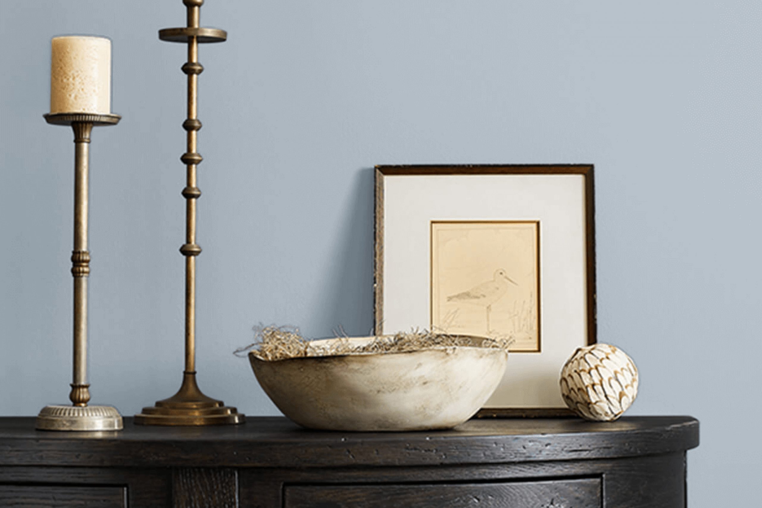
If you’re searching for a fresh shade to spruce up your space, SW 9683 Lakeside by Sherwin Williams might just be the hue you need. Imagine a color that brings the calmness and serenity of a lake into your home. That’s what Lakeside offers. This intriguing shade of blue has a soothing quality that’s subtle yet visually appealing, making it a perfect choice for anyone looking to refresh their living environment.
Whether you want to revamp your living room, bedroom, or even your kitchen, Lakeside has the versatility to fit various spaces and styles. It pairs beautifully with both modern and traditional décor, providing a lovely backdrop that enhances other colors and design elements in a room.
As someone who enjoys updating their home to reflect personal style and comfort, I find Lakeside by Sherwin Williams to be a reliable option that adds a peaceful yet vibrant touch to any room.
This color could be exactly what you need if you’re looking to bring a new energy into your home without overwhelming your existing aesthetic.
What Color Is Lakeside SW 9683 by Sherwin Williams?
The color Lakeside by Sherwin Williams is a refreshing and soothing shade of blue. It brings to mind the calmness and clarity of a serene lake. This color has a vibrant yet calm hue that adds a subtle splash of brightness to any space without overpowering it.
Lakeside is highly versatile and works beautifully in various interior styles, including coastal, contemporary, and even traditional settings. In coastal-themed interiors, it enhances the breezy, light atmosphere characteristic of such spaces.
For contemporary rooms, it introduces a clean, crisp vibe that pairs well with sleek furnishings and modern decor. In traditional spaces, Lakeside can inject a touch of modernity while maintaining a classic appeal.
When it comes to materials and textures, Lakeside pairs exceptionally well with natural elements.
Think of light, unfinished woods or rich, dark mahogany to bring out the depth in the color. It also looks stunning when combined with materials like linen or cotton, adding a soft, airy feel to the room.
Metallic accents in silver or brushed nickel can also complement this shade, offering a hint of refinement without making the space feel too formal. Overall, Lakeside is a flexible color that can create a refreshing look in any room with the right pairings.

Is Lakeside SW 9683 by Sherwin Williams Warm or Cool color?
LakesideSW 9683 by Sherwin Williams is a soothing and versatile shade of blue that brings a calming atmosphere to any room. Its light and airy quality makes it an excellent choice for spaces like living rooms or bedrooms where you want to create a peaceful environment.
This color pairs nicely with natural materials, such as wooden furniture and wicker baskets, enhancing the overall cozy feel. Additionally, LakesideSW 9683 works well in bathrooms to create a clean and refreshing spa-like space.
The adaptability of this blue allows it to blend easily with various decor styles, whether you’re aiming for a more traditional feel or a modern look. You can match it with bright whites for a crisp contrast or with soft grays to keep the mood gentle and inviting. In homes, this color also helps to brighten up spaces that don’t get much natural light, giving the illusion of a more open and airy room.
Overall, LakesideSW 9683 is a charming choice that can nicely complement your home’s aesthetic and create a relaxing vibe.
Undertones of Lakeside SW 9683 by Sherwin Williams
Lakeside is a unique shade of light blue that subtly incorporates a range of subtle undertones. These undertones include light blue, light purple, lilac, pale yellow, mint, pale pink, and grey. Each undertone plays a role in how the color is perceived, adding depth and complexity to the main hue. For example, the hint of light purple and lilac can bring a cooler feel to the color, while pale yellow might warm it up slightly. Mint and pale pink can add a fresh vibrancy, and grey can tone down the intensity, making the color more muted and soft.
When used on interior walls, the effect of these undertones in Lakeside becomes quite significant. In different lighting conditions, these undertones may become more or less noticeable, which changes the appearance of the walls.
Natural light could highlight the blue and mint, creating a refreshing atmosphere, while artificial light might enhance the grey and purple tones, lending a more subdued look.
This makes the color versatile; it can adapt somewhat to different settings and decor styles.
Understanding these undertones can help in making informed decisions about room accessories and furniture colors. Matching or contrasting elements can either highlight or downplay these subtle hues, allowing for a customized ambiance in any room. Overall, the undertones in Lakeside make it a flexible and appealing choice for anyone looking to paint their interior spaces.
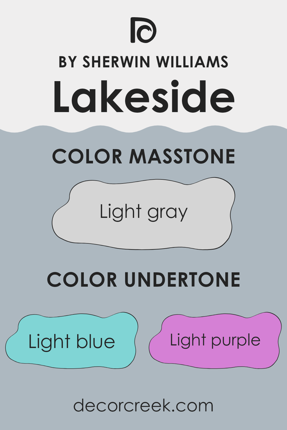
What is the Masstone of the Lakeside SW 9683 by Sherwin Williams?
LakesideSW 9683 is a light gray color with the masstone #D5D5D5. This subtle shade is very versatile, making it easy to use in various home settings. When applied to walls, this color provides a clean and simple backdrop.
It allows other elements in the room, like furniture and artwork, to stand out. Due to its lightness, it helps make smaller spaces appear larger and more open. It’s also excellent for rooms that don’t get a lot of natural light, as it can make these spaces feel brighter.
This light gray color can blend smoothly with other colors, whether you’re pairing it with bold shades to create contrast or sticking to a more neutral palette for a calm environment. Overall, LakesideSW 9683 is a practical choice for adding a fresh and tidy look to any room without making it feel too cold or stark.

How Does Lighting Affect Lakeside SW 9683 by Sherwin Williams?
Lighting plays a critical role in how colors appear in various environments. Different sources of light, whether natural or artificial, can greatly impact the perception of color in a room. Each type of light—be it sunlight or bulbs—has its own characteristics that can enhance or alter the appearance of paint colors on walls.
Take, for example, the paint color Lakeside by Sherwin Williams. In artificial light, such as that from incandescent bulbs, this color might appear warmer and slightly darker. Incandescent lighting often adds a yellowish tint, making the blue tones in Lakeside feel more subdued and cozy.
On the other hand, LED or fluorescent lighting, which is cooler, can make this color look brighter and more vibrant, highlighting its blue aspects more distinctly.
In natural light, the appearance of Lakeside can vary significantly depending on the orientation of the room and the time of day.
In north-facing rooms, which receive less direct sunlight and tend to have cooler, more even light throughout the day, Lakeside may appear as a true, crisp blue since there is less warm light to alter its natural shade. South-facing rooms, bathed in a lot of sunlight, might make Lakeside look lighter and more dynamic, as the intense light can wash out the deeper blue tones.
East-facing rooms get plenty of morning light, making this paint color look bright and cheerful in the morning, then darker and cooler as the day progresses. Conversely, in west-facing rooms, where sunlight is stronger in the afternoons and evenings, Lakeside can look quite vibrant and intense during sunset, then duller in the morning hours.
Thus, when choosing where to apply the color Lakeside, consider the room’s orientation and the type of lighting used to ensure the color fits the desired mood and atmosphere.

What is the LRV of Lakeside SW 9683 by Sherwin Williams?
LRV stands for Light Reflectance Value, which is a measure of the amount of visible and usable light that gets reflected from a surface when light shines on it. The LRV scale runs from 1, which is very dark, to 99, which is very light.
This helps in understanding how light or dark a color will look once it’s applied to a wall and how much it will reflect light. Higher values mean the color reflects more light, making a room feel brighter and more open. Conversely, lower values mean the color absorbs more light, which can make a room feel cozier but smaller and darker.
Considering the LRV of 46.834 for the specific color from Sherwin Williams, it’s nearly in the middle of the LRV scale. This means it doesn’t reflect light as much as lighter colors do, nor does it absorb light like darker colors. Such a mid-range LRV can make the color versatile for use in spaces that aim for a balanced feel with moderate brightness. It will neither overwhelm a space with brightness nor make it feel overly enclosed and dark.
This LRV value suggests that the color can work well in areas that receive a mix of natural and artificial light, maintaining a consistent appearance throughout the day.

What are the Trim colors of Lakeside SW 9683 by Sherwin Williams?
Trim colors are usually contrasted or complementary hues that outline or detail architectural features such as door frames, baseboards, moldings, and window casings, effectively highlighting the main color scheme of a room or exterior. For instance, using trim colors like SW 7005 – Pure White or SW 6140 – Moderate White against a vibrant color can help in defining and enhancing the visual aesthetics of a space, giving it a polished and well-finished look. Such choices draw attention to the shapes and contours of the architectural details, adding depth and dimension that enhance the overall appearance.
SW 7005 – Pure White is a clean and clear white shade that brings a fresh and crisp contrast, especially effective in making other colors stand out. It works beautifully to create distinct lines that can make architectural details pop.
On the other hand, SW 6140 – Moderate White offers a softer, warmer white with a gentle hint of beige, providing a subtle contrast that complements milder color palettes without overpowering them. Both colors are versatile choices that can support a variety of design aesthetics and work particularly well in enhancing the appearance and character of a space.
You can see recommended paint colors below:

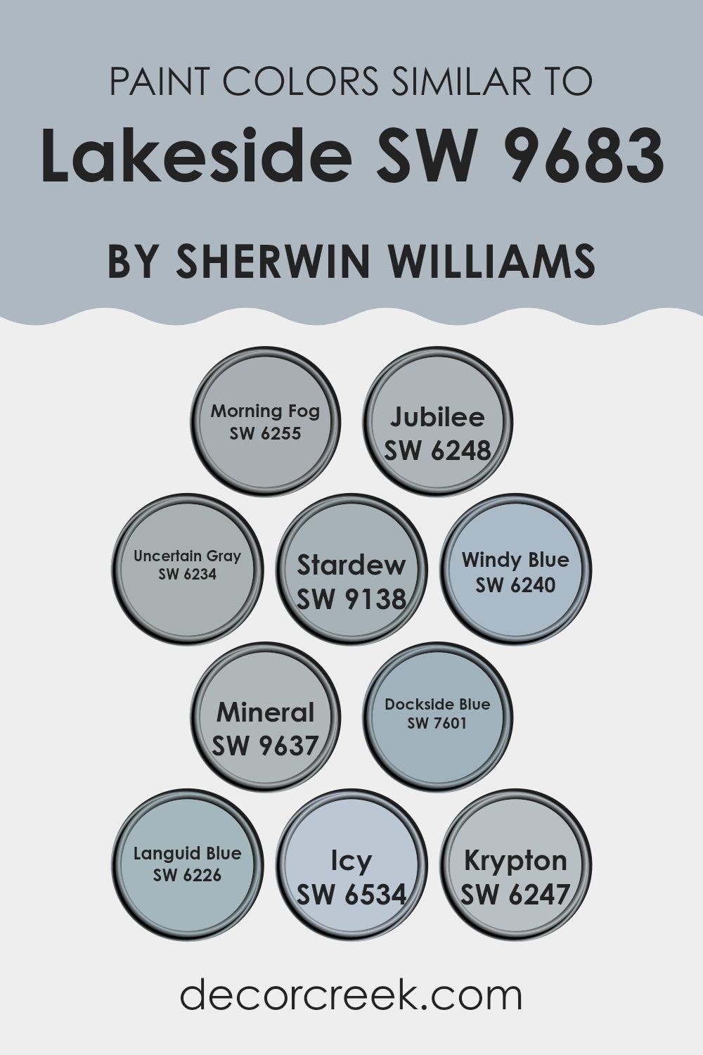
Colors Similar to Lakeside SW 9683 by Sherwin Williams
Choosing similar colors is essential when aiming for a cohesive and harmonious look in interior design. The subtle variations among similar hues can create a smooth visual flow in a space, making it feel unified without appearing monotonous. When using shades like Morning Fog, Jubilee, and Uncertain Gray, the slight differences in undertones can add depth to a room while maintaining a soft and fluid aesthetic.
Morning Fog is a gentle gray with a hint of blue, creating a calm atmosphere. Jubilee is slightly darker, offering a muted backdrop ideal for modern decor. Uncertain Gray has a warmer tone, providing a subtle contrast that enhances the other colors.
Using coordinating colors like Stardew, Windy Blue, and Mineral from a similar palette enhances the overall aesthetic without clashing. Stardew has a soft, powdery vibe that is refreshing, while Windy Blue offers a clearer, airier feel, and Mineral brings a richer and slightly green-tinted slate color that complements wood tones beautifully.
Dockside Blue and Languid Blue are deeper, more expressive shades perfect for accent walls or furniture highlights. Dockside Blue has a strong presence, making it great for making statements, whereas Languid Blue is lighter and leans more towards a soothing effect.
Colors like Icy and Krypton provide options for those looking to inject a cooler, crisp look with hints of blue, perfect for creating a clean, fresh ambiance in any room.
You can see recommended paint colors below:
- SW 6255 Morning Fog
- SW 6248 Jubilee
- SW 6234 Uncertain Gray
- SW 9138 Stardew
- SW 6240 Windy Blue
- SW 9637 Mineral
- SW 7601 Dockside Blue
- SW 6226 Languid Blue
- SW 6534 Icy
- SW 6247 Krypton
How to Use Lakeside SW 9683 by Sherwin Williams In Your Home?
Lakeside SW 9683 is a paint color offered by Sherwin Williams. It’s a beautiful shade that blends blue and green tones, making it perfect for bringing a calm and fresh atmosphere to any room in your house. If you’re thinking about giving your living space a new look, consider using Lakeside for areas where you want to add a touch of nature’s colors. It works great in bathrooms and bedrooms because of its soothing effect, helping to create a relaxing environment ideal for unwinding.
In the kitchen, Lakeside can help create a lively and clean vibe, especially when paired with white cabinets or countertops. For a more unique touch, you could paint an accent wall in your living room or entryway, adding a splash of color that catches the eye without overwhelming the space.
Additionally, this color complements wooden furniture and natural fiber textiles, such as linen, adding to the cozy feel of your home. Overall, Lakeside is a flexible color choice that can refresh various parts of your home with its light and refreshing hue.
Lakeside SW 9683 by Sherwin Williams vs Windy Blue SW 6240 by Sherwin Williams
Lakeside and Windy Blue, both by Sherwin Williams, are two distinct shades of blue. Lakeside is a deep, rich blue with a hint of green, giving it a fresh and vibrant feel. It’s the kind of color that stands out and adds a strong character to any space.
On the other hand, Windy Blue is a lighter, softer blue with gray undertones. It provides a calm and soothing effect, making it ideal for creating a relaxed atmosphere in a room.
While Lakeside might be more suitable for a bold accent wall or a statement piece, Windy Blue works well for larger areas, contributing to a peaceful and airy environment. Both colors offer unique atmospheres, with Lakeside being more dynamic and Windy Blue more gentle and subdued.
You can see recommended paint color below:

Lakeside SW 9683 by Sherwin Williams vs Krypton SW 6247 by Sherwin Williams
Lakeside is a dark, rich blue color that’s bold and noticeable. It exudes confidence and can make a strong statement in any space. This color is ideal for adding a pop of depth and interest to areas like living rooms or dining areas.
On the other hand, Krypton is much softer and lighter, leaning towards a cool grayish-blue tone. It provides a subtle, calming effect, making it perfect for bedrooms and bathrooms where a softer ambiance is preferred.
When comparing the two, Lakeside is more dramatic and stands out, while Krypton is quieter and blends more seamlessly into surroundings. Both colors, though different in intensity, offer unique ways to bring character to a space, either through boldness or understated charm.
You can see recommended paint color below:

Lakeside SW 9683 by Sherwin Williams vs Icy SW 6534 by Sherwin Williams
Lakeside and Icy, both by Sherwin Williams, offer distinct moods for any space. Lakeside is a rich, deep blue with a hint of green that suggests the calming depths of a forest lake. It’s a strong choice if you’re aiming for an impactful yet calm atmosphere. This color works great in living areas or bedrooms where a touch of nature’s calmness is desired.
On the other hand, Icy is a much lighter, airier blue with a cool, crisp finish that can help make a small room feel more open and bright. It evokes the clear sky of a sunny winter day. This makes it perfect for bathrooms or small, less lit spaces where you want to add a fresh, clean look.
Both colors offer unique vibes – Lakeside is deeper and moodier, bringing a touch of earthy nature indoors, while Icy is light and refreshing, giving rooms a more spacious feel.
You can see recommended paint color below:

Lakeside SW 9683 by Sherwin Williams vs Mineral SW 9637 by Sherwin Williams
Both Lakeside and Mineral by Sherwin Williams are tasteful colors with their unique appeal. Lakeside is a deep blue with a hint of green, reminiscent of a peaceful lake under a cloudy sky. It’s bold yet calming, perfect for creating a strong but cozy atmosphere in a room.
On the other hand, Mineral is a soft, muted green with gray undertones, giving it a subtle, earthy feel. This color works great in spaces where you want a gentle, soothing vibe without the intensity of a darker shade.
When comparing the two, Lakeside stands out more and could be ideal as a feature wall or in a larger space, while Mineral is better for a more understated look or in a smaller, intimate setting. Both can complement a range of decor styles, offering flexibility in design choices.
You can see recommended paint color below:

Lakeside SW 9683 by Sherwin Williams vs Morning Fog SW 6255 by Sherwin Williams
Lakeside and Morning Fog are two colors from Sherwin Williams that have distinct tones and moods. Lakeside is a deep, rich blue with a hint of green, reminiscent of a deep lake shimmering under the sky. It has a bold presence, bringing a sense of depth and intensity to any space.
On the other hand, Morning Fog is a soft, muted gray with a slight bluish tinge. It has a gentle and soothing quality, ideal for creating a calm and restful environment.
While Lakeside has a more striking, eye-catching effect, often used to make a statement in a room, Morning Fog is subtler and perfect for backgrounds, helping other colors stand out without overwhelming the space. Although they both bring unique atmospheres, their uses in décor can be quite different based on the ambience you want to achieve.
You can see recommended paint color below:

Lakeside SW 9683 by Sherwin Williams vs Jubilee SW 6248 by Sherwin Williams
Lakeside is a deep, rich teal with a saturation that can add a bold touch to any space. This color works well in areas where a strong, yet welcoming vibe is desired. It can effectively highlight walls in a living room or make a moody statement in a bedroom.
On the other hand, Jubilee is a softer, muted gray with a hint of blue. This color is ideal for those who prefer a subtle and soothing backdrop that can easily blend in with a wide range of decor styles and color palettes. Jubilee is versatile enough for use throughout the home, from bedrooms to kitchens, providing a calm, cohesive look.
While both Lakeside and Jubilee are distinctive, they cater to different aesthetic preferences and uses. Lakeside stands out with its vibrant depth, perfect for feature walls or bold decor themes. Jubilee offers a gentle and light presence, great for creating a peaceful and harmonious environment.
You can see recommended paint color below:

Lakeside SW 9683 by Sherwin Williams vs Uncertain Gray SW 6234 by Sherwin Williams
Lakeside and Uncertain Gray are both colors by Sherwin Williams that offer unique tones for any space. Lakeside is a deep teal that’s quite bold and can really stand out in a room. It has a vibrant quality that brings a sense of energy and life, making it ideal for areas where you want to make a statement, like an accent wall or a creative space.
On the other hand, Uncertain Gray is a much softer color. It’s a light, muted gray with subtle blue undertones. This color is great for those who prefer a more understated look. It works well in rooms where you want a calm and soothing atmosphere, such as bedrooms or offices. This gray can also serve as a neutral backdrop, allowing other colors or decor elements to shine.
Both colors are versatile in their own ways, but they cater to different styles and moods. Lakeside draws more attention while Uncertain Gray sets a more laid-back tone.
You can see recommended paint color below:

Lakeside SW 9683 by Sherwin Williams vs Dockside Blue SW 7601 by Sherwin Williams
Lakeside and Dockside Blue are two colors from Sherwin Williams that offer distinct vibes for any space. Lakeside is a deep, somewhat moody teal with a hint of green, making it perfect for creating a cozy and inviting atmosphere in rooms. This color has an earthy quality, which works well in spaces where you want to relax and feel grounded.
On the other hand, Dockside Blue is a lighter, softer blue with a calm and refreshing feel. It reminds you of a clear sky on a sunny day. This color can brighten up a room and make it feel airy and open, an excellent choice for bathrooms or bedrooms where comfort is key.
While both shades are beautiful, Lakeside provides a more profound, enveloping feel, whereas Dockside Blue offers a gentle uplift to any space. Choosing between them depends on the mood you want to set: warm and intimate with Lakeside or light and breezy with Dockside Blue.
You can see recommended paint color below:

Lakeside SW 9683 by Sherwin Williams vs Languid Blue SW 6226 by Sherwin Williams
Lakeside and Languid Blue are two intriguing colors by Sherwin Williams that both bring their unique vibe to a space. Lakeside is a deeper, more saturated blue that carries a certain richness and depth. It resembles the color of a deep lake or a vivid evening sky, making it a bold choice suitable for making a statement in a room or on an accent wall.
On the other hand, Languid Blue is lighter and softer, projecting a more relaxed and airy feel. It mimics a clear sky on a calm day, providing a gentler touch that can make small spaces appear larger and more open.
While both colors share a blue base, Lakeside offers a stronger presence with its darker tone, potentially providing a dramatic impact. Languid Blue, being milder, offers a soothing touch that’s easy on the eyes, ideal for creating a relaxing environment. They can work well together in different rooms of a home to create varied moods and atmospheres, depending on the intended effect.
You can see recommended paint color below:
- SW 6226 Languid Blue

Lakeside SW 9683 by Sherwin Williams vs Stardew SW 9138 by Sherwin Williams
Lakeside and Stardew, both by Sherwin Williams, are two distinct colors that set varied moods and tones in any space. Lakeside is a deeper, bolder blue with a hint of teal, reminiscent of a deep body of water. It makes a strong statement and can add a touch of drama and energy to a room.
In contrast, Stardew is a softer, muted gray-blue, offering a more laid-back and calming feel. It’s light enough to create an airy and open sense in spaces, making it ideal for a peaceful retreat or a relaxed home environment.
While Lakeside might be more suited for creating a focal point or an accent wall, Stardew works beautifully as a soothing backdrop for everyday living. Matching them in a space can provide a nice contrast, pairing boldness with calm for balanced decor.
You can see recommended paint color below:

In conclusion, SW 9683 Lakeside by Sherwin Williams is a paint color that looks like the soft blue of a peaceful lake. This color has a calm feeling that can make any room look more welcoming and cheerful. It’s not too bright or too dark, so it fits well in a lot of different places in a house, like the living room, bedroom, or even the kitchen.
When I used this color in my own home, I noticed that it helped spaces look bigger and more open. The blue shade also mixes well with many other colors. This means you can use it with colors like light brown, white, or grey and everything still looks really nice together.
One of the best things about this paint is that it hides little marks or dirt on the walls pretty well, so the walls look clean for a long time. I found it easy to apply, and it dried quickly, which saved me a lot of time.
Overall, Lakeside is a great choice if you’re thinking about repainting a room and you want a color that brings a fresh and cheerful feel. It’s a color that will probably make you feel happy every time you walk into the room.

Ever wished paint sampling was as easy as sticking a sticker? Guess what? Now it is! Discover Samplize's unique Peel & Stick samples.
Get paint samples

