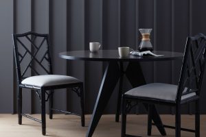
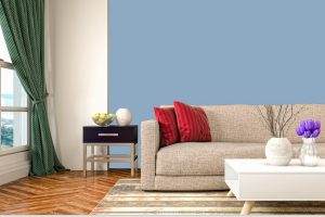
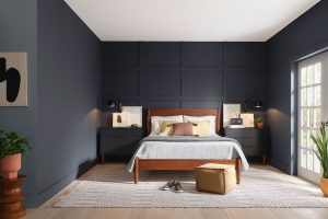
It is a versatile and timeless paint color designed to bring a touch of elegance and serenity to any space. This unique shade, part of the Sherwin Williams palette, offers a perfect balance between warmth and coolness, making it an ideal choice for those looking to create a harmonious and inviting atmosphere in their homes or workplaces.
Mineral is a subtle yet impactful color, reminiscent of natural elements, which allows it to blend seamlessly with a variety of decor styles and color schemes.
SW 9637 Mineral serves as a great backdrop for both bold and muted accents, providing a sophisticated canvas that can elevate the overall aesthetic of a room. Whether you’re aiming to achieve a minimalist look or a more dynamic and pattern-rich design, Mineral adapts effortlessly, proving its versatility.
This shade also benefits from excellent light reflection properties, helping to brighten spaces and give an airy feel to smaller rooms.
Choosing SW 9637 Mineral by Sherwin Williams means embracing a color that complements wood finishes, metals, and a wide range of textiles, enabling a cohesive look throughout any space. Its understated beauty and adaptability make Mineral an enduring choice for designers and homeowners alike.
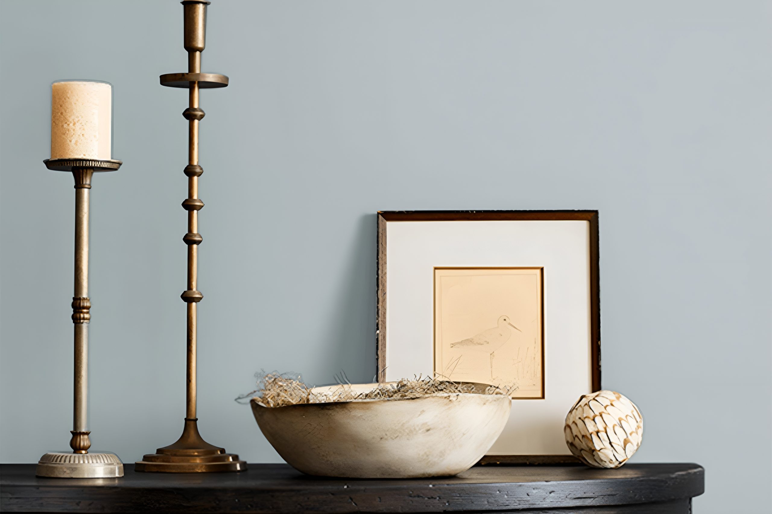
What Color Is Mineral SW 9637 by Sherwin Williams
The color reminiscent of the earth’s natural minerals exudes a serene and grounding aura, making it a transcendent choice for those seeking to create a calming oasis in their personal spaces. This hue, a sophisticated blend of gray and blue with hints of subtle green, mirrors the tranquil essence of a foggy morning landscape, effortlessly bringing nature’s soothing palette indoors.
Its versatility allows it to stand as both a serene backdrop and a statement hue within a room, promising to elevate the aesthetic of any space it adorns.
Perfectly at home in interior styles that celebrate simplicity and substance, such as Scandinavian, Modern Minimalism, and Coastal, this color thrives on its ability to harmonize with a myriad of natural materials and textures.
Imagine it paired with the warm tones of raw wood, enhancing the grain and texture, or alongside the organic beauty of stone and terracotta, creating a grounding effect that is both sophisticated and natural. Soft linens and chunky knits in neutral shades can add layers of texture, while metallic accents in brushed brass or matte black can introduce a contemporary edge.
This versatile hue thrives on its capacity to blend seamlessly with both soft, natural fabrics and more industrial materials, making it an ideal choice for those aiming to create a space that is at once modern and timeless.
Whether aiming to achieve a tranquil sanctuary or a space that feels collected and alive, this color offers a solid foundation upon which to build a tailored and harmonious interior.
Ever wished paint sampling was as easy as sticking a sticker? Guess what? Now it is! Discover Samplize's unique Peel & Stick samples.
Get paint samples
Is Mineral SW 9637 by Sherwin Williams Warm or Cool color?
MineralSW 9637, a distinctive hue offered by Sherwin Williams, presents a unique addition to the palette of any home interior. This subtle yet captivating color embodies a blend of calmness and sophistication, making it an ideal choice for those looking to infuse their space with a sense of serenity and elegance.
Its neutral base allows it to integrate seamlessly with a wide range of decor styles, from minimalist to more eclectic tastes, providing a versatile backdrop for various furnishings and accent pieces.
The adaptability of this particular shade is one of its most compelling attributes, as it can serve equally well in creating a sense of spaciousness and light in smaller areas, or adding a layer of depth and warmth to larger, more open spaces.
When applied to walls, it offers a soothing canvas that enhances natural light during the day, while transitioning into a cozy, enveloping atmosphere in the evening. This duality ensures that homes not only look but also feel welcoming and comfortable, regardless of the time of day or season.
By choosing MineralSW 9637, homeowners can enjoy a balance of contemporary chic and timeless charm, elevating the aesthetic of their living environments.
Undertones of Mineral SW 9637 by Sherwin Williams
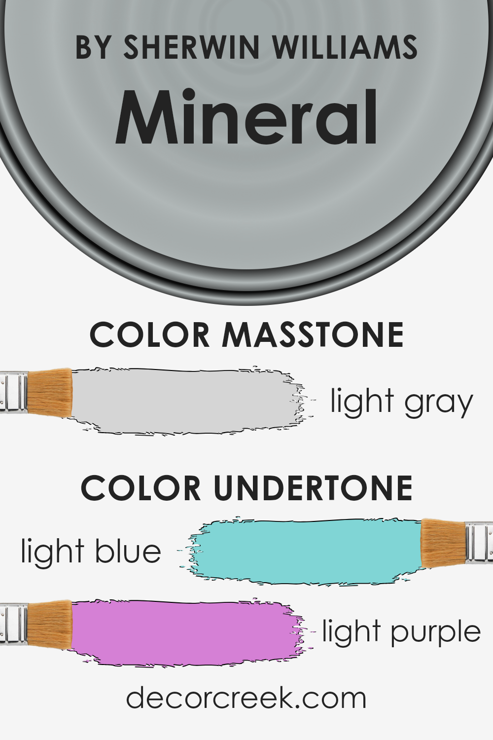
The color in question beautifully exemplifies the complexity and subtlety that can be achieved when nuances are meticulously considered in design. With its light blue and light purple undertones, it presents a fascinating visual experience that transcends the simplicity of a single hue. These undertones contribute a depth and richness, enabling the color to adapt and shift mood under different lighting conditions.
Light blue undertones evoke feelings of calmness and serenity, reminiscent of a clear, sunny sky or a gentle stream, bringing a sense of tranquility and spaciousness to interiors. This makes the color particularly suitable for rooms intended for relaxation and contemplation, such as bedrooms and bathrooms.
On the other hand, the light purple undertones introduce a hint of sophistication and creativity, channeling the mysterious allure of twilight. This blend of warmth and coolness enriches the color, making it versatile for various decorative schemes.
In terms of interior walls, these undertones play a significant role in determining the overall ambiance of a room. Under natural daylight, the light blue may become more pronounced, creating a breezy, open feel. Conversely, in the softer light of the evening or in spaces with warmer artificial lighting, the light purple undertones might emerge more, lending the room a cozy, inviting atmosphere.
The interplay between these undertones allows the color to interact dynamically with its surroundings, making the walls not just a backdrop but an active participant in the room’s aesthetic and mood.
What is the Masstone of the Mineral SW 9637 by Sherwin Williams?
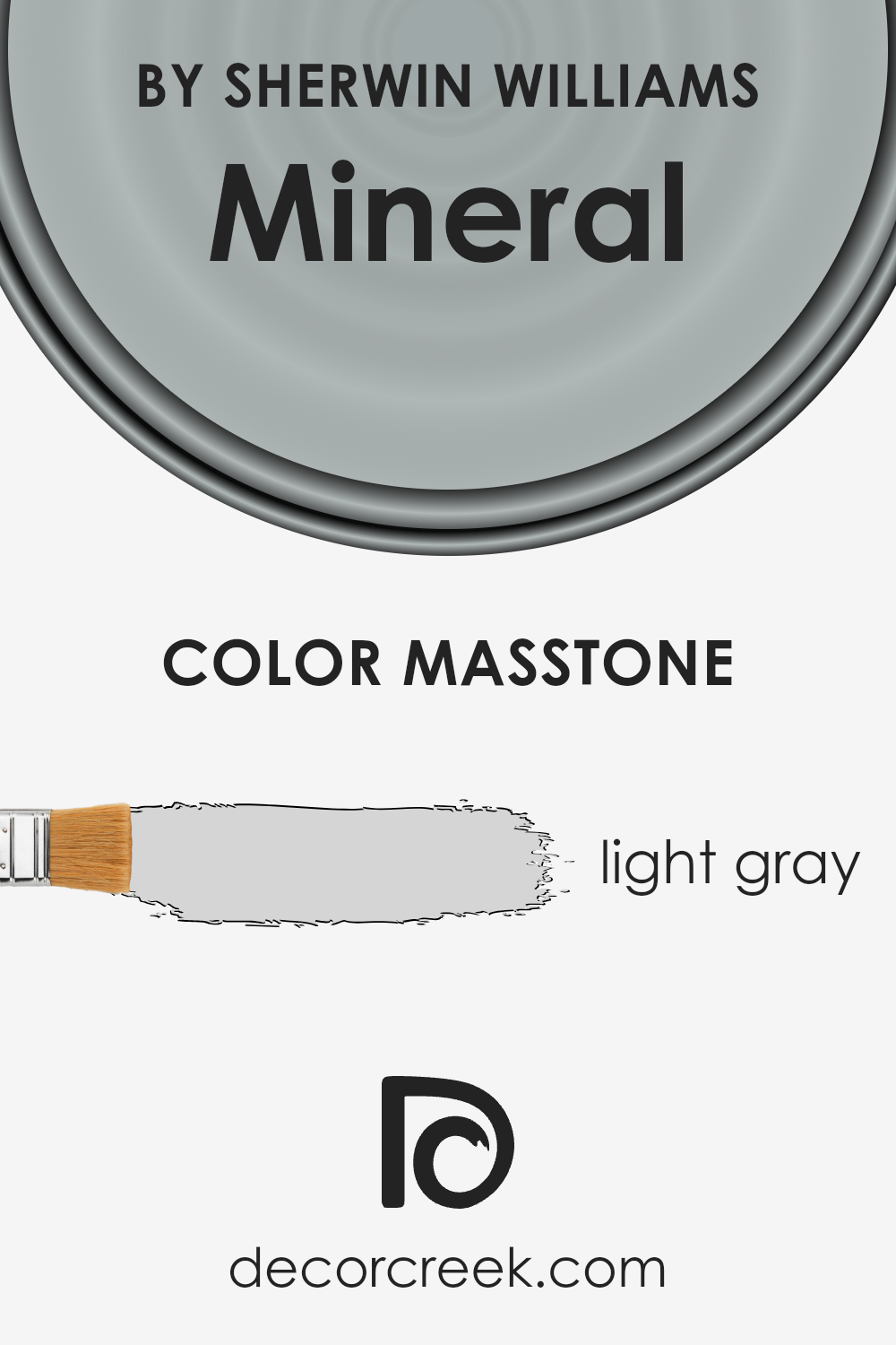
MineralSW 9637 by Sherwin Williams, with its masstone of light gray (#D5D5D5), holds a unique place in the palette of home decoration due to its exceptional versatility and serene ambiance. This particular shade of light gray acts as a subtle yet sophisticated backdrop in any room, working harmoniously with a wide array of colors and decor styles.
Its neutrality ensures it doesn’t overpower, making spaces feel larger and more open, inviting natural light to spread more evenly and create an airy, soothing atmosphere.
Moreover, this shade’s calmness adds a sense of tranquility and elegance, transforming homes into peaceful sanctuaries where relaxation and mindfulness come effortlessly. It’s especially effective in bedrooms, living rooms, and bathrooms where a clean, minimalistic look is desired.
Its adaptability also makes it a favorite for those who enjoy updating their space frequently, as it pairs well with both bold and subtle hues, allowing for easy transitions without the need for a complete overhaul.
In summary, this light gray masstone offers a perfect blend of sophistication and flexibility, making it an excellent choice for creating balanced, serene, and stylish homes.
How Does Lighting Affect Mineral SW 9637 by Sherwin Williams
The interaction between light and color plays a vital role in the perception of hues in our environment. Lighting, whether artificial or natural, has a profound impact on how we see colors, fundamentally altering their appearance and the ambiance they create in a space.
This nuanced interplay is elegantly exemplified by the color Mineral, a nuanced shade by Sherwin Williams, which offers a fascinating study on how light sources can influence color perception.
In artificial light, this hue tends to take on a warmer and cozier tone, making spaces feel inviting and serene. The quality of the artificial light, whether it is cool or warm, can subtly shift its appearance, often enhancing its inherent qualities.
Under cooler artificial light, this shade may appear slightly more muted, embracing a more understated elegance. Conversely, under warmer lighting, it gains depth, creating a more enveloping and intimate atmosphere.
Natural light brings an entirely different dimension to this color, showcasing its versatility across different times of the day and orientations of rooms. In north-facing rooms, which receive less direct sunlight, this color maintains a consistent cool undertone, emphasizing its calming and tranquil qualities. It can make these spaces feel more spacious and airy.
South-facing rooms bathe this shade in abundant light, highlighting its warmth and making the color appear more vibrant and lively. This orientation allows the color to playfully change throughout the day, from a soft and gentle hue in the morning to a more pronounced and dynamic tone in the evening.
East and west-facing rooms offer a unique interaction with this color, as the quality of light changes dramatically from morning to evening. In east-facing rooms, the morning light can make this color appear soft and inviting, providing a gentle start to the day. As the evening approaches, and the light becomes less intense, the color retains its depth, but with a softer edge.
In contrast, west-facing rooms may see this color in a more subdued light in the morning, but as the sunset approaches, it can glow warmly, embracing a stunning richness that enhances the room’s ambiance.
In summary, the color Mineral from Sherwin Williams demonstrates the transformative power of lighting on color perception. Its ability to adapt and change character in different lighting conditions makes it a versatile choice for any space, reflective of the complex interplay between light and color.
What is the LRV of Mineral SW 9637 by Sherwin Williams
Light Reflectance Value (LRV) plays a crucial role in the world of paint and color selection, offering a numerical quantification of how much light a particular color reflects off a surface back into the environment. LRV is measured on a scale from 0 to 100, where 0 absorbs all light (think of a deep black) and 100 reflects all light (akin to a bright white).
This metric is profoundly important in both aesthetic and functional terms.
It affects the perceived brightness of rooms, the visual temperature (warmth or coolness), and the atmospheric mood or tone. For instance, colors with higher LRVs make spaces appear larger and more open, as they reflect more light, whereas lower LRVs create a cozier, more enveloping ambiance but may also make a space appear smaller.
For a color like Mineral with an LRV of 46.402, it occupies a mid-range position on the LRV scale, reflecting almost half of the light that hits it. This makes it a versatile choice for many spaces, capable of bringing warmth and depth without darkening a room excessively.
It can serve well in spaces that aim for balance, neither too bright nor too shadowed, with a natural and grounding effect.
In rooms with ample natural light, this LRV level allows Mineral to look vibrant and alive, subtly shifting in hue and depth as the day progresses. Conversely, in lower light conditions, it can add richness and character, absorbing light to create a cozy atmosphere.
The specific LRV of Mineral ensures that it is dynamic enough to adapt to various lighting situations, making it a solid choice for both residential and commercial spaces seeking balance and sophistication.
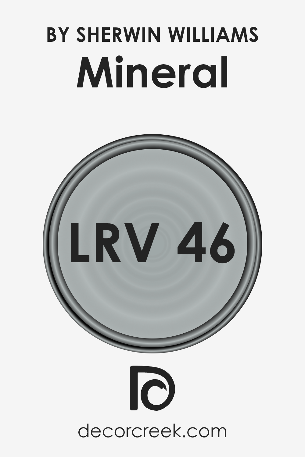
LRV – what does it mean? Read This Before Finding Your Perfect Paint Color
What are the Trim colors of Mineral SW 9637 by Sherwin Williams
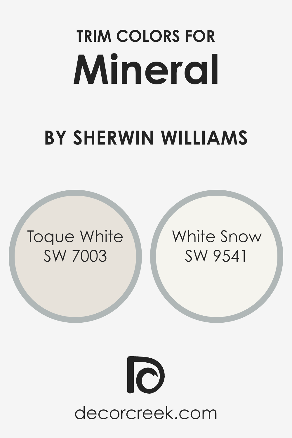
Trim colors, such as SW 7003 – Toque White and SW 9541 – White Snow by Sherwin Williams, play a crucial role in defining the aesthetic and character of a space, particularly when used in conjunction with the main color.
They are often applied to elements like door frames, baseboards, moldings, and window trims, serving not only as a visual frame that highlights architectural details but also as a contrast that can either subtly complement or strikingly offset the dominant color palette.
In the context of using a specific color like SW 9637, which presents a unique hue, selecting the right trim color becomes pivotal in achieving a harmonious balance. The trim acts as a boundary that defines where one color ends and another begins, thereby enhancing the overall visual appeal and making the colors appear more intentional and designed.
Toque White (SW 7003) is a soft, warm white with a serene and inviting quality. Its subtlety makes it an excellent choice for trim, providing a gentle contrast that can soften the transition between the wall color and the trim without creating a stark divide.
On the other hand, White Snow (SW 9541) offers a brighter, more pronounced white that delivers a fresher and crisper edge.
This color is particularly effective at accentuating the crisp architectural features of a space, making it feel more defined and spacious. Whether opting for the warmth of Toque White or the clarity of White Snow as a trim color, each brings its unique atmosphere to the space, complementing a color like SW 9637 by creating an environment that feels cohesive, polished, and thoughtfully designed.
You can see recommended paint colors below:
- SW 7003 Toque White
- SW 9541 White Snow
Colors Similar to Mineral SW 9637 by Sherwin Williams
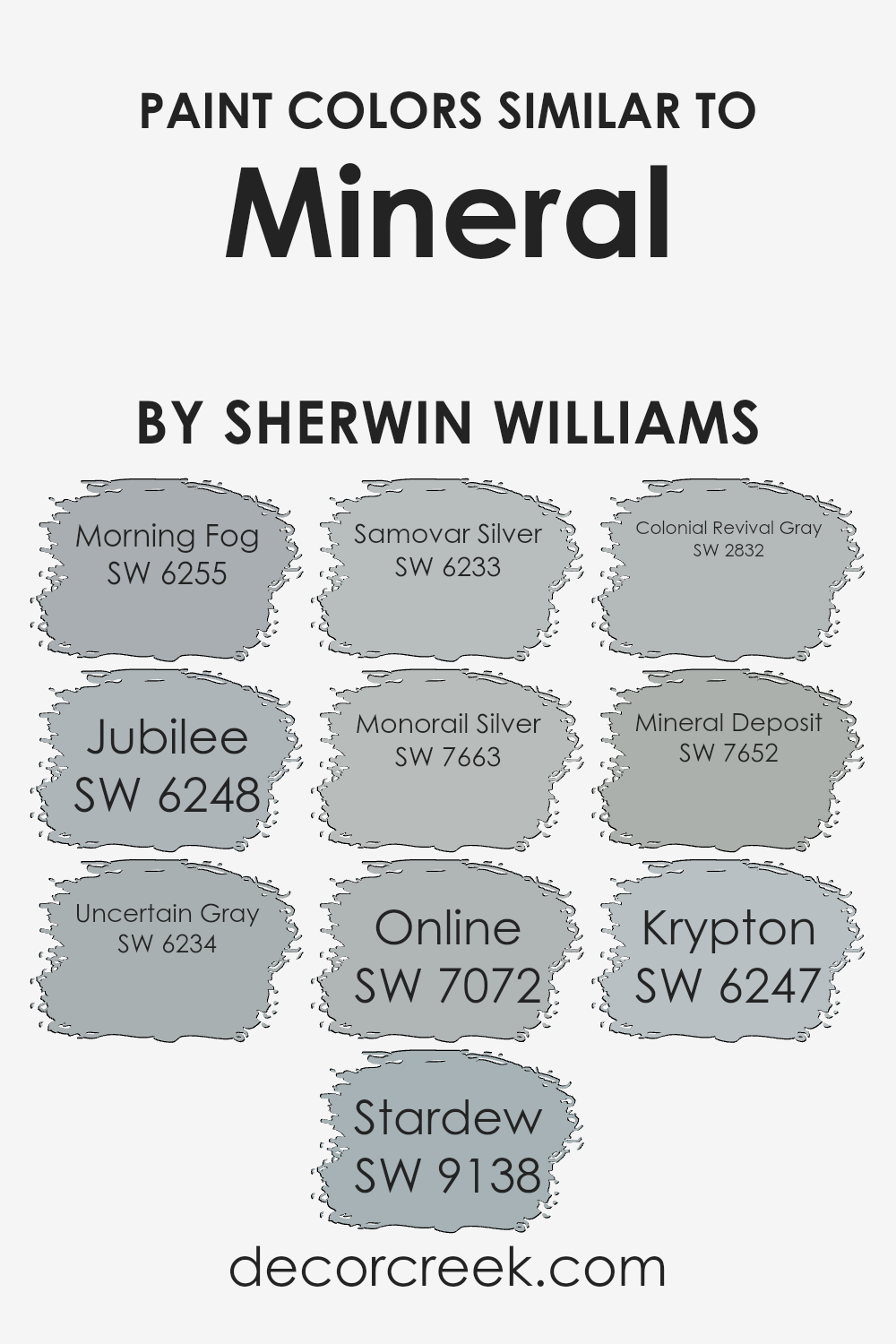
In the realm of interior design, the importance of selecting similar colors cannot be overstated, as they lay the groundwork for a cohesive and harmonious space. Colors like Morning Fog and Jubilee, for instance, hold a subtle grace, with the former exuding a serene, almost ethereal quality reminiscent of early mornings shrouded in mist, and the latter presenting a more subdued, yet equally tranquil vibe that’s perfect for creating a soothing environment.
Uncertain Gray and Stardew follow suit, each offering a balance of cool undertones that evoke a sense of calm and grounding, ideal for spaces intended for relaxation and contemplation.
The cool, metallic whispers of Samovar Silver and Monorail Silver introduce a sleek, modern edge, reflecting light in a way that adds dimension and a touch of sophistication.
Further enriching this palette, Online and Colonial Revival Gray extend an elegance that’s both timeless and adaptable, capable of anchoring a room while still playing nicely with bolder accents or textures.
Mineral Deposit and Krypton, meanwhile, contribute depth and complexity, rounding out the collection with their unique ability to blend seamlessly with their counterparts while still standing strong on their own.
Together, these hues embody the versatility of similar colors, showcasing how a well-curated selection can enhance the aesthetic unity of a space. Through their careful use, interiors can achieve a refined, cohesive look that resonates with both comfort and style.
You can see recommended paint colors below:
- SW 6255 Morning Fog
- SW 6248 Jubilee
- SW 6234 Uncertain Gray
- SW 9138 Stardew
- SW 6233 Samovar Silver
- SW 7663 Monorail Silver
- SW 7072 Online
- SW 2832 Colonial Revival Gray
- SW 7652 Mineral Deposit
- SW 6247 Krypton
How to Use Mineral SW 9637 by Sherwin Williams In Your Home?
Mineral SW 9637 by Sherwin Williams is a captivating paint color that boasts a unique blend of warm and cool tones, creating a subtle, soothing ambiance in any space. This versatile shade can seamlessly integrate into various parts of a home, adding a touch of understated elegance and contemporary flair.
For living rooms or bedrooms, it can serve as a serene backdrop, promoting relaxation and tranquility.
Its balanced nature also makes it an excellent choice for a home office or study, where it can help foster concentration and comfort. In bathrooms or kitchens, Mineral can introduce a spa-like feel, transforming these spaces into refreshing retreats. This color works well with natural light, enhancing its depth and complexity, yet remains equally impressive under artificial lighting.
Pairing it with crisp whites or contrasting deep tones can create a dynamic interior scheme, highlighting architectural features or drawing attention to specific areas. Ultimately, Mineral by Sherwin Williams offers a refreshing palette that can uplift and redefine any home space with its subtle elegance.
Mineral SW 9637 by Sherwin Williams vs Morning Fog SW 6255 by Sherwin Williams
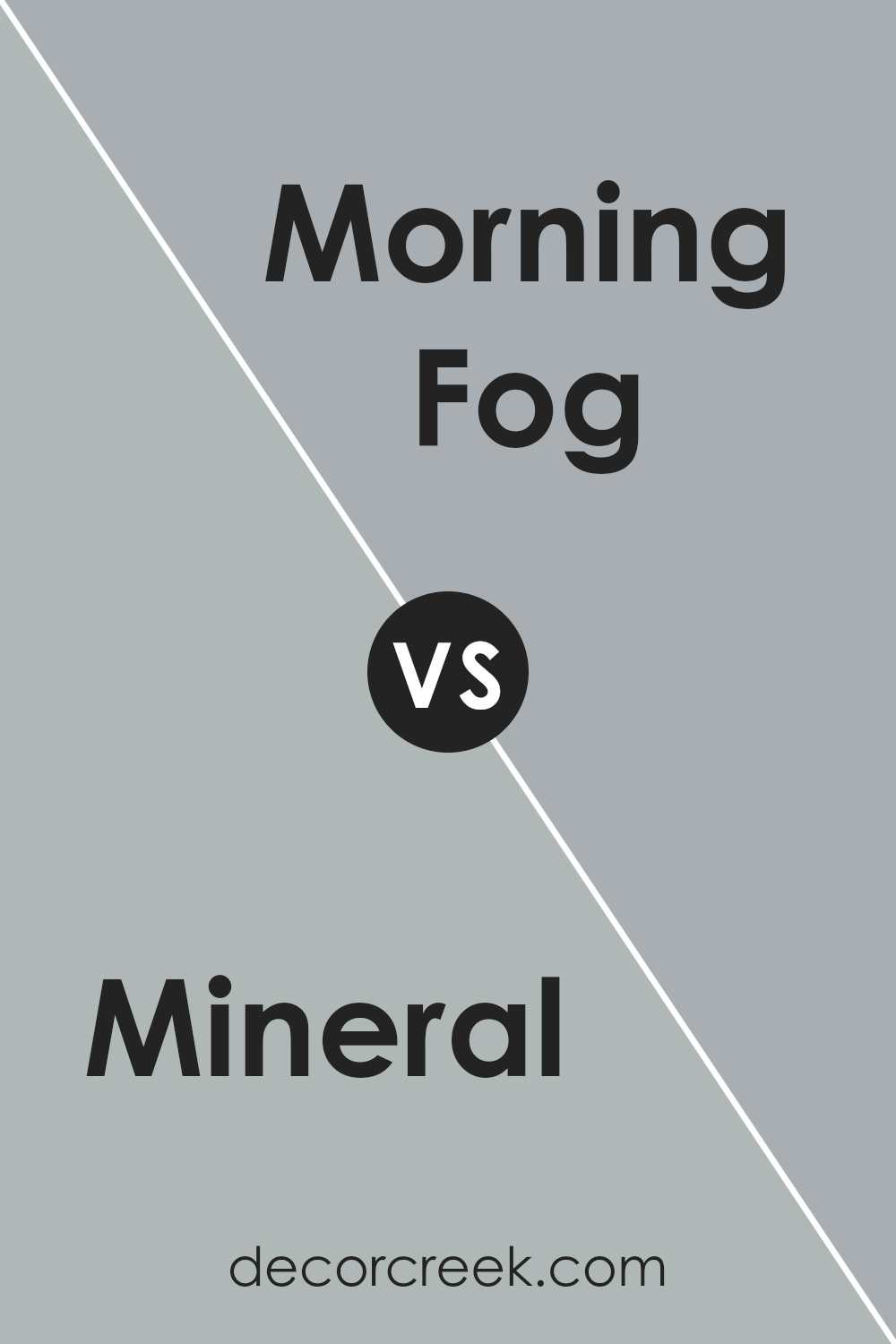
Mineral and Morning Fog, both from Sherwin Williams, present a soothing palette but vary distinctly in their tones and mood-setting capabilities. Mineral is a muted, earthy hue reminiscent of natural elements, offering a grounded and serene atmosphere. Its rich, warm undertones can create a cozy and inviting space, suggesting an inherent connection to the outdoors.
On the other hand, Morning Fog is a cooler, softer gray that evokes a sense of calm and tranquility, akin to a misty morning sky. This color leans towards a more neutral, versatile backdrop, providing a fresh, airy feel to interiors. It’s less about warmth and more about a clean, minimalist elegance. While both colors promote relaxation, Mineral leans towards a rustic, earthy charm, whereas Morning Fog offers a modern, crisp environment.
The choice between them depends on the desired ambiance: cozy and natural versus sleek and serene.
You can see recommended paint color below:
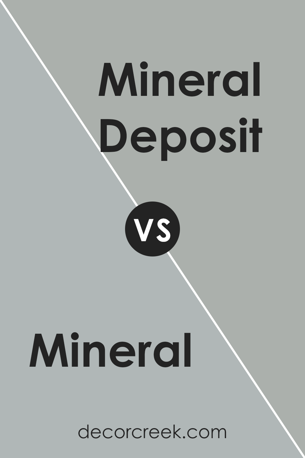
Mineral SW 9637 by Sherwin Williams vs Mineral Deposit SW 7652 by Sherwin Williams
The comparison between Mineral and Mineral Deposit, both by Sherwin Williams, unveils two distinct tones that subtly enrich a space with their unique hues. Mineral, a deeper, more saturated tone, carries an earthy, engaging presence. Its richness brings warmth and depth to environments, making it ideal for areas where a cozy, inviting atmosphere is desired.
On the other hand, Mineral Deposit stands out for its lighter, more muted gray qualities, offering a serene and airy feel. This color provides a sense of calm and openness, making it perfect for creating a refreshing and peaceful ambiance in any room.
While both colors draw inspiration from natural elements, Mineral leans towards a more intense, grounded expression, and Mineral Deposit offers a soft, tranquil retreat.
Their differences lie mainly in their intensity and the mood they set, highlighting Sherwin Williams’ capability to cater to diverse aesthetic preferences with variations on a theme.
You can see recommended paint color below:
- SW 7652 Mineral Deposit
Mineral SW 9637 by Sherwin Williams vs Krypton SW 6247 by Sherwin Williams
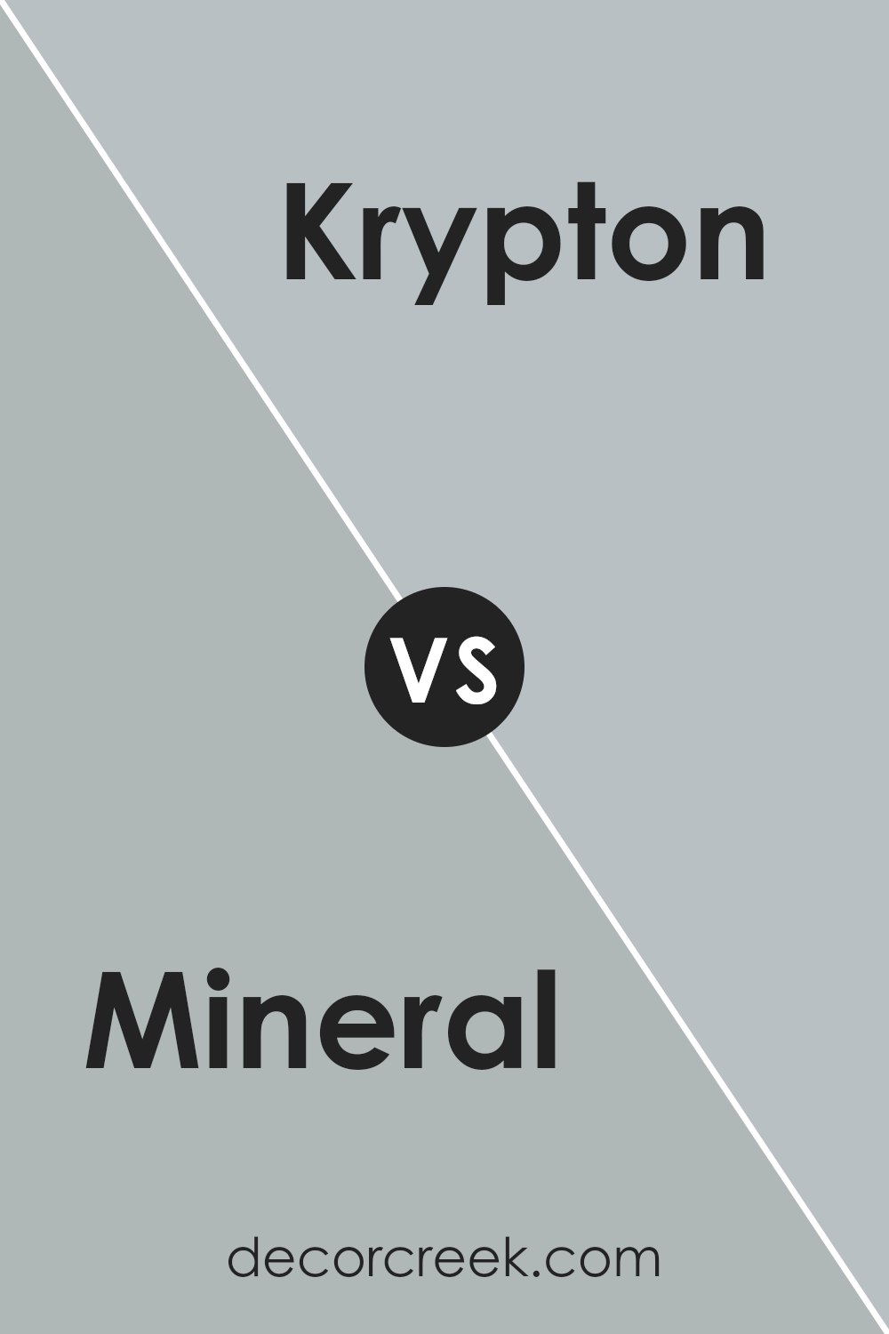
Mineral and Krypton are two distinct colors offered by Sherwin-Williams that bring their own unique ambiance to any space. Mineral is a soft, earthy hue with a subtle warmth that evokes a sense of serenity and grounded elegance.
Its understated charm makes it versatile for various settings, acting as a soothing backdrop that complements both vibrant and muted color palettes.
On the other hand, Krypton presents a cooler, more airy vibe with its gentle, light blue tone. This color leans towards a tranquil and refreshing aesthetic, reminiscent of a serene sky or a calm sea. Krypton works beautifully in spaces aimed at relaxation and rejuvenation, providing a crisp, clean look that pairs well with both contemporary and traditional designs.
While Mineral offers a cozy, welcoming feel, Krypton brings an open and airy quality.
Together, these colors exemplify the diverse range of atmospheres that can be achieved through thoughtful color selection, each bringing its own unique personality and mood to interiors.
You can see recommended paint color below:
Mineral SW 9637 by Sherwin Williams vs Online SW 7072 by Sherwin Williams
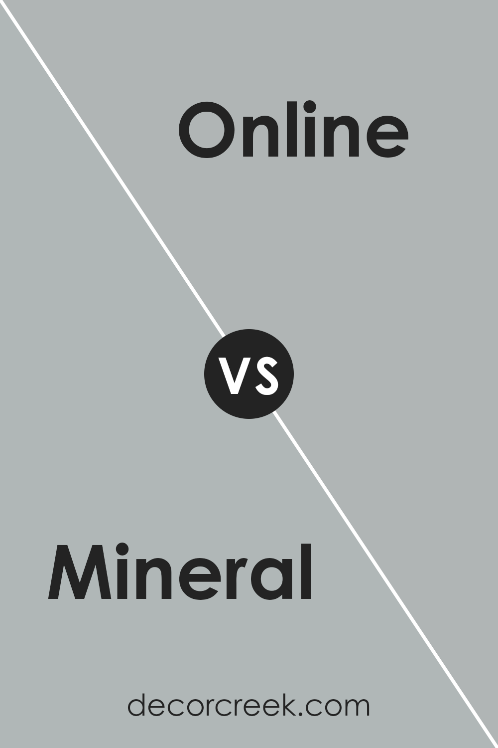
Mineral SW 9637 and Online SW 7072, both from Sherwin Williams, offer distinct vibes and aesthetic possibilities for interior spaces. Mineral presents as a gentle, soothing hue with a subtle blend of gray and green. This color tends to evoke a sense of calmness and natural elegance, making it a versatile choice for rooms seeking a serene atmosphere.
On the other hand, Online is a more defined, cooler shade with a stronger emphasis on gray, providing a sleek and modern look. It carries a certain depth that enhances contemporary designs, making spaces feel more sophisticated and grounded. While Mineral leans towards adding a soft touch of color and warmth, Online offers a sharper, more urbane edge.
Both colors support diverse decorative styles, but the choice between them hinges on the desired mood and theme of the room—tranquil and earthy with Mineral, or bold and chic with Online.
You can see recommended paint color below:
Mineral SW 9637 by Sherwin Williams vs Jubilee SW 6248 by Sherwin Williams
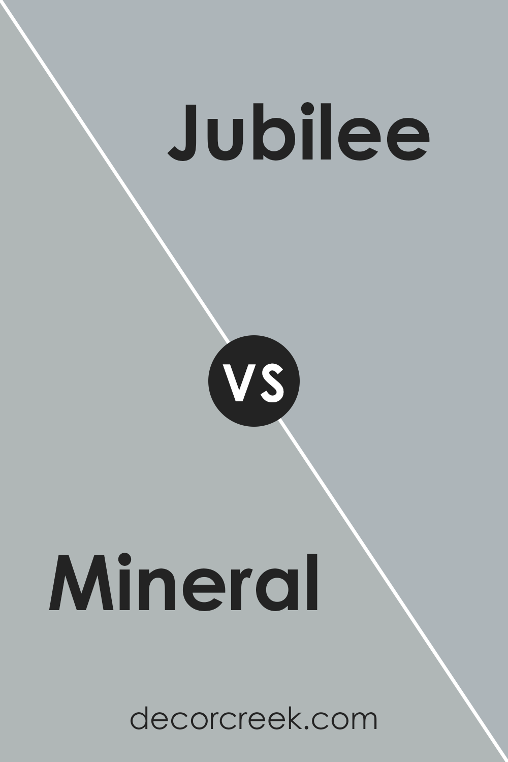
Mineral and Jubilee, both from Sherwin Williams, offer distinctive palettes that cater to varied aesthetic preferences and design needs. Mineral is a serene, soft gray with subtle green undertones, presenting a cool and calming ambiance perfect for spaces meant to soothe and relax. Its muted hue makes it versatile for combining with both bold and soft colors, allowing it to act as a neutral base in a wide range of interior styles.
Jubilee, on the other hand, is a deeper gray that leans towards a mid-tone slate, imbued with bluish undertones. This color brings a more pronounced, yet equally sophisticated presence into a room. It offers a contemporary feel, ideal for modern living spaces and offices that aim for a chic and professional look.
While Jubilee provides a stronger character without overwhelming, it pairs well with crisp whites or warmer tones for a balanced and inviting environment.
Together, Mineral and Jubilee showcase the versatility of gray in interior design, offering options that range from the subtly organic to the elegantly bold.
You can see recommended paint color below:
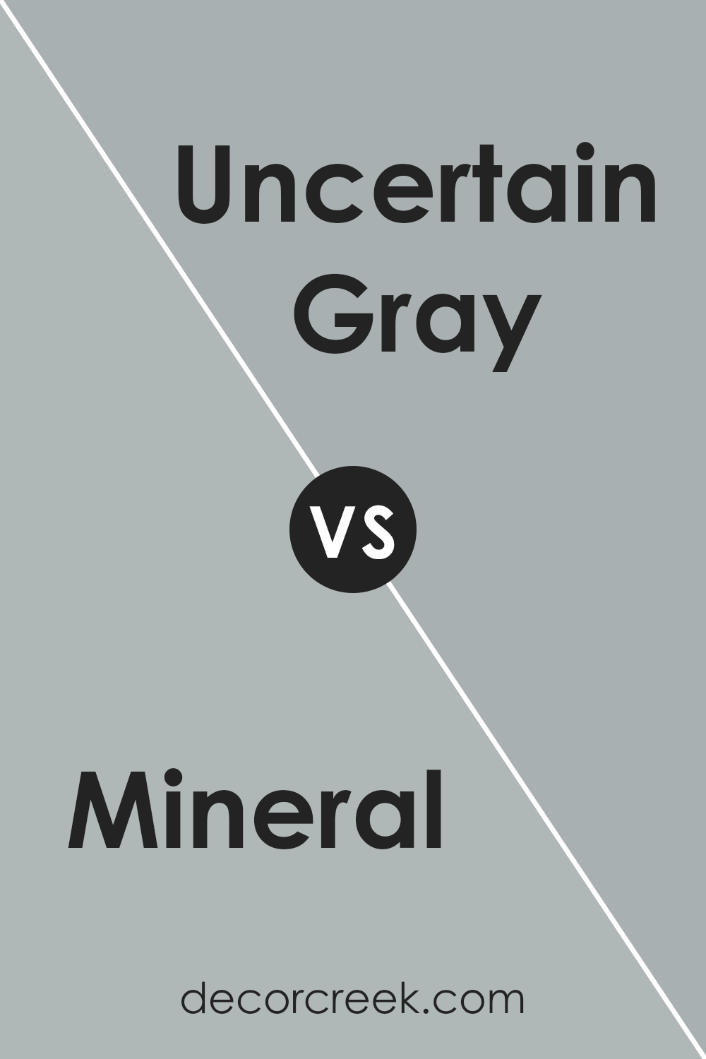
Mineral SW 9637 by Sherwin Williams vs Uncertain Gray SW 6234 by Sherwin Williams
The comparison between Mineral and Uncertain Gray, both by Sherwin Williams, unveils a fascinating exploration of tone and mood within interior spaces. Mineral boasts a serene, earthy quality, embodying a perfect blend of warmth and neutrality.
Its gentle vibe is versatile enough to act as a calming backdrop in various settings, inviting a grounded, natural aesthetic into the room.
In contrast, Uncertain Gray occupies a unique position on the color spectrum. It’s a cooler, more subdued hue, offering a hint of sophistication and depth. This color leans towards the cooler side of the scale, providing a sense of tranquility and refined elegance.
It’s an ideal choice for spaces that aim to project a contemporary, chic ambiance, while still maintaining a touch of inviting warmth.
When these two colors are juxtaposed, Mineral introduces a soft, welcoming warmth that complements the cool, understated elegance of Uncertain Gray. Together, they can harmonize to create a space that feels both modern and comforting, blending the best of warmth and coolness into a seamless aesthetic.
You can see recommended paint color below:
- SW 6234 Uncertain Gray
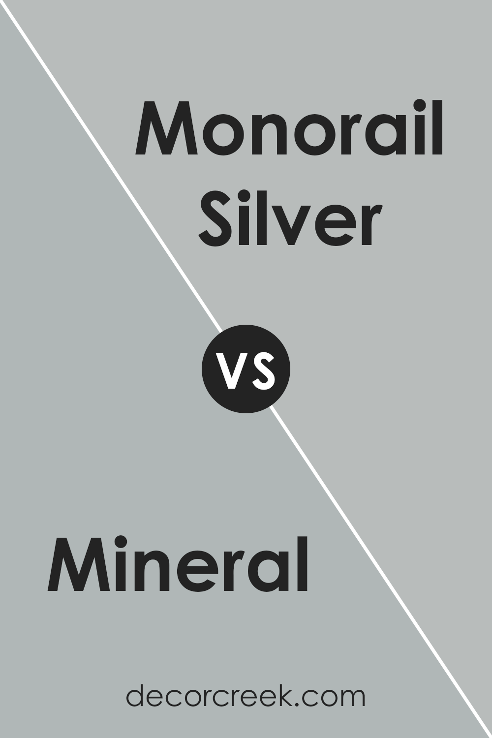
Mineral SW 9637 by Sherwin Williams vs Monorail Silver SW 7663 by Sherwin Williams
Mineral and Monorail Silver, both from Sherwin Williams, present an intriguing comparison through their unique attributes. Mineral, a serene and earthy hue, exudes warmth and a sense of natural elegance. This color tends to illuminate spaces with a soft, inviting glow, offering a perfect backdrop for both contemporary and traditional interiors. It resonates with an understated sophistication, making it versatile for various design aesthetics.
On the other hand, Monorail Silver showcases a cooler, more industrial vibe. This color leans towards a sleek and modern palette, providing a crisp, metallic sheen that can give spaces a more spacious and open feel. It pairs well with bold, vivid colors, serving as a neutral base that allows other elements to stand out.
Both colors offer distinct atmospheres; Mineral brings a cozy, grounded essence to interiors, while Monorail Silver introduces a dynamic, contemporary edge. Whether used independently or together, these colors complement each other, allowing for creative and harmonious design solutions.
You can see recommended paint color below:
- SW 7663 Monorail Silver
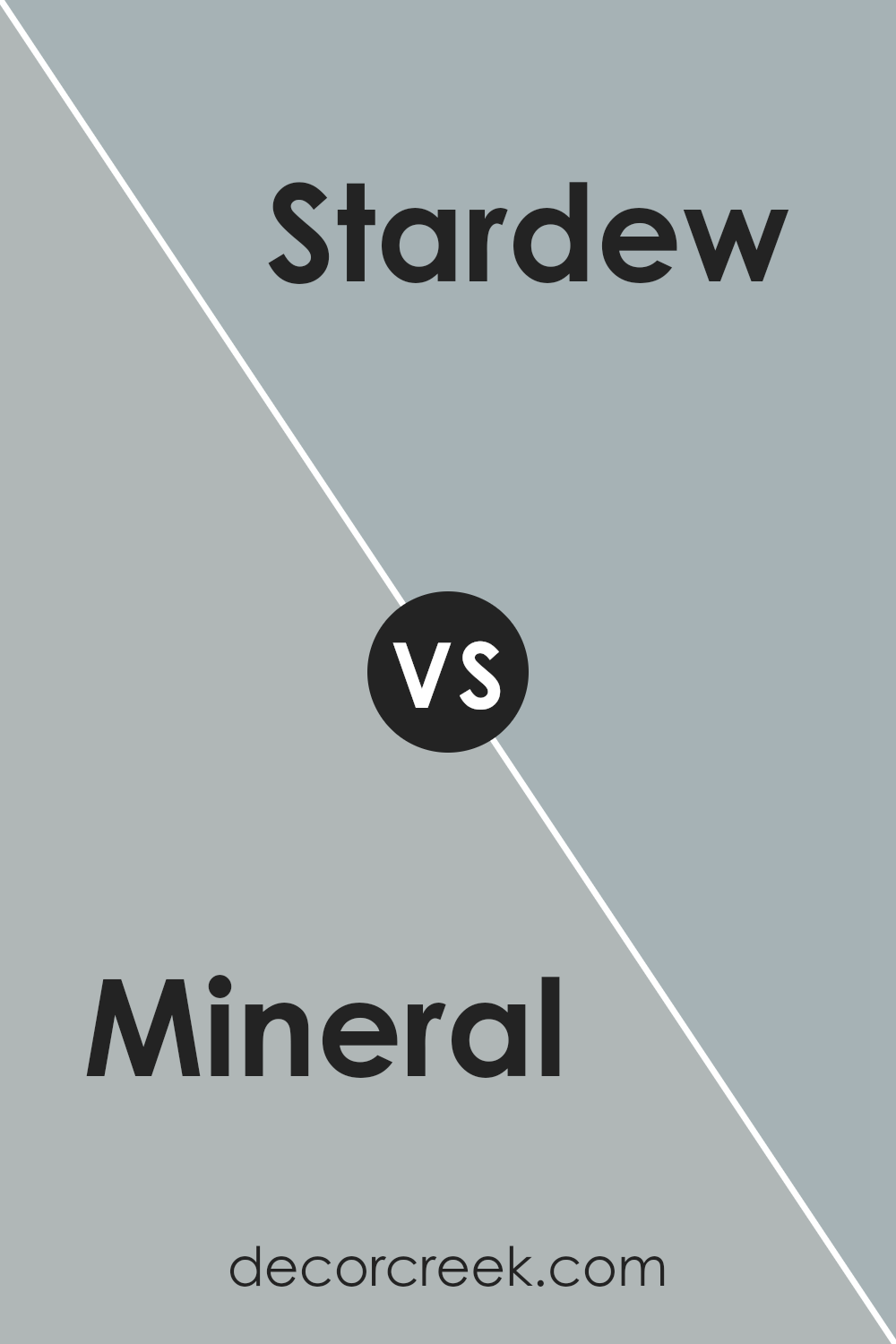
Mineral SW 9637 by Sherwin Williams vs Stardew SW 9138 by Sherwin Williams
Mineral and Stardew, both from Sherwin Williams, offer distinct yet harmonious tones that can transform any space with their unique ambiance. Mineral is a deep, rich color that balances between a serene blue and a subtle gray. This hue evokes a sense of calm and stability, perfect for creating a soothing retreat or an elegant backdrop.
Its depth allows for versatility in design, complementing both contemporary and traditional aesthetics.
In contrast, Stardew presents a lighter, airier feel with its soft, muted blend of gray and blue. This color captures the essence of a tranquil morning sky, bringing a breath of fresh air into any room. It’s particularly effective in spaces intended for relaxation and reflection, promoting a sense of peace and serenity.
While it can stand alone for a minimalist look, it also pairs beautifully with deeper tones like Mineral, adding depth and interest to the palette.
Together, Mineral and Stardew can create a sophisticated scheme, offering balance between grounded elegance and airy lightness, ideal for a cohesive and inviting home environment.
You can see recommended paint color below:
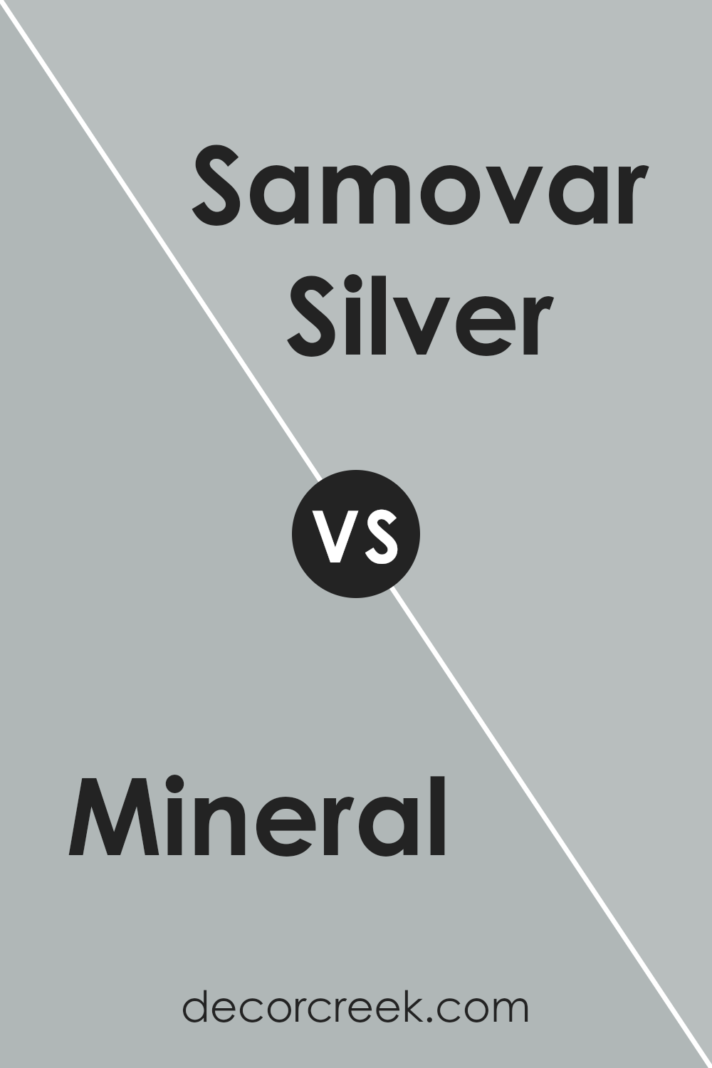
Mineral SW 9637 by Sherwin Williams vs Samovar Silver SW 6233 by Sherwin Williams
Mineral and Samovar Silver, both from Sherwin Williams, present an intriguing contrast while maintaining an air of sophisticated subtlety. Mineral is a deeper hue, reminiscent of the natural earth tones found in a serene, shadowed landscape.
This color brings warmth and depth to spaces, catering to those looking to create an inviting, cozy ambiance. It has an understated elegance that pairs well with both bold and neutral palettes, offering versatility in design choices.
On the other hand, Samovar Silver occupies the lighter end of the spectrum. It leans towards a muted, sophisticated silver-gray that mimics the soft, early morning mist. This color provides a breath of fresh air to any room, introducing a modern and airy feel.
Its ability to reflect light beautifully makes small spaces appear more expansive and welcoming, offering a subtle backdrop that complements a wide range of décor.
When comparing the two, one might consider Mineral as grounding and Samovar Silver as lifting, each offering distinct mood and stylistic options for interior spaces.
You can see recommended paint color below:
- SW 6233 Samovar Silver
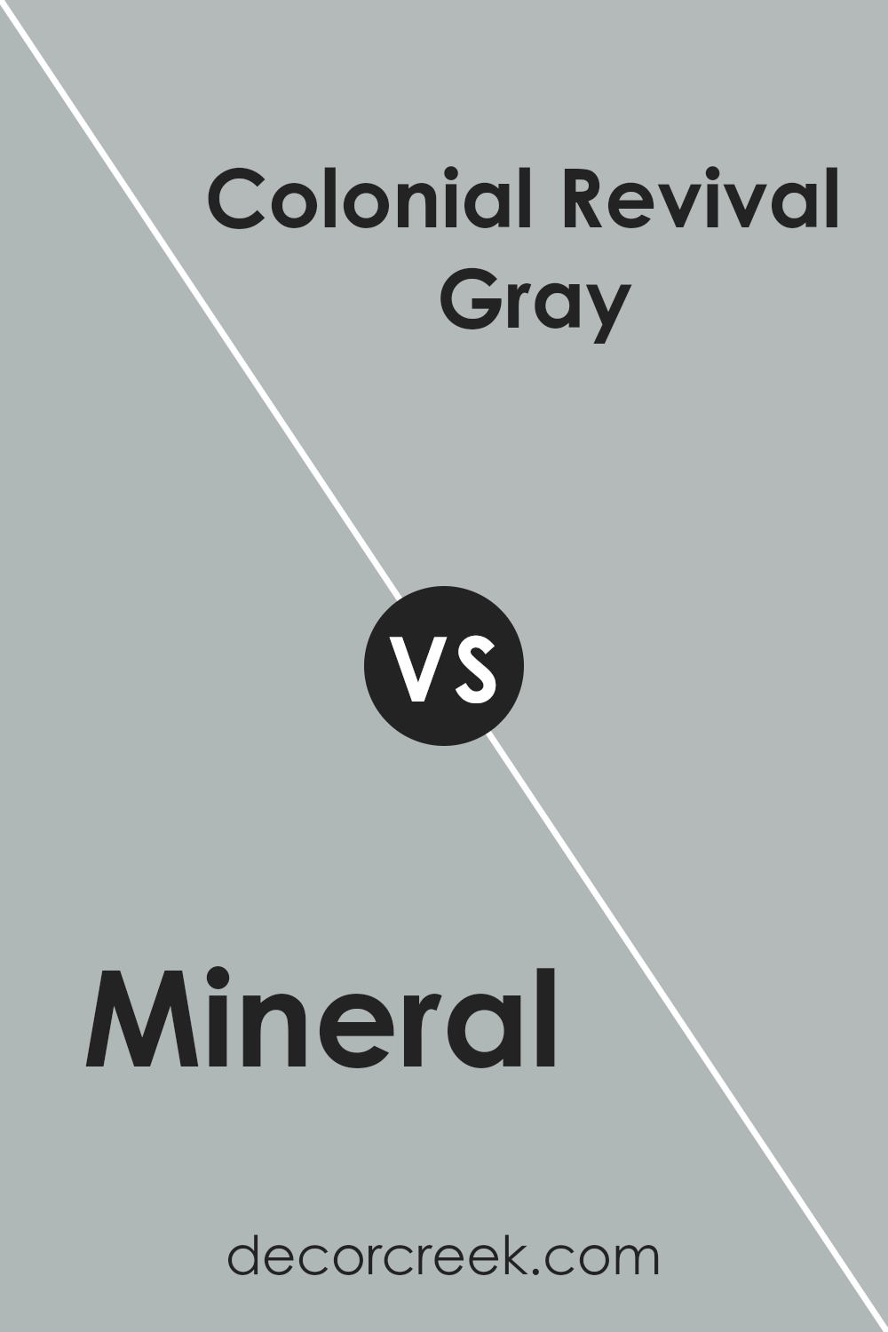
Mineral SW 9637 by Sherwin Williams vs Colonial Revival Gray SW 2832 by Sherwin Williams
Mineral (SW 9637) and Colonial Revival Gray (SW 2832) by Sherwin Williams present a fascinating duo for various interior spaces, each embodying a unique character. Mineral offers a soft, serene backdrop, reminiscent of a tranquil sea or a muted sky at dawn.
Its subtle undertones provide a calming effect, making it ideal for bedrooms or bathrooms where a soothing ambiance is desired.
On the other hand, Colonial Revival Gray presents a more defined statement. Despite its name suggesting a traditional appeal, this color fits seamlessly into both classic and contemporary settings.
The slightly deeper tone compared to Mineral, with its sophisticated gray nuances, offers elegance and a sense of groundedness, making it perfect for living areas, dining rooms, or any space meant to convey a refined yet welcoming atmosphere.
Together, these colors could harmonize well, with Mineral serving as a gentle contrast to the more pronounced Colonial Revival Gray, creating spaces that are both comforting and stylish.
You can see recommended paint color below:
- SW 2832 Colonial Revival Gray
Conclusion
Mineral SW 9637 by Sherwin Williams is a sophisticated hue that redefines spaces with its unique charm and understated elegance. This color, embodying the calmness and serenity of natural elements, has become a favored choice for interior design projects.
Its versatility allows it to blend seamlessly with a variety of decor styles, from contemporary to traditional, making it a go-to for designers seeking a neutral yet impactful backdrop.
The color’s ability to evoke a sense of tranquility and spaciousness is particularly valued in living areas and bedrooms, where creating a peaceful ambiance is often desired.
Furthermore, the adaptability of Mineral SW 9637 extends to its pairing with different materials and textures, enhancing the aesthetic appeal of any room. Whether combined with soft fabrics, rustic wood, or sleek metals, it maintains its grounding presence, offering a cohesive look that ties various elements together.
Its application does not just stop at walls; this color is also popular for cabinetry, furniture, and accent features, showcasing its broad utility. Overall, Mineral SW 9637 stands out as a timeless choice that brings balance and sophistication to spaces, embodying Sherwin Williams’ dedication to offering high-quality, trendsetting hues.
Ever wished paint sampling was as easy as sticking a sticker? Guess what? Now it is! Discover Samplize's unique Peel & Stick samples.
Get paint samples


