Blue can be relaxing and calming, but it can also be oppressing and heavy. It all depends on what shade of blue we choose for our home and how we use it with other colors in our living space. To do that correctly, you should know the essential specifics of the color.
This is exactly what we offer you to do today. We will tell you about one of the most beautiful shades of blue called Krypton by the Sherwin-Williams brand.
You will learn what kind of blue it is, what undertones it has, and how to use them in your home correctly to make the color work. Also, we will explain how to coordinate this color and what color can help you with that.
What Kind of Color Is Sherwin-Williams SW-6247 Krypton?
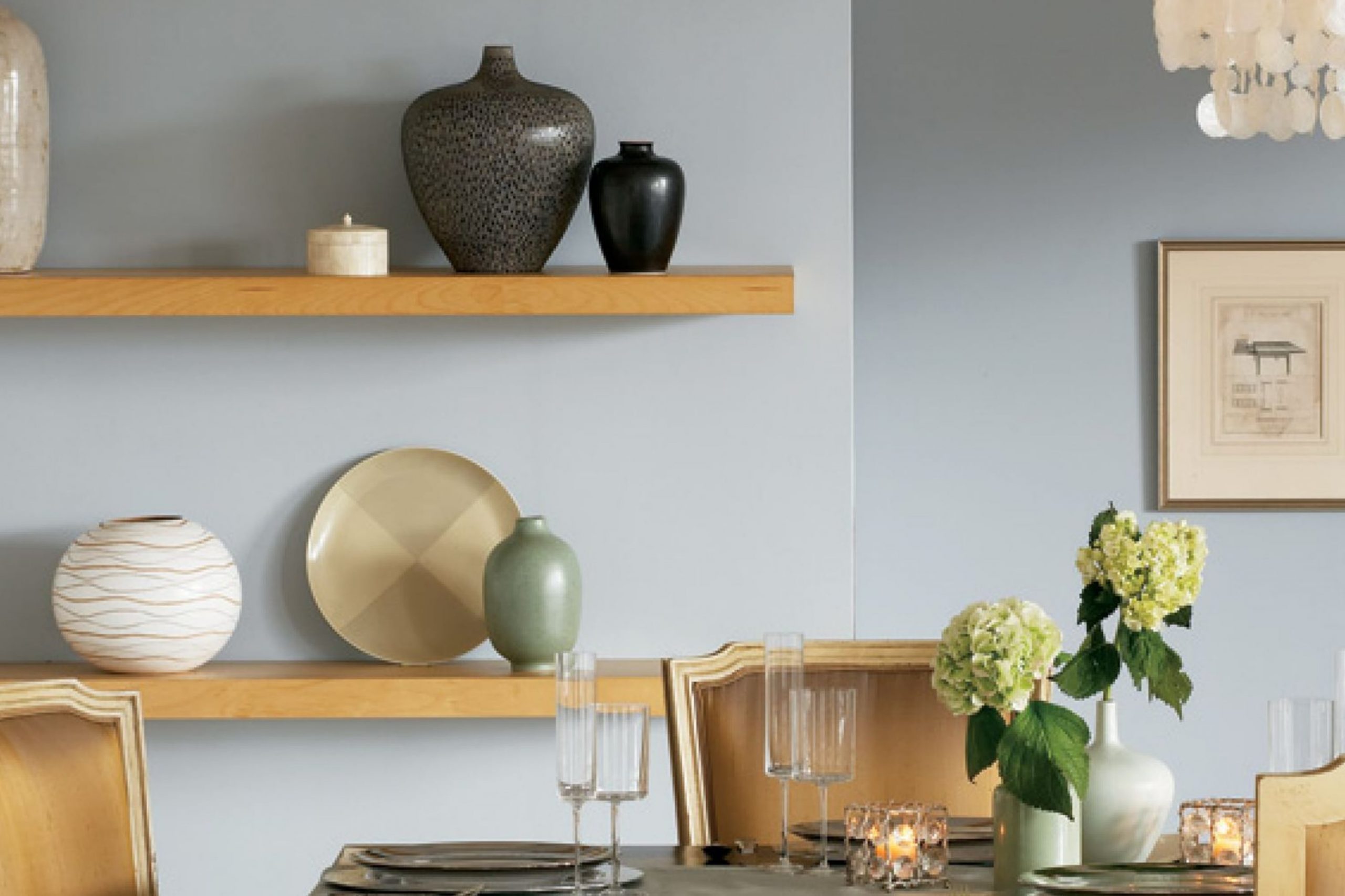
If you like a coastal vibe in your home, you should definitely consider using this blue since SW Krypton is a lovely and tranquil cool blue-gray paint. It will give your living space a delicate and refreshing coastal feel without overdoing it at the same time.
Since this color is pretty light and soft, it will not create sharp contrasts in a room. However, you should use it with other colors that are also soft and muted; otherwise, there will be a dissonance between the colors in the space!
People often avoid using blues in their homes because they believe blue is hard to pair with other colors. As Encycolorpedia says, blue is often associated with cool-toned interiors that don’t feel cozy enough. But this color should not be afraid of!
SW Krypton works surprisingly well with other colors and textures/materials. For example, it will pair nicely with brass or polished nickel. To make this airy blue feel more grounded, you can pair it with matte black.
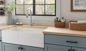
Such versatility makes SW Krypton easy to use on cabinetry with various finishes or near-door hardware. Also, the Krypton color will add a punch of color to a room with neutrals.
Ever wished paint sampling was as easy as sticking a sticker? Guess what? Now it is! Discover Samplize's unique Peel & Stick samples.
Get paint samples
Undertones Of SW-6247 Krypton Color
Undertones must always be considered before you use the color on your walls or other surfaces in your home. Depending on the color’s undertones, your entire space may read differently!
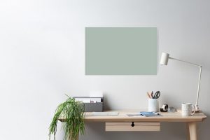
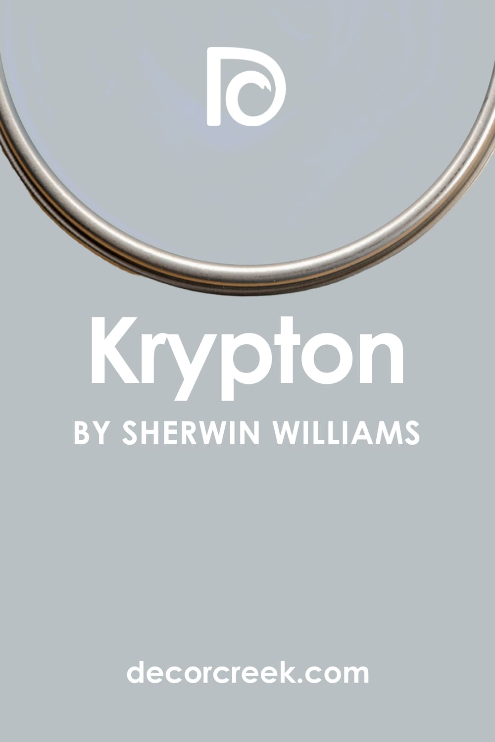
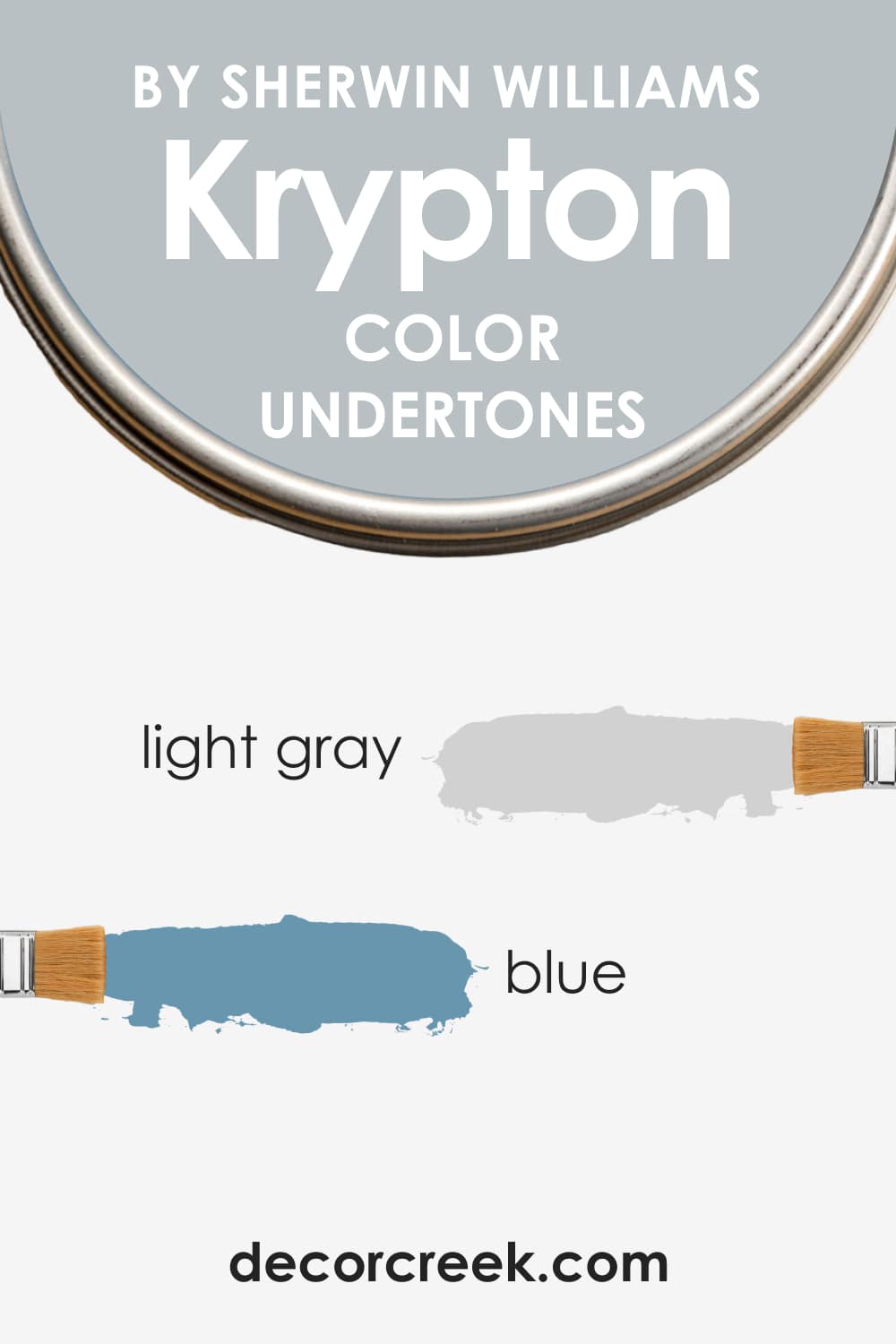
SW Krypton is a soft and cool blue color with gray undertones that make this color look refined and sophisticated.
In fact, the gray undertone in this blue is so pronounced that Sherwin-Williams Krypton often looks like a medium gray, although it is actually a very blue paint.
This is why you should always sample this color before you use it in your home!
Different types of lighting can affect the way it reads, making this blue look grayer or bluer. But in general, SW Krypton looks best in the south, east or west-facing rooms. Those directions get the warmest sunlight throughout the day, making the cool notes in Krypton read warmer.
LRV of Krypton SW-6247 Paint Color
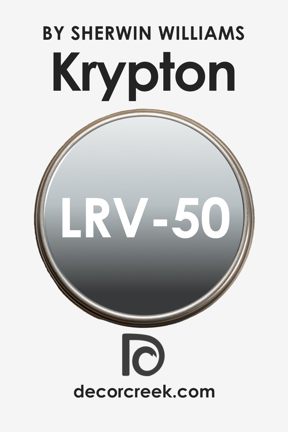
LRV stands for Light Reflectance Value, and this measurement shows how much light the color reflects. The higher the LRV value, the lighter the color, and vice versa. Speaking of SW Krypton, its LRV is 50, which means this blue is neither warm nor cold, being somewhere in the middle.
Also, with an LRV of 50, this soft blue color is neither too dark nor too light. You can use it in your home if you want to create a Scandinavian or Minimalist style.
Coordinating Colors of Krypton SW-6247
To coordinate the color correctly, you should know what colors suit this purpose. However, most of us have no idea of how to coordinate different colors, which is why we often pick up not quite well-matching palettes for our homes.
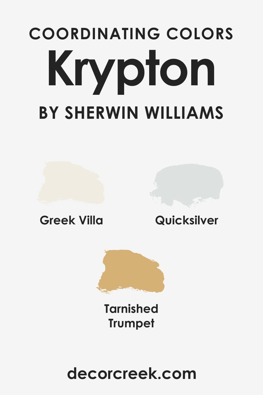
Luckily, you have a few color suggestions to use for SW Krypton to coordinate it since we have done that for you!
- SW Quicksilver (CHECK A SAMPLE)
- SW Greek Villa (CHECK A SAMPLE)
- SW Tarnished Trumpet (CHECK A SAMPLE)
These colors will “dilute” the cool tones of this blue, making the color and the space read less cold.
Colors That Go With SW Krypton
Not all colors can be paired successfully with each other. But with such a tricky color as SW Krypton that can read either blue or gray on the walls, you should be very attentive and cautious when choosing what colors to pair it with in your interior!
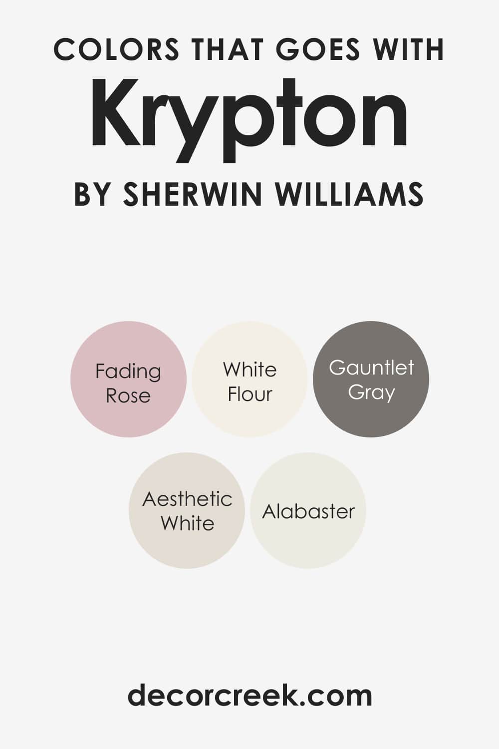
For this specific blue, you should opt for white, neutrals, black, and warm brass and wood tones since SW Krypton works best with them. Muted and soft pinks might also be a good idea. E.g., you might want to consider the following colors:
- SW Fading Rose (CHECK A SAMPLE)
- SW White Flour (CHECK A SAMPLE)
- SW Alabaster (CHECK A SAMPLE)
- SW Aesthetic White (CHECK A SAMPLE)
- SW Gauntlet Gray (CHECK A SAMPLE)
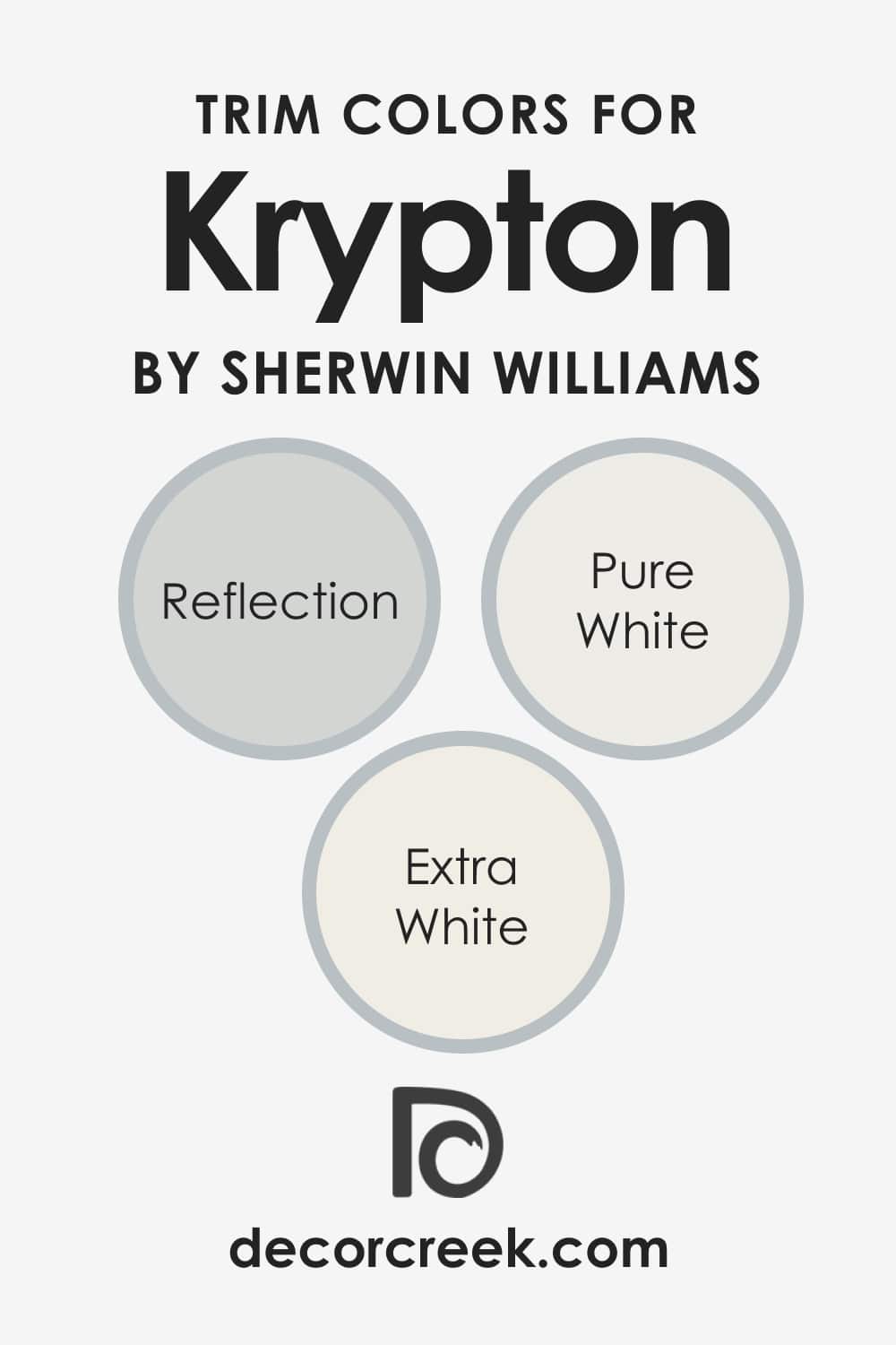
What Is the Best Trim Color for Krypton SW-6247?
White is traditionally the best trim color since it works well with most other colors. However, you need to remember that it does matter what tone and shade of white you use on your trim.
For such cool-toned and soft blue colors as SW Krypton, we recommend using either bright whites like SW Extra White (CHECK A SAMPLE) if you want to highlight the cool tones of the blue color or softer whites like SW Pure White (CHECK A SAMPLE) or SW Reflection (CHECK A SAMPLE).
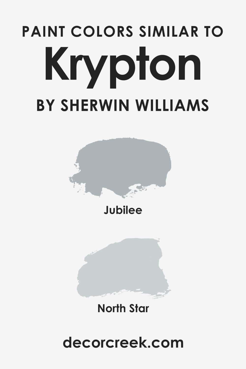
Paint Colors Similar to SW Krypton
When you know what colors can be used instead of the color you have on your mind right now, it will help you to adjust your home’s color palette to any changes and nuances. Usually, similar colors differ a bit in terms of undertones, warmth, and brightness.
So you will definitely find the color that suits your interior design. For SW Krypton, these would be the best similar colors to use instead of this soft and cool-toned blue-gray:
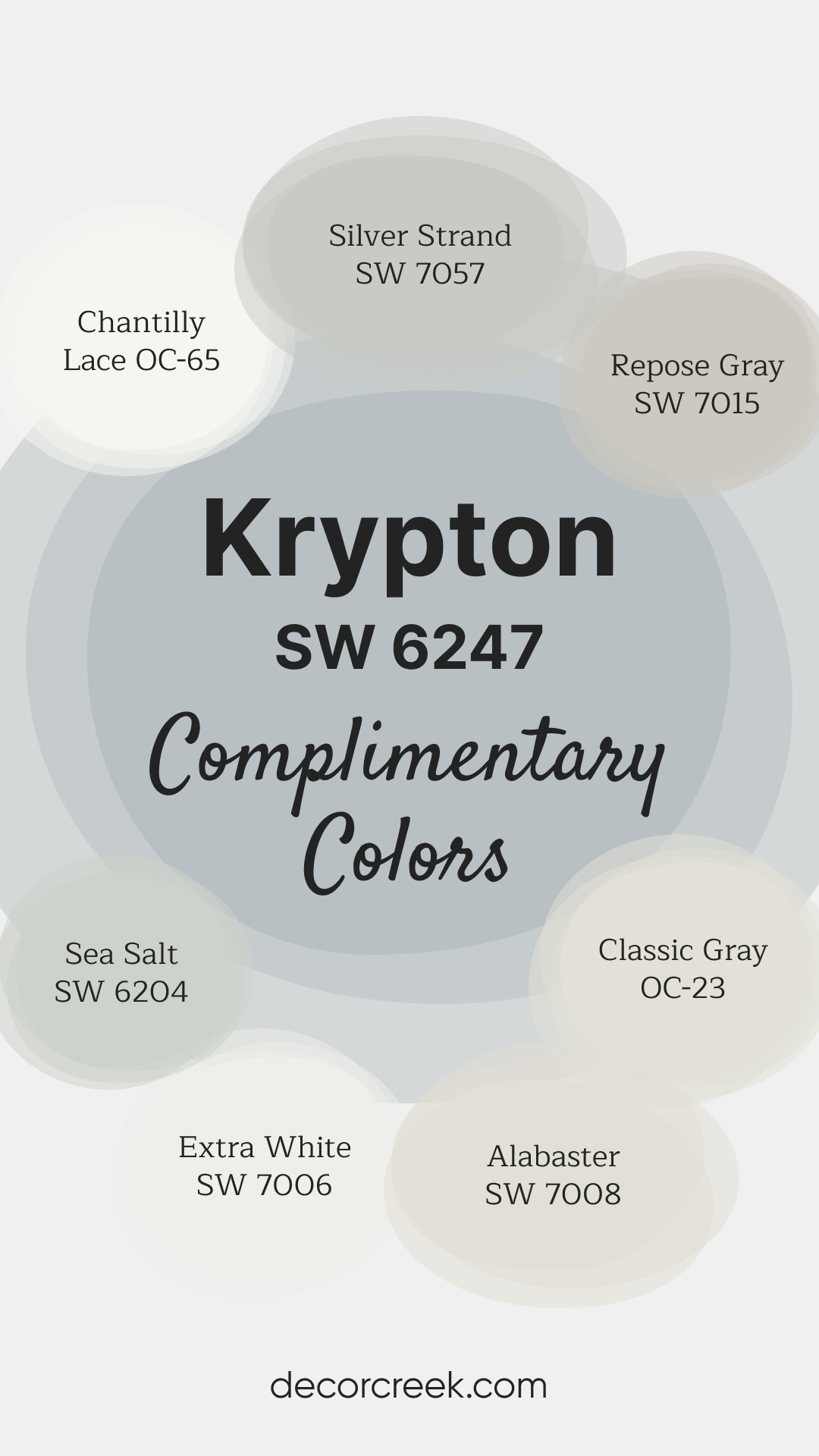
Complimentary Colors for Krypton SW-6247 Paint Color by Sherwin-Williams
Krypton SW 6247 by Sherwin-Williams is a cool and calming blue-gray, perfect for creating a serene atmosphere in any room.
Its subtle undertones make it versatile enough for both modern and traditional spaces, adding a touch of sophistication without overwhelming the design.
To keep the look light and fresh, pair Krypton with whites like Extra White SW 7006 and Chantilly Lace OC-65. For a more balanced palette, Repose Gray SW 7015 and Classic Gray OC-23 provide neutral grounding.
Sea Salt SW 6204 and Silver Strand SW 7057 add a hint of soft color, while Alabaster SW 7008 introduces a warm, inviting touch to complete the cohesive look.
Comparing SW Krypton With Other Colors
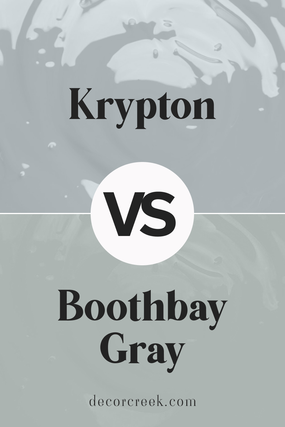
Boothbay Gray HC-165 by Benjamin Moore vs Krypton SW 6247 by Sherwin Williams
Boothbay Gray HC-165 and Krypton SW 6247 are soft, versatile colors with distinct undertones. Boothbay Gray is a muted gray with a subtle blue undertone, giving it a classic, elegant feel perfect for traditional spaces. Krypton is a cooler blue-gray that brings a fresh, airy look ideal for modern settings.
Boothbay Gray works beautifully in living rooms or bedrooms where a timeless feel is desired, while Krypton adds a clean, bright look in bathrooms or kitchens.
Both colors pair wonderfully with white trim and light wood accents, creating a balanced, sophisticated atmosphere.
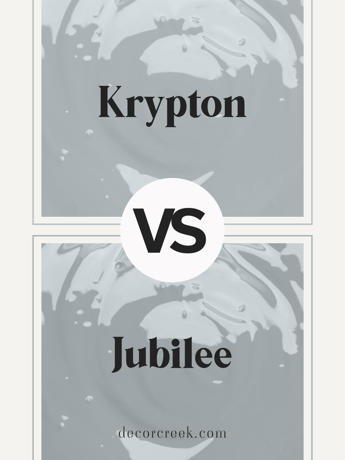
Krypton SW 6247 vs Jubilee SW 6248 by Sherwin Williams
Krypton SW 6247 and Jubilee SW 6248 are two soft, blue-grays by Sherwin Williams with unique vibes. Krypton is a cool blue-gray that has a crisp, refreshing feel, perfect for brightening up spaces. Jubilee is slightly darker and leans toward a muted, grayish blue, bringing a cozy, grounded feel to any room.
Choose Krypton for a fresh, modern look in bathrooms or kitchens, where a light, clean color is desired. Jubilee suits bedrooms or living rooms, where its warmer undertone can create a calm, inviting atmosphere.
Both shades work well with white trim and natural wood, enhancing a serene, cohesive look.
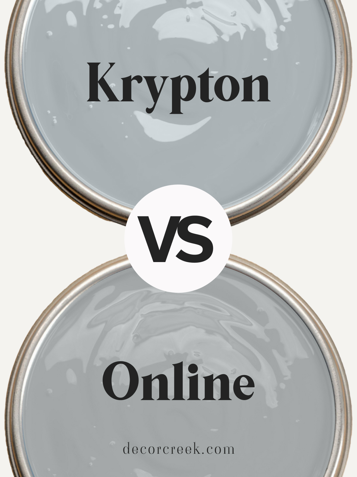
Krypton SW 6247 vs Online SW 7072 by Sherwin Williams
Krypton SW 6247 and Online SW 7072 are two cool-toned grays by Sherwin Williams with slightly different undertones. Krypton has a subtle blue tint, giving it a refreshing, airy quality ideal for modern spaces. Online is a neutral gray with a cooler, balanced undertone, making it versatile and adaptable.
Krypton is perfect for bathrooms or entryways, where its cool blue tone can add brightness. Online works well in open living areas or offices, providing a clean, minimalist backdrop. Both colors pair nicely with white or metallic accents, creating a polished, sophisticated look.
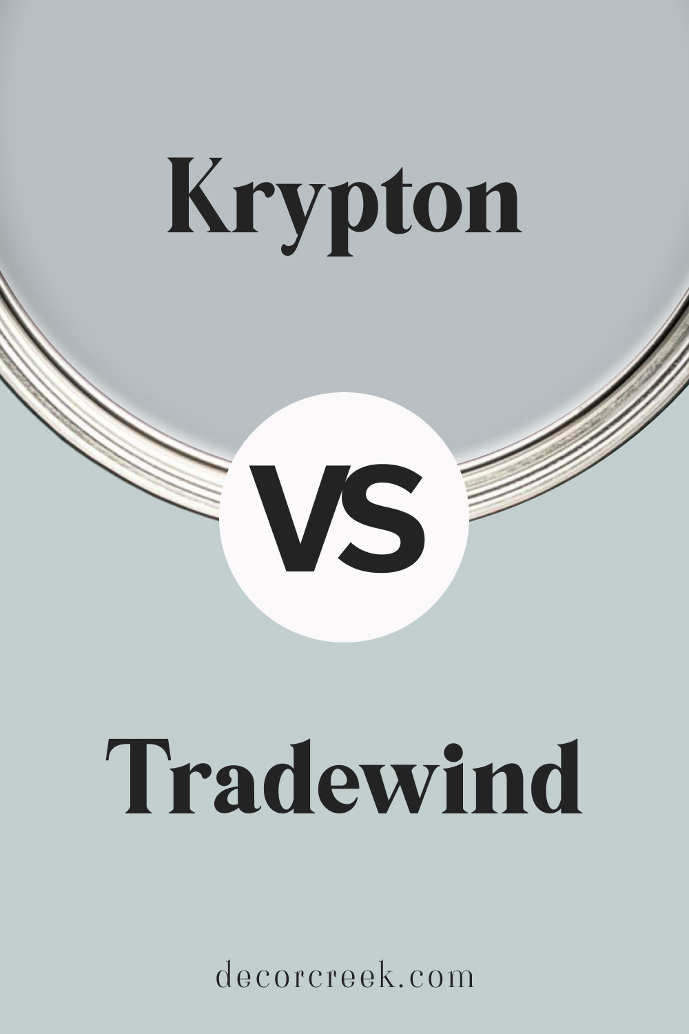
Sherwin Williams Krypton SW 6247 vs Tradewind SW 6218
Krypton SW 6247 and Tradewind SW 6218 by Sherwin Williams are both light, cool-toned blues with unique qualities. Krypton is a crisp blue-gray that brings a fresh, modern feel to spaces. Tradewind has a hint of green in its blue undertone, giving it a soft, breezy quality that’s perfect for creating a coastal vibe.
Krypton is ideal for bathrooms or kitchens where a cool, clean color is desired, while Tradewind suits bedrooms or living rooms, where its warmer undertone can add softness.
Both colors pair beautifully with whites and light wood tones, creating a serene, balanced look.
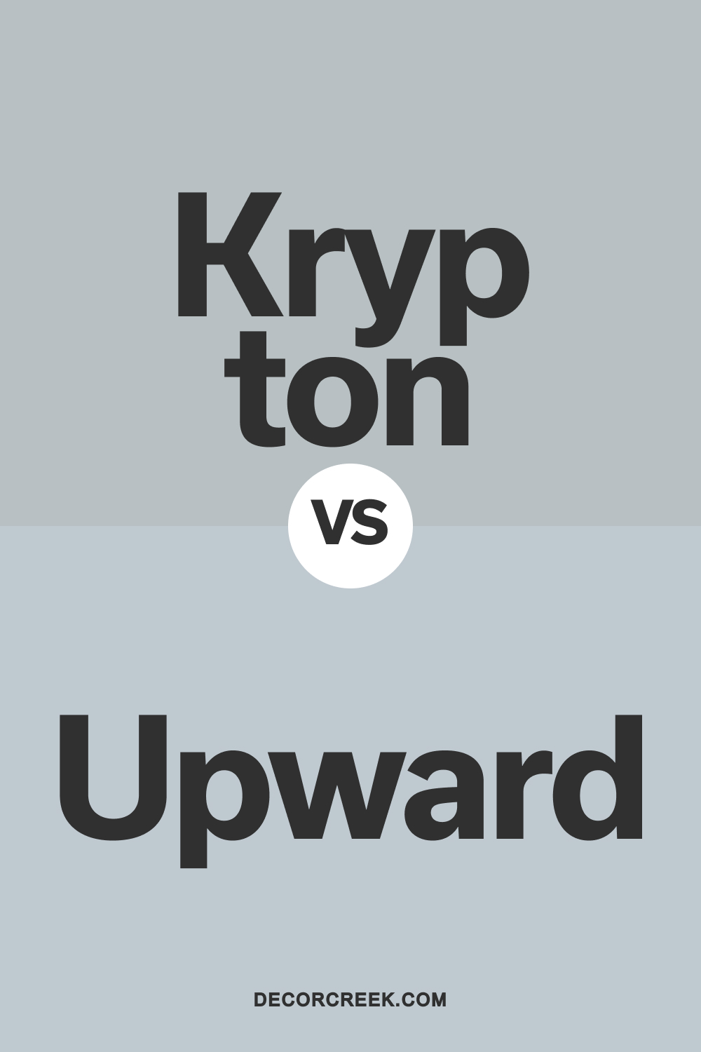
Krypton SW 6247 vs Upward SW 6239 by Sherwin Williams
Krypton SW 6247 and Upward SW 6239 are two soft, cool blues by Sherwin Williams with distinct tones. Krypton has a blue-gray undertone that adds a fresh, crisp look to any space. Upward is a lighter, more airy blue with a hint of warmth, giving rooms an open, breezy feel.
Choose Krypton for bathrooms or offices where a clean, modern look is desired. Upward works well in bedrooms or hallways, bringing lightness and a refreshing vibe. Both shades pair beautifully with white trim and natural accents, creating a cohesive and inviting atmosphere.
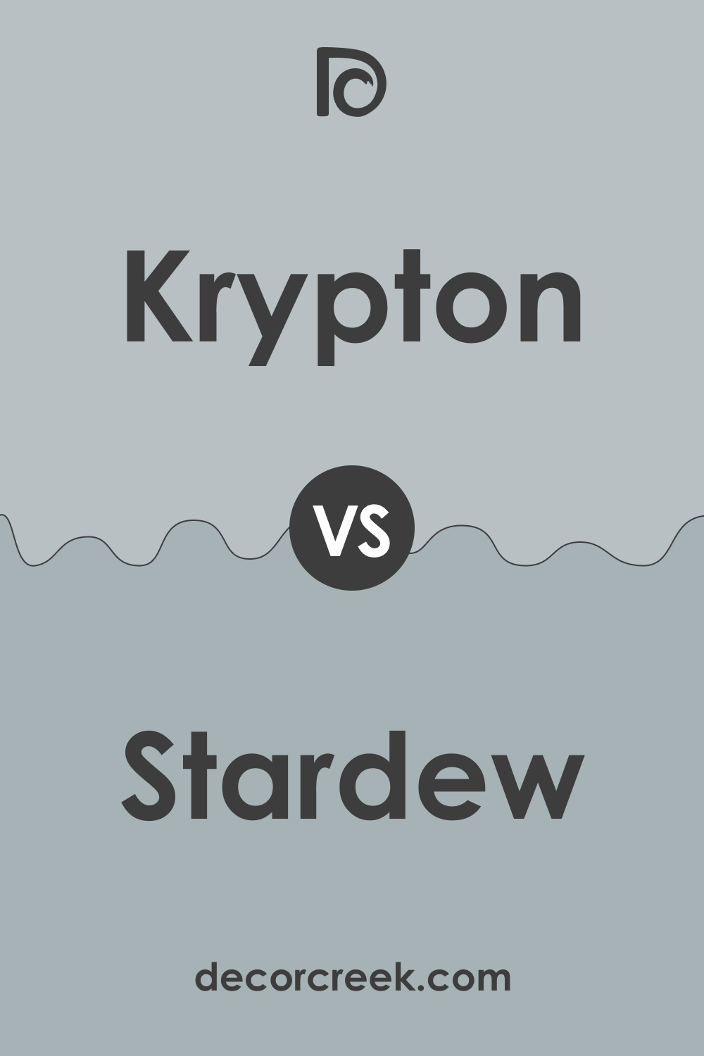
Stardew SW 9138 vs Krypton SW 6247 by Sherwin Williams
Stardew SW 9138 and Krypton SW 6247 by Sherwin Williams are two blue-grays with different personalities. Stardew is a warm blue-gray with earthy undertones, creating a relaxed, cozy feel. Krypton is a cooler, crisp blue-gray, offering a fresh, airy look perfect for modern spaces.
Stardew is ideal for bedrooms or living rooms, where its warmer tone can add a soothing atmosphere.
Krypton works beautifully in bathrooms or kitchens for a clean, light look. Both colors pair nicely with whites and light neutrals, giving any space a serene, balanced feel.
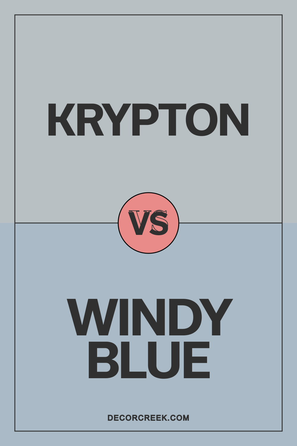
Sherwin Williams Krypton SW 6247 vs Windy Blue SW 6240
Krypton SW 6247 and Windy Blue SW 6240 by Sherwin Williams are cool, soft blues with unique undertones. Krypton is a crisp blue-gray that adds a clean, refreshing look to rooms. Windy Blue is slightly lighter and has a cheerful, airy quality, making it feel open and bright.
Krypton is perfect for bathrooms or offices where a cool, minimalist vibe is desired, while Windy Blue suits living rooms or bedrooms, adding a gentle, uplifting feel. Both colors pair beautifully with white trim and natural accents, creating a balanced, stylish look in any space.
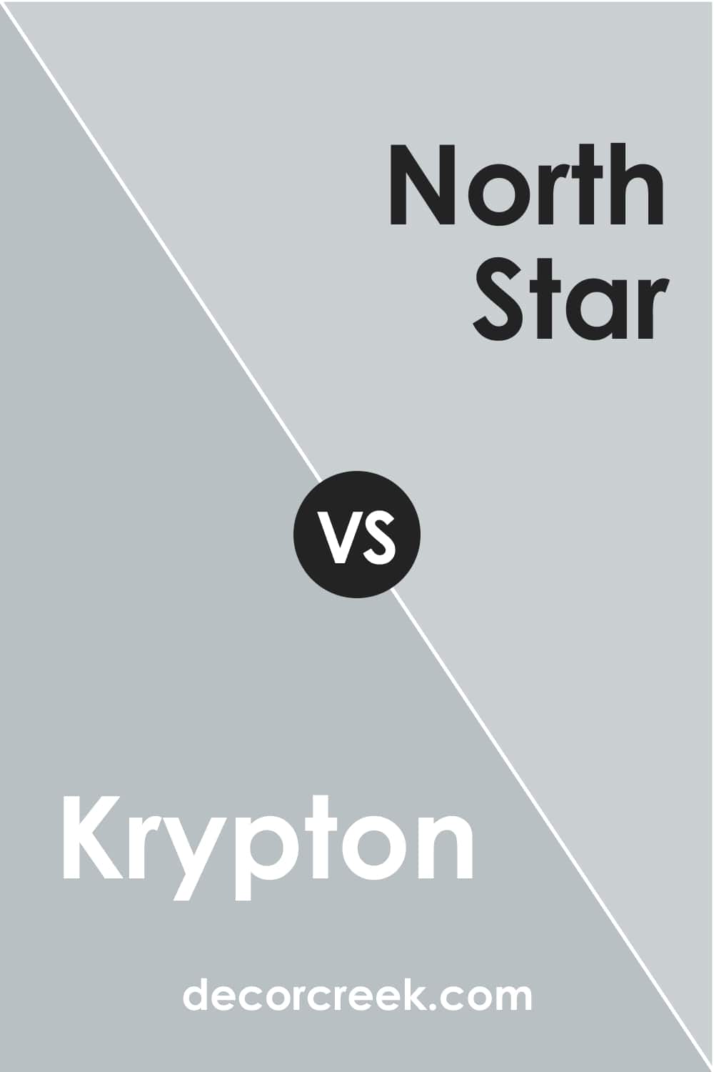
Krypton vs. North Star
Both are muted and calm, being relatively soft blue colors. However, SW Krypton is somewhat darker due to the more pronounced gray undertones, whilst SW North Star (CHECK A SAMPLE) reads bluer and lighter.
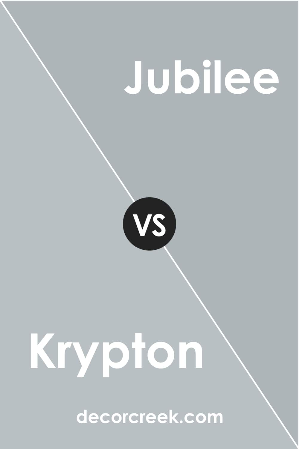
Krypton vs. Jubilee
These two look very alike. However, if you take a closer look, you will see that the Jubilee color has greenish undertones that come out quite noticeably compared to SW Krypton with its gray-blue nature
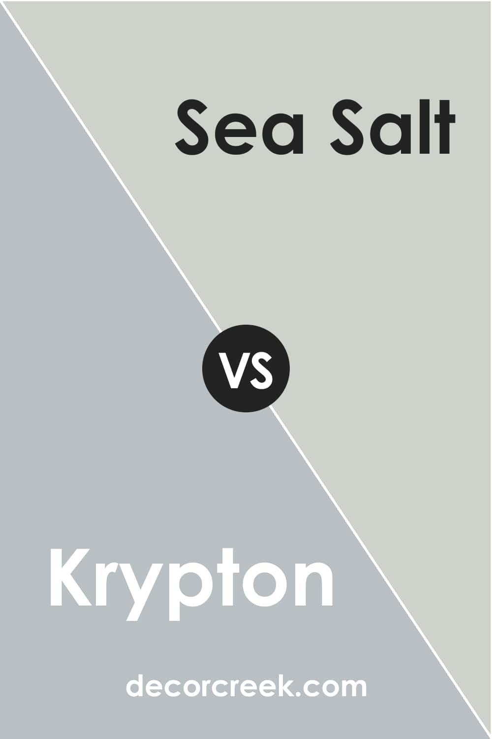
Krypton vs. Sea Salt
SW Sea Salt (CHECK A SAMPLE) is a light green-gray color that nevertheless falls into a light blue pretty much. This makes it read pretty close to SW Krypton. The only distinction is that SW Sea Salt has a rather noticeable grayish undertone. This is why, compared with SW Krypton, which looks blue, it reads grayer.
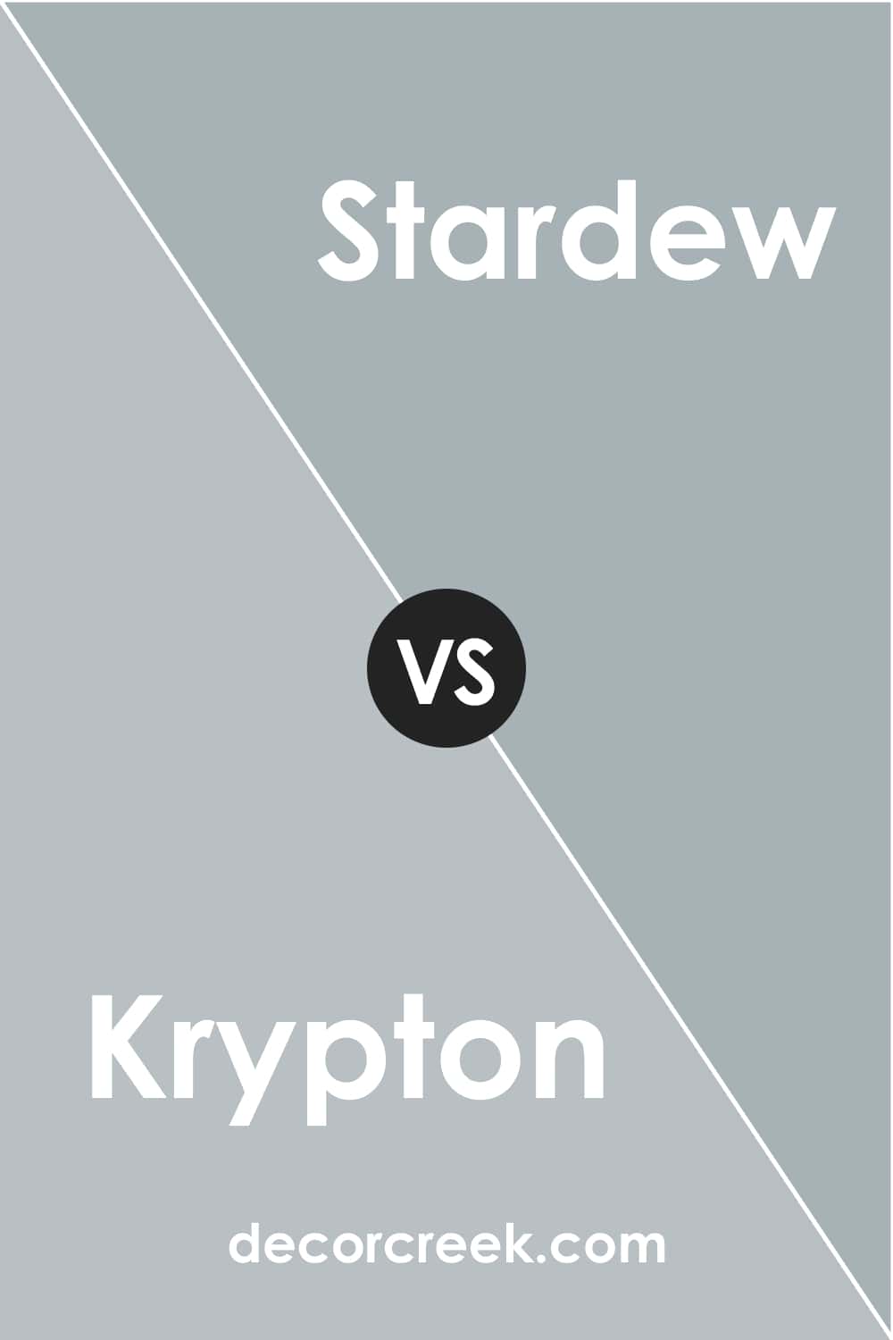
Krypton vs. Stardew
These two might read very much alike because SW Stardew (CHECK A SAMPLE) has subtle blue-gray undertones that relate it to SW Krypton, which is blue with gray undertones. However, compared to SW Krypton side by side, the Stardew color reads much bluer and deeper, in fact.
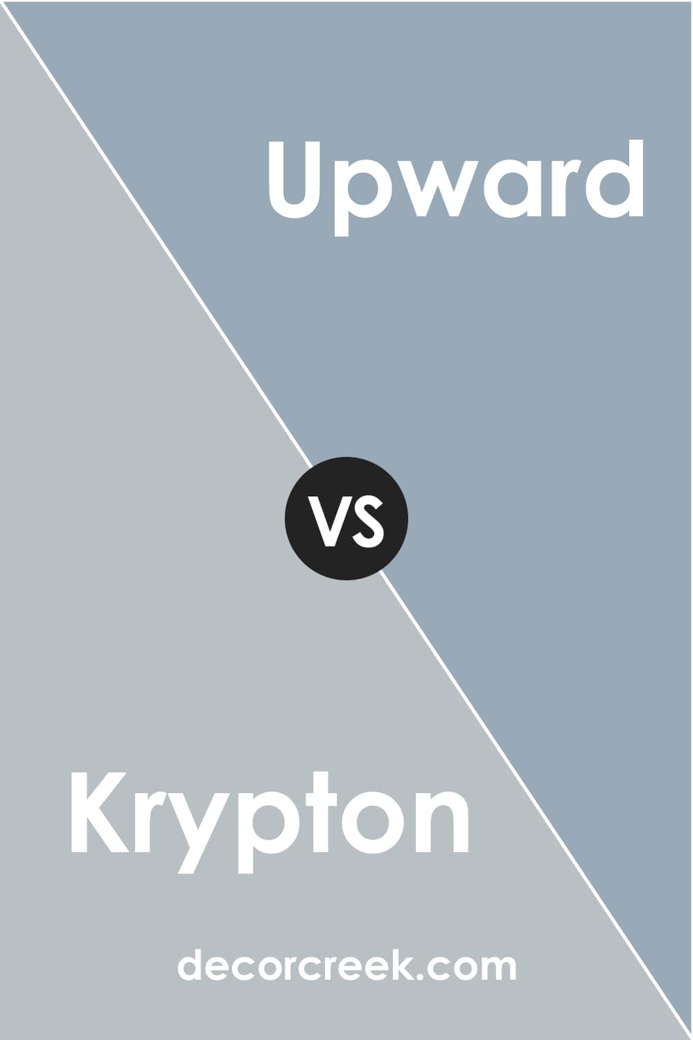
Krypton vs. Upward
If you compare SW Upward (CHECK A SAMPLE) to Krypton, you will see that Krypton reads noticeably grayer. SW Upward, on the other hand, looks blue. However, both colors are blue. SW Upward is a denim-blue with calm gray undertones, and SW Krypton is a cool-toned blue with gray undertones.
Where to Use Krypton SW-6247 Paint Color?
SW Krypton is pretty versatile, which means you can use it in many areas of your home. However, we recommend you use it cautiously since this blue color may read much grayer in different types of light.
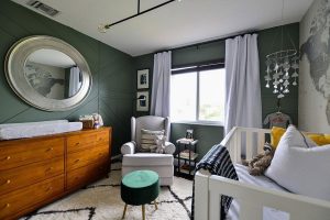
Krypton SW-6247 in the Living Room
In your living room, this cool-toned blue can create a refreshing and calming atmosphere if the room is big and spacious enough and has plenty of natural light.
Also, we recommend you pair this blue with warmer whites, neutrals, and textures like rattan, wood, cotton, linen, and other natural materials. They will help you to warm up the space a bit.

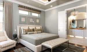
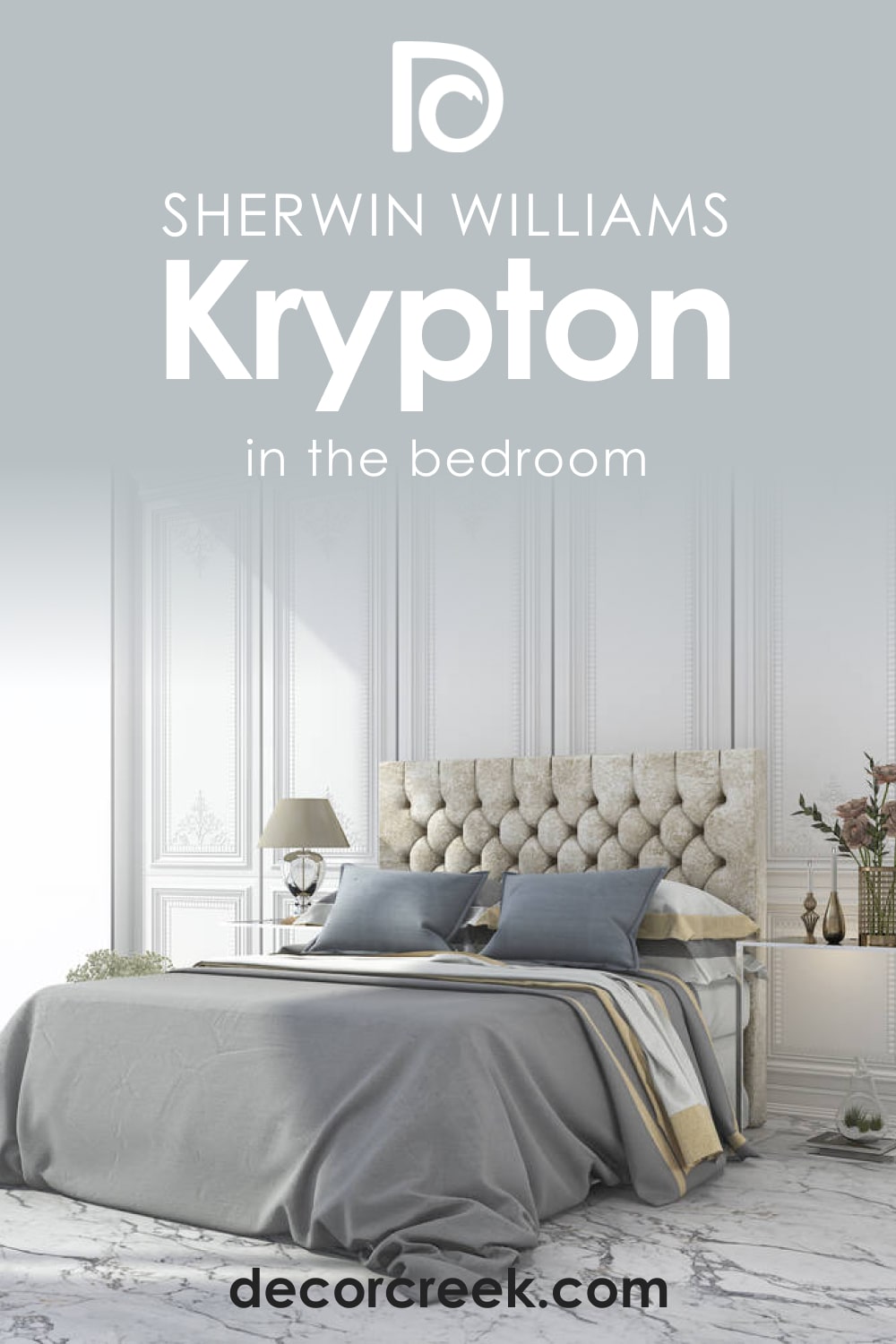
Krypton SW-6247 and Bedroom
Don’t be afraid to use this blue in your bedroom if you want to create a chilling and relaxed vibe there. Just add some warmth by using beige-colored throw blankets and cushions of warmer tones, as well as wooden elements, and your bedroom won’t look cold.
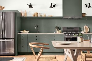
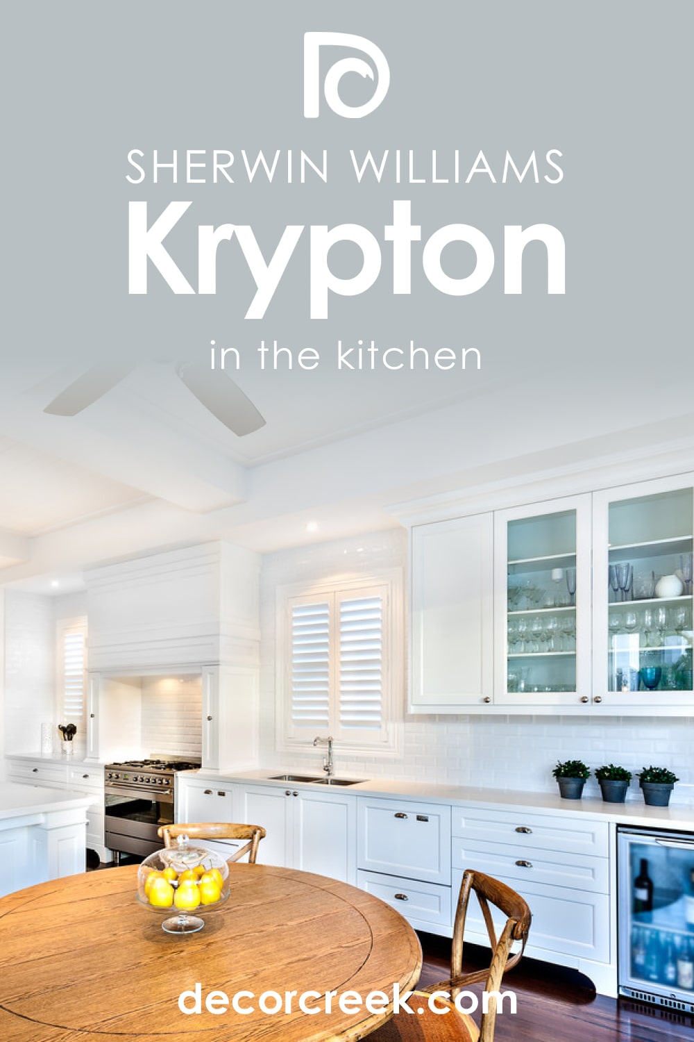
Krypton SW-6247 of Kitchen
This color works great on the walls and on the cabinetry of your kitchen. If you want, and if the space allows, you can even paint it all with it! However, don’t forget about warmer whites and warm-colored elements like wooden countertops, brass hardware, etc. They will make the room read cozier.
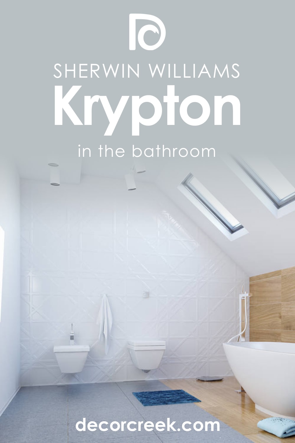
Krypton SW-6247 and Bathroom
This blue is perfect for bathrooms due to its cool and “watery” look. Besides, it can add airiness to it. However, it might not be suitable for a small bathroom since SW Krypton may read grayer in such spaces.
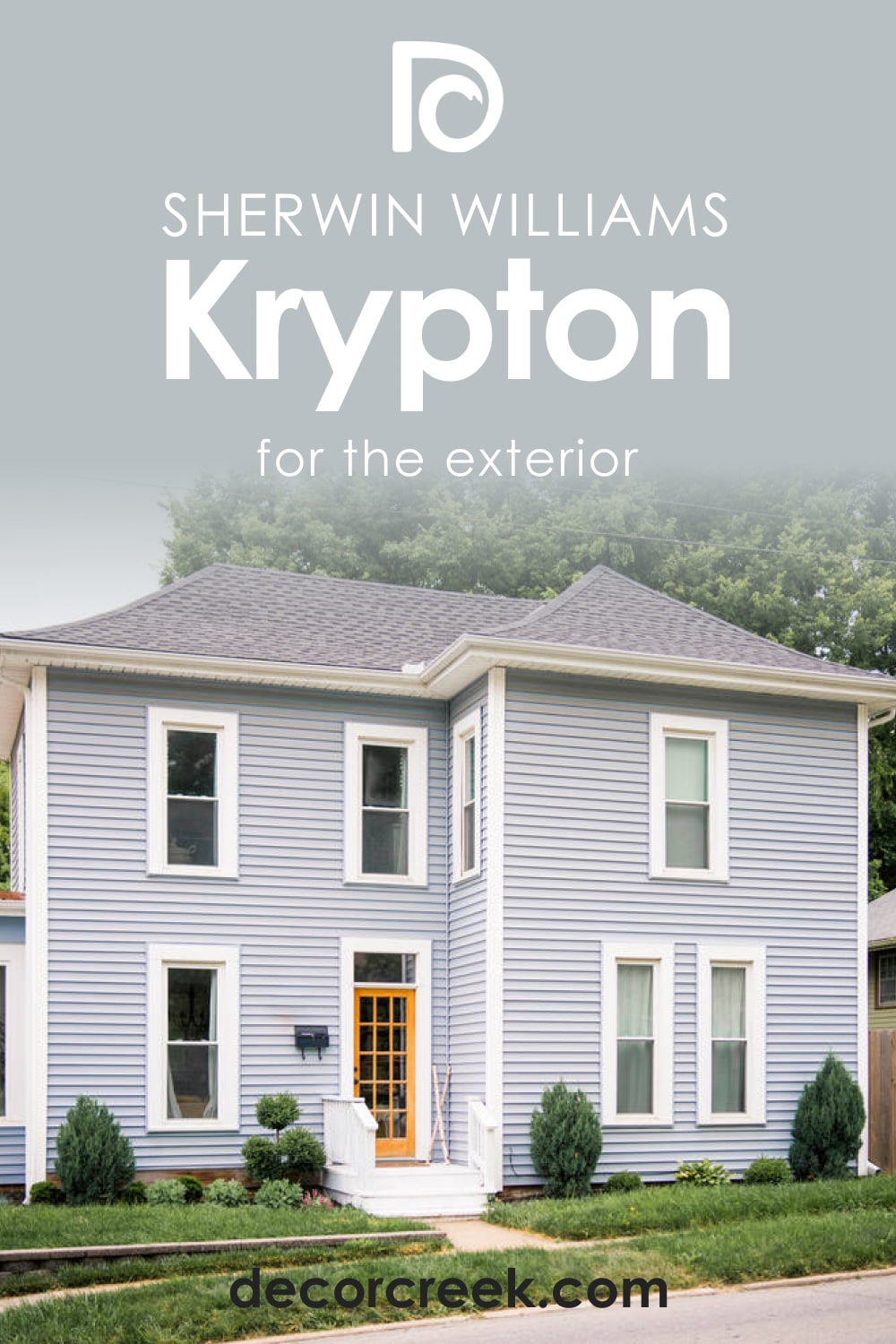
Krypton SW-6247 for the Exterior Use
On exterior walls, SW Krypton may read differently, depending on the lighting around. Generally, it will read blue with pronounced gray undertones, but on sunny days, it may look much bluer and colder.
Now you know more about the paint color called Krypton by the Sherwin-Williams brand. We told you about its undertones and LRV, as well as how this blue-gray soft color can read in your home.
And since you are also informed about its coordinating and trim colors, you can use it in your home correctly, making its sophisticated appearance work better.
Ever wished paint sampling was as easy as sticking a sticker? Guess what? Now it is! Discover Samplize's unique Peel & Stick samples.
Get paint samples
Frequently Asked Questions
⭐Can SW Krypton be used in a Scandinavian-style home?
Absolutely! This blue is ideal for this home style.
⭐Is SW Krypton a good color for the garage?
Generally, yes, it is. But you must ensure it will pair well with the color of your house.
⭐Can SW Krypton be used with pink colors?
Yes, it can, but you should opt for softer and muted shades of pink, e.g., SW Fading Rose.


