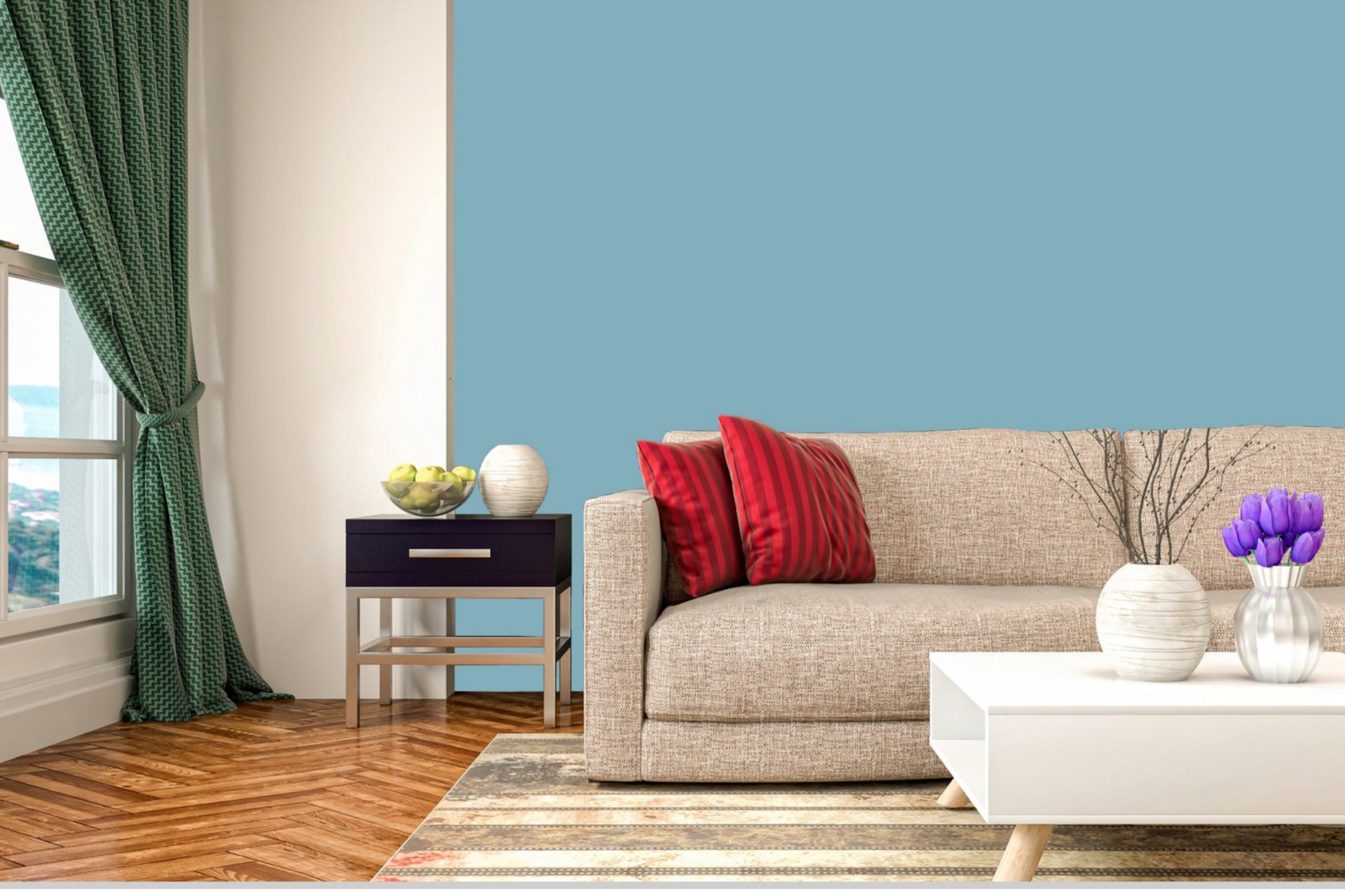
Welcome to the world of Sherwin-Williams, where colors are given life and character. The focus of today’s exploration is SW 6500 Open Seas. A versatile and dynamic color, SW Open Seas invites tranquility and sophistication into your space, transforming it into an oasis of serenity.
In this comprehensive guide, we’ll journey through the essence of SW Open Seas, uncovering its undertones, coordinating colors, the impact of lighting, and application in various home spaces.
What Color Is SW 6500 Open Seas?
SW 6500 Open Seas is a mid-tone blue hue with a captivating depth that echoes the enchanting beauty of the sea. This color exudes a sense of tranquility and peacefulness, reminiscent of a serene ocean vista under a clear sky. Its mesmerizing, somewhat elusive charm stems from its depth and dynamism, as it transforms subtly according to the light and colors around it.
The richness of SW Open Seas makes it an ideal choice for creating a calming atmosphere in a room. Yet, its intensity gives it the ability to make a statement, offering the perfect balance between relaxation and invigoration.
This makes SW Open Seas a versatile choice for both traditional and contemporary home styles, a color that is as flexible as it is captivating.
Ever wished paint sampling was as easy as sticking a sticker? Guess what? Now it is! Discover Samplize's unique Peel & Stick samples.
Get paint samples

Is It a Warm Or Cool Color?
SW 6500 Open Seas is a cool color. Its blue tonality associates it with the cooler end of the color spectrum, fostering feelings of serenity, harmony, and peace. Cool colors like SW Open Seas can have a calming effect and can make a space appear more spacious and airy.
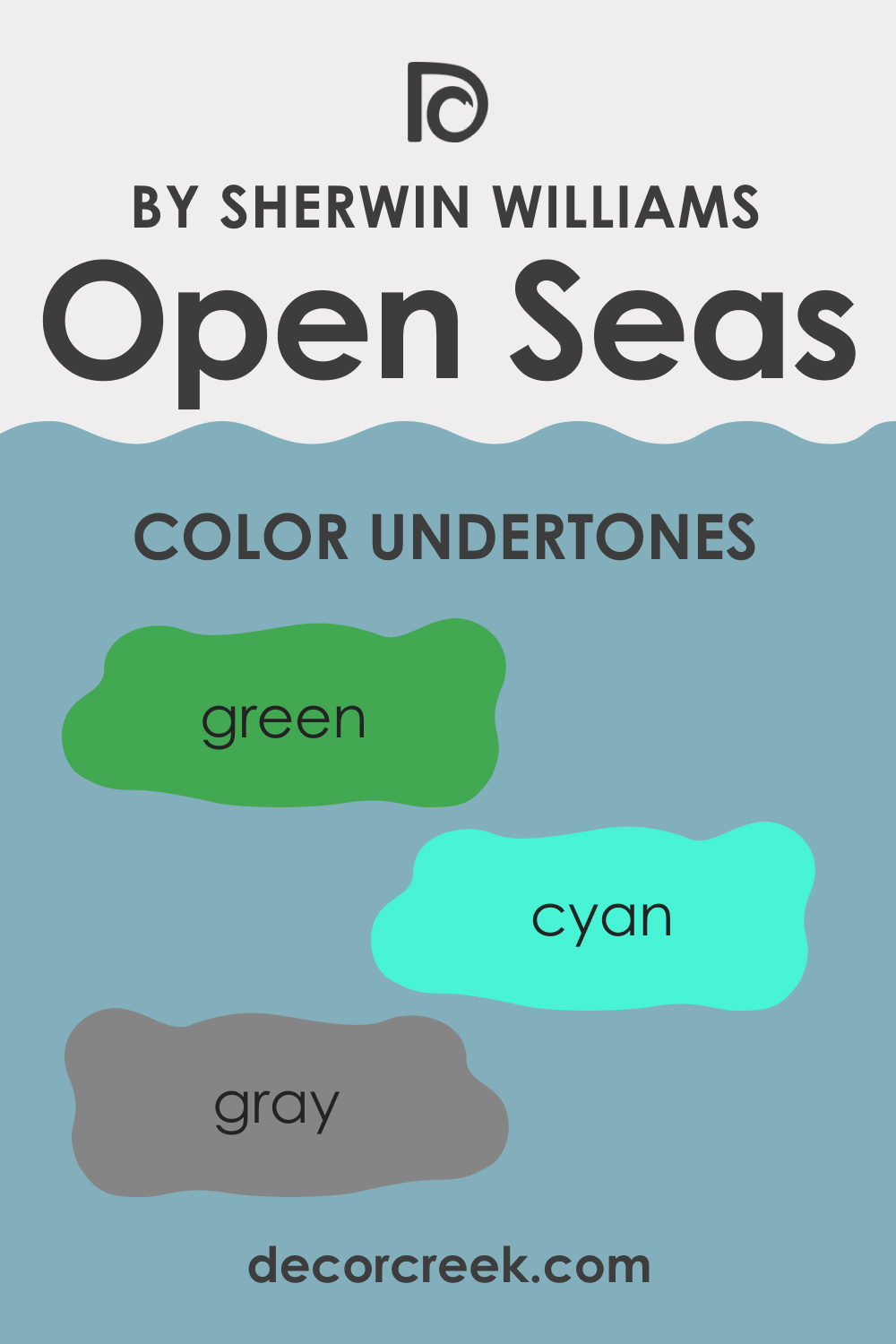
Undertones of SW 6500 Open Seas
Understanding the undertones of color is crucial to creating a balanced and harmonious color scheme. SW Open Seas has three notable undertones:
- Gray: This undertone gives SW Open Seas its sophisticated edge, tempering the vibrancy of the blue and providing a serene, tranquil quality.
- Green: A hint of green adds a natural, organic touch to SW Open Seas, enhancing its connection with the serene beauty of the sea.
- Cyan: A subtle cyan undertone gives SW Open Seas its refreshing and invigorating quality, adding depth and dynamism to the color.
Undertones play a significant role in how we perceive color. They can subtly influence the overall vibe of a color, determining whether it feels warm or cool, muted or vibrant. They can also affect how color interacts with other colors in a room, either harmonizing or contrasting with them.
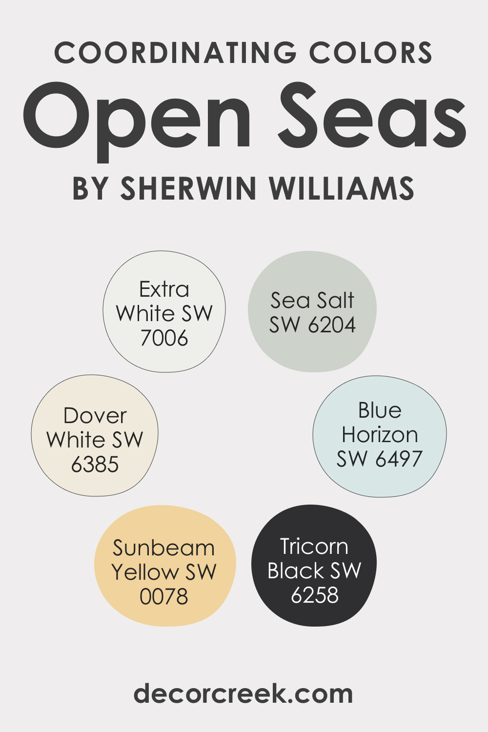
Coordinating Colors of SW 6500 Open Seas
Coordinating colors are those that work well together to create a balanced and visually appealing color scheme. Here are some coordinating colors for SW Open Seas:
- SW 6385 Dover White: A warm, creamy white that offers a crisp and clean contrast to SW Open Seas, highlighting its depth and vibrancy.
- SW 0078 Sunbeam Yellow: A cheerful, sunny yellow that provides a vibrant contrast to SW Open Seas, injecting energy and warmth into the room.
- SW 6497 Blue Horizon: A lighter, softer blue that harmonizes beautifully with SW Open Seas, enhancing its tranquil, serene quality.
In addition to these colors, consider the following complementary hues:
- SW 6204 Sea Salt: This is a muted green with gray undertones that complement the green undertone in SW Open Seas, reinforcing its connection with the sea.
- SW 7006 Extra White: A bright, pure white that offers a stark, crisp contrast to SW Open Seas, making it stand out more prominently.
- SW 6258 Tricorn Black: A deep, intense black that provides a dramatic contrast to SW Open Seas, adding depth and sophistication to the color scheme.
Coordinating colors create harmony and balance in a room. They work together to enhance the beauty of the main color, providing contrast where needed and reinforcing the color’s unique qualities. By choosing coordinating colors carefully, you can create a cohesive, visually appealing color scheme that enhances the overall aesthetic of your space.
How Does Lighting Affect SW 6500 Open Seas?
Lighting plays a significant role in how we perceive color. In natural light, SW Open Seas appears as a vibrant, invigorating blue with a hint of green, reminiscent of a sunny day by the sea. Under artificial light, however, the color can appear darker and more muted, with its gray undertone becoming more prominent.
This chameleon-like quality makes Open Seas a fascinating choice for any space, as it can transform throughout the day and across seasons, offering a dynamic and ever-changing backdrop to your room.
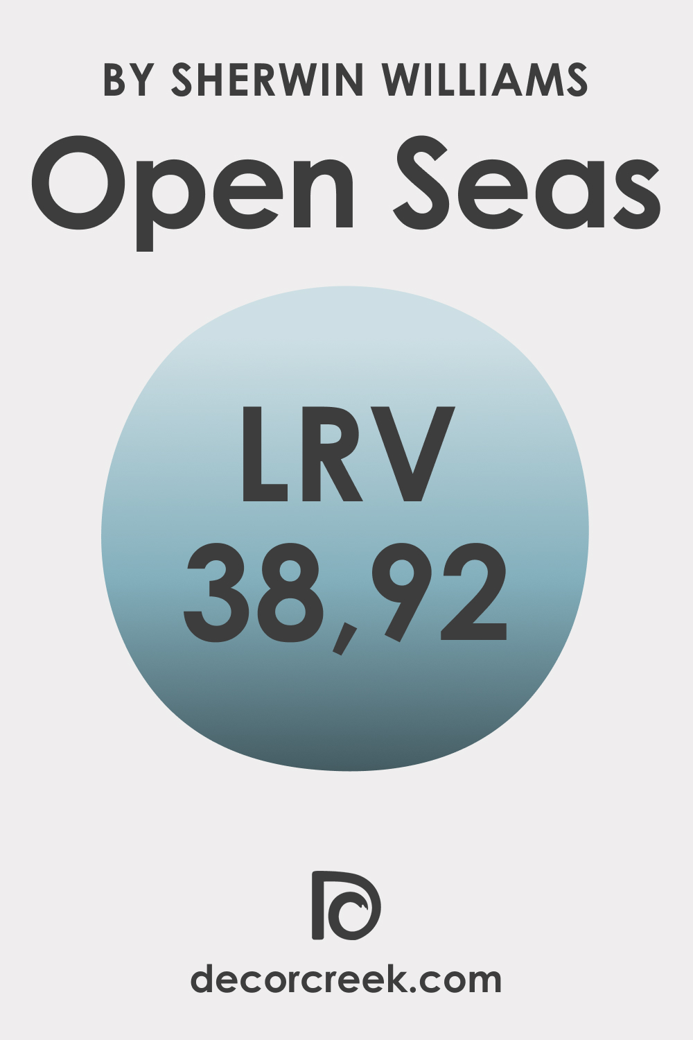
LRV of SW 6500 Open Seas
The Light Reflectance Value (LRV) of color measures the amount of light the color reflects. The LRV of Open Seas is 38.92, placing it in the mid-range of the LRV scale. This means it strikes a balance between reflecting and absorbing light, creating a sense of depth without making a room feel too small or dark.
A color with a moderate LRV, like SW Open Seas, can add character and dimension to a room without overwhelming it. It’s a fantastic choice for spaces where you want to create a tranquil yet engaging atmosphere, such as a bedroom, living room, or home office.
LRV – what does it mean? Read This Before Finding Your Perfect Paint Color
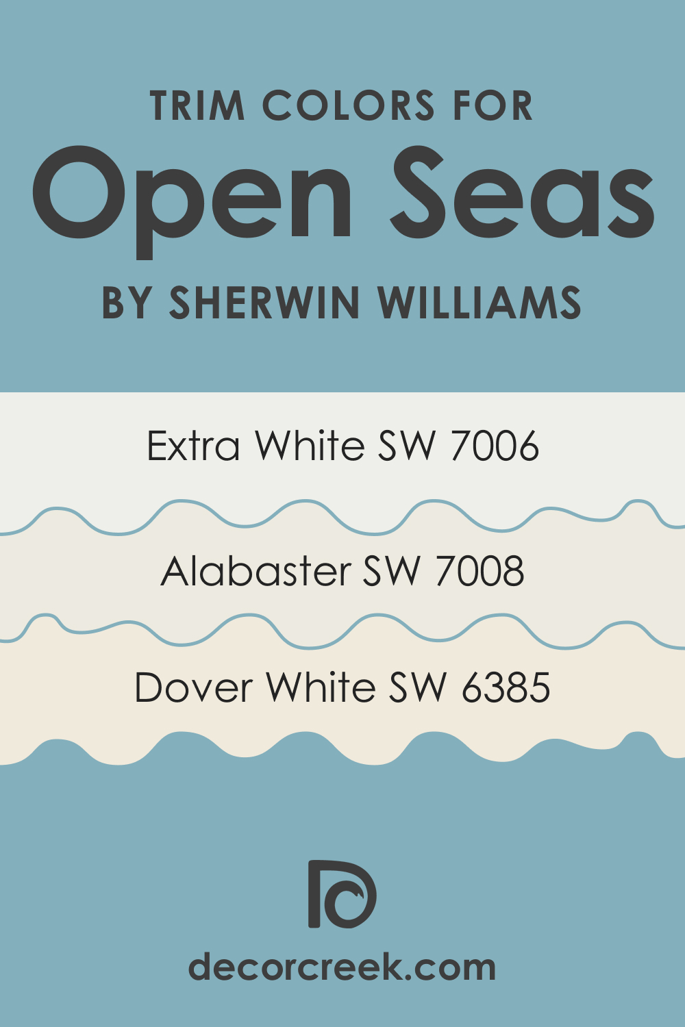
Trim Colors of SW 6500 Open Seas
Choosing the right trim color can make a significant difference in the overall look and feel of a room. For SW Open Seas, consider the following shades of white:
- SW 7006 Extra White: A bright, pure white that provides a crisp, clean contrast to SW Open Seas, making it pop.
- SW 6385 Dover White: A warm, creamy white that softens the intensity of SW Open Seas, creating a cozy, inviting vibe.
- SW 7008 Alabaster: A subtle, off-white with a touch of gray that harmonizes with the gray undertone of SW Open Seas, enhancing its sophisticated quality.
Trim colors play a critical role in defining and enhancing the architectural features of a room. They provide contrast, highlighting the lines and shapes that give a space its structure. By choosing the right trim color, you can enhance the beauty of SW Open Seas and create a polished, well-coordinated look.
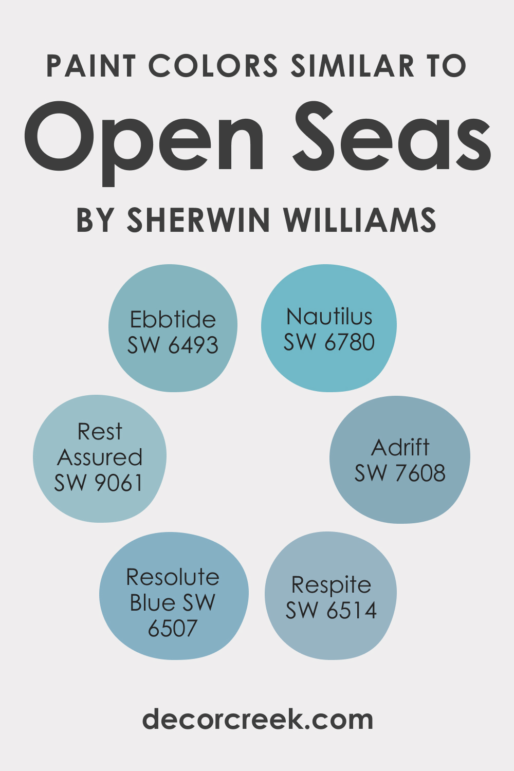
Colors Similar to SW 6500 Open Seas
While SW Open Seas is unique, there are other colors in the Sherwin-Williams palette that bear a close resemblance:
- SW 6493 Ebbtide: A similar mid-tone blue with a gray undertone that offers a slightly more muted take on the vibrancy of Open Seas.
- SW 6507 Resolute Blue: A deeper, more intense blue that carries the same tranquil, sophisticated vibe as Open Seas but with a more dramatic edge.
- SW 6780 Nautilus: A lighter, softer blue that shares Open Seas’ connection with the sea but with a more airy, uplifting feel.
- SW 9061 Rest Assured: A muted blue-green that echoes the natural, organic undertones of Open Seas but with a more subdued, calming quality.
- SW 7608 Adrift: A grayish-blue that takes the tranquility of Open Seas and adds a touch of mystery and intrigue.
- SW 6514 Respite: A bright, refreshing blue that captures the invigorating quality of Open Seas but with a more playful, lively vibe.
These similar colors provide alternative options if you love the feel of Open Seas but want to explore different levels of intensity, brightness, or mood.
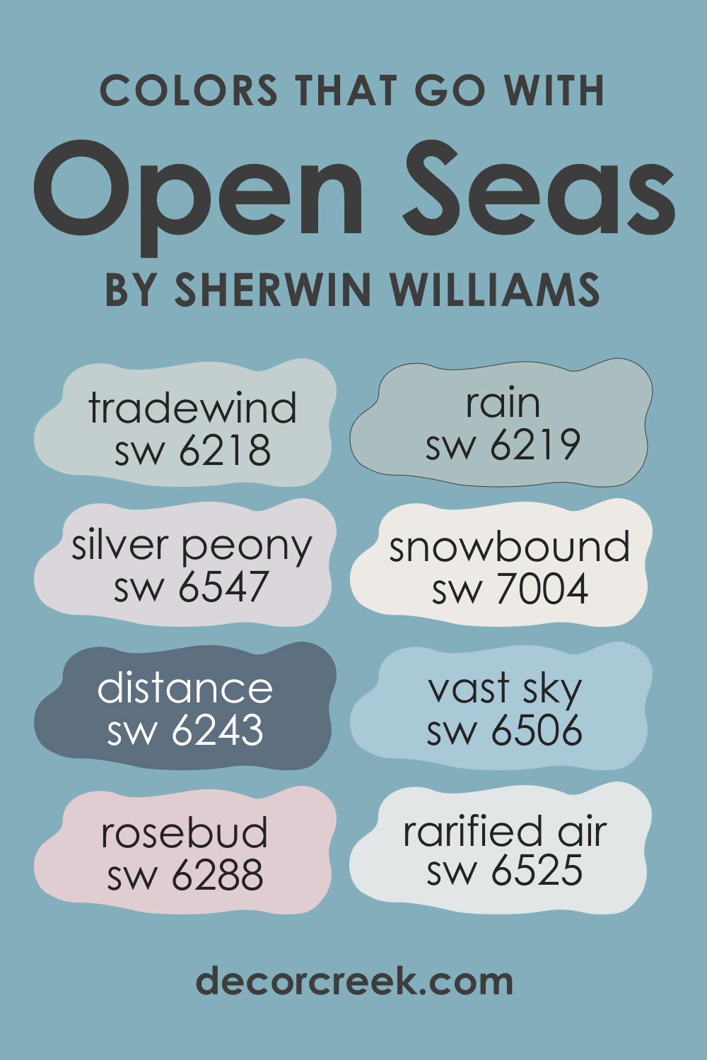
Colors That Go With SW 6500 Open Seas
Coordinating a color palette is crucial to creating a harmonious and balanced room. Consider the following colors that pair well with SW Open Seas:
- SW 6547 Silver Peony
- SW 6506 Vast Sky
- SW 7004 Snowbound
- SW 6288 Rosebud
- SW 6243 Distance
- SW 6218 Tradewind
- SW 6219 Rain
- SW 6525 Rarified Air
Choosing colors that look good together ensures a visually pleasing room. They create harmony and balance, helping to enhance the primary color’s best features. This is why pairing SW Open Seas with colors that accentuate its tranquility and depth can help you create a stunning, cohesive design.
How to Use SW 6500 Open Seas In Your Home?
SW Open Seas is a versatile color that can be used in various rooms and suits multiple interior design styles. Its tranquil vibe makes it a fantastic choice for bedrooms and bathrooms, while its depth and sophistication can add character to living rooms and kitchens.
It works well in coastal and nautical themes, given its sea-inspired hue. Yet, it’s equally at home in contemporary and minimalist designs, where its sophistication and simplicity can shine. Below, you can read how this vivid hue may work in different rooms.
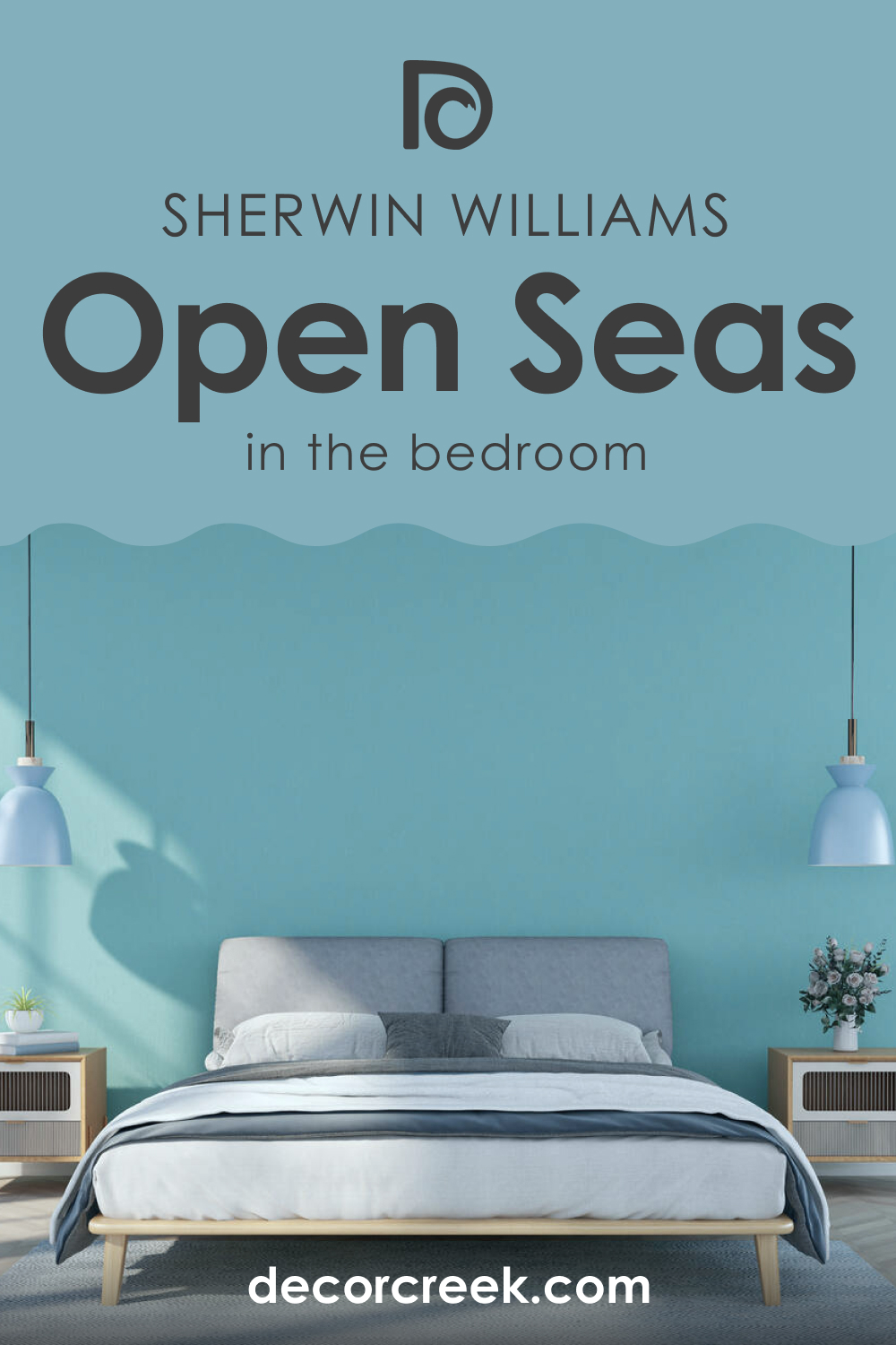
How to Use SW 6500 Open Seas in the Bedroom?
In the bedroom, SW Open Seas can create a peaceful, soothing atmosphere conducive to relaxation and sleep. Apply it on all walls for a cocooning effect, or use it on a feature wall to add depth and interest without overwhelming the space. Pair it with light, neutral furniture and accents to maintain a sense of airiness, or opt for darker pieces for a more dramatic, moody vibe.
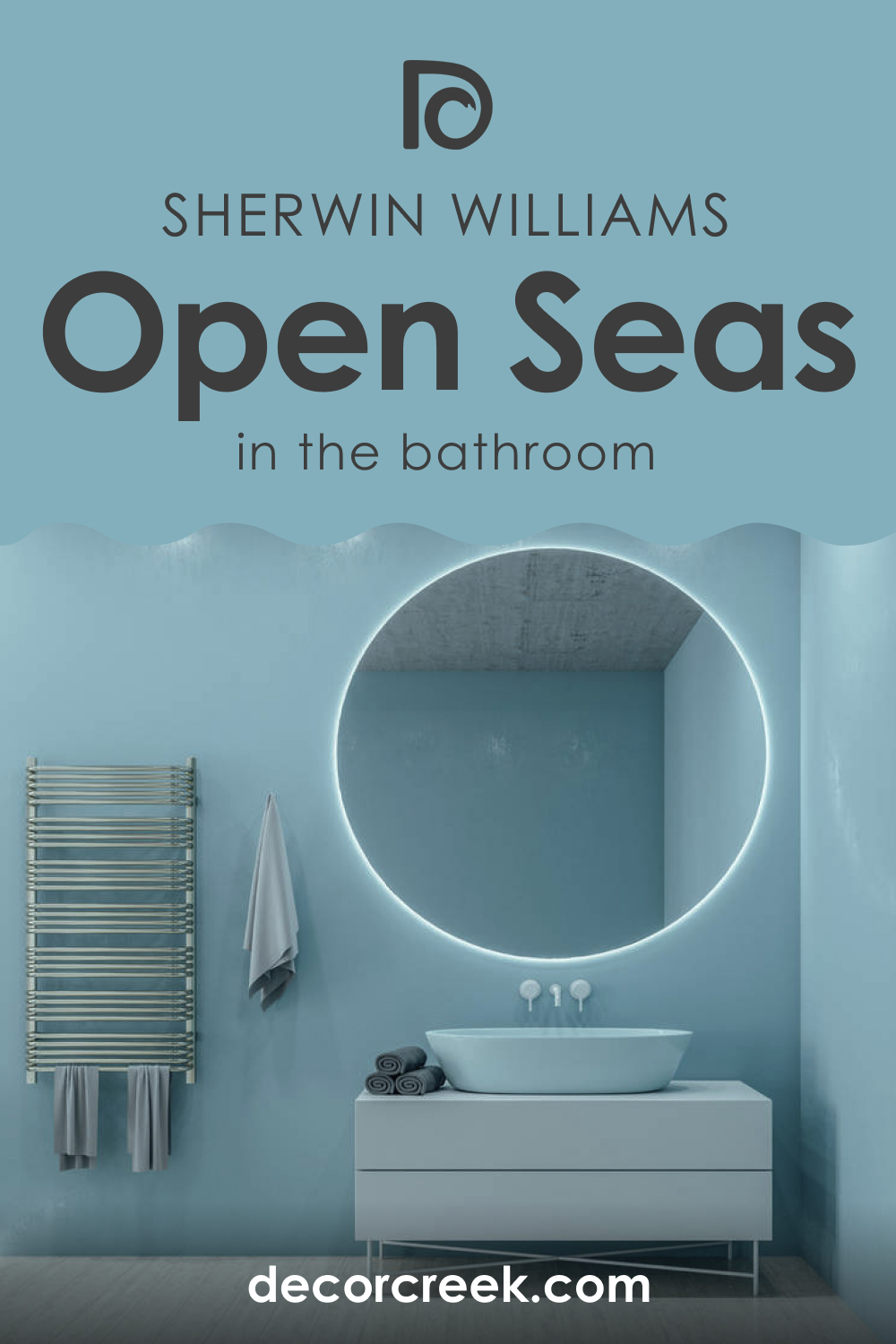
How to Use SW 6500 Open Seas in the Bathroom?
In the bathroom, SW Open Seas can emulate the serene beauty of a spa. The color’s connection to water makes it a natural fit for this space. Pair it with crisp whites or soft neutrals for a fresh, clean look, or go bold with contrasting colors like Sunbeam Yellow or Tricorn Black for a more dynamic, engaging design.
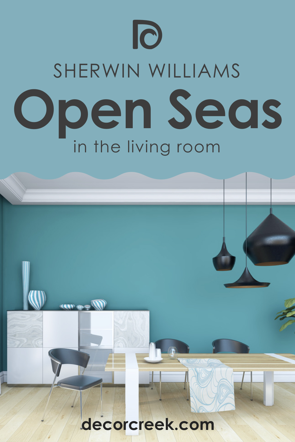
How to Use SW 6500 Open Seas in the Living Room?
In the living room, SW Open Seas can add character and depth, making the space feel more inviting and cozy. Use it on all walls for a bold statement, or apply it to a feature wall or alcove for a subtle touch of color. Pair it with a mix of light and dark furnishings to create a balanced, harmonious look.
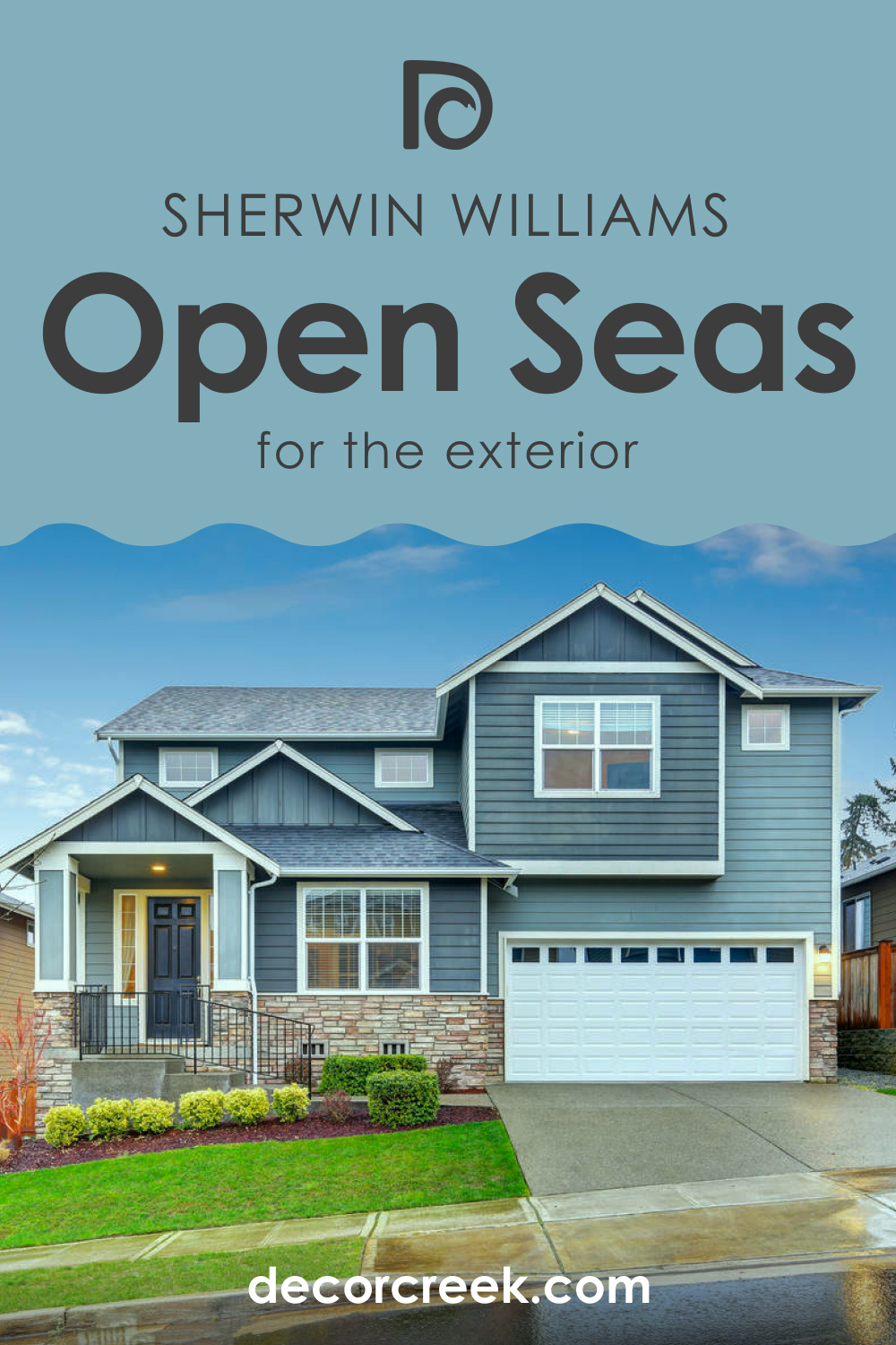
How to Use SW 6500 Open Seas for an Exterior?
On exteriors, SW Open Seas can give your home a charming, coastal vibe. This color stands out beautifully against white or cream trim, creating a crisp, clean contrast. Pair it with a bold door color like Sunbeam Yellow for a cheerful, welcoming look.
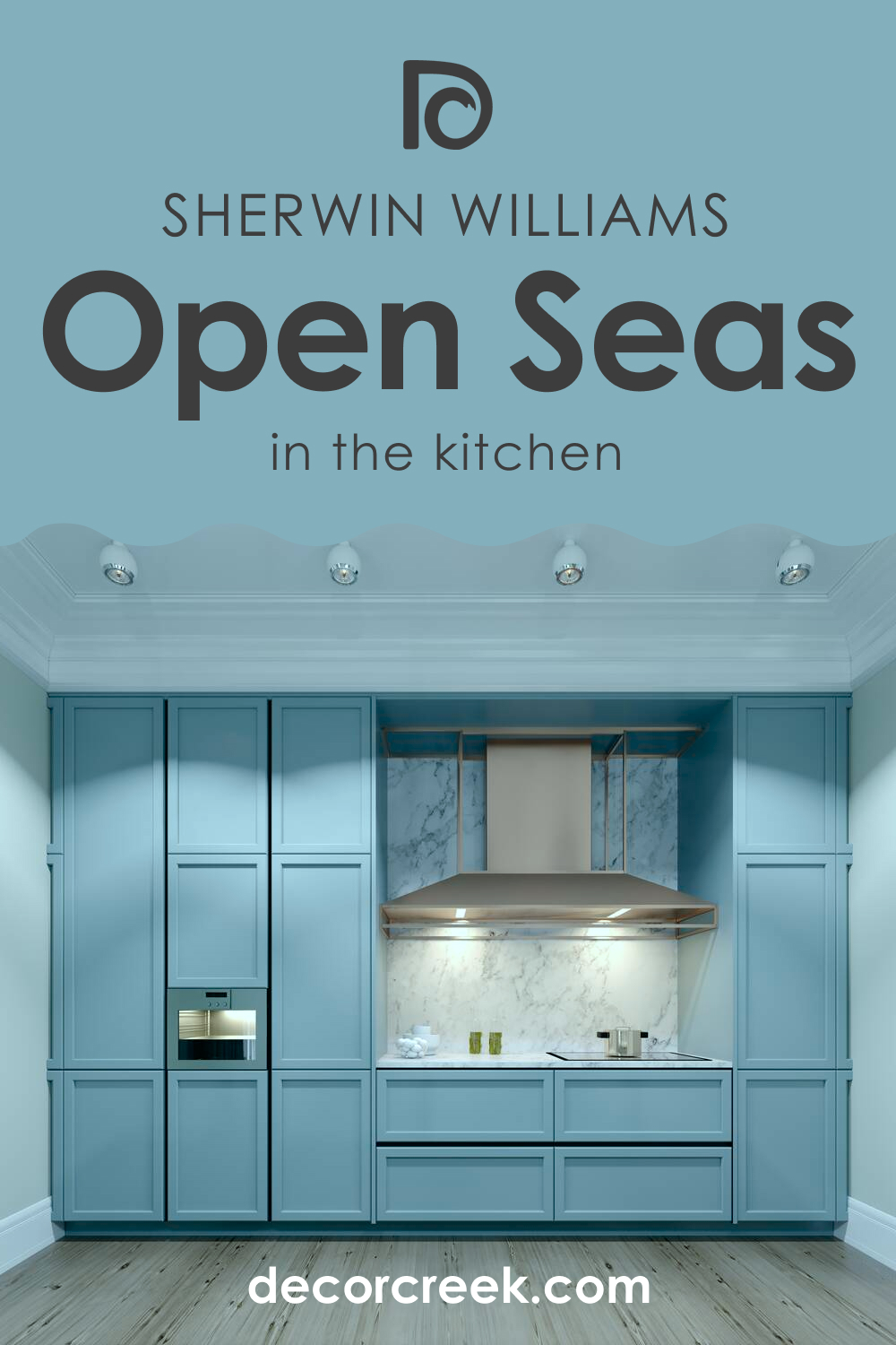
How to Use SW 6500 Open Seas for the Kitchen?
In the kitchen, SW Open Seas can add a fresh, invigorating touch. Consider using it on the walls to create a colorful backdrop for your cabinetry, or apply it to an island or lower cabinets for a bold, modern look. Pair it with white or light wood cabinets for a fresh, airy feel, or opt for dark wood or black cabinets for a more dramatic, sophisticated vibe.
Comparing SW 6500 Open Seas With Other Colors
When compared to other colors, the unique qualities of SW Open Seas shine through. Below, we compare SW Open Seas with several colors that can help you see the uniqueness of this blue hue better.
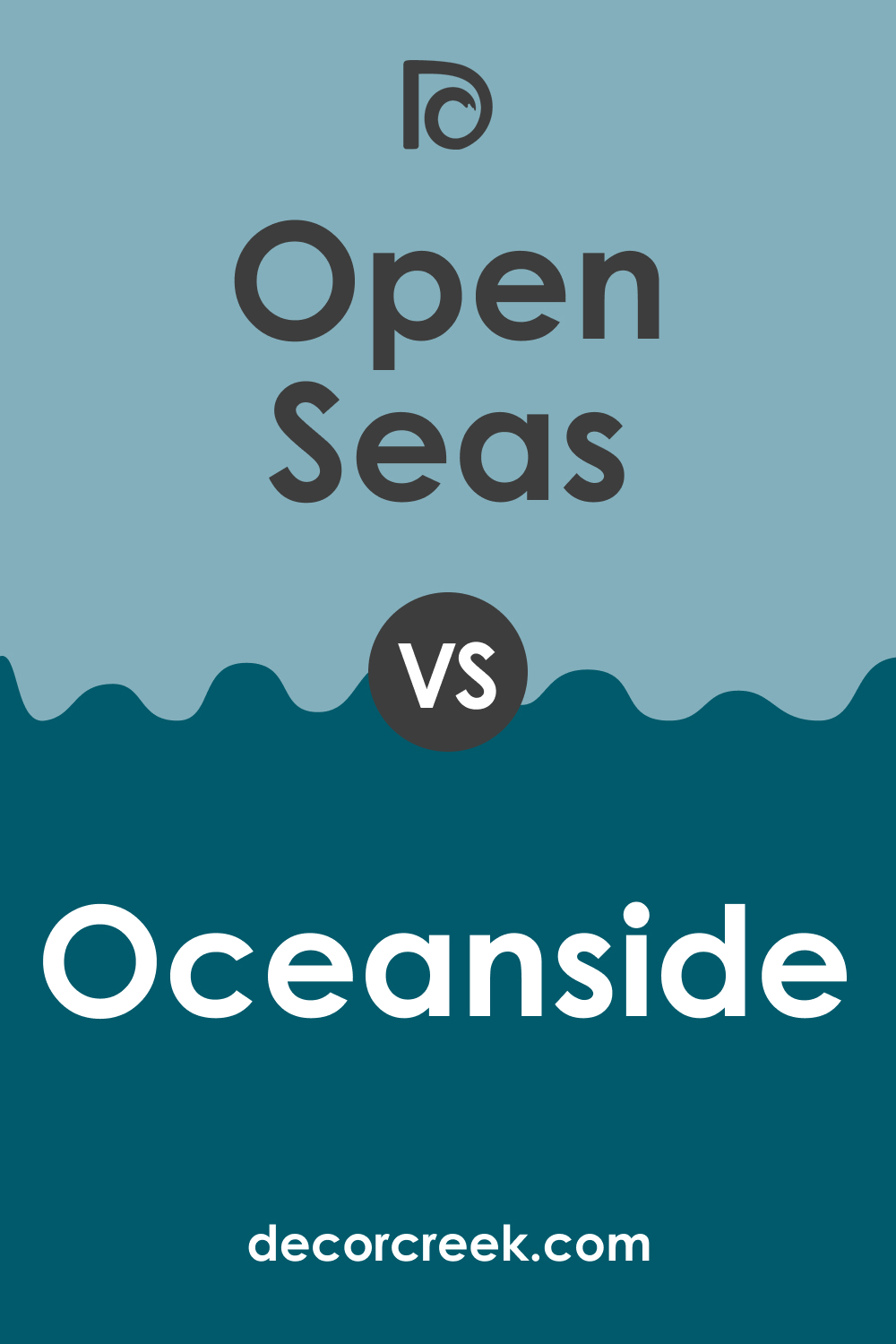
SW 6500 Open Seas vs SW 6496 Oceanside
While both SW 6500 Open Seas and SW 6496 Oceanside carry a strong association with the sea, they each invoke distinct moods. Open Seas is a mid-toned teal blue that brings a sense of calming and refreshing tranquility, similar to a breezy day at the beach.
On the other hand, Oceanside is a deep, rich blue with a hint of green that provides an air of mystery and depth, much like the deep, unexplored parts of the ocean. It’s significantly darker and more intense than Open Seas, making it a striking choice for spaces where a bold impact is desired.
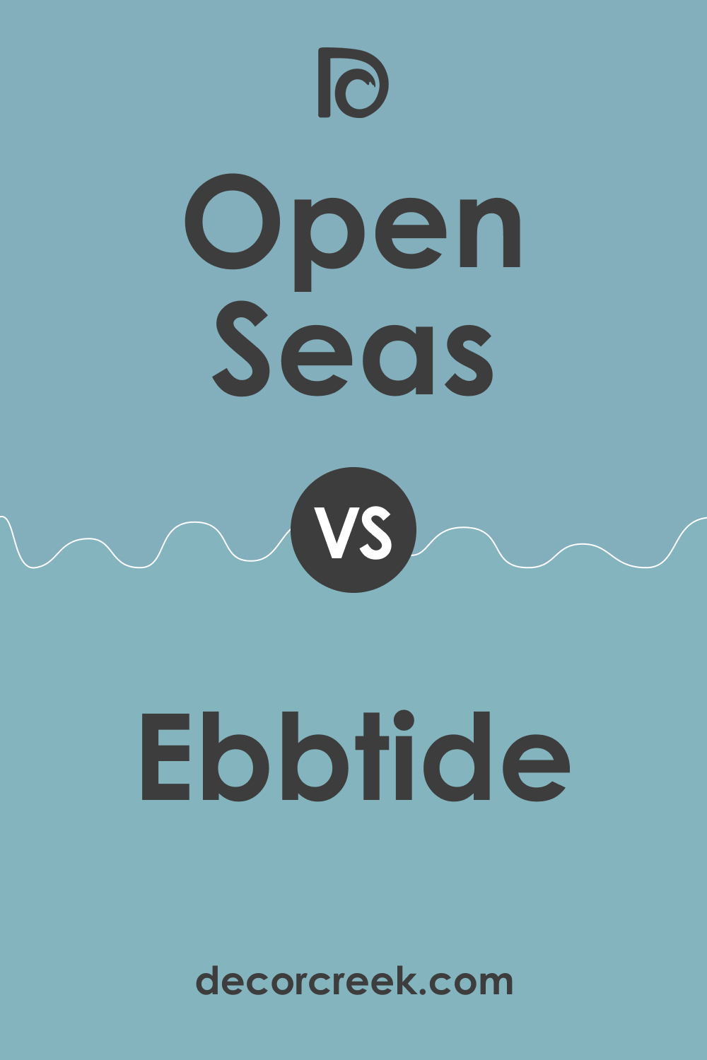
SW 6500 Open Seas vs SW 6493 Ebbtide
SW 6493 Ebbtide and SW 6500 Open Seas share a similar blue-gray foundation, making them comparable, but they manifest their own unique characteristics. Ebbtide is a more muted, subdued shade of blue, almost leaning towards gray, offering a soothing and neutral ambiance.
On the contrary, Open Seas retains more of its vibrant blue undertones, making it a more lively and invigorating color, perfect for spaces where you want a hint of energy.
SW 6500 Open Seas vs SW 6507 Resolute Blue
Comparing SW 6500 Open Seas to SW 6507 Resolute Blue reveals a study in depth and intensity. Resolute Blue is a darker, more saturated color than Open Seas. It carries a boldness that can make a statement in any room.
In contrast, Open Seas, while still having depth, is more restrained, offering a balance that makes it more versatile for various applications, from walls to accent pieces.

SW 6500 Open Seas vs SW 6780 Nautilus
SW 6500 Open Seas and SW 6780 Nautilus both draw their inspiration from the sea but present it in different ways. Nautilus is a lighter, softer blue that exudes an airy, uplifting feel. It can add a refreshing touch to spaces and is ideal for rooms with plenty of natural light.
Conversely, Open Seas carries more green undertones, presenting a richer, deeper hue that can add character and sophistication to a space.
SW 6500 Open Seas vs SW 6486 Reflecting Pool
SW 6500 Open Seas and SW 6486 Reflecting Pool share a beautiful blue-green blend, but they lean in different directions on the color spectrum. Reflecting Pool leans more towards green, offering a vibrant and fresh feel reminiscent of a lush, tropical oasis. Open Seas, while holding a hint of green, leans more towards blue, creating a calming and relaxing atmosphere that mirrors the serene waters of a quiet seaside getaway.
SW 6500 Open Seas vs SW 6213 Halcyon Green
Lastly, when comparing SW 6500 Open Seas with SW 6213 Halcyon Green, the divergence of blue and green undertones is noticeable. Halcyon Green is predominantly a green hue with a soft, restful presence. It evokes feelings of peacefulness and serenity, making it an excellent choice for spaces where relaxation is key.
On the flip side, Open Seas, with its balance of blue and green, offers a bit more energy and stimulation, akin to the ebb and flow of ocean tides.
Conclusion
In conclusion, SW 6500 Open Seas is a truly versatile color that bridges the gap between blue and green. Its soothing, mid-toned hue embodies the tranquility of a day by the sea, making it an ideal choice for creating calming and refreshing spaces. Whether used in a bedroom, bathroom, living room, or even kitchen, SW Open Seas adds a touch of nature-inspired beauty that can harmonize effortlessly with a range of coordinating colors.
This color’s unique depth and sophistication make it adaptable to various lighting conditions and complementary to numerous other shades, from muted grays to vibrant yellows. Its comparatively higher LRV ensures it brings a sense of brightness and openness, even in smaller or less-lit rooms.
SW Open Seas stands its own ground when compared with similar shades, offering a balance of vibrancy and tranquility that sets it apart. Whether you desire a serene retreat or a space filled with energy and character, SW 6500 Open Seas provides a stunning backdrop to shape your interiors according to your vision.
Its ability to adapt to varying styles and moods is what makes it a color truly inspired by the dynamic and ever-changing beauty of the open sea.
Ever wished paint sampling was as easy as sticking a sticker? Guess what? Now it is! Discover Samplize's unique Peel & Stick samples.
Get paint samples
Frequently Asked Questions
⭐What kind of mood does SW 6500 Open Seas create in a room?
Open Seas is a mid-toned teal blue that creates a calming and refreshing atmosphere. It's ideal for creating a tranquil space that's reminiscent of a day spent by the seaside.
⭐What colors coordinate well with SW 6500 Open Seas?
Colors like SW 6385 Dover White, SW 0078 Sunbeam Yellow, and SW 6497 Blue Horizon coordinate well with Open Seas. You can also consider other shades like SW 7011 Natural Choice, SW 7541 Grecian Ivory, and SW 7008 Alabaster for a harmonious palette.
⭐Can I use SW 6500 Open Seas in a small room?
Yes, SW 6500 Open Seas can be used in small rooms. With a relatively higher LRV of 38.92, it can help to brighten up a space and make it appear larger.
⭐How does lighting affect the appearance of SW 6500 Open Seas?
The appearance of Open Seas can change under different lighting conditions. Under natural light, it tends to show more of its vibrant blue-green hue, while artificial light can bring out its deeper, more serene undertones.
⭐What are some suitable trim colors for SW 6500 Open Seas?
Lighter, neutral shades of white like SW 7005 Pure White, SW 7004 Snowbound, or SW 7008 Alabaster can make excellent trim colors to complement Open Seas, providing a clean, crisp contrast.


