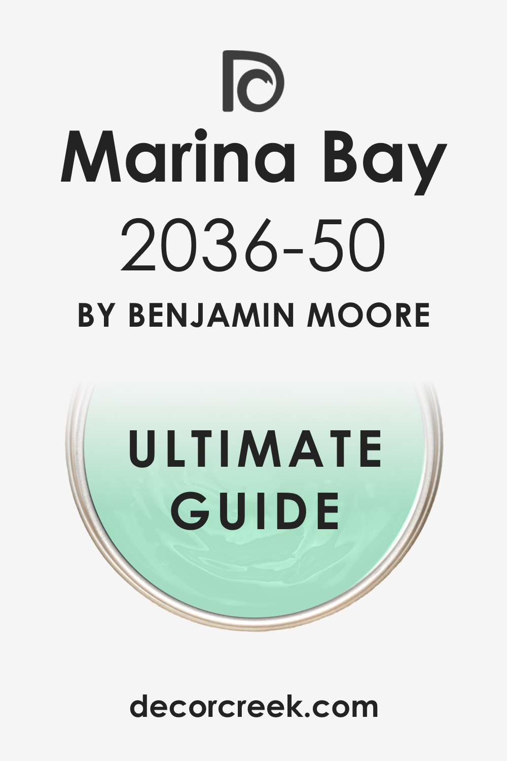
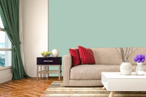
In the realm of interior design, the choice of color plays a pivotal role in defining the space’s ambiance and aesthetic appeal. Among the myriad of hues that paint our interiors, Marina Bay 2036-50 stands out as a color that combines tranquility with a depth that promises to transform any living space.
In this article, we will delve into the intricacies of this distinctive shade, from its underlying tones to its adaptability in various lighting conditions, its coordinating colors, and its impact when used on walls or as a trim.
What Color Is Marina Bay 2036-50?
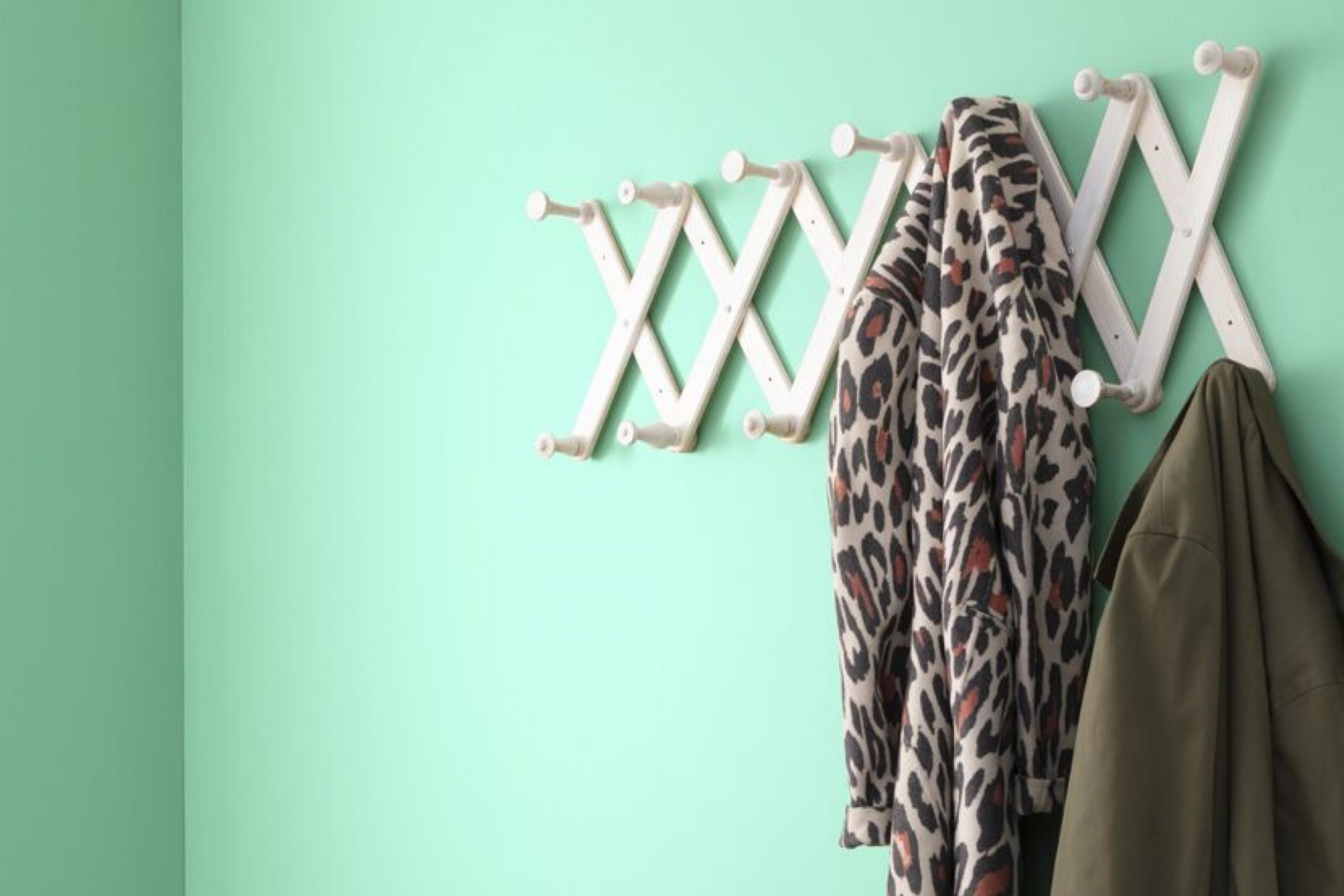
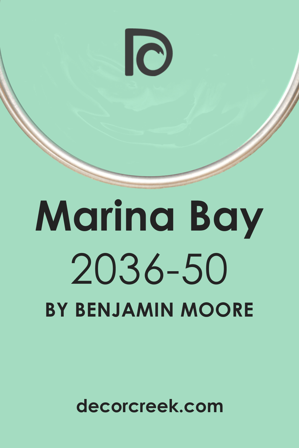
Marina Bay 2036-50 is a color that captures the essence of the horizon where the sky meets the sea; it’s a muted aquamarine that speaks of calm and restfulness. The specific hue has a mid-range light reflectance value (LRV) which makes it versatile for various interior styles, particularly those that seek to create an atmosphere of serenity and open space.
This color works exceptionally well in coastal and Scandinavian interiors, bringing in the relaxed vibe of the seashore and the clean, minimalistic approach of Nordic design.
It pairs exquisitely with natural materials such as light woods, linens, and woven textures, which accentuate its organic roots. Metals like brushed nickel or soft brass can add a touch of elegance without overpowering its gentle nature.
Marina Bay 2036-50 also works with smooth surfaces like glass or polished stone, contributing to a contemporary aesthetic while maintaining a touch of warmth.
Ever wished paint sampling was as easy as sticking a sticker? Guess what? Now it is! Discover Samplize's unique Peel & Stick samples.
Get paint samples
Is It a Warm Or Cool Color?
Marina Bay 2036-50 straddles the line between warm and cool, leaning towards the cooler end of the spectrum. This attribute enables it to evoke a soothing and refreshing environment, reminiscent of a gentle sea breeze. Its coolness doesn’t chill; instead, it brings an airy lightness to a room, making it ideal for spaces intended for relaxation and contemplation.
The cool nature of Marina Bay 2036-50 is pivotal in the way it transforms a home. It introduces a breath of fresh air into interiors that need a touch of calm without the starkness that some cool colors can convey. It is the perfect backdrop for rooms that seek to combine tranquility with a hint of coastal charm, making spaces feel more expansive and inviting.
Undertones of Marina Bay 2036-50
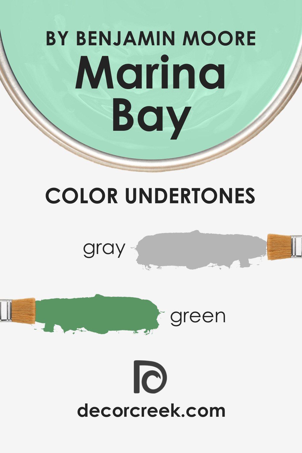
The undertones of a color are subtle hues that influence its overall appearance and how it behaves under different lighting conditions. Marina Bay 2036-50 has a softly layered complexity with undertones that whisper of gray and a whisper of green, which ground the color, preventing it from floating away into pastel territory.
These undertones give it a chameleon-like quality, allowing it to adapt subtly to its surroundings and the changing light.
In interior walls, the undertones of Marina Bay 2036-50 have a profound effect. They can bring forward elements of furniture and decor, providing a harmonious backdrop that allows other colors to shine without competing for attention. On the other hand, in a minimalist space, these undertones can themselves become the focal point, adding depth and interest to the simplicity of the room.
Coordinating Colors of Marina Bay 2036-50
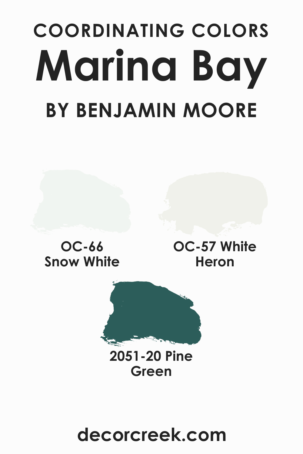
Coordinating colors are hues that complement each other, creating a cohesive and balanced look when used together. Marina Bay 2036-50 pairs beautifully with various colors, including OC-66 Snow White , a pristine and timeless shade that provides a crisp contrast. OC-57 White Heron (CHECK A SAMPLE) is a soft, almost ethereal white with a slight warmth that harmonizes with Marina Bay’s coolness. BM 2051-20 Pine Green (CHECK A SAMPLE) is a deep, rich color that echoes the natural elements, adding a grounding effect to the airiness of Marina Bay 2036-50.
To enhance this palette further, consider adding colors such as a soft lavender that reflects the hue’s tranquility, a light sky blue that complements its airy quality, or a gentle gray that ties in with its undertones, ensuring a harmonious and soothing environment.
How Does Lighting Affect Marina Bay 2036-50?
Lighting profoundly influences how we perceive color, and this interplay is pivotal when considering a hue like Marina Bay 2036-50 for interior spaces. Under artificial light, particularly warm incandescent bulbs, Marina Bay 2036-50 can appear more muted and warm, bringing out its subtle undertones and creating a cozy and inviting atmosphere.
The soft luminescence of LED lights, on the other hand, can maintain the color’s integrity, showcasing its true vibrancy without significant distortion. In natural light, this color flourishes, transforming with the day; the gentle morning light will highlight its brightness, the midday sun will emphasize its depth, and the dusky evening will soften its intensity.
In terms of room orientation, lighting plays a dramatic role. North-facing rooms may render Marina Bay 2036-50 slightly more subdued and cooler, given the cooler, indirect natural light typically found there. South-facing rooms, awash with warm, direct sunlight for most of the day, will make the color appear brighter and more vivid.
In east-facing rooms, the morning light can reveal a crisp and lively aspect of Marina Bay 2036-50, while in west-facing rooms, the color could be bathed in a warm, golden glow in the afternoon, creating a soothing ambiance.

LRV of Marina Bay 2036-50
Light Reflectance Value (LRV) measures the percentage of light a paint color reflects. Ranging from 0 (absolute black, absorbing all light) to 100 (pure white, reflecting all light), LRV is a crucial factor in choosing paint colors for a space.
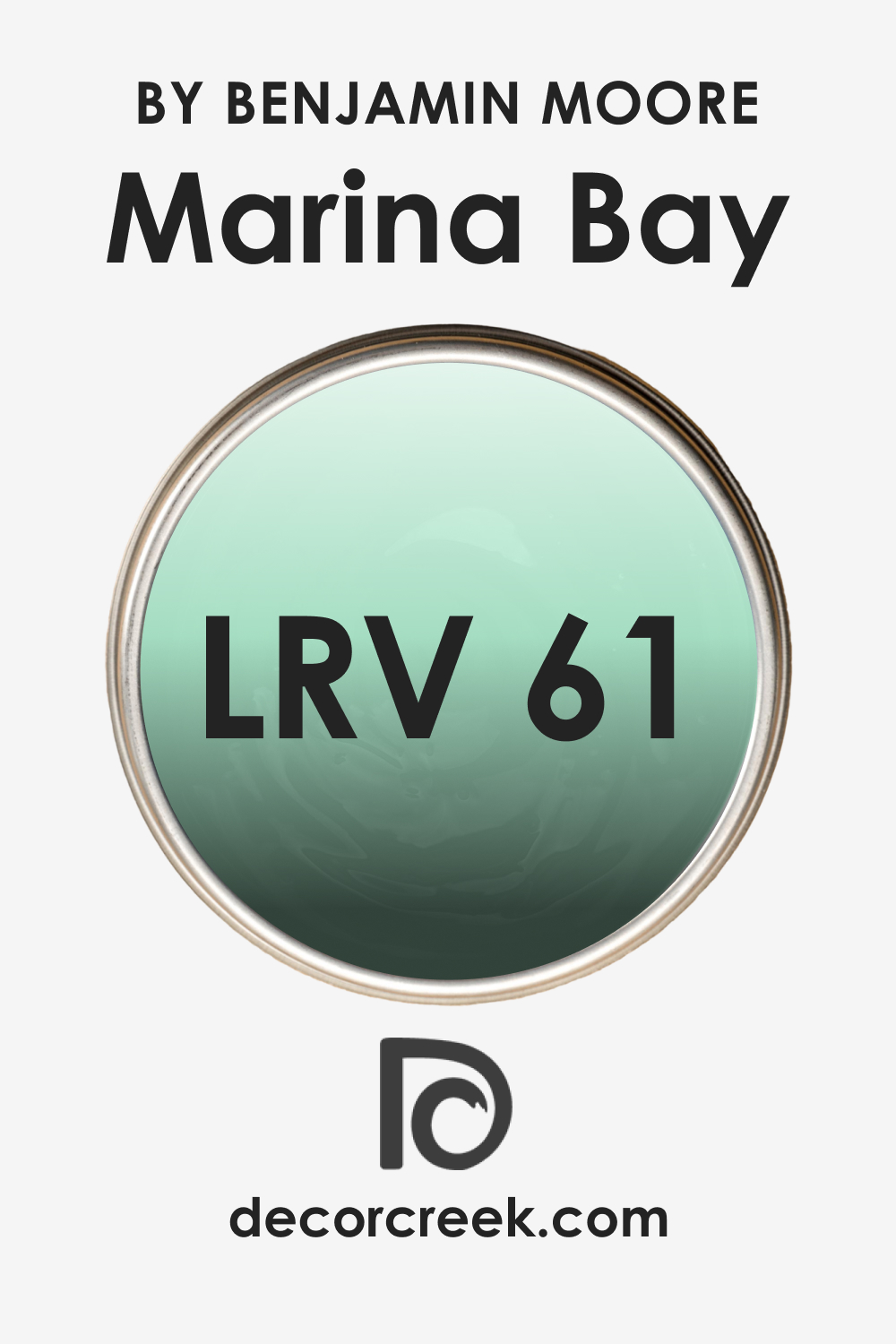
Marina Bay 2036-50, with an LRV of 61, falls into the lighter spectrum, suggesting it has good reflectance properties. This means it’s capable of making a room feel more spacious and open by bouncing a significant amount of light around the space.
The LRV of 61 for Marina Bay 2036-50 ensures that it maintains a balance of depth and lightness, making it versatile for use in various lighting scenarios and spaces. It can enhance natural light in a room without feeling stark or overly reflective.
This particular LRV allows it to be a color that can assert its presence without overwhelming a space, proving to be an excellent choice for those wanting to strike a balance between a welcoming warmth and a refreshing lightness.
LRV – what does it mean? Read This Before Finding Your Perfect Paint Color
Trim Colors of Marina Bay 2036-50
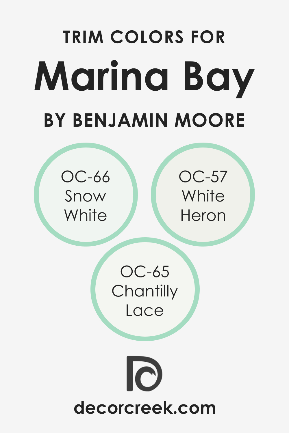
Trim colors are the accents to your wall’s main color; they frame the space, define lines, and create a finished look. For Marina Bay 2036-50, trim colors should complement its unique tone without overshadowing it. Shades of white are often chosen for trims for their crisp contrast and ability to adapt to various hues.
Colors such as OC-66 Snow White , a pure and undisturbed white, can bring out the depth of Marina Bay 2036-50. OC-57 White Heron (CHECK A SAMPLE), with its slight warmth, can seamlessly blend with the color, softening the transition between wall and trim. A more nuanced white, such as OC-65 Chantilly Lace , can offer a sophisticated edge without competing for attention.
These trim colors ensure that Marina Bay 2036-50 remains the focal point while the trims act as a supporting element, enhancing the room’s architecture and adding to the overall aesthetic cohesion.
Colors Similar to Marina Bay 2036-50
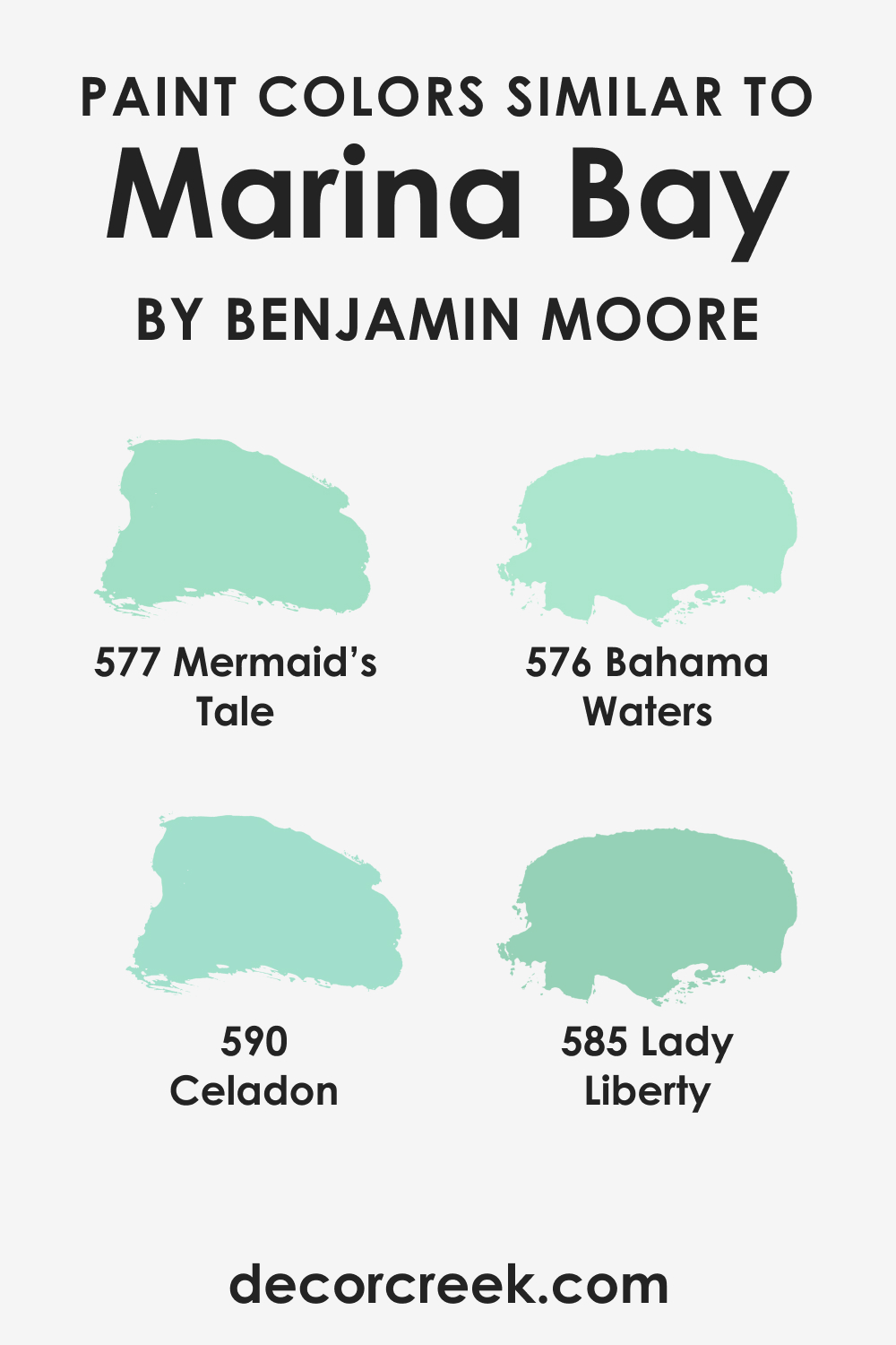
Understanding similar colors is essential for ensuring continuity throughout a home and providing alternatives should the primary color not be suitable in some spaces due to lighting or other design elements. BM 577 Mermaid’s Tale (CHECK A SAMPLE) is a cousin to Marina Bay 2036-50, sharing its aquatic inspiration but leaning into a deeper, more mysterious persona.
BM 576 Bahama Waters (CHECK A SAMPLE) offers a slightly more tropical vibe, reminiscent of clear skies over a Caribbean sea. BM 590 Celadon (CHECK A SAMPLE) is another relative, with a pottery-inspired hue that hints at an artisanal, earthy background. Lastly, BM 585 Lady Liberty (CHECK A SAMPLE), though sharing the same blue-green family, introduces a hint of softness and historic reverence, capturing the patina of aged copper.
Each color, while maintaining a kinship with Marina Bay 2036-50, has its own identity and can serve as an alternative to carry the color scheme through different rooms and lighting conditions.
Colors That Go With Marina Bay 2036-50
The importance of a harmonious color palette in a room cannot be overstated. It creates visual cohesion and sets the tone of the room. A well-considered palette can enhance the features of a room, dictate its mood, and affect its perceived size and temperature.
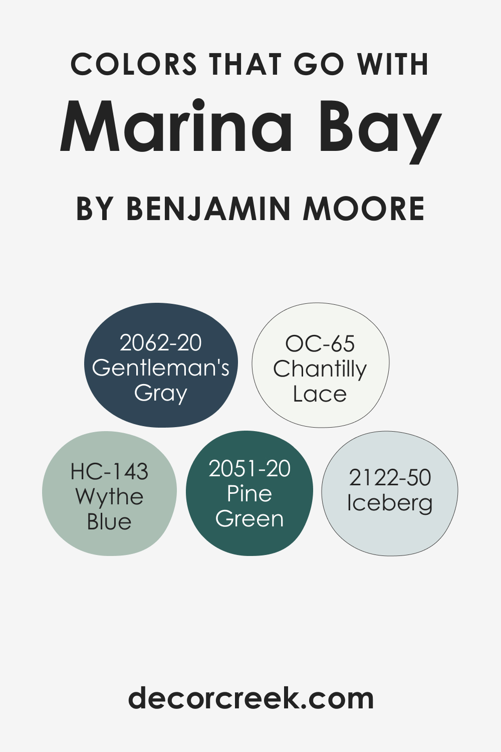
For Marina Bay 2036-50, Benjamin Moore offers a spectrum of colors that can create a complementary dialogue. Consider the following:
- OC-65 Chantilly Lace : A clean, crisp white that provides a sharp contrast and brightens the room.
- BM 2051-20 Pine Green (CHECK A SAMPLE): A deep, rich green that adds a luxurious depth when paired with Marina Bay 2036-50.
- HC-143 Wythe Blue (CHECK A SAMPLE): A historic color that brings a soft, traditional feel to the palette.
- BM 2122-50 Iceberg (CHECK A SAMPLE): A light, airy blue that echoes the coolness of Marina Bay and adds a breezy feel.
- BM 2062-20 Gentleman’s Gray (CHECK A SAMPLE): A bold, sophisticated navy that can ground the airy Marina Bay 2036-50 and add a touch of drama.
These colors, while varied, all share a connection with Marina Bay 2036-50, ensuring a design that feels intentional and well-curated.
How to Use Marina Bay 2036-50 In Your Home?
Marina Bay 2036-50 is a versatile color that can breathe life into various rooms. It shines in spaces like living rooms, bedrooms, and bathrooms, creating a serene backdrop or a vibrant focal point. In terms of style, it complements coastal aesthetics with its water-inspired tones, and it can anchor a Scandinavian look with its clean vibrancy.
Modern and contemporary spaces benefit from its crispness, while in traditional settings, it adds a fresh twist. For a maximalist space, it serves as a dynamic base for pattern and color play. Whether applied as an accent wall or a room enveloping color, Marina Bay 2036-50 adapts fluidly, making it a designer favorite.
How to Use Marina Bay 2036-50 in the Bedroom?
In the bedroom, Marina Bay 2036-50 invites tranquility and rest. Its soothing nature works well with soft linens and natural textures, creating a restful sanctuary. It pairs beautifully with warm woods and brushed metals, adding a modern edge without disturbing the peaceful ambiance. For a more romantic or eclectic look, mix it with bold patterns and a variety of textures.
Use it on all walls for a cocooning effect or on an accent wall to frame the headboard area. Complement with lighter trims and soft lighting to ensure a space where relaxation is inevitable.

How to Use Marina Bay 2036-50 in the Bathroom?
Marina Bay 2036-50 in the bathroom can turn the space into a spa-like retreat. It mirrors the refreshing qualities of water, making it ideal for walls in a bathroom with ample natural light. Pair with white fixtures and cabinetry to create a crisp, clean look, or introduce natural elements like wood or bamboo for warmth.
Chrome or brushed nickel finishes on taps and accessories add a modern, sleek touch. For an en-suite, consider continuity from the bedroom to the bathroom for a seamless transition.

How to Use Marina Bay 2036-50 in the Living Room?
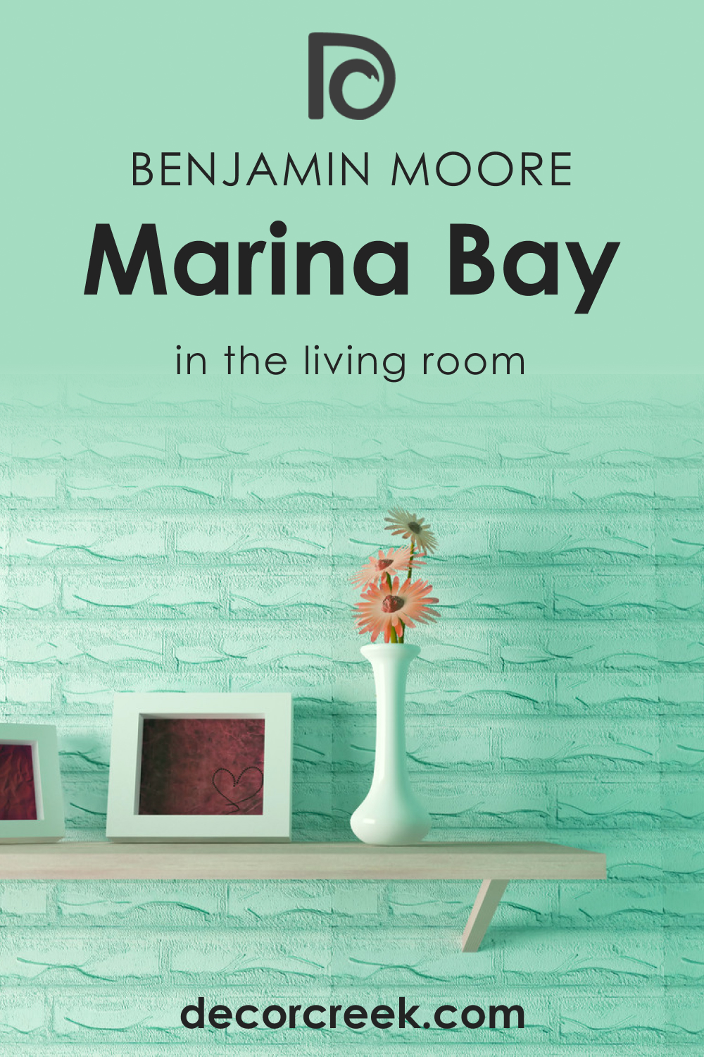
In the living room, Marina Bay 2036-50 offers a vibrant yet calm backdrop for daily life. It’s ideal for creating a focal point around a fireplace or art display. Complementary colors in throw pillows, rugs, and curtains can draw out its complexities. For a cohesive look, paint adjoining hallways or nooks in the same color, or use it in matte for an understated elegance.
Furniture in neutral tones or natural wood can balance the room’s energy, while metallic accents will add a touch of sophistication.
How to Use Marina Bay 2036-50 for an Exterior?
Marina Bay 2036-50 on an exterior can reflect the landscape around your home, blending with the sky and greenery. It’s especially striking on a home with ample natural surroundings. This color works well with stonework and wooden features, complementing natural elements.
For a coastal or cottage-style home, it can highlight architectural details like trim and shutters when paired with crisp whites. In urban settings, it stands out with a contemporary flair against concrete and metal accents.

How to Use Marina Bay 2036-50 in the Kitchen?
The kitchen, the heart of the home, is an ideal space for Marina Bay 2036-50. It’s refreshing like a morning breeze, perfect for starting the day. Pair with countertops and backsplashes in light marble or quartz to enhance its crispness. Introduce copper or brass fixtures for a warm, trendy look.
On walls, it contrasts beautifully with both light and dark cabinetry, and with stainless steel appliances, it maintains a modern, clean aesthetic that’s always welcoming.

How to Use Marina Bay 2036-50 on the Kitchen Cabinets?
For kitchen cabinets, Marina Bay 2036-50 offers a unique alternative to traditional white or wood finishes. It’s light enough to keep the kitchen feeling open and airy, yet it has enough depth to make a statement. Complement with hardware in matte black or polished nickel for a sophisticated touch. This color works particularly well in kitchens with a lot of natural light, but it can also brighten a space with limited light.
To finish, use a high-gloss lacquer to make cleaning easier and to add a luminous quality to the cabinetry.

Comparing Marina Bay 2036-50 With Other Colors
Comparing colors is a pivotal process in design and aesthetics because it provides context and allows for a visual understanding of how colors interact with one another. It helps to discern subtle differences in hue, value, and saturation that aren’t always immediately apparent. In interior design, these comparisons ensure that the chosen colors align with the intended mood and style of a room.
When selecting paint, fabrics, or accessories, understanding how colors compare helps to create a cohesive palette that can either harmonize or provide deliberate contrast within a space.
Marina Bay 2036-50 vs. BM 2036-70 Creme de Mint
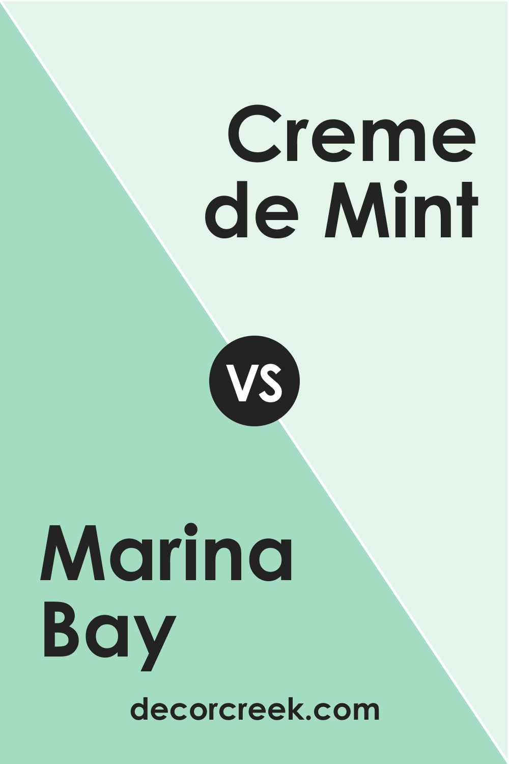
While Marina Bay 2036-50 offers a rich and vibrant presence, Benjamin Moore’s 2036-70 Creme de Mint (CHECK A SAMPLE) is significantly lighter, with a more delicate and airy feel. Creme de Mint possesses a more pronounced pastel quality, lending itself to spaces that aim for a softer, more ethereal ambiance.
In contrast, Marina Bay’s deeper and more saturated tone makes a stronger statement and is more capable of anchoring a room. The two colors could complement each other well in a space that balances boldness with lightness.
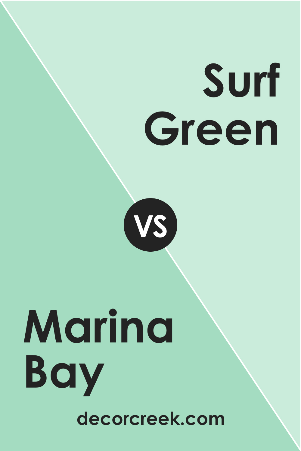
Marina Bay 2036-50 vs. BM 2036-60 Surf Green
Surf Green (CHECK A SAMPLE) sits closer on the spectrum to Marina Bay 2036-50 but is lighter, bringing a more subdued energy to interiors. While Marina Bay 2036-50 has the depth to serve as a feature color, Surf Green is more of a mid-tone that blends easily with a variety of palettes.
It provides a refreshing backdrop that is less commanding, suitable for those preferring a hint of color without overwhelming a space. When paired, they could create a dynamic layering effect of green tones.
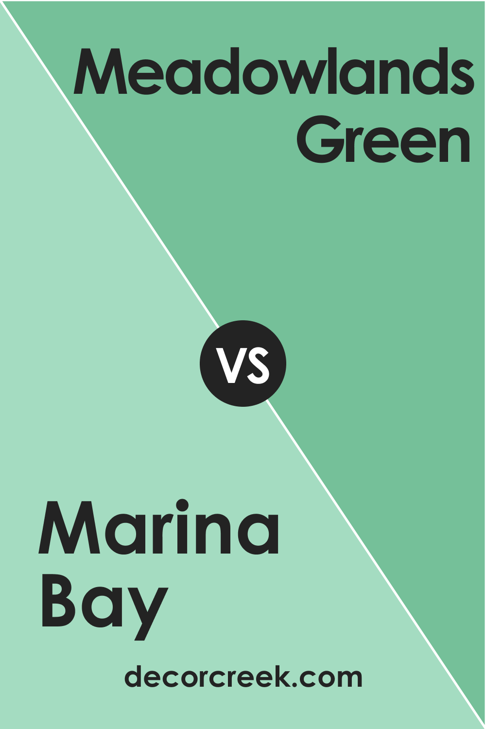
Marina Bay 2036-50 vs. BM 2036-40 Meadowlands Green
Meadowlands Green (CHECK A SAMPLE) presents a slightly yellower undertone compared to the blue-green essence of Marina Bay 2036-50. This subtle shift creates a warmer presence in Meadowlands Green, evoking the feel of sunlit grass. While Marina Bay 2036-50 could evoke the depth of ocean waters, Meadowlands Green is more reminiscent of a spring meadow.
They both can be used to bring nature into a room but in distinctly different ways: Marina Bay for depth and serenity, Meadowlands for brightness and warmth.
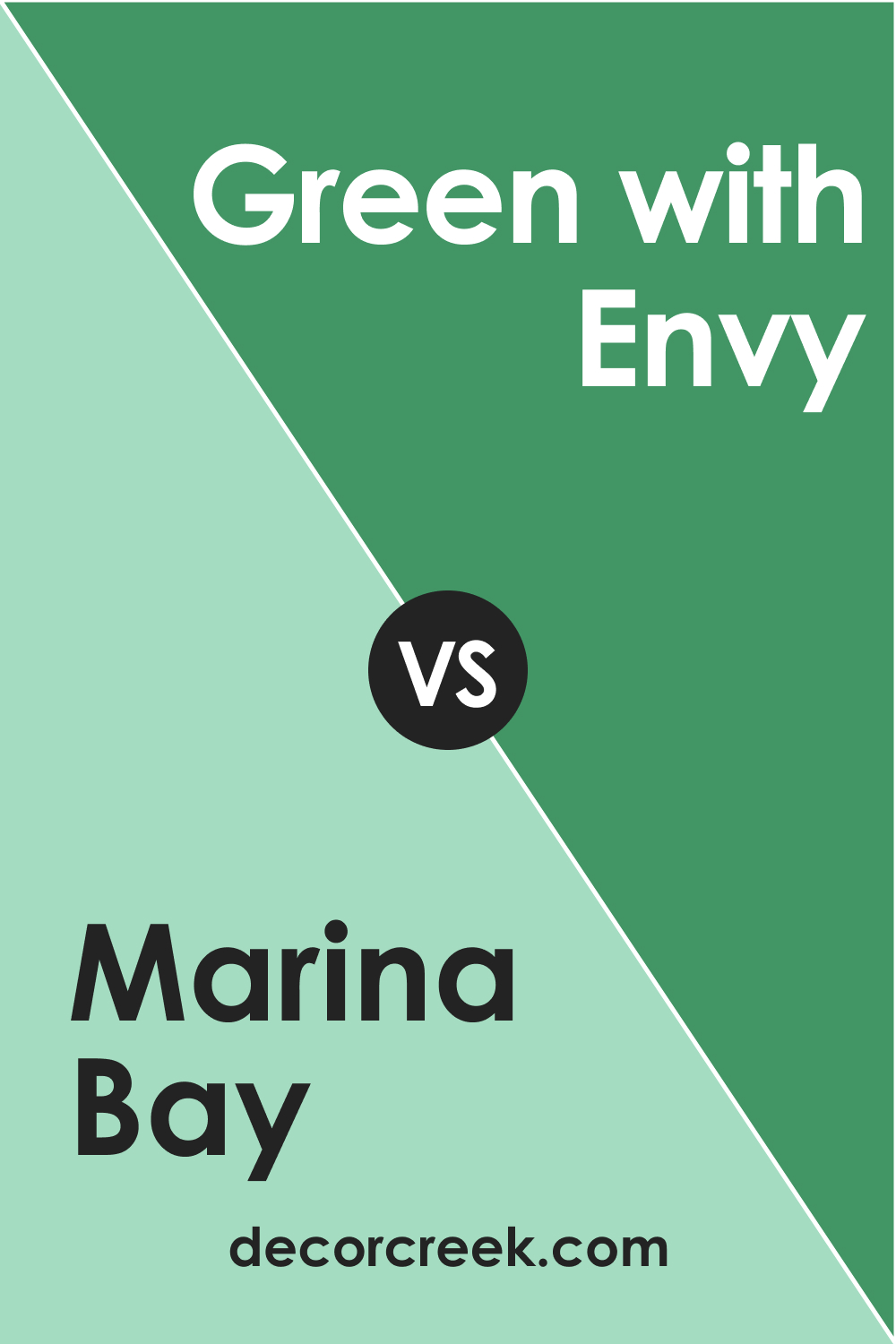
Marina Bay 2036-50 vs. BM 2036-30 Green with Envy
Green with Envy (CHECK A SAMPLE) stands apart from Marina Bay 2036-50 with a much more intense and saturated hue. It’s a color that’s bold and can dominate a space with its vivacious personality. In comparison, Marina Bay, while still vibrant, is more restrained and versatile.
Green with Envy could be the choice for an accent wall or for someone wanting to make a dramatic statement, while Marina Bay could be used more liberally throughout a room.
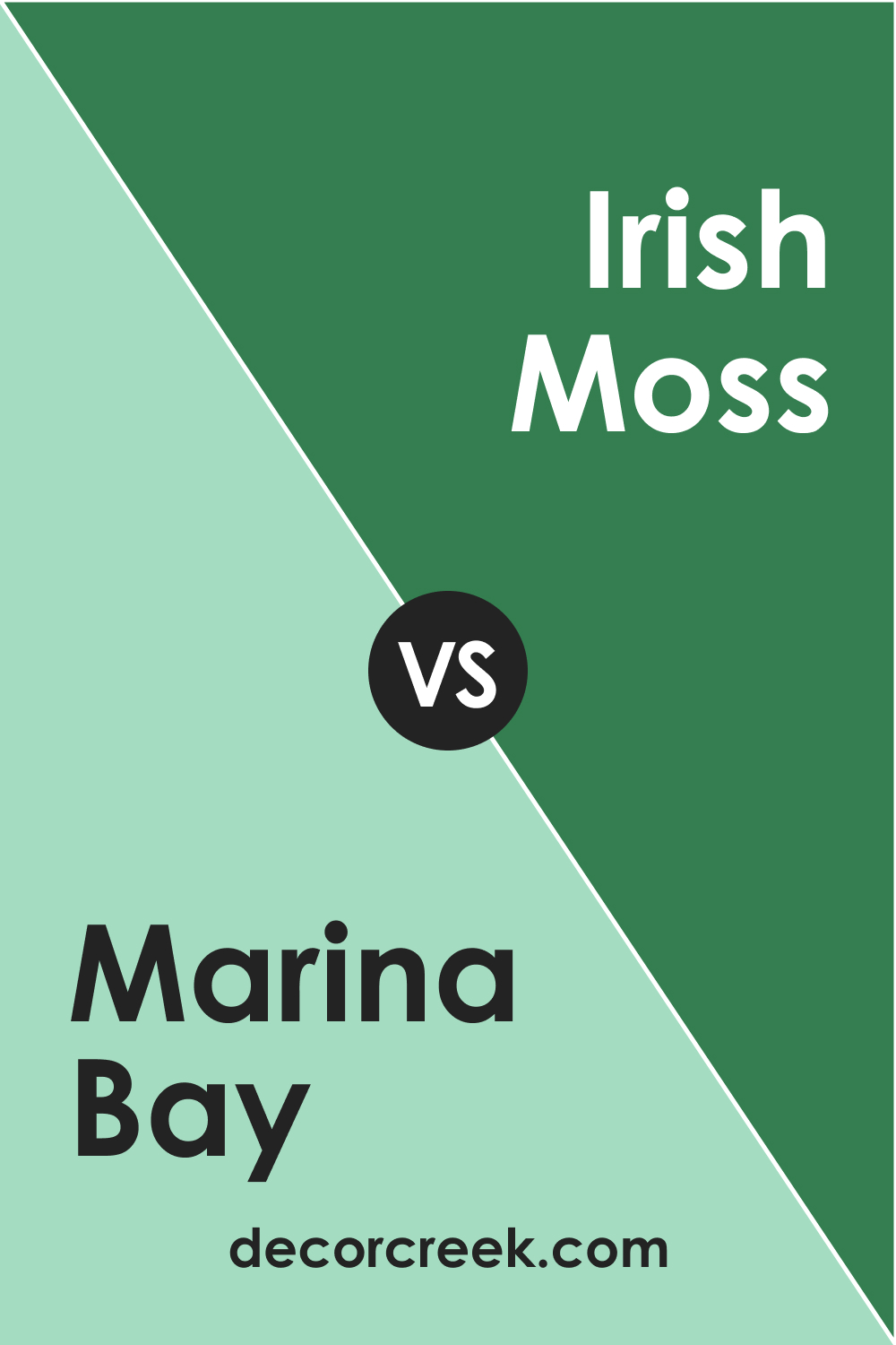
Marina Bay 2036-50 vs. BM 2036-20 Irish Moss
Irish Moss (CHECK A SAMPLE) is a darker, more olive-toned green compared to Marina Bay 2036-50, which leans towards the blue side of green. Irish Moss offers a sense of groundedness and could be used in spaces that aim for a natural, earthy feel, whereas Marina Bay has a cooler, more refreshing vibe.
The contrast between them is quite marked, with Irish Moss providing a heavier visual weight and Marina Bay offering a lighter touch.
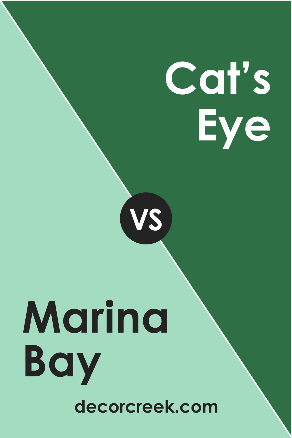
Marina Bay 2036-50 vs. BM 2036-10 Cat’s Eye
Cat’s Eye (CHECK A SAMPLE) is richer and more saturated than Marina Bay 2036-50, providing a sense of luxury and opulence. Its intensity makes it a great choice for a focal point in a room, whereas Marina Bay is more suited to creating a calming and tranquil environment.
When compared, Cat’s Eye commands attention with its depth and strength, while Marina Bay supports the scene with a serene and inviting presence.
Conclusion
The art of comparison in the world of color is not just about finding differences, but also about understanding the unique emotional responses each hue elicits. Marina Bay 2036-50 is a distinctive color that serves a variety of purposes, from creating a statement to providing a soothing background.
When compared with its relatives in the Benjamin Moore palette, it stands out for its versatility and serene beauty. Each color comparison reveals different aspects of Marina Bay 2036-50, showcasing its ability to adapt to various design needs and preferences.
Choosing the right color for a space is much like finding the right piece for a puzzle; it must fit not only in shape but in the overall picture. The comparisons made with Marina Bay 2036-50 illustrate the breadth of options available and the importance of considering each color’s personality and how it will contribute to the tapestry of a room’s design. The careful selection and comparison of colors lay the groundwork for a space that is both aesthetically pleasing and emotionally resonant.
