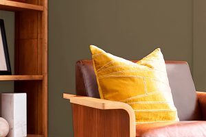
In the ever-evolving world of interior design, certain hues possess the remarkable ability to remain relevant, adapting effortlessly to both contemporary and classic decorating schemes. Among these enduring favorites is SW 9579 Timeless Taupe by Sherwin Williams, a color that epitomizes versatility and understated elegance.
This sophisticated shade serves as a foundational element that can anchor a room, providing both warmth and depth without overwhelming the senses.Timeless Taupe offers a unique blend of gray and brown, creating a neutral backdrop that pairs beautifully with a wide range of color palettes, from bold and vibrant to soft and serene.
Its adaptability makes it a top choice for designers and homeowners alike, who appreciate its capacity to add a subtle layer of sophistication to any space. Whether you’re looking to create a tranquil retreat in a bedroom, a cozy atmosphere in a living room, or an inviting ambiance in a dining area, Timeless Taupe delivers with its classic appeal.
Moreover, its versatility extends beyond color pairings. Timeless Taupe works harmoniously with various textures and materials, from natural wood grains and metallic accents to plush fabrics and sleek modern finishes, making it an ideal selection for integrating into diverse design styles.
As we delve into the characteristics and applications of SW 9579 Timeless Taupe, it’s clear that this color is more than just a passing trend—it’s a timeless choice that offers enduring beauty and flexibility.

What Color Is Timeless Taupe SW 9579 by Sherwin Williams?
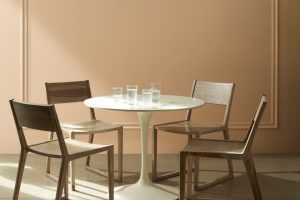
Timeless Taupe embodies a refined elegance that brings a warm and calming presence to any space. This nuanced hue strikes a beautiful balance between a soft beige and a gentle gray, creating a versatile backdrop that complements a wide range of decor styles and color palettes.
Its earthy tone captures the essence of natural elements, infusing interiors with a sense of serenity and understated sophistication.
This color thrives in an array of interior styles, particularly shining in settings that emphasize natural materials and textures. It serves as an exquisite base in modern farmhouse, transitional, and Scandinavian designs, where its ability to blend seamlessly with both warm and cool accents is highly valued.
Timeless Taupe encourages an inviting atmosphere in minimalist spaces, adding depth and warmth without overwhelming the senses.
When it comes to pairing with materials and textures, this shade reveals its chameleon-like adaptability. It pairs splendidly with rich wooden finishes—from light, airy oaks to deep, dark walnuts—highlighting their natural beauty.
In spaces that feature stone, leather, or metal, Timeless Taupe offers a soft contrast that highlights these textures without competing for attention. Fabrics in linen, wool, and cotton, whether in muted tones or vibrant patterns, complement its earthiness, creating a cohesive and inviting interior.
Timeless Taupe’s ability to harmonize with a variety of elements makes it a cherished choice for creating serene and stylish spaces.
Ever wished paint sampling was as easy as sticking a sticker? Guess what? Now it is! Discover Samplize's unique Peel & Stick samples.
Get paint samples

Is Timeless Taupe SW 9579 by Sherwin Williams Warm or Cool color?
Timeless Taupe by Sherwin Williams is a versatile and sophisticated color that brings a harmonious balance to any home it graces. This elegant neutral straddles the fine line between warm and cool tones, making it a perfect backdrop for a wide range of decor styles and color palettes.
Its earthy hue conveys a sense of calm and grounding, making it an ideal choice for spaces where relaxation and tranquility are paramount, such as living rooms and bedrooms. The subtlety of Timeless Taupe allows it to serve as both a stand-alone color and a complementary backdrop that enhances and highlights the colors of furniture, artwork, and fabrics within a space.
Its adaptability extends to various lighting conditions, where it can exhibit warm undertones in natural light and provide a cozy, inviting ambiance under artificial lighting. This chameleon-like quality ensures that no matter the time of day or the type of lighting, Timeless Taupe consistently offers a serene and stylish canvas that elevates the overall aesthetic of a home.
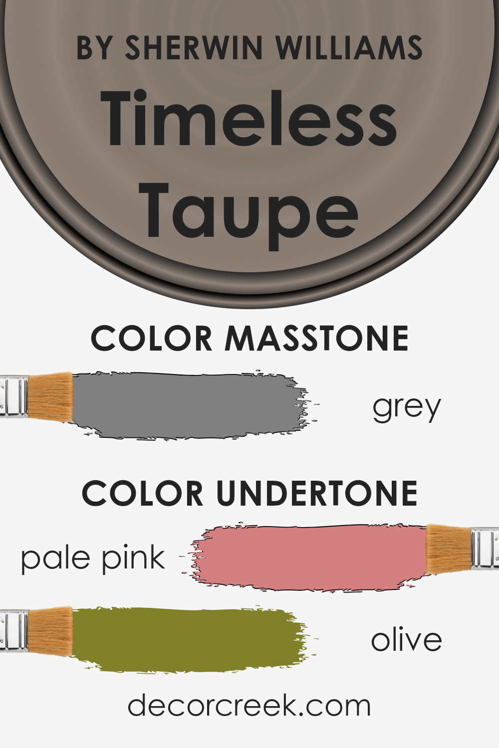
Undertones of Timeless Taupe SW 9579 by Sherwin Williams
Timeless Taupe is a nuanced hue that carries a depth and complexity often appreciated in various settings, especially within interior design. The undertones of a color profoundly influence its perception, acting as subtle whispers that enhance or shift its primary shade depending on the lighting, adjacent colors, and the overall mood of a space.
For Timeless Taupe, the presence of pale pink and olive undertones adds a unique character to this sophisticated neutral.
Pale pink undertones infuse a gentle warmth into the taupe, softening its appearance and allowing it to convey a welcoming and cozy ambiance. This slight rosiness works beautifully in rooms that benefit from a soft, nurturing feel, such as bedrooms and living areas, promoting a sense of calm and restfulness.
In contrast, olive undertones introduce an earthy quality, grounding the color with a touch of natural elegance. This organic aspect reinforces Timeless Taupe’s versatility, making it suitable for spaces aiming to embody a connection to nature or a sense of tranquility.
When applied to interior walls, these olive notes can enhance the perception of space as more anchored and serene, an ideal backdrop for wooden furniture or greenery.
Together, these undertones affect how Timeless Taupe is perceived, transforming it from a simple neutral into a hue that can carry both warmth and depth. Its ability to adapt and shift according to its environment makes it an excellent choice for those seeking a color that combines flexibility with sophistication.
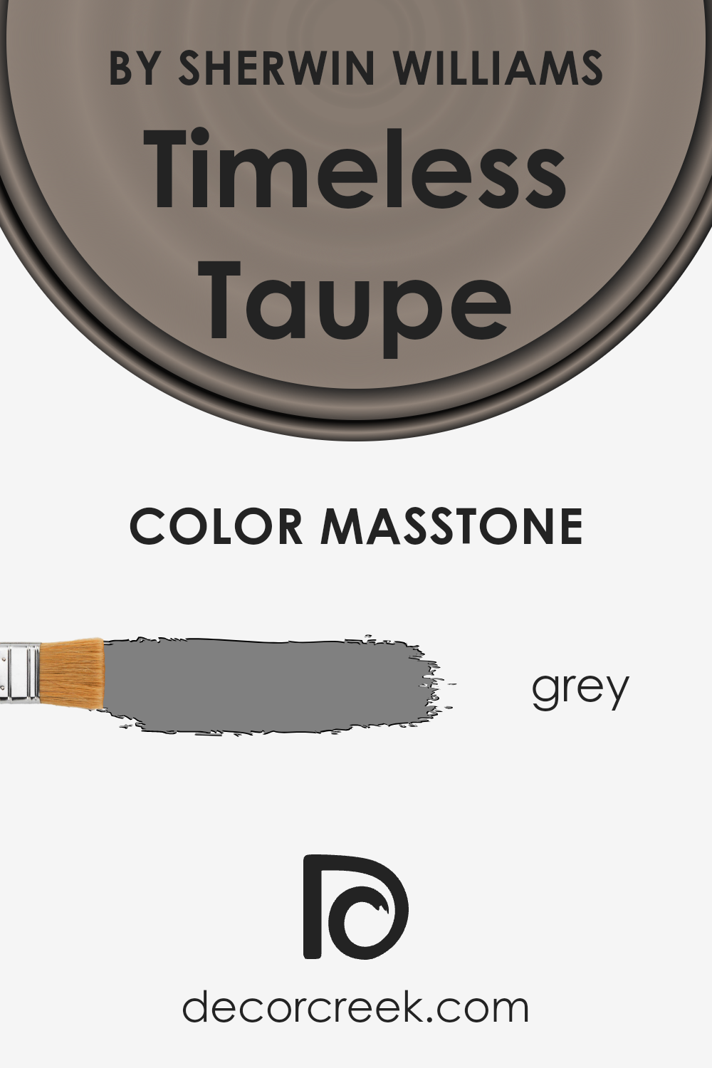
What is the Masstone of the Timeless Taupe SW 9579 by Sherwin Williams?
Timeless Taupe, though often associated with Sherwin Williams, embodies a color that transcends mere brand association, mirroring the exact mid-tone of grey (#808080) in its masstone. This particular shade of taupe merges an understated elegance with unparalleled versatility, making it a quintessential selection for home interiors.
Its grey masstone offers a neutral canvas that works harmoniously within a multitude of color schemes and design aesthetics. Unlike more polarizing colors, this shade of taupe boasts the unique ability to enrich spaces with warmth or coolness, adapting effortlessly to both lighting and accompanying hues.
This adaptability ensures that it finds relevance in a broad range of settings, from modern minimalist apartments to cozy, traditional homes. It serves as a sophisticated backdrop, enabling accent colors to pop or providing a serene, monochromatic palette when used in tandem with similar shades.
Ultimately, its strength lies in its simplicity and the unspoken complexity of its grey undertones, ensuring Timeless Taupe’s place as a favored choice for creating inviting, stylish spaces.
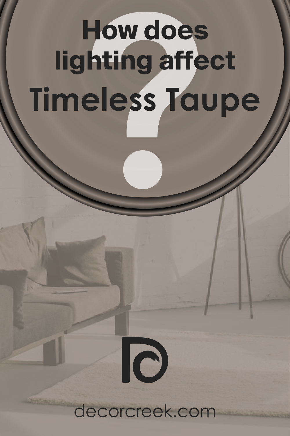
How Does Lighting Affect Timeless Taupe SW 9579 by Sherwin Williams?
Lighting plays a crucial role in the perception of colors, significantly influencing their appearance and the ambiance they create within a space. Various light sources, from natural sunlight to various types of artificial light, can alter a color’s hue, value, intensity, and even its texture. The interplay between light and color can transform spaces and affect moods, making it a vital consideration in interior design.
Timeless Taupe is a sophisticated and versatile shade that offers a unique experience under different lighting conditions. In artificial light, the warmth or coolness of the light bulb impacts the perception of this hue. Under warm lighting, Timeless Taupe can exhibit a cozier and more inviting quality, with its earthy, taupe base bringing forth a sense of softness and warmth.
Conversely, under cooler, artificial light, its undertones might become more pronounced, giving it a sleeker, more neutral appearance that’s perfect for modern and minimalist decors.
Natural light brings its dynamism to how Timeless Taupe is experienced in a room. In north-facing rooms, light tends to be cooler and more diffused, which can enhance the more muted and subtle aspects of Timeless Taupe, giving it a more serene and tranquil quality. This makes it suitable for creating a calm and soothing space.
South-facing rooms bask in abundant light throughout the day, which can warm up the color, making it appear lighter and more welcoming. The color can adapt well to such settings, complementing spaces that aim to be bright, airy, and inviting.
In east-facing rooms, morning light can make Timeless Taupe look particularly soft and warm, ideal for bedrooms or breakfast nooks that benefit from a gentle ambiance. As the day progresses and the light changes, the color can shift slightly, maintaining a neutral balance between warmth and sophistication.
West-facing rooms experience the reverse, with the softer morning light revealing the more delicate nuances of Timeless Taupe. In the afternoon and evening, as the sunlight becomes warmer and more golden, the color can take on a richer, more enveloping feel, perfect for living spaces meant to relax and unwind in.
In essence, Timeless Taupe’s adaptability to different lighting conditions makes it a versatile choice for various spaces and orientations, capable of offering multiple facets of its personality, from serene and sophisticated to warm and inviting.
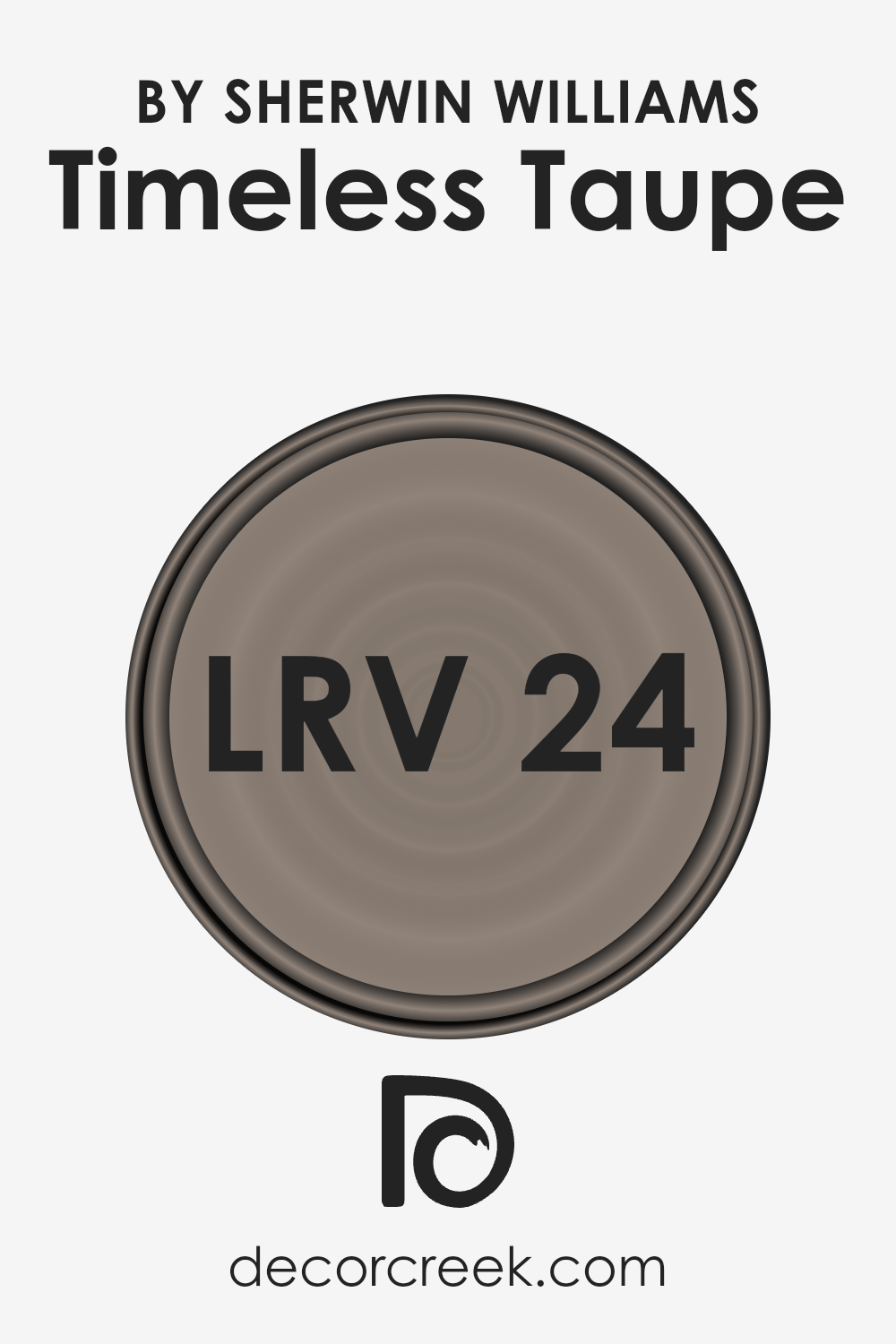
What is the LRV of Timeless Taupe SW 9579 by Sherwin Williams?
Light Reflectance Value, or LRV, is a measure that quantifies the percentage of light a paint color reflects from or absorbs into a surface. It is a crucial concept in both interior design and architecture, as it significantly impacts how a color appears once applied to walls or other surfaces.
The scale runs from 0 to 100, with 0 being completely black (absorbing all light) and 100 being pure white (reflecting all light). This measurement aids in understanding the brightness and visual temperature of a color in a given space, helping with the selection process to achieve the desired ambiance.
Factors such as natural light, room size, and the purpose of the space play into how an LRV will translate in real-world application.
With an LRV of 23.628, the color in question sits on the darker side of the scale, meaning it absorbs more light than it reflects. This characteristic influences the color to appear cozier and more intimate, making it an excellent choice for creating a warm and inviting atmosphere in a room.
However, due to its lower LRV, this color may make small spaces feel smaller and less open, as it does not bounce back as much light. In rooms with limited natural light, it could potentially make the area feel somewhat darker or more enclosed.
Thus, when utilizing colors with a lower LRV like this one, it’s advisable to consider the room’s natural lighting, size, and decor to ensure the desired effect is achieved without inadvertently making the space feel cramped or overly dark.
LRV – what does it mean? Read This Before Finding Your Perfect Paint Color
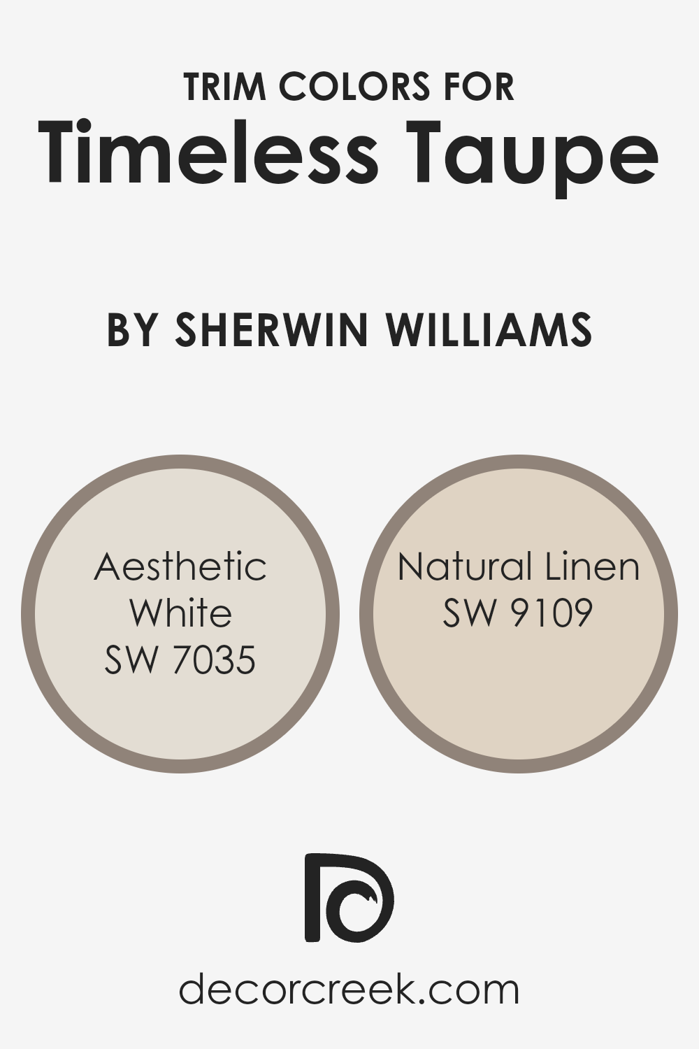
What are the Trim colors of Timeless Taupe SW 9579 by Sherwin Williams?
Trim colors play a vital role in interior design by defining and enhancing the architectural features of a room. When paired with a neutral and sophisticated shade like Timeless Taupe by Sherwin Williams, selecting the right trim color can elevate the space, creating contrast and depth.
Timeless Taupe is a versatile color that can harmonize with various palettes, allowing for a range of trim colors that can match the homeowner’s taste and the room’s theme.
Among the ideal choices are Aesthetic White and Natural Linen by Sherwin Williams, which can complement or subtly contrast with Timeless Taupe to produce a finished look that feels both grounded and airy, depending on the chosen hue.
Aesthetic White is a soft, barely-there shade of white with a warm undertone that makes it incredibly versatile and inviting. It pairs beautifully with Timeless Taupe, bringing out the color’s warm undertones and creating a seamless transition between wall and trim that’s sophisticated yet understated.
On the other hand, Natural Linen offers a more pronounced contrast, with its richer, creamier base adding depth and warmth to the space. This combination enhances the Timeless Taupe’s adaptability, making the space feel cozy and anchored, yet bright and expansive.
Both colors are excellent choices for trim, providing balance and enhancing the overall aesthetic of a room painted with Timeless Taupe.
You can see recommended paint colors below:
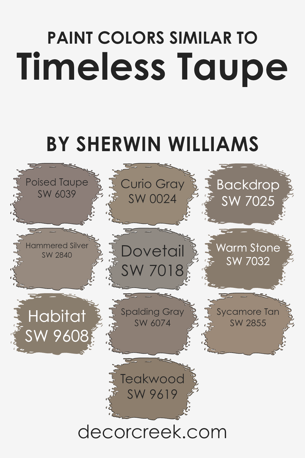
Colors Similar to Timeless Taupe SW 9579 by Sherwin Williams
In interior design and decoration, the harmony between colors is essential for creating visually pleasing spaces, and this is where similar colors play a crucial role. Colors that share a similar tone, such as those within the taupe family including shades like Poised Taupe, Hammered Silver, and Habitat, contribute to a cohesive look.
These colors blend seamlessly, adding depth and interest without overwhelming the eye. For example, Poised Taupe brings a balance of warmth and sophistication, making it versatile for various settings, while Hammered Silver introduces a unique metallic hint, offering a modern twist on classic neutrality.
Habitat, on the other hand, leans towards a more natural, grounded feel, perfect for creating a serene and inviting ambiance.
Other similar hues, such as Teakwood and Curio Gray, further exemplify the range and versatility of taupe shades. Teakwood adds richness and warmth, reminiscent of natural wood, enhancing the coziness of a space. Curio Gray, with its subtle elegance, serves as a delicate backdrop for bolder accents.
Colors like Dovetail, Spalding Gray, and Backdrop, deepen the palette, offering more dramatic and anchoring effects. Meanwhile, Warm Stone and Sycamore Tan extend the warmth, providing a soft and welcoming touch.
Each of these colors contributes to a harmonious palette, allowing for fluidity and consistency in design while accommodating personal tastes and decor styles. The beauty of utilizing similar colors lies in their ability to create a nuanced and layered aesthetic that is both unified and dynamic.
You can see recommended paint colors below:
- SW 6039 Poised Taupe
- SW 2840 Hammered Silver
- SW 9608 Habitat
- SW 9619 Teakwood
- SW 0024 Curio Gray
- SW 7018 Dovetail
- SW 6074 Spalding Gray
- SW 7025 Backdrop
- SW 7032 Warm Stone
- SW 2855 Sycamore Tan
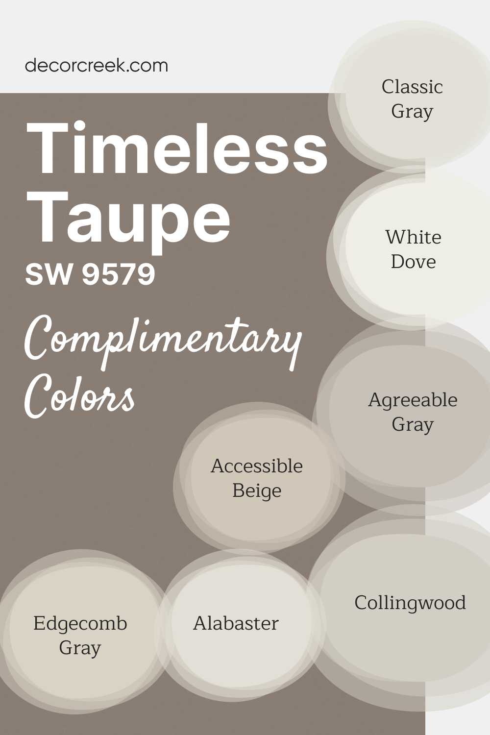
Complimentary Colors for Timeless Taupe SW 9579 Paint Color by Sherwin Williams
Timeless Taupe SW 9579 by Sherwin-Williams is a warm and inviting neutral that adds sophistication to any room. Its subtle undertones create a cozy yet elegant atmosphere, making it a versatile choice for living spaces, bedrooms, or kitchens.
This shade pairs beautifully with a variety of complementary colors to suit both traditional and modern styles. For a bright, crisp look, combine Timeless Taupe with White Dove OC-17 or Alabaster SW 7008.
Collingwood OC-28 and Edgecomb Gray HC-173 offer balanced warmth, while Agreeable Gray SW 7029 and Accessible Beige SW 7036 provide neutral depth.
Classic Gray OC-23 adds a soft, contemporary touch, completing a harmonious and timeless palette.
How to Use Timeless Taupe SW 9579 by Sherwin Williams In Your Home?
Deeply rooted in a sense of serenity and earthiness, Timeless Taupe by Sherwin Williams is a versatile color that brings a subtle elegance to any space within a home. This nuanced shade straddles the line between a soft gray and a warm beige, making it an ideal choice for those looking to infuse their interiors with a neutral, yet inviting, palette.
Its adaptability means it can serve as a harmonious background for a wide range of decor styles, from the sleek and contemporary to the rustic and traditional.
Applying Timeless Taupe to living room walls can create a cozy and welcoming atmosphere, where furniture and colorful accents can stand out or blend in, depending on the desired effect. In bedrooms, its calming presence offers a peaceful retreat, conducive to relaxation and rest.
Kitchens and dining areas benefit from its warm undertones, encouraging a sense of hospitality and togetherness. Even in smaller spaces like bathrooms or hallways, Timeless Taupe adds depth and sophistication, making the area feel more expansive and luxuriously grounded. Its timeless quality ensures that it remains a beloved choice for creating refined and comfortable homes.
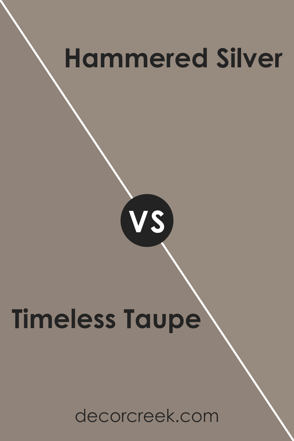
Timeless Taupe SW 9579 by Sherwin Williams vs Hammered Silver SW 2840 by Sherwin Williams
Timeless Taupe and Hammered Silver, both from Sherwin Williams, offer distinctly different hues that cater to varied design aspirations. Timeless Taupe is a soft, warm neutral that exudes a classic and versatile elegance, making it perfect for spaces seeking a serene and inviting atmosphere.
Its warmth brings a cozy comfort to interiors, easily blending with both bold and subdued color palettes. On the other hand, Hammered Silver presents a much cooler tone, leaning towards a sophisticated metallic gray that reflects light beautifully. This color adds a modern and sleek edge to spaces, offering a contemporary vibe that pairs well with minimalist decor and industrial influences.
While Timeless Taupe provides a foundation for a timeless, warm aesthetic, Hammered Silver offers a bold statement, introducing a dynamic and modern flair. Together, these colors could create a nuanced palette, balancing warmth and contemporary sophistication in any interior design scheme.
You can see recommended paint color below:
- SW 2840 Hammered Silver
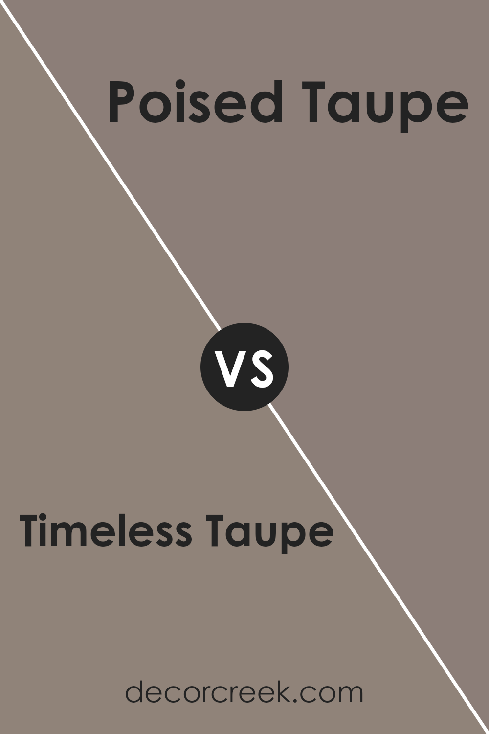
Timeless Taupe SW 9579 by Sherwin Williams vs Poised Taupe SW 6039 by Sherwin Williams
Timeless Taupe and Poised Taupe, while both by Sherwin Williams, evoke subtly different atmospheres within a space because of their unique undertones and intensity. Timeless Taupe leans towards a lighter, more ethereal side of the taupe spectrum. Its hue possesses a gentle, welcoming quality that imparts a serene, calming vibe to interiors.
Its versatility allows it to act as a neutral backdrop, easily complementing a wide range of decor styles and color schemes. On the other hand, Poised Taupe is richer and warmer, imbuing spaces with a cozy, earthy feel. This depth makes it particularly well-suited for creating a statement or anchoring a room with a more grounded aesthetic.
While both colors share the characteristic balance of brown and gray intrinsic to taupe, Timeless Taupe offers a whisper of softness and light, whereas Poised Taupe brings depth and warmth, underscoring the complexity and adaptability of taupe as a color family.
You can see recommended paint color below:
- SW 6039 Poised Taupe
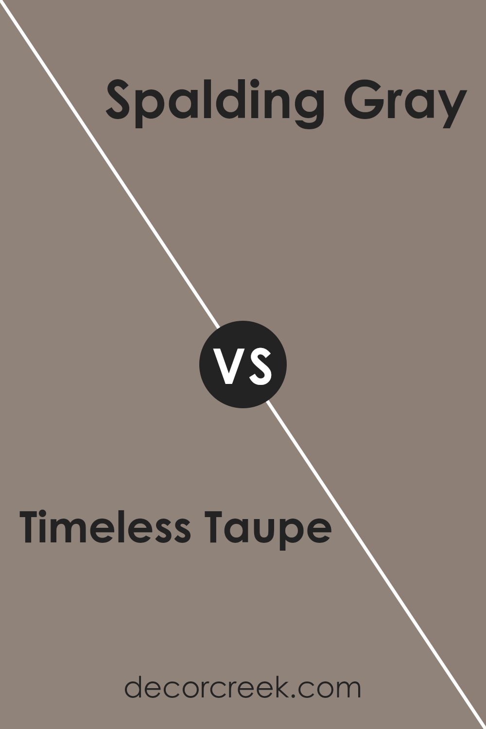
Timeless Taupe SW 9579 by Sherwin Williams vs Spalding Gray SW 6074 by Sherwin Williams
Timeless Taupe and Spalding Gray are two sophisticated shades from Sherwin Williams that offer subtle yet distinct tones for interior spaces. Timeless Taupe is a warm, inviting color that blends beige and light brown with a hint of gray, creating a neutral backdrop that exudes coziness and versatility.
This hue is perfect for creating a serene and welcoming environment, easily complementing a wide range of decor styles and color schemes. On the other hand, Spalding Gray is a deeper, moodier hue that leans more towards a true gray with an earthy undertone.
It offers a stronger statement while still maintaining a level of neutrality, making it ideal for adding depth and drama to a space without overwhelming it. While Timeless Taupe brings warmth and a sense of calm to interiors, Spalding Gray offers a more pronounced, sophisticated edge, making them both excellent choices for those looking to introduce refined color to their homes.
You can see recommended paint color below:
- SW 6074 Spalding Gray
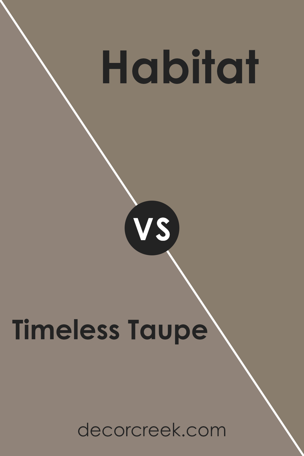
Timeless Taupe SW 9579 by Sherwin Williams vs Habitat SW 9608 by Sherwin Williams
Timeless Taupe and Habitat, both from Sherwin Williams, offer distinct yet harmonious options for interior spaces. Timeless Taupe is a serene, warm neutral with an understated elegance. Its versatility allows it to act as a sophisticated backdrop in various settings, providing a soft, inviting ambiance that complements a wide range of decor styles.
This color exudes a classic charm, making spaces feel grounded and balanced.
In contrast, Habitat introduces a deeper, more earthy tone. This color leans towards a richer, nature-inspired palette, embracing a more pronounced sense of warmth and coziness. Habitat brings a sense of calmness to spaces, reminiscent of the natural world, making it ideal for creating a retreat-like atmosphere in homes.
It has the unique capability to add depth and character to rooms, often used to make bold statements or as an accent to add dimension and interest.
Together, Timeless Taupe and Habitat embody the balance between subtlety and depth, offering complementary choices for those looking to create a nuanced and inviting home environment.
You can see recommended paint color below:
- SW 9608 Habitat
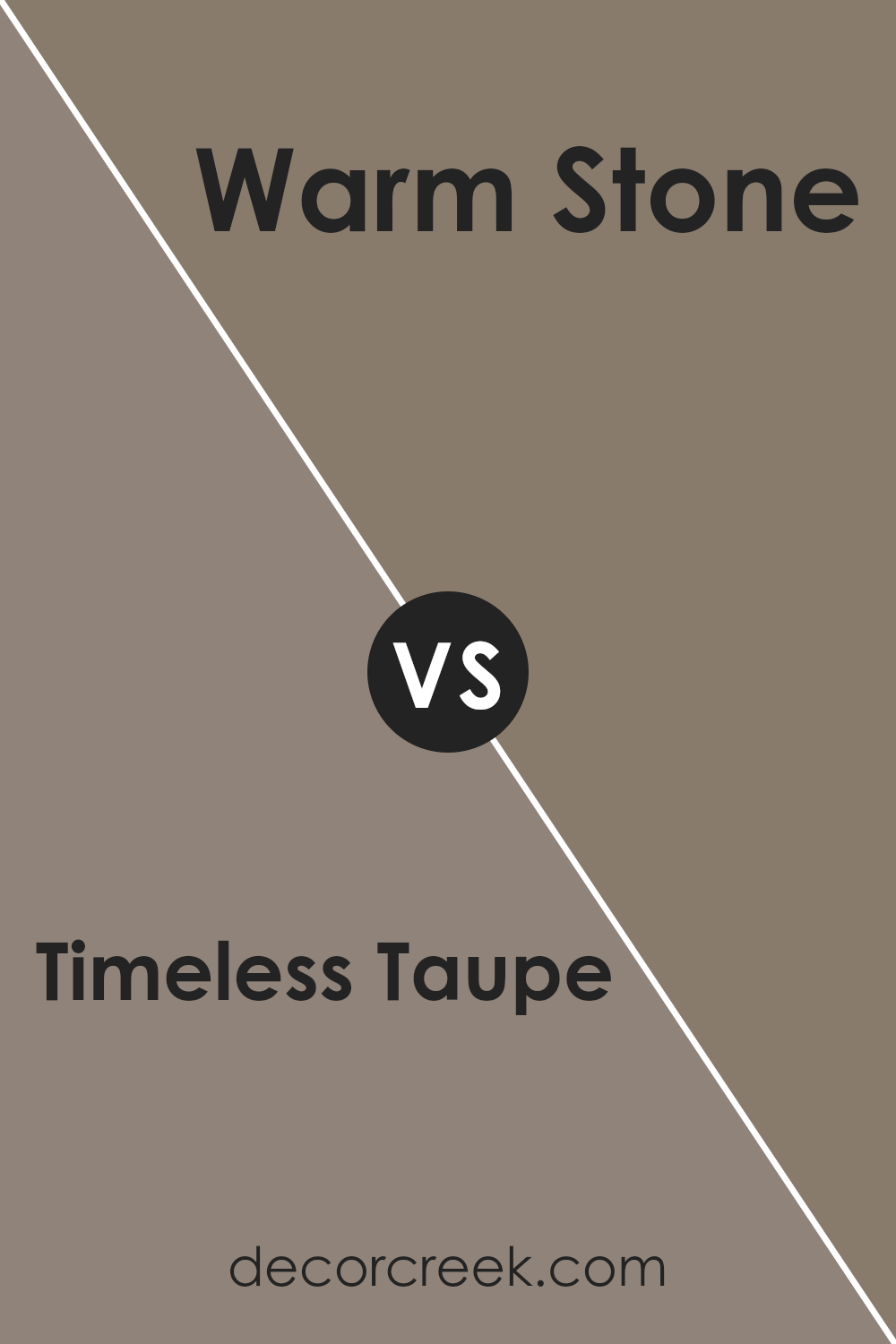
Timeless Taupe SW 9579 by Sherwin Williams vs Warm Stone SW 7032 by Sherwin Williams
Timeless Taupe and Warm Stone are two sophisticated shades from Sherwin Williams that both exude warmth and elegance, yet they cater to slightly different aesthetic preferences. Timeless Taupe is a nuanced blend that straddles the line between gray and beige, offering a versatile backdrop that can adapt to various decor styles.
Its inherent neutrality makes it an ideal choice for those seeking a color that provides a subtle depth to their space without overwhelming it with too much warmth.
On the other hand, Warm Stone steps into the realm of warmer, richer tones, presenting a more pronounced beige that leans towards a soft, earthy clay. This hue brings a comforting warmth to interiors, making spaces feel more inviting and cozy.
Its depth is slightly more pronounced than that of Timeless Taupe, making it a standout choice for those looking to inject a bit more personality and warmth into their rooms.
While both colors maintain a sense of timelessness and adaptability, Timeless Taupe offers a cooler, more understated elegance, whereas Warm Stone leans into warmth and richness, making each suitable for different decorative themes and personal preferences.
You can see recommended paint color below:
- SW 7032 Warm Stone
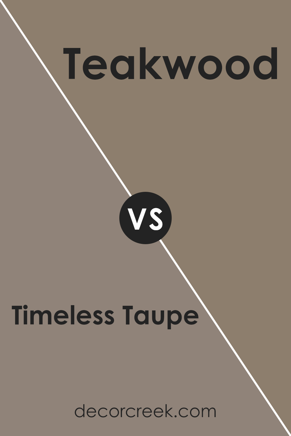
Timeless Taupe SW 9579 by Sherwin Williams vs Teakwood SW 9619 by Sherwin Williams
Timeless Taupe and Teakwood, both by Sherwin Williams, offer nuanced approaches to bringing warmth and sophistication into spaces. Timeless Taupe, as its name suggests, is a classic shade that straddles the line between gray and brown. It’s a soft, adaptable color that provides a neutral backdrop suitable for various design styles, from modern to traditional.
Its versatility allows it to beautifully complement a wide range of other hues, making it a go-to choice for designers seeking a timeless look.
In contrast, Teakwood introduces a richer, more pronounced presence. It leans toward a deeper, warmer spectrum, reminiscent of the natural wood after which it’s named. This color has the ability to create a cozy, inviting atmosphere, making it ideal for spaces where comfort and warmth are key.
While still versatile, Teakwood demands a bit more consideration in pairing to ensure it enhances, rather than overwhelms, a space.
Together, these two Sherwin Williams colors offer a palette that can move seamlessly from understated elegance with Timeless Taupe to a more anchored, earthy feel with Teakwood, providing a versatile foundation for interior design.
You can see recommended paint color below:
- SW 9619 Teakwood
Timeless Taupe SW 9579 by Sherwin Williams vs Dovetail SW 7018 by Sherwin Williams
Timeless Taupe and Dovetail, both from Sherwin Williams, offer a refined palette for spaces where warmth and subtlety are key. Timeless Taupe presents a softer, lighter approach, leaning towards a warm, inviting beige with hints of gray. Its versatility shines in well-lit areas, where its true taupe nature gently enriches the space, making it feel cozy yet spacious.
On the other hand, Dovetail exhibits a deeper, more pronounced gray, elegantly bordering on the edge of charcoal without losing its warm undertones. This color brings a sense of sophistication and depth, perfect for accent walls or cabinets, providing a striking contrast when paired with lighter hues.
The choice between these two depends on the desired ambiance and use of space. Timeless Taupe offers a neutral backdrop, promoting a serene and open atmosphere. In contrast, Dovetail commands attention, grounding spaces with its richer, bolder tone.
Both colors harmonize well within a modern aesthetic, yet their individual characteristics can define a room’s mood, from airy and light to cozy and dramatic.
You can see recommended paint color below:
Timeless Taupe SW 9579 by Sherwin Williams vs Curio Gray SW 0024 by Sherwin Williams
Timeless Taupe and Curio Gray, both from Sherwin Williams, present an elegant palette but differ distinctly in their tones and moods. Timeless Taupe is a warm, inviting neutral with a soft blend of beige and gray, embodying a versatile background that complements a wide array of design styles.
Its warmth adds a cozy, comfortable feel to spaces, making it ideal for creating a soothing and welcoming environment. On the other hand, Curio Gray leans towards a cooler, more subtle gray with a hint of green undertone, offering a more understated elegance.
This cool hue delivers a serene, calming effect, perfect for modern and minimalist aesthetics. While Timeless Taupe brings warmth and a sense of homey comfort, Curio Gray provides a contemporary sophistication with its cool, muted elegance.
Both colors offer unique possibilities for creating depth and interest in interiors, but the choice between them depends on the desired ambiance and design direction.
You can see recommended paint color below:
- SW 0024 Curio Gray
Timeless Taupe SW 9579 by Sherwin Williams vs Backdrop SW 7025 by Sherwin Williams
Timeless Taupe and Backdrop, both by Sherwin Williams, elevate spaces with their unique undertones and depth, offering nuanced choices for interior designs. Timeless Taupe is a soft, warm, earthy shade, invoking a sense of comfort and versatility.
It exudes an inviting warmth, making spaces feel grounded and serene, due to its subtle blend of brown and gray, which adapts flexibly to various lighting conditions and decor styles. In contrast, Backdrop leans towards a cooler, more neutral gray, presenting a minimalistic and sophisticated air.
It serves as an excellent foundation, offering a tranquil backdrop that complements bold accents and a wide range of colors. While Timeless Taupe brings a cozy, enveloping feel, ideal for creating a retreat-like atmosphere, Backdrop stands out for its modern, clean aesthetic, perfect for those seeking a crisp, contemporary vibe.
Each color, though distinct, provides a harmonious base, allowing for creative expression in home and commercial spaces.
You can see recommended paint color below:
Timeless Taupe SW 9579 by Sherwin Williams vs Sycamore Tan SW 2855 by Sherwin Williams
Timeless Taupe and Sycamore Tan, both from Sherwin Williams, present a soothing and earthy palette, though they speak in subtly different tones. Timeless Taupe is a classic, nuanced shade that straddles the line between gray and brown. Its versatility is unmatched, providing a sophisticated backdrop that complements a wide array of design styles and color schemes.
This color has the ability to evoke a sense of calmness and stability in any space, making it an ideal choice for creating serene environments.
On the other hand, Sycamore Tan offers a warmer, more distinctly brown hue that recalls the natural simplicity of bare earth and wood. It radiates warmth and comfort, creating inviting spaces. Sycamore Tan leans more towards a traditional aesthetic, bringing a sense of warmth and coziness that’s perfect for communal areas like living rooms and kitchens.
While Timeless Taupe offers a cool, subdued elegance, Sycamore Tan provides a heartier, warmer embrace. Each color serves different design needs, with Timeless Taupe favoring minimalist, contemporary spaces, and Sycamore Tan enhancing traditional, cozy atmospheres.
You can see recommended paint color below:
- SW 2855 Sycamore Tan
Conclusion
The exploration into the nuances and versatility of Timeless Taupe by Sherwin Williams illuminates its potential to transform and enrich any space it graces. This hue stands out not only for its soothing and neutral characteristics but also for its ability to act as a foundational element within various design schemes.
Its adaptability makes it a go-to choice for designers and homeowners alike, seeking to create atmospheres that are both inviting and elegant. The understated sophistication of Timeless Taupe allows for a wide range of pairing options, from bold and vibrant accents to more subdued and natural elements, offering a canvas upon which personal style and preference can flourish.
Furthermore, the detailed analysis of Timeless Taupe highlights its significance in the realm of color psychology, where it contributes to creating serene and comforting environments conducive to relaxation and well-being. Its capacity to blend seamlessly with different textures and materials further accentuates its appeal in achieving balance and harmony within a space.
As a testament to its enduring popularity, this color choice reflects a growing desire for spaces that reflect stability, warmth, and a sense of timeless elegance. Whether employed in a minimalistic setting or as a backdrop for a more eclectic mix, Timeless Taupe proves to be a versatile and dynamic choice, capable of elevating interior spaces to new heights of sophistication and style.
Ever wished paint sampling was as easy as sticking a sticker? Guess what? Now it is! Discover Samplize's unique Peel & Stick samples.
Get paint samples