
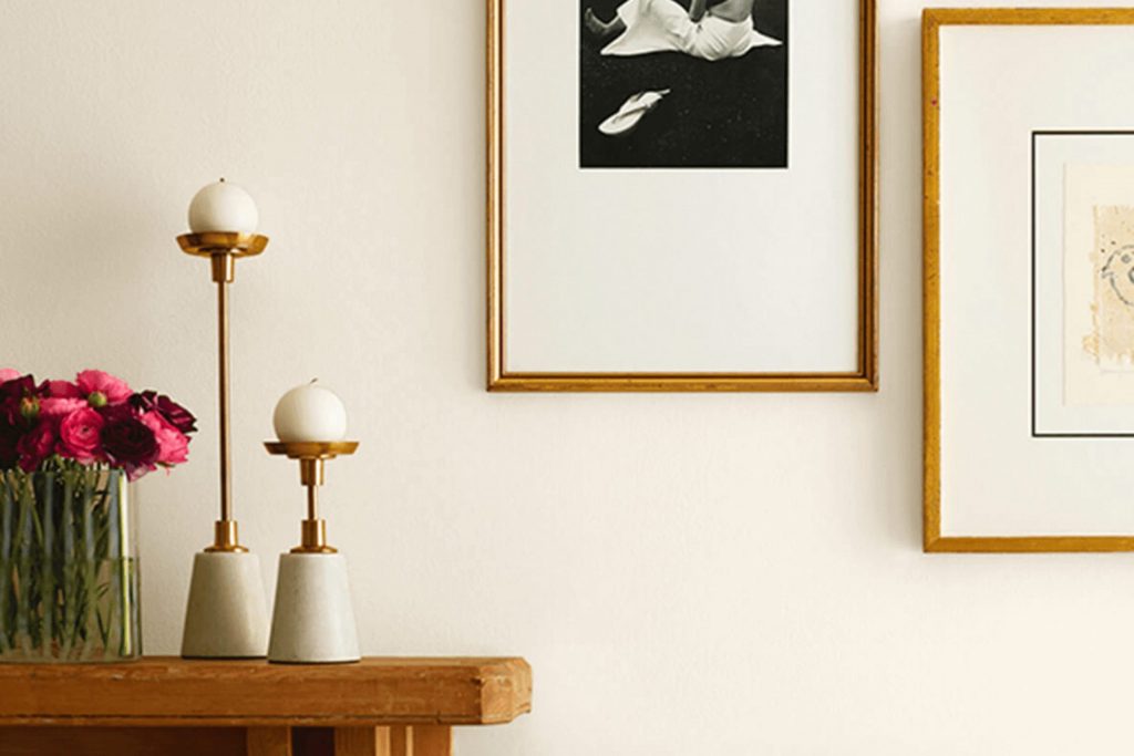
If you’re considering a fresh coat of paint for your area, you might want to look at SW 6147 Panda White by Sherwin Williams. I’m here to tell you a few things you should know before making your choice. This shade can be deceiving; while called “white,” it carries subtle nuances that can dramatically affect the feel of your room. Depending on the lighting, Panda White can shift from a clean, bright white to a warmer tone with hints of grey or beige.
In my experience, this color works exceptionally well in areas that get plenty of natural light, enhancing the room’s overall airy feeling. However, in areas with less light, it tends to pull more of its beige or grey undertones, giving a different effect than you might expect. Also, if you’re someone who likes to refresh your decor seasonally, Panda White is quite flexible—it complements a wide range of colors and styles.
When considering this color, I also suggest looking at how it interacts with your existing furniture and decor elements. Getting a few sample swatches and observing them at different times of the day will help you understand how this shade will live on your walls.
Remember, paint can feel different once it’s all around you, impacting the ambiance from morning to night.
Is Panda White SW 6147 Right for My Home?
Panda White by Sherwin Williams is a soft, warm white with a subtle hint of beige that makes it incredibly adaptable for home interiors. It’s not a stark white, so it brings a welcoming and cozy feel to any area without being overly intense. This gentle hue has a way of making a room feel larger but still maintains a snug vibe, which is perfect for creating a relaxed atmosphere.
I find that Panda White works beautifully in a variety of interior styles, especially in modern farmhouse, Scandinavian, and traditional settings. Its warm undertones complement the clean lines and minimalistic aesthetics of modern designs, as well as the comfortable, classic appeal of traditional styles.
When it comes to pairing materials, this color pairs well with natural wood, adding richness and depth to rooms. It looks particularly stunning when used alongside light oak or walnut. Textures like linen or cotton in soft furnishings also blend smoothly with this color, enhancing its warmth. Moreover, metallic finishes like brass or copper can add a lovely contrast, providing a slight shimmer that highlights the creaminess of Panda White.
Overall, it’s a fantastic choice for anyone looking to refresh their home without opting for a pure white. Adding this color can make your area feel fresh and airy yet warmly inviting.
decorcreek.com
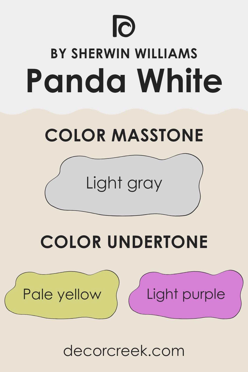
What are the right undertones of Panda White SW 6147 ?
Panda White SW 6147 by Sherwin Williams is a vibrant and adaptable color that has a unique blend of undertones. Undertones are the subtle colors that sit beneath the primary surface color and they can significantly influence how a color appears in different lighting conditions. The undertones present in Panda White include pale yellow, light purple, light blue, pale pink, mint, lilac, and grey.
These undertones play a crucial role in how Panda White behaves on interior walls. The pale yellow and pale pink add a slight warmth to the color, making it welcoming and soft. Light purple and lilac provide a touch of coolness, which can make the color feel fresh and calm.
Mint and light blue bring a hint of freshness, supporting a bright and airy feeling in the room. The grey undertone helps to balance and ground the color, preventing it from becoming too vibrant and ensuring it works well in a variety of areas.
On interior walls, these undertones can make Panda White appear differently depending on the room’s lighting and the colors of adjacent surfaces. In natural light, the blue and mint undertones might become more noticeable, giving the wall a crisper appearance. In artificial lighting, the warmer undertones like pale yellow and pink can become more pronounced, creating a cozy atmosphere. This flexibility makes Panda White a great choice for many different areas and styles.
decorcreek.com
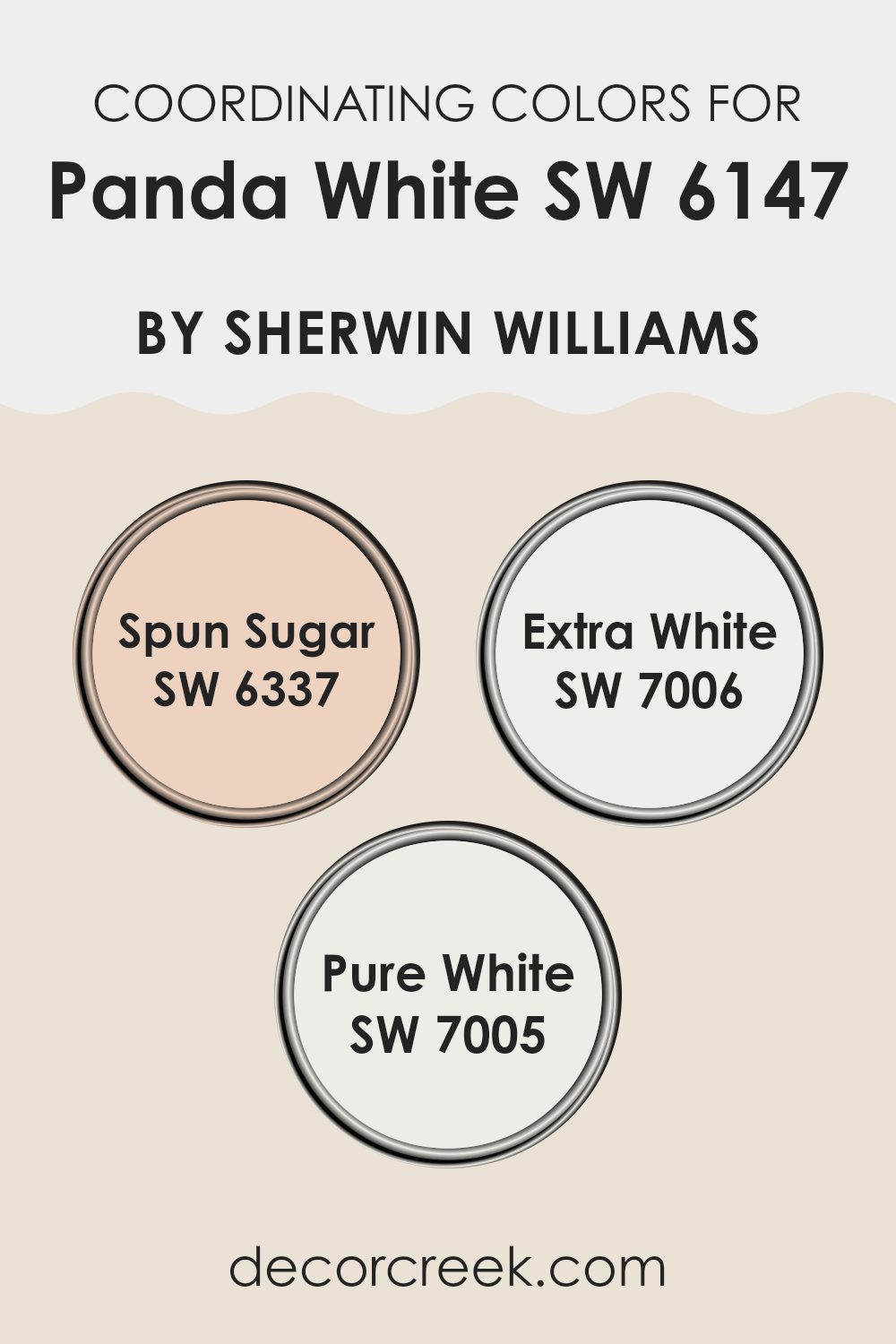
Best Coordinating Colors to use with Panda White SW 6147 by Sherwin Williams this year.
Coordinating colors are chosen to complement each other on walls, trims, and accents in interior design, creating a visually pleasing environment. These colors work together to provide balance and harmony within a room.
For instance, when decorating with a base color like Panda White by Sherwin Williams, selecting the right coordinating colors is essential to achieve a cohesive look. This particular shade of white offers a subtle backdrop that pairs well with other colors without feeling too strong.
One such coordinating color is Spun Sugar, a gentle pink that adds a light, airy touch to a room, providing a soft contrast to Panda White’s neutral undertone. This combination is ideal for creating a subtle, warm ambiance in rooms that aim for a fresh and inviting atmosphere. Extra White and Pure White are also coordinating colors that work well with Panda White.
Extra White offers a crisp, clean look, enhancing the brightness of a room when used on trim or ceilings, thus reflecting more light and adding dimension to the room. On the other hand, Pure White has a slightly softer tone, which can help in softening the overall aesthetic while still maintaining a clean and seamless look, perfect for creating a unified color flow in any room.
You can see recommended paint colors below:
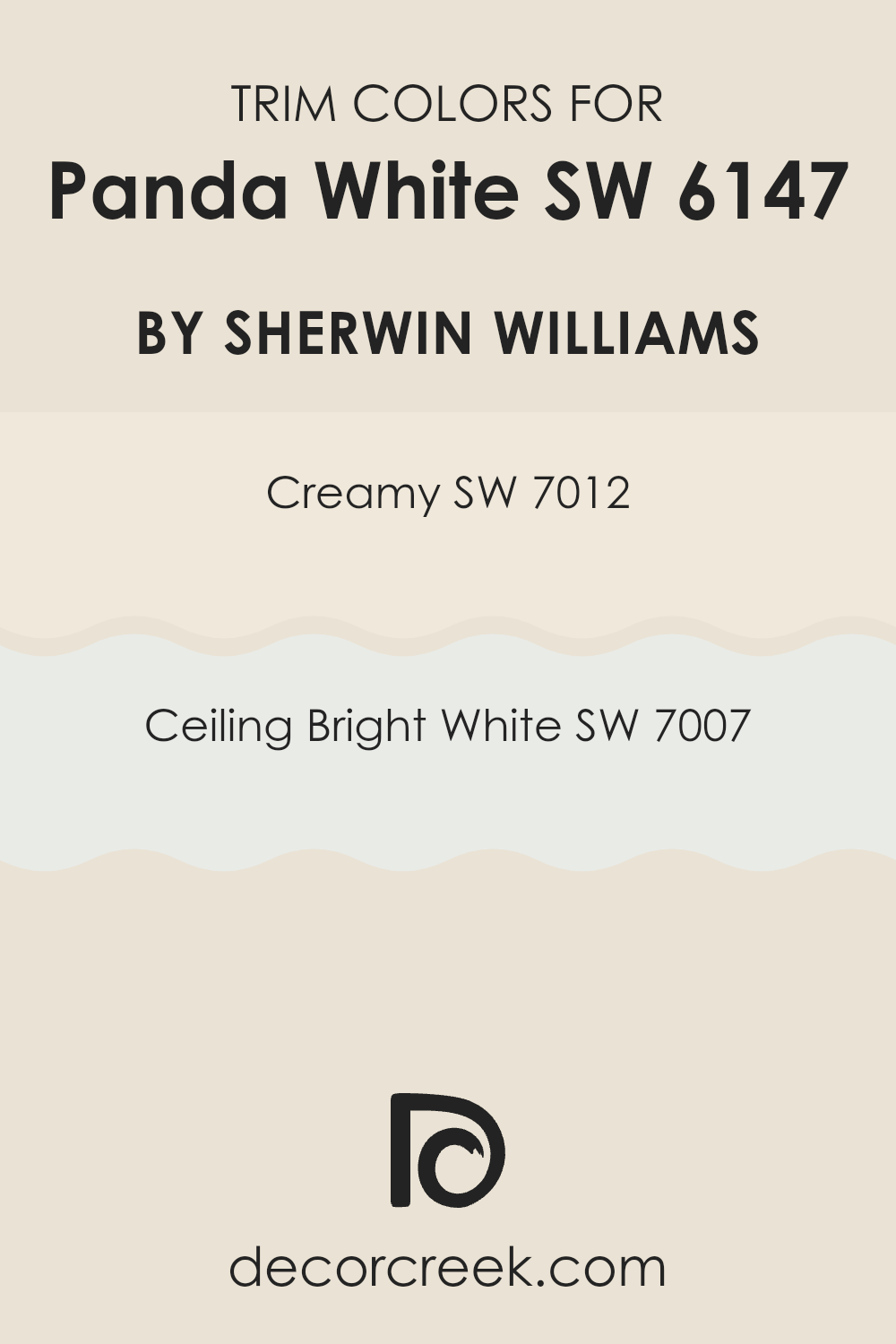
Trendy Trim Colors of Panda White SW 6147 by Sherwin Williams to use this year.
Trim colors are selected to complement the primary wall colors in a room, creating a finishing touch that defines and highlights architectural details like moldings, windows, and doors.
For Panda White by Sherwin Williams, choosing the right trim colors, such as Creamy (SW 7012) and Ceiling Bright White (SW 7007), is crucial because they enhance the subtle nuances of the wall color and ensure that the area feels coherent and well-designed. The right trim color can act as a subtle frame, accentuating the main color, or can introduce contrast, adding depth to the overall aesthetic of the room.
Creamy (SW 7012) is a soft, warm white that provides a gentle contrast to Panda White, giving a room a cozy and inviting atmosphere. It works well in areas that aim for a relaxed and comfortable feel.
Ceiling Bright White (SW 7007), on the other hand, is a crisp, clean white that offers a sharper contrast, making it ideal for brightening areas and making ceilings appear higher. This color is perfect for areas that benefit from a fresh, airy vibe. Together, these trim colors complement Panda White by adding structure and an element of interest to the area without feeling too strong next to the primary color.
You can see recommended paint colors below:
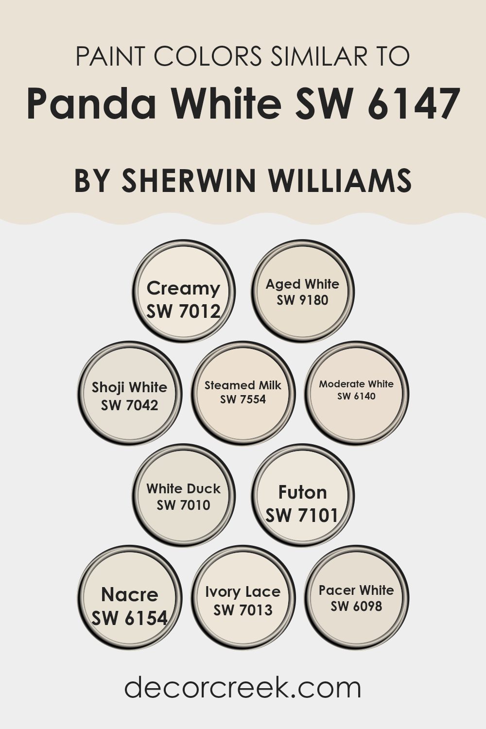
Evergreen Colors Similar to Panda White SW 6147 by Sherwin Williams
Similar colors play a vital role in creating a harmonious and cohesive look within an area. When colors like Creamy, Aged White, Shoji White, and others that are near Panda White’s hue are used together, they offer a subtle variation in tone that can make a room feel more layered and visually interesting without feeling too strong.
This approach is particularly useful in achieving a soft, modern aesthetic where the focus is on simplicity and minimalism. Colors close to each other on the color scale, such as Steamed Milk or Moderate White, have the benefit of blending smoothly with each other, ensuring that no single color stands out too much or disrupts the visual flow.
Creamy and Aged White, for example, bring warmth to an area, making it feel welcoming and comfortable. Shoji White offers a hint of gray that can help ground the lighter tones. Steamed Milk has a touch of beige, perfect for adding depth. Moderate White is slightly more pronounced than the others, providing a gentle contrast. White Duck and Futon, both with undertones that do not stray too far from the neutral base, work well to create a soft backdrop that complements furnishings and decor elements.
Nacre and Ivory Lace introduce a subtle refined feel with their slightly richer texture, while Pacer White serves as a clean slate, pairing well with brighter accents or serving as a standalone backdrop for a calm and collected area. These colors, while individually unique, collectively contribute to a cohesive atmosphere, supporting a smooth visual transition throughout the home.
You can see recommended paint colors below:
- SW 7012 Creamy
- SW 9180 Aged White
- SW 7042 Shoji White
- SW 7554 Steamed Milk
- SW 6140 Moderate White
- SW 7010 White Duck
- SW 7101 Futon
- SW 6154 Nacre
- SW 7013 Ivory Lace
- SW 6098 Pacer White
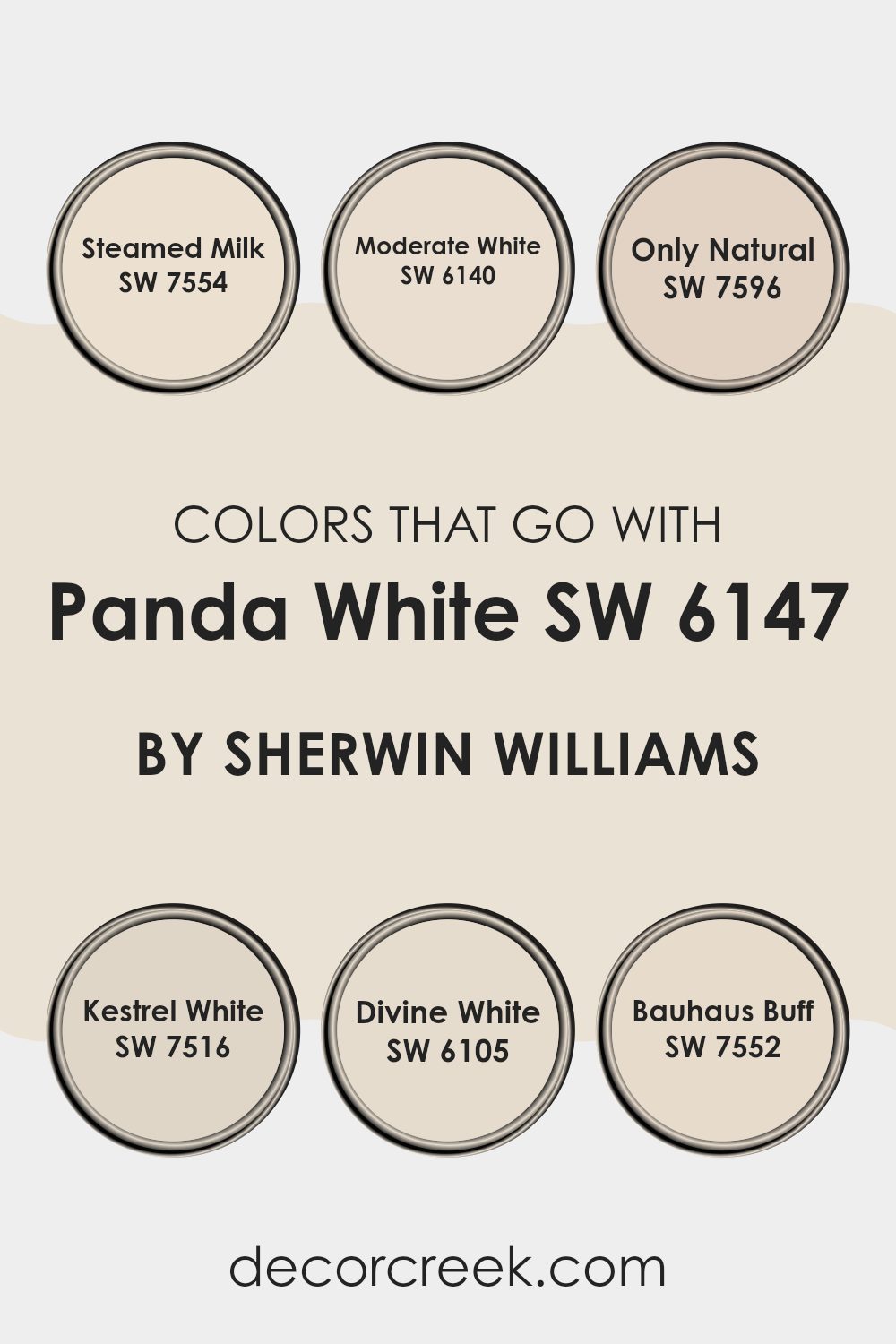
Colors that Go With Panda White SW 6147 by Sherwin Williams
When it comes to interior decorating, choosing the right accompanying colors for a base like Panda White SW 6147 by Sherwin Williams is key to creating a harmonious area. These complementary colors can help balance the atmosphere in a room, making it more inviting. For instance, pairing Panda White with colors like Steamed Milk SW 7554, a soft and creamy hue, brings a warm and cozy feel to any room. This combination is perfect for living areas where comfort is paramount.
Similarly, Moderate White SW 6140 offers a slightly deeper tone and yet remains light, aligning closely with Panda White for a subtle contrast. This can enhance areas without feeling too strong with dark colors. Only Natural SW 7596 provides a deeper, earthy beige that blends well with natural elements like wood or stone, perfect for settings that aim to connect the indoors with the outdoors.
Kestrel White SW 7516 leans towards a grayish tone, offering a modern twist that suits urban decor well. For a hint of warmth, Divine White SW 6105 includes a touch of soft beige that pairs beautifully with natural sunlight streaming through windows. Lastly, Bauhaus Buff SW 7552 incorporates a dusky buff tone that works well to provide a grounded, calm feel to a room decorated in Panda White. All these colors work together to create a cohesive aesthetic that feels both welcoming and stylish.
You can see recommended paint colors below:
- SW 7554 Steamed Milk
- SW 6140 Moderate White
- SW 7596 Only Natural
- SW 7516 Kestrel White
- SW 6105 Divine White
- SW 7552 Bauhaus Buff
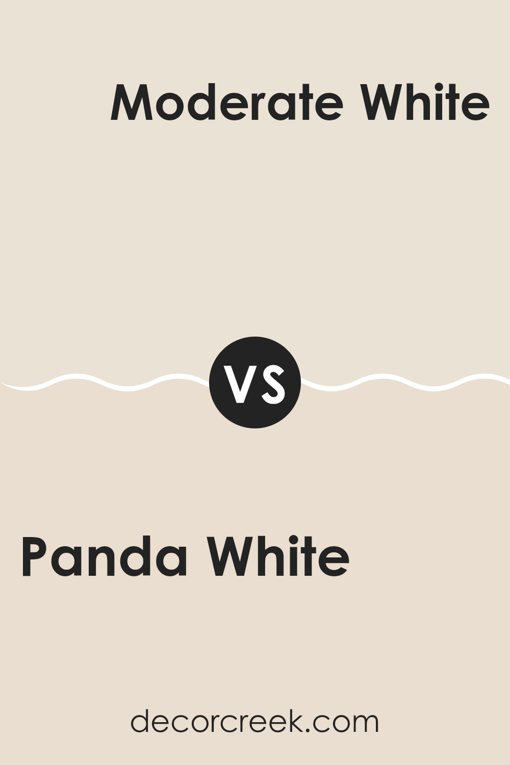
Panda White SW 6147 by Sherwin Williams vs Moderate White SW 6140 by Sherwin Williams
Panda White and Moderate White are both neutral paint colors from Sherwin Williams, but they have different tones that can impact the feel of a room. Panda White has a warmer undertone, making it appear cozier and more welcoming.
It’s great for living areas or bedrooms where you want a soft, inviting atmosphere. On the other hand, Moderate White leans towards a cooler tone, which gives it a cleaner, crisper look. This makes it suitable for areas like kitchens or bathrooms, where a fresh, clean appearance is often desired.
Both colors are quite adaptable and can blend well with various decor styles and color schemes, making them popular choices for those looking to refresh their walls with a subtle, yet effective change.
You can see recommended paint color below:
Panda White SW 6147 by Sherwin Williams vs Creamy SW 7012 by Sherwin Williams
Panda White and Creamy by Sherwin-Williams are both neutral shades, but they bring different vibes to a room. Panda White has a cooler undertone, making it perfect for modern areas that aim for a crisp, clean look.
It reflects light well, which can make small rooms feel more open and airy. On the other hand, Creamy has a warmer undertone; it’s a soft, inviting color that works well in areas where you want a cozy, comforting atmosphere.
This color adds a gentle warmth to rooms and pairs nicely with a wide range of decor styles, from rustic to contemporary. While both colors are quite adaptable, your choice between Panda White and Creamy should depend on the mood you want to create and the existing colors in your decor.
You can see recommended paint color below:
Panda White SW 6147 by Sherwin Williams vs Nacre SW 6154 by Sherwin Williams
Panda White and Nacre are both colors by Sherwin Williams, each bringing its distinct shade to interiors. Panda White is a very soft white with a slight touch of gray, making it clean and bright without feeling too strong.
It’s excellent for areas that you want to feel airy and open. On the other hand, Nacre is a bit warmer and creamier than Panda White. It has a gentle hint of beige that makes it inviting and cozy, ideal for creating a comfortable, welcoming atmosphere in a room.
While both colors provide a neutral backdrop, Panda White leans towards a cooler tone, good for modern aesthetics, whereas Nacre offers a soft warmth that suits traditional or relaxed settings better. Their subtle differences can significantly affect the feel and mood of an area, depending on what you’re looking for.
You can see recommended paint color below:
Panda White SW 6147 by Sherwin Williams vs Shoji White SW 7042 by Sherwin Williams
Panda White and Shoji White by Sherwin Williams are both popular shades of white paint, but they have distinct differences in tone and warmth. Panda White has a soft, creamy feel to it, making it quite warm and inviting.
This color works well in areas that aim for a cozy and slightly more traditional aesthetic. On the other hand, Shoji White has a cleaner, almost neutral quality. While still warm, it leans closer to a pure white without going into stark or cold territory.
Shoji White is ideal for those wanting a modern, clean look that still feels welcoming. Both colors are quite adaptable and can brighten up a room while maintaining a subtle richness, but your choice between them would depend on the specific mood and style you want to achieve in your area.
You can see recommended paint color below:
Panda White SW 6147 by Sherwin Williams vs Aged White SW 9180 by Sherwin Williams
Panda White and Aged White by Sherwin Williams are two distinct colors, each offering a unique take on white tones. Panda White has a clean and crisp feel, leaning towards a true white with only a hint of warmth. This makes it a great choice for areas that want to feel open and bright without the starkness that some pure whites can bring.
On the other hand, Aged White brings in more warmth due to its beige undertones. This gives it a more inviting and cozy vibe, making it perfect for rooms that aim for a comfortable, lived-in feel. It’s also well-suited for areas that don’t get a lot of natural light, as it helps soften shadows and corners with its gentle tone.
In summary, if you’re looking for a whiter, brighter area, Panda White is the way to go. For a room where a touch of warmth and coziness is desired, Aged White would be a better fit. Both colors support various decor styles, depending on the ambiance you want to achieve.
You can see recommended paint color below:
Panda White SW 6147 by Sherwin Williams vs Futon SW 7101 by Sherwin Williams
Panda White and Futon, both by Sherwin Williams, present a subtle contrast in the world of whites and neutrals. Panda White is a soft, warm white with a gentle beige undertone that makes it cozy and welcoming. It’s an excellent choice if you want a room to feel airy yet inviting. This color pairs well with bolder shades and natural materials, and it works wonderfully in places where you want a soothing atmosphere, like living rooms or bedrooms.
On the other hand, Futon is closer to a true neutral or off-white. It has a slightly cooler tone compared to Panda White, which makes it great for areas you want to keep calm and understated. Futon works well in both bright and dim lighting, maintaining its neutrality without shifting too warm or too cool, making it adaptable across various design styles and room functions.
Both colors offer a clean backdrop for furniture and decorations, allowing other elements in the room to stand out. They are practical choices for anyone aiming to create a fresh and modern look in their home.
You can see recommended paint color below:
Panda White SW 6147 by Sherwin Williams vs Ivory Lace SW 7013 by Sherwin Williams
Panda White and Ivory Lace, both by Sherwin Williams, offer subtle variations in tone that can affect the mood of a room. Panda White is a soft white with a warm undertone that makes an area feel cozy and welcoming. It’s particularly effective in areas that want a gentle, inviting atmosphere without being stark.
Ivory Lace, on the other hand, has a slightly creamier base. This gives it a richer appearance that can add a hint of elegance to areas without feeling too strong. It works well in rooms that receive a lot of natural light, as the color can help enhance the brightness of the area.
Both colors are flexible for various decorating styles, but Panda White tends to be better for those looking for a straightforward, clean look, while Ivory Lace is ideal for someone wanting a touch more warmth and depth. When choosing between them, consider the amount of light your room gets and the style you’re aiming for.
You can see recommended paint color below:
Panda White SW 6147 by Sherwin Williams vs Pacer White SW 6098 by Sherwin Williams
Panda White and Pacer White are two paint colors from Sherwin Williams that have subtle differences. Panda White is a soft white with a warm undertone. It creates a cozy and welcoming feel in a room, making it perfect for living areas and bedrooms where you want a gentle and relaxed ambiance. It pairs well with other warm colors and natural materials like wood.
On the other hand, Pacer White leans more towards a neutral white with a hint of gray. This color is more muted compared to Panda White, giving it a more understated look. Pacer White is excellent for areas where you want a clean, straightforward backdrop that allows other elements in the room to stand out. It works well in both modern and traditional settings, making it adaptable for various home styles.
In conclusion, while both colors are whites, Panda White offers warmth and coziness, whereas Pacer White provides a cleaner, more neutral base.
You can see recommended paint color below:
Panda White SW 6147 by Sherwin Williams vs Steamed Milk SW 7554 by Sherwin Williams
Panda White and Steamed Milk are both colors by Sherwin Williams that offer subtle differences suited to various decorating styles. Panda White is a soft white with a slight gray undertone, giving it a clean and fresh look.
It’s ideal for areas where you want a bright feel without starkness. On the other hand, Steamed Milk has a warmer tone, leaning towards a creamy beige rather than a pure white. This color is excellent for creating a cozy and inviting atmosphere in rooms where comfort is a priority, such as living rooms or bedrooms.
Both colors are quite adaptable; however, Steamed Milk is better for those who prefer a hint of warmth, while Panda White works well in a modern, minimalist decor style. Depending on the lighting and accompanying decor, each paint can help enhance the room’s aesthetic in its unique way.
You can see recommended paint color below:
Panda White SW 6147 by Sherwin Williams vs White Duck SW 7010 by Sherwin Williams
Panda White and White Duck, both by Sherwin Williams, present subtle differences in their shades. Panda White has a clean, bright quality, while White Duck leans towards a warmer, slightly beige tone.
When placed side by side, Panda White shows off a purer white look, making it great for areas that want to feel open and airy. In contrast, the warmth of White Duck offers a cozy, inviting atmosphere, perfect for rooms where comfort is key. These colors, albeit both white, suit different moods and settings in the home.
While Panda White reflects more light, making a room look more spacious, White Duck’s creamy undertones provide a soft, subtle richness that can make large areas feel more intimate. Choosing between them depends on the desired effect in your room – brightness with Panda White or warmth with White Duck.
You can see recommended paint color below:
In wrapping up my thoughts on SW 6147 Panda White by Sherwin Williams, I’ve found that this paint color is really something special. Panda White is a color that looks clean and simple, making rooms feel fresh and open. It’s not a bright white, but rather has a gentle touch of grey which makes it more calm and soft to look at. This slight grey tone also means it doesn’t show dirt or scuffs as easily as a pure white might, which is great for areas that get a lot of use, like a living room or a kid’s play area.
When using Panda White on walls, it pairs wonderfully with all sorts of colors. Whether you mix it with dark colors like navy blue for a sharp contrast, or with light pastel shades for a gentle flow, it works perfectly. I also noticed that it’s especially lovely during the daylight hours, as it captures the natural light making areas appear bigger and more inviting.
What’s amazing is how different the color can look and feel based on the lighting and other colors around it. It can come off cooler or a bit warmer, which is really useful because it means you can use it in any type of room, north or south facing, with any lighting situation.
So, if you’re looking for a paint color that is clean, simple, and adaptable, SW 6147 Panda White is an excellent choice. It surely makes rooms look nice without too much fuss or effort.
decorcreek.com
Ever wished paint sampling was as easy as sticking a sticker? Guess what? Now it is! Discover Samplize's unique Peel & Stick samples.
Get paint samples

