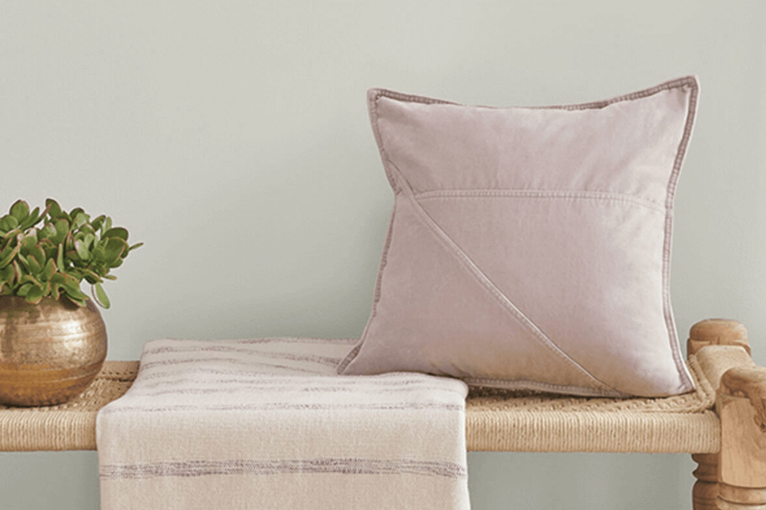
When choosing the perfect paint color, SW 7654 Lattice by Sherwin Williams caught my attention with its unique charm. This delightful gray offers a soft, subtle hue that works wonders in creating a light and airy atmosphere in any room. The color’s soothing quality makes it ideal for spaces where you want to relax and unwind, such as bedrooms or living areas.
Lattice provides a neutral backdrop that pairs beautifully with a wide range of décor styles, from modern minimalism to cozy country. It’s versatile enough to complement bold accents or to quietly anchor a more muted, harmonious palette. Whether you’re looking to refresh your walls, furniture, or cabinets, Lattice offers a timeless elegance that enhances the surrounding colors and textures.
If you’re thinking about giving your space a fresh, clean look, Lattice by Sherwin Williams might just be the shade you need.
It has a way of making spaces feel larger and more inviting without overwhelming the senses, ensuring that the room remains a comfortable retreat.
What Color Is Lattice SW 7654 by Sherwin Williams?
Lattice by Sherwin Williams is a soft gray color with subtle blue undertones, making it a versatile and fresh choice for any space. It has a gentle, inviting quality that can create a calm atmosphere in a room. This color lies somewhere between a light gray and a muted blue, which makes it easy to combine with various decor styles and palettes.
Lattice works beautifully in modern and contemporary interiors because of its clean and understated look. It also fits well in coastal and Scandinavian themes due to its airy and light qualities. For a more traditional space, Lattice provides a modern twist without detracting from the classic elements of the design.
In terms of materials and textures, Lattice pairs well with natural wood, helping to bring out its warm tones. It also looks elegant with white trim or white furniture, creating a crisp, clean contrast. For a cozy feel, you can pair it with soft textiles like wool or cotton in neutral shades. Metallic finishes like brushed nickel or stainless steel can give rooms a more modern vibe, while soft gold or brass can add a touch of warmth to the space.
Overall, Lattice is a flexible color that can help create a light, airy feel in a home while still adding enough character to be the backdrop for a variety of decor styles.

Is Lattice SW 7654 by Sherwin Williams Warm or Cool color?
Lattice SW 7654 by Sherwin Williams is a versatile and light gray color that is perfect for home interiors. Its lightness makes it easy to pair with a wide range of other colors and decoration styles.
Whether you use it in a living room, bedroom, or kitchen, Lattice provides a calm and neutral backdrop. This color can help to brighten up dark spaces because it reflects light well, making rooms feel larger and more open. It’s also great for areas where you want to create a clean and straightforward look without overwhelming the senses with strong colors.
People often use Lattice in modern and minimalist designs, but it is also soft enough to fit well in cozy, more traditional settings. Since it isn’t too bold, it’s easy to decorate over the years without having to repaint as often as you might with darker or more intense colors.
Undertones of Lattice SW 7654 by Sherwin Williams
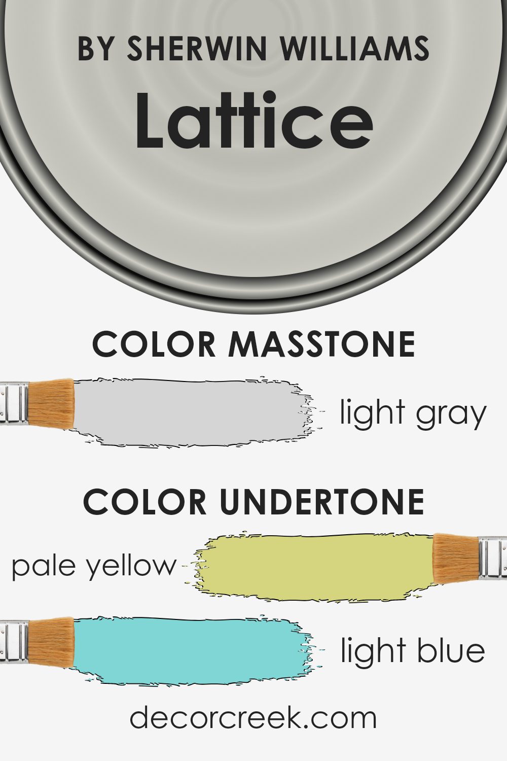
LatticeSW 7654 is a unique paint color because it has a complex mix of undertones that influence its appearance in different lighting conditions and surroundings. Undertones are subtle colors hidden beneath the top layer of the paint color that affect its overall hue. The undertones of this paint include pale yellow, light blue, light purple, mint, pale pink, lilac, and grey.
In general, undertones can significantly impact how we perceive a color. For example, a color with yellow undertones may appear warmer, while one with blue undertones might look cooler. The mix of undertones in LatticeSW 7654 allows it to adapt under various lighting conditions, making the paint highly versatile for use in different rooms and settings.
When applied to interior walls, the undertones of LatticeSW 7654 interact with both natural and artificial light, which can subtly change its appearance throughout the day. The pale yellow and mint undertones can make a room feel brighter and more welcoming, while the light blue and lilac undertones add a calm and gentle vibe. The pale pink undertone provides a touch of warmth, making the space feel cozy.
The grey undertone keeps the color grounded, ensuring it doesn’t become too overpowering, even in well-lit areas. Overall, the blend of these undertones means that LatticeSW 7654 adds a beautiful layer of depth and interest to any space, enhancing the overall aesthetic in a subtle but impactful way.
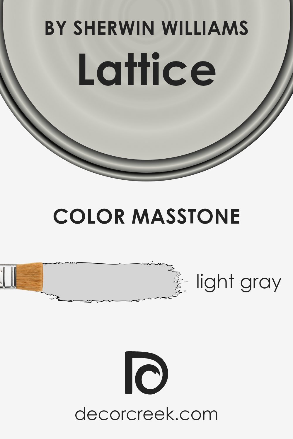
What is the Masstone of the Lattice SW 7654 by Sherwin Williams?
LatticeSW 7654 by Sherwin Williams has a masstone of light gray (#D5D5D5), a shade that works exceptionally well in homes for various reasons. This light gray is neutral, making it incredibly versatile and easy to pair with different decor styles and colors.
Whether you are looking to create a modern look with bold accents or a cozy atmosphere with softer tones, this color provides a calm and subtle background. Its lightness helps to make spaces appear larger and more open, which is particularly beneficial in smaller rooms or apartments.
This color also reflects natural light well, brightening up spaces without being too stark or cold, which can sometimes be a problem with pure whites. It’s an excellent choice for common areas like living rooms and kitchens, where you want a clean, unobtrusive backdrop. Additionally, this light gray is practical as it tends to hide small imperfections better than darker colors and is less likely to show wear and tear, making maintenance easier.
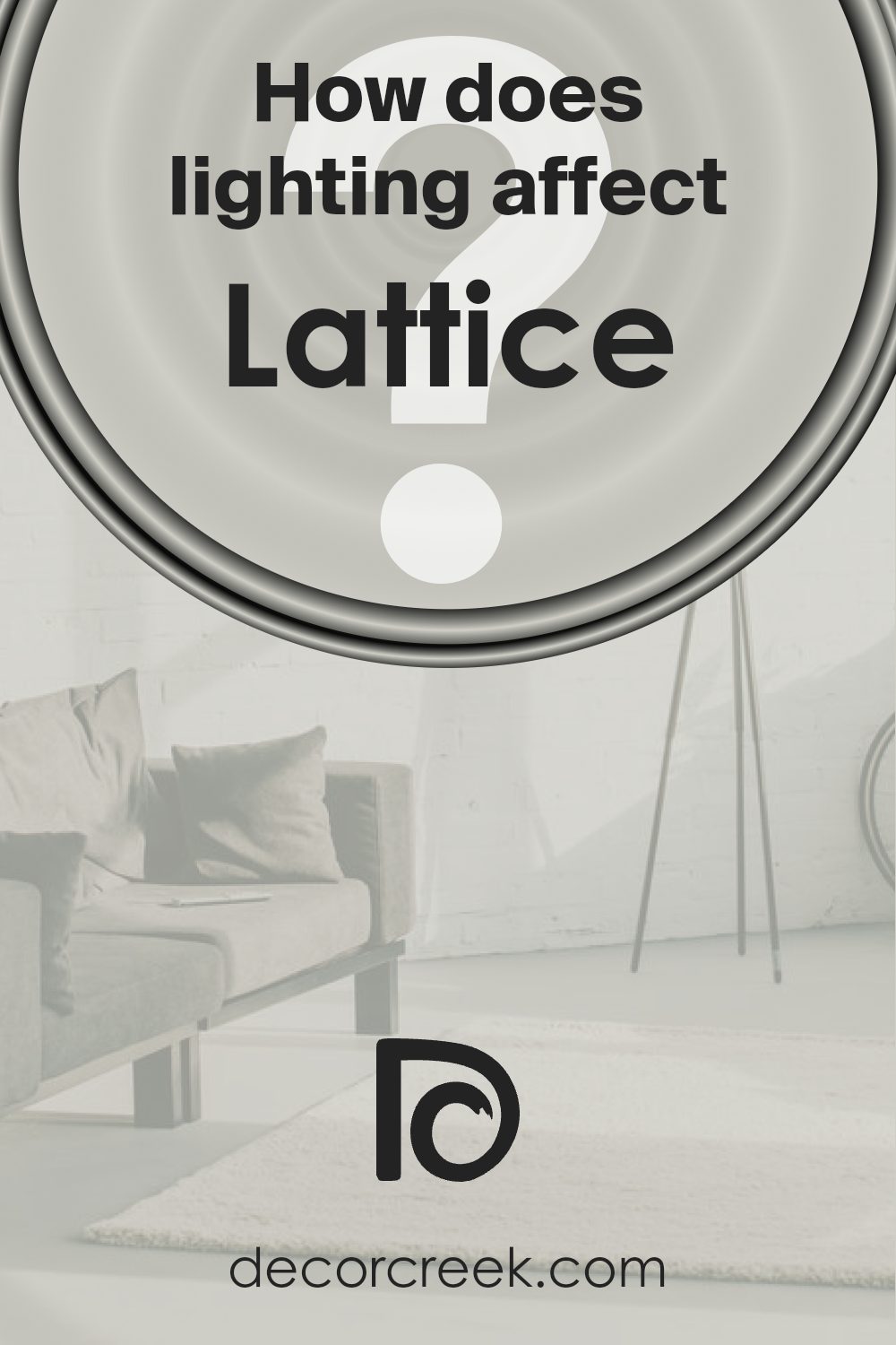
How Does Lighting Affect Lattice SW 7654 by Sherwin Williams?
Lighting plays a crucial role in how colors appear in different environments. The kind of light—whether natural or artificial—can greatly affect the perception of color on your walls. Take Lattice by Sherwin Williams, a versatile shade, and let’s see how it behaves under various lighting conditions.
In natural light, colors can look vastly different depending on the time of the day and the direction your room faces. For instance, in a north-facing room, which tends to receive less direct sunlight, Lattice might appear slightly cooler and more muted. This could make the room feel calm and understated.
On the other hand, in a south-facing room, where the light is warmer and more abundant, Lattice may seem brighter and more lively, giving the space a more cheerful ambiance.
When it comes to rooms facing east, they get most of their light in the morning. Here, Lattice will look warm and inviting in the morning, creating a cozy start to the day, but might turn a bit duller as the day progresses.
Conversely, in west-facing rooms, the color will start off more subdued in the morning and gain warmth and vibrancy towards the evening as the sun sets, which could make the room feel more welcoming by the end of the day.
Artificial lighting also affects how Lattice shows up. Under warm artificial lights, such as incandescent bulbs, the color will appear warmer, enhancing its coziness. Cooler lights, like some LEDs, can make it look sharper and more modern. This variation means you can somewhat control the mood in your space depending on your choice of artificial lighting.
Understanding how lighting affects colors like Lattice can help you make better design choices, ensuring that you achieve the desired effect in each room, regardless of its orientation or the type of lighting used.
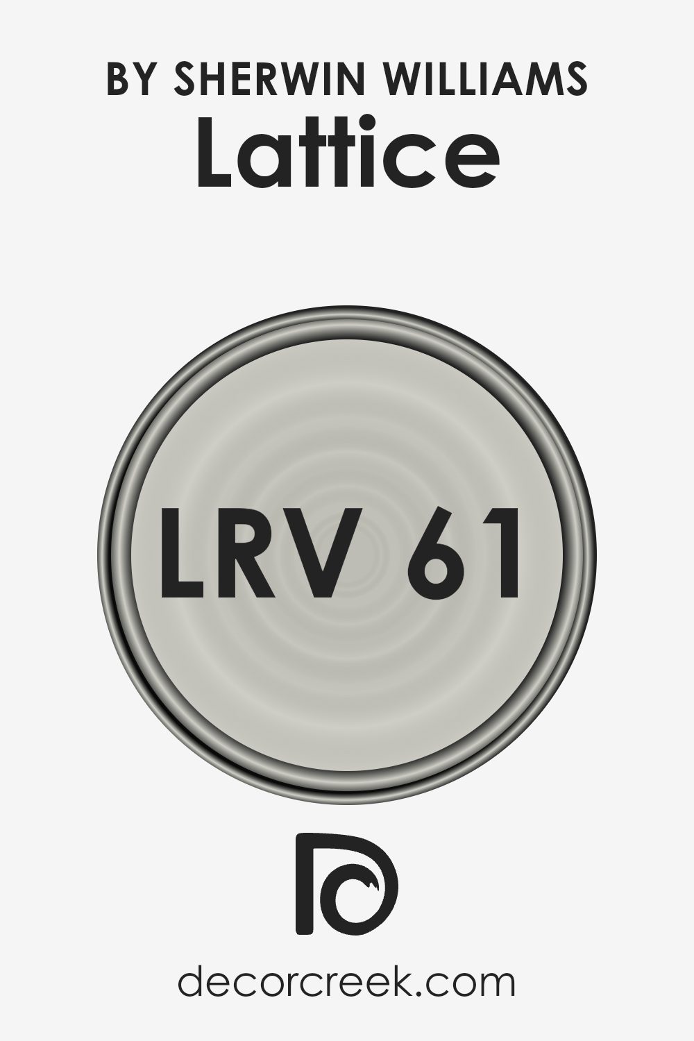
What is the LRV of Lattice SW 7654 by Sherwin Williams?
LRV stands for Light Reflectance Value, a measure used to determine how much light a color reflects or absorbs. This number ranges between 0 and 100, where the lower end indicates that a color absorbs more light, making it appear darker, and the higher end shows that it reflects more light, making it appear lighter.
This measurement is especially useful when choosing paint colors for a room as it helps predict how light or dark the color will feel once on the walls. A higher LRV can make a room feel more open and airy, while a lower LRV can make a room feel cozier and more enclosed.
For Lattice with an LRV of 61.202, the color is on the lighter side, meaning it will reflect a good amount of light. This characteristic makes it a great choice for spaces that need a bright and lively feel. In rooms with less natural light, this color will help maximize the illumination by reflecting artificial lighting effectively. Conversely, in well-lit spaces, using a color like this can enhance the brightness of the room, making it feel spacious and welcoming.
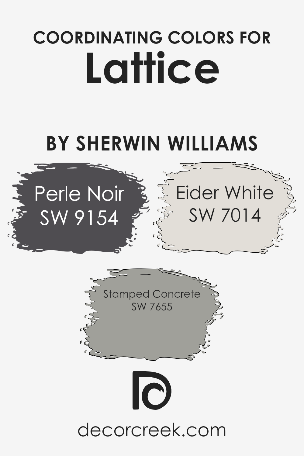
Coordinating Colors of Lattice SW 7654 by Sherwin Williams
Coordinating colors are shades that complement each other well and create a harmonious palette when used together in design. This concept is essential for interior decorating, allowing one to combine various colors to achieve a pleasing aesthetic. Lattice, a neutral grey tone, pairs beautifully with specific coordinating colors such as Perle Noir, Stamped Concrete, and Eider White.
These colors work together by balancing each other out; the neutrality of Lattice serves as a perfect backdrop, letting the other colors stand out or blend in harmoniously, depending on the desired effect.
Perle Noir is a deep, almost black shade that lends a striking contrast when used with lighter tones like Lattice. This contrast is excellent for creating focal points or accentuating details in a room. On the other hand, Stamped Concrete is a mid-tone grey that complements Lattice by providing a subtle distinction without overpowering the space, perfect for larger areas or furniture.
Eider White offers a clean, crisp finish that can help brighten and enlarge a space, making it feel fresh and airy when combined with darker shades like Lattice or Perle Noir. Together, these colors can create a visually interesting space that feels cohesive and well thought out.
You can see recommended paint colors below:
- SW 9154 Perle Noir
- SW 7655 Stamped Concrete
- SW 7014 Eider White
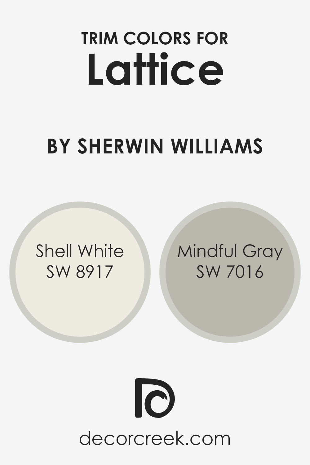
What are the Trim colors of Lattice SW 7654 by Sherwin Williams?
Trim colors are chosen to enhance the aesthetic appeal and overall cohesion of a room’s color scheme. By selecting appropriate trim colors, you can create a striking contrast or a subtle transition that complements the main wall color. For example, using trim colors with Sherwin Williams’ Lattice, a soft muted shade can help to accentuate its unique tone and draw the eye to architectural details like moldings, window frames, and door edges.
Shell White SW 8917 is a soft, warm white that works wonderfully as a trim color. It provides a clean and inviting look without overpowering the main color, making it ideal for creating a gentle and refreshing boundary around Lattice.
On the other hand, Mindful Gray SW 7016 offers a cooler, light gray option that adds a neutral but contrasting edge, lending a subtle distinction that is neither too stark nor too bland. This makes it perfect for more modern spaces where you want to add a touch of crispness without the harshness of a pure white.
You can see recommended paint colors below:
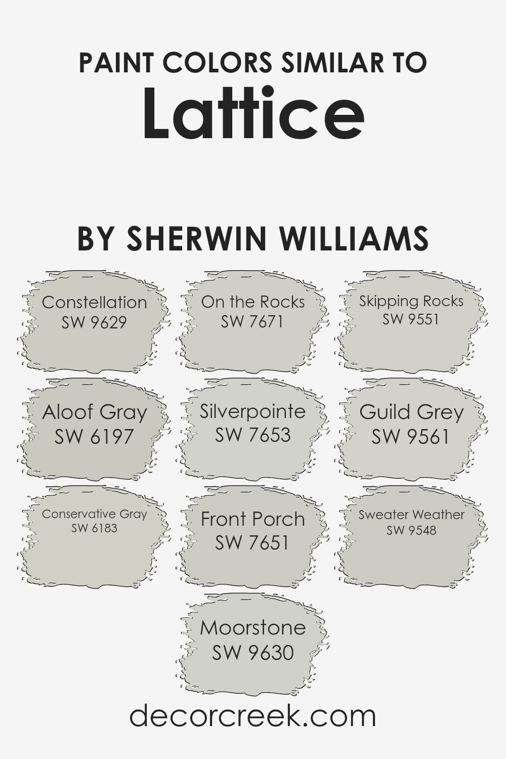
Colors Similar to Lattice SW 7654 by Sherwin Williams
Similar colors play a crucial role in design by creating a harmonious and cohesive look. When colors closely resemble each other, like those akin to Lattice SW 7654 by Sherwin Williams, they help establish a smooth visual flow in a space. Using shades like Constellation SW 9629, which adds a touch of mineral gray, or Aloof Gray SW 6197, a cooler, distant gray, enables subtle contrasts that are pleasing to the eye. Other hues such as Conservative Gray SW 6183 offer a slightly stronger presence without overwhelming the senses.
Further extending the palette, Moorstone SW 9630 brings in a deeper, earthier tone, while On the Rocks SW 7671 presents a muted, soft gray, adding to the versatility of the color scheme. Silverpointe SW 7653 is a light, airy gray that brightens spaces effortlessly.
Front Porch SW 7651 introduces a hint of pale blue-gray that reflects a calm atmosphere. Similarly, Skipping Rocks SW 9551, Guild Grey SW 9561, and Sweater Weather SW 9548 each provide unique takes on the gray theme, ranging from subtle to richer expressions of the same foundational color, ensuring that there is coherence yet enough variety to keep the design interesting. By selecting colors that share similarities, one can create a space that feels connected and thoughtfully curated.
You can see recommended paint colors below:
- SW 9629 Constellation
- SW 6197 Aloof Gray
- SW 6183 Conservative Gray
- SW 9630 Moorstone
- SW 7671 On the Rocks
- SW 7653 Silverpointe
- SW 7651 Front Porch
- SW 9551 Skipping Rocks
- SW 9561 Guild Grey
- SW 9548 Sweater Weather
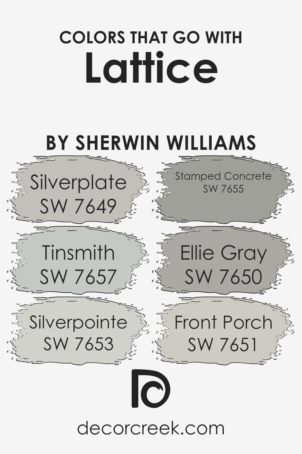
Colors that Go With Lattice SW 7654 by Sherwin Williams
Choosing complementary colors for Lattice SW 7654 by Sherwin Williams is crucial for creating a harmonious and visually appealing space. Colors that pair well with Lattice, such as Silverplate, Tinsmith, Silverpointe, Stamped Concrete, Ellie Gray, and Front Porch, help to either calm down or enhance the main shade, depending on the atmosphere you’re aiming to achieve in your decorating scheme.
For example, using a color like Silverplate can help maintain a balanced look, keeping the décor light without overpowering the soft tone of Lattice. Alternatively, a darker shade like Ellie Gray can provide a pleasing contrast, adding depth and interest to the room.
Silverplate is a soft, light gray that provides a subtle contrast to Lattice, brightening spaces without overwhelming them. Tinsmith, a bit deeper than Silverplate, offers a hint of warmth, making it ideal for adding a gentle, cozy feel to rooms. Silverpointe is another light gray but with a slightly cooler undertone, ideal for modern spaces that require a crisp background.
Stamped Concrete is a mid-tone gray that stands out against Lattice, providing a strong but neutral backdrop. Ellie Gray is a more robust option that brings forward a sturdier character, suitable for accentuating architectural features or furniture. Front Porch, with its airy vibe, complements Lattice by enhancing the light and freshness of a room. Together, these shades work seamlessly to create visually pleasing and functional interiors.
You can see recommended paint colors below:
- SW 7649 Silverplate
- SW 7657 Tinsmith
- SW 7653 Silverpointe
- SW 7655 Stamped Concrete
- SW 7650 Ellie Gray
- SW 7651 Front Porch
How to Use Lattice SW 7654 by Sherwin Williams In Your Home?
Lattice SW 7654 by Sherwin Williams is a beautiful light gray paint that works wonderfully in any space. It’s a versatile color that complements many styles, from modern to rustic. This neutral hue is perfect for creating a calm, cozy setting in your home.
You can use Lattice in living rooms or bedrooms to provide a soft backdrop for furniture and artwork. It’s also great for bathrooms and kitchens, adding a fresh and clean look that’s not too stark.
Consider Lattice for your cabinets or as an accent wall too. It pairs nicely with brighter colors or darker shades, allowing for easy coordination with other elements in your room. Painting your front door with this color can also make a pleasant impression on guests. Overall, using Lattice SW 7654 offers a straightforward way to freshen up your home with a stylish, modern look.
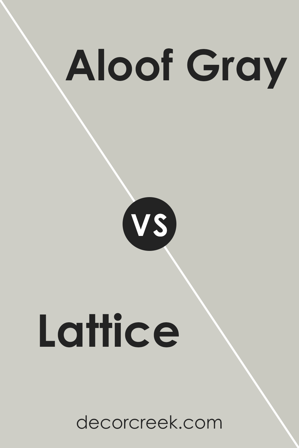
Lattice SW 7654 by Sherwin Williams vs Aloof Gray SW 6197 by Sherwin Williams
Lattice SW 7654 and Aloof Gray SW 6197 by Sherwin Williams are both unique neutral colors, but they carry different tones and feel. Lattice is a warm gray that leans toward a soft taupe, giving it a cozy and inviting appeal.
It’s a versatile shade that works well in spaces where you want a hint of warmth without overpowering the room. On the other hand, Aloof Gray is cooler and has more blue undertones, making it appear more distant yet still very calming. It’s perfect for creating a clean, crisp look in a space. Aloof Gray might seem slightly lighter compared to Lattice under certain lighting conditions, highlighting its cool character against the warmer, earthier tone of Lattice.
Both colors are suitable for various settings, yet their distinct undertones will impact the mood and style of the space.
You can see recommended paint color below:
Lattice SW 7654 by Sherwin Williams vs Constellation SW 9629 by Sherwin Williams
Lattice SW 7654 is a subtle gray shade that offers a calm and neutral backdrop for any room. It’s soft enough to be versatile, yet has enough presence to stand on its own, making it a great choice for living spaces and bedrooms alike.
On the other hand, Constellation SW 9629 is a darker, more intense color. This deep blue is bold and can create a strong impression in a space, especially suitable for an accent wall or a room where a touch of drama is desired.
Both colors come from Sherwin Williams and carry distinct vibes. Lattice is lighter and more understated, providing a quiet elegance to a space. Constellation, with its richness, tends to draw more attention and can make a room feel more enclosed but striking. When choosing between them, consider the mood you want to set and the natural light in your space, as this can affect how the colors appear.
You can see recommended paint color below:

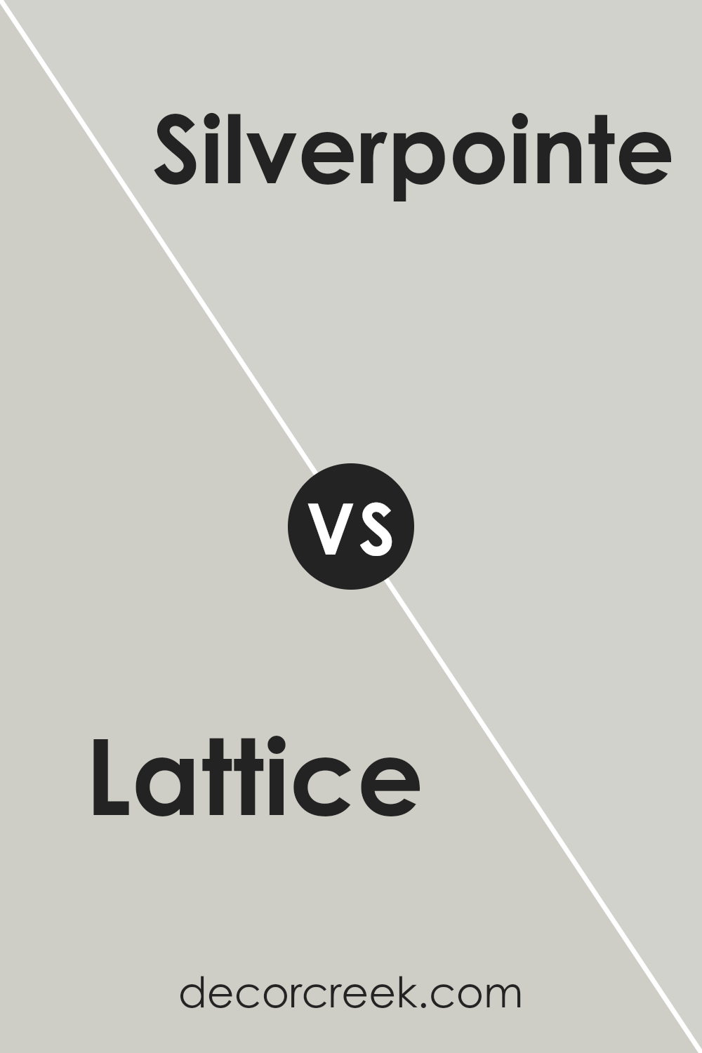
Lattice SW 7654 by Sherwin Williams vs Silverpointe SW 7653 by Sherwin Williams
Lattice SW 7654 and Silverpointe SW 7653 by Sherwin Williams are two subtle but distinct colors. Lattice is a slightly darker gray with a warm taupe undertone, giving it a cozy and inviting feel.
It’s perfect for spaces where you want to add a bit of warmth without overpowering the room with deeper colors. On the other hand, Silverpointe is lighter and leans more towards a cool gray. It has hints of blue, making it feel fresh and clean. This color is ideal for creating a bright and airy atmosphere, especially in smaller rooms or spaces with limited natural light.
Both colors are versatile and can be used in various parts of the home, from living rooms to bedrooms, complementing a wide range of decor styles.
You can see recommended paint color below:
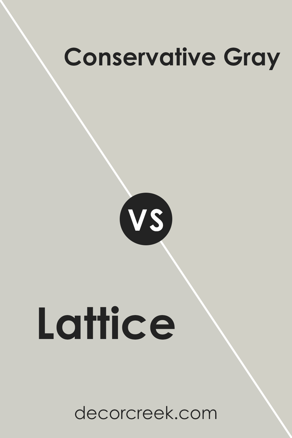
Lattice SW 7654 by Sherwin Williams vs Conservative Gray SW 6183 by Sherwin Williams
The main color, Lattice, and the second color, Conservative Gray, are both neutral shades by Sherwin Williams, but they exhibit different tones. Lattice presents a subtle, warm gray that feels soft and welcoming, making spaces appear cozy and inviting.
It’s a versatile color that accommodates most decor styles effortlessly. On the other hand, Conservative Gray leans towards a cooler, muted gray that offers a more neutral backdrop. This shade is excellent for those looking to create a calm and understated look, as it pairs well with brighter colors or acts as a standalone for a minimalist design.
While Lattice might infuse a room with a hint of warmth, Conservative Gray provides a cleaner, more straightforward gray tone that works well in modern settings. Choosing between the two depends on the desired mood and the decor elements they will accent.
You can see recommended paint color below:
Lattice SW 7654 by Sherwin Williams vs Front Porch SW 7651 by Sherwin Williams
Lattice SW 7654 and Front Porch SW 7651, both by Sherwin Williams, are two shades of gray that offer subtle differences in mood and style. Lattice is a warmer gray that brings a cozy feel to a space. Its toasty undertones make it a great choice for living areas or bedrooms, aiming to create a welcoming atmosphere.
On the other hand, Front Porch is a cooler gray, leaning more towards a fresh and clean appearance. It reflects more light, making it perfect for smaller or darker rooms to help brighten them up. This color is especially good for spaces like bathrooms or kitchens where you want a clear, clean look.
While both colors provide the calm and neutrality of gray, Lattice offers warmth, whereas Front Porch offers a crisp freshness. This makes them each suited to different decorative styles and functions within a home.
You can see recommended paint color below:
Lattice SW 7654 by Sherwin Williams vs Guild Grey SW 9561 by Sherwin Williams
Lattice SW 7654 and Guild Grey SW 9561, both by Sherwin Williams, offer subtly different tones that could change the feel of a room. Lattice is a soft, neutral grey with a warm undertone, making it cozy and inviting. It’s versatile for any space, reflecting light well, which can make small rooms appear larger and more open.
On the other hand, Guild Grey is darker and cooler compared to Lattice. Its deeper tone provides a strong presence, ideal for accent walls or furniture pieces. It might not brighten a space like Lattice, but it adds character and depth.
When choosing between them, consider Lattice if you want a lighter, brighter feel. Go for Guild Grey if you prefer something more grounded and distinct. Both colors work well in modern decor, but their effects will differ based on the room’s lighting and size.
You can see recommended paint color below:
Lattice SW 7654 by Sherwin Williams vs Moorstone SW 9630 by Sherwin Williams
Lattice SW 7654 by Sherwin Williams and Moorstone SW 9630 by Sherwin Williams are two distinct shades. Lattice is a light, subtle gray with a hint of warmth, giving it a soft and inviting appearance. It’s a versatile color that pairs well with various decors and is ideal for creating a light, airy feel in a room.
On the other hand, Moorstone is a much darker gray, offering a stronger, more pronounced look. This color can add depth and a sense of grounding to spaces, making it great for accent walls or rooms where a more dramatic effect is desired. While Lattice reflects more light, making spaces seem larger, Moorstone tends to absorb light, which can make rooms appear cozier and more intimate.
Both colors offer a modern look, but the right choice depends on the visual impact you’re aiming for in your space.
You can see recommended paint color below:
Lattice SW 7654 by Sherwin Williams vs On the Rocks SW 7671 by Sherwin Williams
Lattice SW 7654 and On the Rocks SW 7671 by Sherwin Williams are both neutral shades, but they have different tones that set them apart. Lattice has a warmer gray tone, providing a cozy and welcoming feel to any room. It’s a great choice if you’re looking for a color that gives a gentle, soothing presence without feeling too heavy.
On the other hand, On the Rocks is a cooler gray that leans more towards a soft silver, making it feel lighter and airier. This color is excellent if you want to create a clean, fresh look in your space, as it reflects more light and can make small rooms appear larger.
Both colors are versatile and can work well in various settings, from living rooms to bedrooms, depending on the atmosphere you want to achieve. Lattice works well in areas where a touch of warmth is desirable, while On the Rocks is better suited for spaces that benefit from a crisp, open feel.
You can see recommended paint color below:
Lattice SW 7654 by Sherwin Williams vs Sweater Weather SW 9548 by Sherwin Williams
Lattice SW 7654 by Sherwin Williams is a warm mid-tone gray that adds a cozy feel to any room without darkening it too much. It creates a comfortable backdrop, ideal for living spaces or bedrooms where a subtle hint of color is desirable.
On the other hand, Sweater Weather SW 9548 is a darker, richer gray. It leans more toward a charcoal shade, giving it a stronger presence in a space. This color is excellent for creating drama or accenting specific areas within a room. While Lattice offers a light, airy quality, Sweater Weather provides depth and a more pronounced gray tone, making it suitable for larger rooms or spaces where you want the walls to make a statement.
colors pair well with a variety of decor styles and are versatile, but the choice between them depends on the mood and functionality you want to achieve in a space.
You can see recommended paint color below:
Lattice SW 7654 by Sherwin Williams vs Skipping Rocks SW 9551 by Sherwin Williams
Lattice SW 7654 and Skipping Rocks SW 9551, both by Sherwin Williams, present subtle differences in their hues that could affect the atmosphere of a room. Lattice is a soft, warm gray that has a cozy feel, making it ideal for spaces where you want a comforting and inviting vibe, such as living rooms or bedrooms. It pairs well with a variety of decor styles and adds a gentle, welcoming touch to interiors.
On the other hand, Skipping Rocks is a cooler, lighter gray with hints of blue undertones. This color leans towards a fresher, more neutral look that works well in modern and minimalist designs. It’s great for areas that you want to feel more open and airy, like bathrooms or small spaces that could use a sense of expansion.
Both colors are versatile, but the choice between them depends on the desired mood and the specific characteristics of the space, like lighting and size. Lattice’s warmth contrasts with the cooler, crisper feel of Skipping Rocks, providing options for different aesthetic preferences.
You can see recommended paint color below:
Conclusion
This beautiful shade of gray with a hint of blue makes the room feel happy and open, almost like the sky on a sunny day. It’s not too dark or too light, so it’s just right for making a room look bright and inviting.
Whether you want to paint your bedroom, living room, or even your kitchen, Lattice can make the space look clean and cozy. It matches well with many different colors of furniture and decorations, so you won’t have a hard time making your room look nice. Plus, it’s a color that doesn’t go out of style, which means you will like it for a long time.
So, if you’re thinking about giving your room a new look, consider using SW 7654 Lattice. It’s a happy and fresh color that could make any room in your house look beautiful and feel comfy.
It’s easy to like and even easier to use in all kinds of places in your home.
Ever wished paint sampling was as easy as sticking a sticker? Guess what? Now it is! Discover Samplize's unique Peel & Stick samples.
Get paint samples

