Colors play a significant role in interior design, influencing mood, spatial perception, and overall aesthetics. Among the plethora of shades, Pilgrimage Foliage 2175-20 has emerged as a contender for those looking to make a bold statement.
In this article, we explore its nuances and its best pairings in home interiors.

What Color Is Pilgrimage Foliage 2175-20?
Pilgrimage Foliage 2175-20 is a rich, deep green hue that encapsulates the essence of lush forests and the serenity they evoke. It resonates with the colors found in deep woodlands and evergreen canopies. In interior styles, this shade works best in bohemian, rustic, and even modern minimalist decors.
It pairs exceptionally well with natural materials like wood and stone, as well as textures such as jute, wool, and linen.

Ever wished paint sampling was as easy as sticking a sticker? Guess what? Now it is! Discover Samplize's unique Peel & Stick samples.
Get paint samples

Is It a Warm Or Cool Color?
Despite its verdant depth, Pilgrimage Foliage 2175-20 leans more towards a cool color palette. This cool undertone affects the ambience it creates in homes, offering a sense of tranquility and freshness.
Its calm nature can make spaces feel larger, airy, and more inviting.
Undertones of Pilgrimage Foliage 2175-20
Every color carries undertones that influence its appearance. Pilgrimage Foliage possesses subtle blue undertones, lending it a cool, sophisticated depth. These undertones can influence how the color appears, especially when juxtaposed with other hues.
On interior walls, these undertones give the paint a dynamic quality, changing slightly with varying light conditions and neighboring colors.

Coordinating Colors of Pilgrimage Foliage 2175-20
Coordinating colors enhance the primary shade, creating a harmonious palette. For Pilgrimage Foliage 2175-20, the coordinating colors include:
- OC-17 White Dove : A soft, versatile white.
- OC-57 White Heron : A crisp, radiant white.
- BM 2140-30 Dark Olive : A deep, muted green.
Additionally, hues like BM 2140-20 Tuscany Green , BM 2143-40 Camouflage , and BM 2142-40 Dry Sage also resonate well with Pilgrimage Foliage.

How Does Lighting Affect Pilgrimage Foliage 2175-20?
Lighting, whether artificial or natural, greatly influences color perception. In artificial light, Pilgrimage Foliage may appear even deeper and richer, with its blue undertones becoming slightly more pronounced. Natural light, especially the golden hours, can bring out its verdant qualities. In north-facing rooms, the color can appear slightly cooler due to the indirect light, while in south-facing rooms, the hue can seem warmer and more vibrant.
East-facing rooms with morning light can highlight its freshness, and west-facing rooms at sunset might reveal its cozier undertones.

LRV of Pilgrimage Foliage 2175-20
LRV, or Light Reflectance Value, indicates the percentage of light a color reflects. With an LRV of 16, Pilgrimage Foliage is on the lower end, meaning it absorbs more light than it reflects. Such colors can make a space feel cozier but smaller.
Given its low LRV, it’s best used in larger rooms or spaces with ample natural light to avoid a claustrophobic feel.

LRV – what does it mean? Read This Before Finding Your Perfect Paint Color
Trim Colors of Pilgrimage Foliage 2175-20
Trim colors, often neutral, frame and accentuate wall colors. With Pilgrimage Foliage, shades of white like OC-151 White and OC-130 Cloud White from the same brand can provide a striking contrast, elevating the space’s elegance.

Colors Similar to Pilgrimage Foliage 2175-20
Recognizing similar colors can be crucial for alternatives or coordinating palettes. Similar hues include:
- BM 2175-10 Aztec Brick : A warm, earthy red.
- CSP-1105 Tandoori : A spicy, burnt orange.
- BM 077 Fiery Opal : A lively, spirited orange.
- BM 105 Terra Mauve : A subdued, mature purple.
Each offers its unique flair while retaining a semblance to Pilgrimage Foliage.

Colors That Go With Pilgrimage Foliage 2175-20
Choosing colors that complement each other ensures aesthetic cohesion. With Pilgrimage Foliage, colors like BM 2143-50 Old Prairie , BM 2147-40 Dill Pickle , BM 2007-40 Coral Essence , BM 2018-50 Morning Sunshine , and OC-89 Butter Pecan by Benjamin Moore can be paired harmoniously, enriching the room’s ambiance.

How to Use Pilgrimage Foliage 2175-20 In Your Home?
Pilgrimage Foliage 2175-20 is a versatile hue ideal for any room, be it a cozy bedroom, an inviting living room, or a vibrant kitchen. Its depth resonates well with styles like bohemian, rustic, and even contemporary minimalist. The color’s woodland essence makes it perfect for nature-themed interiors, while its sophisticated undertones suit chic, modern settings.
Whether you’re aiming for contrast or harmony, this shade offers endless possibilities.
Pilgrimage Foliage 2175-20 in the Bedroom
For a serene bedroom oasis, Pilgrimage Foliage introduces a calm yet profound energy. The shade pairs well with soft linens, wooden elements, and muted metallics, creating a tranquil sleeping environment. Consider it as an accent wall behind a bed to draw focus or envelop the entire room for a cocooned feel.

Pilgrimage Foliage 2175-20 in the Bathroom
In the bathroom, this hue offers a spa-like ambiance. The cool undertones of Pilgrimage Foliage against white bathtubs, sinks, and tiles create a lush contrast. Paired with gold or brass fittings, it imparts a touch of luxury, turning an everyday space into a personal retreat.

Pilgrimage Foliage 2175-20 in the Living Room
For living rooms, Pilgrimage Foliage offers a welcoming depth. When used on all walls, it makes large spaces feel intimate. In smaller rooms, it works wonderfully as an accent, especially against lighter walls. Complement with earth-toned furnishings and pops of warm colors for a balanced, lively ambiance.

Pilgrimage Foliage 2175-20 for an Exterior
On exteriors, Pilgrimage Foliage stands out as a statement. It evokes a timeless feel, blending seamlessly with natural surroundings. Use it on entry doors for a striking first impression or on façades, contrasting with lighter trim colors to give your home a distinguished, memorable appearance.

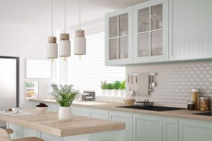
Pilgrimage Foliage 2175-20 in the Kitchen
Kitchens dressed in Pilgrimage Foliage emanate warmth and sophistication. As a backdrop, it accentuates white or marble countertops and stainless-steel appliances. Whether in a modern or traditional kitchen, it sets a vivid, inviting tone, ideal for gatherings and culinary adventures.

Pilgrimage Foliage 2175-20 on the Kitchen Cabinets
Revitalize kitchen cabinets with Pilgrimage Foliage for an instant upgrade. This hue, combined with sleek handles or knobs, transforms cabinets into focal points. Contrast with light-colored walls and backsplash for a stylish, contemporary look or pair with wooden countertops for a more rustic charm.

Comparing Pilgrimage Foliage 2175-20 With Other Colors
Comparing colors is pivotal in interior design and architecture. It helps in understanding how different hues interact with each other, creating harmony or contrast. This comparison aids in choosing the right palette for a space, ensuring that colors don’t clash but instead complement one another.
Especially with a distinct color like Pilgrimage Foliage 2175-20, understanding its interaction with other hues can offer a clearer vision for design projects.
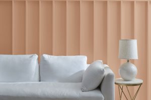
Pilgrimage Foliage 2175-20 vs. BM 2175-70 Peach Parfait
Pilgrimage Foliage, a deep green, contrasts vividly with Peach Parfait , a soft, creamy peach. While Pilgrimage evokes woodland depth, Peach Parfait brings a gentle warmth. Together, they can create a balanced, nature-inspired palette reminiscent of forests at dawn.

Pilgrimage Foliage 2175-20 vs. BM 2175-60 Light Salmon
Light Salmon , with its subdued pink-orange tint, provides a softer contrast to Pilgrimage Foliage. Their combination suggests a harmonious blend of earth and flora, ideal for spaces seeking a mix of vibrancy and serenity.

Pilgrimage Foliage 2175-20 vs. BM 2175-40 Adobe Dust
Adobe Dust is a muted terracotta shade. Next to Pilgrimage Foliage, it exudes an earthy aura. This pairing is reminiscent of dense forests meeting clay terrains, presenting a grounded, rustic appeal.

Pilgrimage Foliage 2175-20 vs. BM 2175-30 Rust
Rust , as the name suggests, has a deeper, more saturated orange-brown hue. Against Pilgrimage Foliage, it creates a bold contrast, invoking images of autumnal forests. It’s a duo for spaces that demand drama and depth.

Pilgrimage Foliage 2175-20 vs. BM 2175-50 Peach Blossom
Peach Blossom offers a delicate, almost ethereal warmth. In juxtaposition with the robustness of Pilgrimage Foliage, it whispers of spring meadows bordered by tall trees. It’s an excellent combination for fresh, airy spaces.

Pilgrimage Foliage 2175-20 vs. BM 1206 Outer Banks
Outer Banks , a sandy beige, provides a neutral counter to Pilgrimage Foliage. This pairing is about balance – the vibrant energy of the green tempered by the calmness of the beige, embodying shorelines meeting dense forests.

Conclusion
Pilgrimage Foliage 2175-20, with its deep green hue, offers a world of design possibilities, especially when compared and contrasted with various other colors. From the gentle warmth of peach tones to the earthy terracottas, each color interaction tells a different story.
Understanding these nuances and comparisons helps in creating spaces that not only resonate with aesthetic appeal but also evoke specific moods and atmospheres. As with any design endeavor, the key is to experiment, envision, and embrace the myriad of possibilities that colors present.

Ever wished paint sampling was as easy as sticking a sticker? Guess what? Now it is! Discover Samplize's unique Peel & Stick samples.
Get paint samples