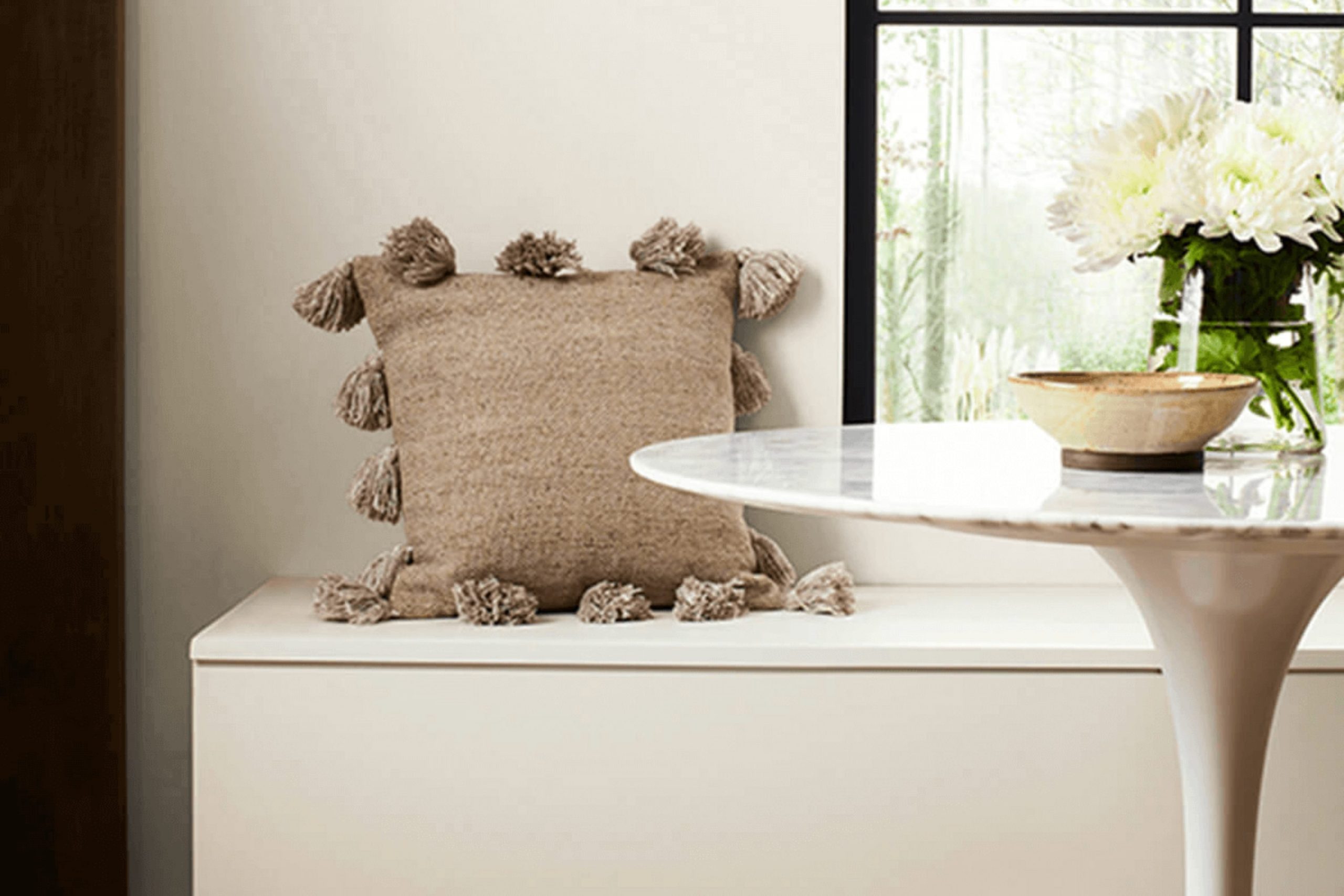
Before you decide to paint your interior with SW 7035 Aesthetic White by Sherwin Williams, there are a few things you should consider. Although it may seem like just another shade of white, Aesthetic White is a particularly unique color that stands out due to its warm undertones. This softness can give your room a cozy and welcoming atmosphere, which is perfect if you want an interior that feels both inviting and bright.
As someone who has experienced the challenges and rewards of choosing the right paint colors, I understand how excessive it can feel. Aesthetic White can look different based on the lighting in your room—looking more beige in dim light and brighter under stronger, natural light.
Make sure to test out a patch on your wall and observe it at different times of the day. This way, you’ll get a true sense of how it will interact with light and your interior’s particular elements.
Choosing the right paint color is a step toward making your house feel like a home, and Aesthetic White could be the perfect backdrop for your ideal interior.
Is Aesthetic White SW 7035 Right for My Home?
Aesthetic White by Sherwin Williams is one of those special shades that works like magic in so many different interiors. It strikes a perfect balance between warm and cool tones, making it incredibly adaptable for practically any setting. For me, this color is like a comforting blanket—it adds a subtle, cozy touch without feeling excessive in the overall design of a room.
In terms of interior styles, Aesthetic White shines in modern and minimalist environments. Its understated warmth helps soften the often stark feel of contemporary design, bringing a gentle, welcoming vibe. It’s also a great pick for Scandinavian-themed interiors, enhancing the crisp, clean lines that characterize this style with its soft presence.
When pairing with materials and textures, Aesthetic White goes hand in hand with natural wood, from light birches to darker walnuts. The warmth of the wood contrasts nicely with this paint shade, creating an inviting interior. I also like using it with elements of matte black or metallic finishes, like brass or copper, to add a dash of refined charm. For textures, linen and soft, knitted throws play nicely against walls painted in Aesthetic White, giving a room a layered, textured look that feels cozy and well-lived.
With all these pairing options and style compatibilities, Aesthetic White is a true workhorse in the world of interior colors. It’s a color I often recommend when someone wants to freshen up their interior without taking a big risk.

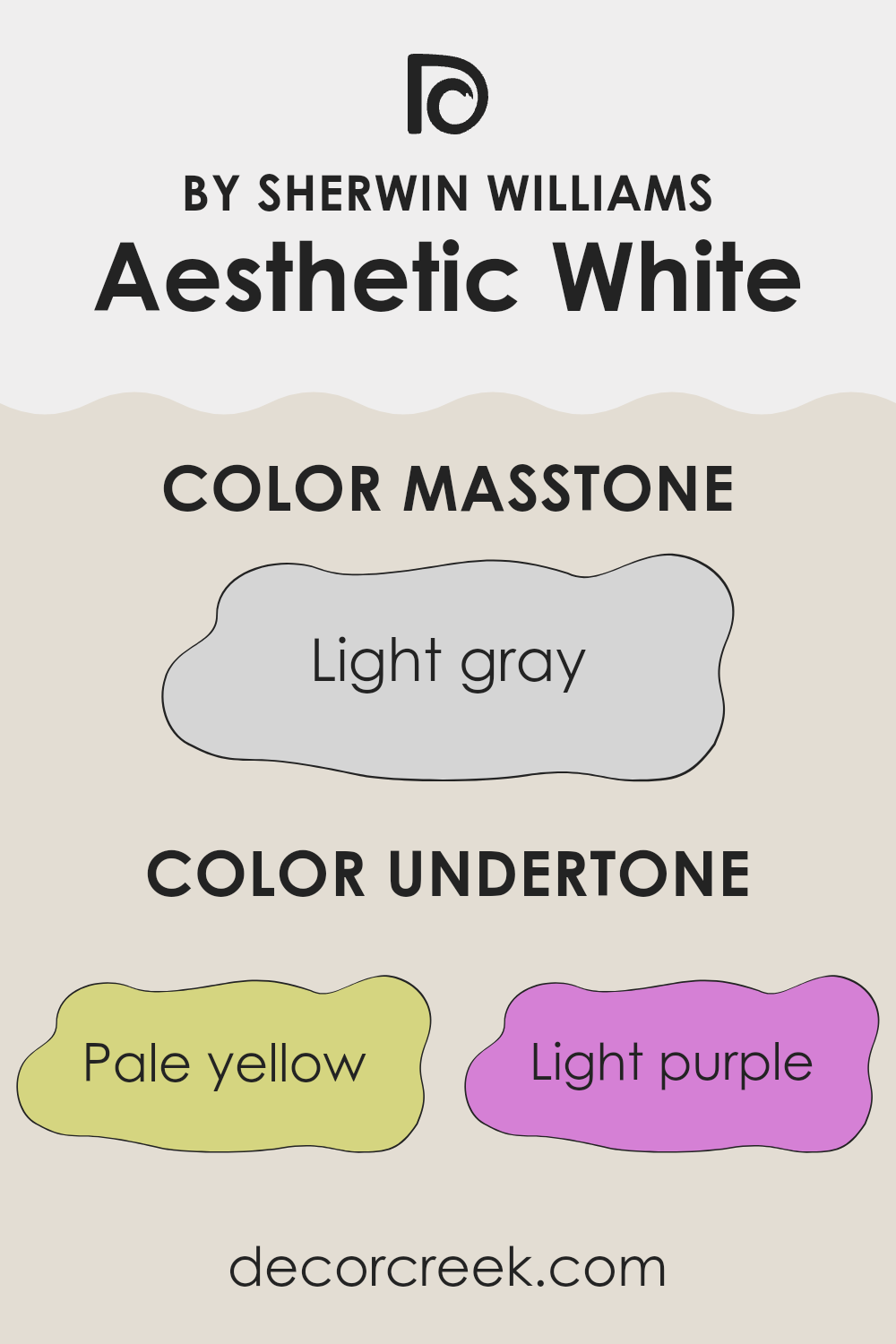
What are the right undertones of Aesthetic White SW 7035 ?
Aesthetic White is an adaptable paint color that looks different depending on the lighting and surrounding colors. This is largely due to its complex undertones. Undertones are subtle colors that sit beneath the surface of what we perceive as the main color. They can significantly influence the overall hue and feel of a paint when applied. This complexity in undertones can make a color like Aesthetic White very adaptable to different environments and decor styles.
The undertones in Aesthetic White include pale yellow, light purple, light blue, pale pink, mint, lilac, and grey. Each of these undertones can bring out different aspects of the color depending on factors like natural light, furnishings, and the colors of adjacent walls. For example, in a room with plenty of sunlight, the pale yellow undertone might make the walls seem warmer and more welcoming. In artificial light, the grey undertone might become more dominant, giving the walls a more neutral or cooler feel.
This adaptability makes Aesthetic White a popular choice for interior walls. It can harmonize with a wide range of decor styles and colors, providing a subtle backdrop that complements various furnishings and accessories. The presence of both warm and cool undertones allows it to balance the interior, often making it feel cozier or more inviting depending on the pairing and lighting conditions.
Whether you are aiming for a look that’s calm and relaxed, or fresh and lively, adjusting the lighting and decor can highlight different undertones in the paint to achieve your desired ambiance.
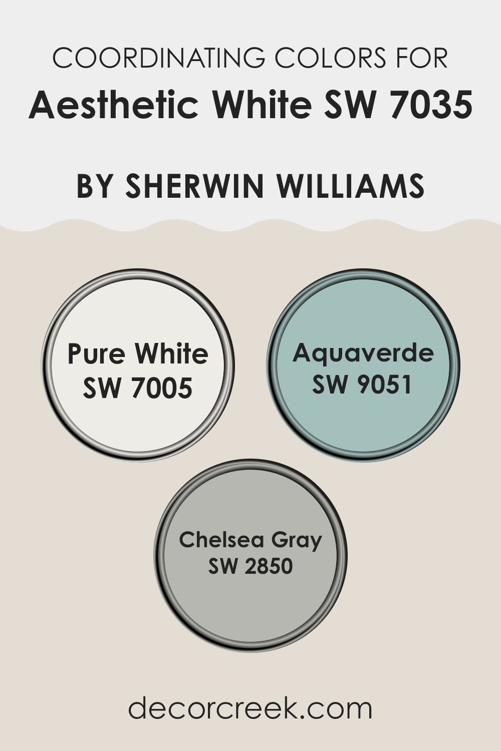
Best Coordinating Colors to use with Aesthetic White SW 7035 by Sherwin Williams this year.
Coordinating colors are hues that complement each other and work harmoniously in an interior to create a pleasing look. For Aesthetic White by Sherwin Williams, an adaptable neutral shade, several coordinating colors can enhance its warm undertones and ensure a well-balanced feel in any room. By selecting the right coordinating colors, you can achieve a smooth visual flow and highlight the key elements of your decor.
One excellent coordinating color is Pure White (SW 7005), which is a clean and crisp white that can brighten interiors while maintaining a neat and unified appearance alongside Aesthetic White. It works particularly well on trims, ceilings, and woodwork, providing a subtle contrast without feeling excessive against the primary color. Another coordinating color, Aquaverde (SW 9051), is a soft, pale green with a hint of blue that adds a refreshing splash of color.
It’s ideal for creating a calm and inviting environment, especially in bathrooms or bedrooms. Lastly, Chelsea Gray (SW 2850) is a rich, medium gray that provides a striking counterbalance to Aesthetic White. This color can be used on accent walls or for furniture, lending a dash of refined charm and depth to the overall design scheme. Together, these colors complement Aesthetic White beautifully, enhancing the atmosphere of any interior.
You can see recommended paint colors below:
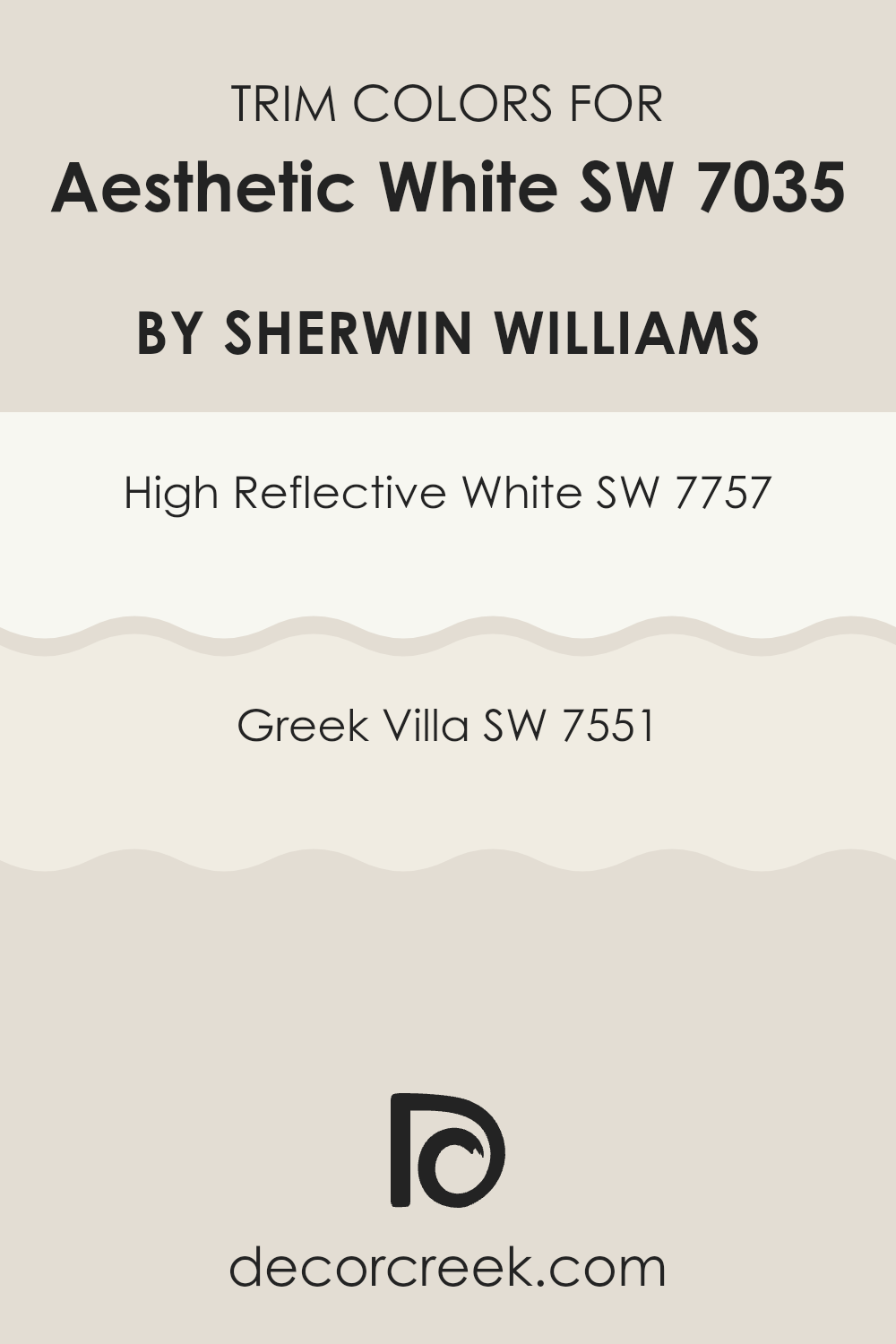
Trendy Trim Colors of Aesthetic White SW 7035 by Sherwin Williams to use this year.
Trim colors are essential for accentuating the features of a house, highlighting architectural details like door frames, window sills, and baseboards. When painting a room or an exterior in Aesthetic White by Sherwin Williams, choosing the right trim color can significantly enhance the overall look.
For instance, pairing the adaptable and understated Aesthetic White with a carefully selected trim color can create a pleasing contrast or softly blend the transitions between the walls and trim.
High Reflective White SW 7757 is an excellent choice for a trim color when used with Aesthetic White. This paint color is a very bright and clean white that can bring a fresh clarity to Aesthetic White, highlighting its soft warmth without feeling excessive. On the other hand, Greek Villa SW 7551 offers a slightly softer approach as a trim color; it’s not as stark, featuring creamy undertones that provide a gentle transition from the more neutral base of Aesthetic White. This pairing can give your interiors a more cohesive feel while still maintaining some differentiation between surfaces.
You can see recommended paint colors below:
Evergreen Colors Similar to Aesthetic White SW 7035 by Sherwin Williams
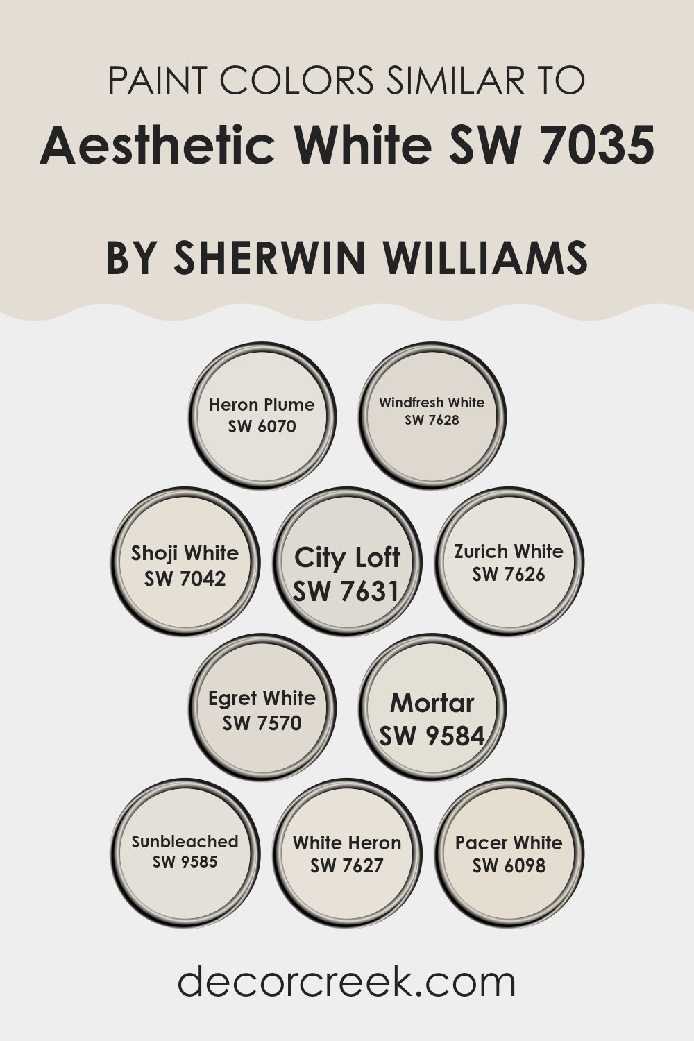
Using similar colors in a design scheme is crucial for creating a harmonious and cohesive look. Choosing shades like Heron Plume, Windfresh White, Shoji White, City Loft, Zurich White, Egret White, Mortar, Sunbleached, White Heron, and Pacer White, which are all close companions to the popular Aesthetic White, helps to ensure that the transitions between walls, trims, and accents feel seamless. These colors have subtle differences that can enhance architectural details without feeling excessive.
Heron Plume is a soft, almost invisible grey that works well in light-filled interiors, whereas Windfresh White is slightly cooler, making it a good choice for modern environments. Shoji White offers a touch of warmth, ideal for living areas or bedrooms seeking a cozy atmosphere. City Loft has a slightly more urban feel, perfect for contemporary interiors. Zurich White blends well in almost any setting, thanks to its balanced, neutral undertone.
Egret White introduces a hint of warmth, lending a mild creamy feel to interiors. Moving toward the deeper shades, Mortar presents as a robust grey that provides a strong foundation for bold decor elements. Sunbleached is a gentle beige, excellent for creating a soft, welcoming environment. White Heron reflects a crisp, clean vibe, great for enhancing natural light in a room. Lastly, Pacer White is very adaptable, fitting well with various decor styles while maintaining a clean, uncluttered feel. Using these similar yet distinct colors allows for a tailored approach to decorating, ensuring each room achieves just the right amount of warmth and character.
You can see recommended paint colors below:
- SW 6070 Heron Plume
- SW 7628 Windfresh White
- SW 7042 Shoji White
- SW 7631 City Loft
- SW 7626 Zurich White
- SW 7570 Egret White
- SW 9584 Mortar
- SW 9585 Sunbleached
- SW 7627 White Heron
- SW 6098 Pacer White
Colors that Go With Aesthetic White SW 7035 by Sherwin Williams
When decorating an interior, choosing the right color combinations enhances the overall look and ambiance. Aesthetic White by Sherwin Williams is a popular shade for its adaptability and subtle warmth, making it easy to combine with a range of other colors. Complementing colors such as Heron Plume, Windfresh White, City Loft, Zurich White, Origami White, and White Heron play a crucial role in creating a cohesive look. These tones harmonize well with Aesthetic White, offering a variety of moods and styles depending on their specific undertones and brightness level.
Heron Plume is a soft and light grayish-white which gives a clean and open feel to interiors, making it a great choice for a subtly nuanced look next to Aesthetic White. Windfresh White, slightly brighter, can energize a room while still maintaining a gentle and inviting atmosphere.
On the other hand, City Loft offers a slightly warmer touch, perfect for cozying up a modern living interior or studio. Zurich White is close to Aesthetic White but has a touch of warmth that can lend a friendly and relaxed air. Origami White stands out for its crispness and can brighten up a room when used as an accent. Lastly, White Heron strikes a balance, being vibrant yet neutral, perfect for interiors that need a touch of clarity without feeling too stark. Pairing these colors with Aesthetic White helps in achieving a coordinated look that flows seamlessly from room to room, enhancing both the visual appeal and the functionality of the interior.
You can see recommended paint colors below:
- SW 6070 Heron Plume
- SW 7628 Windfresh White
- SW 7631 City Loft
- SW 7626 Zurich White
- SW 7636 Origami White
- SW 7627 White Heron

Aesthetic White SW 7035 by Sherwin Williams vs City Loft SW 7631 by Sherwin Williams
Aesthetic White and City Loft, both by Sherwin Williams, are subtle neutrals that differ slightly in their warmth and shade. Aesthetic White is a soft, creamy white with a hint of beige that gives it a warm feel without being too yellow. It’s great for creating a cozy and welcoming interior.
On the other hand, City Loft has a slightly cooler tone, falling into the category of light greige (a mix of gray and beige). It offers a clean, more modern look, making it perfect for both traditional and contemporary interiors.
While Aesthetic White can give a room a more intimate feel, City Loft can make it look more spacious and airy. These colors work well in various lighting situations, but the warmth of Aesthetic White provides a steadier, consistent look compared to the cooler, more changeable hue of City Loft.
You can see recommended paint color below:
Aesthetic White SW 7035 by Sherwin Williams vs Windfresh White SW 7628 by Sherwin Williams
Aesthetic White and Windfresh White are two colors by Sherwin Williams that offer subtle variations in tone. Aesthetic White has a soft, warm undertone that makes it a cozy choice for living interiors and bedrooms. It tends to bring a light, airy feel to a room while still adding a touch of warmth that makes the interior feel inviting.
On the other hand, Windfresh White is cooler and more neutral. It doesn’t lean toward any color too strongly, making it very adaptable for various settings. It’s a great option if you’re aiming for a clean and crisp look in your room, as it reflects more light and can make interiors appear larger.
Both colors are quite light, but the warmth of Aesthetic White provides a gentle, soothing ambiance whereas Windfresh White offers a sharper, more straightforward approach. Choosing between them depends on whether you want the warmth and comfort or a neutral, brighter backdrop in your interior.
You can see recommended paint color below:
Aesthetic White SW 7035 by Sherwin Williams vs Zurich White SW 7626 by Sherwin Williams
Aesthetic White and Zurich White are both popular shades from Sherwin Williams, but they have distinct undertones that set them apart. Aesthetic White is a softer shade with a warm, beige undertone that gives it a cozy and welcoming feel, making it great for living interiors and bedrooms. This color is subtle and can work nicely with various decor styles, adding just the right amount of warmth to an interior.
On the other hand, Zurich White is cooler, with a slight gray undertone. This makes it more neutral and adaptable, ideal for modern environments and interiors that aim for a clean, crisp look. It works especially well in kitchens and bathrooms, where the cooler tones can complement modern fixtures and features.
Both colors reflect light beautifully but in slightly different ways due to their undertones. Aesthetic White brings a warmer glow, while Zurich White offers a more neutral reflection, making each ideal for specific design goals and room functions.
You can see recommended paint color below:
Aesthetic White SW 7035 by Sherwin Williams vs White Heron SW 7627 by Sherwin Williams
Aesthetic White and White Heron are two paint colors from Sherwin Williams that, while similar, have different tones that can affect the mood of a room. Aesthetic White is a soft, warm white with a hint of gray. It’s perfect for creating a cozy atmosphere as it adds a subtle richness to the walls without feeling excessive. It works well in rooms that you want to feel inviting and calm, like living rooms or bedrooms.
On the other hand, White Heron is a cleaner and crisper white. It has a brighter and more refreshing feel, making it ideal for interiors where you want to evoke a sense of freshness, such as kitchens and bathrooms. It reflects light beautifully, which can help make a small interior appear larger and more open.
Choosing between these two will depend on the type of environment you’re aiming to create. Aesthetic White leans toward a more relaxed and homey vibe, while White Heron offers a sharper, more modern look.
You can see recommended paint color below:
Aesthetic White SW 7035 by Sherwin Williams vs Mortar SW 9584 by Sherwin Williams
Aesthetic White and Mortar by Sherwin Williams are two distinct colors that can set very different moods in an interior. Aesthetic White is a soft white with a warm undertone, making it a perfect choice for creating a cozy and inviting environment. It’s quite adaptable and serves well in various rooms, whether for walls or trim, without feeling stark or cold.
On the other hand, Mortar is a much darker shade, resembling a deep gray with a solid, grounding effect. This color can command more attention in an interior and is ideal for accent walls or areas where you want to add some dramatic flair.
While Aesthetic White brings lightness and a sense of airiness to interiors, Mortar offers depth and a stronger presence. Both colors work beautifully together, where Aesthetic White can brighten an interior, and Mortar can provide striking contrasts or act as a focal point. Their uses depend greatly on the mood you’re aiming to achieve and how each room is used.
You can see recommended paint color below:
Aesthetic White SW 7035 by Sherwin Williams vs Pacer White SW 6098 by Sherwin Williams
Aesthetic White and Pacer White, both by Sherwin Williams, present subtle differences that could affect the mood of a room. Aesthetic White leans toward a light gray with a warm undertone, making it adaptable for interiors that aim for a soft yet bright feel. It’s ideal for living areas or bedrooms where a cozy atmosphere is desired, without the starkness sometimes brought by pure white.
On the other hand, Pacer White has a slight peachy undertone which gives it a warmer presence compared to Aesthetic White. This color is perfect if you’re looking to add a hint of warmth to your interior without it becoming too creamy or yellow. Pacer White works well in rooms that receive a lot of sunlight, as the natural light highlights its warm tones beautifully.
Choosing between them depends on the intended vibe and the natural light in your interior. Both shades are subtle and generally easy to integrate into most color schemes.
You can see recommended paint color below:
Aesthetic White SW 7035 by Sherwin Williams vs Sunbleached SW 9585 by Sherwin Williams
Aesthetic White and Sunbleached are both neutral colors by Sherwin Williams but have distinct tones that give them unique appeals. Aesthetic White has a soft, warm undertone that makes it very adaptable and welcoming.
This color is perfect for creating a cozy background in any room, without feeling too stark or cold. On the other hand, Sunbleached has a much lighter, almost grayish tone. It mimics the look of wood or material that has faded slightly due to exposure to sunlight, giving it a gentle, worn-in feel.
This makes Sunbleached ideal for achieving a relaxed, airy atmosphere in interiors that aim for a minimalistic or rustic vibe. Both paints work well in various settings, yet Aesthetic White offers more warmth while Sunbleached provides a cleaner, crisp finish.
You can see recommended paint color below:
Aesthetic White SW 7035 by Sherwin Williams vs Egret White SW 7570 by Sherwin Williams
Aesthetic White and Egret White, both from Sherwin Williams, offer subtle differences that can impact the mood and feel of an interior. Aesthetic White is a softer, lighter shade that can make a room feel more open and airy.
It’s an adaptable color that pairs well with various decor styles, giving a fresh and clean look. On the other hand, Egret White is slightly darker and warmer. This color adds a hint of coziness to interiors, making it a great choice for areas where you want a more inviting atmosphere, like living rooms or bedrooms.
Both colors suit different tastes and can work nicely in different home areas depending on the effect you’re looking to achieve. If you prefer a brighter interior, go with Aesthetic White, but if you want some warmth, Egret White might be the way to go.
You can see recommended paint color below:
Aesthetic White SW 7035 by Sherwin Williams vs Shoji White SW 7042 by Sherwin Williams
Aesthetic White and Shoji White are two popular paint colors from Sherwin Williams, but they have subtle differences. Aesthetic White has a warmer undertone, making it a cozy choice for rooms that need a touch of warmth without being too creamy. It’s adaptable and works well in interiors that get a mix of natural and artificial light.
On the other hand, Shoji White leans more toward a neutral beige with slightly gray undertones. This color is great for creating a calm and inviting atmosphere in interiors. It’s particularly effective in areas with plenty of natural light, where its unique undertones can really show through.
Both colors are fairly light, which makes them excellent for making small interiors appear larger and brighter. However, the warmer hints in Aesthetic White can make it a better choice for a living area or bedroom, while Shoji White might be preferred in a more open interior like a kitchen or a modern living room.
You can see recommended paint color below:
Aesthetic White SW 7035 by Sherwin Williams vs Heron Plume SW 6070 by Sherwin Williams
Aesthetic White and Heron Plume are both neutral paint colors from Sherwin Williams, but they have distinct tones that set them apart. Aesthetic White has a subtle, warm undertone that makes it a cozy and inviting choice for rooms.
It’s particularly great for interiors where you want a soft, not-too-bright white. On the other hand, Heron Plume has a cooler tone, leaning slightly toward gray. This color is great for modern interiors as it provides a clean, crisp backdrop that still feels warm. Both colors work well in various lighting conditions, but Heron Plume might show its gray side more in rooms with less natural light, while Aesthetic White keeps its warmth better.
When choosing between these two, consider the mood and style you want to achieve in your room. Also, think about the other colors and elements in your interior, as each of these whites can act differently depending on their surroundings.
You can see recommended paint color below:
In wrapping up, SW 7035 Aesthetic White by Sherwin Williams is a wonderful paint color choice if you’re looking for a white that’s neither too stark nor too muted. It’s a cozy kind of white that makes rooms feel warm and inviting—not icy like some whites can seem. This white works beautifully with many other colors, so whether you’re pairing it with bold colors or soft hues, it adapts well and complements them nicely.
Also, because it’s not a pure bright white, Aesthetic White doesn’t show small marks or dirt quickly, which is great if you have a busy home. Whether you use it in a sunny bedroom or a dimly lit hallway, it keeps its lovely look.
It’s a color that can help make your home look neat, fresh, and put together without making things look too sharp or brand new. This paint color is a smart choice if you want your home to have a friendly and welcoming feel, helping everyone feel at ease the moment they step through the door. So, Aesthetic White could be just the perfect choice for making your house feel like a true home.

Ever wished paint sampling was as easy as sticking a sticker? Guess what? Now it is! Discover Samplize's unique Peel & Stick samples.
Get paint samples

