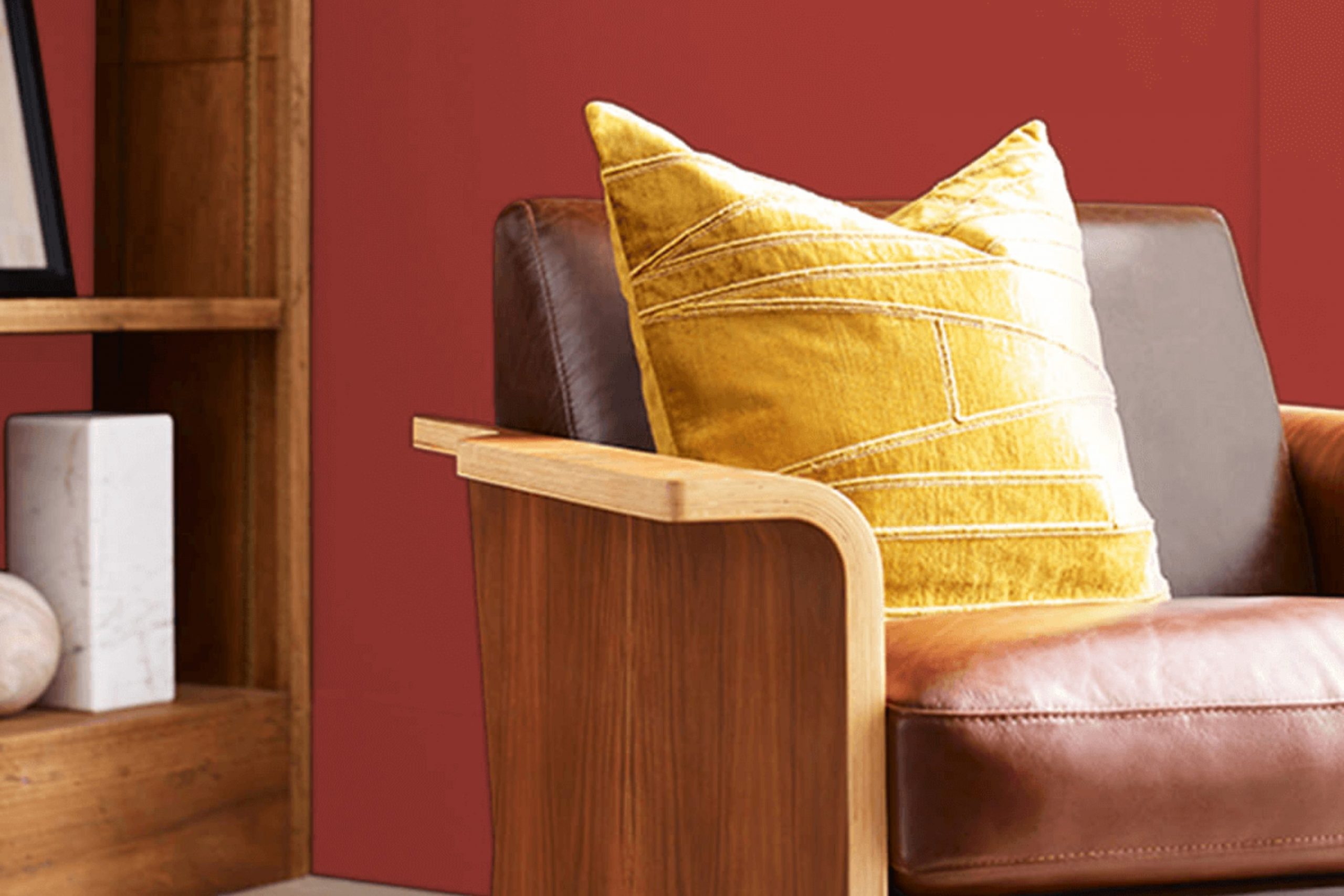
If you’re considering a bold and energetic color for your next decorating project, Sherwin Williams’ SW 6608 Rave Red might just be the perfect choice for you. As a vibrant and deep red, this shade can instantly improve any room, bringing a sense of energy and warmth that can make a room feel lively or cozy and inviting.
Whether you’re looking to paint an accent wall, refresh old furniture, or give your front door a new life, Rave Red offers a flexible color palette that can bring out the character of your home. Using Rave Red in your living areas means you’ll be welcoming a shade that can match various styles and textures.
If you pair it with neutrals, Rave Red stands out as a bold statement, yet it can also work well with other vivid colors for a more eclectic or modern look. It’s especially excellent for anyone aiming to add personality to their room without feeling too intense.
So, if you’re ready to add some warmth and energy to your decor, Rave Red might just be the way to go!
What Color Is Rave Red SW 6608 by Sherwin Williams?
Rave Red by Sherwin Williams is a vibrant, bold red that brings a splash of energy and warmth to any room. This color has a deep, slightly muted tone that strikes a perfect balance between being eye-catching and comfortably inviting. Rave Red works exceptionally well in interior styles that celebrate personality and vibrancy. It is particularly suited for eclectic, bohemian, and modern decor, or even traditional settings that benefit from a modern twist.
Rave Red pairs beautifully with a variety of materials and textures. For a rich feel, combine it with dark woods, soft leathers, and shiny metals like brass or gold. These combinations can create a warm and comfortable atmosphere, especially in living rooms or dining areas. To achieve a more relaxed, casual look, mix Rave Red with natural elements like rattan or bamboo, and textiles such as linen or soft cotton.
This approach is ideal for creating a cozy, inviting nook or an energetic kitchen. Furthermore, Rave Red can also work as an accent wall in a mostly neutral room. Pair it with light-colored walls, such as whites or beiges, to let it stand out without feeling too strong.
This approach can add depth and interest to minimalist or Scandinavian styles, making the room feel more dynamic and lively.
decorcreek.com
Is Rave Red SW 6608 by Sherwin Williams Warm or Cool color?
Rave Red SW 6608 by Sherwin Williams is a bold and vivid red paint color that makes a strong impact in any home decor setting. This shade is perfect for anyone looking to make a statement in their room. Whether applied to an accent wall, a piece of furniture, or even a front door, Rave Red brings a lively and energetic feel.
In a living room or dining area, using Rave Red can create a warm and welcoming atmosphere, ideal for rooms meant for entertaining guests. It pairs well with neutral shades like white, gray, or beige, which help to balance its intensity. For those who prefer a more dramatic look, pairing it with dark colors like navy or black can create a striking contrast.
Additionally, this color works great in small amounts. Think of accessories like pillows or artwork to add a pop of vibrancy without making the room feel too strong. Rave Red is flexible in its ability to draw attention and add character to a home in a confident and cheerful way.
Undertones of Rave Red SW 6608 by Sherwin Williams
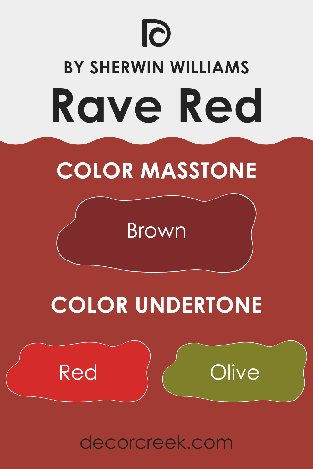
Rave Red is a vibrant paint choice that can really make interior walls stand out with its bold character. This specific shade has a mix of undertones that influence how it appears under different lighting conditions and when paired with various decor elements.
The primary undertone of Rave Red is, unsurprisingly, red, giving it a rich, fiery base. However, it’s the subtle hints of other colors that add depth and complexity to the paint. Olive and dark green undertones bring a touch of natural earthiness, reducing the chance of the red feeling too strong. Purple and navy give a cooler, more refined aspect to the shade, which can make rooms feel more grounded and less intense.
Orange and pink undertones, on the other hand, enhance the warmth of the color, making a room feel cozy and inviting. These warmer undertones can make small rooms feel more intimate and welcoming. Meanwhile, grey and dark grey add a neutral balance, preventing the color from being too bright and helping it fit well in various decorating styles.
Pale pink can soften the overall impact of the paint, adding a slight gentleness. Dark turquoise gives a unique twist, offering a contrasting coolness against the warm base.
When used on interior walls, these undertones interact with both natural and artificial light, affecting the mood and atmosphere of a room throughout the day. Morning light might highlight the paint’s brighter, warmer tones, while evening light could bring out its deeper, cooler undertones. This interplay can noticeably change the look of the room, influencing decorations and furnishings. Thus, Rave Red can be flexible yet challenging to work with, requiring thoughtful consideration of the room’s lighting and decor to truly stand out.
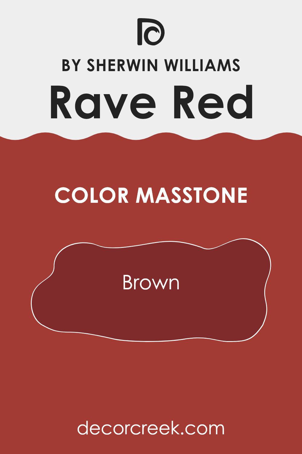
What is the Masstone of the Rave Red SW 6608 by Sherwin Williams?
Rave Red 6608 by Sherwin Williams, with its masstone of Brown (#802B2B), offers a rich and warm hue that effectively adds coziness to any room. This deep brownish-red is flexible, making it a great choice for both modern and traditional interiors.
In living rooms, it creates a welcoming atmosphere, inviting people to relax and enjoy the room. In bedrooms, the depth of its brown-red shade helps to create a comfortable, cozy environment that’s perfect for winding down at the end of the day.
When used on accent walls, Rave Red can act as a striking backdrop for artwork and furniture, highlighting these elements without overpowering them. Its earthy tones blend well with natural materials like wood and leather, improving the overall warm feel of a home. Additionally, in rooms like the dining room, this particular shade can encourage conversations and add to the lively setting of family meals and gatherings.
decorcreek.com
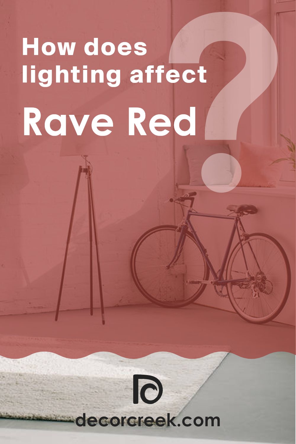
How Does Lighting Affect Rave Red SW 6608 by Sherwin Williams?
Lighting significantly influences how we perceive colors. Depending on the light source, a color can appear more vibrant, muted, or slightly different in hue. For instance, Rave Red, a rich and energetic red shade, has varying appearances under different lighting conditions.
Artificial Light: In rooms lit by artificial lighting, such as LED or incandescent bulbs, Rave Red tends to appear warmer and deeper. This warmth enhances the coziness of a room, making it feel more inviting. In particular, under warm yellow lighting, Rave Red becomes even more intense and rich, ideal for creating a striking impression in dining rooms or living areas.
Natural Light: Under natural sunlight, Rave Red shows its true color but can shift depending on the time of day. Morning light, which is softer, can make the color look bright and vivid, while during the afternoon, when the sun is more intense, the red might appear slightly lighter.
Room Orientation:
- North-Faced Rooms: These rooms get less direct sunlight, which can make Rave Red appear slightly more muted and cooler. It keeps its boldness but with a softer look, suitable for rooms where you want a touch of color without too much brightness.
- South-Faced Rooms: With more exposure to direct sunlight, Rave Red in south-facing rooms looks most vibrant and lively. The strong sunlight enhances the color’s richness, making the room feel energetic and warm.
- East-Faced Rooms: Morning light from the east can make Rave Red look very bright and fresh. It’s a lively way to start the day, as the color will catch the morning rays and beautifully light up the room.
- West-Faced Rooms: Evening light from the west covers Rave Red in a softer, golden tone towards the end of the day. This can create a welcoming and cozy atmosphere, perfect for relaxation after a long day.
Overall, Rave Red’s impact in any room depends heavily on the light it receives, changing the room through its interaction with light. Knowing this can help in deciding which room to paint this color to match the desired effect and mood.
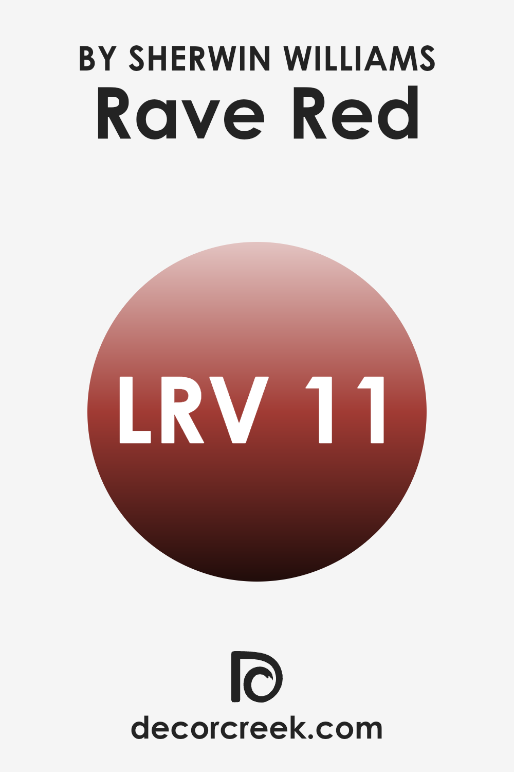
What is the LRV of Rave Red SW 6608 by Sherwin Williams?
LRV stands for Light Reflectance Value and is a measure used to indicate how much light a paint color reflects back into a room, versus how much it absorbs. This value ranges on a scale where lower numbers reflect less light, making rooms appear darker, and higher numbers reflect more light, creating a brighter feel in your room.
LRV is particularly useful when choosing paint colors as it helps predict how light or dark a color might look on your walls depending on the lighting conditions. For example, a room with plenty of windows may brighten up a dark color, while a room with limited natural light might need a higher LRV to keep it from feeling too enclosed.
In the case of Rave Red, which has an LRV value of 11.001, this indicates that it is a darker shade. When you use this color on walls, it can make large rooms feel cozier and small rooms seem a bit more confined because of its lower LRV, meaning it absorbs more light than it reflects. Colors like Rave Red can also create striking contrasts when paired with lighter or neutral colored furnishings or architectural elements, adding lively energy to any setting.
However, if a room lacks enough natural or artificial light, such a low LRV color like Rave Red could make the area feel even darker, so it’s wise to consider the overall lighting available in your room before deciding.
decorcreek.com
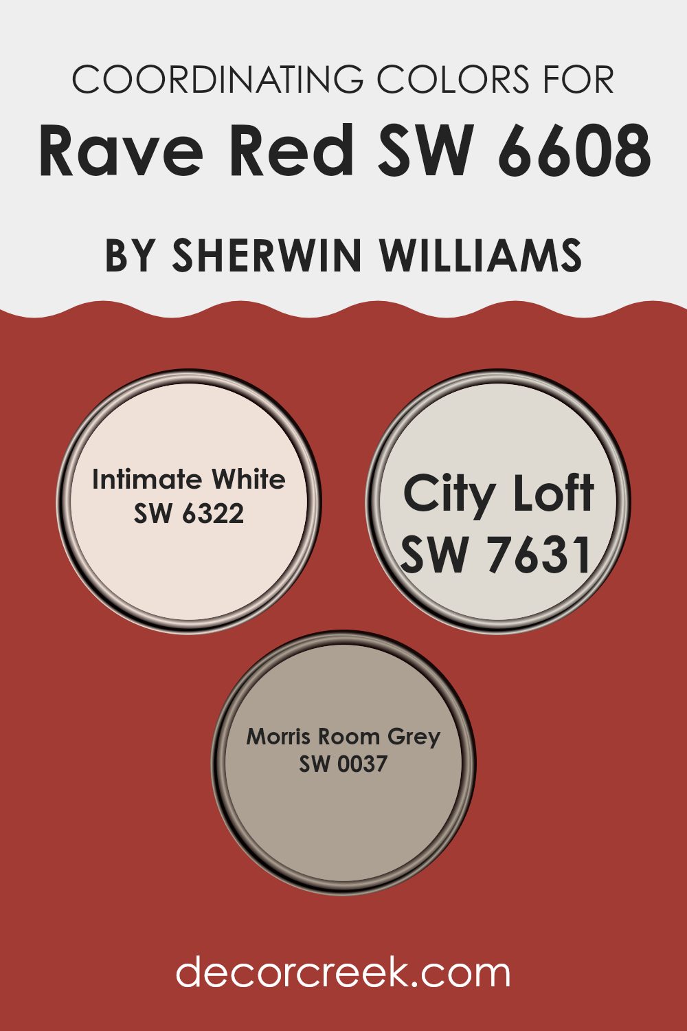
Coordinating Colors of Rave Red SW 6608 by Sherwin Williams
Coordinating colors are chosen to complement a primary color, improving the look and mood of a room without feeling too strong. When working with a vibrant primary color like Rave Red, the aim is to select colors that balance its intensity while contributing to a harmonious look.
The thoughtful use of coordinating colors can create a visually pleasing and cohesive environment, ideal for any design room. It’s important to choose shades that either contrast or blend smoothly with the main color, ensuring that each has its place without creating visual clutter.
In the case of Rave Red, the coordinating shades could include Intimate White, City Loft, and Morris Room Grey. Intimate White is a gentle, soft shade that offers a calm contrast to the vibrancy of Rave Red, making it ideal for trim or ceiling use to provide a subtle lift to the surroundings.
City Loft offers a light, airy gray that connects the bold look of Rave Red and the softness of Intimate White, acting as a neutral backdrop that allows the red to stand out without feeling too strong.
Finally, Morris Room Grey provides a deeper, stronger gray that grounds the color scheme, adding depth and maturity to the room, useful for accent walls or furniture pieces to anchor the decor. These colors work together to create a balanced and appealing palette that complements the primary color’s strong presence.
You can see recommended paint colors below:
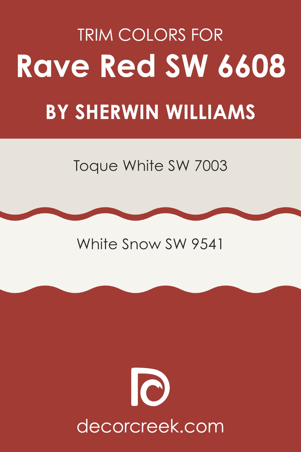
What are the Trim colors of Rave Red SW 6608 by Sherwin Williams?
Trim colors are specific shades used mainly to highlight the key features of a room, such as door frames, window sills, and moldings. Choosing the right trim color can greatly improve the overall look of a room by adding contrast or continuity to the main wall color.
For a vivid and vibrant shade like Rave Red by Sherwin Williams, selecting a suitable trim color is important in order to balance its striking look without feeling too strong. Neutral trim colors, such as Toque White and White Snow by Sherwin Williams, are excellent choices as they can both soften and complement the intensity of a bold red.
Toque White SW 7003 is a warm and inviting off-white with a subtle hint of cream, making it ideal for softening the boldness of Rave Red while still keeping the room cozy and welcoming. Its creamy tone brings a soft contrast that is not too stark, nicely framing the vivid walls without clashing.
White Snow SW 9541, on the other hand, is a bright, crisp white that offers a sharper contrast, which can make the red appear even more dynamic and striking. This trim color is perfect for creating a clean and fresh look, helping to define the sharper architectural features in a room with a more noticeable distinction. Both colors support Rave Red in making a room feel balanced yet clearly stylish.
You can see recommended paint colors below:
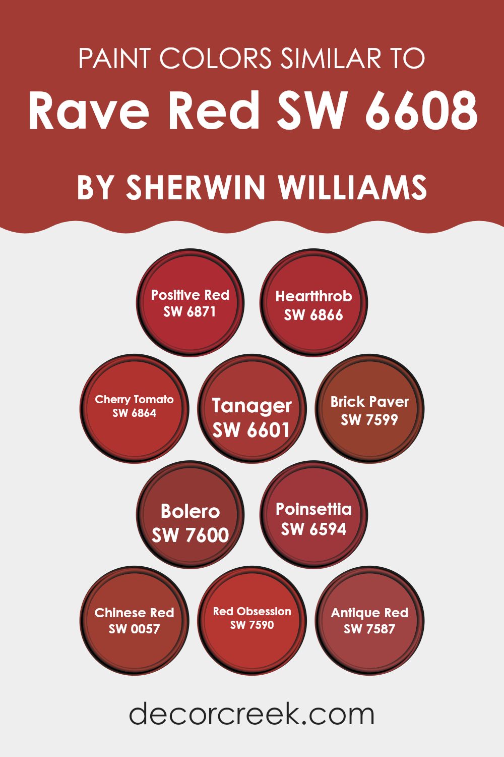
Colors Similar to Rave Red SW 6608 by Sherwin Williams
Similar colors play a crucial role in interior design and decoration because they create a cohesive and harmonious atmosphere. Using colors that closely relate to each other, like those similar to Rave Red from Sherwin Williams, can unify a room while adding depth and interest. These colors, which range from vibrant reds to deep, warm tones, can be used in various combinations to suit different moods and settings.
Positive Red is a vivid, energetic shade that adds a pop of brightness, making it ideal for accent walls or decorative elements that catch the eye. Heartthrob, true to its name, is a deep, passionate red that gives warmth and is perfect for creating a cozy nook or an inviting dining area.
Cherry Tomato offers a slightly playful punch of red with an orange undertone, bringing a fresh and lively feel to kitchens or creative rooms. Tanager, a muted reddish tone, works well where a softer, more understated look is needed. Brick Paver and Bolero are similar in that they both provide rich, earthy reds which can ground a room and make it feel more intimate and secure.
Poinsettia is a classic festive red that brings a cheerful feel to any room, especially during holidays. Chinese Red stands out with its hint of vibrancy, ideal for creating focal points in more neutral rooms. Red Obsession and Antique Red both offer a sense of depth, with the latter carrying a touch more softness, making it great for traditional rooms.
Each of these colors, while unique, supports one another in creating a flexible palette that allows for creative freedom while keeping visual harmony.
You can see recommended paint colors below:
- SW 6871 Positive Red
- SW 6866 Heartthrob
- SW 6864 Cherry Tomato
- SW 6601 Tanager
- SW 7599 Brick Paver
- SW 7600 Bolero
- SW 6594 Poinsettia
- SW 0057 Chinese Red
- SW 7590 Red Obsession
- SW 7587 Antique Red
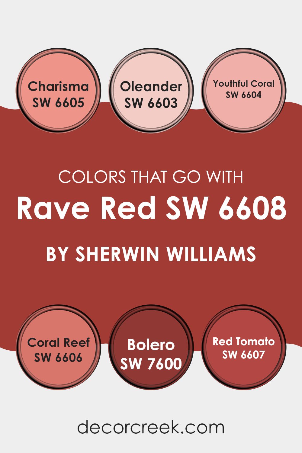
Colors that Go With Rave Red SW 6608 by Sherwin Williams
Choosing the right colors to pair with Rave Red SW 6608 by Sherwin Williams is important for creating a harmonious and appealing color scheme in any room. Rave Red is a vibrant, energetic hue that can bring life to a room, and finding complementary colors to balance or improve its intensity helps create a visually cohesive environment.
For instance, Charisma SW 6605 gives a warm, rich look, with its deep orange-red tone that can either contrast with or highlight the bold qualities of Rave Red, making rooms feel cozy and inviting. Meanwhile, Oleander SW 6603 provides a softer, pinkish coral that offers a gentle step down from the intensity of Rave Red, perfect for creating a smooth and colorful flow from room to room.
Youthful Coral SW 6604 has a fresh, peachy tone that complements Rave Red by adding a cheerful feel to rooms that need a touch of light and energy, while Coral Reef SW 6606 shifts towards a slightly stronger pinkish hue, giving a noticeable yet balanced visual effect when paired with Rave Red.
Bolero SW 7600 leans into a dark, almost rusty red, which can add depth and warmth to the bold feel of Rave Red, perfect for accents and features. Finally, Red Tomato SW 6607 brings a classic, pure red that works well with Rave Red, strengthening the bold and lively feel of the color without feeling too strong, making it ideal for bold design elements. Together, these colors support each other, helping each room use its color potential in a balanced and connected way.
You can see recommended paint colors below:
- SW 6605 Charisma
- SW 6603 Oleander
- SW 6604 Youthful Coral
- SW 6606 Coral Reef
- SW 7600 Bolero
- SW 6607 Red Tomato
How to Use Rave Red SW 6608 by Sherwin Williams In Your Home?
Rave Red SW 6608 is a bold and vibrant shade of red by Sherwin Williams that can make a strong impact in any home. This color is perfect for those looking to add a touch of excitement and energy to their living areas. You can use Rave Red in various ways – from painting an accent wall for a dramatic effect to using it on smaller furniture pieces or decor items like throw pillows for a pop of color.
Rave Red works great in areas where you entertain guests, like the living room or dining area, as its lively hue creates a welcoming and lively atmosphere. It’s also an excellent choice for a personal room like a bedroom where a single wall painted in this color can make the room feel warm and cozy.
Pairing Rave Red with neutral colors such as white, gray, or beige will help balance its intensity, while adding gold or brass accents can improve its warm undertones, making your home look stylish and well-coordinated.
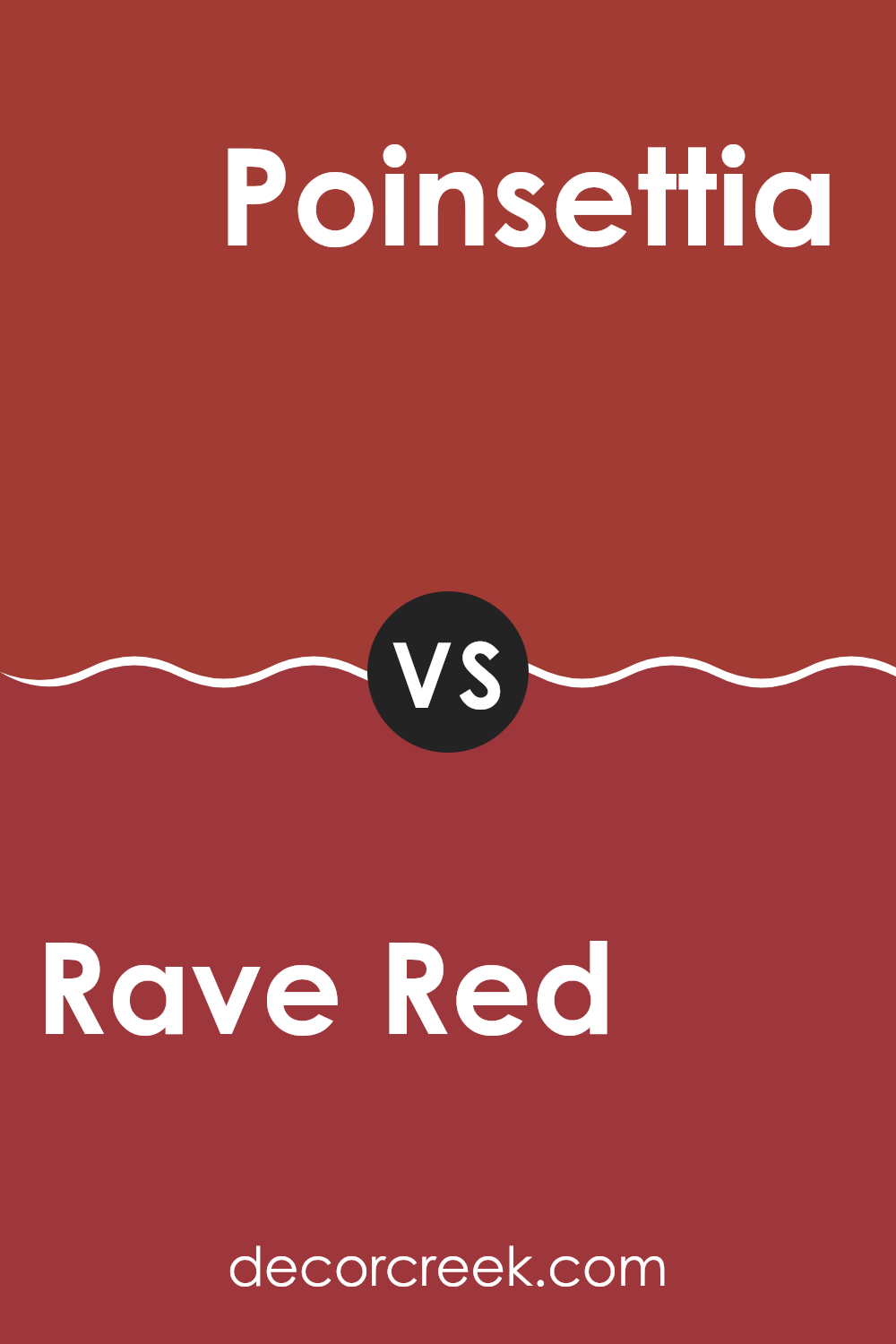
Rave Red SW 6608 by Sherwin Williams vs Poinsettia SW 6594 by Sherwin Williams
Rave Red and Poinsettia are two vibrant shades by Sherwin Williams, each with its own unique charm. Rave Red stands out with a deeper, richer tone that feels warm and inviting. This color is ideal for creating a cozy atmosphere in living rooms or dining areas.
On the other hand, Poinsettia has a brighter and slightly lighter hue, offering a more energetic feel. It’s a perfect choice for places where you want to add a pop of cheerfulness, like kitchens or entryways.
Both colors share a red base, but Rave Red leans towards a more muted, classic look while Poinsettia is more striking and lively. Depending on the mood you want to set and the room you’re decorating, either color could be a great choice.
You can see recommended paint color below:
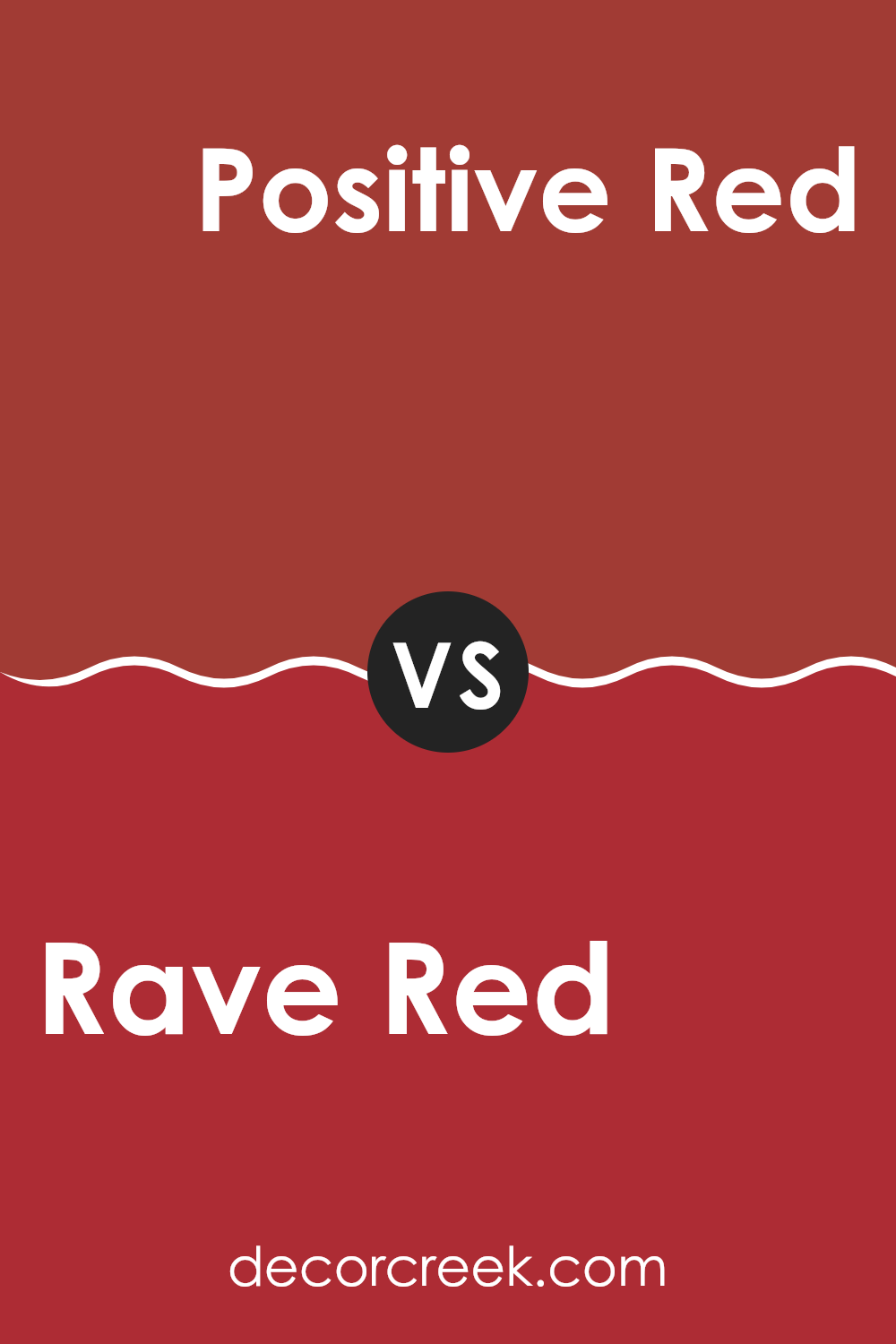
Rave Red SW 6608 by Sherwin Williams vs Positive Red SW 6871 by Sherwin Williams
Rave Red is a deep, vibrant color that leans towards a traditional red with a slightly muted tone, making it ideal for creating a cozy and inviting atmosphere in any room.
It pairs well with neutral shades, improving rooms without overpowering them. On the other hand, Positive Red is bolder and brighter, with an energy that can make it the focal point of a room.
Its vivid hue is great for accents or areas where you want to make a strong statement. While Rave Red offers a more subdued and warm feel, Positive Red is your go-to for adding a punch of brightness and excitement. Both colors stand out in their own ways depending on the desired impact in your decorating project.
You can see recommended paint color below:
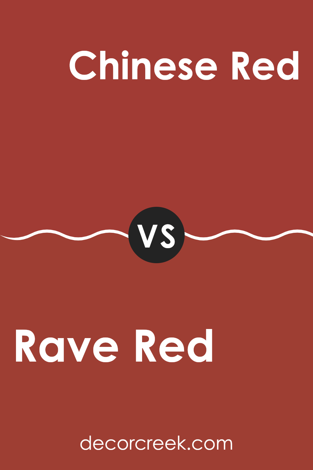
Rave Red SW 6608 by Sherwin Williams vs Chinese Red SW 0057 by Sherwin Williams
Rave Red and Chinese Red by Sherwin Williams are both vivid, attention-grabbing colors, but they have distinct differences. Rave Red is a deep, rich red with a slightly burgundy undertone, making it feel warm and inviting.
It’s perfect for creating a cozy and comfortable atmosphere in rooms like living rooms or dining areas. On the other hand, Chinese Red is brighter and more vibrant, with a hint of orange that makes it stand out. This color is great for areas where you want to add energy and excitement, such as a kitchen or an accent wall in a creative room.
While both shades are bold and beautiful, Rave Red offers a more subdued warmth, whereas Chinese Red provides a lively burst of color. Choosing between them depends on the mood and energy level you want to bring to your room.
You can see recommended paint color below:
- SW 0057 Chinese Red
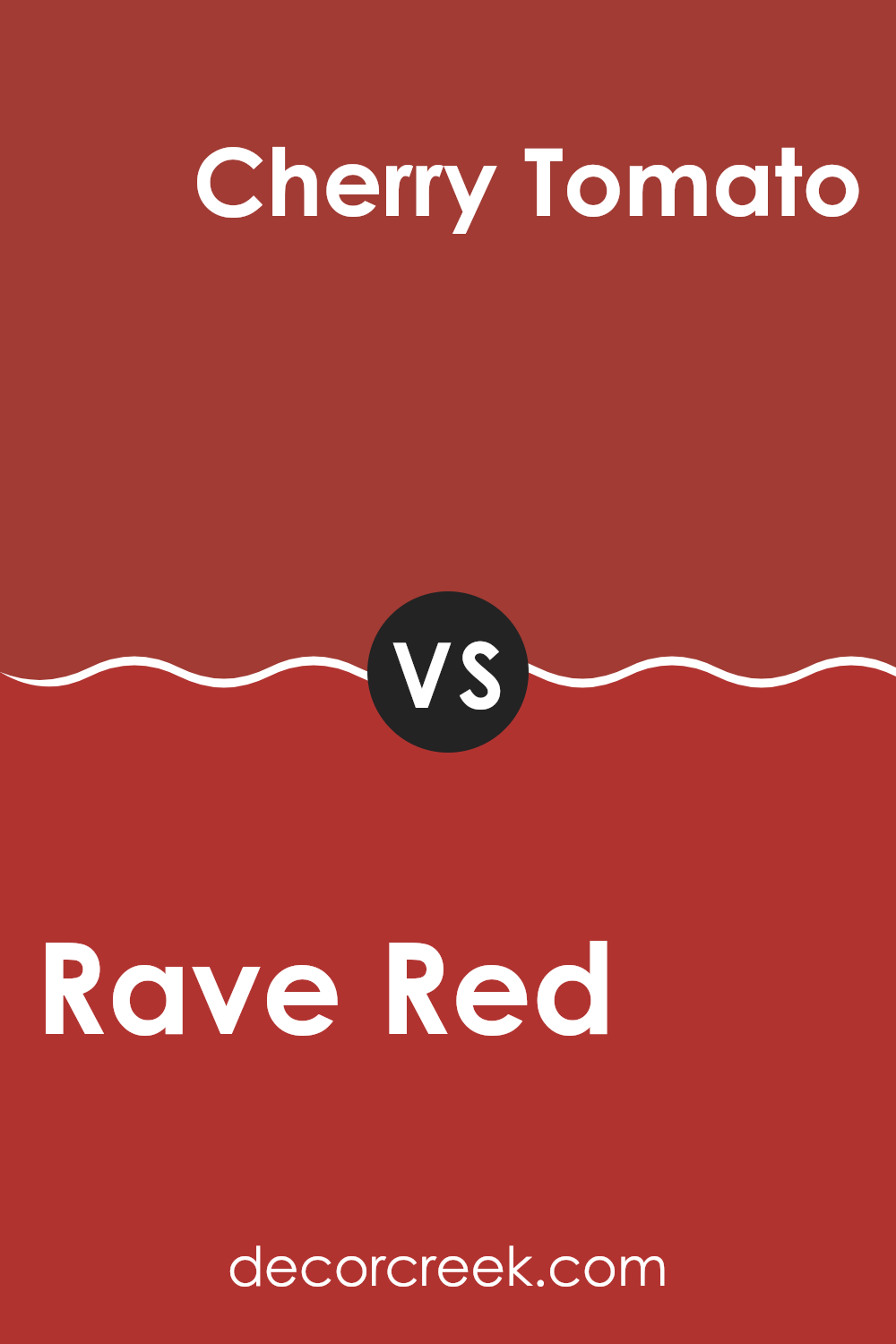
Rave Red SW 6608 by Sherwin Williams vs Cherry Tomato SW 6864 by Sherwin Williams
Rave Red and Cherry Tomato are both vibrant colors from Sherwin Williams, but they have distinct tones that set them apart. Rave Red is a deep, rich red that carries a sense of warmth and coziness.
It has a more traditional feel and would be ideal in rooms that aim for a classic or intimate atmosphere. On the other hand, Cherry Tomato is a vivid, almost fiery red with a noticeably brighter appearance. This color is punchier and can energize a room instantly, making it great for areas where you want to add a lively or playful touch.
While both shades are red, Rave Red offers a more muted, darker hue, whereas Cherry Tomato stands out with its bright, energizing quality. Their uses can vary significantly depending on the mood you want to create in a room.
You can see recommended paint color below:
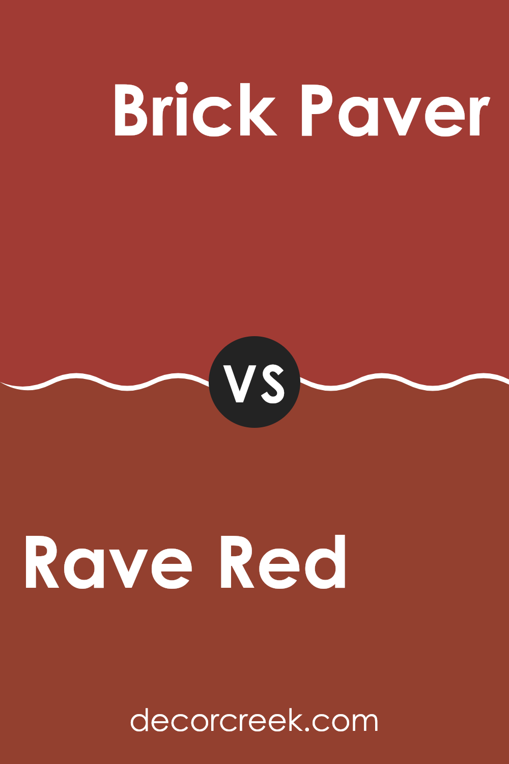
Rave Red SW 6608 by Sherwin Williams vs Brick Paver SW 7599 by Sherwin Williams
Both “Rave Red” and “Brick Paver” by Sherwin Williams are warm, inviting colors, though they each bring a distinct mood to a room. Rave Red is a vibrant and bold color. It is brighter and has more of an exciting, energetic feel, which might be perfect for making a statement in a room.
On the other hand, Brick Paver has a deeper, more muted tone. This color resembles traditional red bricks and gives a cozier, more grounded feel. It’s a great choice if you’re aiming for a room that feels warm and homey without being too strong.
Each color has its unique charm and can work well depending on what atmosphere you want to create in your room. Whether you want the lively pop of Rave Red or the subtle warmth of Brick Paver, both hues offer a strong presence and can make any room more inviting.
You can see recommended paint color below:
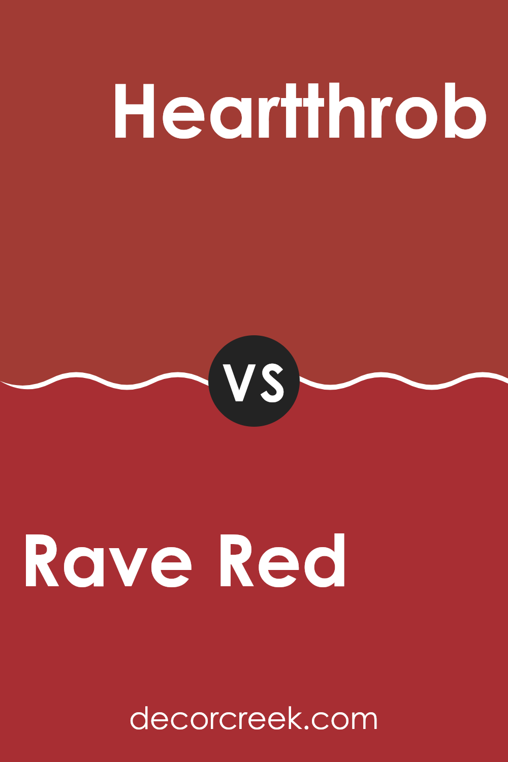
Rave Red SW 6608 by Sherwin Williams vs Heartthrob SW 6866 by Sherwin Williams
Rave Red and Heartthrob are two vivid shades from Sherwin Williams, each with its unique character. Rave Red is a deep, slightly muted red with a cozy warmth, making it a perfect choice for living areas or dining rooms where you want a welcoming yet bold feel. It pairs well with soft neutrals or rich browns, providing a balanced look.
On the other hand, Heartthrob is a much brighter and more vibrant red. This color really stands out and can add excitement to a room. It’s ideal for accent walls or decor elements that you want to stand out. Heartthrob works well in modern designs where a strong pop of color can bring life to simple decor.
Both colors are striking and can create energetic rooms, but the mood each sets can be quite different due to their varying intensities and undertones. Rave Red gives off a warmer, softer feel, while Heartthrob offers a punchier, more dramatic statement.
You can see recommended paint color below:
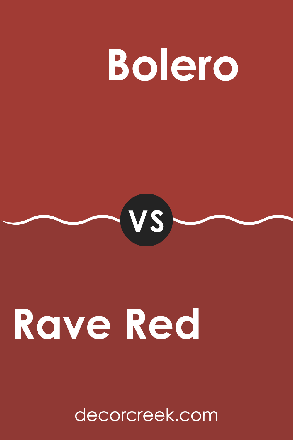
Rave Red SW 6608 by Sherwin Williams vs Bolero SW 7600 by Sherwin Williams
Rave Red and Bolero, both by Sherwin Williams, offer distinct vibes for any room. Rave Red is a bold, vibrant red that can really make a room stand out and draw attention. It’s perfect for creating a statement wall or adding some energy to a dull area.
On the other hand, Bolero leans towards a softer, more muted red with hints of warm undertones. This color is great for those who like a touch of red without making the room feel too strong. It’s ideal for bringing a cozy and welcoming feel to living rooms or bedrooms.
While Rave Red is more about impact and vibrancy, Bolero offers a gentler approach with its earthier, less intense red. Both colors can noticeably change a room, but the choice depends on the mood you want to set: lively and exciting with Rave Red, or relaxed and warm with Bolero.
You can see recommended paint color below:
- SW 7600 Bolero
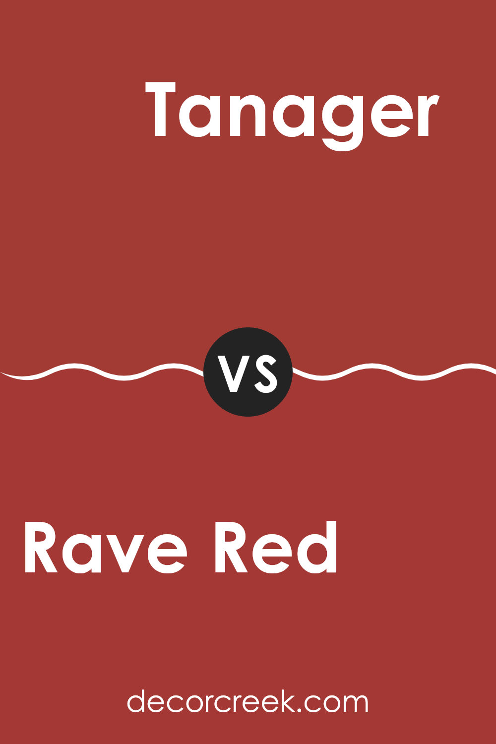
Rave Red SW 6608 by Sherwin Williams vs Tanager SW 6601 by Sherwin Williams
Rave Red and Tanager by Sherwin Williams are two distinct shades that each bring their own unique feel to a room. Rave Red is a deep, bold red that is sure to make a statement wherever it’s used. It has a strong presence and can add a lot of energy and warmth to a room. It’s perfect for creating an accent wall or for use in areas where you want to draw attention.
On the other hand, Tanager is a more subdued shade, darker and less vivid than Rave Red. It leans towards a maroon or burgundy tone, offering a more reserved but equally rich color feel. This color works well in rooms that aim for a refined look without the intensity of a bright red.
Both colors are highly flexible but serve different purposes depending on the mood you want to set in your room. While Rave Red is striking and lively, Tanager provides a deeper, more understated elegance.
You can see recommended paint color below:
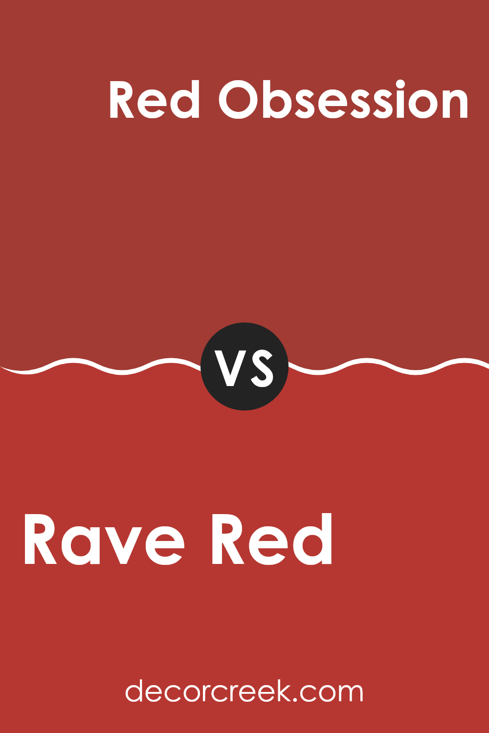
Rave Red SW 6608 by Sherwin Williams vs Red Obsession SW 7590 by Sherwin Williams
Rave Red and Red Obsession, both by Sherwin Williams, are vibrant color choices, though they each carry their own unique tone. Rave Red is a striking, bold red. It stands out with its deep, almost classic cherry red shade that feels very eye-catching, making it a great pick for rooms or items where you want to draw attention right away.
On the other hand, Red Obsession leans towards a richer, slightly darker hue. It mirrors the color of red wine and carries a sense of elegance and warmth. This color is perfect if you’re looking for something that feels cozy yet full of personality.
Both shades are excellent for adding a touch of drama to a room, but the choice between them depends on the intensity and mood you want to create. Rave Red is more vivid and energizing, while Red Obsession offers a more muted, surrounding feel.
You can see recommended paint color below:
- SW 7590 Red Obsession
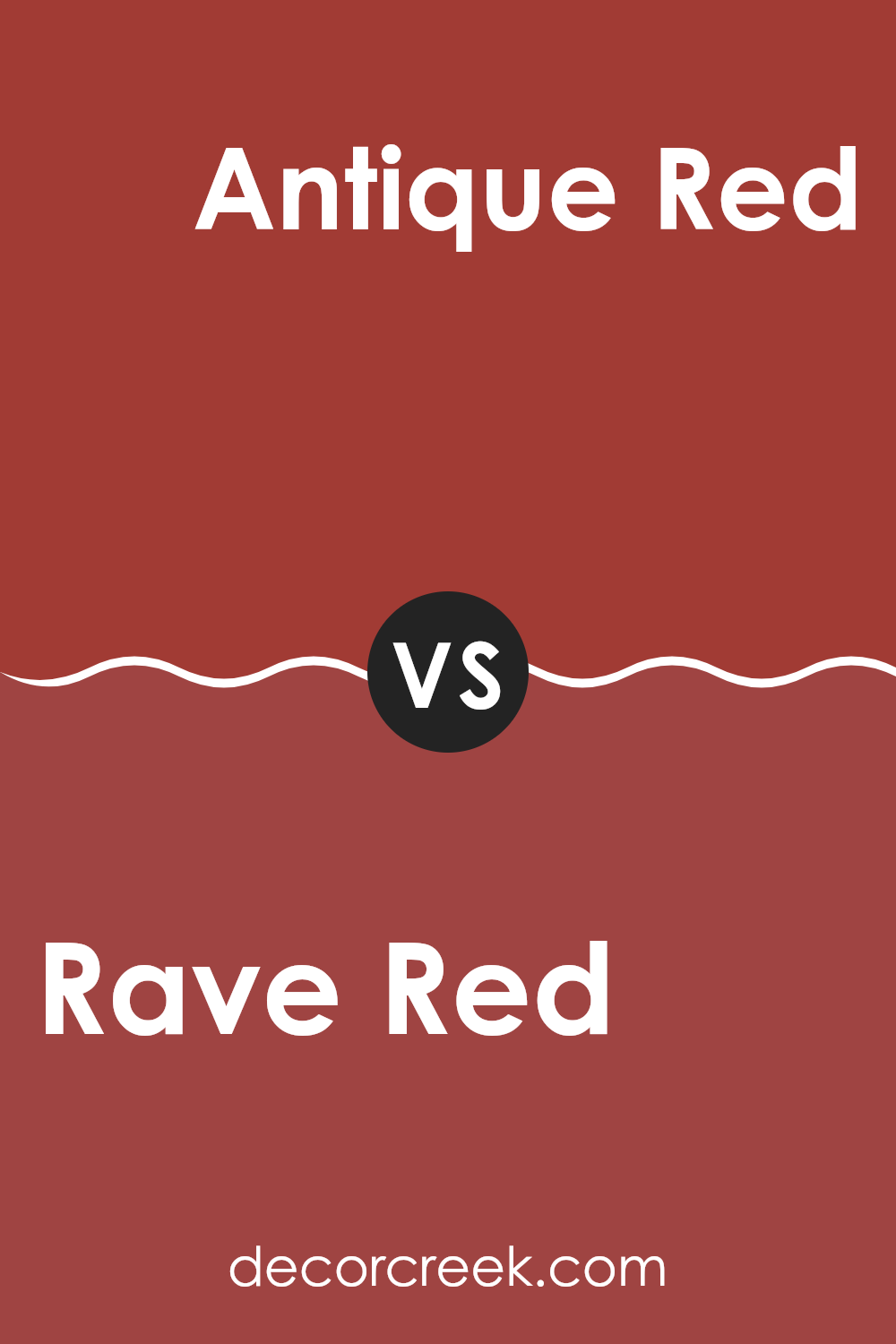
Rave Red SW 6608 by Sherwin Williams vs Antique Red SW 7587 by Sherwin Williams
Rave Red and Antique Red are two distinct shades from Sherwin Williams. Rave Red is a vibrant and bold color, perfect for creating a striking accent in a room. It has a deep, intense hue that stands out and can energize a room significantly. It works well in a lively area like a dining room or as an accent wall in a living room.
On the other hand, Antique Red has a more muted tone. This color offers a traditional look and feels warmer and more subdued compared to Rave Red. It’s ideal for rooms where you might want a cozy and inviting atmosphere, such as in a family room or a study. It pairs well with soft lighting and rich woods, improving a classic look.
While both are reds, Rave Red leans towards a modern, fresh look, whereas Antique Red offers a classic, vintage appeal. Their uses depend on the mood and style you’re aiming to achieve in your decorating project.
You can see recommended paint color below:
- SW 7587 Antique Red
After learning all about SW 6608 Rave Red by Sherwin Williams, I feel excited to share what I’ve found. This paint is super bright and full of energy, just like a bright red apple or a shiny red fire truck. It really catches the eye and can make any room feel more cheerful and lively. If you’re thinking about adding a pop of color to your place, Rave Red could be a perfect choice. It works great on a feature wall or for pieces of furniture that you want to stand out.
However, remember that because it’s so bold, a little bit goes a long way. You might want to use it in smaller areas or mix it with lighter or neutral colors so that it doesn’t make your room feel too crowded or intense. Sherwin Williams did a great job creating a shade of red that isn’t too dark or too light — it’s just right for adding some fun and brightness.
Overall, Rave Red is a fantastic color for adding a dash of joy and excitement to any part of your home. Whether it’s in the living room, kitchen, or even a kids’ play area, this color surely brings a smile and livens up the room.
So if you want to make your home warm and welcoming, think about bringing in some Rave Red!
decorcreek.com
Ever wished paint sampling was as easy as sticking a sticker? Guess what? Now it is! Discover Samplize's unique Peel & Stick samples.
Get paint samples

