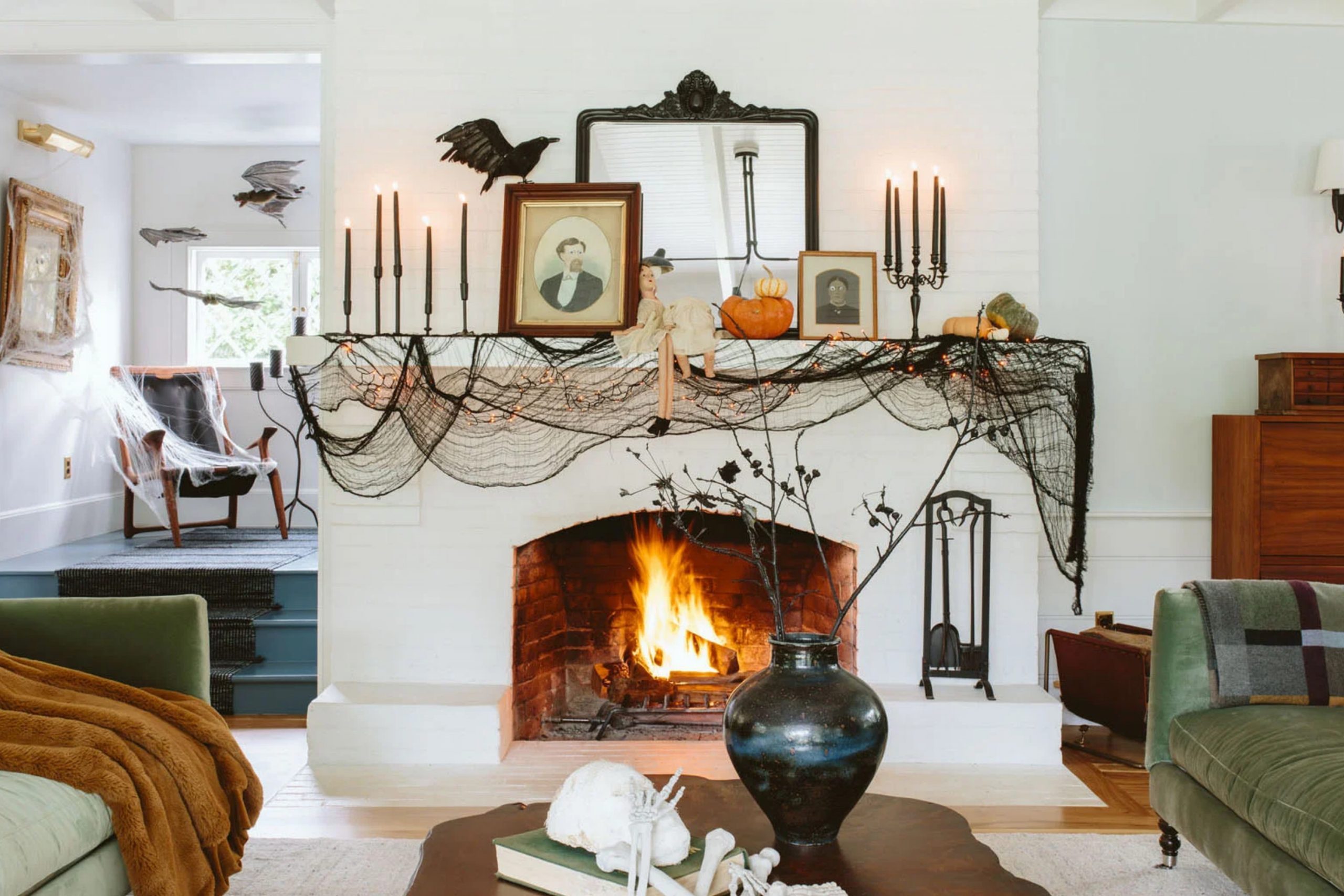
Halloween is one of those holidays that makes me feel like a kid again. The cozy chill in the air, the sound of crunchy leaves, and of course—decorating the house with just the right mix of spooky and fun. But here’s what most people miss: paint colors can completely change the way your home feels for Halloween. Whether you want to go bold and eerie or warm and inviting, the right shade on your walls, door, or even a painted pumpkin can set the whole mood.
I always tell my clients—don’t stop at spiderwebs and candles. The color on your walls should join the celebration, too.
Why I Trust Sherwin-Williams for Halloween Colors
Sherwin-Williams has never let me down when it comes to color that feels rich, deep, and right. Their paints look great both in daylight and candlelight—yes, I test that. For Halloween, I need shades that can hold their drama without looking fake or cheap. Sherwin-Williams gives me purples that feel like magic, greens that look like potions, oranges that actually remind me of real pumpkins, and blacks that don’t fall flat.
The coverage is always solid, and the finish gives my decorations something strong to play off of.
How I Pick the Perfect Halloween Paint Color
I always start by thinking about what kind of Halloween feeling I want. Do I want spooky and bold? Or more cozy and magical? Then I pick one strong color to lead the scene, and two or three supporting shades to balance it out. I look at how much natural light the room gets and what decorations I’ll be using nearby.
I test swatches next to pumpkins, lanterns, and even candy bowls—seriously. I want it to feel like Halloween even when it’s just a normal Tuesday.
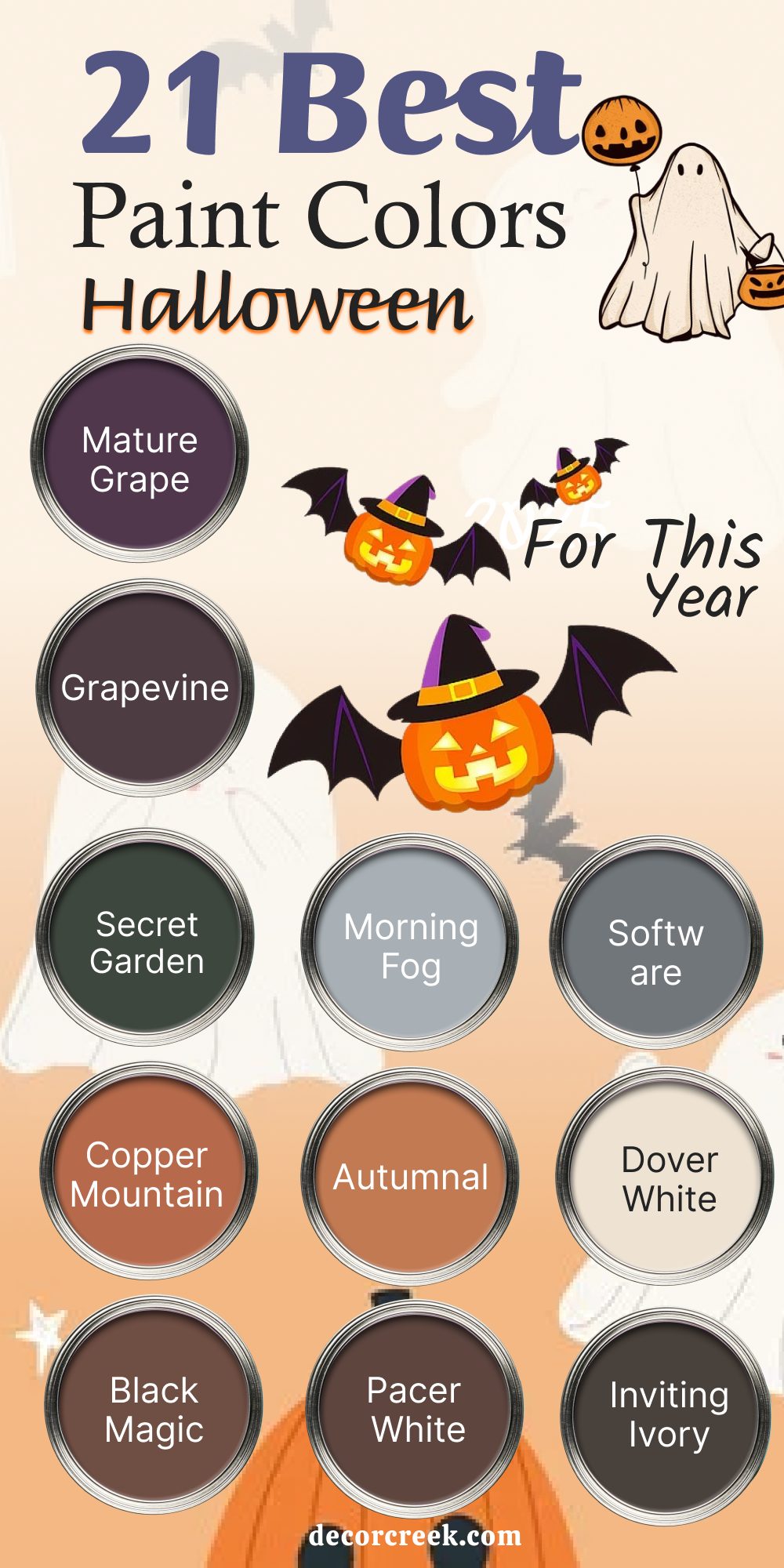
21 Best Halloween Paint Colors for This Year
Witchy Purples & Haunted Violets
Mature Grape (SW 6286)
Mature Grape brings in that deep, almost shadowy purple that makes any room feel like a witch could walk in at any moment. I’ve used it in entryways and powder rooms when I wanted a little drama without going full black. It pairs beautifully with brass hardware and flickering candles.
Mature Grape also holds its color well at night, which is great for spooky lighting. If you’re doing Halloween with a gothic edge, this is one of my first picks.
Grapevine (SW 6285)
Grapevine is the kind of purple that feels like it came straight from a velvet costume. It’s moody but still soft enough to use on a full wall. I love putting it behind old mirrors or vintage gold frames—it brings out that “haunted mansion” vibe without being cheesy.
Grapevine also plays well with dusty oranges and soft greens if you’re doing a layered fall look.
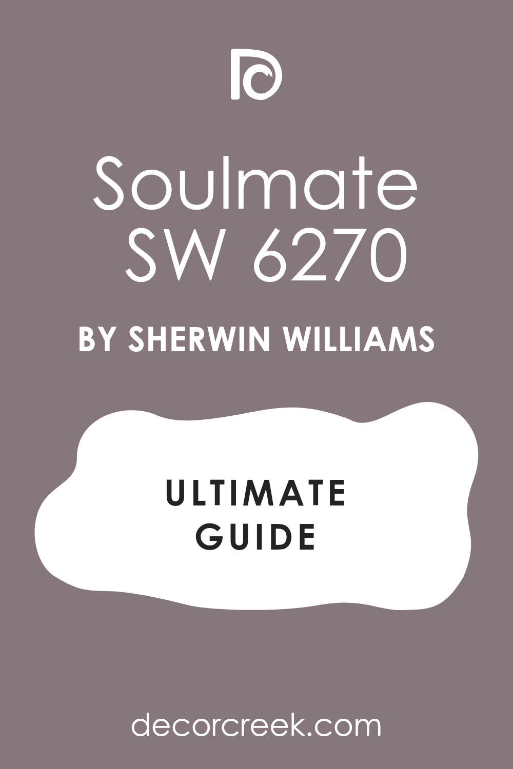
Soulmate (SW 6270)
Soulmate gives you a plummy richness that feels mysterious in the best way. It’s not too loud, which means you can use it even in smaller rooms. I used this once behind a fireplace for Halloween, and it made the whole room feel like a storybook.
Soulmate also works well with black candleholders, and even white pumpkins pop beautifully against it.

Mystical Shade (SW 6276)
Mystical Shade has that silvery violet tone that feels like a full moon glowing through fog. It’s quieter than the other purples here, but still gives that magical, slightly eerie vibe. I love using it in hallways or bedrooms where you want Halloween to feel dreamy instead of scary.
It also works well with dusty whites and soft orange tones.
Grape Harvest (SW 6285)
Grape Harvest is the kind of deep, juicy color that brings all the drama. It’s strong, so I usually use it on accent walls or even painted furniture. I once painted a vintage hutch in this color and filled it with black dishware and candles—it was perfect.
Grape Harvest feels bold but romantic, and looks great under dim lighting.
Spooky Greens & Foggy Grays
Secret Garden (SW 6181)
Secret Garden is that forest green that feels like something magical is hiding in the shadows. It’s dark, rich, and full of depth. I love it for front doors, especially in fall with pumpkins on the steps.
Inside, it works great with wood tones and candlelight. It brings a little mystery without being too loud.
Rock Garden (SW 6195)
Rock Garden has an earthy tone that grounds everything. It feels like moss and wet leaves and old graveyards—in the best way. I use it when I want something natural that still whispers Halloween.
It looks amazing with burnt orange and aged brass.
Rock Garden is especially good in kitchens or dens with stone or wood nearby.

Greenblack (SW 6994)
Greenblack is almost black—but just green enough to catch the eye. It’s one of those colors that makes people lean in and ask, “What is that?” I love it on accent walls and cabinets.
It pairs well with dried florals, black metal, and moody lighting. It’s bold without being harsh.
Web Gray (SW 7075)
Web Gray has that soft, stormy look that reminds me of a cold October sky. It’s a great neutral if you’re not ready for full black or bright color. I’ve used it in bathrooms, entryways, even bedrooms.
It makes white pumpkins and dark wood furniture really stand out. Web Gray also feels calm but still a little eerie.

Morning Fog (SW 6255)
Morning Fog is a gentle gray that has a touch of cool blue. It feels like mist before sunrise. This is one of my favorite background shades when I want to keep things soft but still Halloween-ready.
Pair it with dusty purples or orange candles and it fits right in. Morning Fog works well on walls or even ceilings.
Software (SW 7074)
Software is a cooler, darker gray that gives off a sleek, modern edge. It’s great if you want something spooky but not old-fashioned. I’ve used it on accent walls, bookcases, even front doors.
It looks amazing with copper or bronze accents. Software also holds up well in low light, which is perfect for Halloween vibes.

Pumpkin Oranges & Autumn Spices
Spiced Cider (SW 7702)
Spiced Cider feels like a warm drink by the fire. It’s cozy, rich, and full of that deep orange warmth. I love this color for dining rooms and even porches. It pairs beautifully with blacks, dark purples, and rustic wood.
Spiced Cider feels friendly but still very Halloween.

Copper Wire (SW 7707)
Copper Wire has a shimmer to it that catches the eye right away. It’s not too bright, but it adds a lot of energy to a room. I’ve used it on cabinets and even pumpkins. It looks amazing with matte black and deep greens.
Copper Wire brings that spark of Halloween excitement without going neon.
Copper Mountain (SW 6356)
Copper Mountain gives off those aged, autumn vibes. It’s like rusted leaves and old barns. This color adds depth and character, especially when paired with grays or browns. I love using it in living rooms or outdoor accents.
It warms up any Halloween palette.

Autumnal (SW 6361)
Autumnal feels exactly like its name—fall in a can. It’s a balanced orange-brown that brings in all the comfort of the season. I’ve used it for feature walls and front door trims. It pairs nicely with soft whites and dark accents.
Autumnal is perfect for those who want a seasonal touch that still feels grown-up.
Cavern Clay (SW 7701)
Cavern Clay has that earthy, desert-like feel that works beautifully in fall. It’s not your typical Halloween orange, but that’s what makes it special. I love how it looks with dried florals, dark woods, and vintage décor.
Cavern Clay feels grounded and rich, like it belongs in an old spellbook.

Ghostly Whites & Creepy Blacks
Tricorn Black (SW 6258)
Tricorn Black is one of my go-to blacks. It’s deep, clean, and never looks flat. It works on walls, doors, furniture—anywhere you want drama. I especially love it with brass or orange accents.
Tricorn Black always makes a bold Halloween statement.

Black Magic (SW 6991)
Black Magic has a softness to it that feels mysterious instead of harsh. I’ve used it in bedrooms and reading nooks where I wanted depth but not darkness. It works great with rich purples or metallics.
Black Magic feels like something is hiding behind it—and I love that for Halloween.
Inkwell (SW 6992)
Inkwell is almost black with a touch of navy. It feels like ink, exactly as the name says. I use this one when I want something strong but not boring. It looks amazing with copper, gold, or even dark green.
Inkwell brings a quiet power to a room.

Alabaster (SW 7008)
Alabaster is soft, creamy, and almost ghost-like. It’s one of the few whites that actually works well for Halloween. I use it to balance out darker colors or bring a glow to dim rooms.
It makes orange and black decor pop without being too harsh.

Dover White (SW 6385)
Dover White has a gentle warmth that still feels a little eerie under candlelight. It’s a lovely background shade for spooky décor. I’ve used it in hallways and kitchens where I want a lighter base but still want it to feel like fall.
Dover White is quiet but never boring.

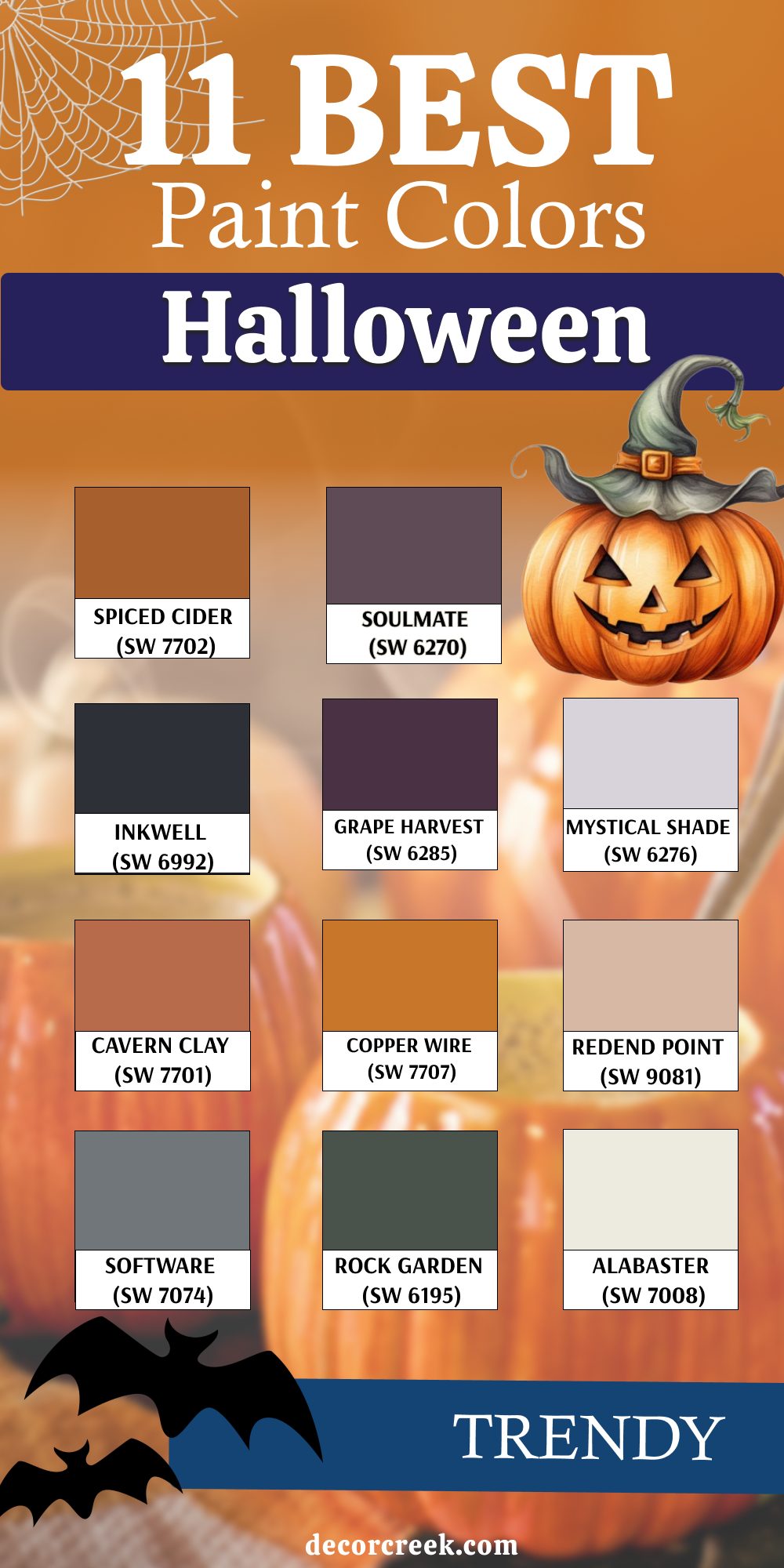
11 Best Paint Color Palettes for Trendy Halloween
Spiced Cider (SW 7702)
Spiced Cider always reminds me of warm mugs and flickering candles. It’s deep, cozy, and rich, like the inside of a fresh pumpkin pie. When I use this color, I instantly feel like fall has arrived. I love pairing it with dark brown furniture, aged copper accents, and big knit blankets. For Halloween, I add black taper candles and dried leaves to pull the whole room together.
Spiced Cider gives you that fall feeling without looking too orange or cartoonish. It feels like comfort with just a hint of mischief.
You can use it in living rooms, entryways, or even paint a wooden cabinet in it—it’ll glow in the candlelight.
Soulmate (SW 6270)
Soulmate is a rich, deep purple that feels mysterious and full of emotion. It’s the kind of color I use when I want a roomto feel like something magical just happened there. I’ve used it in bedrooms and even on built-in bookshelves, surrounded by vintage books and dark candles. It looks amazing next to soft gold, warm browns, or even black.
Soulmate has a gentle depth that feels just right for Halloween—it’s dramatic, but not heavy. When I pair it with cream pumpkins or faded florals, the whole look becomes soft and haunting.
It’s perfect for making your home feel both elegant and a little bit spooky.
Inkwell (SW 6992)
Inkwell brings that strong, mysterious base that every Halloween palette needs. It’s darker than navy but not quite black, and it has this smooth, inky finish that catches the eye. I love using it on walls behind a gallery of Halloween art or even on a front door to create a moody entrance. It’s powerful but not too harsh, and it pairs beautifully with dusty oranges, rich greens, and soft whites.
In a room filled with candlelight and vintage décor, Inkwell feels like the night sky before a storm. It’s one of those colors that helps everything else around it come to life.
Grape Harvest (SW 6285)
Grape Harvest is bold and beautiful—a deep purple that brings drama in the best way. I once painted a dining room in this shade for a Halloween dinner party, and everyone thought it looked like an old castle. It makes gold and brass shine, and when you add dark florals or velvet pillows, it feels rich and layered.
Grape Harvest is perfect if you want a royal touch to your Halloween palette. I also like it with black wood accents and candlelight. It’s a color that feels like magic, mystery, and maybe even a little bit of mischief.
Mystical Shade (SW 6276)
Mystical Shade feels like a pale whisper of Halloween magic. It’s a soft grayish violet that works like a backdrop for other colors to shine. When I want a room to feel eerie but gentle, this is where I start. It’s great in bedrooms or quiet sitting areas where you want Halloween to feel like a dream instead of a fright.
I pair it with faded black, muted orange, and ivory to keep things light but still seasonal. Add some soft lighting and hanging bats or dried herbs, and it becomes a room you’ll want to stay in all October. It’s spooky, but in a pretty way.
Cavern Clay (SW 7701)
Cavern Clay is one of my favorite earth tones, especially for autumn. It’s warm, grounded, and has just enough orange in it to feel seasonal without being too loud. I’ve used it in foyers and kitchens to make the home feel inviting. For Halloween, I like pairing it with smoky grays and weathered woods. Add in a few pumpkins, black candleholders, and woven baskets, and you have the kind of home that feels lived-in and loved.
Cavern Clay doesn’t shout Halloween—but it leans into it with quiet strength. It brings comfort and character, especially when the weather gets colder.
Copper Wire (SW 7707)
Copper Wire shines like firelight. It’s that glowing, rich color that reminds me of Halloween lanterns and candlelit windows. I’ve used it on everything from accent walls to old chairs, and it always adds energy to the room. For a festive but grown-up Halloween look, I mix it with dark greens, slate grays, and soft whites. Copper Wire also works really well outdoors—on porch steps, plant pots, or even wooden crates stacked with pumpkins.
It has a way of catching the light and warming up even the gloomiest October day. It’s one of those shades that says fall fun, but with style.
Redend Point (SW 9081)
Redend Point isn’t your usual Halloween color, but that’s what makes it special. It’s a soft terracotta pink with a cozy, vintage vibe. When I want a more unexpected palette, I start here and add dusty greens, aged brass, and even black for contrast. It creates a quiet, witchy warmth—something that feels like an old storybook or a potion shop in the woods. Redend Point is lovely on walls, cabinets, or even decorative frames.
I love how it makes a room feel warm and soft without being sugary. It’s for the kind of Halloween that’s more candlelight and tea than jump scares.

Software (SW 7074)
Software is that dark gray that makes everything feel a little more dramatic. It’s not as sharp as black, but still moody enough to set the tone. I use it when I want a strong background color that doesn’t overpower the room. In Halloween palettes, I pair it with deep purples, burnt oranges, and creamy whites. I once used it in a dining nook with copper chargers and black tapers—it was simple and so stylish.
Software is perfect for homes that want to look seasonal without losing their modern edge. It’s clean, cool, and lets other colors pop around it.
Rock Garden (SW 6195)
Rock Garden feels like moss growing over stone in an old forest. It’s earthy, rich, and just green enough to feel natural and slightly eerie. I’ve used it on accent walls and front doors, especially when paired with pumpkins and old lanterns. It gives your Halloween palette a deep, grounded tone that balances out all the fiery oranges and spooky blacks. I love mixing it with soft gray, aged wood, and touches of rust.
Rock Garden helps the house feel like part of the outdoors—like it’s been there for centuries, just waiting for October.
Alabaster (SW 7008)
Alabaster is one of the few white paints that works so well for Halloween. It’s soft and creamy, not too cold, and it gives a nice contrast to darker shades. I love using it to break up heavier colors like black, purple, or dark green. It also makes Halloween decorations really pop—especially black bats or orange pumpkins. I’ve painted kitchen cabinets in Alabaster and styled them with matte black hardware for a crisp but cozy feel.
It keeps everything feeling light, even when your decor gets spooky. Alabaster is like the quiet part of the haunted house—the calm before the fun begins.
Why These Halloween Colors Always Work for Me
Every October, I come back to these shades because they just work. The 21 best Halloween paint colors for 2025 give me everything I need—warmth, contrast, depth, and that special feeling only Halloween can bring.
Whether I’m decorating for a party, refreshing a porch, or just painting a little side table, these colors always help me tell a story. Some feel eerie, some feel cozy, and others just feel fun.
That’s what makes Halloween special—it’s not about going over the top, it’s about making your home feel alive with the season. Paint lets you do that in a way nothing else can.
