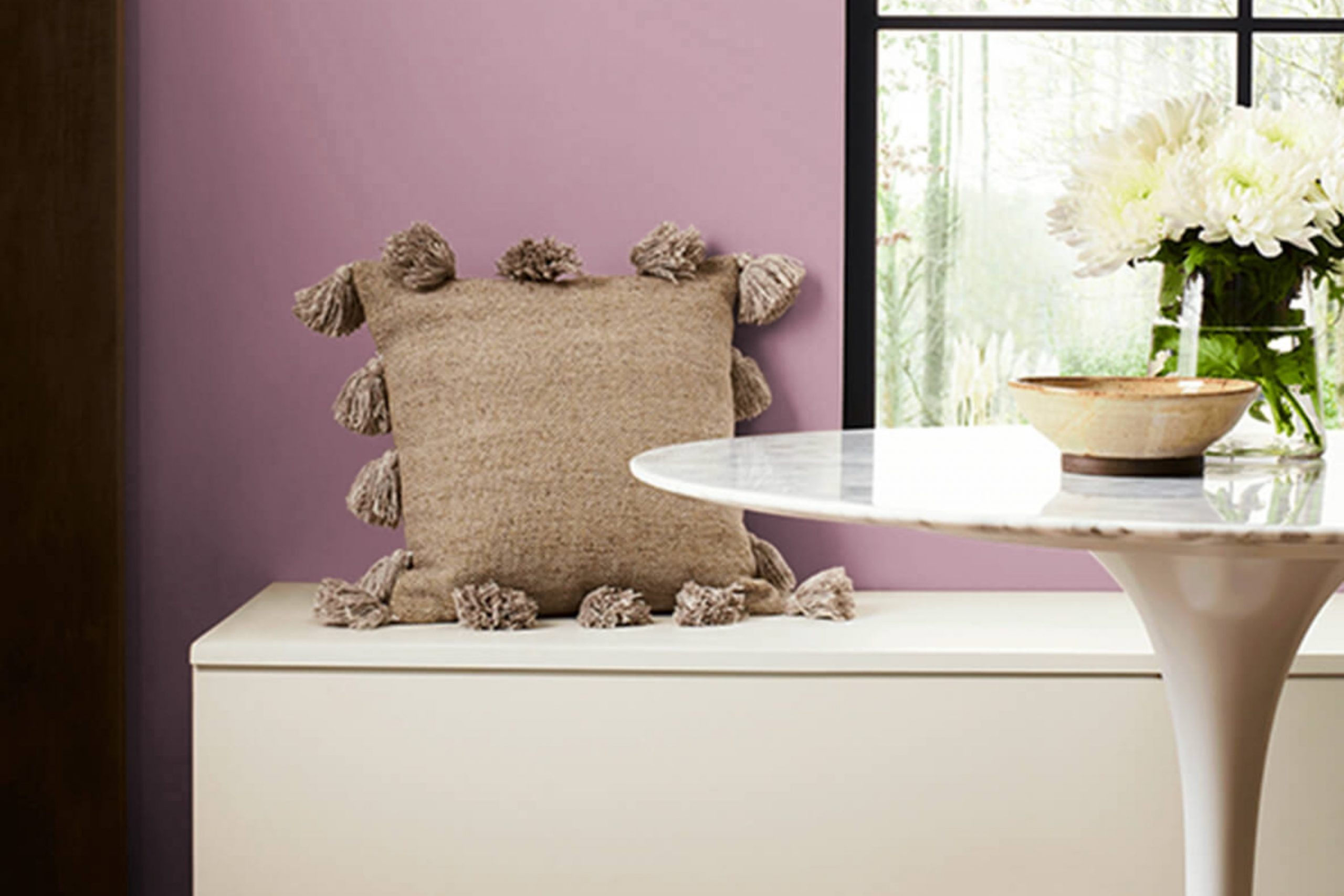
If you’ve ever wondered about finding the perfect shade of pink for your area, you might want to consider SW 6290 Rose by Sherwin Williams. Stepping away from the typical hues, this particular pink offers a subtle warmth that can brighten up a room without overpowering it. You know how some colors are just too loud or too soft? Well, SW 6290 Rose hits the sweet spot. It’s like it has its own glow, bringing a fresh and lively vibe wherever you apply it.
Perfect for a bedroom, bathroom, or even a cozy reading nook, this color has a way of making areas feel welcoming and stylish. Using this shade can instantly lift the mood of a room. You can pair it with whites for a clean look or with dark greys for a bit of drama. Imagine having a background that’s both pleasant and adaptable.
So, if you’re thinking about refreshing a room or starting a new decorating project, SW 6290 Rose is definitely worth your consideration.
It’s not just a color, but a simple way to add a bit of charm and personality to your home.
What Color Is Rose SW 6290 by Sherwin Williams?
Is Rose SW 6290 by Sherwin Williams Warm or Cool color?
RoseSW 6290 is a paint color created by Sherwin Williams known for its warm, inviting vibe. This color, a rich and deep rose shade, adds a cozy and welcoming touch to any room.
It works well in homes because it offers a refreshing change from the usual neutrals without being too bold or overpowering. This rose hue can be particularly effective in living rooms or bedrooms where you want to create a comfortable and relaxing atmosphere.
The color is adaptable enough to match various decor styles, whether you’re going for a rustic look or something more modern. Since it’s not extremely bright, it can also help smaller areas feel more open and larger. In addition, this color pairs well with soft whites or light grays, for a subtle yet striking contrast. This helps in creating a distinct yet harmonious look in your home environment.
Undertones of Rose SW 6290 by Sherwin Williams
RoseSW 6290 is a unique color that includes a mix of various undertones, which can influence the way it appears in different settings. Undertones are subtle colors that lie beneath the surface of the main color. These can alter our perception of the primary color based on lighting and surrounding elements.
For RoseSW 6290, undertones like light purple and lilac add a soft and gentle vibe, making it perfect for creating a relaxing atmosphere in a room. Grey and light gray provide a neutral backdrop, which means that this color can easily blend with various decors without clashing. Also, undertones like pale yellow and mint introduce a splash of freshness, liveliness, and add a touch of warmth, making the area feel more inviting.
When applied to interior walls, the impact of these undertones in RoseSW 6290 becomes evident. In natural light, you might notice the lighter undertones, like light purple or pale yellow, which can make the room feel airy and open. Artificial lighting, depending on its warmth or coolness, might highlight other undertones like grey or lilac, affecting the mood and visual temperature of the room.
Choosing decor and colors to complement the undertones can enhance the main hue’s beauty. For example, pairing it with furniture or decorations that emphasize its mint or light blue undertones can create a cohesive and harmoniously decorated area. Understanding these undertones can help in making informed decisions about paint colors to achieve the desired effect in any room.
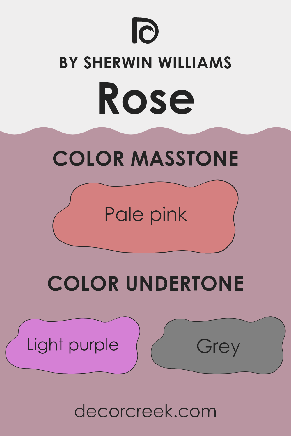
What is the Masstone of the Rose SW 6290 by Sherwin Williams?
The masstone of Pale Pink (#D58080) from Sherwin Williams is a soft, gentle color that brings a warm and welcoming feel to any room. Its subtle hue makes it extremely adaptable, fitting well in many areas such as bedrooms, living rooms, and nurseries.
This light pink shade creates a cozy and comfortable atmosphere, making areas feel more open and inviting. Despite being a color often associated with children’s rooms, its understated elegance allows it to be used effectively in adult areas as well, adding a touch of calmness without being too bold or overpowering.
Its ability to combine well with other colors means it can be paired with neutrals like whites and grays to maintain a soft palette or with bolder colors to add contrast and interest. Importantly, its lightness helps in reflecting natural light, making smaller areas appear larger and more airy.

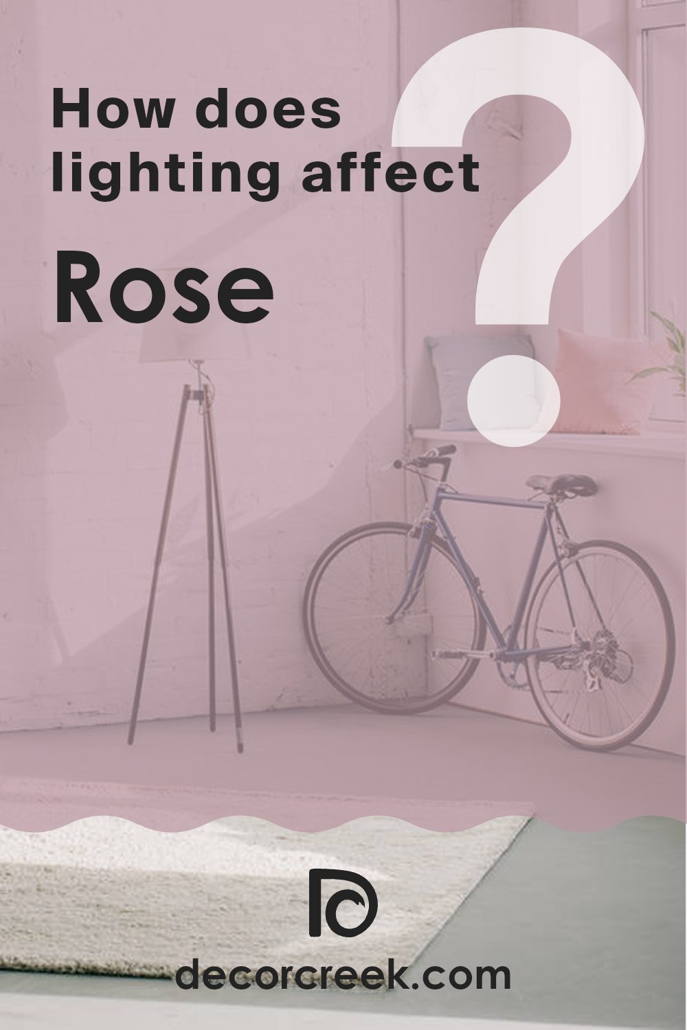
How Does Lighting Affect Rose SW 6290 by Sherwin Williams?
Lighting plays a crucial role in how colors appear in a room. Different types of light—whether natural or artificial—can alter the perception of colors on your walls.
Considering a color like Rose, which is a rich, vibrant shade, its appearance can change significantly under different lighting conditions. In natural light, Rose tends to appear more true to its palette, showing its depth and warmth vividly. This warm, inviting hue can make areas feel cozy and welcoming.
In artificial light, the type of bulb used affects the color’s appearance. Incandescent bulbs, which emit a warmer, yellowish glow, enhance the richness of Rose, making it appear deeper and more intense. LED or fluorescent bulbs, which tend to have a cooler output, might make the color look slightly lighter and less intense.
The orientation of a room also influences how Rose looks:
- North-faced rooms: These rooms get less direct sunlight, which can make Rose appear slightly duller and cooler. This can result in the color lacking some of its warmth, showing a more subdued version of itself.
- South-faced rooms: With plenty of natural sunlight, Rose shines brightly in south-facing rooms. The abundant light helps enhance the warm undertones of the color, making the room feel vibrant and lively.
- East-faced rooms: In the morning, east-facing rooms receive a lot of sunlight, making Rose look bright and cheerful. However, as the day progresses, the intensity of the sunlight decreases, and the color can appear softer and more muted.
- West-faced rooms: These rooms enjoy intense light in the afternoons and evenings. During these times, Rose can look exceptionally warm and welcoming, making the area feel very comfortable during the later parts of the day.
When choosing paint colors like Rose, considering how lighting affects their appearance will help you achieve the desired effect in every room.
What is the LRV of Rose SW 6290 by Sherwin Williams?
LRV stands for Light Reflectance Value, which is a measure used to indicate the amount of visible and usable light that gets reflected off a surface when light shines on it. The value ranges from zero, for a surface that absorbs all light, to a higher number, close to a full reflection of all light. The higher the LRV, the lighter the color appears.
This measurement is important because it helps in determining how a color will look once it is applied to the walls of a room. For instance, colors with a high LRV make areas appear brighter and bigger, whereas colors with a low LRV make a room look cozier and more enclosed.
Considering RoseSW color with an LRV of 34.219, it falls into the category of medium light reflectance. This means it doesn’t reflect a lot of light, nor does it absorb too much. In a practical sense, when used on walls, this color will not make the area feel overly bright, nor will it make it seem dark. It strikes a balance, offering a relatively subdued appearance that can add warmth to a room.
This specific shade is adaptable enough to provide a noticeable color presence that isn’t overpowering, making it suitable for areas where a moderate, inviting atmosphere is desired.

Coordinating Colors of Rose SW 6290 by Sherwin Williams
Coordinating colors are those that complement and enhance the main hue in a color scheme, creating a visually appealing and harmonious look. For example, when using a specific shade like Rose by Sherwin Williams, it is essential to find colors that blend well with it while also offering contrast or emphasis in the right areas. Coordinating colors usually share either a color intensity or tone that resonates with the main color, or they are strategically selected to provide a striking balance.
A good example of a coordinating color is Pediment by Sherwin Williams. This is a soft and neutral gray that pairs beautifully with richer, vibrant tones like Rose, providing a backdrop that allows the primary color to stand out. Another coordinating color that works well is Ibis White, which is a clean and bright white.
Ibis White is great for trim, doors, and ceilings, offering a crisp contrast that makes the main color pop. Lastly, Wickerwork offers a deeper, muted orange tint that complements the warmth of Rose, making it ideal for creating a cozy and welcoming atmosphere in any area. Each of these colors contributes to a cohesive look when paired with a central shade, enhancing the overall aesthetic of a room.
You can see recommended paint colors below:
- SW 7634 Pediment
- SW 7000 Ibis White
- SW 0010 Wickerwork

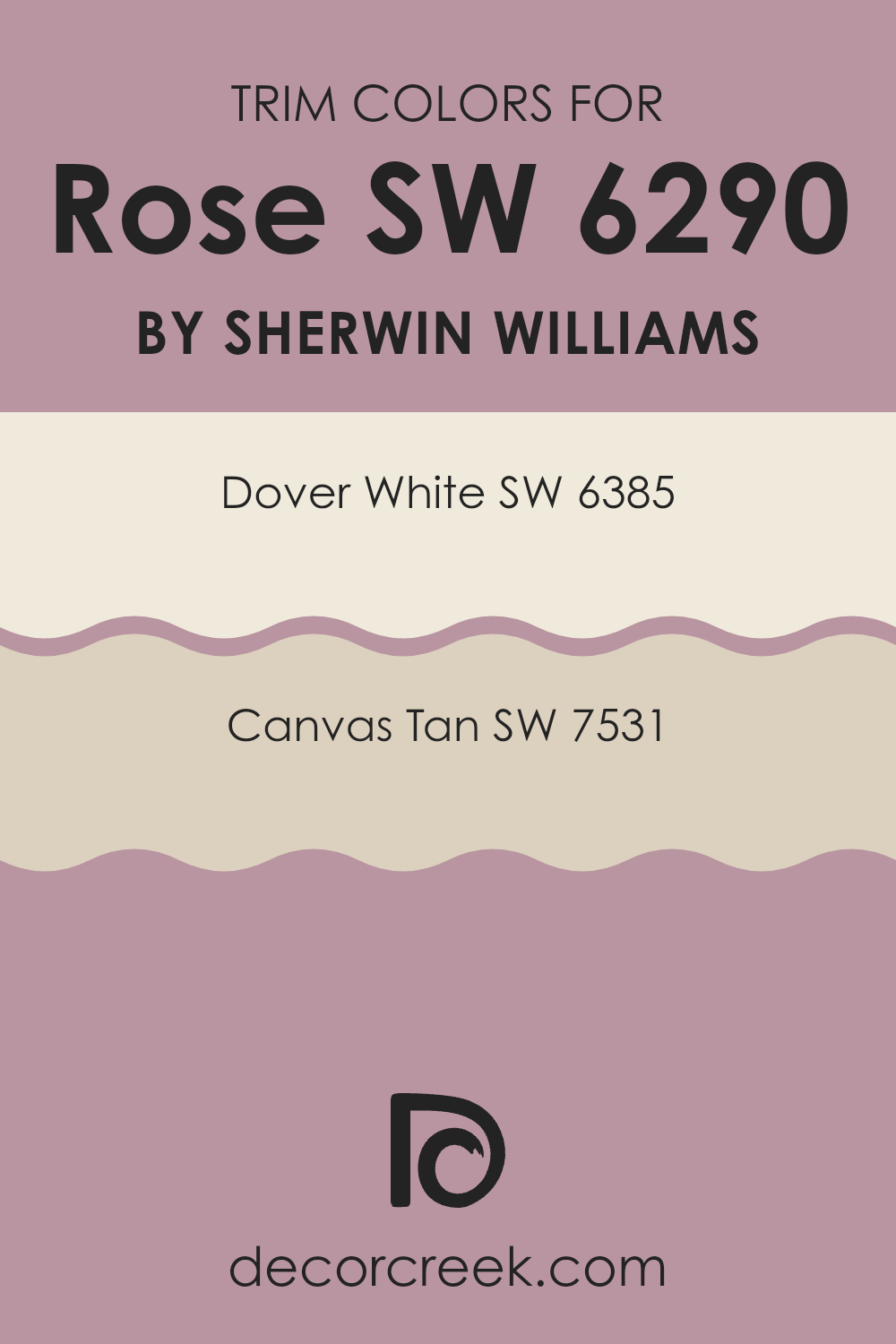
What are the Trim colors of Rose SW 6290 by Sherwin Williams?
Trim colors are essentially the accents used on the architectural features of a room, such as window frames, doors, moldings, and skirting boards. These colors are crucial because they help define and highlight these details, creating a coherent look that complements the main wall color. For a color like SW 6290 by Sherwin Williams, proper trim colors can bring out its best features, making the room feel well put-together.
In choosing trim colors to pair with SW 6290, SW 6385 – Dover White is a lovely option. Dover White offers a clean and fresh appearance, which can effectively contrast with more bold wall colors to provide a beautiful frame around the architectural features.
Another good choice is SW 7531 – Canvas Tan. This color has a warm, gentle tone that works well to soften the overall effect when paired with deeper or more vivid wall colors, helping to create a welcoming and harmonious area.
You can see recommended paint colors below:
Colors Similar to Rose SW 6290 by Sherwin Williams
Similar colors play a key role in creating a harmonious and aesthetically pleasing palette. They offer subtle variations that can enhance the mood of an area without overpowering it with contrast. For instance, when you are decorating a room, using shades like Orchid, Rosebay, and Dressy Rose, which are hues that lie close to each other on the color spectrum, can produce a cohesive and soothing effect. These colors blend seamlessly, eliminating sharp borders between different surfaces, which could otherwise interrupt the visual flow.
For example, Orchid is a gentle purple that brings a soft touch of spring, while Rosebay is a deeper pink that adds a bit of vibrancy without overpowering. Dressy Rose has a mature pink tone that provides a slightly understated elegance. Rose Embroidery goes a bit darker, lending a rich and warm hue that feels inviting. Audrey’s Blush is a muted pink that offers a subtle feeling of warmth.
Pressed Flower is another mellow, dusty pink that works well in softening any decor scheme. Thistle brings a unique lilac note which is pleasantly soft and not too striking. Damsel is a robust mauve that can act as a strong foundation color. Radiant Lilac lights up an area with its cheerful and light purple glow. Lastly, Haute Pink is the boldest among them, popping with a vibrant pink that can energize any area. All these colors, when used thoughtfully, contribute to creating a unified and soothing environment where each hue complements the others.
You can see recommended paint colors below:
- SW 0071 Orchid
- SW 6563 Rosebay
- SW 6024 Dressy Rose
- SW 6297 Rose Embroidery
- SW 9001 Audrey’s Blush
- SW 6304 Pressed Flower
- SW 6283 Thistle
- SW 7576 Damsel
- SW 0074 Radiant Lilac
- SW 6570 Haute Pink
Colors that Go With Rose SW 6290 by Sherwin Williams
Choosing the right colors to complement RoseSW 6290 by Sherwin Williams is key to creating a harmonious and appealing area. When colors like SW 7577 – Blackberry, SW 6293 – Fabulous Grape, and the others in this range are used together, they create a cohesive look that enhances the overall ambiance of a room. These shades are especially adept at providing a balanced aesthetic that can make areas feel more inviting and interesting without overpowering the senses.
For example, SW 7577 – Blackberry is a deep, rich purple that adds a touch of elegance and depth to any area. It works well with RoseSW 6290 as it provides a strong, grounding contrast. SW 6293 – Fabulous Grape is another purple shade but with a brighter, more vibrant tone that injects energy and personality into interiors.
Moving on to SW 6292 – Berry Bush, this color has a softer, muted quality that blends beautifully with RoseSW 6290, adding a subtle touch of nature-inspired color. SW 6289 – Delightful is a light, airy lavender that offers a refreshing respite when paired with darker tones. SW 6288 – Rosebud is a soft, muted pink that echoes the undertones in RoseSW 6290, reinforcing a gentle, cohesive theme. Finally, SW 6291 – Moss Rose is a charming, dusty pink that adds a vintage feel to the palette, rounding out the selection with its warm, welcoming vibe. Each of these colors contributes its unique character while maintaining a delightful visual flow with RoseSW 6290.
You can see recommended paint colors below:
- SW 7577 Blackberry
- SW 6293 Fabulous Grape
- SW 6292 Berry Bush
- SW 6289 Delightful
- SW 6288 Rosebud
- SW 6291 Moss Rose

How to Use Rose SW 6290 by Sherwin Williams In Your Home?
Rose SW 6290 by Sherwin Williams is a rich and appealing color paint. It offers an adaptable shade of pink that can add a warm and welcoming touch to any room in your home. The color is perfect for creating a cozy and comfortable atmosphere, making it ideal for areas where you relax like the living room or bedroom. It pairs beautifully with neutral shades like whites and grays, which can help balance its warmth.
You can use Rose SW 6290 to paint an entire room, which would create a bold impact, or you could use it on a single accent wall for a more subtle hint of warmth and color.
Additionally, complementing it with accessories or furniture in similar or contrasting hues can enhance the overall aesthetic of your area. Applying this color in a nursery or children’s room is also a great choice, as it offers a cheerful and gentle environment for kids.
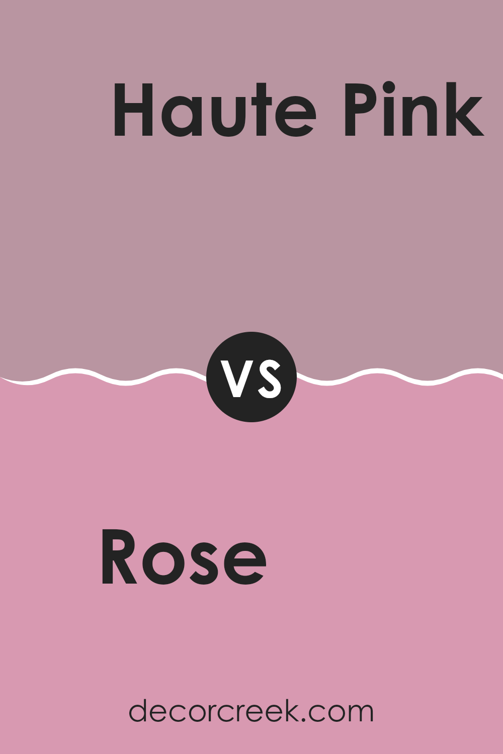
Rose SW 6290 by Sherwin Williams vs Haute Pink SW 6570 by Sherwin Williams
Rose SW 6290 and Haute Pink SW 6570, both by Sherwin Williams, are distinct shades of pink, each setting a unique tone. Rose SW 6290 carries a muted quality, a soft and dusty pink that feels gentle and subdued.
It’s ideal for creating a cozy atmosphere in areas meant for relaxation, such as bedrooms or sitting areas. On the other hand, Haute Pink SW 6570 is a vivid, lively pink that makes a bold statement.
This brighter shade stands out and is perfect for areas where you want to add a pop of color or energize the room, like a playroom or an accent wall in a more neutral area. Comparatively, Rose SW 6290 offers a subtle aesthetic while Haute Pink SW 6570 brings vibrancy, adding dynamic energy wherever it is used.
You can see recommended paint color below:
- SW 6570 Haute Pink
Rose SW 6290 by Sherwin Williams vs Pressed Flower SW 6304 by Sherwin Williams
Rose SW 6290 and Pressed Flower SW 6304 by Sherwin Williams are two distinct shades that each bring a unique feel to an area. Rose is a vibrant, lively pink with a strong presence that can make a room feel cheerful and energetic. It’s a bold choice that works well when you want a pop of color, as it draws the eye and can be the centerpiece of a design.
On the other hand, Pressed Flower is subtler and leans more towards a muted, dusty lavender. This color is excellent for creating a cozy, soothing atmosphere in any room. It’s adaptable enough to work well in a variety of settings, providing a gentle backdrop that complements a wide range of decor styles.
Both colors offer their own unique qualities and can be used effectively to enhance the aesthetic of a home, depending on what mood or style you’re aiming to achieve.
You can see recommended paint color below:
- SW 6304 Pressed Flower

Rose SW 6290 by Sherwin Williams vs Rosebay SW 6563 by Sherwin Williams
Rose SW 6290 and Rosebay SW 6563 by Sherwin Williams are two distinct shades, each giving off its unique vibe. Rose SW 6290 is a rich, vibrant color.
It leans towards a classic rose hue, which gives off a lively yet cozy feel, making it perfect for adding a pop of color in living areas or bedrooms. On the other hand, Rosebay SW 6563 tends to be softer and more subtle. This shade is lighter, almost pastel-like, offering a calm and gentle look, suitable for creating a relaxing atmosphere in areas meant for relaxation or reflection.
While both colors share a floral base, Rose SW 6290’s intensity brings energy, whereas Rosebay SW 6563’s muted tone provides a more laid-back, calming environment. These qualities make each color suitable for different design needs based on the desired mood and functionality of the room.
You can see recommended paint color below:

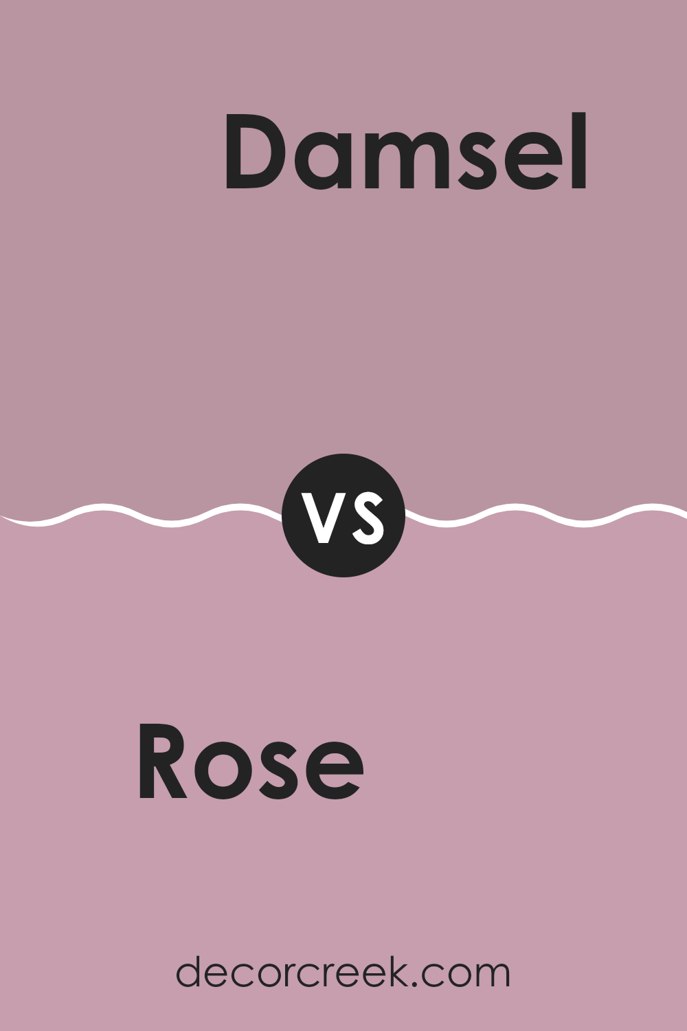
Rose SW 6290 by Sherwin Williams vs Damsel SW 7576 by Sherwin Williams
The main color, Rose, is a lively shade that brings a vibrant, cheerful feel to any area. It has a bright and playful tone that can add a touch of freshness wherever it’s used. It’s perfect for areas where you want to add a pop of color, like a child’s room or a cozy reading nook.
On the other hand, Damsel has a much darker, richer quality. This color offers a sense of depth and elegance, making it well-suited for formal areas or accent walls in a home. Its deeper hue can create a striking contrast, especially when paired with lighter colors.
While Rose is more about adding a splash of energy and fun, Damsel lends a more grounded and bold statement. Both colors hold their own charm and can dramatically shift the mood of an area, depending on what you’re aiming for.
You can see recommended paint color below:
- SW 7576 Damsel
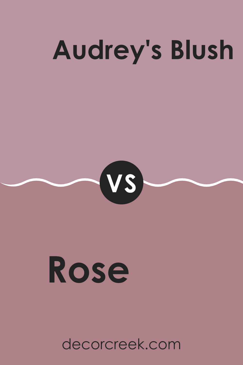
Rose SW 6290 by Sherwin Williams vs Audrey’s Blush SW 9001 by Sherwin Williams
Rose and Audrey’s Blush are two distinct paint colors by Sherwin Williams, each offering a unique vibe to an area. Rose is a deeper, more saturated hue that adds a strong presence to a room. It leans more towards a classic red with pink undertones, which gives it a warm and inviting feel. This color is great for creating a focal point or adding a cozy, vibrant touch to areas like living rooms or dining areas.
On the other hand, Audrey’s Blush is a softer and lighter pink. It has a gentle and airy feel, making it perfect for creating a calming atmosphere. It’s ideal for bedrooms or bathrooms where a light, soothing touch is desired. The color is less intense, providing a more subtle backdrop compared to Rose.
Both colors have their charm, with Rose being bolder and Audrey’s Blush lending a lighter touch. Depending on the mood you want to set, either color could be the perfect choice.
You can see recommended paint color below:
- SW 9001 Audrey’s Blush
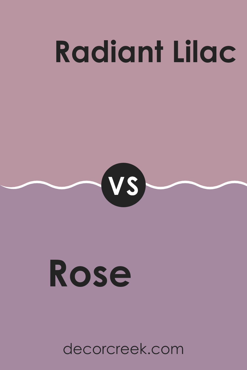
Rose SW 6290 by Sherwin Williams vs Radiant Lilac SW 0074 by Sherwin Williams
Rose SW 6290 and Radiant Lilac SW 0074 are two distinct colors from Sherwin Williams, each bringing its unique charm to an area. Rose is a deep, rich pink with a warm undertone that offers a welcoming feel. It’s ideal for creating cozy and inviting areas, such as living rooms or bedrooms.
On the other hand, Radiant Lilac is a softer, lighter purple with a slightly cooler tone. This color is great for adding a gentle, calming effect to an area, making it perfect for areas meant to be relaxing or reflective, like a home office or a bathroom.
While Rose tends to draw in the eye with its boldness, Radiant Lilac provides a more subdued backdrop that complements other design elements. Depending on the mood you want to set or the size of the room, each color has its strengths. For lively, dynamic rooms, Rose is a strong choice; for quiet, peaceful areas, Radiant Lilac works beautifully.
You can see recommended paint color below:
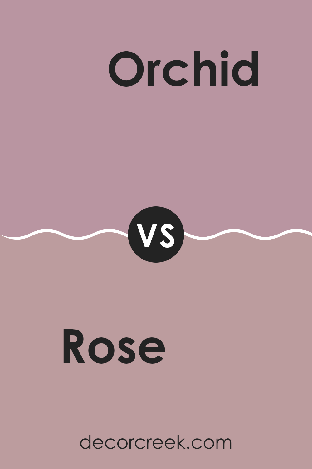
Rose SW 6290 by Sherwin Williams vs Orchid SW 0071 by Sherwin Williams
Rose SW 6290 by Sherwin Williams is a vibrant shade that brings to mind the deep, rich petals of a blossoming rose garden. It exudes warmth and has a cozy, inviting feel, making it perfect for areas where you want to add a pop of strong color without overpowering the area. This color reflects a sense of romantic charm and can work beautifully in a dining room or bedroom where you aim to create a welcoming atmosphere.
On the other hand, Orchid SW 0071 by Sherwin Williams is a lighter, more subtle hue compared to Rose. Orchid is reminiscent of the soft purple of early spring flowers. It’s gentle and has a more understated elegance, which makes it ideal for areas that require a touch of softness and calm, such as bathrooms or meditation rooms. Its airy feel can help open up an area, making it appear brighter and more open.
Both colors offer unique vibes: Rose with its deep, passionate tone, and Orchid with its gentle, soothing presence, each providing distinct possibilities depending on the mood and function of your room.
You can see recommended paint color below:
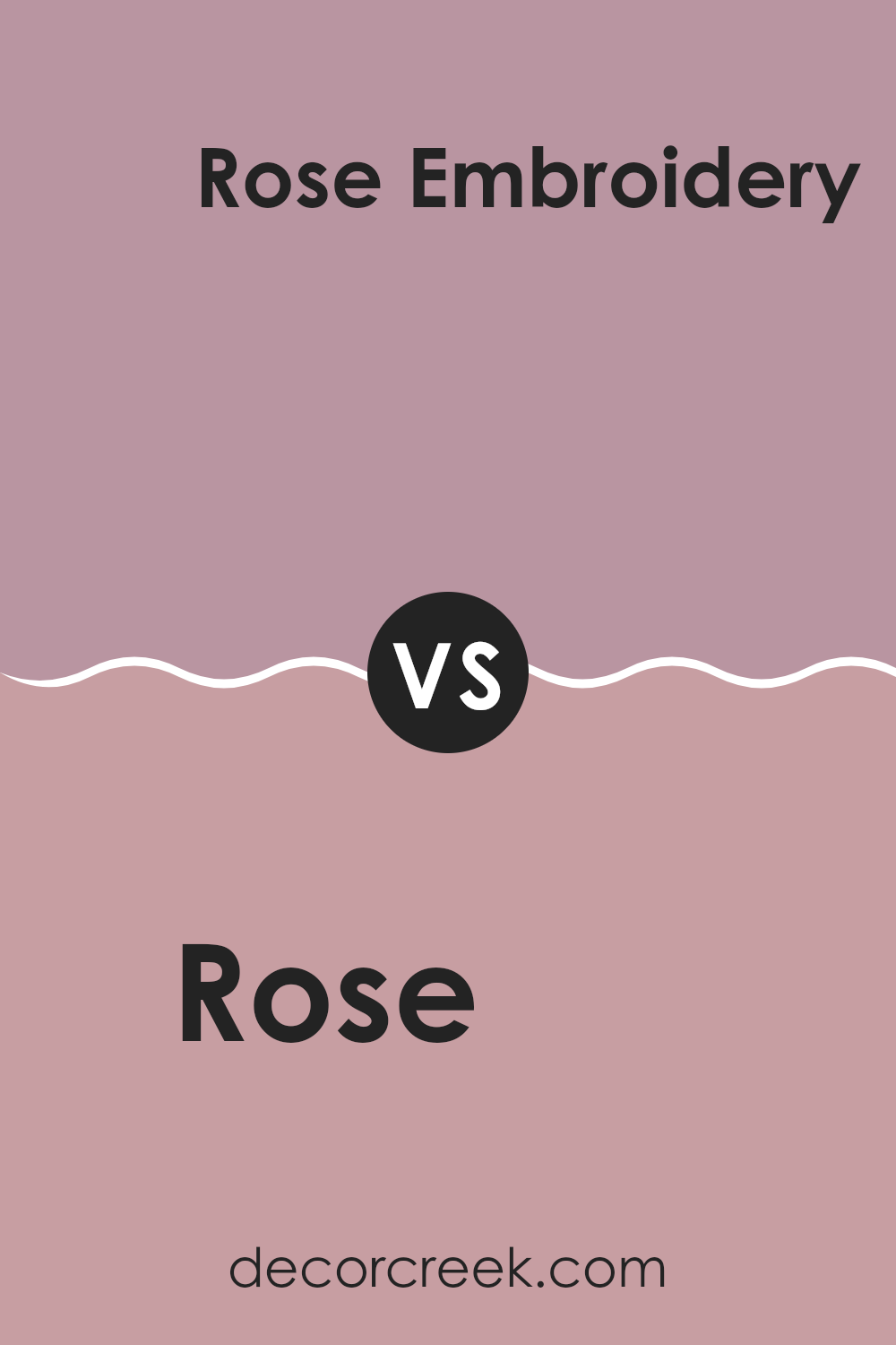
Rose SW 6290 by Sherwin Williams vs Rose Embroidery SW 6297 by Sherwin Williams
Rose SW 6290 and Rose Embroidery SW 6297 by Sherwin Williams are both shades of pink, but they offer distinctly different vibes. Rose SW 6290 is a bolder, more vibrant shade. It’s a type of pink that stands out and adds a clear, confident touch of color to an area. It’s brighter, which makes it a good choice if you want to create a lively, energetic feel in a room.
On the other hand, Rose Embroidery SW 6297 is a subtler, more muted pink. It has a gentler appearance, making it perfect for rooms where you want a softer, more soothing atmosphere. This color works well in areas meant for relaxation or reflection because it’s less intense.
Both colors have their unique appeal and can work beautifully depending on the mood you want to set in your area. The decision between them depends on whether you’re going for impact with a stronger pink or a gentle, calming effect with a toned-down version.
You can see recommended paint color below:
Rose SW 6290 by Sherwin Williams vs Thistle SW 6283 by Sherwin Williams
Rose SW 6290 is a vibrant and warm tone that closely resembles the bold hues of a blossoming rose. This color brings a cheerful and inviting feeling to a room, making it perfect for areas where you want an energetic yet cozy atmosphere, like living rooms or dining areas. It has a pinkish-red quality that is both striking and pleasant, offering a lively splash of color that is nonetheless very homey.
On the other hand, Thistle SW 6283 is a more subdued and gentle color, leaning towards a soft purplish-gray. It’s an excellent choice for creating a calm and gentle background, particularly well-suited for bedrooms or bathrooms where a soothing effect is desired. Unlike the Rose, Thistle lends itself to a more muted palette, providing a quietly elegant backdrop that complements various decor styles without overpowering them.
Both colors offer distinct moods and can dramatically affect the feel of an area, depending on how they’re used. While Rose adds a pop of warmth and energy, Thistle gives a room a peaceful and understated charm.
You can see recommended paint color below:
- SW 6283 Thistle
Rose SW 6290 by Sherwin Williams vs Dressy Rose SW 6024 by Sherwin Williams
Rose SW 6290 by Sherwin Williams is a vibrant and cheerful shade, leaning towards a true pink with a rich intensity that brings a pop of color to any area. It’s perfect for creating a bright, welcoming atmosphere, especially in social areas like living rooms or dining areas.
On the other hand, Dressy Rose SW 6024 by Sherwin Williams is a subtler, more muted pink. It has a refined blend of rose with hints of gray, making it a more reserved and adaptable color. This shade suits areas where you want a touch of warmth without overpowering the room, ideal for bedrooms or modern living areas seeking a hint of softness.
While both colors share a pink base, Rose is more vivid and lively, and Dressy Rose offers a softer, more understated charm. Both can effectively enhance the aesthetic of a room but will set very different moods depending on their application.
You can see recommended paint color below:
- SW 6024 Dressy Rose
After looking at Sherwin Williams’ SW 6290 Rose paint, I can honestly say it’s a great choice if you’re looking to brighten up a room with a touch of pink. This color is soft and light, so it’s perfect if you want something smooth that isn’t too bold or loud. It’s ideal for any room that needs a gentle and cheerful vibe.
I also found out that this pink shade works well with other colors. So, if you have furniture or decorations in colors like grey, white, or even darker colors like blue or green, SW 6290 Rose will go nicely with them. This makes it easy to use in different rooms without worrying about things clashing.
From my perspective, choosing this pink from Sherwin Williams is a smart move if you want a room that feels welcoming and calm. Whether it’s for a place to sleep, relax, or even study, SW 6290 Rose brings a fresh and pleasant look that makes areas feel just right.
So, if you’re thinking about adding some new color to your walls, this one might just be the perfect pick!
Ever wished paint sampling was as easy as sticking a sticker? Guess what? Now it is! Discover Samplize's unique Peel & Stick samples.
Get paint samples

