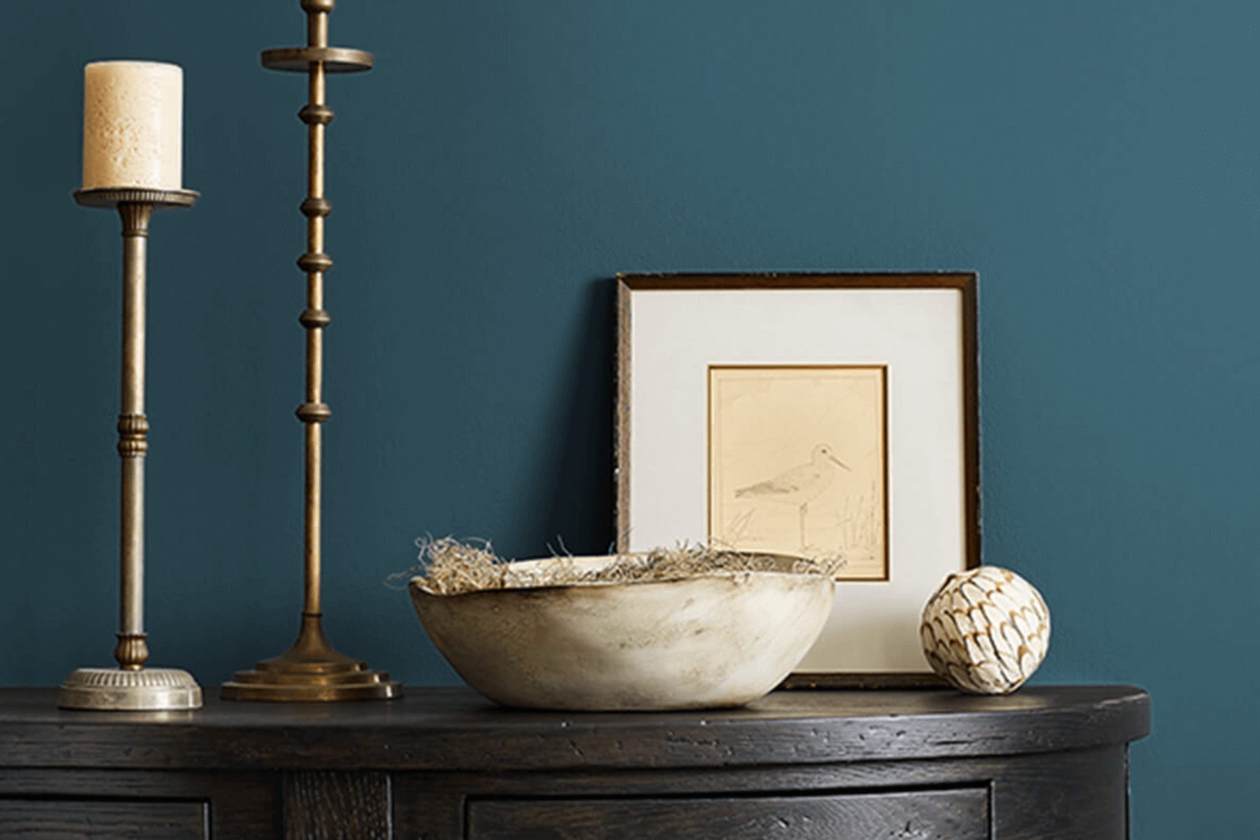
When searching for a perfect paint color, I stumbled upon Sherwin Williams SW 7620 Seaworthy. This color offers a deep sense of calm and richness that struck me as ideal for refreshing any room in need of a nautical charm. With a deep, rich hue that hints at the majestic oceans and cloudy evening skies, Seaworthy sets a mood that can feel both soothing and polished.
The flexibility of SW 7620 Seaworthy encouraged me to consider it for various purposes. Whether aiming to create a feature wall in a living room or to lend an air of elegance to a cozy nook, this shade proves to be a strong choice. Moreover, pairing it with contrasting colors can boost its visual impact, making the surroundings more inviting and refined.
For those trying to choose a color that supports relaxation while adding a strong element of style to their environment, SW 7620 Seaworthy could be a compelling selection.
Its ability to fit into different decor styles while maintaining its unique allure makes it worth considering for anyone looking to refresh their home or office.
What Color Is Seaworthy SW 7620 by Sherwin Williams?
The color Seaworthy by Sherwin Williams is a rich, deep teal that brings a feeling of cozy elegance to any room. It has a vibrant quality without being too strong, making it ideal for creating a stylish statement in your home.
The color works beautifully in a variety of interior styles. It’s particularly striking in modern and coastal designs, lending a fresh yet classic vibe. In a minimalist setting, it adds a splash of personality, while in more traditional or eclectic rooms, it serves as an exquisite backdrop that complements a wide range of decors.
Seaworthy pairs wonderfully with natural materials and textures. Think of combining it with light, sandy woods for a soft contrast or rich, darker woods to enhance its depth. Incorporating metals like brass or copper can add a touch of warmth to the coolness of the teal, creating an inviting room. Fabrics also play a key role; velvety textures can bring out its luxurious side, while linens keep things light and airy.
Its flexibility makes it a great choice for living rooms, bedrooms, or even bathrooms, providing a chic splash of color that’s both stylish and easy to work with.
Is Seaworthy SW 7620 by Sherwin Williams Warm or Cool color?
SeaworthySW 7620 by Sherwin Williams is a deep blue shade that can really make a room feel cozy and inviting. When used on the walls, this color brings a comforting yet strong presence to any room. Its richness works well in a living room or bedroom where you want a calming atmosphere, but it’s still bold enough to make a statement.
This shade pairs nicely with lighter colors like white or gray, which helps balance its intensity. For instance, if you paint your walls with this color, using white for trim or ceilings can keep the room from feeling too dark. Furniture in neutral shades also matches well with this blue, allowing for a clean and balanced look.
Since this blue is quite powerful, it’s good for highlighting a specific area in a home, such as a reading nook or a dining room accent wall. It’s especially attractive in well-lit rooms where natural light can soften its depth, bringing out more vibrancy in the color.
Undertones of Seaworthy SW 7620 by Sherwin Williams
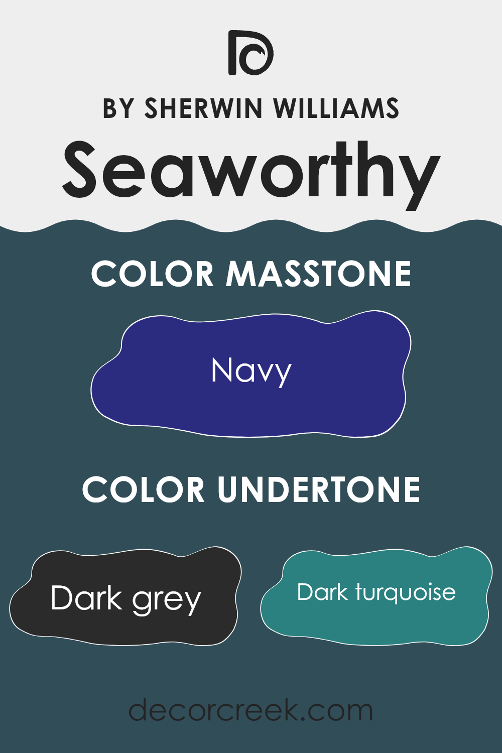
Seaworthy by Sherwin Williams is a rich, flexible color that carries a range of undertones which can subtly influence the perception of the color depending on the lighting and surrounding elements. Undertones are secondary colors that affect the main hue. For Seaworthy, these undertones include dark grey, dark turquoise, dark green, purple, brown, grey, olive, dark blue, blue, violet, and lilac.
These undertones mix to give Seaworthy a complex and dynamic appearance. In different lights, one might notice a hint of dark turquoise or a soft glow of lilac, making the color appear cooler or warmer. This aspect allows the color to adjust to various styles and atmospheres.
When painted on interior walls, the effect of Seaworthy’s undertones can significantly influence the room’s mood and style. For instance, in a room with lots of natural light, the blue and violet undertones might become more pronounced, giving the walls a calm, refreshing look. In artificial light, the darker undertones like dark grey or brown might dominate, creating a cozier, more grounded feel.
Choosing the right lighting and decor to complement these undertones can enhance the aesthetic appeal of a room. Light-colored furniture and decor might highlight Seaworthy’s cooler undertones, whereas darker pieces may bring out its warmer, deeper notes. This interaction ensures that Seaworthy is an adaptable choice that can keep a room feeling current and stylish.
What is the Masstone of the Seaworthy SW 7620 by Sherwin Williams?
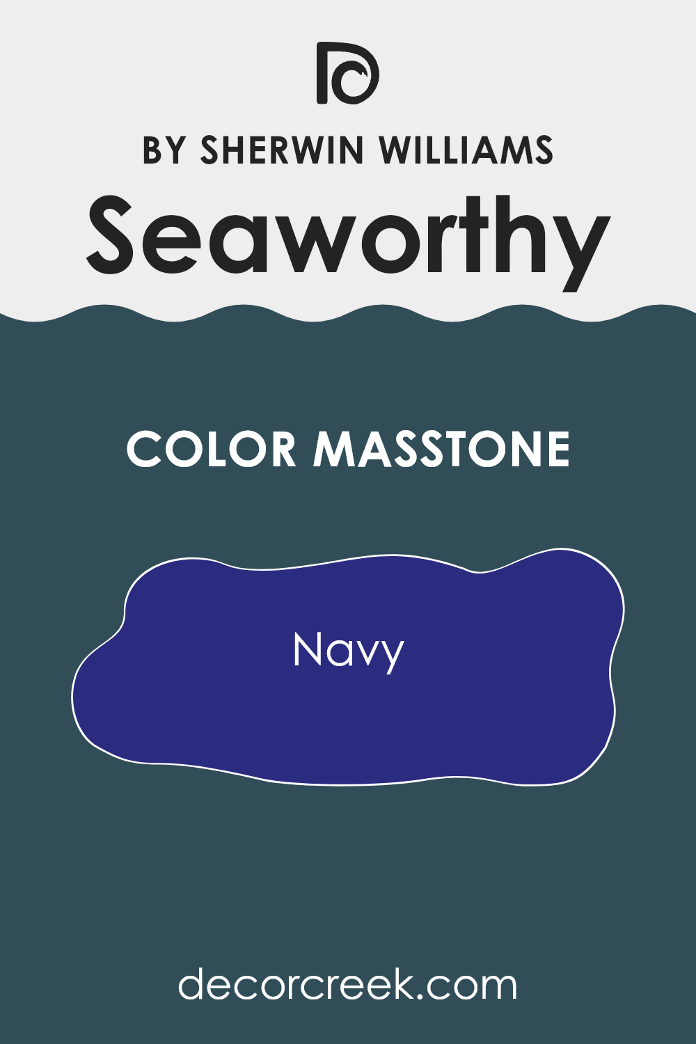
SeaworthySW 7620 by Sherwin Williams is a beautiful navy color with a masstone—or main pigment—closely resembling Navy (#2B2B80). This deep, rich blue brings a strong but calm presence into any room.
Its dark tone makes it perfect for creating a striking feature wall that can anchor the room and draw attention. When used in smaller rooms, such as a bathroom or an office, it can give the illusion of depth, making the area appear larger.
Additionally, this shade works well with natural light, often appearing brighter and more vibrant during the day while maintaining a cozy feel at night. It pairs nicely with a variety of colors, including crisp whites for a classic look, or warm beiges to create a cozy atmosphere. In a home setting, it can also provide a nice contrast to wooden features, enhancing their natural beauty. Overall, the balanced blend of richness and flexibility makes Seaworthy an excellent choice for anyone looking to add a touch of navy to their home.
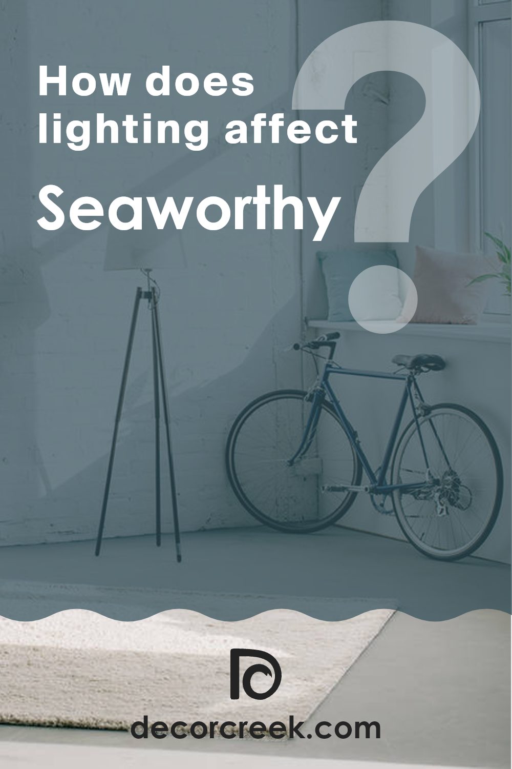
How Does Lighting Affect Seaworthy SW 7620 by Sherwin Williams?
Lighting plays a crucial role in how we perceive colors in different environments. The colors on our walls can appear differently depending on whether they are under natural daylight or artificial lighting. This variation can affect the mood and atmosphere of a room.
The Sherwin Williams color Seaworthy is a deep, rich blue that can offer varied experiences under different lighting conditions. In natural light, this shade of blue can look very vibrant and prominent, making the walls feel alive and impactful. However, under artificial lighting, especially warmer tones like incandescent bulbs, Seaworthy might appear slightly muted, taking on a cozier and more subdued tone.
The orientation of the room also influences how Seaworthy will appear throughout the day. In north-faced rooms, which receive less direct sunlight, this blue might seem a bit darker, giving the room a cooler feel. This can be ideal for creating a focused or calm area.
In south-facing rooms, where light is abundant for most of the day, Seaworthy will show its brighter side, making the room cheerful and more active. This can be perfect for living areas or any area where a lively ambiance is desired.
East-facing rooms get sunlight in the morning when the light is warmer. Here, Seaworthy will look bright and welcoming in the morning, creating a refreshing vibe, which could be great for bedrooms to start the day. However, it will turn into a quieter tone by the afternoon as the sunlight fades.
Conversely, in west-facing rooms, the color will stay subdued during the morning but gains intensity during the late afternoon and evening as the sunlight becomes golden and rich. This can make the room feel dynamic and perfect for areas used more during the afternoon or evening.
In summary, Seaworthy by Sherwin Williams is a flexible color influenced greatly by lighting and room orientation, which affects its appearance and the atmosphere it creates.
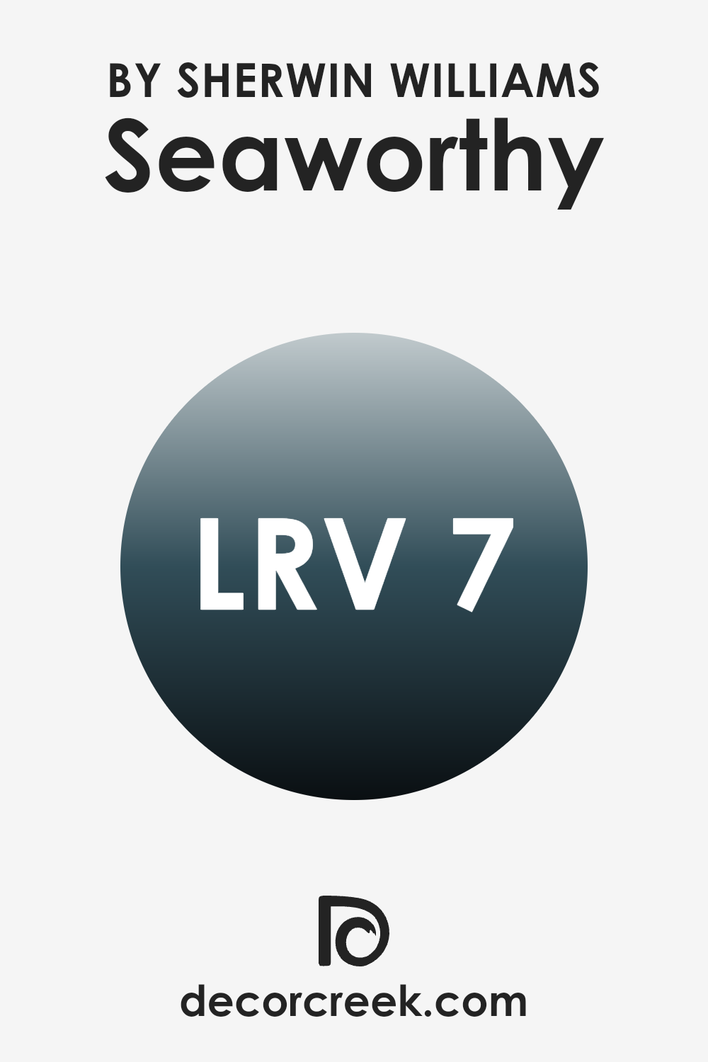
What is the LRV of Seaworthy SW 7620 by Sherwin Williams?
LRV stands for Light Reflectance Value, and it measures the percentage of light a paint color reflects from or absorbs into a painted surface. This value is important because it helps you determine how light or dark a color will appear once applied to walls. High values mean the paint will reflect more light, making the room look brighter. Low values, on the other hand, mean the paint will absorb more light, which can make a room appear darker and more enclosed.
The LRV of Seaworthy SW 7620 by Sherwin Williams is 6.714, indicating it is a darker shade that will absorb a significant amount of light rather than reflecting it. This particular LRV value suggests that when used on walls, the color will add depth and richness to a room but may also make it look smaller or more closed in.
Therefore, it’s ideal for larger rooms or areas with ample natural light to prevent them from feeling too dark and cramped. When planning lighting and furnishings, you might want to add more light sources or lighter-colored decor to balance out this color’s deep, absorbing qualities.
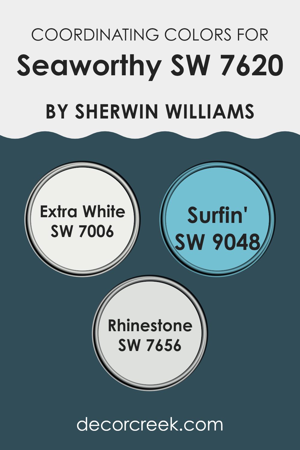
Coordinating Colors of Seaworthy SW 7620 by Sherwin Williams
Coordinating colors are those that complement each other, enhancing the overall aesthetic of a room without feeling too strong. When used alongside a primary color like Seaworthy by Sherwin Williams, coordinating colors like Extra White, Surfin’, and Rhinestone have specific purposes. They help balance, contrast, or support the dominant shade, making the design cohesive and pleasing to the eye.
Extra White is a clean, bright white that acts as a perfect background, allowing colors like Seaworthy to stand out with its rich tones. It brings freshness and clarity, making the room appear more open and well-lit. On the other hand, Surfin’ is a playful, light teal hue that adds a touch of brightness and charm to the atmosphere.
It carries a cool, breezy feel that pairs well with the nautical vibe of Seaworthy. Lastly, Rhinestone is a soft, light gray that serves as a neutral base, tying the boldness of Seaworthy and the vibrancy of Surfin’ together. It provides a gentle contrast and enhances the room with a polished look without feeling heavy. By incorporating these coordinating colors, you can achieve a harmonious and pleasing environment that reflects both personality and style.
You can see recommended paint colors below:
- SW 7006 Extra White
- SW 9048 Surfin’
- SW 7656 Rhinestone
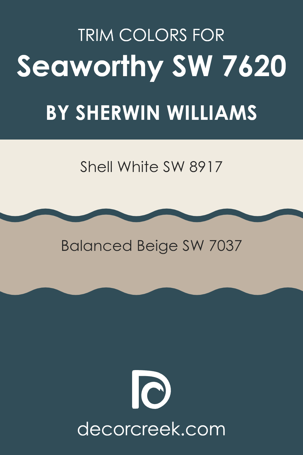
What are the Trim colors of Seaworthy SW 7620 by Sherwin Williams?
Trim colors are used to enhance and define the architectural details and edges of doors, windows, and moldings. In designing an interior using Seaworthy SW 7620 by Sherwin Williams, trim colors like SW 8917 Shell White and SW 7037 Balanced Beige have significant roles.
Choosing Shell White as a trim provides a crisp, clear boundary around Seaworthy’s rich color, offering a fresh contrast that makes the wall color stand out. On the other hand, Balanced Beige offers a smooth transition with its warm tones, softening the boldness of Seaworthy without reducing its impact.
Shell White is a light and airy color that gives off a simple and clean look. It’s excellent for creating a bright and inviting frame for both windows and doorways, adding a subtle lift to the darker shades on the walls. Meanwhile, Balanced Beige has a soothing, warm hue that blends smoothly with more intense colors, ensuring that the room feels cohesive and well put together. This color helps set a calm and welcoming atmosphere, especially in interiors that aim for a more natural and understated elegance.
You can see recommended paint colors below:
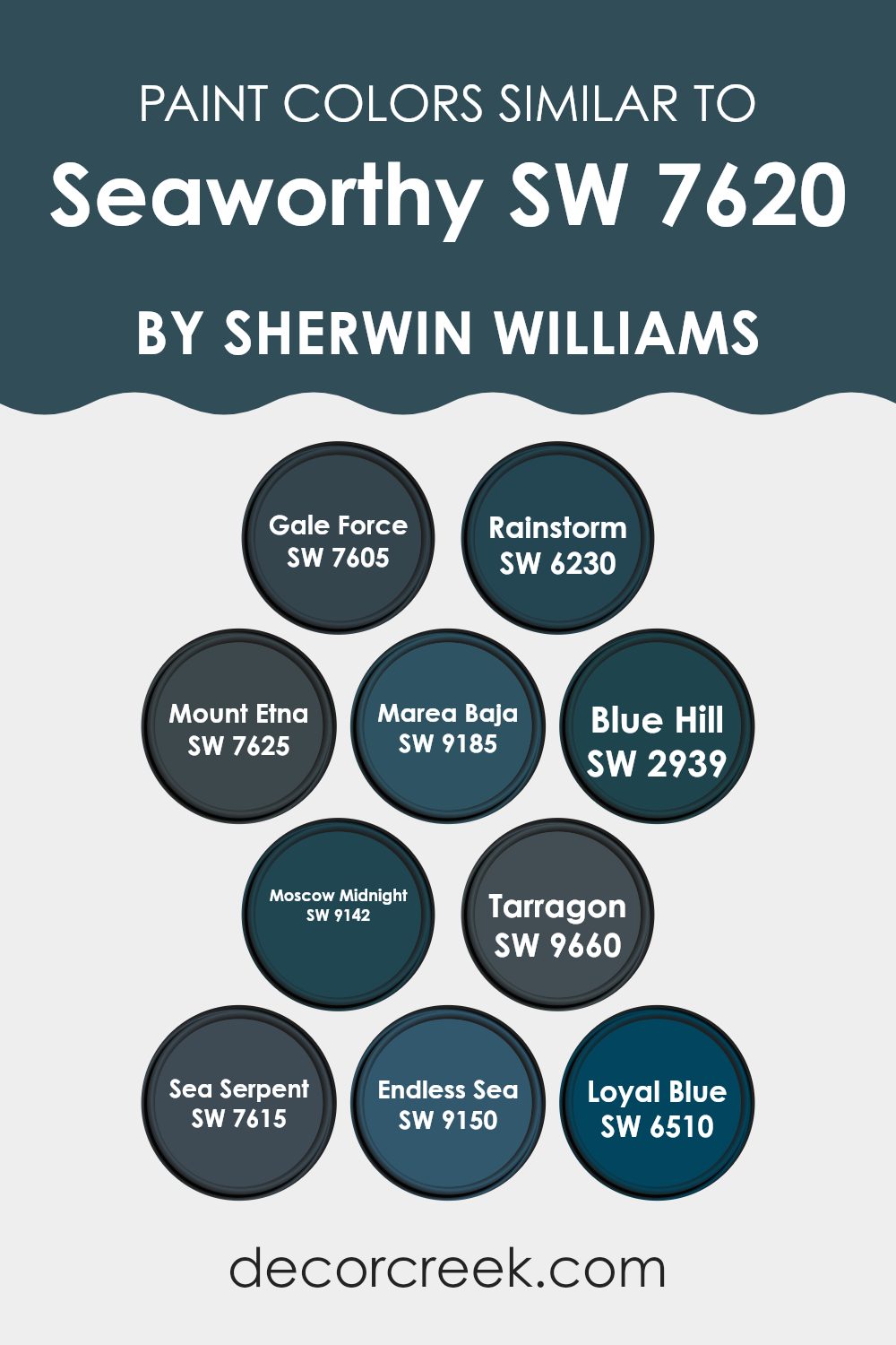
Colors Similar to Seaworthy SW 7620 by Sherwin Williams
Similar colors are important in design because they create a harmonious and appealing aesthetic, allowing for a smooth visual transition between shades. Colors that are close in tone, such as variations of deep blue or sea-inspired shades, work well together because they share a common base tone, making them calming and easy on the eyes. These shades can be used to add depth and interest to a room without feeling too intense with sharp contrast.
Starting with Gale Force, a deep, stormy blue, it brings to mind the power and mystery of the ocean. Similarly, Rainstorm is another intense blue that resembles a dark, brooding sky just before a downpour. Moving to Mount Etna, this color presents a more volcanic, smokey shade of blue, reminiscent of the ash and rocks found on an erupting peak.
Marea Baja also offers a deep, sea-inspired hue, but with hints of green, giving it a unique twist. Blue Hill gently shifts toward a lighter, more understated blue, which can softly complement darker tones like Gale Force or Moscow Midnight. Speaking of Moscow Midnight, this color is a rich, deep blue with a hint of green, perfect for creating a statement wall. Tarragon is slightly different, leaning toward a more herbal green that still fits well with cooler tones.
Sea Serpent provides a strong maritime shade that blends smoothly with other nautical-inspired colors. Endless Sea, true to its name, delivers striking depth of blue, allowing for strong visual interest. Lastly, Loyal Blue stays true to its name with a dependable and classic deep blue tone. All these colors together create a cohesive palette that works beautifully in rooms aiming for depth and continuity in their color scheme.
You can see recommended paint colors below:
- SW 7605 Gale Force
- SW 6230 Rainstorm
- SW 7625 Mount Etna
- SW 9185 Marea Baja
- SW 2939 Blue Hill
- SW 9142 Moscow Midnight
- SW 9660 Tarragon
- SW 7615 Sea Serpent
- SW 9150 Endless Sea
- SW 6510 Loyal Blue
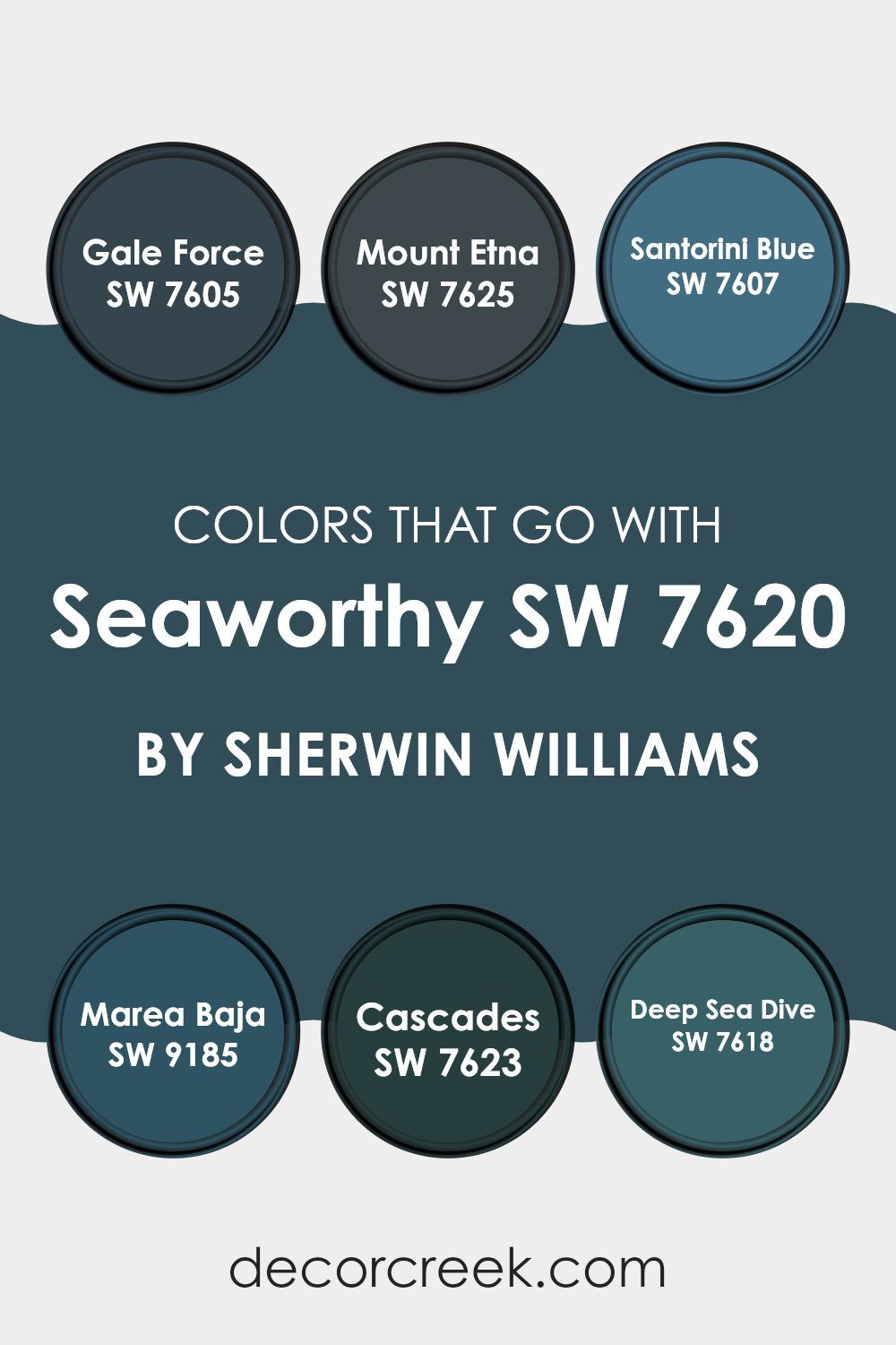
Colors that Go With Seaworthy SW 7620 by Sherwin Williams
Choosing the right colors to complement Seaworthy SW 7620 by Sherwin Williams is essential for achieving a harmonious and appealing aesthetic in any room. Seaworthy is a deep, rich navy blue that carries a feeling of calm and steadiness, making it a popular choice for both interior and exterior painting projects. When paired with complementary colors like Gale Force, Mount Etna, Santorini Blue, Marea Baja, Cascades, and Deep Sea Dive, Seaworthy can help create a cohesive and inviting atmosphere.
Gale Force SW 7605 is a slightly lighter shade of navy that provides a gentle contrast to Seaworthy, softening the overall look while keeping a strong nautical mood. Mount Etna SW 7625 is a solid charcoal color that offers a grounding effect, making it a great match for the bold nature of Seaworthy.
Santorini Blue SW 7607, on the other hand, is a brighter, more lively blue that adds energy and light, creating a noticeable contrast. Marea Baja SW 9185 is a unique teal that sits between blue and green, adding a fresh twist when used alongside a darker blue. Cascades SW 7623 is a deep green-blue tone, similar to ocean depths, which adds richness and variety when combined with Seaworthy.
Lastly, Deep Sea Dive SW 7618 is a dark teal that leans more toward green, offering a moody yet soothing partner to Seaworthy’s classic navy. Using these colors together allows for a flexible palette that can suit many design preferences, ensuring both beauty and function in decor.
You can see recommended paint colors below:
- SW 7605 Gale Force
- SW 7625 Mount Etna
- SW 7607 Santorini Blue
- SW 9185 Marea Baja
- SW 7623 Cascades
- SW 7618 Deep Sea Dive
How to Use Seaworthy SW 7620 by Sherwin Williams In Your Home?
Seaworthy SW 7620 by Sherwin Williams is a rich navy blue paint that brings a bold and striking touch to any room in your house. Its deep color is perfect for creating a strong presence in areas like living rooms or dining areas, adding depth and interest to the walls.
If you’re looking to add a bit of drama to your home, using this shade as an accent wall can be an effective choice. This deep blue can be balanced beautifully with lighter tones such as whites or greys, providing a balanced and appealing contrast. Kitchens can also benefit from Seaworthy on cabinets or an island, paired with brushed metal handles for a chic and modern look.
Moreover, this shade works well in bedrooms too; combined with softer lighting, it can help create a cozy and inviting atmosphere, ideal for relaxation. Whether you’re painting an entire room or just adding some colorful touches, Seaworthy SW 7620 can make your home look fresh and stylish.
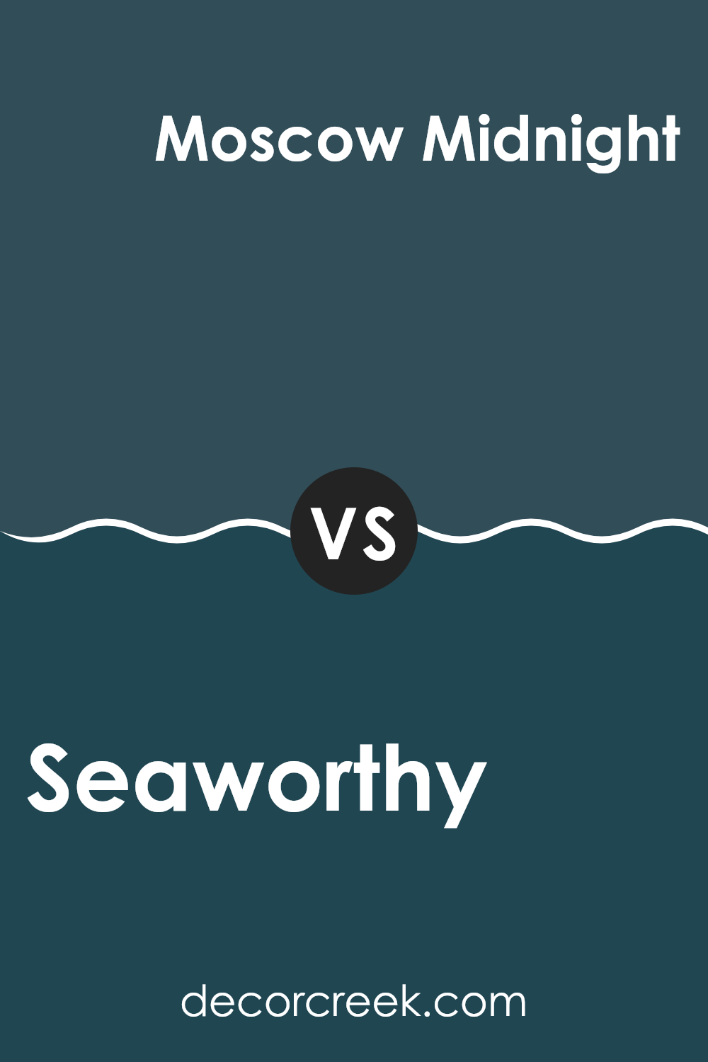
Seaworthy SW 7620 by Sherwin Williams vs Moscow Midnight SW 9142 by Sherwin Williams
Seaworthy and Moscow Midnight, both by Sherwin Williams, are striking colors with unique characters. Seaworthy is a deep, muted teal that combines green and blue hues to create a calming yet distinct presence.
It can give a room a refreshing feel, ideal for areas where you want to relax or feel close to nature. Moscow Midnight, on the other hand, is a dark, dramatic navy blue with a hint of green. This color lends a bold and cozy touch to interiors, perfect for creating an intimate and grounded atmosphere.
When used in decor, Seaworthy tends to brighten up an area due to its lighter and softer appearance, while Moscow Midnight often makes a strong statement, ideal for accent walls or furniture pieces. Both colors offer unique opportunities for style and mood in any room.
You can see recommended paint color below:
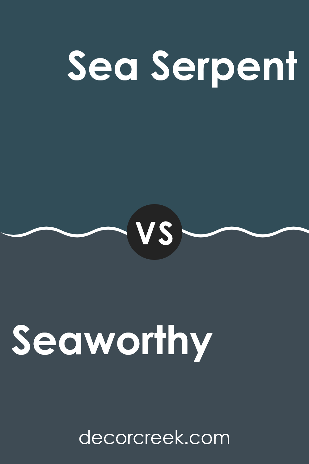
Seaworthy SW 7620 by Sherwin Williams vs Sea Serpent SW 7615 by Sherwin Williams
Seaworthy and Sea Serpent, both by Sherwin Williams, offer unique takes on the theme of ocean-inspired hues. Seaworthy is a warmer, softer gray with a touch of blue, making it flexible and easy to blend with many decor styles.
It works well in rooms where you want a calm and welcoming atmosphere. On the other hand, Sea Serpent is a much darker and bolder color, leaning toward a deep navy blue. This color is great for making a strong statement in a room or when used as an accent to draw attention.
While Seaworthy provides a light, airy feel, Sea Serpent adds depth and drama, making it suitable for more expressive design choices. Both colors have their own charm and can strongly influence the mood and style of a room, depending on how they are used.
You can see recommended paint color below:
Seaworthy SW 7620 by Sherwin Williams vs Blue Hill SW 2939 by Sherwin Williams
Seaworthy and Blue Hill are two distinct colors from Sherwin Williams. Seaworthy is a rich teal with deep blue-green tones. It’s a vibrant color that adds depth and a touch of drama to any room. This shade works well in areas where you want to make a statement, such as living rooms or dining areas.
On the other hand, Blue Hill is a much lighter and softer shade of blue. It has a calm and gentle appearance, making it ideal for creating a relaxed atmosphere. This color is perfect for bedrooms or bathrooms where a soothing effect is desirable.
Both colors bring their unique touch to interior rooms, with Seaworthy offering more intensity and Blue Hill providing a sense of calmness. Depending on the mood you want to set, either color could be a suitable choice for decorating a room.
You can see recommended paint color below:
- SW 2939 Blue Hill
Seaworthy SW 7620 by Sherwin Williams vs Mount Etna SW 7625 by Sherwin Williams
Seaworthy and Mount Etna are both rich, deep shades by Sherwin Williams, but they offer different vibes for interior rooms. Seaworthy is a calming blue with a maritime feel, perfect for creating a relaxed, welcoming atmosphere. It resembles the color of deep ocean waters and works well in living rooms or bedrooms to create a peaceful setting.
On the other hand, Mount Etna is a strong, dark charcoal color that leans toward navy. This shade is more dramatic and grounding. It’s great for adding depth and intensity to rooms, making it ideal for accent walls or even on kitchen cabinets for those who prefer a bold design choice.
While both colors are deep and can anchor a room, Seaworthy lends a calming blue hint, and Mount Etna offers a more solid and dark presence. Depending on the mood you want to set, either color can beautifully enhance the design of a home.
You can see recommended paint color below:
Seaworthy SW 7620 by Sherwin Williams vs Marea Baja SW 9185 by Sherwin Williams
Seaworthy SW 7620 by Sherwin Williams is a calming shade of blue with hints of gray, creating a soothing feel that’s ideal for rooms where you want a peaceful atmosphere. It’s light enough to make small rooms look more open, yet it still offers enough depth to give character to any interior.
In contrast, Marea Baja SW 9185, also by Sherwin Williams, is a darker, more intense blue. This color has a bold quality that can add drama and a strong visual presence to a room. It works well in areas that can handle a deeper shade without feeling too tight or heavy.
Both colors support a nautical theme, but while Seaworthy leans toward a subtle, soft mood, Marea Baja stands out more and can become the main focal point of a design. Depending on how much impact you want your room to have, either color could be the perfect choice. Together, they could even complement each other in different areas of a home.
You can see recommended paint color below:
Seaworthy SW 7620 by Sherwin Williams vs Rainstorm SW 6230 by Sherwin Williams
Seaworthy and Rainstorm by Sherwin Williams are both deep, bold blues, but they have clear differences. Seaworthy is a softer shade that leans slightly toward teal, giving it a warmer, more welcoming feel.
It’s a color that works well in rooms where you want a hint of nature and calm without going too dark. On the other hand, Rainstorm is a much stronger and darker blue, almost navy, with a stormier, more dramatic mood.
It can give a room a more powerful and striking appearance. Both colors are flexible and work well in a variety of settings, from bedrooms to living areas. Whether you choose the lighter, gentler Seaworthy or the deeper, more intense Rainstorm depends on the mood and atmosphere you want to create in your room.
You can see recommended paint color below:
Seaworthy SW 7620 by Sherwin Williams vs Gale Force SW 7605 by Sherwin Williams
Seaworthy SW 7620 and Gale Force SW 7605, both from Sherwin Williams, offer unique shades of blue that are perfect for different decorating needs. Seaworthy is a softer, more muted blue with a hint of gray, making it ideal for creating a calm and cozy atmosphere. Its lightness brings a gentle touch to rooms, making it suitable for a bedroom or a quiet study room.
On the other hand, Gale Force is a much darker and bolder blue with strong gray undertones. It’s perfect for making a statement in a room. Whether used for an accent wall or to cover an entire room, this color adds depth and drama, making it a great choice for living areas or dining rooms where a touch of elegance is desired.
Both colors work beautifully with neutral tones, but while Seaworthy provides a soft backdrop, Gale Force stands out and draws attention with its intensity.
You can see recommended paint color below:
Seaworthy SW 7620 by Sherwin Williams vs Loyal Blue SW 6510 by Sherwin Williams
Seaworthy SW 7620 is a deep teal color that gives off a calm yet vibrant vibe, perfect for creating a cozy atmosphere in any room. It strikes a balance between blue and green, making it a flexible shade that pairs well with both warm and cool tones. This makes it a great choice for living rooms or bedrooms where you want a welcoming environment.
On the other hand, Loyal Blue SW 6510 is a much darker shade of blue. It’s bold and striking, providing a sense of strength and reliability. This color is ideal for accent walls or furniture pieces that you want to stand out in a room. It can also bring depth to a room, making small areas appear larger.
Both colors offer unique moods and can be used effectively depending on the look you want to achieve. Seaworthy is more relaxed and adaptable, whereas Loyal Blue is intense and commanding.
You can see recommended paint color below:
Seaworthy SW 7620 by Sherwin Williams vs Endless Sea SW 9150 by Sherwin Williams
Seaworthy and Endless Sea by Sherwin Williams are both shades inspired by the ocean but have distinct tones. Seaworthy is a softer and more muted shade, leaning toward a gentle blue with hints of gray. It gives a calm and welcoming feel, perfect for creating a relaxed atmosphere in rooms like living rooms or bedrooms.
On the other hand, Endless Sea is a deeper and more intense blue. This color has a stronger presence due to its richer and darker tone, making it ideal for adding a dramatic flair to a room. It works well as an accent color in areas where you want to make a bold statement, such as on a feature wall or in a dining room.
Both colors offer a nod to nautical themes but in different ways. Seaworthy focuses more on lightness and softness, while Endless Sea conveys depth and intensity. Depending on the mood you want to set, you could choose the gentler Seaworthy for a soothing effect, or Endless Sea for more impact and depth.
You can see recommended paint color below:
Seaworthy SW 7620 by Sherwin Williams vs Tarragon SW 9660 by Sherwin Williams
Seaworthy SW 7620 and Tarragon SW 9660 by Sherwin Williams are quite different in their feel and the ambiance they create. Seaworthy is a deep, rich navy blue that brings to mind a calm ocean at dusk. It’s perfect for creating a peaceful and focused atmosphere, often used in bedrooms or studies where a touch of calmness and concentration is desired.
On the other hand, Tarragon is a bright yellow-green that has a fresh and energetic vibe. This color is great for rooms where you want to add liveliness and a dash of cheer, such as kitchens, playrooms, or any area that benefits from a sunny lift.
While Seaworthy lends a cooling, almost regal essence to a room, Tarragon introduces a playful, spring-like feeling that can help make an interior feel more open and inviting. The decision between them really depends on what kind of mood or effect you want to achieve in your home.
You can see recommended paint color below:
In conclusion, I found that SW 7620 Seaworthy by Sherwin Williams is a fantastic paint color to choose if you want to give your room a cozy and calming feeling. The color is like the deep blue of the ocean and brings a touch of nature into your home. It’s perfect for anyone who loves the sea or wants a peaceful vibe in their place.
This color works well in many different parts of the house like the bedroom, living room, or even the bathroom. I realized that it pairs nicely with light colors like white or grey, which can make the room look clean and bright. It’s also strong enough to stand out on furniture or smaller walls if you don’t want to paint an entire room.
Seaworthy has a mature charm that can make any room feel lively and welcoming at the same time, without being too bold or flashy.
So, if you’re thinking about refreshing a room or even painting a new one, SW 7620 Seaworthy could be a great choice that makes you feel relaxed and at home.
Ever wished paint sampling was as easy as sticking a sticker? Guess what? Now it is! Discover Samplize's unique Peel & Stick samples.
Get paint samples

