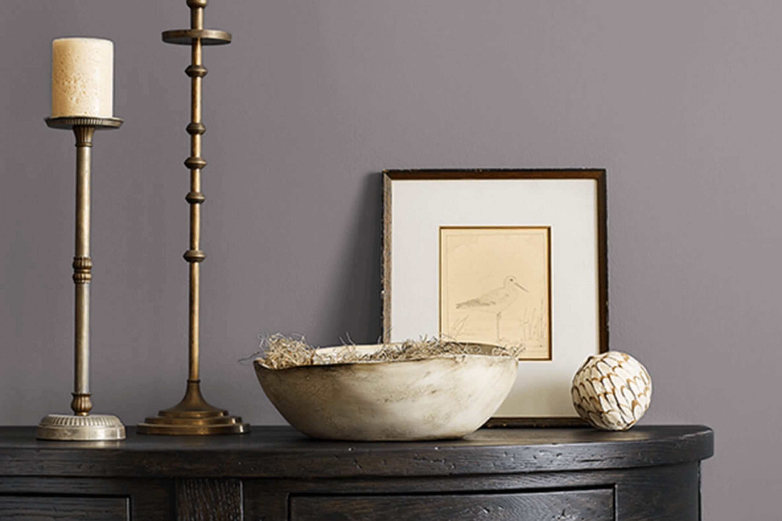
I recently had the chance to use Sherwin Williams SW 7081 Sensuous Gray in a home renovation project, and I must say, it’s a unique shade of gray. This color has a warm undertone that makes a room feel inviting without being too intense. It’s perfect for those who want to add a hint of coziness to their modern room while keeping it sleek and refined.
Using Sensuous Gray was a decision driven by the need for a backdrop that complements various decor styles and colors. Whether you’re hanging art, displaying bright cushions, or adding metallic finishes, Sensuous Gray works beautifully without clashing. It’s a flexible option that can suit various rooms, from a bustling kitchen to a calm bedroom.
As you consider your next painting project, Sensuous Gray could be just what you need if you’re looking for a color that provides warmth and adaptability.
I’ve found that it pairs especially well with natural wood, stone elements, and rich, vibrant hues that might be found in accessories or furniture pieces.
What Color Is Sensuous Gray SW 7081 by Sherwin Williams?
Sensuous Gray by Sherwin Williams is a unique shade of gray with a soft, warm undertone making it adaptable for various rooms in your home. This gray isn’t just a plain, cold gray; it has a subtle depth that can make any room feel inviting and cozy. This particular shade pairs beautifully with soft pastels, vibrant whites, and rich, dark hues, allowing for a range of styling options.
In terms of interior design, Sensuous Gray fits seamlessly into modern and contemporary aesthetics but is equally at home in traditional settings due to its warm undertones. It creates a clean, calm background that is perfect for minimalist designs, yet works equally well in more dynamic, eclectic interiors.
When considering materials and textures, Sensuous Gray goes well with natural wood, which can enhance its warmth. It provides a striking contrast when paired with metal accents in silver or chrome, adding a touch of elegance without being too flashy. Textiles like velvet or silk in rich colors make an excellent match with this color, providing a luxurious feel to any room. Leather furniture and natural stone also complement the welcoming nature of Sensuous Gray, making rooms look more refined and well-put-together.
This color is ideal for creating a cozy, stylish environment that feels like a haven away from the outside world.
Is Sensuous Gray SW 7081 by Sherwin Williams Warm or Cool color?
Sensuous Gray is a unique color by Sherwin Williams, striking a fine balance between gray and brown. This warm shade is adaptable, making it a great choice for various rooms in a home, from living rooms to bedrooms.
Its subtlety allows it to blend well with a range of decor styles, whether you prefer a modern look or a more classic feel. The color’s warm undertones create a cozy atmosphere, inviting you to relax. It works particularly well in rooms with natural light, as the light brings out the richness of the color, making the room feel welcoming.
Sensuous Gray also pairs nicely with white trimmings or darker furniture, providing a pleasing contrast. It’s a practical color too, hiding marks or scuffs better than lighter shades, which makes it suitable for high-traffic areas. Overall, Sensuous Gray offers a stylish yet understated backdrop for everyday living.
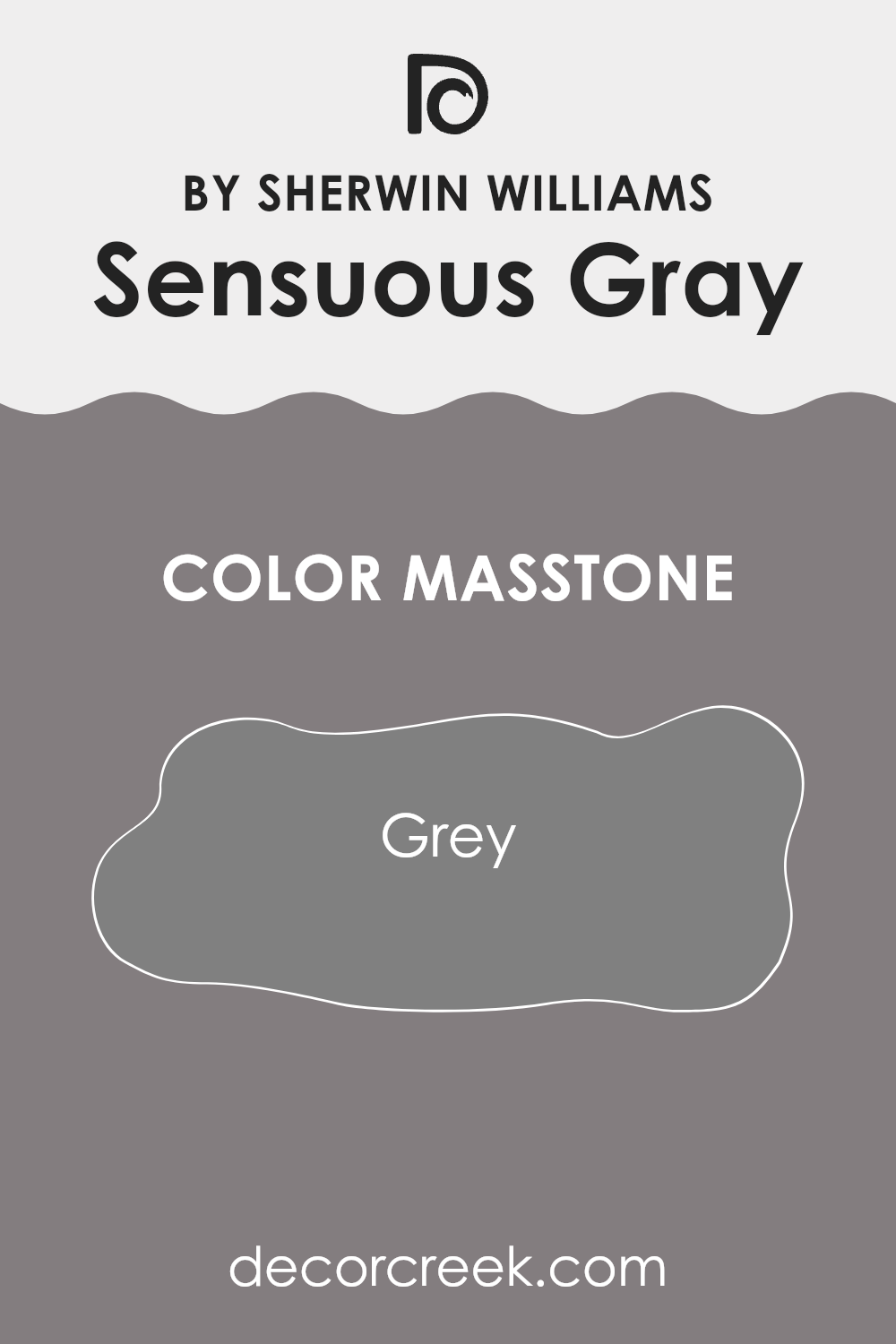
What is the Masstone of the Sensuous Gray SW 7081 by Sherwin Williams?
Sensuous GraySW 7081 by Sherwin Williams has a true gray masstone, similar to the color code #808080. This mid-tone gray makes it an adaptable choice for home interiors, acting as a neutral backdrop that pairs well with both bold and subtle color schemes.
In living rooms, the neutrality of Sensuous Gray can harmonize with diverse decor styles, from modern to traditional, allowing furniture and art to stand out. In more practical terms, this shade of gray can help to hide minor imperfections on walls better than lighter colors, which makes maintenance easier.
Also, the balanced tone of Sensuous Gray doesn’t dramatically darken a room nor does it make rooms feel stark, as some lighter grays might. It provides a calm, steady base that makes it easy to decorate around, whether you want to add colorful accents or keep a more monochromatic color scheme. This adaptability makes it an especially good choice for common areas, bedrooms, or home offices.
How Does Lighting Affect Sensuous Gray SW 7081 by Sherwin Williams?
Lighting significantly influences how we perceive colors. The same paint can appear differently under various lighting conditions due to the light’s color temperature and intensity. This phenomenon is strikingly evident with shades like Sensuous Gray, a neutral color with a unique depth that can complement diverse interior styles.
Under artificial light, Sensuous Gray may look warmer or cooler depending on the type of bulb used. Incandescent bulbs, for example, tend to cast a warmer, yellower glow, making Sensuous Gray appear cozier and slightly richer. Fluorescent lights, though, often have a cooler, bluer tone, causing this color to look more reserved and possibly even somewhat industrial.
In natural light, the appearance of Sensuous Gray changes throughout the day. Morning light in an east-facing room reveals a soft and gentle aspect of the color, offering a calm start to the day. However, in a south-facing room, where sunlight is most direct for the majority of the day, Sensuous Gray radiates warmth and vibrancy, presenting a more welcoming and lively appearance.
Conversely, in rooms facing north, which typically receive less direct sunlight, Sensuous Gray may seem a bit darker and more shadowed, potentially creating a more muted and subdued look. This characteristic could be great for creating a cozy, intimate room. For west-facing rooms, the color can provide a unique experience; it receives intense light at the end of the day, which can make the walls glow warm and inviting as the sun sets but retain a cooler tone during the morning when the light is not as strong.
In summary, Sensuous Gray’s adaptability under different lighting and orientations makes it a suitable choice for many rooms, reflecting various moods and atmospheres depending on the room’s exposure and light sources.
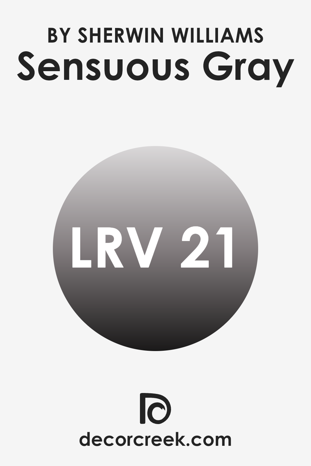
What is the LRV of Sensuous Gray SW 7081 by Sherwin Williams?
LRV stands for Light Reflectance Value, which is a measurement used to determine how much light a paint color reflects compared to how much it absorbs. Think of it as a scale where higher values mean the paint color reflects more light, making a room appear brighter and larger.
Conversely, lower values mean the paint absorbs more light, which can make a room look cozier but smaller. This value is crucial when deciding the paint color for a room, as it influences the atmosphere and visual room within the room.
In the case of Sensuous Gray with an LRV of 20.9, the color is on the darker side, absorbing more light than it reflects. This means that when used on walls, it will contribute to a denser feel in the room. It’s a good choice for those looking to create a more intimate and cozy atmosphere in a room. However, it’s important to consider the room’s natural light availability; in rooms with limited natural light, using a color with such a low LRV might make the room feel smaller or dimmer.
Proper lighting and decor can help balance the ambiance to ensure the room doesn’t feel too closed in.
decorcreek.com
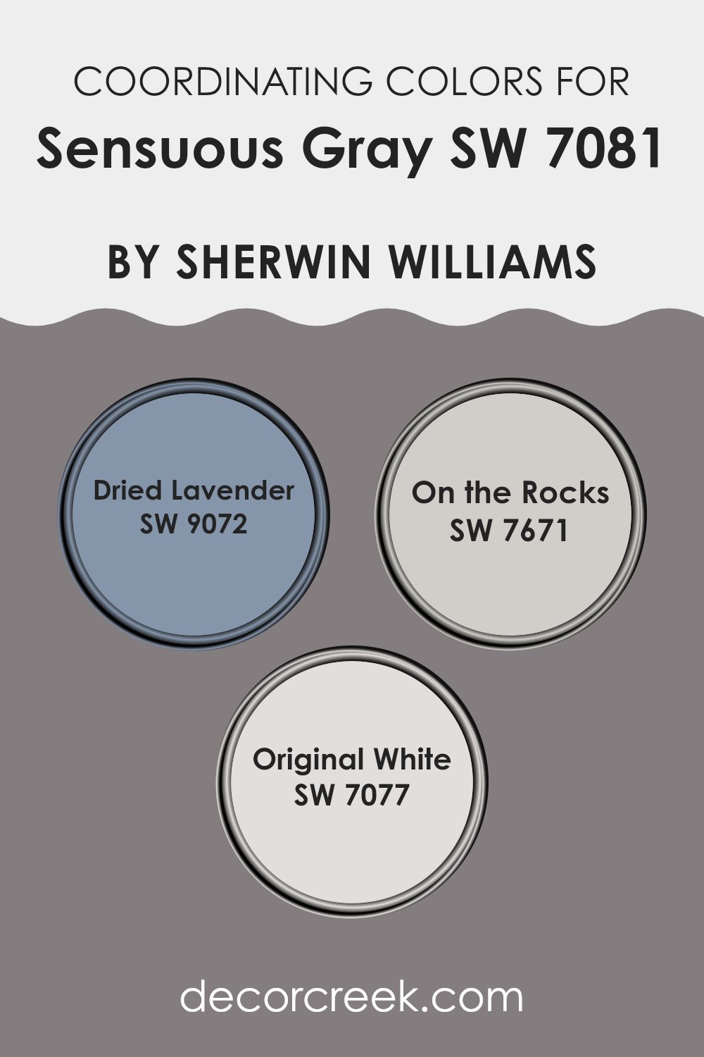
Coordinating Colors of Sensuous Gray SW 7081 by Sherwin Williams
Coordinating colors are chosen to pair well with a main color, enhancing the overall look of a room without overpowering it. For example, Sensuous Gray by Sherwin-Williams can be beautifully complemented with colors like Dried Lavender, On the Rocks, and Original White. These coordinating colors work together to create a harmonious palette that can be used throughout different rooms or to highlight specific architectural features of a room.
Dried Lavender has a subtle hint of purple that provides a gentle contrast to the muted tones of Sensuous Gray, giving a gentle splash of color that’s both refreshing and calm. On the Rocks is a lighter gray that complements the depth of Sensuous Gray, making rooms seem larger and more open by reflecting more light.
Meanwhile, Original White is a clean and crisp color that can brighten a room and bring a sense of freshness when used alongside darker shades like Sensuous Gray. Together, these colors offer a balanced and pleasing palette, perfect for creating a welcoming and comfortable environment.
You can see recommended paint colors below:
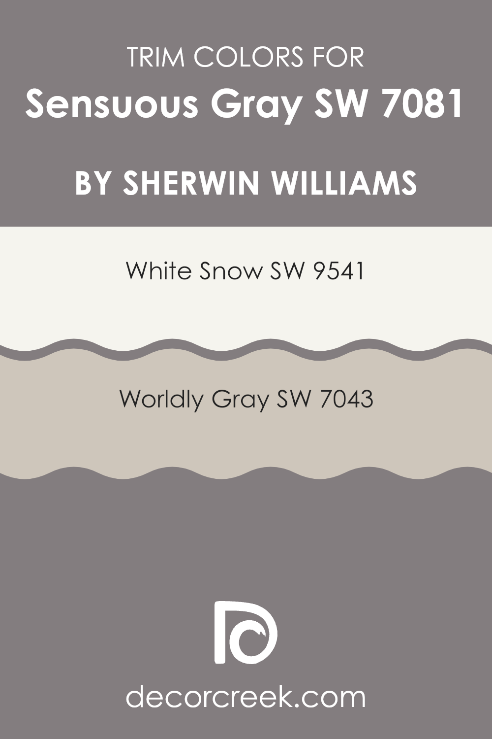
What are the Trim colors of Sensuous Gray SW 7081 by Sherwin Williams?
Trim colors are chosen to complement the main color used on walls or exteriors and play a crucial role in highlighting architectural details and framing rooms attractively. When pairing Sensuous Gray by Sherwin Williams, a balanced and subtly rich hue, utilizing trim colors like SW 9541 – White Snow and SW 7043 – Worldly Gray can significantly enhance the overall aesthetic.
White Snow, being a crisp and clean white, provides a sharp contrast that defines edges clearly and brings a fresh brightness to the room, making it feel more open and airy. On the other hand, Worldly Gray offers a slightly deeper, warmer tone that adds a sense of depth and continuity when used as a trim, creating a cohesive look without stark contrasts.
Choosing the right trim color can impact the perception of the primary color, influencing the room’s mood and visual proportions. With Sensuous Gray, the use of White Snow as a trim can make the walls stand out and add lively energy, ideal for modern and minimalist rooms. Meanwhile, opting for Worldly Gray as a trim allows for a more subtle transition between the wall and trim colors, providing a gentle refinement ideal for creating a welcoming and relaxed atmosphere without overpowering the senses. This careful selection of trim colors ensures that the character of Sensuous Gray is preserved while enhancing the overall design scheme of any interior or exterior room.
You can see recommended paint colors below:
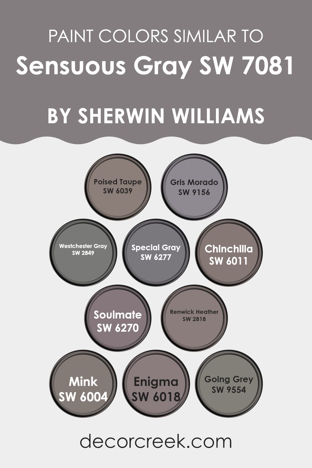
Colors Similar to Sensuous Gray SW 7081 by Sherwin Williams
Similar colors play a crucial role in creating a harmonious and aesthetically pleasing environment. They can be used to craft a subtle yet impactful visual experience in any room. For example, colors like Poised Taupe are gentle and earthy, providing a soft backdrop that complements bolder accents without overpowering the senses. On the other hand, Gris Morado offers a slightly more robust tone, blending hints of gray with understated purple to add depth and interest to a room.
Westchester Gray, akin to a cool shadow, is perfect for those seeking a crisp, clean look that still adds warmth. Special Gray, darker and more mysterious, works well in rooms that benefit from a dramatic flair, yet it coordinates seamlessly with lighter grays to prevent any harsh contrasts.
Chinchilla showcases a lighter, more nuanced approach to gray, ideal for creating a cozy and inviting atmosphere. Soulmate introduces a unique touch with its blend of gray and muted blue, ideal for a calming effect in a bedroom or office. Renwick Heather leans into a more traditional vibe, its rich hue reminiscent of heritage and classic appeal.
Mink, with its deep and luxurious feel, brings a sense of richness to rooms needing a bit of opulence. Enigma stands out as a bold choice, its deep tones offering a striking contrast when used alongside lighter grays. Finally, Going Grey is the epitome of understated elegance, adaptable in its usage and perfect for crafting a cohesive look when used with other similar shades. Indeed, choosing similar colors can effectively tie different elements together, ensuring a smooth transition across a decorating scheme.
You can see recommended paint colors below:
- SW 6039 Poised Taupe
- SW 9156 Gris Morado
- SW 2849 Westchester Gray
- SW 6277 Special Gray
- SW 6011 Chinchilla
- SW 6270 Soulmate
- SW 2818 Renwick Heather
- SW 6004 Mink
- SW 6018 Enigma
- SW 9554 Going Grey
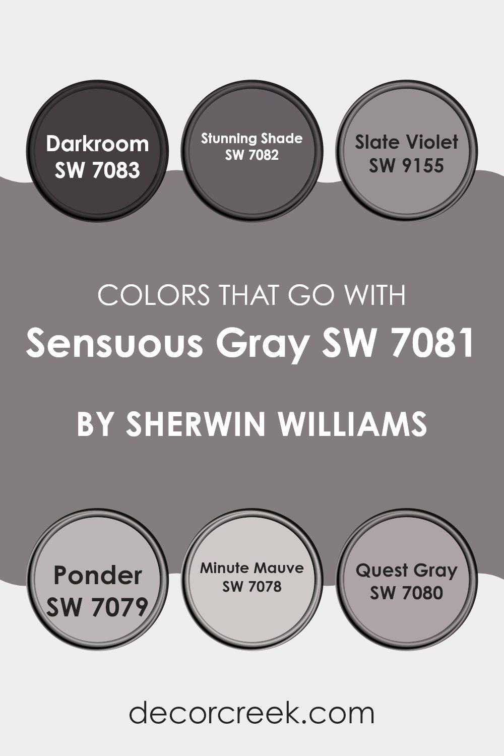
Colors that Go With Sensuous Gray SW 7081 by Sherwin Williams
Choosing complementary colors for Sensuous Gray (SW 7081) from Sherwin-Williams is crucial in achieving a harmonious and appealing aesthetic in any room. These colors help to create a balanced and cohesive look, ensuring that Sensuous Gray does not overpower the room but rather acts as a refined anchor. The right color pairings can enhance the overall ambiance, providing depth and warmth or giving a clean, modern edge depending on the chosen colors.
Darkroom (SW 7083) is a deep, almost charcoal gray that provides a strong contrast to Sensuous Gray, making it ideal for creating a dramatic and moody feel. Stunning Shade (SW 7082) is a slightly lighter shade of gray that offers a subtle difference, perfect for those seeking a more unified gray theme without stark contrasts. Slate Violet (SW 9155) introduces a hint of purple, adding a unique twist to the palette that can give a room a bit of character without being too bright.
Ponder (SW 7079) is a deep blue-gray that mimics the calm of twilight, perfect for crafting a relaxing retreat. Minute Mauve (SW 7078) is a soft, muted mauve that adds a touch of warmth and softness, ideal for rooms where you seek a gentle, inviting atmosphere. Lastly, Quest Gray (SW 7080) mirrors the complexity of stone, offering a neutral but enriching gray tone that plays well with both bright and subdued decorating schemes. Each of these colors supports Sensuous Gray either by offering a solid contrast or by subtly enhancing its innate qualities, making any room feel well-thought-out and professionally styled.
You can see recommended paint colors below:
- SW 7083 Darkroom
- SW 7082 Stunning Shade
- SW 9155 Slate Violet
- SW 7079 Ponder
- SW 7078 Minute Mauve
- SW 7080 Quest Gray
How to Use Sensuous Gray SW 7081 by Sherwin Williams In Your Home?
Sensuous Gray by Sherwin Williams is a subtle and rich gray paint color that adds warmth to any room. This shade has a touch of brown, making it very cozy and welcoming. It’s an adaptable color that works well in many areas of a home.
In the living room, it can create a cozy, relaxing atmosphere without feeling too dark. In bedrooms, it’s perfect for setting a calm and inviting mood. You might also consider Sensuous Gray for kitchen cabinets for a modern, yet warm look.
This color pairs easily with both bold and neutral tones, allowing for various decorating styles from modern to rustic. For instance, match it with whites to keep the room light and airy, or use darker furniture and accents to contrast with its rich tone. This makes it easy for anyone to include Sensuous Gray in their home, whether they’re refreshing walls, updating furniture, or even giving cabinets a new life.
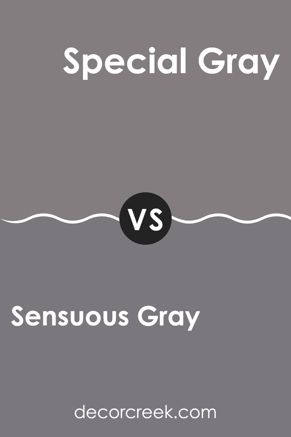
Sensuous Gray SW 7081 by Sherwin Williams vs Special Gray SW 6277 by Sherwin Williams
Sensuous Gray and Special Gray by Sherwin Williams are two distinctive shades with unique appeals. Sensuous Gray is a calm and soft gray with a touch of warmth that makes it very adaptable and welcoming.
It’s perfect for creating a cozy and subtle atmosphere in any room. On the other hand, Special Gray is a deeper, more dramatic shade. This color has a strong presence and brings a bold touch to rooms, making it ideal for accent walls or areas where you want to make a statement.
Both colors work well in modern decor, but while Sensuous Gray lends itself to a more gentle and understated look, Special Gray is great for adding a bit of drama and intensity.
You can see recommended paint color below:
- SW 6277 Special Gray
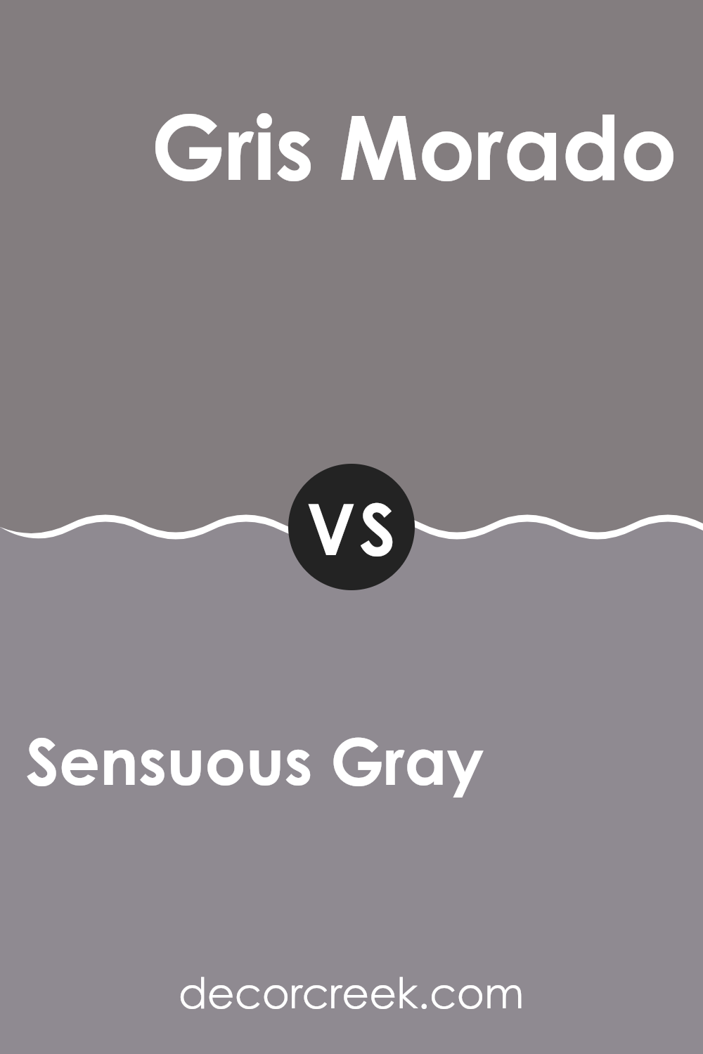
Sensuous Gray SW 7081 by Sherwin Williams vs Gris Morado SW 9156 by Sherwin Williams
Sensuous Gray and Gris Morado are two distinct shades offered by Sherwin Williams. Sensuous Gray is a warm gray with a comforting and welcoming feel. It strikes a lovely balance between being too dark or too light, making it adaptable for various rooms in a home.
On the other hand, Gris Morado leans towards a darker, muted purple-gray shade. This color has a deeper tone compared to Sensuous Gray, providing a cozy, almost nurturing atmosphere. It’s ideal for adding a bit of character in a room without overpowering it with too much darkness.
When comparing these two, Sensuous Gray is more neutral, suitable for larger areas or as a base color that complements brighter or contrasting hues. Gris Morado, meanwhile, is perfect for accent walls or rooms where you want a hint of color but still prefer something understated. Although both colors share a subtle elegance, Gris Morado offers a slightly more distinct flair with its purple undertones.
You can see recommended paint color below:
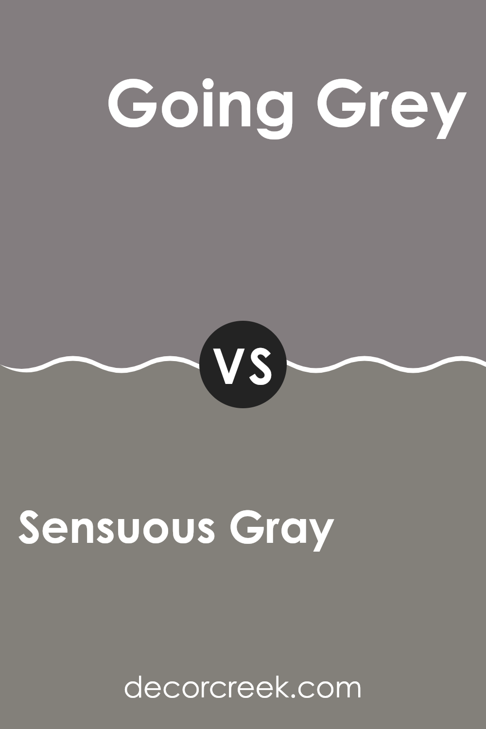
Sensuous Gray SW 7081 by Sherwin Williams vs Going Grey SW 9554 by Sherwin Williams
“Sensuous Gray” and “Going Grey” by Sherwin Williams are two different shades of gray, each bringing its own unique vibe to a room. “Sensuous Gray” is a deeper, warmer gray that has a cozy and welcoming feel. It’s perfect for living areas or bedrooms where you want a comforting atmosphere.
On the other hand, “Going Grey” is lighter and has a cooler tone. It gives off a fresh and clean look, making it ideal for kitchens, bathrooms, or modern living rooms that benefit from a brighter appearance.
Although both are gray, “Sensuous Gray” leans towards a more muted, earthy hue, while “Going Grey” looks sharper and more contemporary. Depending on the room and the amount of natural light it gets, each color can affect the ambiance significantly.
You can see recommended paint color below:
- SW 9554 Going Grey
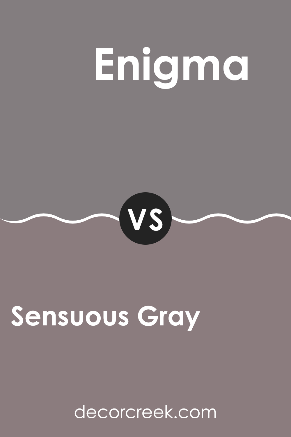
Sensuous Gray SW 7081 by Sherwin Williams vs Enigma SW 6018 by Sherwin Williams
Sensuous Gray and Enigma, both from Sherwin Williams, have unique tones that set distinct moods in any room. Sensuous Gray is a deep, rich gray with a warm undertone that makes rooms feel cozy and welcoming. It’s perfect for living areas or bedrooms where you want a soft, inviting atmosphere.
On the other hand, Enigma is a bit more mysterious, featuring darker gray tones with a hint of blue. This color adds a more dramatic and modern vibe, ideal for accent walls or rooms like home offices and bathrooms where you want a more focused feel.
Both colors work well with various decor styles, but while Sensuous Gray leans towards a traditional warmth, Enigma offers a cooler, contemporary edge. When choosing between them, consider the mood you want to create and the amount of natural light in your room.
You can see recommended paint color below:
- SW 6018 Enigma
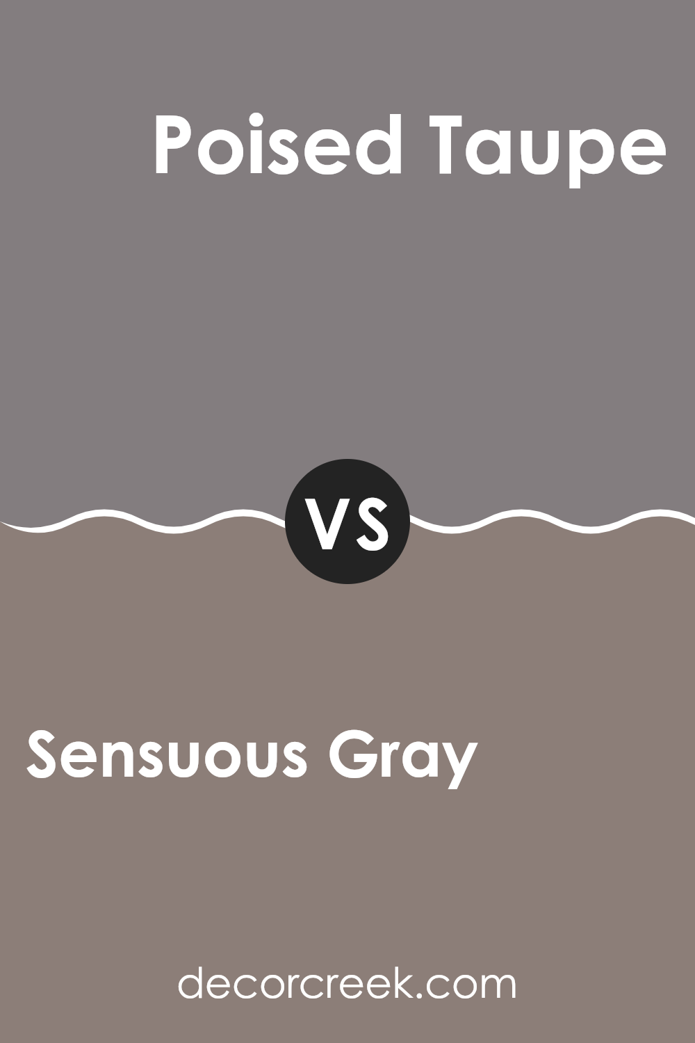
Sensuous Gray SW 7081 by Sherwin Williams vs Poised Taupe SW 6039 by Sherwin Williams
Sensuous Gray and Poised Taupe are both popular paint colors from Sherwin Williams, but they have distinct tones that set them apart. Sensuous Gray leans towards a cooler, more neutral gray with a subtle hint of warmth, making it adaptable for various rooms.
It’s a great choice if you want something that feels fresh yet inviting. On the other hand, Poised Taupe has a warmer, earthier feel, blending taupe’s cozy brown tones with a grayish backdrop that gives it a more grounded presence.
This color is perfect for creating a cozy, welcoming atmosphere in rooms like living rooms or bedrooms. While both colors are neutral, Sensuous Gray offers a crisper, cleaner look, whereas Poised Taupe provides a softer, more comforting vibe. The choice between them depends on the mood and style you’re aiming to achieve in your room.
You can see recommended paint color below:
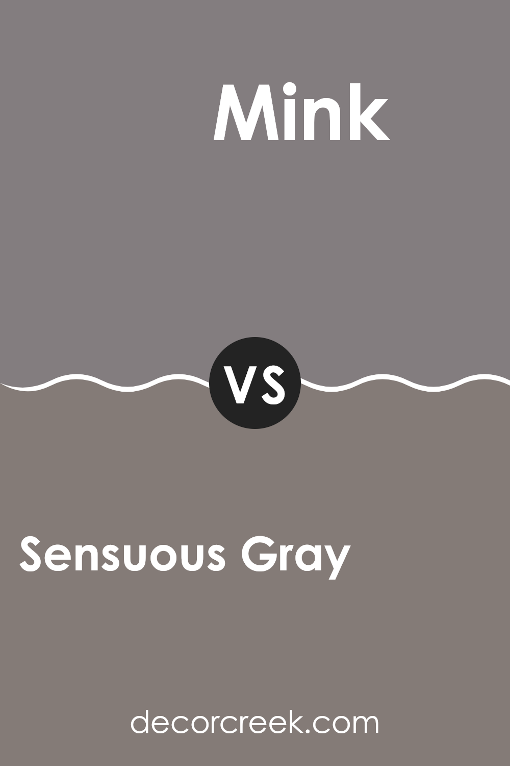
Sensuous Gray SW 7081 by Sherwin Williams vs Mink SW 6004 by Sherwin Williams
Sensuous Gray and Mink by Sherwin Williams are both appealing choices for creating a cozy and stylish atmosphere, yet they offer different vibes. Sensuous Gray has a warmer tone, giving a soft and welcoming feel that works wonderfully in living rooms or bedrooms.
It blends well with a variety of decor styles and adds a gentle radiance to rooms without overpowering them. On the other hand, Mink has a richer and slightly darker hue. This color is ideal for adding depth and definition to a room.
It’s perfect for accent walls or for rooms that benefit from a more defined, cozy feel like studies or dining areas. Both colors coordinate beautifully with a range of furnishings and can help to give your home a more polished and inviting look.
You can see recommended paint color below:
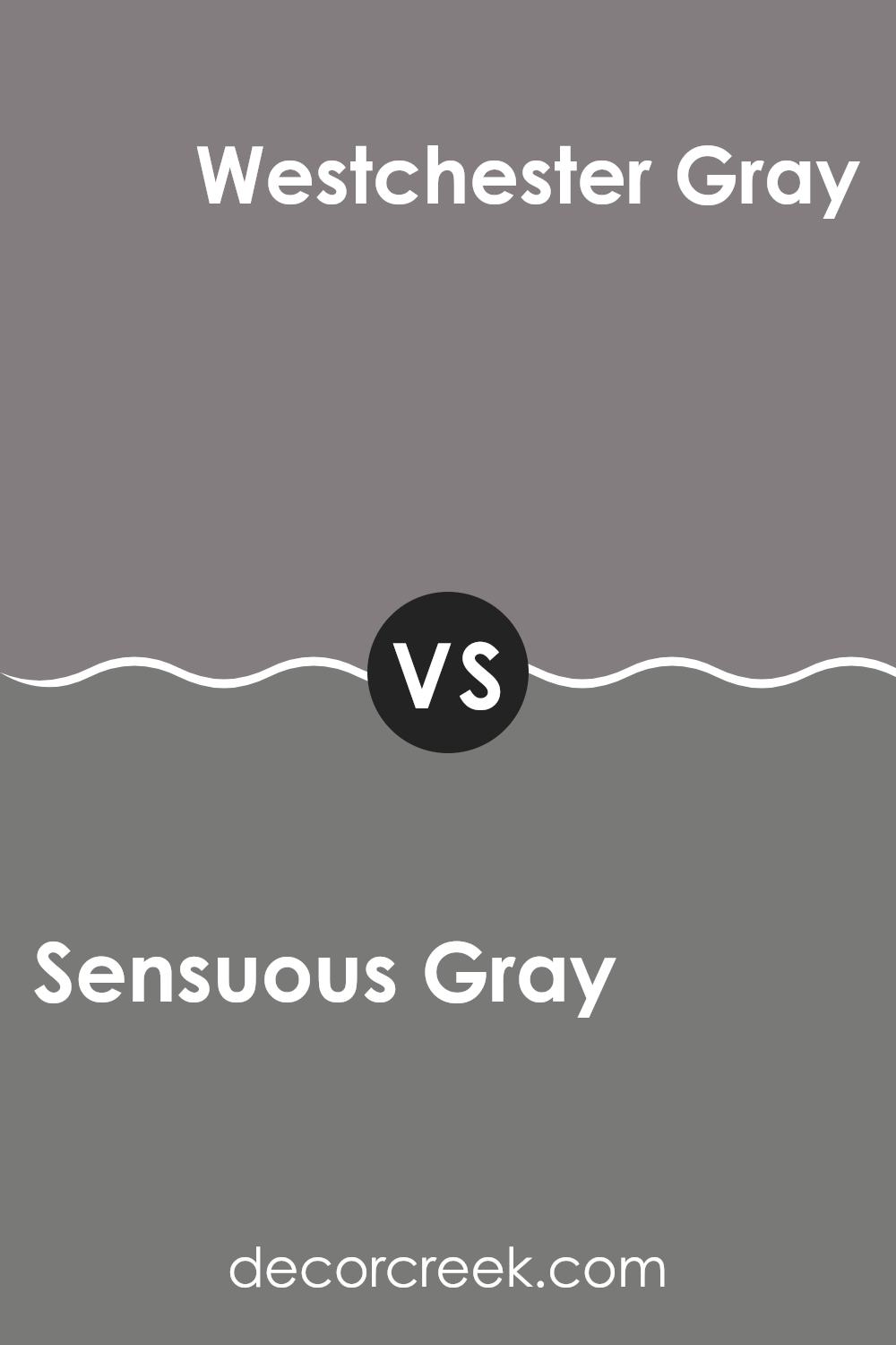
Sensuous Gray SW 7081 by Sherwin Williams vs Westchester Gray SW 2849 by Sherwin Williams
Sensuous Gray and Westchester Gray by Sherwin Williams are two distinct shades of gray that cater to different tastes and design needs. Sensuous Gray is a softer, lighter gray with a warmth that makes it adaptable for any room aiming for a cozy, inviting atmosphere. It pairs well with a variety of decor styles, particularly enhancing rooms that benefit from a gentle, understated elegance.
On the other hand, Westchester Gray stands out as a deeper gray, offering a bolder look. It conveys a more pronounced statement and is excellent for areas where you want more impact or to anchor lighter elements. This shade is particularly useful in providing contrast against brighter colors or serving as a strong background for artworks.
Both colors have their unique appeal and can be used effectively to achieve different looks, whether you’re after something bold with Westchester Gray or softer with Sensuous Gray.
You can see recommended paint color below:
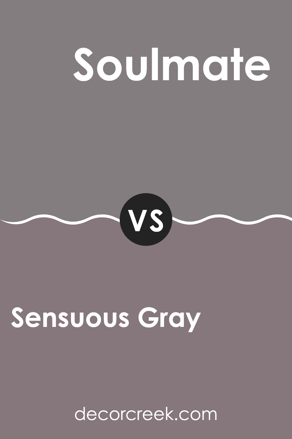
Sensuous Gray SW 7081 by Sherwin Williams vs Soulmate SW 6270 by Sherwin Williams
Sensuous Gray and Soulmate, both from Sherwin Williams, present subtle yet distinct tones for any room. Sensuous Gray is a warm, soft gray that offers a cozy and welcoming vibe. It’s adaptable and pairs well with a range of decor styles, making it easy to work with.
On the other hand, Soulmate has a deeper, blue-gray hue, giving it a slightly more pronounced and moody feel compared to Sensuous Gray. This color is perfect for creating a focal point in a room or adding depth.
While both colors share a base of gray, Sensuous Gray leans towards a neutral, light-hearted warmth, whereas Soulmate stands out with its cooler, more assertive presence. Each color has its own charm, making them suitable for different moods and settings within a home.
You can see recommended paint color below:
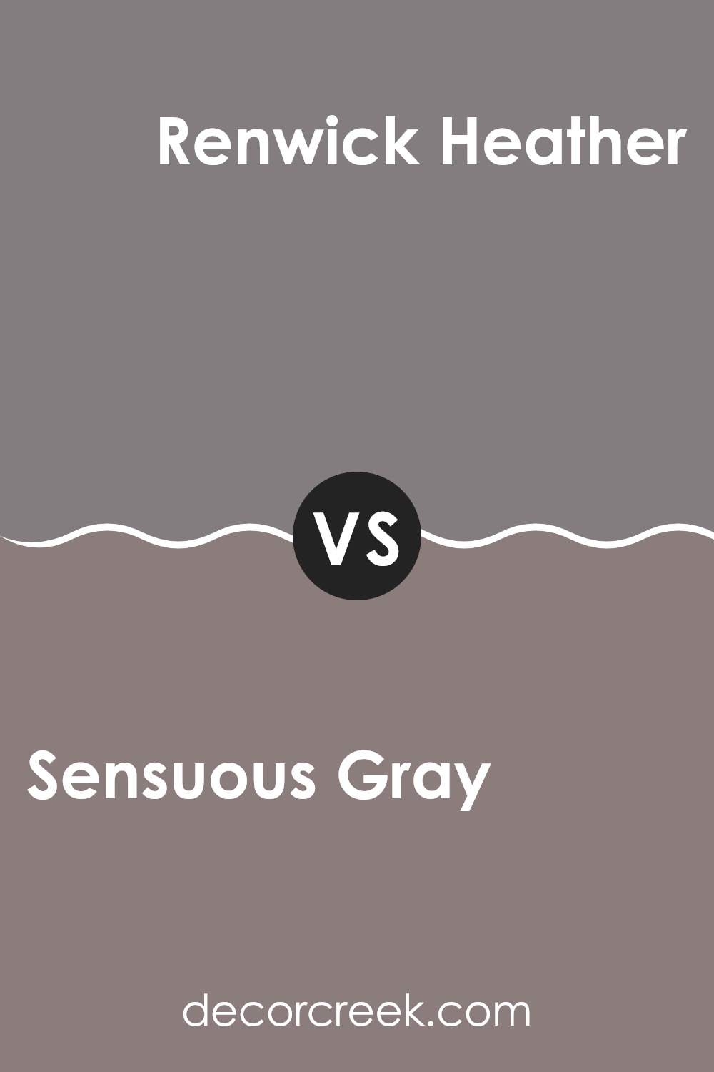
Sensuous Gray SW 7081 by Sherwin Williams vs Renwick Heather SW 2818 by Sherwin Williams
Sensuous Gray and Renwick Heather are both shades offered by Sherwin Williams but differ distinctly in tones. Sensuous Gray has a cooler, more neutral gray tone that readily fits into a variety of rooms, offering a straightforward, muted backdrop. This color has the adaptability to work well in either a modern or traditional setting, blending seamlessly with different styles and furnishings.
In contrast, Renwick Heather leans towards a warmer, earthier hue that evokes a sense of welcoming warmth. This color has a brown undertone, making it an excellent choice for areas where a cozy, inviting atmosphere is desired. It pairs well with rich woods and natural textures, giving rooms a grounded and comfortable feel.
While both colors provide unique aesthetic benefits, the choice between them depends largely on the desired mood and color temperature for the room. Sensuous Gray, being cooler, offers a fresh and calm look, whereas Renwick Heather, with its warmth, adds a more enveloping and homey touch.
You can see recommended paint color below:
- SW 2818 Renwick Heather
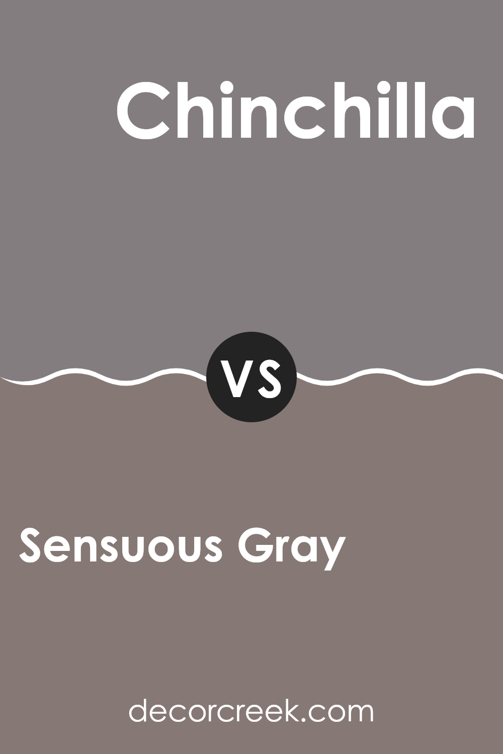
Sensuous Gray SW 7081 by Sherwin Williams vs Chinchilla SW 6011 by Sherwin Williams
Sensuous Gray and Chinchilla, both by Sherwin Williams, are unique yet subtle shades perfect for creating a cozy and welcoming room. Sensuous Gray is a warm, soft gray with a touch of brown, making it cozy and approachable.
This color is adaptable, fitting well in living rooms or bedrooms as it adds a gentle warmth to the walls. On the other hand, Chinchilla is a darker, more pronounced gray with hints of brown and purple. This shade gives a room a bit more drama and depth, making it ideal for accent walls or rooms where you want to make a statement.
Despite their differences, both colors provide a neutral base, allowing for various decorating styles and color pairings. Whether you prefer the lighter touch of Sensuous Gray or the deeper tone of Chinchilla, each offers a unique atmosphere to your home.
You can see recommended paint color below:
After looking closely at SW 7081 Sensuous Gray by Sherwin Williams, I think it’s a really cool paint color! It’s like a gentle gray that sometimes looks a little blue or even purple, which makes it super interesting to look at. This color is perfect for my bedroom or even the living room because it makes the rooms feel calm and cozy. It’s not too dark and not too light, so it works well in places that don’t get lots of sunlight, and it can make small rooms seem a bit bigger.
When I tested Sensuous Gray in different lights, I noticed how it changed slightly, adding a fun twist depending on the time of day. For anyone who wants to paint their home and make it look nice and not boring, Sensuous Gray is a great choice. It goes well with lots of other colors, like white for the trims, or even some bold colors like yellow for pillows or decorations.
In my opinion, Sherwin Williams created a lovely gray paint with Sensuous Gray that is easy to use and looks great everywhere in the house. It’s definitely a paint color I would recommend if someone wants to freshen up their room without making things too complicated.
It’s like picking the perfect background that lets all your favorite things shine!
Ever wished paint sampling was as easy as sticking a sticker? Guess what? Now it is! Discover Samplize's unique Peel & Stick samples.
Get paint samples

