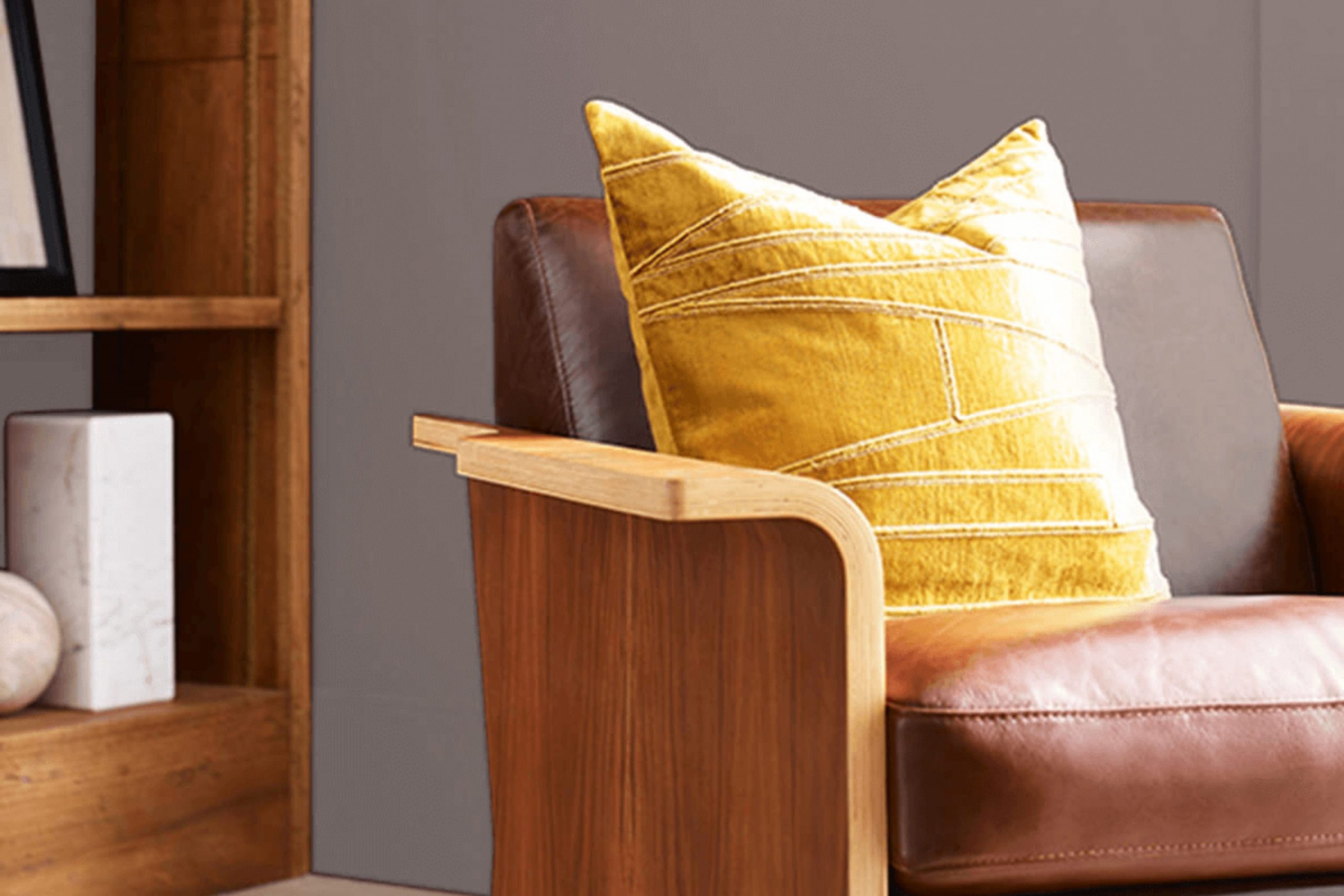
I recently came across SW 6011 Chinchilla by Sherwin Williams, a unique shade of gray that holds a subtle charm, perfect for refreshing any room into a calm and stylish retreat. As I looked into how to incorporate this color into different parts of my home, I realized its adaptability is truly impressive. Whether you’re thinking about refreshing a living room, bedroom, or even a bathroom, Chinchilla has this quiet elegance that can blend beautifully with various decor styles, from modern minimalism to cozy traditional.
The gray tones in Chinchilla are soft yet distinct, offering a soothing backdrop that enhances other colors and elements in a room. It works particularly well with natural textures like wood, metals, and woven fabrics, bringing a balanced harmony that feels both welcoming and refined.
If you’re curious about how to match it or what themes work best with it, you’ll find it to be an accommodating companion to your design ideas.
Join me as we look at some creative ways to use Chinchilla in your decorating plans, proving that a simple can of paint can indeed refresh and revitalize your living room.
What Color Is Chinchilla SW 6011 by Sherwin Williams?
The color Chinchilla by Sherwin Williams is a warm, muted shade of gray with subtle brown undertones, giving it a cozy and welcoming feel. This adaptable hue works exceptionally well in a variety of interior styles, particularly in modern farmhouse, rustic, and contemporary designs. Its understated elegance provides a perfect backdrop for living rooms and bedrooms where a calm and inviting atmosphere is desired.
Chinchilla pairs beautifully with natural materials such as wood, stone, and leather, enhancing the organic feel of a room. The warmth of wood furniture or flooring complements Chinchilla’s earthy base, while stone elements in a fireplace or backsplash can highlight its gray tones. For textiles, consider soft linens or chunky wool throws to add texture and depth to the color on walls.
In terms of metallics, both gold and brushed nickel accents work well with this color, offering a touch of glamour without overpowering its subtlety. Chinchilla is also an excellent choice for cabinetry or as an accent wall, providing a neutral but striking canvas that allows furnishings and décor to stand out. Overall, this color is a practical choice for those looking to create a warm, inviting, and well-coordinated room.
Is Chinchilla SW 6011 by Sherwin Williams Warm or Cool color?
Chinchilla SW 6011 by Sherwin Williams is a unique gray color with warm undertones, making it very adaptable for use in homes. This color can work wonders in a room by adding a soft and cozy feel without making the room feel too heavy or dark. Whether it’s used on living room walls, in a bedroom, or even in a kitchen, Chinchilla helps to create a welcoming and comfortable environment.
This shade of gray manages to keep things neutral while still adding a touch of warmth, which is great for pairing with both light and dark furniture. It can help to highlight artwork or other features in a room without overpowering them.
Chinchilla can also help to make small rooms appear bigger and brighter, as it reflects light nicely. Overall, using Chinchilla in your home can make rooms feel more inviting and put together.
Undertones of Chinchilla SW 6011 by Sherwin Williams
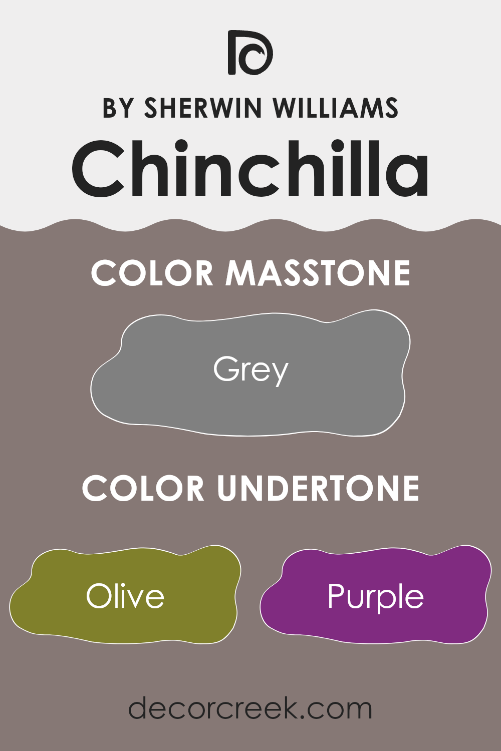
Chinchilla by Sherwin Williams is a unique paint color with a complex spectrum of undertones. Undertones are subtle colors that are not immediately obvious but can significantly influence the overall appearance of a paint color in various lighting conditions. These undertones can include colors like olive, purple, pale pink, and many others.
When considering Chinchilla for interior walls, it’s important to understand how its undertones will play out in your specific setting. For instance, in a room with a lot of natural light, the lighter undertones like pale pink or light green might become more visible, giving the room a softer, more gentle feel. In contrast, in a room with less light or at different times of the day, darker undertones like dark grey or navy might stand out, giving the walls a richer and more intense look.
The diverse range of undertones in Chinchilla means it can appear differently based on the surrounding colors and furnishings. For example, placing it near vibrant greens can highlight its green undertones, while pairing it with warmer colors like orange or yellow can draw out its warmer hues.
Understanding these effects is crucial when choosing where and how to apply this color. You need to consider not only the primary color but also how its undertones will interact with elements in the room and the changing light conditions throughout the day. Using samples on your walls to see how it changes in different lighting is always a good step before making a final decision. This understanding will ensure that the color works harmoniously in your room, creating the desired atmosphere.
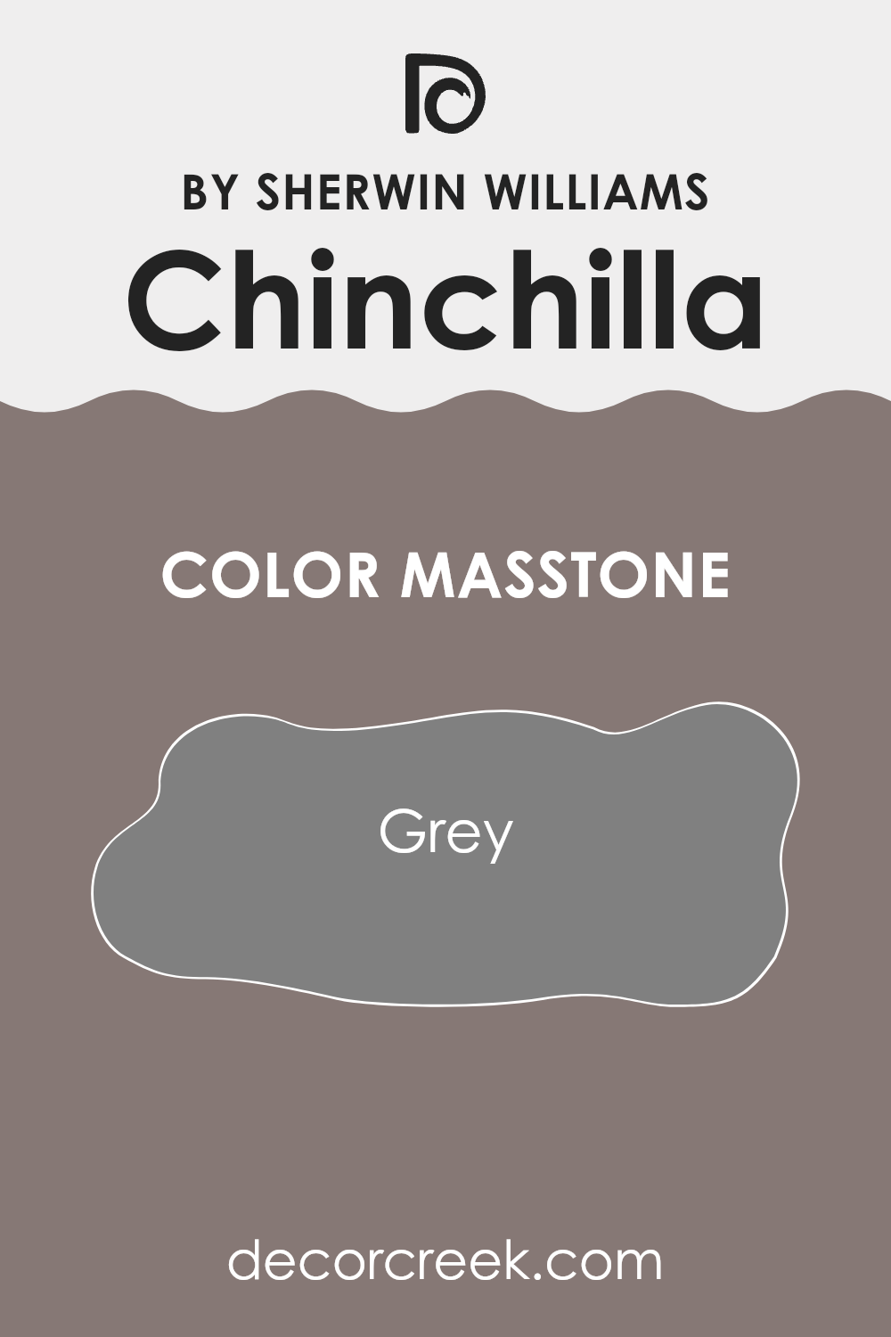
What is the Masstone of the Chinchilla SW 6011 by Sherwin Williams?
Chinchilla SW 6011 by Sherwin Williams has a masstone of Grey (#808080). This grey shade is neutral and flexible, making it a popular choice for home interiors. It acts like a blank canvas—it doesn’t dominate a room but quietly supports any style or décor. Whether your furniture is bold and colorful or soft and subtle, this grey blends effortlessly, offering a stable backdrop that lets other colors stand out.
This color is particularly practical for rooms that serve multiple purposes or need to appeal to various tastes. It’s forgiving with everyday wear and works well in high-traffic areas like living rooms and hallways.
Additionally, lighter and darker tones of furniture or decorations naturally stand out against Chinchilla’s steady grey, allowing homeowners to mix different textures and finishes. The easy-going nature of this grey means that it can last through various redecorating changes without clashing or needing replacement. Thus, it serves as a wise option for those seeking longevity and adaptability in their decor.
How Does Lighting Affect Chinchilla SW 6011 by Sherwin Williams?
Lighting plays a crucial role in how colors appear in a room. The type of light, whether it’s natural sunlight or artificial light from bulbs, can dramatically change the look of a paint color. Chinchilla, a color from Sherwin Williams, is an adaptable neutral with a warm undertone. In artificial light, such as light from LED or incandescent bulbs, this shade tends to appear warmer, enhancing its beige and gray tones. The warmth comes out more strongly under yellow or warm white bulbs making it cozy and inviting, while cool white bulbs may make it look slightly more gray.
In contrast, natural light affects this color differently throughout the day and depending on room orientation. In north-faced rooms, which receive less direct sunlight and have a cooler light, the color may seem more muted and slightly cooler, emphasizing its gray tones rather than its warmth. These rooms usually have a consistent quality of light all day, keeping the color fairly stable.
South-faced rooms get plenty of sunlight, washing the walls with bright, warm light for the majority of the day. This intense exposure makes the gray-beige of Chinchilla look brighter and more vibrant, with its warm undertones coming to the forefront, making the room feel warm and sunny.
East-faced rooms enjoy morning light, which is cool and bright. Chinchilla will appear softer and lighter in the morning, potentially showing more of its beige side. As the day progresses and the natural light diminishes, the color can look more neutral and subdued.
West-faced rooms experience the opposite, with weaker morning light that keeps the color looking neutral or cooler, changing later in the day as the sun sets. The intense, warm afternoon light can make the walls glow with warm undertones, offering a cozy, welcoming feel toward the evening. Overall, Chinchilla’s ability to adapt to different lighting conditions makes it a flexible choice for various rooms and settings.
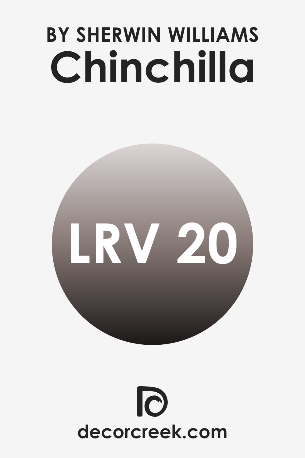
What is the LRV of Chinchilla SW 6011 by Sherwin Williams?
LRV stands for Light Reflectance Value, which measures the percentage of light a paint color reflects back into a room. Essentially, it’s a gauge of how light or dark a color will appear once it’s on your walls. The scale runs from 1 to 99, with lower numbers indicating darker shades that absorb more light and higher numbers representing lighter shades that reflect more light.
This value is crucial when choosing paint colors because it helps you understand how the color will behave in different lighting conditions in your room, potentially making a room feel more open and airy or cozier, depending on the value.
The LRV of 19.774 for a particular shade means it’s on the darker end of the spectrum, absorbing more light than it reflects. This dark characteristic can influence the atmosphere and visual dimensions of a room. In smaller rooms or rooms with limited natural light, using a color with this LRV might make the room feel smaller or more enclosed. However, in a well-lit, spacious room, this color can add warmth and depth, creating a cozy and inviting environment. When using darker colors like this, it’s particularly important to consider lighting and other room elements to ensure the room doesn’t become too dark.
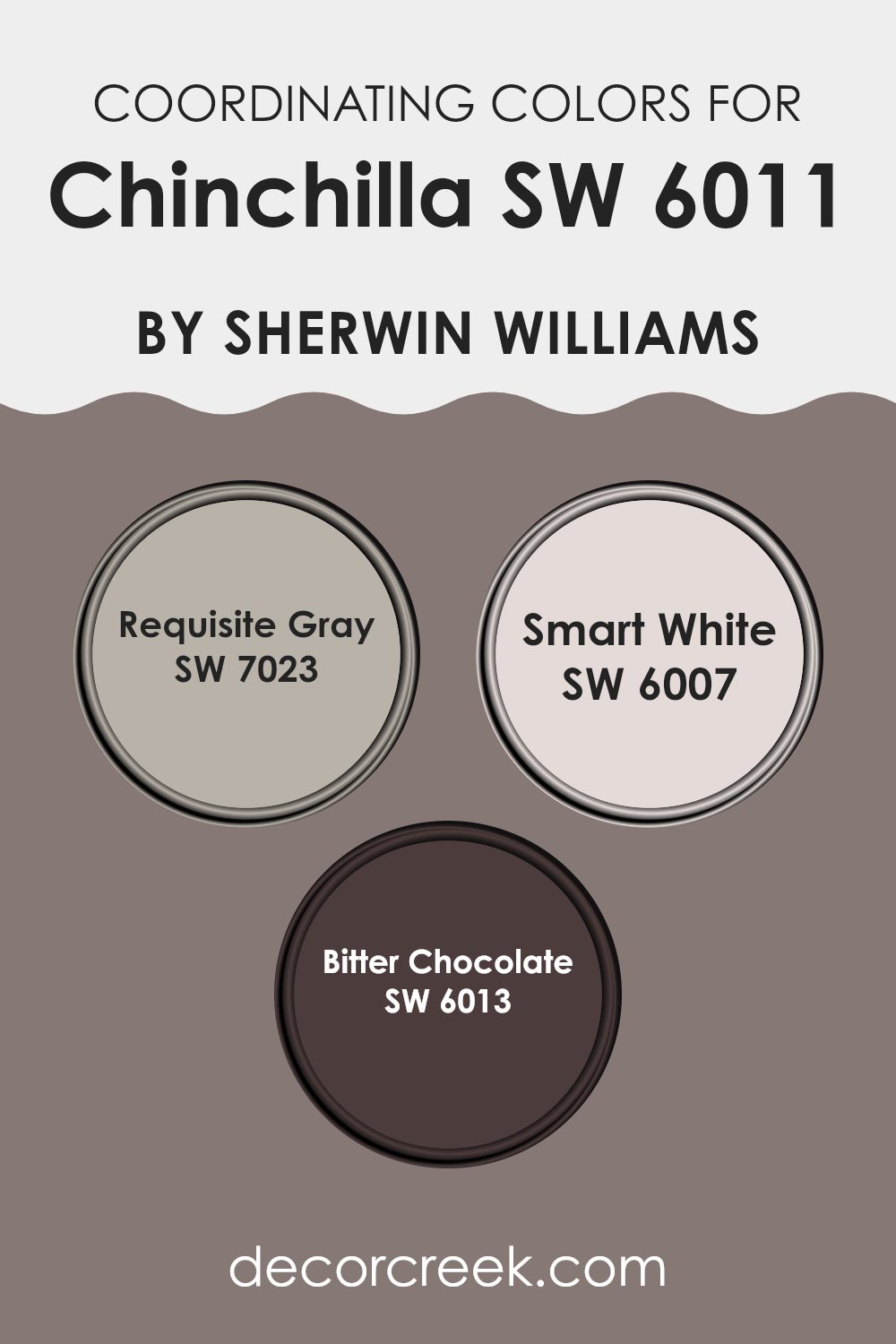
Coordinating Colors of Chinchilla SW 6011 by Sherwin Williams
Coordinating colors are complementary shades that go well together to create aesthetically pleasing color schemes. When used with a primary color like Chinchilla from Sherwin Williams, coordinating colors can either enhance the base shade, create contrasting effects, or deliver a balanced visual experience. Coordinating colors are selected based on their ability to harmonize while also allowing each individual color to stand out or blend according to the decorator’s intention.
For example, Requisite Gray is a moderate gray shade with warm undertones that pairs well with Chinchilla, softening its overall appearance and providing a subtle contrast. This color can effectively round out the edges of a darker hue, making it perfect for living areas and bedrooms where a gentle transition between colors is desired.
Smart White, as its name suggests, is a sharp, clear white that works brilliantly to bring out the cooler tones in Chinchilla, offering a crisp outline and freshness to any room. Lastly, Bitter Chocolate is an intensely rich, deep brown that draws out the depth in Chinchilla, adding a dramatic flair and anchoring lighter shades within a room’s palette. Each coordinating color, with its unique properties, complements and balances the look when combined thoughtfully with others.
You can see recommended paint colors below:
- SW 7023 Requisite Gray
- SW 6007 Smart White
- SW 6013 Bitter Chocolate
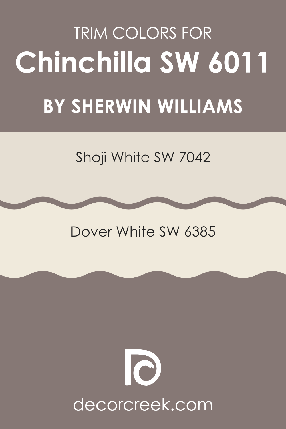
What are the Trim colors of Chinchilla SW 6011 by Sherwin Williams?
Trim colors are specific shades used to accentuate or complement the main color on walls, highlighting architectural details such as door frames, window sills, and baseboards. By carefully selecting trim colors, you can enhance the overall aesthetic of a room, create a more cohesive look, and even influence the perception of room and light.
For instance, using classic trim colors like SW 7042 – Shoji White or SW 6385 – Dover White with a primary shade like ChinchillaSW 6011 by Sherwin Williams can provide a crisp, clean contrast that accentuates the elegant gray tones of the main wall color.
SW 7042 – Shoji White has a subtle off-white tone that brings a light, airy feel to the trim, giving a fresh and open impression that’s ideal for modern and traditional rooms alike. Meanwhile, SW 6385 – Dover White offers a warmer, creamy hue that pairs beautifully with cooler tones, softening the edges and adding a gentle, welcoming touch to any room. Both colors are adaptable choices that can help enhance the visual appeal of your room, supporting the primary wall color to stand out or blend harmoniously within the design.
You can see recommended paint colors below:
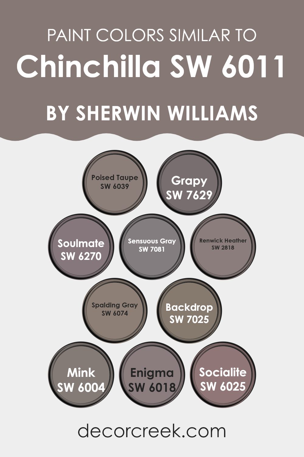
Colors Similar to Chinchilla SW 6011 by Sherwin Williams
Choosing similar colors can significantly enhance the overall aesthetic of any room by creating a harmonious and cohesive look. Similar colors such as those akin to Chinchilla, like Poised Taupe and Grapy, blend seamlessly to provide gentle contrasts that are soothing to the eye. These colors, which share subtle similarities, help in achieving a balanced visual effect.
For example, Poised Taupe offers a calm balance with its earthy tone that’s neither too dark nor too bright, making it perfect for rooms seeking a neutral but warm backdrop. In contrast, Grapy can add a subtle depth with its muted purple hue.
Colors like Soulmate and Sensuous Gray work beautifully to complement more pronounced shades like Chinchilla due to their understated elegance. Soulmate showcases a soft lavender grey that pairs perfectly with other neutrals to create a restful environment. Sensuous Gray, on the other hand, provides a deeper grey that anchors lighter colors and adds refinement without overpowering the senses.
Renwick Heather and Spalding Gray are excellent for adding subdued complexity with their richer tones, while Backdrop grounds a room with its darker, cozier feel. Moreover, colors like Mink, Enigma, and Socialite offer varied depth and intrigue. Mink’s deeper browner tones add a hint of luxury; Enigma presents a mysterious slate hue, and Socialite offers a lighter, more playful grey that keeps the palette fresh and engaging.
You can see recommended paint colors below:
- SW 6039 Poised Taupe
- SW 7629 Grapy
- SW 6270 Soulmate
- SW 7081 Sensuous Gray
- SW 2818 Renwick Heather
- SW 6074 Spalding Gray
- SW 7025 Backdrop
- SW 6004 Mink
- SW 6018 Enigma
- SW 6025 Socialite
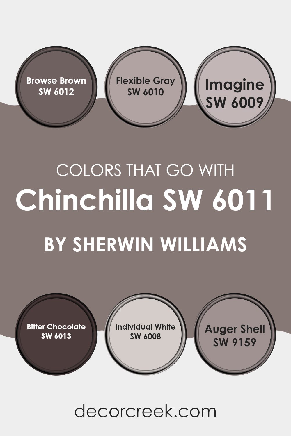
Colors that Go With Chinchilla SW 6011 by Sherwin Williams
Choosing the right complementary colors for Chinchilla SW 6011 by Sherwin Williams is essential for creating a harmonious and appealing color scheme in any room. When paired correctly, these colors can enhance each other, making a room feel balanced and aesthetically pleasing.
For instance, Browse Brown SW 6012 offers a rich, deep hue, providing a solid grounding effect that works well in balancing the lighter mid-tone gray of Chinchilla. Likewise, Flexible Gray SW 6010, with its adaptable shade, can serve as a smooth transition between the darker and lighter tones within the room, aiding in achieving a cohesive look.
Similarly, colors like Imagine SW 6009 contribute a subtle warmth that can soften the overall feel of a room without overpowering the gentle neutrality of Chinchilla. This is contrasted nicely by Bitter Chocolate SW 6013, which brings a boldness through its dark, sumptuous tone, adding depth and definition to the setting.
Individual White SW 6008 has a clean, crisp quality that helps to brighten rooms and highlight their architectural features, complementing the cool undertones of Chinchilla. Lastly, Auger Shell SW 9159 offers a hint of earthy taupe that works well to create a soothing and welcoming environment, making it an excellent choice for living areas and bedrooms alike. These color combinations ensure a well-rounded, visually pleasing environment suited to a variety of decorating styles.
You can see recommended paint colors below:
- SW 6012 Browse Brown
- SW 6010 Flexible Gray
- SW 6009 Imagine
- SW 6013 Bitter Chocolate
- SW 6008 Individual White
- SW 9159 Auger Shell
How to Use Chinchilla SW 6011 by Sherwin Williams In Your Home?
Chinchilla SW 6011 by Sherwin Williams is a soothing, deep gray color with hints of brown. It’s a neutral shade that goes well in almost any room, adding a sense of calmness and elegance. You can use this paint color in your living room to create a cozy and inviting atmosphere, which makes it perfect for family gatherings or relaxing after a busy day.
In the bedroom, Chinchilla SW 6011 works great as it helps to foster a peaceful sleep environment. This color can also be used in kitchens and bathrooms where it adds a touch of class without making the room feel too dark.
Since it is a neutral color, it pairs beautifully with brighter colors like blues and yellows or even other neutrals for a more streamlined look. Furniture and decorations in both light and dark tones will stand out against a Chinchilla backdrop, giving your home a stylish and welcoming feel.
Chinchilla SW 6011 by Sherwin Williams vs Poised Taupe SW 6039 by Sherwin Williams
Chinchilla and Poised Taupe by Sherwin Williams are two popular paint colors, each with a distinct character. Chinchilla is a subtle gray with hints of brown that create a warm, neutral backdrop. Ideal for rooms where a calm and cozy feel is desired, it pairs well with a wide variety of decor styles.
In contrast, Poised Taupe is a deeper, richer shade that blends gray with warmer taupe tones. This color adds more depth to a room and works well in areas that benefit from a stronger color presence, like living rooms or bedrooms.
While both colors provide a neutral palette, Chinchilla offers a lighter, softer look, and Poised Taupe presents itself as bolder and more dynamic. The choice between them depends on the desired mood and the specific uses of the room.
You can see recommended paint color below:
Chinchilla SW 6011 by Sherwin Williams vs Sensuous Gray SW 7081 by Sherwin Williams
Chinchilla and Sensuous Gray by Sherwin Williams are both interesting choices if you’re looking to paint a room in neutral tones. Chinchilla is a soft, light gray that has a slightly warmer, almost beige undertone. This makes it a cozy choice for living rooms or bedrooms, where you might want a gentle color on the walls that complements a wide range of decor styles and colors.
On the other hand, Sensuous Gray is a deeper, medium gray that leans towards taupe. It’s cooler than Chinchilla, providing a more pronounced, yet still neutral background that can add a bit of depth and contrast to a room without overpowering it. This color works well in areas where you want a bit more definition but still maintain a calm atmosphere.
Both colors offer versatility and can be paired with various furnishings, accentuating different moods depending on the lighting and accompanying decor. Whether you choose the lighter Chinchilla or the deeper Sensuous Gray depends on how bold or subtle you want your room to feel.
You can see recommended paint color below:
- SW 7081 Sensuous Gray
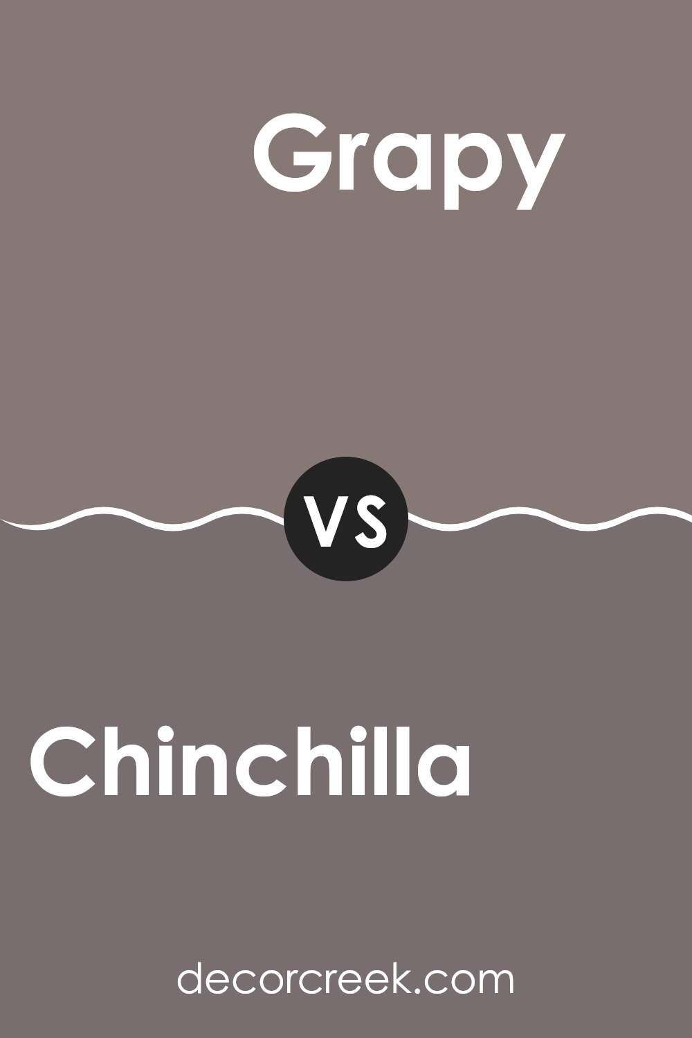
Chinchilla SW 6011 by Sherwin Williams vs Grapy SW 7629 by Sherwin Williams
Chinchilla by Sherwin Williams is a soft and muted gray that exudes warmth. It is an adaptable color that can coexist well with various decor styles and other colors, giving a cozy feel to any room. Its light gray shade can make small rooms appear larger and is great for creating a calm atmosphere.
On the other hand, Grapy by Sherwin Williams is a significantly darker shade, characterized by its deep gray with hints of purple. This color provides a bold and cozy feel, making it suitable for accent walls or rooms where a more intimate ambiance is desired. Despite its darkness, Grapy doesn’t overpower a room but instead adds a rich and inviting layer to interiors.
Both colors can be used effectively in home decor but serve different purposes based on their tone. Chinchilla works well where a light, airy feel is needed, while Grapy is ideal for adding depth and interest to a room.
You can see recommended paint color below:
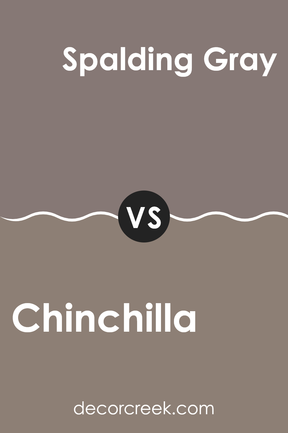
Chinchilla SW 6011 by Sherwin Williams vs Spalding Gray SW 6074 by Sherwin Williams
Chinchilla and Spalding Gray by Sherwin Williams are two distinct colors that can set very different moods in a room. Chinchilla is a lighter, warm gray that gives a soft and inviting feel to any room. It reflects light well, making rooms appear larger and more open.
On the other hand, Spalding Gray is a deeper gray that provides a stronger, more grounded presence. This darker shade can make large rooms feel cozier and more contained. While Chinchilla works beautifully in areas where you want a gentle, airy feel, Spalding Gray is ideal for creating a sense of depth and formality.
Both colors are adaptable and can be used in various decor styles, but the choice between them depends largely on the atmosphere you want to achieve: light and open with Chinchilla, or more solid and defined with Spalding Gray.
You can see recommended paint color below:
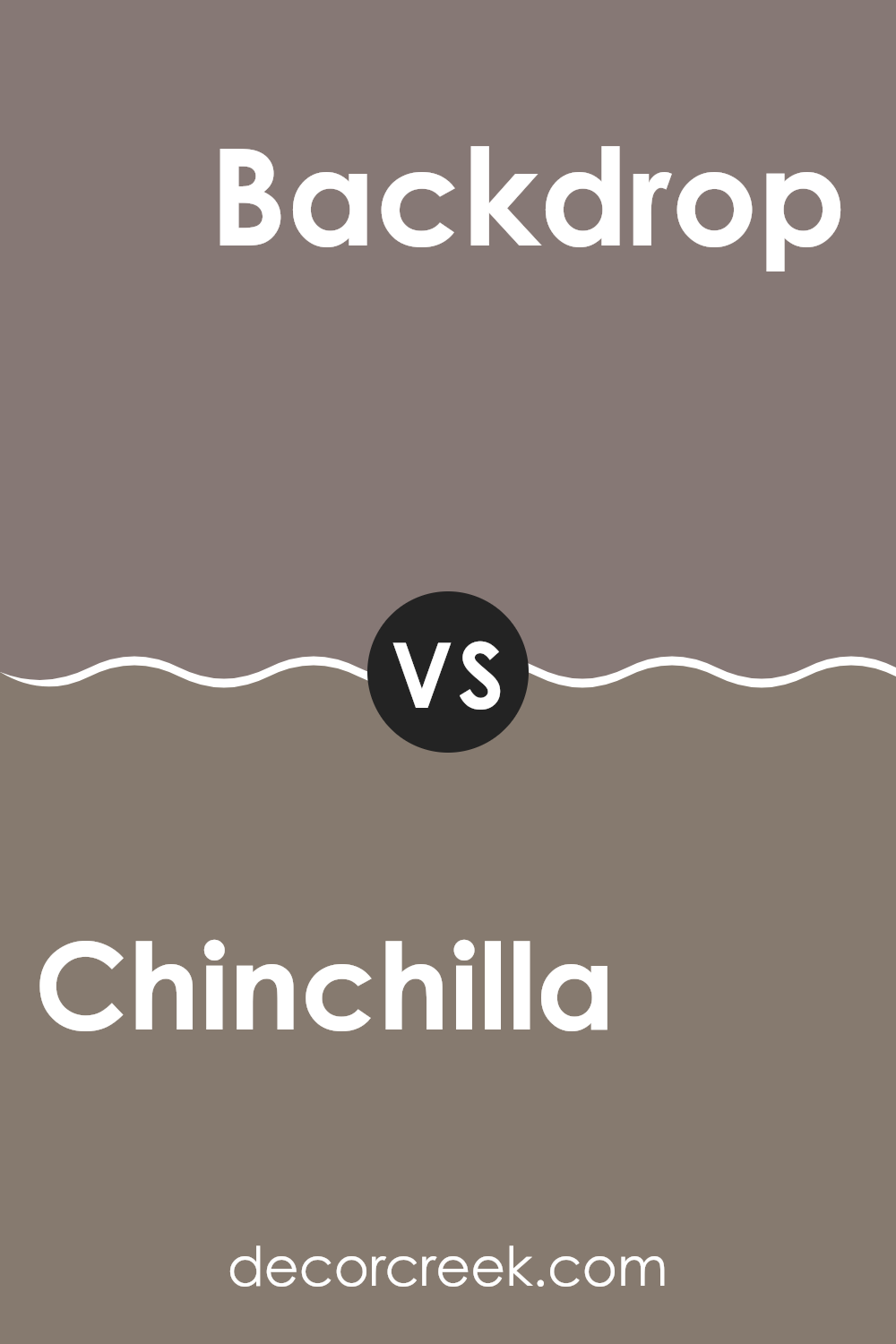
Chinchilla SW 6011 by Sherwin Williams vs Backdrop SW 7025 by Sherwin Williams
Chinchilla SW 6011 and Backdrop SW 7025 are both neutral shades by Sherwin Williams, but they bring different vibes to a room. Chinchilla is a lighter, warm gray that gives off a soft and welcoming feel.
It’s subtle enough to work well in any room, serving as a gentle backdrop that complements various decor styles and colors. In contrast, Backdrop is a darker gray with cooler undertones. This color offers a more striking impact, making it ideal for creating a strong visual statement.
It stands out more on walls and can give rooms a more grounded, decisive look. Although both colors are adaptable, Chinchilla leans towards creating a cozy, lighter environment, while Backdrop tends towards a more defined and bold room. Both choices are great, but your preference might depend on how light or dramatic you want your room to feel.
You can see recommended paint color below:
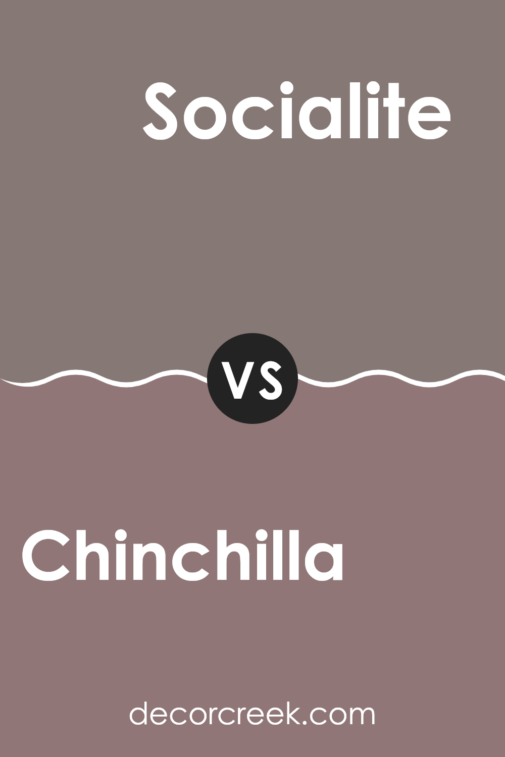
Chinchilla SW 6011 by Sherwin Williams vs Socialite SW 6025 by Sherwin Williams
Chinchilla by Sherwin Williams is a warm, muted gray that offers a cozy and inviting feel to any room. It has a soothing quality without being too dark, making it adaptable for various rooms, whether it’s a living room, bedroom, or even a kitchen.
In contrast, Socialite, also by Sherwin Williams, is a darker gray that leans slightly towards blue. This color provides a more dramatic and bold look, perfect for making a statement in a room. While both colors share a gray base, Chinchilla is lighter and warmer, which makes a room feel snug and welcoming.
Socialite, with its deeper tone, is ideal for those looking to add a touch of drama or an elegant flair. Both colors work well with a range of decor styles, but Chinchilla is better for a soft, subtle background, and Socialite stands out more as a focal point in a room.
You can see recommended paint color below:
- SW 6025 Socialite
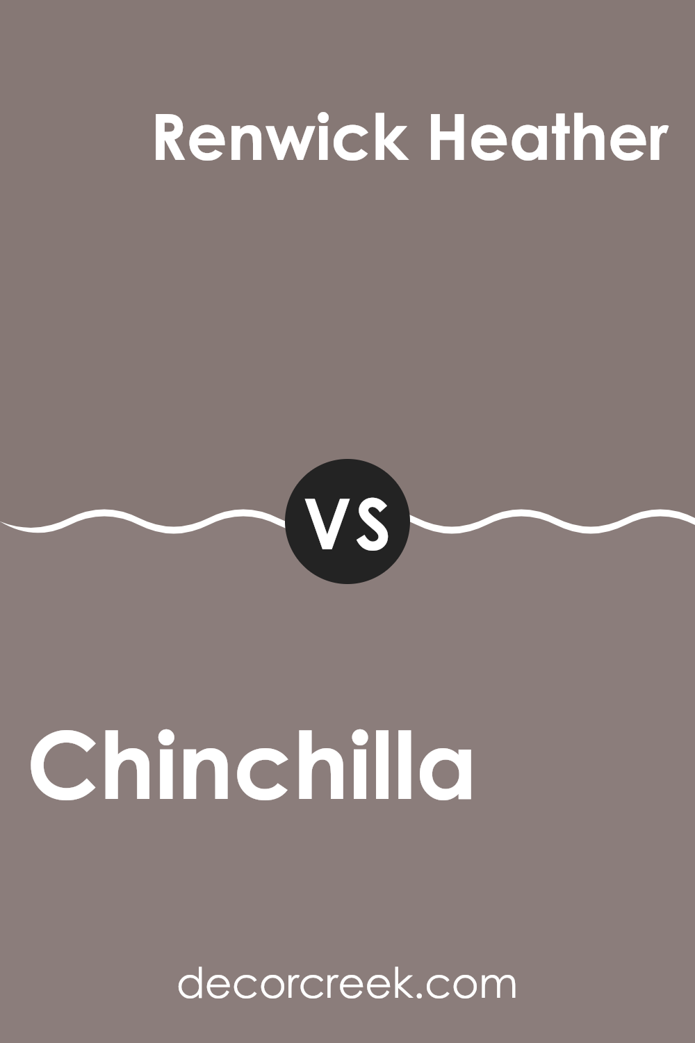
Chinchilla SW 6011 by Sherwin Williams vs Renwick Heather SW 2818 by Sherwin Williams
Chinchilla SW 6011 and Renwick Heather SW 2818, both by Sherwin-Williams, have distinct tones that can greatly influence the mood of a room. Chinchilla is a light gray color with warm undertones, which gives it a soft and welcoming appearance.
This makes it a great option for creating a cozy and comfortable room in your home. On the other hand, Renwick Heather is a much darker shade, featuring deep gray and brown tones. This color provides a strong and grounding effect, which can add a sense of stability and richness to any area.
While Chinchilla reflects more light and can make a small room appear larger and brighter, Renwick Heather is better suited for a large room or one where a sense of formality or prominence is desired. Both colors work well in a variety of decorating styles, but the choice between them depends largely on the desired atmosphere and the size of the room.
You can see recommended paint color below:
- SW 2818 Renwick Heather
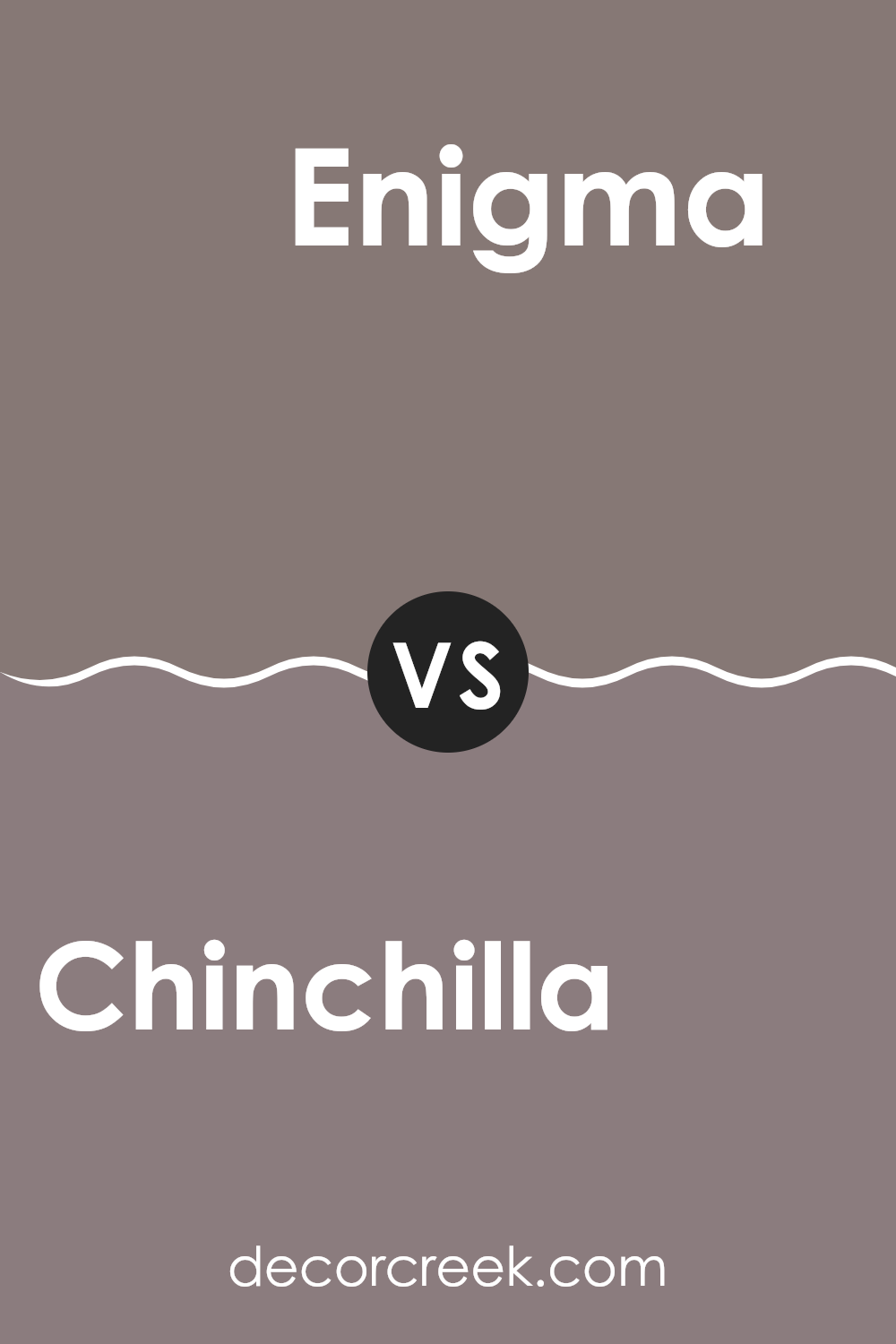
Chinchilla SW 6011 by Sherwin Williams vs Enigma SW 6018 by Sherwin Williams
Chinchilla and Enigma, both colors by Sherwin Williams, provide unique yet subtle tones for wall paint. Chinchilla has a warm gray tone, bringing a cozy and inviting atmosphere to any room. This color pairs well with a variety of decor styles, making it extremely adaptable for both modern and traditional rooms.
On the other hand, Enigma presents a darker hue, leaning towards a deeper, smoky gray. This shade offers a bolder statement and is ideal for creating a focal point in a room or accentuating specific areas with a richer backdrop.
Despite their differences in depth, both shades maintain a neutral palette, which allows for easy matching with different colors and materials in interior design. Together, they could work well in the same home to define different moods across rooms, depending on the desired impact.
You can see recommended paint color below:
- SW 6018 Enigma
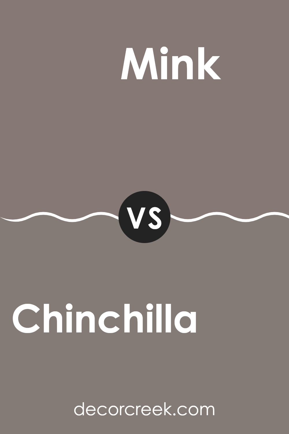
Chinchilla SW 6011 by Sherwin Williams vs Mink SW 6004 by Sherwin Williams
Chinchilla SW 6011 and Mink SW 6004, both by Sherwin Williams, are two neutral colors with subtle differences. Chinchilla is a light gray that gives a soft and clean look to any room. It’s perfect for creating a calm atmosphere in rooms that get plenty of natural light, as it reflects the light beautifully, making the room feel bigger.
On the other hand, Mink is a bit darker than Chinchilla, leaning more towards a taupe shade. This color adds a bit more warmth to the walls compared to Chinchilla. It’s a great choice if you want to add a touch of coziness and a more inviting feel to a room. Mink works well in areas where you want a cozy, yet still neutral background.
Both colors are adaptable and can be used in various settings, from modern to traditional. However, your choice between the two would depend on the amount of natural light in your room and the mood you want to set.
You can see recommended paint color below:
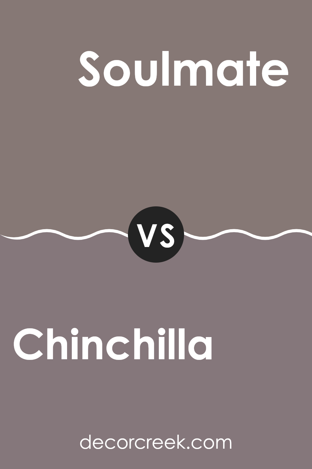
Chinchilla SW 6011 by Sherwin Williams vs Soulmate SW 6270 by Sherwin Williams
Chinchilla SW 6011 and Soulmate SW 6270 from Sherwin Williams are both unique shades, each providing its own distinct vibe. Chinchilla is a soft, neutral grey that brings a calm and understated feel to any room.
It’s an adaptable color that works well in a variety of rooms, either as a base color or when paired with brighter accents. On the other hand, Soulmate is a deeper, bolder blue with a hint of moody charm.
This color tends to make more of a statement and is ideal for adding a touch of drama and depth to a room. While Chinchilla acts as a subtle backdrop, Soulmate stands out and can define the aesthetic of a room. Both colors offer different benefits depending on what atmosphere you want to create in your room.
You can see recommended paint color below:
SW 6011 Chinchilla by Sherwin Williams is a really interesting color for your walls! It’s not just a plain gray; it’s like a soft, warm hug that makes any room feel cozy and welcoming. I’ve learned that this shade can really brighten up places in your home that might not get a lot of sunlight, making them feel more inviting.
Because it’s such a calm and gentle color, it makes your room look nice and cheerful without being too bright or in your face. It also goes well with lots of other colors, so whether you have bright cushions, dark furniture, or colorful curtains, Chinchilla will fit right in.
Painting a room with SW 6011 Chinchilla can change how you feel when you walk in. It has a calming effect that makes you feel relaxed. So, if you’re looking for a color that’s cozy, calm, and easy to match with other colors, Chinchilla could be the perfect choice for you to make any room in your home feel extra special. Plus, it’s a color that will look good for a long time, which is great because you won’t need to repaint it often.
That makes it a clever choice for anyone wanting to freshen up their room.
Ever wished paint sampling was as easy as sticking a sticker? Guess what? Now it is! Discover Samplize's unique Peel & Stick samples.
Get paint samples

