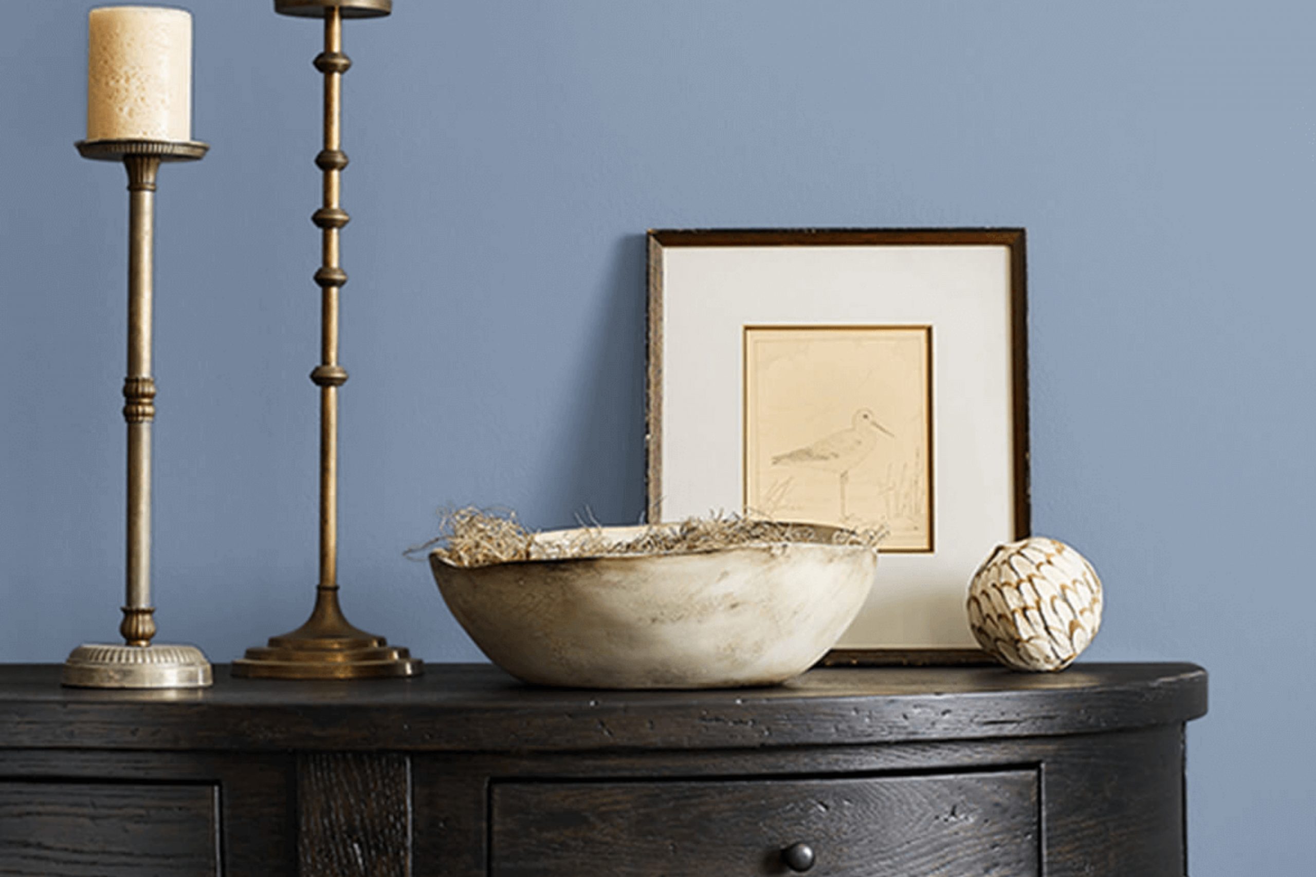
I recently came across SW 9072 Dried Lavender by Sherwin Williams, and let me tell you, it’s a unique hue that caught my eye. Known for its subtle and soft presence, Dried Lavender offers a hint of sophistication and quiet elegance to any space.
This shade is particularly versatile, blending well with both modern and traditional decor. What makes it stand out is its ability to provide a soothing backdrop that complements a wide range of accent colors, from warm golds to cool blues.
Using Dried Lavender in your home can be a smart choice if you’re looking to create a serene and inviting atmosphere. It works wonderfully in bedrooms due to its calming qualities but is equally effective in living areas where comfort and relaxation are key.
If you’re thinking about refreshing a room or even just a single wall, Dried Lavender is a color that offers both beauty and flexibility, making it a solid choice for anyone looking to add a touch of refined tranquility to their living space without overwhelming it.
What Color Is Dried Lavender SW 9072 by Sherwin Williams?
Dried Lavender is a unique color by Sherwin Williams that blends subtle hints of purple and gray, creating a soothing and versatile backdrop for any room. It leans towards a muted, earthy tone, offering a modern twist on traditional lavender hues.
This color possesses a distinct understated elegance that’s ideal for creating a peaceful and inviting atmosphere. In terms of interior styles, Dried Lavender shines in both contemporary and rustic settings. Its muted quality allows it to easily pair with a range of natural materials like raw wood, linen, and wool, enhancing the texture of these elements without overpowering them.
Stone accents and terracotta also complement this hue, bringing warmth to spaces that feature Dried Lavender on the walls. For a contemporary room, Dried Lavender works beautifully when combined with sleek metals like brushed nickel or chrome and can be paired with glass for a clean, minimalist aesthetic.
In more rustic interiors, pairing it with leather and chunky knits can create a cozy, comforting vibe. Dried Lavender also goes well with soft pastels for a gentle, airy look or can be contrasted with bolder colors like navy or deep green for more dynamic spaces.
It’s a flexible shade that adapts well to different lighting and can help in making small rooms appear larger and more open. Whether you’re looking to create a calm study area or a stylish living room, Dried Lavender offers a timeless appeal that can fit various design needs.
Is Dried Lavender SW 9072 by Sherwin Williams Warm or Cool color?
Dried Lavender by Sherwin Williams is a unique shade that brings a cozy and soft atmosphere to any room. This subdued purple color has a dusty look, which makes it easy to incorporate into various home styles, from modern to traditional.
In a bedroom, this soothing tone can contribute to a restful environment, ideal for winding down after a busy day. When used in a living space, it adds a touch of personality without overwhelming the area, especially when combined with neutral colors like whites or soft grays.
This color is also versatile for creative spaces, like craft rooms or home offices, where it encourages a calm but inspiring vibe. In smaller spaces like bathrooms, Dried Lavender can make the area feel more open and airy. Homeowners looking to add a gentle splash of color that is both stylish and understated might find Dried Lavender an excellent choice for painting walls, accent pieces, or even furniture.
Undertones of Dried Lavender SW 9072 by Sherwin Williams
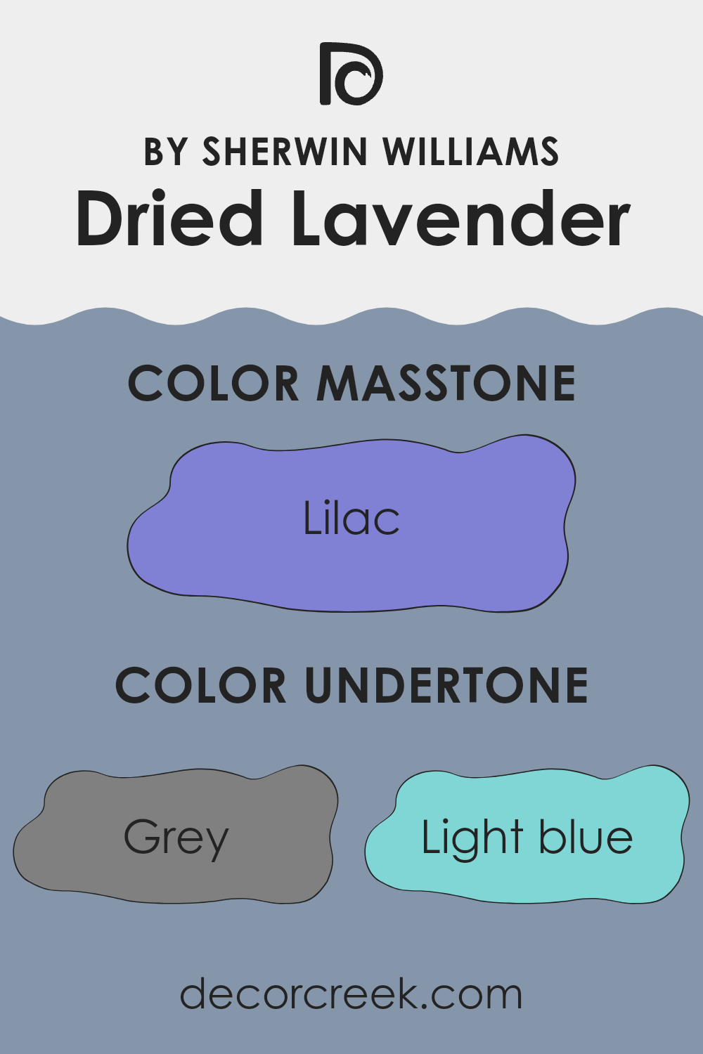
Dried Lavender by Sherwin Williams is a unique paint color that can look different depending on its environment. This is due to its variety of undertones which include shades of gray, light blue, mint, light purple, and many others like pale pink, dark turquoise, and navy. Undertones are subtle colors that affect the main hue, especially under different lighting conditions or when paired with other colors in a room.
For example, the gray and light gray undertones in Dried Lavender give it a muted, neutral feel which can make it a versatile choice in many spaces. These cooler undertones can help create a calm atmosphere in a room. Yet, this color also has warmer undertones like pale yellow and pale pink, which can softly brighten a space and add a touch of warmth.
When Dried Lavender is used on interior walls, its range of undertones plays a significant role in the overall look. In a room with lots of natural light, the lighter undertones such as light blue or mint might become more pronounced, giving the room a fresher, airy feel. In spaces with less light, the darker undertones like navy or dark blue might stand out, giving the room a more dramatic look.
Therefore, when choosing colors for decor or furnishings, it’s important to consider how they will interact with the undertones of Dried Lavender to achieve the desired effect in your space. Whether creating a soothing retreat or a stylishly modern room, understanding and using these undertones can help you better utilize this color in your decorating projects.
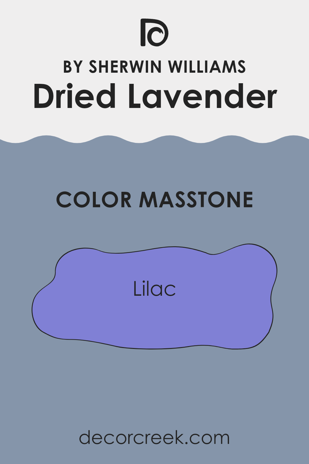
What is the Masstone of the Dried Lavender SW 9072 by Sherwin Williams?
Dried Lavender SW 9072 from Sherwin Williams, with its masstone labeled as Lilac (#8080D5), offers a refreshing and light hue that can make any room feel more open and airy. Its soft purple shade adds a hint of cheerful color without overpowering the space.
This makes it particularly useful for smaller rooms or areas with limited natural light, as it can help to make them appear brighter and more spacious. Additionally, the gentle tone of Dried Lavender can be easily paired with various decor styles and other colors, ranging from neutrals like white and gray to more vibrant shades.
It provides a calm atmosphere, ideal for bedrooms where you might want to wind down or for bathrooms where a clean, fresh feel is desired. Overall, its subtle, yet appealing color enhances home environments by providing a gentle background that complements a wide range of furnishings and decorations.
How Does Lighting Affect Dried Lavender SW 9072 by Sherwin Williams?
Lighting plays a crucial role in how we perceive colors, because different light sources can significantly change the appearance of a color on walls, furniture, and decorations. The same color can look different under natural sunlight compared to artificial light because the intensity and type of light affects how we see color tones.
For instance, the color Dried Lavender, a gentle shade of purple, may appear differently under various lighting conditions. In rooms with artificial lighting, such as LED or fluorescent lights, Dried Lavender tends to look more vibrant since these lights often enhance cooler colors. The purple may come across as slightly richer and more pronounced, making it a strong choice for spaces that you want to feel cozy and lively.
In natural light, the true character of Dried Lavender shines, but the tone can vary depending on the direction of the room. In a north-facing room, where the light is usually cooler and softer, Dried Lavender might look more muted and subtle, possibly taking on a more grayish hue. This makes it ideal for a space where you want calmness without strong color overpowering the room.
South-facing rooms, bathed in warm and bright sunlight for most of the day, will highlight the warmer undertones of Dried Lavender, making the walls look slightly warmer and more inviting. This light can make the room feel more pleasant, especially during colder months.
In east-facing rooms, morning light can make Dried Lavender seem bright and cheerful, while in west-facing rooms, the afternoon and evening light can bring out the color’s depth, potentially giving it a softer and more soothing appearance by the end of the day. Understanding these nuances can help you decide where to apply specific colors depending on the mood and atmosphere you wish to create in each room.
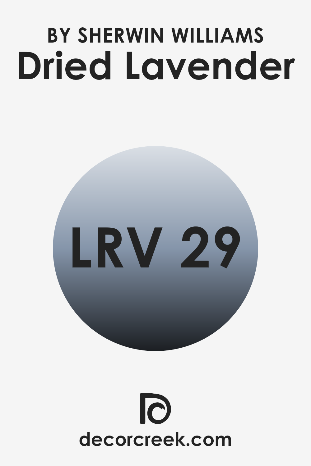
What is the LRV of Dried Lavender SW 9072 by Sherwin Williams?
LRV stands for Light Reflectance Value, which is a measure of how much light a color reflects compared to how much it absorbs. Think of LRV as a scale from absolute black, which absorbs all the light that hits it, to pure white, which reflects all the light that shines on it. The LRV scale helps to determine how light or dark a color will look once applied to the walls.
A higher LRV means the color is lighter and reflects more light, making a room feel more open and airy. Conversely, a lower LRV indicates a darker color that absorbs more light, which can make a space feel smaller or cozier.
The LRV of Dried Lavender, standing at around 29, suggests it is on the darker side of the scale. This means it absorbs more light than it reflects, which can have a significant impact on the feel and usability of a space.
In rooms with less natural light, using a color like Dried Lavender may make the space appear more closed in and intimate, which could be perfect for creating a cozy atmosphere in areas like bedrooms or dens. However, in a small or already dark room, this same quality could make the room feel even smaller or dimmer. Selection of this color should consider room size, lighting, and desired ambience.
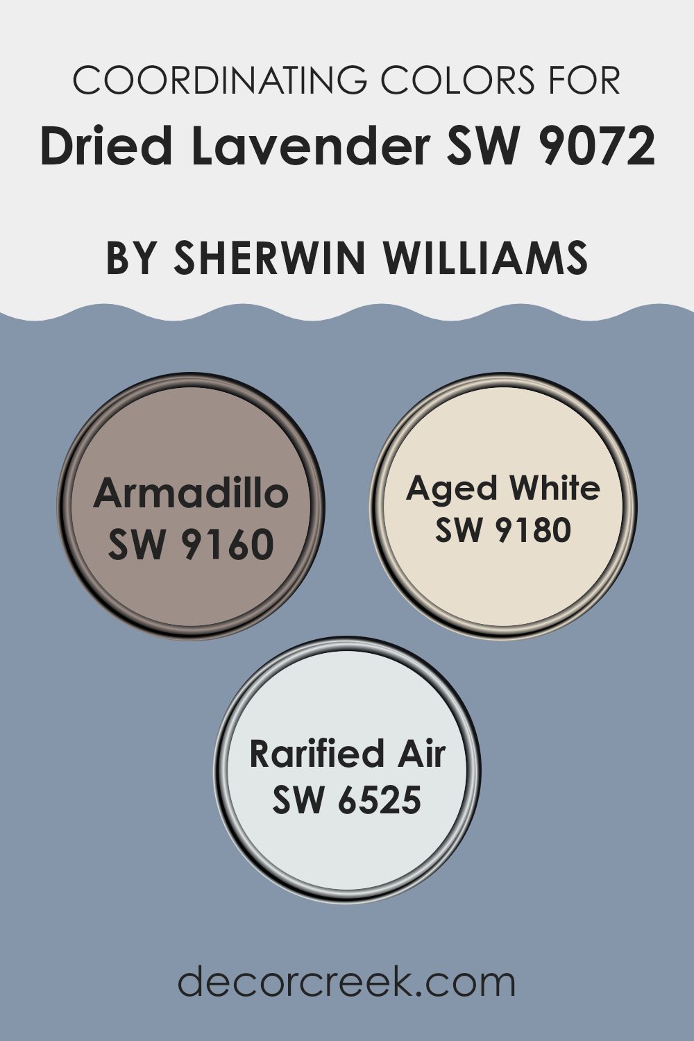
Coordinating Colors of Dried Lavender SW 9072 by Sherwin Williams
Coordinating colors are selected to create a harmonious and balanced look when used together in a space. Each color complements or contrasts with the main color in such a way that the overall aesthetic is pleasing to the eye. For instance, Dried Lavender from Sherwin Williams pairs beautifully with shades like Armadillo, Aged White, and Rarified Air, which are specifically chosen for their compatibility with the lavender hue. These coordinating colors work by either enhancing the main color or by offering a subtle backdrop that allows the primary color to stand out.
Armadillo is a sturdy, deep gray tone with earthy undercurrents that provides a solid grounding effect, making it a great contrast to the lighter, ethereal quality of lavender. Meanwhile, Aged White offers a soft, creamy palette that gently blends with the lavender, providing a smooth transition in spaces that favor a muted, cohesive look.
On the other hand, Rarified Air is a light, almost ethereal pale blue that offers a crisp, clean feeling to the combination, adding a breath of fresh air to the overall scheme. These coordinating colors are chosen to ensure that the environment feels balanced and harmonious while highlighting the beauty of the primary shade.
You can see recommended paint colors below:
- SW 9160 Armadillo
- SW 9180 Aged White
- SW 6525 Rarified Air
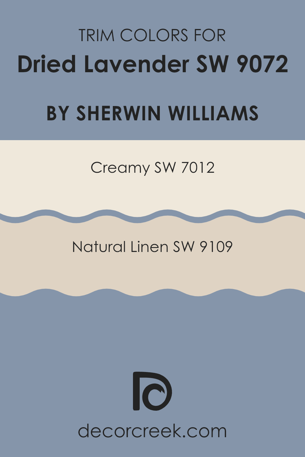
What are the Trim colors of Dried Lavender SW 9072 by Sherwin Williams?
Trim colors are essentially the hues used to paint the borders or edges of different elements in a room, like window sills, door frames, and baseboards, contrasting with the primary wall color to enhance the overall aesthetic appeal. Selecting the right trim color is crucial as it defines the transitions between different surfaces, creating visual boundaries that draw attention to architectural details.
For example, a softer trim color like Creamy or Natural Linen can complement a richer wall color such as Dried Lavender by Sherwin Williams, adding a gentle warmth to the space without overwhelming the senses.
Creamy (SW 7012) is a soft, pale yellow color that gives a smooth and comforting feel when used as a trim, gently framing the Dried Lavender in a way that subtly enriches the room’s atmosphere. On the other hand, Natural Linen (SW 9109) offers a light beige tone that merges beautifully with the calmness of Dried Lavender, providing a natural, understated elegance to the space.
Both colors are effective in helping to subtly highlight the depth and charm of Dried Lavender, making it stand out as a thoughtful choice for creating a pleasant, inviting environment.
You can see recommended paint colors below:
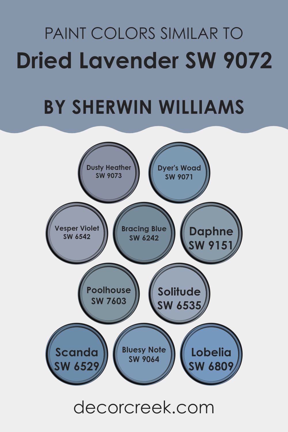
Colors Similar to Dried Lavender SW 9072 by Sherwin Williams
Using similar colors in decorating can create a harmonious and aesthetically pleasing environment. These hues, which closely resemble each other, work well together to provide a gentle and cohesive look, avoiding harsh contrasts and allowing the eyes to move smoothly from one area to another.
For instance, colors like Dusty Heather and Dyer’s Woad, both reminiscent of the subtle shades found in nature, offer a soft background that can make spaces feel larger and more open. Vesper Violet and Bracing Blue add a splash of depth, providing a calm and gentle ambiance that can enhance relaxation.
Daphne, a mild and soothing shade, works beautifully in spaces aimed at rest, like bedrooms or reading nooks. Meanwhile, Poolhouse gives off a refreshing vibe that’s perfect for livelier areas such as kitchens or bathrooms. Solitude and Scanda, with their understated elegance, are excellent for creating a soft, unified look that ties different design elements together seamlessly.
Completing this palette, Bluesy Note and Lobelia introduce a deeper, albeit still subdued, color option that can be used for accent walls or furniture, giving a room a bit of character without overwhelming the senses. Each of these colors, while distinct, shares a similar softness and depth that can easily blend to create a cohesive and inviting interior space.
You can see recommended paint colors below:
- SW 9073 Dusty Heather
- SW 9071 Dyer’s Woad
- SW 6542 Vesper Violet
- SW 6242 Bracing Blue
- SW 9151 Daphne
- SW 7603 Poolhouse
- SW 6535 Solitude
- SW 6529 Scanda
- SW 9064 Bluesy Note
- SW 6809 Lobelia
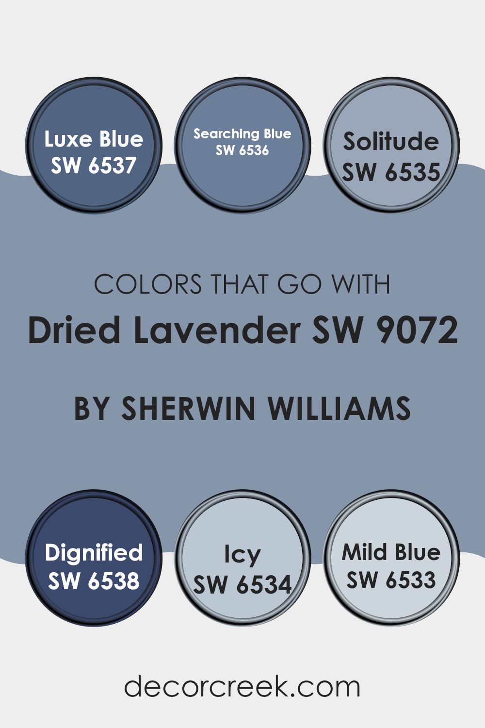
Colors that Go With Dried Lavender SW 9072 by Sherwin Williams
Choosing colors that complement Dried Lavender SW 9072 by Sherwin Williams is crucial in achieving a harmonious and appealing look in any space. Dried Lavender is a unique hue that can be matched with various colors to create different moods and styles in a room. Pairing it with the right colors can enhance its beauty and make the decor feel coordinated and well thought out.
Luxe Blue SW 6537 is a rich and vibrant shade that adds a deep contrast to the softness of Dried Lavender. It brings a bold look that can make a statement in any setting. Searching Blue SW 6536, on the other hand, provides a slightly more understated option with a hint of mystery, perfect for creating a balanced yet dynamic atmosphere.
Solitude SW 6535 offers a lighter, airier feel that pairs well with Dried Lavender by reflecting a calm and inviting vibe. Dignified SW 6538 introduces a strong, traditional blue that leans into a more formal look. For those looking to add a crisp and refreshing touch, Icy SW 6534 is an excellent choice due to its very light and almost airy quality, which can brighten up spaces significantly.
Clearly, Mild Blue SW 6533 gives a soft and gentle finish that complements the subdued quality of Dried Lavender exceptionally, making it ideal for spaces aiming for a gentle and relaxed tone. These colors work together to offer versatile options for styling with Dried Lavender, ensuring that each room can exhibit a sense of harmony and personal style.
You can see recommended paint colors below:
- SW 6537 Luxe Blue
- SW 6536 Searching Blue
- SW 6535 Solitude
- SW 6538 Dignified
- SW 6534 Icy
- SW 6533 Mild Blue
How to Use Dried Lavender SW 9072 by Sherwin Williams In Your Home?
Dried Lavender SW 9072 by Sherwin Williams is a beautiful paint color that brings a subtle, soft purple hue into your home. It’s perfect for creating a cozy, warm atmosphere in rooms where you want to relax and feel comfortable. You can use this color in various places such as your bedroom or living room to add a touch of calmness without being too bold.
This shade works well on walls and can also be used for painting furniture or accent pieces. If you prefer something less permanent, consider using Dried Lavender for smaller projects like picture frames or a bookshelf. It pairs nicely with light grays, creams, and even some greens for a natural, grounded look.
When decorating, you don’t need a lot of other colors to make a room feel complete. Dried Lavender offers a gentle pop of color and goes well with both light woods and white trim for a fresh and inviting space. Whether you want a full room makeover or just a splash of new color, this paint can help you freshen up your space beautifully.
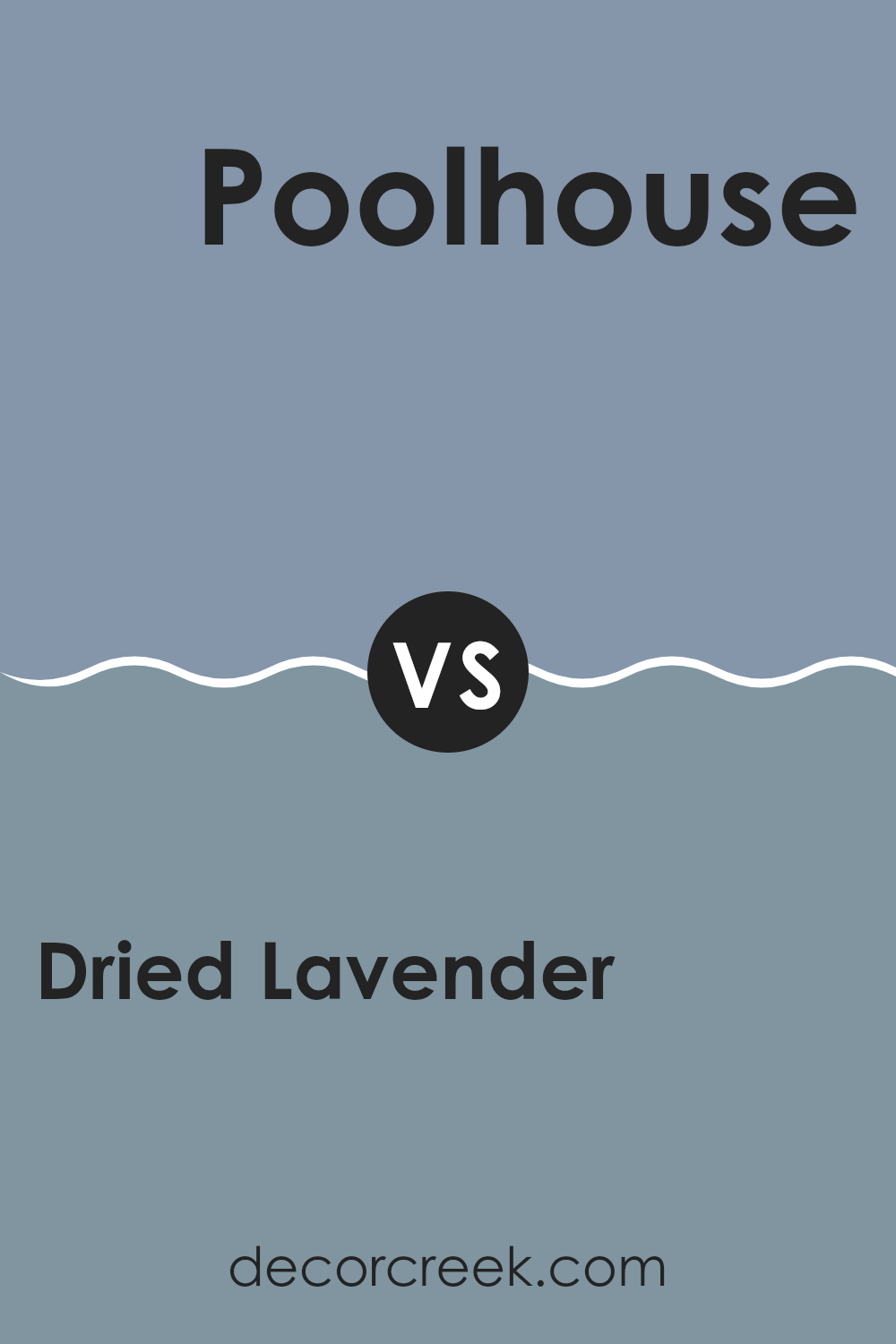
Dried Lavender SW 9072 by Sherwin Williams vs Poolhouse SW 7603 by Sherwin Williams
Dried Lavender and Poolhouse by Sherwin Williams are two distinct paint colors, each setting a unique mood for any space. Dried Lavender is a subtle, muted shade of purple with gray tones, providing a calm and soft feel. It’s versatile, fitting well in bedrooms or living areas where a gentle backdrop is desired.
On the other hand, Poolhouse is a vibrant aqua blue that brings a lively and refreshing touch. It’s perfect for bathrooms or as an accent wall in a living space, injecting energy and brightness into the room.
Both colors have their charms and work beautifully depending on the atmosphere you want to create. Dried Lavender leans towards a quiet, understated elegance, while Poolhouse offers an upbeat and cheerful vibe.
You can see recommended paint color below:
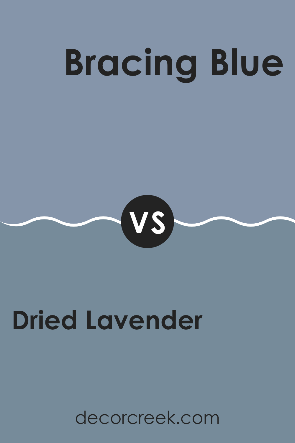
Dried Lavender SW 9072 by Sherwin Williams vs Bracing Blue SW 6242 by Sherwin Williams
The main color, Dried Lavender, is a soft, muted purple with hints of gray, giving it a calm and cozy feel. It works well in spaces meant for relaxation, like bedrooms or living rooms, as it adds a gentle touch of color without being overwhelming.
On the other hand, Bracing Blue is a deeper, more intense color with a navy tone that suggests a sense of strength and reliability. It’s ideal for creating a bold statement in areas like an office or a dining room, where its rich hue can establish a feeling of confidence and stability.
Both colors serve distinct purposes in home decor, with Dried Lavender leaning towards a soothing effect, while Bracing Blue offers a more striking visual impact. Choosing between them depends on the mood and style you want to achieve in your space.
You can see recommended paint color below:
Dried Lavender SW 9072 by Sherwin Williams vs Bluesy Note SW 9064 by Sherwin Williams
“Dried Lavender” and “Bluesy Note” are two distinctive colors by Sherwin Williams that bring different vibes to a space. Dried Lavender is a soft, muted purple with hints of gray, making it a subtle choice that doesn’t overwhelm a room.
It works well in areas where a calm and gentle touch is desired, like bedrooms or living spaces. On the other hand, Bluesy Note is a deeper shade, leaning towards a rich navy with hints of slate. This color is perfect for adding a bit of drama and depth to any space, suitable for accent walls or furniture pieces to make them stand out.
Though both colors are not bold, each holds its own charm and can dramatically alter the feel of a room depending on how they’re used. They are versatile enough for various decor styles, from modern to traditional.
You can see recommended paint color below:
- SW 9064 Bluesy Note

Dried Lavender SW 9072 by Sherwin Williams vs Dyer’s Woad SW 9071 by Sherwin Williams
Dried Lavender is a gentle gray with a subtle hint of lavender, making it a soft and calming choice for spaces meant to relax in. Its muted tones are versatile, perfect for both modern and traditional décor, and wonderful for creating a cozy ambiance.
On the other hand, Dyer’s Woad offers a slightly darker and richer feel due to its deeper blue-gray hue. This color can add a touch of elegance and depth to a room without being too bold. It works well in areas where you might want to add a bit of weight or impact, like an accent wall or in a study.
Both colors share a similar softness and neutrality but evoke different moods due to their undertones. Dried Lavender pulls in more purple, lending a warmer touch, while Dyer’s Woad leans towards a cooler, more formal blue. Choosing between them depends on the feel you want for your room and how the color interacts with the light and furnishings in your space.
You can see recommended paint color below:
- SW 9071 Dyer’s Woad
Dried Lavender SW 9072 by Sherwin Williams vs Scanda SW 6529 by Sherwin Williams
The main color, Dried Lavender, is a soft, muted purple that has a gentle and cozy feel. It gives off a calm vibe, making it perfect for peaceful spaces like bedrooms or quiet sitting areas. On the other hand, Scanda is a light, airy blue with a clear and refreshing quality. This shade is great for creating a bright and open feel in a room, making it ideal for bathrooms or small spaces to make them appear larger.
Both colors are versatile and can work well in various parts of a home, but they set different moods. Dried Lavender tends to create a more warm and inviting atmosphere, which can help in spaces where relaxation is key. Scanda, with its crispness, is more about freshness and clarity, suitable for lively spaces or places that need a touch of brightness.
Combining them could also work nicely, as the cool tones of Scanda can complement the depth of Dried Lavender, offering a balanced and harmonious color scheme.
You can see recommended paint color below:
- SW 6529 Scanda
Dried Lavender SW 9072 by Sherwin Williams vs Solitude SW 6535 by Sherwin Williams
Dried Lavender and Solitude by Sherwin Williams are two distinct shades that bring unique vibes to any space. Dried Lavender has a subtle, muted purple tone that gives off a gentle and calming feel, perfect for creating a cozy atmosphere in bedrooms or living spaces. It pairs well with soft whites and light wood finishes for a balanced look.
On the other hand, Solitude is a soft, airy blue with a soothing presence that can make rooms feel more open and relaxed. It’s an excellent choice for bathrooms or offices where a peaceful, refreshing environment is desired. This color works beautifully with darker blues and greys for a more modern aesthetic.
Both colors are versatile and can be used to achieve different styles depending on the accompanying decor. While Dried Lavender tends to add a warm touch, Solitude leans towards creating a crisp, refreshing mood.
You can see recommended paint color below:
Dried Lavender SW 9072 by Sherwin Williams vs Vesper Violet SW 6542 by Sherwin Williams
Dried Lavender and Vesper Violet, both by Sherwin Williams, offer distinct yet subtle hues for any space. Dried Lavender is a muted purple with a grayish tone, giving it a soft and calming presence. This makes it a great choice for creating a cozy and gentle atmosphere in rooms where you spend a lot of relaxing time, like bedrooms or living areas.
On the other hand, Vesper Violet is deeper and richer, leaning more heavily on the purple side. This color is impactful and can add a touch of drama or boldness to a space without overwhelming it. Its depth makes it suitable for accent walls or furniture pieces that you want to stand out.
When looking for a soothing, neutral color, Dried Lavender is the go-to, while Vesper Violet is excellent for injecting more vibrancy and character into a room. Both colors are quite versatile and can be used in various design styles, from modern to traditional.
You can see recommended paint color below:
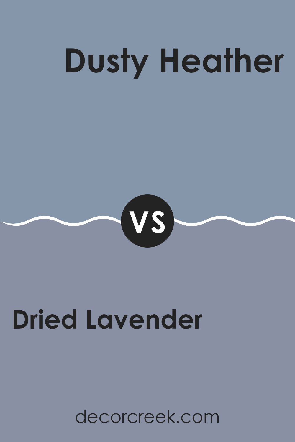
Dried Lavender SW 9072 by Sherwin Williams vs Dusty Heather SW 9073 by Sherwin Williams
“Dried Lavender” is a soft, subtle gray with a gentle touch of lavender. It’s a quiet color that feels soothing and easy to match with other shades. It brings a light, airy feel to a room, making it perfect for spaces like bedrooms or living areas where you want a calming atmosphere.
On the other hand, “Dusty Heather” is slightly deeper than “Dried Lavender” and leans more towards the purple side. This color is still understated but has a bit more presence due to its richer hue. It can add a touch of warmth and depth to spaces, making it great for areas where you want a bit more color without overwhelming the senses.
Both colors are gentle and easy on the eyes, but “Dusty Heather” offers a bit more vibrancy. When choosing between the two, consider how much color impact you want in your space. “Dried Lavender” is ideal for a lighter, breezier feel, while “Dusty Heather” suits a slightly bolder, yet still soft, aesthetic.
You can see recommended paint color below:
- SW 9073 Dusty Heather
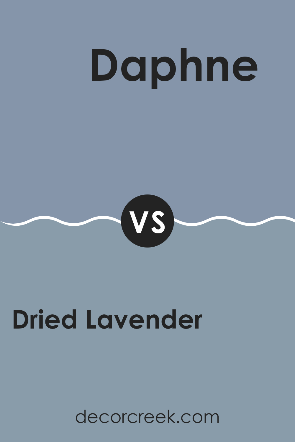
Dried Lavender SW 9072 by Sherwin Williams vs Daphne SW 9151 by Sherwin Williams
Dried Lavender and Daphne are two distinct colors by Sherwin Williams, each with its own unique appeal. Dried Lavender has a soft, muted tone that resembles the pale purple hue of lavender flowers. It’s a gentle color that brings a calm and relaxing feel to spaces, perfect for bedrooms or living areas where you want a peaceful atmosphere.
On the other hand, Daphne is a deeper, more vibrant shade. This color stands out more and has a regal presence, making it a great choice for accent walls or areas where you want to add a splash of richness. Its boldness is balanced by its warmth, which can make a room feel cozy and inviting.
In summary, while Dried Lavender offers a subtle and soothing vibe, Daphne brings warmth and a more vivid color impact. Each can set a very different mood and style in a space depending on what you’re aiming for in your decorating project.
You can see recommended paint color below:
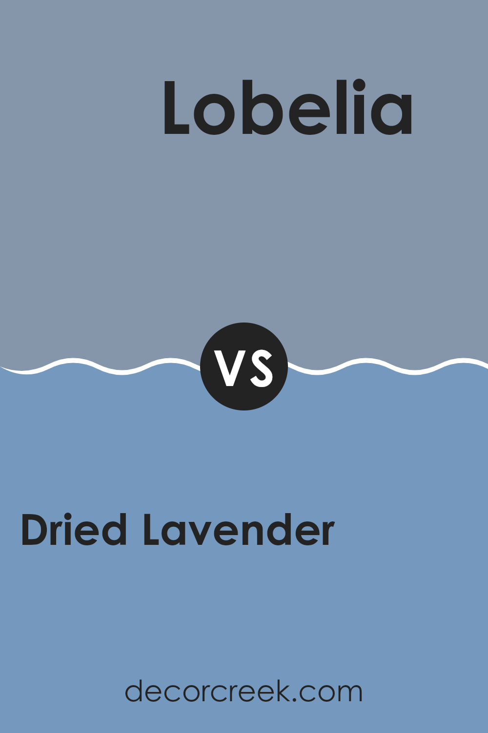
Dried Lavender SW 9072 by Sherwin Williams vs Lobelia SW 6809 by Sherwin Williams
Dried Lavender by Sherwin Williams is a subtle, soft purple with gray undertones, giving it a muted and calming feel. It works well in spaces that aim for a gentle and soothing ambiance. This color is versatile enough to be used in various rooms, including bedrooms or living areas, and pairs nicely with both light and dark accents.
On the other hand, Lobelia by Sherwin Williams is a much deeper and vivid shade of blue. It has a bold and energetic vibe, making it a striking choice for areas where you want to make a statement, like an accent wall or a powder room. Because of its intensity, it might seem slightly overwhelming in larger areas but can really liven up smaller spaces.
Though both colors come from the same family of cool tones, Dried Lavender is more understated and calming, while Lobelia is vibrant and dynamic, suitable for different purposes in home decor.
You can see recommended paint color below:
- SW 6809 Lobelia
Conclusion
After learning all about SW 9072 Dried Lavender by Sherwin Williams, I can definitely say it’s a pretty cool paint color! It’s not just plain purple but has a bit of gray mixed in, which makes it really unique. It looks great in so many different rooms, whether it’s a cozy corner in a bedroom or a spot for reading in the living room.
What I like most is how it can make any room feel calm and happy, without being too bright or too dark. It works well with lots of other colors, from soft whites to bold blacks, and adds a nice touch to furniture and accessories too.
For anyone thinking about giving their room a new look, Dried Lavender is a wonderful choice. It’s not just another purple; it’s a special shade that adds just the right amount of color and makes any room look beautiful. So if you’re thinking about changing up your room, this color could be the perfect way to do it!
Ever wished paint sampling was as easy as sticking a sticker? Guess what? Now it is! Discover Samplize's unique Peel & Stick samples.
Get paint samples

