Nature-inspired hues bring a tranquil ambiance to interiors, and Sherwin-Williams SW 6450 Easy Green is no exception. This versatile shade exudes an air of calmness and serenity, making it a perfect choice for various settings.
In this article, we will explore the nuances of SW Easy Green and understand how to use this soothing shade in your space best.
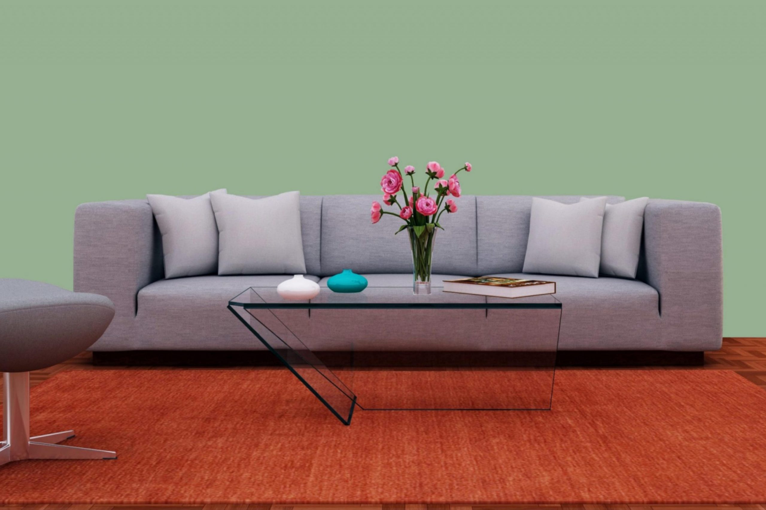
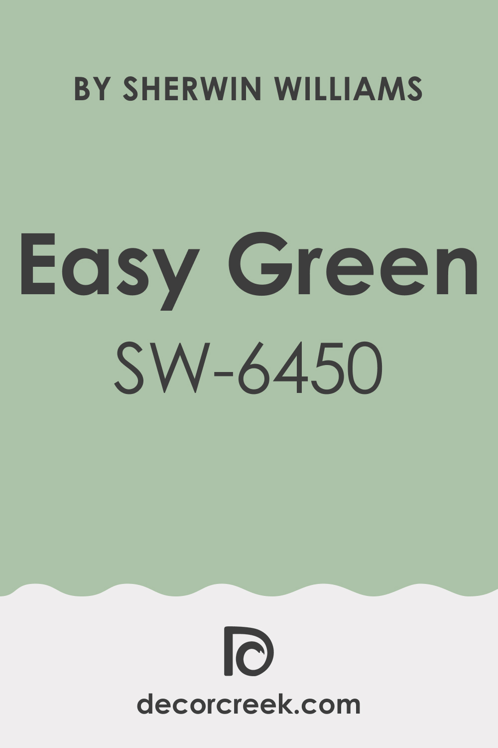
What Color Is SW 6450 Easy Green? Is It a Warm Or Cool Color?
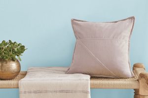
Depending on whether a color is warm or cool, it will create a specific atmosphere in your home. As Hextoral says, SW Easy Green is a mid-tone green color that embodies the essence of lush, verdant foliage. It’s like bringing the outdoors into your living space. It leans towards the cooler side of the color spectrum but has a hint of warmth to it, making it feel inviting and comfortable.
Ever wished paint sampling was as easy as sticking a sticker? Guess what? Now it is! Discover Samplize's unique Peel & Stick samples.
Get paint samples
What Are the Undertones of SW Easy Green Paint Color?
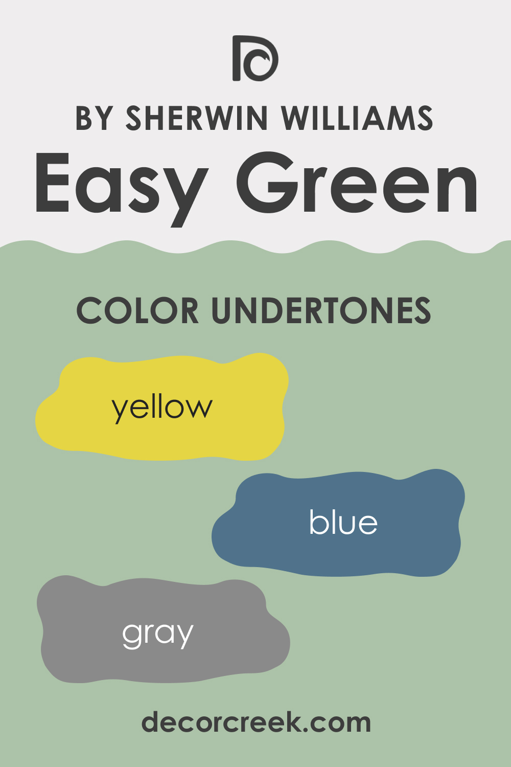
Understanding the undertones of color can help you determine how it will interact with other colors in your space. The undertones of SW 6450 Easy Green include:
- Yellow: This undertone enhances the liveliness of Easy Green, giving it an energetic, spring-like feel.
- Blue: A slight blue undertone adds depth to the color, making it cooler and more tranquil.
- Gray: The presence of a gray undertone mutes the vibrancy of Easy Green, giving it a softer, more sophisticated appearance.
Coordinating Colors of SW 6450 Easy Green
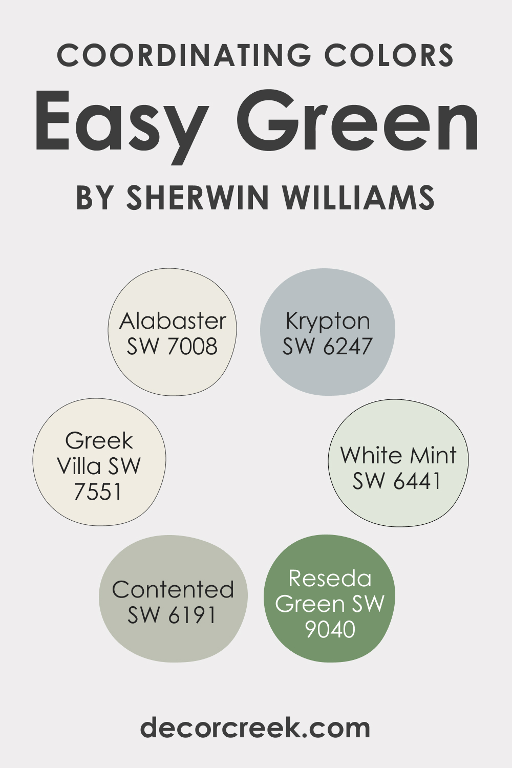
Coordinating colors can help create a cohesive look in your space. Here are the coordinating colors for SW 6450 Easy Green, along with brief explanations:
- SW 6441 White Mint: A refreshing, crisp white with a slight hint of green that can add brightness to any space when paired with Easy Green.
- SW 7551 Greek Villa: This is a warm, creamy white that can offer a pleasant contrast to the cooler Easy Green.
- SW 9040 Reseda Green: A deeper, more muted green that can add depth and sophistication when used alongside Easy Green.
To round off the palette, consider these additional colors:
- SW 7008 Alabaster: This true neutral white can provide a clean, refreshing contrast to Easy Green.
- SW 6247 Krypton: A cool, gray-blue hue that can complement the cool undertones of Easy Green.
- SW 6191 Contented: A soft, muted green that creates a gradient effect when paired with Easy Green.
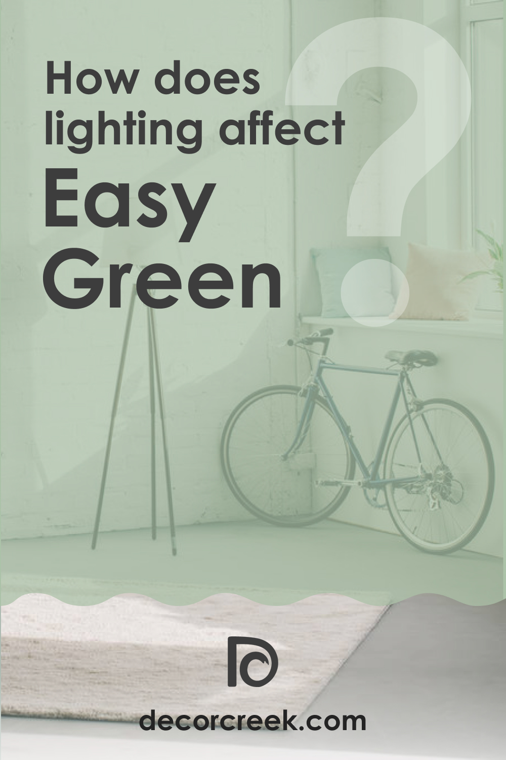
How Does Lighting Affect SW 6450 Easy Green Paint Color?
Lighting can significantly impact the appearance of paint colors. In ample natural light, SW Easy Green appears brighter and more vibrant. The yellow undertones may be more pronounced, making the color feel more energetic and lively.
In artificial light, especially warm light, the color can appear slightly more subdued, and the gray undertones become more noticeable. It’s always a good idea to observe how the color changes in different lighting conditions before making your final decision.
LRV of SW 6450 Easy Green Paint Color
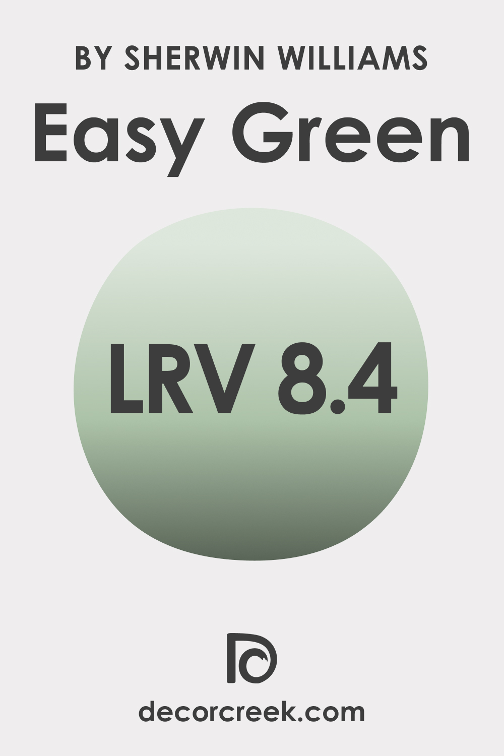
The Light Reflectance Value (LRV) measures the amount of light a color reflects. The higher the LRV value is, approaching 100, the lighter the color. Respectively, the closer the LRV value is to zero, the darker the hue.
SW Easy Green has an LRV of 8,4, which is right in the middle of the scale. This makes it a balanced color – neither too dark nor too light. It’s a versatile choice that can work well in a variety of spaces, whether small or large, without making the room feel too enclosed or overly bright.
Its balanced LRV means it can absorb and reflect a fair amount of light, adding depth and interest to a space without overpowering it.
LRV – what does it mean? Read This Before Finding Your Perfect Paint Color
Trim Colors of SW 6450 Easy Green
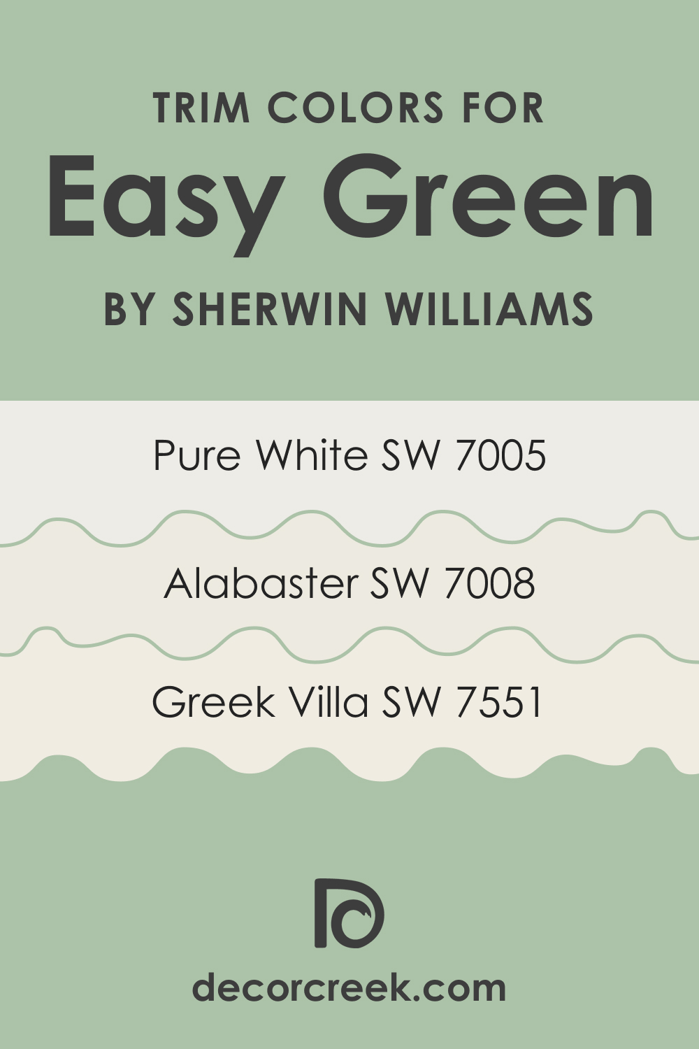
Choosing the right trim color can help highlight architectural details and create a cohesive look. For SW 6450 Easy Green, consider the following Sherwin-Williams whites:
- SW 7005 Pure White: This clean, bright white can provide a refreshing contrast to Easy Green.
- SW 7008 Alabaster: A true neutral white, Alabaster can create a subtle, harmonious look when paired with Easy Green.
- SW 7551 Greek Villa: This warm, creamy white can soften the coolness of Easy Green, creating a balanced, inviting look.
Colors Similar to SW 6450 Easy Green
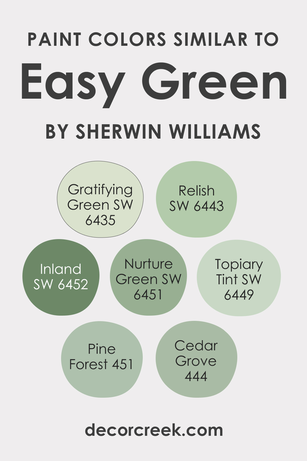
If you are not sure whether SW Easy Green will suit your interior palette, consider having a few alternative colors at hand. Here are some Sherwin-Williams colors that are slightly different but similar to SW Easy Green:
- SW 6451 Nurture Green: A softer, more muted green with gray undertones.
- SW 6449 Topiary Tint: A lighter, more pastel shade of green.
- SW 6452 Inland: A green-gray color that is slightly more subdued and earthy.
- SW 6435 Gratifying Green
Also, you might want to check out several color options from other paint brands that can work as SW Easy Green substitutes:
- Relish (SW 6443)
- BM Pine Forest (451)
- BM Cedar Grove (444)
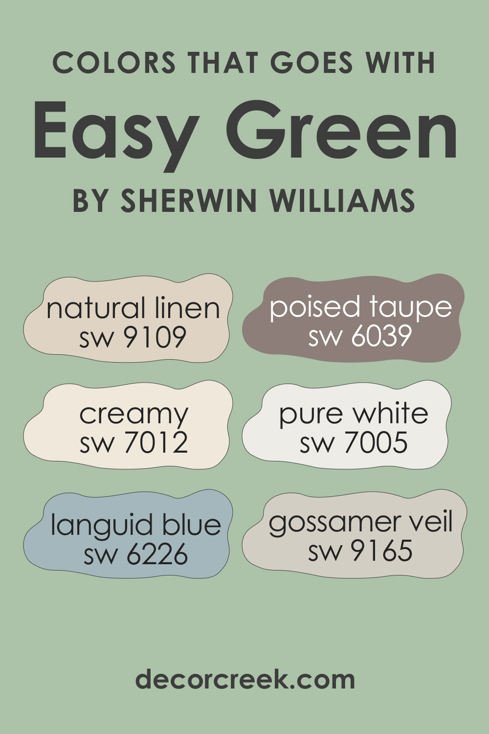
Colors That Go With SW 6450 Easy Green
To achieve a balanced and appealing palette in your home that looks welcoming, you should know what colors will work with the hue you use on the walls. For SW Easy Green, opt for the following paint colors:
- SW 7005 Pure White: For a clean, fresh look.
- SW 6039 Poised Taupe: To add a warm, earthy contrast.
- SW 9165 Gossamer Veil: A soft gray that complements Easy Green’s cool undertones.
- SW 9109 Natural Linen: This neutral beige provides a warm balance.
- SW 6226 Languid Blue: For a cool, calming palette.
- SW 7012 Creamy: A rich, creamy color that offers a pleasant contrast.
How to Use SW Easy Green In Different Rooms of Your Home?
Here you can read how SW Easy Green may work in different rooms of your house or apartment. This way, you can better imagine what to expect from this green color and in what space it will work best.
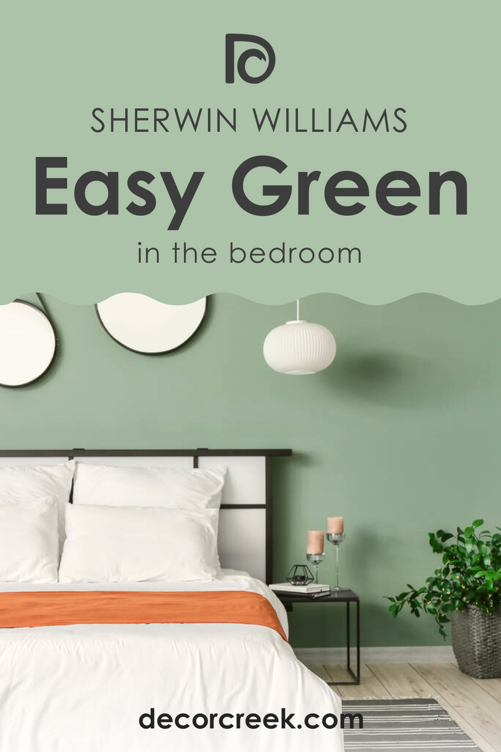
Easy Green SW 6450 In the Bedroom
SW Easy Green can create a tranquil and relaxing atmosphere in a bedroom. Consider painting all walls in SW Easy Green for a monochromatic look, or use it on the accent wall to create a focal point. Pair it with crisp white bedding and light wood furniture for a clean, nature-inspired aesthetic.
Alternatively, use it in combination with deep blues or grays for a sophisticated, contemporary look. The color works beautifully with natural materials such as wood and rattan, which can add texture and warmth to the space.
Easy Green SW 6450 In the Bathroom
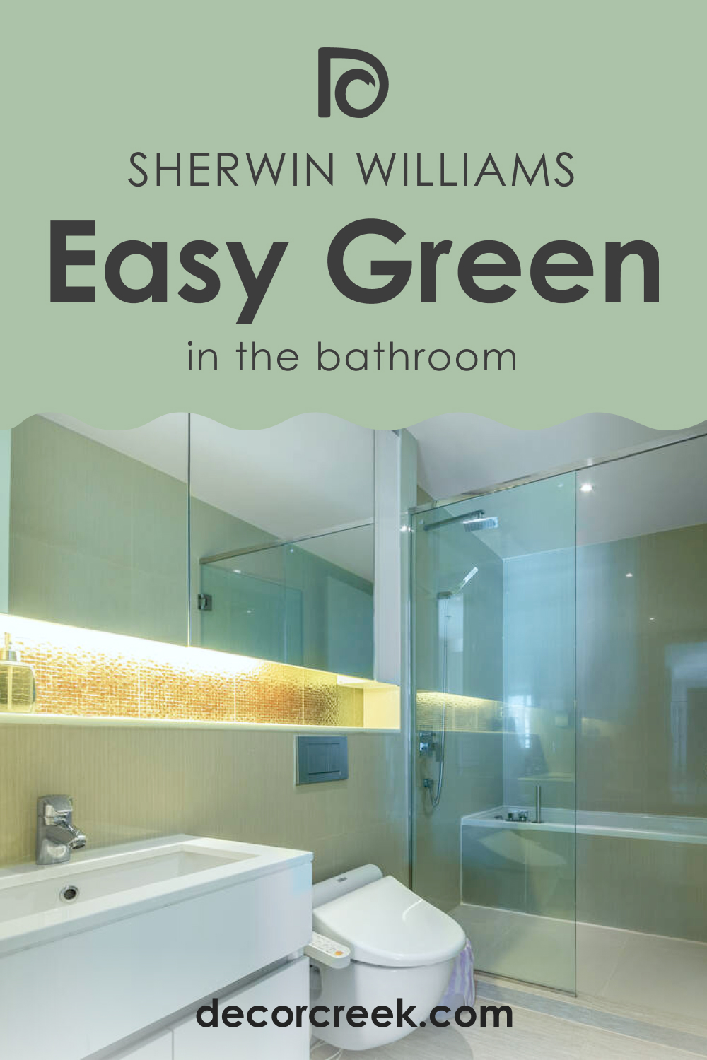
SW Easy Green can bring a spa-like serenity to a bathroom. Combine it with white fixtures and finishes for a fresh, clean look. Or pair it with brass or gold fixtures to add a touch of luxury.
For a more dramatic effect, consider painting the entire bathroom, including the ceiling, in SW Easy Green. This can create a cocoon-like feel, making the bathroom a perfect place for relaxation and rejuvenation.
Easy Green SW 6450 In the Living Room
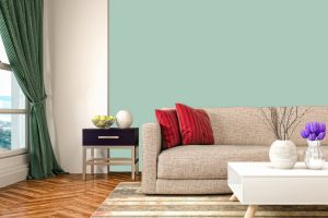
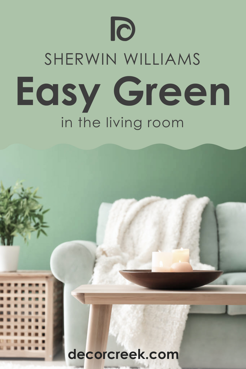
SW Easy Green can add a calming, balanced feel to a living room. Use it on all walls for a harmonious look or on an accent wall to add a touch of nature-inspired vibrancy. Pair it with white or light-colored furniture to create contrast or with wooden furniture to create a warm, earthy vibe.
The color also works wonderfully with a variety of textures and materials. Leather furniture, chunky knitted throws, or sleek modern pieces can all look stunning against an SW Easy Green backdrop. The key is to balance the richness of the color with lighter or contrasting elements to prevent the room from feeling too heavy.
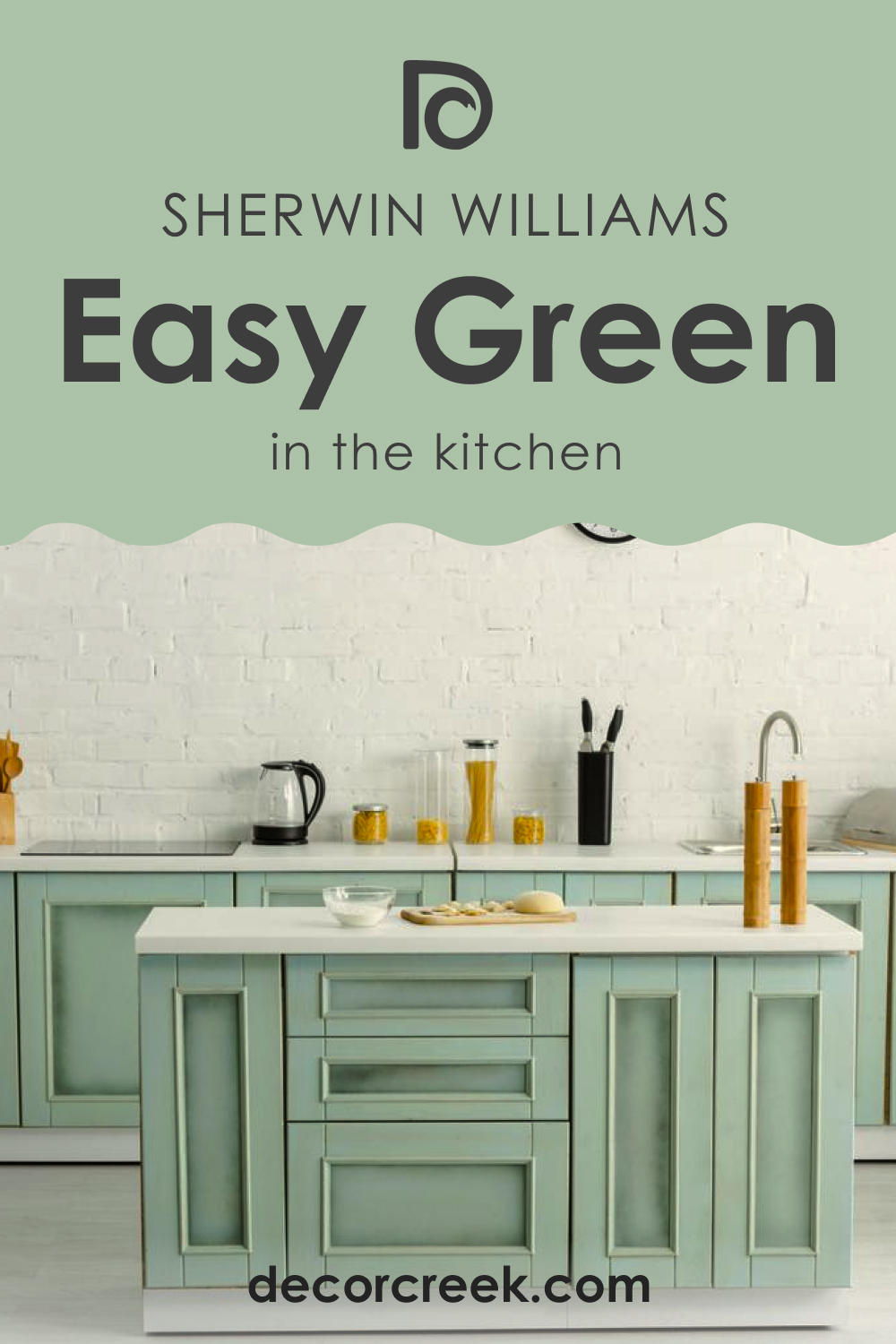
Easy Green SW 6450 In the Kitchen
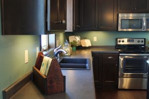
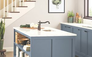
SW Easy Green is a bold yet timeless choice for kitchen cabinets. Paired with a light countertop and backsplash, it can make a striking statement. Alternatively, consider using it on an island or lower cabinets paired with white or light-colored upper cabinets for a two-toned look.
For a softer look, use SW Easy Green on the walls and pair it with white or light wood cabinets. No matter how you use it, SW Easy Green can add a lively yet sophisticated touch to a kitchen.
Easy Green SW 6450 For an Exterior
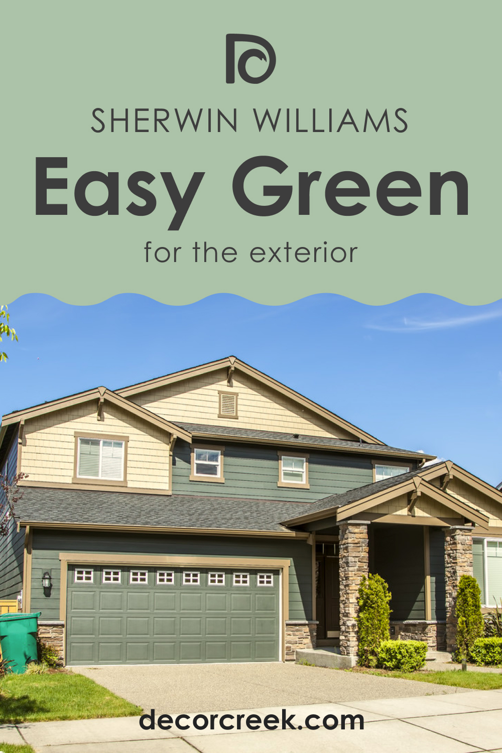
On exteriors, SW Easy Green can blend beautifully with natural surroundings while adding a touch of elegance. Use it on the front door for a welcoming entry, or paint the entire facade for a standout look. Pair it with crisp white trims for a classic appearance or with a darker color like black or deep gray for a modern twist.
It’s also a great choice for garden sheds or fences, helping them blend seamlessly with the greenery around them. Just remember to consider the surrounding elements and your home’s architectural style before making a decision.
Comparing SW Easy Green With Other Colors
Here you can read how SW Easy Green compares to other colors. This will help you better see this color’s unique features and understand how LRVs and undertones work, making colors unique.
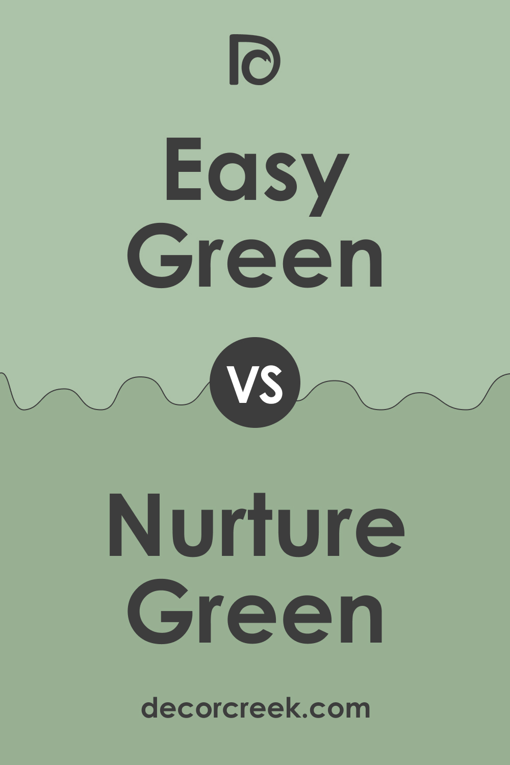
SW 6450 Easy Green vs SW 6451 Nurture Green
SW Nurture Green is a more muted, earthy tone than Easy Green, with more pronounced gray undertones. It is a subtler and less vibrant hue, perfect for those looking for a more understated, neutral green. In comparison, Easy Green is more lively and bright, bringing a refreshing burst of nature into the space.
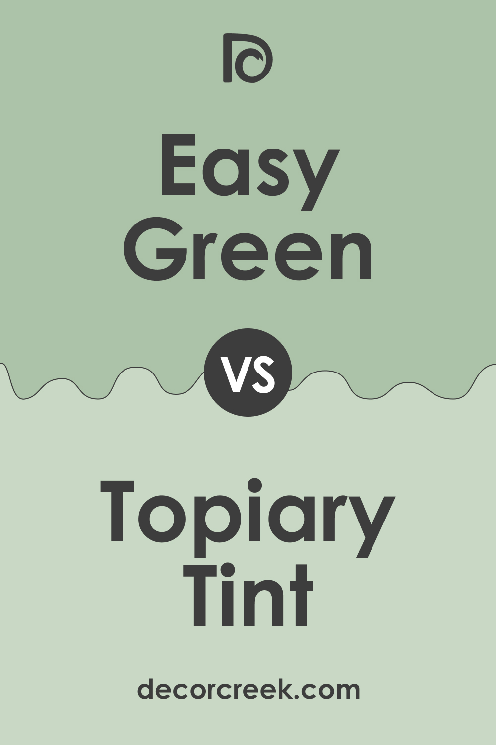
SW 6450 Easy Green vs SW 6449 Topiary Tint
SW Topiary Tint is a lighter, pastel shade of green, softer and more subtle than Easy Green. It has a delicate, airy vibe that lends itself well to spaces where a calm, soothing atmosphere is desired. Easy Green, with its richer and more vibrant hue, brings a stronger presence of green, making it an excellent choice for those seeking a more dynamic look.
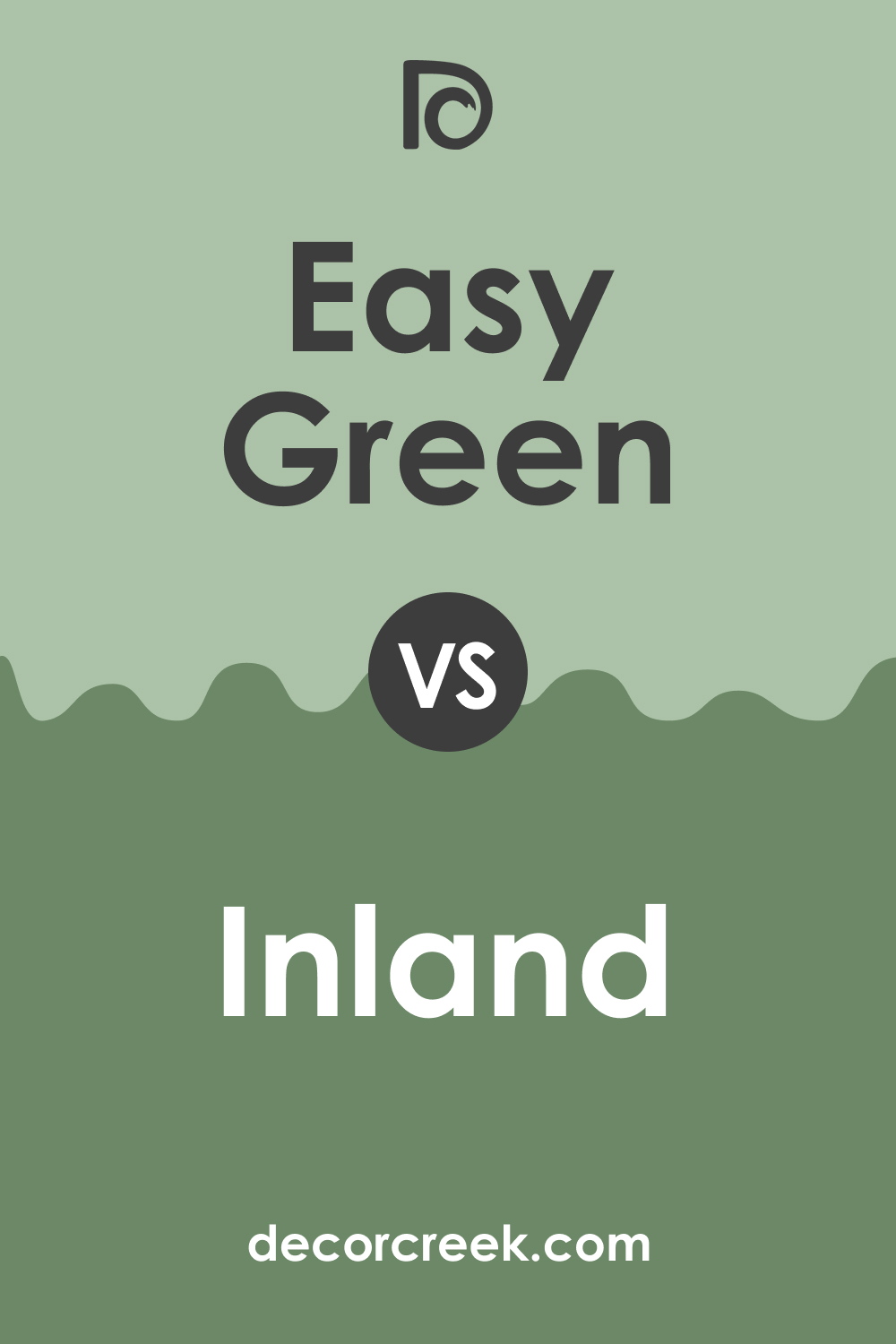
SW 6450 Easy Green vs SW 6452 Inland
SW Inland is a green-gray color, darker and more muted than Easy Green. It is a versatile neutral that can work well in a wide range of settings. Inland’s subdued nature is a contrast to the brighter, more lively vibe of Easy Green, which brings more energy to a space.
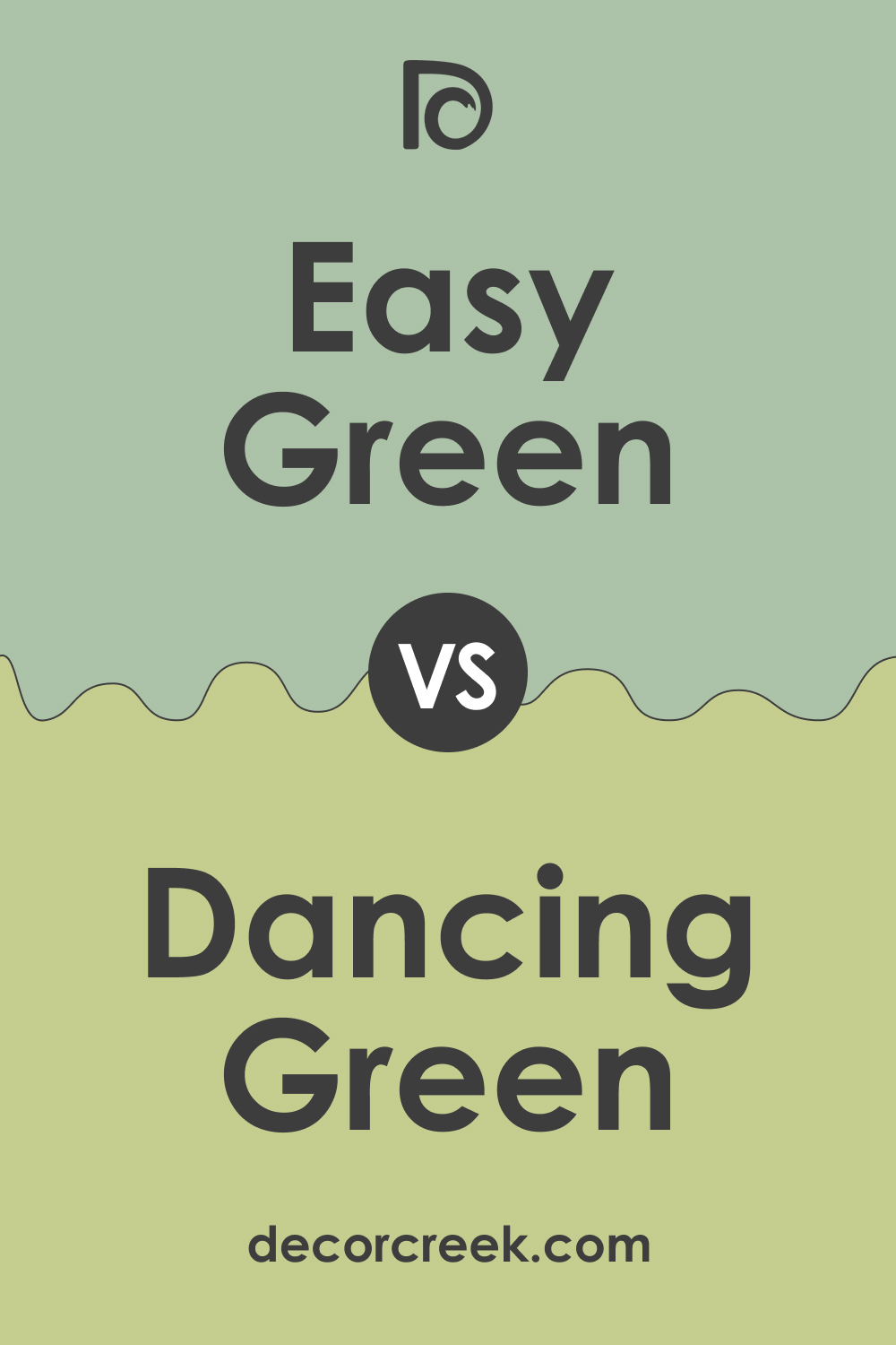
SW 6450 Easy Green vs SW 6716 Dancing Green
SW Dancing Green is a brighter, more vibrant green than Easy Green. It’s a lively color that can add a playful, energetic touch to any space. In comparison, Easy Green offers a softer, more balanced look, making it a more flexible and versatile choice for various applications.
Conclusion
Sherwin-Williams SW 6450 Easy Green is a beautifully versatile color that can bring a refreshing touch of nature into any space. Its balance of warm and cool undertones makes it a flexible choice for a wide range of applications.
Whether used as a primary color or an accent, Easy Green can enhance a room’s ambiance, making it feel tranquil and invigorating at the same time. Remember to consider lighting, accompanying colors, and the overall mood you want to create when working with this delightful shade.
Ever wished paint sampling was as easy as sticking a sticker? Guess what? Now it is! Discover Samplize's unique Peel & Stick samples.
Get paint samples
Frequently Asked Questions
⭐Is SW 6450 Easy Green a warm or cool color?
SW Easy Green leans more towards a cool color due to its predominantly green hue, although it has a balance of warm and cool undertones that make it incredibly versatile.
⭐What are the undertones of SW 6450 Easy Green?
SW Easy Green has a blend of yellow and gray undertones, creating a balance between cool and warm hues. These undertones make the color adaptable in various lighting situations and complementary to a wide range of color schemes.
⭐What colors coordinate well with SW 6450 Easy Green?
SW Easy Green pairs well with both warm and cool colors. For a fresh, clean look, consider pairing it with whites such as SW 7005 Pure White or SW 7551 Greek Villa. For a more dynamic contrast, colors like SW 6039 Poised Taupe or SW 6226 Languid Blue can be excellent choices.
⭐How does lighting affect SW 6450 Easy Green?
Like all paint colors, Easy Green can appear differently depending on the lighting conditions. Under natural daylight, it may appear brighter and more vibrant, while under artificial lighting, it may appear more muted and earthy. It's always recommended to test a small swatch on the wall and observe it at different times of the day before finalizing your decision.
⭐Can SW 6450 Easy Green be used for exteriors?
Absolutely. SW Easy Green is a versatile color that can be used both indoors and outdoors. When used on exteriors, it can blend beautifully with natural surroundings and is particularly striking when paired with crisp white trims or dark accents.


