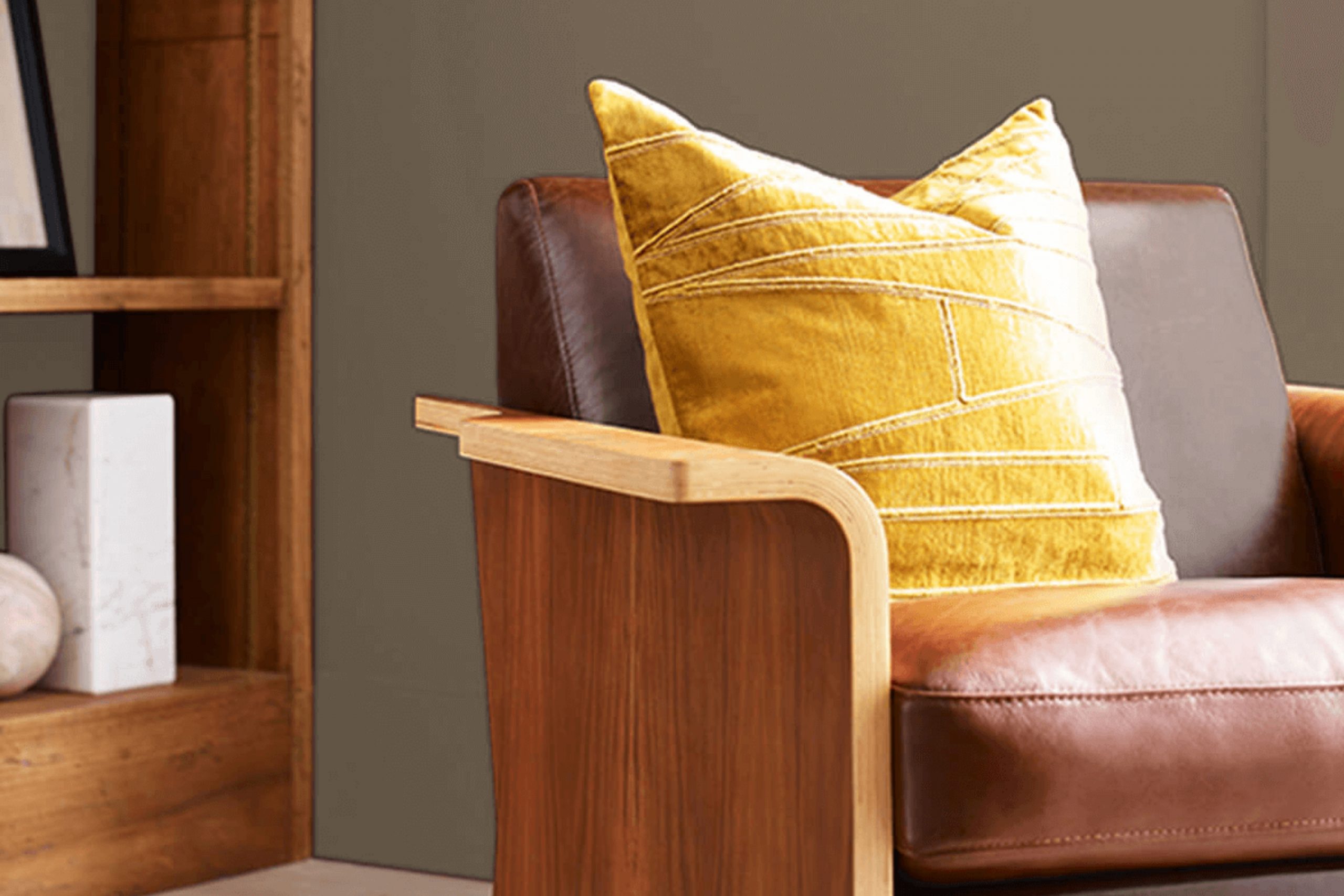
Colors have the power to influence the mood and style of our homes. As someone who’s always looking to create warm and inviting areas, I find that the right shade can truly make a difference. That’s why I was drawn to Sherwin Williams’ SW 6152 Superior Bronze, a rich and earthly hue that adds a touch of welcoming depth to any room.
This elegant bronze tone blends beautifully with natural elements and materials like wood and stone, enhancing the cozy feel of an area. Whether you’re thinking about revamping your living room, bedroom, or even the kitchen, Superior Bronze offers a flexible backdrop that complements both modern and traditional décor.
Using Superior Bronze on the walls, you can easily pair it with lighter shades like creams and soft whites for a balanced look, or you can opt for bold contrast with bright accents and dark furnishing for a more dramatic effect.
If you’re unsure how to incorporate such a distinct color into your decor, my experience with SW 6152 Superior Bronze might give you some useful insights and ideas.
What Color Is Superior Bronze SW 6152 by Sherwin Williams?
Superior Bronze is a warm, inviting hue that resembles a soft, sunlit piece of worn leather or the rich, earthy tones found in a dense forest. It’s an adaptable color that adds coziness and depth to any room. This shade sits perfectly between a robust brown and a subtle hint of gray, making it comforting yet distinctive.
In terms of interior styles, Superior Bronze works exceptionally well in rustic settings where natural elements are key. It also complements traditional areas that display elegant woodworks and classic furnishings. This color can be a standout in modern minimalist designs too, bringing warmth to an often cool palette.
When it comes to materials, Superior Bronze pairs beautifully with raw, natural textures like linen, burlap, and unpolished wood. Against these materials, it stands out, but harmoniously so, providing a backdrop that feels both grounded and inviting.
It also looks elegant when matched with metallic finishes such as brass or copper, adding a touch of glamour without overpowering the area. Leather furniture and accents amplify its warmth, creating an inviting ambiance that’s hard to resist. Whether used as a main color for walls or as an accent in accessories, Superior Bronze blends well, ensuring a harmonious yet dynamic interior atmosphere.
Is Superior Bronze SW 6152 by Sherwin Williams Warm or Cool color?
Superior Bronze by Sherwin Williams is a warm and inviting paint color that brings a cozy feel to any room in a home. This particular shade is a blend of deep brown with hints of red, creating a rich and welcoming atmosphere. It works especially well in areas where you want to add a touch of elegance without making the room feel too dark.
Since it’s a darker color, it pairs beautifully with lighter accents such as creamy whites or soft beiges, which help to balance out the intensity of the bronze tone. In living rooms or dining areas, Superior Bronze can make the area feel more grounded and comfortable, ideal for relaxing or hosting guests.
In bedrooms, it adds a cozy, nest-like feel, perfect for a restful night. It’s also great for accent walls, highlighting artwork or furniture, and can be complemented with natural wood or metallic finishes to create a homely yet stylish look. For those looking to add a bit of warmth and character to their home, this color is a reliable choice.
Undertones of Superior Bronze SW 6152 by Sherwin Williams
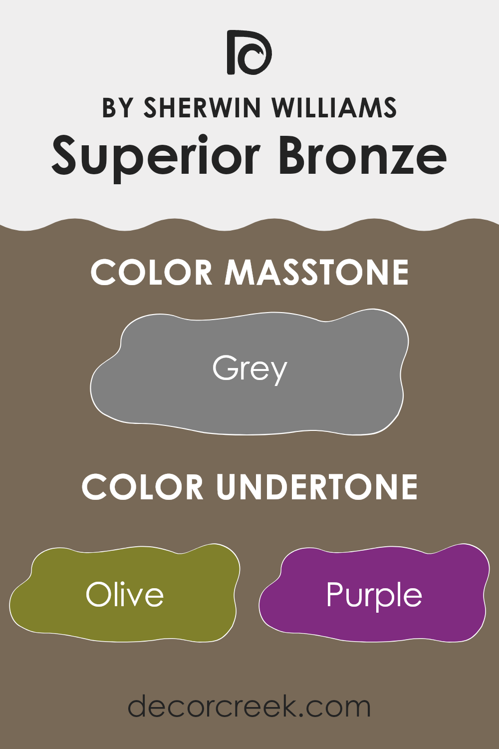
Superior Bronze is a complex paint color with a rich blend of undertones that include olive, purple, brown, and many other subtle tones. Undertones are the underlying hints of color that are seen when light hits a surface, and they play a crucial role in how we perceive the main color.
For instance, in different lighting conditions, Superior Bronze might show more of its olive undertones in one room, while in another area with different lighting, the brown or purple undertones might be more noticeable.
When used on interior walls, the various undertones of Superior Bronze can significantly affect the mood and appearance of an area. For example, the olive and brown undertones can make a room feel warm and cozy, creating a welcoming atmosphere. The subtle hints of purple and dark turquoise can add a unique character and depth, making the walls stand out in a refined yet accessible way.
In areas with ample natural light, the lighter undertones such as light green and pale pink might become more visible, softening the overall look and feel of the area. Conversely, in areas with less light, the darker undertones like navy and dark grey might become more dominant, giving the area a more grounded and enclosed feel.
Overall, the diverse undertones of Superior Bronze make it a flexible choice for various interior styles and settings, affecting how the area feels and how colors and furniture within the room appear in conjunction with the walls.
What is the Masstone of the Superior Bronze SW 6152 by Sherwin Williams?
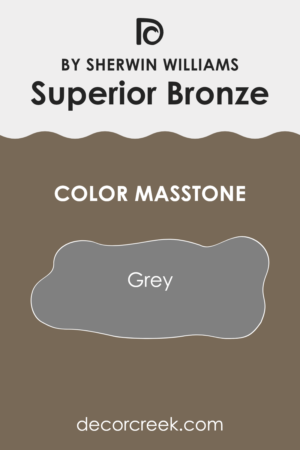
Superior Bronze SW 6152 by Sherwin Williams, with a masstone of Grey (#808080), offers a subdued and adaptable color option for home interiors. This neutral grey works well in various areas because it blends seamlessly with different decor styles, from modern to traditional.
Its grey hue provides a balanced backdrop that can enhance furnishings without overpowering them. This color is particularly effective in rooms that require a calming atmosphere, like bedrooms or home offices. It pairs nicely with both bright colors, bringing a lively contrast, or with other neutrals for a more cohesive look.
The flexibility of this shade makes it a practical choice for those looking to refresh their walls without committing to a bold color that might restrict their decorating options in the future. This color’s ability to work harmoniously with other shades also means fewer headaches when choosing matching accessories or furniture, simplifying the decorating process.
How Does Lighting Affect Superior Bronze SW 6152 by Sherwin Williams?
Lighting plays a crucial role in how we perceive colors. The type of light and its intensity can greatly influence the appearance of a color in an area. For example, artificial lighting, such as LED or fluorescent lights, can alter how a color is viewed compared to natural sunlight.
Considering the color Superior Bronze, a rich and warm hue, its appearance varies under different lighting conditions. In artificial light, especially warm white LEDs, Superior Bronze tends to look more intense and vivid. The yellow and orange undertones in the light enhance the warmth of the color, making it feel cozy and inviting. In cooler artificial light, like that from fluorescent bulbs, the color might appear slightly muted and less vibrant.
In natural light, Superior Bronze also behaves differently throughout the day and depending on the orientation of the area. In a north-facing area, which receives less direct sunlight and tends to have cooler, softer light, Superior Bronze might appear slightly darker and less dynamic. The lack of intense light can make it lean more towards a subtle and soothing earth tone.
In south-facing areas, where sunlight is abundant throughout the day, Superior Bronze can truly shine. The ample natural light brings out the depth and richness of the color, making the area feel warm and lively. This exposure is ideal for showcasing the true beauty of Superior Bronze.
East-facing areas receive strong light in the morning when the sun rises. Here, Superior Bronze will look brightest in the morning, offering a cheerful and vibrant ambiance that softens as the day progresses and the natural light diminishes.
West-facing areas experience the opposite effect; the color will look softer during the morning and become more pronounced and warmer in the afternoon to evening as the sun sets. This can make the area feel welcoming and snug, especially towards the end of the day.
Overall, the effect of light on Superior Bronze is significant and can help determine the mood and feel of the area, influenced by both the type of light and the room’s orientation. Adjustments in lighting can help utilize this color to its full potential, catering to the desired atmosphere of an interior.
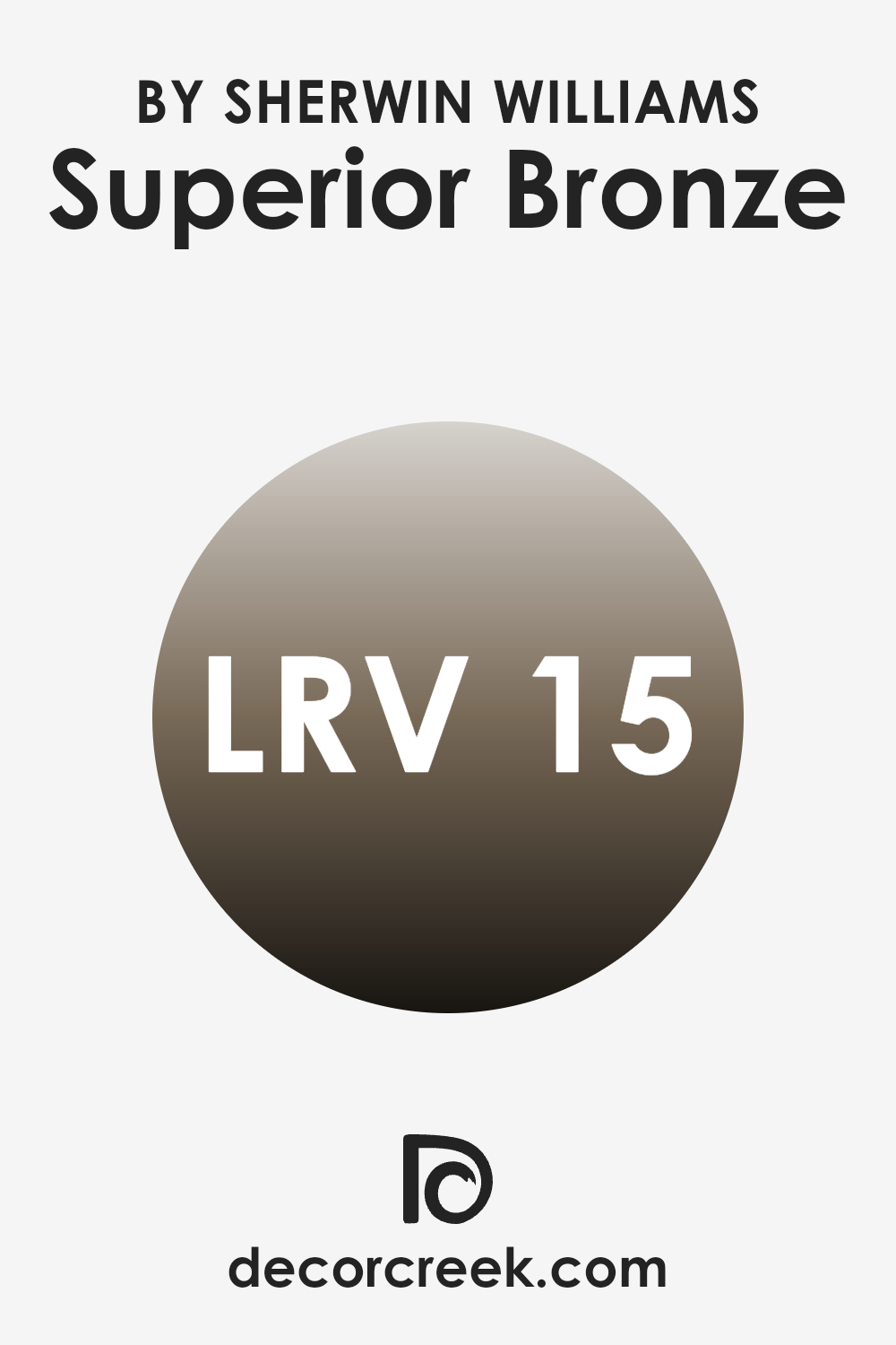
What is the LRV of Superior Bronze SW 6152 by Sherwin Williams?
Light Reflectance Value (LRV) measures the percentage of light a paint color reflects from or absorbs into a painted surface. Essentially, it’s a scale to judge how light or dark a color will look once applied to walls. Higher LRVs mean the color reflects more light, making an area feel brighter and more open, while lower LRVs mean the color absorbs more light, which can make an area feel cozier but smaller.
It’s a practical tool used by designers to determine how a color can affect the perception of an area’s size and brightness. In the case of a color like Superior Bronze, with an LRV of 14.776, it falls on the lower end of the scale, which means it absorbs much more light than it reflects.
This characteristic makes it a deep, rich color that can add warmth and depth to an area. However, using it on the walls might make a room appear smaller and darker. It is ideal for large, well-lit areas or as an accent color to create a focal point in a room without making the overall area feel too enclosed. This low LRV color is perfect for those looking to create a cozy, intimate atmosphere in a living area or a bedroom.
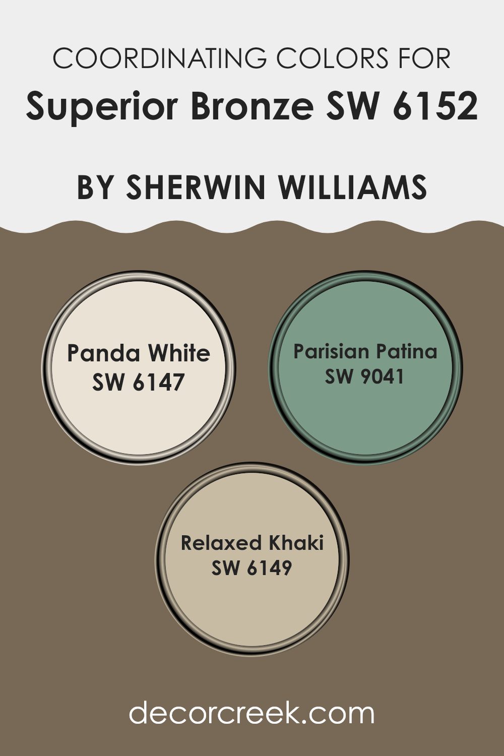
Coordinating Colors of Superior Bronze SW 6152 by Sherwin Williams
Coordinating colors are shades that complement each other and work well together in a color scheme. They help in creating a balanced and harmonious look in any area, enhancing the main color without overpowering it. For instance, in the case of a rich hue like bronze, coordinating colors can subtly accentuate its warmth and depth.
For a base color like a deep bronze, Panda White (SW 6147) offers a soft contrast with its light, airy feel. This gentle off-white provides a clean, refreshing touch that can lighten an area, making it feel more open and inviting. Meanwhile, Parisian Patina (SW 9041) introduces a subtle, muted green that can amplify the organic qualities of the bronze, lending a natural, calming element to the atmosphere.
Relaxed Khaki (SW 6149) is a soft, neutral beige that blends seamlessly with the bronze, providing a subtle transition between the more vibrant bronze and soothing tones, ensuring the area feels cohesive yet distinctly layered. Each of these colors supports the primary hue by creating depth and interest, making them ideal companions in decor.
You can see recommended paint colors below:
- SW 6147 Panda White
- SW 9041 Parisian Patina
- SW 6149 Relaxed Khaki
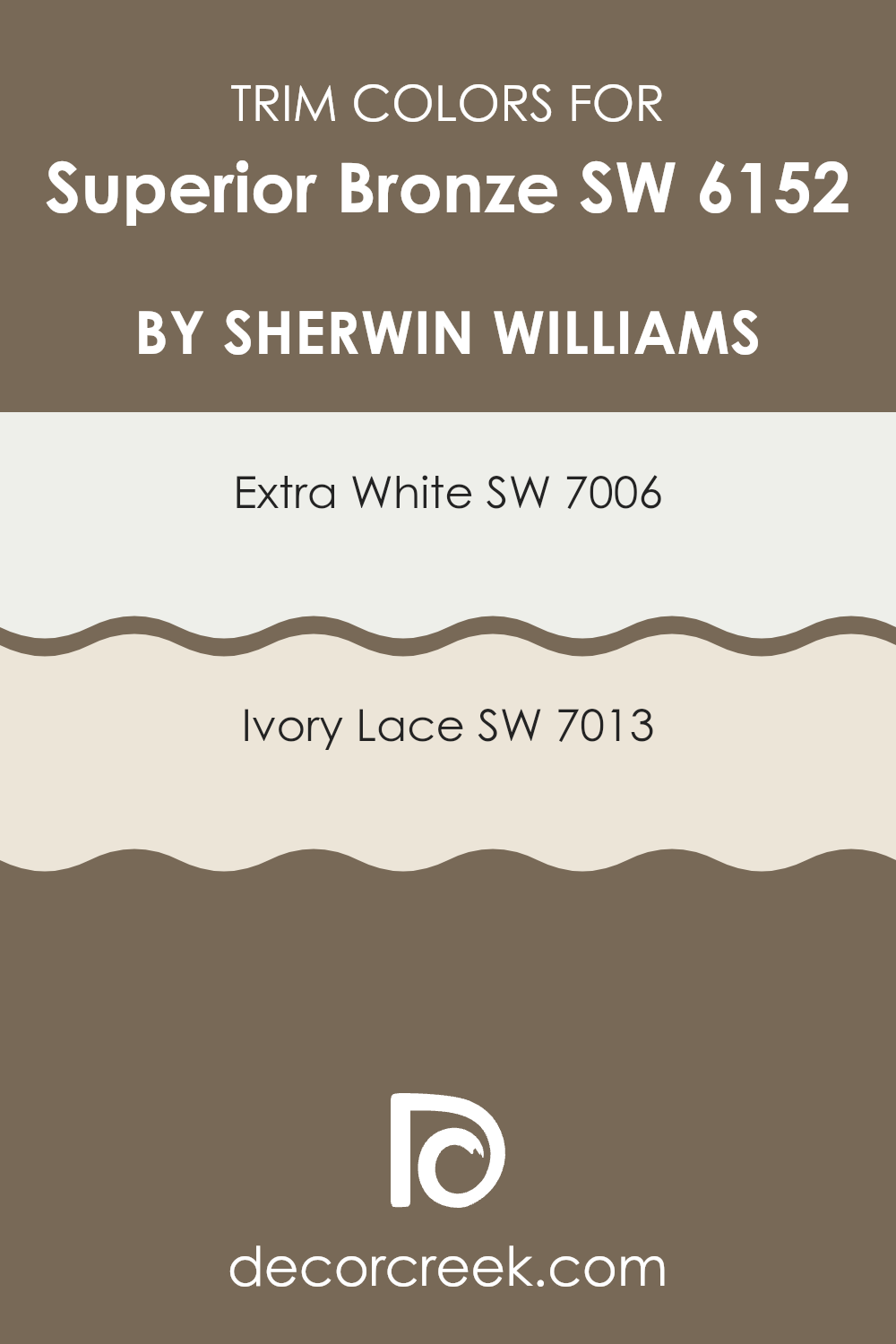
What are the Trim colors of Superior Bronze SW 6152 by Sherwin Williams?
Trim colors act as an enhancing framework for your main wall color, giving a cleaner and more polished finish to an area. When using a rich and warm hue like Superior Bronze by Sherwin Williams, choosing the right trim colors is crucial to define and balance the visual impact of the walls.
Opting for light trim colors such as SW 7006 – Extra White or SW 7013 – Ivory Lace can create a striking contrast, which not only highlights the architectural features of the area but also brightens and lightens the overall feel, making the warm tones of Superior Bronze stand out more effectively.
Extra White, identified by Sherwin Williams as SW 7006, is a crisp, clean white that reflects maximum light, making it a great choice for trim as it provides a vivid contrast that can make the warm depths of Superior Bronze pop.
Ivory Lace, or SW 7013, offers a softer, slightly creamy white, providing a subtle and gentle contrast with warmer wall colors like Superior Bronze, thus softening transitions between the wall and trim and creating a harmonious and inviting atmosphere. Both colors help in defining the area crisply when coordinated with a darker, richer color such as Superior Bronze.
You can see recommended paint colors below:
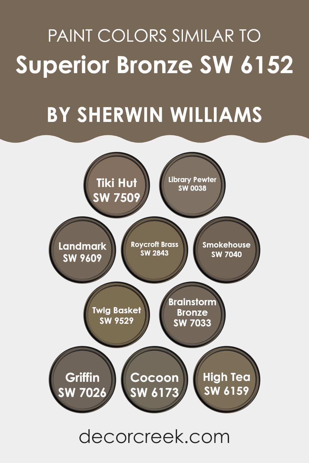
Colors Similar to Superior Bronze SW 6152 by Sherwin Williams
Using similar colors in design can have a subtle yet powerful impact on the overall aesthetics of an area. Similar colors, such as those closely related to Superior Bronze by Sherwin Williams, create a harmonious and cohesive look.
These shades work well together because they share a common hue intensity and tone, which helps in achieving a balanced and unified appearance. Combining these similar colors can also enhance the feeling of continuity and flow in an area, making small areas appear larger and more open.
For instance, Tiki Hut is a warm, earthy color that brings a cozy and comforting feel to any room, similar to the welcoming vibe of Library Pewter, which offers a deeper, muted gray with hints of brown. Landmark, another similar tone, leans slightly more into green, providing a robust foundation for designs that call for a touch of nature-inspired richness.
In the same family, Roycroft Brass shines as a muted golden hue, perfect for adding a subtle touch of brightness. Smokehouse stands out with its smoky gray, offering a sturdy base that complements more vibrant decorations. Another companion tone, Twig Basket, serves up a lighter, sandier version of the foundational brown, great for softening edges in a design.
Brainstorm Bronze picks up where Superior Bronze leaves off, deepening the effect with a richer, darker bronzy tone, while Griffin brings gray into the palette, offering flexibility in pairing with other decor elements.
Cocoon adds a unique twist with its slightly greenish cast, offering a refreshing alternative, and High Tea rounds out the options with its lighter, softer approach to taupe, ideal for creating a calming atmosphere. Each of these colors maintains the integrity of a cohesive design theme, enabling designers and homeowners alike to craft areas that are both beautiful and functional.
You can see recommended paint colors below:
- SW 7509 Tiki Hut
- SW 0038 Library Pewter
- SW 9609 Landmark
- SW 2843 Roycroft Brass
- SW 7040 Smokehouse
- SW 9529 Twig Basket
- SW 7033 Brainstorm Bronze
- SW 7026 Griffin
- SW 6173 Cocoon
- SW 6159 High Tea
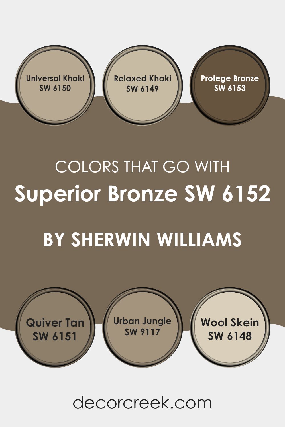
Colors that Go With Superior Bronze SW 6152 by Sherwin Williams
Choosing the right colors to complement Superior Bronze SW 6152 by Sherwin Williams is essential for creating a cohesive and appealing look in any area. Colors like Universal Khaki, Relaxed Khaki, Protege Bronze, Quiver Tan, Urban Jungle, and Wool Skein enhance the rich tones of Superior Bronze, allowing it to stand out as a focal point or blend smoothly into the design, depending on the desired effect. These coordinating colors can help establish a warm and welcoming atmosphere, particularly important in areas like living rooms and bedrooms where comfort is key.
Universal Khaki is a light and warm hue that pairs well with Superior Bronze, offering a subtle contrast while maintaining a soft and inviting atmosphere. Relaxed Khaki, similar but with a slightly greener undertone, provides a natural, earthy feel that complements the depth of Superior Bronze.
On the darker side, Protege Bronze works seamlessly with Superior Bronze, enhancing the richness and warmth of the area. Quiver Tan is a lighter, more muted option that brings a gentle balance, perfect for softening the boldness of Superior Bronze. Urban Jungle adds a touch of modern refinement with its grey-green shade, introducing a contemporary twist to traditional color pairings.
Lastly, Wool Skein, with its neutral yet sunny tone, lifts and lightens the palette, offering a fresh and airy complement to the more grounded Superior Bronze. Together, these colors create diverse options for harmonizing with Superior Bronze in a variety of interior designs.
You can see recommended paint colors below:
- SW 6150 Universal Khaki
- SW 6149 Relaxed Khaki
- SW 6153 Protege Bronze
- SW 6151 Quiver Tan
- SW 9117 Urban Jungle
- SW 6148 Wool Skein
How to Use Superior Bronze SW 6152 by Sherwin Williams In Your Home?
Superior Bronze by Sherwin Williams is a warm, rich paint color that infuses any room with a cozy, welcoming vibe. This shade, with its deep, earthy undertones, is perfect for creating a homey atmosphere. If you’re thinking about using this color in your home, here are a few ideas.
In the living room, Superior Bronze can make the area feel more inviting. Painting one accent wall with this color can add depth and interest, especially when paired with lighter furniture and decor. It’s also an excellent choice for a dining room, where it can provide a backdrop for long dinners and get-togethers.
For bedrooms, this shade works well because it provides a warm and calm setting that’s ideal for relaxing at the end of the day. You might consider using it for a feature wall behind the bed or for all walls for a cozy, enveloping feel. In smaller doses, like on trim or in a hallway, it can also add a touch of warmth without overpowering the area. Pair it with similar earthy tones or contrast it with brighter colors to highlight its beauty.
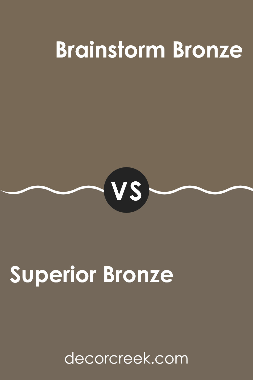
Superior Bronze SW 6152 by Sherwin Williams vs Brainstorm Bronze SW 7033 by Sherwin Williams
Superior Bronze and Brainstorm Bronze by Sherwin Williams are two appealing colors that share a somewhat similar base but have unique characteristics. Superior Bronze has a softer, lighter tone that gives a gentle, warm feel to any area. It often creates a cozy and welcoming atmosphere, ideal for living rooms or bedrooms where you want to create a relaxed environment.
On the other hand, Brainstorm Bronze is a darker, more intense shade. It leans towards a stronger, more pronounced presence, making it perfect for accent walls or areas where you aim to make more of a statement. This color adds depth and can anchor an area with its rich hue.
While both colors are adaptable, the choice between them depends on the mood and function of the area you are decorating. Superior Bronze works well where subtlety is needed, while Brainstorm Bronze suits areas that benefit from a bold, definitive touch.
You can see recommended paint color below:
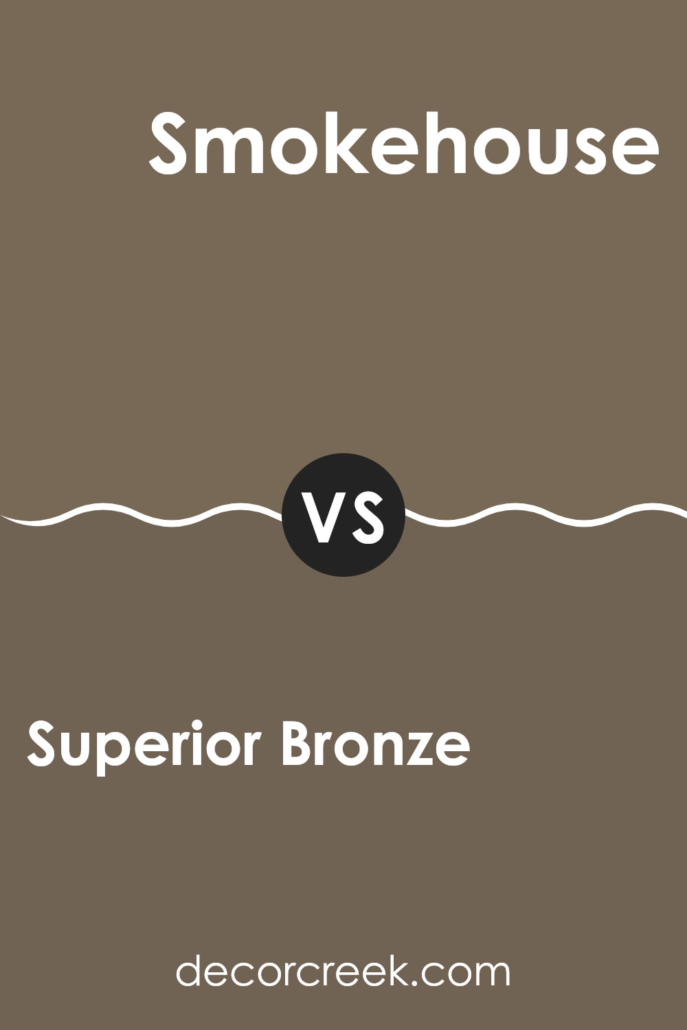
Superior Bronze SW 6152 by Sherwin Williams vs Smokehouse SW 7040 by Sherwin Williams
Superior Bronze and Smokehouse, both by Sherwin Williams, offer distinct vibes for different areas. Superior Bronze has a warm, welcoming golden brown tone that gives off a cozy, comforting feeling, making it perfect for living areas or any place where you want a touch of warmth. It pairs well with soft lighting and can make large areas feel more inviting.
On the other hand, Smokehouse stands out with its cooler, darker gray shade that brings a modern and sleek look to any area. It’s more subdued than Superior Bronze and works exceptionally well in areas that aim for a contemporary feel, such as kitchens or bathrooms. It can also serve to balance brighter colors, adding a grounding effect to vibrant interiors.
Both colors are quite adaptable but cater to different aesthetic tastes and functions, presenting a warm, earthy option with Superior Bronze and a cool, chic alternative with Smokehouse.
You can see recommended paint color below:
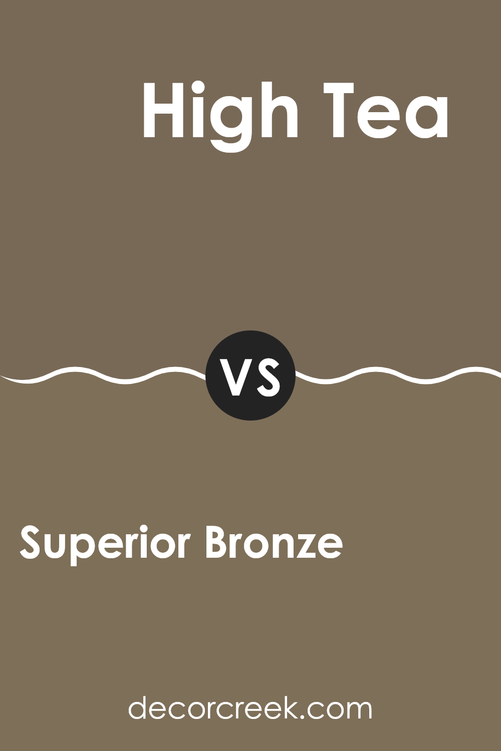
Superior Bronze SW 6152 by Sherwin Williams vs High Tea SW 6159 by Sherwin Williams
Superior Bronze and High Tea by Sherwin Williams are two subtly distinct shades that give an area unique vibes. Superior Bronze has a deeper, warmer tone that feels cozy and inviting. It’s a kind of color that makes an area feel like a snug hideaway, especially in well-lit interiors where its rich undertones can really shine through.
On the other hand, High Tea is lighter and leans more toward a muted beige with grayish undertones. This color is great for creating a calm and gentle atmosphere in an area, making it appear more open and airy. It’s an excellent choice for someone looking to refresh their room without going too bright, maintaining a natural and understated look.
Both colors work well to create a homey environment, but your choice depends on the mood you want to set. Superior Bronze tends to make a statement, while High Tea is more about blending in and adding a soft touch to the decor.
You can see recommended paint color below:
- SW 6159 High Tea
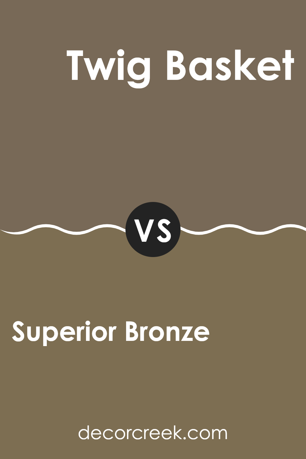
Superior Bronze SW 6152 by Sherwin Williams vs Twig Basket SW 9529 by Sherwin Williams
Superior Bronze and Twig Basket, both by Sherwin Williams, offer distinct tones that can significantly influence the mood and style of an area. Superior Bronze is a deeper, warm hue with a rich, cozy vibe, perfect for creating a welcoming and comfortable atmosphere in places like living rooms or studies. It has a robust presence and adds a sense of stability and warmth to interiors.
On the other hand, Twig Basket is lighter and leans toward a neutral palette, offering a subtle and clean look. This color is adaptable and works well in areas that aim for a fresh, airy feel. It’s particularly effective in smaller rooms or areas with limited natural light, as it can help make them appear larger and more open.
Both colors are beautiful in their own right, but the choice between them depends on the desired effect—warm and enveloping with Superior Bronze or light and breezy with Twig Basket.
You can see recommended paint color below:
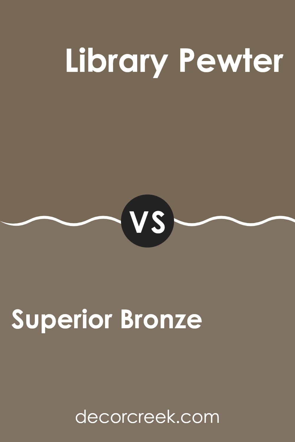
Superior Bronze SW 6152 by Sherwin Williams vs Library Pewter SW 0038 by Sherwin Williams
Superior Bronze and Library Pewter by Sherwin Williams are both unique shades but have different vibes and applications. Superior Bronze is a warm, welcoming color that feels cozy and homey. It’s not too dark, making it a great choice for living rooms or bedrooms where you want a soft, inviting atmosphere. This shade pairs well with natural elements like wood and leather, enhancing its earthy quality.
On the other hand, Library Pewter is a cooler, darker gray that gives a more formal and professional look. It’s perfect for areas like home offices or modern living rooms where a touch of elegance and a stronger color presence are desired. Library Pewter can also serve as a bold backdrop for artwork or contrasting decor pieces.
While both colors can significantly affect an area’s styling, Superior Bronze adds warmth and coziness, whereas Library Pewter offers a sense of sleekness and formality.
You can see recommended paint color below:
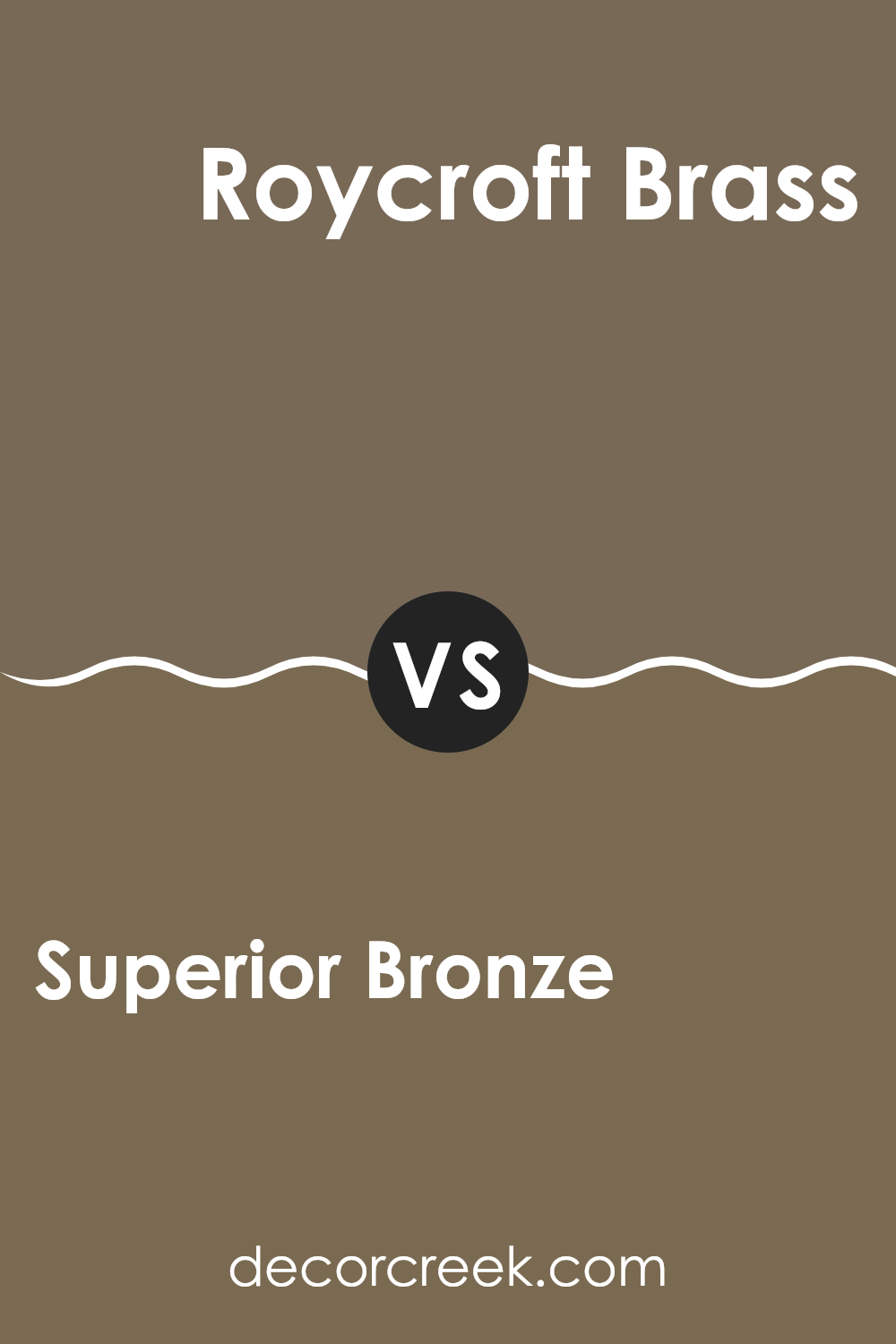
Superior Bronze SW 6152 by Sherwin Williams vs Roycroft Brass SW 2843 by Sherwin Williams
Superior Bronze and Roycroft Brass, both by Sherwin Williams, offer unique yet harmonious color options for interior areas. Superior Bronze is a soft, warm brown with a subtle gray undertone, presenting a cozy and inviting feel to any room. It’s an adaptable shade that can complement various decor styles, providing a grounded and comforting atmosphere.
On the other hand, Roycroft Brass is a deeper, more golden-toned brown that carries a hint of luxury. This color is richer and slightly more intense, making it ideal for areas where a stronger, but still warm, impact is desired. It works well in areas that benefit from a bold yet not overpowering color statement.
Both colors can enhance an area’s aesthetic, with Superior Bronze being more understated and flexible, while Roycroft Brass offers a bit more drama and warmth, making each suitable for different tastes and functions.
You can see recommended paint color below:
- SW 2843 Roycroft Brass
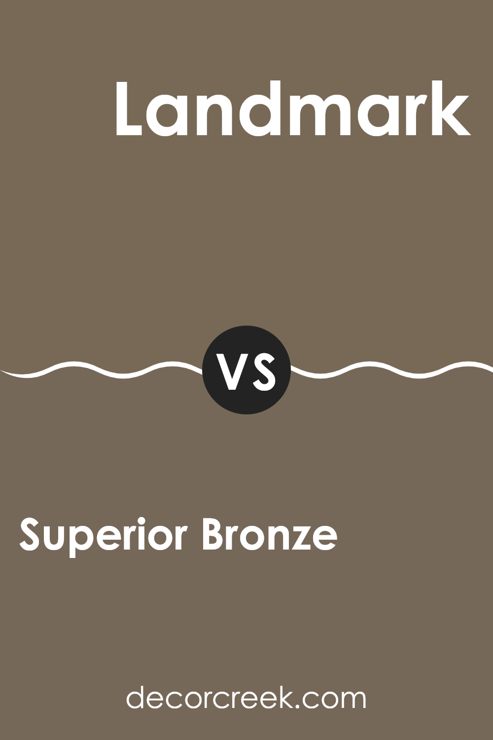
Superior Bronze SW 6152 by Sherwin Williams vs Landmark SW 9609 by Sherwin Williams
Superior Bronze is a warm, inviting shade that brings to mind the natural earth tones of a peaceful landscape. It has an understated, cozy vibe, offering a sense of comfort and hospitality that makes it perfect for living areas. This color fits wonderfully in places where relaxation and warmth are key, contributing a friendly and homey touch.
In contrast, Landmark is a darker, richer tone with a strong presence. This color leans toward a slightly more formal aesthetic, making it a great choice for areas that require a touch of elegance without being too bold. Its deeper hue provides a solid backdrop, well-suited for accent walls or furniture, enhancing other colors in the area.
Together, these two colors offer a range of possibilities for home decor. While Superior Bronze lends itself to a range of welcoming settings, Landmark offers depth and grounding, suitable for creating focal points or highlighting architectural details.
You can see recommended paint color below:
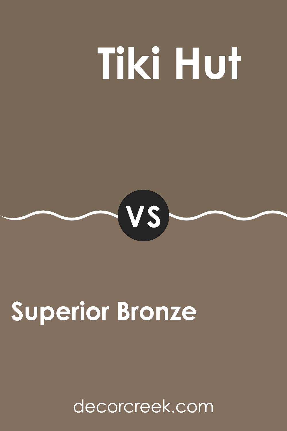
Superior Bronze SW 6152 by Sherwin Williams vs Tiki Hut SW 7509 by Sherwin Williams
Superior Bronze and Tiki Hut are two distinct paint colors from Sherwin Williams. Superior Bronze has a rich, deep tone that feels warm and cozy, making it great for creating a snug and inviting atmosphere in any area.
This color can add a touch of elegance without being too bold or overpowering. On the other hand, Tiki Hut is lighter and has a more neutral, beige tone. It’s adaptable and subtle, making it easy to pair with various decor styles and colors. Tiki Hut is ideal for someone looking for a color that maintains a low profile yet offers a warm backdrop to their interior.
Perfectly suited for living areas or bedrooms, it brings a gentle warmth without darkening the area too much. Together, these colors could work well in a single design, using Tiki Hut for larger surfaces and Superior Bronze for accents, providing a balanced and harmonious look.
You can see recommended paint color below:
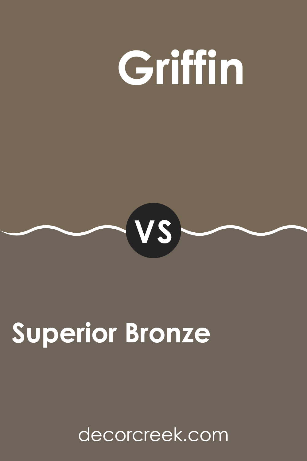
Superior Bronze SW 6152 by Sherwin Williams vs Griffin SW 7026 by Sherwin Williams
Superior Bronze and Griffin by Sherwin Williams are both unique in their tones and ambiance. Superior Bronze has a warm, welcoming vibe with its brownish hue that feels cozy and inviting. It leans toward earthy tones, creating a comfortable and homey atmosphere, ideal for living areas or a study.
Griffin, on the other hand, is a cooler, mid-tone gray that offers a subtle hint of neutrality. It’s adaptable and comparatively less warm than Superior Bronze, making it suitable for modern areas that aim for a clean and straightforward look. This color works well in both large and small areas, providing a stable backdrop that complements various decor styles.
While both colors add character to an area, Superior Bronze brings warmth and comfort, while Griffin leans toward a minimalistic and muted style. Depending on your area’s needs and your personal taste, you might choose the welcoming comfort of Superior Bronze or the calm neutrality of Griffin.
You can see recommended paint color below:
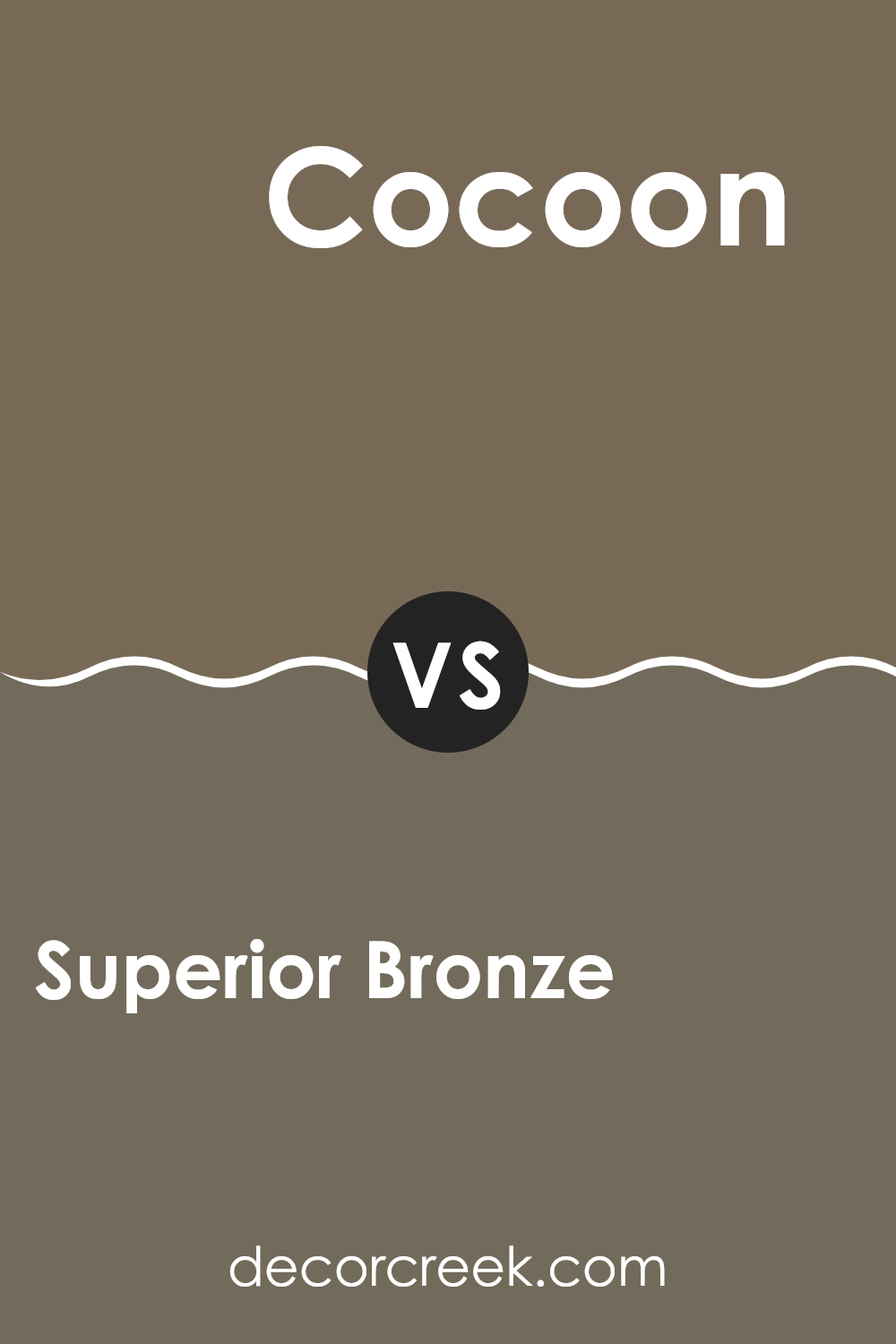
Superior Bronze SW 6152 by Sherwin Williams vs Cocoon SW 6173 by Sherwin Williams
Superior Bronze and Cocoon by Sherwin Williams are two distinct hues that bring their own unique vibes to an area. Superior Bronze is a warm, medium-toned brown with a comforting presence, perfect for creating a cozy and inviting atmosphere.
It strikes a nice balance, not being too dark or too light. On the other hand, Cocoon is a deeper, grayer shade that offers a more muted and subtle feel. It’s great for those looking to add a touch of understated elegance to their interiors without overpowering them with color.
When comparing these two, Superior Bronze has a slightly richer and warmer tone that works well in areas where you want to add a bit of warmth, such as living rooms or bedrooms. Cocoon, due to its gray undertones, can serve beautifully in a modern setting or where you might prefer a more neutral backdrop. Both colors are adaptable, but your choice will depend on the type of mood or style you’re aiming to achieve in your area.
You can see recommended paint color below:
- SW 6173 Cocoon
In wrapping up my thoughts on the SW 6152 Superior Bronze paint by Sherwin Williams, I can genuinely say this color has been a pleasant surprise. It brings a warm and inviting vibe wherever it’s applied. Whether on the outside of a house or inside on a feature wall, this brown shade with its rich, deep undertones creates a cozy atmosphere.
I found that Superior Bronze pairs beautifully with lighter colors like creams and beiges, which helps to balance its boldness. This makes it easy to use in almost any room, without making the area feel too dark or small. Perfect for anyone wanting to add a bit of warmth and comfort to their living area without going too dark.
Through my personal use and from what others have mentioned, the quality of the paint is solid. It goes on smoothly, covers well, and lasts long, which means not having to repaint anytime soon. Plus, cleaning up is simple, which is great for families or anyone who doesn’t want to fuss over maintenance.
In conclusion, SW 6152 Superior Bronze by Sherwin Williams is more than just a basic brown paint. It’s a way to make any area feel more like home. After seeing how it works in different areas and hearing others praise it, I’m confident it’s a color choice well worth considering. Whether you’re looking to refresh a single room or rethink your whole home, this color checks all the boxes for style and practicality.
decorcreek.com
Ever wished paint sampling was as easy as sticking a sticker? Guess what? Now it is! Discover Samplize's unique Peel & Stick samples.
Get paint samples

