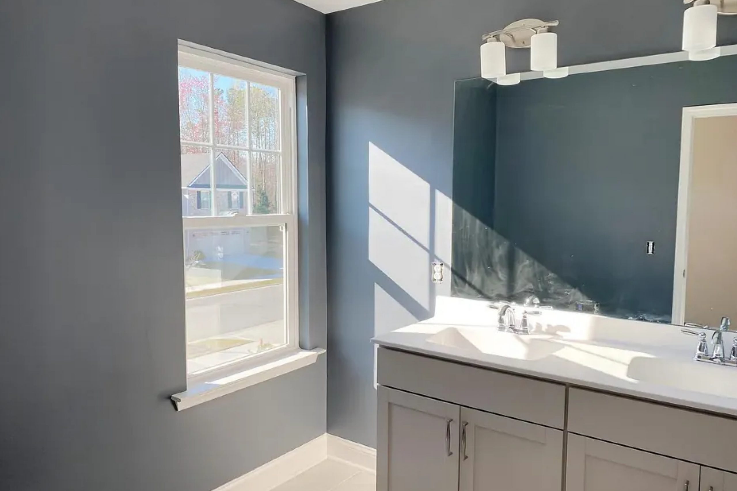
Imagine wandering through the bustling, energetic streets of a city, where the pulse of commerce and sophistication beats at every corner. That’s the essence captured in SW 7665 Wall Street by Sherwin-Williams, a color that embodies the sharpness and power of urban life.
As I reflect on this shade, it strikes me as a perfect anchor for a modern space, drawing on the deep, rich tones of dark gray with a hint of blue. This particular color holds a unique ability to add an element of formal elegance to any area, making rooms feel more grounded and intentionally styled.
Whether you’re considering a dramatic living room makeover or looking to add some gravitas to your office, SW 7665 Wall Street can be the foundation for creating an atmosphere that’s both striking and inviting. It pairs brilliantly with bright whites, which can make the dark tones pop even more, or with soft, muted colors that smooth out its edges for a more relaxed feel.
In my experience, using Wall Street in space, it manages to elevate the aesthetic while keeping a cool, composed look that feels effortlessly chic. This color has become my go-to recommendation for anyone looking to make a bold yet sophisticated statement in their interiors.
What Color Is Wall Street SW 7665 by Sherwin Williams?
Wall Street by Sherwin Williams is a deep, refined shade of blue that leans towards a rich charcoal. This color has an understated elegance that makes it exceptionally versatile for various interior styles. It works particularly well in modern and minimalist settings due to its bold yet muted hue, which pairs seamlessly with clean lines and simple forms. Additionally, this color can create a striking contrast in industrial-style interiors, complementing exposed metal elements and rustic wooden textures.
In terms of materials, Wall Street pairs beautifully with natural wood, helping to warm up its cool undertones. When matched with lighter woods like oak or birch, it can create a balanced, cozy ambiance. For a more dramatic and contemporary feel, combining it with darker woods, like walnut, enhances its depth and richness.
Metals like brushed nickel, stainless steel, or even matte black fixtures stand out crisply against this blue, offering a touch of modernity that can give a space a fresh, current feel. For textiles, using soft, plush fabrics like velvet or wool can add a layer of luxury and comfort to the refined atmosphere created by Wall Street. To maintain a sleek and contemporary vibe, incorporating materials with subtle textures such as linen or silk can keep spaces feeling open and light.
Is Wall Street SW 7665 by Sherwin Williams Warm or Cool color?
Wall StreetSW 7665 by Sherwin Williams is a dark shade of gray that brings a modern and bold touch to any room. This color has a solid presence that can make other colors in the room stand out.
It works great in a living room or bedroom as it provides a strong backdrop that can highlight furniture and decor items. This gray is flexible enough that it can be paired with brighter colors like blues or yellows, or kept with other neutrals for a more toned-down look.
It’s also a practical choice for spaces that might get messy, like a kitchen or children’s playroom, as darker colors can help hide smudges and stains. In well-lit areas, Wall Street can look more vibrant and dynamic, while in spaces with less light, it can create a cozy and inviting atmosphere. Overall, it’s a versatile color that fits well in many different home styles.
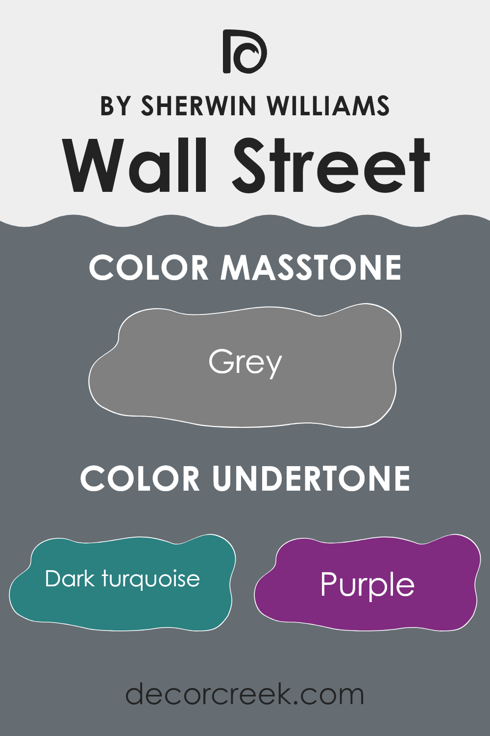
Undertones of Wall Street SW 7665 by Sherwin Williams
Wall Street by Sherwin Williams is a unique shade that embodies a deep, rich essence, often reflecting multiple undertones depending on the lighting and accompanying decor. Undertones are subtle colors that influence the main hue, impacting how we perceive the overall color in varying conditions. For example, in low light, a color might show its cooler undertones, while under bright light, warmer undertones might become more apparent.
The undertones in Wall Street make it a versatile paint color for interior walls, influencing the atmosphere of a room. For instance, the dark turquoise and navy undertones give a sense of depth and calm, making it a good choice for a bedroom or office where a focused ambiance is desired. On the other hand, touches of brown and dark grey can bring warmth and grounding, ideal for creating a welcoming living room or dining area.
Moreover, when used on walls, this color can interact with furnishings and decor to either bring forward or subdue its various undertones. Bright-colored decor could enhance its lighter undertones like light turquoise and mint, making the room feel energetic and vibrant. Conversely, darker furniture might highlight its deeper undertones like olive or dark green, contributing to a cozier and more enclosed feel.
Thus, the diverse undertones of Wall Street make it an adaptable choice, able to complement a wide range of interior styles and color schemes, enhancing the aesthetic value and mood of a space.
What is the Masstone of the Wall Street SW 7665 by Sherwin Williams?
Wall Street, with its masstone of Grey (#808080), offers a neutral base that is extremely versatile for home interiors. This shade of grey provides a calm, neutral backdrop that is ideal for any room in the house.
Whether used in a living room, bedroom, or a study, it sets an easy-going tone that doesn’t overpower the senses. This grey works well with various decor styles, whether you’re pairing it with vibrant colors or sticking to a more monochromatic theme. The color is particularly effective in spaces that require a sense of calm, such as bedrooms and offices, where it supports a relaxed environment.
Furthermore, its neutrality allows homeowners the freedom to switch up accent colors or furnishings without worrying about clashing tones. The ease with which this color blends into its surroundings makes it a popular choice for those looking to create a cohesive look throughout their home.

How Does Lighting Affect Wall Street SW 7665 by Sherwin Williams?
Lighting plays a crucial role in how we perceive colors. The same paint can look different under various light sources. For instance, natural light tends to bring out the truest color, while artificial light can alter this perception.
For a color like Wall Street by Sherwin Williams, a deep, rich hue, the effect of lighting is very noticeable.
Under artificial lighting, especially with warm bulbs, this color may appear slightly more muted, taking on a cozy and inviting quality. This is because warm lights tend to add yellow tones, softening the color slightly.
In contrast, cooler lights, like those common in office settings, might make it look sharper and more vivid, highlighting its bluish undertones.
In natural light, the appearance of this color can change depending on the time of day and the orientation of the room.
For rooms facing north, natural light is typically cooler and more consistent throughout the day. Here, the color could appear more true to its base, maintaining a steady, sophisticated appearance, leaning more towards its cooler, grayish aspects.
- In south-facing rooms, which receive strong, warm light all day, the color can look lighter and brighter. This dynamic sunlight can highlight the depth of the color, making it appear vibrant and rich.
- East-facing rooms get bright light in the morning, which means that the color will start the day looking bright and warm, gradually fading to a cooler tone as natural light diminishes. Conversely, in west-facing rooms, the color will display its cooler, subtle tones in the morning, but become warmer and more dynamic in the evening as it catches the sunset.
Overall, the perception of the color Wall Street from Sherwin Williams is greatly influenced by both the type and direction of light, shifting its appearance from subtle shifts in the morning light to dramatic changes in artificial lighting environments.
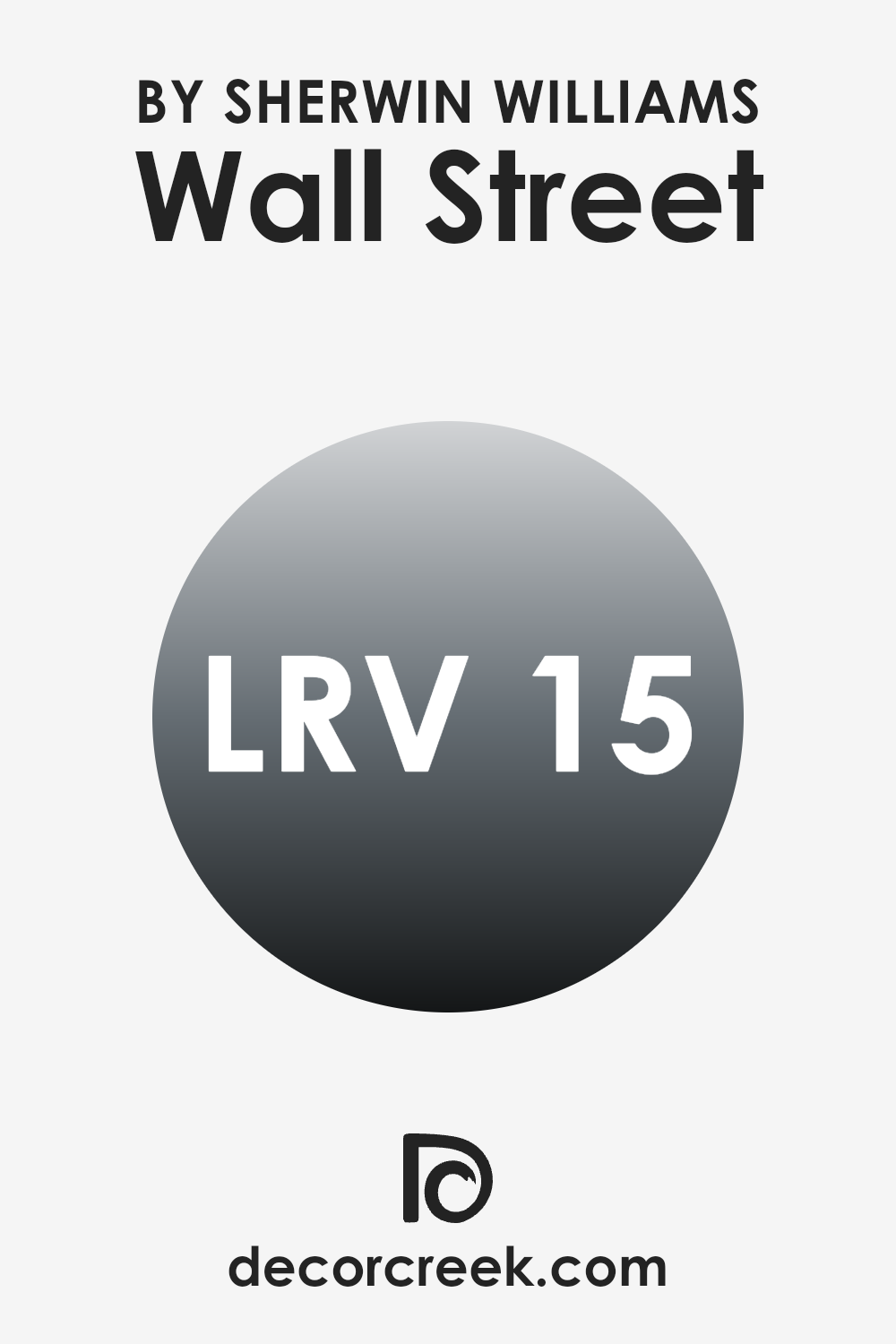
What is the LRV of Wall Street SW 7665 by Sherwin Williams?
LRV stands for Light Reflectance Value, a measure used to describe the amount of visible and usable light that reflects from or absorbs into a painted surface. This value is represented on a scale from zero, which absorbs all light and appears totally black, to the highest point which reflects all the light and appears completely white.
This measure helps in understanding how light or dark a color might look once applied to the walls. A higher LRV means the color will appear lighter and reflect more light, making a room look more open and airy, while a lower LRV means the color will absorb more light and can make a space feel smaller or cozier.
With an LRV of 14.886, the color in question is quite dark and will absorb a significant amount of light rather than reflecting it. This specific value indicates that the color is closer to the darker end of the spectrum, which makes it an ideal choice for creating a more focused and intimate environment. In bright, well-lit spaces, using a color with this LRV can add depth and drama, providing a strong visual contrast against lighter colors or furnishings. However, in a poorly lit room, this color might make the space feel somewhat cramped or gloomy due to its low light reflectance.
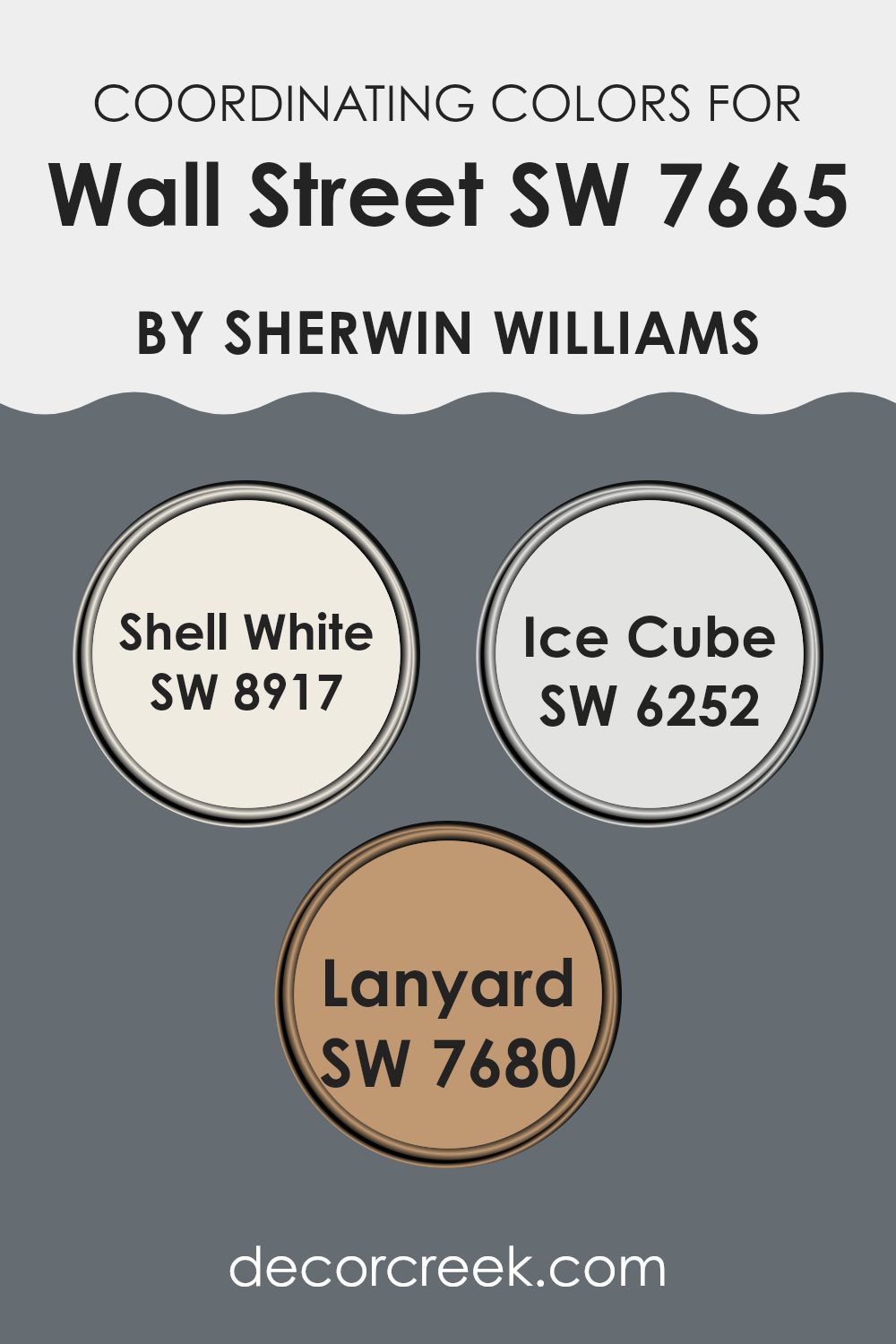
Coordinating Colors of Wall Street SW 7665 by Sherwin Williams
Coordinating colors are chosen to complement a main color, enhancing the overall aesthetic of a space. For instance, with a base color like a deep gray from Sherwin Williams, lighter or contrasting shades can be picked to create a visually appealing palette. These complementary colors can vary in hues and saturation, but they work together to create harmony and balance in design.
For a light and airy feel, you can pair a deep gray with a shade like Shell White, which is a soft, warm white that offers a subtle contrast, making it a great choice for trims and ceilings, or as an all-over color to brighten up the rooms.
Another coordinating option is Ice Cube, a crisp, cool blue-gray that provides a fresh and modern feel, ideal for bathrooms or kitchens for a clean and refreshing look. Additionally, Lanyard, a rich, muted brownish-gray, works well for providing depth and warmth, suitable for accent walls or furniture, giving the room a grounded and cozy atmosphere. These coordinating colors work in unison to enhance the depth and character of the primary color, creating an inviting and well-rounded space.
You can see recommended paint colors below:
- SW 8917 Shell White
- SW 6252 Ice Cube
- SW 7680 Lanyard
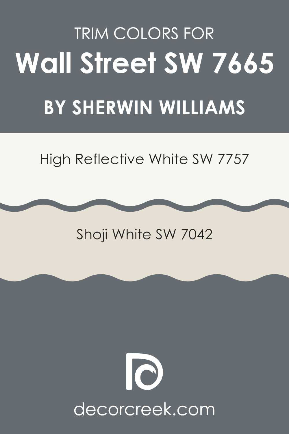
What are the Trim colors of Wall Street SW 7665 by Sherwin Williams?
Trim colors are used to highlight architectural details and elements such as door frames, window frames, and baseboards, by creating a visual contrast with the main wall color. In this case, using specific trim colors such as SW 7757 – High Reflective White or SW 7042 – Shoji White by Sherwin Williams can complement and accentuate the shade ‘Wall Street’.
These trim colors are crucial because they help define the space, enhance the overall decor, and make the walls appear more striking and clean. SW 7757 – High Reflective White is a very bright and clean white color that offers a crisp contrast. It is exceptionally versatile and can help in making the room appear larger and more open.
On the other hand, SW 7042 – Shoji White provides a softer approach as a trim color. This color adds a light, airy quality without stark contrasts, promoting a subtle yet defined separation between the walls and trims. Both colors provide options to achieve a tailored look that complements the Wall Street shade beautifully.
You can see recommended paint colors below:
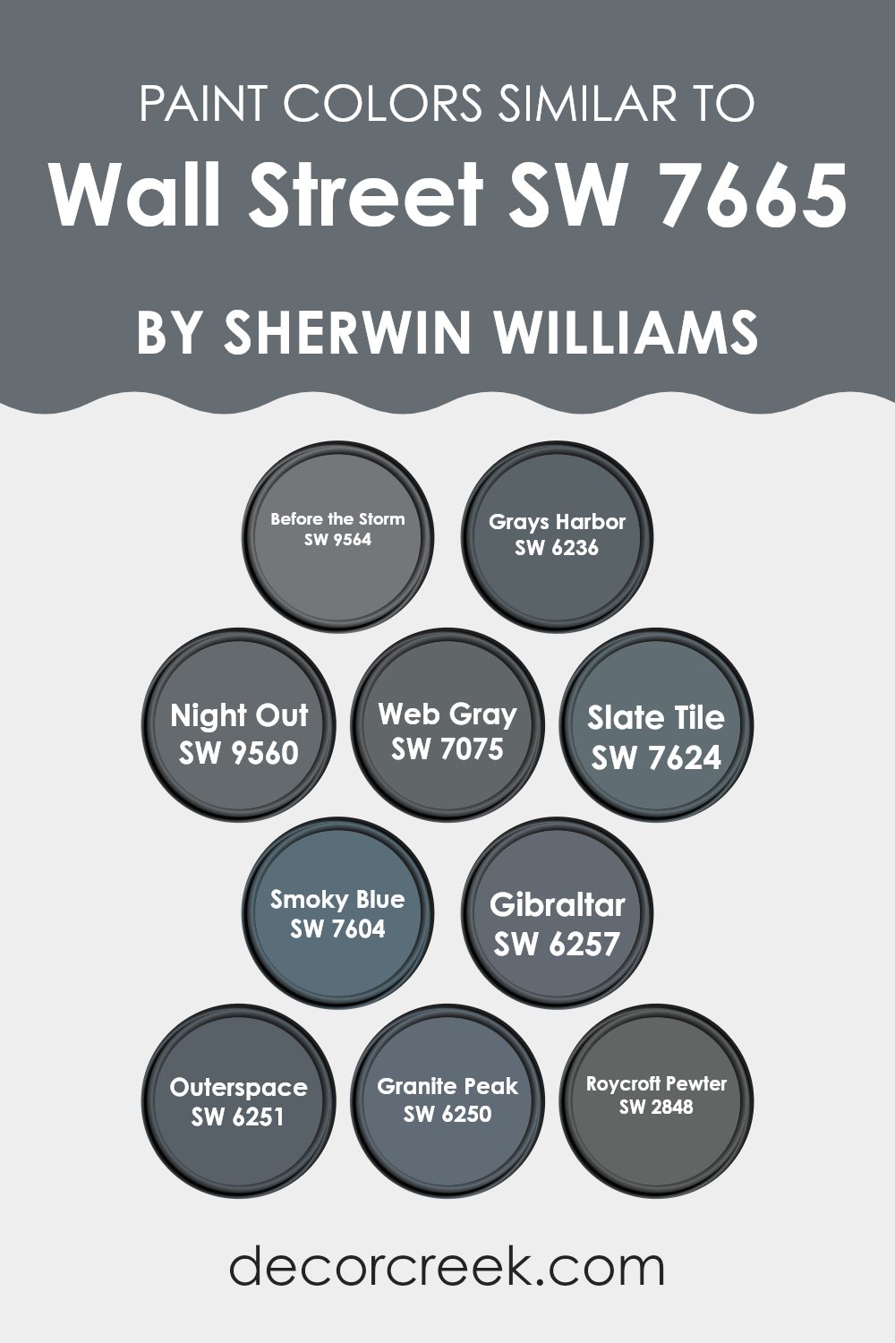
Colors Similar to Wall Street SW 7665 by Sherwin Williams
Similar colors are crucial in design because they create a cohesive look and feel, allowing for a seamless aesthetic transition between spaces or elements. When similar shades are used together, such as the ones close to Wall Street by Sherwin Williams, they help to establish a unified theme without stark contrasts, supporting a smooth visual flow throughout a space. This harmony is especially important in environments where the goal is to provide a continuous visual experience without abrupt shifts in color, promoting a subtle, yet effective impact.
Before the Storm brings a soft, stormy gray that envelopes a room in a calm and collected hue, reminiscent of a cloudy sky just on the brink of rainfall. Grays Harbor is a darker shade that draws from the depths of a storm-laden sea, offering a strong but muted presence.
Night Out is deeper still, suggesting the dark elegance of a cityscape under a midnight sky. Web Gray and Slate Tile both offer variations of a steely charm, grounding spaces with their solid and reliable tones. Smoky Blue introduces a hint of cooler tones, soft like a distant mountain range at dusk. Gibraltar and Outerspace each play with the darkness of the deep sea and the vastness of the cosmos, presenting themselves as bold choices that retain a welcoming coolness.
Granite Peak and Roycroft Pewter, meanwhile, stand out with their rocky and metallic influences, providing a sturdy base color that combines the natural with the industrially inspired. Together, these colors weave a visual narrative that is cohesive and visually pleasing, without becoming overwhelming or monotonous.
You can see recommended paint colors below:
- SW 9564 Before the Storm
- SW 6236 Grays Harbor
- SW 9560 Night Out
- SW 7075 Web Gray
- SW 7624 Slate Tile
- SW 7604 Smoky Blue
- SW 6257 Gibraltar
- SW 6251 Outerspace
- SW 6250 Granite Peak
- SW 2848 Roycroft Pewter
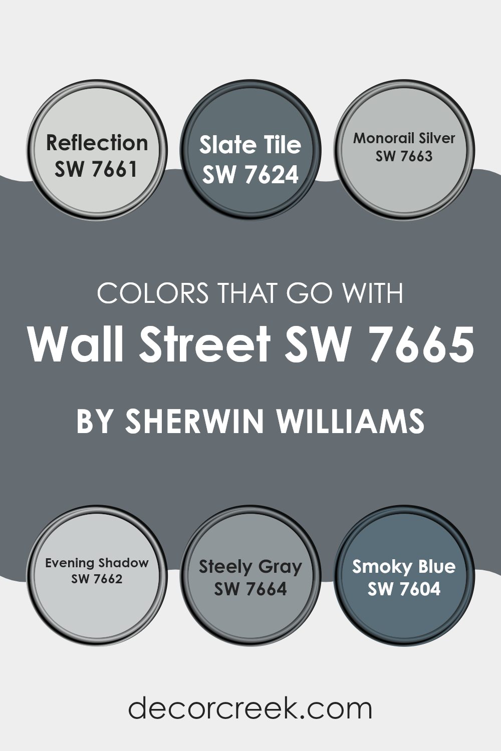
Colors that Go With Wall Street SW 7665 by Sherwin Williams
Choosing the right colors to pair with Wall Street SW 7665 by Sherwin Williams is crucial for achieving a harmonious and aesthetically pleasing space. The recommended colors complement Wall Street, creating a balanced and cohesive look that enhances the overall ambiance of a room. Whether you’re looking to create contrast or flow, selecting compatible shades ensures that each room feels thoughtfully designed and visually interesting.
SW 7661 – Reflection is a light gray with a hint of blue that offers a fresh and airy feel, making it a great choice for creating a calm and inviting atmosphere. SW 7624 – Slate Tile is a deeper gray that adds a touch of drama and depth, perfect for feature walls or furniture pieces. SW 7663 – Monorail Silver is a versatile silver-gray that works well in modern and traditional settings alike.
SW 7662 – Evening Shadow is a subtle gray with cool undertones, ideal for a sleek, contemporary look. SW 7664 – Steely Gray is a medium gray that provides a strong foundation for any color scheme. Lastly, SW 7604 – Smoky Blue is a rich blue with gray undertones that adds a pop of color while still maintaining a neutral palette. Each of these colors supports the complex hues of Wall Street, allowing for a professional yet personal interior design that is both striking and cohesive.
You can see recommended paint colors below:
- SW 7661 Reflection
- SW 7624 Slate Tile
- SW 7663 Monorail Silver
- SW 7662 Evening Shadow
- SW 7664 Steely Gray
- SW 7604 Smoky Blue
How to Use Wall Street SW 7665 by Sherwin Williams In Your Home?
Wall Street SW 7665 by Sherwin-Williams is a deep shade of blue-gray that gives spaces a modern and stylish look. It’s versatile enough to use in various rooms, from kitchens to bedrooms. This color works well on walls, especially in areas where you want to create a calm, yet strong feel. For a more striking look, you could paint one wall with this color as an accent wall, matched with lighter colors on other walls to keep the room feeling open and airy.
In the bedroom, using this color can help set a peaceful, restful mood. You can complement Wall Street with soft whites or creams in bedding and curtains for a balanced look. In the living room, pairing it with metallic accents like silver or gold can add a touch of luxury without being too overwhelming.
Furthermore, this color is a great choice for painting cabinetry or furniture, offering a modern twist to traditional pieces. Whether you want to create a feature wall or refresh the old furniture, Wall Street can breathe new life into your home’s decor.
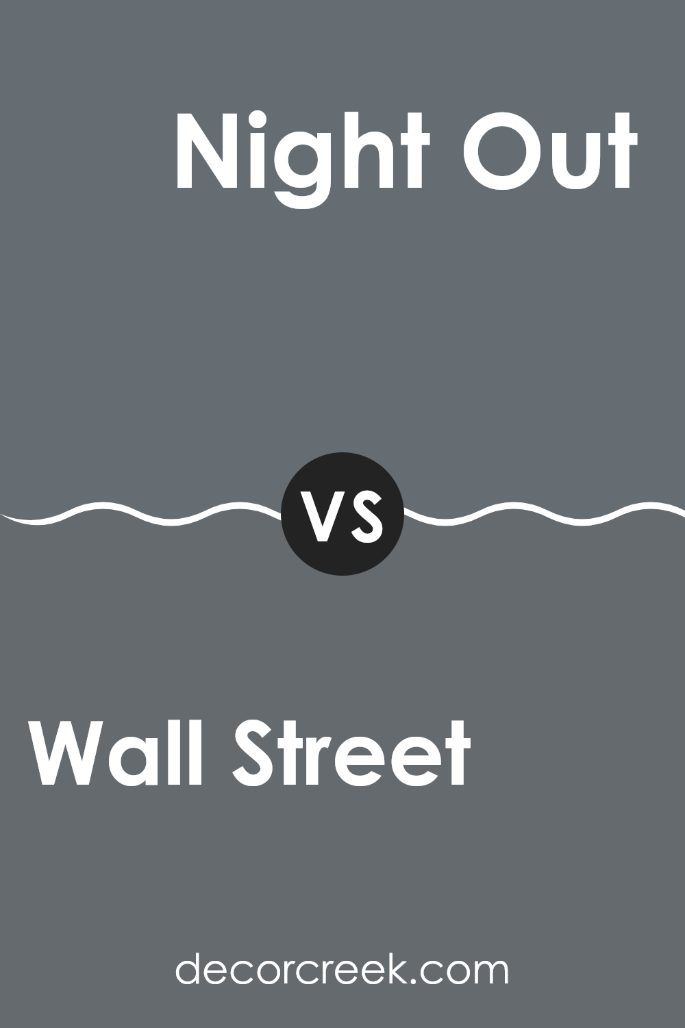
Wall Street SW 7665 by Sherwin Williams vs Night Out SW 9560 by Sherwin Williams
Wall Street and Night Out are two distinct shades from Sherwin Williams. Wall Street is a deep, rich gray with a subtle coolness. It gives a space a strong, grounded feel, perfect for creating a professional or soothing atmosphere.
On the other hand, Night Out is a darker tone, venturing closer to black. This color adds drama and depth to any room, making it ideal for areas where you want to make a bold statement or give a feeling of cozy enclosure. While Wall Street can lighten up slightly with good lighting, Night Out tends to hold its depth and darkness regardless of lighting conditions.
Both colors work well in modern decor but serve different purposes based on the mood you aim to achieve. Wall Street can be used more broadly, while Night Out is better for specific accents or features.
You can see recommended paint color below:
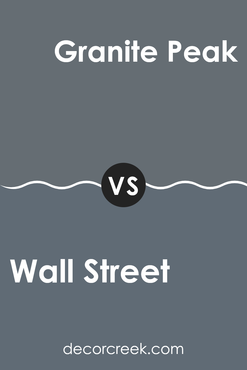
Wall Street SW 7665 by Sherwin Williams vs Granite Peak SW 6250 by Sherwin Williams
Wall Street and Granite Peak are two colors by Sherwin Williams that complement each other well, yet each offers a unique vibe. Wall Street is a deep, cool gray that conveys a sense of strength and formality. It’s a great choice for spaces meant to have a professional or more serious tone.
On the other hand, Granite Peak is a darker gray with hints of blue, making it slightly warmer compared to Wall Street. This color can add a subtle touch of moodiness and coziness to a room, perfect for creating a more inviting atmosphere.
Both colors work well in a modern decor setting, especially when used in interiors aiming for a clean, minimalistic look. They are versatile enough to be used in various rooms, from kitchens to bedrooms, depending on the ambiance you want to achieve.
You can see recommended paint color below:
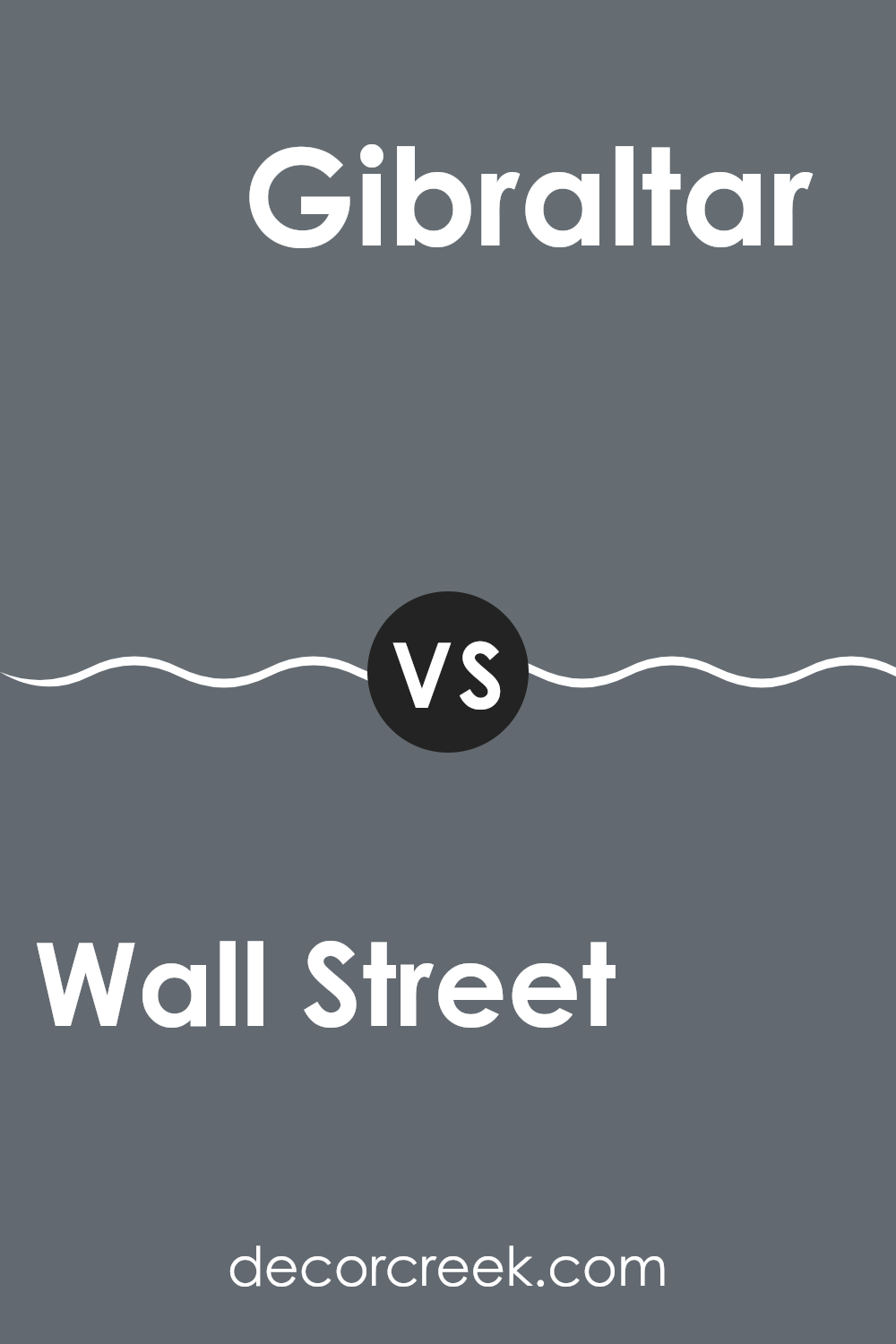
Wall Street SW 7665 by Sherwin Williams vs Gibraltar SW 6257 by Sherwin Williams
Wall Street and Gibraltar, both by Sherwin Williams, offer distinct tones that could easily change the feel of a room. Wall Street is a deep gray that leans towards a cool charcoal. It’s a strong color that can make a room feel cozy and enclosed, often used in spaces meant to feel snug and secure.
In contrast, Gibraltar is a shade of blue with a strong gray undertone. It’s lighter than Wall Street, providing a breezy and fresh feel, which could make a room seem more open and airy.
Gibraltar could work well in spaces designed for calm activities like reading or relaxing. When comparing the two, Wall Street offers a more grounded atmosphere, while Gibraltar is airy and light, ideal for those wanting to brighten up their space.
You can see recommended paint color below:
Wall Street SW 7665 by Sherwin Williams vs Roycroft Pewter SW 2848 by Sherwin Williams
Wall Street and Roycroft Pewter are both colors by Sherwin Williams, but they have distinct tones. Wall Street is a deep, grayish-blue shade that brings a sense of calm and steadiness to a space. Its cool undertone makes it ideal for creating a grounded, peaceful environment. This color works well in areas like bedrooms or offices where you want a backdrop that helps in focusing and relaxing.
On the other hand, Roycroft Pewter is a darker, warmer gray that leans slightly towards brown. This color gives a room a cozy, welcoming feel, making it excellent for living areas or dining rooms where you want a more intimate atmosphere. Its richness also adds a layer of depth to the space, enhancing other decor elements.
Although both colors are variations of gray, Wall Street’s blue base and Roycroft Pewter’s brownish tint offer different vibes and can drastically affect the mood of a room depending on their application.
You can see recommended paint color below:
- SW 2848 Roycroft Pewter
Wall Street SW 7665 by Sherwin Williams vs Slate Tile SW 7624 by Sherwin Williams
Wall Street is a refined gray that has subtle blue undertones, giving it a rich and balanced look. It’s versatile for various spaces, whether in a living area or an office, providing a grounded and calm atmosphere without feeling cold.
On the other hand, Slate Tile is darker with more pronounced blue undertones. This stronger presence of blue gives Slate Tile a more noticeable depth and character. While both colors are in the gray family, Wall Street serves as a lighter, more neutral backdrop, which can be easier to match with various decor styles.
Slate Tile, being darker, can make a bold statement and works well when you want to highlight specific areas or create a focal point in a room. Both shades offer distinct personalities that can effectively enhance an environment according to your decor preferences and the mood you want to set.
You can see recommended paint color below:
Wall Street SW 7665 by Sherwin Williams vs Outerspace SW 6251 by Sherwin Williams
Wall Street and Outerspace, both from Sherwin Williams, offer distinct tones that can significantly influence the feel of a space. Wall Street is a deep grey with a subtle hint of blue. This color has a strong presence and can make a room feel more grounded and quiet. It works well in a formal setting or an area where you want to foster a sense of calm.
On the other hand, Outerspace is a darker shade that blends black and navy blue. This color is perfect for creating a bold statement and can give any room a dramatic flair. It’s ideal for accent walls or spaces where you want to add depth and a touch of mystery.
While both colors share a cool-tone base, Wall Street leans towards a lighter, more neutral grey, making it more versatile across various spaces. Outerspace, being darker and moodier, is best suited for specific uses where you want to highlight architectural features or create a focal point. Both colors are excellent choices but serve different purposes depending on your decorating goals.
You can see recommended paint color below:
Wall Street SW 7665 by Sherwin Williams vs Grays Harbor SW 6236 by Sherwin Williams
**Wall Street** and **Grays Harbor** are two distinctive shades from Sherwin Williams. Wall Street is a quieter gray with hints of green, giving it a subtle and calm feeling that works well in professional and private spaces alike. Its green undertone makes it versatile for combining with both warm and cool tones, enhancing various decor styles.
On the other hand, **Grays Harbor** is a much deeper gray, leaning closer to charcoal. This color provides a strong presence in a room, making it suitable for accent walls or for creating a bold statement. It also pairs well with light colors, which can help to balance its intensity.
Both colors are effective for adding a touch of modernity to any space. While Wall Street brings a lighter, softer approach, Grays Harbor offers depth and drama, making them excellent choices depending on the mood and style you wish to achieve in your decorating project.
You can see recommended paint color below:
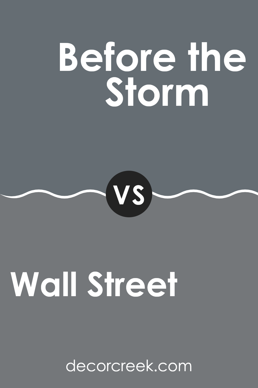
Wall Street SW 7665 by Sherwin Williams vs Before the Storm SW 9564 by Sherwin Williams
“Wall Street” and “Before the Storm” are two intriguing paint colors from Sherwin Williams. Wall Street is a deep, rich gray that carries a hint of green. It’s the kind of color that brings a strong and calming presence to a room, making spaces feel more grounded and cozy.
On the other hand, Before the Storm is slightly lighter than Wall Street and has a cooler tone. This color leans more towards a true gray, providing a fresh and modern look that brightens rooms while still maintaining a calm atmosphere. Both colors work well in various settings, be it a home office, bedroom, or living room.
However, Wall Street’s deeper hue might be better suited for larger spaces or as an accent wall to create contrast, while Before the Storm could be ideal for smaller rooms or areas with less natural light.
You can see recommended paint color below:
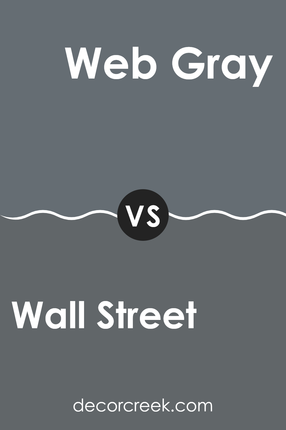
Wall Street SW 7665 by Sherwin Williams vs Web Gray SW 7075 by Sherwin Williams
Wall Street and Web Gray are both shades by Sherwin Williams. Wall Street is a deeper gray with strong blue undertones. This color gives a sense of solidity and calmness in a subtle way. It’s quite adaptable, working well in a sophisticated office or a cozy living room.
On the other hand, Web Gray is a tad lighter and carries a more pronounced blue base compared to Wall Street. This slight difference makes Web Gray stand out a bit more, offering a gentle nautical vibe that can make spaces feel fresh and open.
Both shades can refresh a room’s appearance, with Wall Street providing a more grounded, traditional feel, and Web Gray presenting a lighter, airier atmosphere. Each color, depending on the room’s lighting and the accompanying decor, has its unique appeal and can significantly affect the mood and style of a space.
You can see recommended paint color below:
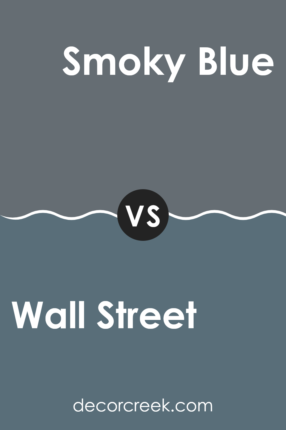
Wall Street SW 7665 by Sherwin Williams vs Smoky Blue SW 7604 by Sherwin Williams
Wall Street SW 7665 is a deep, rich gray that carries a hint of green. This color gives a bold yet understated look to any room, creating a calm and collected atmosphere. It’s a versatile shade that pairs well with a variety of decor styles, from modern to traditional.
On the other hand, Smoky Blue SW 7604 is a softer, medium blue with gray undertones. This color provides a cooler feel and is ideal for creating a relaxed, comfortable environment. It’s an excellent choice for spaces where you want to promote rest and relaxation, such as bedrooms or bathrooms.
While both colors are grounded in gray components, Wall Street leans towards a darker, greenish hue, bringing a more grounded, neutral vibe. Smoky Blue, conversely, pulls in the freshness of blue, adding a lighter and airier touch. Both colors work well for creating peaceful, elegant spaces, but their different hues can set quite distinct moods in a room.
You can see recommended paint color below:
Conclusion
After looking closely at SW 7665 Wall Street by Sherwin Williams, I can say it’s a pretty impressive paint color. It’s a deep, charcoal gray that adds a really cool touch to any room. Whether you want to use it in a bedroom, living room, or even an office, this color brings a mature and stylish look without being too flashy.
What’s great about Wall Street is that it works well with other colors. You can pair it with lighter grays or whites and it still looks great. It’s also strong enough to stand on its own, whether on a feature wall or when used all around the room. This makes it a reliable choice if you’re thinking about changing up a room in your house.
It seems like SW 7665 Wall Street by Sherwin Williams is a great go-to color for anyone looking to make their space fresh yet classy. Whether you’re fixing up a room for studying or turning an area into a sleek office, this color hits the right notes for style and comfort. When I think about my next room project, Wall Street will definitely be at the top of my list!
Ever wished paint sampling was as easy as sticking a sticker? Guess what? Now it is! Discover Samplize's unique Peel & Stick samples.
Get paint samples

