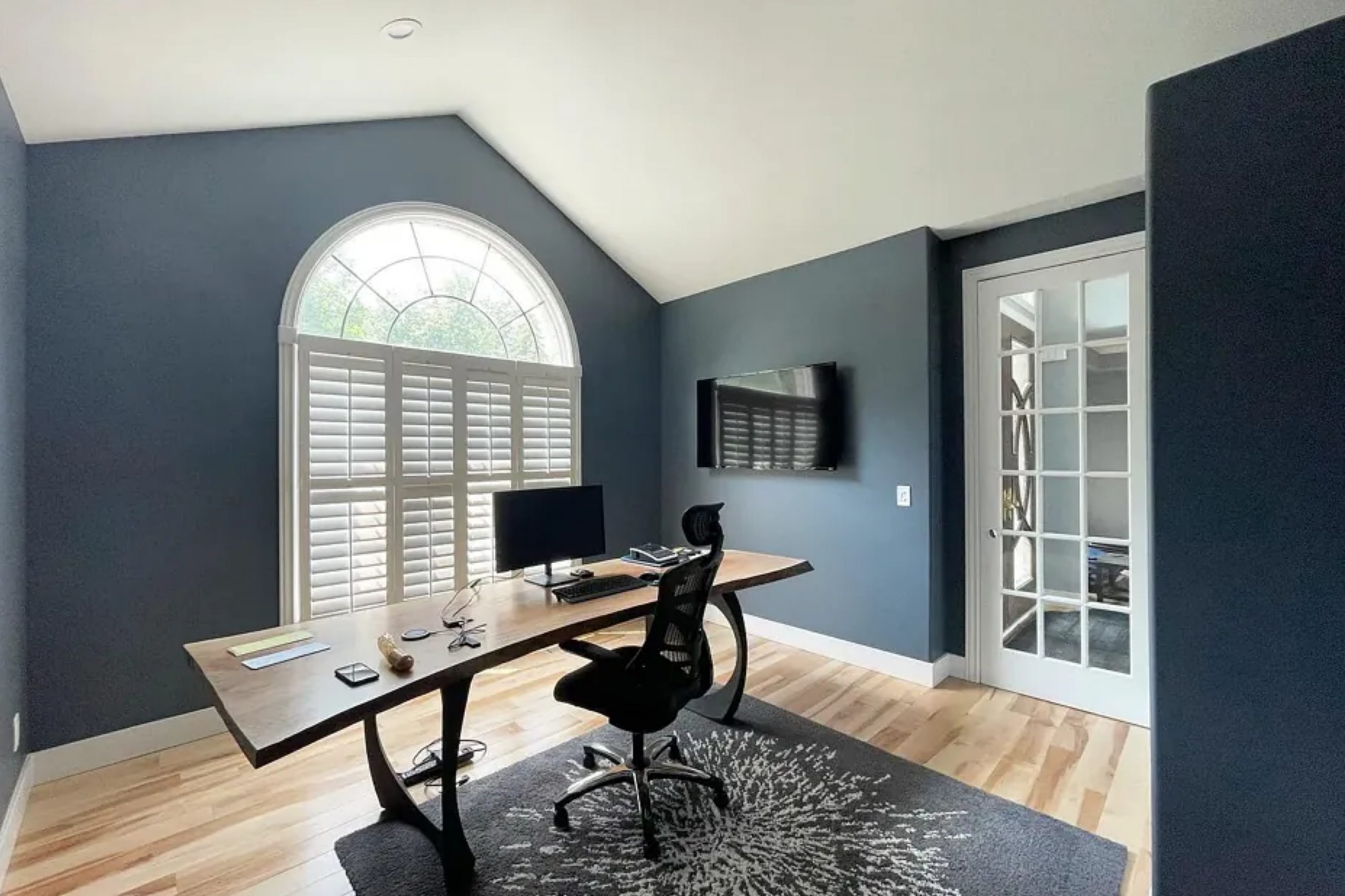
Granite Peak is a color that combines depth and sophistication, making it a perfect choice for a variety of spaces. The shade has an intriguing blend of blue and gray tones, creating a sense of calm and refinement without being overpowering.
As someone who loves to play with different color palettes in my home, I found Granite Peak to be a perfect backdrop that complements both modern and classic designs. Whether applied in a cozy living room, a serene bedroom, or a sleek kitchen, this hue seems to adapt and enhance the feel of any room.
What I appreciate most about Granite Peak is its ability to anchor a space while allowing other colors and textures to stand out. It pairs beautifully with crisp whites for a clean, striking look and with warmer tones for a more inviting atmosphere.
Granite Peak is more than just a wall color; it’s a design element that adds depth and character to your living spaces. When I decided to use it in my home, it truly transformed the mood of the rooms, offering a stylish yet relaxing environment that felt just right.
What Color Is Granite Peak SW 6250 by Sherwin Williams?
Granite Peak is a versatile and rich color offered by Sherwin Williams. It is a deep, muted blue-gray hue that creates a calming and cozy atmosphere in any room. This color works particularly well in modern and contemporary interiors, where its subdued tone can add a touch of elegance and depth.
It’s also a great choice for industrial and rustic styles, where it provides a pleasing contrast to raw materials.
Granite Peak complements a variety of materials and textures. It pairs beautifully with natural woods, such as oak or walnut, enhancing their warmth. The color also works well with metallic accents, like brushed nickel or matte black, which can add a modern edge to the space
. You can also combine it with soft, textural fabrics such as linen or velvet. These materials will provide a pleasant balance to the color’s cool undertones.
For a cohesive look, you could use Granite Peak on walls with white or light gray trims. This will highlight the color’s depth. Additionally, pairing it with crisp white or soft cream accessories and furnishings will create a fresh and inviting space. Overall, Granite Peak is a timeless choice that can add character and style to any home.
Is Granite Peak SW 6250 by Sherwin Williams Warm or Cool color?
Granite Peak by Sherwin Williams is a deep, muted blue-gray color that adds a sense of calm and balance to any room. Its rich tone can make a space feel cozy and inviting, creating a comforting atmosphere. This versatile color works well in various rooms, from living rooms to bedrooms, as it pairs perfectly with both warm and cool tones.
When used on walls, Granite Peak can make a bold statement without being overpowering. It complements white or lighter-colored trim, which can highlight room details. In spaces with plenty of natural light, it provides a beautiful contrast, making the room feel more grounded.
Granite Peak is also a great choice for accent walls. It can add depth and interest to a space without overwhelming the entire room. Additionally, it pairs wonderfully with natural materials like wood or stone, making it a good fit for homes with rustic or modern interior designs.
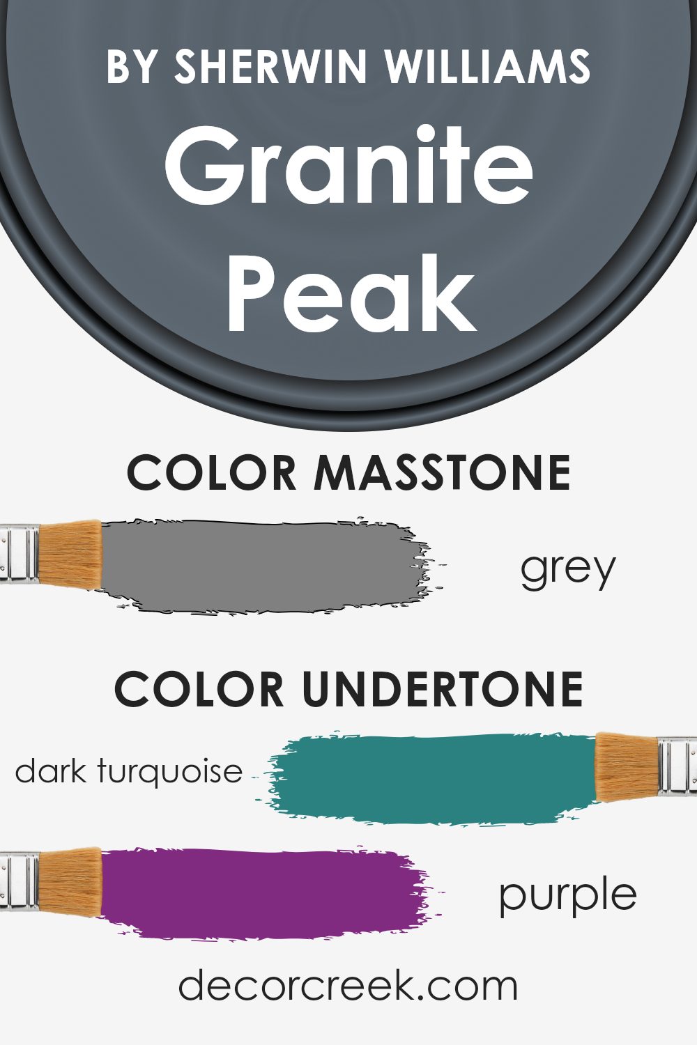
Undertones of Granite Peak SW 6250 by Sherwin Williams
Granite Peak by Sherwin Williams is a multifaceted color that carries a range of hidden tones. These undertones can change how we perceive the paint, depending on lighting and surroundings. Granite Peak has subtle hints of colors like turquoise, purple, olive, navy, and more. These undertones hold a lot of influence over the finished look on a wall.
When you put Granite Peak on your walls, these undertones become important. They can make the color appear warmer or cooler. For example, in natural light, the hue might lean more towards a soft blue or green due to the turquoise and navy undertones.
However, under artificial or dim lighting, the deeper tones like dark grey and dark blue may come through more prominently, giving the room a cozier feel.
Having a mix of contrasting soft and dark undertones means this paint adapts well to different settings. In a sunny room, the paint can feel light and refreshing because of the light turquoise and mint influences. In more shadowy areas, its deeper shades, like the hints of violet and dark green, can make a space feel intimate and inviting.
This versatility makes it a popular choice for creating rooms that feel both stylish and comfortable.
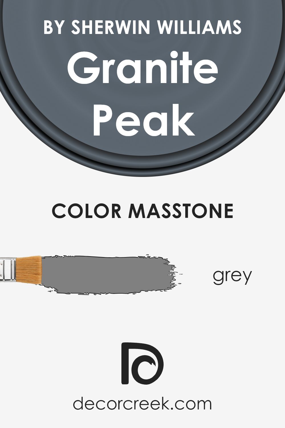
What is the Masstone of the Granite Peak SW 6250 by Sherwin Williams?
Granite Peak by Sherwin Williams is a color with a deep, muted blue tone. Its masstone, or the dominant visible color, is a soft grey (#808080). This grey undertone plays a crucial role in how the color is perceived in homes. It provides a sense of balance and neutrality, making it a versatile choice for various spaces.
The grey masstone helps it blend well with both warm and cool color palettes, offering homeowners flexibility in designing their interiors.
When used on walls, the color creates a calming and cozy environment without being too dark. It works especially well in bedrooms, living rooms, or home offices where a soothing yet substantial presence is desired. Additionally, this color complements different materials, like wood or metal, adding a touch of modernity without overwhelming the space. Overall, the grey masstone in this color makes it a smart choice for various interior design styles.
How Does Lighting Affect Granite Peak SW 6250 by Sherwin Williams?
Lighting can have a big impact on how colors look in a room. Natural light, which comes from the sun, changes throughout the day and affects how colors appear. Artificial light, from lamps and bulbs, can also alter color appearance, depending on the type of bulb used. Some bulbs emit warm light with a yellow hue, while others give off cool light with a bluish tint.
Granite Peak by Sherwin Williams is a deep, moody blue-gray color. In natural light, its gray-blue tone can shift depending on the light’s quality and direction. In artificial light, the color can change again, appearing warmer or cooler depending on the lighting’s temperature.
For instance, under warm incandescent bulbs, Granite Peak might look a bit softer, while under cool LED lights, it could appear crisper.
In north-facing rooms, which get less direct sunlight, Granite Peak may look cooler and more muted, as north light enhances the blue and gray tones within the color. These rooms often have a consistent light quality that doesn’t change much, which tends to keep the color stable throughout the day, though it can feel a bit darker.
South-facing rooms receive lots of direct sunlight, which tends to warm up any color. In such a setting, Granite Peak could appear slightly lighter and warmer, as the strong sunlight enhances its undertones. The color might seem more vibrant here during the day but can darken as the sun sets.
In east-facing rooms, the morning sun can make Granite Peak look brighter and slightly warmer, as the early light is soft and golden. As the day progresses, the color might take on its cooler, bluer tones again as the natural light fades.
West-facing rooms get warm light in the afternoon and evening. Here, Granite Peak can shift dramatically from cooler in the morning to warmer as the sun lowers, creating a dynamic look as the day goes on.
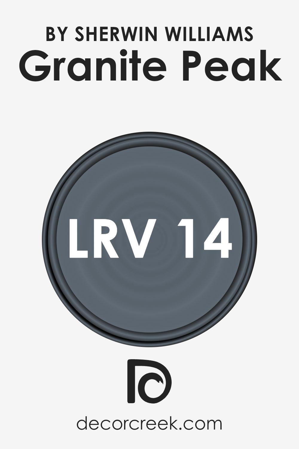
What is the LRV of Granite Peak SW 6250 by Sherwin Williams?
LRV, or Light Reflectance Value, is a number that indicates how much light a color will reflect. It is measured on a scale from 0 to 100, where 0 means the color absorbs all light (and thus is completely black), while 100 means the color reflects all light (and is pure white).
A color with a low LRV, like 0 to 30, absorbs more light, making a room feel cozier but also potentially darker. On the other hand, a color with a high LRV, such as 70 or above, reflects more light, which can make a room feel larger and brighter.
So, when choosing a paint color for a room, considering its LRV helps you anticipate how it will interact with natural and artificial light in the space.
Granite Peak has an LRV of 14.35, which means it’s a darker color that will absorb more light than it reflects. This gives it a rich, deep appearance, making it ideal for creating an intimate or dramatic atmosphere in a room.
Because it has a low LRV, it may make smaller spaces feel cozier but could also make them seem smaller if there’s not enough light. In larger rooms with plenty of natural light, Granite Peak can add a touch of sophistication without overwhelming the space. It’s essential to pair this color with lighter accents and sufficient lighting to balance its dark tone, ensuring the room doesn’t appear too dim.
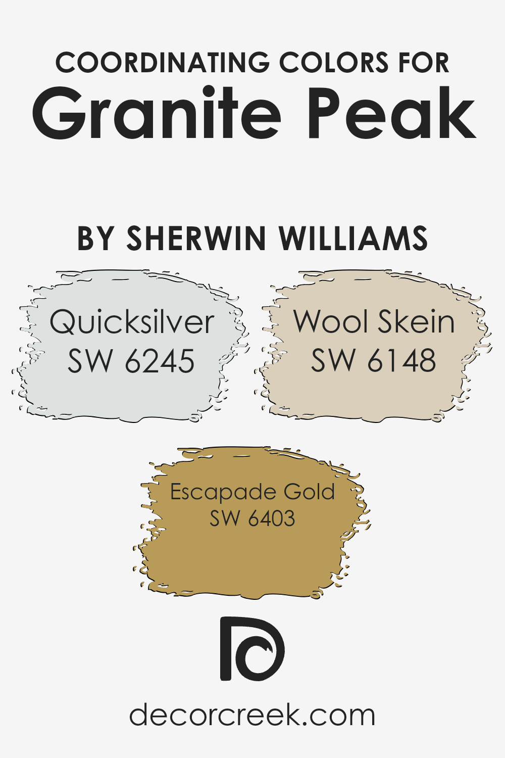
Coordinating Colors of Granite Peak SW 6250 by Sherwin Williams
Coordinating colors are hues that complement each other, creating a cohesive and visually appealing color scheme. These colors harmonize with the main color without clashing, enhancing the overall aesthetic of a space.
Granite Peak by Sherwin Williams is a rich, blue-gray tone that pairs well with various shades due to its versatile nature. To create a balanced palette, consider pairing it with colors like Quicksilver, Escapade Gold, and Wool Skein.
Quicksilver is a soft, muted gray with a hint of coolness that balances and complements the deeper tones of Granite Peak. It adds a gentle contrast and can help brighten a room. Escapade Gold brings warmth into the mix with its rich, golden hue.
This color adds a touch of brightness and energy, creating a lively yet harmonious atmosphere. Wool Skein, on the other hand, is a warm, neutral beige that provides a subtle backdrop. It ties the colors together seamlessly, offering a sense of calm and cohesion.
When used alongside Granite Peak, these colors work together to create a well-rounded and inviting environment.
You can see recommended paint colors below:
- SW 6245 Quicksilver
- SW 6403 Escapade Gold
- SW 6148 Wool Skein
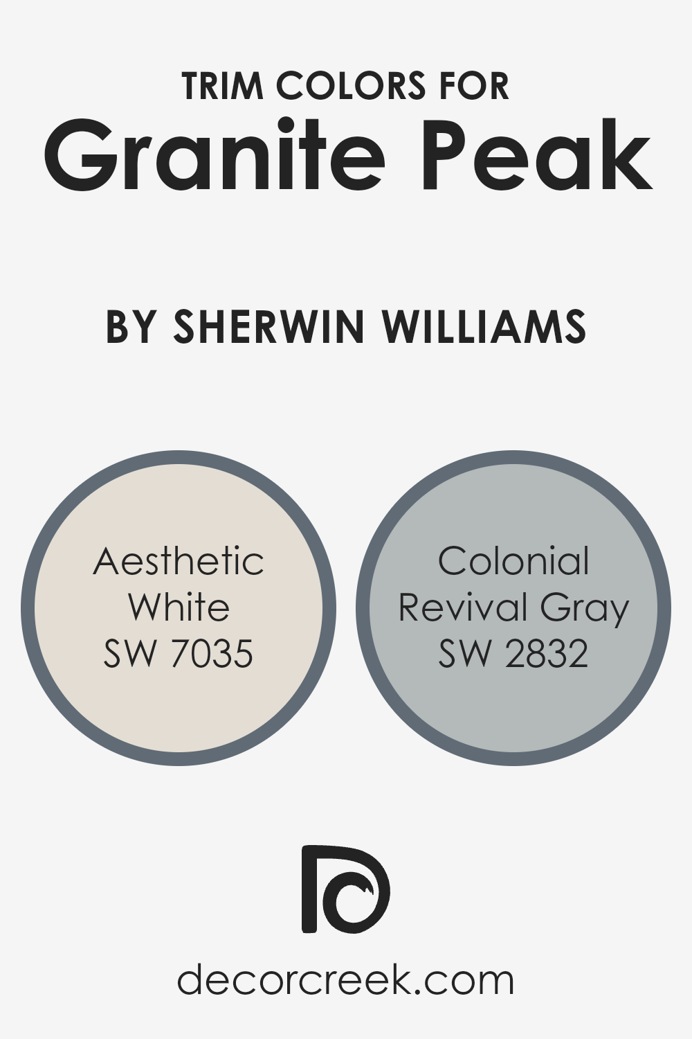
What are the Trim colors of Granite Peak SW 6250 by Sherwin Williams?
Trim colors are the shades used on the elements of a room or building that frame or highlight certain areas, such as baseboards, moldings, and windowsills. Choosing the right trim colors can enhance the overall appearance of a space by providing contrast and balance to the primary color used on the walls.
For a shade like Granite Peak by Sherwin Williams, which is a deep grayish-blue, selecting suitable trim colors can significantly change the look and feel of the room. By using Aesthetic White and Colonial Revival Gray as trim colors, you can create a warm and inviting space that complements Granite Peak without overpowering it.
Aesthetic White is a soft, neutral color with a slight warmth to it, which can create a gentle contrast against the richness of Granite Peak. It helps to lighten the space and adds an airy and clean touch to the darker main color.
On the other hand, Colonial Revival Gray is a medium tone with a hint of coolness, providing a harmonious contrast that pairs well with the depth of Granite Peak. This combination supports understated elegance, making the room feel well-rounded and inviting.
Together, these trim colors play a crucial role in complementing the main color and ensuring the overall design is cohesive and visually pleasing.
You can see recommended paint colors below:
- SW 7035 Aesthetic White
- SW 2832 Colonial Revival Gray
Colors Similar to Granite Peak SW 6250 by Sherwin Williams
Using similar colors to Granite Peak by Sherwin Williams can create a cohesive and balanced look in your space. These colors have a way of working together that offers harmony without being overly matched. Paint colors like Distance and Grays Harbor provide a deep, moody ambiance.
Distance is a rich blue with hints of slate, offering a touch of duskiness, while Grays Harbor leans closer to charcoal with its rich gray undertones. Night Out brings in a slightly darker blue that feels like a quiet evening sky, adding a layer of depth.
Web Gray presents an understated, cool gray that is neither too dark nor too light, perfect for a balanced backdrop.
Slate Tile combines a deep blue with gray undertones, suggesting the strength of slate stone. Wall Street carries a strong gray with subtle blue tones, offering a more formal feel. Needlepoint Navy is a darker navy, grounded yet familiar, evoking the traditional color of naval uniforms.
Smoky Blue provides a soft, blue-gray that feels gentle and adaptable for any room. Gibraltar melds gray and blue into a stormy hue with an inviting, cozy quality. Lastly, Outerspace offers a deeper, mysterious gray ideal for creating a space with character.
By choosing these colors, you’re setting a tone that is both calming and elegant, perfect for any room.
You can see recommended paint colors below:
- SW 6243 Distance
- SW 6236 Grays Harbor
- SW 9560 Night Out
- SW 7075 Web Gray
- SW 7624 Slate Tile
- SW 7665 Wall Street
- SW 0032 Needlepoint Navy
- SW 7604 Smoky Blue
- SW 6257 Gibraltar
- SW 6251 Outerspace

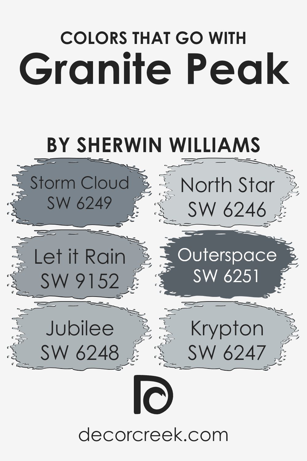
Colors that Go With Granite Peak SW 6250 by Sherwin Williams
When decorating with Granite Peak SW 6250 by Sherwin-Williams, it’s helpful to find colors that pair well with it to create a harmonious look. Granite Peak is a rich, dark blue with gray undertones, making it versatile for various design styles. By choosing complementary colors, you can make a room feel balanced and cohesive.
For example, SW 6249 – Storm Cloud is a cooler, softer blue-gray that brings a gentle contrast, making Granite Peak stand out without overpowering the space. SW 9152 – Let it Rain offers a touch of warmth with its muted blue-green hue, providing a soothing background that complements Granite Peak’s boldness.
Another color like SW 6248 – Jubilee adds a light, airy feel with its cheerful, soft blue shade, bringing brightness to the combination. Meanwhile, SW 6246 – North Star, a pale gray with blue undertones, offers a subtle complement to Granite Peak, making it ideal for a calming effect.
For a darker, moodier touch, SW 6251 – Outerspace is a deep charcoal blue that provides depth and drama. Additionally, SW 6247 – Krypton, a light blue-gray, can be used to keep things fresh and modern, creating a balanced and well-coordinated design scheme with Granite Peak.
You can see recommended paint colors below:
- SW 6249 Storm Cloud
- SW 9152 Let it Rain
- SW 6248 Jubilee
- SW 6246 North Star
- SW 6251 Outerspace
- SW 6247 Krypton
How to Use Granite Peak SW 6250 by Sherwin Williams In Your Home?
Granite Peak SW 6250 by Sherwin Williams is a rich, deep blue-gray paint color that can add a touch of elegance and warmth to various spaces in a home. This versatile shade works well in many rooms, giving them a cozy and inviting atmosphere.
In living rooms, Granite Peak can create a focal point when used on an accent wall, complementing lighter furniture and decor. In bedrooms, it brings a calming and restful vibe, perfect for creating a peaceful retreat.
For kitchens, Granite Peak can be used on cabinets to provide a modern and sophisticated look that pairs well with stainless steel appliances and white countertops. Bathrooms can benefit from this color too, adding a touch of depth and contrast when combined with white tiles and fixtures. Whether used in small doses or as a main color, Granite Peak enhances the beauty of a home with its timeless appeal.
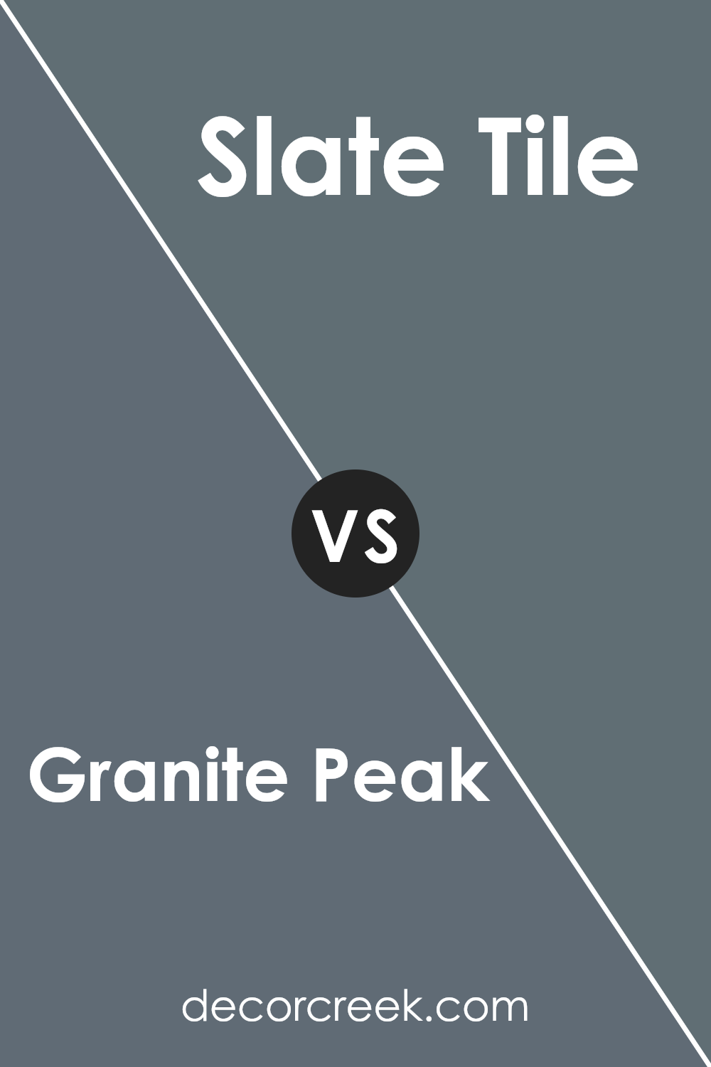
Granite Peak SW 6250 by Sherwin Williams vs Slate Tile SW 7624 by Sherwin Williams
Granite Peak SW 6250 and Slate Tile SW 7624 by Sherwin Williams are both deep, rich colors that bring a sense of coziness and depth to a room. Granite Peak is a dark, muted blue with gray undertones, giving it a soft and calming presence. It’s versatile and works well in spaces where a subtle yet moody color is desired.
On the other hand, Slate Tile is a dark blue with a hint of teal. It’s slightly more vibrant than Granite Peak, offering a bit more color saturation. While both shades add warmth and sophistication to a room, Granite Peak leans more towards a neutral palette, making it more understated.
Slate Tile, however, can add a bit more personality due to its teal undertones. Both colors work well in a variety of settings, from living rooms to bedrooms, providing rich backgrounds that easily match with other elements.
You can see recommended paint color below:
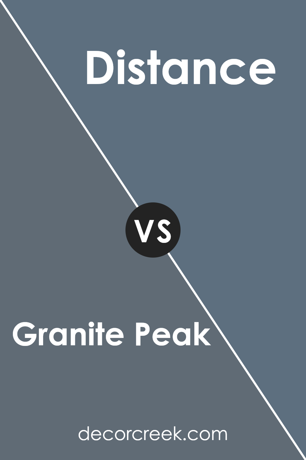
Granite Peak SW 6250 by Sherwin Williams vs Distance SW 6243 by Sherwin Williams
Granite Peak and Distance are two paint colors from Sherwin Williams that offer different vibes for a space. Granite Peak is a cool, deep blue-gray that lends a sense of calm and stability. It’s bold yet not overwhelming, making it suitable for accent walls or to create a cozy environment in rooms like a bedroom or study.
Distance, on the other hand, is also a blue-gray color but lighter than Granite Peak. It feels airy and open, making it perfect for spaces that need a touch of color without feeling too dark. Distance can work well in living rooms or kitchens, where you want a fresh, inviting look.
Both colors belong to the same family, but Granite Peak provides more depth and mystery, while Distance adds lightness and freshness. They can be used individually or paired together, depending on the mood you wish to create in your home.
You can see recommended paint color below:
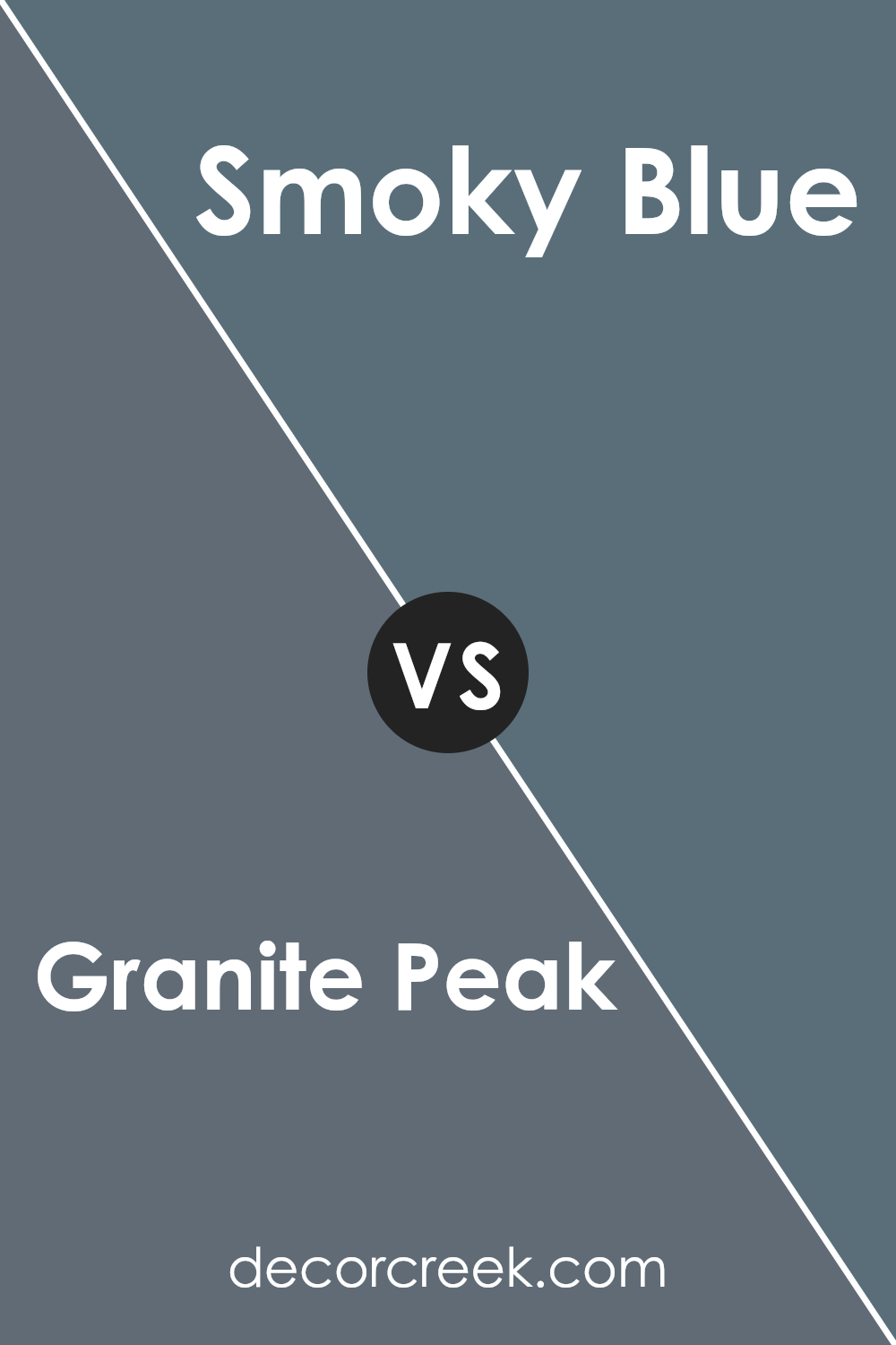
Granite Peak SW 6250 by Sherwin Williams vs Smoky Blue SW 7604 by Sherwin Williams
Granite Peak and Smoky Blue are both popular paint colors by Sherwin Williams, but they each have distinct characteristics. Granite Peak is a darker, muted blue-gray color that brings a sense of depth and richness to a space. It can create a cozy and intimate atmosphere, making it ideal for bedrooms or living areas where a calm ambiance is desired.
On the other hand, Smoky Blue is a bit lighter and has a more pronounced blue tone with subtle gray undertones. This color is refreshing and versatile, making it suitable for a variety of spaces. It can brighten a room without being too overpowering and pairs well with both light and dark accents.
While Granite Peak offers a more dramatic and deep hue, Smoky Blue is softer and slightly more versatile. Both colors share a calm vibe but differ in intensity and mood, offering unique options for different spaces and design preferences.
You can see recommended paint color below:
Granite Peak SW 6250 by Sherwin Williams vs Wall Street SW 7665 by Sherwin Williams
Granite Peak (SW 6250) and Wall Street (SW 7665) by Sherwin Williams are two popular paint colors. Granite Peak is a deep blue-gray that gives a moody and dramatic vibe. It feels cozy and works well in spaces where you want a bold, relaxing atmosphere
. On the other hand, Wall Street is more of a balanced gray with a hint of blue. It is lighter than Granite Peak and offers a more neutral backdrop, making it versatile and suitable for many different areas.
Granite Peak is great for adding a strong statement to a room, while Wall Street offers a more subtle, calming effect. Although both colors have blue undertones, Granite Peak’s deeper shade makes it more intense, whereas Wall Street’s lighter tone keeps spaces feeling open and airy.
Both colors pair well with whites and creams, but Granite Peak can handle bold accents, whereas Wall Street fits with softer tones.
You can see recommended paint color below:
- SW 7665 Wall Street
Granite Peak SW 6250 by Sherwin Williams vs Web Gray SW 7075 by Sherwin Williams
Granite Peak and Web Gray by Sherwin Williams are two rich and versatile colors. Granite Peak SW 6250 is a deep blue-gray with a hint of green, giving it a cool, calming effect. Its subdued tone can add depth to a room, making it feel more intimate and cozy. It’s an excellent choice for accent walls, bringing character without overwhelming the space.
In contrast, Web Gray SW 7075 is a medium-dark gray with a warm undertone. It leans more towards a true gray than Granite Peak, which makes it a neutral choice for various designs. Web Gray is adaptable and pairs well with both warm and cool hues, serving as a solid backdrop for brighter colors.
Both colors are stylish and modern, each bringing distinct vibes. Granite Peak has a slightly bolder and more dramatic feel, while Web Gray is understated and classic. The choice between them depends on the mood and style you want for your space.
You can see recommended paint color below:
Granite Peak SW 6250 by Sherwin Williams vs Gibraltar SW 6257 by Sherwin Williams
Granite Peak and Gibraltar are two popular colors from Sherwin Williams’ palette. Granite Peak is a deep, cool blue with gray undertones, making it a perfect choice for those who want a calm and collected vibe in their space. It brings a sense of coziness and warmth, without being too dark or overpowering.
On the other hand, Gibraltar is a slightly darker blue with stronger gray undertones. This shade is more muted compared to Granite Peak, giving it a more neutral and balanced appearance. It works well in spaces where you want a subtle, elegant backdrop that doesn’t draw too much attention.
Both colors have a grounding effect, but Granite Peak is a touch more vibrant due to its bluer hue, while Gibraltar leans more towards a neutral gray-blue. Choosing between them depends on whether you want a bit more color with Granite Peak or a more subdued look with Gibraltar.
You can see recommended paint color below:
Granite Peak SW 6250 by Sherwin Williams vs Grays Harbor SW 6236 by Sherwin Williams
Granite Peak SW 6250 and Grays Harbor SW 6236 are two popular paint colors from Sherwin Williams, both offering unique characteristics. Granite Peak is a rich, deep blue-gray shade with a subtle hint of warmth. This color creates a cozy and inviting atmosphere, making it a great choice for living rooms or bedrooms where you want a calm and comfortable vibe.
Grays Harbor, on the other hand, is a darker gray with blue undertones. It’s a more neutral choice that can work well in various settings and pairs easily with other colors and design elements.
While both colors have blue-gray tones, Grays Harbor feels more grounded and versatile, suitable for spaces you want to feel more formal or elegant.
Overall, Granite Peak leans more into blue tones and warmth, while Grays Harbor presents a deeper, more neutral gray with blue undertones. Both can add sophistication to any room, but your choice will depend on the mood and feel you want for your space.
You can see recommended paint color below:
Granite Peak SW 6250 by Sherwin Williams vs Needlepoint Navy SW 0032 by Sherwin Williams
Granite Peak and Needlepoint Navy are two rich and versatile colors by Sherwin Williams. Granite Peak is a soft, muted gray-blue that exudes calmness and feels subtly balanced between gray and blue. It’s a shade that can create a cozy and inviting atmosphere in a room.
On the other hand, Needlepoint Navy is a deep, classic navy with a strong, bold presence. This color brings a sense of depth and drama, perfect for making a statement on an accent wall or as part of a more formal setting.
While Granite Peak leans towards a lighter, more relaxed feel, Needlepoint Navy adds intensity and richness. Both colors can complement a range of styles and furnishings, but the choice between them largely depends on whether you’re seeking a subtle backdrop or a more commanding, bold look in your space.
You can see recommended paint color below:
- SW 0032 Needlepoint Navy
Granite Peak SW 6250 by Sherwin Williams vs Outerspace SW 6251 by Sherwin Williams
Granite Peak and Outerspace are two popular colors by Sherwin Williams that offer different moods for a room. Granite Peak is a deep, rich blue-gray shade that provides a strong, calming presence. It’s versatile enough to work well in both traditional and modern spaces, giving off a sense of depth and stability.
On the other hand, Outerspace, also a cool blue-gray tone, is slightly lighter with a hint of silver. This makes it feel a bit more airy and open compared to Granite Peak.
While both colors belong to the same family, Granite Peak tends to create a more intimate and cozy atmosphere, whereas Outerspace is perfect if you desire a fresher, breezier feel.
Choosing between them depends on the look and feel you want to achieve in your space, but both promise to add a touch of elegance to your home.
You can see recommended paint color below:
Granite Peak SW 6250 by Sherwin Williams vs Night Out SW 9560 by Sherwin Williams
Granite Peak is a deep, muted gray-blue with a calming and composed presence. It’s a versatile color, perfect for creating a cozy and grounded atmosphere in a room. This shade can work well as a backdrop, highlighting lighter or brighter accents through furniture and decor.
On the other hand, Night Out is another rich color but leans more towards a complex dark gray with subtle hints of other undertones. It’s a bold choice, adding a touch of drama and depth to any space. Night Out can add a modern and sophisticated touch to interiors, working well with metallics and vibrant accents.
Both colors are great for those who enjoy darker, more subdued palettes. Granite Peak offers more of a blue tone, providing a bit of coolness, while Night Out emphasizes a sleeker, more urban aesthetic. Used correctly, each color can create a unique and inviting environment.
You can see recommended paint color below:
Conclusion
After learning about SW 6250 Granite Peak by Sherwin Williams, I found this color is a special shade of blue-gray that feels like it brings a mountain’s calmness into a room. It’s interesting because it can look one way in bright sunlight and another way in a dim room, like it’s playing a gentle trick! This makes it fun to use because it keeps things lively.
In a bedroom, SW 6250 Granite Peak can help make things feel cozy and comfortable, just like being wrapped in a soft blanket. It’s also a great color for a living room, where it can add a touch of warmth and make everything feel a bit more put together without being too fancy.
What makes Granite Peak really cool is how well it goes with other colors. You can pair it with white to keep things light and bright, or maybe add some pops of yellow or orange to make it more cheerful. It’s like a friendly color that gets along well with its neighbors!
In conclusion, SW 6250 Granite Peak is not just a color; it’s like bringing a piece of a beautiful mountain inside. It helps make rooms feel comforting and pleasant, working with other colors to keep everything balanced and nice.
It’s a color that does a job but also makes any room feel a bit more special.

Ever wished paint sampling was as easy as sticking a sticker? Guess what? Now it is! Discover Samplize's unique Peel & Stick samples.
Get paint samples

