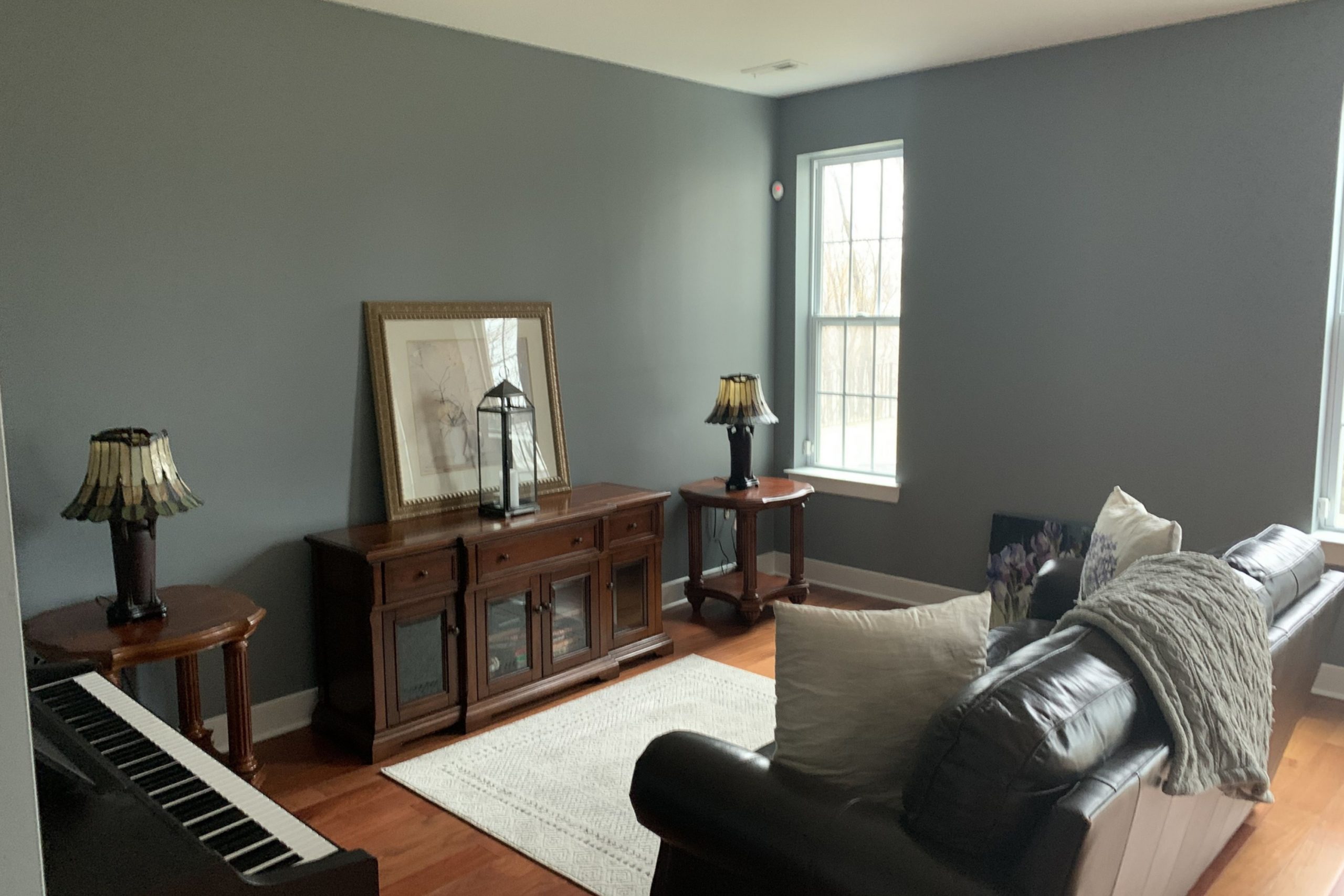
Just wanted to share a paint color that’s been catching a lot of attention lately—SW 7664 Steely Gray by Sherwin Williams.
It’s that perfect middle-of-the-road gray—not too dark, not too light. Just right. What makes it stand out is how easy it is to work with. It’s got a calm, solid feel that fits right in whether you’re going for a more modern look or something classic and cozy.
Using Steely Gray in my project, I noticed it works well in areas with lots of natural light as well as spaces that rely on artificial lighting, maintaining its unique charm under different conditions. This adaptability also extends to various color palettes, as it supports bold colors and complements softer tones, offering endless design possibilities.
If you’re considering a neutral that adds both warmth and sophistication, Steely Gray could be the ideal choice. It elevates the aesthetic without overwhelming the senses, making it suitable for large areas like living rooms or cozy spaces like bedrooms.
By choosing Steely Gray, you assure yourself of a timeless backdrop that enhances your furniture and decor elements beautifully.
What Color Is Steely Gray SW 7664 by Sherwin Williams?
The color Steely Gray by Sherwin Williams is a versatile and balanced gray shade with slight blue undertones. This neutral hue is subtle yet impactful, making it an excellent option for those looking to create a clean and modern ambiance in their living space without overwhelming it with color. Ideal for achieving a minimalist aesthetic, Steely Gray matches well with a variety of décor styles, especially contemporary and industrial designs.
In terms of pairing, Steely Gray works beautifully with natural materials like wood and stone, enhancing their organic textures. It contrasts strikingly with polished metals such as stainless steel or chrome, adding a touch of sleekness to the environment. When it comes to textiles, this color complements both soft, plush fabrics like velvet and simpler, rough-textured materials like burlap or linen.
The versatility of Steely Gray allows it to blend seamlessly with other colors. It pairs well with both pastels for a soft, modern look and with vibrant colors, which it grounds nicely. Utilizing this color in spaces such as living rooms, bedrooms, or home offices can help achieve a fresh, tidy appearance that remains warm and inviting.
Whether used as a primary color on walls or as an accent in furnishings and decor, it helps create a cohesive and contemporary space.
Is Steely Gray SW 7664 by Sherwin Williams Warm or Cool color?
Steely Gray is a unique paint color from Sherwin Williams that offers a bold yet neutral choice for home interiors. This shade is a deep gray with hints of blue, which gives it a cooler tone, perfect for creating a modern and inviting space.
The coolness of Steely Gray works well in areas that receive a lot of sunlight, balancing the brightness with its subtle, muted appeal. It is versatile enough to complement various home styles, from contemporary to traditional.
Using Steely Gray in a living room or bedroom can give the space a fresh and clean look, while maintaining a cozy atmosphere. It pairs beautifully with crisp whites or softer creams, which can help to soften the intensity of the gray, making the room feel more spacious and open. Additionally, this color goes well with vibrant accents like yellow or teal, which can add a pop of color to a room without overpowering it.
In summary, Steely Gray provides a stylish yet functional backdrop for any home, adapting easily to different decorating tastes and styles.
Undertones of Steely Gray SW 7664 by Sherwin Williams
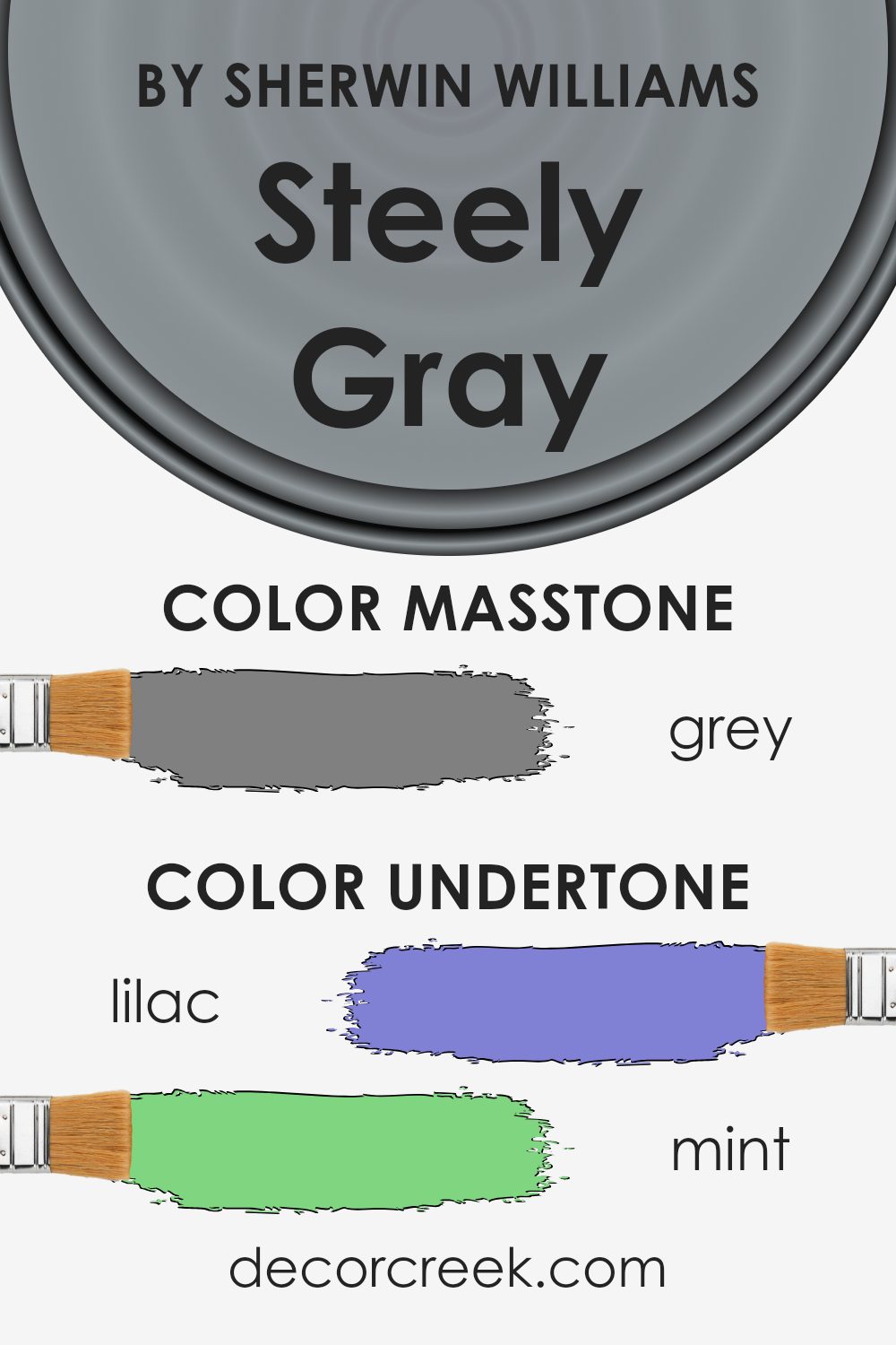
Steely Gray by Sherwin Williams is a nuanced paint color that can dramatically alter the mood and style of a space depending on its undertones. This color incorporates a wide array of undertones, ranging from darker shades like navy and dark gray to lighter hues like lilac and pale pink. These subtler shades can add intriguing depth to Steely Gray, influencing the color’s overall appearance under different lighting conditions.
When applied to interior walls, the undertones of Steely Gray play an essential role in harmonizing with various decor elements. In rooms with ample natural light, the lighter undertones such as mint, pale pink, and light blue might become more pronounced, creating a calming, gentle ambiance. In contrast, spaces with less natural light might highlight the cooler, darker undertones like dark turquoise and navy, giving the room a more grounded, cozier feel.
Colors with multiple undertones like Steely Gray are versatile. The mint and light green undertones can give a breath of freshness to a space, making it feel lively. On the other hand, undertones like purple and fuchsia might add a subtle hint of playfulness. The overall effect of these undertones on Steely Gray can make it a perfect candidate for those looking to add a sense of sophistication without overwhelming the space with bold color choices.
In essence, Steely Gray’s complexity due to its mix of undertones ensures it can work well in many different interior styles and settings, adapting subtly to various furnishings and natural lighting conditions, thus enhancing the overall aesthetic of any room.
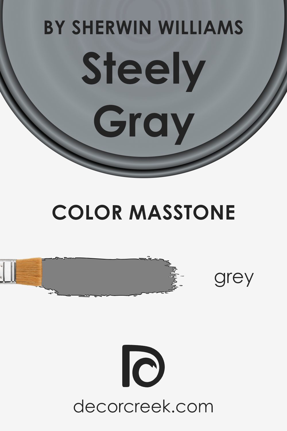
What is the Masstone of the Steely Gray SW 7664 by Sherwin Williams?
Steely Gray SW 7664 by Sherwin Williams has a masstone that matches Grey (#808080), a neutral shade that works well in various areas of a home. This shade is a versatile choice for those looking to create a calm and balanced atmosphere in their rooms.
Due to its neutral tone, it pairs effortlessly with many other colors, making it easy for homeowners to mix and match their furniture and decor. Whether used for living room walls, bedroom backdrops, or kitchen cabinets, its ability to blend seamlessly into any setting ensures that spaces feel cohesive and well put together. Additionally, this kind of gray can help to gently highlight other colors or design elements in the room without clashing.
It’s perfect for anyone looking for a modern yet understated backdrop in their living space, helping to tie various design aspects together smoothly. The neutrality of Steely Gray also means it’s great at hiding imperfections, making spaces appear cleaner and more polished.
How Does Lighting Affect Steely Gray SW 7664 by Sherwin Williams?
Lighting plays a crucial role in how we perceive colors in our daily environments. The impact of light on color is such that the same shade can appear different under various lighting conditions, due to how light affects color wavelengths.
Taking the shade Steely Gray (SW 7664) as an example, its appearances can vary remarkably depending on the lighting. Under artificial light, such as LED or fluorescent bulbs, this gray can look sharper and slightly more intense. This occurs because artificial light often has a specific color temperature that can emphasize certain tones in the paint.
For example, under a cooler light, Steely Gray might seem to have a bluish tinge, whereas under warmer lights, it might appear softer and more muted.
In natural light, the appearance of Steely Gray shifts throughout the day. Natural light offers the truest representation of color, showing this particular gray in its clearest form during midday when the light is brightest.
During dawn or dusk, natural light has a reddish hue, potentially giving Steely Gray a warmer feel.
Room orientation also affects how Steely Gray looks:
- 1. North-Faced Rooms:These rooms get less direct sunlight, which tends to make colors appear cooler. In north-facing rooms, Steely Gray might look somewhat more austere or shadowed, highlighting its steely characteristics.
- 2. South-Faced Rooms: These rooms benefit from plentiful sunlight throughout the day, making colors warmer and brighter. In south-facing rooms, Steely Gray will likely appear lighter and softer.
- 3. East-Faced Rooms:With sunlight in the morning, Steely Gray will start the day with a bright, warm appearance, shifting towards cooler tones as the day progresses and the natural light diminishes.
- 4. West-Faced Rooms:*Here, the color will appear neutral or muted during the morning, and become warmer in the evening as the sun sets.
Understanding how lighting affects colors like Steely Gray can help in making informed decisions about paint choices depending on the room’s purpose and orientation.
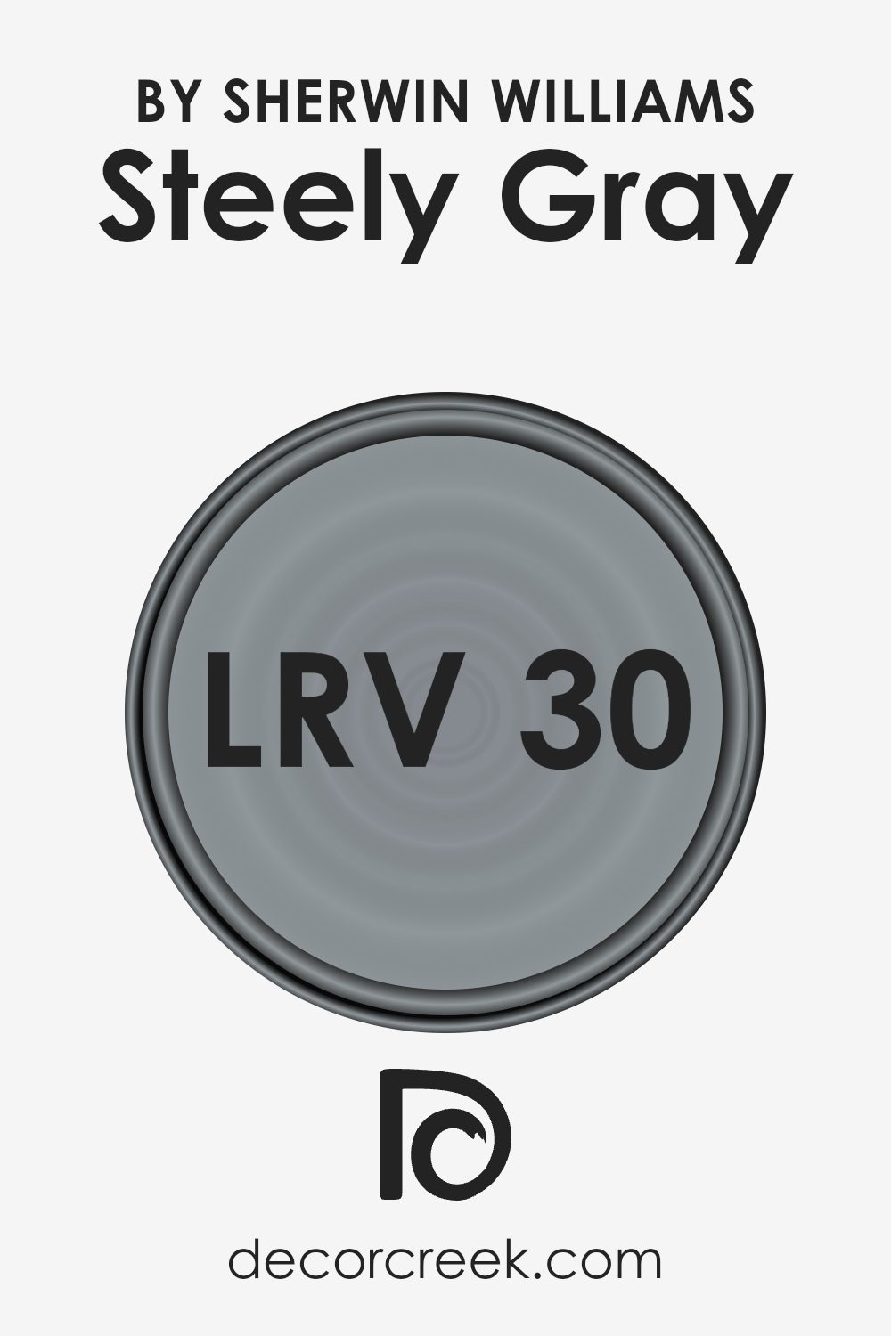
What is the LRV of Steely Gray SW 7664 by Sherwin Williams?
LRV stands for Light Reflectance Value, which measures the percentage of light a paint color reflects back into a room. It ranges from 0 to 100, where 0 absorbs all light and 100 reflects all light. Higher LRVs make rooms feel brighter since they reflect more light around the space.
Paint colors with lower LRV can make a room feel cozier and more enclosed because they absorb more light.
For Steely Gray, with an LRV of 30.355, it’s on the darker end of the scale. This means it won’t reflect much light. In rooms with less natural light or smaller spaces, using a color like Steely Gray might make the room feel smaller or darker. However, in a well-lit or large room, it can add depth and character without making the space feel too cramped. The effect of this LRV is significant because it can influence the atmosphere and mood in the living space.
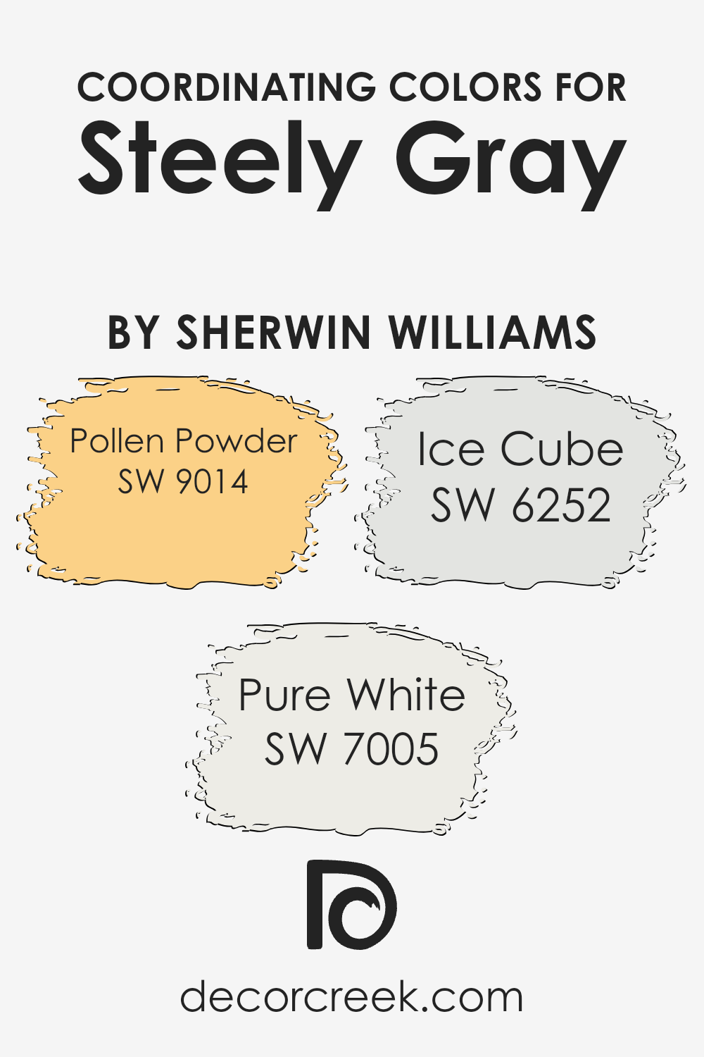
Coordinating Colors of Steely Gray SW 7664 by Sherwin Williams
Coordinating colors are those that complement each other when used together in a space, enhancing the overall aesthetic appeal without overpowering the primary color. In the case of Steely Gray SW 7664 by Sherwin Williams, a balanced, modern gray hue, there are specific shades recommended to harmonize with it, creating a cohesive look. These shades include Pollen Powder SW 9014, Pure White SW 7005, and Ice Cube SW 6252, each bringing its unique vibe while maintaining visual balance with the primary color of Steely Gray.
Pollen Powder SW 9014 is a gentle, warm yellow that injects a subtle brightness into spaces, making it a great accent color to complement the neutrality of Steely Gray. It works well to provide a sunny contrast without clashing. Pure White SW 7005 is a clean and crisp white that acts as a versatile backdrop, helping to make the gray tones stand out more prominently and providing a sense of freshness to the area.
Lastly, Ice Cube SW 6252 offers a light, airy blue that introduces a cool, fresh feel, pairing wonderfully with the sturdiness of Steely Gray to create a refreshing palette. Together, these colors support and enhance one another, allowing for a harmoniously decorated space.
You can see recommended paint colors below:
- SW 9014 Pollen Powder
- SW 7005 Pure White
- SW 6252 Ice Cube
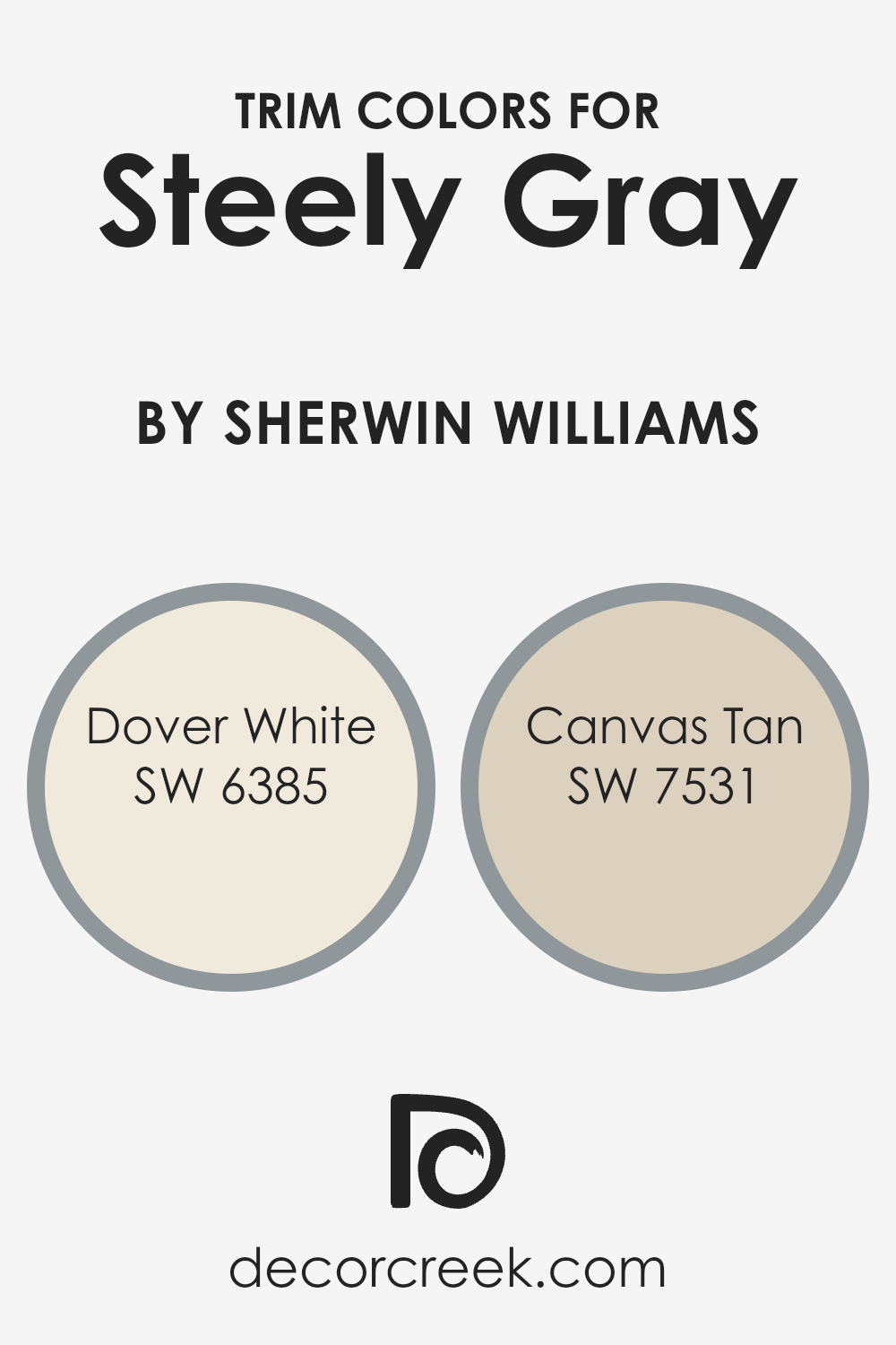
What are the Trim colors of Steely Gray SW 7664 by Sherwin Williams?
Trim colors are selected to complement the main color on walls, enhancing architectural details and framing features like doors, windows, and skirtings. Choosing the right trim color can significantly affect the overall look and feel of a room, providing contrast that defines spaces clearly and adds visual interest. For a color like Steely Gray, which has a subtle and versatile hue, using bright or warm trim colors can create a pleasant balance.
Dover White SW 6385 is a clean and bright white that offers a stark contrast to Steely Gray, accentuating the trim with a refreshing pop. It is a great choice for creating a crisp outline around doors and windows, making them stand out against the cooler tones of the gray.
Another option, Canvas Tan SW 7531, is a warm neutral with a soothing beige tone, which provides a softer blend with Steely Gray. This color is excellent for a seamless and subtle transition between the wall and the trim, enhancing a harmonious and inviting atmosphere.
You can see recommended paint colors below:
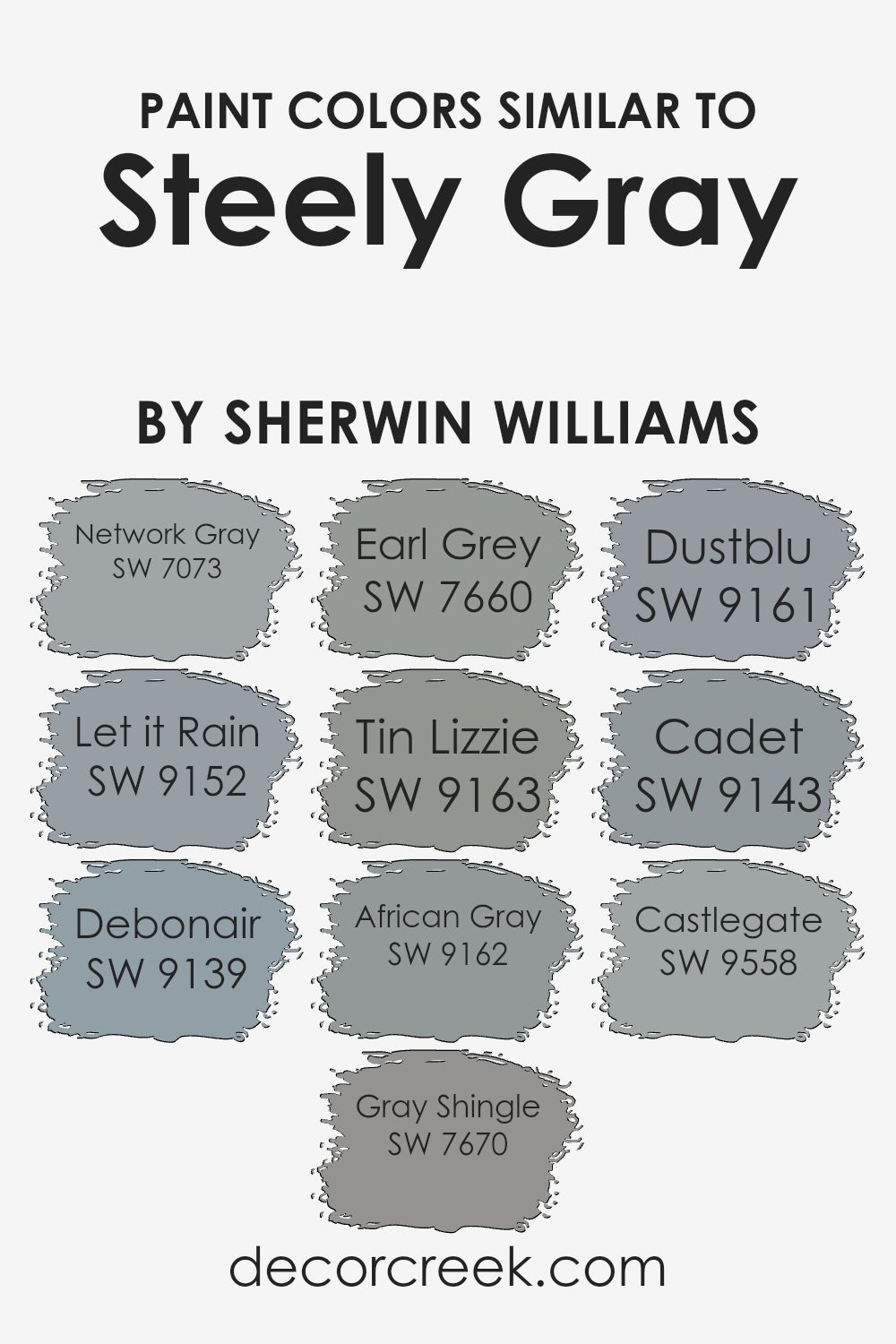
Colors Similar to Steely Gray SW 7664 by Sherwin Williams
Similar colors are crucial in design because they create a harmonious and coherent aesthetic, which is pleasing to the eye. Choosing similar colors allows for seamless transitions and subtle distinctions in spaces, making them feel thoughtfully put together. For instance, colors like Network Gray and Let it Rain share a common base with Steely Gray, but each brings its own unique shade to the table, ensuring variety without clashing. Network Gray is a cooler tone that gives a calm feel, while Let it Rain is slightly darker, offering a soothing atmosphere.
Debonair, Gray Shingle, and Earl Grey are also in the same color family, providing a balanced and cohesive look when used together. Debonair is a soft, muted color adding a gentle touch, whereas Gray Shingle has a bit more depth to create a striking effect in any room.
Earl Grey, with its stronger presence, works well to add interest and focus. The subtle variations among Tin Lizzie, African Gray, and Dustblu also contribute to creating a space that feels layered yet unified.
Tin Lizzie has a smooth, metallic feel, African Gray adds warmth with its earthier tone, and Dustblu provides a dusty, airy quality. Cadet and Castlegate, two more variations, add further dimension; Cadet has a cool, military-inspired tone and Castlegate brings a solid, grounded feeling to the mix.
These similar colors, while unique in their own right, blend seamlessly when paired with each other, achieving an overall effect that enhances the environment without overwhelming it.
You can see recommended paint colors below:
- SW 7073 Network Gray
- SW 9152 Let it Rain
- SW 9139 Debonair
- SW 7670 Gray Shingle
- SW 7660 Earl Grey
- SW 9163 Tin Lizzie
- SW 9162 African Gray
- SW 9161 Dustblu
- SW 9143 Cadet
- SW 9558 Castlegate
Colors that Go With Steely Gray SW 7664 by Sherwin Williams
Choosing complementary colors for Steely Gray SW 7664 by Sherwin Williams can significantly enhance the visual appeal of a space. It allows for creating an aesthetic balance and can unify a room’s design while adding depth and character. When paired with colors such as Reflection, Slate Tile, Wall Street, Monorail Silver, Evening Shadow, and Smoky Blue, Steely Gray brings out a cohesive yet dynamic atmosphere, perfect for modern living spaces.
Reflection SW 7661 is a light and airy gray that provides a gentle contrast to the deeper tones of Steely Gray, ideal for creating a soothing backdrop. Slate Tile SW 7624 is a deeper blue-gray that adds a substantial and grounding presence to interiors, pairing nicely with the neutrality of Steely Gray.
Wall Street SW 7665 is a strong, dark gray that can give a room a bold yet balanced feel when used alongside Steely Gray. Similarly, Monorail Silver SW 7663 offers a bright, metallic twist that can enliven the muted Steely Gray smoothly. Evening Shadow SW 7662 is slightly cooler and brings a subtle vibrancy to the duo, perfect for a contemporary setting.
Lastly, Smoky Blue SW 7604 infuses a touch of color with its muted blue hue that complements the cool undertones of Steely Gray. Together, these colors provide multiple styling options, ensuring that each room can flaunt its unique charm while maintaining an inviting atmosphere.
You can see recommended paint colors below:
- SW 7661 Reflection
- SW 7624 Slate Tile
- SW 7665 Wall Street
- SW 7663 Monorail Silver
- SW 7662 Evening Shadow
- SW 7604 Smoky Blue

How to Use Steely Gray SW 7664 by Sherwin Williams In Your Home?
Steely Gray SW 7664 by Sherwin Williams is a versatile gray paint color that suits various spaces in a home. This medium-tone gray offers a balanced look that’s not too dark or too light, making it perfect for both small and large rooms.
You can use Steely Gray in your living room to create a cozy and inviting atmosphere. It’s gentle enough to blend well with most furniture colors, from bright whites to deep blues.
In bedrooms, this color works well, providing a calm backdrop that’s ideal for relaxation and sleep. It pairs beautifully with soft textiles and natural wood, enhancing a clean, fresh look. For those looking to freshen up their kitchen or bathrooms, Steely Gray is a great choice. It complements stainless steel appliances and white cabinetry very well, bringing a modern touch to the space without being overpowering.
Simply put, Steely Gray is a practical and stylish choice that can easily fit into any decorating style, helping to make your house feel more like a home.
Steely Gray SW 7664 by Sherwin Williams vs Debonair SW 9139 by Sherwin Williams
The main color, Steely Gray, offers a deep, cool gray tone that brings a modern and sleek feel to any space. Its ability to blend seamlessly with various decor styles makes it a versatile choice for interior walls and exteriors alike.
On the other hand, Debonair, the second color, presents a lighter and warmer gray, providing a softer look that is inviting and comfortable. This shade is ideal for creating a cozy atmosphere in places like living rooms or bedrooms. Both colors share a gray base, but Steely Gray leans more towards a bold and stark presence, whereas Debonair gives off a gentler and more welcoming vibe.
Each color serves well in environments where you want to establish a clean and stylish aesthetic, but the choice between them depends on the mood and tone you wish to set in the room.
You can see recommended paint color below:

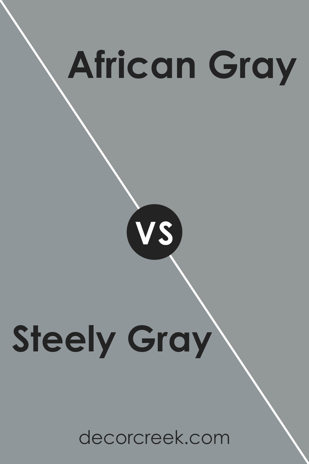
Steely Gray SW 7664 by Sherwin Williams vs African Gray SW 9162 by Sherwin Williams
Steely Gray and African Gray are both gray shades from Sherwin Williams that bring a modern touch to any space. Steely Gray has a cooler tone, which sometimes gives it a subtle bluish tint. This makes it excellent for creating a fresh, sleek look in areas like kitchens or bathrooms. It’s the type of color that goes well with white trim or can be paired with brighter colors for a clean contrast.
On the other hand, African Gray has warmer undertones. This warmth makes it more inviting, perfect for living spaces like family rooms or bedrooms where a cozy atmosphere is desired. It pairs nicely with wooden furniture and earthy decor, enhancing the feeling of warmth.
Overall, the choice between Steely Gray and African Gray depends on what mood you want to set in your room. Steely Gray will give a sharper, more modern vibe, while African Gray offers a softer, more welcoming feel.
You can see recommended paint color below:
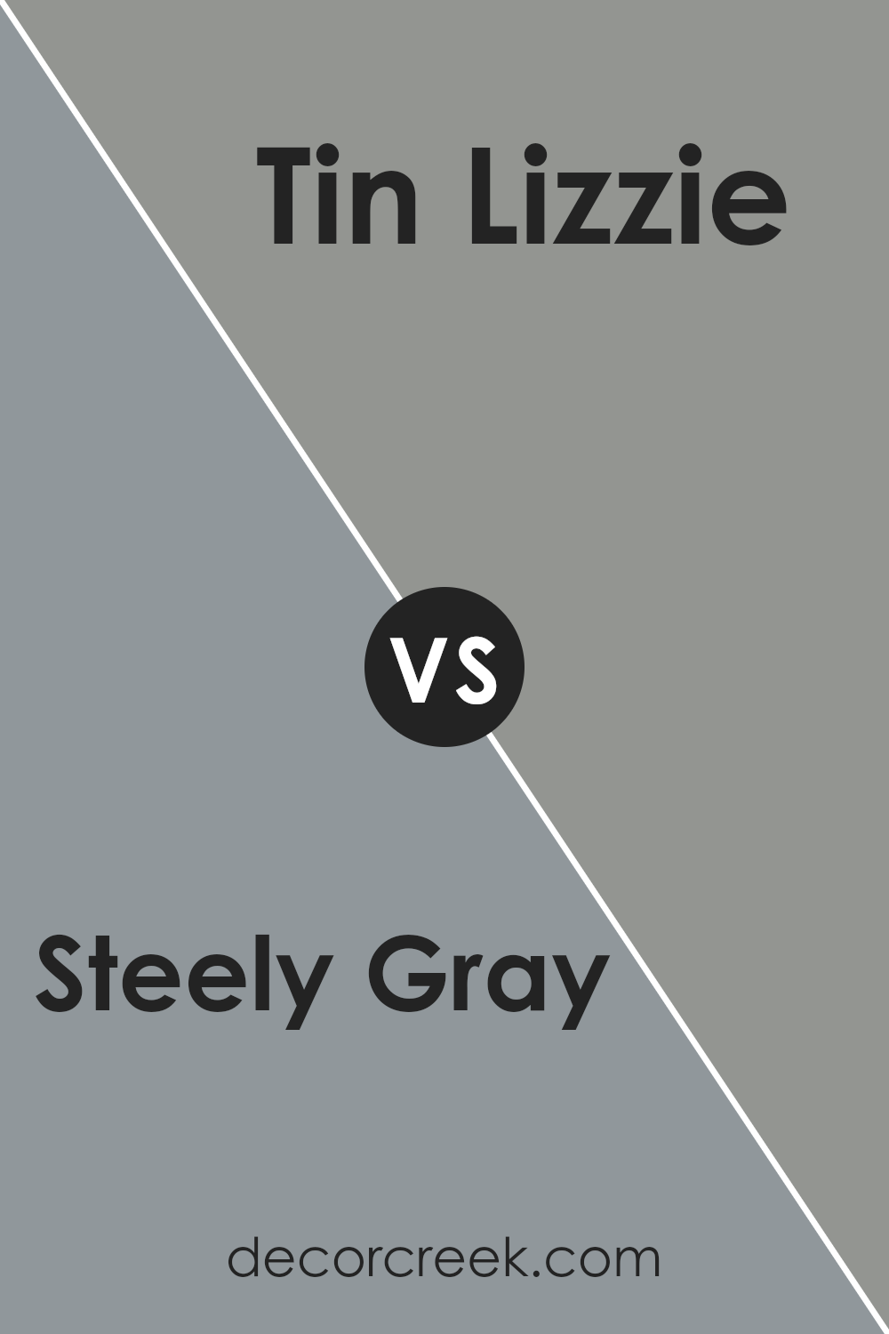
Steely Gray SW 7664 by Sherwin Williams vs Tin Lizzie SW 9163 by Sherwin Williams
Steely Gray and Tin Lizzie are both colors by Sherwin Williams. Steely Gray is a deep, cool gray that has a strong presence in a room. It’s darker, making it great for creating a cozy and grounded atmosphere.
On the other hand, Tin Lizzie is a lighter gray with a slightly warmer tone. This color is more subtle and can make a room feel open and airy. While Steely Gray works well in spaces where you want a sense of solidity and anchoring, Tin Lizzie is better suited for areas where a lighter, more calming feel is desired.
colors can complement a variety of decor styles, but Steely Gray might be better for a bold, dramatic look, whereas Tin Lizzie could be ideal for a softer, more relaxed vibe.
You can see recommended paint color below:
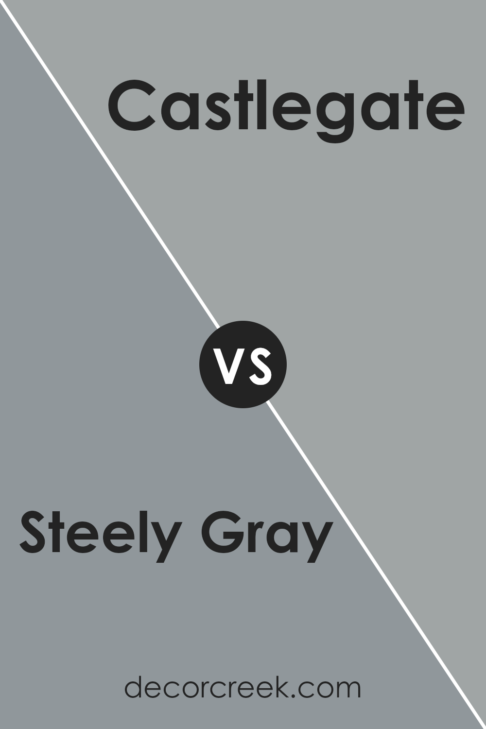
Steely Gray SW 7664 by Sherwin Williams vs Castlegate SW 9558 by Sherwin Williams
Steely Gray and Castlegate by Sherwin Williams are two distinct colors that bring different moods to a space. Steely Gray is a deep, cool gray with a hint of blue undertone. It reflects a classic look, fitting well in modern and traditional settings. This color is versatile, perfect for living areas, bedrooms, and kitchens, providing a neutral backdrop that complements both vivid and subdued accents.
On the other hand, Castlegate is a darker shade, leaning towards a rich, warm gray with brown undertones. This color offers a cozy and inviting atmosphere, ideally suited for spaces where you want to feel relaxed and comfortable, such as dens and dining rooms. Unlike the cooler touch of Steely Gray, Castlegate’s warmth helps create a more intimate environment.
While both shades fall under the gray spectrum, Steely Gray caters more towards a crisp and clean vibe, whereas Castlegate gears towards a heartier, enveloping feel. Depending on the desired mood and room function, one might choose the refreshing neutrality of Steely Gray or the warm embrace of Castlegate.
You can see recommended paint color below:
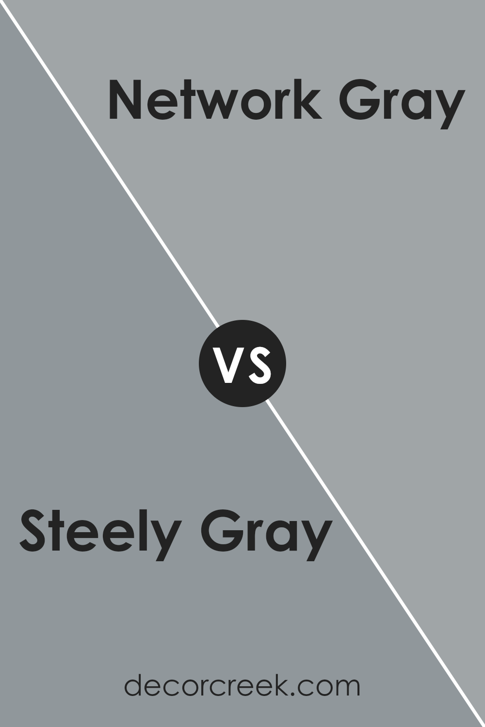
Steely Gray SW 7664 by Sherwin Williams vs Network Gray SW 7073 by Sherwin Williams
Steely Gray and Network Gray are two different shades by Sherwin Williams, each offering its own unique character. Steely Gray presents a deeper, almost charcoal-like tone which makes it ideal for creating a strong, assertive presence in a room. It pairs well with bright colors as it can balance vibrancy with its solid, grounding effect.
On the other hand, Network Gray s lighter and has a more neutral undertone. This makes it extremely versatile for various spaces, whether it’s a home office or a living room. **Network Gray** gives a clean and contemporary look, making it easier to combine with both warm and cool palette accessories.
While Steely Gray brings depth and definition, Network Gray offers a softer approach with greater flexibility in blending with different decors. Choosing between them depends on the desired mood and functional needs of the space.
You can see recommended paint color below:
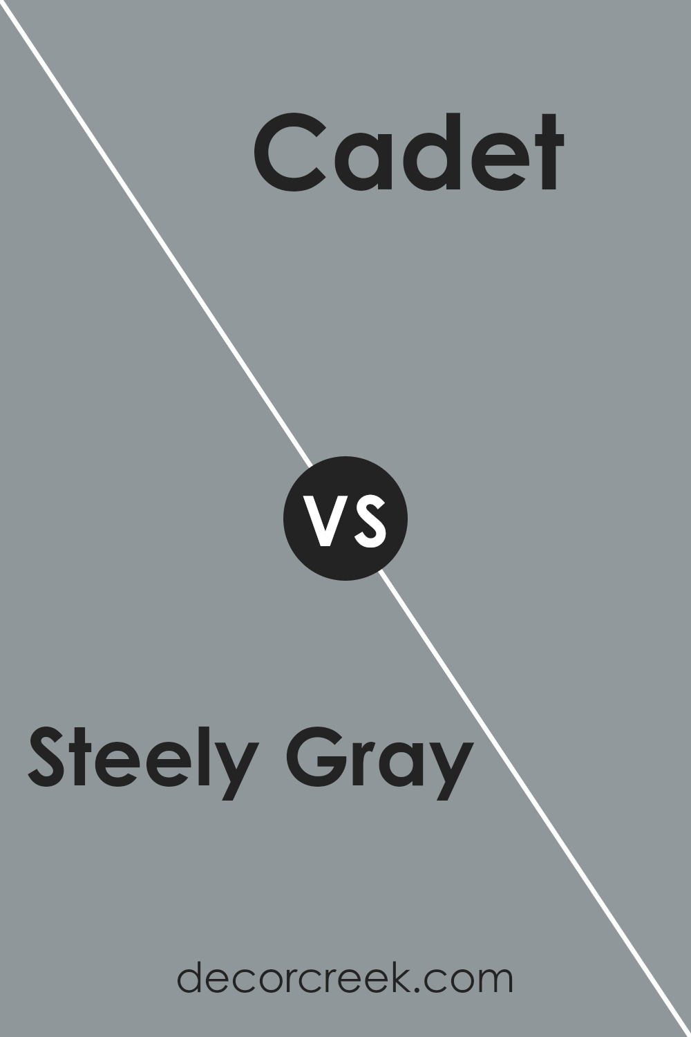
Steely Gray SW 7664 by Sherwin Williams vs Cadet SW 9143 by Sherwin Williams
Steely Gray and Cadet by Sherwin Williams are two distinct colors that each bring their own unique vibe to a space. Steely Gray is a deep, cool gray that has a certain strength and crispness to it, making it an excellent choice for modern and minimalist decor. It works well in rooms that receive a lot of natural light, as it adds depth without overpowering the space.
On the other hand, Cadet is a softer shade that leans a bit more towards blue, giving it a fresher and slightly more relaxing feel compared to Steely Gray. Cadet is great for creating a calm and welcoming atmosphere in a room, making it ideal for bedrooms or quiet sitting areas.
Both colors are versatile and can work nicely with white trim or furniture, but their different undertones can influence the mood of the room. Steely Gray offers a bold and stark contrast, whereas Cadet provides a gentle and soothing environment.
You can see recommended paint color below:
- SW 9143 Cadet
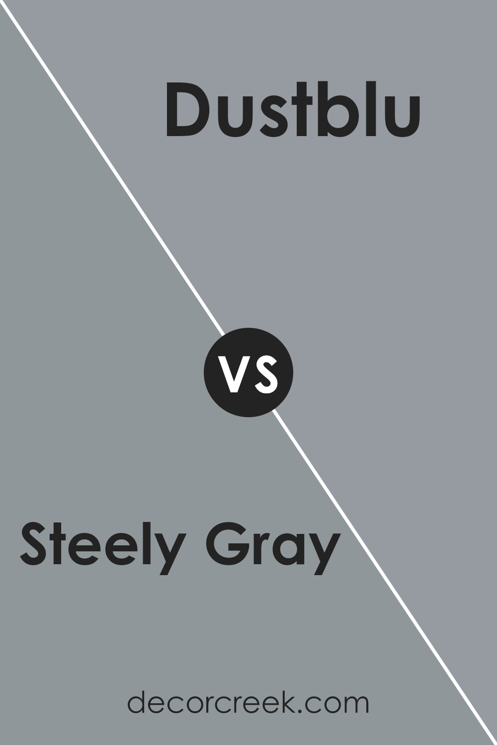
Steely Gray SW 7664 by Sherwin Williams vs Dustblu SW 9161 by Sherwin Williams
Steely Gray and Dustblu, both by Sherwin Williams, are quite distinct in their hues and mood-setting capabilities. Steely Gray is a deep, bold gray with a strong presence, making it ideal for a modern look or as a background that highlights other colors. It tends to give a room a more serious and grounded atmosphere.
On the other hand, Dustblu is a much lighter, soft blue with a hint of gray. This color feels airy and gentle, making spaces seem more open and light. It’s perfect for creating a relaxing environment, suitable for bedrooms or bathrooms where a calming effect is desirable.
While Steely Gray leans towards a more stark and powerful impact suitable for feature walls or furniture, Dustblu is softer and blends easily into backgrounds, providing a soothing touch to any room. These different uses and effects make them suitable for different spaces and styles.
You can see recommended paint color below:
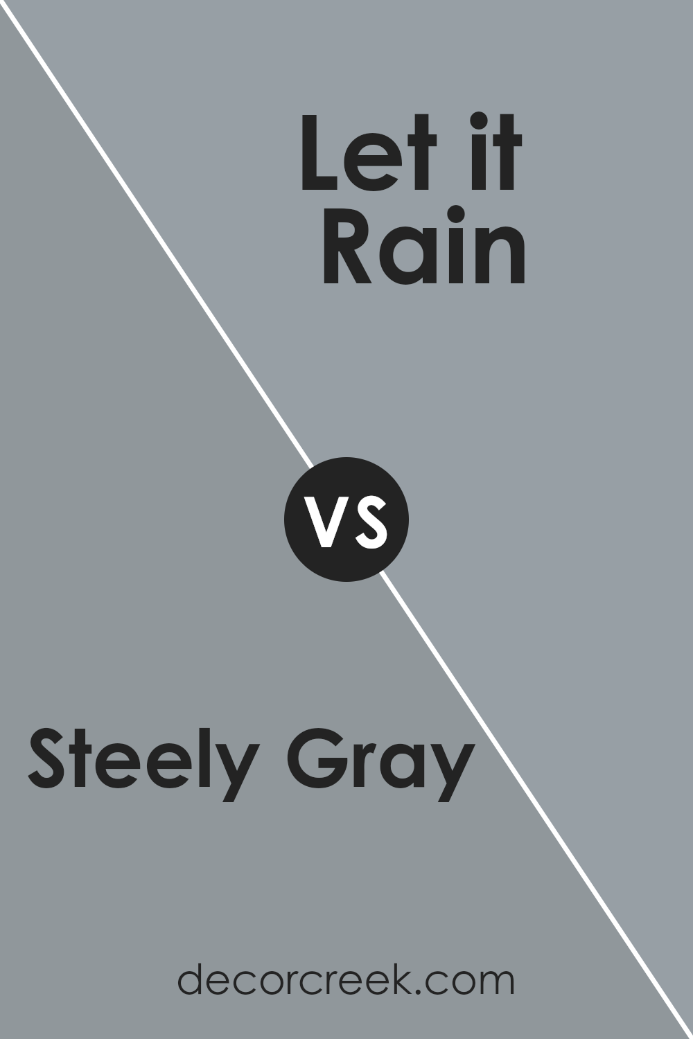
Steely Gray SW 7664 by Sherwin Williams vs Let it Rain SW 9152 by Sherwin Williams
Steely Gray and Let it Rain, both by Sherwin Williams, offer distinct atmospheres for spaces. Steely Gray is a deep, true gray that brings a strong, grounded feel to rooms. It works well to create a solid base in a space, making it appear more anchored and defined. This color is perfect for those who prefer a timeless look that stays stylish without needing frequent updates.
On the other hand, Let it Rain is a softer gray that has a slight blue undertone. This color adds a gentle, refreshing touch to walls, leaning towards a more relaxed and light ambiance. It is ideal for enhancing a space with a calm and airy feel, especially in bedrooms or bathrooms where a soothing effect is desired.
Both colors are versatile and work well in various design settings, but your choice depends on the mood you want to set. Steely Gray offers a firmer, more classic appeal, while Let it Rain provides a softer, more open feel.
You can see recommended paint color below:
- SW 9152 Let it Rain
Steely Gray SW 7664 by Sherwin Williams vs Earl Grey SW 7660 by Sherwin Williams
Steely Gray and Earl Grey are two paint colors from Sherwin Williams that offer subtle yet distinct differences. Steely Gray has a cooler undertone that makes it appear more like a classic gray. It’s perfect for spaces where you want a modern and clean look. This color can give a room a crisp, fresh vibe, especially in well-lit areas.
On the other hand, Earl Grey is slightly warmer and has a softness to its appearance, making it a great choice for creating a cozy atmosphere. It leans slightly towards brown tones, providing a gentle, inviting feel to any room. This makes it ideal for places where comfort is a priority, like living rooms or bedrooms.
While both colors are versatile and easy to match with decor and furniture, your choice between Steely Gray and Earl Grey will depend on the mood you want to set and the lighting in your space. Earl Grey’s warmth makes it better for a welcoming space, whereas Steely Gray is the go-to for a sharper, more modern look.
You can see recommended paint color below:
Steely Gray SW 7664 by Sherwin Williams vs Gray Shingle SW 7670 by Sherwin Williams
Steely Gray and Gray Shingle are both gray shades from Sherwin Williams, each with its own unique qualities. Steely Gray is a darker, more robust hue that evokes strength and reliability. It has a certain depth that makes it stand out in spaces needing a solid, profound backdrop. This color works well in areas that benefit from a darker tone that doesn’t overpower the surroundings.
On the other hand, Gray Shingle is lighter and softer, providing a more subtle option for those wanting a less intense gray. It is versatile and blends well with many decor styles, making it ideal for creating a calm and inviting atmosphere. This shade is perfect for smaller rooms or spaces with limited natural light, as it helps brighten and visually expand the area.
Both colors offer distinct advantages, depending on the need for a bold versus a gentle gray in decorating schemes.
You can see recommended paint color below:
Conclusion
In conclusion, SW 7664 Steely Gray by Sherwin Williams is a really cool paint color that can make any room look nicer. It’s like a magical gray that can fit in almost anywhere, from your living room to your bedroom. Whether your furniture is colorful or simple, this gray color can be a great background that helps everything else look good. It works well in rooms with big windows or in spaces that don’t get a lot of sunlight.
The best part is that it doesn’t change much under different lights, so the color you see in the morning will be pretty much the same at night. Using Steely Gray can make your room feel calm and organized, which is great if you spend a lot of time there studying or playing.
If you ever decide to change how your room looks by adding new pictures or colorful pillows, this gray will still match perfectly.
So, picking this color can be a smart choice because it will keep looking good, no matter how you change your room’s decorations over time.
Ever wished paint sampling was as easy as sticking a sticker? Guess what? Now it is! Discover Samplize's unique Peel & Stick samples.
Get paint samples

