The art of transforming a space isn’t confined solely to the choice of furniture or decorations; the charm of an area heavily depends on the color painted on its walls. Color selection is a vital step that determines the aesthetic and ambiance of a space.
Today, we will delve into the alluring world of SW 7029 Agreeable Gray, a color that holds a reputation for adding a timeless appeal to any space.
As we journey through its characteristics, undertones, coordinating colors, the impact of lighting, and more, we’ll unravel the reasons behind its widespread popularity.

What Color Is SW 7029 Agreeable Gray?
SW 7029 Agreeable Gray is a subtle shade of gray with a distinct yet gentle, earthy quality. While “gray” might conjure up cold, metallic images, Agreeable Gray exudes a soft, welcoming warmth that is far from sterile or harsh. Its neutral tone serves as a versatile backdrop, inviting calm and balanced energy into the space it graces.
In its essence, Agreeable Gray is an elegant blend of gray and beige. The result of this harmonious combination is a ‘greige’—a sophisticated, modern, yet timeless color that straddles the line between two of the most popular neutrals. It’s a perfect color for those seeking the coolness of gray without completely foregoing the comforting warmth of beige.

Is It a Warm Or Cool Color?
The unique blend of Agreeable Gray makes it a warm gray color. While it is predominantly gray, its beige undertones add a sense of warmth to it, making it come across as more welcoming and cozy compared to other, more ‘industrial’ gray shades.
Undertones of SW 7029 Agreeable Gray
Undertones are subtle colors that can be seen beneath the main color when it is illuminated by light. They play a crucial role in color perception and are a significant factor in achieving the desired look. The following are the three notable undertones of Agreeable Gray:
- Beige: The beige undertone is primarily responsible for the warmth that Agreeable Gray radiates. It softens the harshness often associated with grays and adds a comforting depth to the color.
- Green: A faint hint of green lurks beneath the dominant gray-beige combination. This green undertone contributes to the earthiness of Agreeable Gray and can become more pronounced in certain lighting conditions.
- Purple: The most elusive of the undertones, a gentle hint of purple can occasionally be detected, adding a touch of sophistication and depth.
Undertones can significantly affect our perception of color. While Agreeable Gray might seem like a simple gray color at first glance, the undertones mentioned above can subtly shift the color’s appearance based on lighting conditions and surrounding colors. This is what makes Agreeable Gray such an adaptable and versatile color option.

Coordinating Colors of SW 7029 Agreeable Gray
Coordinating colors are hues that work harmoniously with a primary color, helping to create a balanced and aesthetically pleasing palette. They can either be contrasting for a vibrant look or similar for a more monochromatic scheme. Here are the coordinating colors for SW 7029 Agreeable Gray:
- SW 7028 Incredible White: This is a slightly warm white, which complements the warm undertones in Agreeable Gray.
- SW 7006 Extra White: A crisp, clean white, it offers a bright contrast to the subtlety of Agreeable Gray.
- SW 9004 Coral Rose: This color adds a lively pop of color to the neutral Agreeable Gray.
And here are three additional coordinating colors that pair well with Agreeable Gray:
- SW 7015 Repose Gray: This is a slightly cooler gray, providing a subtle contrast to Agreeable Gray’s warm undertone.
- SW 7036 Accessible Beige: As a warm beige, it reinforces the warm, earthy undertones of Agreeable Gray.
- SW 7673 Pewter Cast: This deeper gray offers a rich contrast to the softness of Agreeable Gray.

How Does Lighting Affect SW 7029 Agreeable Gray?
Lighting significantly influences our perception of color, and Agreeable Gray is no exception. In abundant natural light, Agreeable Gray looks lighter and leans more towards its beige undertone. As the daylight fades and in spaces with limited natural light, the color appears darker, and the gray is more noticeable.
Artificial lighting also impacts Agreeable Gray’s appearance. Incandescent lighting brings out the warm beige undertone, while fluorescent lighting accentuates the cooler gray aspect. LED lights, depending on their color temperature, can either bring out the warmth or the coolness of Agreeable Gray.

LRV of SW 7029 Agreeable Gray
Light Reflectance Value (LRV) is a measure of how much light a color reflects and how light or dark it will appear when painted on walls. SW 7029 Agreeable Gray has an LRV of 60. This places Agreeable Gray in the light color category, as it reflects a significant amount of light.
An LRV of 60 indicates that Agreeable Gray has a good balance of light reflection and absorption. It means that Agreeable Gray is light enough to make small spaces feel more open and larger but has enough depth to add character to the room. Furthermore, its higher LRV ensures that the color doesn’t shift dramatically under different lighting conditions, contributing to its versatility.

LRV – what does it mean? Read This Before Finding Your Perfect Paint Color
Trim Colors of SW 7029 Agreeable Gray
Trim colors provide a framework that enhances the room’s architectural details and complements the wall color. Shades of white are usually preferred for trim colors because they offer a fresh contrast to the wall color and help highlight the room’s features.
For Agreeable Gray, consider these trim colors:
- SW 7006 Extra White: This clean white offers a crisp contrast to the softness of Agreeable Gray.
- SW 7008 Alabaster: Alabaster is a warmer off-white that seamlessly blends with Agreeable Gray’s warmth.
- SW 7012 Creamy: This creamy white gives a soft, harmonious contrast to Agreeable Gray.
Trim colors can profoundly impact a room’s aesthetics. They help break the monotony, add depth, and direct attention to architectural elements. It’s essential to choose trim colors that both complement and enhance the main wall color.

Colors Similar to SW 7029 Agreeable Gray
Identifying colors similar to Agreeable Gray is beneficial for several reasons. If you love the color but are struggling to find the exact shade in a particular brand, these similar colors provide excellent alternatives. Furthermore, similar colors give you the flexibility to create a consistent color theme across different spaces while adding slight variations to keep things interesting.
For SW Agreeable Gray, we recommend the following similar hues:
- Behr Toasty Gray
- Benjamin Moore Rodeo
- PPG Whiskers
- Valspar Villa Grey

Colors That Go With SW 7029 Agreeable Gray
Choosing colors that look good together is crucial for a well-designed space. Here are six colors that pair well with Agreeable Gray:
- SW 7015 Repose Gray: A bit cooler than Agreeable Gray, it provides a subtle contrast.
- SW 7669 Summit Gray: This deeper, cooler gray offers a dramatic contrast.
- SW 7036 Accessible Beige: This color reinforces the warm, earthy undertones of Agreeable Gray.
- SW 6232 Misty: This light blue color brings a fresh contrast to Agreeable Gray.
- SW 6338 Beaujolais: This deep, warm red adds a vibrant contrast to Agreeable Gray’s neutrality.
- SW 6718 Deep Forest Brown: This dark, rich brown adds depth and warmth, creating a cozy atmosphere.
Choosing colors that work well together ensures that your room has a harmonious and cohesive feel. The colors should complement and enhance each other, creating a balanced and appealing palette.

How to Use SW 7029 Agreeable Gray In Your Home?
SW 7029 Agreeable Gray is a versatile color that can be used in any room of your home, from the living room to the kitchen, bathroom, and bedroom. Its warm undertones and high LRV make it a great choice for both small and large spaces, enhancing natural light in darker rooms while providing depth in brightly lit areas.
Moreover, its neutral nature allows it to fit seamlessly into a wide range of interior design styles, from modern and minimalist to traditional and country-style interiors. The key is in the way you style it.
How to Use SW 7029 Agreeable Gray in the Bedroom?
Using Agreeable Gray in the bedroom can create a calm and soothing environment. The warm undertones of this color bring a cozy feel, which is essential for a space meant for rest and relaxation. It pairs well with crisp white linens for a clean and airy look or deeper tones like navy or burgundy for a more dramatic and luxurious feel.
The versatility of Agreeable Gray allows it to adapt to different design styles in the bedroom. For a modern aesthetic, pair it with sleek, minimalist furniture and silver or chrome accents. For a traditional look, ornate wooden furniture and gold accents work beautifully. It’s a color that invites creativity and personalization, making it the perfect canvas for your dream bedroom.

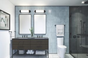
How to Use SW 7029 Agreeable Gray in the Bathroom?
Agreeable Gray can turn your bathroom into a tranquil sanctuary. Its neutral, calming tone makes it a perfect color for creating a spa-like atmosphere. Pair it with marble or white tiles for a classic, clean look. To add depth, consider using darker grays or blues in your tile work or vanity.
The versatility of Agreeable Gray shines in the bathroom. It works beautifully in both modern and traditional bathrooms. In a modern setting, pair it with sleek chrome fixtures for a polished, contemporary look. In a traditional or farmhouse-style bathroom, pair it with warm wood tones and antique brass fixtures.

How to Use SW 7029 Agreeable Gray in the Living Room?
The living room is a common area where people gather, and Agreeable Gray can help create an inviting, warm, and friendly space. It provides a neutral backdrop, allowing your furniture and artwork to shine. It works particularly well with a variety of colors, including deep blues, greens, or even vibrant hues like coral or teal.
Whether your living room is more modern or leans towards the traditional, Agreeable Gray can adapt to the aesthetic. For a modern look, pair it with clean lines, metal accents, and a mix of black and white. For a more traditional style, consider pairing Agreeable Gray with classic furniture pieces, rich wood tones, and gold accents.

How to Use SW 7029 Agreeable Gray for an Exterior
Agreeable Gray isn’t only for interiors. It can be an excellent choice for the exterior of your home as well. This warm, inviting color can enhance the curb appeal of your home, making it look welcoming. It pairs well with both light and dark trim colors, providing a balanced and harmonious appearance.
When using Agreeable Gray on your home’s exterior, consider the style of your home and the surrounding landscape. It complements natural materials such as stone and wood, making it perfect for rustic or country-style homes. However, its neutral, timeless quality also makes it suitable for more contemporary or minimalist exteriors.

How to Use SW 7029 Agreeable Gray for the Kitchen
In the kitchen, Agreeable Gray can bring a sense of warmth and sophistication. As a neutral color, it pairs well with various countertop materials, from marble and granite to quartz and butcher block. Whether your kitchen features stainless steel appliances or black or white ones, Agreeable Gray serves as a lovely backdrop.
The versatility of Agreeable Gray extends to various kitchen styles. In a modern kitchen, it could be paired with sleek, minimalist cabinets, a white subway tile backsplash, and stainless-steel appliances. In a farmhouse-style kitchen, Agreeable Gray walls can complement shaker-style cabinets, open shelving, and a farmhouse sink.

How to Use SW 7029 Agreeable Gray for the Kitchen Cabinets
If you’re considering Agreeable Gray for your kitchen cabinets, you’re in for a treat. This soft, warm gray is a fantastic alternative to white for cabinets, offering a bit more depth and interest while still looking clean and timeless. It works exceptionally well with brushed nickel or chrome hardware for a modern look or bronze and brass for a more traditional vibe.
Agreeable Gray cabinets can work well in different styles and color schemes. They can provide a soft contrast against white walls for a two-tone kitchen or pair beautifully with a bold, colorful backsplash. The result is a harmonious and balanced look that can seamlessly tie your kitchen design together.

Comparing SW 7029 Agreeable Gray With Other Colors
Comparing colors is vital in interior design as it allows us to understand how colors interact with one another and affect the overall aesthetic of a space. Comparing colors helps to identify complementary shades, contrasting hues, and the overall mood that a particular color scheme creates.
This comparison is crucial to creating a harmonious and well-designed space. Moreover, it can provide a better understanding of a color’s undertones, its behavior under different lighting conditions, and its impact on a room’s perceived size. Below, you can see how SW Agreeable Gray compares with other colors.
SW 7029 Agreeable Gray vs. SW 7015 Repose Gray
Both Agreeable Gray and Repose Gray occupy the spectrum of warm grays, but they offer different atmospheres. Repose Gray, while still warm, leans towards being a cooler gray because of its blue undertones. The color is often seen as more traditional and sophisticated, working exceptionally well in spaces where a serene, calm vibe is desired.
On the other hand, Agreeable Gray has more beige undertones, making it a greige (gray + beige) that leans more towards beige. Its warmer undertones give it a cozy, inviting feel, making spaces feel more relaxed and homely. This feature makes Agreeable Gray a more versatile color, able to fit into a variety of decor styles

SW 7029 Agreeable Gray vs. SW 7043 Worldly Gray
Worldly Gray, like Agreeable Gray, is a warm gray. However, it’s slightly darker and has a bit more of a green undertone, giving it a more earthy feel. It works wonderfully in spaces where a natural, grounded atmosphere is preferred. It has the ability to connect indoor spaces with the outdoors, making it a perfect choice for rooms with lots of natural light or views of greenery.
Agreeable Gray, with its warmer, beige undertones, has a more cozy and inviting feel. It’s a softer color that can make spaces feel light and airy. Its versatility allows it to work well with various decor styles and color schemes, making it a great all-around choice.

SW 7029 Agreeable Gray vs. SW 7030 Anew Gray
Anew Gray is a few shades darker than Agreeable Gray and leans more towards a traditional gray, though it still has warm undertones. Its deeper color gives it a richer, more pronounced presence on walls, making it a fantastic choice for larger spaces or rooms where a strong, impactful color is desired.
Agreeable Gray, being lighter, has a softer presence. It’s a more flexible color that can make spaces feel more open and airy. The warm undertones create a comfortable and inviting atmosphere, making it an excellent choice for living spaces and bedrooms.

SW 7029 Agreeable Gray vs. SW 7037 Balanced Beige
Balanced Beige is a warm, neutral color that leans more towards beige than gray. It’s also slightly darker than Agreeable Gray. Balanced Beige is a wonderful choice for those who prefer a warmer, homier feel in their spaces. It’s a strong neutral that can serve as a solid background for both bold and subtle color schemes.
Agreeable Gray, although still a warm neutral, leans more towards gray than beige. It’s a more versatile color that can adapt to various decor styles and colors. Its lighter tone makes spaces feel more open, while its warm undertones create a cozy and comfortable atmosphere.

SW 7029 Agreeable Gray vs. SW 7031 Mega Greige
Mega Greige is a much darker color than Agreeable Gray and leans more towards brown, giving it a deep, earthy vibe. This color works beautifully in spaces that seek to create a cozy, enveloping feel, such as dens or libraries. It’s a rich, warm color that can make a strong statement.
In contrast, Agreeable Gray, while still warm, is much lighter and more neutral. It has a versatile and adaptable nature, making it suitable for a variety of spaces and styles. Agreeable Gray can make rooms feel open and airy while still offering warmth and comfort.

SW 7029 Agreeable Gray vs. SW 7044 Amazing Gray
Amazing Gray is a cool, medium-tone gray that is significantly darker than Agreeable Gray. It’s a neutral color that can add depth and sophistication to a space. Amazing Gray can create a cool, calming ambiance, perfect for bedrooms or office spaces.
In contrast, Agreeable Gray is a warm, light gray that offers a more inviting feel. It’s a flexible color that can adapt to different decor styles and color schemes. Despite its lighter shade, Agreeable Gray can still add depth and interest to a space, especially when paired with the right accent colors.

Conclusion
In summary, SW 7029 Agreeable Gray is an incredibly versatile and adaptable color. Its warm undertones and light gray hue make it a fantastic neutral that can fit into a variety of decor styles and color schemes.
Whether used as a main color or as a backdrop for bolder accent colors, Agreeable Gray can create a cozy, inviting atmosphere in any space. Its ability to compare and contrast beautifully with other colors only adds to its appeal, making it a worthy consideration for any interior design project.

Frequently Asked Questions
⭐What color undertones does SW 7029 Agreeable Gray have?
SW 7029 Agreeable Gray has warm undertones, specifically a mix of green and red. This blend gives it a warm, inviting character that isn't overly beige or brown, providing a lovely neutral balance.
⭐ Is Agreeable Gray a good color for small spaces?
Yes, Agreeable Gray, with its light Reflective Value (LRV) of 60, is a great color for small spaces. It can make a room feel larger, more open, and well-lit.
⭐What trim color works best with SW 7029 Agreeable Gray?
Shades of white, particularly SW 7028 Incredible White, SW 7006 Extra White, and SW 7008 Alabaster, work beautifully with Agreeable Gray. These trim colors create a crisp, clean contrast that enhances the beauty of Agreeable Gray.
⭐Can SW 7029 Agreeable Gray be used for exteriors?
Yes, SW 7029 Agreeable Gray can be used for exteriors. Its warm undertones make it a welcoming color, and its high LRV helps it reflect light well, keeping your exterior bright.