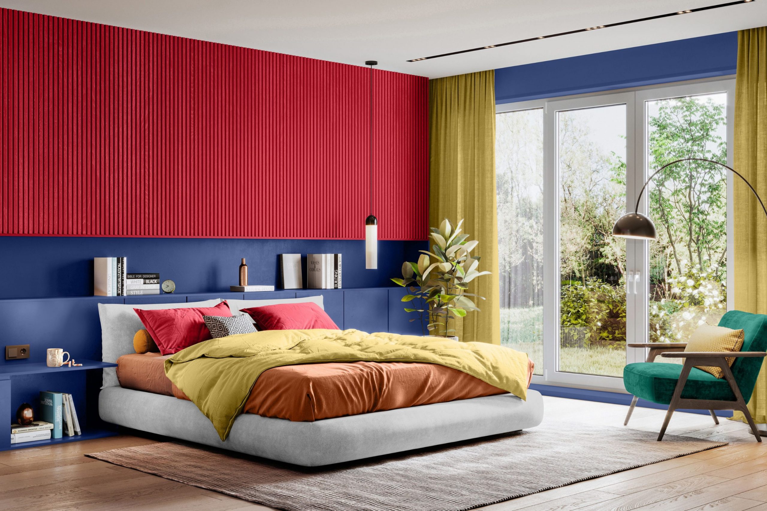
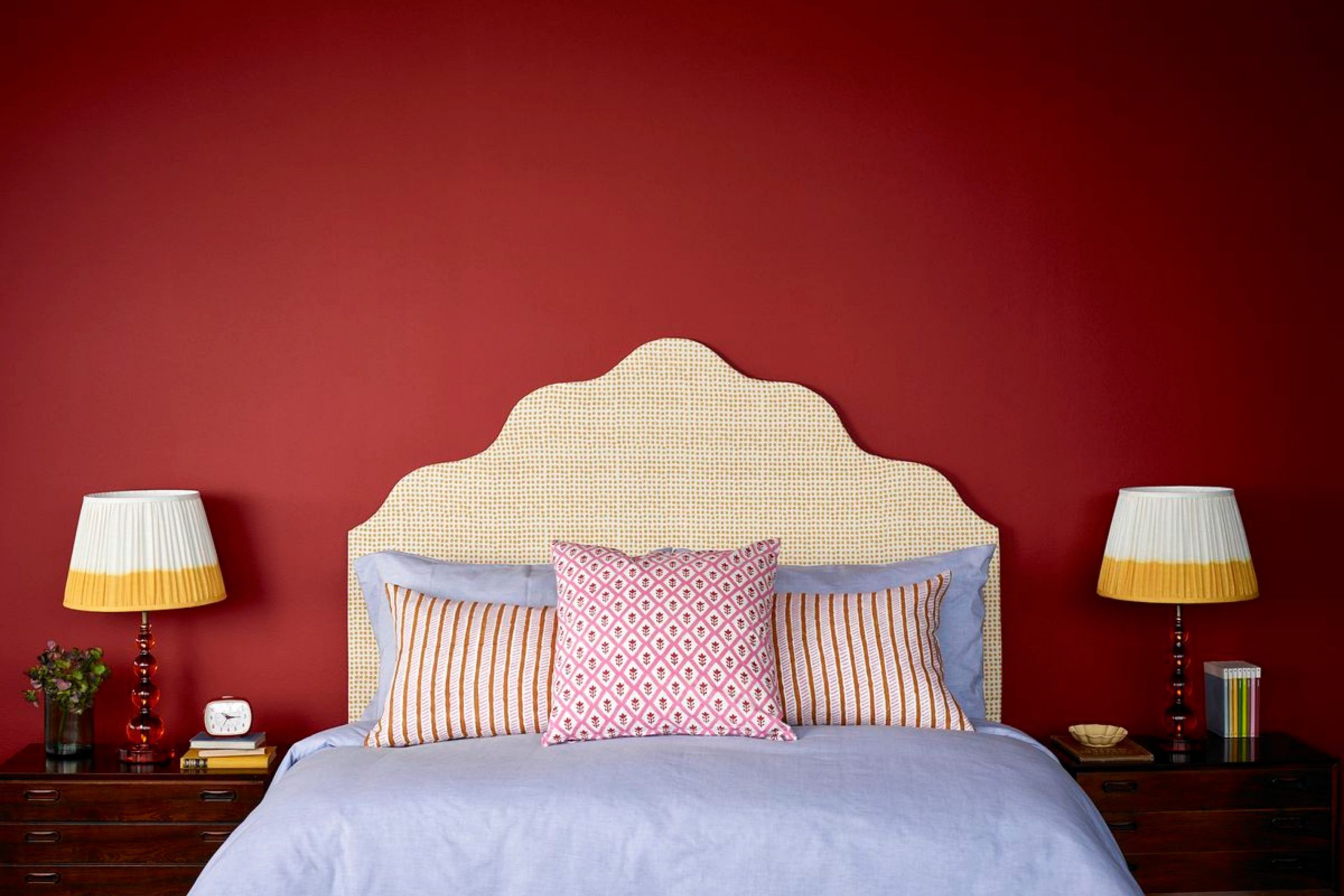
Red is a color that scares a lot of people, and I absolutely understand why; it is certainly not a quiet wallflower, but I am here to tell you that choosing a cherry red is one of the most rewarding and impactful decisions you can make for your home’s mood. When I walk into a house that uses a bold cherry red, I immediately feel an intense energy, a sense of warmth, and a pulse of excitement that neutral colors like beige or white just cannot give you, no matter how hard they try.
Many of my clients worry deeply that red will be too loud or too aggressive, or that it will dramatically shrink a room, but that is only true if you carelessly pick the wrong shade that fights the light. I have spent years meticulously testing and comparing different red pigments on walls, on kitchen cabinets, and on refurbished furniture pieces to find the exact ones that feel cozy, inviting, and intimate rather than chaotic or jarring.
A good cherry red can successfully make a plain dining room feel like a fancy, romantic restaurant or turn a boring bedroom into a luxurious, romantic getaway destination. It is all about finding that perfect, necessary balance between cool (blue) and warm (orange/yellow) undertones hidden within the paint. I want to help you change your perspective and see red in a new, exciting way, not as a danger signal, but as a powerfully uplifting way to bring life, depth, and character into your house.
We are going to look at colors that range from bright, happy berries and luscious corals to deep, moody, sophisticated wines. Trust me completely, once you find the right, perfect red for your room, you will never want to go back to beige or boring grey again.
Why I Always Trust Sherwin-Williams and Benjamin Moore for Cherry Red Paints
I have been actively working in the professional design business for a long time, and I learned early on that trying to save money by buying cheap paint is never, ever worth the headache or the wasted time. Sherwin-Williams and Benjamin Moore are consistently my go-to brands because they offer an unmatched depth of color and pigment saturation that is genuinely hard to match anywhere else.
When you are dealing with red, the actual quality of the pigment matters exponentially more than with any other color in the spectrum. Lower quality paints often require four or five tiring coats to finally achieve a true, non-streaky red finish, but these two professional-grade brands usually cover beautifully in just two standard coats.
They also have special color technology that creates rich colors that stay perfectly true to the swatch even when the natural lighting in the room dramatically changes throughout the day. Furthermore, I absolutely love that their finishes are incredibly durable and washable, which is especially important because red walls tend to show scuff marks and fingerprints much more easily if the paint is not tough and resilient. When I specify a specific color like Sherwin-Williams’ “Real Red” or Benjamin Moore’s “Heritage Red” from these respected companies, I know exactly what kind of luxurious, professional result I am going to get every single time.
They invest so much into their proprietary color technology that the little swatches you see in the store accurately match the color that beautifully ends up on your wall. Using these premium paints saves me time on site, it saves my clients money in expensive labor costs for extra coats, and the result always looks utterly professional and beautifully polished.
How I Choose the Perfect Cherry Red Shade for Any Room
Choosing a red paint is definitely not as simple as just pointing at a bright, pretty swatch and buying a gallon right away—it requires careful planning. I always tell my clients that the very first step is to look at the fixed elements in their room, such as the wood floor color, any visible brickwork, and the main pieces of furniture.
If you have warm wood floors with clear yellow or orange tones, you absolutely need a warm, tomato-based or brick red to ensure everything blends together nicely and feels harmonious. However, if your floors are cool grey, slate, or very dark espresso, a blue-based cherry red or a deep wine will look incredibly sharp, modern, and high-contrast.
Lighting is the next massive thing I analyze because it changes the perceived color drastically. A room that faces north will have cool, blue-ish light all day, which can turn a warm red into something that looks muddy, dull, or even brownish. In those cool rooms, I prefer a clear, bright, high-chroma red to successfully cut through the shadows and stay vibrant. For south-facing rooms that are flooded with warm sun, you have the freedom to choose deeper, darker wine colors because the abundance of light will make them sing and prevent them from feeling like a cave.
I also strongly suggest painting a large piece of poster board with two generous coats of your sample color and moving it around the room for a few days. This simple exercise helps you see how the color truly looks in the morning, in the bright afternoon sun, and under your lamps at night before you commit to painting the whole room.
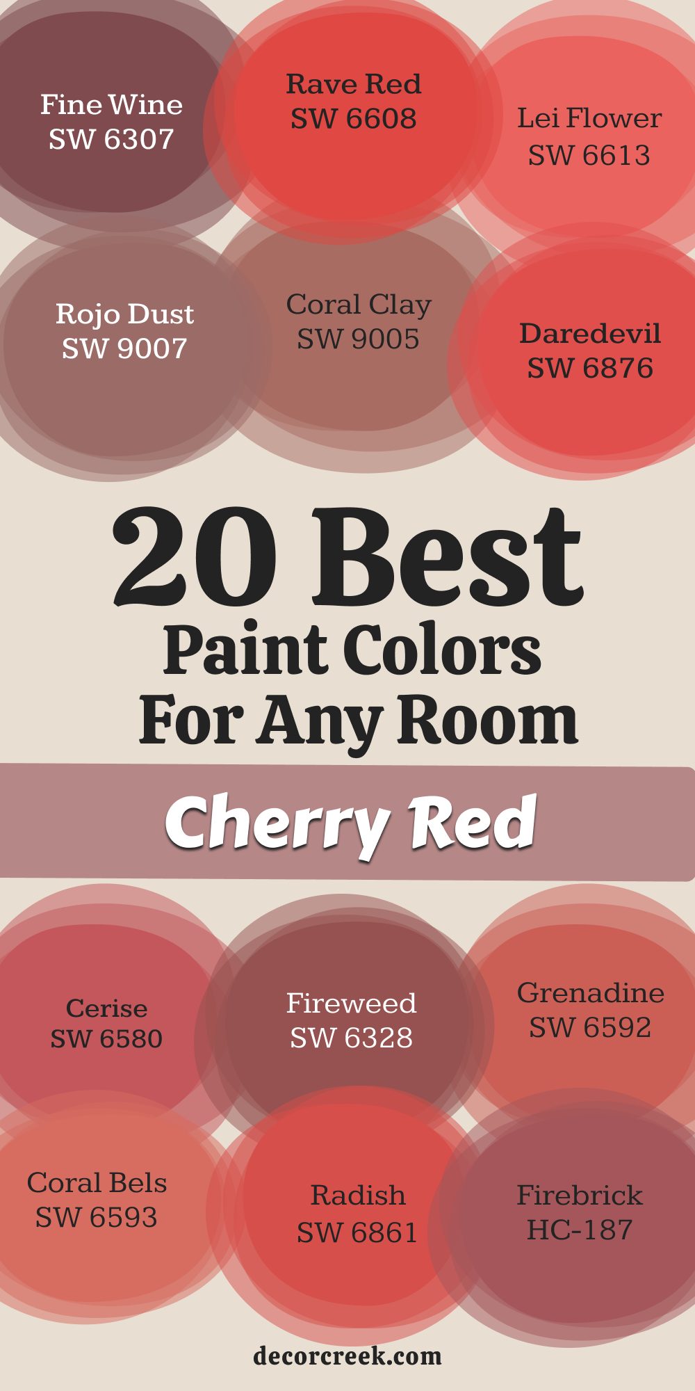
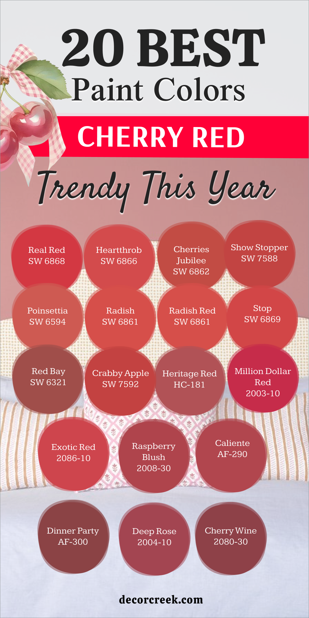
20 Best Cherry Red Paint Colors for Any Room in 2026
Cherries Jubilee SW 6862
Cherries Jubilee SW 6862 is one of those colors that immediately makes a room feel happier and more welcoming to guests. Cherries Jubilee SW 6862 has a distinct pink undertone that keeps it from feeling too aggressive or angry on your walls. Cherries Jubilee SW 6862 reminds me of fresh fruit in the summer and works wonderfully in a kitchen or a breakfast nook.
Cherries Jubilee SW 6862 pairs beautifully with crisp white trim because the contrast makes the red look even cleaner. Cherries Jubilee SW 6862 is vibrant enough to be an accent wall but soft enough to paint an entire powder room. Cherries Jubilee SW 6862 reflects light in a way that gives a rosy glow to everything else in the room.
Cherries Jubilee SW 6862 works very well with gold or brass hardware if you are using it on cabinets. Cherries Jubilee SW 6862 is a favorite of mine for front doors because it offers a cheerful greeting from the street. Cherries Jubilee SW 6862 does not turn orange when the sun hits it, which is a common problem with other reds. Cherries Jubilee SW 6862 is truly a sweet spot color that balances energy with comfort.
🎨 Check out the complete guide to this color right HERE 👈

Redend Point SW 9081
Redend Point SW 9081 is actually a very earthy tone that bridges the gap between a soft clay and a muted cherry. Redend Point SW 9081 was a Color of the Year recently and it has remained popular because it is so easy to live with. Redend Point SW 9081 brings a sense of nature indoors, reminding me of southwestern pottery or desert sands at sunset.
Redend Point SW 9081 is perfect for a bedroom where you want warmth but you do not want the color to keep you awake. Redend Point SW 9081 looks incredible when you pair it with natural wood furniture and creamy white textiles. Redend Point SW 9081 changes personality throughout the day, looking pinker in the morning and more brownish-red at night.
Redend Point SW 9081 is my secret weapon for making a cold, north-facing room feel instantly warmer. Redend Point SW 9081 is not a screaming bright red, so it works well in open floor plans. Redend Point SW 9081 creates a very sophisticated backdrop for art and gallery walls. Redend Point SW 9081 is the color I choose for people who say they are afraid of red paint.
🎨 Check out the complete guide to this color right HERE 👈

Poinsettia SW 6594
Poinsettia SW 6594 captures the exact feeling of the holiday flower it is named after, bright and undeniably festive. Poinsettia SW 6594 is a cool-toned red, meaning it has a tiny bit of blue in it rather than orange. Poinsettia SW 6594 looks absolutely stunning in a dining room, especially under the glow of a crystal chandelier.
Poinsettia SW 6594 is bold, so I often use it on just the top half of a wall with wainscoting below. Poinsettia SW 6594 brings a level of drama that makes simple furniture look much more expensive and curated. Poinsettia SW 6594 pairs very well with dark grey or charcoal accents to tone down the brightness.
Poinsettia SW 6594 is energetic, so I would avoid using it in a nursery or a place where you need total quiet. Poinsettia SW 6594 makes white ceilings look higher because the contrast draws your eye up. Poinsettia SW 6594 is a brave choice that pays off by giving your home a custom, designer look. Poinsettia SW 6594 stays true to its color and does not fade into a dull brick shade.
Real Red SW 6868
Real Red SW 6868 is exactly what the name says it is, a true and unapologetic primary red color. Real Red SW 6868 is the color I grab when a client wants a retro diner vibe or a classic Americana look. Real Red SW 6868 has virtually no confusing undertones, so it sits right in the middle of the spectrum. Real Red SW 6868 is fantastic for painting a kitchen island if you want it to be the star of the room.
Real Red SW 6868 pops beautifully against black and white checkered floors or subway tiles. Real Red SW 6868 is high energy, so it works great in playrooms or creative studios where you want to feel active. Real Red SW 6868 can be intense, so good lighting is key to making sure it does not feel like a cave.
Real Red SW 6868 looks very sharp with chrome fixtures and modern stainless steel appliances. Real Red SW 6868 is a happy color that reminds me of fire engines and vintage lipstick. Real Red SW 6868 is a classic that never really goes out of style if you style it correctly.
🎨 Check out the complete guide to this color right HERE 👈
Valentine SW 6587
Valentine SW 6587 leans heavily into the pink side of the red family, making it soft and romantic. Valentine SW 6587 is not as hot as a chili pepper red, so it feels much more relaxing to sit next to. Valentine SW 6587 is a wonderful choice for a guest room where you want people to feel pampered and cozy.
Valentine SW 6587 looks very elegant when you mix it with floral patterns and soft, velvet fabrics. Valentine SW 6587 has a vintage charm to it, almost like an old-fashioned greeting card. Valentine SW 6587 works well in bathrooms too, as the pinkish tone is actually very flattering for skin tones in the mirror.
Valentine SW 6587 is distinct enough to be colorful but muted enough not to hurt your eyes. Valentine SW 6587 pairs unexpectedly well with olive green accents for a nature-inspired palette. Valentine SW 6587 brings a feminine touch without being overly girly or childish. Valentine SW 6587 is the color of love and warmth, and it truly brings that spirit into a home.
🎨 Check out the complete guide to this color right HERE 👈
Show Stopper SW 7588
Show Stopper SW 7588 lives up to its name by being one of the most vibrant reds you can put on a wall. Show Stopper SW 7588 commands attention the moment you walk into the room and demands you look at it. Show Stopper SW 7588 has a slight berry undertone that gives it a richness you do not get with flat reds.
Show Stopper SW 7588 is perfect for an accent wall behind a bed or a sofa to anchor the room. Show Stopper SW 7588 looks luxurious when paired with dark wood furniture like mahogany or walnut. Show Stopper SW 7588 changes with the light, looking bright during the day and moody and deep at night.
Show Stopper SW 7588 is a confident color, so I use it for clients who want to make a big statement. Show Stopper SW 7588 requires a good primer, usually a grey one, to get the full depth of the color. Show Stopper SW 7588 makes a large, empty room feel furnished even if you do not have much stuff in it. Show Stopper SW 7588 is a powerhouse paint color that transforms boring drywall into art.
🎨 Check out the complete guide to this color right HERE 👈

Cherry Tomato SW 6864
Cherry Tomato SW 6864 introduces a zesty, orange-leaning vibe that feels fresh and very modern. Cherry Tomato SW 6864 is warm and inviting, making it a great choice for gathering spots like the kitchen or living room. Cherry Tomato SW 6864 reminds me of summer gardens and has a very organic, lively feel to it.
Cherry Tomato SW 6864 pairs excellently with teal or turquoise decor for a fun, mid-century modern look. Cherry Tomato SW 6864 is bright enough to help bounce light around a room that might feel a little dark. Cherry Tomato SW 6864 is not a serious or stuffy color; it is playful and full of life.
Cherry Tomato SW 6864 looks crisp against bright white trim and baseboards. Cherry Tomato SW 6864 is an appetizing color, which is why it works so well in dining areas to stimulate conversation. Cherry Tomato SW 6864 prevents a room from feeling cold and sterile. Cherry Tomato SW 6864 is a spicy addition to any home that needs a wake-up call.
Shy Cherry 2007-20
Shy Cherry 2007-20 by Benjamin Moore is a deep, muted rose color that feels very sophisticated and grown-up. Shy Cherry 2007-20 is not “shy” in beauty, but it is less loud than a fire engine red. Shy Cherry 2007-20 has a dusty quality to it that makes it look like it has been on the wall for years in a historic home.
Shy Cherry 2007-20 is amazing for a library or a home office where you want to focus. Shy Cherry 2007-20 creates a cozy, wrapping effect that makes you want to curl up with a book. Shy Cherry 2007-20 works well with beige and taupe neutrals rather than stark whites.
Shy Cherry 2007-20 is a very safe entry point for anyone nervous about painting with red. Shy Cherry 2007-20 brings warmth without bringing the high energy that some people find exhausting. Shy Cherry 2007-20 looks lovely with brass lamps and leather furniture. Shy Cherry 2007-20 is a timeless shade that feels elegant in almost any architectural style.
Cherry Wine 2080-30
Cherry Wine 2080-30 is a luscious, purple-leaning red that feels like a glass of expensive merlot. Cherry Wine 2080-30 adds instant drama and depth to a room, making it feel smaller and more intimate. Cherry Wine 2080-30 is my top pick for formal dining rooms where you want to create a moody atmosphere.
Cherry Wine 2080-30 looks incredible in a powder room with gold fixtures and a fancy mirror. Cherry Wine 2080-30 has cool undertones, so it pairs nicely with grey floors or silver accents. Cherry Wine 2080-30 is a dark color, so you need good lighting to make sure the room does not feel like a cave.
Cherry Wine 2080-30 hides scuffs and shadows better than lighter reds, which is a practical bonus. Cherry Wine 2080-30 feels velvety and rich, adding texture to the look of your walls. Cherry Wine 2080-30 makes lighter artwork pop off the walls because of the strong contrast. Cherry Wine 2080-30 is luxury in a paint can.
Heritage Red HC-181
Heritage Red HC-181 is part of Benjamin Moore’s Historical Collection, and it is a classic for a reason. Heritage Red HC-181 is a rich, deep red that does not lean too pink or too orange. Heritage Red HC-181 is often used on front doors, but I love bringing it inside for a study or a hallway. Heritage Red HC-181 has a weight to it that feels permanent and traditional.
Heritage Red HC-181 looks fantastic with dark wood trim, which is common in older houses. Heritage Red HC-181 is a very grounded color that does not feel flighty or trendy. Heritage Red HC-181 works well in country-style kitchens or farmhouse interiors.
Heritage Red HC-181 is vibrant but controlled, so it does not overwhelm the eye. Heritage Red HC-181 is one of those colors that looks good in both daylight and artificial lamp light. Heritage Red HC-181 is a color I trust when a client wants something that will look good for ten years.
🎨 Check out the complete guide to this color right HERE 👈
Lyons Red CC-68
Lyons Red CC-68 is a deep, intense red that feels very serious and grounded. Lyons Red CC-68 has a touch of brown in the base, which stops it from looking like plastic. Lyons Red CC-68 is an excellent choice for exterior accents or a very bold living room wall.
Lyons Red CC-68 pairs beautifully with stone fireplaces and slate floors. Lyons Red CC-68 is a warm color that makes a large, drafty room feel instantly hotter. Lyons Red CC-68 has a classic appeal that fits well in traditional homes with crown molding.
Lyons Red CC-68 is strong, so I usually suggest using it in moderation or balancing it with light furniture. Lyons Red CC-68 does not fade easily, keeping its richness over time. Lyons Red CC-68 evokes a feeling of history and strength. Lyons Red CC-68 is the color of a sturdy brick building or a classic barn.
Million Dollar Red 2003-10
Million Dollar Red 2003-10 is a bright, punchy color that lives up to its expensive-sounding name. Million Dollar Red 2003-10 is vibrant and clean, making it perfect for modern, minimalist homes that need a splash of fun. Million Dollar Red 2003-10 looks amazing on a front door to boost curb appeal instantly.
Million Dollar Red 2003-10 is a happy red that brings a smile to your face when you see it. Million Dollar Red 2003-10 has a slight pinkish undertone that keeps it fresh and lively. Million Dollar Red 2003-10 works well in children’s rooms or creative spaces.
Million Dollar Red 2003-10 stands out against white siding or white interior walls. Million Dollar Red 2003-10 is a confident choice that says you are not afraid of color. Million Dollar Red 2003-10 reflects light well, keeping the energy up in the room. Million Dollar Red 2003-10 is a pure joy to work with.
🎨 Check out the complete guide to this color right HERE 👈

Cherry Burst CSP-1200
Cherry Burst CSP-1200 is a complex color that sits somewhere between a red and a deep coral. Cherry Burst CSP-1200 feels very organic and natural, unlike some synthetic-looking reds. Cherry Burst CSP-1200 is part of a special collection that focuses on depth and storytelling through color.
Cherry Burst CSP-1200 looks different depending on where you stand in the room, which makes it fascinating. Cherry Burst CSP-1200 is warm and glowing, perfect for a cozy sitting room. Cherry Burst CSP-1200 pairs well with woven textures like rattan or jute rugs.
Cherry Burst CSP-1200 is spicy and inviting without being too dark. Cherry Burst CSP-1200 works well with green plants, creating a complementary color scheme. Cherry Burst CSP-1200 is a unique shade that you won’t see in everyone else’s house. Cherry Burst CSP-1200 brings a sunset vibe right into your living room.
Fine Wine SW 6307
Fine Wine SW 6307 is a deep, moody red that leans heavily into purple and brown territory. Fine Wine SW 6307 is incredibly sophisticated and works best in rooms meant for evening use. Fine Wine SW 6307 creates a cocoon-like feeling that is very restful and quiet.
Fine Wine SW 6307 looks expensive and elevates the look of basic furniture. Fine Wine SW 6307 pairs beautifully with metallic gold or brass accents. Fine Wine SW 6307 is dark, so use it in a room that gets decent light or embrace the darkness for a theater room.
Fine Wine SW 6307 is a dramatic backdrop for light-colored artwork. Fine Wine SW 6307 feels like velvet on the walls. Fine Wine SW 6307 is a serious color for a serious design statement. Fine Wine SW 6307 is the ultimate choice for elegance.
Roycroft Bottle Green SW 2847
Roycroft Bottle Green SW 2847 is a surprise on this list because it is actually a deep green, but it is the perfect partner for a cherry red room. Roycroft Bottle Green SW 2847 is often used in the Arts and Crafts style to complement red brick or red woods. Roycroft Bottle Green SW 2847 provides a cool balance to the heat of cherry red furniture or rugs.
Roycroft Bottle Green SW 2847 is dark and forest-like, creating a sense of depth. Roycroft Bottle Green SW 2847 makes red accents pop visually because red and green are opposites on the color wheel. Roycroft Bottle Green SW 2847 is soothing and historic in its feel.
Roycroft Bottle Green SW 2847 works well on trim if your walls are a lighter red or clay color. Roycroft Bottle Green SW 2847 anchors a room and gives your eyes a place to rest. Roycroft Bottle Green SW 2847 is essential if you want a palette that feels complete and balanced. Roycroft Bottle Green SW 2847 proves that sometimes the best way to highlight red is with green.
🎨 Check out the complete guide to this color right HERE 👈
Polished Mahogany SW 2838
Polished Mahogany SW 2838 is a rich, reddish-brown that mimics the look of expensive wood. Polished Mahogany SW 2838 is perfect for a study or a library where you want a masculine, traditional vibe. Polished Mahogany SW 2838 is very warm and makes a large room feel smaller and cozier.
Polished Mahogany SW 2838 works well with leather furniture and heavy drapes. Polished Mahogany SW 2838 is a neutral red, meaning it acts more like a brown in the background. Polished Mahogany SW 2838 does not scream for attention but adds a layer of luxury.
Polished Mahogany SW 2838 is great for cabinetry or wainscoting. Polished Mahogany SW 2838 pairs well with cream or beige rather than stark white. Polished Mahogany SW 2838 is a grounding color that feels solid and permanent. Polished Mahogany SW 2838 is the definition of understated elegance.
Borscht SW 7578
Borscht SW 7578 takes its name from the beet soup, and the color is just as earthy and deep. Borscht SW 7578 has a purple undertone that makes it feel very organic and vegetable-dyed. Borscht SW 7578 is a unique shade that is not quite red and not quite purple.
Borscht SW 7578 looks stunning in a kitchen with butcher block countertops. Borscht SW 7578 is a quirky color that adds a lot of personality to a home. Borscht SW 7578 works well with grey and cool neutrals. Borscht SW 7578 is a warm color that feels very comforting in the winter.
Borscht SW 7578 is a bold choice for a dining room ceiling. Borscht SW 7578 is a conversation starter because it is so distinct. Borscht SW 7578 brings a farm-to-table aesthetic right onto your walls.
Blackberry Wine 2069-20
Blackberry Wine 2069-20 is a deep, luscious purple-red that is very romantic. Blackberry Wine 2069-20 is perfect for a master bedroom where you want a moody, boutique hotel feel. Blackberry Wine 2069-20 absorbs light, so it creates a very quiet and still atmosphere. Blackberry Wine 2069-20 looks amazing with silver or mirrored furniture.
Blackberry Wine 2069-20 is a jewel tone that feels regal and important. Blackberry Wine 2069-20 is great for an accent wall if painting the whole room feels too dark.
Blackberry Wine 2069-20 contrasts beautifully with white bedding. Blackberry Wine 2069-20 has a mystery to it that lighter reds lack. Blackberry Wine 2069-20 is a color that feels like a warm hug at the end of the day. Blackberry Wine 2069-20 is sophisticated and timeless.
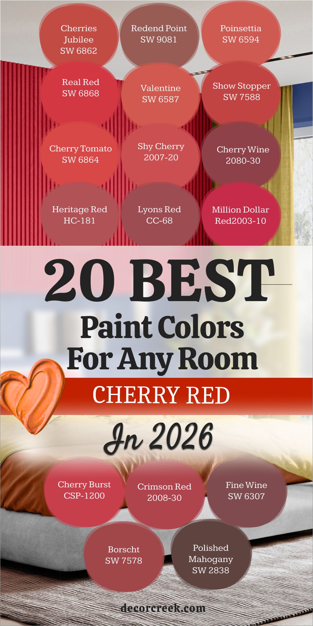
20 Best Cherry Red Paint Colors Trendy This Year
Real Red SW 6868
Real Red SW 6868 appears on my list again because it is simply the standard for a perfect, true red. Real Red SW 6868 is currently trendy because people are finally moving away from boring greys and wanting bold, primary colors again. Real Red SW 6868 works like magic in pop-art inspired rooms or retro kitchens that need a kick of energy.
Real Red SW 6868 is a fearless color that shows you have huge confidence in your personal style. Real Red SW 6868 is the anchor for the maximalist design trend we are seeing right now in all the magazines. Real Red SW 6868 is bright, happy, and impossible to ignore when you walk into the room. Real Red SW 6868 reflects light in a way that makes everything around it look sharper and more defined.
Real Red SW 6868 pairs wonderfully with shiny chrome finishes and black accents for a diner vibe. Real Red SW 6868 is not for people who want to blend in; it is for those who want to stand out. Real Red SW 6868 is the ultimate red for 2026 because it brings pure joy back into our homes.
🎨 Check out the complete guide to this color right HERE 👈
Heartthrob SW 6866
Heartthrob SW 6866 is a passionate and intense red that has gained a lot of popularity lately for good reason. Heartthrob SW 6866 is slightly warmer than a true red, giving it a welcoming and hugging vibe. Heartthrob SW 6866 looks fantastic on front doors to boost curb appeal and make your house the best on the block.
Heartthrob SW 6866 pairs well with warm neutrals like cream and beige rather than stark, cold whites. Heartthrob SW 6866 is a romantic color that fits the “grandmillennial” style perfectly with its vintage charm. Heartthrob SW 6866 feels classic yet very current, bridging the gap between old and new styles.
Heartthrob SW 6866 makes any room feel heartfelt and warm, especially in the evenings. Heartthrob SW 6866 reminds me of red lipstick and valentines, bringing a sense of love to a home. Heartthrob SW 6866 works beautifully on a dining room wall to stimulate appetite and conversation. Heartthrob SW 6866 is the color you choose when you want your home to have a big heart.
🎨 Check out the complete guide to this color right HERE 👈
Cherries Jubilee SW 6862
Cherries Jubilee SW 6862 remains a top pick because of its berry-like sweetness that feels fresh and fun. Cherries Jubilee SW 6862 fits the “Barbiecore” and pink-red trends that have taken over social media recently. Cherries Jubilee SW 6862 is fun and does not take itself too seriously, unlike some darker, moodier reds.
Cherries Jubilee SW 6862 looks great in bathrooms for a fresh burst of color that wakes you up in the morning. Cherries Jubilee SW 6862 is a crowd-pleaser that bridges the gap between a primary red and a hot pink. Cherries Jubilee SW 6862 is vibrant without being headache-inducing, so you can use it on larger walls.
Cherries Jubilee SW 6862 is a joyful addition to any trendy home that needs a splash of optimism. Cherries Jubilee SW 6862 pairs unexpectedly well with teal or turquoise for a high-contrast look. Cherries Jubilee SW 6862 reminds me of summer desserts and sunny days in the garden. Cherries Jubilee SW 6862 brings a youthful energy that makes any room feel younger.
🎨 Check out the complete guide to this color right HERE 👈
Show Stopper SW 7588
Show Stopper SW 7588 is trending because homeowners are looking for colors that act as art on their walls. Show Stopper SW 7588 provides a deep, saturated background that makes furniture look amazing and expensive. Show Stopper SW 7588 works with the “dark academia” trend of moody, rich interiors filled with books and leather.
Show Stopper SW 7588 is perfect for a dramatic powder room renovation where you want to impress guests. Show Stopper SW 7588 feels curated and designed, as if a professional picked it out for you. Show Stopper SW 7588 is a color that guests will definitely comment on because of its richness.
Show Stopper SW 7588 is bold luxury that you can buy in a paint can. Show Stopper SW 7588 changes throughout the day, looking bright at noon and velvety at night. Show Stopper SW 7588 requires a brave spirit, but the result is absolutely worth the risk. Show Stopper SW 7588 turns a boring drywall box into a designer showcase.
🎨 Check out the complete guide to this color right HERE 👈
Poinsettia SW 6594
Poinsettia SW 6594 is seeing a resurgence as people look for cool-toned reds to match modern grey flooring. Poinsettia SW 6594 feels crisp and clean, which fits the modern farmhouse aesthetic that is still very popular. Poinsettia SW 6594 is a wintery red that looks good all year round, not just during the holidays.
Poinsettia SW 6594 brings a pop of color to otherwise neutral rooms without clashing with cool tones. Poinsettia SW 6594 is energetic and lively, making it great for a hallway or entryway. Poinsettia SW 6594 works well as an accent in a white kitchen, perhaps on an island or a pantry door.
Poinsettia SW 6594 is a sharp, smart choice for people who dislike orange-reds. Poinsettia SW 6594 looks incredibly elegant when paired with silver or nickel hardware. Poinsettia SW 6594 stays true to its color and does not fade into a dull brown over time. Poinsettia SW 6594 captures the beauty of the flower it is named after perfectly.
Radish SW 6861
Radish SW 6861 is a bright, peppery red that adds spice to a room instantly. Radish SW 6861 is a bit more orange than a cherry red, making it feel very warm and inviting. Radish SW 6861 is perfect for boho-chic interiors filled with green plants and woven rugs.
Radish SW 6861 looks great with terracotta and natural wood tones found in mid-century furniture. Radish SW 6861 is an earthy take on a bright red, so it feels grounded rather than plastic. Radish SW 6861 feels organic and garden-fresh, bringing the outdoors inside your house.
Radish SW 6861 is a lively choice for a sunroom where you want to feel energized by the light. Radish SW 6861 pairs well with mustard yellows and deep greens for a nature-inspired palette. Radish SW 6861 makes a kitchen feel like a place where delicious food is cooked. Radish SW 6861 has a zest to it that prevents a room from ever feeling boring.
🎨 Check out the complete guide to this color right HERE 👈
Radish Red SW 6861
Radish Red SW 6861 is the same stunning color as above, reinforcing its huge popularity this year. Radish Red SW 6861 is being used more often on painted furniture and cabinetry rather than just walls. Radish Red SW 6861 brings a rustic charm to kitchen islands that might otherwise look too plain.
Radish Red SW 6861 pairs well with brass hardware for a vintage look that feels established. Radish Red SW 6861 is warm and inviting, making it a great color for a guest bedroom. Radish Red SW 6861 makes a room feel lived-in and cozy, removing that “new construction” sterility.
Radish Red SW 6861 is a spicy favorite that adds flavor to your design scheme. Radish Red SW 6861 looks amazing when the sun hits it, glowing with an inner fire. Radish Red SW 6861 is versatile enough to work in both a country cottage and a modern loft. Radish Red SW 6861 is the secret ingredient for a warm and happy home.
Stop SW 6869
Stop SW 6869 is a commanding color that literally makes you stop and look at it. Stop SW 6869 is a very pure red that works well in modern, graphic designs with sharp lines. Stop SW 6869 is great for commercial rooms or home offices where you need high energy to work.
Stop SW 6869 is clean and sharp, offering a no-nonsense approach to color. Stop SW 6869 does not have muddy undertones, so it reads as a very clear signal red. Stop SW 6869 is a high-impact color that works best when used with intention, like on a single wall.
Stop SW 6869 is for the bold decorator who is not afraid of visual power. Stop SW 6869 pairs excellently with black and white photography or abstract art. Stop SW 6869 creates a focal point in a room that lacks architectural interest. Stop SW 6869 is a color that says you know exactly what you are doing.
Red Bay SW 6321
Red Bay SW 6321 is a muted, brick-like red that fits the earthy trend sweeping the design world. Red Bay SW 6321 looks like dried clay or autumn leaves, bringing a natural feel indoors. Red Bay SW 6321 is very calming for a red, making it suitable for living rooms where you relax.
Red Bay SW 6321 works well with the beige and brown palettes that are coming back into style. Red Bay SW 6321 is sophisticated and grounded, never feeling too loud or aggressive. Red Bay SW 6321 feels historical and established, like the walls of an old library.
Red Bay SW 6321 is a warm, comforting blanket of color that wraps around the room. Red Bay SW 6321 pairs beautifully with linen fabrics and rough-hewn wood textures. Red Bay SW 6321 is distinct from primary reds because it feels more like a neutral. Red Bay SW 6321 adds character to a room without taking over the whole show.
🎨 Check out the complete guide to this color right HERE 👈
Crabby Apple SW 7592
Crabby Apple SW 7592 is a fun, slightly tart red that feels very playful and lighthearted. Crabby Apple SW 7592 is not too dark, so it keeps a room feeling open and airy. Crabby Apple SW 7592 works great in a cottage or bungalow style home that has a lot of charm.
Crabby Apple SW 7592 pairs well with white beadboard or wainscoting for a classic look. Crabby Apple SW 7592 is a happy, daytime red that looks best with plenty of natural light. Crabby Apple SW 7592 brings a smile to your face because it reminds you of fresh fruit.
Crabby Apple SW 7592 is fresh and fruity, making it a delicious choice for a kitchen. Crabby Apple SW 7592 works well with blue and white accents for a patriotic or nautical theme. Crabby Apple SW 7592 is less serious than a burgundy but more interesting than a pink. Crabby Apple SW 7592 adds a punch of personality to any small nook.
Heritage Red HC-181
Heritage Red HC-181 remains a staple because traditional design is coming back in style in a big way. Heritage Red HC-181 is the perfect red for a classic library or dining room filled with wood furniture. Heritage Red HC-181 looks rich and expensive, adding value to the look of your home.
Heritage Red HC-181 is a color that never looks dated, no matter how trends change over the years. Heritage Red HC-181 works with antiques and modern furniture alike, acting as a bridge between eras. Heritage Red HC-181 is a deep, satisfying red that feels solid and permanent on the walls.
Heritage Red HC-181 is the king of traditional reds and is often used in historic preservation. Heritage Red HC-181 creates a backdrop that makes oil paintings and gold frames pop. Heritage Red HC-181 feels like a color that has been in the house for a hundred years. Heritage Red HC-181 is the definition of class and reliability.
🎨 Check out the complete guide to this color right HERE 👈
Million Dollar Red 2003-10
Million Dollar Red 2003-10 is trending because it is bright and optimistic, which we all need. Million Dollar Red 2003-10 fits the post-pandemic desire for joyful, happy interiors that lift our spirits. Million Dollar Red 2003-10 is vibrant and full of life, bringing energy to any stagnant corner.
Million Dollar Red 2003-10 works well in small doses like a painted chair, or on big walls for impact. Million Dollar Red 2003-10 is a celebration on a wall, making every day feel a little festive. Million Dollar Red 2003-10 is purely positive energy that radiates throughout the house.
Million Dollar Red 2003-10 is a winner for playrooms or creative studios where you want to feel inspired. Million Dollar Red 2003-10 makes white trim look whiter and brighter by contrast. Million Dollar Red 2003-10 is a confident color that does not hide in the shadows. Million Dollar Red 2003-10 makes your home feel worth a million bucks.
🎨 Check out the complete guide to this color right HERE 👈
Exotic Red 2086-10
Exotic Red 2086-10 is a deep, sultry red that adds mystery and intrigue to a room. Exotic Red 2086-10 has a touch of pink and purple that makes it very glamorous and unique. Exotic Red 2086-10 is perfect for a bedroom accent wall where you want to create a mood.
Exotic Red 2086-10 feels lush and tropical, like a rare flower found in a jungle. Exotic Red 2086-10 is a daring choice for 2026, perfect for people tired of safe colors. Exotic Red 2086-10 is rich and saturated, offering excellent coverage on the wall.
Exotic Red 2086-10 is a beautiful escape from the ordinary world outside your door. Exotic Red 2086-10 pairs wonderfully with black velvet and metallic gold accents. Exotic Red 2086-10 changes with the light, offering different looks morning and night. Exotic Red 2086-10 is for the homeowner who wants their house to tell a story.
Raspberry Blush 2008-30
Raspberry Blush 2008-30 was a major color trend recently and is still going strong in designs. Raspberry Blush 2008-30 is more coral-pink than a true red, but it fits the cherry family well. Raspberry Blush 2008-30 is incredibly cheerful and sunny, making it impossible to feel sad around it.
Raspberry Blush 2008-30 lights up a room instantly, even if the room does not have many windows. Raspberry Blush 2008-30 is the happiest color on this list and radiates warmth. Raspberry Blush 2008-30 is perfect for a breakfast nook where you start your day with coffee.
Raspberry Blush 2008-30 is sweet and tangy, adding a flavor of fun to your decor. Raspberry Blush 2008-30 works beautifully with warm wood tones and rattan furniture. Raspberry Blush 2008-30 makes skin tones look healthy and glowing in the reflection. Raspberry Blush 2008-30 is a burst of joy on four walls.
Caliente AF-290
Caliente AF-290 is a spicy, warm red that Benjamin Moore is famous for around the world. Caliente AF-290 has a lot of depth without being too dark, hitting a perfect middle ground. Caliente AF-290 is sophisticated and sexy, bringing a lot of heat to a design.
Caliente AF-290 looks amazing on front doors to welcome guests with a warm hello. Caliente AF-290 is a color with a lot of personality that stands on its own. Caliente AF-290 warms up cool grey rooms that might otherwise feel too sterile or hospital-like.
Caliente AF-290 is a modern classic that designers return to again and again. Caliente AF-290 pairs perfectly with crisp white trim for a sharp, clean look. Caliente AF-290 is versatile enough to work in a kitchen, dining room, or living area. Caliente AF-290 is the color of confidence and warmth combined.
🎨 Check out the complete guide to this color right HERE 👈
Dinner Party AF-300
Dinner Party AF-300 is a deep, wine red specifically designed for formal dining spaces. Dinner Party AF-300 creates an intimate, cozy atmosphere that encourages guests to stay longer. Dinner Party AF-300 makes guests feel welcome and relaxed because it feels like a warm hug.
Dinner Party AF-300 looks beautiful by candlelight, which brings out the rich purple undertones. Dinner Party AF-300 is rich and romantic, perfect for evening entertaining and special occasions. Dinner Party AF-300 is a very social color that seems to stimulate good conversation.
Dinner Party AF-300 sets the mood perfectly for a meal, making food look and feel better. Dinner Party AF-300 works well with dark wood tables and upholstered chairs. Dinner Party AF-300 adds a layer of sophistication that lighter reds simply cannot match. Dinner Party AF-300 is the ultimate host’s secret weapon.
Deep Rose 2004-10
Deep Rose 2004-10 is a floral-inspired red that feels soft, velvety, and luxurious to the touch. Deep Rose 2004-10 is great for a feminine touch in a bedroom or a lady’s study. Deep Rose 2004-10 is not as harsh as a primary red, making it easier to sleep near.
Deep Rose 2004-10 works well with floral wallpapers and soft, patterned fabrics. Deep Rose 2004-10 is elegant and timeless, recalling the colors of a Victorian garden. Deep Rose 2004-10 is a gentle red that whispers rather than shouts.
Deep Rose 2004-10 is pure romance and looks lovely in the soft morning light. Deep Rose 2004-10 pairs beautifully with cream, ivory, and soft sage greens. Deep Rose 2004-10 brings a sense of calm beauty to any room it is in. Deep Rose 2004-10 is a classic choice for a sophisticated home.
Cherry Wine 2080-30
Cherry Wine 2080-30 is back on the trendy list for its moody vibe and deep saturation. Cherry Wine 2080-30 fits the “goth cottage” aesthetic that some people love right now. Cherry Wine 2080-30 is dark and dramatic, turning a room into a cozy cave.
Cherry Wine 2080-30 makes a small room feel like a jewelry box lined with velvet. Cherry Wine 2080-30 is a bold commitment because it absorbs a lot of light. Cherry Wine 2080-30 is deep and thoughtful, perfect for a place of reflection or reading.
Cherry Wine 2080-30 is for the brave decorator who wants a high-impact room. Cherry Wine 2080-30 pairs stunningly with crystal chandeliers and gold mirrors. Cherry Wine 2080-30 has a purple undertone that adds to its mystery and richness. Cherry Wine 2080-30 creates a world of its own inside your home.
Moroccan Red 1309
Moroccan Red 1309 is an earthy, spicy red that feels like a walk through a distant bazaar. Moroccan Red 1309 has brown undertones that make it very warm and easy to live with. Moroccan Red 1309 pairs well with global decor, woven baskets, and patterned rugs.
Moroccan Red 1309 is texture in a color, adding visual interest to flat walls. Moroccan Red 1309 feels like travel and adventure, bringing the world to your living room. Moroccan Red 1309 is a grounded, sandy red that feels like it comes from the earth.
Moroccan Red 1309 is unique and beautiful, standing out from standard paint chart reds. Moroccan Red 1309 works incredibly well with leather furniture and heavy wood pieces. Moroccan Red 1309 creates a cozy, enclosed feeling that is very comforting. Moroccan Red 1309 is the color of spice and warmth.
20 Best Cherry Red Paint Colors by Sherwin Williams
Radish SW 6861
Radish SW 6861 is a Sherwin Williams favorite for its spicy warmth and lively character. Radish SW 6861 brings a kitchen to life with its orange-red glow that stimulates the appetite. Radish SW 6861 is appetizing and energetic, making it impossible to feel sluggish in its presence.
Radish SW 6861 pairs well with warm woods like oak and walnut, enhancing their grain. Radish SW 6861 is a standout color that guests will always ask you the name of. Radish SW 6861 is fresh and zesty, adding a kick to your interior design.
Radish SW 6861 is a garden-inspired beauty that feels organic rather than synthetic. Radish SW 6861 looks wonderful with green plants placed in front of it for contrast. Radish SW 6861 works best in rooms that receive plenty of natural sunlight. Radish SW 6861 is the color of a vibrant, happy home.
🎨 Check out the complete guide to this color right HERE 👈
Positive Red SW 6871
Positive Red SW 6871 is a bright, cheerful red that lives up to its optimistic name. Positive Red SW 6871 has a slight pink undertone that keeps it light and prevents it from feeling heavy. Positive Red SW 6871 is great for a child’s room or a playroom where energy runs high.
Positive Red SW 6871 is full of optimism and makes you smile when you walk in. Positive Red SW 6871 reflects light beautifully, helping to brighten up a darker corner of the house. Positive Red SW 6871 is a happy paint choice that brings good vibes to everyone who sees it.
Positive Red SW 6871 works well on furniture pieces, like a refurbished dresser or side table. Positive Red SW 6871 is distinct without being blindingly neon. Positive Red SW 6871 pairs nicely with crisp whites and soft greys. Positive Red SW 6871 is a color that encourages fun and creativity.
🎨 Check out the complete guide to this color right HERE 👈
Lusty Red SW 6863
Lusty Red SW 6863 is a deep, romantic red with a lot of passion and depth. Lusty Red SW 6863 is darker and more serious than Positive Red, offering a more grown-up vibe. Lusty Red SW 6863 works well in a master suite where you want to create a sanctuary.
Lusty Red SW 6863 is rich and saturated, covering the walls in a blanket of color. Lusty Red SW 6863 feels very luxurious, especially when used with velvet or silk fabrics. Lusty Red SW 6863 creates a warm atmosphere that is perfect for relaxing after a long day.
Lusty Red SW 6863 is a bold choice that pays off by making the room feel expensive. Lusty Red SW 6863 looks incredible under warm, dim lighting in the evening. Lusty Red SW 6863 pairs beautifully with dark furniture and gold accents. Lusty Red SW 6863 is a statement color for a confident home.
Cerise SW 6580
Cerise SW 6580 is a fun, berry-toned red that leans distinctly towards pink. Cerise SW 6580 is vibrant and youthful, making it a great choice for lively households. Cerise SW 6580 pops against white trim, creating a clean and crisp look. Cerise SW 6580 is a playful color for a bathroom, adding a splash of fun to the morning routine.
Cerise SW 6580 is like a summer fruit, sweet and full of life. Cerise SW 6580 is energetic and sweet, perfect for an accent wall in a craft room. Cerise SW 6580 is a delight to behold and never feels boring or stuffy.
Cerise SW 6580 pairs nicely with turquoise or teal for a bold, contrasting palette. Cerise SW 6580 brings a sense of joy and playfulness to interior design. Cerise SW 6580 is a color that refuses to be ignored.
Fireweed SW 6328
Fireweed SW 6328 is a rusty, earthy red that feels very natural and grounded. Fireweed SW 6328 looks like autumn leaves or the red rocks of the desert. Fireweed SW 6328 is great for exteriors or rustic interiors like cabins and farmhouses.
Fireweed SW 6328 pairs well with stone fireplaces and slate flooring. Fireweed SW 6328 is a grounded color that connects your home to the earth outside. Fireweed SW 6328 is warm and cozy, making a large room feel more intimate.
Fireweed SW 6328 is nature’s red, lacking the artificial brightness of some other shades. Fireweed SW 6328 works well with leather furniture and heavy wool rugs. Fireweed SW 6328 is a subtle way to introduce red without it being too loud. Fireweed SW 6328 is timeless and rugged.
🎨 Check out the complete guide to this color right HERE 👈
Grenadine SW 6592
Grenadine SW 6592 is a sweet, syrup-colored red that is very bright and saturated. Grenadine SW 6592 is perfect for an accent wall because it draws the eye immediately. Grenadine SW 6592 brings high energy to a room, so it is best for active areas.
Grenadine SW 6592 is fun and loud, making a statement that you love color. Grenadine SW 6592 works in a creative studio to keep the mind active and engaged. Grenadine SW 6592 is a cocktail of color that mixes well with other bright hues.
Grenadine SW 6592 is a party on the wall, celebrating life and vibrancy. Grenadine SW 6592 looks sharpest when paired with pure white and deep black. Grenadine SW 6592 is not for a quiet library; it is for a room full of life. Grenadine SW 6592 is a bold, flavorful choice.
🎨 Check out the complete guide to this color right HERE 👈
Coral Bells SW 6593
Coral Bells SW 6593 is a red that leans heavily into orange-coral territory. Coral Bells SW 6593 is tropical and warm, reminding me of hibiscus flowers. Coral Bells SW 6593 feels like a vacation every time you walk into the room.
Coral Bells SW 6593 lights up a dark room, mimicking the effect of sunlight. Coral Bells SW 6593 is fresh and floral, bringing a softness to the red family. Coral Bells SW 6593 is a happy shade that works well in kitchens and dining nooks.
Coral Bells SW 6593 is distinct and pretty, offering a unique twist on standard red. Coral Bells SW 6593 pairs beautifully with soft greens and aquas. Coral Bells SW 6593 is inviting and friendly to guests. Coral Bells SW 6593 is a breath of fresh air.
Red Tomato SW 6607
Red Tomato SW 6607 is a juicy, ripe red that is very appetizing and bold. Red Tomato SW 6607 is a classic kitchen color because it mimics fresh produce. Red Tomato SW 6607 is warm and inviting, making the kitchen the heart of the home.
Red Tomato SW 6607 pairs with yellow and green for a true garden-inspired palette. Red Tomato SW 6607 is a garden color that feels organic and lively. Red Tomato SW 6607 is fresh and bold, standing out against white cabinets.
Red Tomato SW 6607 is a culinary favorite that stimulates the senses. Red Tomato SW 6607 looks great with butcher block countertops and farmhouse sinks. Red Tomato SW 6607 brings a sense of abundance and health. Red Tomato SW 6607 is a recipe for a happy kitchen.
Ravishing Coral SW 6612
Ravishing Coral SW 6612 is a soft, pinkish-red that is very flattering to skin tones. Ravishing Coral SW 6612 is gentle on the eyes, making it suitable for relaxation spaces. Ravishing Coral SW 6612 works in bathrooms and bedrooms where you want a calming vibe.
Ravishing Coral SW 6612 is warm without being hot, offering a gentle glow. Ravishing Coral SW 6612 is a sunset color, capturing the pinks and oranges of twilight. Ravishing Coral SW 6612 is elegant and soft, adding a feminine touch to a room.
Ravishing Coral SW 6612 is a beauty that does not need to shout to be heard. Ravishing Coral SW 6612 pairs well with beige, sand, and other warm neutrals. Ravishing Coral SW 6612 makes a room feel cozy and safe. Ravishing Coral SW 6612 is a lovely embrace of color.
Begonia SW 6599
Begonia SW 6599 is a floral red with strong pink vibes that feels very botanical. Begonia SW 6599 is lively and spring-like, even in the middle of winter. Begonia SW 6599 works well with floral prints and chintz fabrics.
Begonia SW 6599 is a happy accent color that brightens up drab corners. Begonia SW 6599 is fresh and clean, perfect for a laundry room or powder room. Begonia SW 6599 brings the garden inside, reminding you of blooming flowers.
Begonia SW 6599 is a sweet choice that feels innocent and joyful. Begonia SW 6599 pairs wonderfully with leaf green accents. Begonia SW 6599 is vibrant enough to stand alone but soft enough to blend in. Begonia SW 6599 is a cheerful companion for your home.
Lei Flower SW 6613
Lei Flower SW 6613 is a tropical, coral red that feels breezy and island-inspired. Lei Flower SW 6613 is perfect for a coastal home or a beach cottage. Lei Flower SW 6613 is light and airy for a red, lacking the heaviness of burgundy.
Lei Flower SW 6613 pairs with teal and white for a classic seaside look. Lei Flower SW 6613 is a vacation vibe that you can enjoy every day. Lei Flower SW 6613 is fun and relaxed, encouraging you to kick off your shoes.
Lei Flower SW 6613 is a sunny day captured in a paint can. Lei Flower SW 6613 makes small rooms feel larger because it reflects light well. Lei Flower SW 6613 works great on wicker or rattan furniture. Lei Flower SW 6613 is a breath of salty ocean air.
🎨 Check out the complete guide to this color right HERE 👈
Daredevil SW 6876
Daredevil SW 6876 is a neon-bright, intense red-orange that vibrates with energy. Daredevil SW 6876 is for the bravest decorators only who are not afraid of risk. Daredevil SW 6876 is incredibly high energy and creates a buzzing atmosphere.
Daredevil SW 6876 works in modern, stark rooms as a focal point of color. Daredevil SW 6876 is a shock of color that immediately grabs attention. Daredevil SW 6876 is electric and feels almost like it is glowing.
Daredevil SW 6876 is unforgettable; once you see it, you remember it. Daredevil SW 6876 needs simple furniture so the room does not feel chaotic. Daredevil SW 6876 is best used in small doses or on a single feature wall. Daredevil SW 6876 is pure adrenaline for your home.
Fired Brick SW 6335
Fired Brick SW 6335 is a dusty, muted red that looks like clay or old masonry. Fired Brick SW 6335 is very usable and neutral, acting more like a brown in some lights. Fired Brick SW 6335 fits the desert modern style perfectly with its earthy tone.
Fired Brick SW 6335 is warm and grounding, providing a stable base for a room. Fired Brick SW 6335 is not overwhelming, so you can paint all four walls with it. Fired Brick SW 6335 is a solid choice for a study or a masculine bedroom.
Fired Brick SW 6335 is earthy and connects the indoors to the outdoors. Fired Brick SW 6335 pairs well with navy blue and cream. Fired Brick SW 6335 feels established and permanent. Fired Brick SW 6335 is a reliable classic.
Rojo Marrón SW 9182
Rojo Marrón SW 9182 is a deep, brown-red that is very sophisticated and dark. Rojo Marrón SW 9182 looks like dark leather or mahogany wood. Rojo Marrón SW 9182 is perfect for a study or a library filled with books.
Rojo Marrón SW 9182 is warm and masculine, adding a serious note to a home. Rojo Marrón SW 9182 is a serious color for dignified spaces. Rojo Marrón SW 9182 is rich and dark, absorbing light to create a cozy mood.
Rojo Marrón SW 9182 is elegant and pairs well with brass lamps. Rojo Marrón SW 9182 works well on cabinetry or wainscoting. Rojo Marrón SW 9182 feels expensive and high-end. Rojo Marrón SW 9182 is a timeless choice for luxury.
🎨 Check out the complete guide to this color right HERE 👈
Dark Clove SW 9183
Dark Clove SW 9183 is a spicy, brown-red that feels like fall in a bottle. Burnished Brandy SW 9183 is cozy and wrapping, making you want to curl up with a blanket. Dark Clove looks great by a fireplace, enhancing the warmth of the hearth.
Dark Clove is a comfort color that puts you at ease. Dark Cloveis deep and warm without being too dark. Burnished Brandy SW 9183 is a toasty shade that works well in living rooms.
BDark Clove is inviting to everyone who enters the room. Dark Clove pairs well with autumn colors like gold and olive. Burnished Brandy SW 9183 feels like a warm drink on a cold day.Dark Clove is homey and rich.
🎨 Check out the complete guide to this color right HERE 👈
Cherries Jubilee SW 6862
Cherries Jubilee SW 6862 is a Sherwin Williams classic I mentioned before, but it deserves a second look here. Cherries Jubilee SW 6862 is the perfect balance of sweet and tart, just like the fruit. Cherries Jubilee SW 6862 works in almost any room, from the kitchen to the bedroom.
Cherries Jubilee SW 6862 is a reliable red that does not surprise you with weird undertones. Cherries Jubilee SW 6862 is a fan favorite because it is so easy to love. Cherries Jubilee SW 6862 is versatile enough for modern or traditional furniture.
Cherries Jubilee SW 6862 is simply the best all-around red for beginners. Cherries Jubilee SW 6862 makes white trim look exceptionally bright. Cherries Jubilee SW 6862 brings a cheerful spirit to the home. Cherries Jubilee SW 6862 is a color you will not regret.
🎨 Check out the complete guide to this color right HERE 👈
Fine Wine SW 6307
Fine Wine SW 6307 appears again because it is the best dark red they make in my opinion. Fine Wine SW 6307 is for dramatic, moody rooms where you want to make a statement. Fine Wine SW 6307 is sheer luxury on a wall, looking like expensive fabric.
Fine Wine SW 6307 is deep and purple, reminiscent of a glass of merlot. Fine Wine SW 6307 is a night-time color that looks best with artificial light. Fine Wine SW 6307 is sophisticated and grown-up.
Fine Wine SW 6307 is beautiful in a powder room with gold fixtures. Fine Wine SW 6307 wraps the room in a layer of comfort. Fine Wine SW 6307 is a bold choice that pays off. Fine Wine SW 6307 is elegance defined.
Rave Red SW 6608
Rave Red SW 6608 is a deep, saturated red that has a lot of punch and vibrancy. Rave Red SW 6608 is darker than a primary red but brighter than a burgundy. Rave Red SW 6608 is very balanced, sitting right in the middle of the spectrum.
Rave Red SW 6608 works on front doors to give a classic, welcoming look. Rave Red SW 6608 is a strong color that holds its own against dark brick or stone. Rave Red SW 6608 is classic yet bold, never feeling outdated.
Rave Red SW 6608 is a great red for dining rooms to stimulate appetite. Rave Red SW 6608 pairs well with both warm and cool neutrals. Rave Red SW 6608 is dependable and rich. Rave Red SW 6608 is a winner in any home.
Rojo Dust SW 9006
Rojo Dust SW 9006 is a very soft, brownish-red that acts like a neutral in the room. Rojo Dust SW 9007 is subtle and easy to use if you are afraid of bright colors. Rojo Dust SW 9006 works in southwest designs or adobe-style homes perfectly.
Rojo Dust SW 9007 is a quiet color that does not demand attention. Rojo Dust SW 9006 is warm clay that feels very organic. Rojo Dust SW 9006 is gentle on the eyes and very relaxing.
Rojo Dust SW 9006 is peaceful, making it great for a bedroom. Rojo Dust SW 9006 pairs well with sage green and cream. Rojo Dust SW 9006 adds warmth without heat. Rojo Dust SW 9007 is a soft embrace.
Coral Clay SW 9005
Coral Clay SW 9005 is a pinkish-brown red that is very earthy and trendy right now. Coral Clay SW 9005 is trendy and natural, fitting into the “organic modern” style. Coral Clay SW 9005 looks like raw pottery before it is glazed.
Coral Clay SW 9005 is warm and soft, making a room feel cozy instantly. Coral Clay SW 9005 is great for bedrooms because it is soothing. Coral Clay SW 9005 is a nature color that brings the outdoors in. Coral Clay SW 9005 is lovely with light wood furniture and white linens.
Coral Clay SW 9005 changes slightly with the light but always feels warm. Coral Clay SW 9005 is a subtle way to bring pink and red into your home. Coral Clay SW 9005 is a beautiful finish to this list.

My Final Thoughts about Best Cherry Red Paint Colors for Any Room
Choosing a cherry red paint color is a journey, but it is one that truly pays off in the end, rewarding your bravery with stunning results. I hope this extensive list helps you clearly see that red is not just one scary color, but a whole, beautiful family of shades ranging from sweet, cheerful pinks to deep, luxurious wines.
Whether you ultimately want the high, pulsating energy of “Real Red” to stimulate conversation or the cozy, comforting hug of “Fine Wine” for a dramatic evening room, there is absolutely a perfect shade here for you to find.
Remember, my key piece of advice is always to buy samples and carefully look at them in your own home before you commit to painting an entire wall.
Lighting changes everything about paint, and what looks perfectly balanced in the fluorescent store might look too blue or too orange on your wall under morning sun.
Do not be afraid to try something bold and unusual; paint is, after all, the easiest and least expensive way to change the entire feeling of a home. If you are nervous about such a strong color, start with a small room like a powder bathroom or perhaps just an accent wall behind your sofa.
I promise you, once you see how much life, warmth, and personality red brings to your home, you will wonder why you waited so long to embrace this vibrant choice. Go grab a brush, trust your instincts, and make your home happy and memorable.