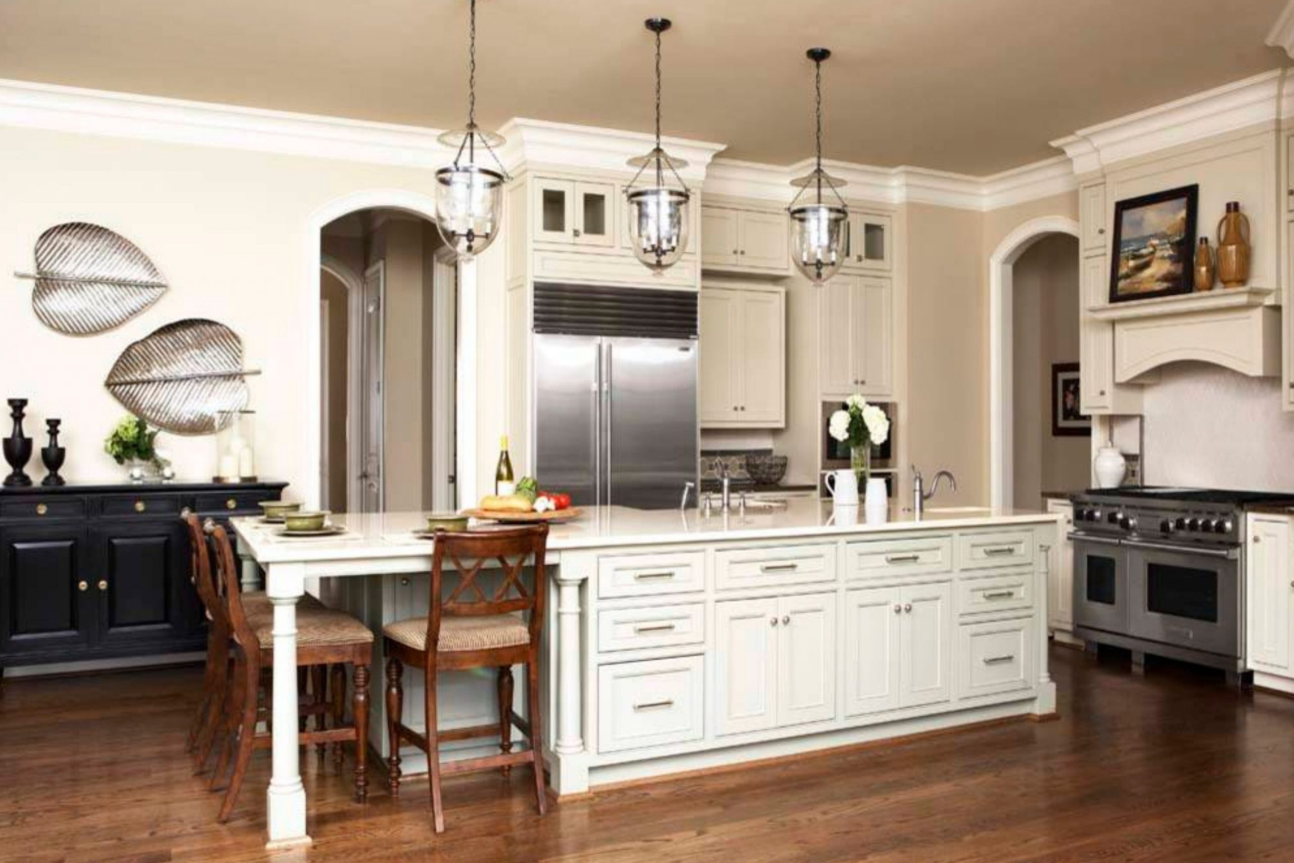
Getting into the world of paint colors can be a bit confusing with all the choices out there. If you’re considering Sherwin Williams SW 7002 Downy for your next project, let me share a few essential tips. As someone who’s used this paint, I can tell you first-hand that its soft, creamy hue offers a feeling of calmness and simplicity to any room.
Before you decide to use Downy in your own area, consider how this warm white carries different subtleties under varying lighting conditions, impacting the overall mood and aesthetic. It shifts smoothly from daylight to artificial light, keeping its calm vibe without turning stark or cold, which is a huge plus.
Additionally, pay attention to the existing colors in your decor. Downy pairs beautifully with a wide range of hues, but it truly stands out when given the chance to gently contrast with bolder colors or act as a cohesive background for softer palettes.
Whether you’re looking to refresh your living room, bedroom, or even the kitchen, SW 7002 Downy could be the adaptable choice you need.
Remember, the finish you choose—whether matte, eggshell, or satin—will also affect the final look, so consider what will work best for your rooms’ functionality and aesthetics.
Is Downy SW 7002 Right for My Home?
I recently found a delightful color called Downy by Sherwin Williams, and I must say, it’s subtle yet wonderfully adaptable. It’s a light, airy gray that carries a hint of warmth, making it an excellent choice for creating a cozy, inviting area without feeling too strong with color.
I find that Downy works perfectly in a variety of interior styles. Its soft, neutral tone makes it a natural fit for modern and minimalist designs, adding a touch of warmth while keeping the overall feel light and open. I’ve also used it in more traditional settings, where it complements rich wood finishes and classic furniture beautifully.
When it comes to pairing materials and textures with this color, I love how it looks with natural elements. Think along the lines of light wooden floors, stone accents, and wool or linen fabrics. These materials really help in bringing out the warmth in the color, while maintaining a fresh, airy feel. For a more dramatic contrast, I mix in some darker accessories like deep blue cushions or a dark gray throw. The balance is always lovely.
Overall, Downy has proved to be an excellent choice for anyone looking to create a fresh, inviting atmosphere in their home. It’s a color that works hard to stay softly in the background, enhancing everything around it.

decorcreek.com
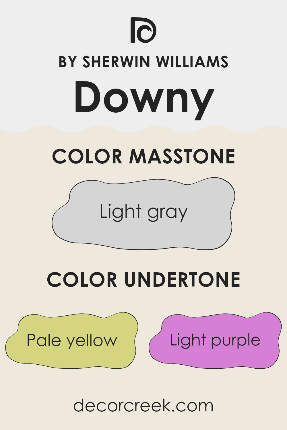
What are the right undertones of Downy SW 7002 ?
Downy is a paint color that showcases a soft and subtle hue, but its unique appearance comes from a special mix of undertones that influence how it looks on your walls. Undertones are the colors sitting beneath the main color, and they can change the way paint appears under different lighting conditions.
The undertones in this specific color include pale yellow, light purple, light blue, pale pink, mint, lilac, and grey. Each of these adds a layer of depth and complexity to the paint. For example, the pale yellow undertone can make the color feel warmer, which could make a room seem cozier under warm lighting.
Light blue and mint offer a hint of freshness, brightening up areas that might not get a lot of natural sunlight.
Pale pink and lilac undertones add a pinch of softness and a subtle vibrancy that can enhance the aesthetic appeal, making the room feel more welcoming.
The presence of grey keeps the color grounded, ensuring it doesn’t lean too heavily toward any overly bright or pastel shade.
When applied to interior walls, these undertones work together to bring out different moods depending on the time of day and the type of light in the room. In sunlight, the blues and yellows might stand out more, creating a bright and airy feel, while electric light in the evenings could draw out the greys and purples, making the area feel more intimate.
This adaptability makes it an ideal choice for many rooms, adjusting smoothly to changing atmospheres.
decorcreek.com
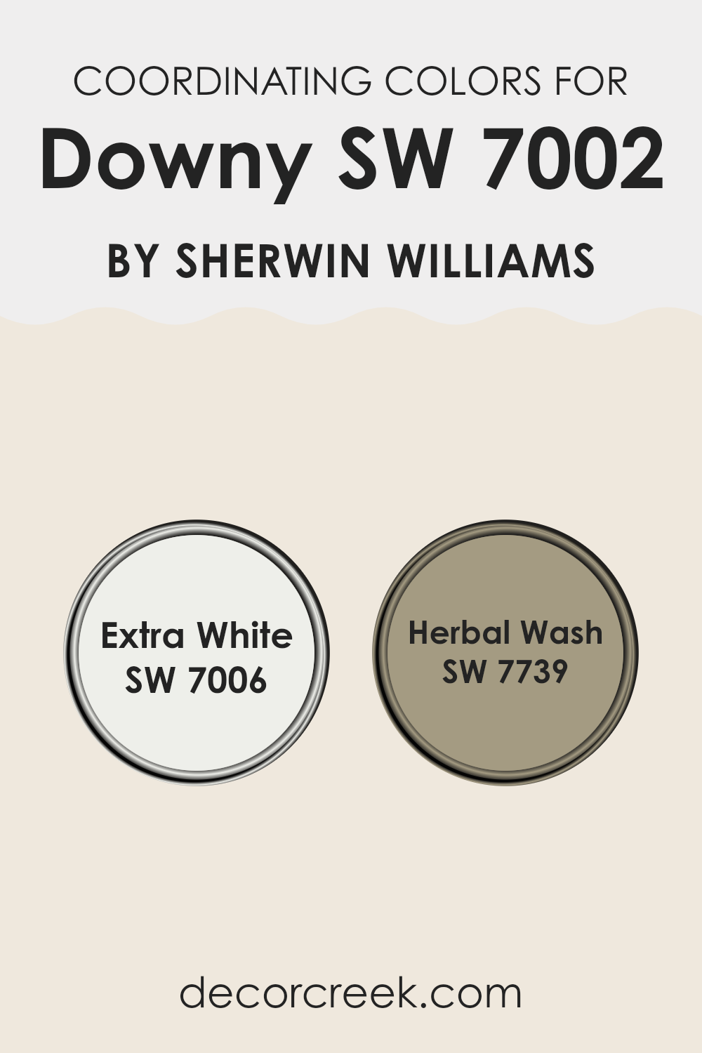
Best Coordinating Colors to use with Downy SW 7002 by Sherwin Williams this year.
Coordinating colors are selected shades that complement a primary color to enhance the overall aesthetic of an area. These coordinating colors are chosen based on their ability to harmonize with the main color, creating a balanced and pleasing palette.
For instance, if your primary wall color is a gentle neutral, like Downy by Sherwin Williams, you might pair it with contrasting or complementary shades to highlight architectural features or to define different areas within a room.
It’s important to select coordinating colors that create the desired mood and functionality of the area, whether that’s calm and relaxing, or vibrant and energizing.
For Downy by Sherwin Williams, two excellent coordinating colors are Extra White and Herbal Wash. Extra White is a clean, crisp white that works brilliantly to offset deeper or more saturated hues, providing a fresh and bright appearance that can make other colors pop while making areas appear larger and more open.
On the other hand, Herbal Wash is a subdued, earthy green that gives a natural feel and brings a touch of the outdoors inside. Its organic vibe pairs well with softer, neutral backgrounds to add depth and interest to interiors without feeling too strong. This combination can help to create a smooth color transition throughout your living area.
You can see recommended paint colors below:
- SW 7006 Extra White
- SW 7739 Herbal Wash
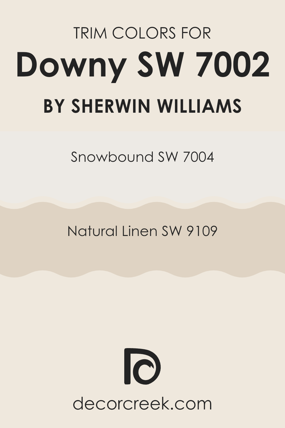
Trendy Trim Colors of Downy SW 7002 by Sherwin Williams to use this year.
Trim colors are essential in design because they help frame and accentuate the main colors used on walls, possibly making the walls stand out more or enhancing the overall aesthetic of a room. When using Downy SW 7002 by Sherwin Williams, a soft and gentle gray with a calming presence, selecting the right trim colors can add a clean, finished look.
Snowbound SW 7004 and Natural Linen SW 9109 are excellent choices for trims when paired with Downy, due to their subtle yet impactful tones that can complement without feeling too strong next to the base color.
Snowbound SW 7004 is a soft, warm white with subtle undertones that keep it from appearing too stark or icy, making it a great choice for trim; it gives a fresh, crisp edge to the walls painted in Downy. On the other hand, Natural Linen SW 9109 offers a warmer, beigey hue that provides a cozy, inviting feel at the borders, smoothly balancing with the cooler gray of Downy. This combination of trim colors not only defines the architectural features of a room but also enhances the overall warmth and appeal.
You can see recommended paint colors below:
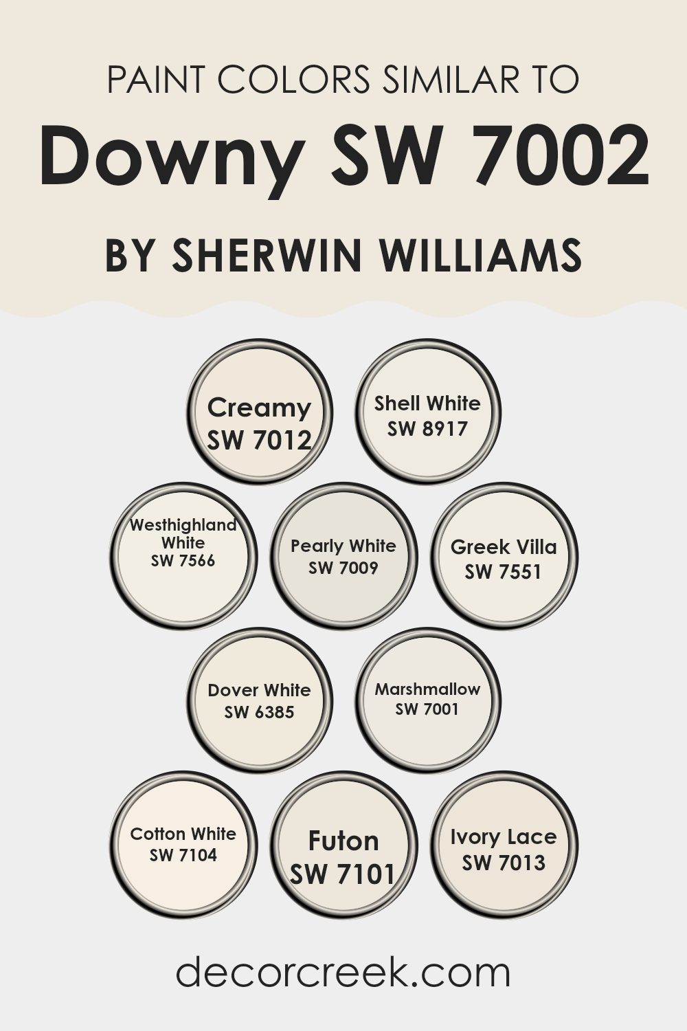
Evergreen Colors Similar to Downy SW 7002 by Sherwin Williams
Choosing the right color palette for an area is crucial as it sets the mood and style. Similar colors work well together because they create a sense of harmony and balance without contrasting sharply, which can make a room feel abrupt or disjointed. For example, shades like Creamy and Shell White are both soft and warm, providing a gentle backdrop that is not too strong.
They gently enhance the area, blending smoothly with various decor elements. Westhighland White offers a slightly richer tone, akin to Creamy but with a hint of depth, making it ideal for those who prefer a bit more warmth.
Pearly White and Greek Villa are also similar to the primary shade, yet they bring their unique undertones—Pearly White with a soft, almost glowing quality and Greek Villa presenting a slightly more beige hue. Dover White leans towards a creamy yellow, adding warmth and light. Marshmallow, Cotton White, Futon, and Ivory Lace range from soft whites to gentle beiges, each offering a clean and airy feel, making any room appear more open and inviting. These colors are adaptable and can complement not just each other but also a range of furnishing styles and textures, helping create cohesively styled areas.
You can see recommended paint colors below:
- SW 7012 Creamy
- SW 8917 Shell White
- SW 7566 Westhighland White
- SW 7009 Pearly White
- SW 7551 Greek Villa
- SW 6385 Dover White
- SW 7001 Marshmallow
- SW 7104 Cotton White
- SW 7101 Futon
- SW 7013 Ivory Lace
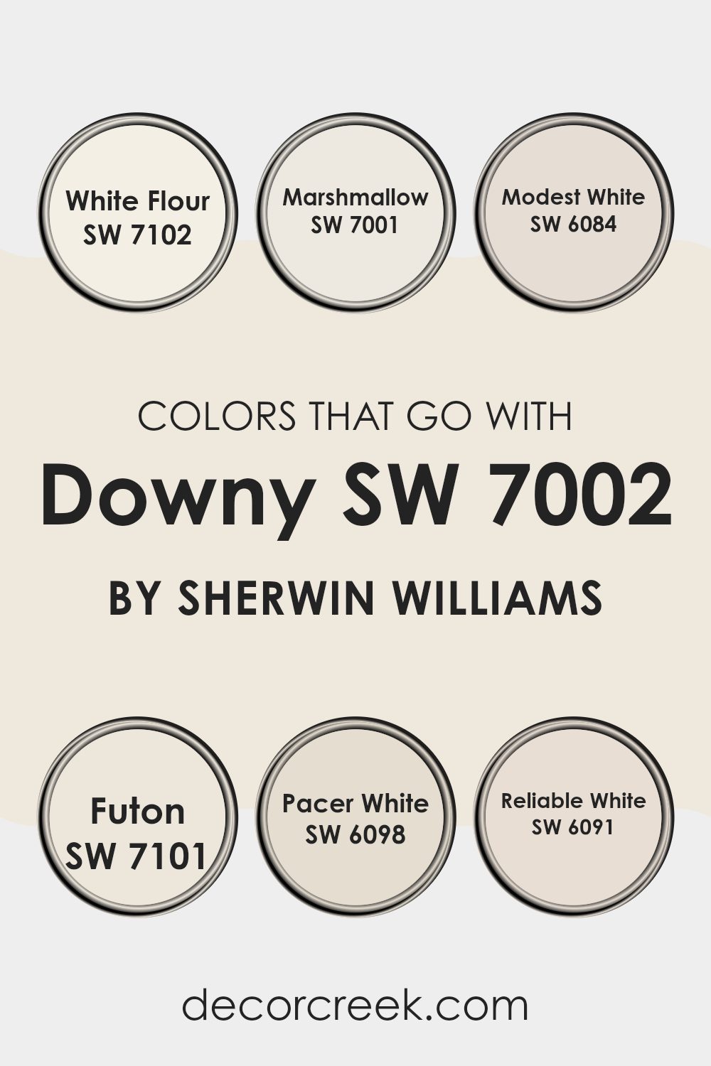
Colors that Go With Downy SW 7002 by Sherwin Williams
When it comes to home decorating, choosing the right colors to complement a base tone like Downy SW 7002 by Sherwin Williams is crucial for creating a harmonious and inviting atmosphere. Colors that pair well with Downy, such as White Flour SW 7102 and Marshmallow SW 7001, play a significant role in achieving a balanced and aesthetic look.
White Flour SW 7102 is a soft white that offers a subtle warmth, making it a perfect match for the gentle hue of Downy. On the other hand, Marshmallow SW 7001 is a bit creamier, providing a smooth transition that enhances the calming effect of your area.
Including other complementary colors like Modest White SW 6084, Futon SW 7101, Pacer White SW 6098, and Reliable White SW 6091 can also prove beneficial. Modest White SW 6084 has a hint of gray, which adds a slight contrast while maintaining the overall softness of the color scheme. Futon SW 7101 is a deeper, more beige tone that pairs nicely with Downy, offering a richer layer to the design.
Pacer White SW 6098 is more of a muted off-white that blends effortlessly with both Downy and the other surrounding whites. Lastly, Reliable White SW 6091 has an undertone that pulls everything together, ensuring that each room feels connected and flows smoothly from one area to another. By carefully selecting these shades, you can easily create an area that feels cohesive and aesthetically pleasing.
You can see recommended paint colors below:
- SW 7102 White Flour
- SW 7001 Marshmallow
- SW 6084 Modest White
- SW 7101 Futon
- SW 6098 Pacer White
- SW 6091 Reliable White
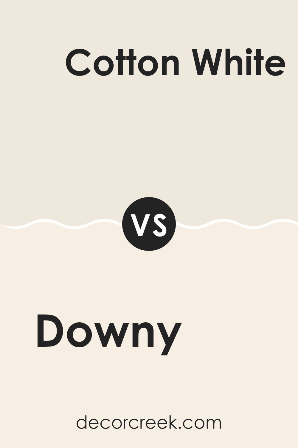
Downy SW 7002 by Sherwin Williams vs Cotton White SW 7104 by Sherwin Williams
The main color, Downy, is a gentle gray with soft, warm undertones, making it an adaptable choice for areas aiming for a cozy and peaceful atmosphere. On the other hand, Cotton White is a clean and pure white shade that offers a brighter, more refreshing look.
This color tends to make rooms feel more open and airy. Comparing the two, Downy provides a subtle hint of color and warmth, ideal for creating a welcoming environment without feeling too strong with color.
In contrast, Cotton White is great for achieving a crisp, clean look that can work well in a more modern or minimalist decor. Both colors work well in various settings, but your choice might depend on the mood you want to set and how much natural light your area receives.
You can see recommended paint color below:
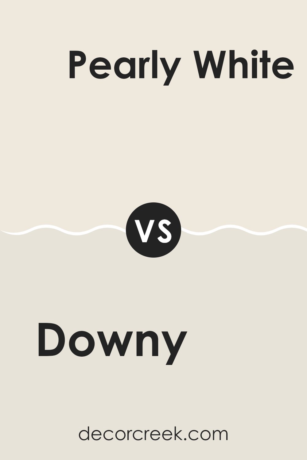
Downy SW 7002 by Sherwin Williams vs Pearly White SW 7009 by Sherwin Williams
Downy and Pearly White are two popular paint colors from Sherwin Williams. Downy is a soft, light gray color with a hint of warmth, making it cozy and inviting. It’s neutral enough to use in any room, providing a calm and gentle background that pairs well with bolder colors or other neutrals.
On the other hand, Pearly White is a bit warmer, leaning towards a creamy white with subtle beige undertones. It’s perfect for areas where you want a bit more brightness without the starkness of a pure white.
Both colors are quite adaptable and can make small rooms appear bigger and more open. While Downy offers a hint of color, Pearly White brings a clean, fresh look that’s excellent for walls, ceilings, and trims. Their subtle differences allow them to suit various decorating styles, from modern to traditional.
You can see recommended paint color below:
Downy SW 7002 by Sherwin Williams vs Creamy SW 7012 by Sherwin Williams
Downy and Creamy by Sherwin Williams are two light and gentle colors that pair well together. Downy is a soft gray with a calm and clean feel, making it ideal for creating a peaceful area.
It has a slight blue undertone that brings a cool freshness to a room, giving it a modern look. On the other hand, Creamy is a warm white with a buttery tone to it, which adds a cozy and inviting touch to any area. This color is great for making a room feel welcoming and bright.
Together, Downy and Creamy blend beautifully, as the cool tone of Downy complements the warmth of Creamy, providing a balanced atmosphere. This combination can work well in many parts of a home, from living areas to bedrooms, setting a relaxed mood.
You can see recommended paint color below:
Downy SW 7002 by Sherwin Williams vs Marshmallow SW 7001 by Sherwin Williams
Downy and Marshmallow are two light and airy colors from Sherwin Williams, but they have some subtle differences. Downy is a calm, neutral gray with just a hint of green. It offers a gentle and soothing atmosphere, making it adaptable for any room. It’s especially great for creating a soft backdrop that allows other colors to stand out.
On the other hand, Marshmallow is a creamy white that feels warm and welcoming. This color works well in areas where you want to add brightness without the starkness of pure white. Marshmallow can make small rooms feel bigger and more open.
Overall, while both colors are light and can help in making a room feel relaxed and peaceful, Downy leans more towards a muted gray-green, providing a unique touch to the area. Marshmallow, being closer to a traditional white, offers a classic look that pairs well with almost any color scheme.
You can see recommended paint color below:
Downy SW 7002 by Sherwin Williams vs Westhighland White SW 7566 by Sherwin Williams
Downy and Westhighland White are both colors by Sherwin Williams that offer subtle, soothing tones for any area. Downy is a light gray that has a gentle hint of blue. This color has a clean and airy feel, ideal for creating a fresh and calming atmosphere in rooms. It works well in areas that aim for a modern yet understated look.
On the other hand, Westhighland White is a soft, creamy white. It stands out for its warm undertones that add a cozy, inviting feel to any room. Unlike the cooler tones of Downy, Westhighland White works well where a touch of warmth is desired, making it perfect for living areas or bedrooms where comfort is a priority.
Both colors are quite adaptable, but while Downy offers a cool freshness, Westhighland White provides a warmer, more nurturing vibe. They can also complement each other beautifully when used in the same color scheme.
You can see recommended paint color below:
Downy SW 7002 by Sherwin Williams vs Shell White SW 8917 by Sherwin Williams
The main color, Downy, is a soft and light grey with cool undertones, offering a gentle and subtle vibe to any area. It’s very adaptable, making it a great choice for bedrooms or living rooms where a calm, understated elegance is desired. Its neutrality helps in blending well with various decor, enhancing other colors without feeling too strong.
On the other hand, Shell White has a warmer, creamy tone that gives a welcoming and cozy feel. It’s slightly brighter than Downy and leans more towards a pure, classic white. This makes it ideal for areas that need to feel more open and airy, like kitchens and bathrooms. Shell White reflects more light, thereby giving the illusion of more area and a cleaner look.
Both colors are subtle yet distinct, each providing a unique atmosphere. Downy can be seen as more modern and reserved, while Shell White offers a traditional and friendly touch. Choosing between them would largely depend on the desired mood and room function.
You can see recommended paint color below:
Downy SW 7002 by Sherwin Williams vs Greek Villa SW 7551 by Sherwin Williams
Both Downy and Greek Villa by Sherwin Williams are popular choices for interior paint, each offering its own unique shade of white. Downy is a soft, subtle gray with a hint of warmth, making it an adaptable choice for any room. It’s like a light mist, delicate and gentle, perfect for creating a soothing backdrop in an area intended for relaxation.
On the other hand, Greek Villa has a slightly creamier tone that gives a warmer feel compared to Downy. Its creaminess brings a cozy and inviting atmosphere, which works great in areas where you want to add just a touch more warmth without going too far from white.
The choice between the two would largely depend on the amount of warmth one desires in the room and the specific lighting conditions. Downy stays closer to a true soft white under various lighting, while Greek Villa can appear warmer and richer, especially in well-lit or natural light-filled areas.
You can see recommended paint color below:
Downy SW 7002 by Sherwin Williams vs Dover White SW 6385 by Sherwin Williams
Downy SW 7002 by Sherwin Williams is a gentle off-white with a subtle hint of gray. It’s a neutral shade that provides a soothing backdrop for various interior settings, ideal for creating a soft, inviting atmosphere. On the other hand, Dover White SW 6385 is a warmer, more distinct white. This color has a creamy undertone that adds a touch of coziness and brightness to areas, making it perfect for enhancing the light in a room.
While Downy maintains a muted, understated character, Dover White stands out a bit more due to its creamier base. Downy works well in areas where you want to keep things quiet and understated, blending with other colors without causing any clash. Conversely, Dover White is excellent if you’re aiming for an area that feels warmer and more welcoming.
These shades complement each other effectively when used together, with Dover White possibly being used for trim or accent areas to bring a soft contrast to the calming hue of Downy.
You can see recommended paint color below:
Downy SW 7002 by Sherwin Williams vs Ivory Lace SW 7013 by Sherwin Williams
The main color, Downy, is a soft, muted gray that leans slightly toward pale blue. It’s a calm and soothing color that works well in areas where a light and airy feel is desired. It’s particularly great for bedrooms or living areas due to its gentle and relaxing vibe.
The second color, Ivory Lace, is a creamy white with a warm undertone. This color is ideal for bringing brightness into a room without the starkness sometimes associated with pure white. Ivory Lace pairs beautifully with various hues and adds a cozy warmth to any area, making it excellent for areas like kitchens or living rooms.
When comparing Downy and Ivory Lace, Downy provides a cooler, more understated backdrop, whereas Ivory Lace offers a warmer and brighter look. Choosing between the two depends on the desired mood and brightness of the area. While Downy suggests a more open, breezy feel, Ivory Lace is all about warmth and welcoming light.
You can see recommended paint color below:
Downy SW 7002 by Sherwin Williams vs Futon SW 7101 by Sherwin Williams
Downy SW 7002 and Futon SW 7101 are both colors by Sherwin Williams but they bring different vibes to an area. Downy is a light, soft gray with a subtle blue undertone, giving it a clean and fresh look. It’s perfect for creating a bright and airy feel in any room. In contrast, Futon is darker and warmer, leaning towards a beige-gray blend. This color is excellent for adding a cozy and inviting atmosphere, making areas feel more grounded and snug.
Using Downy could make a small room seem larger and more open because of its lightness. It reflects more light, which enhances the sense of area. On the other hand, Futon, being a deeper shade, works well in larger areas or on accent walls to add depth and interest without feeling too strong with darkness.
Both colors are neutral, so they pair well with a variety of decor styles and other colors. Downy works particularly well in modern and minimalist designs, while Futon is ideal for more traditional or rustic themes. Choosing between them depends on the mood you want to set and the size of your room.
You can see recommended paint color below:
In wrapping up, SW 7002 Downy by Sherwin Williams is a paint color that many people seem to love! It has a soft, cloudy white look that makes any room feel calm and cozy. Whether you want to paint a bedroom, living room, or even the kitchen, Downy brings a fresh and clean feel that isn’t too sharp or bright, but just right.
I found out that due to its gentle shade, it works perfectly with many different colors. This means if you have green, blue, or even grey elements in your room, Downy will still look good with all of them. It’s especially useful for anyone who likes to change their room decorations often because you won’t need to change the wall color every time you get new cushions or curtains.
Overall, SW 7002 Downy by Sherwin Williams gives an area a nice touch without making it too different. It’s like having a cloud in your room that makes everything look soft and pleasant. So if you’re looking for a color that’s not too loud but still makes your room look good, Downy might be the perfect choice.
I had a really good time learning about this color, and I think it could make many homes look even nicer!
decorcreek.com
Ever wished paint sampling was as easy as sticking a sticker? Guess what? Now it is! Discover Samplize's unique Peel & Stick samples.
Get paint samples

