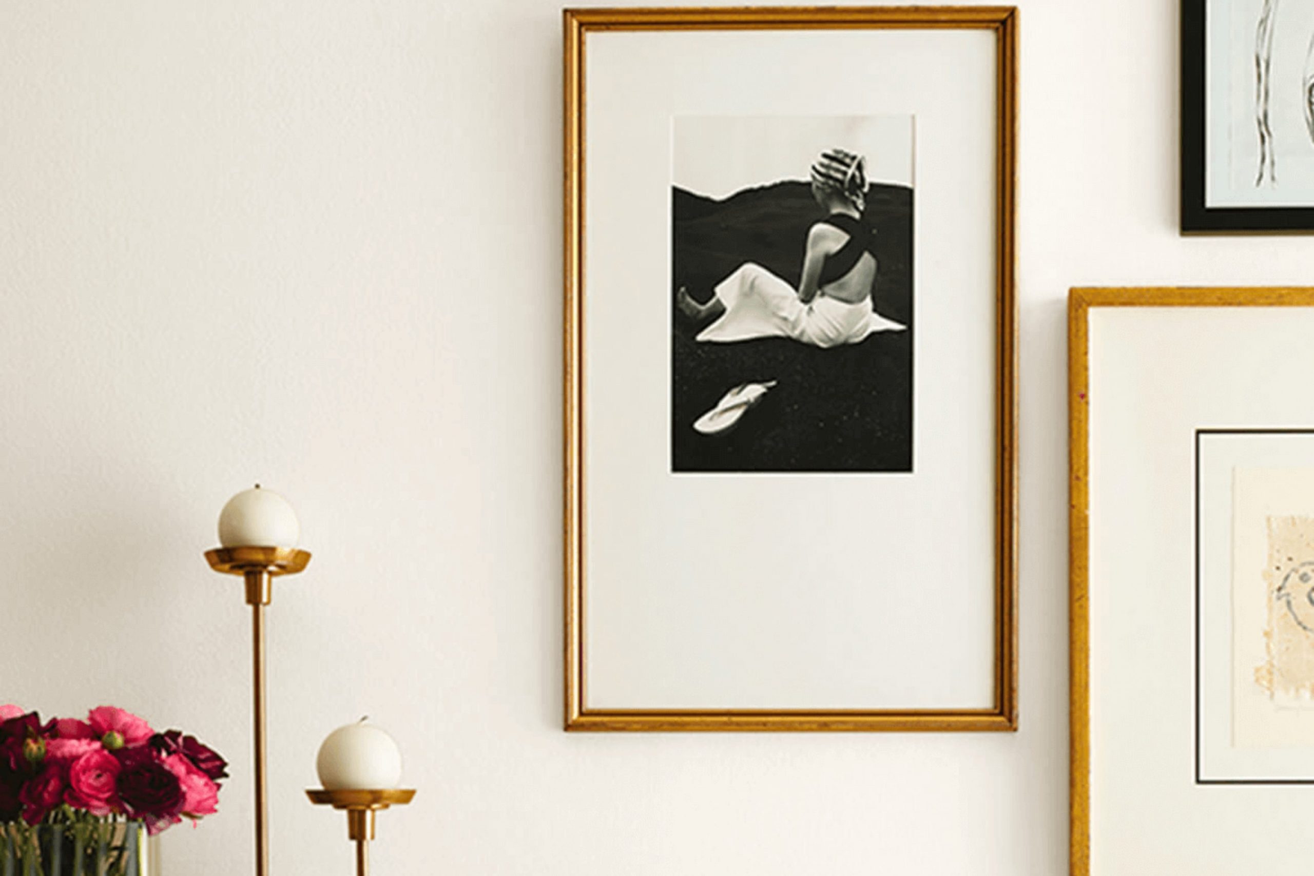
Choosing the right paint color for your room can often feel intense, given the multitude of options available. Today, I want to share some insights about Sherwin Williams SW 7001 Marshmallow, a color that might just be the perfect choice for your decorating needs. This shade of white has a warm undertone that makes it flexible and inviting, a great fit for almost any room.
As someone who’s always tweaking and refreshing home rooms, I’ve seen how the right shade can influence the mood and style of a room. Marshmallow can serve as a calm backdrop for bold decor or work seamlessly with a minimalist look. When you are looking to brighten up a room without making it feel sterile, Marshmallow strikes just the right balance.
In the following paragraphs, I’ll go through some practical considerations such as lighting, coordinating colors, and the types of finishes available. Whether you’re planning to repaint your living room, bedroom, or kitchen, I’ll provide useful tips to ensure that you make the best choice with Sherwin Williams Marshmallow.
Think about how the paint will interact with elements like natural light and furniture, creating an atmosphere that feels right to you. Let me guide you through making your decision with confidence.
Is Marshmallow SW 7001 Right for My Home?
The color Marshmallow by Sherwin Williams is a soft, creamy white that brings a sense of calmness and simplicity. This shade has a warm undertone that makes any room feel welcoming and cozy. It’s flexible, making it perfect for nearly every room in your home, whether you’re looking to brighten up a small bathroom or create a gentle backdrop for a lively living area.
In terms of interior styles, Marshmallow fits wonderfully with minimalist, modern, and even rustic designs. This color allows for a lot of flexibility in decor choices, helping other elements in the room stand out. It works especially well in minimalist rooms where the focus is on simplicity and openness. The warmth of this white makes it ideal for pairing with natural materials like wood in a rustic setting, which helps in creating a homely, yet stylish, environment.
When it comes to materials and textures, Marshmallow pairs beautifully with exposed brick, warm wood tones, and soft, plush fabrics like velvet or wool. These combinations can help to create layers of texture that make the room feel lived-in and cozy while maintaining a clean look. Additionally, this color complements metallic accents like brass or copper, adding a touch of elegance to any room without feeling too flashy.
Overall, its ability to adapt to various decor styles and elements makes it a go-to choice for both designers and homeowners alike.
decorcreek.com
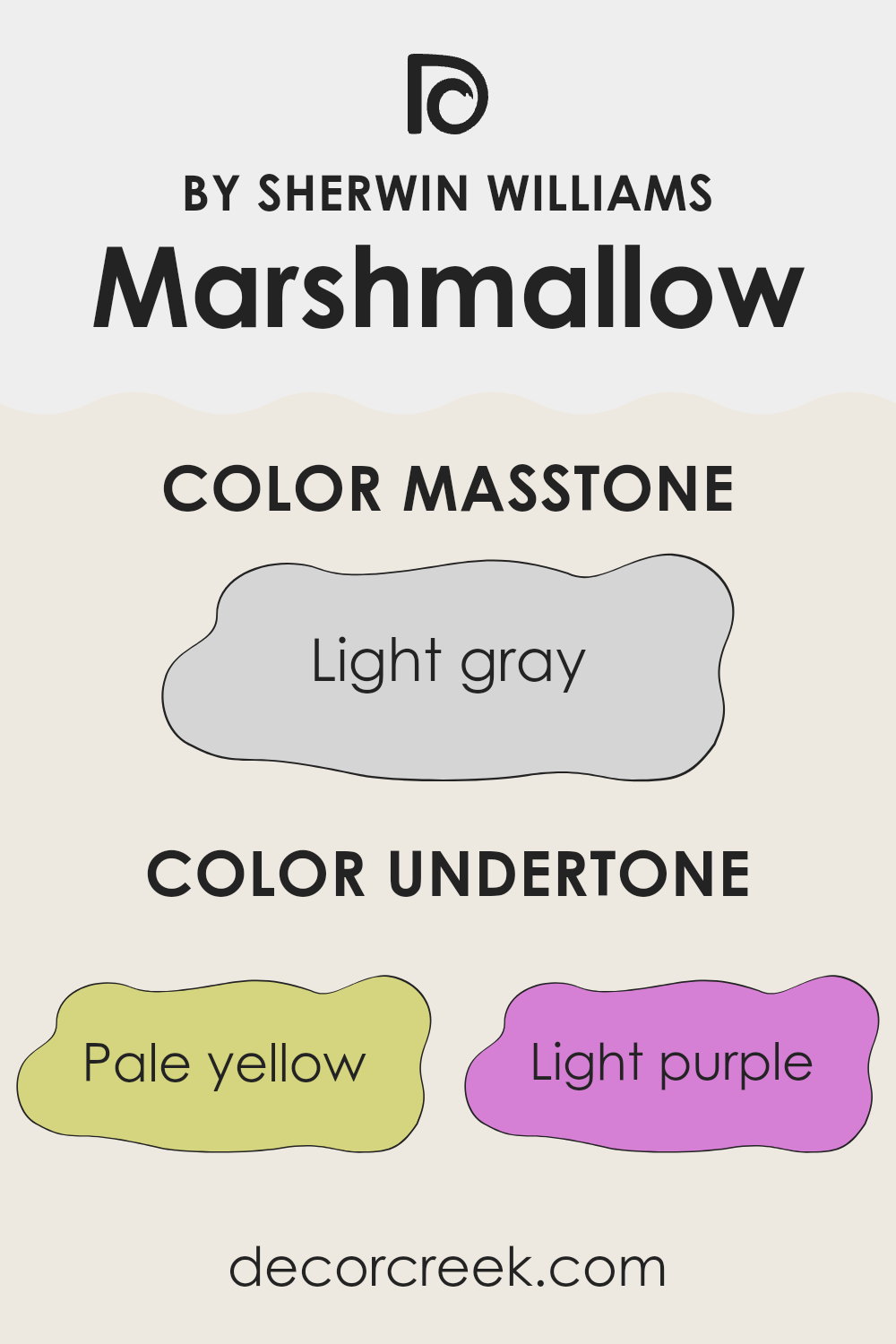
What are the right undertones of Marshmallow SW 7001 ?
Marshmallow is a flexible white paint that has subtle undertones, making it unique. These undertones include pale yellow, light purple, light blue, pale pink, mint, lilac, and grey. An undertone is a hint of a color that appears subtly beneath the main color when exposed to different lighting conditions or when placed against other colors. It’s important because it affects how the color looks in various environments and can enhance the mood of a room.
For instance, when you paint a room with Marshmallow, you might notice it seems warmer in some areas and cooler in others, depending on the light. The pale yellow undertone might make the room feel slightly warmer and welcoming during the daytime when there’s natural sunlight. At night, under artificial light, the grey or lilac undertones could become more noticeable, giving the walls a softer and cooler look.
These undertones can also impact how other colors in the room appear. Furniture and decor that have blues and greens might stand out a bit more due to the light blue and mint undertones in the paint. Similarly, items with purple touches can harmonize beautifully with the light purple undertone.
Choosing a color like Marshmallow with its subtle range of undertones can add a dynamic layer to your interior walls without feeling intense. It pairs flexibility with neutrality, making it easy to incorporate into various design styles and palettes while providing a gentle backdrop to other elements in the room.
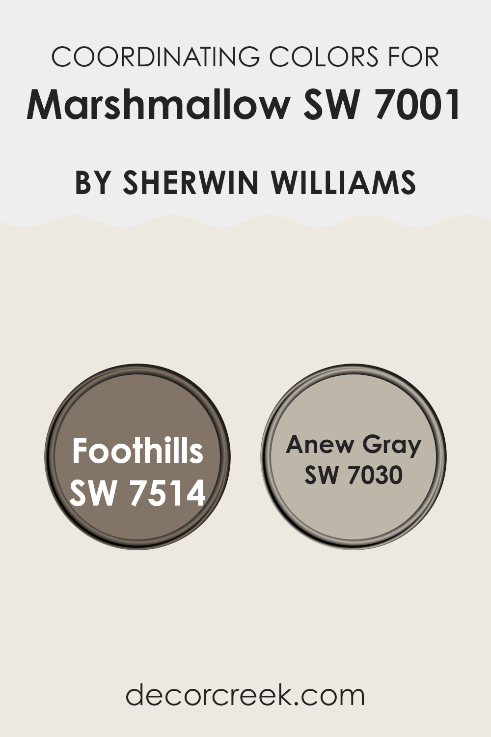
Best Coordinating Colors to use with Marshmallow SW 7001 by Sherwin Williams this year.
Coordinating colors work together to enhance the ambiance of a room by balancing or complementing each other. When dealing with a neutral base color like a soft white, choosing coordinating colors such as grays and deeper hues can create a harmonious and appealing look in your room. Color coordination involves selecting shades that sit well with each other on the color spectrum, enhancing the overall look without feeling too intense.
For example, Foothills is a deep, warm taupe that offers a rich contrast to lighter shades. Its earthy tone creates a cozy and inviting environment, making it an excellent choice for accent walls or furniture. On the other hand, Anew Gray is a flexible mid-tone gray with warm undertones, which offers a subtle, soothing backdrop for various decor styles and colors.
It works particularly well in rooms where you want a touch of color without it being too bold or striking, maintaining a calm and cohesive look with its gentle warmth. These colors support and enhance each other when used with a base like a soft white, providing a balanced and pleasant palette.
You can see recommended paint colors below:
Trendy Trim Colors of Marshmallow SW 7001 by Sherwin Williams to use this year.
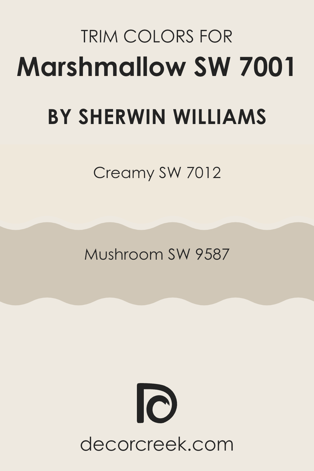
Trim colors are specific shades used on the architectural details and edges of a room to highlight or complement the main wall color. In the case of a subtle and neutral shade like Marshmallow by Sherwin Williams, choosing the right trim colors can enhance the overall look and make the wall color stand out more effectively. Two ideal trim colors for Marshmallow are Creamy (SW 7012) and Mushroom (SW 9587), each bringing its unique flair to the décor.
Creamy (SW 7012) is a soft, warm white that offers a gentle contrast against the cooler tones of Marshmallow, creating a seamless yet defined look that is clean and inviting.
On the other hand, Mushroom (SW 9587) is a deeper, taupe-like color that provides a striking contrast, adding depth and interest to rooms that feature Marshmallow as the primary color. Both these trim colors work beautifully with Marshmallow to create a cozy, cohesive environment.
You can see recommended paint colors below:
Evergreen Colors Similar to Marshmallow SW 7001 by Sherwin Williams
Similar colors are crucial in creating a cohesive and harmonious look in your room because they help in maintaining visual balance while giving the room a unified feel. Colors like White Flour and Shell White play a subtle role in enhancing a room’s brightness without feeling too intense. White Flour is a soft, warm white that has a very faint hint of creaminess, perfect for creating a cozy yet bright atmosphere. Shell White has a slightly more pronounced warmth, making it ideal for rooms that need a gentle, inviting tone.
Westhighland White, Alabaster, and Pearly White are other variations that work well in different settings. Westhighland White offers a crisp, clean white with a refreshing vibe, excellent for modern rooms. Alabaster, in contrast, has a deeper, creamier background that works wonderfully in more traditional or rustic environments.
Pearly White stands out with its subtle gray undertones, providing a polished yet understated backdrop for art and furniture. Greek Villa and Cotton are similar in their use, both presenting a blank canvas with a touch of warmth. Greek Villa has a slightly more beige tone, lending a Mediterranean feel, whereas Cotton is pure and simple, ideal for minimal designs.
Downy, Futon, and Cold Foam round out the options by offering unique shades that still maintain the softness and lightness needed for calm rooms. Downy’s airy feel makes it perfect for nurseries or quiet nooks. Futon offers a more muted, soft gray that can help ground a room without darkening it.
Lastly, Cold Foam provides a cooler touch while keeping the room bright and lively, suitable for rooms that aim for a fresh, clean look. These colors together provide a palette that can achieve a seamless look throughout your home, ensuring each room flows into the next with grace and ease.
You can see recommended paint colors below:
- SW 7102 White Flour
- SW 8917 Shell White
- SW 7566 Westhighland White
- SW 7008 Alabaster
- SW 7009 Pearly White
- SW 7551 Greek Villa
- SW 9581 Cotton
- SW 7002 Downy
- SW 7101 Futon
- SW 9504 Cold Foam
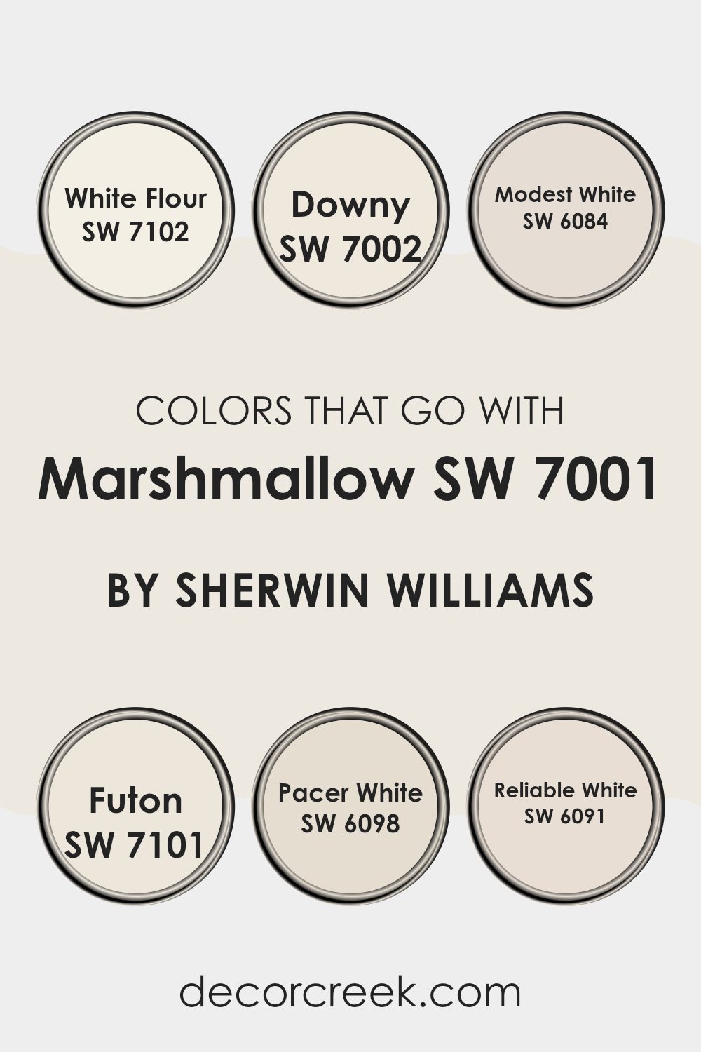
Colors that Go With Marshmallow SW 7001 by Sherwin Williams
Choosing the right colors to pair with Marshmallow SW 7001 by Sherwin Williams can significantly impact the overall look and mood of a room. Since Marshmallow is a clean and soft white, it acts as a flexible backdrop, allowing other hues to stand out while maintaining a cohesive feel.
Complementary colors like White Flour, Downy, Modest White, Futon, Pacer White, and Reliable White vary slightly in tone and undertones, providing subtle contrasts and a harmonious flow from room to room, which can make your room appear larger and more connected.
White Flour is almost as pure as Marshmallow but with a hint of warmth, making it ideal for rooms that crave a touch of coziness without feeling too intense. Downy offers a touch of gray, which works beautifully in rooms that get a lot of natural light, softening the bright influx. Modest White, with its hint of beige, adds slight depth to the décor, perfect for creating a welcoming feel in living areas or bedrooms.
Conversely, Futon pulls in gray undertones that offer a cooler contrast, suitable for modern rooms seeking a crisp, clean look. Pacer White leans toward a slightly creamier side, which can warm a room subtly.
Finally, Reliable White holds a slight yellow undertone, bringing gentle warmth that’s great for kitchens or bathrooms that need a sunny lift. By considering these complementary colors when decorating with Marshmallow SW 7001, one can achieve a polished and inviting atmosphere, making the room both pleasant and stylish.
You can see recommended paint colors below:
- SW 7102 White Flour
- SW 7002 Downy
- SW 6084 Modest White
- SW 7101 Futon
- SW 6098 Pacer White
- SW 6091 Reliable White
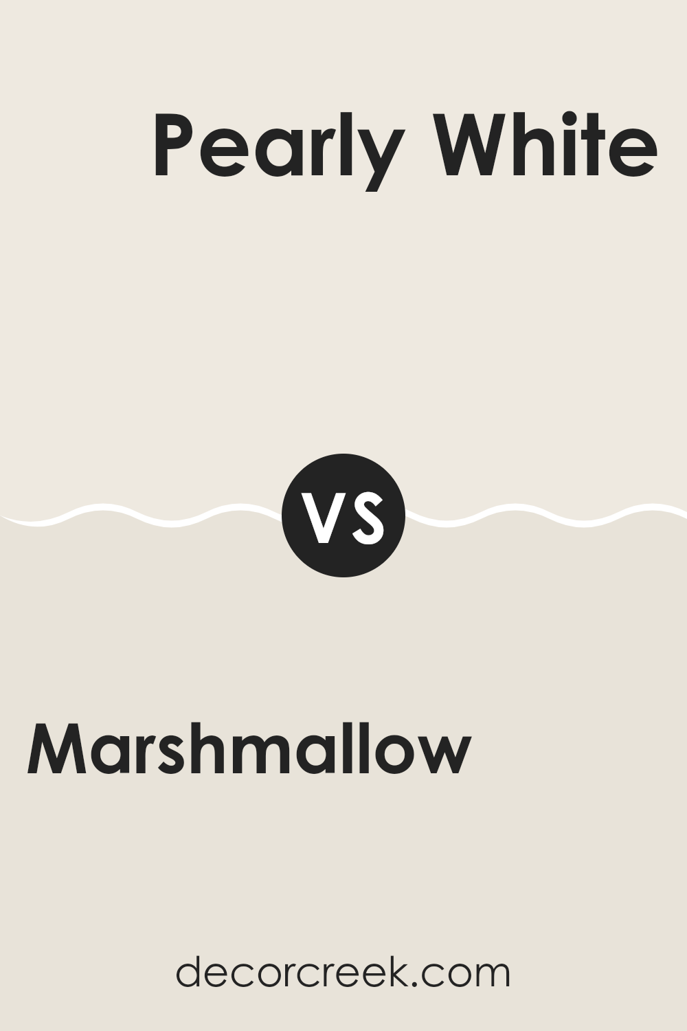
Marshmallow SW 7001 by Sherwin Williams vs Pearly White SW 7009 by Sherwin Williams
The primary color, Marshmallow, is a bright white with a hint of warmth, making it perfect for creating a light and airy feel in any room. It contrasts with Pearly White, which, while still in the white family, has a slightly creamier tone that gives a softer look.
Marshmallow is ideal for rooms that need a pure, clean backdrop, as it doesn’t carry any strong undertones that could alter the perception of colors used with it. Pearly White, on the other hand, offers a hint of coziness due to its warmer base, making it great for living areas or bedrooms where a gentle atmosphere is desired.
Both colors reflect light well, but Marshmallow does so with more intensity, potentially making a room feel larger, while Pearly White provides a more muted reflection, contributing to a relaxed look.
You can see recommended paint color below:
Marshmallow SW 7001 by Sherwin Williams vs Futon SW 7101 by Sherwin Williams
“Marshmallow” and “Futon” by Sherwin Williams are two neutral colors that can set quite different moods for a room. “Marshmallow” is a very light shade of white that carries a pure and clean vibe with it, making rooms feel more open and airy.
It’s an excellent choice for making smaller rooms appear larger and brighter. On the other hand, “Futon” is a richer, deeper grey with warm undertones. This color can make a room feel more cozy and grounded, providing a subtle sense of warmth.
While “Marshmallow” reflects more light, brightening up a room, “Futon” absorbs light slightly, making it ideal for creating a more relaxed and comfortable atmosphere. Both colors work well in modern decor and can be beautifully combined with contrasting brighter colors or similar neutral tones, depending on the desired effect.
You can see recommended paint color below:
Marshmallow SW 7001 by Sherwin Williams vs Downy SW 7002 by Sherwin Williams
Marshmallow SW 7001 and Downy SW 7002 by Sherwin Williams are both light, soothing colors, but they have subtle differences. Marshmallow is a very soft white with a warm, creamy feel, ideal for creating a cozy and inviting atmosphere.
It reflects light beautifully, making rooms appear brighter and more open. On the other hand, Downy is slightly darker than Marshmallow, leaning toward a gentle gray tone. This color provides a slightly cooler touch compared to Marshmallow, offering a calm and gentle backdrop that’s easy on the eyes.
Downy can be perfect for rooms where you want a hint of color while maintaining a light, airy feel. Both colors work well in various settings, complementing different decor styles and contributing to a relaxed environment. Choosing between them depends on whether you prefer a warmer or cooler undertone in your room.
You can see recommended paint color below:
Marshmallow SW 7001 by Sherwin Williams vs Greek Villa SW 7551 by Sherwin Williams
Marshmallow and Greek Villa by Sherwin Williams are two popular white paint colors, but each has its unique tone and feel. Marshmallow is a soft, gentle white with a slightly grayish undertone. It creates a cozy and calm atmosphere, making it excellent for any room that needs a touch of warmth without being too stark or bright.
On the other hand, Greek Villa has a slightly creamier base, which adds a bit of warmth and richness to rooms. This color leans more toward a warmer spectrum compared to Marshmallow, giving rooms a welcoming, homey feel. Greek Villa is particularly great in rooms with natural light, as the sunlight enhances its creamy undertones.
The choice between the two depends on your preference for either a cooler (Marshmallow) or a warmer (Greek Villa) ambiance in your room. Both colors are flexible, pairing nicely with various decor styles and other paint hues.
You can see recommended paint color below:
Marshmallow SW 7001 by Sherwin Williams vs Westhighland White SW 7566 by Sherwin Williams
Marshmallow and Westhighland White are both popular paint colors from Sherwin Williams, commonly chosen for their clean and subtle appeal. Marshmallow is a soft, warm white with a slight creamy feel to it, making it a cozy choice for any room.
It’s flexible and can blend easily with other colors, setting a relaxed tone. On the other hand, Westhighland White is a bit brighter and crisper compared to Marshmallow. It leans more toward a pure white, offering a fresh and clear appearance that works well in rooms aiming for a minimal and clean look.
When choosing between these two, consider the amount of light your room gets—Marshmallow works well in dimmer, cozier rooms while Westhighland White is perfect for brightening up a well-lit area. Both colors provide a neutral backdrop, but the choice depends on the specific mood and brightness you’re aiming to achieve in your room.
You can see recommended paint color below:
Marshmallow SW 7001 by Sherwin Williams vs White Flour SW 7102 by Sherwin Williams
Marshmallow and White Flour, both by Sherwin Williams, offer subtle distinctions in their shades of white. Marshmallow has a warm, creamy undertone that provides a cozy and inviting feel to rooms. This color is great for living areas and bedrooms where a soft, welcoming atmosphere is desired.
On the other hand, White Flour is slightly brighter and cooler compared to Marshmallow. It works well in rooms that benefit from a clean and crisp appearance, like kitchens and bathrooms. Additionally, White Flour reflects light a bit more effectively, making it a good choice for smaller or darker rooms that you want to appear larger and more open.
Both colors are quite flexible, but the choice between them depends on the specific mood and functionality you want to achieve in your room.
You can see recommended paint color below:
Marshmallow SW 7001 by Sherwin Williams vs Cold Foam SW 9504 by Sherwin Williams
Marshmallow and Cold Foam by Sherwin Williams are two distinct shades that bring their own unique vibe to a room. Marshmallow has a warm, soft white hue that offers a cozy and inviting feel. It brightens rooms effortlessly and pairs well with almost any decor, making it quite flexible for various rooms in a home.
On the other hand, Cold Foam is a cooler tone that leans toward a soft gray. It provides a modern and clean look, making it ideal for a contemporary setting. This color can create a neutral backdrop that allows other elements in a room to stand out more prominently.
Both colors reflect a decent amount of light, but Marshmallow, with its warmer undertone, tends to add a bit more warmth to a room, while Cold Foam’s cooler undertones bring a fresh and calm atmosphere. Choosing between them depends on the desired mood and style, as well as how other colors in the room might coordinate with these hues.
You can see recommended paint color below:
Marshmallow SW 7001 by Sherwin Williams vs Shell White SW 8917 by Sherwin Williams
Marshmallow and Shell White are both popular colors by Sherwin Williams, but they do have some differences. Marshmallow has a creamy, slightly warm tone that brings a soft and cozy feel to any room. It works well in rooms where you want a gentle, welcoming atmosphere without going too stark or cold.
On the other hand, Shell White has a cleaner, more neutral look. It lacks the warm undertones of Marshmallow, making it a good choice for a modern and straightforward style.
Shell White can make small rooms appear larger and is flexible enough to work in any room. Both colors are quite light, but where Marshmallow offers warmth, Shell White provides a crisp background, suitable for various decor styles and preferences.
You can see recommended paint color below:
Marshmallow SW 7001 by Sherwin Williams vs Alabaster SW 7008 by Sherwin Williams
Marshmallow and Alabaster by Sherwin Williams are both off-white colors, but they have subtle differences that could influence your choice depending on what you’re looking for. Marshmallow has a slightly cooler undertone, which gives it a clean, fresh look.
This makes it a great choice for rooms where you want a crisp feel, like bathrooms or kitchens. On the other hand, Alabaster tends to lean a bit warmer with a creamier appearance, offering a softer and more inviting vibe.
This warmth makes it ideal for living rooms and bedrooms where a cozy atmosphere is often desired. Both colors reflect light well, making rooms appear brighter and more spacious. Your final choice might depend on the mood you want to set in your room and the other colors and materials you plan to use.
You can see recommended paint color below:
Marshmallow SW 7001 by Sherwin Williams vs Cotton SW 9581 by Sherwin Williams
Marshmallow and Cotton by Sherwin Williams are both neutral colors, but they have distinct differences in tone and feeling. Marshmallow is a soft, warm white that creates a cozy and inviting atmosphere. It has a hint of creaminess, making it ideal for living rooms where you want a comforting and soft ambiance.
On the other hand, Cotton is a purer, brighter white. It gives off a clean and crisp look, perfect for creating a fresh and airy feel in a room. This color works well in areas like kitchens and bathrooms where you might want a more pristine appearance.
When deciding between the two, consider the mood and function of your room. Marshmallow works well where warmth is desired, while Cotton is great for rooms that benefit from a brighter, sharper look. Both colors are flexible and pair beautifully with other shades, making them great choices for any home.
You can see recommended paint color below:
As I wrap up talking about SW 7001 Marshmallow by Sherwin Williams, I have to say I’m really impressed with this color. Marshmallow is a warm and cozy white that makes any room feel welcoming. It’s not a plain white; it has a bit of creaminess that adds a soft touch to the walls without making the room look too stark or bright.
This paint is great for anyone looking to freshen up their home because it works well in so many different rooms. From living rooms and kitchens to bedrooms and bathrooms, it makes rooms look clean and put together. It also pairs nicely with lots of other colors. Whether you like bold colors or more muted tones, Marshmallow can be the perfect backdrop.
For families or anyone who has a lot of activity in their home, this paint is practical, too. It hides small marks or scuffs better than a brighter white might. So, walls look good for longer, even with kids and pets around.
In conclusion, SW 7001 Marshmallow by Sherwin Williams is a great choice if you’re thinking about painting your home. It’s pretty, practical, and works with everything. It definitely gets my thumbs up for anyone wanting to make their home feel more cozy and bright!
Ever wished paint sampling was as easy as sticking a sticker? Guess what? Now it is! Discover Samplize's unique Peel & Stick samples.
Get paint samples

