When it comes to creating captivating interiors and breathtaking exteriors, the role of color is irreplaceable. It can set the mood, express personal style, and bring a space to life. In the world of paint colors, Sherwin-Williams (SW) has a stunning palette, but one standout hue is SW 9178 In the Navy.
This article will delve into this fascinating color, exploring its characteristics, effects under different lighting, its Light Reflectance Value (LRV), coordinating colors, and its application in various parts of the home.
What Color Is SW 9178 In the Navy?
SW 9178 In the Navy is a deep, rich, dark blue that exudes a certain sophistication and elegance. It’s the kind of blue that calls to mind the deep sea, a starless night sky, or the strength and dignity of a naval officer’s uniform.
This blue is not frivolous or flighty. It has gravitas and depth, commanding attention without screaming for it. It’s the color of reflection and quiet power, offering a richness that makes it a delight to use in a wide range of settings, from traditional to contemporary, interior to exterior.
Ever wished paint sampling was as easy as sticking a sticker? Guess what? Now it is! Discover Samplize's unique Peel & Stick samples.
Get paint samples

Is It a Warm Or Cool Color?
SW 9178 In the Navy is a cool color. In color theory, blues are typically considered cool as they tend to recede, creating a sense of calm, peace, and serenity. This is in contrast to warm colors like red, orange, and yellow, which are more vibrant and energetic, seemingly moving forward in space.
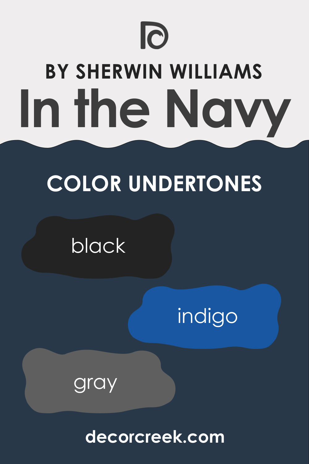
Undertones of SW 9178 In the Navy
Undertones are subtle hues that can be found beneath the primary color, and they significantly influence how we perceive the main color. For SW 9178 In the Navy, the following undertones can be detected:
- Black: The presence of black gives SW In the Navy its deep, rich intensity, and contributes to the perception of the color as a serious, strong, and stable shade.
- Indigo: This undertone adds a hint of vibrancy to the deep blue, giving it a lively yet refined character.
- Grey: The grey undertone brings a certain sophistication and elegance, preventing the color from becoming too bold or overpowering.
These undertones make SW In the Navy a flexible and adaptable color, capable of fitting into various color schemes and designs.
Coordinating Colors of SW 9178 In the Navy
The magic of color can be further enhanced when paired with coordinating colors. Here are a few that work wonderfully with SW 9178 In the Navy:
- SW 7005 Pure White : This crisp, clean white offers a striking contrast to In the Navy, allowing the rich blue to pop truly.
- SW 9119 Dirty Martini : A muted, earthy green, Dirty Martini brings a warm balance to the coolness of In the Navy, adding a natural touch to the palette.
- SW 9164 Illusive Green : This soft, gray-green shade provides a serene, harmonious pairing with In the Navy.
Additional coordinating colors could include:
- SW 9125 Oyster Bay : This is a relaxed green-grey color that complements the depth of In the Navy without overpowering it.
- SW 7036 Accessible Beige : This neutral, warm beige color balances the cool intensity of In the Navy.
- SW 6045 Emerging Taupe : This is a medium-dark taupe that pairs well with In the Navy, adding to the richness of the color scheme.
Coordinating colors work well together, creating a harmonious and balanced color scheme. They can be different tones from the same color family, contrasting colors, or neutrals that provide a clean backdrop for the main color.

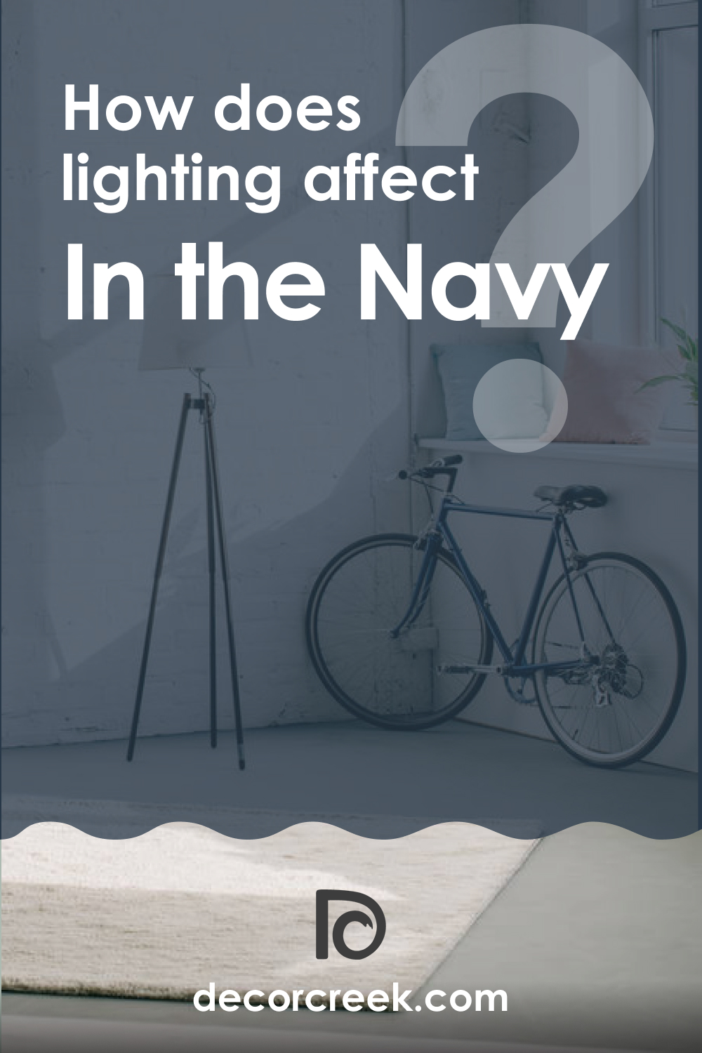
How Does Lighting Affect SW 9178 In the Navy?
Lighting plays a critical role in how we perceive color. Under bright, natural light, In the Navy appears vibrant and energetic, with its blue hue more pronounced. However, under artificial or dim lighting, the color deepens and takes on a more muted, sophisticated tone.
LRV of SW 9178 In the Navy
The Light Reflectance Value (LRV) of color measures how much light it reflects. The LRV scale ranges from 0 (absolute black, absorbing all light) to 100 (pure white, reflecting all light).
SW 9178 In the Navy has an LRV of 4, meaning it is a very dark color that absorbs a significant amount of light. This can make spaces painted in this hue seem smaller or more intimate and can add a sense of drama or sophistication to a room.
A low LRV also means that this blue color absorbs more heat, making it a suitable choice for cooler climates when used on exterior surfaces. It’s also worth noting that colors with low LRVs can show wear and tear more quickly, so they may require more frequent touch-ups.

LRV – what does it mean? Read This Before Finding Your Perfect Paint Color
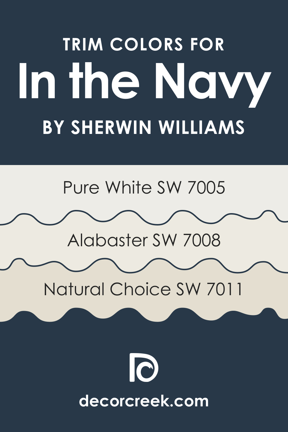
Trim Colors of SW 9178 In the Navy
Trim colors are those used on window and door frames, baseboards, crown molding, and other architectural features. They are essential in defining and highlighting these elements. When paired with SW 9178 In the Navy, these shades of white from Sherwin-Williams can serve as excellent trim colors:
- SW 7005 Pure White : This true white provides a crisp, clean contrast to In the Navy, emphasizing architectural details.
- SW 7008 Alabaster : A warm, creamy white, SW Alabaster softens the contrast with In the Navy while still offering distinction.
- SW 7011 Natural Choice : This subtle, warm white blends smoothly with In the Navy, providing a softer, more nuanced contrast.
Trim colors are crucial as they help break up the space, highlighting the architecture of the room and providing a border that separates different colors or patterns.
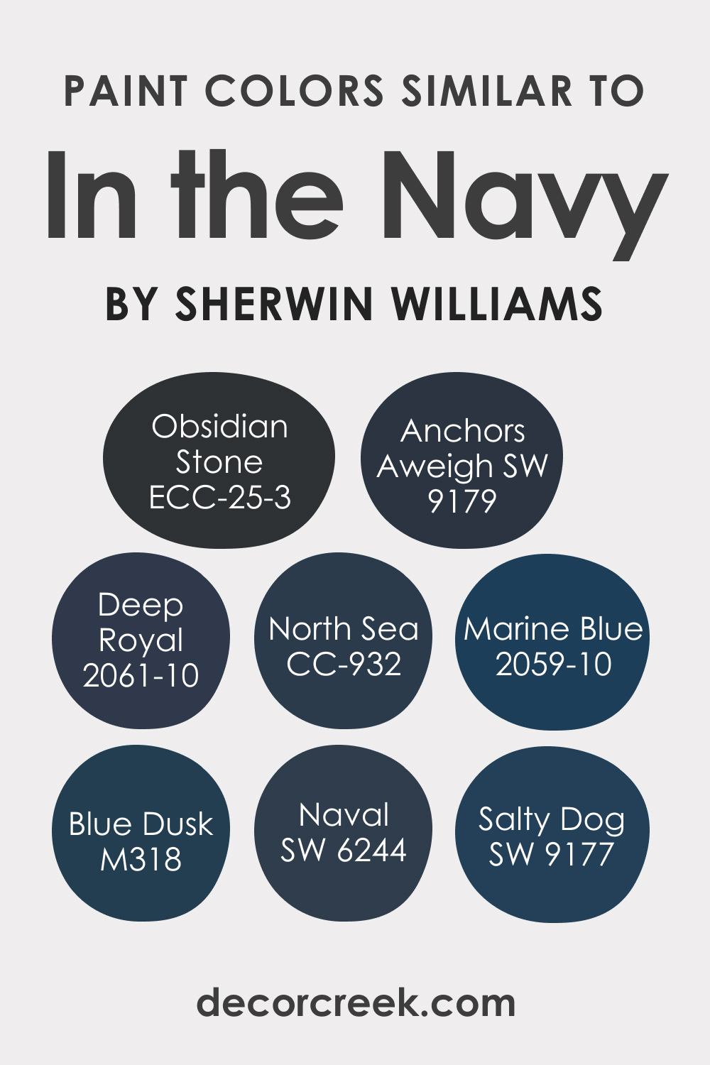
Colors Similar to SW 9178 In the Navy
Similar colors can offer alternatives or variations to a primary color. They can help create a monochromatic color scheme or provide options for those who love a specific color but want slight variations for different spaces or elements in a room.
Understanding similar colors allows us to create a balanced, harmonious, and varied color scheme. Below, you can check out what colors can be used instead of SW In the Navy.
- Behr Obsidian Stone
- BM North Sea CC-932
- BM Deep Royal (2061-10)
- BM Marine Blue (2059-10)
- Valspar Blue Dusk
- SW 6244 Naval
- SW 9179 Anchors Aweigh
- SW 9177 Salty Dog
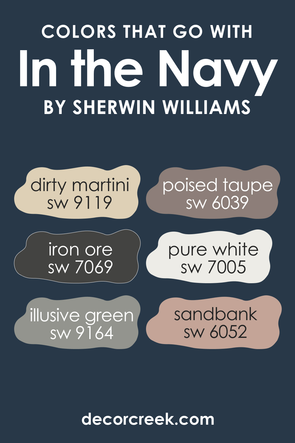
Colors That Go With SW 9178 In the Navy
Pairing SW In the Navy with other colors can create stunning combinations. Here are a few suggestions:
- SW 7005 Pure White : As mentioned, this provides a striking contrast to the deep blue.
- SW 9119 Dirty Martini : This earthy green adds a natural touch.
- SW 9164 Illusive Green : A harmonious pairing with deep blue.
- SW 6039 Poised Taupe : This timeless neutral offers a calming balance to In the Navy.
- SW 7069 Iron Ore : A rich, dark grey that adds a modern touch when paired with In the Navy.
- SW 6052 Sandbank : A warm, sandy beige that brings a beachy, casual vibe to the navy blue.
Colors that go well together can create visual harmony and balance and bring out the best in each color. They can help set the mood and theme of a space and make it feel more put together and polished.
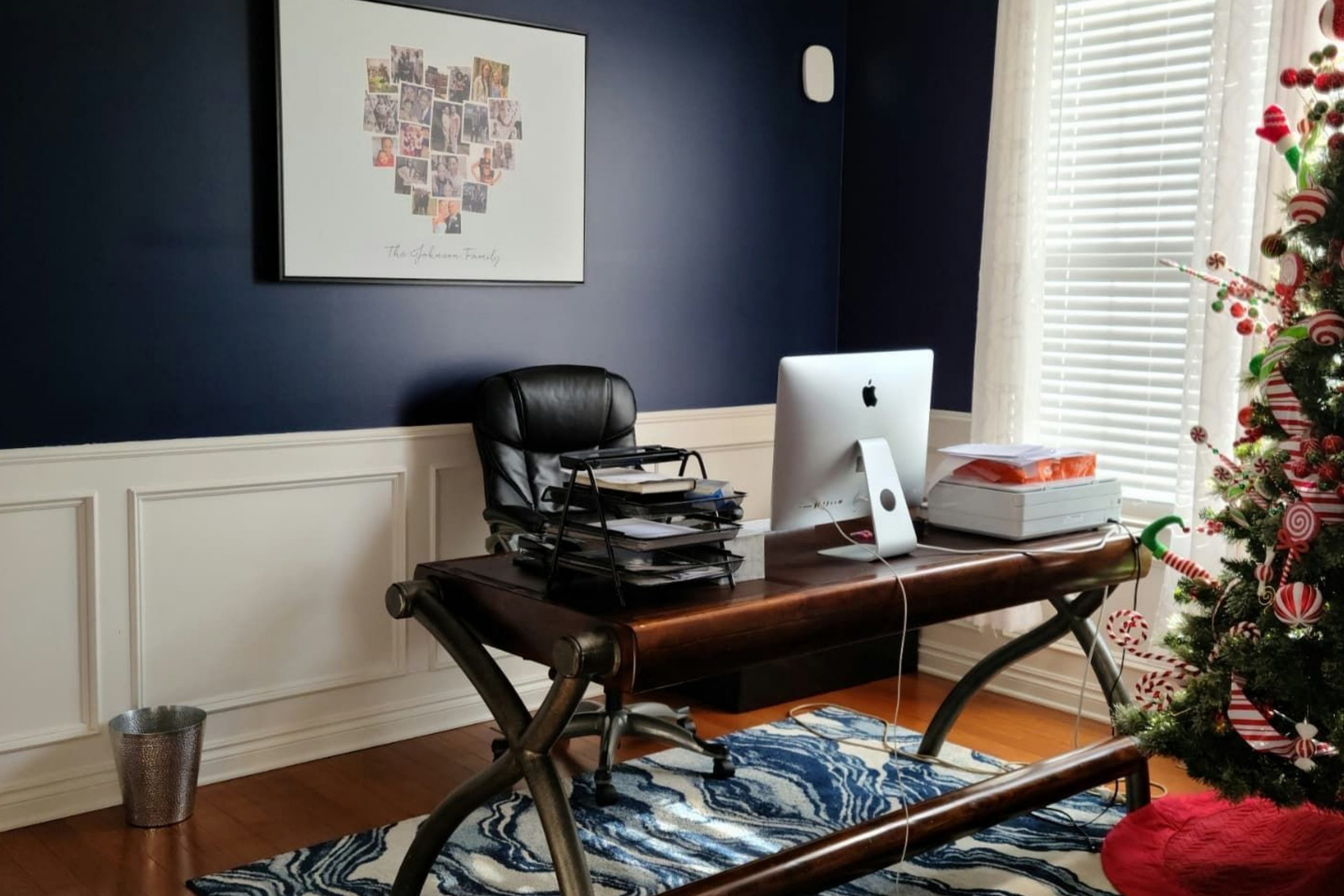
How to Use SW 9178 In the Navy In Your Home?
SW In the Navy can be used in a variety of rooms and in various design styles. Its depth and richness can create a focal point in a room or add a touch of sophistication and elegance. It works well in both traditional and contemporary settings. Below, you can check out how this color may work in different rooms of your home.
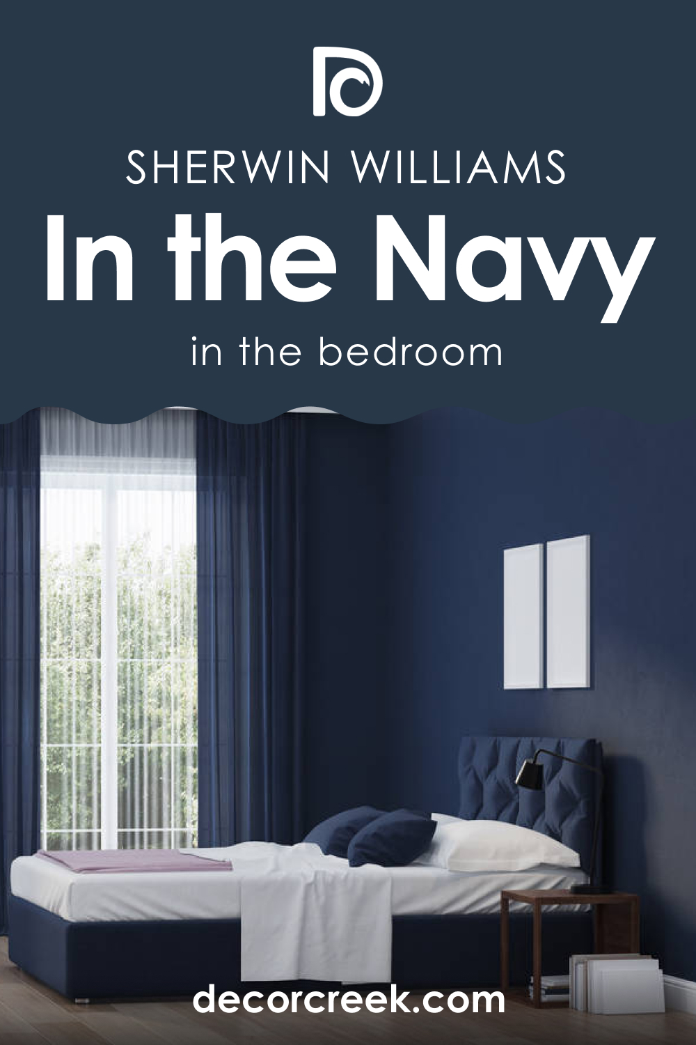
In the Navy SW 9178 in the Bedrooms
SW In the Navy can be particularly striking in a bedroom, where its depth and serenity can foster a sense of calm and relaxation. Consider using it on an accent wall behind the bed for a touch of drama or throughout the room for a cozy, enveloping feel. It pairs beautifully with crisp white linens for a classic look or with rich, warm woods for a more rustic feel.
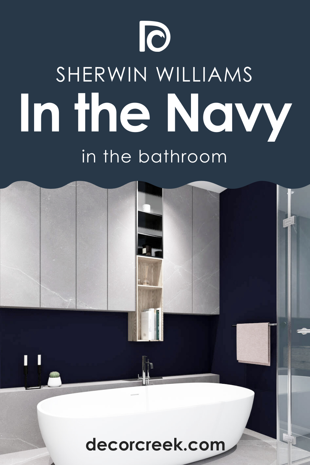
In the Navy SW 9178 in the Bathrooms
In a bathroom, SW In the Navy can bring a sense of luxury and elegance. Whether on the walls or in the cabinetry, it pairs beautifully with white and gray marble, brushed nickel fixtures, and soft white towels. The color also works well in smaller powder rooms, where its intensity can make the space feel more intimate and inviting.
In the Navy SW 9178 in the Living Rooms
In the living room, SW In the Navy can create a sophisticated backdrop for a variety of furnishings and décor. It pairs well with a range of colors, from soft neutrals to bolder hues, and can accommodate a variety of styles, from mid-century modern to coastal chic. Consider using it on an accent wall or in built-in shelving or cabinetry.

In the Navy SW 9178 for the Exterior
For an exterior, SW In the Navy can make a bold and stylish statement. It works particularly well with white or cream trim and can create a striking contrast with natural stone or brickwork. Consider using it on a front door for a pop of color or on shutters or trim for a more subtle approach.

In the Navy SW 9178 in the Kitchens/Kitchen Cabinets
In the kitchen, SW In the Navy can bring depth and character. It can be particularly striking on lower cabinets or an island, paired with white upper cabinets for a two-tone look. The color pairs well with a range of countertop materials, from natural wood to white or gray stone.
On kitchen cabinets, SW In the Navy offers a stylish alternative to traditional white or wood tones. It can create a bold contrast with white walls and countertops or blend seamlessly with darker tones for a monochromatic look. Paired with gold or brass hardware, it can create a look that’s both sophisticated and trendy.

Comparing SW 9178 In the Navy With Other Colors
When compared with other colors, the depth, and richness of this blue color make it a standout choice. It’s darker and more intense than lighter blues or grays, but its cool undertones make it more versatile than some bolder hues. It brings a touch of sophistication and elegance that many other colors lack, and its ability to pair with a wide range of hues makes it a flexible choice for any space.
SW 6244 Naval vs. SW 9178 In the Navy
Both SW Naval and In the Navy are deep, dark blues, but they carry subtle differences. Naval is a touch lighter and leans slightly towards the purple undertone. Its richness and depth make it an excellent choice for creating striking contrast in a room.
Meanwhile, In the Navy, with its deeper tone and cooler undertones, offers a more dramatic look. It carries a touch of sophistication that’s perfect for rooms where you want to foster an environment of tranquility and peace.

SW 6258 Tricorn Black vs. SW 9178 In the Navy
SW 6258 Tricorn Black is a deep, pure black with a neutral base. This shade creates a dramatic, high-contrast look and can make a bold statement in any room. Compared to In the Navy, Tricorn Black is less colorful and much more stark. SW In the Navy, while still dark, carries the cool tranquility of blue, making it a less severe option while maintaining the same level of sophistication and drama.

SW 7621 Silvermist vs. SW 9178 In the Navy
Silvermist is a soft , light silvery blue with a hint of green undertones. This shade offers a serene and calming vibe, perfect for bedrooms or bathrooms. When compared with In the Navy, Silvermist is significantly lighter and softer.
In contrast, In the Navy, with its deep, bold tone, creates a more dramatic and commanding presence. The two can work together beautifully, with Silvermist offering a softer contrast to the boldness of In the Navy.

SW 7029 Agreeable Gray vs. SW 9178 In the Navy
Agreeable Gray is a versatile, warm gray with a taupe undertone. It is a go-to neutral for many designers due to its ability to pair beautifully with a variety of colors. When compared with In the Navy, Agreeable Gray is significantly lighter and warmer. While In the Navy commands attention with its depth and intensity, Agreeable Gray quietly complements a wide range of hues, including In the Navy, offering a warm balance to its cool intensity.

SW 9171 Felted Wool vs. SW 9178 In the Navy
SW Felted Wool is a warm, medium to dark gray with brown undertones. It carries a sense of comfort and warmth, making it a great choice for cozy, intimate spaces. When paired with In the Navy, SW Felted Wool’s warmth balances the cool intensity of the deep blue, creating a harmonious and sophisticated color palette. SW Felted Wool is subtler than In the Navy but provides a complementary, warm contrast to the navy blue’s bold coolness.

SW 7740 Messenger Bag vs. SW 9178 In the Navy
SW Messenger Bag is a dark, earthy green with olive undertones. This color adds a touch of natural, organic feel to spaces and works well in a variety of settings. Compared to In the Navy, SW Messenger Bag is warmer and has an earthier tone, but both share a similar level of intensity.
While In the Navy evokes the depths of the sea, SW Messenger Bag brings to mind a dense forest, and the two together can create a rich, nature-inspired color palette.

Conclusion
In the sea of paint color options, SW 9178 In the Navy stands out for its depth, versatility, and timeless elegance. Whether used as a bold statement on an exterior, a calming backdrop in a bedroom, or a chic choice for kitchen cabinetry, this color adds character and sophistication to any space. Its ability to pair with a wide range of hues makes it a flexible choice for any design scheme, and its depth and richness bring a touch of luxury that’s hard to beat.
Whether you’re looking to create a calming oasis, a dramatic focal point, or a sophisticated backdrop, In the Navy is a color worth considering.

Ever wished paint sampling was as easy as sticking a sticker? Guess what? Now it is! Discover Samplize's unique Peel & Stick samples.
Get paint samples
Frequently Asked Questions
⭐What undertones does SW 9178 In the Navy have?
SW 9178 In the Navy has cool undertones that lean toward blue and violet. These undertones add depth and richness to the color, making it a stunning choice for many spaces.
⭐What are the best coordinating colors for SW 9178 In the Navy?
Some of the best coordinating colors for In the Navy include neutrals like SW 7005 Pure White and SW 7035 Aesthetic White, and greens like SW 9119 Dirty Martini and SW 9164 Illusive Green. These colors complement In the Navy and help to create a balanced and harmonious color scheme.
⭐How does lighting affect the appearance of SW 9178 In the Navy?
Under bright, natural light, In the Navy appears vibrant and energetic, with its blue hue more pronounced. However, under artificial or dim lighting, the color deepens and takes on a more muted, sophisticated tone.
⭐What is the Light Reflectance Value (LRV) of SW 9178 In the Navy?
The LRV of In the Navy is 4, meaning it is a very dark color that absorbs a significant amount of light. This can add a sense of drama or sophistication to a room and can make spaces seem smaller or more intimate.
⭐Where can I use SW 9178 In the Navy in my home?
SW In the Navy is a versatile color that can be used in various rooms. It is especially striking in bedrooms and bathrooms, where its depth can foster a sense of calm and relaxation. It can also be used in living rooms, on exteriors, in kitchens, and on kitchen cabinets, offering a wide range of design possibilities.


