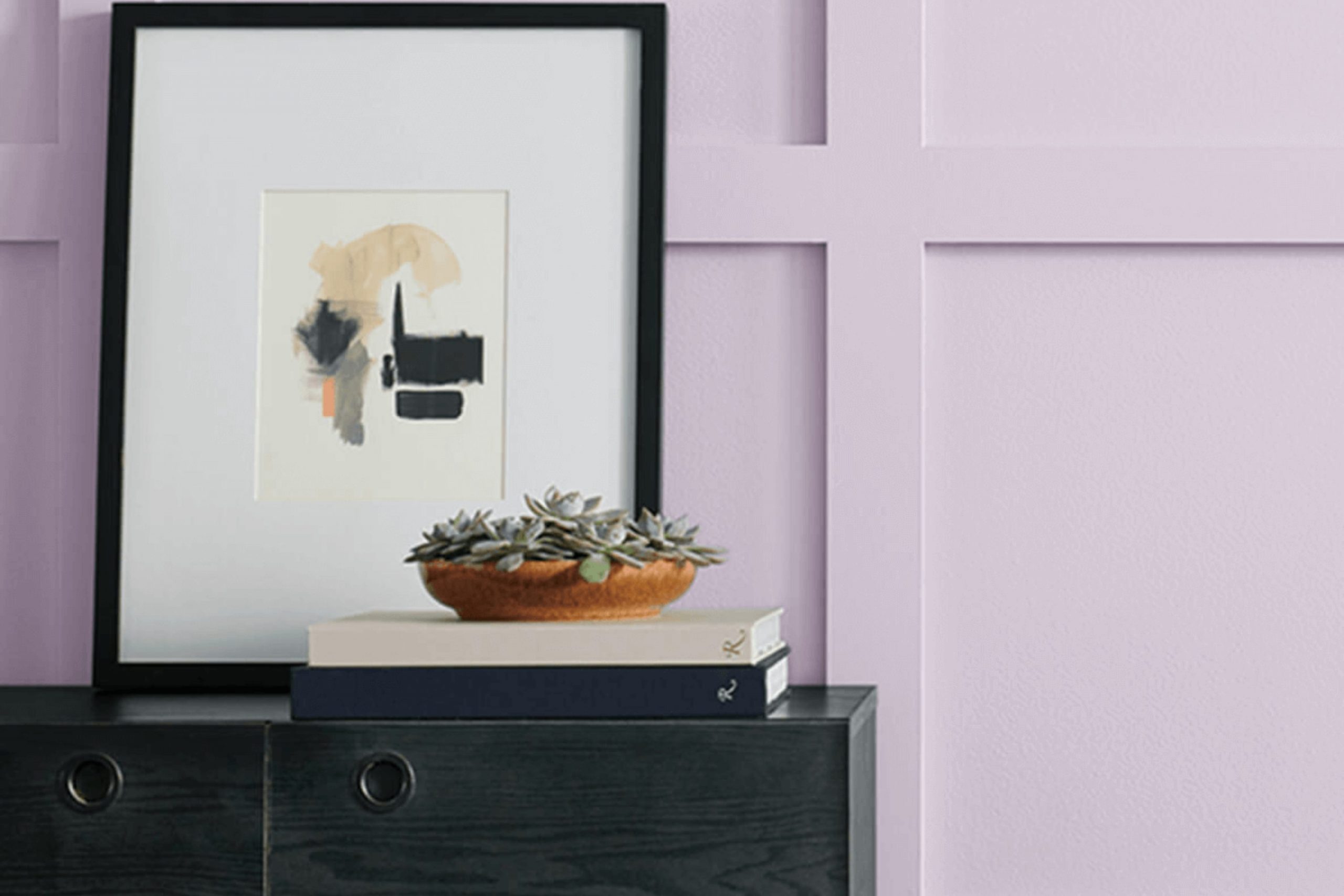
I recently had the pleasure of using SW 6555 Enchant by Sherwin Williams in one of my interior design projects. If you’re looking for a paint color that can subtly enhance a room without overpowering it, Enchant could be the perfect choice. This color is like a peaceful whisper in a room; it’s a soft, muted purple that brings a sense of calmness to any room without feeling too bold or out of place.
What I appreciate most about Enchant is its adaptability. It works beautifully in a variety of settings, from bedrooms to living areas, and complements a wide range of decor styles, whether modern, classic, or eclectic.
This hue particularly shines in well-lit rooms, where its true color can really come alive, adding a gentle touch of personality and warmth.
Choosing the right paint can often feel too intense, but my experience with SW 6555 Enchant has been nothing but positive.
It’s the kind of color that supports other design elements rather than stealing the spotlight, providing a perfect backdrop for both bold and subdued interior choices.
If gentle elegance is what you’re going for in your room, you might find that Enchant is just the right fit.
What Color Is Enchant SW 6555 by Sherwin Williams?
The color Enchant by Sherwin Williams is a vibrant shade of purple with a slightly muted tone that gives it a warm and inviting feel. This lovely hue strikes a nice balance between being lively and subdued, making it adaptable enough to use in various interior styles. Particularly, this shade works well in contemporary settings due to its modern vibe, but it can also add a vintage touch to traditional decor.
Enchant pairs excellently with natural materials and textures. In a room with wooden flooring or furniture, this color can create a cozy, grounded atmosphere.
It also looks stunning alongside metallic accents like gold or brass, which add a touch of elegance and contrast well with its deep, rich tones.
For a softer look, matching Enchant with fabrics such as velvet or silk can produce a luxurious, comforting feel.
The subtle richness of the purple is perfect for creating focal points in a room, whether on a feature wall or through accents like cushions or curtains.
Ideal for bedrooms, living rooms, or even home offices, Enchant offers a unique blend of warmth and character that can help make any room more inviting and stylish. Its adaptability with different decors and materials makes it a go-to choice for those looking to add a splash of color without overpowering the senses.
Is Enchant SW 6555 by Sherwin Williams Warm or Cool color?
EnchantSW 6555 by Sherwin Williams is a unique shade that brings a fresh vibe into any home. This specific color is adaptable since it can create a relaxed atmosphere in rooms that are meant for relaxation, like living rooms and bedrooms, without making them feel dull. Its warmth works beautifully to make large rooms feel more inviting while also making small areas seem brighter and more open.
Great for pairing with neutral tones like whites or grays, it allows for various decorating styles—whether you’re into modern minimalism or cozy country aesthetics. Plus, it’s just as effective in a lively area like a kitchen or a calm study room.
The color is durable too, maintaining its depth and richness over time, which means your rooms will keep looking good without needing frequent touch-ups. This color can help make your home a more enjoyable place to live, reflecting a sense of comfort through its vibrant yet gentle hue.
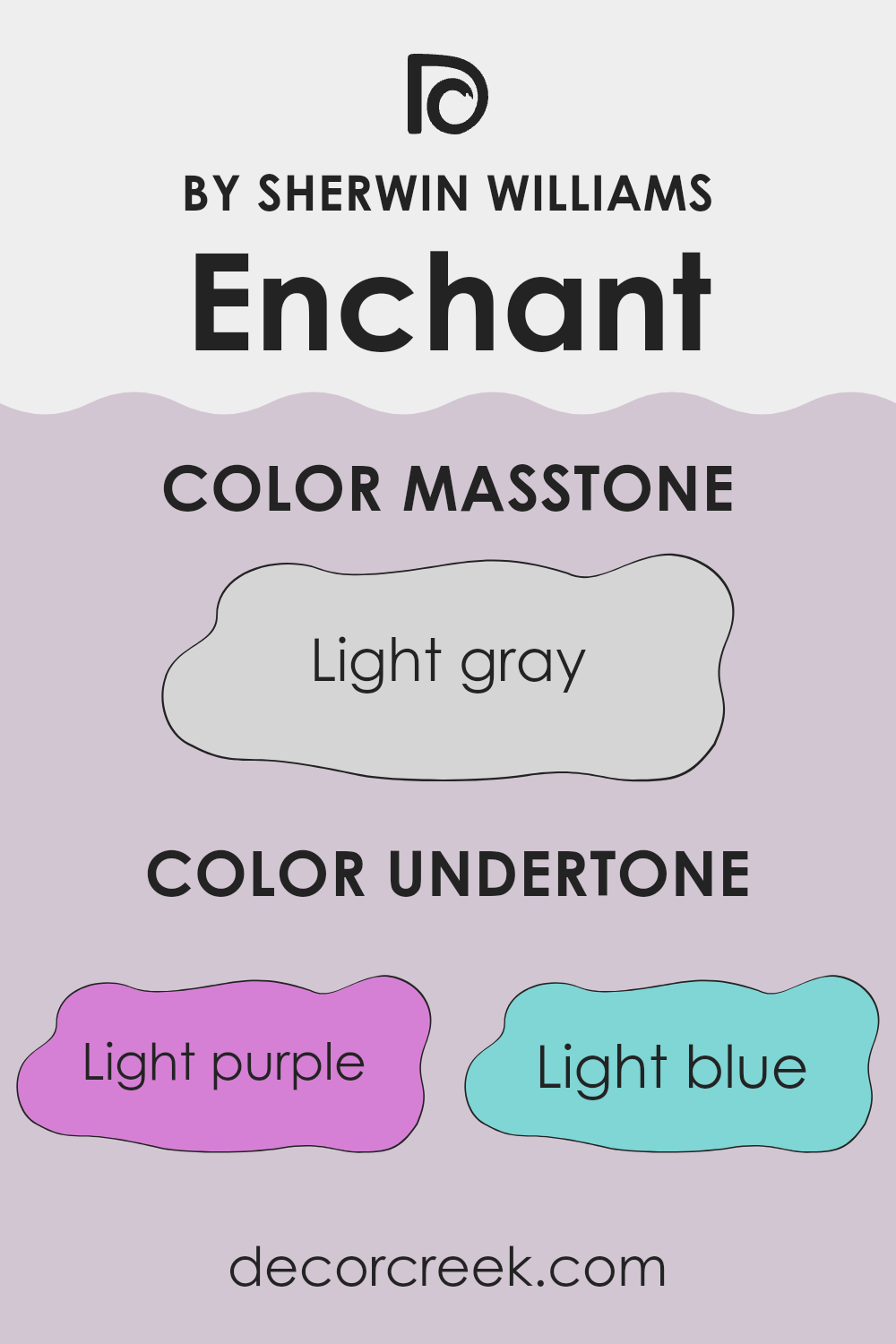
Undertones of Enchant SW 6555 by Sherwin Williams
Enchant is an adaptable color that catches the eye with its unique meld of undertones which can subtly change how it appears based on lighting and surrounding colors. The undertones include light purple, light blue, pale yellow, lilac, pale pink, mint, and grey. These mixed undertones can make the color shift under different light conditions. For example, in a room with a lot of natural light, the pale yellow and light blue might become more noticeable, giving the walls a fresher feel.
In rooms with less light, the grey and lilac undertones might stand out, providing a more muted and calm appearance.
Moreover, if the room has existing hints of colors like pale pink or mint in its décor or furnishings, the walls might pull these colors, enhancing their effect and creating a cohesive look.
Using this paint on interior walls can therefore have a varied impact depending on the existing elements in the room.
It adds depth and interest to a room and can match well with multiple themes and décor styles. Its ability to reflect and meld with different hues makes it a practical choice for anyone looking to refresh their living room without overpowering it with color. This adaptability is why many people enjoy using it in their homes.
decorcreek.com
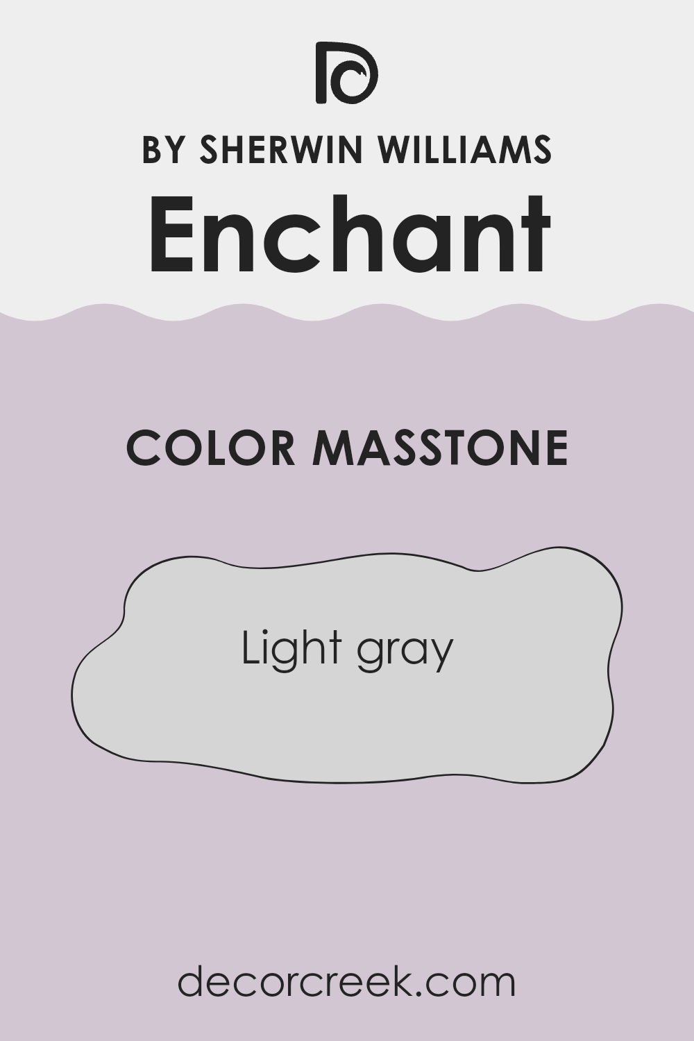
What is the Masstone of the Enchant SW 6555 by Sherwin Williams?
EnchantSW 6555 by Sherwin Williams, with its light gray masstone (#D5D5D5), is an adaptable choice for home interiors. This soft and gentle shade of gray forms a neutral backdrop that is easy on the eyes and pairs well with various decor styles and colors.
It can make small rooms appear larger and brighter, as light colors tend to open up rooms. This color also has a calming effect, making it suitable for bedrooms and living areas where a relaxing atmosphere is desirable.
Additionally, light gray walls are great for showcasing artwork or colorful furniture, as they provide a subtle contrast that allows other colors to stand out. In busier areas like kitchens and bathrooms, this shade can maintain a clean and tidy look, as it hides minor imperfections better than stark whites. Overall, the light gray of EnchantSW 6555 is a practical and stylish choice that works well in many different home settings.
How Does Lighting Affect Enchant SW 6555 by Sherwin Williams?
Lighting plays a crucial role in determining how colors appear in different environments. The way a specific shade looks can vary significantly depending on whether it is under natural or artificial lighting.
Taking the color Enchant (SW 6555) by Sherwin Williams as an example, we can see how this color might appear in various settings under different lighting conditions. Enchant is a vibrant color that can change its vibe based on the light.
Under artificial light, such as LED or fluorescent bulbs, this color might look more intense and slightly more saturated, bringing out the richness of the hue. This makes it a great choice for living areas or places where you want the color to make a strong impact.
In contrast, under natural sunlight, the true colors of Enchant come out. Natural light brings out the brightness and can make the color look more vivid.
Depending on the time of day and the amount of sunlight, this can make the walls painted with this color glow beautifully, enhancing the liveliness of the room.
The direction a room faces also affects how Enchant appears:
- North-Faced Rooms – These rooms can be a bit darker as they don’t get a lot of direct sunlight throughout the day. In north-faced rooms, Enchant might appear slightly muted and cooler, which gives a calm feel to the room.
- South-Faced Rooms – These rooms receive more sunlight, making colors look brighter and more vibrant. Here, Enchant will appear brighter and more dynamic, making the room lively and energetic.
- East-Faced Rooms – In rooms that face east, the morning light can make Enchant look very cheerful and warm early in the day, fading as the day goes on.
- West-Faced Rooms – As the afternoon and evening sun shines into west-facing rooms, Enchant will warm up and create a welcoming and cozy atmosphere as the day progresses.
Thus, lighting and room orientation can greatly affect how this particular color influences the mood and visual impact of a room.
This understanding can help you choose the best application of color based on the characteristics of light in your room.
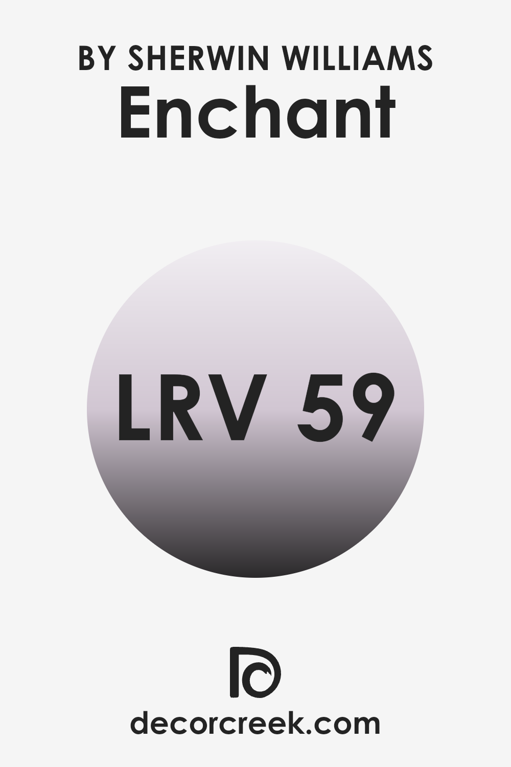
What is the LRV of Enchant SW 6555 by Sherwin Williams?
LRV stands for Light Reflectance Value, which is a measure of how much light a color reflects back into a room as opposed to absorbing it. Essentially, it gives you an idea of how bright or dark a color will appear once it’s on your walls. Paint colors with a higher LRV reflect more light, making areas feel more open and airy, whereas colors with a lower LRV absorb more light, which can make a room feel cozier or smaller.
The LRV of the paint color in question, at 58.559, is somewhat in the middle but leaning towards the lighter side. This means it is capable of reflecting a good amount of light, helping to brighten up an area.
In practical terms, it won’t make a room feel cramped or overly dark, but it will offer a rich enough hue to give warmth and character to the area. This level of LRV is flexible because it works well in rooms that get less natural light, providing a subtle enhancement to the brightness, and also complements well-lit areas without appearing too stark.
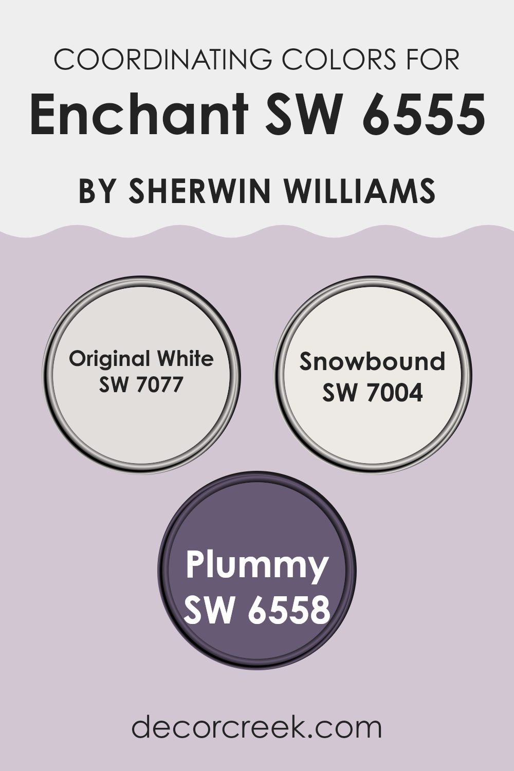
Coordinating Colors of Enchant SW 6555 by Sherwin Williams
Coordinating colors are shades that complement or enhance each other when used together. These colors harmoniously interact, creating a balanced and aesthetically pleasing result. Coordinating colors often share similar undertones or are positioned opposite each other on the color wheel to offer a striking contrast. For example, SW 6555 Enchant by Sherwin Williams can be paired with various coordinating colors to achieve different effects, depending on the room’s purpose and the atmosphere desired.
One of the coordinating colors for Enchant SW 6555 is SW 7077 Original White. This is a clean and fresh shade of white that can help to highlight the vibrant hue of Enchant, creating a crisp look in any room. It works particularly well in areas where you want to increase the sense of light and spaciousness.
Another coordinating color is SW 7004 Snowbound, a slightly cooler white with gray undertones. This color provides a subtle contrast, softening the intensity of richer hues without overpowering them.
Lastly, SW 6558 Plummy is a deep, warm purple that can add depth and drama when used alongside Enchant.
It’s perfect for creating a more intimate and cozy environment, especially in living rooms or bedrooms where a touch of elegance is desired.
You can see recommended paint colors below:
- SW 7077 Original White
- SW 7004 Snowbound
- SW 6558 Plummy
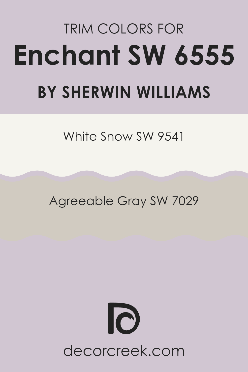
What are the Trim colors of Enchant SW 6555 by Sherwin Williams?
Trim colors are used in painting to highlight or define the edges and details of a room, such as door frames, window sills, and skirting boards. For a paint color like Enchant from Sherwin Williams, selecting the right trim color can enhance the overall aesthetic and ensure that the wall colors stand out. Trim colors can either contrast sharply with the main wall color or complement it subtly, depending on the desired visual effect.
White Snow SW 9541 is a clean, bright white that is perfect for making Enchant’s unique tones pop, creating a clear distinction between walls and trim that can make an area feel more open and airy.
On the other hand, Agreeable Gray SW 7029 offers a soft, neutral gray that blends smoothly with Enchant, fostering a gentle transition from the walls to the trim. This can help in achieving a more cohesive look throughout the area.
You can see recommended paint colors below:
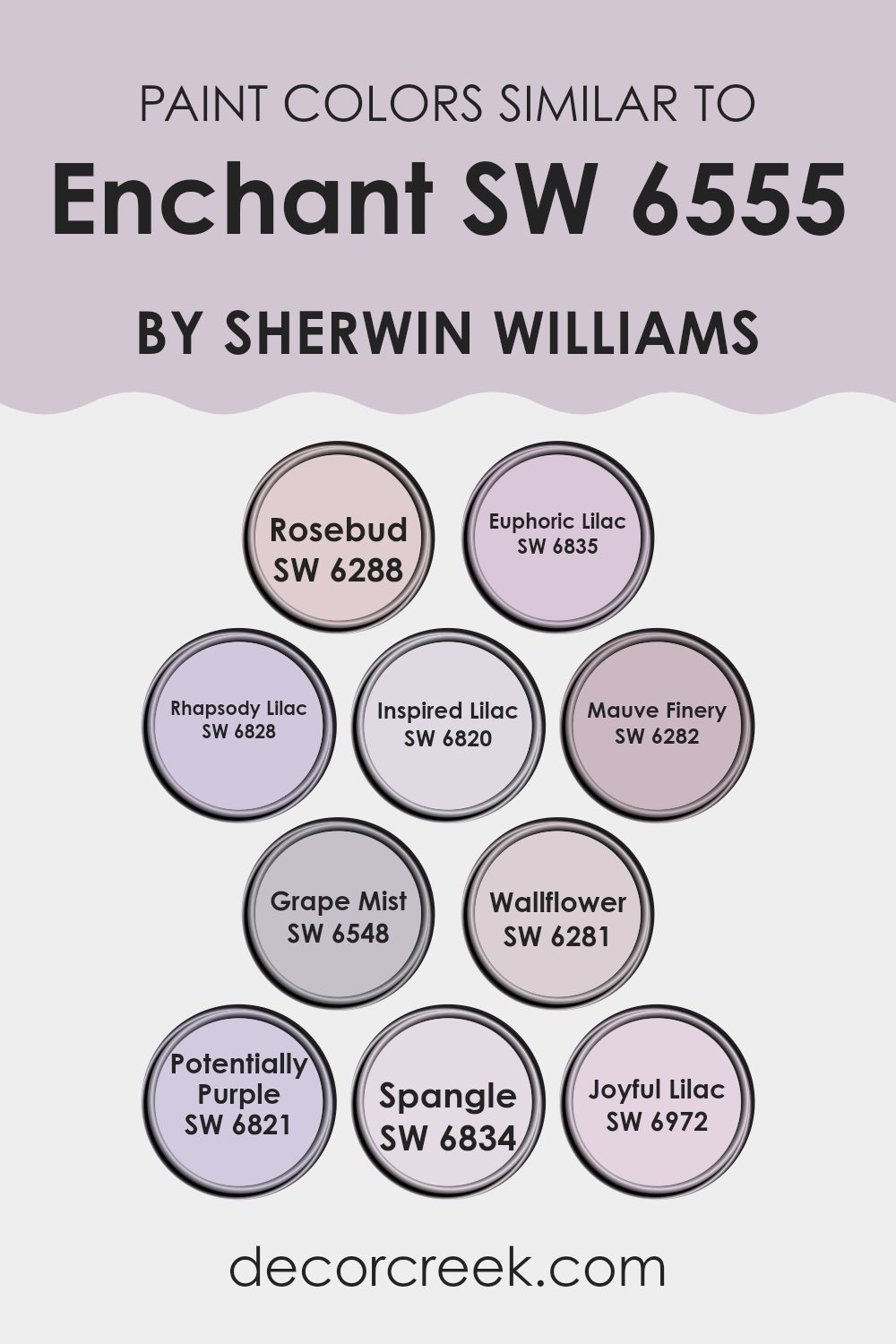
Colors Similar to Enchant SW 6555 by Sherwin Williams
Choosing similar colors can be incredibly beneficial when designing an area, as these colors create a harmonious and cohesive look. Similar colors, like those related to Enchant by Sherwin Williams, work well together because they share common undertones or intensities, allowing for a smooth visual transition across an area.
For instance, colors such as Rosebud SW 6288 and Joyful Lilac SW 6972, which share a subtle purple hue, can blend seamlessly when applied in adjacent areas or as accent colors, providing a gentle variation without stark contrast.
For a better understanding, let’s consider these similar colors; Rosebud has a soft, dusky rose tone that sets a gentle mood in any room. Euphoric Lilac, on the other hand, is brighter with a lavender essence that feels fresh and lively. Rhapsody Lilac offers a deeper, more saturated shade of lavender, adding a rich layer of color. Inspired Lilac is a lighter, airier lavender, giving rooms a breezy and open feel.
Mauve Finery introduces a touch of g0ray to the subtle purple, making it ideal for areas that require a muted yet inviting atmosphere.
Grape Mist has a faint, bluish-purple tint, perfect for achieving a cool, calm setting. Wallflower presents a more subdued, dusty lavender that works well in calm environments. Potentially Purple is bolder, with a vivid hue that can act as a striking focal point. Spangle is a light, almost ethereal lavender that enhances areas with a touch of whimsy.
Lastly, Joyful Lilac brings a vibrant, cheerful lavender tone, great for injecting a playful dynamic.
Each of these colors, while unique, shares a connection through their lilac roots, allowing them to work well individually or collectively in a design scheme.
This palette of similar colors encourages creative expressions that are visually coherent, ensuring that every design choice feels intentional and fluid.
You can see recommended paint colors below:
- SW 6288 Rosebud
- SW 6835 Euphoric Lilac
- SW 6828 Rhapsody Lilac
- SW 6820 Inspired Lilac
- SW 6282 Mauve Finery
- SW 6548 Grape Mist
- SW 6281 Wallflower
- SW 6821 Potentially Purple
- SW 6834 Spangle
- SW 6972 Joyful Lilac
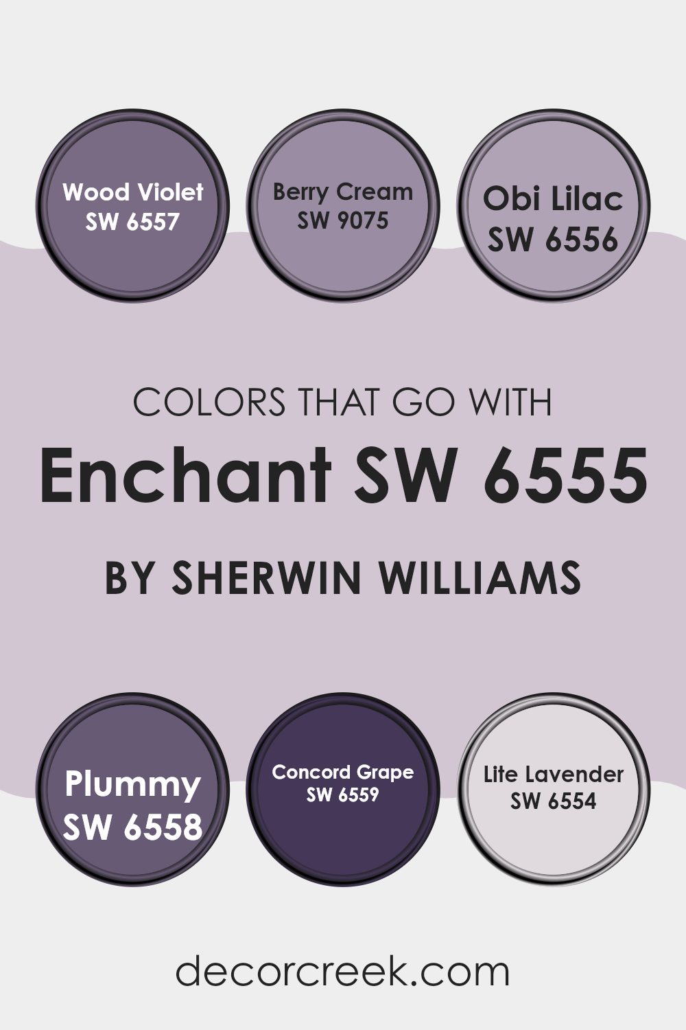
Colors that Go With Enchant SW 6555 by Sherwin Williams
Choosing the right colors to accompany Enchant SW 6555 by Sherwin Williams is crucial for creating a harmonious and appealing color scheme in any area. These coordinating colors are designed to complement and enhance the base color, ensuring that the overall look is balanced and visually pleasant.
For example, SW 6557 – Wood Violet is a deeper, more muted purple that adds a robust depth when paired with the lighter tones of Enchant SW 6555, making it ideal for adding a touch of drama without overpowering a room.
SW 9075 – Berry Cream, on the other hand, is a soft, creamy pink that introduces a gentle warmth, perfect for creating a cozy, inviting atmosphere.
Continuing with this theme, SW 6556 – Obi Lilac offers a subtle, lighter purple that highlights the softer aspects of Enchant SW 6555, contributing to a soothing yet cohesive look.
SW 6558 – Plummy is another excellent companion, providing a rich, deep purple that reinforces the luxurious feel of an area.
Then there’s SW 6559 – Concord Grape, a vivid purple that brings a vibrant energy, drawing attention and making a bold statement.
Lastly, SW 6554 – Lite Lavender is the lightest among the options, providing a gentle contrast that keeps areas feeling open and light. Using these colors together, one can achieve a delightful balance between vibrancy and subtlety, suited to any room looking to combine modern appeal with a comfortable atmosphere.
You can see recommended paint colors below:
- SW 6557 Wood Violet
- SW 9075 Berry Cream
- SW 6556 Obi Lilac
- SW 6558 Plummy
- SW 6559 Concord Grape
- SW 6554 Lite Lavender
How to Use Enchant SW 6555 by Sherwin Williams In Your Home?
Enchant SW 6555 by Sherwin Williams is a stunning paint color that can add a lot of charm to any room in your house. Its rich, vibrant hue can make a powerful statement whether used for a whole room or just as an accent wall. This shade works wonderfully in areas like living rooms or dining areas where you want to create a warm and welcoming atmosphere.
For a modern twist, try pairing Enchant SW 6555 with neutral colors, such as whites or light grays. This can help balance the bright intensity of the color, ensuring your room looks inviting without feeling overpowering.
It’s also great for painting furniture or interior doors for an unexpected pop of color.
Additionally, using this shade in a bedroom can also bring a cozy and personal feel to the area. Combining it with soft lighting and rich textiles, like velvet or silk, can make the bedroom a comforting retreat at the end of the day.
Overall, Enchant SW 6555 is very flexible and easy to incorporate into various home decorating styles.
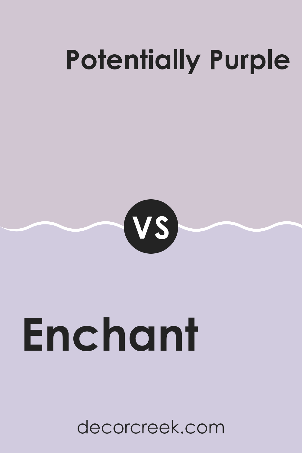
Enchant SW 6555 by Sherwin Williams vs Potentially Purple SW 6821 by Sherwin Williams
“Enchant” and “Potentially Purple” both offer their unique shades of purple from Sherwin Williams. Enchant is a soft, muted lavender. It’s a light, easy-going color that feels gentle and soothing in an area.
On the other hand, Potentially Purple is a much deeper and darker purple. It has a richer, more commanding presence, which can add a bold touch to a room.
While Enchant works well in a setting that aims for a calm and peaceful atmosphere, Potentially Purple is ideal where you want to make a statement or add a pop of deep color.
Both colors are flexible but serve different purposes depending on the mood and style you’re aiming for in your decorating.
You can see recommended paint color below:
- SW 6821 Potentially Purple
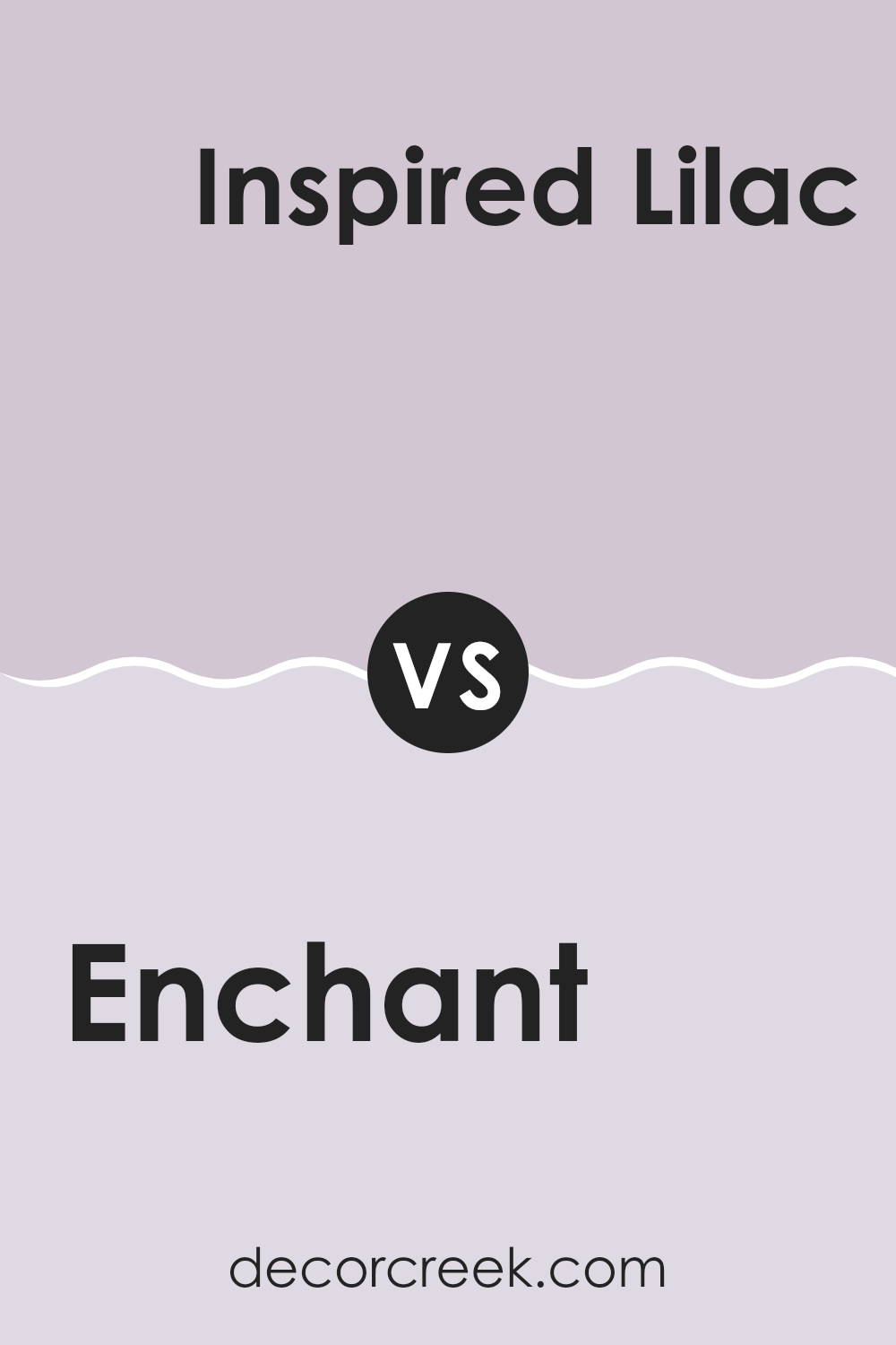
Enchant SW 6555 by Sherwin Williams vs Inspired Lilac SW 6820 by Sherwin Williams
Enchant (SW 6555) by Sherwin Williams is a deep, vibrant shade of blue with a rich undertone that can give a bold feel to any area. It is somewhat calm but still offers a striking color statement that can draw attention. This color works well in areas designed for creativity and energy, like a home office or playroom.
In comparison, Inspired Lilac (SW 6820) by Sherwin Williams is from the purple family and is much lighter and softer in appearance. It carries a fresher vibe, often providing a pleasant and inviting atmosphere to areas like bedrooms or bathrooms.
The lightness of Inspired Lilac offers a gentle touch, making it suitable for creating a soothing and friendly environment.
Using these colors in the same room can provide a nice contrast, with Enchant adding depth and Inspired Lilac bringing a lighter touch.
You can see recommended paint color below:
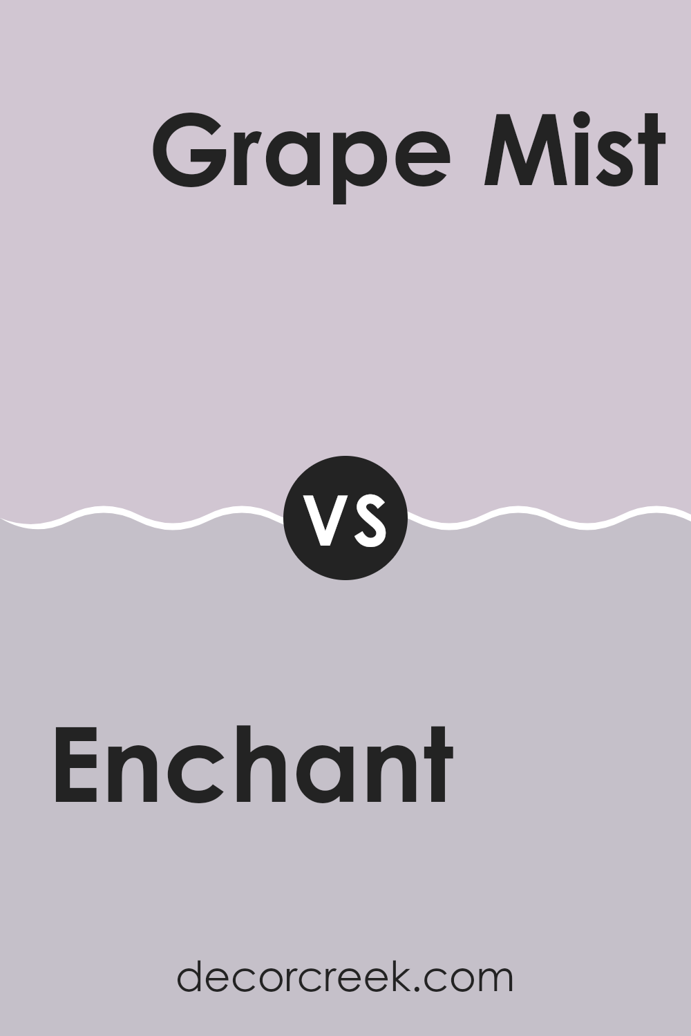
Enchant SW 6555 by Sherwin Williams vs Grape Mist SW 6548 by Sherwin Williams
The two colors, Enchant and Grape Mist from Sherwin Williams, offer unique vibes and styles. Enchant is a vibrant hue with a strong presence of purple, giving a lively and energetic feel to any area. It leans towards a richer, more saturated tone, making it ideal for creating a statement in a room or as an accent wall.
On the other hand, Grape Mist has a subtler approach. It’s a lighter shade of purple with a soft, gentle vibe. This color is great for rooms where you want a calmer atmosphere, like bedrooms or bathrooms.
It reflects light well, making it fantastic for smaller areas or places with limited natural light.
Both colors hold their own charm and can work beautifully depending on what mood or style you want to achieve in your area. Whether you go for the boldness of Enchant or the softness of Grape Mist, each brings its own unique touch to interiors.
You can see recommended paint color below:
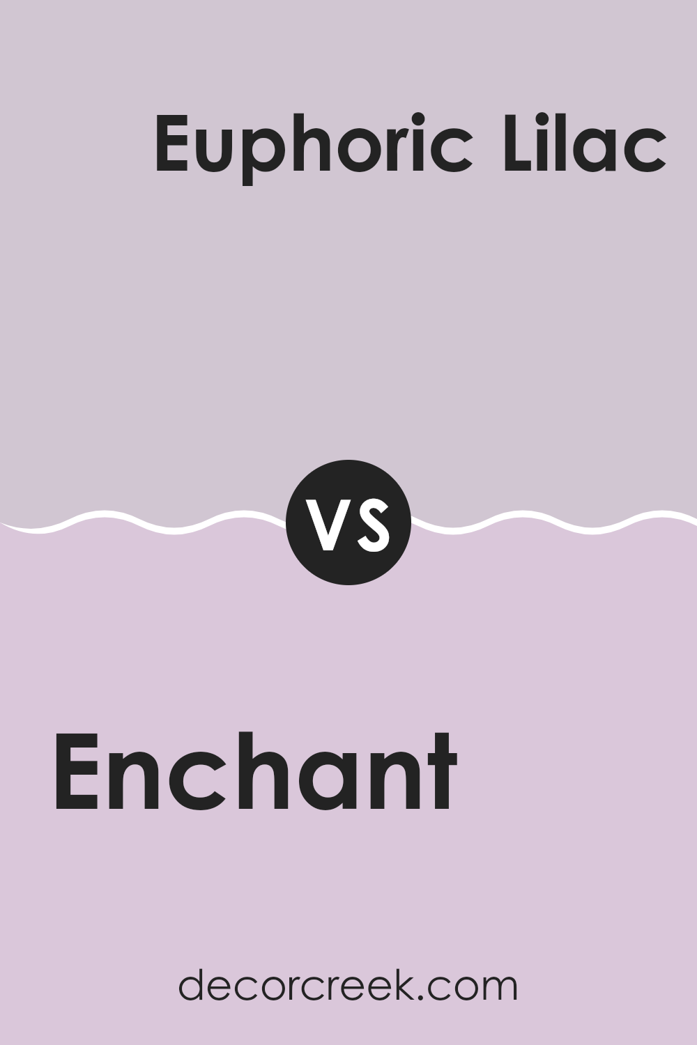
Enchant SW 6555 by Sherwin Williams vs Euphoric Lilac SW 6835 by Sherwin Williams
Enchant and Euphoric Lilac are two distinct colors by Sherwin Williams. Enchant is a deep, vibrant shade of blue with a slight purple undertone. It’s rich and bold, making it a great choice for adding a pop of color to any area that needs a bit of energy.
On the other hand, Euphoric Lilac is a much lighter color, offering a soft, airy purple that feels gentle and soothing. This color works well in areas aimed to create a calm, relaxed atmosphere.
While both colors share a connection to purple, Enchant tends to command more attention due to its darker, more saturated quality. In contrast, Euphoric Lilac is more subdued, providing a backdrop that enhances a peaceful and light feel in a room. Depending on what you want to achieve in a given area—whether it’s adding drama or promoting calm—these colors can offer very different moods and effects.
You can see recommended paint color below:
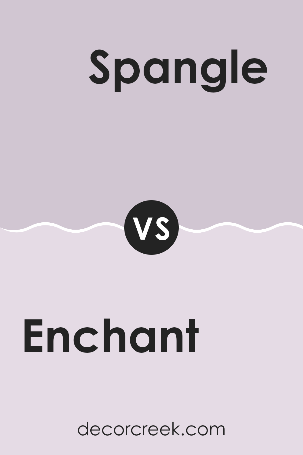
Enchant SW 6555 by Sherwin Williams vs Spangle SW 6834 by Sherwin Williams
The main color, Enchant, and the second color, Spangle, both by Sherwin Williams, have distinct tones that set them apart. Enchant is a deeper, more intense shade of purple, bringing a bold and rich feel to any area.
It’s a color that stands out and adds a sense of depth to walls or decor. On the other hand, Spangle is a lighter, pastel-like greenish-blue. This color feels fresh, airy, and light, making it excellent for creating a relaxed, cheerful atmosphere.
When comparing these two, Enchant provides a striking and dramatic look, perfect for making a statement or accenting a room, while Spangle offers a soft and gentle ambiance, ideal for brightening up areas and imparting a calming effect. Both colors have unique qualities that can enhance different aspects of a room depending on the mood and style you want to achieve.
You can see recommended paint color below:
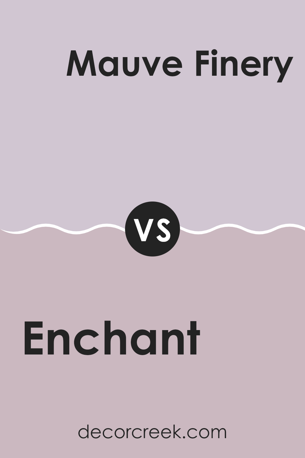
Enchant SW 6555 by Sherwin Williams vs Mauve Finery SW 6282 by Sherwin Williams
Enchant SW 6555 by Sherwin Williams is a vibrant shade of blue with a slight purple undertone, giving it a playful yet rich appearance. It stands out as a bold choice that can liven up any area, making it ideal for places like playrooms or creative areas.
On the other hand, Mauve Finery SW 6282 is a soft, muted purple with pinkish tones, offering a more subdued and gentle vibe. This color is great for creating a calm and welcoming environment, perfect for areas like bedrooms or living rooms where relaxation is key.
When comparing the two, Enchant is likely to draw more attention due to its brighter and more dynamic nature. In contrast, Mauve Finery works well as a background color, supporting other shades without overpowering them. Each color has its unique charm, depending on the feel you want to achieve in your room.
You can see recommended paint color below:
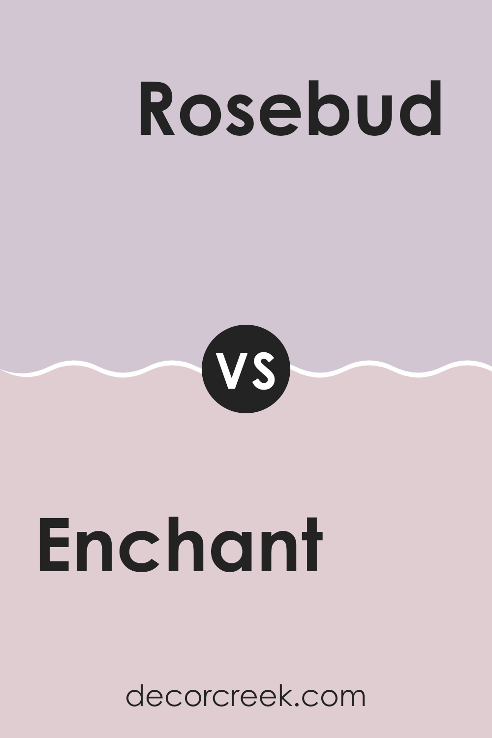
Enchant SW 6555 by Sherwin Williams vs Rosebud SW 6288 by Sherwin Williams
Enchant is a vibrant, deep periwinkle blue that brings a bold and lively feel to any area. It has a mix of blue and violet that makes it stand out, adding a pop of color without being too overpowering. On the other hand, Rosebud is a soft, muted pink with a warm undertone, giving rooms a cozy and inviting atmosphere.
It’s perfect for creating a gentle and welcoming environment, especially in areas like bedrooms or living rooms. When comparing these two colors, Enchant has a more dramatic and energizing effect due to its richer hue, while Rosebud offers a subtle touch of warmth, making areas feel homely and relaxed.
Both colors work well in different settings depending on the mood you want to set: Enchant for a dynamic and cheerful vibe, and Rosebud for a soothing and gentle ambiance. Together, they could complement each other beautifully, especially in a creative or eclectic area.
You can see recommended paint color below:
- SW 6288 Rosebud
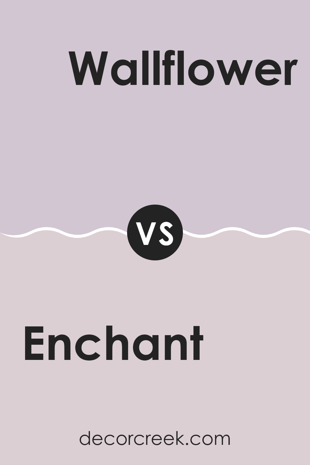
Enchant SW 6555 by Sherwin Williams vs Wallflower SW 6281 by Sherwin Williams
Enchant SW 6555 by Sherwin Williams is a vibrant and deep purple shade that adds a strong, bold touch to any area. It’s a color that stands out and brings a noticeable sense of energy and liveliness. On the other hand, Wallflower SW 6281 by Sherwin Williams is a much softer, more muted purple with gray undertones.
This color presents a more laid-back and subtle feel, making it ideal for creating a calm and soothing atmosphere. When comparing these two colors, Enchant serves well in areas where you want to make a statement or add a pop of color, such as an accent wall or a decorative piece.
Wallflower, however, is better suited for larger areas or rooms where you prefer a gentle, neutral backdrop that’s easy on the eyes. Together, they could complement each other well if used in the same area, balancing boldness and calm.
You can see recommended paint color below:
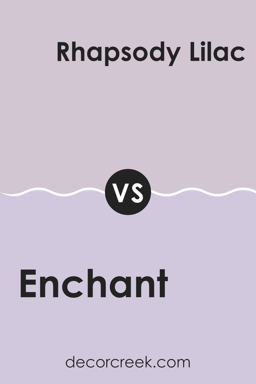
Enchant SW 6555 by Sherwin Williams vs Rhapsody Lilac SW 6828 by Sherwin Williams
Enchant SW 6555 and Rhapsody Lilac SW 6828, both by Sherwin Williams, offer unique hues for different decorating styles. Enchant is a soft, gentle shade of blue with a calming quality that makes it great for rooms where you want to relax, like bedrooms or bathrooms. It has a clean and soothing presence.
In contrast, Rhapsody Lilac is a vibrant, deeper purple that brings a sense of cheer and boldness to an area. It’s perfect for places where you want a pop of color or to make a strong visual statement, such as an accent wall or a creative area.
Both colors provide beautiful options but serve different purposes based on the mood you’re aiming to achieve. While Enchant offers a peaceful backdrop, Rhapsody Lilac stands out more and can energize a room. Depending on your room and personal taste, either color could enhance the aesthetic appeal of your home.
You can see recommended paint color below:
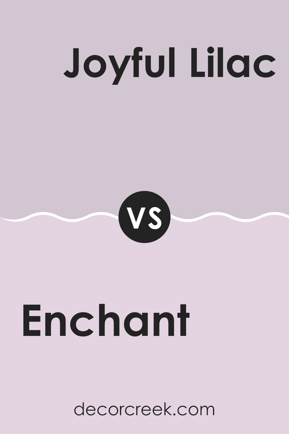
Enchant SW 6555 by Sherwin Williams vs Joyful Lilac SW 6972 by Sherwin Williams
Enchant SW 6555 by Sherwin Williams is a soft, muted purple that provides a subtle and relaxing vibe to any area. It’s gentle and almost pastel, making it perfect for creating a calm and soft atmosphere in areas like bedrooms or living rooms.
On the other hand, Joyful Lilac SW 6972 by Sherwin Williams is a much brighter and more vivid purple. This color is livelier and more energetic, bringing a cheerful and playful mood to wherever it is applied.
It stands out more than Enchant and would be great for adding a pop of color and personality to an area.
While both colors share a purple base, Enchant offers a more toned-down shade that blends easily with other colors and decorations. In contrast, Joyful Lilac makes more of a statement and tends to draw the eye, perfect for accent walls or for when you want to add a burst of energy to a room.
Both colors offer unique possibilities, depending on the atmosphere you’re hoping to achieve.
You can see recommended paint color below:
- SW 6972 Joyful Lilac
In conclusion, SW 6555 Enchant by Sherwin Williams is a wonderful paint color that really brightens up any room. It’s like a soft, gentle blue with just a hint of purple that makes you think of the sky on a sunny morning. I found that it’s really easy to match with different things like furniture and curtains. Whether I’m painting a bedroom or a play area, this color adds a fresh and cheerful feel wherever it’s used.
I also noticed that Enchant goes on very smoothly and covers the walls nicely, and once it dries, it looks even and pretty.
It’s the kind of color that makes you feel happy and calm as soon as you walk into the room. Plus, cleaning the walls is simple too, which is great if you have kids or pets that might make a mess.
Using this color in my home has made the rooms look new and lovely. I highly recommend SW 6555 Enchant by Sherwin Williams if you’re thinking of giving your home a fresh paint job. It’s amazing how much a new color can change the feel of your home, making it more inviting and fun.
If I were to repaint another room, I’d definitely consider using this color again because it has worked out so well for me!
Ever wished paint sampling was as easy as sticking a sticker? Guess what? Now it is! Discover Samplize's unique Peel & Stick samples.
Get paint samples

