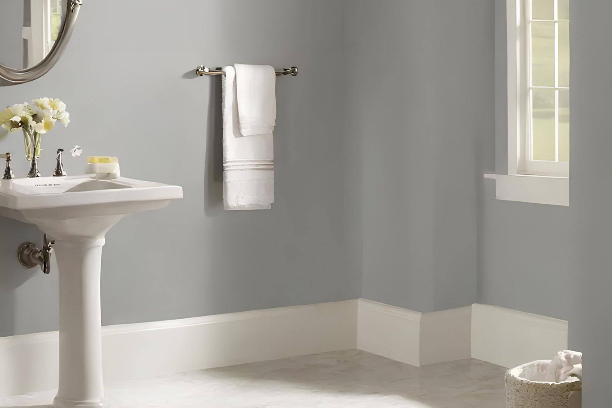
Today, I’m focusing on SW 7658 Gray Clouds by Sherwin Williams, a color that has added a subtle yet sophisticated touch to my home.
Choosing the right gray can be tricky, as some can cast too cool or too warm, disrupting the desired ambiance of a room. Gray Clouds, however, strikes a perfect balance. With its calm and balanced undertones, it pairs beautifully with a variety of decor styles and other colors, providing a versatile backdrop that adapts to both modern and traditional settings.
In my experience, Gray Clouds has proven to be more than just a functional choice; it’s a subtle nod to minimalist chic that complements any room it graces.
Whether I’m looking to create a soothing atmosphere in the bedroom or a bright, airy feel in the living room, this color has been my go-to solution.
The muted elegance of Gray Clouds helps unify the elements within a space, making it feel cohesive and thoughtfully designed.
So, let me share how this color has enhanced my home and might inspire changes in your own space.
What Color Is Gray Clouds SW 7658 by Sherwin Williams?
Gray Clouds by Sherwin Williams is a versatile and muted gray shade that perfectly balances between a light and medium tone. This color is a great choice for those looking to add a neutral backdrop to their spaces without committing to something as stark as white or as dark as charcoal. The beauty of this gray lies in its ability to seamlessly blend with other colors, providing a subtle warmth that makes a room feel welcoming and cozy.
This shade is especially well-suited for modern and minimalist interior styles, where its clean and understated quality can complement the sleek lines and simple forms typical of these designs. Gray Clouds also works wonderfully in Scandinavian-inspired decors, pairing well with natural wood textures, soft textiles like wool or cotton, and minimalist furniture.
The neutrality of the color helps highlight and harmonize with the organic elements often found in Nordic styles.
Materials like linen, silk, and brushed metal look particularly striking against Gray Clouds, as it provides a soft contrast that enhances these textures without overpowering them.
Whether applied on living room walls, bedroom settings, or even kitchens and bathrooms, Gray Clouds offers a consistently fresh and contemporary look, making it a reliable choice for a chic and modern home aesthetic.
Is Gray Clouds SW 7658 by Sherwin Williams Warm or Cool color?
Gray Clouds by Sherwin Williams is a versatile paint color that can influence the atmosphere of a home in several beneficial ways. It is a soft, muted gray that works well in various settings, from modern to traditional.
This color has a calm, soothing effect, making it ideal for rooms meant to be spaces of relaxation and rest, like bedrooms or reading areas. It also serves as a strong background color that lets furnishings and decor items stand out, making it practical for living rooms.
Additionally, since Gray Clouds is a neutral color, it pairs easily with brighter colors, allowing for flexibility in decorating without the need for frequent repaints as styles or preferences change. This makes it a budget-friendly and time-saving choice for homeowners who enjoy updating their interior design. Overall, Gray Clouds offers a clean, unobtrusive backdrop that enhances the visual appeal of spaces without dominating them, fostering a pleasant and peaceful home environment.
Undertones of Gray Clouds SW 7658 by Sherwin Williams
Gray Clouds is a versatile paint color with a complex mix of undertones that subtly affect its overall appearance. Undertones are secondary colors that contribute to the primary shade but aren’t always immediately noticeable. Understanding these undertones is crucial because they can change how a color looks under different lighting conditions or when paired with other colors.
The undertones in Gray Clouds include pale yellow, light blue, light purple, mint, pale pink, lilac, and grey. These undertones make this color unique and able to adapt to various interior styles and moods. For instance, the pale yellow undertone adds a hint of warmth, making a room feel more inviting.
Light blue and lilac provide a sense of calm, which can make spaces like bedrooms or bathrooms feel more relaxing.
When using Gray Clouds on interior walls, the effect of these undertones is noticeable.
The mint and light purple can subtly influence the vibe, making the wall color look slightly different as the day progresses and the lighting changes. Furnishings and decor that complement or contrast with specific undertones in the paint can either highlight or subdue these effects.
Overall, Gray Clouds is not just a simple gray. Its complexity, due to its range of undertones, allows it to adapt seamlessly with a variety of decor styles and preferences, enhancing the aesthetic of any room.

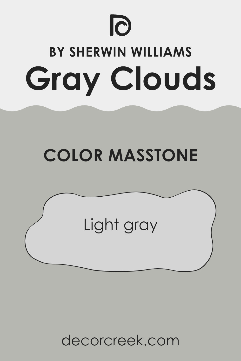
What is the Masstone of the Gray Clouds SW 7658 by Sherwin Williams?
Gray Clouds SW 7658 by Sherwin Williams has a masstone of light gray, which is a versatile and neutral color. This shade can work well in numerous areas around the home due to its understated yet elegant appeal. Light gray is perfect for creating a calm and soothing atmosphere in spaces like bedrooms and living rooms.
It provides a clean and crisp backdrop that can make small rooms appear larger and brighter. This light gray color is also easy to match with a wide range of decor styles and colors, from bold and bright interiors to more muted and minimalist themes.
In practical terms, light gray walls are forgiving with dust and minor smudges, which makes them a practical choice for high-traffic areas such as hallways and family rooms. Whether you aim to have a contemporary look or a more traditional feel, Gray Clouds can effortlessly tie your decorative elements together, making it a smart choice for harmonizing the aesthetics of your home.
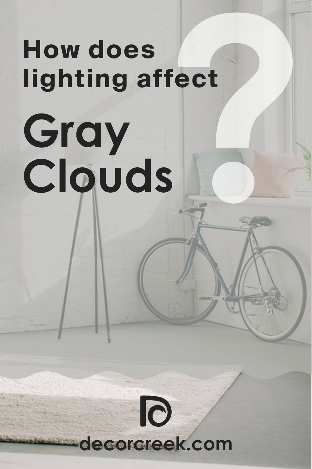
How Does Lighting Affect Gray Clouds SW 7658 by Sherwin Williams?
Lighting significantly influences how we perceive colors. The same paint, such as Gray Clouds by Sherwin Williams, can appear differently under various lighting conditions, which is crucial when planning room decor.
Natural Light Effects:
In natural light, colors can show their truest form, but the direction of the light makes a significant difference:
– North-facing rooms: These rooms get less direct sunlight, making natural light cooler and somewhat bluish. Gray Clouds in a north-facing room might look slightly more slate-like, emphasizing its cooler tones.
– South-facing rooms: These rooms are bathed in plentiful sunlight throughout the day, which can warm up the color. Gray Clouds will appear lighter and slightly warmer, enhancing the underlying warm tones in the color.
– East-facing rooms: Light in east-facing rooms is brightest in the morning, with a golden quality at sunrise. This warm, yellow light can make Gray Clouds look softer and more inviting in the morning, fading to cooler tones as the day progresses.
– West-facing rooms: Evening light in these rooms can be intensely warm and bring out the most depth in Gray Clouds, highlighting beige or warmer undertones as the sun sets.
Artificial Light Effects:
Different artificial lights can alter the appearance of colors:
– Incandescent lighting: This type of lighting adds a yellowish tint, making Gray Clouds look warmer and reducing its natural coolness.
– Fluorescent lighting: Typically emitting a flat, cool light, fluorescent bulbs can enhance the gray aspects, making it appear more stark and pure gray.
Understanding these effects can help you choose the right paint placement based on the room’s orientation and the quality of light it receives, ensuring that Gray Clouds gives off the desired vibe in your space.
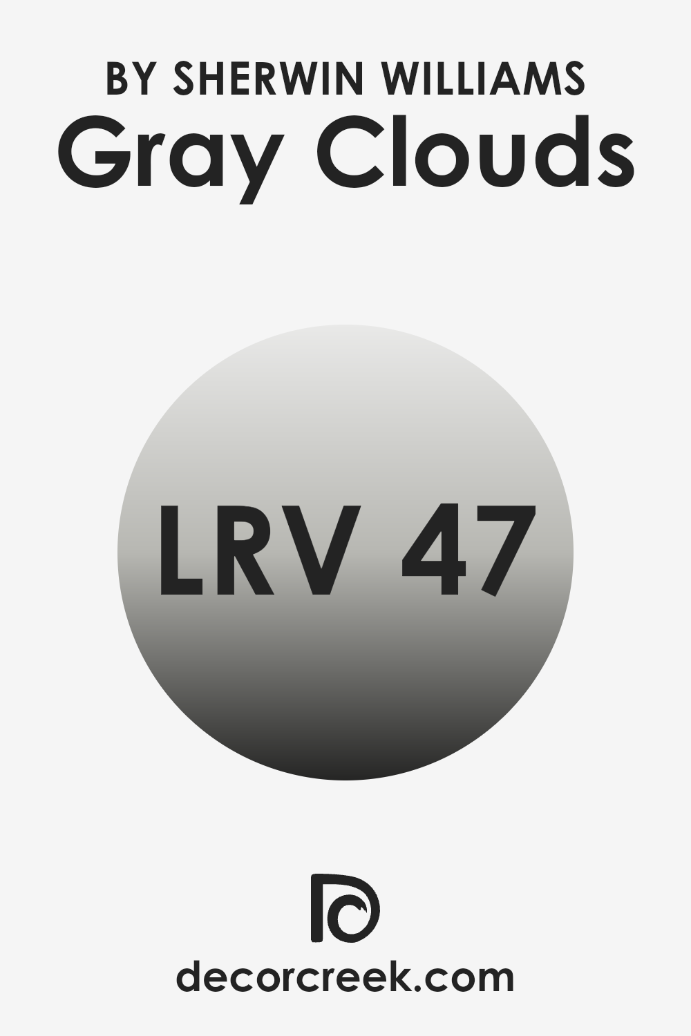
What is the LRV of Gray Clouds SW 7658 by Sherwin Williams?
LRV stands for Light Reflectance Value, a measure used to indicate how much light a paint color reflects or absorbs when applied to a surface. This value is represented on a scale from zero, which absorbs all light and appears completely black, to the highest, which reflects all light and appears pure white.
Knowing the LRV of a color helps in deciding how bright or dark a room will feel once it is painted. Higher LRV values mean the color reflects more light, making a room feel brighter and more open, while lower values make a room feel cozier or smaller because they absorb more light.
For the color Gray Clouds, with an LRV of around 47, it falls in the mid-range of the scale. This means it neither reflects light excessively nor absorbs it too much, making it a versatile choice for spaces that don’t have a lot of natural light or are not overly spacious. Spaces painted in this shade will appear moderately illuminated, providing a balanced ambiance that is not too stark or too dim.
This medium light reflectance makes it a practical choice for common areas and work spaces where a neutral, calming backdrop is desirable without making the space feel cramped or overly bright.
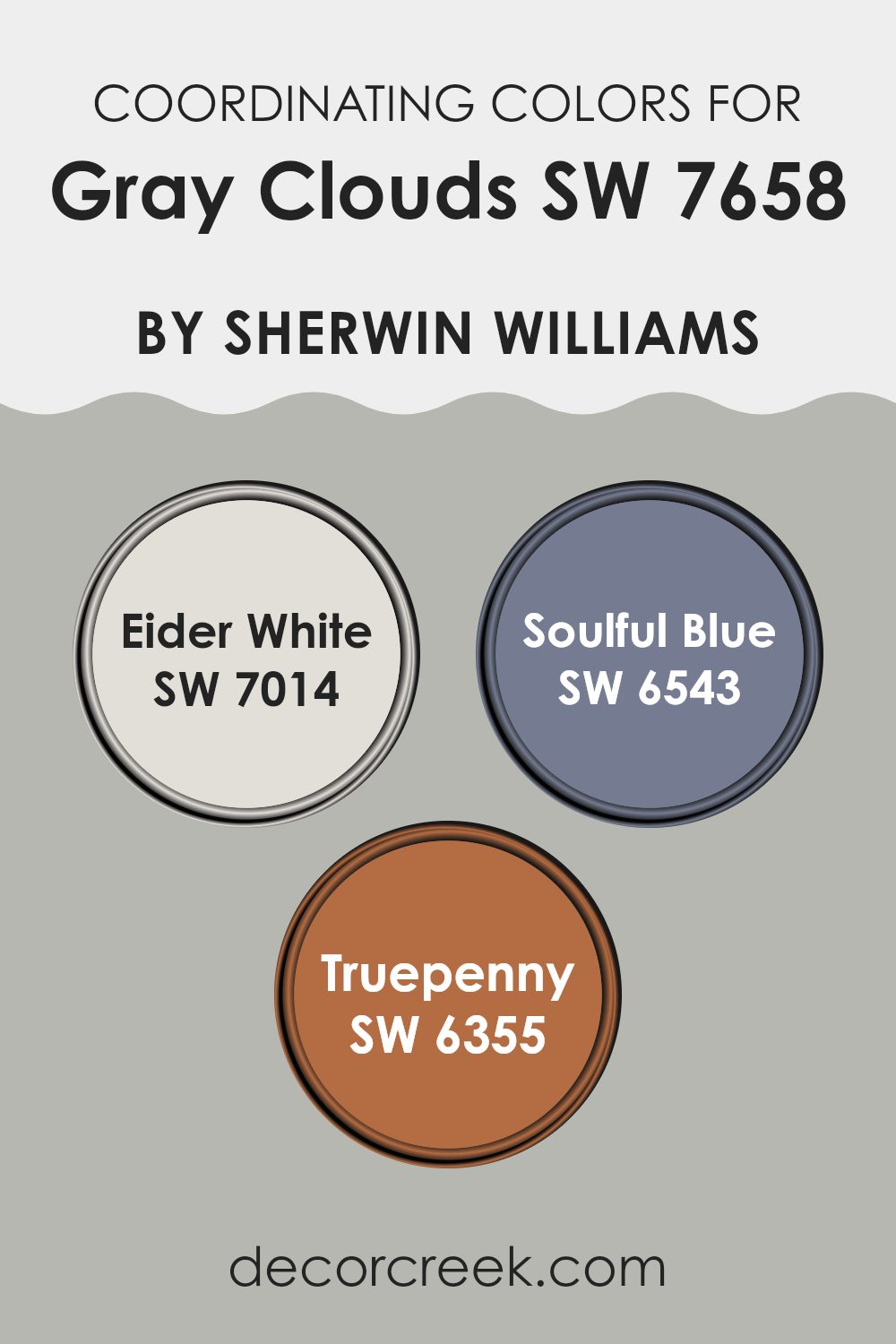
Coordinating Colors of Gray Clouds SW 7658 by Sherwin Williams
Coordinating colors are selected hues that harmonize well with a primary color, enhancing the aesthetic appeal of a space without overpowering it. When used effectively, these colors can create a balanced and visually appealing scheme. For example, consider the soft and neutral tone of Gray Clouds by Sherwin-Williams. To complement this color, one might choose hues that bring contrast or continue the subtle undertone theme.
Eider White is a soft white with a hint of gray that pairs beautifully with Gray Clouds, providing a clean, understated backdrop that allows for versatility in decor. It’s perfect for creating a light and airy feel in any room, making spaces appear larger and more open.
Soulful Blue, on the other hand, adds a touch of depth with its muted, soothing blue tone, offering a gentle pop of color that’s neither too bold nor too dull.
This color works well in areas designed for relaxation and thoughtfulness. Finally, Truepenny brings a warm, coppery hue to the palette, injecting a cozy, inviting vibe.
This richer shade works splendidly for adding warmth to a room, perfect for spaces where you want to add a touch of comfort and homeliness.
Collectively, these colors support and enhance the ambiance set by Gray Clouds, allowing for a cohesive and harmonious color scheme.
You can see recommended paint colors below:
- SW 7014 Eider White
- SW 6543 Soulful Blue
- SW 6355 Truepenny
What are the Trim colors of Gray Clouds SW 7658 by Sherwin Williams?
Trim colors are vital in interior design because they help frame and define the spaces in a room, highlighting architectural details and creating clear visual separations. When using a neutral shade like Gray Clouds by Sherwin Williams on walls, choosing the right trim colors can enhance the overall aesthetic and ensure that the wall color stands out appropriately.
For Gray Clouds, a soft, warm trim color like Sherwin Williams’ Aesthetic White (SW 7035) or a light and balanced grey such as Agreeable Gray (SW 7029) can complement the base color beautifully without causing a harsh contrast, maintaining a smooth and cohesive look throughout the space.
Aesthetic White by Sherwin Williams (SW 7035) is a warm white that provides a gentle contrast to cooler tones, lending a cozy feel to any room while keeping the look fresh and clean. On the other hand, Agreeable Gray (SW 7029) is a mild gray that harmonizes well with other neutrals, providing just enough depth to make surrounding colors pop without overshadowing them.
Both colors are excellent choices for trims when paired with Gray Clouds, as they enhance the space’s appeal without overwhelming it, keeping the environment light and inviting.
You can see recommended paint colors below:

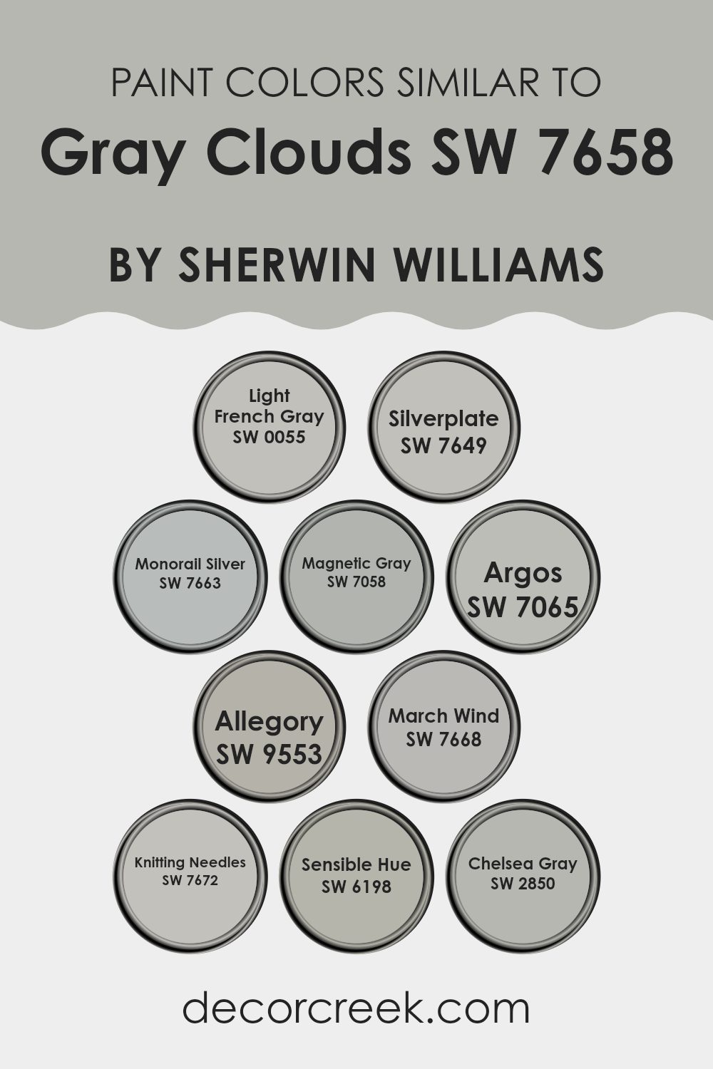
Colors Similar to Gray Clouds SW 7658 by Sherwin Williams
Similar colors play a crucial role in interior design by creating a harmonious atmosphere and a seamless visual flow. When colors like those similar to Gray Clouds by Sherwin Williams are used together, they can enhance the sense of unity and coherence in a space. These shades, ranging from light to dark grays, all maintain a balance that isn’t overpowering, making them excellent for consistent background tones or for tying together diverse decor elements.
For instance, Light French Gray offers a subtle touch with its gentle gray hue, making it perfect for creating a calm, cohesive look. Silverplate, on the other hand, provides a slightly more assertive gray that works well in modern settings. Monorail Silver adds depth with its darker tone, ideal for accentuating spaces with a bolder aesthetic.
Magnetic Gray has a magnetic appeal due to its noticeable depth, enriching spaces without dominating them. Argos, a clear, medium gray, provides a crisp backdrop, enhancing accompanying colors. Allegory, slightly muted, pairs wonderfully with brighter accents. March Wind brings a dynamic, airy feel to rooms, perfect for spaces needing a light, spacious vibe.
Knitting Needles, with its subtle blue undertone, offers sophistication without complexity. Sensible Hue acts as a soft, versatile base that complements a wide range of design elements. Lastly, Chelsea Gray strikes a balance with its rich depth, ideal for creating focal points without stark contrasts.
Each of these colors supports design aims with versatility and ease, allowing for beautiful, understated environments.
You can see recommended paint colors below:
- SW 0055 Light French Gray
- SW 7649 Silverplate
- SW 7663 Monorail Silver
- SW 7058 Magnetic Gray
- SW 7065 Argos
- SW 9553 Allegory
- SW 7668 March Wind
- SW 7672 Knitting Needles
- SW 6198 Sensible Hue
- SW 2850 Chelsea Gray
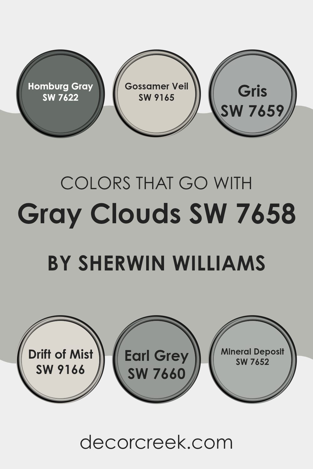
Colors that Go With Gray Clouds SW 7658 by Sherwin Williams
When you’re considering painting a space in your home, choosing the right colors to complement your main shade is crucial for achieving a balanced and appealing look. Gray Clouds SW 7658 by Sherwin Williams is a versatile neutral that serves as a fantastic base, making it essential to pick colors that work well with it. Colors that pair effectively not only bring out the best in the main color but also help in creating a cohesive and visually appealing space. Matching colors can affect the mood and size perception of a room, making it appear more harmonious and put together.
For instance, a color like Homburg Gray SW 7622 works beautifully with Gray Clouds as it adds a slightly darker tone that can be used for accent walls or furniture, bringing a grounding effect to the space. Gossamer Veil SW 9165, on the other hand, is lighter and works to soften the overall feel, perfect for creating a subtle contrast.
Gris SW 7659 adds a touch of earthiness and can beautifully tie together furniture pieces or textiles in a room. Drift of Mist SW 9166 offers a clean, almost ethereal contrast to Gray Clouds, ideal for enhancing spaces with a fresh and airy feel. Earl Grey SW 7660 is deeper and can be used to make a statement, whether through accessories or a feature wall.
Lastly, Mineral Deposit SW 7652 introduces a hint of blue, giving a cool and calm effect that pairs nicely with the balanced tone of Gray Clouds, making it ideal for bathrooms or bedrooms where a calming atmosphere is desirable. These colors collectively offer a palette that can handle various elements of a home while maintaining an aligned and inviting atmosphere.
You can see recommended paint colors below:
- SW 7622 Homburg Gray
- SW 9165 Gossamer Veil
- SW 7659 Gris
- SW 9166 Drift of Mist
- SW 7660 Earl Grey
- SW 7652 Mineral Deposit
How to Use Gray Clouds SW 7658 by Sherwin Williams In Your Home?
Gray Clouds SW 7658 by Sherwin Williams is a versatile paint color that fits well in many areas of a home. Its neutral gray hue makes it an excellent choice for creating a calm and welcoming atmosphere in rooms such as living rooms, bedrooms, or bathrooms. Because it doesn’t lean too heavily toward warm or cool tones, it pairs effortlessly with various decor styles, from modern to rustic.
This color works well as a main color on walls, providing a soft backdrop that allows furniture and art to stand out. You can also use it for painting cabinets or as an accent in alcoves or on interior doors for a subtle contrast.
Additionally, because of its neutrality, Gray Clouds SW 7658 complements a wide range of other colors, including blues, greens, and even bolder shades like mustard or berry tones. If you’re looking to refresh your space without making a dramatic change, this color offers a simple yet effective solution.
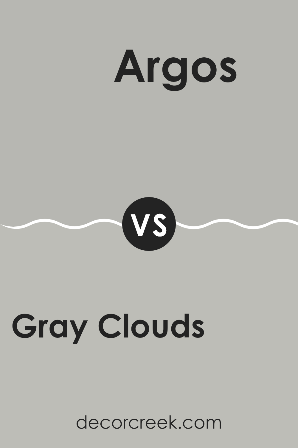
Gray Clouds SW 7658 by Sherwin Williams vs Argos SW 7065 by Sherwin Williams
Gray Clouds and Argos are two different shades by Sherwin Williams. Gray Clouds is a lighter gray that brings a calm and soft feeling to a room. It’s an excellent choice if you’re looking for a gray that isn’t too heavy, making spaces feel more open and airy.
On the other hand, Argos is a deeper gray with slightly cooler blue undertones. This makes Argos ideal for a more modern look, adding a bit more drama and impact to your space without feeling too overpowering.
comparing these two, think about the mood you want to set; Gray Clouds keeps things light and relaxed, while Argos can make a strong statement, yet still remains quite neutral. Both colors are versatile and can work well in a variety of decorating styles, depending on what kind of atmosphere you want to achieve.
You can see recommended paint color below:
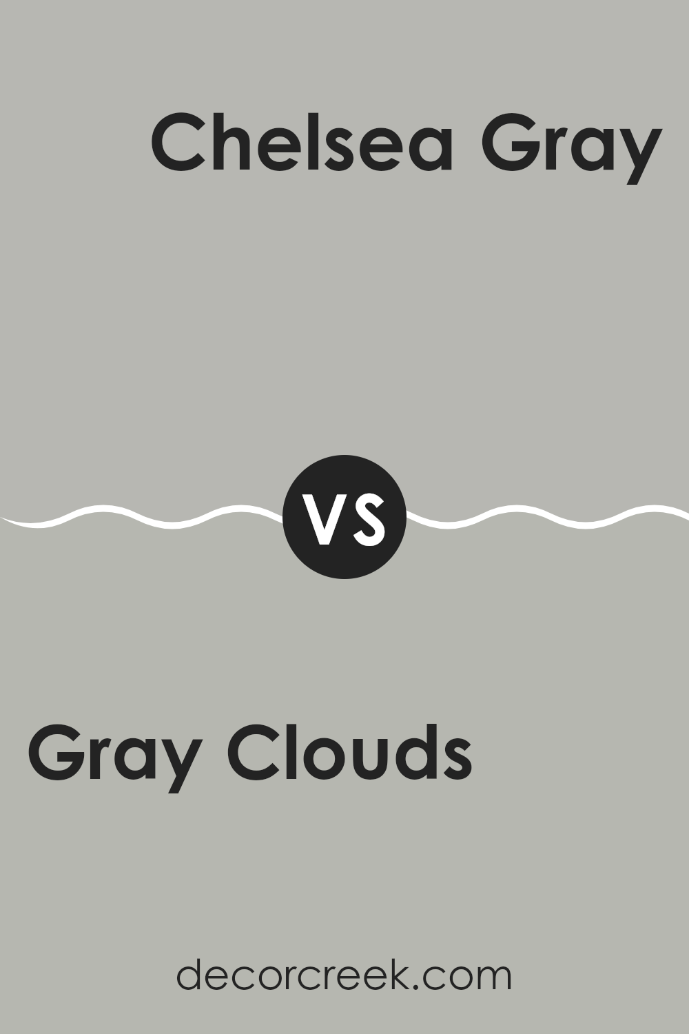
Gray Clouds SW 7658 by Sherwin Williams vs Chelsea Gray SW 2850 by Sherwin Williams
Gray Clouds and Chelsea Gray from Sherwin Williams are two distinct shades of gray, each bringing its unique feel to a space. Gray Clouds is a lighter, softer gray that offers a gentle, almost muted tone.
It’s perfect for creating a calm and quiet background, allowing other colors or decor items to stand out. On the other hand, Chelsea Gray is a deeper, more pronounced gray. This color has a stronger presence and can give a room a more defined, bolder look without being too overwhelming.
It works well in areas where you want to add some depth and drama to the color palette. Both grays are versatile, but while Gray Clouds provides a light, airy feel, Chelsea Gray makes a more significant, confident statement. Choosing between them depends on the atmosphere you’re looking to create in your space.
You can see recommended paint color below:
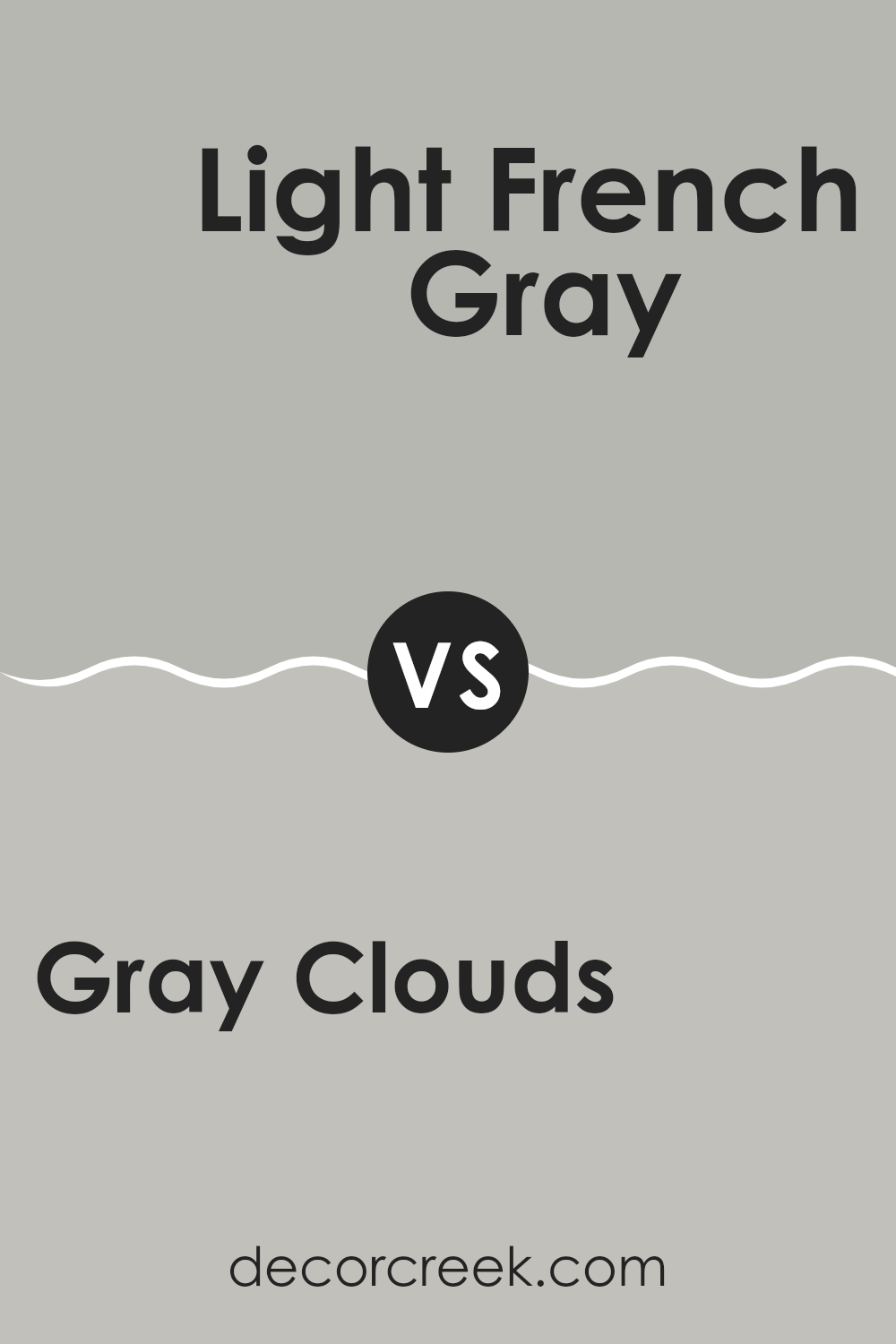
Gray Clouds SW 7658 by Sherwin Williams vs Light French Gray SW 0055 by Sherwin Williams
Gray Clouds and Light French Gray by Sherwin Williams are two popular shades that can freshen up any space. Gray Clouds is darker with a heavier feel, making it great for creating a cozy, inviting atmosphere in rooms like living rooms or bedrooms. On the other hand, Light French Gray is lighter and provides a cleaner, more airy feeling, perfect for making small spaces appear bigger or for ceilings and trims to contrast with darker walls.
Both colors are versatile but serve different purposes depending on the vibe you’re aiming for in a room. Gray Clouds might be better suited for those who prefer a more anchored, muted backdrop that pairs well with vibrant furniture or art. Light French Gray, being a bit more neutral and less imposing, works well in a minimalist setting or when you want to keep your walls understated.
Choosing between them depends on your need for either a strong base color or a subtle enhancement to your existing decor.
You can see recommended paint color below:
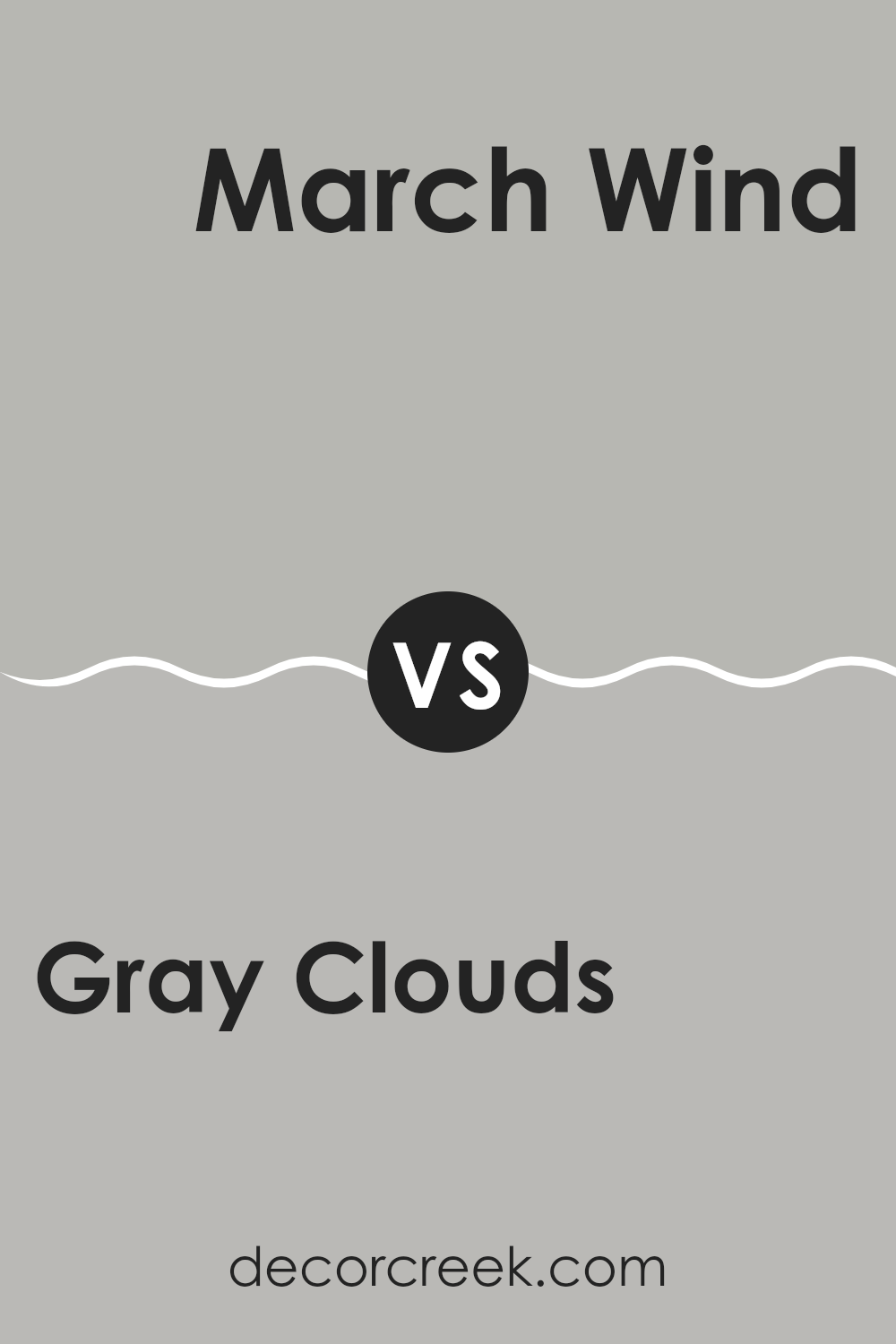
Gray Clouds SW 7658 by Sherwin Williams vs March Wind SW 7668 by Sherwin Williams
Gray Clouds and March Wind, both by Sherwin Williams, are subtle and neutral colors, but they have different tones. Gray Clouds is a lighter gray that has a soft and calm appearance, making it great for creating a relaxed and airy feel in a room. It works well in spaces where you want to promote a sense of openness and light.
On the other hand, March Wind is a deeper gray with a stronger presence. This color offers a moodier feel, which can add some drama or intensity to a space without overwhelming it. It’s excellent for areas where you want more of an impactful look but still want to keep things neutral.
Both colors are versatile and can fit various decor styles, but your choice between them would depend on the effect you want in your room—whether you prefer the lighter, breezier feel of Gray Clouds or the more anchored, striking vibe of March Wind.
You can see recommended paint color below:
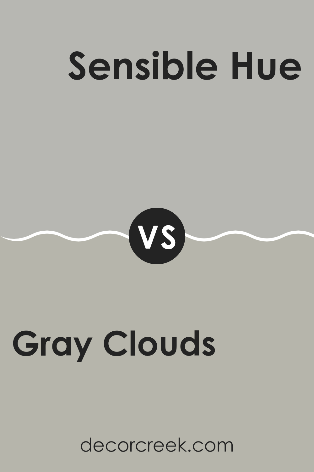
Gray Clouds SW 7658 by Sherwin Williams vs Sensible Hue SW 6198 by Sherwin Williams
Gray Clouds and Sensible Hue are two colors by Sherwin Williams that showcase subtle differences in tone and mood. Gray Clouds is a lighter shade, resembling the soft color of the sky during a cloudy day, providing a gentle and calming effect to any room.
It’s a great choice for those who want to create a light, airy space. On the other hand, Sensible Hue leans more towards a deeper, greenish-gray color, offering a stronger presence while still maintaining an overall neutral appearance. This color works well in spaces where a touch of depth is desired without overwhelming the room with darkness.
colors are versatile and can be used in various settings, from living rooms to bedrooms, but the choice between them comes down to the desired brightness and the subtle undertone preference. Gray Clouds offers a purer gray, while Sensible Hue brings a hint of green for a bit more character.
You can see recommended paint color below:
- SW 6198 Sensible Hue
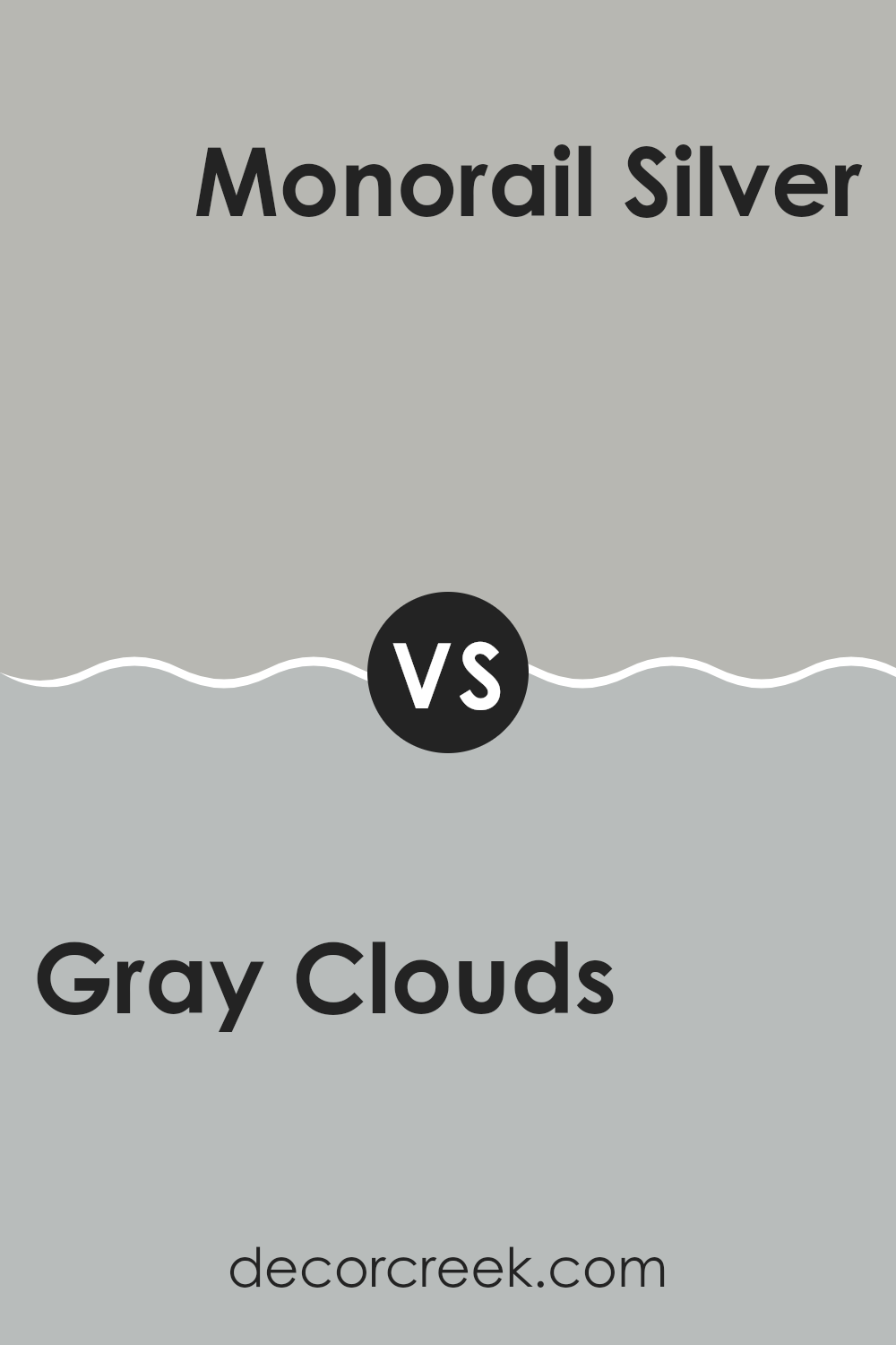
Gray Clouds SW 7658 by Sherwin Williams vs Monorail Silver SW 7663 by Sherwin Williams
Gray Clouds and Monorail Silver, both by Sherwin Williams, offer subtle differences in their tones, making them unique choices for home decor. Gray Clouds has a lighter, airier feel, resembling a soft, overcast sky. This color is great for spaces where you want a gentle, soothing backdrop, as it brings a sense of calm and openness without feeling too cold.
Monorail Silver, on the other hand, is a deeper shade, mimicking the industrial feel of steel or silver found in a modern monorail. This gray has more depth, making it a strong choice for those looking to add a bit more drama or a bold, modern touch to their room. It stands out more than Gray Clouds, providing a striking contrast against white trim or light-colored furniture.
In summary, while both colors share gray tones, Gray Clouds is lighter and softer, making it ideal for a relaxed space, while Monorail Silver, being darker, offers a more pronounced and modern vibe.
You can see recommended paint color below:
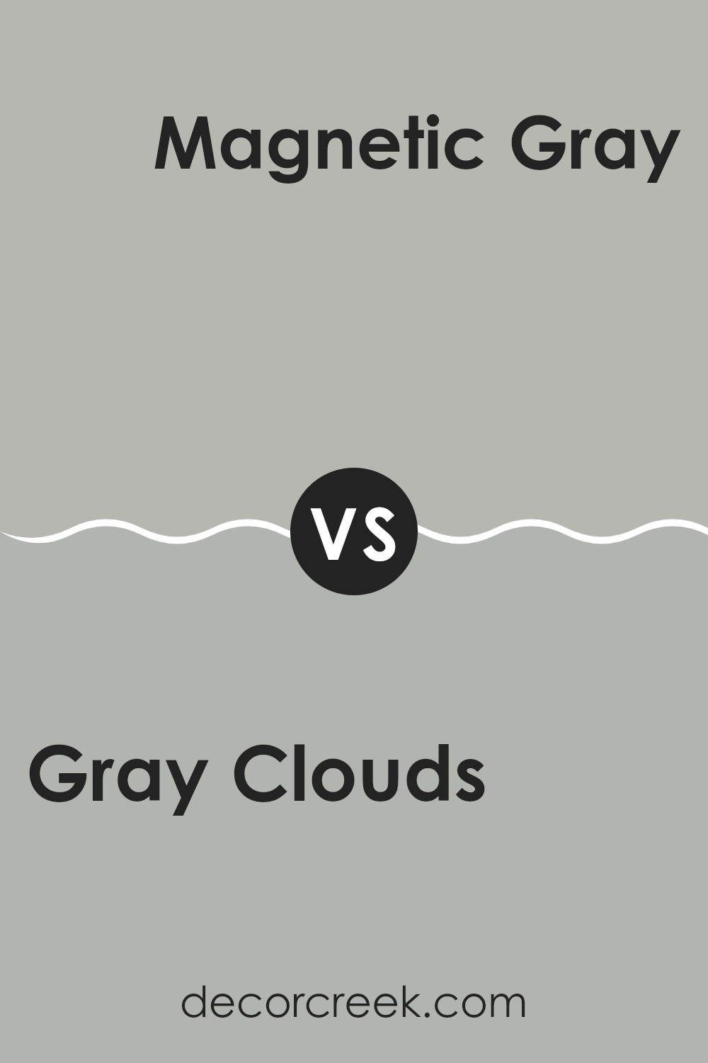
Gray Clouds SW 7658 by Sherwin Williams vs Magnetic Gray SW 7058 by Sherwin Williams
Gray Clouds and Magnetic Gray are both from Sherwin Williams, but they offer distinct shades. Gray Clouds presents a lighter, softer gray that can brighten up a space effectively. It’s versatile, fitting well in various areas of a home, from living rooms to bedrooms, giving a clean and airy feel.
On the other hand, Magnetic Gray is a deeper shade, providing a stronger presence with its richer tone. This color works well in spaces where you want more definition or a slightly more pronounced gray ambiance without overwhelming the area.
The choice between these two would depend on the amount of natural light in your room and your personal preference for lighter versus darker tones. Both colors are neutral, making them easy to pair with various decor styles and color schemes.
You can see recommended paint color below:
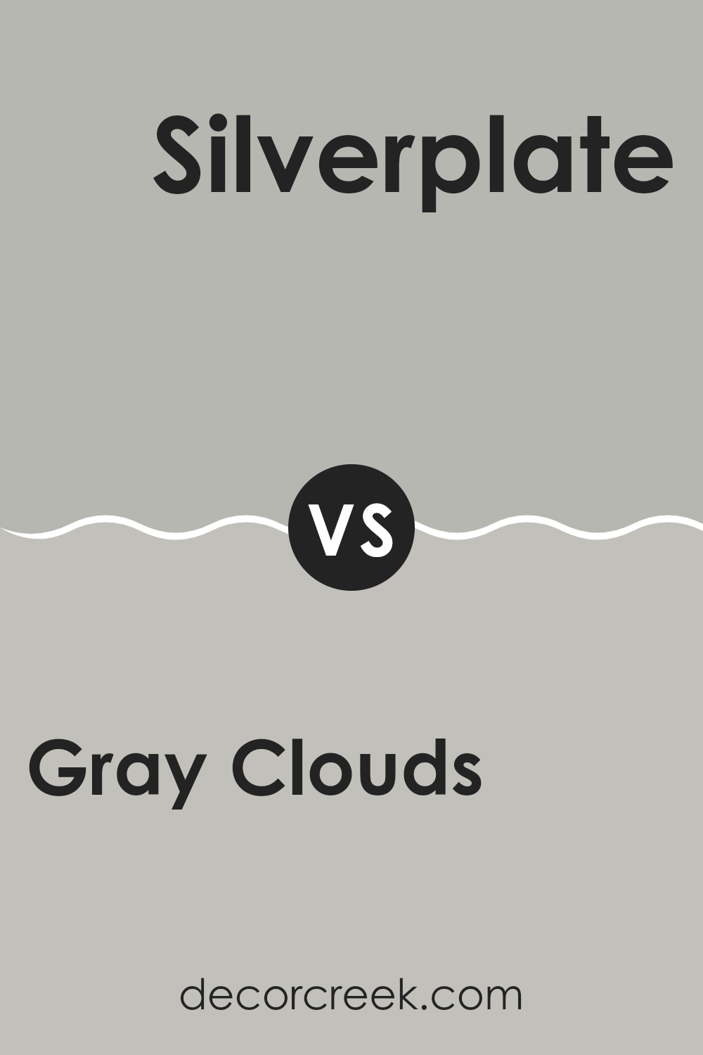
Gray Clouds SW 7658 by Sherwin Williams vs Silverplate SW 7649 by Sherwin Williams
Gray Clouds and Silverplate by Sherwin-Williams are two gray shades with subtle differences in tone and mood. Gray Clouds is a softer, lighter gray that gives off a gentle, airy feel. It’s perfect for creating a calm and soothing atmosphere in a room.
On the other hand, Silverplate is a bit darker and has a cool undertone, making it a great choice for bringing a modern and sleek look to spaces. This shade can add a touch of elegance without overpowering the room.
Both colors are versatile and can work well in various settings, from living rooms and bedrooms to kitchens and bathrooms. However, Gray Clouds might be better suited for those who prefer a softer ambiance, while Silverplate is ideal for those looking for a crisper, more defined appearance.
You can see recommended paint color below:
Gray Clouds SW 7658 by Sherwin Williams vs Knitting Needles SW 7672 by Sherwin Williams
Gray Clouds and Knitting Needles, both by Sherwin Williams, are subtly different shades that can create distinct atmospheres in any space. Gray Clouds is a slightly lighter, softer gray which gives a calm and gentle feel to a room. It carries an airy vibe that can make spaces feel more open and light, ideal for living areas or bedrooms where a peaceful setting is desired.
On the other hand, Knitting Needles steps in with a deeper, more pronounced gray. This color has a stronger presence, providing a sense of groundedness and stability which can be perfect for accent walls or areas requiring a bit more substance and focus, such as home offices.
Both colors are versatile and neutral, making them easy to pair with a wide variety of decor styles and colors. Whether you prefer the lighter touch of Gray Clouds or the more noticeable shade of Knitting Needles, both provide elegant solutions for interior spaces.
You can see recommended paint color below:
Gray Clouds SW 7658 by Sherwin Williams vs Allegory SW 9553 by Sherwin Williams
Gray Clouds and Allegory, both by Sherwin Williams, offer distinct tones that can greatly influence the mood in any space. Gray Clouds is a subtle, cool shade of gray that provides a calm, neutral background.
It is perfect for those looking for a non-distracting color that complements various decor styles and colors. On the other hand, Allegory is a deeper, warmer color that resembles the rich tones of earthy clay. This color can make a room feel more cozy and grounded, offering a soothing yet strong presence.
When comparing the two, Gray Clouds is lighter and more understated, making spaces seem larger and brighter, while Allegory adds depth and warmth, which can make large rooms feel more intimate. Both colors offer versatility, but their impacts on the atmosphere of a room are notably different.
You can see recommended paint color below:
As I wrap up talking about the SW 7658 Gray Clouds paint by Sherwin Williams, it’s clear this gray color is really something special. It’s a soft, gentle gray that looks good almost anywhere. Whether you’re painting a bedroom to make it cozy or updating your living room so it feels a bit more cheerful, this color seems to work beautifully.
It keeps things simple but still adds a nice touch of style, kind of like wearing your favorite gray sweater that looks good but feels super comfortable too. It also mixes well with other colors. You could add blues, reds, or even yellows, and it still looks great.
From what I’ve learned, Gray Clouds can make small places look bigger and help rooms with not much sunshine feel lighter and brighter. If you ever want to change up your room but you’re not sure what color to pick, SW 7658 Gray Clouds could be a good choice. It’s easy to like, doesn’t shout for attention, and makes almost any room look and feel nicer. It’s like a friendly color that makes everyone feel at home.
Ever wished paint sampling was as easy as sticking a sticker? Guess what? Now it is! Discover Samplize's unique Peel & Stick samples.
Get paint samples

