When you first see SW 0059 Frostwork by Sherwin Williams, it immediately strikes you with its subtle charm. This particular shade of paint envelops a room in a velvety smooth gray with just the faintest whisper of blue, making it an ideal backdrop for both modern and traditional areas.
As someone looking to refresh your home, you’ll appreciate how Frostwork maintains a calm and collected ambiance without clashing with your existing decor. It effortlessly balances cool and warm tones, allowing for flexibility in decorating with different textures and colors.
Whether you’re planning to update your living room, bedroom, or even your bathroom, Frostwork has a flexible appeal that works wonders across various settings. The color’s light-reflective properties help to make small rooms appear larger, while its understated elegance doesn’t overpower but rather enhances the aesthetic of larger rooms.
By choosing Frostwork, you’ll find it simple to mix and match furnishings and accessories, making your decorating process a breeze. This color doesn’t just paint your walls; it provides a calm foundation that enhances the overall feel of your home with a touch of refinement.
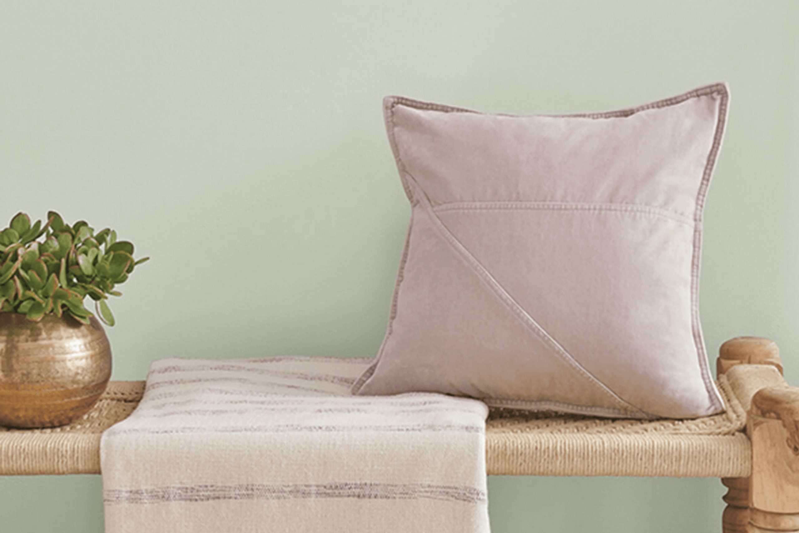
What Color Is Frostwork SW 0059 by Sherwin Williams?
Frostwork by Sherwin Williams is a soft, light gray color that carries a hint of blue, giving it a crisp and fresh appearance. This particular shade manages to be both subtle and striking, offering a clean backdrop that can brighten up any room without overpowering it. Its cool tone makes it a perfect choice for modern and minimalist interior styles, complementing clean lines and uncluttered areas.
This color works exceptionally well in coastal interiors where the light blue undertones can mirror the colors of the sea and sky. It is also ideal for Scandinavian designs, which favor light hues to maximize the sense of room and light.
Frostwork pairs beautifully with natural materials such as light woods, cotton, and linen, enhancing its airy feel. When matched with glass or metallic finishes, such as silver or brushed nickel, it achieves a subtle, contemporary look that feels grounded yet light.
For those wanting to add a bit of texture, Frostwork goes well with soft textiles like wool or chunky knits to create a cozy atmosphere. It’s an excellent choice for common areas like living rooms and kitchens, as well as more private areas like bedrooms and bathrooms, providing a calm and inviting environment.
Is Frostwork SW 0059 by Sherwin Williams Warm or Cool color?
FrostworkSW 0059 by Sherwin Williams is a light and airy paint color that brings a fresh feel to any home. It has subtle blue undertones that make it similar to the color of a gentle morning sky, which helps create a calm and relaxing atmosphere in rooms.
Because of its light tone, Frostwork reflects natural light beautifully. This feature causes smaller areas to appear larger and more open, making it a great choice for compact rooms or areas with limited sunlight.
This color works well with modern and minimalistic home themes, as well as in more traditional settings. It pairs nicely with white trim for a clean and crisp look, or it can be matched with darker colors like navy or gray for a striking contrast. Additionally, Frostwork is flexible enough to be used in various rooms of the house, including bedrooms, bathrooms, and living areas, providing a consistent and cohesive look throughout the home.
Undertones of Frostwork SW 0059 by Sherwin Williams
Frostwork by Sherwin Williams is a flexible color that has a complex mix of undertones, including pale yellow, light blue, light purple, mint, pale pink, lilac, and grey. These undertones play a significant role in how the color is perceived and can affect the overall feel of a room. Undertones are subtle colors that influence the main hue.
They can change how colors look based on lighting conditions or what other colors are nearby. For example, in natural light, Frostwork might lean more towards its pale yellow or light blue undertones, giving it a fresher, more uplifting feel. In artificial lighting, the grey or lilac undertones might become more dominant, making the color look cooler and more muted.
On interior walls, Frostwork’s undertones allow it to adapt to different settings and decor styles. The pale yellow and mint undertones can make a room feel more welcoming and lively, especially in rooms that get a lot of sunlight.
The light blue and lilac undertones can offer a subtle hint of color, which contributes to a more relaxed atmosphere, ideal for bedrooms and bathrooms. The presence of grey helps ground the color, ensuring it pairs well with a broad range of furniture and accent colors.
In essence, the mixed undertones of Frostwork make it a flexible choice for many interior rooms, able to complement various decorations and styles, while subtly influencing the mood and visual temperature of a room.
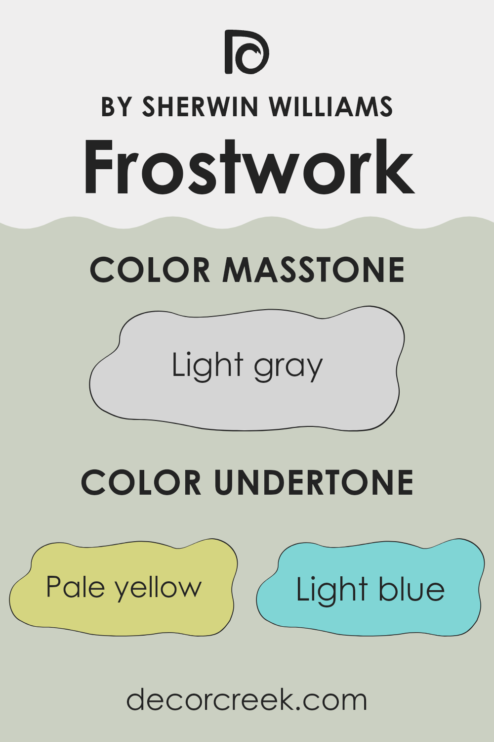
What is the Masstone of the Frostwork SW 0059 by Sherwin Williams?
Frostwork SW 0059 from Sherwin Williams has a masstone of light gray (#D5D5D5). This neutral and gentle shade is flexible, making it a popular choice for homes. Its light gray tone blends well with a variety of decor styles and colors, acting as a calming backdrop rather than taking center stage.
This makes it ideal for rooms that you want to keep clean looking and organized, such as kitchens and bathrooms. In larger rooms like living rooms, it helps to make the area seem more open and airy, reflecting natural light beautifully during the day.
It’s also easy to match with furniture and accessories, whether you’re pairing it with bold colors for a modern look or softer shades for a cozy feel. Overall, its adaptability and light reflective quality make it a practical and attractive option for painting interiors.
How Does Lighting Affect Frostwork SW 0059 by Sherwin Williams?
Lighting plays a crucial role in how we perceive colors. The same paint color can appear differently depending on the type of light it is exposed to — whether it’s natural sunlight or artificial light from lamps and fixtures.
Take the color Frostwork by Sherwin Williams, for instance. This shade is a soft, subtle color that can shift in appearance based on the lighting conditions. Under artificial light, such as LED or fluorescent lights, Frostwork tends to look slightly cooler, which emphasizes its gray undertones. This can make the color appear more crisp and vivid, especially in environments where cooler artificial light dominates.
In natural light, Frostwork’s true color is more evident. During the daytime when sunlight floods a room, this color can reveal a soft, warm glow that feels inviting. The natural light highlights its base tones, making the room feel airy and light.
The direction a room faces also affects how Frostwork looks:
1. North-Faced Rooms: These rooms get less direct sunlight, so with the cooler, indirect light, Frostwork will show its cooler, more muted gray sides. It might look a bit more subdued and calm in these settings.
2. South-Faced Rooms: Expect this color to warm up pleasantly in a south-facing room due to the abundance of direct sunlight throughout the day. It will likely look lighter and more dynamic, making the room feel more open and cheerful.
3. East-Faced Rooms: In the morning, east-facing rooms are bathed in warm, yellowish morning light, making Frostwork appear softer and warmer. As the day progresses, the color might lose some of its warmth and revert to a more neutral stance with the diminishing light.
4. West-Faced Rooms: Here, the color will change as the day goes on. In the afternoon and evening, when sunlight is warmer and more golden, the paint will catch those orange and red sunbeams, allowing the room to glow with warmth, then transition to a cooler tone as the light fades.
Understanding how light affects color can help in making informed decisions about paint choices based on the room’s orientation and the kind of lighting fixtures used. This ensures that you achieve the desired effect and feel in your room with colors like Frostwork.

What is the LRV of Frostwork SW 0059 by Sherwin Williams?
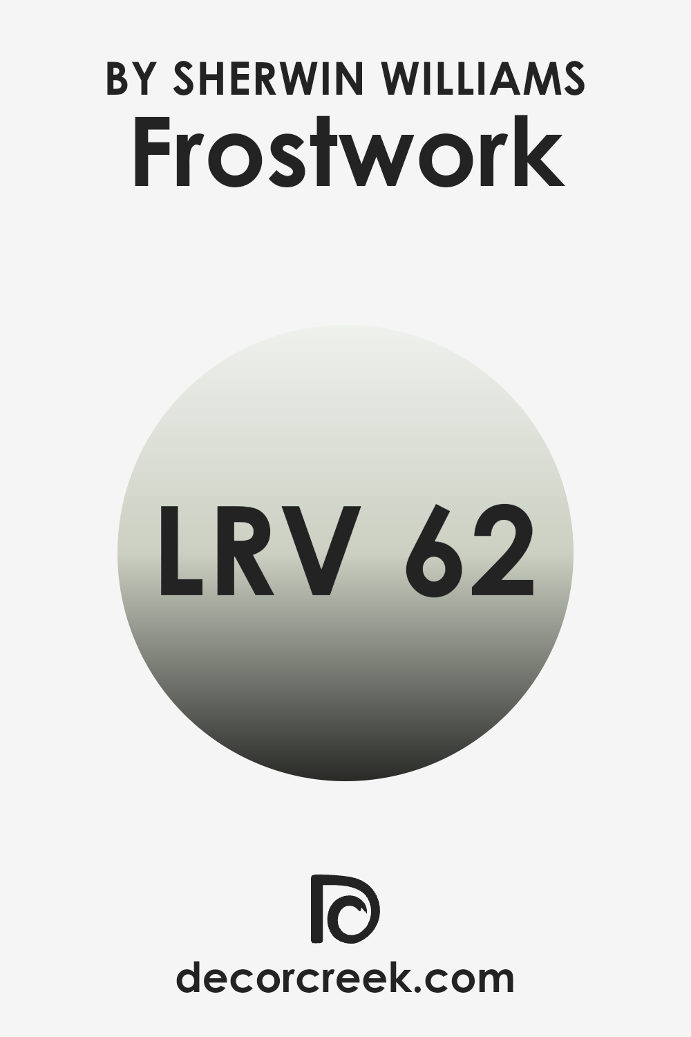
LRV stands for Light Reflectance Value, which is a measure used to indicate how much light a paint color will reflect versus how much it will absorb. This scale ranges from 1 to 99, where a higher number means the color will reflect more light.
It helps in deciding which color to use based on how bright or dark you want a room to look. A room painted in a high LRV color will generally appear lighter and can make the room feel larger, whereas a lower LRV could make a room feel cozier but potentially smaller.
The LRV for the color in question is 61.573, which is fairly high on the scale. This means it is quite reflective, making it a good choice for areas that you want to keep bright and airy. It can help in making a smaller room feel larger or a dimly lit room feel more open and inviting.
This particular shade will reflect significant amounts of light without being overly stark, providing a balanced and light backdrop for any room. It is a flexible choice that can work well in many different areas and lighting conditions.
Coordinating Colors of Frostwork SW 0059 by Sherwin Williams
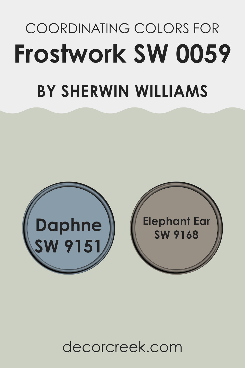
Coordinating colors are chosen based on how well they complement a primary color, enhancing the overall aesthetic of a room without overpowering the main hue. In the case of Frostwork by Sherwin Williams, coordinating colors like Daphne (SW 9151) and Elephant Ear (SW 9168) work harmoniously to provide balance and variety.
These colors have been selected due to their ability to interact well with Frostwork, creating a cohesive yet visually stimulating environment. By choosing coordinating colors, you’re able to create a palette that feels coherent and intentionally designed.
Daphne is a soft, muted shade with a blend of blue and green tones that recalls the calmness of a dusky sky just before twilight sets in. It’s light enough to add a gentle splash of color without overpowering the senses. On the other hand, Elephant Ear is a rich, deep taupe that resonates warmth and earthiness.
Its darker tone provides a strong anchor or counterbalance to the lighter shades in a palette, giving depth and definition to any room. Both colors add their own unique charm and feel, making them ideal partners for enhancing the baseline color without causing visual discord.
You can see recommended paint colors below:
What are the Trim colors of Frostwork SW 0059 by Sherwin Williams?
Trim colors are essential accents in interior design, used to enhance the visual aesthetics and define architectural details of rooms. For a hue like Frostwork SW 0059 by Sherwin Williams, which is a gentle and subtle shade, trim colors play a crucial role in either subtly complementing the primary color or offering a striking contrast.
Trim colors help in creating visual boundaries and can even make the wall colors stand out more. For example, using contrasting trim colors can highlight Frostwork’s unique attributes, making it pop against the defining lines of doors, windows, and baseboards, while complementary trim colors can give a room a more unified and cohesive look.
Considering SW 7531 – Canvas Tan and SW 7029 – Agreeable Gray as trim options for Frostwork SW 0059, both can enhance the room in different ways. Canvas Tan is a warm and inviting color that leans towards a neutral beige, offering a smooth transition between the wall color and the trim, creating a warm and cozy atmosphere in the room.
On the other hand, Agreeable Gray provides a cooler, neutral backdrop that can add a crisp contrast to the cooler undertones of Frostwork, enhancing the overall aesthetic with a modern and clean look. Both options offer the flexibility to match different décor styles and personal tastes, making them flexible choices for designing a visually appealing room.
You can see recommended paint colors below:

Colors Similar to Frostwork SW 0059 by Sherwin Williams
Similar colors play a fundamental role in design by creating visual harmony and a sense of cohesion. When colors are closely related, such as the variations around Frostwork by Sherwin Williams, they can be used to craft rooms that feel seamlessly connected and balanced. These colors subtly differ from each other, which allows for depth and interest without overpowering the senses. This technique is especially useful in achieving a cohesive look while still allowing individual elements to stand out.
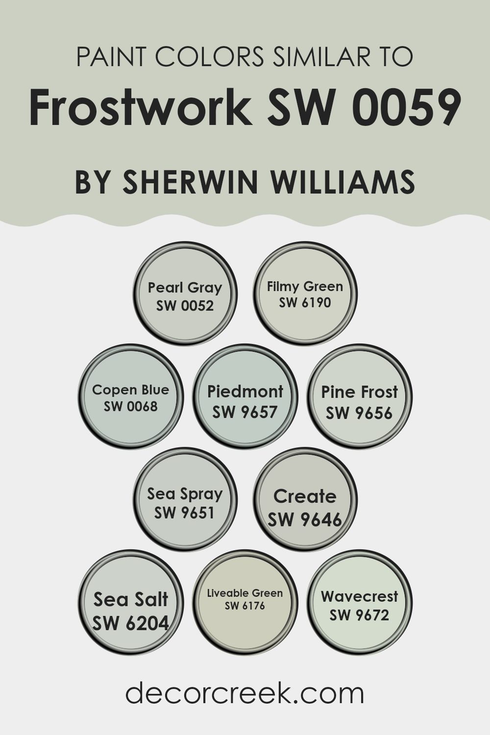
For example, Pearl Gray is a muted gray that can act as a neutral backdrop, offering a calm base for interior rooms. Filmy Green brings a hint of nature into the mix, evoking the look of a soft fog over a lush field. Copen Blue, a gentle sky blue, adds a cool, refreshing touch, perfect for bathrooms or bedrooms seeking a light and airy feel.
Piedmont, slightly richer and more defined, bridges the gap between neutral and accent. Pine Frost hints at winter mornings with its crisp, light green tone. Sea Spray, a subtle green-blue, resembles the mist off ocean waves, ideal for creating a soothing environment.
Create is a vibrant, lively green which injects energy and brightness into any room. Sea Salt, a favorite among designers, beautifully blends green and gray to produce a calming, ocean-inspired hue. Liveable Green, aptly named, offers a comforting, green tone that’s easy to incorporate into various decor styles.
Lastly, Wavecrest stands out with a gentle, washed-out blue that captures the essence of a peaceful shoreline retreat. Utilizing these similar colors helps to tie different areas together, making it easier to design a home with a unified aesthetic.
Whether used in different rooms or combined within a single area, these colors can enhance the overall ambiance while maintaining a smooth visual flow. Each color provides its unique touch while still supporting the collective palette, proving that a carefully selected range of similar colors can enrich the design without complicating it.
You can see recommended paint colors below:
- SW 0052 Pearl Gray (CHECK A SAMPLE)
- SW 6190 Filmy Green (CHECK A SAMPLE)
- SW 0068 Copen Blue (CHECK A SAMPLE)
- SW 9657 Piedmont (CHECK A SAMPLE)
- SW 9656 Pine Frost (CHECK A SAMPLE)
- SW 9651 Sea Spray (CHECK A SAMPLE)
- SW 9646 Create (CHECK A SAMPLE)
- SW 6204 Sea Salt (CHECK A SAMPLE)
- SW 6176 Liveable Green (CHECK A SAMPLE)
- SW 9672 Wavecrest (CHECK A SAMPLE)
How to Use Frostwork SW 0059 by Sherwin Williams In Your Home?
Frostwork SW 0059 by Sherwin Williams is a cool and refreshing color that you could use in various ways in your home. It’s a light blue shade that adds a peaceful and clean feeling to any room. If you want to freshen up your living room, painting the walls with Frostwork can make the room feel more open and airy. This color can also work well in a bathroom or kitchen for a crisp, clean look.
Frostwork pairs well with both dark and light furniture, so it’s pretty flexible no matter your style. For bedrooms, it creates a calm atmosphere, helping to relax after a long day. You could also consider using it for a nursery since the soft tone is perfect for a soothing environment.
Additionally, if you’re not ready to commit to painting whole walls, think about just painting one accent wall or even some furniture like bookshelves or cabinets in this color to add a subtle touch of freshness to your room.
Frostwork SW 0059 by Sherwin Williams vs Sea Spray SW 9651 by Sherwin Williams
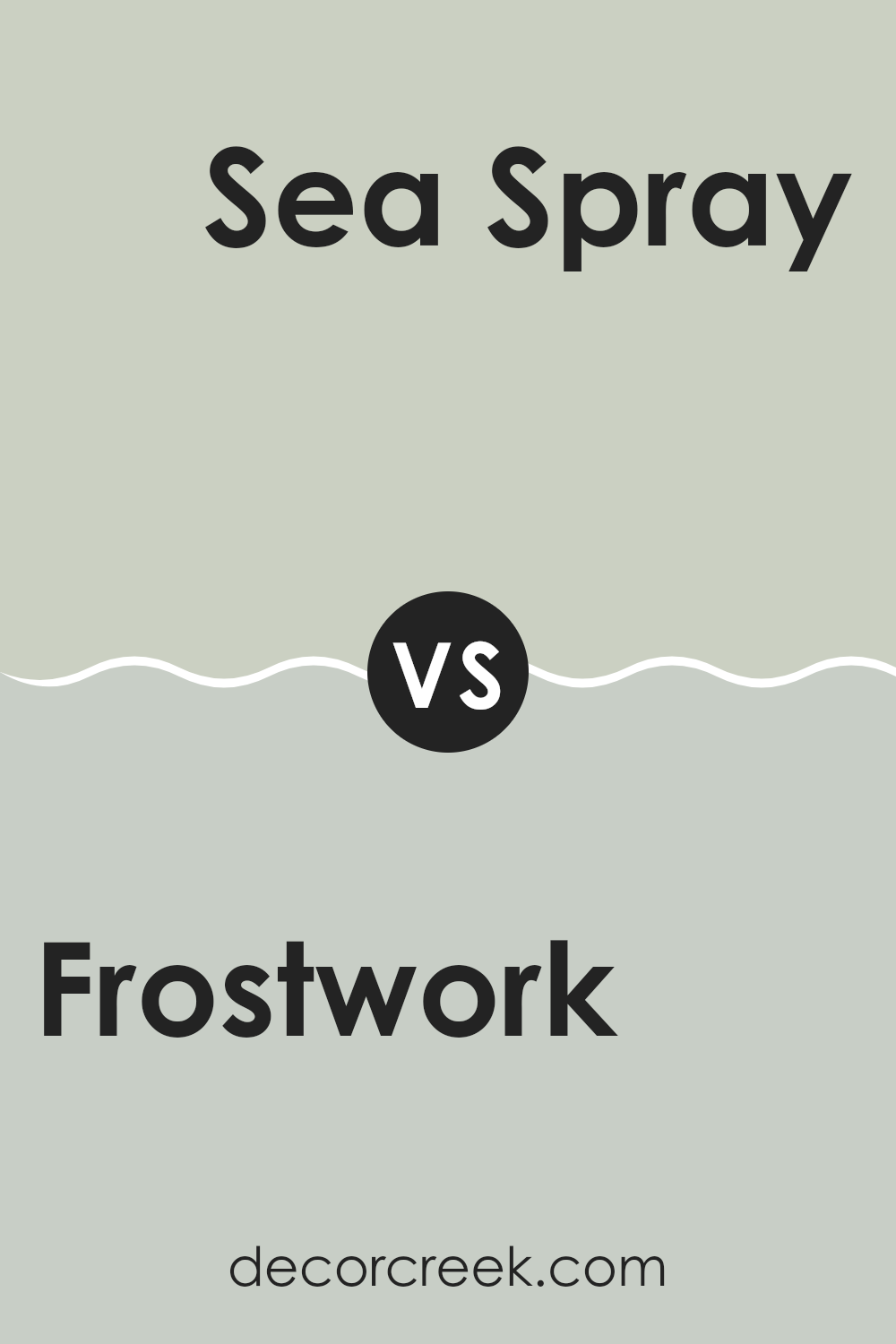
Frostwork and Sea Spray are two interesting colors from Sherwin Williams that both bring a cool, refreshing vibe to a room, yet they have distinct tones. Frostwork is a light gray color with subtle blue undertones, making it a great choice for a modern and minimalist look.
It’s really flexible and goes well in rooms aiming for a clean, sharp appearance. On the other hand, Sea Spray has a slightly greener tone, resembling the color of sea foam. This makes it a perfect option for creating a calm, beach-like feel in a room.
While both colors share a sense of coolness, Frostwork leans more towards a neutral gray, and Sea Spray offers a touch of nature with its green hints. These qualities make Frostwork ideal for formal or sleek settings, whereas Sea Spray suits relaxed, informal environments. Both are great for refreshing a room, yet they cater to slightly different aesthetic preferences.
You can see recommended paint color below:
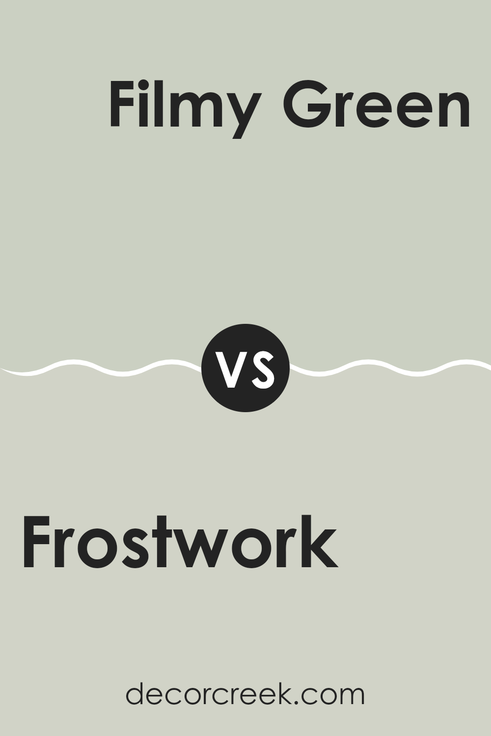
Frostwork SW 0059 by Sherwin Williams vs Filmy Green SW 6190 by Sherwin Williams
Frostwork is a light and soft gray color with subtle blue undertones, making it a calming choice for any room looking to achieve a clean and airy feel. Its neutrality means it pairs well with a wide range of decor styles, from modern to traditional.
On the other hand, Filmy Green is a soft, muted green with a hint of gray. This color carries a hint of nature indoors, offering a gentle and soothing atmosphere. Although also neutral, Filmy Green adds a touch more color to a room compared to Frostwork.
Both paints have their unique appeal: Frostwork brightens rooms with its near-white appearance, while Filmy Green introduces a natural element with its understated green. Choosing between them depends on the desired mood and color scheme of your room, with Frostwork leaning towards a more minimalist look and Filmy Green encouraging a touch of earthiness.
You can see recommended paint color below:
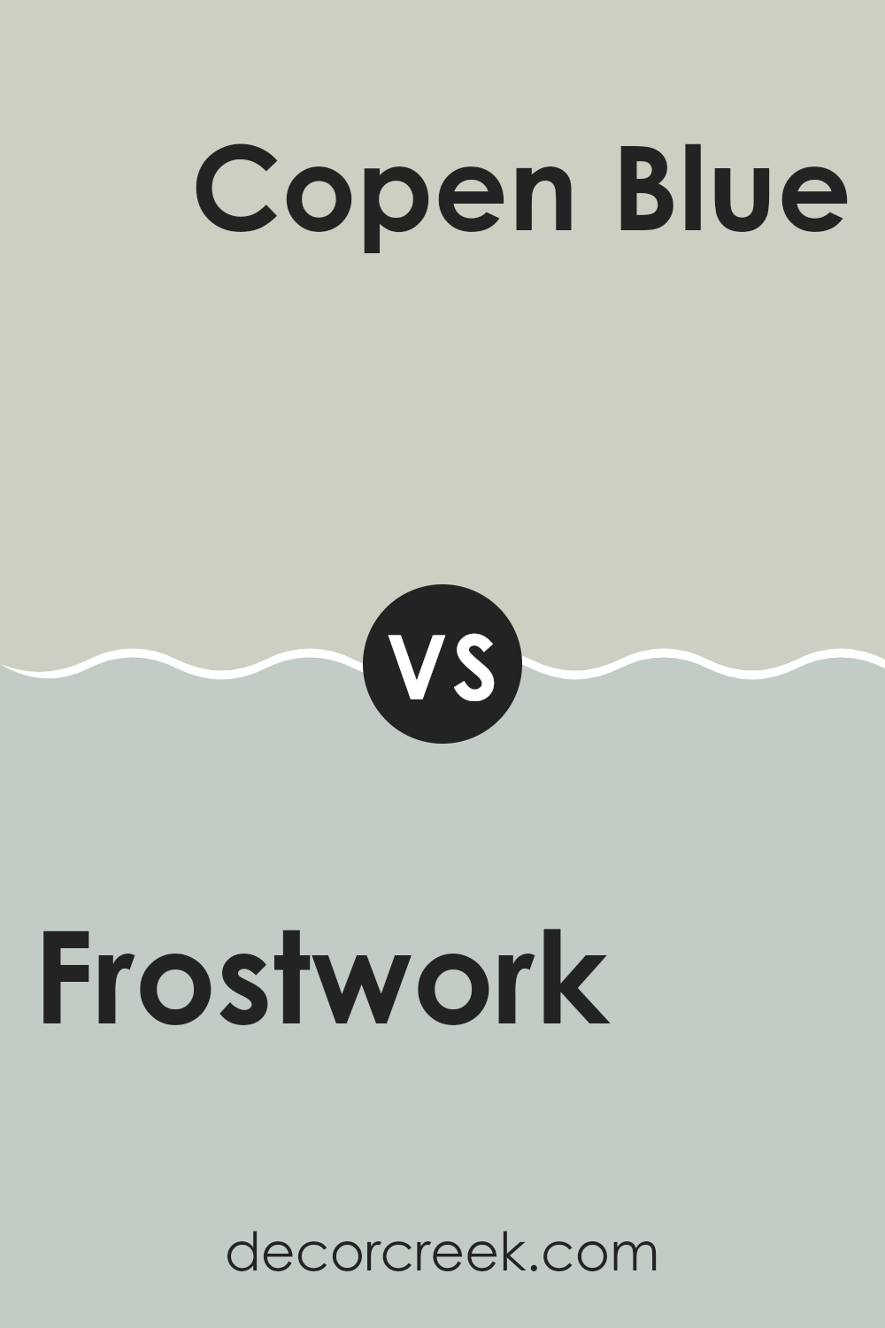
Frostwork SW 0059 by Sherwin Williams vs Copen Blue SW 0068 by Sherwin Williams
Frostwork and Copen Blue are both colors by Sherwin Williams, but they offer different vibes for your room. Frostwork is a very light gray with a hint of blue, which gives a clean and fresh look. It’s subtle enough to be used across large areas without overpowering the room. This color works well in modern or minimalist designs because it offers a quiet backdrop that lets other elements in the room stand out.
On the other hand, Copen Blue is a deeper shade that leans more distinctly towards a soothing blue with some gray undertones. It’s a bit more noticeable than Frostwork and brings a gentle, welcoming feel to any room. This color is perfect for creating a cozy atmosphere, particularly in bedrooms or bathrooms where you might want a more relaxed environment.
Both colors are flexible, but Frostwork is better for those who prefer a nearly neutral palette, while Copen Blue adds a touch of soft color to liven up a room.
You can see recommended paint color below:
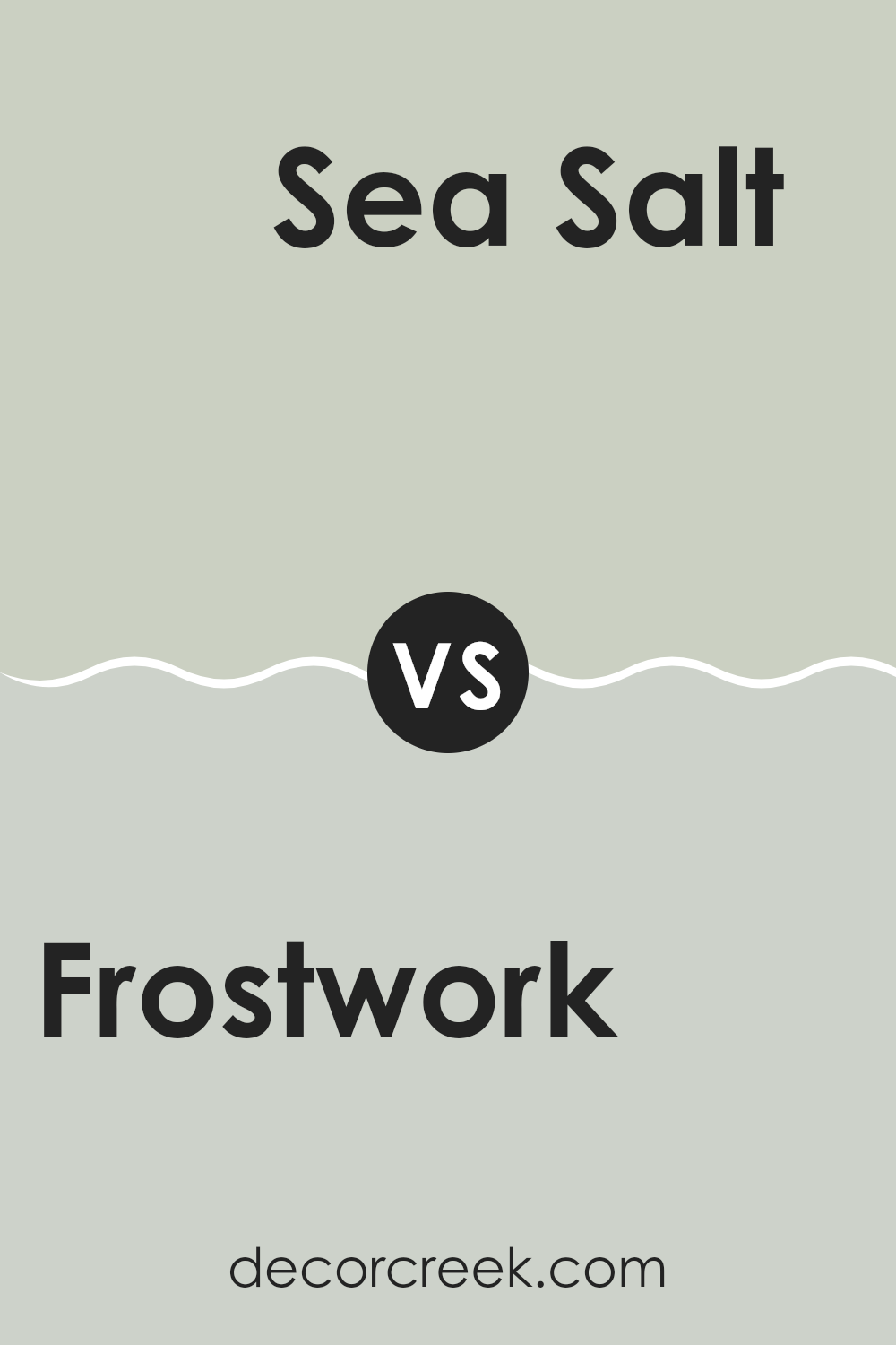
Frostwork SW 0059 by Sherwin Williams vs Sea Salt SW 6204 by Sherwin Williams
Both Frostwork and Sea Salt are unique colors offered by Sherwin Williams. Frostwork is a shade that leans closer to pure white, with a subtle hint of cool grey. This makes it a great choice for creating a clean and bright look in any room. Its lightness gives rooms an open, airy feel.
In contrast, Sea Salt is a blend of green and gray, forming a soft, muted color that is reminiscent of the coast. It’s slightly darker than Frostwork and offers a calm, refreshing vibe that works well in bathrooms or bedrooms, combining well with natural materials and light woods.
When deciding between these colors, consider the atmosphere you want to achieve. Frostwork will brighten a room and make it appear larger, whereas Sea Salt adds a touch of color while keeping the mood relaxed and natural. Both are flexible, but your choice might hinge on whether you prefer the stark simplicity of Frostwork or the gentle, welcoming tone of Sea Salt.
You can see recommended paint color below:
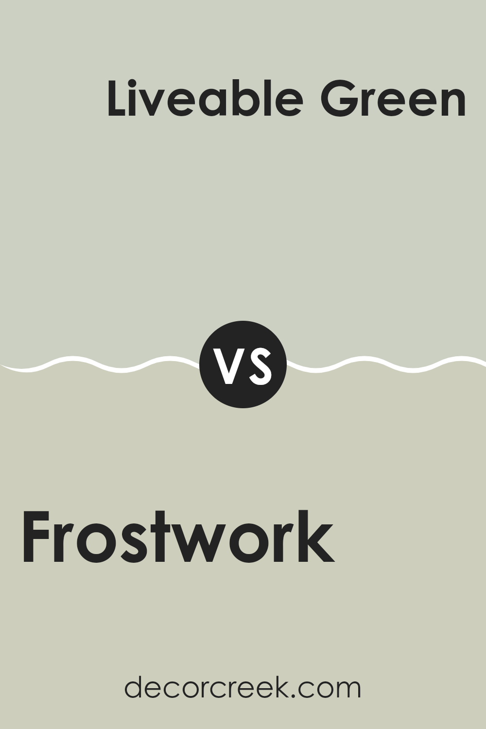
Frostwork SW 0059 by Sherwin Williams vs Liveable Green SW 6176 by Sherwin Williams
Frostwork by Sherwin Williams is a light, crisp gray with cool blue undertones, giving it a fresh, clean look. This color is great for areas where you want to create a bright and airy feel, as it reflects light well and can make rooms appear more spacious.
On the other hand, Liveable Green, also by Sherwin Williams, is a soft, muted green with a touch of gray, creating a cozy and welcoming vibe. This color is ideal for those aiming for a natural, calming atmosphere in their home, as it pairs well with wood tones and other earthy elements.
While both colors can brighten up a room, Frostwork leans towards a cooler palette, making it suitable for a modern look. Liveable Green, in contrast, offers a warmer touch that works well in traditional or rustic settings. Depending on the mood you want to set, each color has its unique appeal for different home styles.
You can see recommended paint color below:
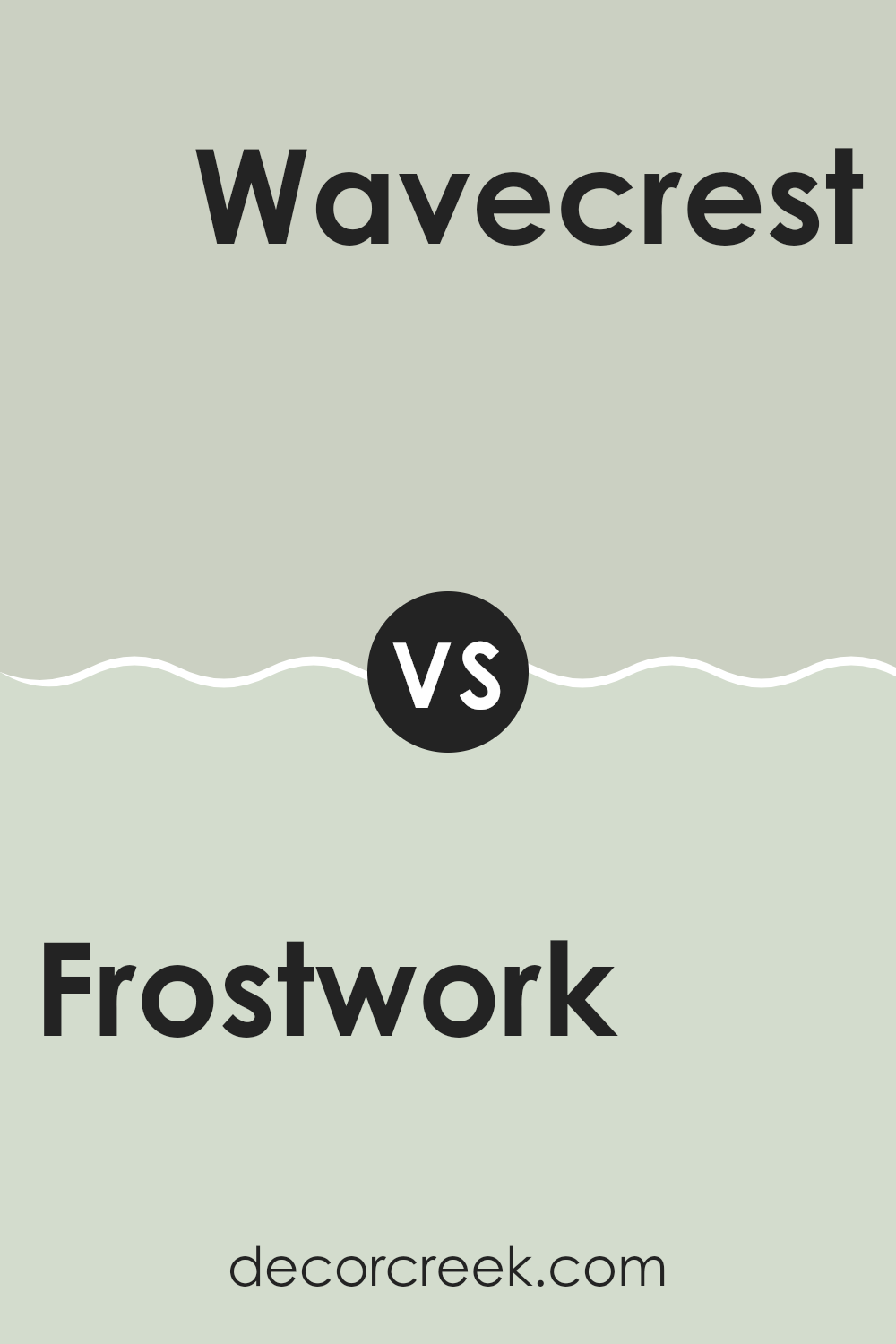
Frostwork SW 0059 by Sherwin Williams vs Wavecrest SW 9672 by Sherwin Williams
The color Frostwork by Sherwin Williams is a soft, pale blue with a hint of gray that gives it a subtle, understated look. It’s light enough to make a room feel airy and open, yet has enough depth to add character without overpowering a room. This color works well in areas where you want a calm and gentle atmosphere, such as bedrooms or bathrooms.
On the other hand, Wavecrest is also a blue shade but differs as it leans more toward a true, clear blue. This makes it brighter and more refreshing compared to Frostwork. Wavecrest is great for areas where you might want a more vibrant feel but still want to keep things pretty relaxed. It’s particularly nice in areas like kitchens or living rooms where it adds a cheerful splash of color.
Both colors are flexible and beautiful in their own right, each offering a unique vibe to the environment. While Frostwork has a soothing, muted quality, Wavecrest offers a splash of freshness without being too bold.
You can see recommended paint color below:
- SW 9672 Wavecrest (CHECK A SAMPLE)
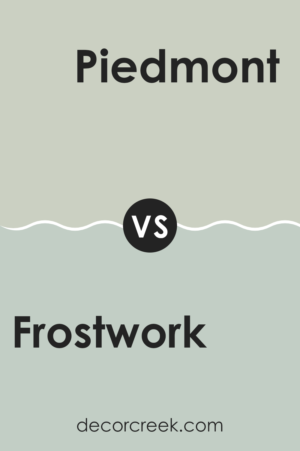
Frostwork SW 0059 by Sherwin Williams vs Piedmont SW 9657 by Sherwin Williams
Frostwork is a cool, light blue hue with a subtle gray undertone, making it flexible for creating a calm atmosphere. It’s particularly good for smaller areas or rooms with limited natural light, as it can make them appear brighter and more open. This color works well in bathrooms or bedrooms, where a soft, restful vibe is often desired.
On the other hand, Piedmont is a darker, more intense shade. It has richer blue tones, which give it a more pronounced presence in any room. This makes Piedmont ideal for accent walls or furniture that you want to stand out. It’s suited for areas where you want to add depth or bring attention, such as dining rooms or sitting areas.
Both colors pair well together for a layered look, with Frostwork providing a light backdrop that enhances the boldness of Piedmont. Together, they can create a dynamic yet harmonious room, suitable for modern homes looking for a touch of elegance without being overly grand.
You can see recommended paint color below:
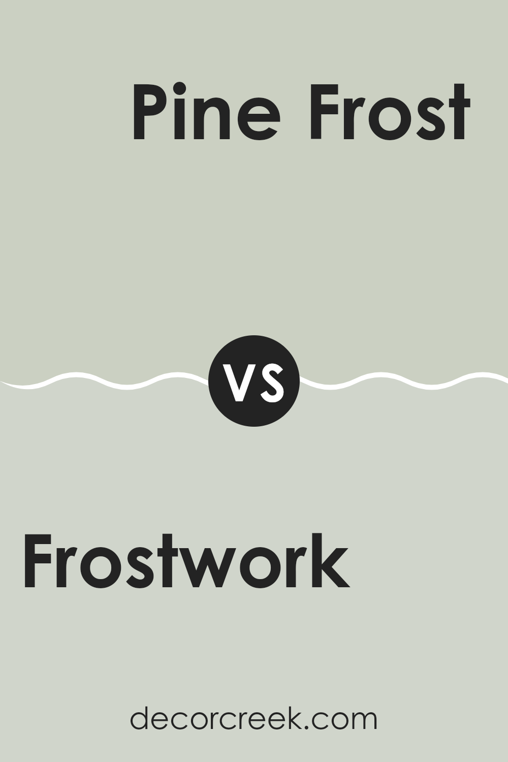
Frostwork SW 0059 by Sherwin Williams vs Pine Frost SW 9656 by Sherwin Williams
Frostwora and Pine Frost by Sherwin Williams are two distinct colors that can enhance any room differently. Frostwork is a soft, light gray shade with a cool undertone, making it a great choice for creating a calm and clean look in any room. It’s light enough to make a small area appear larger while maintaining an airy feel.
On the other hand, Pine Frost has a touch of green, mirroring the subtle hues of frost-covered pine trees. This color is also fairly light but carries a hint of earthiness, which adds a natural, refreshing vibe. Because of its cooler undertone, it pairs well with natural elements like wood or stone.
Both colors reflect light well and can brighten up a room, but their unique undertones set them apart. Frostwork is more neutral, fitting into modern and minimalistic designs, while Pine Frost suits areas that aim for a more organic, nature-inspired look.
You can see recommended paint color below:
Frostwork SW 0059 by Sherwin Williams vs Create SW 9646 by Sherwin Williams
Frostwork and Create are two distinct colors by Sherwin Williams. Frostwork is a soft, light gray with a hint of blue, making it feel fresh and clean. It’s ideal for creating a bright and airy room, especially in small rooms or areas with limited natural light. This color pairs well with both bold and subtle hues, giving you flexibility in your decor choices.
On the other hand, Create is a deeper, more saturated teal that adds a touch of drama and personality to any room. It stands out more distinctly compared to Frostwork due to its richer intensity. This color works exceptionally well in areas that are aimed at being striking and memorable, such as accent walls or in artistic settings.
Together, if used in the same room, Frostwork can act as a calming, neutral background, while Create can serve as an exciting focal point, offering a dynamic contrast that can make interiors look lively and inviting.
You can see recommended paint color below:

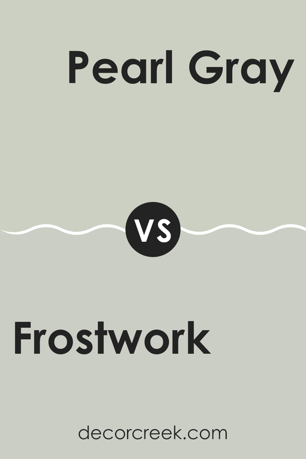
Frostwork SW 0059 by Sherwin Williams vs Pearl Gray SW 0052 by Sherwin Williams
The color Frostwork is a soft, cool blue with a muted quality, making it a calming choice for any room. It brings a light and airy feel, reflecting enough light to make areas seem larger and more open. On the other hand, Pearl Gray is a neutral, mild gray that has a subtle warmth to it.
This color is flexible and pairs well with a variety of decor styles, acting as a gentle backdrop that allows other colors to shine. While Frostwork has a hint of blue that could add a fresh, calming vibe to rooms, Pearl Gray is more understated, providing a stable and grounding effect.
Both colors are suitable for various applications, from walls and cabinets to accents and trim, but their impact on a room’s mood and feel can be quite different. Frostwork lights up a room softly, while Pearl Gray offers a cozy, welcoming atmosphere.
You can see recommended paint color below:
After looking at and talking a lot about the paint color SW 0059 Frostwork by Sherwin Williams, I can really say it’s a fantastic choice for anyone thinking about giving their room a fresh, new look. This color is a soft, calm gray with just a hint of blue, which makes it cool and easy to look at. It works really well in bedrooms or living rooms where you want to feel relaxed and comfy.
This color isn’t too bright or too dark, making it just perfect for places where you don’t get a lot of sunlight. It kind of acts like a gentle hug for your walls, wrapping them in a color that isn’t too flashy or dull. It’s especially awesome for places where kids play or do their homework, because it doesn’t distract them too much.
I can see why many people would pick Frostwork for their homes. It’s a color that doesn’t scream for attention but nicely holds your hand and fits quietly into your life. Even when you put it on all the walls in a room, it doesn’t get boring – it actually helps other colors like your pillows, curtains, or a comfy couch stand out more.
To wrap it up, Frostwork by Sherwin Williams is a great paint if you want something that looks clean, calm, and helps everything else around it look better. It’s great for just about any room, and I would definitely think about using it the next time I want to paint something at home!

Ever wished paint sampling was as easy as sticking a sticker? Guess what? Now it is! Discover Samplize's unique Peel & Stick samples.
Get paint samples


